| |
|
|
|
|
| |
 |
ChartWatchers
the StockCharts.com Newsletter
|
|
|
|
|
|
|
|
CUSTOMIZING CANDLEGLANCE CHARTS
by Chip Anderson | ChartWatchers
Hello Fellow ChartWatchers!
The big news at the moment is the big move in bonds ($TNX is at highest point since mid-2011) and gold ($GOLD is at lowest point since mid-2010). Several of the other commentators will have more to say about those developments below. As for me, I've got another big improvement to announce for people that like to look at lots of charts.
Customizable CandleGlance Charts Now Available!
We've just released a new feature that allows members to customize their CandleGlance charts. This is similar to the Customizable GalleryView feature that we announced in June and, depending on how you use your account, could have an even bigger impact on your use of StockCharts.com.
CandleGlance charts are deliberately designed to be small charts that let you quickly evaluate (and optionally delete) large numbers of saved charts. We have several collections of pre-created CandleGlance charts in our "Free Charts" area and members can view any of their saved ChartLists in "CandleGlance View" as well.
In my SCU Seminars, I show how critical CandleGlance view is for validating and further refining scan results as well. All-in-all CandleGlance is a wonderful tool that I use several times every day. (If you are not familiar with it, check out some of these articles for more details.)
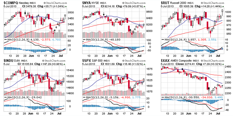
Until now however, CandleGlance charts have been limited in what they can display. There was a limited number of duration choices. The overlays were fixed to just 2 moving averages. Furthermore, each chart was limited to a single, optional indicator. Here's an example of what that looks like:
Over the years we've had many people ask us if they could change the format of the CandleGlance charts to better fit their investing style. As of today, I am happy to be able to say "Yes, you can do that!" Check out this version:
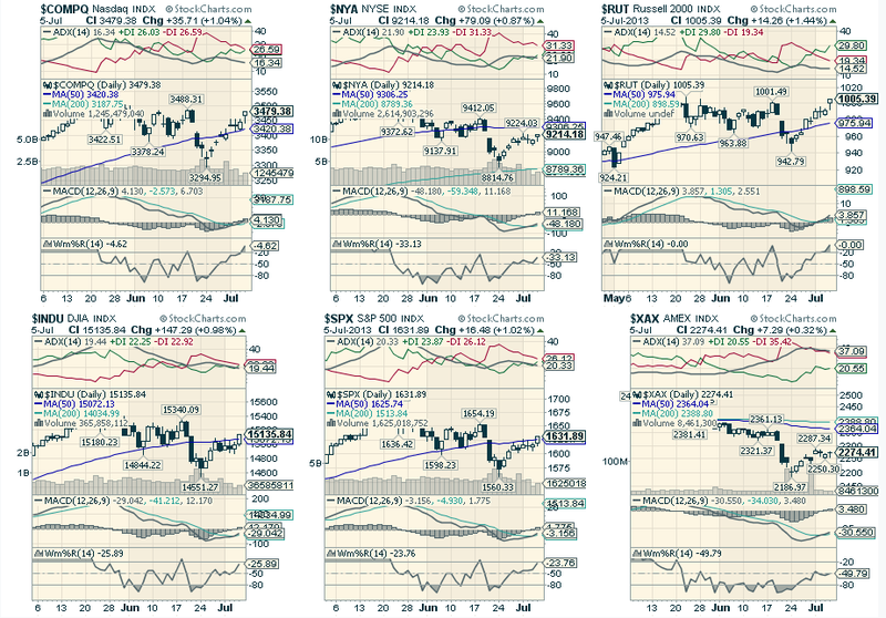
The key is to create and save a ChartStyle named "CandleGlance" (all one word, no spaces). That style will then be available to use in CandleGlance view by selecting the "My CandleGlance Style" choice in the "Duration" dropdown on the CandleGlance page.
Notes:
- This is still CandleGlance, meaning that the sizes of the charts are still small and the height of indicator panels are adjusted accordingly.
- The original CandleGlance styles are still available. Just select a "regular" duration from that same dropdown to switch back.
- If you need help creating a ChartStyle, be sure to review the "Getting Started with StockCharts" video (recently updated by Arthur Hill!)
Again, if you are a fan of CandleGlance (especially for using it in conjunction with scans), this could be a HUGE game-changer for how you use our website. Enjoy!
- Chip
P.S. Several people had trouble with the instructions for customizing GalleryView in the last newsletter. Be sure to use style names that are all one word - no spaces. i.e., "GalleryIntraday", "GalleryDaily" and "GalleryWeekly"
P.P.S. Hey Toronto! We've just gotten approval to give out IIROC/CECAP credits for our SCU Seminars that we are holding in Toronto on July 26th and 27th. That's in addition to the 3 free months of service and free DVD seminar that are included with every registration. Interested? Click here for more details.
SITE NEWS
RECENT ADDITIONS TO STOCKCHARTS.COM
- Documentation for Indexes Added to ChartSchool - We've just added a new section to our ChartSchool area that documents all of the indexes on our website. Definitions, publishers, update schedules and more are included. Click here to see for yourself.
- Public ChartLists Need Love Too! - Don't forget to visit our Public ChartList area on a regular basis. That area is where StockCharts users like yourself publish their thoughts on the market and interesting charts to watch. If you haven't visited it in a while, you will be amazed by the improved quality of many of these lists. Check it out and be sure to vote for your favorites.
- StockCharts Has Tons of Videos - Did you know that? We have lots of educational videos that show you exactly how to use our tools and find great stocks. For instance, here's a link to a new video about our new Technical Alerts feature.
WTI CRUDE IS CATCHING UP TO BRENT
by John Murphy | The Market Message
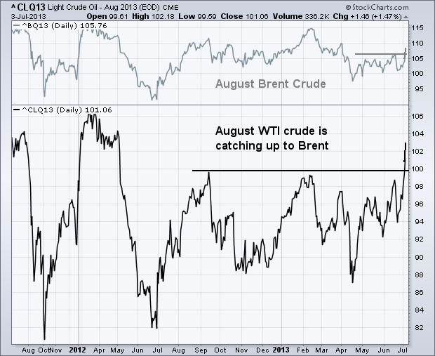
The price of West Texas Intermediate Crude oil (the U.S. benchmark) has exploded over the last week. The lower line in the chart below shows the August light crude oil contract having broken out to the highest level in 14 months. Today's rise puts August crude at 103.12, which is $4.34 below the price of European brent crude (which ended at 107.46). Both varieties of crude usually trade around the same price. U.S. crude has been much weaker than brent over the last two years, owing to supply bottlenecks in the the U.S. With those having been relieved, the U.S. oil market is catching up to Europe. The upper line in the chart shows the August Brent Crude contract trading at a three-month high. Energy traders are betting that WTI crude will catch up to the price of Brent and close the unusual gap between the two.
- John
THE CASE FOR $1000 GOLD
by Arthur Hill | Art's Charts
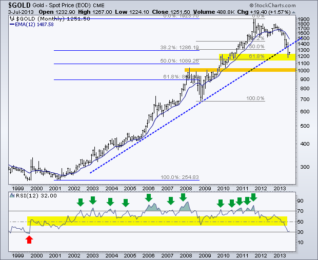
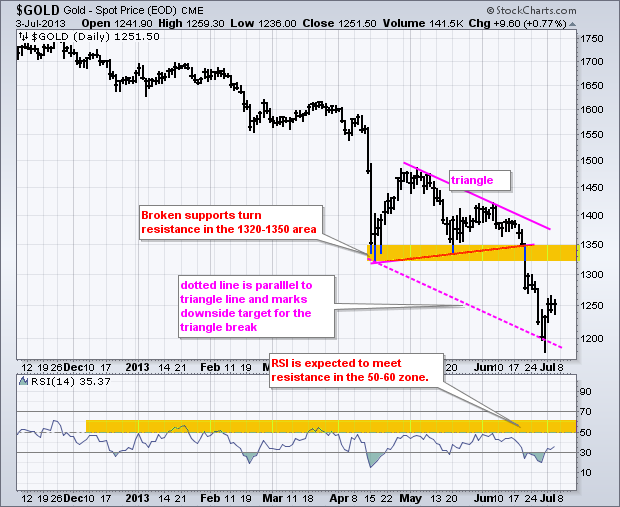
Gold is medium-term oversold and ripe for a bounce, but the long-term trend remains down with a target in the $1000 area. There are two big moves defined by two sets of retracement lines on this chart. The first extends from the 2001 low to the 2011 high (±250 to ±1900). A normal 50-61.80% retracement of this advance would extend to the 900-1100 area. There is also potential support in the 1000 area from broken resistance and the February 2010 low (orange shading). Thus, 1000 is the long-term target for gold at this point.
Click this image for a live chart.
Medium-term, gold is oversold after a plunge from 1800 to 1200. Notice that 12-month RSI is near 30 for the first time since 1999. Oversold conditions typically occur in downtrends, not uptrends. Overbought conditions are typical for uptrends (green arrows). In addition to medium-term oversold conditions, gold is in a support zone marked by the 61.80% retracement and broken resistance from the December 2009 high. The combination of oversold conditions and support could give way to a bounce back towards the 1320-1350 area. The long-term downtrend, however, is expected to takeover at some point and the subsequent resumption would open the door to $1000, which might make Grover Cleveland happy.
Click this image for a live chart
Have a great weekend!
--Arthur Hill CMT
THE SNAP OF THE $USD
by Greg Schnell | The Canadian Technician

I noticed the British Pound took an absolute thumping this week. It moved almost 5 cents to the $USD.
But more importantly, the USD has moved above the long term trend line.
As the largest currency in the world, that would suggest money continues to move to the $USD.
For safety, for the best opportunity for return or for trend following, the money is going to the USD.
Click here to see the live $USD Chart.

We will move the dotted line over if it closes the month here.
Lastly, the big picture currency chart with of of the $USD index currencies. Here is the live link $USD Currencies
They are all breaking down slowly. The British pound and the Canadian dollar are the most recent.

ANOTHER BREAKDOWN FOR BONDS
by Carl Swenlin | DecisionPoint.com
Last week TLT, our bond market surrogate, made a new low, then bounced up to the resistance of the declining tops line drawn from the May top. It turned down on Wednesday, we thought beginning a move to test the recent low, but today TLT didn't bother to retest the low. It gapped down below the support and kept heading south.
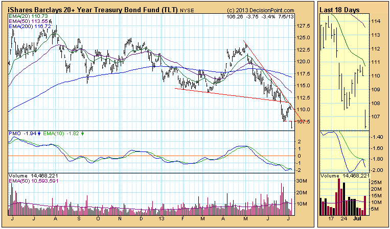
The situation is more obvious on the weekly chart. A massive top has been forming over the last two years, and price is headed toward support at 105. We are tempted to say that it is all over for bonds, but we can see that bond prices are nothing if not volatile. It is notable that the weekly PMO (Price Momentum Oscillator) has reached a level where it has previously found support.

Conclusion: TLT is near long-term support in price and internally, so a bounce in price is possible; however, the rise to over 125 was excessive in speed and amplitude, and we think that a more extended correction is needed.
In the very near-term, it's difficult to predict which way the S&P 500 is heading. Recently, we saw the Volatility Index ($VIX) spike to nearly 22 and the multi-month uptrend line on the S&P 500 was violated. Take a quick look:
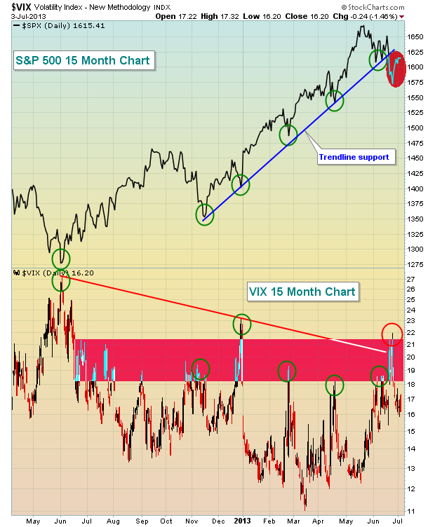
The biggest technical issue wasn't necessarily the VIX rising to 22 as we saw it move above that level in late December 2012. Instead, breaking that 5-6 month trendline that already had four successful tests was the bigger story. In my view, it changed the "cloudy" outlook for equities from a short-term concern to a more intermediate-term issue. It also happened just as we approach the worst 2-3 consecutive months of the year historically.
Here are the historical numbers - you decide if they'll impact trading in the next few months:
S&P 500 annualized return since 1950:
July 1st through July 17th: +21.48%
July 17th through September 28th: -2.04%
Since 1950, that July 17-September 28 period has covered 3140 trading days, or roughly 12.4 years worth of data. That's a lot of data and certainly should be considered a "representative sample" by statisticians. And it trails the AVERAGE annual return of the S&P 500 by more than 10 percentage points. Based on these FACTS, there is no doubt that the market has an historical "tendency" (not a guarantee) to struggle throughout this period, some years much worse than others.
Why else should we be concerned? Well, let's take a look at the weekly chart of the S&P 500:
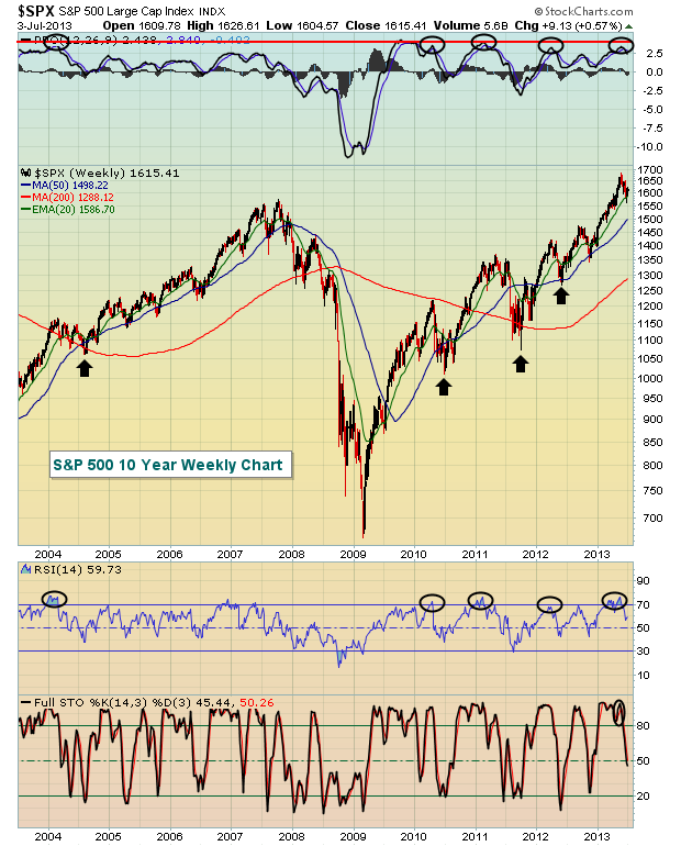
Check out the black circles on the chart above. It shows that over the past decade, we've seen a handful of times where the weekly PPO (percentage price oscillator - similar to the MACD, but expressed in percentages rather than dollars) is stretched to the 3-4 level and the weekly RSI hits 70 (overbought) simultaneously. In every case, we've seen selling take us AT LEAST to rising 50 week SMAs over the next 2-3 months. To be honest, it makes perfect sense. A stretched PPO tells us that the market has been running HOT for an extended period of time and the overbought RSI confirms it. A pullback really is to be expected.
But before you go running for the hills, you should also realize that key sectors/industries are performing exceptionally well on a relative basis, suggesting the longer-term bull market remains intact.
So what does all this mean? Well, it tells me that short- to intermediate-term risks are rising if you're on the long side. I combat that by trading less often and fewer shares. You can further reduce risk by selling calls or buying put insurance on the S&P 500.
Please don't misunderstand my overall view, however. I remain BULLISH over the longer-term (6-9 months) but realize the market is likely to continue its recent choppy pattern, perhaps turning more bearish later this summer. I believe we'll see 1530 on the S&P 500 at some point over the summer, possibly even the 1465-1485 area. I do not plan to short, however, as these levels are not guarantees and as I said before, I remain bullish in the longer-term.
My Chart of the Day for Monday highlights a few of the reasons for my bullishness later in 2013. You can CLICK HERE for details.
Happy trading!
Tom Bowley
Chief Market Strategist
Invested Central
This past week, the monetary policy world shook once again as the Bank of England and the European Central Bank provided the markets with "dovish" comments regarding leaving o/n funding rates low "for an extended period of time." This was clearly reminiscent of the Fed's proclamation some years ago; and served to buttress a move into risk assets. Whether or not this is the case this time is up for debate, and will be known in the fullness of time.
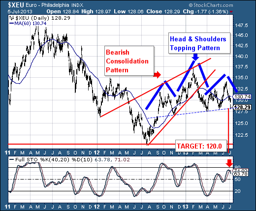
However, what we do believe to be true is that the British Pound Sterling and Euro are embarking upon declines that will carry them very sharply lower. In particular, our focus is upon the Euro chart, and the fact that a larger bearish consolidation was confirmed in February, with prices simply consolidating since then. But, the fact of the matter is that during this time, a right shoulder of a bearish "head & shoulders" top pattern has formed, of which neckline support is on the verge of being given. We believe the odds are rather good for such a decline given the 40-day stochastic is just now turning lower from less than overbought levels.
The downside target measurement is 1.2000...a full 8 "big figures" from current levels. However, let us forewarn our readers, a move to this level would cause significant long-term technical damage on the monthly chart (not shown). Quite simply, this would break the neckline of a 10-year "head & shoulders" top pattern, which would then target the 2001-2002 lows near .9000.
In any case, the bottom line is that it is proper to be sellers of Euros at current levels - now and into the future as both the fundamentals and technicals are lining up in proper order.
Good luck and good trading,
Richard
|
|
|
Recent StockCharts Articles You Might Have Missed
|
|
|
|
|
UPCOMING EVENTS
|
 |
StockCharts University Seminars - Live, in-person training for Technical Investors
|
|
|
- Toronto, ON - SCU 101 & 102 July 26, 2013 - July 27, 2013
- New York, NY - SCU 101 & 102 September 20, 2013 - September 21, 2013
- Dallas / Forth Worth, TX - SCU 101 & 102 November 8, 2013 - November 9, 2013
- Dallas / Forth Worth, TX - SCU 310 November 10, 2013
Click here for more details
|
 |
|
|
|
|
Are you new to StockCharts.com?
|
|
Here are some activities that will help you learn more about our website:
Do you know someone else that would appreciate this newsletter? Please feel free to forward this to other people interested in stock charting. Thanks!
|
|
|
|
|
|
|
|
|
|
|
|
|
| |
|