Hello Fellow ChartWatchers!
In case you haven't noticed, the Financial sector has been dominating the market for over a year now with the Consumer Cyclicals not far behind. How do I know? I used our S&P Sector Performance chart. Here's how you can do that analysis for yourself:
1.) Click on the "S&P Sector Performance" chart link located on our Home page (just below the collection of ticker symbols in the middle of the page).
2.) After the PerfChart appears, click the grey "S&P 500" button in the upper, left corner of the chart. This will convert the chart into "Absolute" mode where each line represents the absolute performance of each sector ETF.
3.) Click the "Histogram Chart" icon in the lower left corner of the chart to change the chart into a histogram chart where each vertical bar represents the overall percent change for each ETF over the time selected.
4.) Finally, move your mouse pointer over the center of the chart and click the right mouse button to bring up the popup menu, then select "Performance Sort On."
If everything goes well, you should see something similar to this:
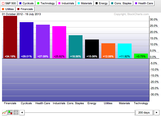
This chart shows that over the past 200 days, the S&P Financial Sector ETF (XLF) has outperformed all of the other sectors with a 34.19% gain. It also shows that the Technology sector - the sector that outperforms other sectors when a recovery is well under way - had the worst performance during that period.
(If you are unfamiliar with PerfCharts, check out this video for more information on using them.)
As you might be aware, you can use your mouse to move and resize the date slider at the bottom of the chart. If you can, take a moment to click on the "d" in "days" located in the middle of the slider and drag it to the left. As you do that, the size and position of the histogram bars change to show you the strength of each sector over that time period that corresponds to the slider's position.
After you are don't experimenting, move the slider all the way back to the right side of the chart. Next, right-click on the "d" in "days" in the middle of the slider. A popup menu should appear with several date range choices. Select "Year-to-Date" from that menu and the date range will change accordingly. Here's what you should see:
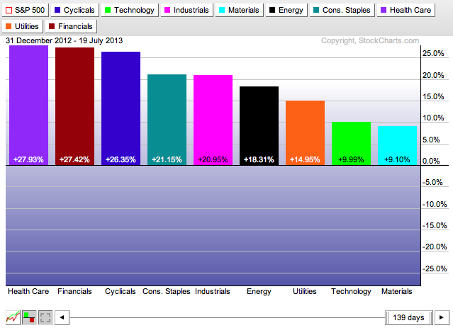
Note that Health Care is now in the #1 spot with Financials close behind on the Year-to-Date chart. Also note that Tech stocks have improved (slightly) to the next-to-last position. Now use that same popup menu to see how things look over the past 3 months.
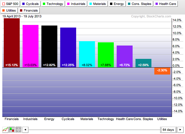
Did you get the same results? Again, the Financials is the top performer and the Tech sector has moved even more to the left of the chart. Finally, let's check out the 1 month verson of this chart:
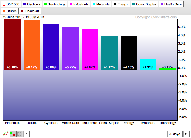
Again, Financials is still in the forefront however Utilities has moved into the #2 position and the Tech sector lagged badly. This suggests a setback any near-term prospects for a strong recovery.
Hopefully you can also see the value of the "Performance Sort" feature of our PerfCharts tool.
Take care out there,
- Chip
P.S. Toronto, I will see you next weekend for our SCU 101 and 102 seminars!
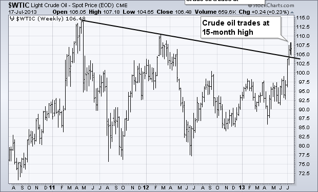
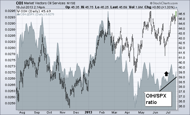
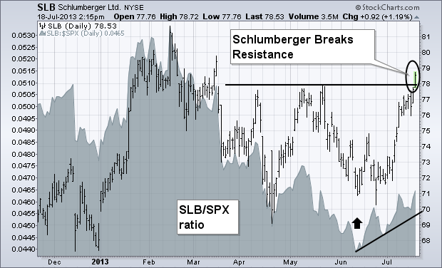
Chart 1 shows Light Crude Oil trading at the highest level in fifteen months. My July 5 message showed crude oil trading higher in an attempt to close the gap between it and higher priced brent crude. As of today, crude is only a dollar away from its European counterpart. With oil prices on the rise, investors appear to be showing new interest in energy stocks. My July 8 message showed the Market Vectors Oil Services ETF (OIH) moving up toward its 2013 highs. Chart 2 show the OIH very close to challenging its May peak. Its relative strength ratio (gray area) has also started to climb since June. That same message showed upside breakouts in Baker Hughes (BHI) and National OIlwell Varco (NOV). Today's upside breakout belongs to Schlumberger (SLB). Chart 3 shows SLB trading over its spring high with a rising relative strength ratio. SLB is also the largest holding in the OIH.
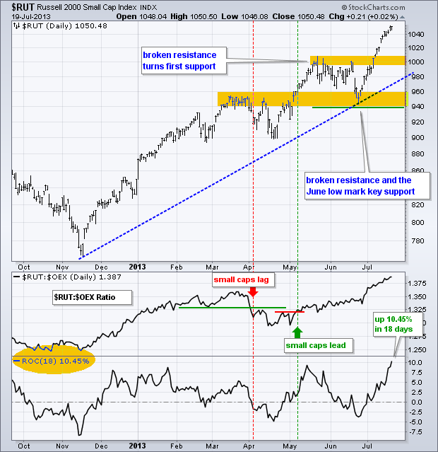
The Russell 2000 ($RUT) is leading the market higher with a breakout on July 8th and a series of 52-week highs the last two weeks. This key small-cap index was one of the first of the major indices to break above its May high. Even though the index is looking a little overbought after a 10+ percent move the last 18 days, the breakout is clearly holding and bullish until proven otherwise. Should we see a pullback, broken resistance in the 1000 area turns into the first support zone to watch. The late June low marks long-term support. The indicator window shows the price relative ($RUT:$OEX ratio) moving to a new high as well. This means the Russell 2000 (small-caps) is outperforming the S&P 100 (large-caps). Relative strength in small-caps is positive for the market overall because smaller companies are more sensitive to changes in the economy. In addition, smaller companies tend to be more domestically oriented and relative strength bodes well for the US economic outlook.
Click this image for a live chart
Good trading and good weekend!
--Arthur Hill CMT
Notice the price action on the $VIX. The peaks and valleys are 100% apart!
The monthly options expiration date has marked a significant turning point for the $VIX every month for at least 8 months.
I have marked the OE day with a black dashed line. The circles represent 2 major turns that were not associated with OE.
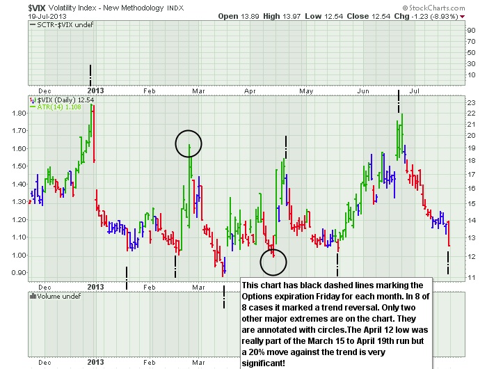
So being aware of the price action coming into and leaving the OE date can be very important for short term traders.
Currently we appear to be near recent lows. We also have made 3 higher lows in a row. We'll see if that trend changes in the next few weeks.
Globally, I think watching the foreign market charts will tell us where the markets are going next.
This is Asia below.
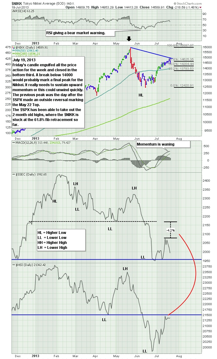
The Nikkei has been one of the most volatile markets in the world. It soared 100%, pulled back over 20% and
is now trying to push higher. The real problem is the momentum. The strong momentum has been lost here. Notice how all these markets have faired
since the May 22 high on the $SPX. The $NIKK can't seem to get back up and closed the week at a 61.8% retracement of the move. It also
had an engulfing candle on Friday which covered the entire range of the week. It closed in the bottom third which is bearish.
You can see the RSI has given off a bear market warning signal (RSI below 40) and is now testing the high side of the range.
The MACD is showing the slowing momentum.
Notice how the $SSEC (Shanghai) is a full 4% behind the $HSI (Hong Kong)on the retracement move. The $HSI finds itself at resistance.
For Europe, the charts couldn't get more interesting. The elder statesmen technicians will tell you to watch the $FTSE
to see if it starts making lower highs. That usually precedes the $SPX.
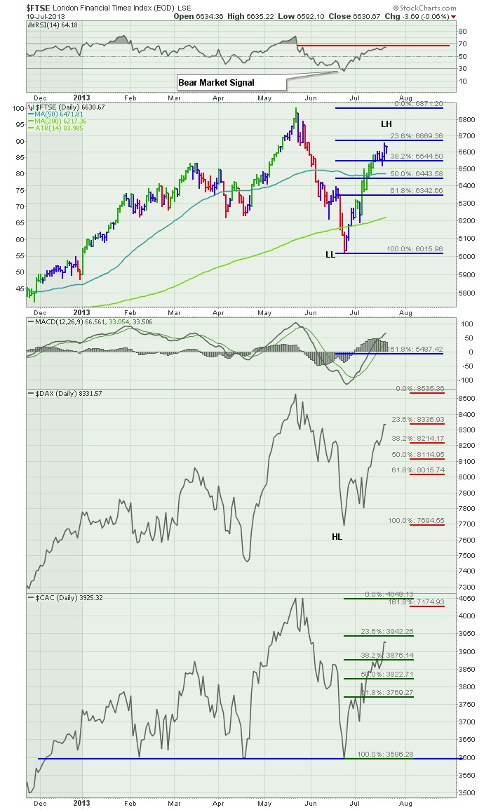
The $FTSE has made a lower low (LL), the $DAX has made a higher low (HL) and the $CAC has tested the 2
previous lows exactly! All of them have retraced the same amount of the move down in percentage terms unlike the
Asian markets above. The $FTSE RSI has given a bear market signal by going below 30. It is weak. Now can it get back above 70?
It should be an interesting month. July marked the top of the big $SPX pullback in 2011 amidst the commodity weakness.
We currently have the commodity weakness. The global markets are softer than the USA. I think it will be very important for the $FTSE
and $DAX to make new highs here. The long term $FTSE chart would look like a failed double top compared to the 2007 highs.
The $CAC is still below 2011 highs. The $DAX is the strongest market in Europe with the chart well above the 2007 high.
Good trading,
Greg Schnell, CMT
DecisionPoint.com has a unique market indicator that measures very short-term participation of stocks in a given index. The Participation Index (PI) is a dynamic, price-based measure of the percentage of stocks that are literally pushing the short-term price envelope -- not just advancing or declining, but actually meeting or exceeding the edge of the envelope.
Actually, there are two Participation Indexes -- the PI-UP and PI-DOWN. Readings of 60 or greater are generally considered climactic. (Note on the chart below that the PI-DOWN scale is reversed in order to present a more intuitive view.) Climactic readings signal an internal blow-off that will usually result in a period of consolidation, a price reversal, or prices might continue in the direction they were going. Of course we can't be sure of the outcome, but it does serve as a reminder to tighten stops.
Let's look at some of the PI-UP climaxes on the chart. In March the UP climax resulted in several weeks of consolidation, but the one in April, while breaking the consolidation, was followed by a correction within two days. The UP climax at the beginning of May led a three-week advance, and the one in June preceded a correction.
It remains to be seen where the most recent UP climax (last week) will lead. So far, prices are consolidating, which is promising, but Thursday's new price high was accompanied by a lower PI-UP reading (negative divergence), so tight stops are in order.
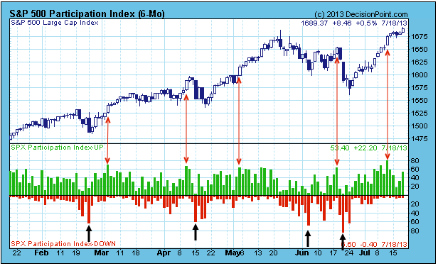
PI-DOWN climaxes (marked by the black arrows) in a bull market generally tell us that the decline is finished or nearly so.
Summary: The Participation Index identifies short-term buying and selling climaxes, and prods us to tighten stops to prepare for possible price reversals. Because it is based upon price performance, we believe it is somewhat more credible than breadth or volume based indicators.
Transportation stocks helped lead the market rally from October 2012 through March 2013, but since that time it's been a struggle on a relative basis. Check out this relative chart:
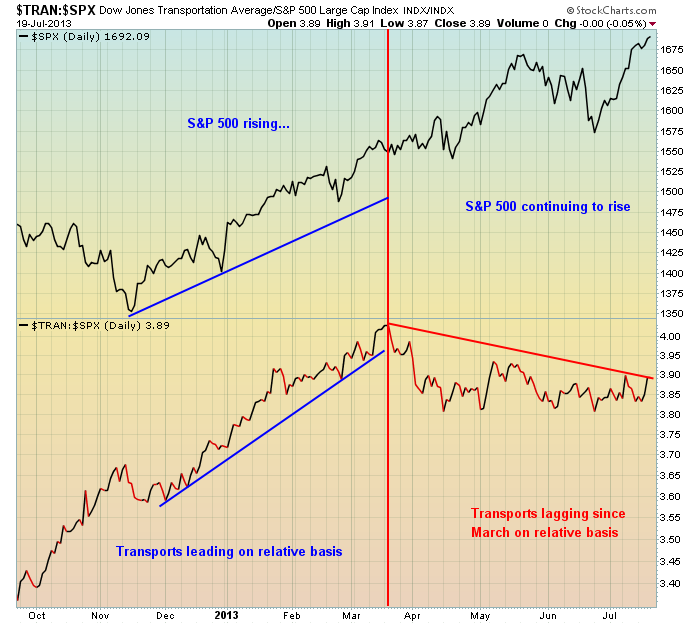
Relative support resides near the 3.80 level in the chart above - a relative close beneath this level could be an additional warning sign.
The biggest problem for transports, however, is the sign of slowing momentum on the longer-term weekly chart. The last two breakouts in transports have occurred with MACDs much lower. While this guarantees us nothing, it certainly suggests the risks of remaining long this group are spiking. Take a look at the chart:

It's looking eerily similar to the summer of 2011 when transports rose to fresh highs in July with a nasty long-term negative divergence. That evidence of slowing momentum eventually resulted in a significant selloff throughout the balance of the summer. We may not see a repeat in 2013, but the warning is there nonetheless.
There's one component of the transportation index that has printed negative divergences in each of the last two summers and then subsequently lost 30% (2011) and 15% (2012) in the following three months. It's set up in a very similar bearish pattern in 2013 and I'm including it as my Chart of the Day for Monday. CLICK HERE for more details.
The NASDAQ Composite is a "forgotten index", as it led the tech bubble higher into the 2000 high. Now, it is the NASDAQ 100 that garners all the attention given it consists mainly of Apple (AAPL) and Google (GOOG). But that aside, the Composite is on a bullish run that looks to hit new highs in the years ahead as the long-term bullish triangle breakout remains in force. However, in the interim - a rather sharp and nasty correction is anticipated.
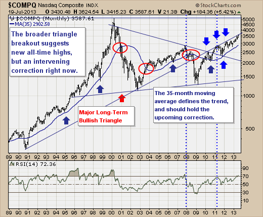
Technically speaking, prices have now rallied again into long-term trendline resistance connecting the 1990 and 1992 lows, and as in previous cases - a decline is expected to occur. Also, note that post-bubble price behavior has faltered from trendline resistance in tandem with the 14-month RSI hitting the overbought 70-level. Thus, the risk-reward is skewed towards the downside, with a test of the longer-term 35-month moving average expected.
Lastly, the depth of the correction can be up to -20% given current price levels and the rising 35-month moving average. But in reality, it will likely be something less than this, but otherwise a very good downside trade...which hasn't occurred in quite some time. Now, if the 35-month moving average is violated, then we would understand that a decline far greater than -20% were underway, and a clear bear market. We don't anticipate this at this time, for the evidence isn't there to support it, but it does have a place in the probability distribution curve.
Good luck and good trading,
Richard