Hello Fellow ChartWatchers!
Today I am thrilled to announce a big change in how people can configure and use StockCharts to understand the markets and make better investing decisions. StockCharts Members can now add pre-created collections of SharpCharts, ChartLists and ChartStyles to their account with just a couple of clicks by installing a StockCharts ChartPack. Think of ChartPacks as optional "Plug-Ins" or "Add-Ons" for StockCharts Extra and PRO accounts.
The StockCharts Essentials ChartPack
Today we are releasing our very first ChartPack - the "StockCharts Essentials." Over the course of the next couple of weeks, we will be releasing several more packs - each with a different focus - but for now I want to tell you about the Essentials ChartPack and help you decide if it is useful to you.
Designed for any technical investor regardless of their experience level, the StockCharts Essentials ChartPack contains 13 core ChartLists with over 140 charts that can give anyone a complete overview of the market. The charts are clean and uncluttered - ready for you to add your own personal indicators, annotations and commentary.
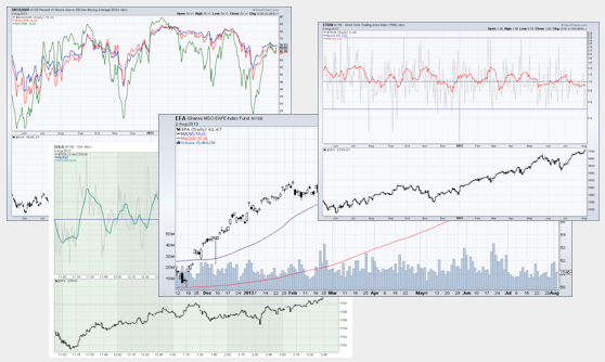
The Essentials ChartPack also includes 10 invaluable ChartStyles that let you quickly create charts for analyzing stocks, market indicators and economic datasets with a single click.
In many ways this is the quintessential ChartPack - a large, but not overwhelming, collection of useful market analysis charts.
To install the StockCharts Essentials ChartPack, follow these steps:
1.) Log In to your Account
2.) Click on the "Your Account" link in the upper right corner of the page
3.) Scroll down to the new "ChartPacks" area of the "Your Account" page. (Note: This section is only available to Extra, ExtraRT, and PRO members.)
4.) Click on the yellow "Details" button next to the "StockCharts Essentials" ChartPack listing.
5.) Review the information presented and then click the yellow "Install ChartPack" button at the bottom of the page if you want to install the pack.
Voila! You've just installed your first ChartPack and made your StockCharts account much more valuable. To see for yourself, scroll to the bottom of the "Members" page and look at how your new ChartLists are arranged and organized. If your account was previously empty, it should look something like this:
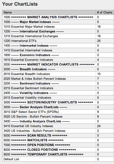
At this point, you could click on the "10 per page" link beside any of your new lists to see their contents. You could also click on the "Summary" link for the "Essentials US Industry Indexes" to see a very useful page. You could also click on the "CandleGlance" link for any of the "Bullish Percent Index" lists. The point is you now have lots of options!
It is important to keep in mind that when a ChartPack is installed, COPIES of the pack's charts and ChartLists are created and placed into your account. You are then free to change those copies in any way that you want. You can annotate them. You can rename them. You can even delete them (not recommended). Once the charts are copied into your account, there is nothing special about them - they are exactly like any other SharpChart that you created. The same goes for the ChartStyles and ChartLists.
Something else you probably want to do after installing the Essentials ChartPack is to check out the SharpCharts workbench to see the new ChartStyles that were added to the "ChartStyles" dropdown. You'll probably also want to assign StyleButtons to some/all of them for quick acces.
Finally, if you had any old lists in your account, you can "move" them into the Framework by adding an appropriate 4-digit number to the front of your ChartList's name. For example, if you had ChartList called "My Watchlist", you could rename it to "6100 My Watchlist" and it will "slot" into the area of the Framework that is reserved for Watchlists.
Frequently Asked Questions about ChartPacks
Q: Do ChartPacks cost money?
A: The StockCharts Essentials ChartPack is free. Most of the ChartPacks we plan on releasing in the near future will also be free. Down the road, we may have more advanced versions of ChartPacks with customized settings from known analysts that will be available for a fee, but that is still in the planning stages.
Q: What is the "StockCharts ChartList Framework" that I see mentioned in several places?
A: The "Framework" is a collection of special, empty ChartLists that are designed to help you organize your saved charts. (Specifically the ChartLists that have lots of equals signs in their name.) They are also used by ChartPacks to ensure that their ChartLists are grouped correctly. You can choose to install the Framework separately or have the Framework installed automatically when you install your first ChartPack. Use of the Framework is completely optional (but recommended for people that have not developed their own organization scheme already). For more information on the ChartList Framework, please read this article.
Q: What if I don't have enough room left in my account for these new ChartPack lists?
A: We've increased the limits on ChartLists for Extra, Extra RT and PRO members to make room for these new ChartLists. Extra and Extra RT members can now have up to 250 ChartLists while PRO members can now have up to 350 ChartLists.
Q: Do the numbers that are in front of the ChartList names and chart names really matter?
A: Only to the degree that they cause the ChartLists and saved charts to appear grouped in a particular order. The most important numbers to try and keep organized are the 4-digit numbers in front of ChartList names. Ideally, each of the different numbers areas (1000s, 2000s, 3000s, etc.) should only contain charts that match the area's useage (i.e., watchlists in the 6000s, open positions in the 7000s, etc.) But ultimately, the numbering is just a suggestion and you can change it if you want.
Q: I've worked hard to organize my account the way that I like it. Why are you forcing me to change everything?
A: The use of our ChartPacks and the ChartList Framework are completely optional. If your account is organized in a way that works for you, you don't need to change anything. On the otherhand, if your account is disorganized and you never seem to find the time to straighten it out, ChartPacks and the ChartList Framework could be just what you've been looking for!
As always, I am very interested in your feedback on this new feature. Please send it to me via blog comments, email or our support form.
- Chip
P.S. If you are a member, you can simply click here and scroll down to the ChartPack area to get started.
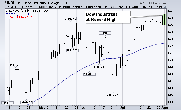
The Dow Industrials and Transports are hitting new record highs together once again. That's a sign of an ongoing bull market. [Dow Theory holds that an upside breakout in either one needs to be confirmed by a similar breakout in the other]. Chart 1 shows the Dow Industrials trading at a new record today. Today's action in the transports is even more impressive. Chart 2 shows the Dow Transports climbing 3% to also trade at a new record. The upside action in the transports is also encouraging, since they're considered to be an economically-sensitive stock group. That's especially true of air freight, rails, and trucks. Today's upside leadership is coming mostly from truckers.

Take care everyone.
- John
P.S. Please consider signing up for our upcoming SCU Seminar Series in NYC Mid-Town. I'll be presenting there in person on September 20th and 21st. Click here for details.
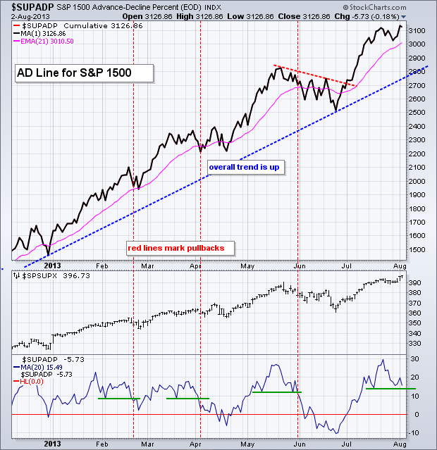
The major stock indices recorded 52-week highs this week and these highs were confirmed by the breadth indicators for the S&P 1500. Note that the S&P 500, S&P MidCap 400, S&P SmallCap 600, Nasdaq 100 and Dow Industrials recorded fresh 52-week highs this week. When the major indices hit 52-week highs, I always check key breadth indicators for confirmation. Failure to confirm suggests that the stock market is not hitting on all cylinders. New highs in key breadth indicators, on the other hand, reflect broad underlying strength that validates the overall uptrend. I like to use the breadth indicators for the S&P 1500 because this is a broad index that covers large-caps, mid-caps, small-caps and Nasdaq stocks. Over 500 stocks in the S&P 1500 are traded on the Nasdaq.
Click this image for a live chart
The chart above shows the S&P 1500 AD Line ($SUPADP) turning up this week and moving above the 23-July high. The overall trend is clearly up and breadth is keeping pace with the underlying index (S&P 1500). The indicator window shows the 20-day SMA of Net Advances for the S&P 1500. This moving average acts as like a momentum oscillator for short-term breadth. The green lines mark short-term support levels. Prior support breaks coincided with pullbacks in the S&P 1500. The first two were real short, while the third lasted a few weeks. Chartists can watch the current support line for breaks that may lead to a pullback in the stock market. The chart below shows the S&P 1500 AD Volume Line ($SUPUDP) with similar characteristics.

Click this image for a live chart
$COPPER is one of our best indicators of economic activity. It is usually early in bull markets and very weak when markets top.
We all know that $COPPER has been under pressure for a long time. I like to use a dashboard of world mining leaders to confirm moves in $COPPER.
Here is the chart live link. $COPPER
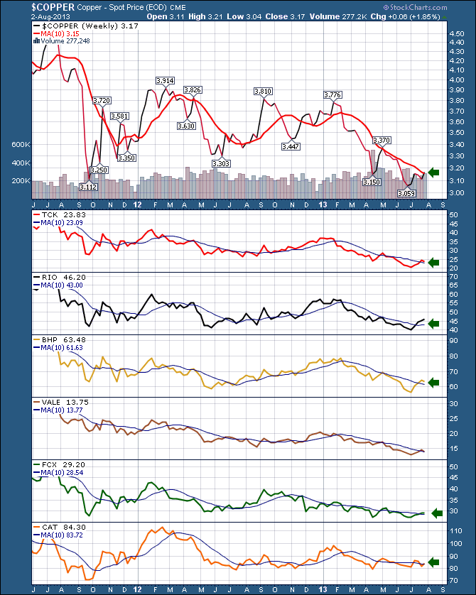
So almost all of these stocks that seem to be correlated to $COPPER have moved above the 10 WMA. We need to see this hold and actually make a solid push above.
We can also see $COPPER will face resistance at the $3.30 level.
But currently, it looks like things are starting to run. If we can continue to ride above the 10 WMA, this will be an attractive sector.
Good trading,
Greg Schnell, CMT
The Rydex Cash FLow Ratio is one of the sentiment indicators we track, and currently it is showing that investors are unusually reluctant to commit money to the current rally.
The Rydex Cash Flow Ratio gives an improved view of sentiment extremes by using cumulative cash flow (CCFL) into Rydex mutual funds rather than using the totals of assets in those funds (which we use for the Rydex Asset Ratio). It is calculated by dividing Money Market plus Bear Funds CCFL by Bull Funds plus Sector Funds CCFL.
After reaching the bullish edge of the Ratio scale at the May market top, we can see how sentiment became quite bearish during the June correction. The July rally has taken the market to new, all-time highs, but, so far, investors have been holding back.
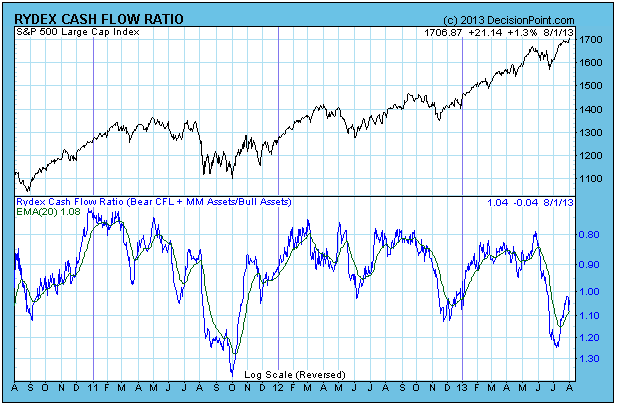
Analyzing the data more closely, we can see that cash flow into bull and sector funds has not been enthusiastic, and bear fund cash flow shows that the bears have not yet capitulated. A note of encouragement is that the rally is not that old -- if it continues, positive cash flow could quickly catch up.

Conclusion: The Rydex Cash Flow Ratio shows that investors abandoned the market during the June correction, more than the size of the correction ultimately warranted. Their reluctance to commit to the rally may be simply a case of not enough time for sentiment to change, and a reflection of how the "wall of worry" works. But in the end, money must be committed to the market to push prices higher, and so far, that isn't happening to any large degree.
Take care,
Carl Swenlin
Most areas of the stock market have enjoyed the past few months, especially since the lows of June 24th. Don't count software as one of those groups, however. At first glance, this might seem like an area of the market to avoid because of poor relative strength over the past couple years. Check out this relative chart showing software lagging the S&P 500 since late 2011:
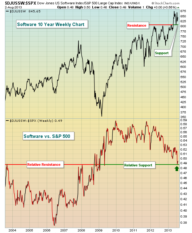
So why might this be an industry group worth considering? Well, first consider that technology is regaining relative strength. A couple months ago, I featured an equal weighted technology ETF (RYT) that was just making a relative breakout vs. the S&P 500. That relative breakout is now much more obvious. Take a look:

Another reason to like software stocks here is that they appear to have hit an area of relative support where we might begin to see relative strength once again. Money flowing away from overbought areas could easily look to software as a lower risk area within the technology space.
Equities overall are quite extended and I try not to make a habit of chasing extended areas of the market. Rotation is a key part of any bull market, so I look for areas that are technically healthy that might be poised to benefit from temporary selling in other sectors and industry groups. Software is clearly in an uptrend and technically sound, but it's been consolidating since May and may be ripe for another advance.
I like several stocks in the software space, but am featuring one in particular for my Chart of the Day for Monday, August 5th. This stock just blew away consensus estimates on both the top and bottom line with its latest quarterly earnings results and I expect it to be a leader over the next few months. CLICK HERE for more details.
Happy trading!
Tom Bowley
Chief Market Strategist
Invested Central