Hello Fellow ChartWatchers!
Three consecutive down days at the end of the week confirmed that August is going to be a rough month for stocks. A couple of quick clicks on our Interactive PerfChart tool show that all of the major market averages moved lower this week by between 1.6% (Nasdaq) and 2.30% (Russell 2000). A couple more clicks on our S&P Sector PerfChart show that Utilities was the weakest sector losing over 4% for the week while Technology stocks got the week's "Least Terrible" award for only losing 0.5%.
(For those of you following along at home, be sure to un-click the "S&P 500" button at the top of the Sector PerfChart to get absolute readings.)
Our Major Markets CandleGlance page provides another view of the damage with both the Dow and the S&P 500 finishing below their 50-day moving averages on Friday.
So what's doing well right now? How about HOG? Harley-Davidson is racing up our SCTR rankings thanks to a strong rebound on Friday. WPX Energy did even better.
"Stealing" Arthur Hill's Market Analysis Routine
OK, so I've just led you on a "tour" of my routine for understanding the market and finding interesting stocks to look at. It's pretty simple: PerfCharts -> CandleGlance -> SCTRs
The key point is that it is an easy, quick, repeatable routine that can be done consistantly every day. Finding a routine that gives you a useful picture of the market is one of the most important things you can do as a technical investor. I preach about this all the time in the SCU Seminars that I give.
If you don't have a routine that you are happy with, I have some great news for you - now you can "steal" Arthur Hill's daily routine and add it to your StockCharts account with just two clicks. That is because we've just released another free ChartPack called "Arthur Hill's Market-in-a-Nutshell."
(In case you are new to StockCharts, Arthur Hill is our Senior Technical Analyst who works with John Murphy to publish the "Market Message" area of our website. Arthur also wrote much of our ChartSchool area and appears in many of the Videos we have. Did I mention that he also writes many of our free blog articles including one lower down in this newsletter? Art's awesome.)
(Oh, and if you haven't heard about them already, click here to learn more about ChartPacks. Members can install Art's ChartPack by clicking on the "Your Account" link at the top of any page and scrolling down to the "ChartPacks" section of that page.)
The "Nutshell" ChartPack contains the 10 charts that Arthur reviews every morning before the market opens. They give him a complete picture of where things are currently and where they may be headed.
And of the 10 charts that Arthur considers essential for understanding the market, here is the most essential - the creme of the crop. (And I bet you've never heard of the ticker symbol before now!)
Presenting... $SUPHLP! (Wait, what?)
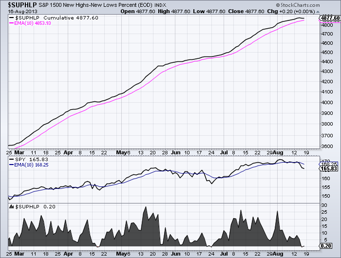
Click on the chart to see a live version.
$SUPHLP is the "Percentage High-Low Line" for the stocks in the S&P 1500. It's the number of S&P 1500 stocks making new 52-week highs minus the number of stocks making new 52-week lows divided by 1500). This chart plots that percentage as a black cumulative line with a pink 10-period EMA signal line.
To quote Art:
The market has a bullish bias when the High-Low Line is above its 10-day EMA (rising) and a bearish bias when below (falling).
Below the main price plot is SPY, the S&P 500 ETF, and its 10-period EMA. Below that is the non-cumulative version of $SUPHLP plotted as an area graph. Note that it dipped briefly into negative territory on Thursday. The question now is how long will it stay at or below zero in the coming days?
The reason this chart is so important is because the S&P 1500 is an extremely broad index and if it is weakening internally (as measured by the High-Low Line) then you should be cautious. Make sense?
So there is a great chart for you to build into your own market analysis routine. If you want the rest of Arthur's key charts (and you are an Extra member), just install the "Nutshell" ChartPack using the yellow button near the bottom of the "Your Account" page. After installation, click on the "Members" tab, scroll down and click on the "10 per page" link beside Art's list. You'll see the charts and Art's notes that fully explain each chart.
Take care everyone!
- Chip
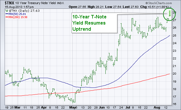
The uptrend that started in bond yields during May is resuming. Chart 1 shows the 10-Year Treasury Note Yield ($TNX) hitting a new recovery high today. That resumes the uptrend in bond yields. The weekly bars in Chart 2 show that the TNX is now trading at the highest level in two years. That confirms the upside breakout in the TNX that occurred during June when it exceeded its early 2012 high (see circle). The monthly bars in Chart 3 show the TNX also testing a falling resistance line extending back to its 2007 peak. A decisive close above that falling trendline would leave little doubt (if any still exists) that bond yields have bottomed and that the thirty-year bull market in bond prices has ended. That's bad news for bond prices that fall when yields rise. To the extent that rising bond yields are discounting an improving economy, that should be good for stocks over the long term. Over the short run, however, the jump in bond yields (and more talk of Fed tapering) is causing profit-taking in an overextended stock market.


The Russell 2000 ETF (IWM) moved sharply lower this week to start a short-term downtrend, but this is still considered just correction within a bigger uptrend. There are simply no signs of a major top at this moment. Tops often form with major reversal patterns or consolidation, a bearish divergence in the Advance-Decline Line or relative weakness in the key offensive sectors. These factors were not present when the market peaked in early August. A correction at this point is hardly surprising given the run up from mid November to early August. The Russell 2000 ETF surged some 40% from the November low to the August high, while the S&P 500 ETF (SPY) and Nasdaq 100 ETF (QQQ) advanced over 25%. These are huge moves that deserve a rest, which is what a correction implies.
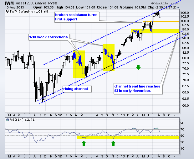
Click this image for a live chart.
The chart above shows IWM within a rising channel the last two years. The ETF hit the upper trend line in late July, stalled for a few weeks and fell back below 102 this week. At this point, chartists can start contemplating correction targets and timeframes. Short corrections last a few weeks. The last two "long" corrections lasted 9-10 weeks. A 10 week correction would extend into mid October. For price levels, broken resistance in the 99-100 area turns first support for a short correction. Broken resistance, the June lows and the lower trend line mark key support in the 93-95 area. Note that the lower trend line does not reach this area until November. Chartists can also use RSI to set a support zone because it usually trades between 40 and 80 during an uptrend. Notice how this momentum oscillator bounced off the 40-50 zone in May and November 2012. RSI has yet to breach 50 in 2013, which is testament to the strength of the current uptrend. Chartists can mark RSI support in the 40-50 zone and look for IWM to firm if/when RSI reaches this zone.
Good weekend and good charting!
--Arthur Hill CMT
Canada had a popular TV show called The Friendly Giant.
When Suncor merged with Petro Canada in March 2009 it become Canada's energy giant.
It is the largest oil company on the $TSX by market cap and one of the top 5 companies in Canada as well.
Here is the live link. Suncor. It has been trading in a sideways range for 2 years.
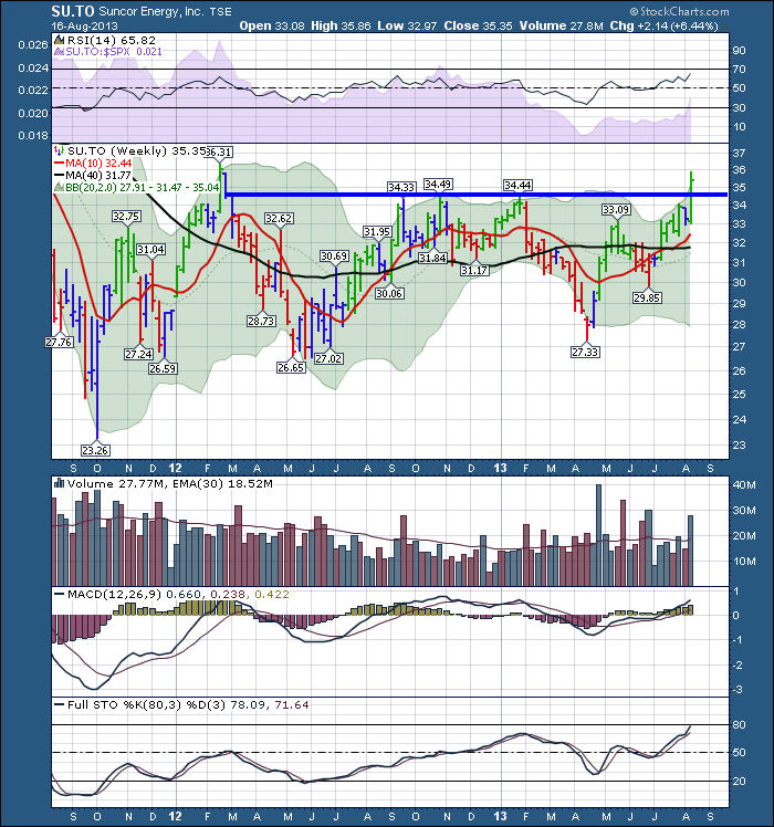
However, on a down week for the US index and an up week for Canada, something was going on.
With the gold miners breaking to the upside, Canada's energy sector and Canadian banks going sideways,
the undercurrents are swift here.
It emerged this week that Warren Buffett had put Suncor on his Breakfast Buffet. T Boone Pickens was also adding more Suncor.
When the big guys start to pile in, this stock should be well supported for retail investors. Canada's largest oil and gas company has broken out to 52 week highs.
With another $1 per share we will be at 2 year highs.
The $TSX still remains trapped below the 2 year top at 12904. Having this major company push up the overall index is bullish.
If we can get Canada to break out here, that would be a major trend change going into the fall. Currently we have lower highs and lower lows in 2013.
Here is the link to the live chart. $TSX.

Lets see if we can make moves into new highs. Rejection at this level will be just as important so stay tuned.
Good trading,
Greg Schnell, CMT
This week let's take a look at bonds because rising rates are capturing broad attention.
We use the 20+ Year T-Bonds ETF (TLT) as the surrogate for long bond timing. As of 5/20/2013 TLT is on a
Trend Model NEUTRAL signal, which means that the model has been out of bonds but not short. The
LT Trend Model, which informs our long-term outlook, is on a
Sell signal as of 5/29/2013, so our long-term posture is
bearish.
The weekly chart shows a support zone between 105 and 106, and TLT has violated that zone in a move that is becoming decisive. Note also that the PMO (Price Momentum Oscillator), which is used to estimate when prices have become overbought or oversold, has dropped below the bottom of the five-year PMO range. That range was established during a long-term rising price trend, and it will become irrelevant as the long-term trend turns down. In fact, if a down trend persists, over the next five years or more, the PMO range will shift downward from +7 to -1 to something like +1 to -5.
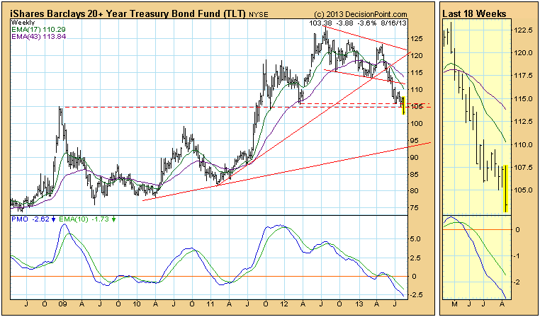
For the time being we are ignoring the possibility of a large head and shoulders pattern forming (the right shoulder being the only element remaining to complete the pattern); however, an extended bounce is not out of the question once the bears are fully committed.
The capital market starting to trend once again. The 10-year note yield has risen rather swiftly in recent months, which has caused both the stock market and the US dollar to trade in a sideways movement. In each case, we believe it to be a distribution phase that will lead to lower prices in the months ahead. If we had a crystal ball, then we would simply note that the 10-year note yield risk-reward profile is setting up towards lower rates given the upside "head & shoulders" bottom target is on the verge of being achieved. This may not happen immediately, as a period of distribution may set it. But the fact of the matter is that lower interest rates will be fundamental headwind for the US dollar.

Quite simply, the USD technical picture is one of breaking down. After a new highs was forged in early-July, sharp weakness has ensued, with the 180-day moving average "fulcrum point" having been violated once again. Now, this violation isn't yet material, but given rising bull market trendline support is on the verge of being violated as well - then the prospect for lower prices is growing quite rapidly. We would view a breakdown below the 80.55 previous low as sufficient to "call a high", and then look for a test of the April-July 2011 lows around the 73-level. If we are to trade individual currenices, then we would look to be long the Swiss Franc.
Good luck and good trading,
Richard