Hello Fellow ChartWatchers!
Things are heating up in the markets now that we are past the Labor Day holiday and people are returning from their vacations. Currently the market averages appear to be driven largely by news (Syria, G20, etc.) but that should change soon as the Fed clarifies its intentions for the remainder of the year. Be sure to check out the articles below for more thoughts on where things might be headed from John Murphy, Arthur Hill, Greg Schnell, Carl Swenlin and Tom Bowley.
"I Didn't Know StockCharts Could Do That!"
We get this all the time. Whether it is from users who have written to us with a problem or face-to-face at one of our SCU seminars, we love it when members say that phrase. So I thought I would try to get you to say (or at least think) that phrase right now. Here are some of the top things that many people didn't know that StockCharts could do:
(Note: Member-only tips start with an asterisk *)
Send a chart as a nice HTML Email message -
Click the "Share" link located underneath the SharpChart you want to send and then select "Email." Tip: Some people email charts to themselves for archival purposes.
See the 10 technically strongest stocks in the S&P 500 with one click -
Click the "CandleGlance" link located inside the "S&P 500 SCTRs" box on our homepage
See what the current Sector Rotation picture is -
Click the "S&P Sector PerfChart" link in the middle of our homepage, then click the "Histogram" button in the lower left corner of the PerfChart. Finally, right-click in the middle of the chart and select "Show Cycle Line." Click and drag on the yellow cycle line to move it until it "contains" the histogram bars. (You probably want to adjust the duration of the chart using the slider at the bottom as well.)
See a slideshow of random charts created by other users -
Click on the "SharpCharts Voyeur" link on the right side of our homepage, then sit back and watch. (Note: Charts with text annotations do not appear here in order to protect people's privacy.)
*Read the latest issue of Stocks & Commodities magazine online for free(!) -
Click on the "Members" tab, then on the "Stocks & Commodities Archive" link on the right side of that page. Next, click on the "Enter Now" button underneath "Digital Edition." Finally, click on picture of the most recent edition of the magazine (requires Adobe Reader).
*Scroll through your saved charts quickly with your keyboard -
Pull up a chart in the SharpCharts Workbench, then select the ChartList that you want to review from the "ChartList" dropdown. Now just hold down the CTRL key and press the period key (which has the foward pointing ">" symbol on it). That should move you forward to the next saved chart in that list. Press CTRL+Comma (with "<" on it) to move backwards.
Quickly count the number of periods between two points on a SharpChart -
Pull up the chart in the SharpCharts workbench then click "Inspect." Click and drag your mouse from the starting bar to the ending bar. The number of periods between those two points will be displayed on the left of the chart until you release your mouse button.
Display a chart using non-adjusted price data -
Simply add an underscore character to the start of the ticker symbol (e.g., _AAPL)
Add a moving average for volume to a SharpChart -
In the Chart Attributes area of the workbench, set the "Volume" dropdown to "Off" then scroll down to the "Indicators" area and add a "Volume" indicator to your chart. Find the "Overlay" dropdown located to the right of the "Volume" indicator you just added, select the "Moving Average" that you want and enter the period in the "Parameters" box. Finally click "Update" to see the result.
*Get an email notification whenever your favorite blogger posts an article -
Click on the "Blogs" tab, then click on an article from your favorite blog author, then click the "Email updates" link located to the right of the article.
Search the website for any topic regardless of which page you are on -
Find the "Create a Chart" bar at the top of the page, then click the "SharpChart" dropdown and select "Site Search" then enter the term you are interested in finding and click the "Go" button.
Make the text of our articles larger and easier to read -
Find the "Font Size" buttons on the right side of the page near the top and then click on the "+" button until the article's text is a comfortable size.
Find today's strongest stock in the strongest industry in the strongest sector with just 3 clicks -
Click on the "Sector Summary" link on our homepage (just below the yellow chart). Click on the name of the sector at the top of the table that appears. Click on the name of the industry in the top of the table that appears. Voila!
See the important technical conditions that recently appeared for the major indexes and sectors -
Click on the "Predefined Technical Alerts" link on the right side of the homepage.
See which cities have the most StockCharts members -
Click on the "Free Charts" link, then click on the "Top Subscriber Cities" link on the right side of that page.
See which sectors are strengthening and which are declining -
Click on the "Free Charts" link, then find the "CandleGlance Groups" area and finally click on the "Sector Bullish Percent Indexes" link.
Learn more about any of the topics I just mentioned -
Type the name of the topic (e.g., "Bullish Percent") into the "Search" box on our homepage and click the "Search" button.
Attend a live presentation covering everything that you may not know about from myself, Greg Schnell and John Murphy -
Sign up for one of our StockCharts University seminars. We've never had someone attend one and not leave with multiple "Ah ha!" moments - even long-time users. Check out the video in the middle of this page for some examples. I hope to see you at one of these events soon.
Take care everyone!
- Chip
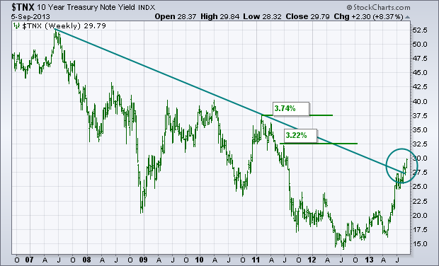
The weekly bars in the chart below show the 10-Year Treasury Note Yield ($TNX) reaching a new two-year high today and very close to breaching the psychologally important 3% barrier for the first time since early 2011. The TNX has also cleared a five-year resistance line extending back to 2007 (see circle). That leaves little doubt that bond yields are headed higher, and bond prices lower. Chartwise, the next potential upside targets are 3.22% (which is a minor peak formed during summer 2011) and 3.74% (which is a more prominent peak formed in early 2011). I've expressed the view that rising bond yields are a positive sign because it suggests more economic optimism. One way to measure that more bullish sentiment is to compare the recent performance of ecomically-sensitive stocks to more defensive consumer stocks.
On a personal note, I'm looking forward to meeting everyone at the upcoming SCU seminar in New York. I'll be sharing my thoughts on the current Intermarket picture during the Saturday session.
- John
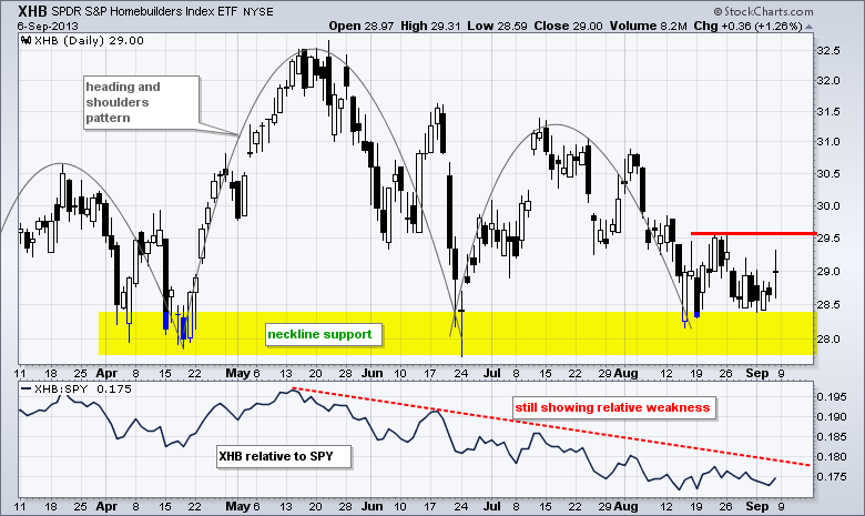
Treasury yields fell after Friday’s jobs report and interest rate sensitive stocks got a bounce as utilities, REITs and homebuilders moved higher. My focus is on the Home Construction iShares (ITB) because this group is important to the consumer discretionary sector and housing is key to the overall economy. The first chart shows ITB in a downtrend since late May. The ETF broke neckline support from a head-and-shoulders pattern and remains below broken support, which turns into resistance. Downside, however, has been limited since a big bullish engulfing pattern formed in mid August. Notice how ITB fell back and tested this low in the 20.5 area. It is still too early to call for a trend reversal, but I will be watching resistance in the 21.5-22 area. A follow through breakout here would be bullish for ITB and this would be positive for the market overall. The second chart shows the Homebuilders SPDR (XHB) in a downtrend since late May and testing the 2013 lows.

Have a great weekend!
--Arthur Hill CMT
The $TSX has tried to move above the 12900 level a few times this year. We are approaching it again.
Here is the live link to the $TSX Chart. The unfortunate part about this $TSX chart is it looks extremely similar to this link of the year 2000 chart of the $SPX relative to previous highs.
The June low is the only thing that makes this look worse than the $SPX 2000 chart. A series of tests at the highs with multiple tests of the 40 WMA below before failing. However there are some strong positives.
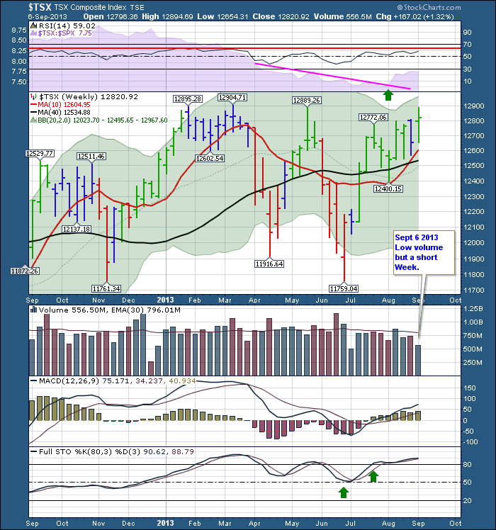
This one year view has a couple of major positives going on. For the first time in a long time the $TSX has outperformed the $SPX for 4 weeks as shown on the SPURS in purple behind the RSI chart.
The RSI has not broken out into a new bull trend (above the red line) yet, but this could happen soon. The 10 WMA is above the 40 WMA, and the 20 WMA is just below. If the 10 WMA and the 20 WMA can both move above and hold above the 40 WMA over the next 2 weeks, we'll confirm a bullish upside breakout. I would like to see the $FTSE, the $DAX and the $AORD move above May highs to confirm the breakout. The $TSX price chart has made a series of lower highs currently and a lower low in June which is the definition of a downtrend, so I am apprehensive here. This weeks test of 12889 was taken out intraday but so far, failed to hold. Currently, the $AORD (Australia Index) has also made a lower low, and not a higher high (yet!) as you can see below. Click here for the live link to the Aussie chart.
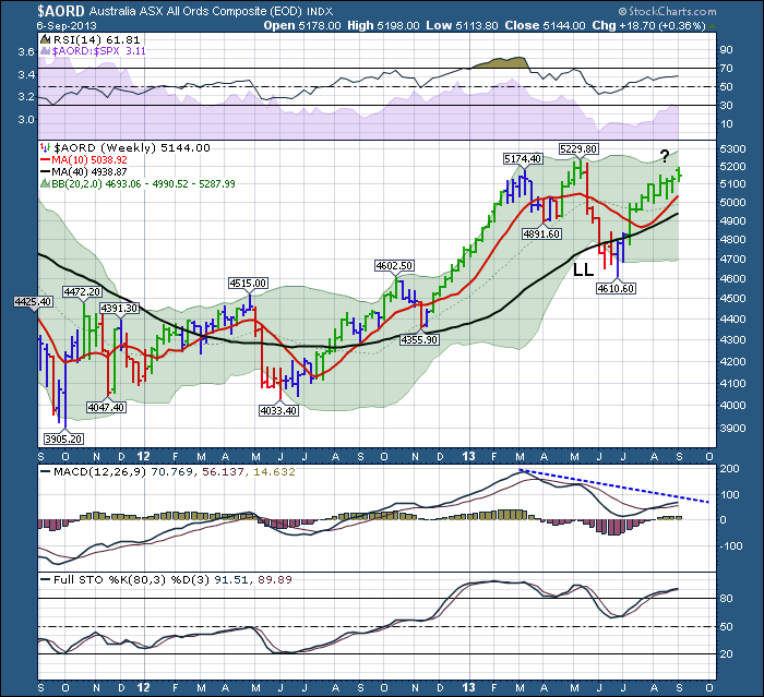
The LL indicates the lower low. I plan to keep watching for the confirmation from the two major commodity countries. I would be thrilled if we could break out of this 2 year $TSX base that you can see below. Here is the 5 year view of Canada.
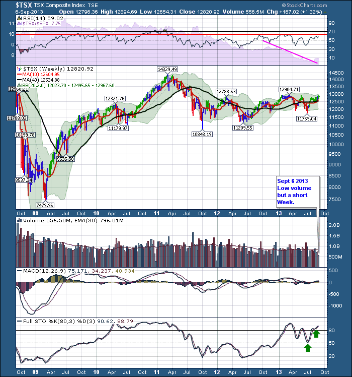
You can see how frustrating it has been to hold Canadian equities. This would be a considerable breakout that would be very very bullish, especially with global confirmation. The Full sto's have stayed above 50 all year, so maybe this is finally the big breakout. Last fall we moved above the 12500 level as the full sto's moved above 50 and that looked to be the big breakout. Unfortunately we stalled at 12900 with a lower high in May and a lower low in June. Recently we pushed the full sto's above 80 where it can stay for a long time. This does not mean overbought but a good strong uptrend with these long period settings on a weekly chart.
Conversely, if the breakout does not hold, I would be very bearish in short order if Canada and the global markets mentioned fail at former resistance levels. Stay tuned!
Looking forward to seeing investors in NYC. We'll have a great market presentation including intermarket analysis by John Murphy. Couldn't come at a better time. The major downturns on the $SPX started September 1, 2000 and October 9 2007. The next month marks another 6 year cycle from the 2007 high to current highs. We'll have more cycle work on that in NYC as well. Not just courses but some current market analysis thrown in for good measure! Hope to see you there!
Good trading,
Greg Schnell, CMT
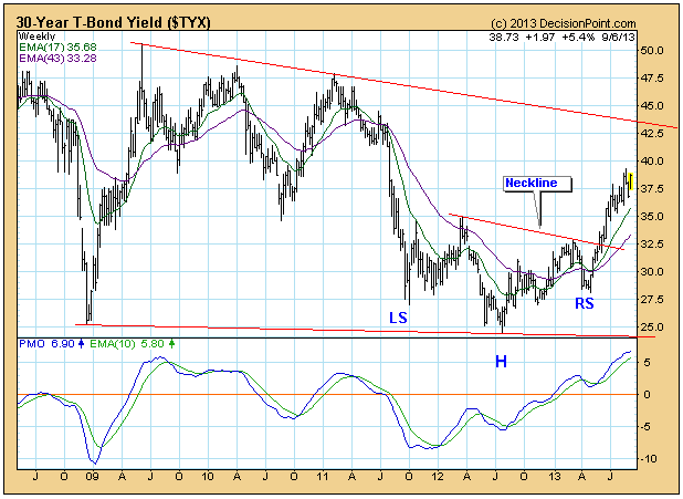
We have been observing how, in spite of the Fed's efforts, bond yields have been persistently rising, but now they have become very overbought.
On the weekly bar chart, we can see how a reverse head and shoulders pattern is in progress and yield is headed toward a minimum upside objective of about 42.5. However, we also notice that the PMO (Price Momentum Oscillator) has reached its highest level since 2009, and that it has begun to decelerate. If the weekly PMO tops, yield will probably top as well.
To put it into better perspective we have to look at a really long-term chart going back to 1948. Here we see that the weekly PMO has reached the second highest level in over 60 years. Does this mean that yield is about to experience a violent reversal? We don't think so.

In more than 60 years there has never been a situation resembling this one. There has been a decline of over 30 years terminating in the formation of a broad based double bottom, and there is also a PMO positive divergence. To us, this setup is bullish, and the PMO up move from its 2011 low is evidence of an initiation of a new long-term rising trend.
Conclusion: While we believe that yield is in the process of changing the long-term trend from down to up, markets never go from one point to another in a straight line. As overbought as things have gotten, there will probably be a period of correction or consolidation so that the PMO can become less overbought.
- Carl
The past 5-6 weeks have not been overly kind to the bulls. In fact, since topping at 1709.67 at the close on August 2nd, the S&P 500 has lost more than 50 points or roughly 3%. Many are calling for the end of the four and a half year bull market...for the umpteenth time. Eventually, just like a broken clock, they'll get it right. I don't believe we're there yet and the relative performance of financials is backing me up. I'll get back to this in just a minute. But first....
Those who follow my column every couple weeks know that I'm a huge fan of history in the stock market. September is not the month to be particularly bullish and I am cautious in the very near-term.....and for good reason. September is the only calendar month where the S&P 500 has fallen more than it's risen. The annualized return during September on the S&P 500 since 1950 is a NEGATIVE 6.14%. The bad news is that we're already halfway through the first half of September and that's the good half of the month. September 1st - 15th has produced annualized returns of +3.70% since 1950. Now for the worst news. September 16th - 30th is obviously the bearish half of September where we've seen annualized returns of -15.82% over the past 63 years. It's hard to get excited about that from a bullish perspective.
History tells us to be cautious as we approach the next few weeks.
I always like to take a step back from the day to day charts and view the longer-term relative charts of key sectors/industries. These charts are much more powerful in signaling to us when major shifts are taking place "under the surface". In my opinion, there's no better place to look than the financials. Our economy is dependent on a sound financial structure. We saw what happened to the stock market when our financial system imploded in 2008. It's very difficult for the overall stock market to move higher when the critical financial space is struggling. So one simple chart I like to follow is the XLF (ETF that tracks the financial sector) and how this ETF is performing relative to the S&P 500 as a whole. Take a look:
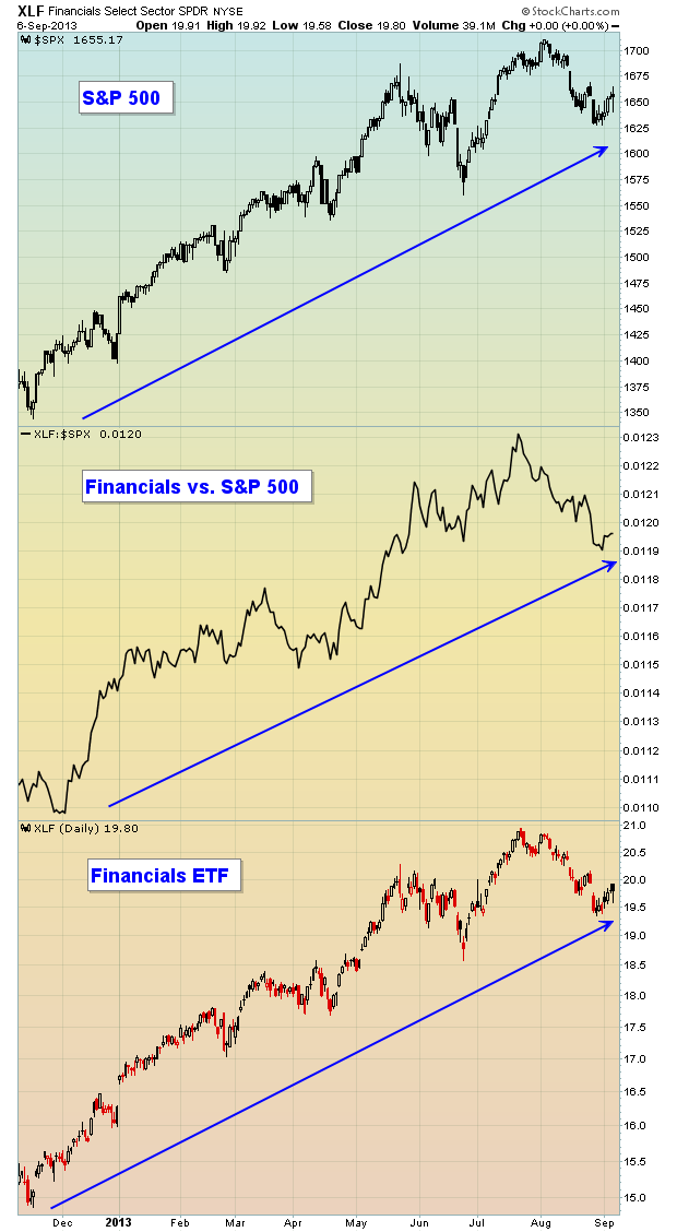
Not only is the S&P 500 in the midst of a powerful uptrend, but financials (XLF) are among the leaders of the rally. On the chart above, you can see that the "Financials vs. S&P 500" line continues to print higher highs and higher lows. This tells us that financials aren't just going higher, they're going higher faster than the overall market, a sign of a sustainable rally in my humble opinion.
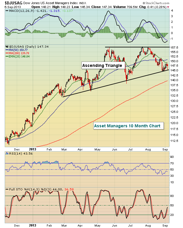
If the S&P 500 is likely to move higher later this year and financials are showing relative strength, it would make sense to look for beaten down industry groups in the financial space to lead the market as we wrap up 2013. I think I've found a very strong group to focus on - asset managers. When the stock market consolidates in a bull market, I look for bullish continuation patterns - cups with handles, triangles, inverse head & shoulders, etc. Check out the ascending triangle pattern on the Dow Jones U.S. Asset Managers index ($DJUSAG):
Taking this one step further, there's a stock within the asset manager space that rallied more than 30% from the June 24th low to the early August market high. Since that time, however, it's fallen back as profit taking has kicked in. It's beginning to find some support at its 20 day EMA, 50 day SMA and 20 week EMA. In addition, it recently tested a significant price support level. While the balance of September may be difficult for equities, this stock candidate beat Wall Street estimates on its top line and bottom line recently and is poised to advance into year end. I'm providing it as my Chart of the Day for Monday, September 9th. CLICK HERE for more details.
- Tom