Hello Fellow ChartWatchers!
We've just complete a terrific visit to the New York area where we held our two day SCU seminars and where I was able to squeeze in a visit to the Long Island Stock Traders Meetup Group. During my presentation to the Long Island group, I needed to show them exactly how the MACD indicator works. As one of the most popular technical indicators, understanding the MACD is something that everyone should know. The typical answer is something like "Well, it shows a stock's momentum." OK, that's fine, but what exactly is "Momentum"?
To make it visual, I created the following chart for my presentation:

(Click the chart for a live version)
As you can see with this chart, momentum is the concept of "the rate of increase for a uptrend." During the initial part of the uptrend for BA on the chart, not only were prices moving higher, they were moving higher at an increasing rate. That's what the green curve represents. Later, prices were still moving higher, but the rate started to decrease (the red curved line). Eventually, around the start of August, prices were just moving sideways.
So, the MACD and the MACD Histogram quantify that "rate of increase" that the curved lines show. First off, notice that the black MACD Line was above zero for most of this time - meaning that in general the stock was in an uptrend for most of the chart.
Now look at what happened to the MACD while the stock was moving higher with increasing momentum (i.e., the green box). First off, notice that during that time, the black MACD line moved higher (mostly). Also notice that the blue MACD Histogram bars (which represent the difference between the black MACD Line and the red MACD Signal Line) were (mostly) above zero during this time. That is how the MACD indicates that a stock has positive momentum.
Later, when momentum started to decrease (during the red box), the MACD Line was moving lower and the blue histogram bars were (mostly) below zero. That is how the MACD indicates negative momentum.
Understanding a stock's momentum is critical to understanding the strength of its current trend. And since riding trends is ultimately how technical investors make money, that means that understanding the MACD is very important indeed. Hopefully this chart has helped you better understand how it works.
Take care,
-- Chip
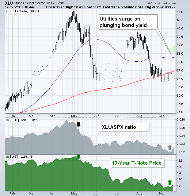
The Fed surprised everyone yesterday by deciding not to start its widely anticipated tapering of bond purchases. Although that decision was a surprise, market reactions weren't. In fact, each market did pretty much was one would expect. Bond yields tumbled and bond prices soared. Stocks surged around the world. The dollar plunged along with bond yields which pushed gold and other commodities higher. Foreign stocks surged, especially in emerging markets, which had been hit especially hard by rising U.S. bond yields and a stronger dollar (more on that later). Within market sectors, yesterday's biggest gainers were rate-senitive stock groups that had been weakened by rising bond yields since May -- including homebuilders, REITS, and utilities. Chart 1 shows the Utilities Sector SPDR (XLU) surging nearly 3% yesterday to end back above both moving average lines. The gray areas shows the XLU/SPX ratio falling since the start of May. That's when bond yields started to surge and bond prices collapsed (green line). Yesterday's collapse in bond yields, and bond price rally, turned those trends around. Chart 2 shows the Dow Jones REIT Fund (RWR) surging 3.5% on rising volume. Chart 3 shows the Dow Jones U.S. Home Construction iShares (ITB) jumping nearly 5% on rising volume.


After bottoming in late June and advancing some 15%, the Metals & Mining SPDR (XME) hit resistance in the 39 area with a pop-and-drop this week. The chart below shows XME surging above 39 on the FOMC statement day and then giving most of it back with a decline below 38 on Thursday-Friday. Despite this pop-and-drop, the ETF remains in an uptrend since late June. The trend line and last week’s low mark first support just below 37, while the August lows mark key support just below 36. Watch these levels for breaks that could signal a reversal of the three month uptrend.
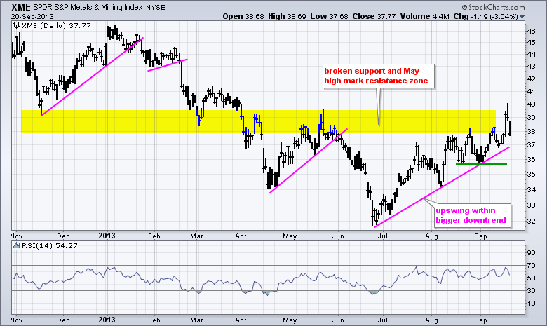
Click this image for a live chart
The first indicator window shows RSI holding the 40-50 support zone during this uptrend. A break below 40 would turn RSI (momentum), bearish. Put another way, such a move would signal enough selling pressure to warrant a trend change. The bottom window shows the price relative (XME:SPY ratio) flattening out the last six weeks. Even though XME moved higher during this timeframe, it did not outperform and did not show upside leadership. A breakout here is needed to signal relative strength. Otherwise, a downturn and break below the September lows would signal a return to relative weakness.
Good trading and good weekend!
Arthur Hill CMT
When looking at a chart that shows new 52-week highs and lows, have you ever wondered what is happening with all the other stocks in the index? Where are they in relation to their 52-week high-low range? DecisionPoint.com's "Rel-to-52" index provides that answer.
DecisionPoint.com tracks each stock in the S&P 500 Index and determines the location of its current price in relation to its 52-week high and 52-week low. We express this relationship using a scale of zero (at the 52-week low) to 100 (at the 52-week high). For example, a stock in the middle of its 52-week range would get a "Rel-to-52" value of 50. The charts below show the average "Rel-to-52" for all the stocks in the S&P 500 Index.
The most recent Rel-to-52 reading is 80, which means that on average S&P 500 stocks are within 20% of their 52-week high. This shows a lot of strength behind the recent rally; however, in the last four months the Rel-to-52 index has made a series of lower tops (a negative divergence), giving evidence that support for the rally is fading.
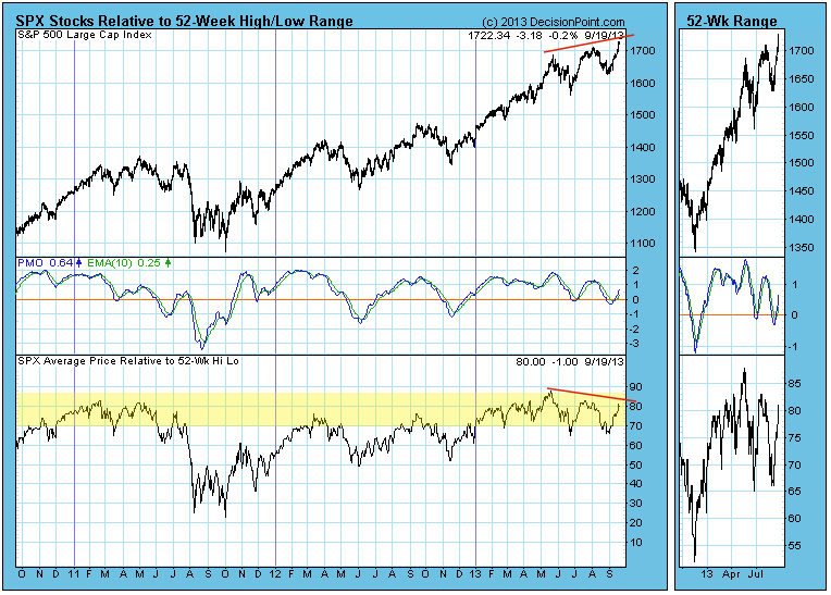
The current negative divergence is not nearly as profound as the one that formed at the 2007 bull market top, but it is a problem nevertheless. Another problem is that the Rel-to-52 index is currently in the zone where we would consider it to be overbought, and because of this we will typically see Rel-to-52 tops corresponding with price tops. It is simply a matter of cyclical behavior where things get as good as they are going to get, then they swing back in the other direction.
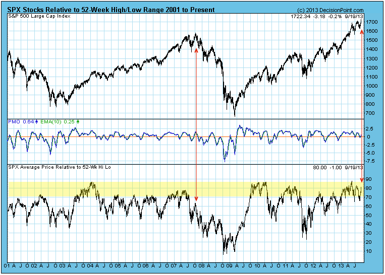
Conclusion: DecisionPoint.com's Rel-to-52 index provides a unique, precise analysis of 52-week high and low status of all stocks in the S&P 500 index. It is currently overbought and presenting a negative divergence, so it is likely that the market will soon roll over into a correction. We have no reason to believe it will be a particularly severe correction, but we certainly think one is due.
Federal Reserve Chairman Ben Bernanke has had several mandates since the financial crisis began several years ago. One was to keep interest rates extraordinarily low for an extended period of time. Check. Another was to make the Fed more transparent. This one was humming along just fine....until Wednesday's Fed announcement. Bernanke shocked the financial world by delaying the tapering of asset purchases. Instead, the Fed Chairman left the current $85 billion monthly asset purchase plan intact. Investors reacted as if they had received another dose of QE. Check out the initial reaction at 2pm on Wednesday, September 18th, as the news was released:
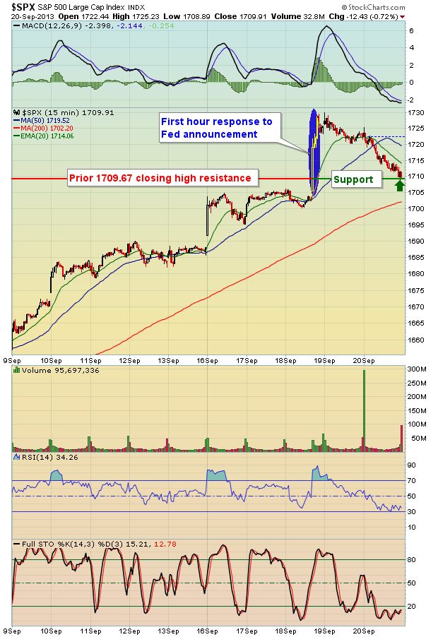
The reaction was quite positive - initially. After all, it was more candy from the candy store. The problem this time, in my view, is that Wall Street had seen enough economic evidence to view the tapering of asset purchases as likely. In fact, just about every analyst on the planet expected a reduction in monthly asset purchases from $85 billion to $75 billion. In effect, the Fed had a freebie and they blew it. By week's end, the S&P 500 had lost nearly all of its Fed-induced rally.
I saw the initial reaction, but I'm not buying it either. Think about WHY the Fed left the purchases at $85 billion. They clearly don't like what they're seeing ahead in terms of economic growth. They almost certainly don't like what's been happening to home construction stocks during the interest rate rise since May. Check out the rise in the 10 year treasury yield since May and the impact it's had on home construction stocks:
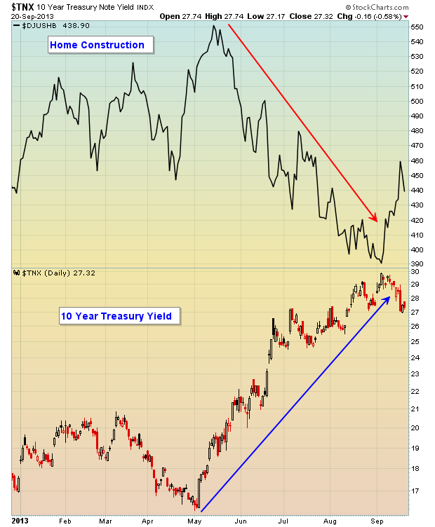
Housing is a key component of our economy. The Fed has to pick its next battle. Beginning on the path of tapering would send interest rates rising further, almost definitely causing a further freefall in housing. The problem is that the Fed knows our economy is not strong enough right now to handle a further rise in rates and further decline in housing. And a rapidly declining home construction index would destroy confidence. So apparently their choice was an easy one. But this REALLY muddies the waters for equities and this is occurring just ahead of a likely showdown between Democrats and Republicans. Oh joy! (sarcasm)
Most of the reaction to the Fed's decision was expected. Interest-rate sensitive areas of the market did very well - again, at least initially. Utilities, REITs and home construction stocks soared. The dollar fell precipitously, spurring a rapid rise in gold prices.
The biggest surprise of all for me, though, was the negative reaction of one key industry group that benefited from all of the prior quantitative easing - banks. For a detailed chart on banks and my interpretation of what this could mean near-term in the stock market, CLICK HERE as this will be my Chart of the Day for Monday, September 23rd.
Happy trading!
Tom Bowley
Chief Market Strategist
Invested Central