Hello Fellow ChartWatchers!
We have several bearish-sounding articles for you this week as several of the major markets continue moving lower. The Dow has been down 9 of the past 12 trading days and its chart reflects that decline. However all is not lost. There are still some positive developments if you know where to look. Check out this PerfChart of the major markets for that same period of time:
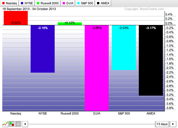
The Nasdaq and the Russell 2000 are bucking that large-cap downtrend in a very significant way. Will that trend continue? If so, for how long? Keep checking our "Blogs" page throughout the week for the latest technical charting news as things continue to develop.
Don't Fall for "Visual Coincidences" on Overlaid Charts
Everytime I present our SCU 101 seminar, I pull out the following slide and I ask a question:
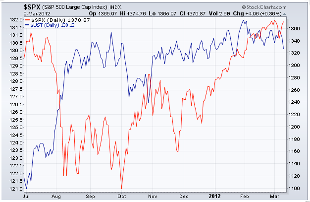
"What is the significance of the red line crossing the blue line on this chart?"
Think about that question for a second and answer the question in your own head before reading on.
Invariably, several people throw out some very good possibilities: "It's a bullish crossover." "Bonds are going to continue rising." "Its a support level for stocks." etc.
Other people suspect, rightly, that I'm trying to trick them. Just like I'm doing now. ;-)
The real answer is... "Nothing!" It is a visual coincidence that those two line cross where the do on that overlaid chart. They are on two different scales - $SPX uses the scale on the right and $UST uses the scale on the left - and we have programmed our system to make sure that each scale causes the line to "fill up" the vertical space on the chart. If we had programmed things differently, the lines would cross in different locations.
(Click here to learn how to create an Overlaid chart like the one above.)
So this is a big warning for everyone who is using the "Behind Price" position setting for their indicators - if two datasets use different scales, you cannot attach any significance to any crossing signals that you see.
So, given that, why overlay things at all?
You overlay things because you can still draw very valid conclusions from the "shape" of the two lines. Divergences in particular are very significant and they are often easier to spot on overlaid charts. Is the trend of one line different from the trend of the other line? If so, you've found a divergence and you have used an overlaid chart correctly.
Take care everyone!
- Chip
P.S. If you want to learn about all the tools on our site, all the pitfalls to avoid, all the controls on our SharpCharts workbench, and all the ways you can improve your results on your way to becoming a successful, disciplined technical investor - why not join myself, Greg Schnell, and Gatis Roze in Dallas next month for our live SCU 101, 102 and 310 seminars? We'd love to see you there. Click here for more details (and be sure to watch the testimonial video)
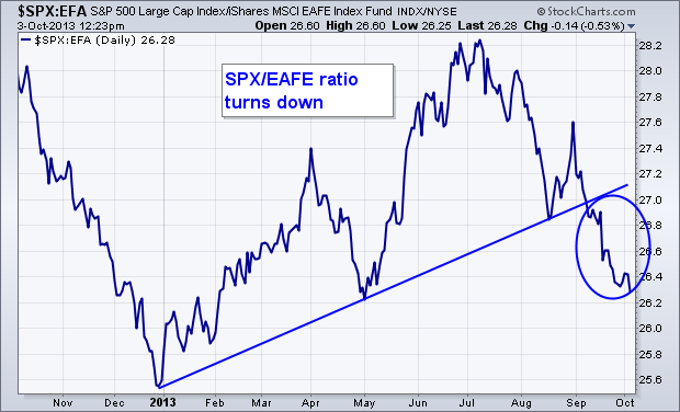
My last message discussed how money was starting to rotate out of an over-extended U.S. stock market into foreign stocks which are trying to catch up to the U.S. market. This message will build on that theme by using ratio (or relative strength analysis). Chart 1 plots a ratio of the S&P 500 versus the EAFE iShares (EFA) over the last year. The EAFE represents developed foreign stocks in Europe, Australasis, and the Far East. After rising between January and June, the U.S./EAFE ratio peaked in July and has fallen since then. [The peak in the ratio coincided with peak in the U.S. dollar and a rally in foreign currencies, especially in Europe]. The ratio has also broken a rising support line drawn under its January/ May lows. That shows that the asset allocation pendulum has swung to foreign developed markets. We see a similar pattern in emerging markets. Chart 2 shows a ratio of the S&P 500 divided by Emerging Market iShares (EEM) having also broken a rising trendline going back to January. That suggests that some money is also rotating from the U.S. into riskier emerging markets.

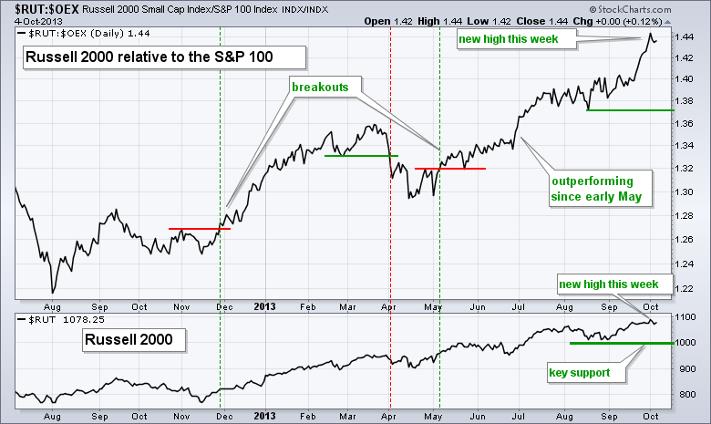
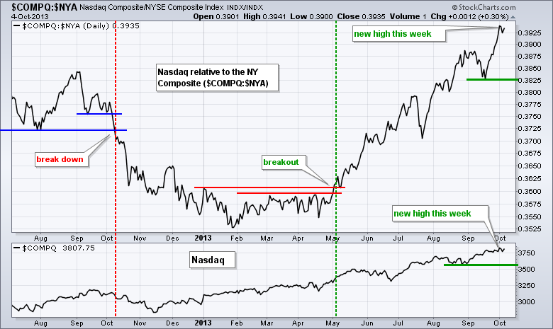
The Russell 2000 ($RUT) and the Nasdaq ($COMPQ) are leading the relative performance game and this is positive for the stock market. The Russell 2000 represents small-caps and the Nasdaq represents the technology sector. Together, these two represent risk appetite because their stocks have higher betas, which translates into higher volatility. The appetite for risk is strong when these two lead and weak when these two lag. Also note that small-caps are less diversified and more dependent on the domestic economy. This makes small-caps the proverbial canaries in the economic coalmine. Relative strength in small-caps is also a positive indication for the economy.
Click this image for a live chart
The first chart shows the Russell 2000 relative to the S&P 100 using the price relative ($RUT:$OEX ratio). This ratio broke out in May, trended higher for several months and hit a 52-week high this week. A new high in the price relative means small-caps are outperforming large-caps and this is bullish for the overall market. The indicator window shows the Russell 2000 ($RUT) hitting a new high earlier this week and affirming the long-term uptrend. The August lows mark key support around 1000. The second chart shows the Nasdaq relative to the NY Composite using the $COMPQ:$NYA ratio. This ratio also hit a new high this week as the Nasdaq continues to outperform the NY Composite.
Click this image for a live chart
Good trading and good weekend!
Arthur Hill CMT
The global expansion has been tepid at best. One of the indicators I like to look at is the commodities demand.
The easiest way to check that is to compare the commodities to the 10 Week MA.
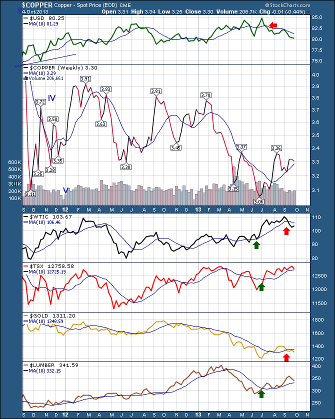
Here is the Commodities Dashboard I like to scan. Click here for a live version.You can see we had a nice uptrend since the June lows.
One of the most difficult parts of this market has been the continuous start stop of the commodities cycle.
Here we see gold and $WTIC (West Texas Crude) falling below the 10 week. Lumber and Copper remain above as does the $TSX.
We need to see renewed strength in the commodities complex to push the $TSX higher. This would also signal an improvement in global demand.
The different benchmarks continue to oscillate, and the global test at resistance has stalled for now.
I am encouraged by a few of the indicators and discouraged by a few as well. As you can see on the top of this chart, the $USD has traded within a $0.05 range for 2 years.
Compare that to the massive swings in the Yen and the Pound. The Yen moved almost 30% to the dollar, and the Pound has moved $0.14 in 4 months.
$GOLD and oil appear to be expecting the $USD to strengthen here while Copper and Lumber are still above the 10 week. Copper has solid resistance at $3.36. A break above that would be bullish with a measurement into the $3.75 level.
The commodities markets usually do well in the 4th quarter, so we'll stay optimistic. If Copper and Lumber fail the 10 week test, I'll have to pause my optimism on the $TSX as well.
Good trading,
Greg Schnell, CMT
The Rydex Ratio has reached a level where it is telling us that sentiment is too bullish, and that stock prices are vulnerable.
The Rydex Ratio gives a view of sentiment extremes using using the totals of assets in Rydex mutual funds. It is calculated by dividing Money Market Assets plus Bear Funds Assets by Bull Funds Assets. We display the indicator with the scale reversed so that interpretation can be more intuitive. The unique feature of the Ratio is that it measures sentiment based upon where people are actually deploying real money, not just an opinion poll.
Currently, the Ratio has reached the top of the normal extreme range, and at this level we should be looking for a price decline. But wait, there already has been a price decline from the September top, and the Ratio has moved even higher during the price pullback. This is not a rational response by investors, and suggests there will be a stronger downside reaction when investors decide that buying into a decline isn't working.
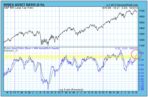
Conclusion: When Rydex Ratio readings reach current levels, prices become vulnerable to stalling or an outright correction -- not always, but more often than not. In this particular case the situation seems unusually precarious because bullishness has increased even in the face of a price decline.
As a trader, this is my favorite time of each quarter. I love it when earnings begin to roll out because the increased volatility generally sets up excellent trading opportunities. In early April, I wrote about the strong earnings report that Nike (NKE) enjoyed in March and I highlighted a strong reward to risk entry point. For a refresher, take a look:
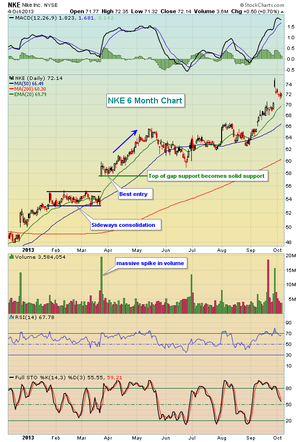
NKE posted better than expected revenues and earnings, then buyers bid the shares up immediately on massive volume. I don't like to chase these moves, but once I see the accumulation, I wait for a pullback to relieve overbought oscillators and to test gap support. That came just a week later. There's a reason to wait past the opening bell to jump in. Normally when stocks gap higher, market makers are on the other side of the trade providing liquidity. Market maker activity is the primary reason that gaps usually fill back to the prior close. When demand is too great, however, we see what happened with NKE. Volume is massive and the gap fill to the bottom of the gap never occurs.
Here are two more recent examples - take a look:


In both cases, revenues and earnings blew away consensus estimates on Wall Street, volume exploded higher and market makers couldn't stem the tide of buying. Eventually, however, both of these stock returned to critical gap support areas, maximizing potential return for astute traders while minimizing risk. Throughout earnings season, these are the types of individual stock setups you can find. Believe me, they don't all work, but appropriate entry levels can certainly lessen risk significantly.
On Monday, October 7th, I will be hosting a FREE and LIVE event discussing how the combination of strong earnings and strong technicals can reward traders if they exercise patience to allow trades to set up for them. Earnings season kicks off on Tuesday with Alcoa (AA) reporting. I hope you can join me on Monday evening. For more information, CLICK HERE.
Happy trading!
Tom Bowley
Chief Market Strategist
Invested Central