Hello Fellow ChartWatchers!
And that includes a special "Hello!" to all DecisionPoint.com members that have just joined us. Yes, in case you haven't heard, StockCharts.com has acquired DecisionPoint.com and we are now working hard to incorporate all of great features that DecisionPoint has into our system.

My article this week is kind of divided into two halves. The first half is for everyone, especially existing StockCharts subscribers who are not familiar with DecisionPoint. The second half is specifically for DecisionPoint.com members who are not familar with StockCharts.
What DecisionPoint Brings to StockCharts.com
The simple answer is a bunch of new charting features, a huge collection of new market indicators (over 1300!), a terrific new blogger, and some new advanced technical indicators. (And no, we aren't raising prices as part of this either.)
If you haven't heard the story yet, Carl Swenlin and his daughter Erin started DecisionPoint back in 1992 and it quickly grew into an amazing website known for its precision charting, great market timing signals, and a wide range of unique market indicators. Now they are bringing all of that great content to StockCharts.
At this point, we have implemented and rolled out about 60% of these new features. For example, you'll now find the following new features in the SharpCharts workbench:
- The "Zoom" Thumbnail - Did you ever wish you could see a close-up of the right side of your chart without having to change the rest of the chart? Now you can. Just check the new "Zoom Thumbnail" checkbox located in the "Chart Attributes" area below the chart. Here's an example:

(Click on the chart for a live version.)
The "Zoom Thumbnail" is the new area on the right of the chart. Extremely useful don't you think?
- The "Price Momentum Oscillator (PMO)" - Did you ever want to have a momentum indicator that's like the MACD but doesn't have as many whipsaws? Carl's PMO oscillator is an advanced momentum oscillator that provides more reliable signals. Here's an example:

(Click on the chart for a live version.)
Note how the MACD crosses its signal line several times in November? Now notice that the PMO doesn't(!). Click here for more details on the PMO.
- Over 1300 New Market Indicators - Did you ever want to see the Advanced-Decline line for just the Nasdaq 100 stocks? How about the PE ratio for the S&P 500? Carl's known for his thoroughness and that extends to all of the new market indicators that DecisionPoint has. They are all now available for use on StockCharts.com. Their ticker symbols all start with "!" so to see a list of them, just search for "!" - or just click here.

- New Color Schemes and Legend choices - Did you notice the new color schemes on the charts above? What about the more descriptive text in the legends? There are several other small but useful tweaks to SharpCharts that we'll roll out soon as a result of this merger.
- The New "DecisionPoint" Blog - We've also added a new blog to our free Blogs area. It is called "DecisionPoint" (surprise!) and it will contain articles writen by Erin and Carl explaining more about how to use these new features to help you make better investing decisions. Click here to read Erin's first article.
And we still have lots to do before this merger is complete! In the coming weeks, you can expect to see us roll out:
- Lots of new ChartSchool Articles documenting the new indicators, indexes and features.
- DecisionPoint support in our Scan Engine so you can scan for these new signals.
- The DecisionPoint Chart Gallery - a page containing the most popular charts from the DecisionPoint.com website along with Erin's commentary on what it all means.
- New ChartPacks containing all of the original charts from the DecisionPoint.com website - over 2000 charts in all.
- And much, much more!
Keep an eye on the "What's New" area on our homepage for more announcements as those new features are made available. And enjoy all these new capabilities! We can't wait to see what you do with them.
A Message for Existing DecisionPoint Members
For all of the DecisionPoint members out there that are new to StockCharts, I want to take a moment and emphasize a couple of points about this merger.
- The merger is happening slowly over the next three months to give everyone time to become more familiar with using StockCharts. When that process is complete, everyone will have access to all of the charts from the DecisionPoint.com website, just in a different location.
- In addition, optionally, you will also have the ability to add annotations to those charts, to modify the settings on those charts, to save different variations of those charts, and much more. The full power of the StockCharts charting platform (which we call "SharpCharts") is available to you.
- Not all pieces of the merger are in place on StockCharts.com yet. We have rolled out about 60% of the DP features so far. Earlier in this article, I listed the things that we are still working on. That includes the "DP Chart Gallery" and "DP ChartPacks" which will contain pre-created versions of all the charts currently on DecisionPoint.com. If you are not a "tinkerer" and just want to see specific charts, please wait until those features are available.
- If you are a "tinkerer" or you just want to learn more about using StockCharts.com, please start by reviewing the videos in our "Educational Videos" area. They can get you up and running quickly.
- Remember, Erin is also here to be your guide! She will be writing many articles in the new "DecisionPoint" blog which will help explain and demonstrate how to use the DecisionPoint features on StockCharts. Remember to click on the "Blogs" tab at the top of our pages often to see if she has posted anything new.
- When the transition period is over - in about 3 months - we will send out instructions to all new DecisionPoint members with their options for renewing their accounts. We have 4 different service plans with prices ranging from $14.95 to $49.95 per month. All of those plans will have access to all of the DecisionPoint charts and features. For details on those plans, click here.
- If you have any questions or concerns about your new StockCharts account and how to use it, please send them to us using the "Support" tab at the top of any of our pages.
- Finally, because this process will take time, we have arrainged for the existing DecisionPoint.com website to remain up and available to all DecisionPoint.com members throughout the transition period.
So again, this is a very exciting time as everyone gets their hands on a huge collection of new capabilities. Hopefully you are just now beginning to see the possibilities.
Welcome aboard!
- Chip
P.S. Don't forget to keep checking the "DecisionPoint" blog for more details.
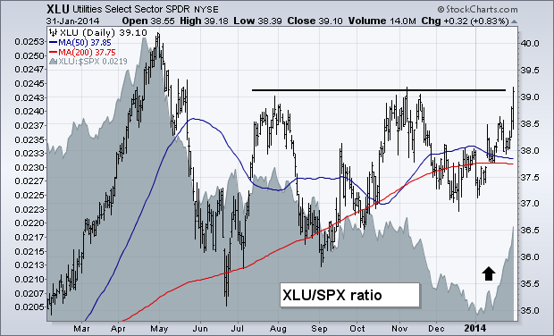
An early January message (January 11) talked about the need to do some rotating out of over-extended stock market groups that did especially well during 2013 into more defensive (and dividend-paying) groups that had been market laggards. The two I mentioned were utilities and REITs. I mentioned those two groups for two reasons. One was that they are defensive in nature, and usually hold up better when stocks weaken. The other is because both groups are closely tied to the direction of bond prices. With bond prices rising throughout the month (as stocks fell), those two groups have done especially well. Chart 1 shows the Utilities Sector SPDR (XLU) moving up to challenge its November high. Its relative strength ratio (gray area) has surged as well. [Dividend-paying stocks also do better when bond yields decline, as they did during January]. Chart 2 shows the Dow Jones Wilshire REIT ETF (RWR) also climbing during the month. Its relative strength line has risen as well. The RWR is nearing a test of its 200-day moving average. Homebuilders also had a strong week and a strong January.


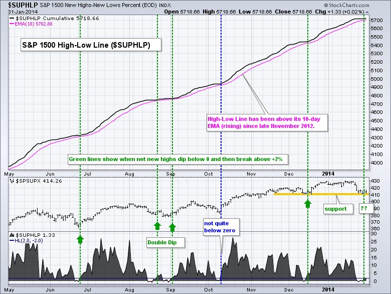
High-Low Percent for the S&P 1500 dipped into negative territory in late January. This is potentially significant because prior dips did not extend past the -2% level and marked turning points in the S&P 1500. The chart below shows the S&P 1500 High-Low Line ($SUPHLP) in the main window and High-Low Percent in the bottom window. High-Low Percent equals new highs less new lows divided by total issues. The High-Low Line is a cumulative measure of High-Low Percent. First, notice that the High-Low Line has been above its 10-day EMA (rising) since November 2012. This is an extraordinarily long time and indicative of a strong uptrend. The last flattening occurred in late August.

Click this image for a live chart
Turning to High-Low Percent, notice how this indicator dipped into negative territory in late June, mid-late August and mid December. The indicator almost dipped into negative territory in early October, but not quite. Subsequent dips and moves back above +2% provided opportunities to partake in the long-term uptrend. In other words, a dip to the zero line signaled a correction within the uptrend. Another bullish signal triggered this week as High-Low Percent dipped into negative territory and then moved back above 2% on Thursday. Before getting too bullish, notice that there was a double dip in August as the market produced one more leg lower during the August correction. This is not a stand-alone signal and should be used in conjunction with other aspect of technical analysis, such a chart patterns and momentum indicators. Note that StockCharts calculates and provides breadth data for over a dozen indices and sector SPDRs.
Good trading, good weekend and great football!
--Arthur Hill CMT
Signs of a sustainable bull market rally include strong relative performance from financial stocks, especially banks, and rising treasury yields that result from rotation away from treasuries. Both of these areas of the market are flashing warning signs right now, although technical breakdowns to confirm the weakness have not yet been made.
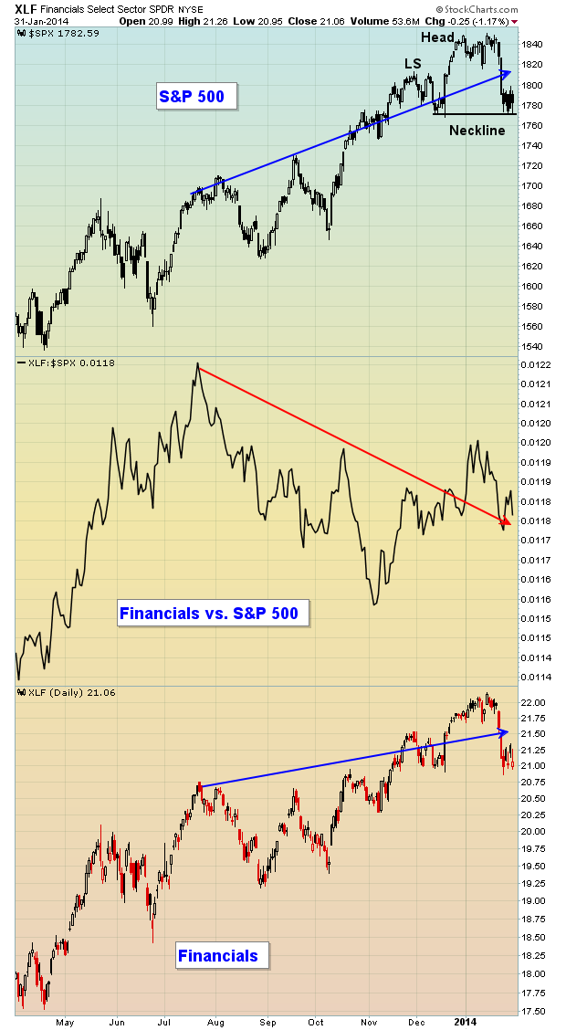
First, let's discuss financials and banks. Below is a chart of the financial sector ETF (XLF) and how it's performed relative to the S&P 500 over the past several months:

The bottom part of this chart shows that the financial sector has been rising and moving to fresh new highs, just like the S&P 500 (top part of chart). But the middle chart shows that, on a relative basis, financials have been lagging since late summer. This indicates that traders are looking to rotate their money away from the financial sector. That money has recently been moving into defensive sectors like utilities and healthcare, both of which have outperformed their aggressive sector counterparts by several percentage points in 2014 thus far.
Also, note that the S&P 500 could be in the process of forming a topping head & shoulders formation. A close below 1770-1775 on the S&P 500 with increasing volume would suggest a downside target/measurement somewhere in the 1690-1700 area.
The next chart below features the Bank Index ($BKX) and you can once again see that the relative strength in this group is lacking. It's generally a good sign to see banks performing at least at the level of the S&P 500. When they begin to lag, it potentially sends a warning signal about the sustainability of a stock market rally. A strengthening economy should bolster bank profits so the BKX should rise if such an economy is anticipated. Check out the BKX below:

Finally, let's take a look at the 10 year treasury yield ($TNX):

Traders have a choice whether to invest for income (treasuries) or growth (stocks). If they choose safety and income, they buy treasuries - treasury prices move higher and the yield moves inversely, or lower. By buying treasuries, those dollars cannot also buy equities. The fact that demand slows on equities sends stock market prices lower. So when treasuries are in favor, yields AND equity prices drop. But many times in the past, you'll find that yields begin dropping before equity prices, providing astute traders with a potential warning sign regarding an impending drop in equities.
Take a look at that 10 year treasury yield chart again now. Note that the S&P 500 tried breaking to fresh highs in mid-January, but did so with the yield dropping. In my view, that's a form of a negative divergence from an intermarket perspective. The precipitous drop in yields occurred just before a significant decline in equities.
If you're bullish the stock market over the longer-term, which I still am for now, you'll want to see strengthening relative performance on banks and rotation OUT of treasuries, sending yields higher to challenge and eventually surpass the yield at the start of 2014. In the near-term, however, please watch that head & shoulders pattern for possible breakdown. Should the neckline support fail to hold, we could be looking at more weakness in February before technicals begin to improve.
Enjoy the Super Bowl and Happy Trading!
Tom Bowley
Chief Market Strategist
Invested Central