Hello Fellow ChartWatchers!
Just in time for the ongoing February rally, I'm thrilled to announce the launch of the DecisionPoint Market Analysis Chart Gallery!
As you probably know, we have recently acquired DecisionPoint.com and are currently in the process of merging their terrific charting tools and datasets into our website. (If that is news to you, click here for all the details.) Today, we're taking the next step in that process with the roll out of the DP Market Analysis Chart Gallery.
One of DecisionPoint's greatest strengths - its huge diversity of market indicators - has also been one of its weaknesses. It has always been a challenge determining which set of indicators to focus on and how much creedence to give each signal from each indicator. Therefore, as part of the merger process, we've worked closely with Carl Swenlin and Erin Heim (the driving forces behind DecisionPoint) to create a new tool that provides all of the key DP market indicators on one page in an improved format for understanding where the market is most likely headed.
For those of you that can't stand the suspense, just click here and check out the results.
For the three people still reading along, here's a list of some of the improvements you'll find in this new tool when compared to the original charts on DecisionPoint.com:
- All the key charts on one page. Just scroll down to review them all.
- The charts are larger now.
- In some instances, multiple charts have been consolidated into one.
- We've added the "Y-Axis Label" feature so that you can see the final value of each indicator.
- We've added the "Zoom Thumbnail" to all of the charts.
- We've added short descriptions for how to interpret each indicator.
- We've linked the descriptions to full-length ChartSchool articles for the major indicators.
- If the page is printed, the charts should appear one-per-page.
- And, possibly most importantly, we've made the charts clickable (for members)! Now you can see exactly how each chart was created, you can change any of the settings that you want, you can add your own annotations, and you can save the results in your own account.
StockCharts members will be thrilled to see that some of the indicators on these new charts are very, very unique and very, very helpful when it comes to analyzing the market. For example, the "Average Price Relative to 52-Week High" shows you how close all the S&P 500 stocks are (on average) to their 52-week highs. That's new. That's wonderful stuff. That's just one example!
Now, the currently version is still in "Beta Release" meaning that we might make a couple of more changes to it in the next couple of days. It also means that we want your feedback. Feel free to send it to us via our Support page or by just emailing support@stockcharts.com.
Enjoy!
- Chip
WEEKLY MACD LINES ARE STILL NEGATIVE
by John Murphy | The Market Message
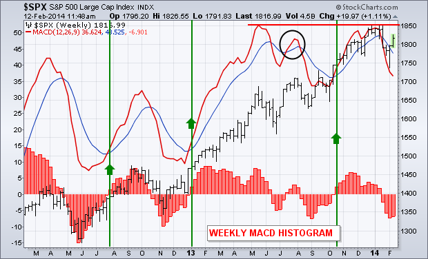
The daily MACD for QQQ, SPY and DIA have turned positive. Weekly MACD lines, however, are still negative. That's not unusual since weekly lines are slower to turn. Weekly lines, however, measure the stock market's longer trend. A strong stock market rally requires the weekly lines to turn positive as well. Chart 7 overlays weekly MACD lines on the S&P 500 over the last two years. The red bars along the bottom are MACD histogram bars which measure the spread between the red and blue lines. The histogram bars revolve above and below a zero line, and show us whether the two MACD lines are positive or negative. At the moment, they're negative. The chart shows the performance of the MACD lines (and histogram) during three previous market corrections. [I'm not counting the minor MACD upturn last July (circle) since the lines resumed falling]. In all three instances, positive turns in the MACD lines (and histogram) confirmed resumption of the market uptrend. The green lines showed that it usually took several weeks for that to happen. But that positive turn confirmed that the stock rally had staying power. One other thing. The yearend top in the two MACD lines ended at the same level as last May (while prices kept rising). That "double top" in the MACD line represents a possible "negative divergence" with the S&P 500. That makes me suspicious of the staying power of the stock market rally from here. It also reinforces my view that the market may run into bigger trouble as we approach the spring months.
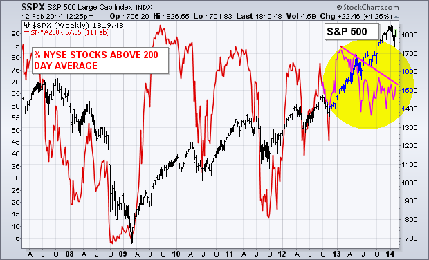
% NYSE STOCK OVER 200-DAY AVERAGE ISN'T KEEPING PACE ... Here's another reason why I'm suspicious of the strength of any market upturn from here. Although the stock market is within a few percentage points of a record high, only two-thirds of stocks on the NYSE are trading above their 200-day averages. The red line in Chart 8 plots the % of NYSE stocks over their 200-day averages ($NYA200R) relative to the S&P 500 since 2007. [The percentage scale is on the left side of the chart]. The two lines generally trend in the same direction, but not at the same pace. During the upsurge in 2009, the red line went from below 20% at the start of the year to 90% by the end. That reflected a dramatic turn in the market for the better. Readings in the red line over 80% generally reflect an overbought market. Subsequent drops below 70% have usually coincided with downturns in the SPX (2010, 2011, and twice in 2012). Which brings us to the present situation. At the start of 2013, 83% of NYSE stocks were trading over their 200-day averages. At the moment, only 67% are in that bullish position. While the S&P 500 rose 27% over the last year, the participation rate of NYSE stocks in that uptrend dropped by 16%. The falling trendline over the past year shows that bull market participation by individual NYSE stocks has lagged behind the rising market index by a noticeable amount. In my view, that suggests that any stock market rally between now and the spring will be on shaky technical grounds.
- John
Chartists can find sectors with consistent performance by analyzing PerfCharts across different timeframes. The three PerfCharts show different performance periods for the S&P 500 and the nine sector SPDRs. I am looking at year-to-date performance and then dividing 2014 into two parts. The first part covers the period from January 2nd to February 4th, which is when the S&P 500 fell sharply. The second period covers February 4th to February 14th, which is when the S&P 500 rebounded. By looking at these three distinct periods, chartists can uncover which sectors show consistent relative strength and which show consistent relative weakness.
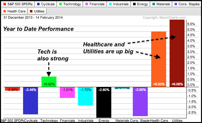
Year-to-date, we can see that the Technology SPDR (XLK), Utilities SPDR (XLU) and HealthCare SPDR (XLV) are the only sector SPDRs showing gains. These three show both absolute and relative strength. The Consumer Discretionary SPDR (XLY), Industrials SPDR (XLI), Materials SPDR (XLB), Energy SPDR (XLE) and Consumer Staples SPDR (XLP) are down more than the S&P 500 and show relative weakness. Even though healthcare and utilities are defensive sectors that typically lead when the market is in risk-off mode, note that the technology sector is also leading and this is positive for the market overall. Also notice that the consumer staples sector is lagging and this suggests that the market is not all that defensive.
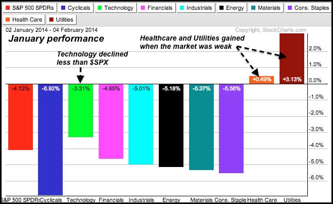
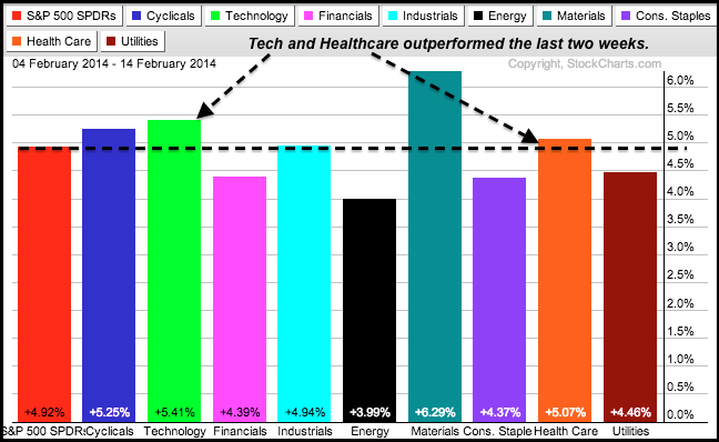
The PerfCharts above show the breakdown for 2014. First, notice that healthcare and utilities gained from January 2nd to February 4th, which is when the S&P 500 declined. These two showed both absolute and relative strength. Talk about strong. Second, notice that the technology sector declined less than the S&P 500. This shows relative strength. Meanwhile, the consumer discretionary sector showed the most weakness with a 6.92% decline. The second PerfChart shows the gains over the last two weeks. Notice that technology and healthcare outperformed. These two are clearly the top two sectors in 2014. The utilities sector underperformed with a smaller gain, but a 4.46% advance ain't too shabby for high-dividend group and it is still the best performing sector for 2014. You can learn more about PerfCharts in these videos.
Good weekend and good trading!
Arthur Hill CMT
WHAT IS COMPELLING THIS WEEK?
by Greg Schnell | The Canadian Technician
The Chartwatchers newsletter is an interesting one. On all the other blogs, we write whenever we see something interesting on a daily basis, but the ChartWatchers newsletter is unique. With a different audience and a release period two to three weeks apart, it earns a unique perspective.
So when I have a story to tell in a few charts in Chartwatchers, it forces me to be very selective. What is the most compelling 'One picture is worth a thousand words' chart? Today, I came across Utilities. Really. Utilities? Let's go deeper.
I want to spend a minute and talk about how charts change. Sometimes, every sector rises but the super strong growth sectors make new highs before the other sectors. In a bull market we expect Consumer Discretionary, Technology, Industrials to be running and leading. In weak markets, defensive sectors rise faster as investors (think institutions) look for stable and predictable earnings. So when everything is making higher highs, Utilities might too. However, when a chill comes into the markets, growth stocks tend to go flat or down while the defensive sectors like Utilities start to move above the 40 WMA, make new 6 month or 1 year highs well before the other sectors are challenging their recent highs. That is the picture we have today. In the chart below, I have posted a weekly chart of Utilities. What is remarkable is that Utilities touched a low level during this week that the Utilities chart had also touched in July 2012. The lower pane is the $COMPQ. Notice what low price level the $COMPQ touched this week and compare it to the price area back in 2012. The Utilites enjoyed the ride off the Nov 2012 lows for a while, and then it spent 10 months oscillating around the 500 Level..
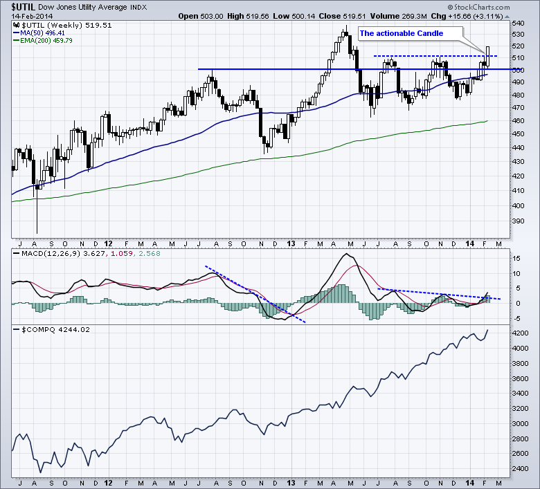
You can see in April May June of 2012,the equity market rolled over but utilities kept surging.
Now we have the $UTIL breaking out from the long horintal resistance for a new push. The only actionable candle on a chart is the current week. All the rest are historical records. While the main markets are trying to take out their previous highs, the $UTIL chart looks engaged and breaking higher in a breakout above 9 months of resistance on this actionable candle. While the $COMPQ has made higher highs and is still making new highs, the defensive stocks are adding the power. The probability rises that the growth sectors may pull back.
The $INDU is well behind trying to exceed recent highs(not shown). Seeing the $UTIL chart in breakout mode and the REIT sector and bond sector start to power above their 40 WMA, suggests something is changing.
That is the most powerful message I can send in Chartwatchers this week. An investor might not go all defensive but defense could be starting to hold a larger percentage in a portfolio until proven otherwise.
Good trading,
Greg Schnell. CMT
The StockCharts charting tools are very powerful but can be a little confusing at first, especially if you are used to the simpler charting tool on DecisionPoint.com. So I wanted to take time today and talk a little bit about the differences between those two tools.
First off, I've just posted a longer blog article about this topic in the new DecisionPoint Blog on the StockCharts.com website. You can click here to read it. It talks about how StockCharts lets you store your customized charts in your account as well as add more indicators and generally do more with your charts than the DP charting tool does. Again, I encourage all DecisionPoint.com members to read that article (and the rest of my blog) as soon as you have some time.
Now, there is one change that several people have asked about that I didn't address in that blog article - the Price Relative indicator. The old DecisionPoint.com charting tool has it, but it is not listed as an indicator in the SharpCharts dropdowns. Where did it go?
The good news is that it is there in SharpCharts, it is just in a different, more flexible form called a "Ratio Ticker Symbol."
In SharpCharts, you can chart one ticker symbol if you want to see that dataset. However, you can also chart two ticker symbols joined together with a colon character (":") - e.g., "IBM:$SPX" or "$GOLD:$USD". That pair of symbols is called a "Ratio Ticker Symbol" and when it sees one of those, SharpCharts will plot the values for the first symbol divided by the closing value for the second symbol.
Sound familiar? It should. That is essentially what the old "Price Relative" indicator does.
That means that in order to chart a "Price Relative" line in SharpCharts, you actually need to add a "Price" indicator to your chart and then set the parameter for that indicator to the ratio symbol you want (e.g., "IBM:$SPX")
Here's an example:
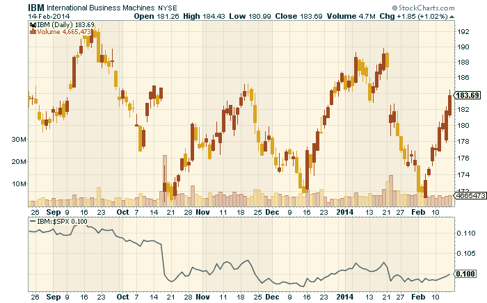
(Click on the chart for a live version with all the settings.)
So I can hear the questions now - "This is so complex! Why? why? why? why? WHY?"
The good folks at StockCharts did this so that you can also plot a ratio symbol as the "Main" ticker symbol for your chart - something you cannot do with the old DecisionPoint charting tool. You can then add overlays like Moving Average and Bollinger Bands on top of it, you can plot it as a set of candlesticks instead of just a line, you can add indicators based on that ratio, and you can annotate it. Check out this example:
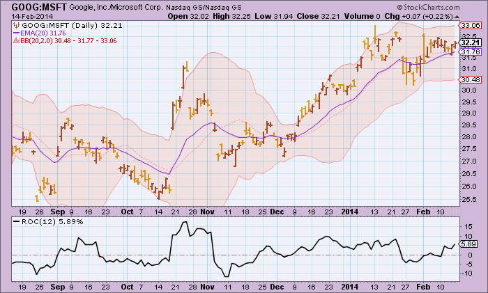
(Click on the chart to see a live version with all the settings.)
For instance in this chart, we can now track the Rate of Change (ROC) of our Google/Microsoft ratio which can alert us to upcoming changes in the relationship between those two stocks. We can also see if that ratio has moved outside of its typical Bollinger Band range.
All-in-all, Ratio Symbols are just as easy to use and much more flexible than the old Price Relative indicator.
Happy charting!
Erin
MIXED SIGNALS ABOUND
by Tom Bowley | InvestEd Central
Just two weeks ago, the stock market seemed on the verge of its first correction in a long time - all within the confines of a long-term bull market that began in March 2009. Then came the breakdown I was looking for to confirm it. Check out the head & shoulders breakdown that occurred earlier this month on the S&P 500:
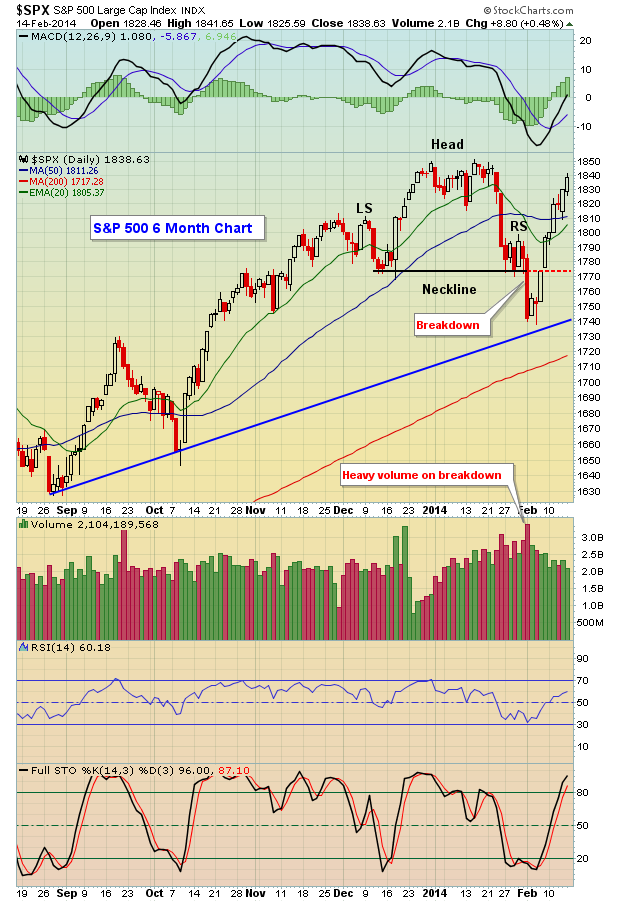
Generally speaking, confirmed head & shoulders patterns that lose neckline support on very heavy volume don't usually move right back through what should become solid price resistance at that neckline. Yet that's exactly what the S&P 500 did - it lost neckline support, then regained it almost as fast as it had lost it. Volume on the recovery was much lighter as well.
As traders, we must respect these ugly bearish breakdowns. But we must also swallow our pride when the pattern resistance fails to hold back the bulls. The reason? There's a long-term bull market in play and sitting on the tracks as the bull market freight train approaches is the equivalent of financial suicide. Let's go back into recent history and I'll show you a previous example where I was prepping for the worst just as the market bottomed. Take a look at June 2010:

It was another false head & shoulders top and I had to quickly admit my mistake and be prepared to follow the bull market higher.
So the bottom line is that I'm treating this bull market as though it remains in full force. There are still issues that remain, so I wouldn't commit all my capital to the long side. It certainly appeared to me as if a corrective phase had begun just a couple weeks ago given the high volume breakdown of a bearish head & shoulders pattern. And the relative weakness in financials, especially banks, and relative strength in treasuries both argued for lower equity prices as well. One thing I've learned over the years, though, is don't question a bull market too often or for too long.
Given these mixed signals, how's the best way to approach the market? Well, I was looking for a short-term correction only so I still like longer-term money remaining fully invested. I like to swing trade, however, so I'd keep position sizes fairly light, maintain a comfortable level of cash and trade primarily on the long side. I'd look for companies that beat Wall Street top line and bottom line estimates and wait for solid reward to risk entry points. Recently, I've mentioned candidates like Charles Schwab (SCHW), Alcoa (AA) and Lennar (LEN). They've all performed quite well on a relative basis and, with patience, all hit nice solid support levels.
I'll feature another company with solid revenues and earnings as my Chart of the Day for Monday, February 17th. CLICK HERE for more details.
- Tom
|