| |
|
|
|
|
| |
 |
ChartWatchers
the StockCharts.com Newsletter
|
|
|
|
|
|
|
|
Hello Fellow ChartWatchers!
Last year, I had an article dedicated to things that many people didn't know about StockCharts.com. The list was based on our customer support questions and the feeedback we get from our live seminars. I thought now would be a good time to revisit and update that list.
- Our Twitter Feed - we are still faithfully tweeting out alerts whenever interesting technical events happen. Yesterday, we had some doozies:
In case you are not already a member of the "Twitterati," Twitter is totally free and is easy to setup. Click here for a great article on getting started.
- Gatis Roze's Secretly Disguised Novel - Have you been reading Gatis' blog articles faithfully? His advice can definitely help you become a better investor. And here's the thing - his articles secretly fit together like jigsaw puzzle pieces to form a complete book! So even if you have been reading his articles faithfully, you should still click here and read the entire thing from cover to cover. It's only by reading it from beginning to end that you will start to see what the phrase "Tensile Trading" really means.
(And if you want more of Gatis' knowledge, come see him live in Atlanta on March 16.)
- NYSE Common Stock Only Datasets - Our merger with DecisionPoint.com has added a whole slew of new datasets to our system including a collection of 29 new market indicator based solely on common stocks in the NYSE. No funds, no ETFs, no classes - just regular stocks. The differences can be significant. Click here to see a list of these indexes.
- Videos, Videos, Videos - We have a ton of helpful videos that can answer almost any question you may have about using our website. Watching them all does take time but it really is worth it. Click here when you have a spare hour (or two).
- Technical ETF Rankings - Our SCTR page for ETFs. when sorted by "Change" really is quite special. It can show more than just which ETFs are the strongest on that day. It can also tell you what sectors and industries are strengthening. Just click here and then read the names of the funds and look for groups of similar names. Right now - March 1st, 2014 - I'm noticing lots of Natural Gas and Oil funds moving higher.
- $SPX Seasonality - Is "Sell in May and Go Away" good advice? Our new Seasonality tool can tell you. Just use it to chart $SPX (and set the 'Compare' field empty) and then click on the Histogram button and stretch the slider out to 10 years. Boom!
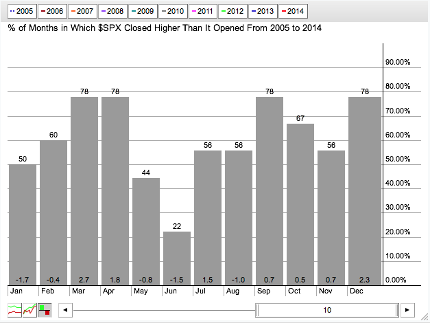
Clearly, May and June have not been kind to $SPX. Good to know!
- Unadjusted Data - We still get lots of questions about this so here it is again one more time. Our regular stock ticker symbols are adjusted to remove the "artificial" effects of splits, dividends and distributions. Always have, always will. However, if you want to see what the charts look like without those adjustments, just add an underscore character to the front of the ticker symbol and voila! Gap city.
- A Free Book from John Murphy - We just added a free, online version of John's classic "Charting Made Easy" to our ChartSchool. Click here to get your copy.
- The Entire History of StockCharts Online - Every single one of our ChartWatcher newsletters is still available on our website. Just click on the "Archives" link at the bottom of the homepage. You can even read the very first StockCharts newsletter ever written. How long ago was that??
So there you go. There are even more gems hiding inside the site of course (like this and this and this) but that's a good list to start with. Hopefully some of those are news to you. Enjoy!
- Chip
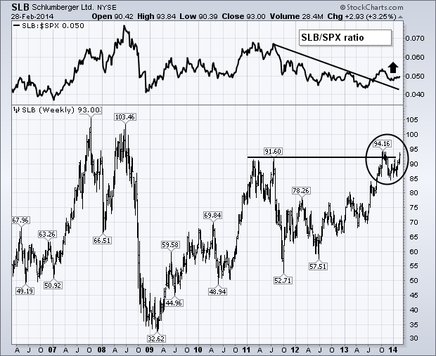
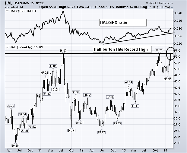
The two biggest stocks in the OIH also happen to be two of the strongest. The weekly bars in Chart 4 show Schlumberger (SLB) nearing a test of its fourth quarter high near 94. A close above that level would put the oil service leader at the highest level in six years. The SLB/SPX relative ratio (above chart) is also starting to rise for the first time since 2011 (when crude oil started to weaken). Halliburton (the second biggest OIH stock) has an even stronger pattern. Chart 5 shows Halliburton (HAL) ending February at a new record high after clearing previous peaks formed during 2013 and 2011. Its relative strength line (above chart) shows a nice uptick during the first two months of 2014. No doubt, rising oil prices have a lot to do with the stronger performance of both stocks.
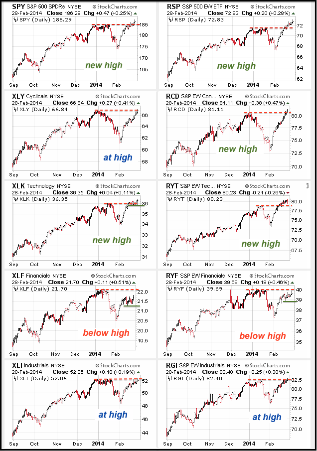
The market can be divided into nine sectors using the S&P Sector SPDRs and the Rydex Equal-weight Sector ETFs. These sectors can be subsequently divided into three groups: offensive, defensive and other. Technology, finance, consumer discretionary and industrials make up the offensive group, which is key to a healthy bull market. Healthcare, consumer staples and utilities make up the defensive group, which typically outperforms when the market is in risk-off mode. The energy and materials sectors represent the "other" group. In a bull market, which we are in, I am most concerned with the performance of the offensive sectors. Further insight can be gained by looking at performance for the market-cap weighted SPDRs and the equal-weight Rydex ETFs (hat tip J.A.). The SPDRs, of course, tell us what is happening with large-caps, while the equal-weight ETFs reflect the performance of small and mid-caps.
Click this image for a live chart
The CandleGlance chart above shows the four offensive sector SPDRs and their equal-weight counter parts. I also added the S&P 500 SPDR (SPY) and Equal-Weight S&P 500 ETF (RSP) for good measure. First, the broader market is in good shape because SPY and RSP recorded new highs, although SPY appears to be struggling to hold this high. Second, the consumer discretionary sector was lagging at the beginning of the month, but surged in February and the Equal-Weight Consumer Discretionary ETF (RCD) hit a new high. This is positive. Third. The technology sector ETFs both hit new highs and this sector is leading. Note that XLK formed a rather tight consolidation the last two weeks and chartists should watch this support level closely. Fourth, the finance is lagging because XLF remains below its January high and the RYF has yet to forge a new high. Both remain in upswings, but chartists should watch support from the late February lows for signs of a weakness. And finally, the industrials sector is challenging its prior highs, but has yet to forge new highs. Overall, we have five ETFs with new highs, three ETFs at their highs and two below their highs. It is a bit of a mixed picture. Let's see if the strong can hold their highs and the others can confirm with new highs of their own. Check out this mailbag article for 14 essential CandleGlance groups.
Good weekend and good trading!
Arthur Hill CMT
DECISION TIME FOR THE EURO
by Greg Schnell | The Canadian Technician
The Euro made a startling move higher on Friday. Rather than get into the daily perspective, I wanted to take a minute to look at the long term view of both the Euro and the Dollar Index. The $XEU is the Euro / US Dollar cross, whereas the $USD is the Dollar Index which reflects a basket of currencies. The Euro is the largest chunk of the Dollar Index, but the remaining currencies make up 42.2%.
Here is the view since the Inception of the Euro. Two real big picture concepts on the upper chart.
The Euro has spent the vast majority of the chart below the red line. I have placed the red line based on when the Euro finally surged meaningfully above an old resistance level to make new highs. That resistance level is at Wave III in January 2005. The second big picture concept is the narrowing range on the right hand side of the chart. The moving average is a very long 40 months.
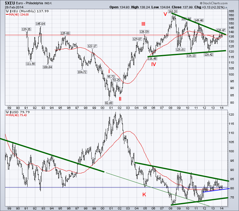
For the $USD in the lower plot, the same horizontal line is shown in blue and placed based on point K. There is a norrowing range on the $USD as well. The $USD is well above the 2008 - 2011 trendline. Interestingly both currencies are in the top 1/2 of these macro pennant patterns. On the $USD chart, if the trendline from the nineties is continued (thin green line) it was support for the currency in 2005, 2010 and 2011. The extreme low of the $USD at the height of the commodity bubble was the only exception. So will the $USD track back to this line if the Euro breaks out? We'll zoom in to get a better view.
Looking at chart 2, we can see the red line is a serious support/resistance line. I have changed the moving average to a 10 month MA which is approximately 220 days. The Euro is above a rising MA. Bullish. It is also just below the major 6 year down sloping green trend line. The most recent low at the bottom of the pattern coincides with July 2012 that Mario Draghi states he'll do whatever it takes to defend the Euro. The Fed started QE 3 in September 2012. Lastly, the Euro has tried to get above the red line 3 times in the last 5 months. It closed February above it.
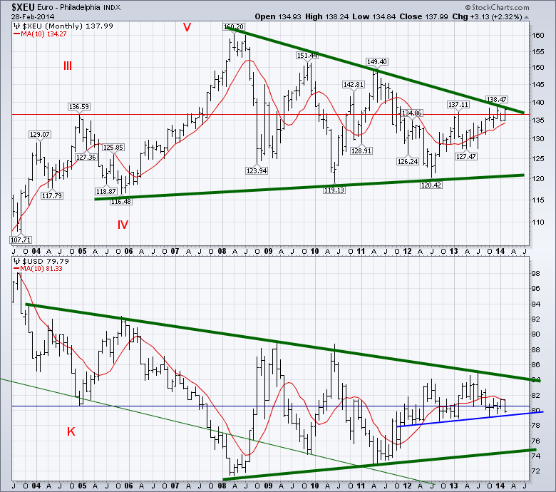
The $USD in Chart 2 is below its horizontal blue line but above the rising trendline from late 2011 to now. The 10 Month MA has turned down and the $USD appears trapped underneath it currently. It has been resistance since September. The $USD could move down to the 75-76 cent range and still be in the pennant.
Lastly, let's zoom in one more time. I count 6 important levels on Chart 3. 2 above and 4 below the current price. 1 - Above is the Major green trendline. 2 - A secondary down trend line that has been strong resistance in the past. The Euro has been above it for 2 weeks. 3 - The rising red trendline that has been resistance since January 2012 similar to the Blue support line on the $USD in the chart above. 4 - The long historical support/resistance line for the Dollar and the price is above this line. Bullish. 5 - The upsloping 40 week MA which is very bullish. 6 - The rising blue trendline from the July 2012 lows - Draghi speech. Both cur In conclusion, we are at the apex of all of these lines for the Euro. They are in a tightening pattern. Will 6 year resistance hold, or will the Euro thrust through like it did in September 2007? September 2007 was a breakout month after hovering at resistance for July and August 2007.The longer the line, the more important the break.
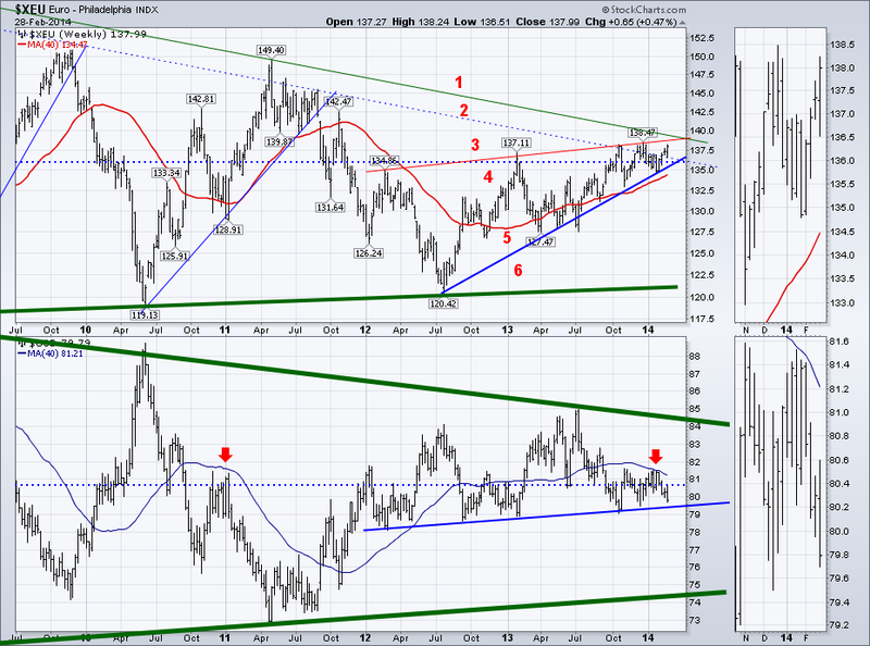
Both currencies have up sloping base trend lines. The $USD is now below both the horizontal resistance line and the down sloping 40 WMA. That is very bearish. It is supported by the 2 year blue trend line just below. In 2012 and 2013, the $USD tested the blue up sloping support line in the early months of each year, but it held. It would appear there are major trend changes coming either way. If the Euro stops and the $USD rises, that will be a change for the recent push higher in commodities. If the Euro breaks out, it will be a major boost for commodities and European stocks. Should be an important month for the $XEU and the $USD.
Good trading,
Greg Schnell, CMT.
The bulls had been dropping out of the ring during the recent correction, but they're baaaaack.
The DecisionPoint Chart Gallery has a section devoted to sentiment. There is the Investor's Intelligence Survey chart with not only the percentage of bulls and bears, but also a bull-bear ratio. And there is the DecisionPoint Rydex Asset Ratio chart. Both illustrate that bullish sentiment is rising
Investor's Intelligence surveys over a hundred independent market newsletters and assesses each author's current stance on the market: bullish, bearish or correction. The results are below in the chart from the DecisionPoint Chart Gallery. For a live version, click on the chart.

Data is collected on Wednesday and published Thursday. I find it interesting that we saw an increase in bulls, almost into top of its range and then we saw a price breakout on Friday. Generally sentiment is contrarian. However, that's why we also use the Bull/Bear ratio. It shows a definite increase, but the disparity between bulls and bears as measured by the ratio isn't as high as it was before the last correction.
Developed by my father Carl Swenlin, the Rydex Asset Ratio is a unique way to measure sentiment. Rydex is an unusual mutual fund company in that it publishes the total dollar amount of assets in each of its funds on a daily basis. This makes it possible for us to analyze sentiment based upon what investors are actually doing with real money. We do this by calculating a daily bear/bull asset ratio and monitoring the relationship between assets in the two types of funds.
Because we don't receive asset information until hours after the close, you should be aware of the date of the last update noted in parentheses. The chart below shows data from Thursday, Feb. 27. (Click it to see Friday's data.)

Let's start at the bottom pane and work our way up. We can see that during the correction money was leaving the Bull+Sector funds. That's not surprising. But what is surprising is that not much has gone back in during the upswing.
Money Market assets has been moving mostly sideways since September of last year. Notice the peaks in Money Market assets tended to coincide with market bottoms. This is logical since investors move assets into cash when they are pessimistic.
The next pane illustrates that assets in bear funds has been relatively even since peaking at the 2011 price bottom.
The Rydex Asset Ratio is produced by dividing the Bear funds plus money market assets by Bull assets. We use a reverse log scale to chart the value of the ratio. If you remember from calculus, if you have a fraction and the denominator gets larger and larger, the overall value approaches zero. So as more and more money moves into the bull funds, the ratio value also approaches zero. Conversely, if the numerator gets larger and larger, the ratio value moves away from zero. Note in the chart that the largest value of the ratio was reached near the 2011 price low and right now the ratio value is very small and is residing in overbought territory, meaning sentiment is very bullish based on where the money is residing.
In conclusion, sentiment in both the survey and Rydex Ratio is very bullish. While sentiment is generally contrarian, neither the Investor's Intelligence ratio nor the Rydex Ratio have reached the extremes that they can. And, we know that today, the market had a breakout and hit new all-time highs. It will be interesting to review the survey next week and watch the changes nightly on the Rydex Assets chart.
Happy Charting,
Erin
PARDON THE INTERRUPTION
by Tom Bowley | InvestEd Central
Make no mistake about it, I prefer to be bullish. History supports this notion because the stock market has always tended to move higher more than it moves lower. Dating back to 1950, the S&P 500 has moved higher over 53% of trading days. Did you know that the S&P 500 has finished lower only 6 of the past 32 calendar years? Three of those down years were consecutive years from 2000 through 2002. Of the other 29 years since 1981, only 3 were lower. There's an undeniable bias to the upside in equities over the long-term, so you really have to pick your spots and limit your overall bearish views to periods where the market is literally beating you over the head with warning signs. I don't yet have a concussion, but I have to admit I'm getting a little "woozy" from the recent market body blows.
This is NOT a healthy market advance and unless it changes soon, I'd continue to grow more and more cautious. The good news is that volume trends and momentum remain primarily in the bulls' corner and that could support higher prices in the very near-term. Before we look at charts to see the issues visually, just consider the numbers. Last week, the S&P 500 and Russell 2000 both set all-time closing highs, but I have to question the leadership of this rally. Here is your sector performance leaderboard in 2014:
Healthcare +7.22%
Utilities +6.53%
Materials +1.86%
Technology +1.71%
Consumer Discretionary +0.01%
Industrials -0.38%
Financials -0.73%
Energy -0.97%
Consumer Staples -1.47%
I grow uneasy when the four aggressive horsemen - technology, industrials, financials and consumer discretionary - lag when the stock market moves to fresh highs. It's an indication that there's really not a lot of faith in the move to the upside. If those investing and creating the breakouts have no faith in the advance and are not willing to take big risks, why should I? And why should you?
Money is flowing towards safety. It's moving towards income-oriented investments. I want to see money flow into areas where investors seek capital appreciation. That's not apparent right now, however, as treasuries, healthcare and utilities are all attracting much more than their fair share of investment dollars.
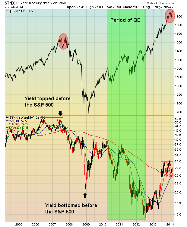
While the S&P 500 gained 4.3% in February, the 10 year treasury yield ($TNX) didn't budge higher. Put another way, a true equity market rally should see a selloff in treasuries (and higher yields), but it didn't happen. In fact, the yield is significantly lower now than it was to start the year, despite a rise in the S&P 500. Investors are keeping their umbrellas out. They're not trusting this rally. Check out the $TNX chart:
Financials have significantly underperformed the defensive healthcare and utilities sectors in 2014. What I find most interesting is that if you break down the industry groups within the financial sector, you'll see that financials are being held up by the REITs, which are big dividend payers, or safety stocks. Look at this chart of the Dow Jones U.S. Financial Index and the relative performance of banks ($DJUSBK) and REITs ($DJR) vs. the S&P 500:
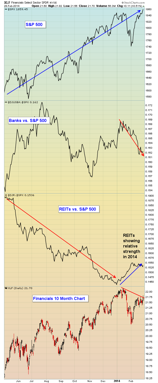
While the XLF (ETF that tracks the financial sector) remains in an uptrend, note that this influential group has not broken out like the S&P 500 and, if we dig a little deeper, we see that what strength the financials are showing, it's from REITs, not banks. The relative charts in 2014 are eye-popping. REITs, on a relative basis, lagged the S&P 500 badly throughout 2013 and that makes sense during a sustainable bull market rally because traders are seeking capital appreciation. They take risks. But fast forward to 2014. The S&P 500 once again breaks out, but REITs are now in favor. What does that tell you? It tells me that there are a lot of investors that are not backing this rally in equities.
Finally, banks are the backbone of any period of economic strength because they provide the credit to businesses needed for expansion. When banks struggle on a relative basis, I get nervous. 2014 has not been kind to banks. Take a look at the relative strength line of banks vs. the S&P 500 over the past two months. It made sense for banks to take a hit in January, but the February rally did little to get traders excited about banks again. That's bothersome.
On Wednesday, March 5th, I'm hosting a FREE webinar to discuss ALL of the warning signs currently in play, along with potential future warning signs that could corroborate that a bear market is approaching. For more information, CLICK HERE.
 To the over 500 investors who are presently using my ChartPack, I've been sincerely humbled by your many emails and wonderful personal comments. When you are happy, making money and saving time, I'm happy too! My objective is to help you step up your investing another tier with over 60 upgrades within Version 2.0. (Instructions for installing the upgrade are at the bottom of this... Read More
|
|
|
Recent StockCharts Articles You Might Have Missed
|
|
|
|
|
UPCOMING EVENTS
|
 |
StockCharts University Seminars - Live, in-person training for Technical Investors
|
|
|
|
|
|
|
|
Are you new to StockCharts.com?
|
|
Here are some activities that will help you learn more about our website:
Do you know someone else that would appreciate this newsletter? Please feel free to forward this to other people interested in stock charting. Thanks!
|
|
|
|
|
|
|
|
|
|
|
|
|
| |
|