Hello Fellow ChartWatchers!
There's been a sea-change in the markets with the recent uncertainty about Russia and the Ukraine. Almost instantly the bullishness on the Sector Rotation charts turned into bearish concern with defensive sectors like Utilities taking off. John Murphy, Art Hill and the rest of our great commentators have a lot more to say about these changes so scroll down if you want to see their take on things.
This week, I, on the other hand, wanted to talk about a part of our Home page that almost everyone overlooks. During our SCU seminars, we spend a lot of time talking about what we now call "The Golden Line" (a term first coined by Greg Schnell). And at the end of these seminars, invariably, several people come up and tell me that they never noticed that line before but that it was, by far, the most valuable thing that they learned about.
The "Golden Line" is the line of links located just below the big ticker cloud on the home page. Here's a screen shot of what it looks like:
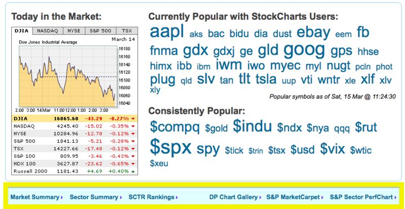
Those links in the big yellow box are the links I'm talking about. Here's what each one does and why it is valuable:
Market Summary - Our list of the major market indexes, their current values and their change over the past 24 hours. Click here for more details.
Sector Summary - Three clicks will show you the strongest stocks in the strongest industries in the strongest sectors of the market. Click here for more details.
SCTR Rankings - Our "StockCharts Technical Ranks" show you which stocks are the strongest from a technical perspective. They have proved extremely popular with seminar attendees also. Click here for more details.
DP Chart Gallery - Our newest "Golden Line" member contains a collection of key market analysis charts created by DecisionPoint which can help you quickly see the direction and technical condition of the market. Click here for more details.
S&P MarketCarpet - All of the S&P 500 charts shown as a collection of red and green squares that allow you to see which stocks have outperformed the others. Click here for more details.
S&P Sector PerfChart - Possibly the most valuable of the "Golden Line" links, the Sector PerfChart helps you discover where we are in the market's sector rotation cycle.
So don't overlook these tools - they are some of our best. (Members can also now find these same links in the middle of the "Members" page as well.)
- Chip
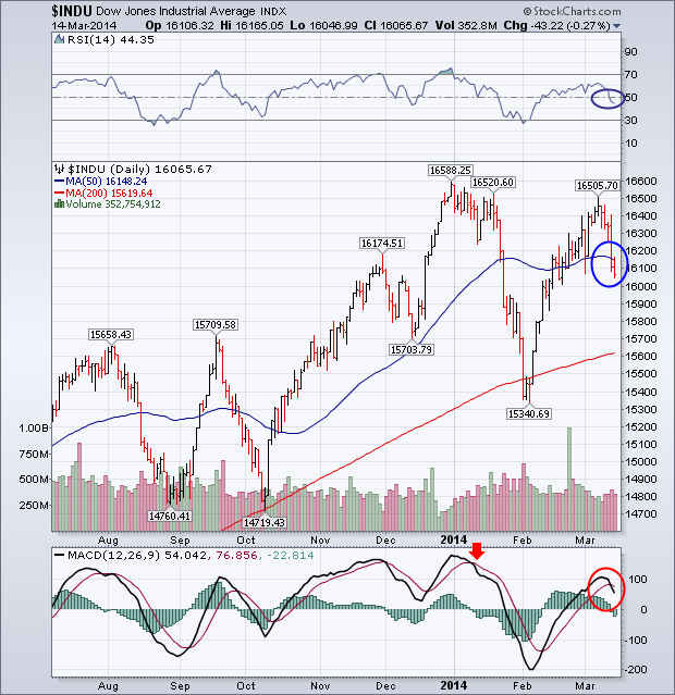
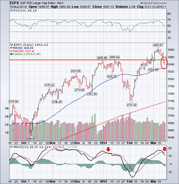
My Wednesday message warned that the Dow Industrials could run into profit-taking near its January highs, and that weekly indicators for the S&P 500 were giving "negative divergences" which also warned of a market pullback. Combined with increased tensions in the Ukraine and increased concerns about problems in the Chinese economy, it was no surprise then to see the markets fall sharply later in the week. And some short-term technical damage was done. Chart 1 shows the Dow Industrials falling below its 50-day average (on rising volume). At the same time, the 14-day RSI line (above chart) slipped below 50. More importantly, daily MACD lines (below chart) turned negative for the first time since early January. I wouldn't be surprised to see the Dow retest its 200-day average and/or its February low. Chart 2 shows the S&P 500 falling back below its January high (also on higher volume) and threatening its 50-day line. Daily MACD lines turned down as well. [As shown on Wednesday, weekly S&P 500 MACD lines have been negative since January which makes this week's downturn potentially more serious].
- John
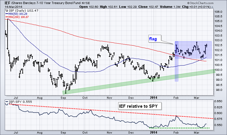
Stocks and bonds have been inversely correlated for most of the last four years, which means they tend to move in opposite directions. This inverse correlation showed up in January as stocks swooned and Treasuries surged. February was mixed because stocks surged and Treasuries traded flat. The inverse correlation reasserted itself this week as stocks dipped and Treasuries surged. I am particularly interested in this weeks surge because the 7-10 YR T-Bond ETF (IEF) and 20+ YR T-Bond ETF (TLT) held their golden crosses. A golden cross occurs when the 50-day moving average moves above the 200-day moving average.
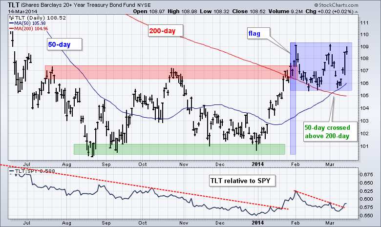
The chart above shows TLT breaking out with the January surge and then moving into a flat consolidation that looks like a flag. Notice how the 50-day day moved above the 200-day in early March and TLT found support near this cross. The ability to hold these moving averages and the golden cross are long-term bullish for TLT. Medium-term, the flat flag is a bullish continuation pattern. A break above the flag highs would signal a continuation higher and target a move to the 114 area. A flag flies at half-mast and the flagpole extends around 8.5 points (100.7 to 109.2). An 8.5-point advance from the flag lows would project such a move. A upside breakout in Treasuries would be negative for stocks and could facility further selling pressure. The chart below shows IEF with similar characteristics.
Good weekend and good trading!
--Arthur Hill CMT
This week, the market moved down every day. Wednesday spent the entire day below Tuesday's close except for the last few minutes. That does make a short term trend, again a short term trend.
By closing Friday without rebounding, it would appear that investors didn't want to jump in and push the market higher on a Friday close.
I have three charts that tell me the market is setting up to be more defensive. Is it next week? We don't know, but we do know money is shifting in defensive areas.
My first chart is the XLU. The SCTR has now pushed up above 70. It started back in January, pulled back and has now moved back above 70. This is an indication of moving out of growth and into safety.
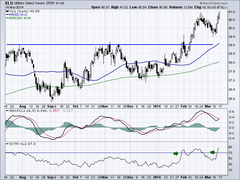
It is this renewed commitment after pulling back that leads me to believe the market is more and more comfortable being defensive.
- Greg
In his book "Winning on Wall Street", the late Marty Zweig showed us the value of volume ratios. A ratio of 9:1 or greater of up/down volume is considered to be very bullish and 9:1 down/up volume is considered to be very bearish. We certainly met the bearish threshold today. In the short history shown on the chart, we can see that it is a mixed bag. Quite often the ratio spike actually pegs an important bottom, but other times it occurs earlier in a decline.
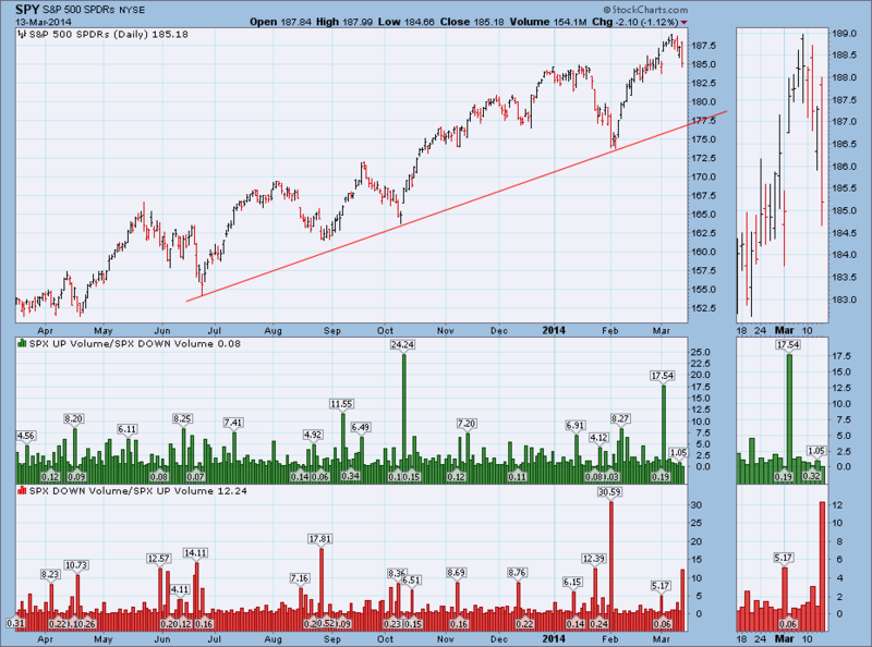
(To see a live version of this chart click here.)
Considering that prices are due for a correction back to the rising trend line drawn from the June low, I think I will interpret today's high down/up ratio as bearish.
Watching the windsock,
Carl
Nope, I'm not referring to college basketball. Instead, it's this wacky stock market. In my last article, I discussed several reasons why the 2014 advance is on shaky ground. Since then, we've seen increased volatility and lots of whipsaw action. Earlier in March, our major indices pushed to fresh 2014 and/or all-time highs and briefly even suggested money was rotating back into more aggressive areas of the market. For instance, I had questioned the lack of leadership of banks ($BKX) just a couple weeks ago. Well, that changed in early March and banks improved their relative strength standing. Check this out:
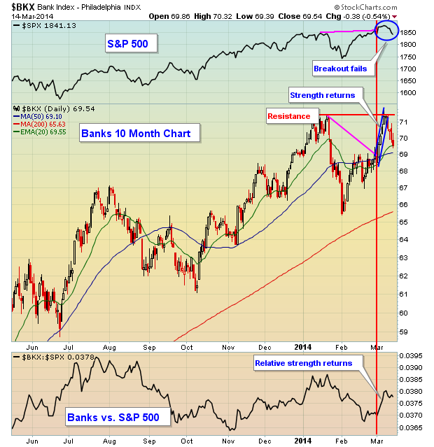
Note however that while banks did begin to show strength again to open March, there was an obvious failure at price resistance just above the 71 level and banks have since been leading the push to the downside again. One of the keys to a sustainable S&P 500 advance, in my opinion, is a relatively strong financial sector, especially banking industry. Should the S&P 500 rally again and banks lead the rally, it would help to argue for higher prices near-term. Short of that, though, I'd be very careful given the current market backdrop.
The Volatility Index ($VIX) is sending a warning message of its own. Generally speaking as the S&P 500 rises, the VIX declines. Market rallies are normally quite boring with little volatility from intraday highs and lows. Nearly every significant S&P 500 rally has been accompanied by a downtrending VIX. Check out this long-term chart:
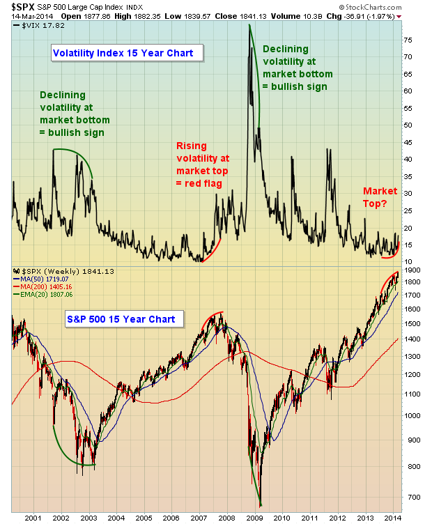
One common denominator at major market tops and bottoms the past 15 years is that the VIX has begun to change trend directions just prior to the directional change of the S&P 500. Think about it. We just broke out to an all-time high on the S&P 500. We should see the VIX moving to near-term lows, reflecting the market's bullish belief that the rally will continue and volatility will be minimal. But that's not the message the market is sending and we should take note.
Higher volatility can set up very big moves in riskier trading candidates and I'm featuring one as my Chart of the Day for Monday, March 17th. If you'd like to see this Chart, you can CLICK HERE.
Happy trading!
Tom Bowley
Chief Market Strategist
Invested Central


 President Harry Truman once said "We must have strong minds, ready to accept facts as they are." He must have been addressing a convention of individual investors. Let me pick-up this week where I left off last week. If you missed last week's blog, I suggest you visit that Part I blog to get a better foundational understanding of this week's Part II.

