Hello Fellow ChartWatchers!
If you are looking for lots of near-term optimism, I'm afraid the rest of this newsletter will be very disappointing. There are numerous technical reasons to think the market is overdue for a pull-back. And here they are...
Sector Rotation Points to Defensive Outlook
I've written on numerous occasions in the past about how anyone can quickly and easily use our Interactive PerfChart tool to study sector rotation effects. Rarely however has the picture changed so quickly from a clearly "offensive" (bullish) situation to a clearly "defensive" (bearish) picture. Check it out. Here's a picture of the situation at the end of 2013 (only 3 months ago!). This is a very bullish rotation picture:
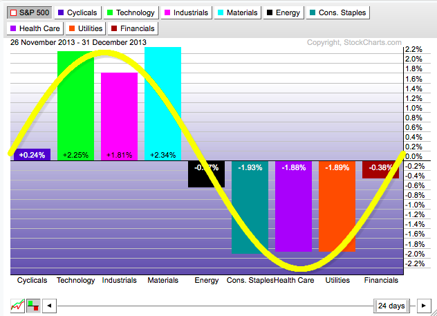
To create this picture yourself, follow these steps:
- Visit our homepage, then click on the "S&P Sector PerfChart" link under all the ticker symbols.
- Click on the little "Histogram" button in the lower left corner of the chart.
- Right-click on the middle of the date-range slider (located at the bottom of the chart) and select "One Month" from the menu that appears.
- Press and hold down the left arrow key on your keyboard until the start date says "26 November 2013"
- Right-click in the middle of the chart and select "Show Cycle Line" to add the yellow line
- Finally, click and drag the yellow line until most of the bars are "underneath" it like I have on the chart above.
Looking at that chart, see how the bars on the left side (the bullish "offensive" sectors) are all outperforming the market while the bars on the other side are all underperfoming it? That strongly suggests that the market felt things were picking up and looking good for the future.
(And, to be honest, the rotation picture had been similarly positive for several months prior to December as well. Move the slider to the left to see for yourself.)
However, if you want to see the market change its mind about things in a short period of time, just press and hold down the right arrow on your keyboard. By the time the slider gets to now, things are almost 180 degrees reversed:
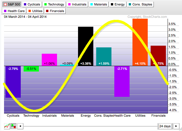
OK, granted, the Health Care sector is still negative, but can you think of anything that might be going on right now to cause that? ;-)
Ignoring Health Care, the "defensive " sectors - lead by Utilities - are currently in control of things. It's not a bullish situation folks. As always, you should check out this chart on a regular basis to see how things continue to evolve. For more details, check out our ChartSchool article on Sector Rotation.
- Chip
P.S. Space at ChartCon 2014 is filling up fast. I'd love to see you in Seattle this August if at all possible. John, Arthur, Greg, Erin, Alex, Martin, Gatis, and Dick would too. If you can make it, I guarantee you'll learn more about charting in those two days that you could ever imagine! Click here for details.
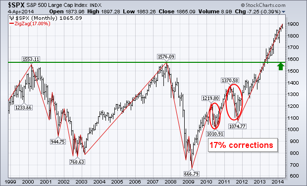
Last December 14 I wrote a message warning of the likelihood of a market correction during 2014. Midterm election years are the most dangerous of the four-year presidential cycle. That article pointed out the fact that midterm year peaks usually start in the spring. Since April ends the "strongest six month period" that starts in November, that makes April a good time to take some money off the table. It may also make the "sell in May" maxim more meaningful this year. The good news is that a major bottom usually takes place during the second half of the year (usually in October). Calendar-wise, we've now entered the dangerous spring season. That makes warning signs of a possible market top more meaningful. The monthly bars in Chart 1 show the S&P 500 rising above its 2007/2000 highs last spring to register a major bullish breakout. Those two prior peaks should act as major support below the market. Measuring from this week's intra-day high to the 2007 intra-day peak at 1576, an S&P 500 drop of 17% would bring it back to that major support level. That's probably the maximum correction we can expect. The red line shows the last two 17% corrections taking place during 2010 and 2011 (the 2011 correction of 19% lasted from May to October). The moral of the chart is that a correction as big as 17% would not disturb the market's major uptrend, and would most likely represent a major buying opportunity later this year.
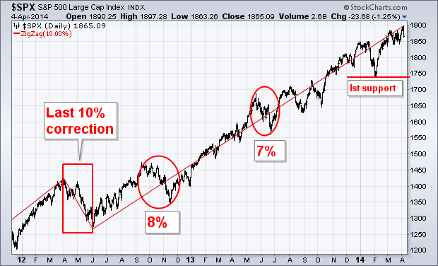
A LOOK AT RECENT S&P 500 CORRECTIONS... Chart 2 shows the last 10% correction in the S&P 500 (using intra-day prices) taking place in the spring of 2012 (during April and May). Two years without a 10% correction is unusual. A correction of 8% took place in the autumn of 2012, and a smaller 7% drop in the spring of 2013 (during May and June). An even smaller pullback of 6% took place this January. An S&P 500 drop to its early 2014 February low near 1740 would represent an 8% correction (see first support line). That's probably the minimum correction we can expect this year.
- John
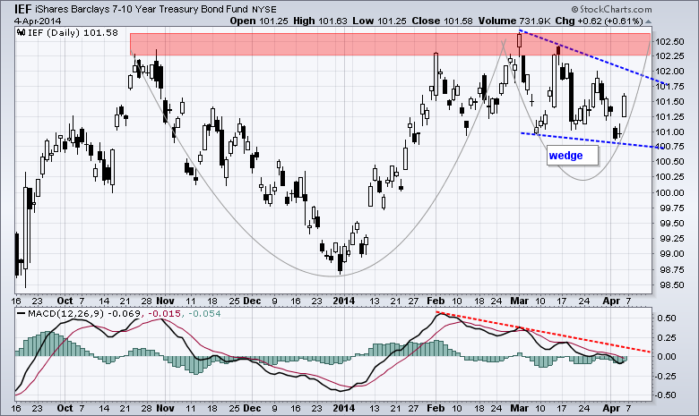
The 7-10 YR T-Bond ETF (IEF) is tracing out two potentially bullish patterns and chartists should watch these patterns for clues on the stock market. The chart below shows IEF hitting resistance in the 102.25-102.5 area and then correcting with a falling wedge. With Friday's big surge, "correcting" could be the key word here because a breakout would signal a continuation of the January advance. Note that stocks were weak when Treasuries advanced in January. Taking a step back, notice that the ETF is also forming a big cup-with-handle, which is a bullish continuation pattern. A break above rim resistance would also be bullish and argue for a move to the 105 area. The height of the cup is added to the breakout zone for a target. The indicator window shows MACD falling just below zero the last few weeks. A break above the red trend line would reverse the downswing in MACD and turn momentum bullish.
Click this image for a live chart
Even though we have yet to see a breakout, note that strength in Treasuries could be negative for stocks for several reasons. First, stocks and Treasuries have been negatively correlated for most of the last five years. Second, money flowing into Treasuries is money that is not available for stocks. Third, Treasuries rise as the outlook for the economy falls. Fourth, strength in Treasuries reflects a certain risk aversion in the market. This risk aversion was reflected in the stock market because small-caps and techs are bearing the brunt of selling pressure on Friday.
Good weekend and good trading!
Arthur Hill, CMT
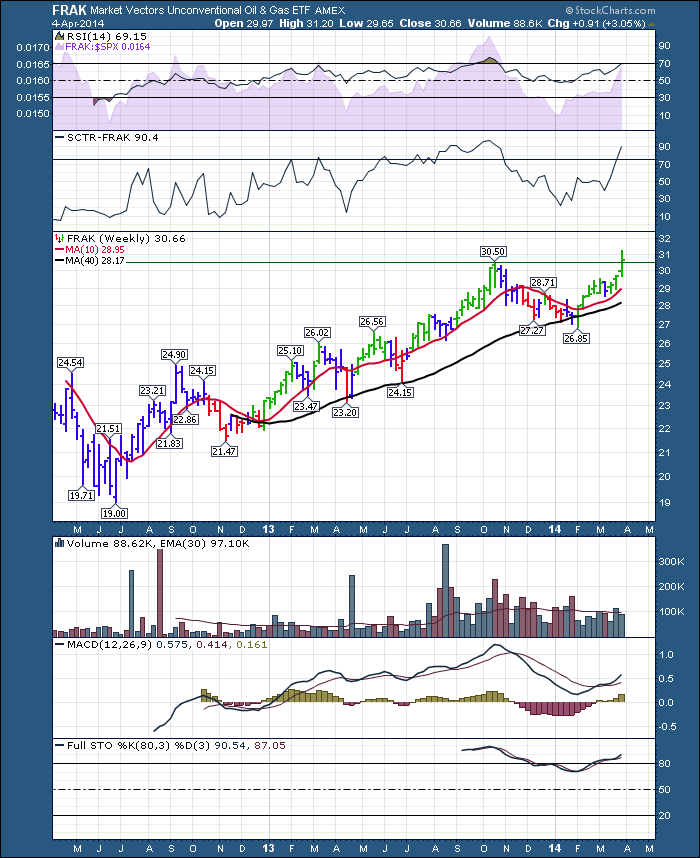
FRAK is an Unconventional Oil and Gas ETF. It spurred up to new 2 year highs this week and closed above the previous high.
- Greg
On any given day we can find a wide range of opinions as to whether the stock market is undervalued or overvalued, and the bases for these assessments are also wide ranging and sometimes overly optimistic. I think a good starting point for estimating value is to use a price to earnings ratio (P/E) based upon twelve-month-trailing “as reported” or GAAP earnings (calculated using Generally Accepted Accounting Principles). I do not assert that this is necessarily the best method, but it is simple, easy to understand, and doesn’t rely on assumptions about future earnings. The normal range for the GAAP P/E ratio is between 10 (undervalued) to 20 (overvalued). The following chart shows the S&P 500 Index in relation to this range.
![Sc[1] Sc[1]](http://d.stockcharts.com/img/articles/2014/04/6a0105370026df970c01a3fce768ae970b-800wi.png)
As you can see the S&P 500 has reached the top of the normal range and is overvalued. This kind of situation doesn’t always lead to disaster, but it tells us at the very least that conditions are not ideal for major new commitments to the long side. A price reversal is possible, but it is also possible that earnings will continue to rise, creating a rational environment for prices to continue higher. The bottom line is that valuations are unfavorable, making the market more vulnerable in this regard.
Watching the windsock,
Carl
P.S. You can also read Erin's latest thoughts about Gold's chart by clicking here
In earlier 2014 articles, I've discussed warning signs that emerged from Volatility indices, behavior in the treasury market, relative weakness of banks and relative strength of defensive areas of the market like utilities and REITs. In addition, the S&P 500 has shown a propensity to struggle during calendar years in which it shows January weakness - and we were very weak in January 2014.
Well, let's add a couple more concerns to this list - one a short-term concern, the other longer-term in nature.
The short-term concern relates to the 60 minute negative divergence that emerged on the S&P 500 as it pushed to an all-time high on Friday morning. Check out this sign of slowing momentum just before the afternoon collapse on Friday:
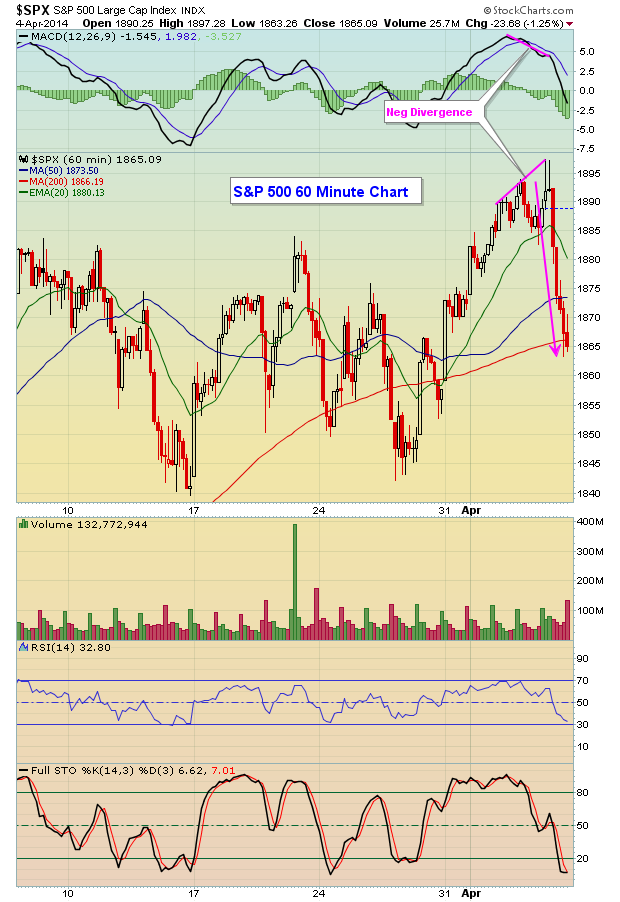
The Dow Jones is not pictured here, but it too had a negative divergence appear on Friday morning as it was challenging major price resistance of 16577 (all-time high close from late 2013).
These are short-term issues. Now for the more troubling problem.
In the consumer area, money has been rotating away from cyclicals and moving into staples. That's a sign of overall market weakness as traders scurry to find safer alternatives. In a bull market, the ratio of cyclicals to staples (XLY:XLP) normally pushes higher as the S&P 500 breaks out. This indicates that traders remain in "risk on: mode and adds to the sustainability of a rally.
Before we look at the current state of consumer stocks, let's rewind back to 2007, just before the last bear market. Check out how the shift in consumer stocks then was a precursor to market weakness ahead:
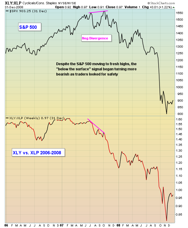
Now fast forward back to where we are today. The S&P 500 just printed a fresh all-time closing high this past week, but the relationship between consumer stocks sent a very strong message to those watching. Money over the past 4-5 weeks has shifted considerably towards the safer consumer staples (XLP) group. In a bull market, we usually see the opposite. Sustainable bull market rallies are accompanied by a strengthening cyclical group (XLY), but that's not the case now. See for yourself:
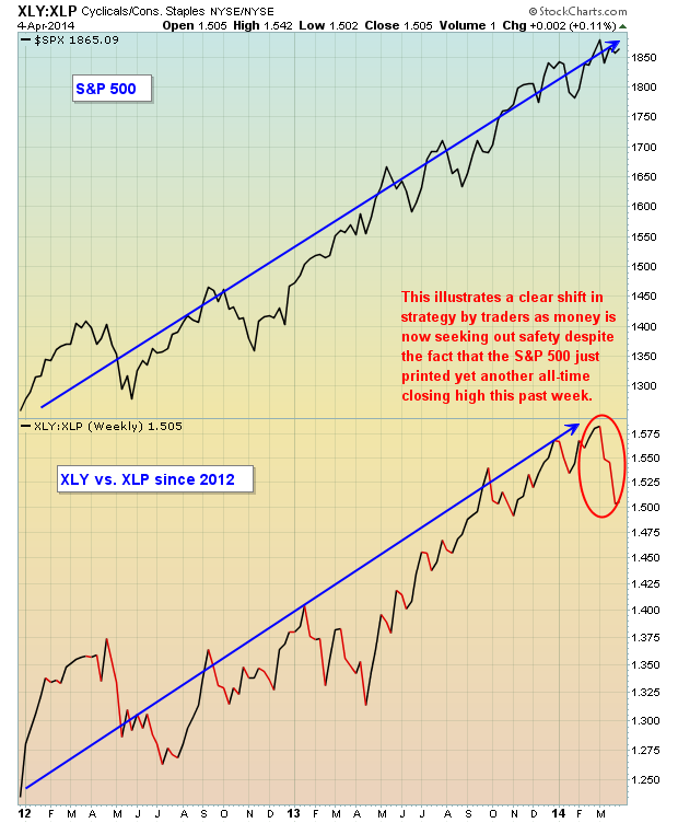
We all have to recognize the changes that have been taking place below the surface of what appears to be a raging bull market. If you simply listen to CNBC, you'll approach the market the same as you have since the start of this five year bull market. But conditions are changing, highlighting the added risk of remaining long equities.
Next Saturday, I plan to discuss some of these market conditions in a 3 hour webinar, in addition to illustrating how finding the best stock candidates using the StockCharts scan engine - on both the long and short side - can benefit your trading results. For more information on this event, CLICK HERE.
Happy trading!
Tom Bowley
Chief Market Strategist/Chief Equity Strategist
Invested Central/EarningsBeats.com


![Sc[1] Sc[1]](http://d.stockcharts.com/img/articles/2014/04/6a0105370026df970c01a3fce768ae970b-800wi.png)


 Trading the markets is basically a solo adventure, and since the markets here in Seattle close at 1:00 PM, it's nice to break bread afterward with other traders and unwind. I thought my readers would enjoy a brief summary of one such spontaneous unscripted discussion at a recent lunch.

