| THIS WEEK'S ARTICLES |
| The Market Message |
| Friday's Selling Suggests that Overbought Stock Pullback has Probably Begun |
| by John Murphy |
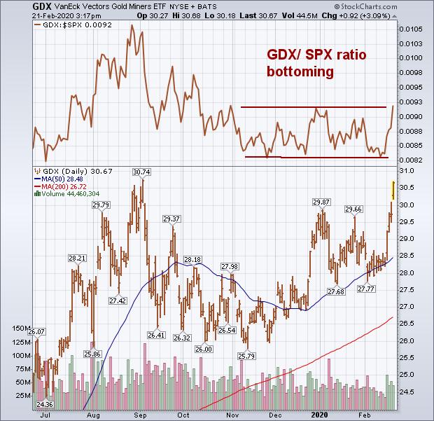
With gold surging again today to another seven-year high, gold miners are having an even stronger day percentage-wise. And are nearing a major upside breakout. Chart 1 shows the VanEck Gold Miners ETF (GDX) trading 3% higher today and nearing a challenge of its early September peak. A close above that high would put the GDX at the highest level in more than three years. An upside breakout is likely with gold leading the way. The GDX/SPX ratio in the upper box appears to be bottoming as well. The recent big buying of gold assets is largely due to the plunge in Treasury bond yields which fell today to lowest level since September. And a flight to safety into Treasury bonds; and defensive stock market sectors like consumer staples, utilities, and REITS.
At the same time, stocks closely tied to the coronavirus like airlines, cruise ships, gaming, and hotels are coming under renewed selling at week's end which suggests that the viral threat to stocks still remains. Technology has gone from the market's strongest sector to its weakest over the past week. That makes sense considering that technology stocks are the most overbought market sector; making them the most vulnerable to a market pullback. Semiconductor stocks heavily influenced by disrupted supply chains in China are leading the tech SPDR lower.
Chart 1
Editor's Note: This is an excerpt of an article that was originally published in John Murphy's Market Message on Friday, February 21st at 3:20pm ET. Click here to read the full article, which includes Charts 2-3.
|
| READ ONLINE → |
|
|
|
| Art's Charts |
Bank ETF Gets a Bounce, but
Falling Yields Could Spoil the Party |
| by Arthur Hill |
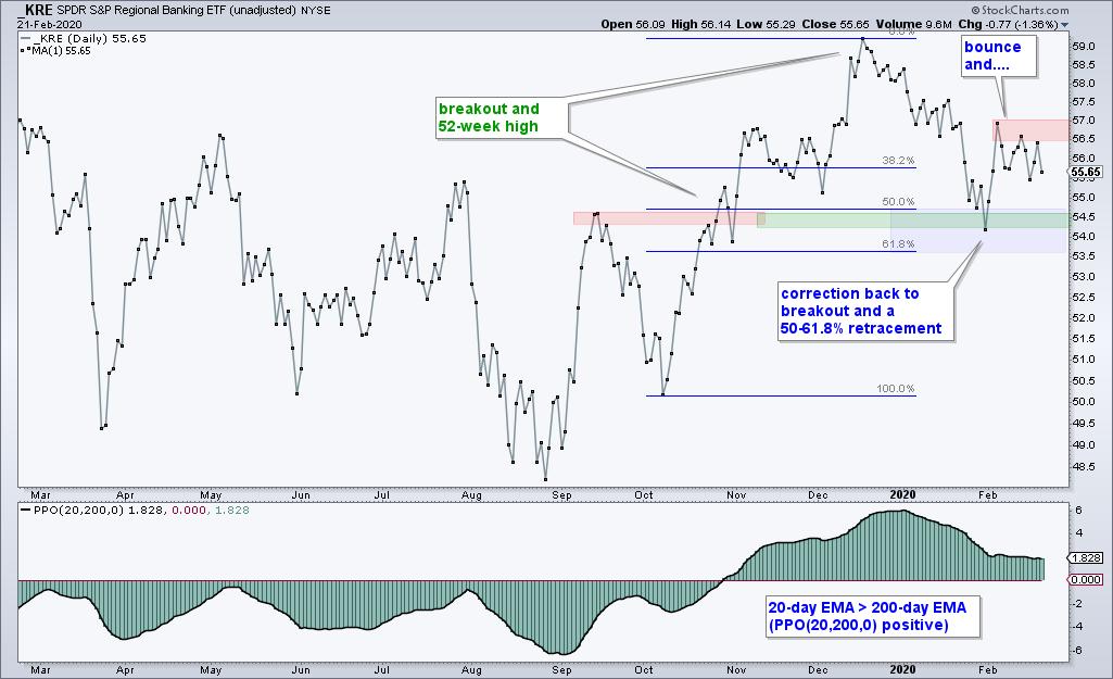
 After falling for over a year, the Regional Bank ETF (KRE) finally got its mojo back in the fourth quarter of 2019 and broke out to new highs. The ETF then became overextended in mid December and fell back to the 200-day SMA here in February. A potentially bullish setup is taking shape, but a positive correlation to the 10 Year Treasury Yield could spoil the setup. Banks are not happy campers with the recent decline in Treasury yields, and this decline is extending. After falling for over a year, the Regional Bank ETF (KRE) finally got its mojo back in the fourth quarter of 2019 and broke out to new highs. The ETF then became overextended in mid December and fell back to the 200-day SMA here in February. A potentially bullish setup is taking shape, but a positive correlation to the 10 Year Treasury Yield could spoil the setup. Banks are not happy campers with the recent decline in Treasury yields, and this decline is extending.
Let's first hit the Regional Bank ETF. The long-term trend is up for three reasons. There was a breakout in late October, the ETF hit a 52-week high in mid December and the PPO(20,200,0) is positive.

After hitting a new high, the ETF fell back to the breakout zone by retracing 50-61.8% of the prior advance. A return to the breakout zone and ~50% retracement are normal for corrections after big advances. Think of it as two steps forward and one step backward. Thus, the correction is a potential bullish setup for the next leg higher.
Even though the long-term trend is up and the pullback looks like a correction, KRE is lagging since mid December and there was NO follow through to the early February bounce. Note that SPY is up over 4% since mid December and KRE is down 6%. Such a big performance discrepancy puts the onus on the bulls to prove the bears wrong here in 2020. A breakout at 57 would show follow through and put the bulls back in control.
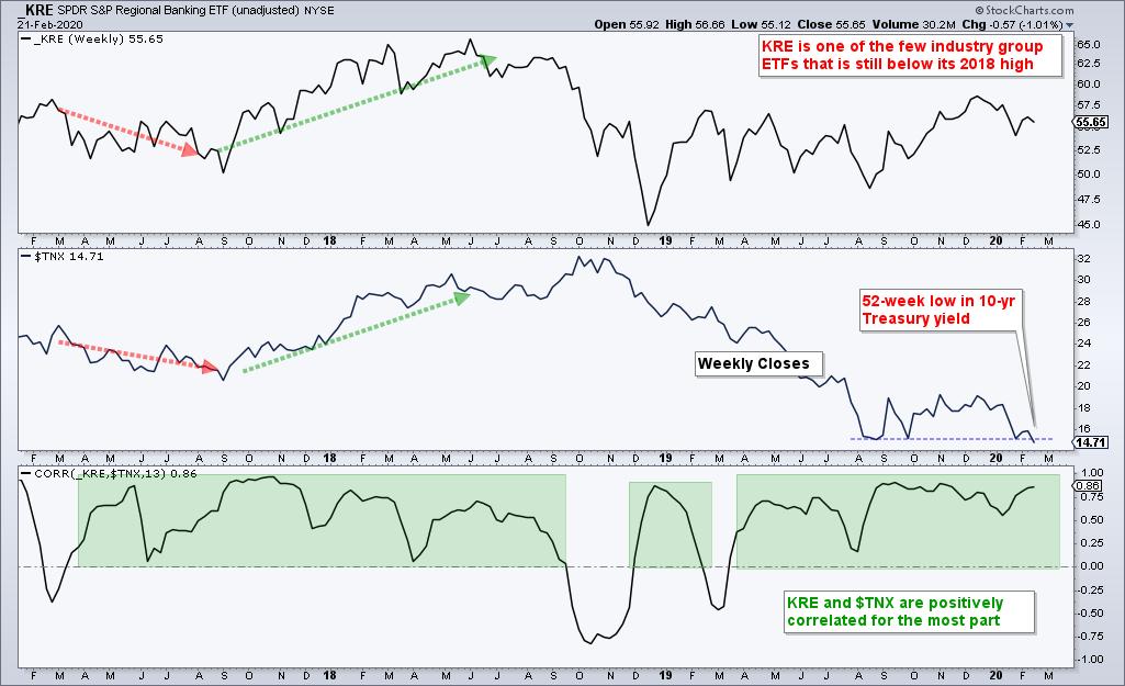
The decline and new low in the 10-yr Treasury Yield ($TNX) is also a concern for banking stocks. $TNX fell below 1.5% (15 on the chart) and closed at its lowest level since June 2016. It is clearly a bear market in Treasury yields, and a bull market in Treasury bonds.

The indicator window shows the 13-week Correlation Coefficient spending most of its time in positive territory. This means KRE and $TNX tend to move in the same direction. This also suggests that a new low in the 10-yr yield is negative for KRE. Nevertheless, keep an eye on the KRE chart because relationships are subject to change. Note that the Dollar and Gold are now positively correlated. Returning to the business at hand, a breakout at 57 in KRE would still be bullish. The Bank SPDR (KBE) sports a similar chart setup.
KRE and KBE are part of 60 ETFs in the Core ETF ChartList at TrendInvestorPro.com. Subscribe today for immediate access to the following: weekly ETF report, ETF ranking tables, market timing models, ETF ChartBook, weekend video, Saturday stock setups and more.
Click here to take your charting to the next level!
----------------------
|
| READ ONLINE → |
|
|
|
| The Canadian Technician |
| The Roaring 20's |
| by Greg Schnell |
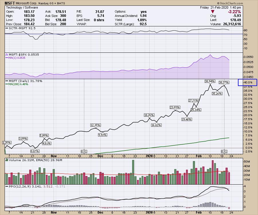
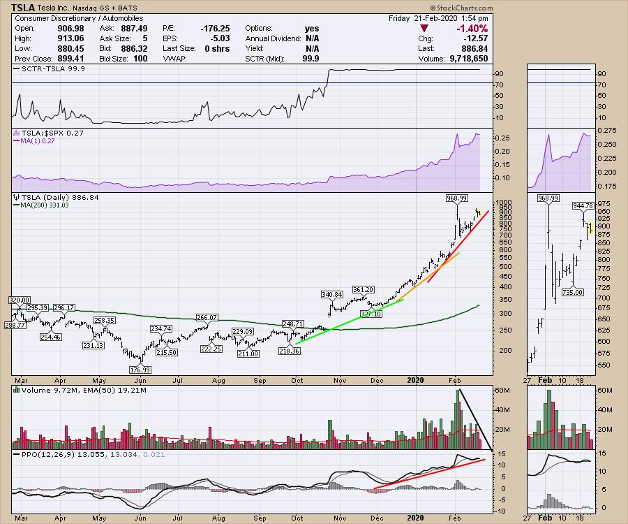
It has been an unbelievable run in the large-cap tech stocks, as the portfolio managers have been moving their bets into a smaller and smaller circle of names. After what could only be described as euphoria, 10% annual growers have had their stocks wildly bid. To start, Microsoft (MSFT) stock is up almost 40% from the October lows. After testing prior highs earlier this week, it looks like Mr. Softie is taking a few days off.

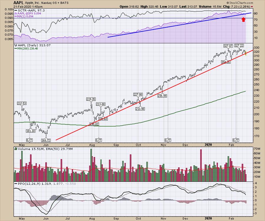
Apple (AAPL) is breaking the trend line in price and relative strength (purple area chart) compared to the S&P 500 for the first time since the rally started.

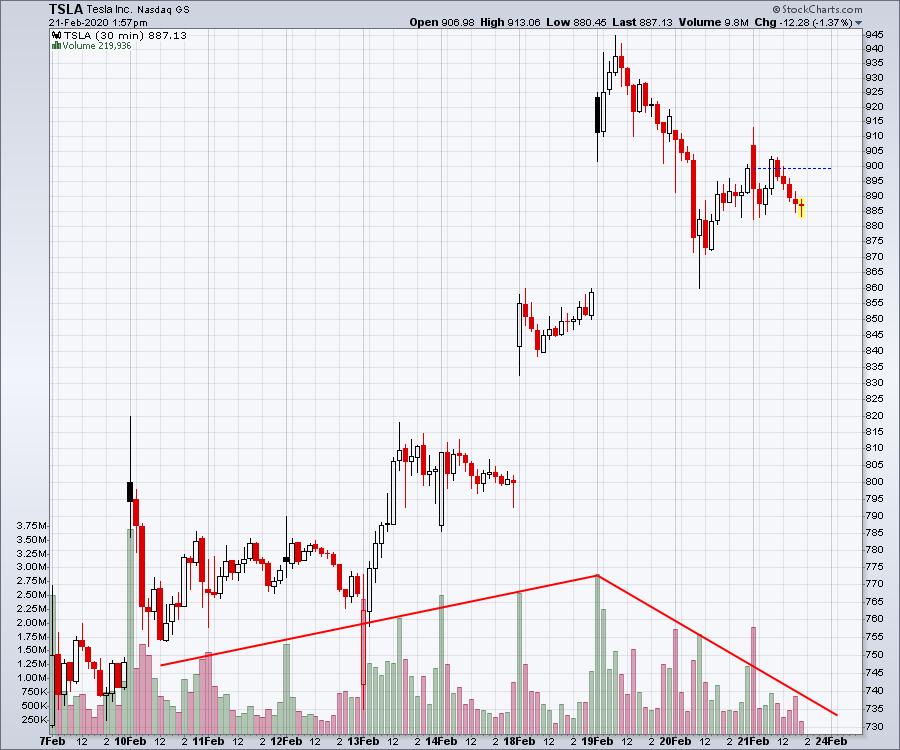
The Nasdaq 100 (an umbrella name for the Nasdaq top 10) is also letting go. But perhaps the bigger story might be the double top forming in the world's latest parabola.

You may prefer the 30-minute view. The declining volume on the retest of the high is an excellent warning sign that we are running out of investors at these highs. Trying to call the top in a parabola is never easy. Figure out a way to keep your gains! The dates on the chart below are all after the original spike high. This is just examining the retest of the highs.

Good luck out there - the euphoria is tremendous, but, I might suggest, a breather is coming, with today being Options Expiration day.
|
| READ ONLINE → |
|
|
|
| The Traders Journal |
| The Straightforward Secret To Outperforming The 11 Sector SPDR ETFs |
| by Gatis Roze |

There is no shortage of academic papers to validate the paramount importance of accurate sector analysis in producing market beating results. My own three decades of experience confirms this. Simply put, SECTORS MATTER! I was recently given the opportunity to attend a presentation by sector guru and strategist Denise Chisholm of Fidelity. I'm pleased to report that her presentation exceeded my expectations. The following is just some of the wisdom and insights she disclosed.
The present market is divided into 11 sectors that we're all familiar with — Technology (XLK), Utilities (XLU), Financials (XLF) and so on. What Denise Chisholm explained is that a number of these are too large and contain odd bedfellows (my words!). For example, Healthcare (XLV) contains both Big Pharma companies such as Johnson & Johnson (JNJ) and HMOs such as Unitedhealth Group (UNH). Similarly, she pointed out that Industrials (XLI) contain both Caterpillar (CAT) and Waste Management (WM). Both examples show how very different businesses are somewhat unnaturally clustered in the same sector. Herein lies the opportunity for us individual investors.
Over the past 12 months, the Healthcare sector (XLV) has produced a return of 17%. If, however, one is willing to unbundle Healthcare into, say, three sectors as represented by the Fidelity Select Sector Funds, we bump our returns by 72% for Pharmaceuticals (FPHAX), by 39% for Medical Technology & Devices (FSMEX), and by 31% for Biotechnology (FBIOX). I don't know about your portfolio, but I'm very receptive to that sort of outperformance.
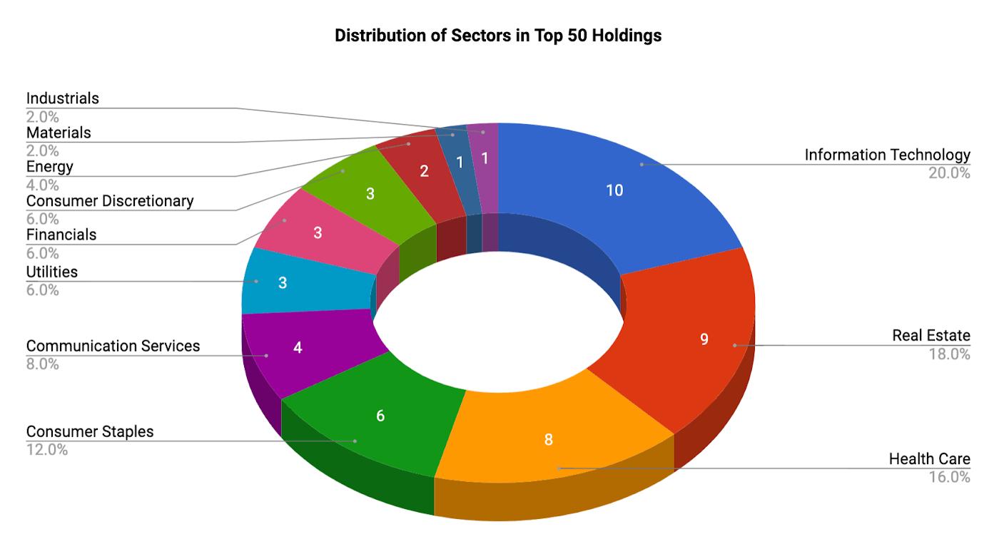
This reality exists for many of the other eleven Sector SPDRs as well. And it is precisely why the Tensile Trading ChartPack has included these Fidelity No-Load Sector Funds for many years. Fidelity has wisely subdivided the eleven Sector SPDR ETF universe into a more representative group of 43 Sector Funds. In the ChartPack, Grayson and I take it one step further each quarter by updating the top ten stocks held by each of these 43 Sector Funds.
So, let's recap. The Healthcare Sector SPDR ETF (XLV) was up 17.1% for the past 12 months. The Fidelity Select Sector Pharmaceuticals Fund (FPHAX) was up 29.42%. Within that fund, one of its ten largest holdings — Zoetis (ZTS) — was up 59.6%. So each quarter, the ChartPack gets you there in just three mouse clicks! Put the probabilities to work for you and put profits in your pocket.
For myself, the takeaway from Denise Chisholm's excellent presentation is that for those individual investors willing to unbundle the eleven SPDR Sector ETFs into more representative groups, the outperformance is significant. We can debate whether it should be 43 Sectors or something less, but it's clear that Sector Analysis matters big time. Your personal Sector Scoreboard needs to be part of your investment routines. You can formulate your own or just use the ChartLists in our ChartPack. Either way, you profit mightily from your additional focus on sectors because, as we know, the markets big money ebbs and flows amongst key sectors. Follow the money flows!
March 21: "Mastering The Stock Market At All Ages"
Next month, Grayson and I will be presenting in Los Angeles to the AAII about "Mastering The Stock Market At All Ages". In this special event, we're taking over for a full morning (9:00am - noon) with three mini presentations designed to bring young and older investors together into the same room. We'll share how we manage our money, how we invest both separately and together, and discuss the most important lessons that we've learned as a father-son investing team with over 45 years of combined experience.
For more information about the event or to register, CLICK HERE.
|
| READ ONLINE → |
|
|
|
| DecisionPoint |
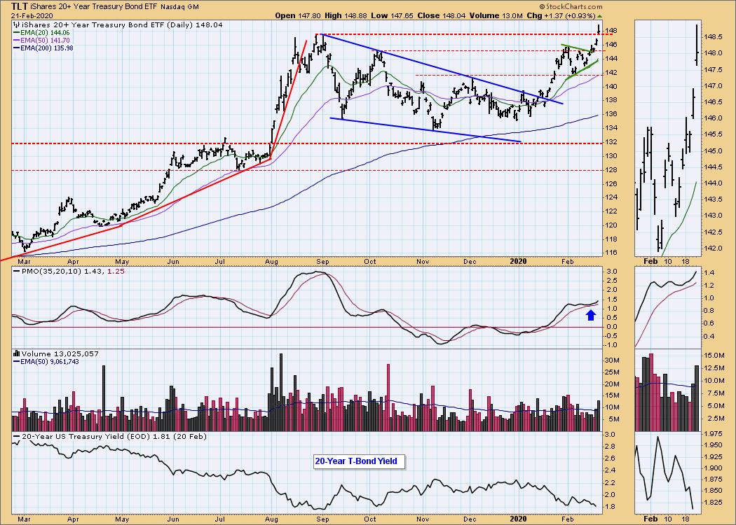
| 20+ Year Treasury Bond ETF (TLT) Breaks Out to New All-Time Highs |
| by Erin Swenlin |
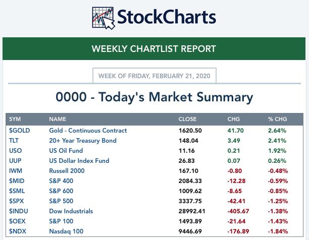
This week's big winners were $GOLD and TLT, though the Dollar also did fairly well. Carl will be writing about these three (as well as Oil) in this week's edition of the "DecisionPoint Weekly Wrap" on DecisionPoint.com (We would love to have you come see our website and sign up for our free email list). As I write the DP Alert daily edition and have been watching and writing about TLT for some time, I thought I would share my insight, given the very successful week and now the new all-time highs for TLT.


As investors, we want to accomplish two basic things: (1) determine the trend and condition of the market, and (2) select stocks that will ride that tide. The DecisionPoint Alert helps with the first step; DecisionPoint Diamonds helps with the second. Go to DecisionPoint.com and SUBSCRIBE TODAY! (Charter Subscriber Discounts available!)
It took many months for TLT to form a textbook falling wedge. These are bullish patterns and the expectation is for a breakout. The breakout was prefaced by a PMO BUY signal in oversold territory. Price broke out just as the 20-EMA was crossing above the 50-EMA, which generated an IT Trend Model BUY signal. The breakout rally stalled at the October top, but formed a symmetrical triangle which is a continuation pattern, meaning you should expect the trend that formed before to "continue." In this case, it was a rising trend. While I had expected the breakout, I didn't expect to see such a strong charge. Today, price popped above the August top on high volume. The PMO avoided a SELL signal and is now rising; it is moderately overbought and certainly has room to move higher before hitting overbought extremes.

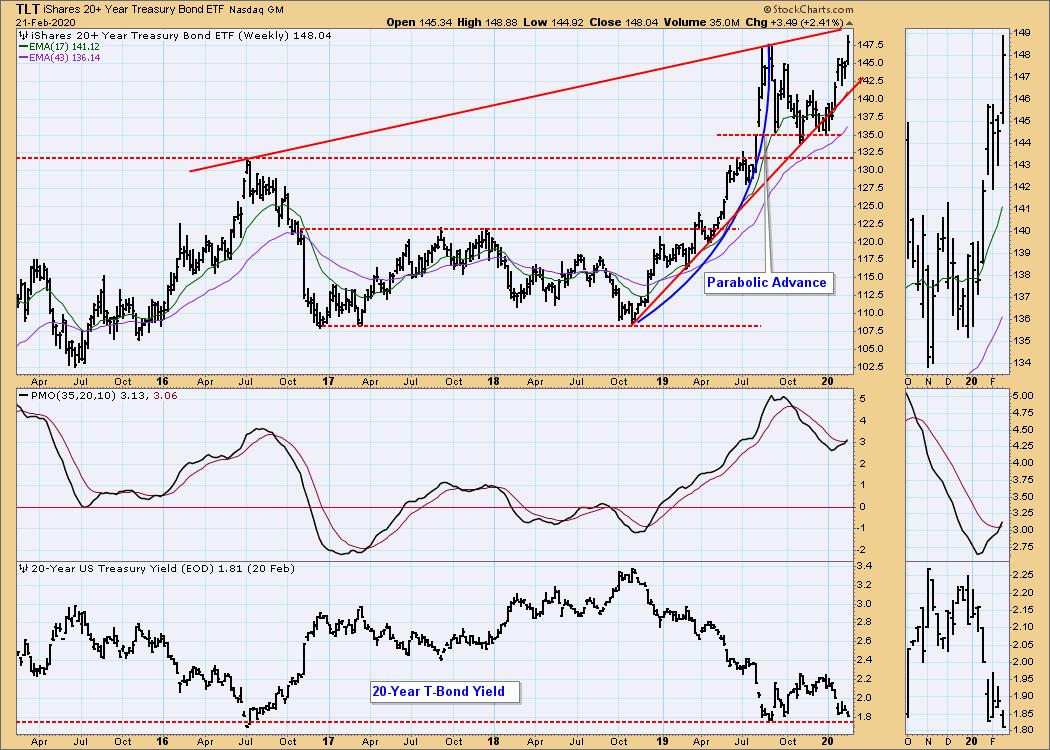
Below is the weekly chart. We saw parabolic advance break down. While it could have fallen down to the consolidation zone from 2017-19, it managed to build support just above the 2016 high. The weekly PMO triggered a BUY signal this week, which also suggests higher prices.

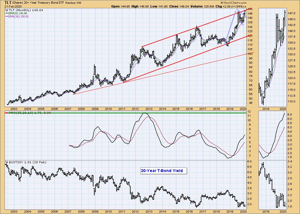
The monthly chart accentuates a bull flag. The flagpole looks less parabolic on the monthly chart and the pullback formed the flag. We have broken out of it. The monthly PMO also looks very bullish, as it is rising strongly and is not overbought.

Conclusion: Today's breakout move looks great and the indicators are lining up to tell us we should continue to see strength here. The monthly chart does show that price is up against the top of a long-term rising trend channel, but momentum is very positive, which suggests to me that it will likely stay in that rising trend channel for some time to come. If you haven't seen our new website DecisionPoint.com, I invite you to come check it out and sign up for our free email newsletter! You'll find free material and workshop links on the left-side of the "Blogs and Links" page.
Technical Analysis is a windsock, not a crystal ball.
Happy Charting! - Erin
Email: erin@decisionpoint.com

Erin Swenlin will be presenting at the The MoneyShow Las Vegas May 11-13, 2020! You'll have an opportunity to meet Erin and discuss the latest DecisionPoint news and Diamond Scans. The conference is free to attend or view online!
Helpful DecisionPoint Links (Can Be Found on DecisionPoint.com Links Page):
Erin's PMO Scan
DecisionPoint Shared ChartList and DecisionPoint Chart Gallery
Trend Models
Price Momentum Oscillator (PMO)
On Balance Volume
Swenlin Trading Oscillators (STO-B and STO-V)
ITBM and ITVM
SCTR Ranking
|
| READ ONLINE → |
|
|
|
|
|
| ChartWatchers |
| Don't Buy a Stock Like This Heading into Earnings |
| by John Hopkins |
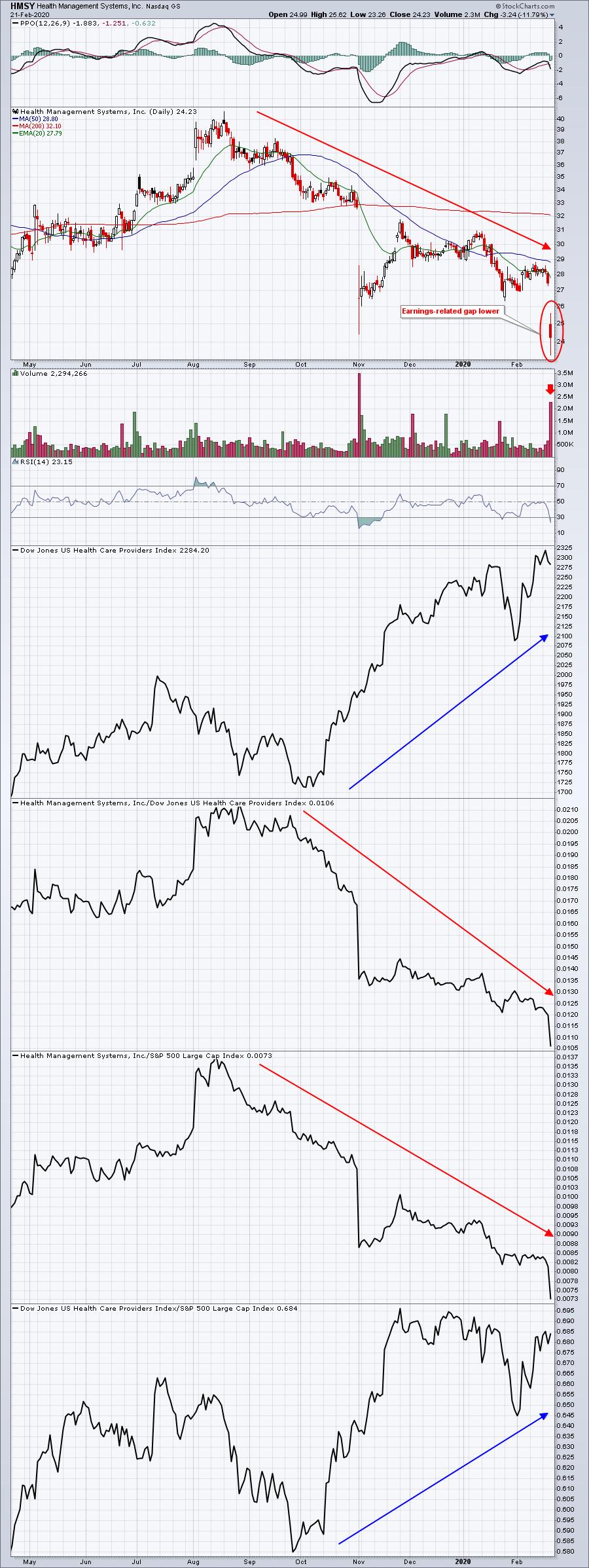
Earnings season has come and (mostly) gone, with all of the major companies reporting Q4 numbers. The consensus is that, overall, earnings were strong, as witnessed by record levels in the market. But there were also companies that came up short that had charts showing warning signs, one of them being Health Management Systems, Inc. (HMSY), which got slammed when they reported their numbers the end of last week.

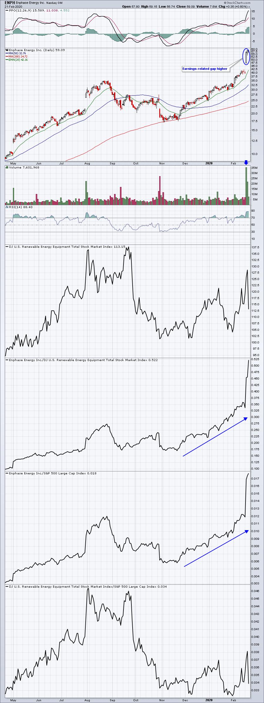
The warning signs were clear, with the stock heading down non-stop while the rest of the market was riding high. There was nothing on the chart saying "buy me" going into the earnings report.
On the flip side of the scale was Enphase Energy, Inc. (ENPH). Just look at the chart, which shows the stock was going along for the ride with the rest of the market just ahead of its report. And talk about Relative Strength!

Generally, we avoid getting involved in stocks ahead of earnings reports. However, we know there are a lot of traders who like the opportunity to participate in stocks just before they report. In fact, we've started a new feature at EarningsBeats.com where we'll be looking at companies about to report (the day before) and will provide members with those that look solid on a relative basis heading into earnings. In other words, looking for stocks like ENPH that could be setting up for a nice move higher once they report. This will be a members-only feature, so if you aren't already an EarningsBeats.com member, just click here and you can sign up for a 30-day trial for NO COST.
At your service,
John Hopkins
EarningsBeats.com
|
| READ ONLINE → |
|
|
|
|
|
| MORE ARTICLES → |
|


 After falling for over a year, the Regional Bank ETF (KRE) finally got its mojo back in the fourth quarter of 2019 and broke out to new highs. The ETF then became overextended in mid December and fell back to the 200-day SMA here in February. A potentially bullish setup is taking shape, but a positive correlation to the 10 Year Treasury Yield could spoil the setup. Banks are not happy campers with the recent decline in Treasury yields, and this decline is extending.