| THIS WEEK'S ARTICLES |
| Market Roundup |
| Commodity Indexes Reach Important Breakout Points |
| by Martin Pring |
The Stock Market is Forecasting Higher Commodity Prices
[One big] thing going positive for commodities is my Inflation/Deflation ratio. This series pits equities sensitive to swings in commodity prices, such as natural resource stocks, to those that do better when interest rates are falling, such as utilities, consumer staples, etc. The arrows show that this stock market relationship has a good track record of forecasting major turning points for commodities. Consequently, its recent sharp rally is a strong omen in favor of forthcoming strength in the commodity pits - but what of commodities themselves?
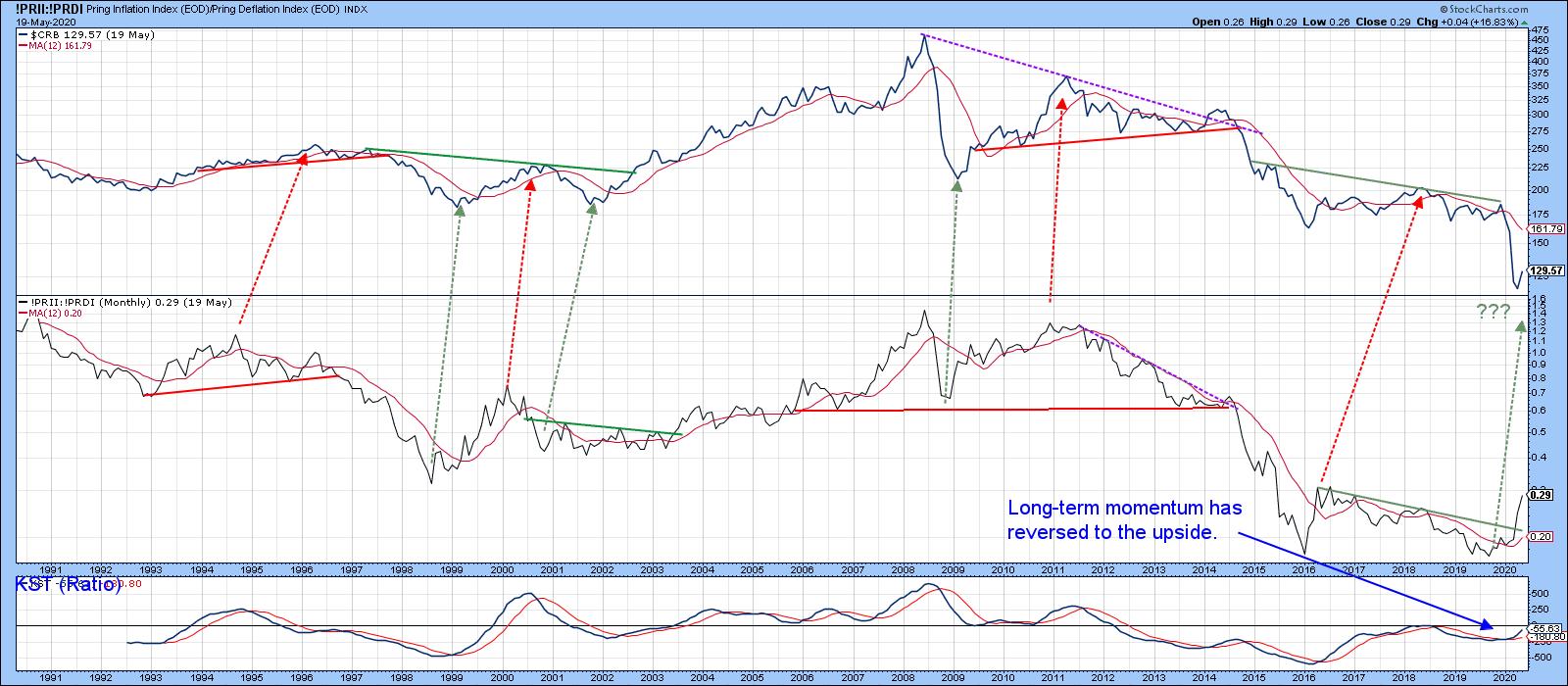 Chart 3 Chart 3
Commodities on the Verge of a Breakout
Chart 4 reveals the very long-term technical position, where we can see a break below the red support trendline. There are many ways that the line could be constructed, but they would all have been violated. The one drawn in the chart makes sense, because it touches or approaches six declines and, importantly, intersects with the 12-month MA. It therefore represents a very significant barrier (resistance) to upside progress. There is obviously a lot to reverse here, so when I talk about a commodity rally, I am referring to a move that attempts to regain lost ground following the breakdown point at around 160, rather than something more ambitious.
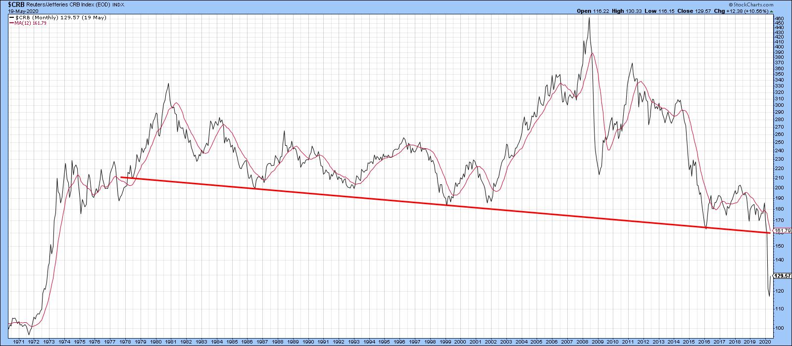 Chart 4 Chart 4
The starting point is Chart 5, which indicates that the Index is in the process of breaking above the horizontal resistance trendline. A breakout is a breakout, but the chart looks as though some additional re-accumulation may be required, as a right shoulder completion would result in a stronger foundation from which a rally could be launched. Also, gaps are usually closed and there is a noticeable one that developed between Friday and Monday.
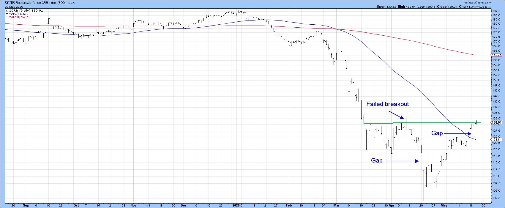 Chart 5 Chart 5
We see the same thing in Chart 6, featuring the DB Commodity ETF (DBC) and the Bloomberg Commodity ETN (DJP).
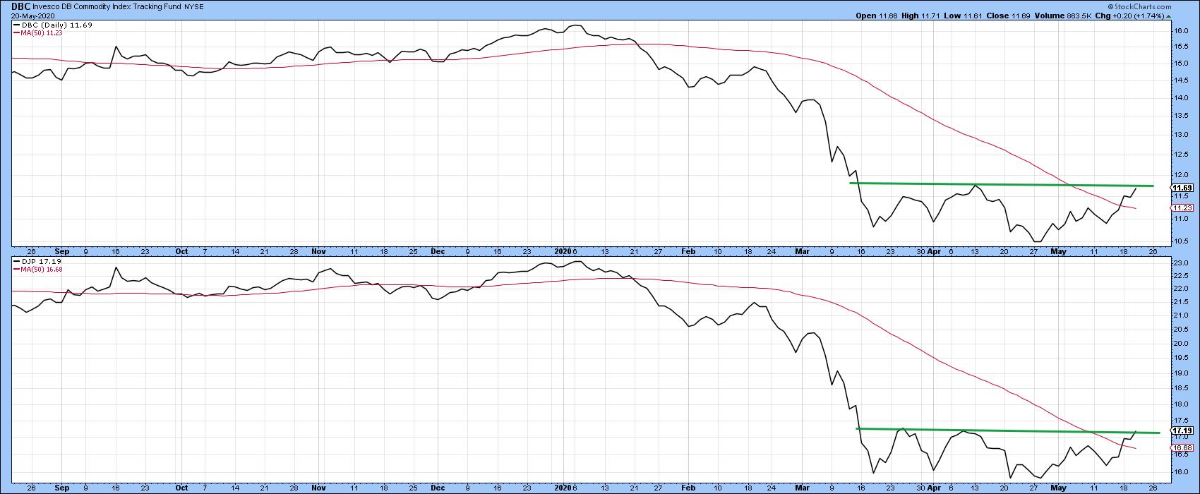 Chart 6 Chart 6
Three important commodity sub-components, the DB Energy (DBE), DB Base Metals (DBB) and Agriculture (DBA) are plotted in Chart 7, where three more potential bases are revealed. Base metals are worth watching because they appear to be the first that are emerging from their recent trading range, and, therefore, leading the way.
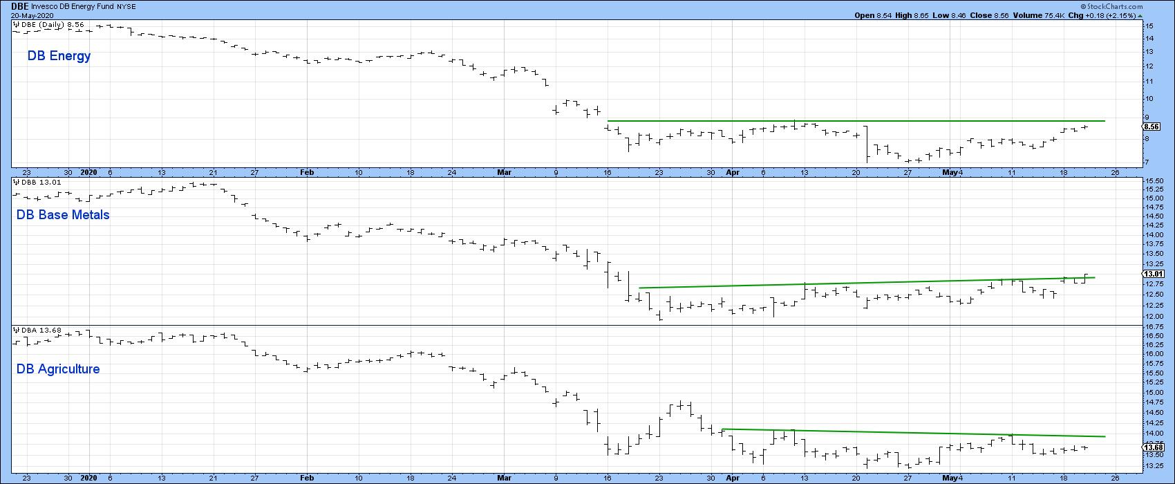 Chart 7 Chart 7
Editor's Note: This is an excerpt of an article that was originally published in Martin Pring's Market Roundup on Thursday, May 21st at 12:15pm ET. Click here to read the full article, which includes Charts 1-2 and 8 plus a discussion of Gold and the Oil VIX.
Good luck and good charting,
Martin J. Pring
The views expressed in this article are those of the author and do not necessarily reflect the position or opinion of Pring Turner Capital Group of Walnut Creek or its affiliates.
|
| READ ONLINE → |
|
|
|
|
|
| The Mindful Investor |
| Limited-Time Offer on Consumer Discretionary |
| by David Keller |
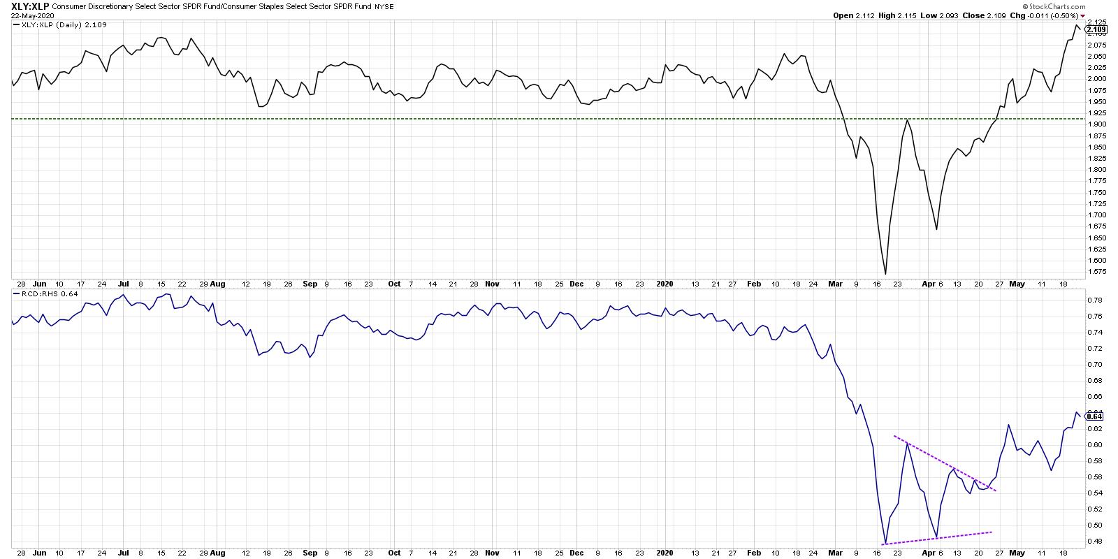
One of my favorite ratios to track offense vs. defense within the equity markets is the Consumer Discretionary sector (XLY) divided by the Consumer Staples sector (XLP). But a look under the hood shares narrow leadership and questionable upside.
Below, we see the S&P 500 ETF along with the ratio of Consumer Discretionary vs. Consumer Staples.

When this ratio is increasing, the assumption is that institutions are rotating more to the offense, like retailers, luxury goods and discretionary purchases. When the ratio turns lower, you can assume that investors are moving more toward traditional defense like beverages and household goods.
The ratio bottomed out before the market low in mid-March and broke to an important new swing high in late April. The last week saw this ratio finally break above its February high, confirming a broad move into Consumer Discretionary.
But does it really suggest a broad move?
The chart of the XLY drives home the relative outperformance of this traditionally offensive sector, with the relative strength line threatening to find a new 52-week high. It's also important to note that, while the S&P 500 has yet to break above its 200-day moving average, the XLY settled into a range below its 200-day in late April and subsequently broke to new swing high, with a gap higher this week.
While on the surface this all seems very constructive, here are some additional charts to perhaps damper the rampant optimism a bit.
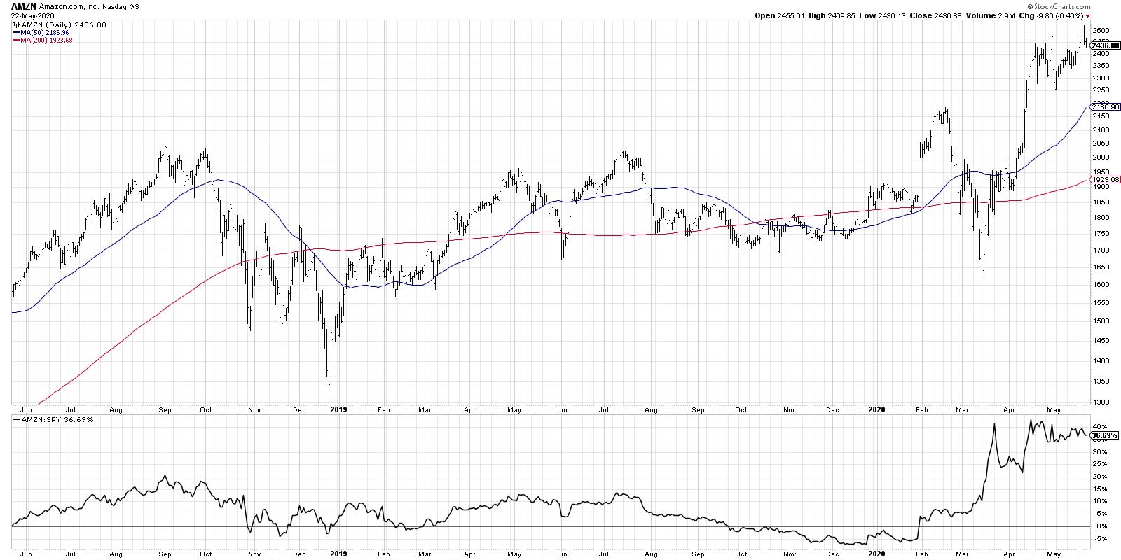
First, Amazon (AMZN) is a huge weight in the Consumer Discretionary ETF, comprising about 24% of the sector. So, when the chart of AMZN looks like this, chances are the sector as a whole will be doing quite well based purely on this one stock.
 Home Depot (HD) is the second largest stock in the sector and makes up another 13% of the weight. So, with that chart also testing new 52-week highs, we have two mega-cap names with outsized weights making outsized gains. Home Depot (HD) is the second largest stock in the sector and makes up another 13% of the weight. So, with that chart also testing new 52-week highs, we have two mega-cap names with outsized weights making outsized gains.
 Second, while the cap-weighted ratio is indeed breaking out, the equal-weighted ratio (using the ETFs RCD and RHS) is well below its 2020 highs. While it is indeed in an uptrend of higher highs and higher lows, it's not as bullishly configured as the cap-weighted version. Second, while the cap-weighted ratio is indeed breaking out, the equal-weighted ratio (using the ETFs RCD and RHS) is well below its 2020 highs. While it is indeed in an uptrend of higher highs and higher lows, it's not as bullishly configured as the cap-weighted version.

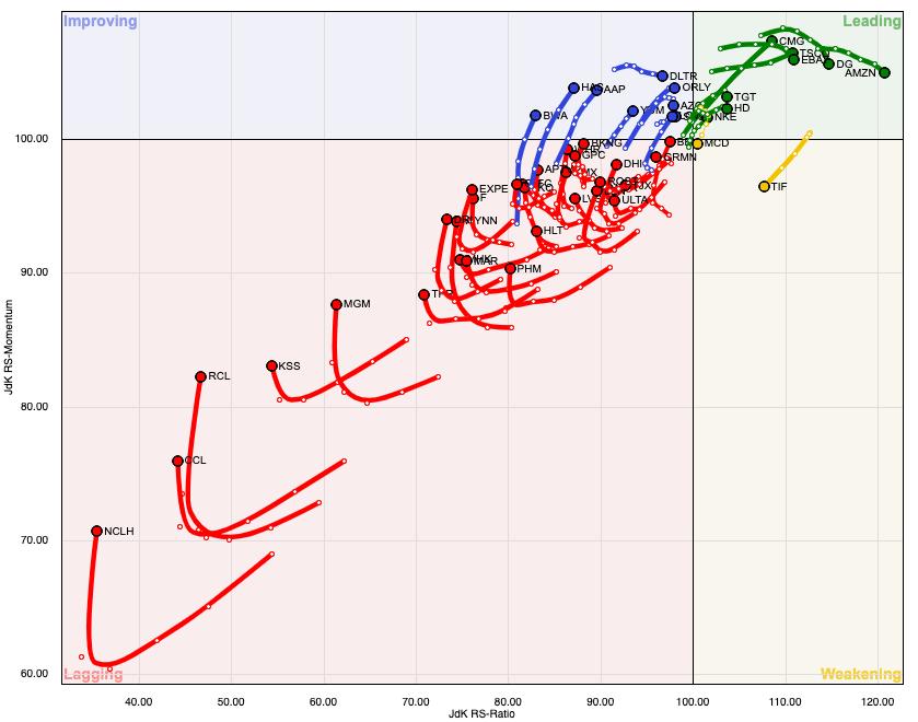
Finally, the Relative Rotation Graph below shows how beaten-down parts of the sector have become. While AMZN appears to be the strongest name according to this methodology, the center point is southwest of the zero line, suggesting the average name has been underperforming the S&P 500. While many of the stocks in the sector have rotated in a more positive direction, much of the sector remains in the Lagging quadrant.

The Consumer Discretionary sector has indeed shown signs of strength at the top level. But an analysis of the stocks that comprise this sector suggest that, without a few key mega-cap names in strong uptrends, the sector may start looking a lot less attractive right about now.
RR#6,
Dave
David Keller, CMT
Chief Market Strategist
StockCharts.com
Disclaimer: This blog is for educational purposes only and should not be construed as financial advice. The ideas and strategies should never be used without first assessing your own personal and financial situation or without consulting a financial professional.
The author does not have a position in mentioned securities at the time of publication. Any opinions expressed herein are solely those of the author and do not in any way represent the views or opinions of any other person or entity.
|
| READ ONLINE → |
|
|
|
| Trading Places |
| How I Scan ChartLists For High Profit Trades |
| by Tom Bowley |
I have a routine that I've implemented where I typically review market action around 10:00am ET, 30 minutes after the market has opened. It's not at all unusual to see uptrending stocks down in the morning, so running scans at about that 30-minute mark can generate very profitable trading ideas. Before I get to this point, however, I need to have already done my homework in setting up ChartLists to organize everything and save myself valuable time. Here are 2 key steps to consider in developing your own routine and improving your trading results:
Establishing Watchlists
I have my own watchlists set up and maintained constantly. I use various ChartLists to organize my "homework." As a former practicing CPA, I value companies that execute their business plans. For me, that involves beating quarterly revenue and EPS estimates. That's what Wall Street expects. If you're going to attract their dollars and their clients' dollars, you need to provide evidence that you're worth their investment. Falling short of expectations is no way to do that.
So my first ChartList is my Strong Earnings ChartList (SECL). Use whatever source you like to obtain earnings information, but I prefer Zacks. Every day, I scour the earnings reports and see which companies have beaten Wall Street consensus estimates as to both revenues and earnings per share (EPS). If those companies also are liquid (average trading 200,000 shares a day or more) and look solid technically (show relative strength vs. their peers, and the benchmark S&P 500 and also appear to be trending higher), then I include them in my SECL. I'll briefly annotate a couple of support/resistance lines that I want to watch. That way, I don't forget about a company and then see it 30% higher two weeks later and say "oh yeah, I remember looking at that stock!" ChartLists keep you organized, save your homework and prepare you for that upcoming winning trade.
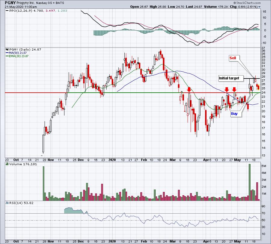
Let me give you an example of how I use the ChartList. I'm a fan of health care stocks because they've been leading the market higher since the March 23rd low - and even prior to that. Progyny (PGNY), a health care provider, posted earnings results on May 12th. It had closed at 20.49 prior to reporting its results. After posting revenues of $81.02 million (which easily beat estimates of $72.78 million), as well as EPS of $.04 (quadrupling the expected $.01), PGNY gapped higher and opened at 25.05. Prior price resistance was easily identified by three prior tops from 23.95-24.05. I didn't want to chase PGNY at its opening price, but I had identified two key support levels - the 23.95-24.05 price support and gap support all the way back down at 20.49. In between those two levels was the rising 20-day EMA, which, at that time, was slightly above 22.00. On May 14th, I had pulled up my SECL and viewed it in Summary form and by health care stocks. I saw that PGNY was trading down, so I placed my initial order to buy at 24.05. It executed that afternoon. My strategy was to buy PGNY at 3 levels - first at price support, next at the rising 20-day EMA, and finally at gap support. Only my initial entry triggered, but I quickly was able to take a nice profit (albeit on fewer shares) at the post-earnings high at 27.49 two days after entering the trade. It turned out to be a 14% winner in two trading days. Here's a look at the chart:

The key point here is that, without doing my homework and then using the ChartList feature, this trade opportunity would likely have been missed.
Scanning ChartLists
When I'm asked what my favorite tools and features are at StockCharts.com, I do not hesitate. For me, it's definitely the scan engine and the ChartLists. So, being able to marry the two is absolutely essential to my trading strategy. I encourage every one of our EarningsBeats.com members to subscribe to StockCharts.com at the Extra level or above for one simple reason: as an Extra member, you can save up to 250 ChartLists. This feature is worth the upgrade from Basic in order to be able to organize your "homework" into different ChartLists.
I had a WebinAR (WAR) Room session, which was open to the public, on Friday morning to show how I put together my ChartLists and how I scan against them. I'd be happy to share it with you. You can CLICK HERE to watch our video at YouTube. Be sure to subscribe to our YouTube channel while you're there. :-)
Happy trading!
Tom
|
| READ ONLINE → |
|
|
|
| RRG Charts |
| Sector BETA Can Help You with General Market Direction |
| by Julius de Kempenaer |

Some time ago, I started to play around with BETA as a metric to gauge risk appetite for sectors, then went from there to the general market. If you search for BETA in ChartSchool you will find this entry:
Beta: A measure of a security's systematic or market risk. While most stocks move in the same direction as the stock market, the level of the beta indicates the degree of correlation between a security and the market. The market is the benchmark and has a beta of 1.
A more explanatory article can be found at Investopedia: What BETA Means When Considering a Stock's Risk.
Basically, it comes down to the interpretation of stocks, with a BETA > 1 being more volatile, and, in general, these are the stocks that do well in a rising market when investors usually have a bigger risk appetite. This is as opposed to stocks with BETA < 1, which are sought after when the market declines or uncertainty (=risk) hits the markets.
What we can do for individual stocks, we can also do for sectors. So what I did was set up a spreadsheet (drop me a message if you'd like a copy) that enables you to calculate the rolling BETA for all eleven sectors and rank them based on the results. When you play around with various periodicities, 12-month, 36-month, etc), you will find that the ranking changes. Thus, the the average volatility for sectors (and thus stocks) varies over time.
The most pronounced change that I have found is for the Technology sector.
60-Months
Here are the BETAs and the ranking for a 60-month period:

Technology is here just above 1, at 1.03.
36-Months
When we then switch to a 36-month period, the ranking looks like this:

Tech has already come down to almost 1, at a 1.01 reading.
12-Months
At 12-months, this is what it looks like:

Technology has now dropped, significantly, below 1 at a reading of 0.93.
3-Months
But things get really interesting when you look at a 3-month period.

Technology is now down at 0.88, which puts it well inside the lower part of the ranking, just above the three traditionally (and widely accepted as such) defensive sectors. This observation led me to write this article: Technology Emerging as a Defensive Sector? Here are a Few Stocks to Watch.
Also, note how Real-Estate crawled up on the list with a 60-month BETA at 0.76 and 3-month at 0.99.
Ultimately, you want to look on how these BETAs for various periods evolve over time - that's work in progress!
What About the Current Status?

The current rotation on the Relative Rotation Graph shows the low (< 1) BETA sectors at the right side of the RRG and the high BETA sectors at the left hand side.
BUT... a change in rotation seems to be underway. The low BETA sectors are almost all rolling over or already heading lower at the JdK RS-Momentum scale and picking up negative movement on the JdK RS-Ratio scale, while the high-BETA sectors are curling up and starting to rotate to a positive RRG-Heading.
It's the early stages, with the Energy sector in particular being very far away from crossing over to the right hand side, but the emerging rotation is definitely worth keeping an eye on.
Here's what we get when we switch to the daily RRG with the same BETA labels:

We can see that the sectors inside the weakening quadrant are all low BETA sectors, which have all curled up in the past week while XLK and XLC, both inside leading and low BETA, are rolling over.
It's for sure not the holy grail, but (imho) it is worth keeping an eye on to see if it can help us gauge the direction of the general market ($SPX).

As always, the proof is in the pudding. For the time being, I am watching the recent trading range in $SPX, with the lower boundary at 2765 and the upper boundary at 2980. With the current emerging rotation in favor of high(er) BETA sectors, I am expecting an upward break out of that range, which will serve as the trigger for that rotation to continue.
The next level to watch after such a break would be 3150.
Here's the video for this week's Sector Spotlight, including the segment discussing the use of BETA for sectors.
Sector Spotlight #31 (5/19) segment on use of BETA (13:19)
Stay Tuned and #StaySafe,
--Julius
My regular blog is the RRG Charts blog. If you would like to receive a notification when a new article is published there, simply "Subscribe" with your email address.
|
| READ ONLINE → |
|
|
|
| The MEM Edge |
| One Area That's Due To Grow In The Post-Pandemic Economy |
| by Mary Ellen McGonagle |
The unforeseen usefulness of robots during the current global lockdown has kicked up interest in an already-growing area of the markets. Companies have poured billions of dollars into the development of technology to create all kinds of robots, designed to help with deliveries, transportation and manufacturing, and demand has never been higher as mandated quarantines have peaked interest in their no-contact capabilities.
The use of robots in production lines for manufacturing facilities are getting the most attention now, as the pandemic has made humans the risk factor as to whether operations can be continued and when.
Going forward, while most CFOs of industrial production companies surveyed plan to cancel or defer investments, only 15 percent are planning to cut investments for automation. In fact, research shows that the robotic process automation market is poised to grow at an annual rate of 33% through 2029 due to the adverse impact of COVID-19.
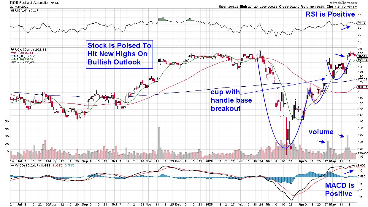
DAILY CHART OF ROCKWELL AUTOMATION (ROK)
Above is a chart of Rockwell Automation (ROK), a leader in industrial automation. The company reported earnings and sales for the first quarter that were above analyst's estimates. In addition, management believes manufacturing will change more radically in the next five years than it has in the past 20, due largely to the rapid integration of technologies that can work together, such as those that they offer.
The positive results were met with buying that pushed the stock out of a cup-with-handle base formation on volume. This week, ROK broke out of a saucer base on volume following a 2-week period of consolidation. The high volume on the base breakouts is bullish as, historically, this points to further upside for a stock.
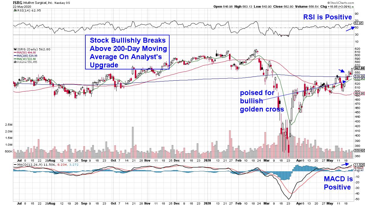
DAILY CHART OF INTUITIVE SURGICAL, INC. (ISRG)
Robotics in the medical field are continuing to advance, led by pioneer Healthcare stock Intuitive Surgical (ISRG), who received FDA clearance for their robotic surgical device 20 years ago. The company was upgraded last week on an improved outlook of sales for their one-time-use surgical devices, as they continue to grow sales globally.
ISRG bullishly broke above its 200-day moving average on the news, with the RSI and MACD both in bullish positions. A further advance in the stock's price should help the 10-day moving average cross above the 50-day moving average, which would form a bullish golden cross.
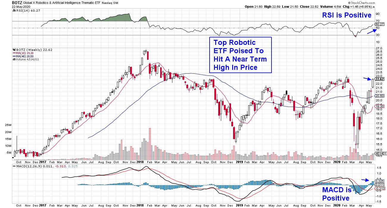
WEEKLY CHART OF GLOBAL ROBOTICS & AI ETF (BOTZ)

One way to participate in the recent advance among robotic and artificial intelligence stocks is with an ETF such as BOTZ above, which boasts global companies that are leaders in this space. In fact, its top holding is Semiconductor chip maker Nvidia (NVDA), which marched to new highs this week after reporting triple-digit sales.
The weekly chart of BOTZ shows the potential explosiveness of this ETF, as can be seen in the 2017 advance when it was named ETF of the year due to its outperformance. More recently, BOTZ is poised to hit a near-term high in price, with both the RSI and MACD in positive territory on its weekly chart. The good news is that orders for industrial robots were already seeing an increase in demand prior to the lockdown, as companies such as Apple (AAPL) and Amazon (AMZN) have been integrating automated machines for repetitive tasks for some time.
For those who'd like to be alerted to other areas of the market, as well as select stocks that are exhibiting promising growth prospects now as well as going forward, take a 4-week trial of my MEM Edge Report for a nominal fee now. This bi-weekly report has been helping investors outperform the markets for years, with stock recommendations such as winning stock Nvidia (NVDA) from a while ago, that make our select list after having gone through a rigorous screening process.
Warmly,
Mary Ellen McGonagle,
MEM Investment Research
|
| READ ONLINE → |
|
|
|
| MORE ARTICLES → |
|
 Chart 3
 Chart 4
 Chart 5
 Chart 6
 Chart 7


 Home Depot (HD) is the second largest stock in the sector and makes up another 13% of the weight. So, with that chart also testing new 52-week highs, we have two mega-cap names with outsized weights making outsized gains.
 Second, while the cap-weighted ratio is indeed breaking out, the equal-weighted ratio (using the ETFs RCD and RHS) is well below its 2020 highs. While it is indeed in an uptrend of higher highs and higher lows, it's not as bullishly configured as the cap-weighted version.