| THIS WEEK'S ARTICLES |
| Market Roundup |
| Eight Charts I Am Watching Closely Right Now |
| by Martin Pring |
Strong Bull Market Indications
We are all aware of the Shakespearian saying "Beware of the Ides of March," which didn't go so well for Julius Caesar. In market folklore, October is the season for crashes and September is the worst-performing month. Welcome to the bearish season!
Right now, there are eight charts I am watching closely. Some are long-term, to remind me we are in a bull market. Others are short-term, to alert me to the fact that bull markets are never straight lines up, but usually interrupted from time-to time by unexpected sharp and believable shakeouts. Let's start with the long-term perspective.
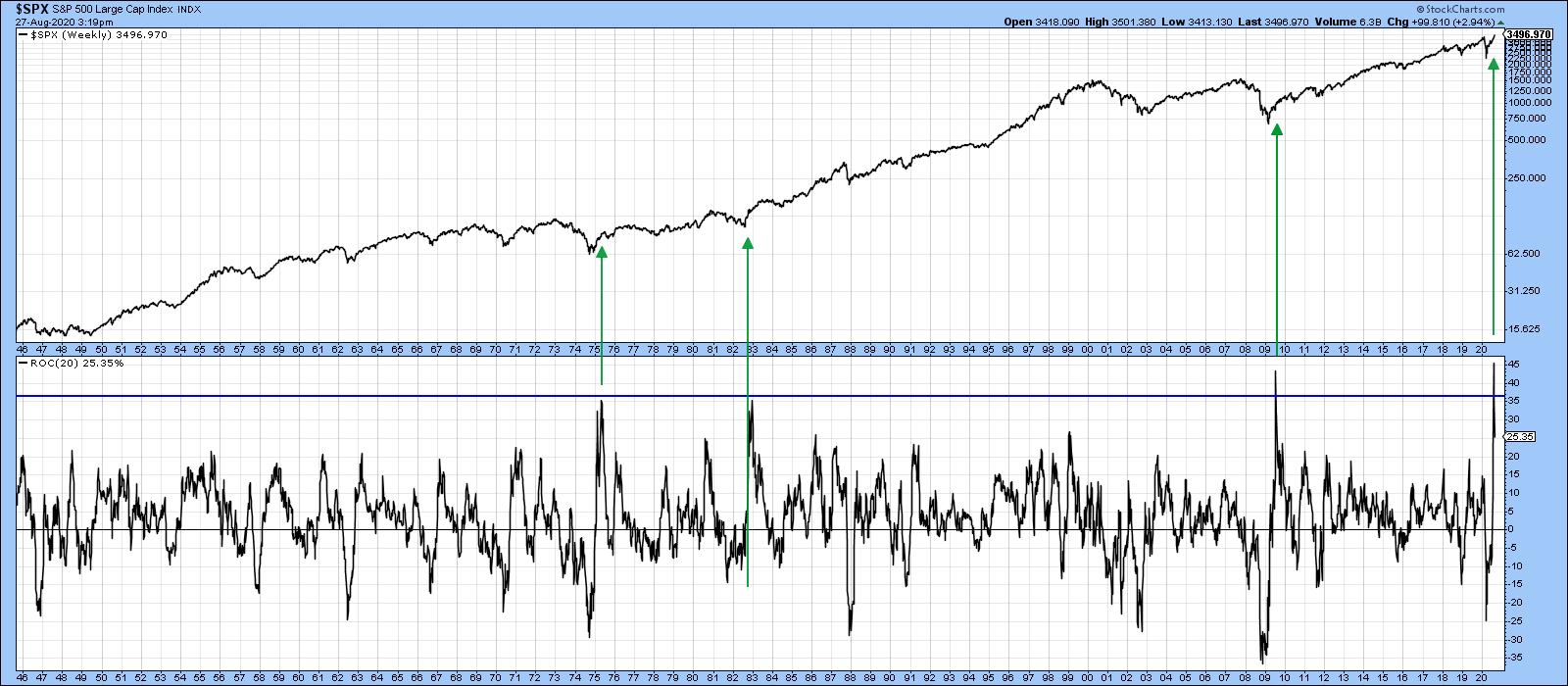 Chart 1The beginning of a powerful long-term bull market is often heralded with short or medium-term oscillators reaching an exceptionally high level. Chart 1 compares the S&P to its 20-week ROC and shows that three of the last four bull markets were signaled by the ROC reaching an extraordinary high level. Mid-July saw this indicator reach a post-1946 record. It's not the only example of a strong initial thrust, as I could have used several other breadth and price momentum series that transmit a similar message. In the three previous examples featured in the chart, it would clearly have paid to downplay the inevitable short-term correction, but instead to focus on the bigger trend. Chart 1The beginning of a powerful long-term bull market is often heralded with short or medium-term oscillators reaching an exceptionally high level. Chart 1 compares the S&P to its 20-week ROC and shows that three of the last four bull markets were signaled by the ROC reaching an extraordinary high level. Mid-July saw this indicator reach a post-1946 record. It's not the only example of a strong initial thrust, as I could have used several other breadth and price momentum series that transmit a similar message. In the three previous examples featured in the chart, it would clearly have paid to downplay the inevitable short-term correction, but instead to focus on the bigger trend.
Chart 2 features the NASDAQ, which is clearly in a strong bull market as the Index is above its 12-month MA and is experiencing a positive KST. This action is certainly reinforcing the powerful reading in the 20-week ROC for the S&P.
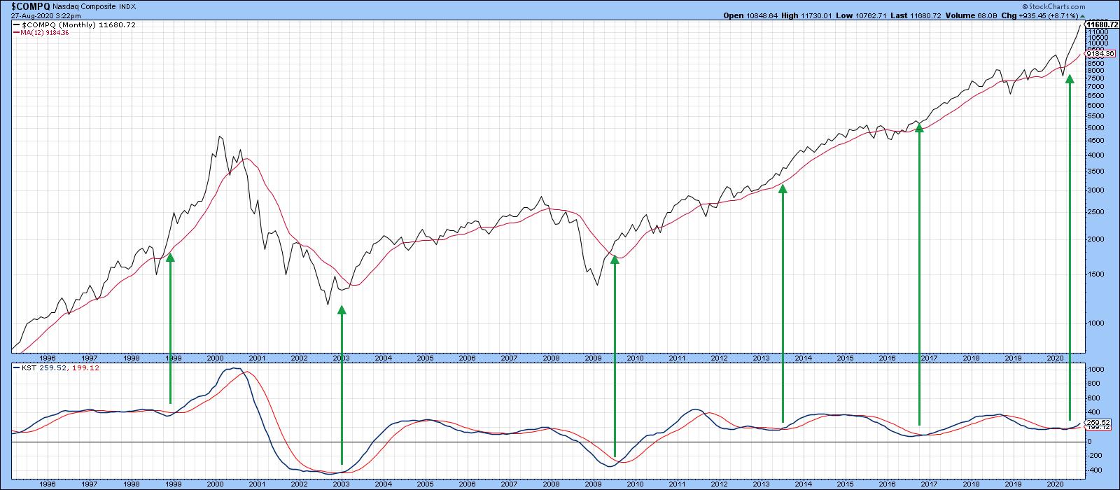 Chart 2 Chart 2
Chart 3 downplays the technology strength in the regular capital-weighted S&P in the form of the Invesco Equal Weight ETF (RSP). It's also been inflation-adjusted. After all, if stocks and the CPI both increase by 10%, there is no actual gain, just an illusory paper profit. Over the long-term, the adjusted series offers a more accurate picture of what's going on. The green horizontal arrow indicates that, unlike the regular S&P or NASDAQ, there has been no net gain for the average S&P stock since the end of 2017, as it has been range-bound for the last 3 years. The small arrows show that the 12-month MA has turned back numerous rallies and reactions over the last 16 years and, therefore, represents a really impressive dynamic level of support and resistance. It's not the end of the month yet, but the price appears to be punching through the average. The point I am trying to make is that, while the NASDAQ and S&P might look a bit overextended on the upside, indexes such as the unweighted S&P and NYSE Composite are poised to break out from major trading ranges and move substantially higher.
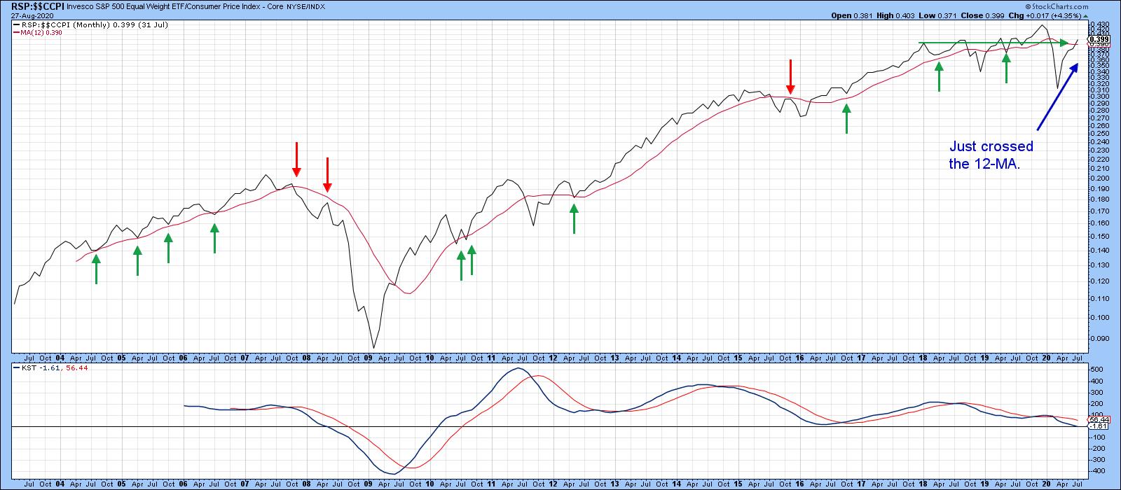 Chart 3 Chart 3
Short-term Vulnerability?
Chart 4 shows the long-term perspective of the monthly VIX. The red arrows indicate that all the major peaks since 1994 developed when the VIX was well below the blue horizontal line. The only exception developed in 1998, when it reversed from a position slightly above it. The indicator touched a major peak earlier in the year. Despite a substantial decline, it is still well above that sub-blue line complacent zone associated with market tops. That does not mean that the upcoming negative seasonal period will avoid an uncomfortable shakeout, after all, the VIX itself is quite volatile, but, more to the point, several short-term indicators are starting to misbehave.
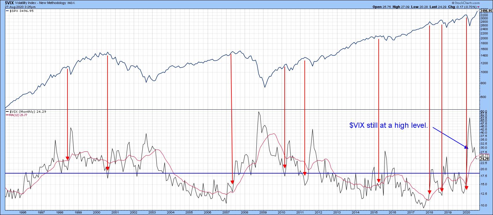 Chart 4 Chart 4
Take Chart 5, for instance. It shows that the Common Stock A/D line has been pretty much in gear with the S&P for the last couple of years. Just prior to the 2020 bear market, it diverged negatively, as indicated by the two dashed arrows at "1". Recently, we have seen another small divergence at "2" as the A/D line declined and the S&P exploded to the upside. There is also another, much larger, divergence that has been flagged by the solid red arrows.
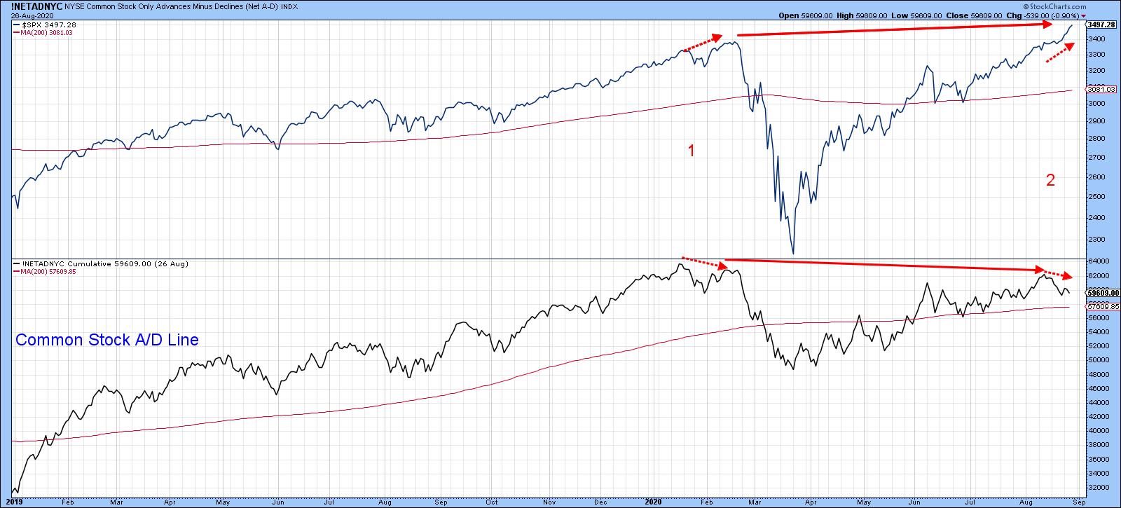 Chart 5 Chart 5
Chart 6 tells us that the sharp rally being experienced at the NASDAQ is starting to show some cracks, as the NASDAQ bullish percentage has diverged negatively with the Index itself. Three previous examples of negative divergences and trendline breaks, in both the indicator and the Index, were all followed by a correction of some kind. Right now, neither series has cracked its up trendline, but it's something I am watching carefully.
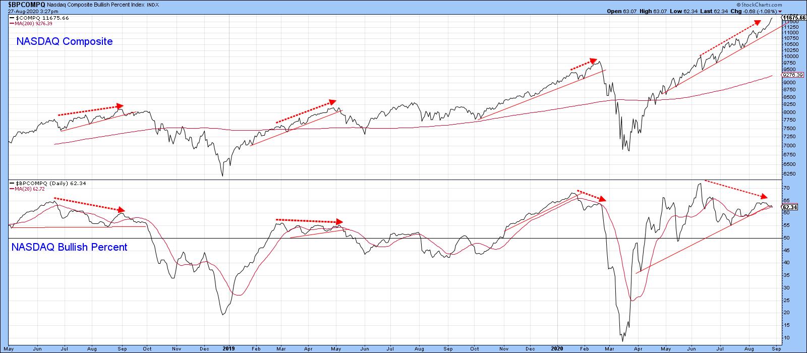 Chart 6 Chart 6
Elsewhere, things are starting to look a little precarious from a short-term aspect. Chart 7 shows that joint trendline breaks by the S&P and VIX have given us two timely signals this year. A third could well be in the cards. The VIX is already experiencing a sight break, but two violations are required for a signal and the S&P remains above its line.
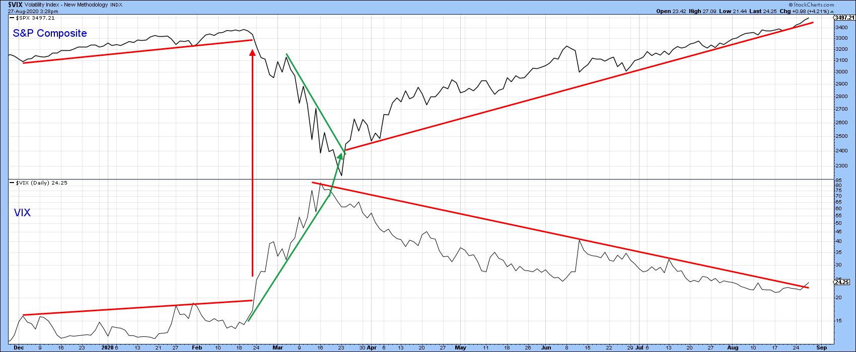 Chart 7 Chart 7
A similar exercise for the NASDAQ and NASDAQ VIX indicates that both trendlines are intact, but certainly close enough to justify some careful monitoring in the next few sessions.
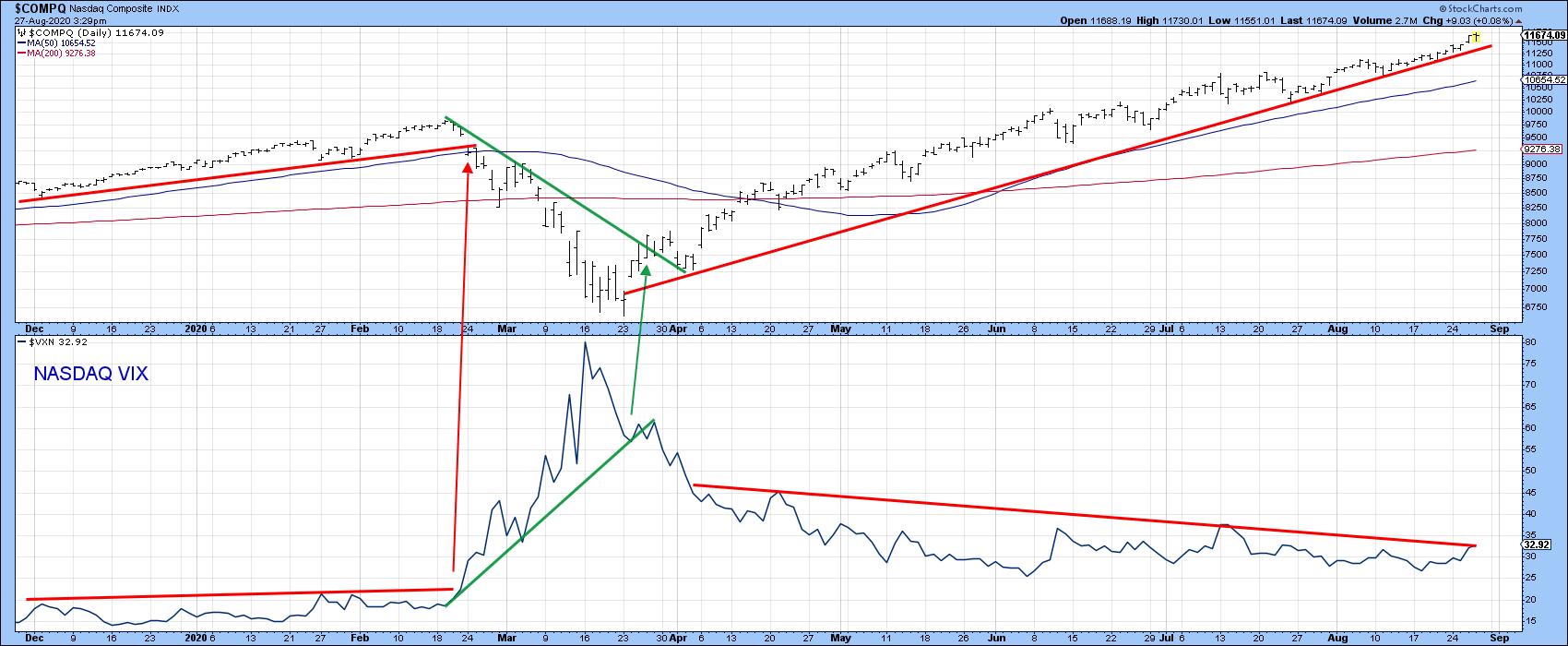 Chart 8 Chart 8
The bottom line: expect the bull market to continue big time, but don't be surprised if a seasonal correction comes first.
Editor's Note: This article was originally published in Martin Pring's Market Roundup on Thursday, August 27th at 5:51pm ET.
Good luck and good charting
Martin J. Pring
The views expressed in this article are those of the author and do not necessarily reflect the position or opinion of Pring Turner Capital Group of Walnut Creek or its affiliates.
|
| READ ONLINE → |
|
|
|
| Trading Places |
| Key Sentiment Indicator is Flashing a Major Short-Term Warning |
| by Tom Bowley |
If you've followed my work, you know three things. First, I'm one of the few analysts that kept my long-term secular bull market call intact despite the pandemic-induced selloff back in March. Second, while my big picture view is firmly bullish, my primary focus is on the short- to intermediate-term as I'm a short-term trader. Third, we're about to enter the only calendar month (September) where the S&P 500 has not risen more often than it has fallen over the past 7 decades. I'm generally very upbeat about the stock market's prospects and I continue to be very upbeat longer-term. In the very near-term, however, I'm seeing one MAJOR warning sign and I'm building a significant cash position as a result - just to be safe. The ends of calendar months tend to start a one-week-to-ten-day period of bullishness, so I realize we could still see higher prices in the week ahead, but I'd make sure stops are in place in the event short-term selling takes over.
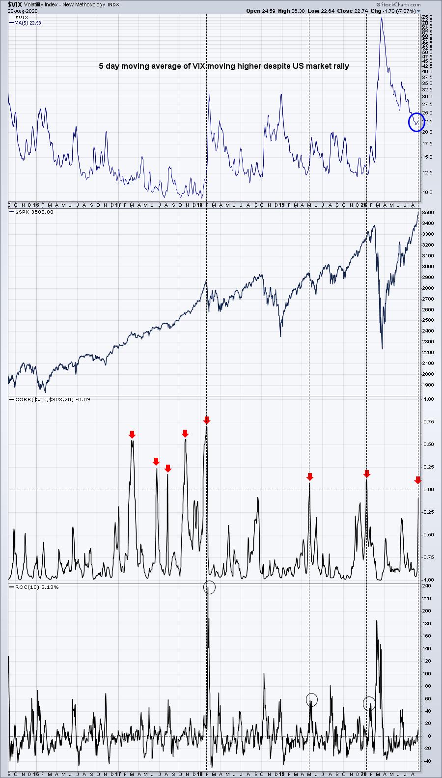
As prices keep rolling higher day after day, traders continue to grow more and more optimistic, resulting in an almost euphoric state currently. Typically, as stock prices rise, fear dissipates. When fear rises to coincide with a rising equity market, that's when we've had issues historically. Let me paint you a picture in the form of a chart of the Volatility Index ($VIX):

The normal relationship between the VIX and the S&P 500 is one that's inverse. When stock prices rise, the VIX typically falls. When stock prices fall, the VIX generally rises. The expectation, then, is to see the correlation of these two in negative, or inverse, territory. That's not what we're seeing right now, however, which is worrisome. It's telling us that the market is growing more and more nervous with every upside move. The last two times we've seen this correlation cross the centerline and move into positive territory, big selloffs ensued. Don't misinterpret what I'm saying, though. While I believe we could see a short-term selling event rather soon, I remain steadfastly bullish in the long-term. I completely believe we're in a secular bull market and will remain in one for the next decade or longer. We'll have corrections and even the occasional cyclical bear market that lasts a few months, but I firmly expect to see the uptrend since the March 2009 low continue for quite some time.
In our free EB Digest newsletter on Monday, I plan to share a short-term downside target on the S&P 500 for our EarningsBeats.com community based on this latest development on sentiment. If you'd like to receive that target and join the thousands of traders in our community, you can sign up HERE.
Happy trading!
Tom
|
| READ ONLINE → |
|
|
|
|
|
| RRG Charts |
| Swap From XLK to RYT to Mitigate The Increasing Risk For AAPL |
| by Julius de Kempenaer |

Last week, I wrote an article titled "What Can We Learn From Equal Weight vs. Cap Weighted Rotations on RRG". In that article, I touched upon distortions between EW and CW sector ETFs because of the large and increasing weight of a few Mega-Cap stocks.
In this week's episode of Sector Spotlight, I showed how to subdivide the Technology sector into industries on a Relative Rotation Graph, then proceeded to zoom in on the Technology Hardware, Storage & Peripherals Index, which includes AAPL, to show the impact.
Mega-Cap Dominance
With the fast and continuing rise in mega-cap stocks like AMZN, GOOG, FB and AAPL, the sector ETFs that include these stocks get dominated by the movement of those stocks. As a result, these cap-weighted ETFs are no longer as good a representation of the sector as they used to be.
Due to those moves, the single-stock risk in these cap-weighted ETFs has increased significantly. Avoiding that single-stock risk is one of the most important reasons for investors to trade/invest in ETFs, so that they don't have to worry about that.
Breaking Tech Down Into Industries
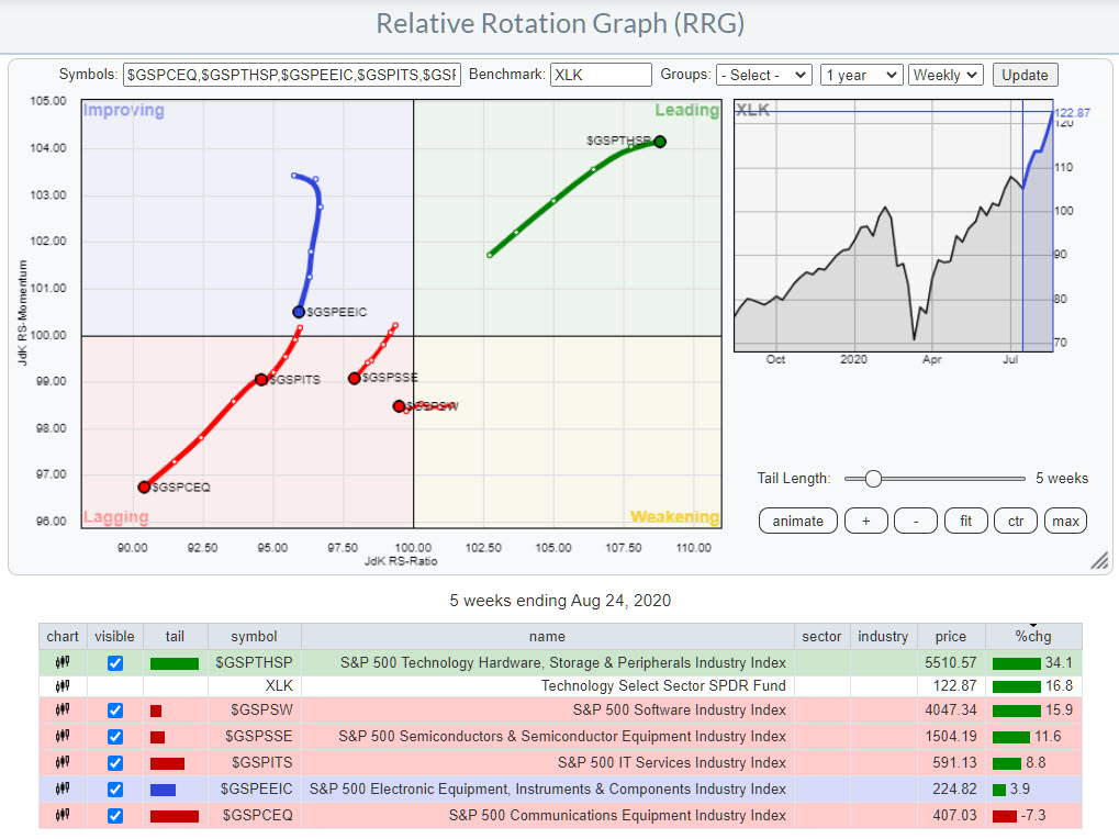
If we break down the Technology sector (XLK) into its industries and put these on a Relative Rotation Graph, this is what we get:

These six industries together make up the Information Technology sector as it is tracked by XLK. One industry is shooting off into the leading quadrant, while all five others are either inside the lagging quadrant or on the way to it.
But look at the performance % in the table below the image. Five out of the six groups are showing seriously positive gains over the last five weeks, but $GSPTHSP is blowing everything else out of the water with a gain that is more than twice as big as the second in line, the Software Industry.
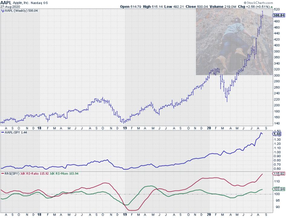
You get one guess to tell me which group AAPL belongs to. ;) The disconnect is already showing up in this RRG, but things get even more clear when we break down these industries into their individual stocks.

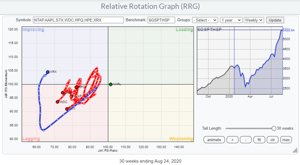
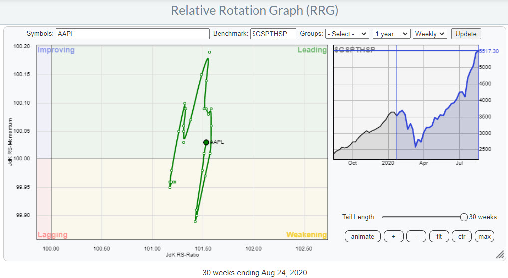
The RRG above shows the rotation of the seven stocks that are in the Technology Hardware, Storage & Peripherals Industry. I have deliberately lengthened the tails to 30-weeks and, believe it or not, all symbols on this RRG have a 30-week tail. Even AAPL!!
Single Stock Risk for AAPL Increasing
The fact that AAPL is close to the center of the chart, has been so for 30 weeks and remains almost stationary illustrates and underscores how dominant this stock is inside this industry.
In order to see that AAPL did actually move around, a little bit, over this 30-week period, we have to delete all names from the chart and only keep AAPL and the benchmark.

This is essentially a very magnified and zoomed-in image of the space around AAPL as we saw it in the first RRG, where AAPL looked like a single dot.
Divergence Between XLK and RYT
Of course, the impact of a single stock is much bigger in a small group, like $GSPTHSP, but it is definitely also showing up at the sector level.

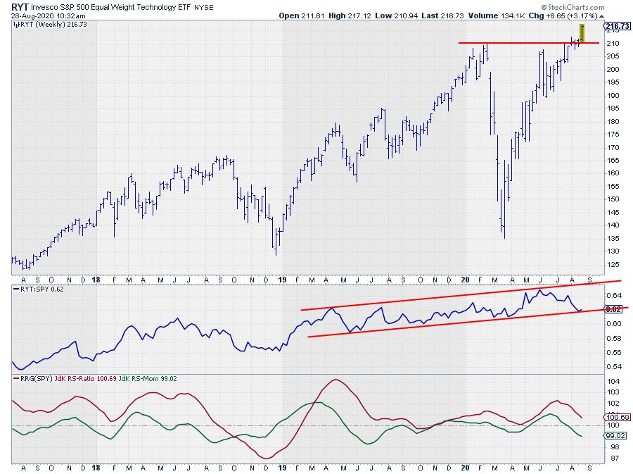
The two RRGs above show the rotations for XLK, the cap-weighted technology ETF, and RYT, the equal weight technology ETF, side by side. The different trajectories are clearly visible.
Both tails are positioned inside the weakening quadrant, but XLK has rotated back up and is now heading back towards the leading quadrant. RYT has shrugged off the loss of relative momentum in the last few weeks, but is still moving lower on the RS-Ratio scale. We need more improvement here for RYT to turn back up to a positive RRG-Heading.

The good news is that RYT has recently broken out above its early 2020 peak, which should give the rally some new fuel and enable a rotation back towards the leading quadrant. Such a rotation would absolutely be good news for the market, as it means that the base for the improvement in the technology sector is getting broader, more reliable and less dependent on the performance of AAPL.
So, all in all, the technology sector is still looking good on a broader base, but, for the time being, remains dominated by AAPL.
Investors who want to take the single-stock risk for AAPL out of their ETF portfolio may want to consider swapping XLK for RYT.
In this way, you remain invested in the sector, but with a more balanced portfolio and less exposure and therefore less risk to AAPL.
#StaySafe, --Julius
My regular blog is the RRG Charts blog. If you would like to receive a notification when a new article is published there, simply "Subscribe" with your email address.
|
| READ ONLINE → |
|
|
|
| The MEM Edge |
| A COVID-19 Game Changer Sparked Bullish Moves in These Leisure Stocks |
| by Mary Ellen McGonagle |
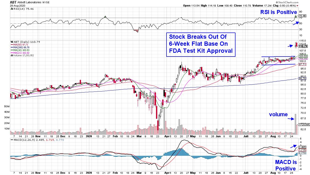
Shares of Abbott Laboratories (ABT) jumped 8% Thursday on news that the FDA granted emergency use authorization for their COVID-19 testing kit.
Abbott's test is a game-changer as it is rapid, reliable and affordable and can detect active coronavirus at massive scale. At a cost of $5 and with a 15-minute result time, the news sparked a sharp rally in many Airline, Cruise and Movie Theatre stocks that would benefit from reliably fast analysis of virus cases.
DAILY CHART OF ABBOTT LABORATORIES (ABT)

While ABT may consolidate a bit here following its gap up in price, signs of expected heavy demand for their kits will easily spur further upside. The company is planning to produce as many as 50 million tests per month starting in October.
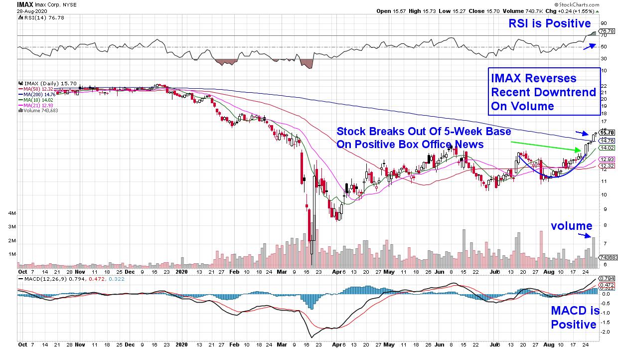
Below is a chart for Movie Theatre company Imax Corp. (IMAX), which reversed its 6-week downtrend following Thursday's break back above a downward trending 200-day moving average. The fact that the move occurred on volume is quite positive.
DAILY CHART OF IMAX CORP. (IMAX)

IMAX not only rallied on positive COVID testing news that pushed the stock into an uptrend, but the stock rallied strongly earlier in the week after reporting impressive box office results from their first major theatrical release in China. This country accounts for 46% of the company's global screen base and last week's news pushed the stock out of a 5-week base on Monday.
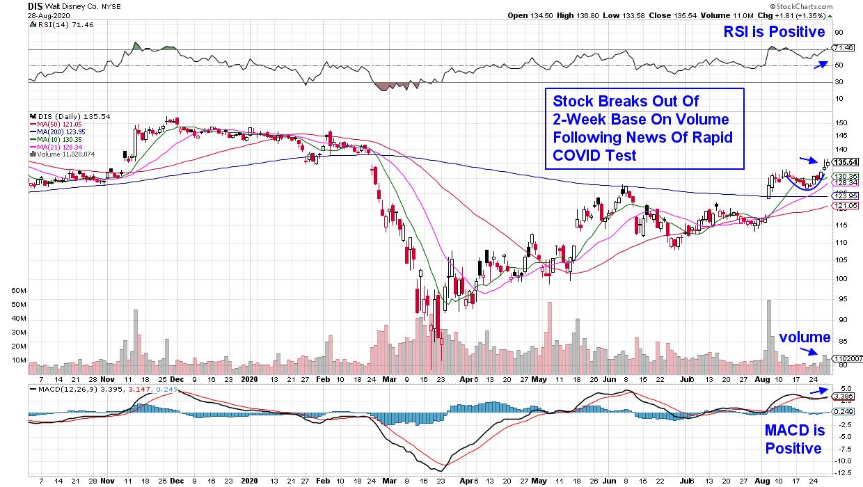
The RSI is in an overbought position, which may signal a slight pullback, but its positive position, as well as the MACD, bode well for further upside.
DAILY CHART OF WALT DISNEY CO. (DIS)

Walt Disney Co. (DIS) broke out of a 2-week base this week following news that foot traffic has picked up at their Walt Disney World location. While traffic is still down considerably from pre-pandemic levels, news of improved testing possibilities helped push the stock even higher, with DIS ending the week with a 6.5% gain.
Disney (DIS) is one of the country's largest and oldest media companies, and an even stronger near-term catalyst for growth is their pivot to direct-to-consumer streaming. Disney is expected to generate $11 billion in revenues from this division, and their unconventional decision to release their new film Mulan online next week has investors excited.
While Airline and Cruise stocks rallied, they remain below key longer-term moving averages, which may act as upside resistance. Instead, my work screens for stocks that are trading above their key simple moving averages, with the company also anticipating growth from high demand from their products.
If you'd like to be alerted to high-quality stocks poised to greatly outperform the markets, take a 4-week trial of my bi-weekly MEM Edge Report at a nominal fee. You'll receive insights into industries experiencing strong growth, as well as entry points into select stocks from those areas that are poised to benefit. Check out our track record here!
Warmly,
Mary Ellen McGonagle, MEM Investment Research
|
| READ ONLINE → |
|
|
|
| SPECIAL EVENT |
 |
|
| MORE ARTICLES → |
|
 Chart 1The beginning of a powerful long-term bull market is often heralded with short or medium-term oscillators reaching an exceptionally high level. Chart 1 compares the S&P to its 20-week ROC and shows that three of the last four bull markets were signaled by the ROC reaching an extraordinary high level. Mid-July saw this indicator reach a post-1946 record. It's not the only example of a strong initial thrust, as I could have used several other breadth and price momentum series that transmit a similar message. In the three previous examples featured in the chart, it would clearly have paid to downplay the inevitable short-term correction, but instead to focus on the bigger trend.
 Chart 2
 Chart 3
 Chart 4
 Chart 5
 Chart 6
 Chart 7
 Chart 8
