| THIS WEEK'S ARTICLES |
| Market Roundup |
| Reliable Long-Term Ratio May Be About to Trigger its Seventh Buy Signal for Stocks Since 1995 |
| by Martin Pring |
Sometimes, it's a good idea to approach likely market action not so much from an analysis of the market itself, but substituting intermarket or inter-asset relationships to accomplish the same objective. It is a fact that each business cycle goes through a set series of chronological sequences. We know this best from the publication of leading coincident and lagging indicators, which get their name from the fact that certain areas of the economy, such as housing starts, lead us out of recession, while others, such as capital spending, prosper in the more mature phase of the recovery. The great thing about all this is that the primary trend turning points for bonds, stocks and commodities are part of this chronological sequence. Specifically, stocks respond to swings in the economy about 90% of the time. Two notable exceptions developed in 1926-27, when a major sell-off was avoided despite a recession. The second was in November 2001, when prices continued to drop for 11 months following end of that recession. Monitoring the 12-month MA would have kept you in stocks in 1927 and out of them in the 2001-02 period.
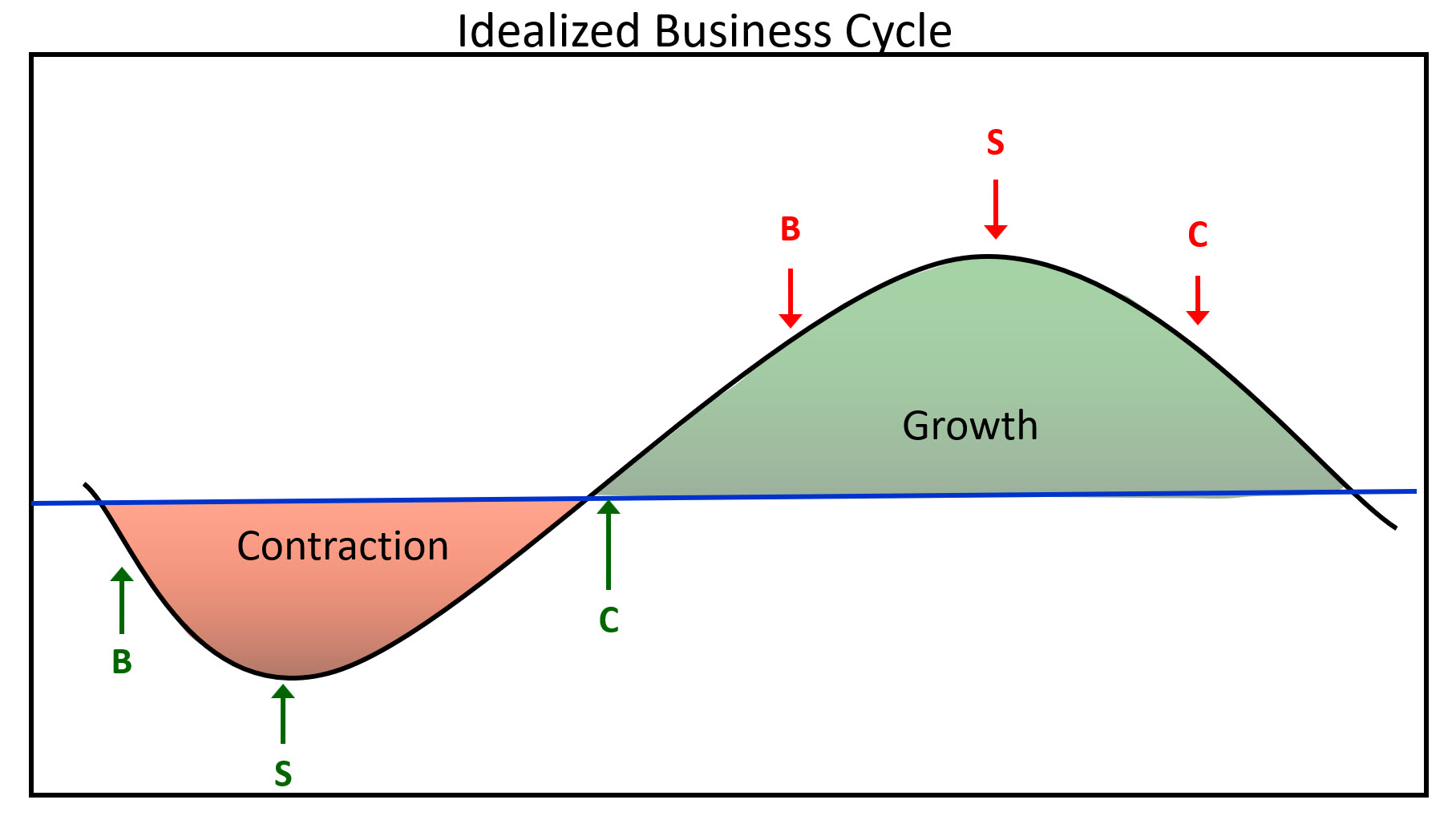 Figure 1 Figure 1
Figure 1 shows an idealized economic growth path, with the theoretical peaks and troughs of the financial markets. Bonds usually bottom after the recession has gotten underway. Stocks reach their low point later, as market participants begin to realize that higher bond prices (lower yields) are going to have a positive effect on the economy.
In that respect, Chart 1 compares the performance between stocks and bonds. It shows that, in reality, the nice-looking connection between them in Figure 1 is not always helpful. Yes, bonds do have a tendency to lead stocks at major tops and bottoms, but the leads and lags vary. Also, the 2009 stock market bottom was accompanied by a bond market peak.
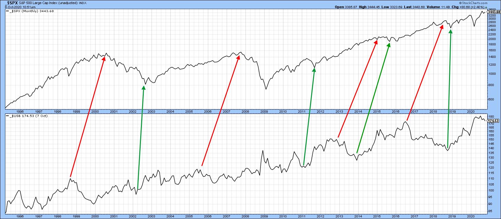 Chart 1 Chart 1
Chart 2 takes us a step further by comparing stocks to the ratio between stocks and bonds. This arrangement, whilst not perfect, does offer a more cyclic feel akin to Figure 1. It may be informative using the benefit of hindsight, but, from a practical point of view, this relationship is not offering much in the way of actionable signals going forwards.
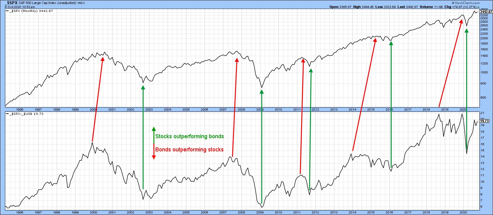 Chart 2 Chart 2
That's where Chart 3 comes in, as it's possible to construct a series of trendlines for both the S&P and the ratio. Violations are typically followed by an important change in the direction of the stock market. Note that the last few years have been periods of consolidation for the ratio. That suggests that, if it can break above the horizontal green resistance trendline, a long-term durable rally will follow for both series.
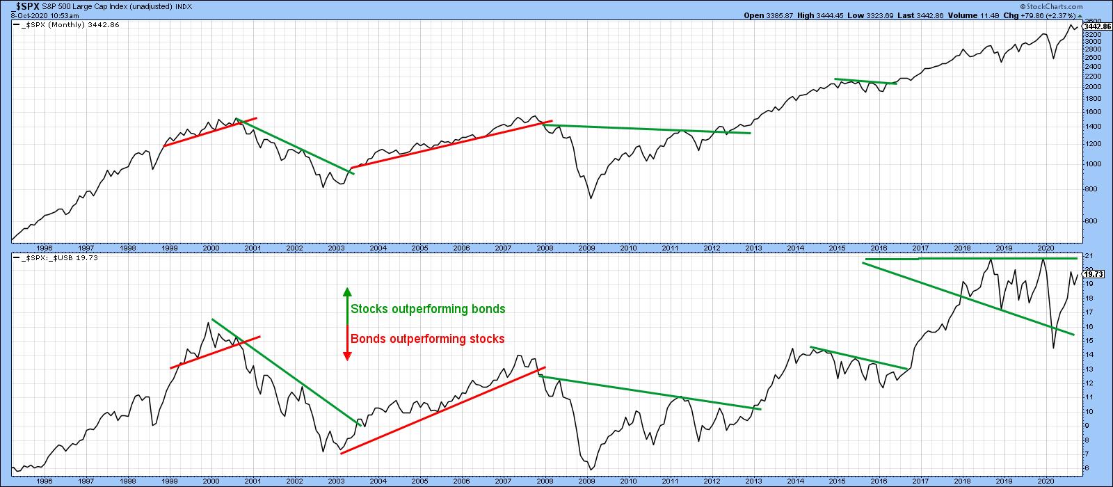 Chart 3 Chart 3
A more objective and arguably reliable approach is to calculate a long-term momentum curve for the ratio, such as the KST. Chart 4 shows that positive MA crossovers by this highly cyclic indicator are then used as buy signals for the stock market. The chart tells us that all six previous signals were followed by a long-term equity rally. In that respect, the thick arrows point up cycles that experienced a recession, whereas the thin ones reflect four slowdowns in the growth rate of the economy. Slowdowns occur where the economy's growth rate decelerates, but not sufficiently to result in a recession. Note that the two recession associated signals were followed by the longest and strongest advances.
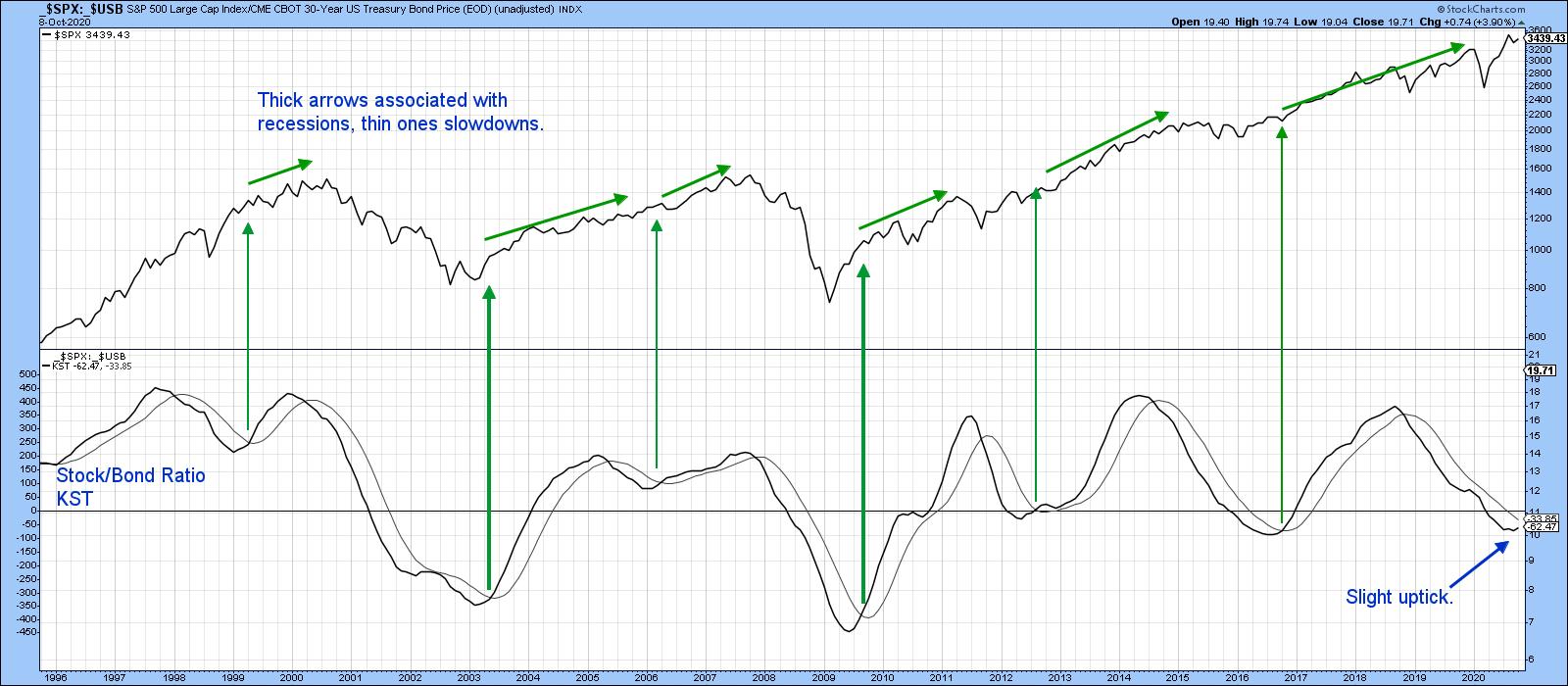 Chart 4 Chart 4
The KST has yet to experience its 2020 recession-associated buy signal, but the latest uptick suggests that it may not be that far away.
Remember, you can update these charts going forward by simply clicking on them.
Editor's Note: This is an excerpt of an article originally published in Martin Pring's Market Roundup on Thursday, October 8th at 1:27pm ET. Click here to read the full article, which includes charts 5-7 and further analysis using Pring's Special K indicator and the 12-day ROC.
Good luck and good charting,
Martin J. Pring
The views expressed in this article are those of the author and do not necessarily reflect the position or opinion of Pring Turner Capital Group of Walnut Creek or its affiliates.
|
| READ ONLINE → |
|
|
|
|
|
| The Mindful Investor |
| Bullish Expansion of New Highs |
| by David Keller |
I would currently describe myself as a "cautious bull," in that I recognize that the market is trending higher, I'm prepared to follow that trend as long as it continues, and I'm always looking for some signs of potential weakness and/or exhaustion.
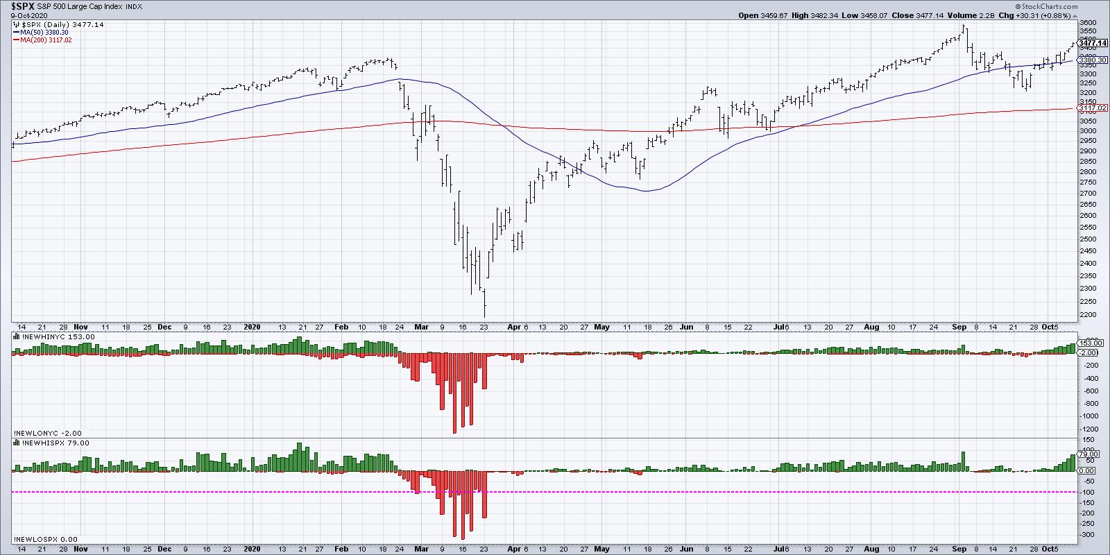
Over the last two weeks, I've seen many of the most negative market conditions, particularly in the area of breadth, transition from distribution phase to accumulation phase. This suggests that the recent upswing to push the S&P 500 back above 3400 is not just based on a relatively small number of mega cap names, but rather a broader increase based on widespread participation.
This brings us to the focus of today's article, the 52-week highs list.
One of the charts in my Mindful Investor LIVE ChartList shows the number of S&P 500 members making new 52-week highs and lows every day. This indicator was relatively muted after the 1st quarter market selloff, with so many stocks dropping so far from long-term highs.

Starting in July, the number of 52-week highs expanded, as more stocks were able to eclipse their previous peaks from January or February. One of the signs of a healthy bull market is when new highs expand before the broad indexes reach new highs.
When the S&P 500 pulled back from the 3600 range in early September, the 52-week highs list immediately dried up, as should be expected. With the S&P testing support around 3200 and beginning to increase, we discussed on The Final Bar how an increase in 52-week highs would indicate greater potential for market to retest its own all-time highs.
This week, we have begun to see just that. Over 75 stocks made a new 52-week high on Friday of this week, or just over 15% of the S&P 500. That's a non-zero value and suggests that this is a broad advance led by more than a small number of stocks.
Let's look at the composition of the new highs list to see which sectors are best represented.
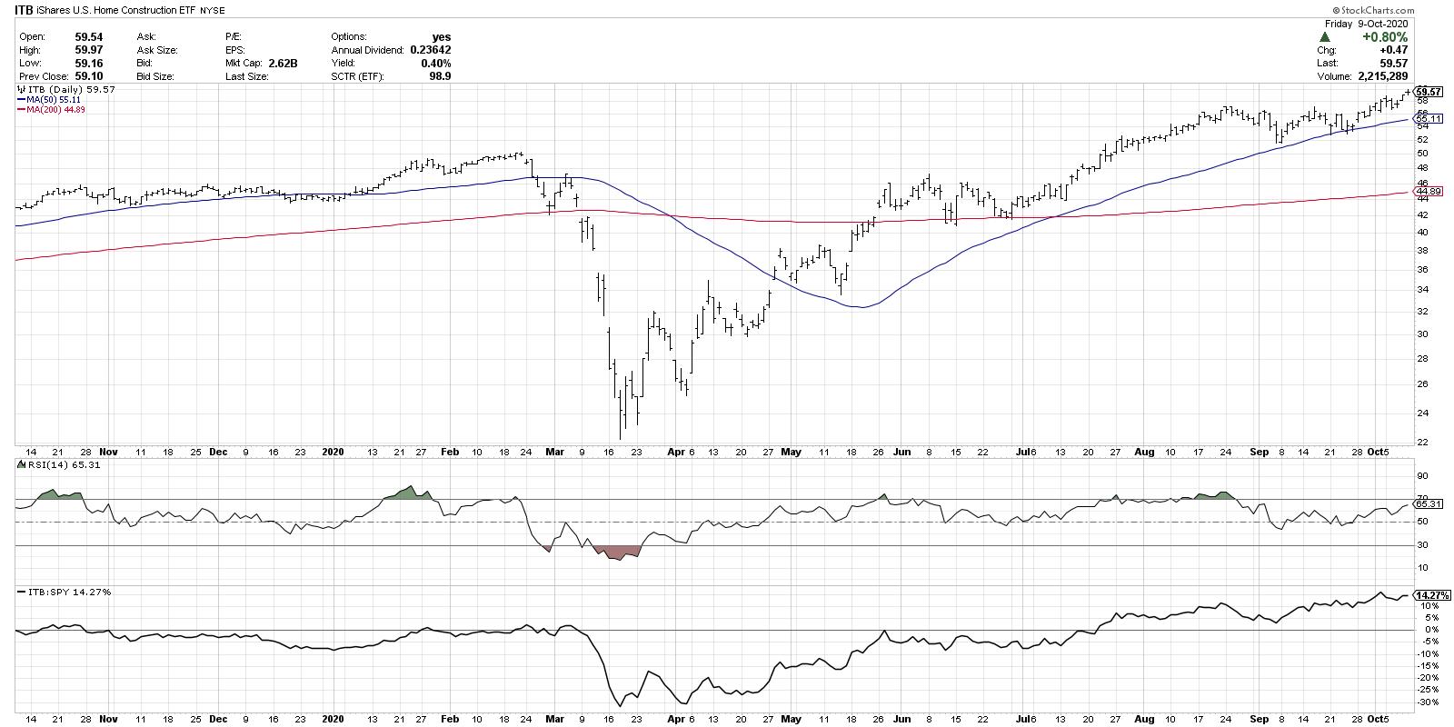
Consumer Discretionary had 13 new highs on Friday, with two groups dominating the list: homebuilders and personal products. The Home Construction ETF (ITB) includes stocks like LEN, DHI, PHM and NVR, all of which made the list this week.

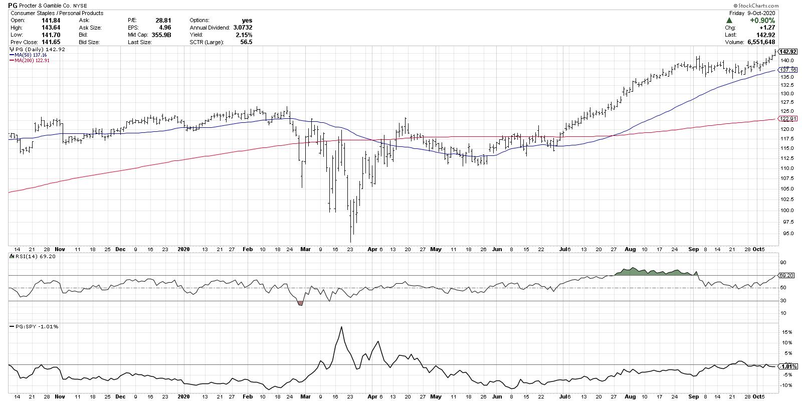
The personal products group includes stocks like PG, which we featured this week on The Final Bar as one our "3 in 3" charts. It's worth noting that, while many stocks (as well as the S&P 500 itself) broke down through their 50-day moving averages in September, PG has remained steadily above two upward-sloping moving averages.

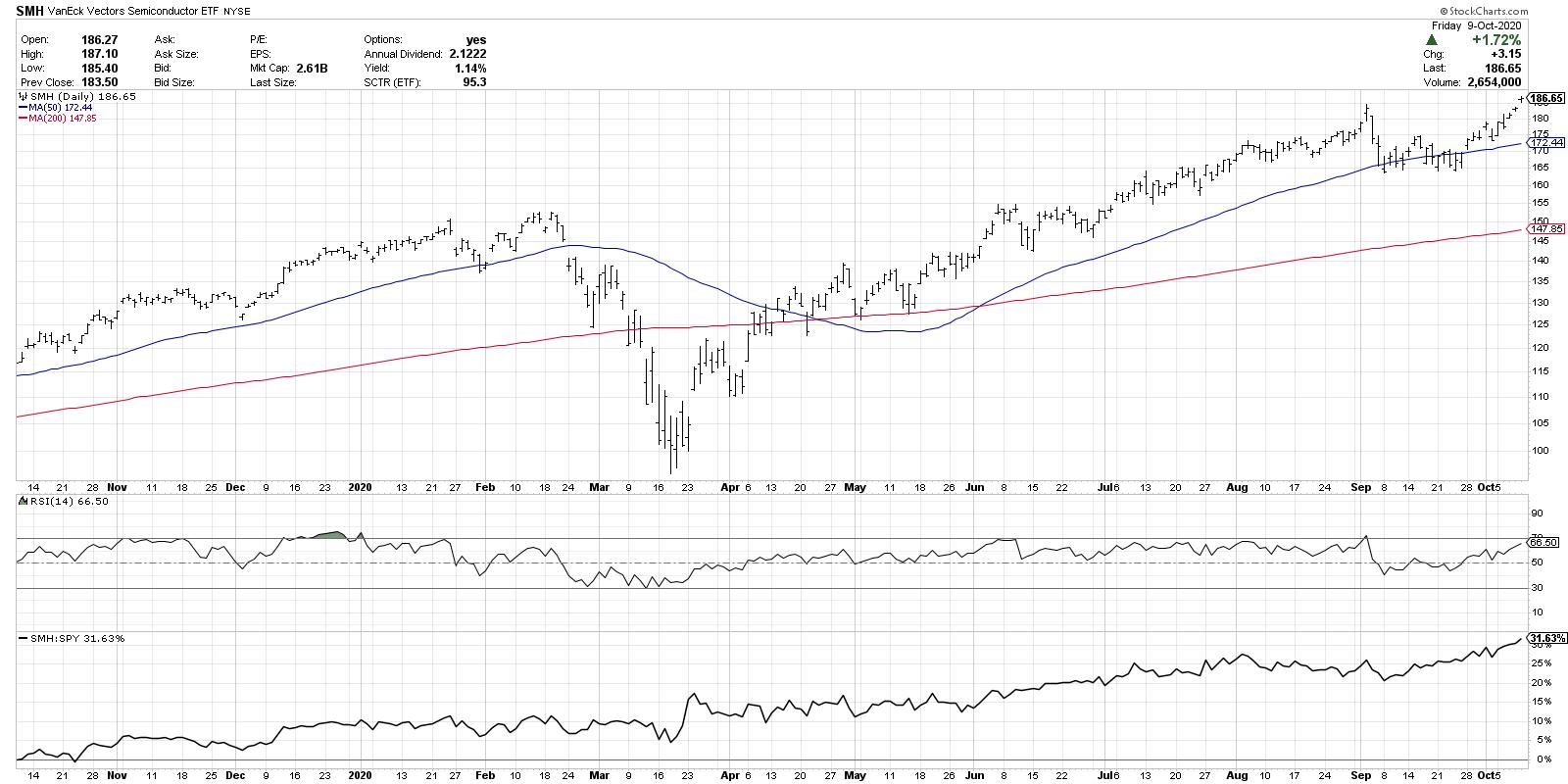
The Technology sector had 13 stocks on the new high list on Friday, with almost half of those from the semiconductor group. The strong relative performance of the semiconductor ETF (SMH) speaks to the long-term strength of this key bellwether group.

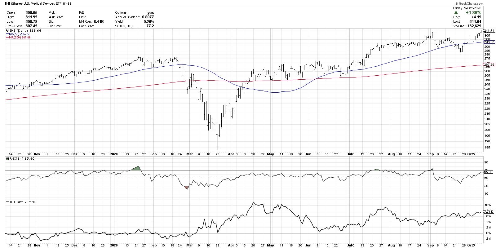
The Health Care sector included 12 stocks on this week's list, with over half of those coming from the medical equipment group. The Medical Devices ETF (IHI) provides exposure to stocks like DHR, TMO and SYK, all on the new highs list.

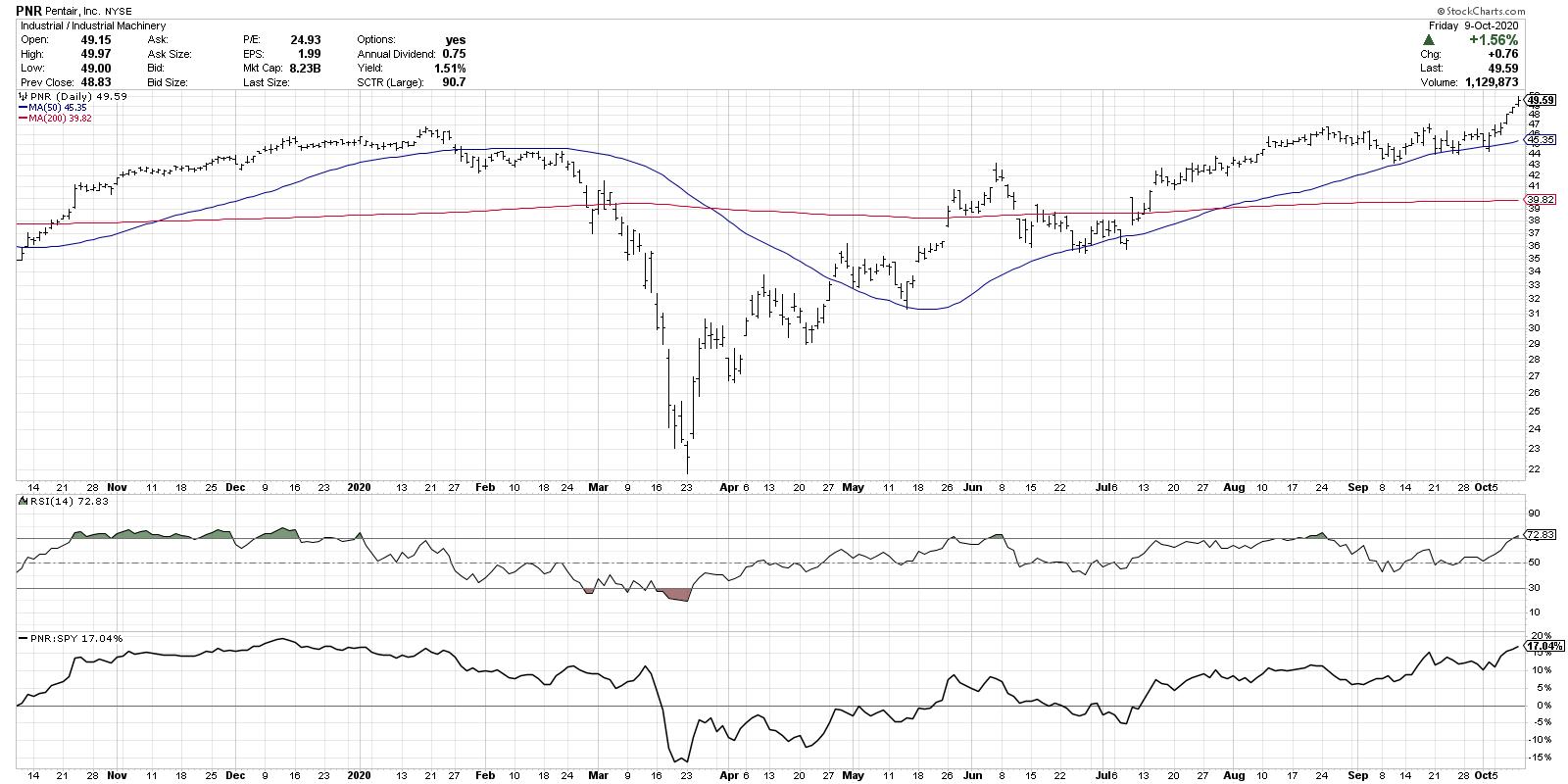
But the most represented sector on this week's new high list? Industrials, with 18 stocks from a number of different industry groups. Perhaps PNR best represents the charts in this sector, with a breakout to new swing highs above the $47 level, which also propelled the stock above its long-term high from January.

To review this list on your own, just bring up the scan engine and include these two lines in your scan:
and [Daily Close > Yesterday's Daily MAX(262,Daily Close)]
and [group is SP500]
You can also check out the Predefined Scans page, which includes 52-week highs and lows among many other technically-oriented screen ideas.
As the market once again approaches all-time highs, an increasing number of new highs confirms the broad-based recovery as opposed to narrow leadership. By digging deeper into the stocks and groups that comprise this list, you may be able to identify the names leading the way higher into year-end and beyond.
RR#6,
Dave
David Keller, CMT
Chief Market Strategist
StockCharts.com
Disclaimer: This blog is for educational purposes only and should not be construed as financial advice. The ideas and strategies should never be used without first assessing your own personal and financial situation, or without consulting a financial professional.
The author does not have a position in mentioned securities at the time of publication. Any opinions expressed herein are solely those of the author, and do not in any way represent the views or opinions of any other person or entity.
|
| READ ONLINE → |
|
|
|
|
|
| Trading Places |
| Ready For a Melt UP? Bears, It's Checkmate! |
| by Tom Bowley |
I remain firmly in the secular bull market theory camp. We're going higher. Forget about politics, civil unrest, the virus, the deficit, the economy, blah, blah, blah. Money flow, the Fed and historically-low interest rates will fuel higher prices. While each of those is extremely important in the performance of U.S. equities, here are the 3 really big reasons why I believe stocks are heading higher.
Seasonality
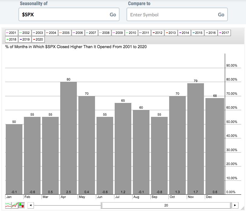
I've done quite a bit of historical analysis over the years, and there are clear identifiable patterns as to how the stock market trades. Let's start with a simple seasonality chart of the S&P 500 over the past 20 years:

April has been the strongest month this century, rising 80% of the time AND producing average monthly gains of 2.5%. The second- and third-best months are November (rises 79% of the time, with average monthly gains of 1.7%) and October (rises 70% of the time, with average monthly gains of 1.3%), respectively. In fact, if we look at the S&P 500, there have only been 7 years when this benchmark index has fallen during both October AND November. Here are the years:
1951, 1971, 1973, 1976, 1987, 2000, 2008.
5 of those 7 years occurred during the secular bear markets from the 1970s and 2000s. 1987 was when we had Black Monday and the resulting fallout the next month (November). Outside of those years, we've had ONE year since 1950 when we've been in a secular bull market and saw the S&P 500 slide during both October and November in the same year. I think it's safe to say that the odds really favor the bulls during the balance of 2020.
Let's take it one step further. If we look at the S&P 500 from the close on October 27th through the close on January 18th of the following calendar year, our benchmark index has ended this period higher than it started in 61 of the last 70 years. It's risen 35 times in the past 38 years during that period. I'd say the odds are definitely on the bulls' side. But it's not just the frequency of the gains, it's the size of them. Before I give you this next stat, keep in mind that the S&P 500 has averaged gaining roughly 9% per year since 1950. Would you like to know how many times the S&P 500 has gained at least 9% during this "less-than-90-day-period"? 17. And if we lower the bar to 8% or more, the number swells to 25 times in the past 70 years.
What if I said that the NASDAQ's history during this period is even more bullish? Because it is. The average gain on the S&P 500 during that October 28th through January 18th period is 4.59%. The NASDAQ? +6.20%. Furthermore, over the past three decades, here are the 4 best calendar months on the NASDAQ in terms of annualized returns:
November: +23.42%
October: +22.02%
December: +22.01%
January: +21.25%
The rest of the year? +7.18%
We're into the second week of October and we see the stock market gaining strength. It's just beginning.
Transportation Stocks
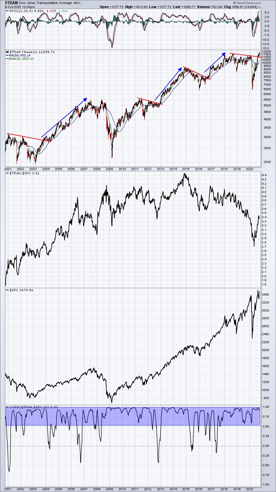
The history of the stock market tells us that, when the Dow Jones Transportation Average ($TRAN) breaks out, it's generally a very good thing for the overall stock market. It's very difficult to argue with this if you've looked at a long-term weekly chart and transports' correlation with the broader market:

When transports struggle, it's typically associated with uncertainty in our economy and a consolidating (or selling) S&P 500. But when this group ends its consolidation and resumes its uptrend, it sends a very bullish message to investors/traders. We're getting that message right now.
10-Year Treasury Yield ($TNX)
When I've been asked in recent months what could possibly carry the stock market higher, I've responded nearly every time with this: ROTATION. It's that simple. As transports send us the signal of a strengthening economy ahead, bond traders will sell bonds and move to stocks to capture the better performance during economic expansion. We begin to see big Wall Street firms announcing their rotation to a more aggressive allocation between stocks and bonds. Of course, they're not going to tell you before they do it. Instead, the rotation will take place on the charts, and then the news will follow.
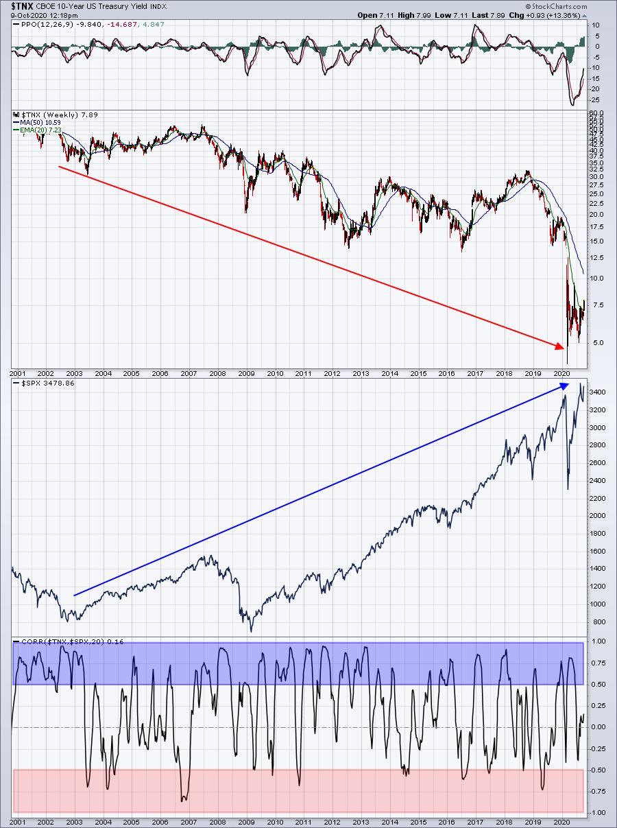
So how can we tell that money is rotating? Follow the 10-year treasury yield ($TNX). In addition to the strong correlation between transports and the S&P 500, there's a very similar positive correlation between the TNX and the SPX:

At first, it may appear that your eyes are deceiving you. The TNX has been in a downtrend for 20 years. The S&P 500 has been mostly in an uptrend for 20 years. Therefore, the initial conclusion would probably be that there's inverse, or negative, correlation between the two. But look at the shaded areas. There's much more positive correlation (blue-shaded area) than negative correlation (red-shaded area). The correlation is based on a 20-week period, not 20 years. When treasury yields rise, money is leaving the bond market. During secular equity bull market advances, that money pours into stocks. That's what we have on our hands now - a secular bull market. If you don't believe me, then objectively answer this question: How could the S&P 500 set new all-time highs after a trade-war-related cyclical bear market (Q4 2018) AND a 100-year-pandemic-related cyclical bear market? Seriously, can there be news much worse that what we've dealt with the past 2 years? Sure, we took a hit each time, but we came roaring back - very unlike 2007-2009, when every rebound was met with another serious drop.
We're in a different market environment. I've been writing about it all year. Stop fighting this bull market. I'm not talking about an advance that lasts the rest of this year....or for 2021. I'm talking about a secular bull market that will last another 10-12 years, into the 2030s.
It's CHECKMATE!
If you'd like to take advantage of the incredible strength we're going to see the next several years, join me and Grayson Roze, VP of Operations at StockCharts.com. We have a TON lined up for a 2-hour event that starts at 11:00am ET on Saturday, October 10th, including (1) Grayson's overview of StockCharts.com's new ACP - their advanced charting platform, (2) my overview of our EarningsBeats.com research engine (I'll show you how simple it is to set up our research in YOUR StockCharts.com account in minutes!), (3) mine and Grayson's top 5 stocks for Q4, plus much, much more!
If you recall, Grayson and I provided our top 5 picks back on April 1st during the height of the pandemic. My 5 were PTON, REGN, ZM, PETS, and WING. Grayson's were TEAM, FIVN, MSFT, AMZN, SHOP. PTON was a 5-bagger in 6 months. ZM was more than a 3-bagger. SHOP was close to a 3-bagger. Want our latest picks? Register NOW by CLICKING HERE and entering your name and email address at the bottom of the page!
If you want, you can join us using the room link below, but understand that you'll be added to our FREE EB Digest newsletter, published 3x per week. There's no credit card required and you may unsubscribe at any time. If you agree to be added, then click on this room link Saturday morning any time after 10:30am ET. The webinar will begin promptly at 11:00am ET. https://us02web.zoom.us/j/87945264831
Happy trading!
Tom
|
| READ ONLINE → |
|
|
|
| The MEM Edge |
| These Leading Growth Stocks Just Reversed Their Downtrends |
| by Mary Ellen McGonagle |
The Nasdaq has been in recovery mode over the past 3 weeks after a September rout that left many high-growth Tech stocks underwater. Leading stock Apple (AAPL) was down over 25% from its peak and the stock is still trying to get up off the mat.
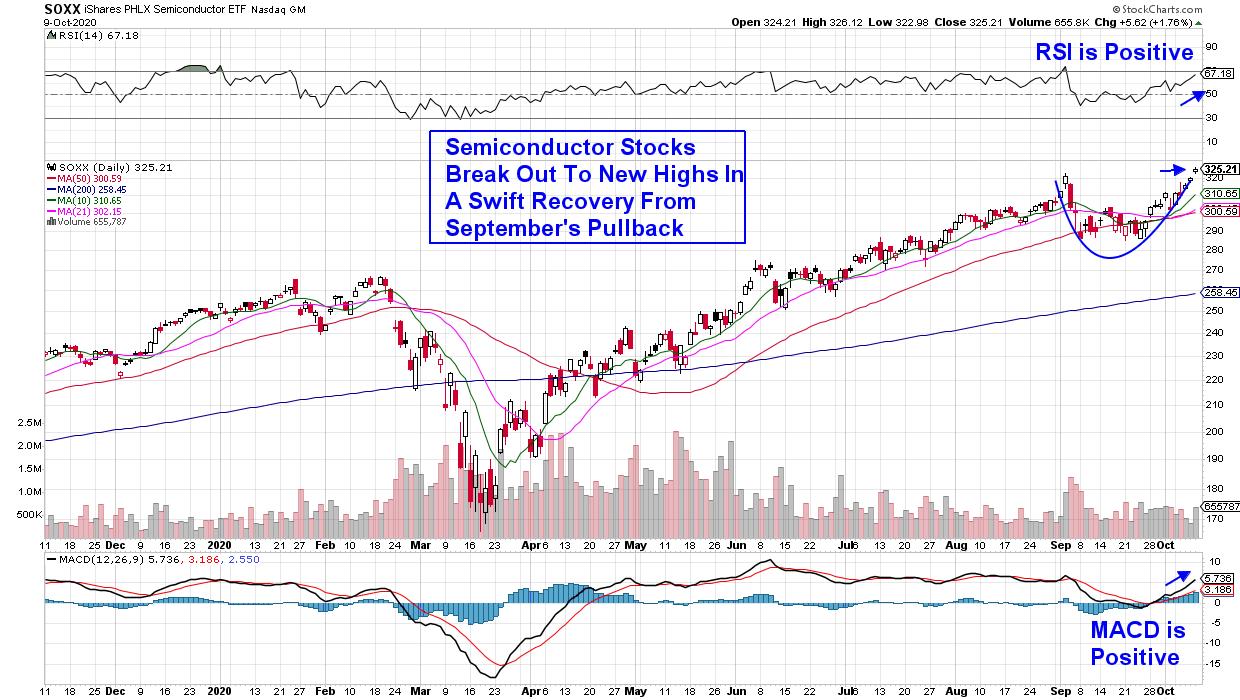
Not all recently hit areas are having as tough a time rebounding, however. Leading Semiconductor stocks are now hitting a new high on volume, led by heavyweight stocks in this area such as Qualcomm (QCOM) and Taiwan Semiconductor (TSM).
My MEM Edge Report has been alerting readers to the outsized growth prospects for chip stocks for some time now, as demand for 5G networks and faster PCs has been driving demand. Last week's sharp rally in Semis helped push the group to new highs, with several smaller companies reversing recent downtrends.
DAILY CHART OF SEMICONDUCTOR ETF (SOXX)

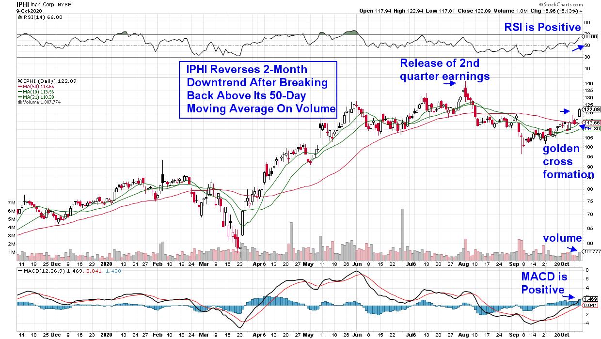
Inphi Corp. (IPHI) is one such company and, after reporting explosive 2nd quarter growth in early August with management guiding higher for both this year and next, the stock hit new highs that had Wall Street downgrading their outlook due to high valuations.
Inphi makes products that are critical for moving large amounts of digital information quickly between and within data centers. More recently, analysts have been raising their price targets to as high as $157, as demand from 5G and telecom is expected to drive growth for many quarters to come.

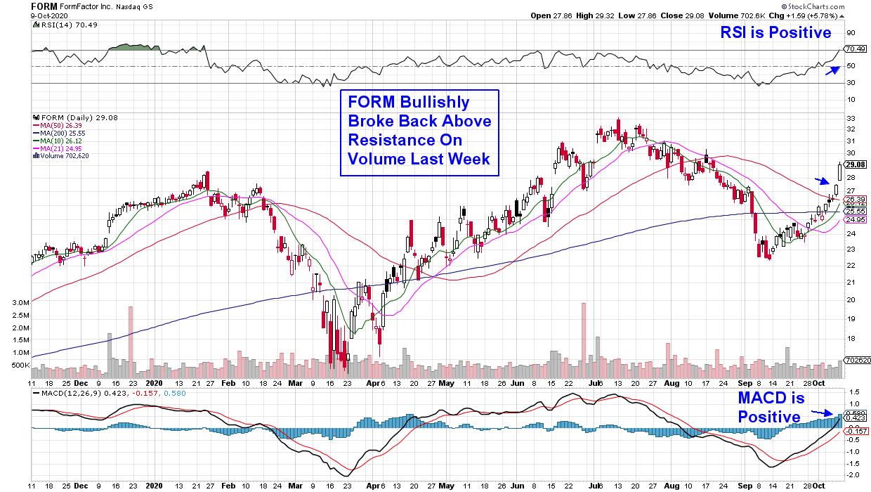
Next up is Formfactor Inc. (FORM), which saw explosive gains last week. This was a delayed response to the company's mid-September news of the creation of engineering probes optimized for use in supercomputers. The cutting-edge probes will be used to meet exponential growth in data center power consumption, as well as the demand for high performance image sensors elsewhere.
DAILY CHART OF FORMFACTOR INC. (FORM)

While last week's rally pushed FORM back into an uptrend, the stock is currently extended out of a buy zone and would need a pullback to the $27 area before being attractive. Analysts are raising guidance for next year's earnings, which call for 25% growth.
While both these smaller Semiconductor stocks are on my Watch List, subscribers to my MEM Edge Report were alerted to both Qualcomm (QCOM) and Taiwan Semiconductor (TSM) some time ago and subscribers have seen gains averaging 56% over the past several months. For those who'd like to receive similar alerts with precise entry and exit points, take a 4-week trial of my bi-weekly MEM Edge Report for a nominal fee. You'll also receive in-depth market and sector analysis to provide you with the confidence needed to outperform in this currently volatile market.
Warmly,
Mary Ellen McGonagle - MEM Investment Research
|
| READ ONLINE → |
|
|
|
| MORE ARTICLES → |
|
 Figure 1
 Chart 1
 Chart 2
 Chart 3
 Chart 4

