| THIS WEEK'S ARTICLES |
| John Murphy's Market Message |
| NASDAQ BREAKOUT LEADS MARKET HIGHER |
| by John Murphy |
NASDAQ BREAKS OUT TO NEW RECORD... Stocks are having another strong day with the S&P 500 and Nasdaq indexes hitting new records. The Nasdaq breakout is especially impressive. Chart 1 shows the Nasdaq Composite Index having broken through its February/April highs to reach new record territory. In addition, the rising trendline along the bottom of the chart and the flat upper line along the top have the look of a potential "ascending triangle". That's normally a bullish continuation pattern. The Nasdaq breakout is indicative of a stronger technology sector (XLK) which is also hitting a new record. Nine sectors are in the black with the leaders being communication services, technology, healthcare and consumer discretionary.
 Chart 1 Chart 1
|
| READ ONLINE → |
|
|
|
| ChartWatchers |
| Mind the 10-year Yield Chart, Not the Fed |
| by Arthur Hill |
 Traders interested in Treasury bonds, Treasury bond ETFs and yields would be better off ignoring Fed-speak and focusing on the charts. The bond market leads the Fed, not the other way around. Traders interested in Treasury bonds, Treasury bond ETFs and yields would be better off ignoring Fed-speak and focusing on the charts. The bond market leads the Fed, not the other way around.
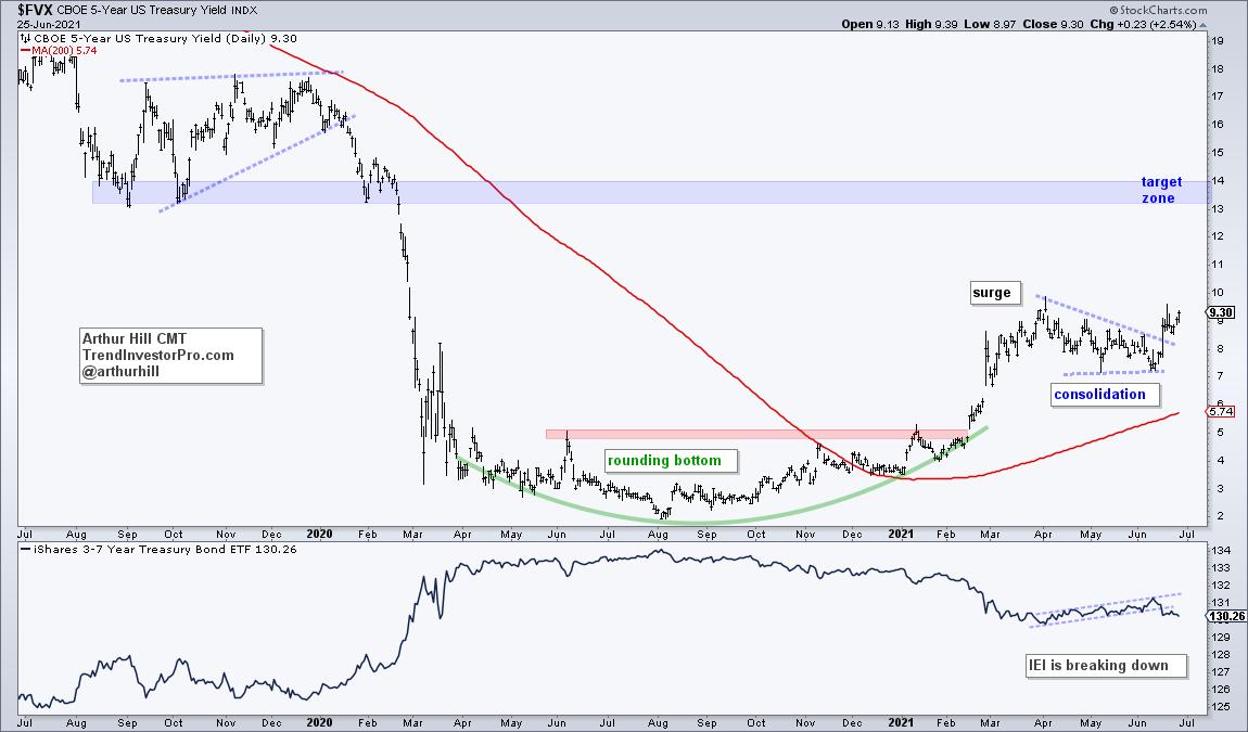
There is a battle raging for the heart and soul of the bond market. In a rare divergence, short-term yields are rising and long-term yields are falling. As a result, the difference between the two is narrowing and the yield curve is flattening. The first chart shows the 5-yr yield surging from late February to early April, consolidating into June and breaking out of this consolidation. The breakout signals a continuation of the bigger uptrend and higher short-term yields are expected. A rising 5-yr yield would be bearish for the 3-7 Yr Treasury Bond ETF (IEI).
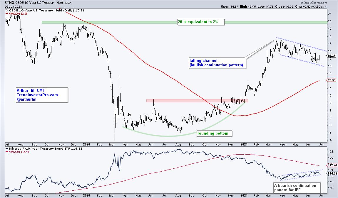
The next chart shows the 10-yr yield with a long basing process from April 2020 to December 2020 and a breakout at the beginning of 2021. The yield surged above 1.7% (17 on chart) and then fell back with a falling channel. The 5-yr yield is breaking out, but the 10-yr yield is within its falling channel. Nevertheless, this channel is viewed as a correction within a bigger uptrend. This is also a bullish continuation pattern and a breakout at 16.5 (1.65%) would signal an end to this correction. I would then target a move toward the 2% area. A breakout and move higher in the 10-yr yield would be bearish for the 7-10 Yr Treasury Bond ETF (IEF).
This analysis continues at TrendInvestorPro.com as we look at the yield curve, the Regional Bank SPDR, the breakout in the Junk Bond ETF and the effect on small-caps. I also posted a summer reading list of 12 books that influenced my analysis process, understanding of markets and trading mindset. This is available to all (click here).
---------------------------------------------------
|
| READ ONLINE → |
|
|
|
| Martin Pring's Market Roundup |
| NASDAQ and S&P at a New High, But It's Very Lonely Up There |
| by Martin Pring |
This week saw the NASDAQ and S&P Composites rally to a new high, but not the DJIA, NYSE Composite, Unweighted S&P and Russell 2000. That's not necessarily the kiss of death, as these discrepancies can always be cleared up over time. In any case, Chart 1 shows that these averages are all close to breaking out themselves. If the bullish end-of-the-month seasonal, which kicks in next week, is powerful enough to enable the NASDAQ to build on its breakout and drag a few more indexes higher, especially the NYSE, count me in. On the other hand, if the breakouts do not hold, then we could be in for an extended period of correction.
My caution is based on several internal indicators, which have been showing weakness in the face of an advancing NASDAQ and S&P Composite. That raises an amber flag concerning the validity of the breakout.
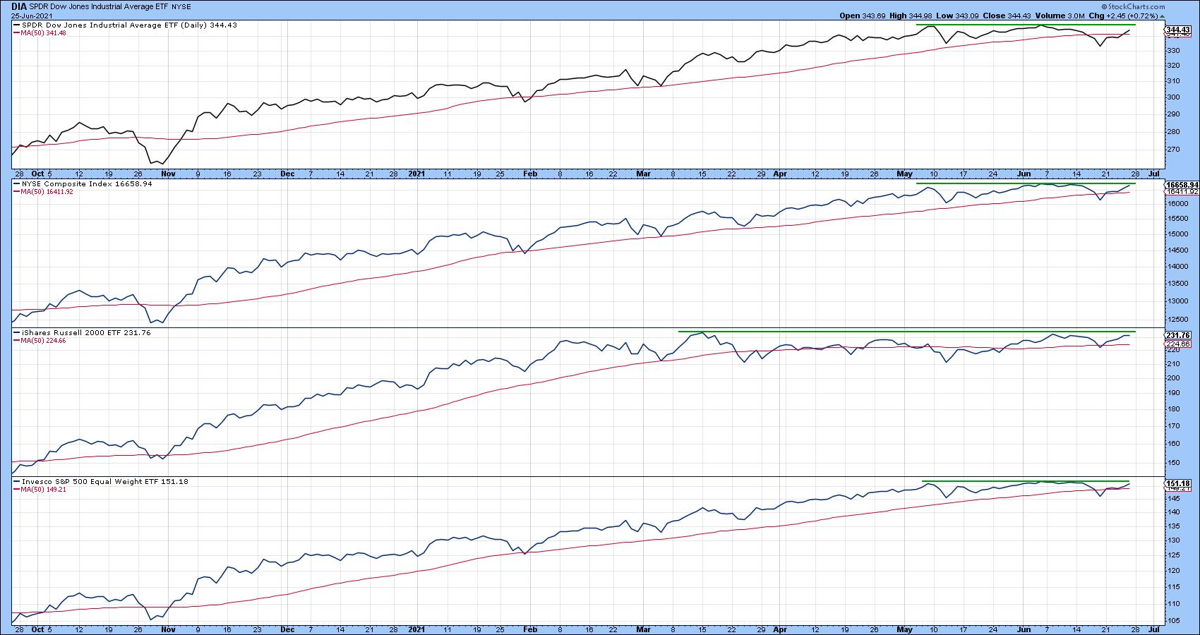 Chart 1 Chart 1
NASDAQ Indicators
The number of NASDAQ issues registering net new highs (Chart 2) has shrunk progressively since the March peak. This points up the fact that there probably far fewer issues breaking to the upside in support of the Index.
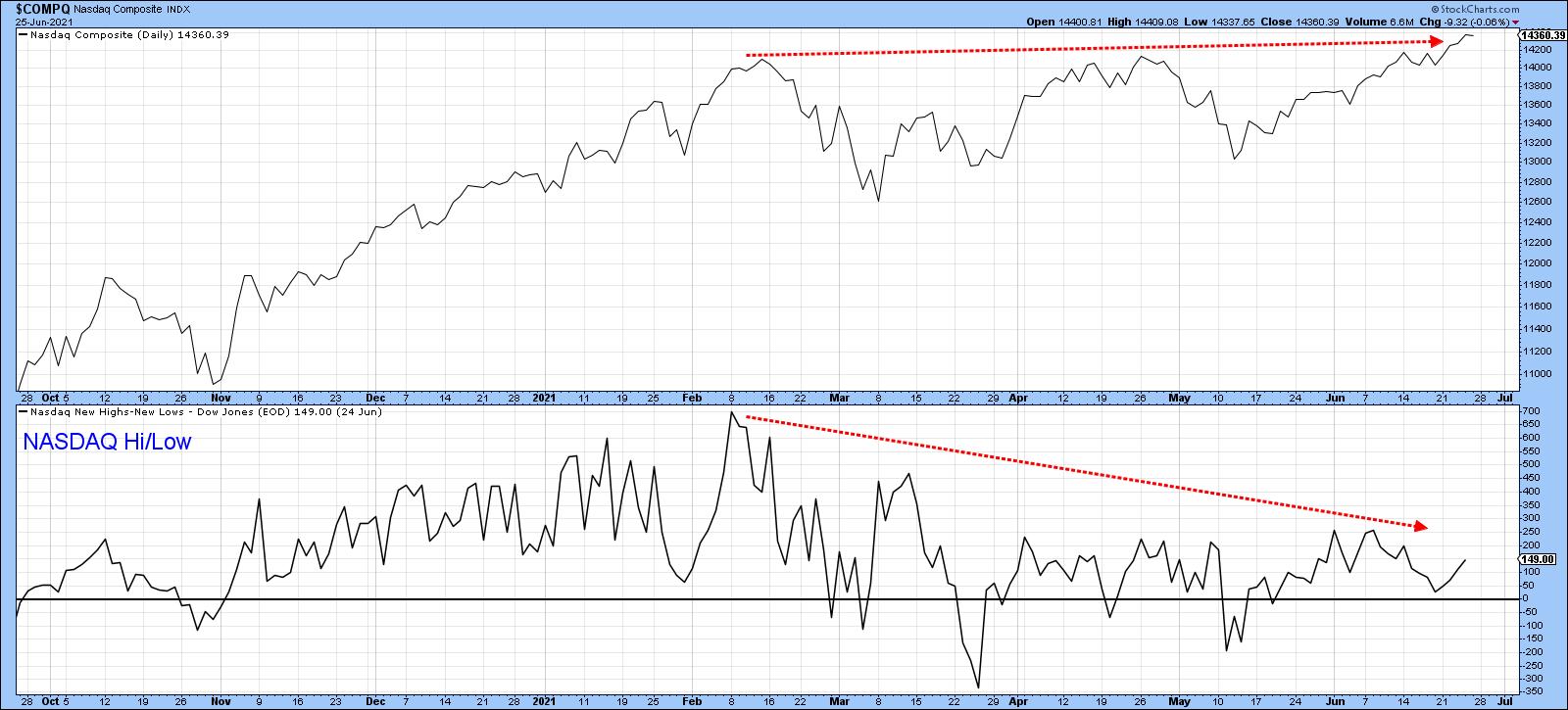 Chart 2 Chart 2
The NASDAQ has certainly lost some mojo because its relative performance has also been lacking. Chart 3, for instance, shows that the RS line is way below its February peak and even remains below its 200-day MA. One encouraging factor is that the head-and-shoulders breakdown did not hold. Normally, such whipsaw action is followed by an above-average rally. Clearing the 200-day MA and April peaks would be a sign that such a move is underway because it would also violate the green resistance line currently intersecting with the MA. As it stands right now, though, the RS trend is negative, despite the fact that the NASDAQ is one of the few averages at new highs.
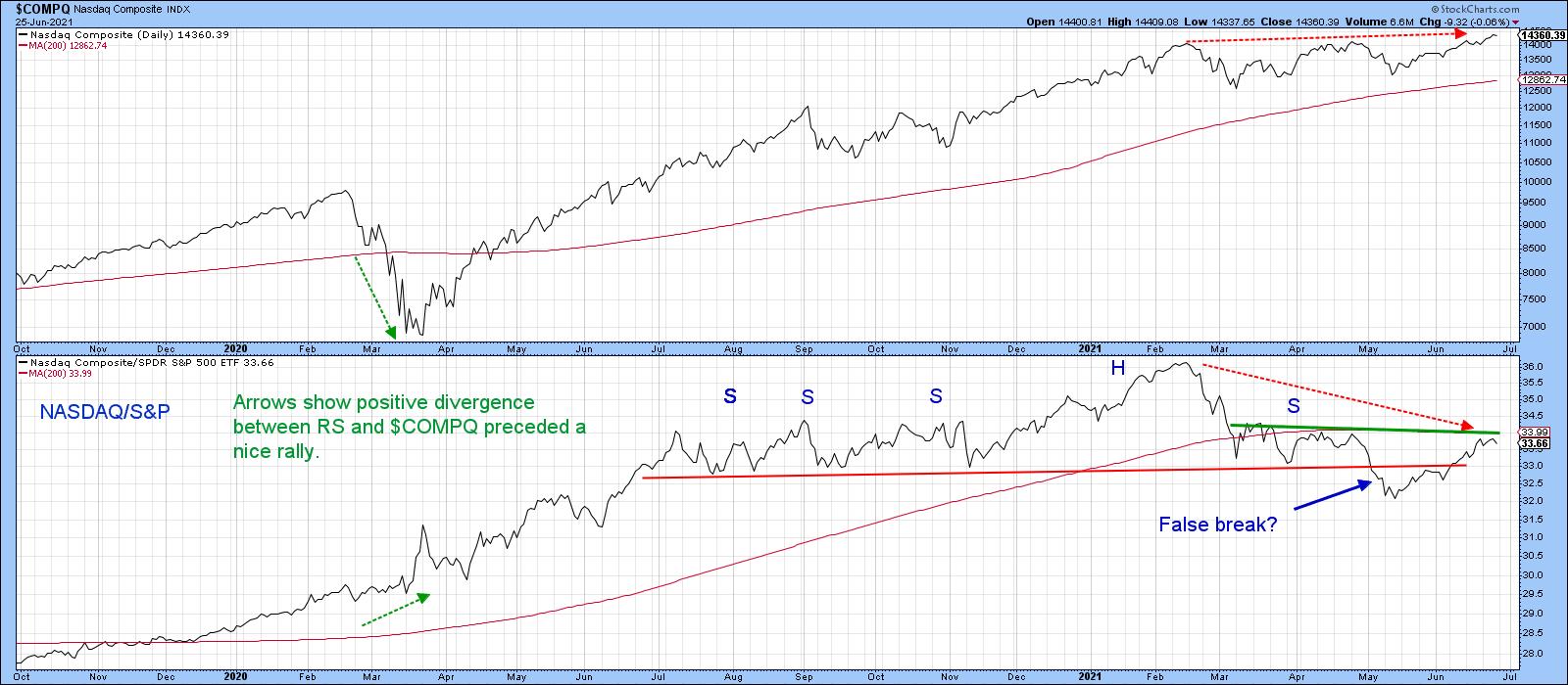 Chart 3 Chart 3
NYSE Internal Indicators
Over at the NYSE (Chart 4), we see breadth, in the form of the cumulative common stock only McClellan oscillator, violating its dashed October/May up trendline. That break was also confirmed by the NYSE Composite itself. When an up trendline such as this is violated, one of two things usually follows; either there is an actual reversal or prices experience a trading range. If that trading range is resolved on the downside, the original break is re-categorized as a reversal. On the other hand, an upside resolution results in the original trend being resumed but at a slower pace. The break is then considered to be a consolidation or continuation one. So far, the May trendline violation has been followed by an unresolved trading range. It could turn out to be a head-and-shoulders top or a bullish continuation one.
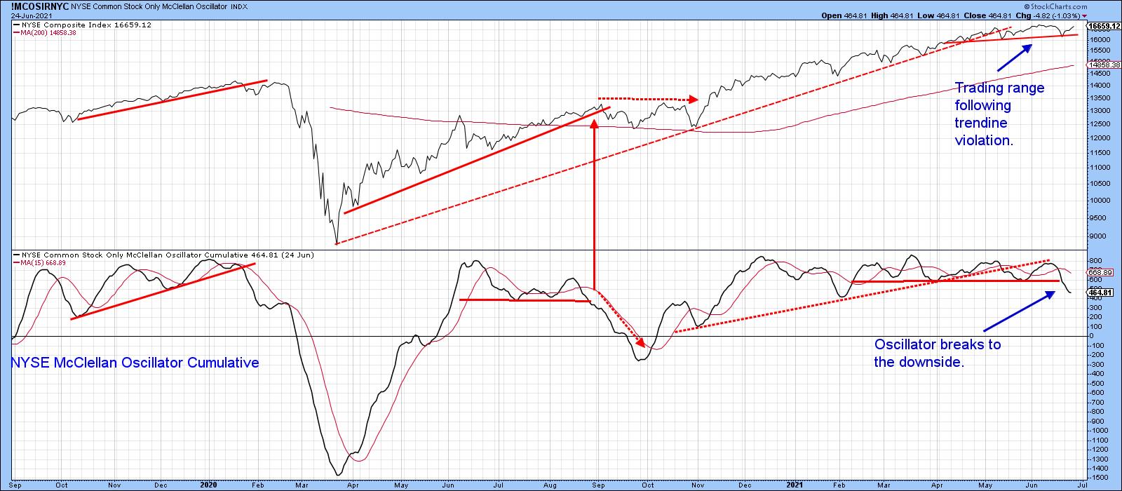 Chart 4 Chart 4
The McClellan oscillator also experienced a trading range of its own, but has now broken to the downside. Usually, oscillator weakness is eventually accompanied by a drop in the NYSE itself, but that does not always happen, as we can see from last September's break. In that instance, the NYSE traded sideways for a while following the oscillator's break to a new low.
In the current situation, it's possible that the trading range could turn out to be a head-and-shoulders top, but only if completed. That would happen with a decisive daily close that can hold below the previous low at 16,400.
Chart 5 displays the same kind of weakening breadth action, but this time from the percentage of NYSE stocks above their 50-day MA. It's similar to three previous setups that have taken place in the last few years, each of which was followed by some form of corrective activity.
 Chart 5 Chart 5
An indicator that helps to identify many short-term price movements is a change in direction of a 10-day MA for a 12-day ROC. An example is shown in Chart 6 for the DJIA. It can also be helpful when it has been above zero for 3 months or more and then crosses below it. All four such setups since 2018 were associated with a decline of some kind. The July 2020 example has been flagged by a dashed arrow to indicate that a decline did take place but the signal came too late to be of any profitable use.
This week has seen a fifth such example. Ignoring the extremely marginal penetration that took place in February, the current negative zero crossover has developed after a pretty lengthy seven-month period where the indicator traded above it.
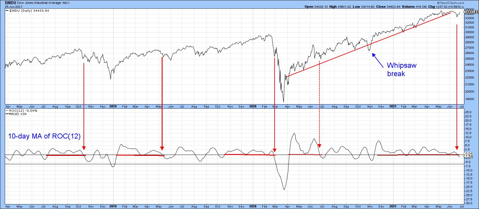 Chart 6 Chart 6
Conclusion
The vast majority of the long-term indicators I follow continue to offer a positive backdrop. However, the more-or-less solitary breakout by the tech-dominated NASDAQ and S&P Composite, combined with internal weakness in some of the breadth data, throw up some questions on the validity of the breakout. A strong showing going into early July could clear up most of these discrepancies. Indeed, if the NYSE can move to a new high, that would be very bullish, since it would mean that its potentially bearish head-and-shoulders top had not worked. An above-average-type move typically follows such setups. However, if the NASDAQ and S&P breakouts do not hold, that would suggest that the overall corrective environment that has taken place since February is likely to extend.
Good luck and good charting,
Martin J. Pring
The views expressed in this article are those of the author and do not necessarily reflect the position or opinion of Pring Turner Capital Group of Walnut Creek or its affiliates.
|
| READ ONLINE → |
|
|
|
|
|
| ChartWatchers |
| An Update on Chart Madness |
| by Greg Schnell |
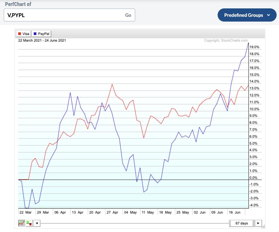
This past spring, Tom Bowley, Grayson Roze, David Keller and Greg Schnell got together for a stock selection process we called Chart Madness. This article is an update on the stocks from that event. Everything started 67 days ago on March 22.
The first two were Visa vs. Paypal. Both great names. Visa (V) was leading until last week, as Paypal (PYPL) went ballistic from mid-May. Remember the growth names were out of favour in March. They look to be returning to form.
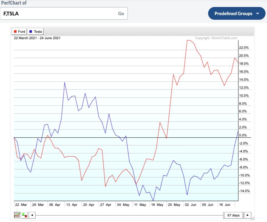
 Next was Ford vs. Tesla. It's been a seesaw battle. Ford (F) has been outperforming Tesla (TSLA), but Tesla is turning up. Next was Ford vs. Tesla. It's been a seesaw battle. Ford (F) has been outperforming Tesla (TSLA), but Tesla is turning up.

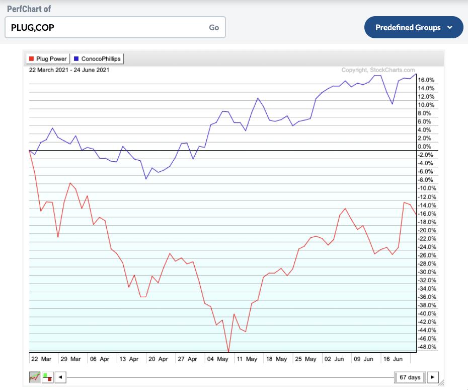
Plug Power vs. Conoco Phillips. Conoco (COP) has had a good run, up 16% since March. Plug Power (PLUG) was in the Clean Tech washout and those stocks got pommeled. The alternative energy space is perking up. Can Plug Power come back?

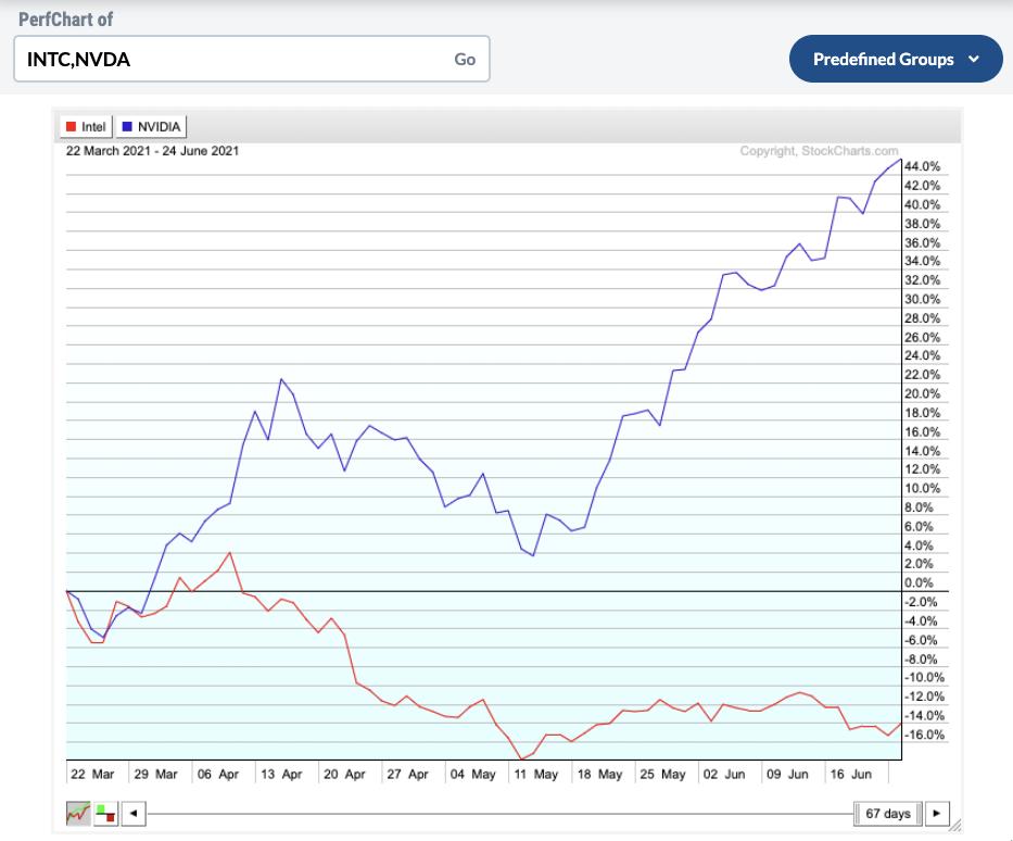
Intel vs. Nvidia. It's been a house of pain for Intel (INTC); sadly, that was my pick in the pairing. Nvidia (NVDA) continues to run huge.

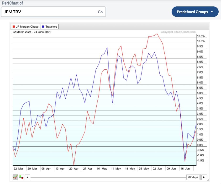
JPM and Travelers (TRV). On any given day, one could be leading the other. The bottom line for me is, as yields have turned, these became dead money.

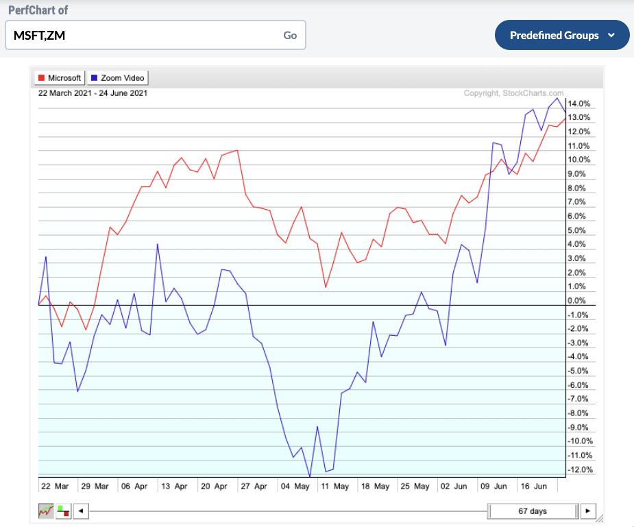
Microsoft vs. Zoom. I did not expect Zoom (ZM) to come zooming back actually. Microsoft (MSFT) is such a strong name, but the two are in a dogfight. It's been a big month for Zoom investors.

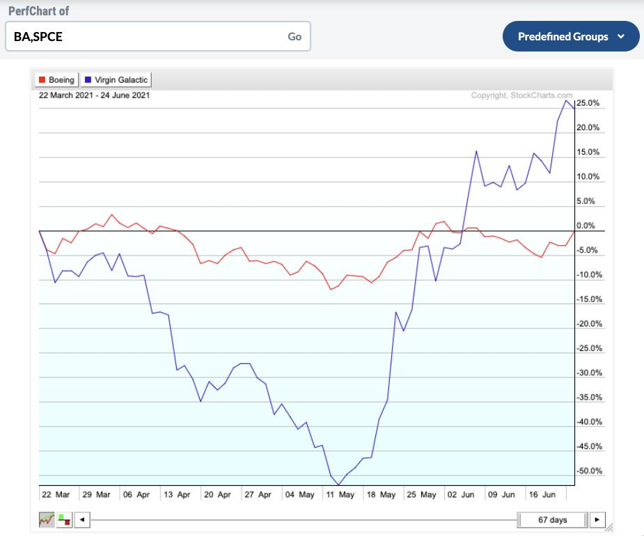
Boeing vs. Virgin Galactic. I thought Boeing (BA) would have this one wrapped up. Once again, the return to growth in mid-May sent Virgin Galactic (SPCE) rocketing higher. Wowza.

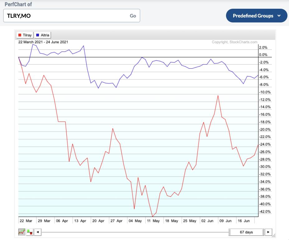
Lastly, we have Tilray (TLRY) vs. Altria (MO). Clearly Altria is the winner so far, but both are down from the start.

The picking was to be for a six-month time frame, ending September 22. While I started off real strong, the resurgence of growth names in May has made it much more interesting. My choices were V, F, COP, INTC, JPM, MSFT, BA and TLRY.
It's fun to do a look back on the event. Here is a link to the original video.
StockCharts Chart Madness
|
| READ ONLINE → |
|
|
|
| SPECIAL EVENT ANNOUNCEMENT |
| Don't miss your chance to hear our own David Keller at the upcoming MoneyShow Virtual Event, streaming LIVE June 29th - July 1st. Click the banner below to learn more and register for the event. |
 |
| LEARN MORE → |
|
| ChartWatchers |
| Fading Participation is Still a Huge Problem |
| by Carl Swenlin, Erin Swenlin |
(This is an excerpt from today's DecisionPoint Weekly Wrap)
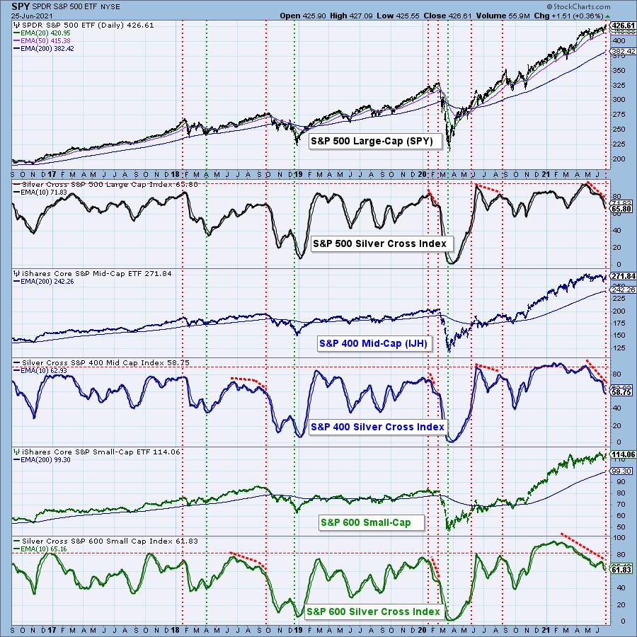
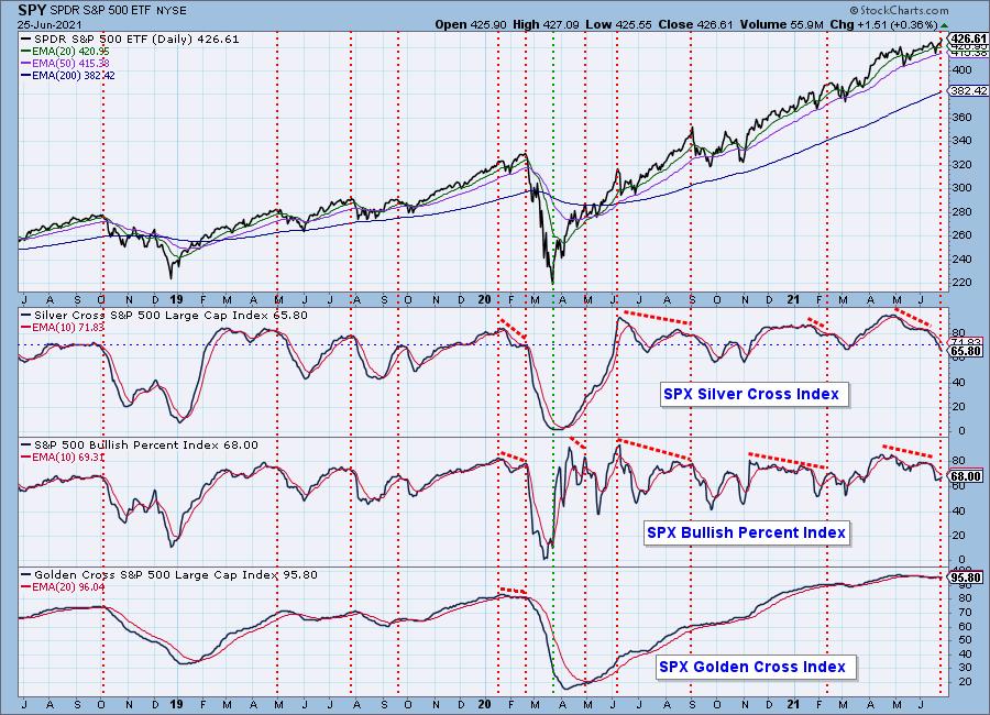
When the 20-EMA crosses up through the 50-EMA, we consider that to be an intermediate-term BUY signal (a "silver cross") and track the percentage of stocks with BUY signals in a given market index with the Silver Cross Index (SCI). The chart below shows the SCIs for the S&P 500 Large-Cap, S&P 400 Mid-Cap and S&P 600 Small-Cap Indexes, and there are significant negative divergences on all three SCIs. Specifically, the price indexes are at or near all-time highs, while all three SCIs show fewer and fewer stocks on BUY signals. To emphasize: This is happening from large-cap to small-cap indexes. This cannot continue.

Don't miss out! Our special will end on July 15th!
Use coupon code SAVE50 and receive your first month of any DecisionPoint publication at 50% off!

PARTICIPATION: The following chart uses different methodologies for objectively showing the depth and trend of participation for intermediate- and long-term time frames.
- The Silver Cross Index (SCI) shows the percentage of SPX stocks on IT Trend Model BUY signals (20-EMA > 50-EMA).
- The Golden Cross Index (GCI) shows the percentage of SPX stocks on LT Trend Model BUY signals (50-EMA > 200-EMA).
- The Bullish Percent Index (BPI) shows the percentage of SPX stocks on Point & Figure BUY signals.
Fading participation is a huge issue for the market. The Silver Cross Index (SCI) shows only 66% of S&P 500 stocks have the 20EMA above the 50EMA and the trend of the SCI is down. This implies that the larger-cap stocks in the index are holding it up. This condition can persist, but, unless the SCI trend reverses, the tipping point will be reached and we'll see prices hit an air pocket.


Click here to register in advance for the recurring free DecisionPoint Trading Room!
Free DP Trading Room RECORDING LINK from 6/21:
Topic: DecisionPoint Trading Room
Start Time: Jun 21, 2021 08:49 AM
Free DP Trading Room (6/21) Recording Link.
Access Passcode: June-21st
For best results, copy and paste the access code to avoid typos.
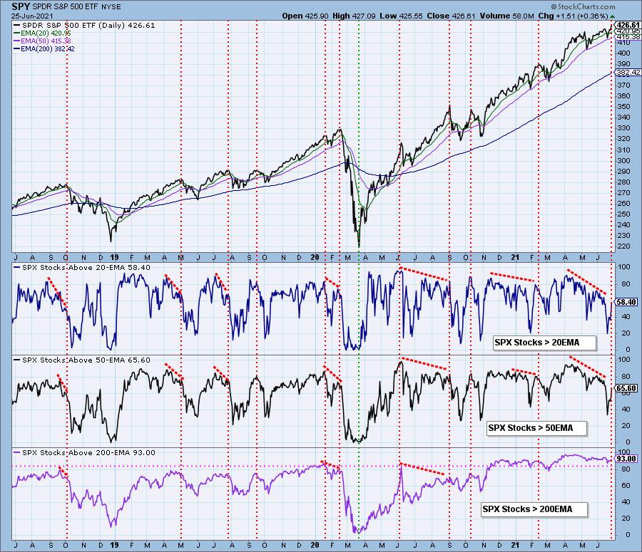
There are still sharp negative divergences on the Stocks > 20EMA and Stocks > 50EMA even with the improved readings this week.

Conclusion: Fading participation and negative divergences suggest the current short-term and intermediate-term rising trends are in jeopardy.
Happy Charting!
- Carl & Erin
Technical Analysis is a windsock, not a crystal ball.
Helpful DecisionPoint Links:
DecisionPoint Alert Chart List
DecisionPoint Golden Cross/Silver Cross Index Chart List
DecisionPoint Sector Chart List
DecisionPoint Chart Gallery
Trend Models
Price Momentum Oscillator (PMO)
On Balance Volume
Swenlin Trading Oscillators (STO-B and STO-V)
ITBM and ITVM
SCTR Ranking
DecisionPoint is not a registered investment advisor. Investment and trading decisions are solely your responsibility. DecisionPoint newsletters, blogs or website materials should NOT be interpreted as a recommendation or solicitation to buy or sell any security or to take any specific action.
|
| READ ONLINE → |
|
|
|
| ChartWatchers |
| Are Nike's Earnings Results a Precursor of What is About to Come? |
| by John Hopkins |
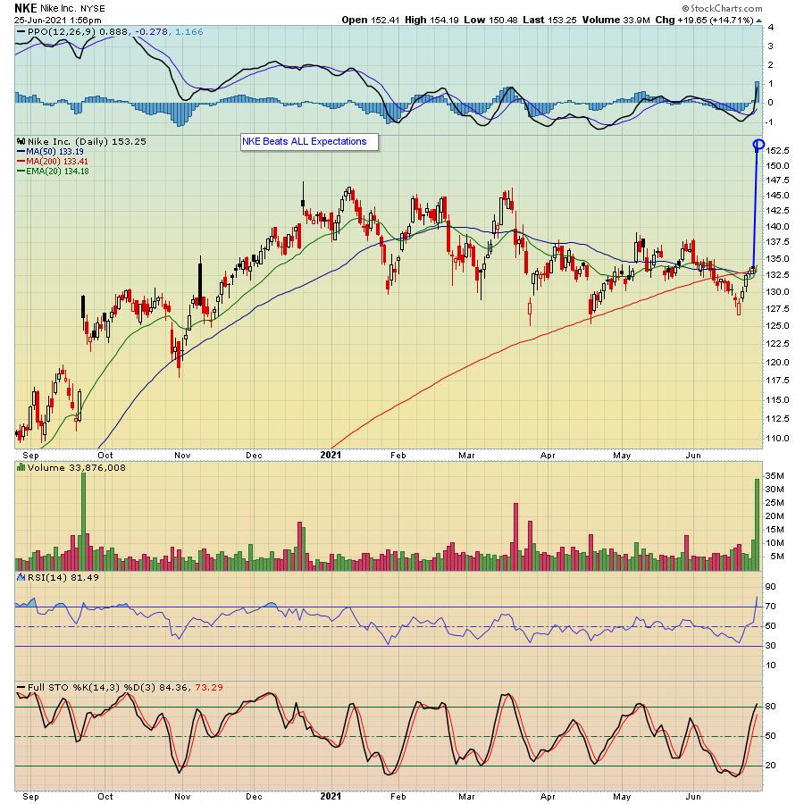
Nike (NKE) reported blowout earnings Thursday after the bell and the market liked what it heard and saw, with the stock rising by 15% when it opened for trading on Friday. The company smashed all expectations and even guided higher, a combo that launched it to an all-time high.

Of course, there's no way of knowing what overall market earnings will look like when they start coming out in droves in just a few weeks. But with both the NASDAQ and S&P hitting record levels this past week, it shows that expectations are indeed high.
There's also no way of knowing how investors will react to a company's earnings report. For example, I've seen plenty of times where a company beat all expectations and the stock sold off on the news. Why? Maybe because investors had already factored in the possibility of strong results. And I've seen times when a company missed their numbers, but the stock rose after they reported. Why? Maybe because they raised their earnings forecast and the past became less important than the future.
Whatever the case, it makes sense to try to identify those companies with charts that might offer clues pertaining to their earnings -- i.e., which companies are showing characteristics that indicate they could beat expectations? In fact, our Chief Market Strategist Tom Bowley has created a ChartList -- our "Strong Future Earnings ChartList" -- that does just that. The list, which was just updated this past Friday, contains 234 companies that belong to strong industry groups and have SCTR scores greater than 80. These are companies that are favored by Wall Street, suggesting that perhaps we'll see better than expected quarterly revenues and earnings as we approach their respective earnings dates. And if you would like to see one of the companies on the list that Tom believes fits the bill, just click on this link to sign up for our FREE EarningsBeats Digest that comes out every M, W and F; Tom will reveal the stock in this Monday's Digest. In addition, Monday's Digest will provide readers with a full description of all of the powerful EarningsBeats ChartLists our members have access to, which helps them make smart, strategic trading decisions.
NKE shareholders were rewarded handsomely when the company beat all expectations. Identifying those companies that show promising charts ahead of their earnings could put you in a position to profit nicely.
At your service,
John Hopkins
EarningsBeats.com
|
| READ ONLINE → |
|
|
|
| MORE ARTICLES → |
|
 Chart 1

 Traders interested in Treasury bonds, Treasury bond ETFs and yields would be better off ignoring Fed-speak and focusing on the charts. The bond market leads the Fed, not the other way around.


 Next was Ford vs. Tesla. It's been a seesaw battle. Ford (F) has been outperforming Tesla (TSLA), but Tesla is turning up.