| THIS WEEK'S ARTICLES |
| John Murphy's Market Message |
| STOCK REBOUND CONTINUES |
| by John Murphy |
MARKET REBOUND CONTINUES... Stocks had another strong day today and have more than made back their sharp losses from Monday. Chart 1 shows the Dow Industrials closing above their 50-day average for the second day in row. Chart 2 shows the S&P 500 gaining more ground following Monday's successful test of its 50-day line. Chart 3 shows the Nasdaq Composite closing back above its 20-day average. Eight of eleven market sectors ended in the black today with the biggest gains coming from more cyclical sectors like energy, financials, materials, and industrials. More defensive sectors like utilities, real estate, and staples lost some ground. That's usually a sign that investors are in a more optimistic mood. Treasury yields also jumped today as some money rotated out of the safety of bonds. The 10-Year Treasury yield ended the day back over its 200-day average that was broken on Monday.
 Chart 1 Chart 1
 Chart 2 Chart 2
 Chart 3 Chart 3
|
| READ ONLINE → |
|
|
|
| ChartWatchers |
| XLE Bids to End Correction and Resume Uptrend |
| by Arthur Hill |
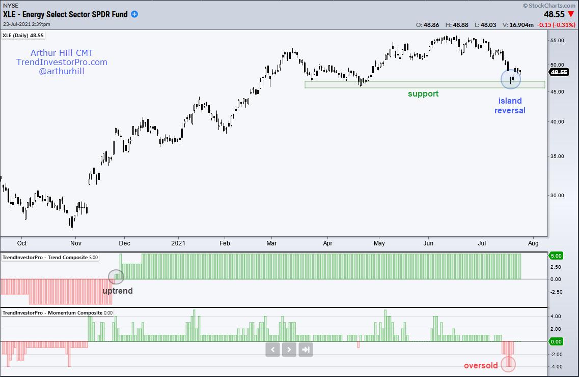
The Energy SPDR (XLE) is setting up to end its correction and resume its bigger uptrend.
First and foremost, the long-term trend is up because the Trend Composite signaled an uptrend (gray circle) in late November when the majority of indicators turned bullish. There are five trend-following indicators in the Trend Composite and all five are currently signaling an uptrend. This indicator, and 10 others, are part of the TIP Indicator Edge Plugin for StockCharts ACP.
The trend is the dominant force at work and we want to look for setups in harmony with this trend. Thus, I am on the hunt for short-term bullish setups and signals when the trend is up. XLE fell some 10% from mid June to mid July and became quite oversold as the Momentum Composite hit -4. There are five indicators in the Momentum Composite and this means four of the five were oversold.

On the price chart, XLE fell to the March-April lows and these levels offered prior support (green shading). Buyers again stepped in as XLE forged an island reversal this week with a gap up (blue oval). A bullish island reversal is a short-term reversal that forms with a gap down, stall and gap up. The two gaps align to create a price island where the bears are trapped with losses.
The uptrend, oversold condition, support zone and island reversal suggest that XLE is ripe for a bounce and continuation of the bigger uptrend. This week's lows mark support and a close below these lows would argue for a re-evaluation.
As the name suggests, TrendInvestorPro specializes in trend identification and finding short-term bullish setups within the bigger uptrend. We constantly monitor a core ETF list with over 120 names and regularly update trend signals. Click here to subscribe.
----------------------------------------------
|
| READ ONLINE → |
|
|
|
| Martin Pring's Market Roundup |
| The Correction May Not Be as Bad as You Think |
| by Martin Pring |
The bad news is that a correction is underway and that many indicators and market averages have started to break through key support. The good news is that, internally, corrective activity has been underway for several months. Provided the bull market is still in existence (and there are few grounds at this point for suspecting otherwise), we are probably near the end of this corrective process, at least in terms of time. Ironically, the steeper and quicker the price loss, the more likely it's a contra-trend price move. That's not to ignore the fact that speculation is rampant and many levels of valuation are at extremes. That was also true of the last few years of the 1982-2000 bull market. However, until long-term measures of momentum and sentiment start to reverse, I am nervously assuming that the main trend is up and what we are witnessing will turn out to be a buying rather than a selling opportunity.
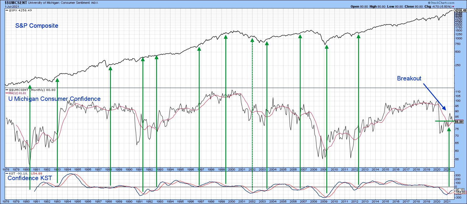
One Long-Term Indicator that Has Just Turned Bullish
Chart 1 offers an example of why the market is ultimately likely to move higher. It features the University of Michigan Consumer Sentiment. The raw data correlate in a rough way with swings in the S&P. However, the month-to-month volatility of this data does not lend it to moving average crossovers and other traditional trend identification techniques. When it is expressed in momentum format, though, useful bullish signals for the market are generated from KST reversals. They have consistently called important rallies since the 1970s, as indicated by the green arrows. There was one notable exception, which took place in 2001. It happened as the economy emerged from a recession, but the market was still focusing on the unwinding of the tech bubble.
The KST went bullish a couple of months ago and remains at a subdued level. That suggests consumer confidence and the market will eventually move higher.
 Chart 1 Chart 1
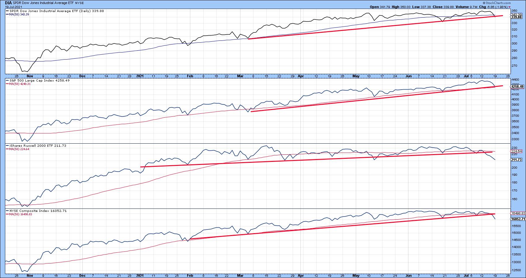
Market Breaking Support
Chart 2 shows that a number of major averages are either at or have decisively penetrated key trendlines.
 Chart 2 Chart 2
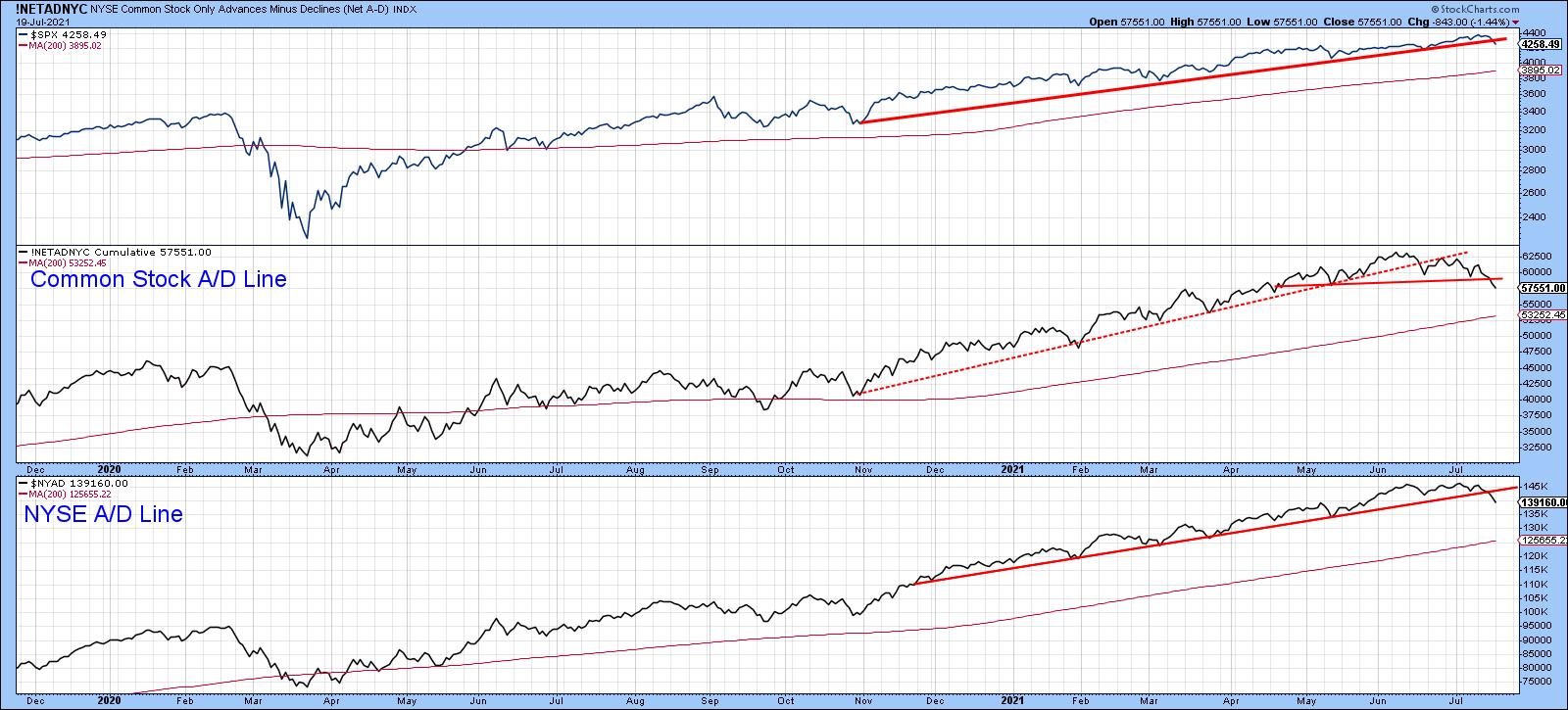
Chart 3 indicates that both the NYSE Common Stock and regular A/D Lines have violated important up trendlines and completed small tops. That action in itself argues in favor of further price erosion before the correction has run its course. However, it is also important to note that none of these series have yet come close to challenging their 200-day MAs, an event that could represent the first sign of a bear market.
 Chart 3 Chart 3
Correction is Quite Mature
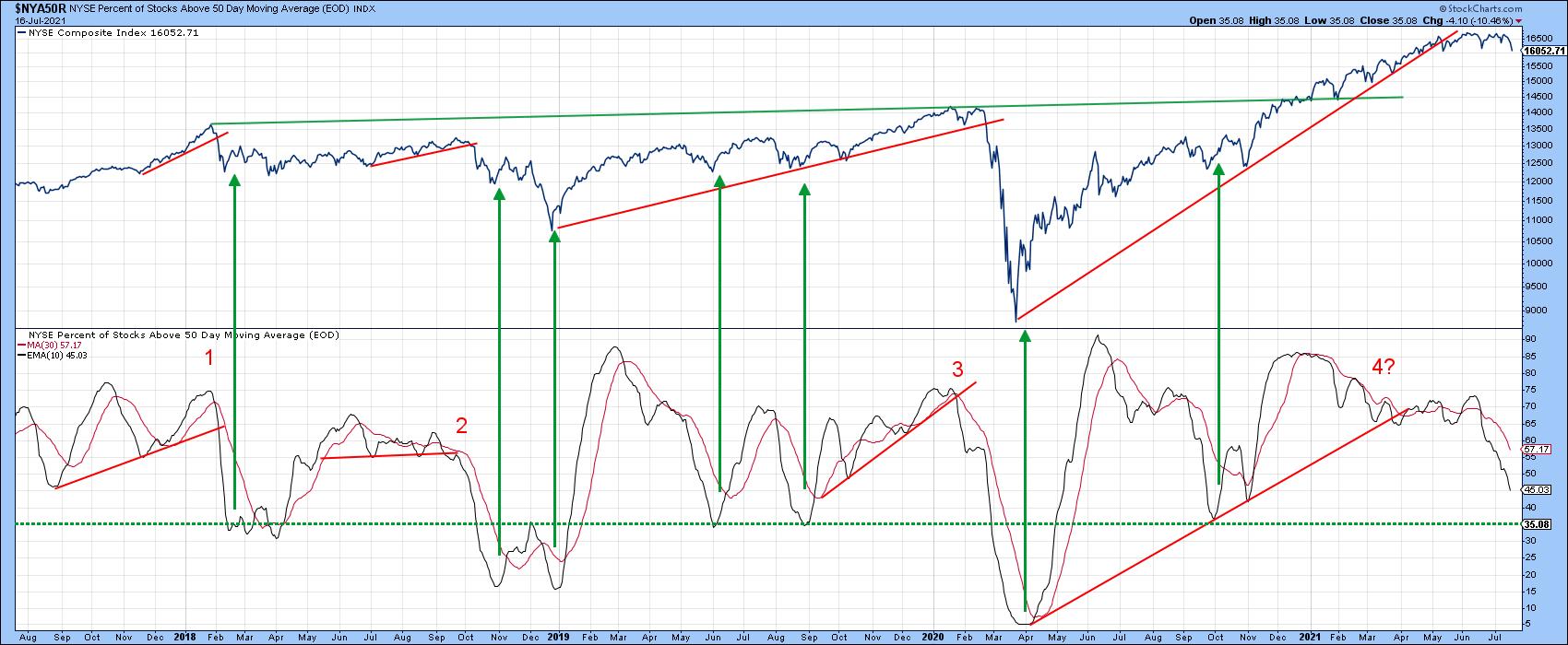
Looking at the S&P Composite gives the impression that the decline is less than a week old. However, it's been going on since February or March, depending on which average or internal indicator being monitored. Chart 4 offers a great example, as it pits the NYSE Composite against the percentage of stocks above their 50-day moving averages. That indicator peaked way back in June of last year. It has since diverged three times with the Index itself. I presented this chart earlier in the year to demonstrate the three double trendline setups that had taken place since 2018. A fourth seemed to be developing at the time, hence the question mark. It took some sideways action in the Index combined with a June/July free fall in the oscillator to finally confirm this setup.
I never like to see a market move sideways whilst a substantial number of its components are deteriorating. That could certainly lead to some serious trouble. However, the good news is that the indicator is not that far from its green oversold line at 35. The arrows show that reversals from such a level have usually been followed by a worthwhile advance.
 Chart 4 Chart 4
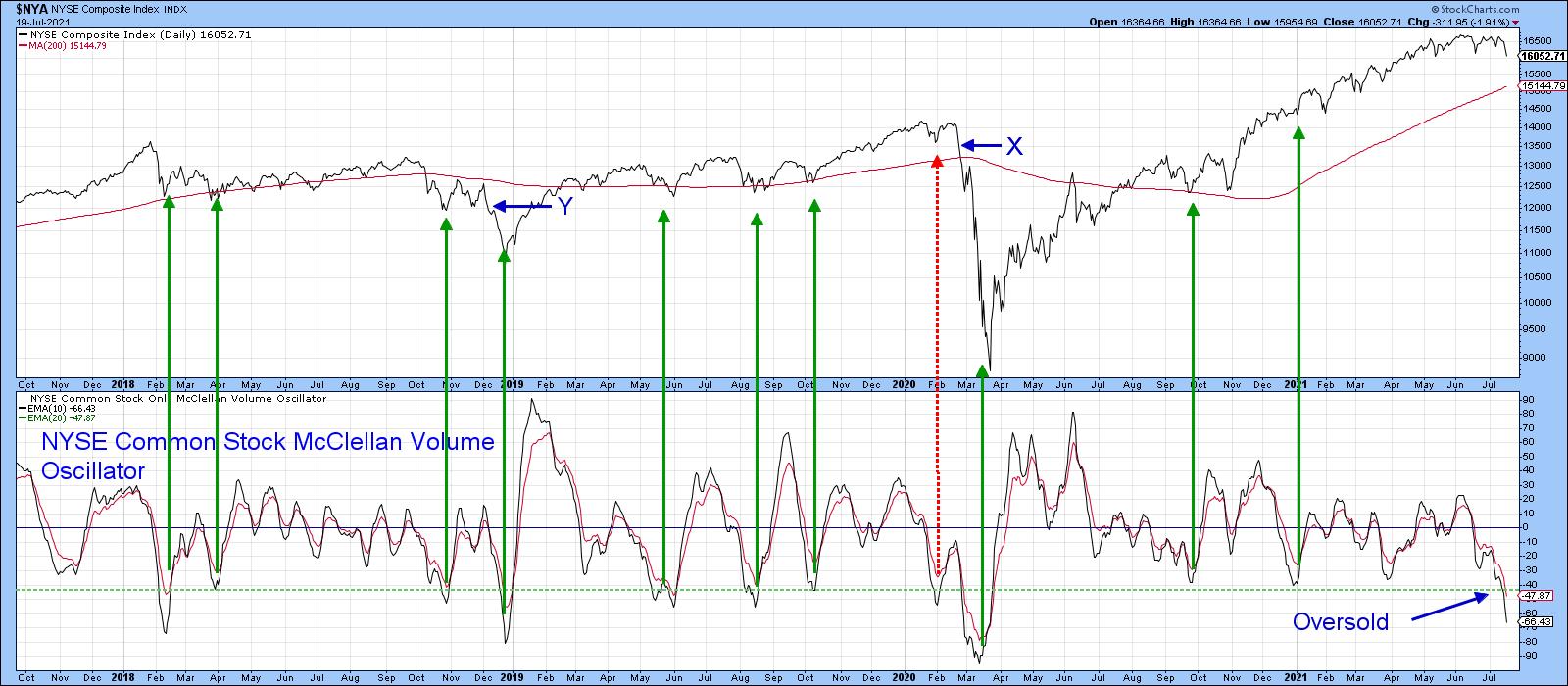
The 10-day MA of the NYSE Common Stock McClellan Volume Oscillator is even more oversold. The green arrows tell us that most times reversals from such a level are good bull market buying opportunities. It also offers an example of my worst nightmare at point X. In that situation, the indicator triggered a buy signal by reversing from an oversold condition, but the rally was sub-par and subsequently followed by a 35% decline. Once the initial low was taken out at X, it warned that the technical structure was unexpectedly weak. Note that we got a milder version of this red flag setup at point Y. Even though it seems likely that the bull market is alive and well, if that kind of action is spotted again, it will warn us that it probably is not.
 Chart 5 Chart 5
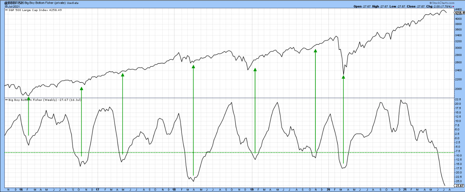
Chart 6 presents an intermediate version of my Bottom Fisher, which you can read about here. This intermediate format is a user-defined index (UDI), so it cannot be updated. The arrows show when oversold reversals take place. Usually, this is followed by a worthwhile rally, as oversold conditions reflect a washed-out market. The indicator is still in a declining mode, so a signal has not yet been given. However, it seems likely that it soon will as it is already below the March 2020 low.
 Chart 6 Chart 6
Conclusion
The long-term indicators monitoring the primary trend, whilst overextended, are still bullish. Since many averages have broken important support, the decline has probably got further to run. However, as the late Richard Russell used to say, and here I paraphrase, "surprises usually develop in the direction of the main trend." With "Dow Watch'' boxes regularly appearing on cable news today, the big surprise could be a smaller correction than expected because most of it has already taken place..... internally.
Good luck and good charting,
Martin J. Pring
The views expressed in this article are those of the author and do not necessarily reflect the position or opinion of Pring Turner Capital Group of Walnut Creek or its affiliates.
|
| READ ONLINE → |
|
|
|
|
|
| ChartWatchers |
| Watch This Sector and Industry Group Next Week! |
| by Erin Swenlin |

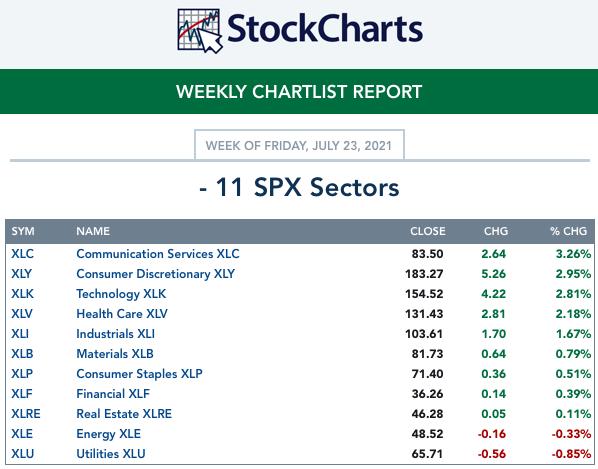
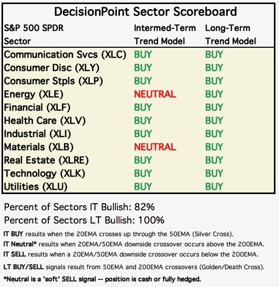
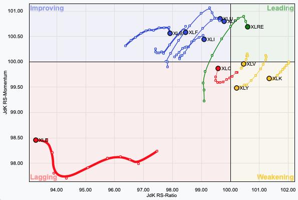
On Fridays, as part of my subscriber-only DecisionPoint Diamonds Report, I give readers insight on how the Sectors did for the week, what our Sector Scoreboard and daily RRG look like and, most importantly, what sector and industry group to watch going into next week.
I decided to share an excerpt from Friday's 7/23 DP Diamonds Recap. It was actually difficult to choose this week's sector to watch, as we are seeing rebounds off key levels of support and newly rising Price Momentum Oscillators (PMO). While I picked Healthcare as my "sector to watch" this week, XLP and XLU also look pretty good.
THIS WEEK's Sector Performance: 
DecisionPoint Sector Scoreboard (Mechanical Trend Model Signals):

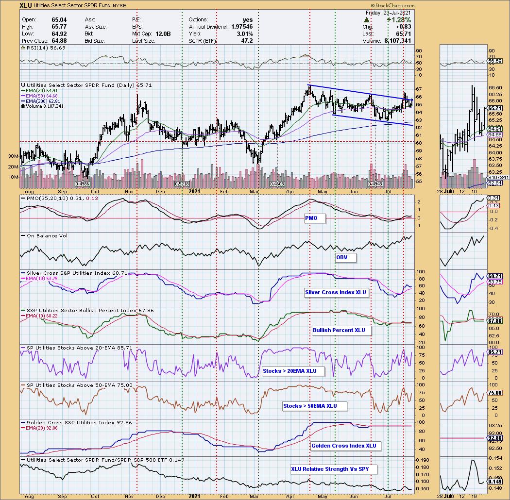
Short-Term RRG: No significant changes. I would just note that XLV, which is in Weakening, has reversed direction and is headed back to Leading. XLU and XLP are also heading toward Leading. For those in the Diamond Mine this morning, that should be no surprise, as those were short-listed for "Sector to Watch" next week.


Click here to register in advance for the recurring free DecisionPoint Trading Room! Recordings are available!

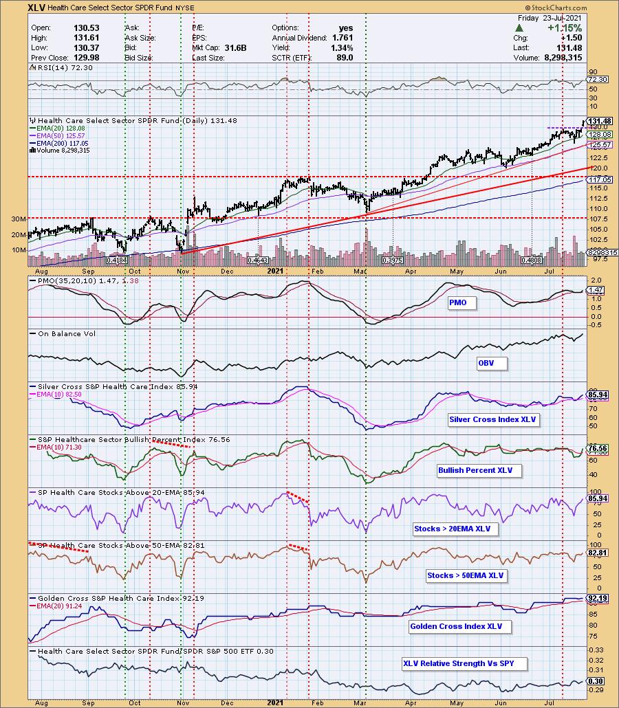
Sector to Watch: Healthcare (XLV)
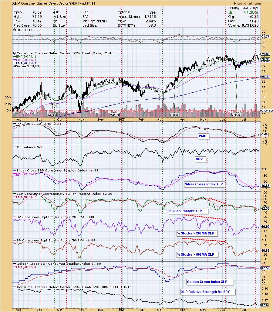
The sector chart style below is available for all sectors on our website for subscribers. The "under the hood" indicators on participation make these charts a must have.
I struggled "live" in the Diamond Mine trying to find the perfect sector to watch next week. I opted to go with XLV because the only real negative on the chart was the newly overbought RSI. Today's gap up breakout also affected my decision. The configuration of the PMO, SCI and BPI, as well as strong participation numbers, sold it for me.
You'll also note that the relative strength line shows that the sector is beginning to outperform the SPX.

I've added the XLP and XLU sector charts below for comparison. They are also bullish.


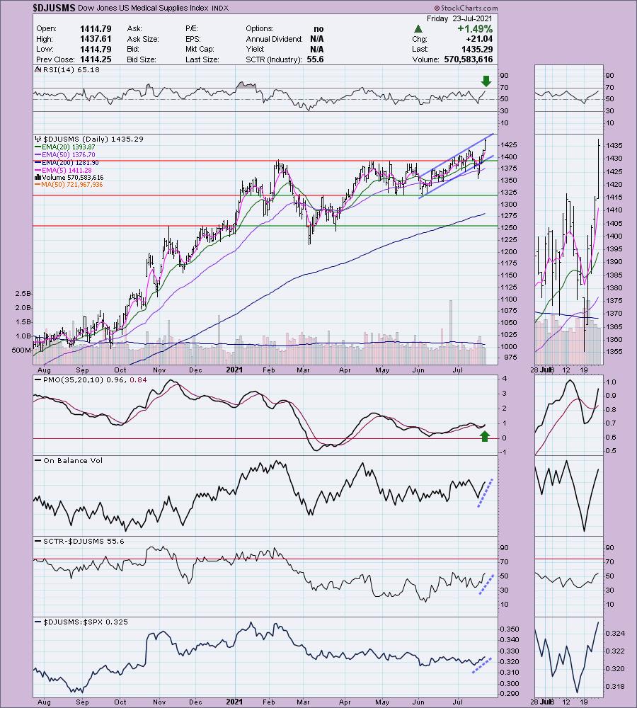
Industry Group to Watch: Medical Supplies ($DJUSMS)
After breaking down from the rising trend channel, price successfully tested the 50-EMA and recaptured the rising trend. The RSI is positive and not overbought and the PMO just gave us a crossover BUY signal. Relative performance is strong.

Conclusion: It appears that the three defensive sectors XLV, XLP and XLU all show promise for next week. Rotation is shifting toward these defensive groups, telling us that investors are already opting to play defense in anticipation of a market failure.
Technical Analysis is a windsock, not a crystal ball.
Have a great weekend & Happy Charting!
- Erin
erin@decisionpoint.com
Full Disclosure: I'm about 35% invested right now and 65% is in "cash," meaning in money markets and readily available to trade with.
Watch the latest episode of DecisionPoint with Carl & Erin Swenlin on Mondays 7:00p EST or on the DecisionPoint playlist on the StockCharts TV YouTube channel here!
NOTE: The stocks reported herein are from mechanical trading model scans that are based upon moving average relationships, momentum and volume. DecisionPoint analysis is then applied to get five selections from the scans. The selections given should prompt readers to do a chart review using their own analysis process. This letter is not a call for a specific action to buy, sell or short any of the stocks provided. There are NO sure things or guaranteed returns on the daily selection of "diamonds in the rough."
Helpful DecisionPoint Links:
Erin's PMO Scan
DecisionPoint Chart Gallery
Trend Models
Price Momentum Oscillator (PMO)
On Balance Volume
Swenlin Trading Oscillators (STO-B and STO-V)
ITBM and ITVM
SCTR Ranking
Relative Strength Index (RSI)
(c) Copyright 2021 DecisionPoint.com
|
| READ ONLINE → |
|
|
|
| ChartWatchers |
| These Names are Alluring |
| by Greg Schnell |
One of the interesting phenomena about investing is how stocks run up, consolidate for a period of time, then mark their next leg of the journey as they break out above the consolidation.
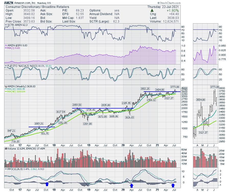
Amazon provides a great example of the pattern, with three large consolidation areas that had a ceiling on them. For swing traders, there are a lot more consolidations areas with breakouts, but the macro view on a weekly chart really works well to see the breakout. People are willing to pay more for the stock than ever before.

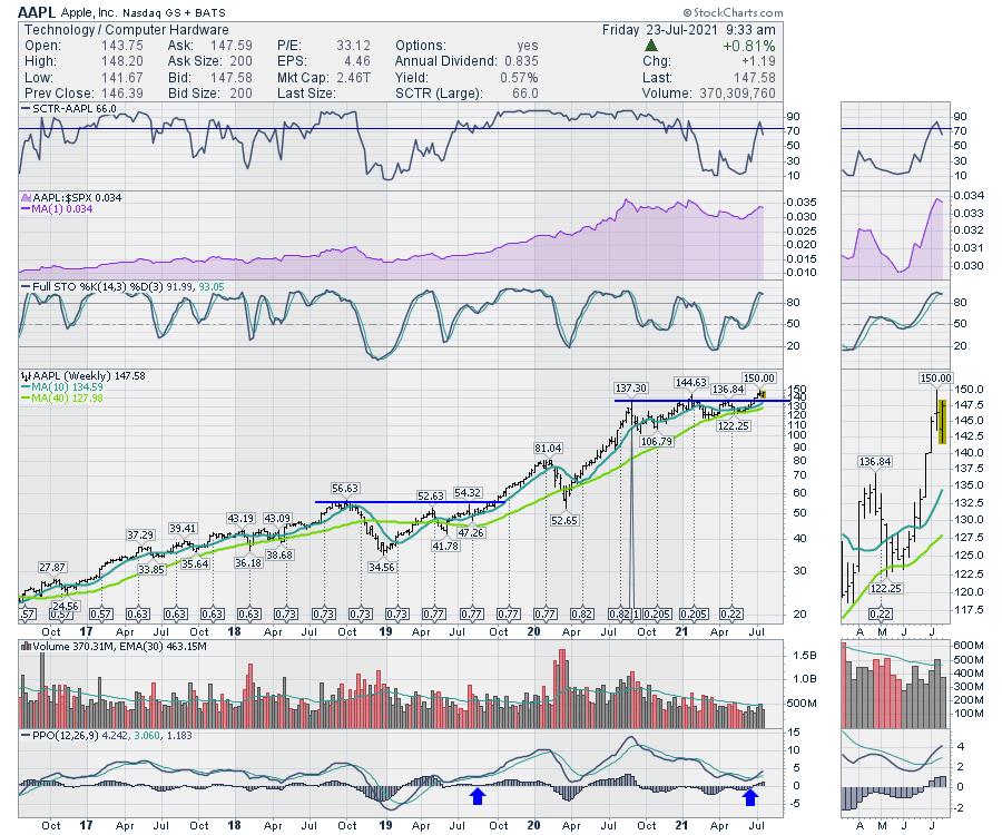
AAPL has done this multiple times.

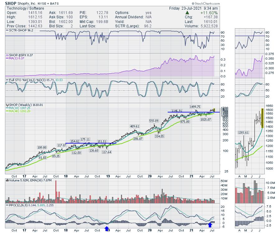
Small companies can exhibit these same traits. The example below is SHOP.

It is the psychology of the trade that is so important. Essentially, the stock runs up and investors start to feel the stock is too expensive for its earnings stream. So they sell it. This creates a pause in the chart or a consolidation. Time goes by and the stock is out of favor. We can see on the SCTR ranking; these stocks are best of breed (above 75) and then they fall out of favor for a period of time.
As their earnings come more into line, investors start to take an interest in the stock. The stock runs up to former highs and "retests" the level and investors interest to pay more for the stock. Eventually, the investors start to take a new perspective on the stock and it goes on another run.
The purpose of technical investing is to watch the investors' behaviour towards a stock. This can be seen in the charts with what we call "price action". The price action is good, weak, consolidating, poor, etc. The price action is the inertia of the core of investors towards the stock.
One of the nicest buy signals for investors is the setup of a stock breaking out to a new high, pausing and then continuing on the run. All three of these stocks are exhibiting signs they are building momentum for their next run.
|
| READ ONLINE → |
|
|
|
| Trading Places with Tom Bowley |
| Evaluating Early Earnings Results: 3 Big Winners Thus Far |
| by Tom Bowley |
A great post-earnings set up needs to check several boxes. The first box I need to check is the "beat revenue and earnings estimates" box, followed closely by the "raised guidance" box. When a company beats top and bottom line estimates and raises guidance, it results in Wall Street firms having to revalue those companies. Future earnings and future earnings growth assumptions change, which should result in higher valuations. That should make good common sense. Of course, the stock market rarely operates in the short-term based on common sense. That's exactly where opportunities arise. Great companies can sometimes report great results and still see a decline. Why? Because those great results have already been baked into the stock price before earnings are released.
This is the reason why I maintain our flagship ChartList, our Strong Earnings ChartList (SECL). Our SECL features only companies that have beaten both revenue and EPS estimates in their most recent quarter. As a company approaches its earnings report, if it beat both top and bottom line estimates in its prior quarter and it's on our SECL, it gets removed prior to that upcoming next report. There's only one way back on the list - it has to beat both revenue and EPS estimates again. There are also other filters like average daily volume to make sure all stocks on the SECL are liquid. I also use my judgment to remove stocks that are not technically sound or belong to a group that's not technically sound. I believe our SECL is the best Watch List anywhere to trade off of. Nearly every stock in our Model, Aggressive, Income, and Strong AD portfolios has come from our SECL. Since inception, our portfolios have crushed the benchmark S&P 500.
I know it's very early in earnings season, but I've already seen a few dozen really solid earnings reports. But which have stood out above the rest? Well, that's the purpose of this article. Here's my short list of the best Q2 earnings reports:
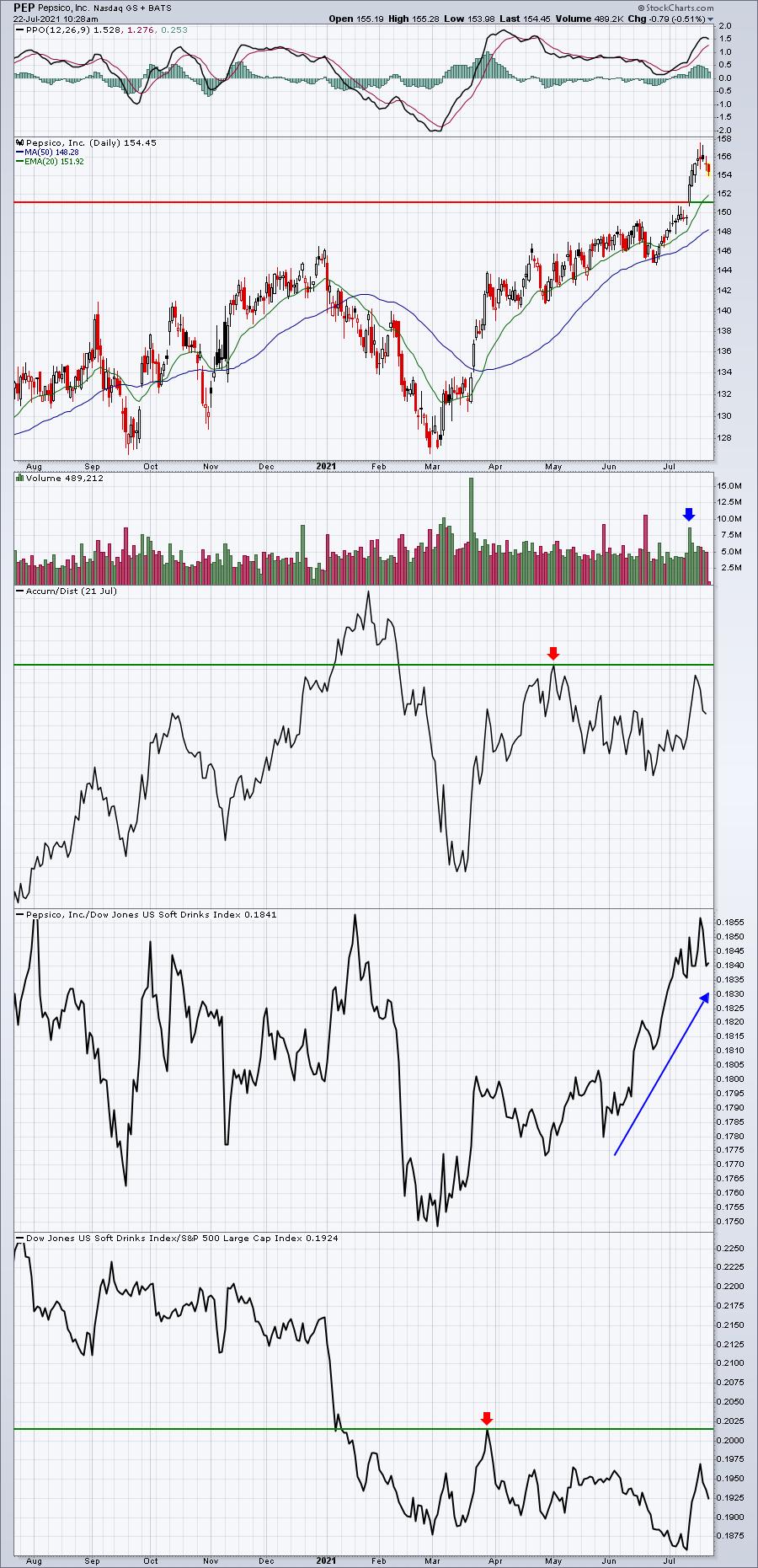
PepsiCo, Inc. (PEP)
Q2 Earnings Results:
- Revenues: $19.22 bil (actual) vs. $17.96 bil (estimate)
- EPS: $1.72 (actual) vs. $1.53 (estimate)
In addition, PEP raised its EPS guidance for 2021 from $5.94 to $6.20.
On this news, PEP broke out on an absolute basis and is threatening a relative breakout vs. its soft drink peers ($DJUSSD):

There's a bit of relative work to be done as PEP has established a relative triple top. Also, the AD line has improved, but could use another breakout indicative of Wall Street accumulation. But the numbers were sound and I believe will result in higher prices ahead for PEP.
Crocs, Inc. (CROX)
Q2 Earnings Results:
- Revenues: $640.77 mil (actual) vs. $559.11 mil (estimate)
- EPS: $2.23 (actual) vs. $1.52 (estimate)
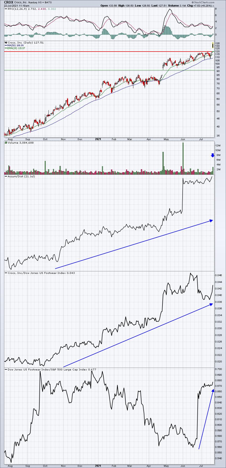
In addition, CROX indicated that its 2021 revenue growth would be in the 60% to 65% range, up from prior guidance of 40% to 50% growth.
The initial reaction to this morning's excellent quarterly report was what you might expect - a huge gap higher with a bit of selling after the open. Market makers are on the short side when there's an imbalance of buy orders, so we should generally look for intraday selling.
Nike (NKE) started off the frenzy in footwear stocks ($DJUSFT) when it reported blowout results. Today, we get further confirmation that the industry is doing just fine with the CROX results. Here's how CROX looks currently:

We're seeing a black candle print early today and the PPO negative divergence suggests we could see further selling ahead. This doesn't change the fundamental strength of this report one bit. But it could present us with a great opportunity for entry at some point over the next few days to few weeks. That's what I'm waiting for to trade.
HCA Healthcare, Inc. (HCA)
Q2 Earnings Results:
- Revenues: $14.44 bil (actual) vs. $13.61 bil (estimate)
- EPS: $4.37 (actual) vs. $3.16 (estimate)
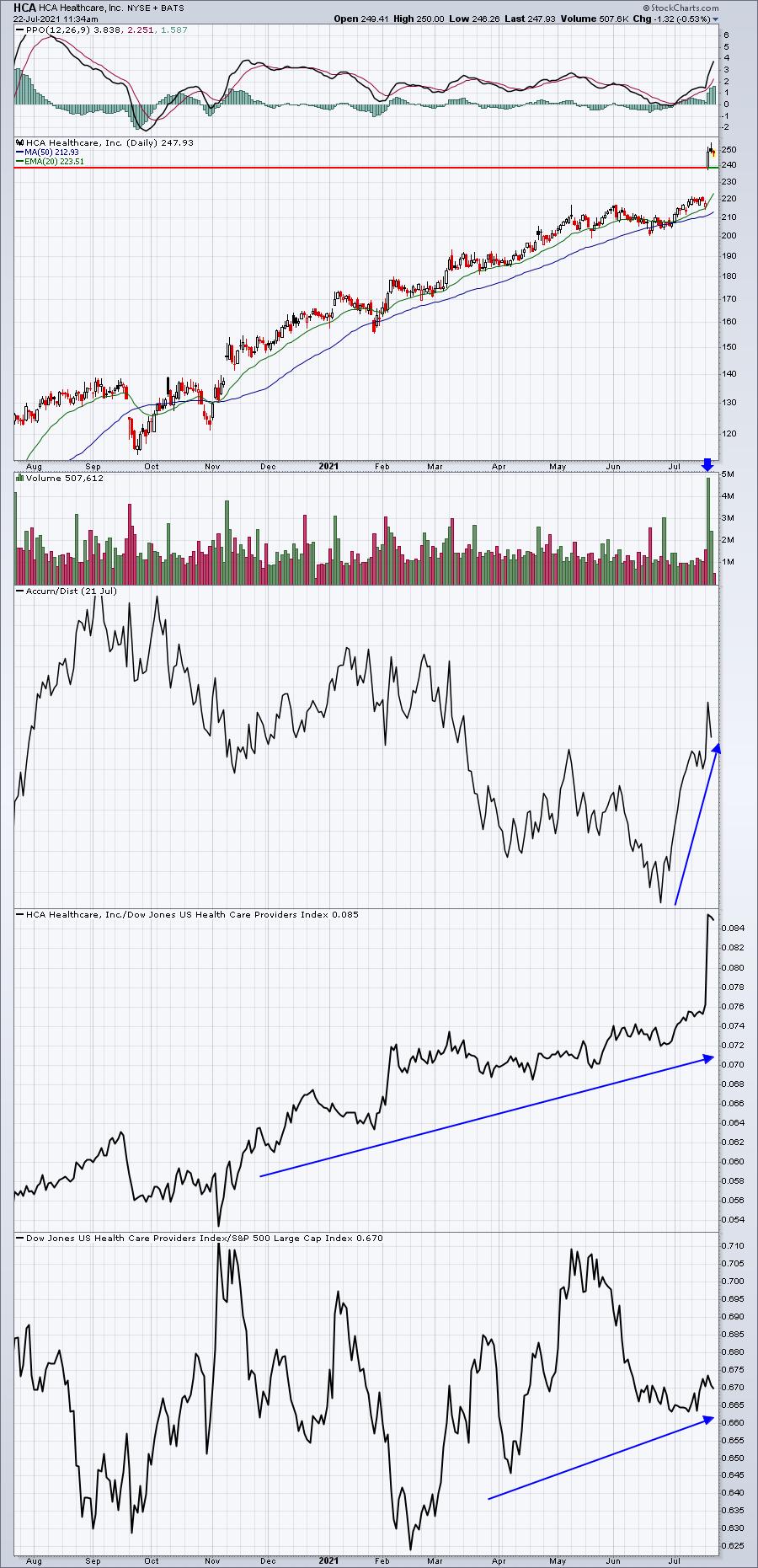
In addition, HCA raised its 2021 revenue and EPS guidance. Its 2021 EPS guidance was raised from a range of $13.30-$14.30 to a new range of $16.30-$17.10. That's a hefty jump in earnings growth that'll likely require a re-evaluation of market cap. We've seen the start of that process with the initial earnings reaction:

When a stock like HCA gaps higher and then continues moving higher throughout the session on massive volume, it's an indication to me that demand overwhelmed supply and that typically bodes well for further appreciation. Also, any return trip to the open after earnings, in this case 239.10, represents an excellent reward-to-risk entry point.
Looking ahead to the balance of earnings season, we'll see many, many more companies that report exceptionally strong results. Those companies will be organized in our Strong Earnings ChartList and we'll run scans against that ChartList throughout the next several weeks, providing excellent trading opportunities. If you'd like to become a 30-day trial member at EarningsBeats.com to take advantage of these opportunities, I have great news! Our 30-day trial is completely free and you can download our Strong Earnings ChartList (among other ChartLists) directly into your StockCharts.com account. If you're not a member at StockCharts, you'll still be able to view the charts. CLICK HERE to start your 30-day trial!
Also, in tomorrow's free EB Digest newsletter, I'll be highlighting a company that I expect to report absolutely BLOWOUT numbers next week. Relative strength has been exceptional and its AD line is at a new high as well, suggesting that Wall Street has been accumulating the stock ahead of its report. If you'd like to become a free subscriber (no credit card required) of our EB Digest newsletter, simply CLICK HERE and provide us your name and email address in the spaces provided. You can then see next week if I'm right about this upcoming blowout report.
Happy trading!
Tom
|
| READ ONLINE → |
|
|
|
| ChartWatchers |
| This is Why You MUST Follow Relative Strength Heading into Earnings |
| by John Hopkins |
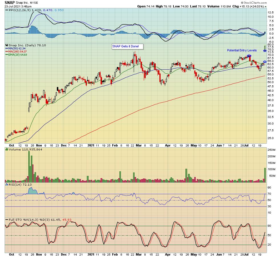
If you have been paying attention to earnings, you would have seen that SNAP reported their numbers on Thursday and crushed all expectations. As a result, the stock was higher by over 25% at its peak the day after the numbers were released.

While you might not have benefited from SNAP's terrific move to the upside, it could present a nice opportunity if you are patient and wait for it to pullback to an attractive level -- for example, those levels I've identified in the chart above.
SNAP's results and the market response were not guaranteed. However, it was one of a number of stocks our Chief Market Strategist Tom Bowley pointed out in our Q2 Earnings webinar last week, which also included CMG, HCA, IPG, DPZ, and CROX. All of these moved higher once their numbers were released. What did they all have in common? Relative strength readings that made them good bets.
Even though a number of companies have already reported, it's just the tip of the iceberg, with thousands of additional companies getting set to reveal their numbers over the next several weeks. And how about this upcoming week alone, when we'll hear from AMZN, AAPL, FB, GOOGL and MSFT, with a combined Market Cap of $9.3 trillion - that's trillion with a T!
Expectations for the tech giants must be high, with 3 of the 5 companies -- FB, GOOGL and MSFT -- hitting record highs last week. AAPL and AMZN also recently hit all-time highs before pulling back some. So the stage is set for the market to continue higher, barring any significant earnings misses from the most visible companies. Which gets to the question, where might the S&P be heading next?
Since the S&P has never been above 4400 before, there's no telling where it might go next. However, natural targets could include 4450 to 4500. And if earnings continue to impress the way they have so far, those levels could be easily reached.
Tom Bowley has created a list of companies with market caps in excess of $1 billion. This is our "Upcoming Earnings" ChartList, which is available to all members of the EarningsBeats community. This list is very helpful as it gives members a "heads up" as to which companies will be reporting their numbers throughout the week. And if you can identify those companies showing the greatest relative strength, it could prove to be profitable. You can get access to the list by clicking here and subscribing to our FREE EarningsBeats Digest newsletter. As a bonus, in Monday's EBD, Tom will reveal his top pick for the upcoming week. Don't miss it!
At your service,
John Hopkins
EarningsBeats.com
|
| READ ONLINE → |
|
|
|
| MORE ARTICLES → |
|
 Chart 1
 Chart 2
 Chart 3

