| THIS WEEK'S ARTICLES |
| John Murphy's Market Message |
| STOCKS STRUGGLE WITH RATE HIKES AND OMICRON |
| by John Murphy |
STOCK INDEXES WEAKEN... Stock prices are ending a volatile week on the downside. So far, no serious chart damage has been done as the three major stock indexes shown below are testing potential support at their 50-day moving averages. Stocks are struggling with the spread of the omicron virus (and government steps to contain it) and a more hawkish Fed. The Fed on Wednesday doubled the pace at which it is reducing its bond buying program (or tapering) which should end in March. At least three rate hikes are expected to follow to combat surging inflation. That combination has made stock investors more cautious. One surprising development has been the drop in bond yields following the Fed message. That's not likely to last given the fact that interest rates should start rising in the coming year. That could provide a much bigger headwind for stock prices. Stock sectors were equally split during week as five rose while six declined. The Nasdaq suffered the biggest drop as the threat of higher rates weighed on technology stocks. Another sign of investor caution is the fact that defensive sectors have been hitting new records.
 Chart 1 Chart 1
 Chart 2 Chart 2
 Chart 3 Chart 3
DEFENSIVE SECTORS HIT NEW RECORDS... The four top sectors for the week are healthcare, real estate, consumer staples, and utilities. The four charts below show them all hitting new records. All four sectors are defensive in nature which usually do better when investors turn more cautious on the market.
 Chart 4 Chart 4
 Chart 5 Chart 5
 Chart 6 Chart 6
 Chart 7 Chart 7
BANK STOCKS WEAKEN... Financials are Friday's weakest sector and banks in particular. Chart 8 shows the S&P Regional Banking SPDR (KRE) falling back to its 200-day average. Falling bond yields during the week may have contributed to bank weakness. That could change for the better in the new year if and when bond yields start to climb.
 Chart 8 Chart 8
|
| READ ONLINE → |
|
|
|
|
|
| The Mindful Investor |
| Bearish Divergence Continues for S&P 500 |
| by David Keller |
Something changed on November 5, 2021.
The S&P 500 had successfully broken up through the previous resistance level around 4550; early November saw the benchmark continue higher to finally reach 2700 on November 5th. Until that first Friday in November, the S&P 500 appeared to be in a raging uptrend, with down days becoming a rare exception to the bullish daily move in stocks. From that day on, the S&P has transitioned from a bullish market to a sideways market, particularly on the short-term time frame.
My Market Trend Model has remained bullish on the long-term and medium-term time frames, suggesting the recent consolidation can be considered a pullback within the overall bullish trend for the S&P 500. But what about the momentum characteristics?
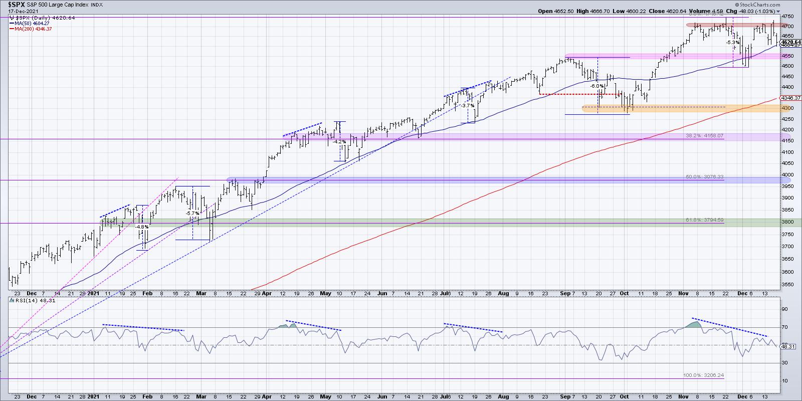
On November 5, as the S&P first reached 4700, the RSI peaked around 76. That was overbought, which indicated strong upside momentum into that new all-time high. On November 16, when the S&P reached 4700 for the second time, the RSI was around 70. When the S&P reached its highest level so far, 475 on November 22, the RSI was around 64.
This week, the highest reading for the S&P 500's RSI was around 55. That's right -- we have the dreaded bearish momentum divergence. Every time the most widely followed US equity benchmark reached 4700, the RSI has moved lower and lower. This is a sign of weakening buying power, with less and less momentum behind each attempt.
On my daily market recap show, The Final Bar, I try to remind viewers that your goal as an investor should be three steps:
- Identify trends.
- Follow those trends.
- Anticipate when those trends are exhausted.
The third step involves using charts to identify signs of trend exhaustion. Bearish divergences, using momentum indicators, breadth indicators or even volume, can be an indication that upside potential is limited, as the trend may be nearing an exhaustion point.
We have seen a bearish momentum divergence three times earlier in 2021. In January and February, we saw about a 5-6% correction to the 50-day moving average before the uptrend resumed. Then, in April and May, we saw another bearish divergence and the S&P pulled back around 4%. Finally, in July 2021, there was very little pullback after the divergence. The S&P accelerated to new highs on increasing momentum, effectively eliminating the bearish divergence condition.
What would confirm the current momentum reading and indicate a high potential for a market pullback? The S&P 500 actually touched its 50-day moving average on Friday of this week before closing just above that level. Previous bearish divergences in 2021 saw a pullback to around the 50-day moving average before resuming the longer-term uptrend. A break of the 50-day moving average next week would be a strong bearish signal, and a further drop below the 4500-4550 level would take the S&P below previous price support. In that case, you will see me writing articles about a strong potential for further downside price action!
On the other hand, what would invalidate this bearish divergence and indicate an "all clear" for the S&P? Similar to what we saw in August, a bearish divergence would be considered invalidated if you saw the price continue higher and with a higher RSI reading, not a lower one. In other words, you would need to see the market move higher on stronger momentum, not weaker momentum.
The S&P 500 has essentially been rangebound for the last six weeks, with 4500-4550 as support and 4700-4750 as resistance. The bearish divergence suggests that momentum is weakening and a move lower is a distinct possibility.
For now, I would identify key levels to watch for all your positions. Pay attention to market internals and look for downside follow-through. Most importantly, think of the S&P 500 in terms of probabilities, not certainties. You never know what tomorrow may bring!
For a video discussion on momentum divergence including one key stock showing a bullish divergence, head over to my YouTube channel:
RR#6,
Dave
P.S. Ready to upgrade your investment process? Check out my free course on behavioral investing!
David Keller, CMT
Chief Market Strategist
StockCharts.com
Disclaimer: This blog is for educational purposes only and should not be construed as financial advice. The ideas and strategies should never be used without first assessing your own personal and financial situation, or without consulting a financial professional.
The author does not have a position in mentioned securities at the time of publication. Any opinions expressed herein are solely those of the author, and do not in any way represent the views or opinions of any other person or entity.
|
| READ ONLINE → |
|
|
|
| ChartWatchers |
| See the Growth -- Value Dance on Relative Rotation Graphs |
| by Julius de Kempenaer |

One of the predefined universes/groups on the RRG page is for Growth/Value. Many investors look at this relationship to help them determine whether the market is in a risk-on or risk-off mode. Just pull down the "Groups" selection box and look for Growth / Value.

When browsing through some RRGs to use for this article, I noticed the rotations for Growth vs Value. In particular, when you use the animation function over a longer period of time, that relationship looks like a dance, hence the title for this article.
The RRG above shows a 26-week tail and, as you can see, it more or less forms a complete rotation. Just like a dance, this relationship moves around and around in different patterns.
Over this 26-week period, Growth beat value by roughly 6%.

When we look at a shorter time span like 13 weeks (one quarter), a different picture emerges.

Over 13 weeks, Value comes out on top, this is roughly the period after the bend (see arrows on the chart) in the tails on the RRG, when Growth started to lose relative momentum inside the leading quadrant and value started to pick up on the other side. Another observation we can make is that the RRG-Velocity, the distance between the weekly observations, has started to shrink over the last weeks. This often is a prelude to a turn.
So, assuming a continuation of the current rotation, it looks like Growth is ready to pick up again and start a new period of outperformance of value.
Breaking Down Growth and Value
Another option in the drop-down is the Growth / Value / Size universe.

On this Relative Rotation Graph, the Growth and Value indexes are shown, as well as the Large-, Mid- and Small-Cap indexes and also the cross-sectional indexes. One of the things immediately visible is the fact that the population on the right of the chart is much smaller than on the left. This can be translated as some sort of breadth measure. Not all market segments are participating.
As the complete chart showing 13-week tails on all tickers is a bit crowded, I have deleted the broad indexes for size and Growth/Value and only left the cross-sectional indexes on the RRG.

From this image, I think, the message becomes crystal clear...
Large-Cap Growth is the strongest segment in the market at the moment.
And even within the cross-sectional value indexes, Large Cap Value is the strongest.
Finally, if you want to make full use of the new ACP platform, you can create a ChartList with these ticker symbols and open it in a multi-chart layout so thatyou will have all the charts, including RRG lines and relative strength, at your fingertips.

If you have a widescreen monitor, go wild and use the best of both worlds (SharpCharts and ACP) with RRG on 1/3 or 1/4 of your screen and ACP filling the remaining screen real estate!!

Have a great weekend!
#StaySafe, --Julius
My regular blog is the RRG Charts blog. If you would like to receive a notification when a new article is published there, "Subscribe" with your email address.
|
| READ ONLINE → |
|
|
|
| ChartWatchers |
| In Search of Some Inflation Protection? Check Out These Considerations |
| by Mary Ellen McGonagle |
Last week, the Federal Reserve announced plans to shift to a tighter monetary policy to allow for interest rate hikes sooner than expected. The move is in an effort to keep inflation from spiraling out of control and was in response to reports of a surge in inflation. November's Consumer Price Index rose the fastest it has since 1982, while the Producer Price Index showed a rise in wholesale prices, the fastest pace on record.
The data had Fed Chair Powell acknowledging that there's a real risk that the pandemic-era inflation will stick around for longer than initially expected. Investors initially cheered the news, as a Wednesday rally signaled relief that a plan of action was revealed.
Price action over the past two days has shown a different side, however, as already weak Retailers sold off further in the face of reduced consumer spending amid higher prices. Fast-growing Tech stocks also came under selling pressure, as the erosion of future earnings due to inflation spooked shareholders.
There were pockets of strength last week, however, with areas such as Real Estate stocks trading higher. REITs tend to do well in times of inflation, as they generate revenue through the properties they own. Many long-term leases on these properties include inflation clauses that allow them to increase rent, with the income being passed on to shareholders.
DAILY CHART OF CUBESMART (CUBE)
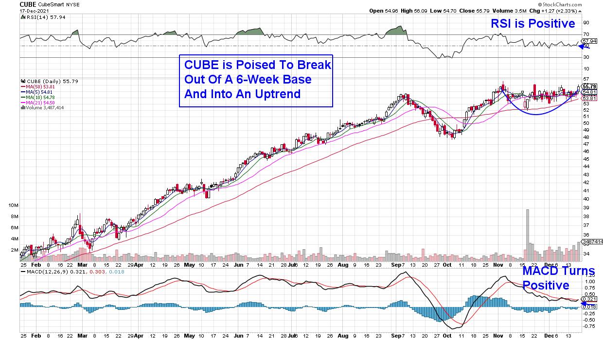
Cubesmart (CUBE) is a smaller self-storage operator; however, the company just announced a $1.7 Billion acquisition that will help them grow while expanding further within the Western U.S.
Currently, CUBE offers a 3.1% yield and the stock is poised to break out of a 6-week base, with its RSI in positive territory. CUBE has a MACD that just had a bullish crossover from a very low level. A base breakout at $57 would be an ideal entry point.
DAILY CHART OF PUBLIC STORAGE (PSA)
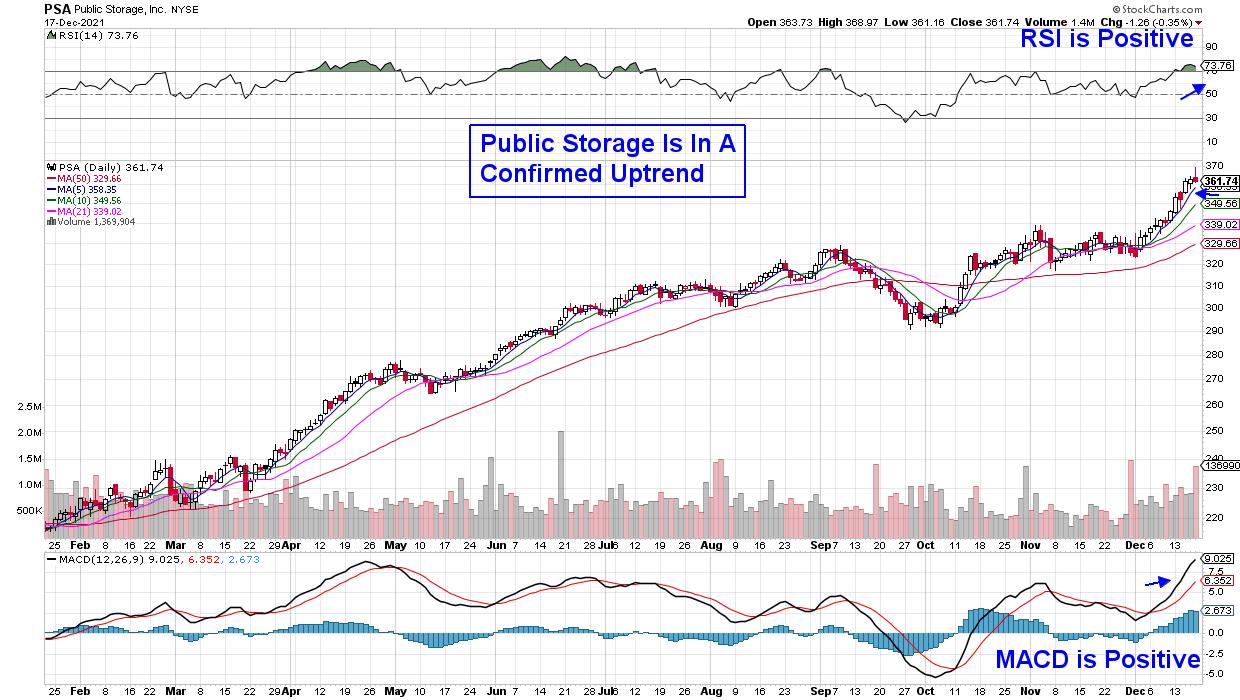
Public Storage (PSA) is the largest owner and operator of self-storage facilities, with operations in the U.S., Canada and Europe. The company reported quarterly results early last month that were ahead of estimates, while also raising guidance for the remainder of this year.
The 2.2-yielder is in a confirmed uptrend on its daily chart as it finds support at its upward-trending 5-day moving average. Its recent advance has put the stock into an overbought position, however, and we'd be a buyer on any pullback that would allow the MACD to reset for another leg up.
WEEKLY CHART OF CROWN CASTLE INT'L CORP. (CCI)
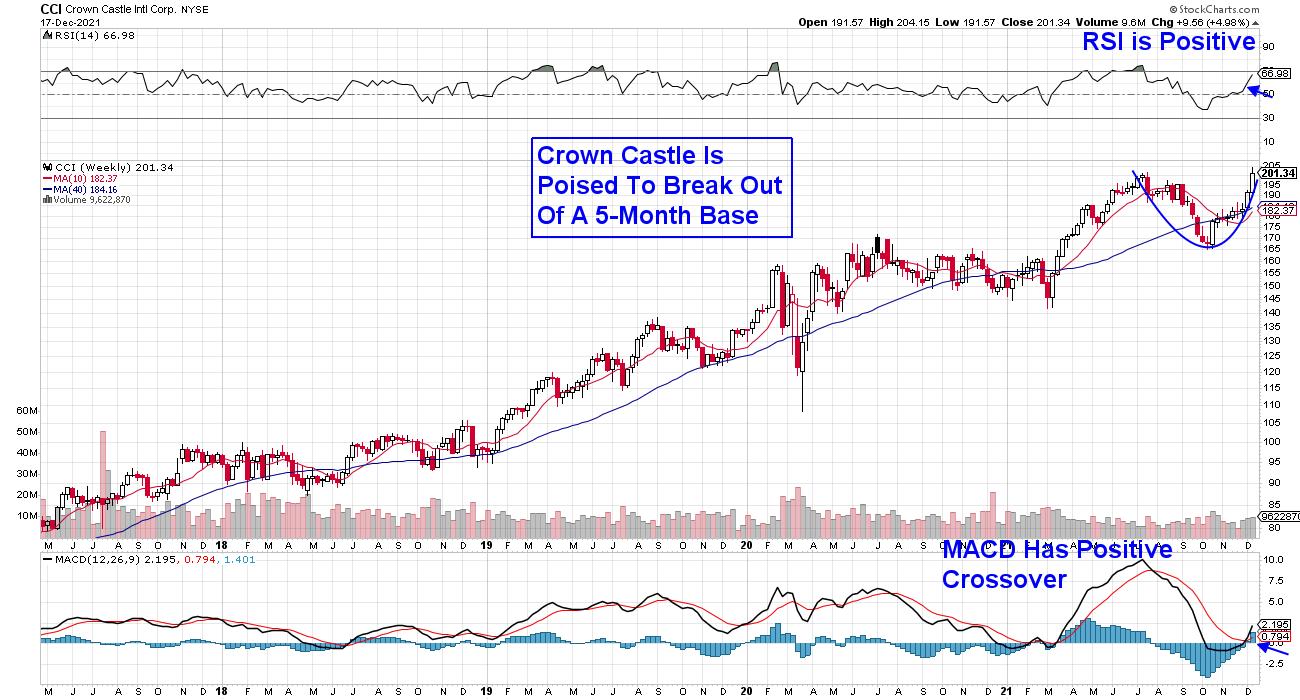
Last up is an infrastructure REIT focused on cell towers and fiber optic networks in the U.S. With carriers building out their 5G networks, companies such as Crown Castle (CCI) are providing new tower sites and equipment that's providing rural areas with mobile services.
Crown Castle sees a decade-long investment cycle in 5G and, because of that, the company estimates that they can grow their dividend at a 7%-8% annual rate over the long term. CCI is poised to break out of a 5-month base at $205 and, with its MACD crossing from a low level on its weekly chart, the stock is poised to trade higher.
In addition to REITs, there are other areas that are showing relative outperformance in an otherwise difficult market. This would include a select sub-industry among Technology stocks. If you'd like to uncover these select groups and the stocks I've highlighted to benefit, use this link here to gain immediate access to my latest reports.
Your 4-week trial of this twice-weekly report will also keep you up to date on whether it's safe to put new money to work while also revealing sector rotation. I hope you'll take advantage of this special offer!
On this week's episode of StockCharts TV's The MEM Edge, Mary Ellen reviews where the relative strength is in the markets and shares individual stocks that are expected to remain strong into next year.
On this week's edition of Chartwise Women, Mary Ellen and Erin Swenlin talk about their favorite chart patterns, with Mary Ellen going in-depth on Base Breakout patterns while Erin covers the Double Bottom, Ascending Triangle, Falling Wedge, Bull Flag and Triple Bottom patterns.
Warmly,
Mary Ellen McGonagle
President, MEM Investment Research
|
| READ ONLINE → |
|
|
|
| The Traders Journal |
| The Evolution And Essential Foundations Of The Stock Market Mastery Methodology |
| by Gatis Roze |
 This past week, Grayson and I had the special pleasure of being interviewed by David Keller who, in the video, posed many pithy questions as to the evolution of our Stock Market Mastery methodology. This past week, Grayson and I had the special pleasure of being interviewed by David Keller who, in the video, posed many pithy questions as to the evolution of our Stock Market Mastery methodology.
We each reflected on the investing foundations differently, but all three of us agreed on the gravity and relevance of routines. The emphasis on a framework and disciplined structure is touted by essentially every profitable money manage as the key to investing success. So as we close out this year and look to a new year, my wish for you is that you open your eyes, ears and mind to the many wisdoms the markets are offering you.
It has been my observation that wise investors have a humility both personally and intellectually. It comes from an accumulation of their trading experiences and knowledge of interacting with the markets over years. This intuition can't be developed in isolation. It's their interactions and participation that result in the enlightenment that we call "market wisdom". After years of diligence, these investors earn our accolades as we label them "wise beyond their years".
The interview is unique in that it presents three investors from three different generations as we each explore our respective orientations. I'm confident this video will contribute to your own personal accumulation of market knowledge and wisdom. Here's a link to the specific tools we discuss.
Trade well; trade with discipline!
Gatis Roze, MBA, CMT
StockMarketMastery.com
|
| READ ONLINE → |
|
|
|
| Martin Pring's Market Roundup |
| Three Charts That Suggests This Rally Has Legs.... For the Time Being |
| by Martin Pring |
A lot of indicators, such as the percentage of NYSE stocks above their 200-day MA and the NYSE bullish percentage, remain in confirmed downtrends that will take time to reverse. However, some of the shorter-term charts that have proved reliable in the past have just begun to offer some bullish vibes.
Three Bullish Charts
Chart 1 features my Bottom Fisher, an indicator that tries to smell out short-term lows. You can read about it here, but, to make it brief, it monitors a universe of Dow stocks whose daily KST bottoms out from a position below zero. This indicator only picks bottoms and is not intended to identify peaks. The arrows flag periods when it reverses to the upside from a position at or below the solid green horizontal line. Earlier in the week, it generated another signal and is now officially bullish.
 Chart 1 Chart 1
Chart 2 compares the S&P to the CBOE Total Put/call ratio, or, rather, its daily KST. Buy signals are generated when pessimism amongst traders drives the KST above the blue horizontal line, which subsequently reverses to the downside. The reversal indicates a change in sentiment that is usually associated with a bottom of some kind. The dashed arrows flag peaks that develop above the blue line but below the green-dashed one. The solid lines reflect reversals from above the dashed line.
The indicator is higher than it's been in the post-March 2020 period and has ever-so-slightly begun to tip to the downside. Whilst we really need to wait for a more decisive reversal, the overstretched nature of the current reading suggests that the pessimistic elastic has pretty-well run its course.
 Chart 2 Chart 2
Chart 3 also features a daily KST, but this time it reflects momentum for the VIX. In this instance, buy signals are generated when the fear level, indicated by the KST, reaches an extreme and then starts to reverse. Such periods are again identified with the green arrows, with pretty consistent results. This week has seen the generation of the sixth signal since 2016.
 Chart 3 Chart 3
S&P Ready to Confirm?
If the bullish tone being suggested by these indicators is valid, I would expect to see it being reflected very soon, with a decisive breakout by the S&P above the green neckline of the potential inverse head-and-shoulders featured in Chart 4. That would indicate that the market had begun to respond to the constructive internals contained in the first three charts. Failure not to do so would be a worrying sign.
 Chart 4 Chart 4
Longer-Term Aspects
It's important to bear in mind that these indicators are short-term in nature and, in and of themselves, are only likely to have an effect between 2-4 weeks. That's why it is also important to monitor Chart 5, which shows that both the NYSE common stock and regular A/D Lines have recently been lagging the S&P itself. Despite this week's bounce, they are both closer to breaking down than up. These things can always be cleared up, of course, but if the S&P breaks to new highs, it makes sense to see whether these two indicators participate. On the other hand, there is a lot of support for the regular A/D line at the trendline and 200-day MA. If that were to give way to any great degree, it would likely signal a high degree of vulnerability going into 2022, especially as that would suggest that our three indicators had not responded in their usual positive manner.
 Chart 5 Chart 5
Good luck and good charting,
Martin J. Pring
The views expressed in this article are those of the author and do not necessarily reflect the position or opinion of Pring Turner Capital Group of Walnut Creek or its affiliates.
|
| READ ONLINE → |
|
|
|
| The Canadian Technician |
| Two Forces at Play |
| by Greg Schnell |
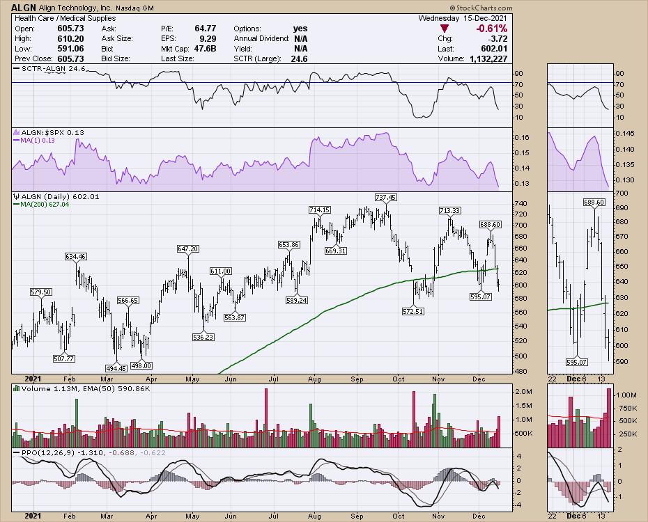
The market is really testing a lot of traders this month. Most of the bullishness is being eroded as the technology traders keep getting pushed lower in many of the Nasdaq 100 names. Lots of the big leaders have wiped $100 off their stock price. As an example, Align (ALGN) is quickly down from $713 a month ago to $600. Last week it ripped $90 higher and this week it lost $90. That's hard if you are trying to buy a new trend starting, but it whips you in and out so quickly. More importantly, each high is a lower high. The higher lows looked good until today, as they were still holding the stock up. Looks real bearish if that uptrend is breaking.

We have all been bombarded with the news that Technology is roaring ahead, with names like AAPL pushing up.

The Technology sector still looks great. So many names have been pounded down, but the large weight of the mega-caps makes this very resilient.

With the Fed meeting over, the rally in the last 2 hours of the day was exceptional and the Nasdaq soared. This is an hourly chart showing the massive rally into the close, as the index soared 500 points in 2 hours.

So that leads us into a big dilemma. With such wide-ranging poor breadth data showing carnage inside the market like ALGN and the continual drumbeat of bear market expectations, the market keeps rallying. The bears can't seem to take control of the narrative. The Twitter feed was filled with tech investors getting pounded for the last couple of days. But what about seasonality? Not only are the forces of bull and bear at play, but what about seasonality? I don't use it a lot, but, for today, that might be a better piece of information.
My friend Jeff Hirsch at Stock Traders Almanac expects a rally for December to start right around now. With the significant reversal today, could this be the start of the mood-altering positive price action? I use a longer PPO on this 60-minute chart so it is not so whippy, but the higher low on the PPO and higher low on the price seems to be landing here. The next few hours of trading could break the 6-week downtrend in momentum shown by the PPO. I specifically like when the PPO trend changes (from down to up) for at least a strong rally, as the breaking of the trend line looks very bullish. The best hourly volume candle in months could also be a clue that the buyers are showing up for work here.

I don't want to get too bearish here anyway, as the momentum downtrend has been going on for 6 weeks. If the bears can't muster control after that, what will it take?
My Schnell Strength indicators turned up last week and, this week, they looked overly optimistic, with the market moving lower Monday and Tuesday. After Wednesday's 500-point Nasdaq rally, it is hard to argue that lower is the direction. A surge in volume and a surge in momentum are just the clues I like to see to kick off a good uptrend. It is exactly this sort of positive price action that we'll need to break out of the range. At this point, it is hard to bet against the rally with the way the chart is shaping up.
If you'd like more information on my Schnell Strength indicators, you can access that with a free trial at gregschnell.com/explore.
Stay tuned!
|
| READ ONLINE → |
|
|
|
| Mish's Market Minute |
| Is the ARKK ETF Showing Big Potential Going into 2022? |
| by Mish Schneider |

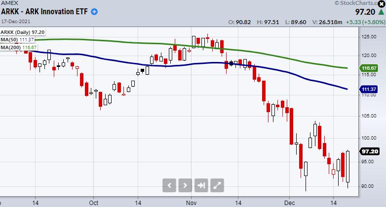
While the Nasdaq 100 (QQQ) is down 0.3% on Friday's close, Cathy Woods Ark Innovation ETF (ARKK) closed over 6% on the day. Additionally, ARKK made a strong close over yesterday's high, showing added strength when compared to the major indices. With that said, this could be a potential turnaround situation for the fund, which has been trending lower for the past month and a half.
While we could invest in the ARKK fund, we can also review its top holdings as ideas for picks heading into 2022. One interesting company is Unity Software (U). Unity is a game engine used to create video games across multiple platforms such as gaming consoles and phones. What gives Unity a large amount of potential is its use for creating worlds in the metaverse/virtual reality space. However, from a technical standpoint, U has come far off its highs around $210 and needs to form a stronger base or begin to clear the $150 price area before it looks ready to run higher.
Another big trend is crypto trading. Currently, Coinbase (COIN) has a tight grip on the crypto app space, since it is widely used and considered a safe place to trade. Like U, it has come off highs and will need to hold over $220 if it's going to stop the bleed to the downside. $220 is also near the bottom of its trading range, making it a clear area to watch.
Tesla is one of ARKKs biggest holdings and, while it has historically done very well for Cathy Wood, it has gone through some recent trials. Right now, Tesla (TSLA) is interesting if it continues to hold over $910. If it breaks lower, it will need to find a support level before its ready to trade.
One thing to note is that if Tesla is going to increase sales next year, supply chain issues with semiconductors will need to improve, as all car manufactures have been struggling to source enough semi-chips for their factories. Nonetheless, since these companies are currently trending lower, we will need to see them hold key areas or form reversal patterns worth trading.
Right now, overall market volatility makes timing trades much tougher, and with Christmas almost upon us, the rest of the year could easily stay choppy. Therefore, keep these on the watchlist, but always remember that even symbols with great potential can break down if the general market isn't holding.
Follow Mish on Twitter @marketminute for stock picks and more. Follow Mish on Instagram (mishschneider) for daily morning videos. To see updated media clips, click here.
On this week's edition of StockCharts TV's Mish's Market Minute, Mish takes another deep dive into the macro and prepare you for what could come at you in 2022. Watch to find out what the "Grinch" is and what is doing to the Christmas rally on the last new edition of 2021.
ETF Summary
- S&P 500 (SPY): Very choppy. Watching to for either consolidation or a large break under the 50-DMA at 459.45.
- Russell 2000 (IWM): 211.08 low to hold.
- Dow (DIA): 346 next main support area.
- Nasdaq (QQQ): Watching for second close under the 50-DMA.
- KRE (Regional Banks): 67.97 200-Day moving average support.
- SMH (Semiconductors): 289.33 next big support the 50-DMA.
- IYT (Transportation): Watching to hold over 260.89 the 200-DMA.
- IBB (Biotechnology): Strong close but did not close over the 50-DMA at 154.96.
- XRT (Retail): Trending lower without any obvious support to lean on.
Forrest Crist-Ruiz
MarketGauge.com
Assistant Director of Trading Research and Education
|
| READ ONLINE → |
|
|
|
| MORE ARTICLES → |
|
 Chart 1
 Chart 2
 Chart 3
 Chart 4
 Chart 5
 Chart 6
 Chart 7
 Chart 8


 This past week, Grayson and I had the special pleasure of being interviewed by David Keller who, in the video, posed many pithy questions as to the evolution of our


