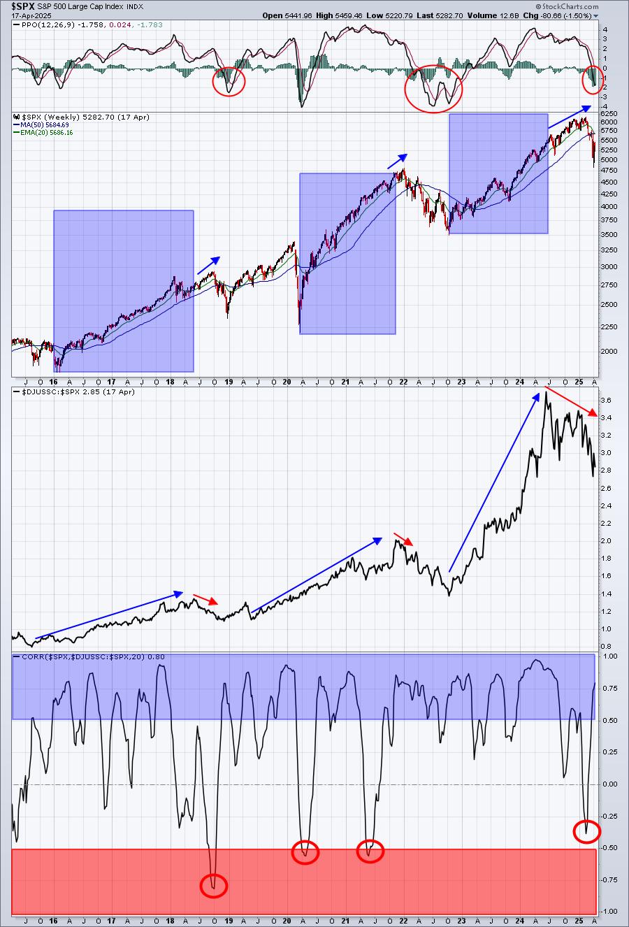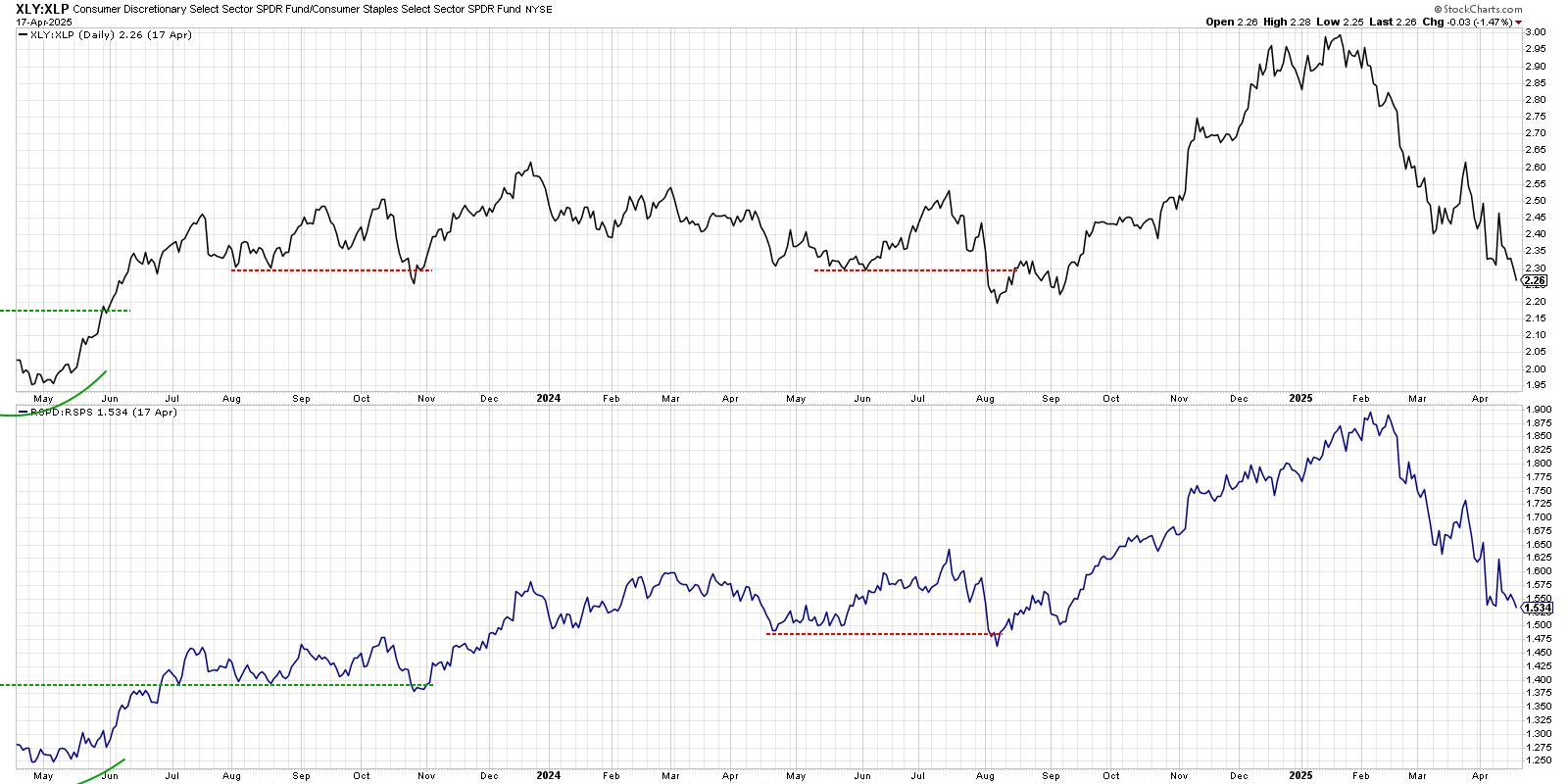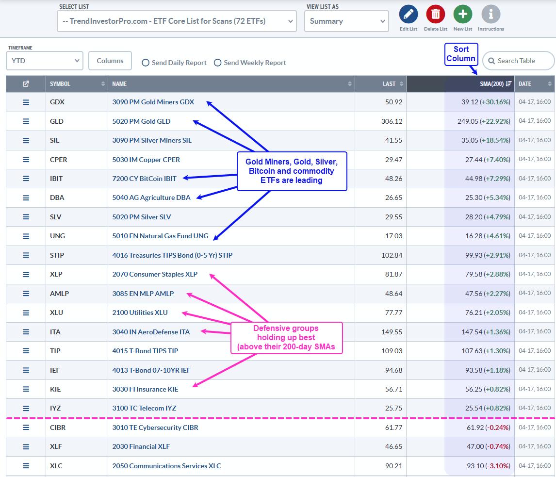
One of the predefined universes/groups on the RRG page is for Growth/Value. Many investors look at this relationship to help them determine whether the market is in a risk-on or risk-off mode. Just pull down the "Groups" selection box and look for Growth / Value.

When browsing through some RRGs to use for this article, I noticed the rotations for Growth vs Value. In particular, when you use the animation function over a longer period of time, that relationship looks like a dance, hence the title for this article.
The RRG above shows a 26-week tail and, as you can see, it more or less forms a complete rotation. Just like a dance, this relationship moves around and around in different patterns.
Over this 26-week period, Growth beat value by roughly 6%.

When we look at a shorter time span like 13 weeks (one quarter), a different picture emerges.

Over 13 weeks, Value comes out on top, this is roughly the period after the bend (see arrows on the chart) in the tails on the RRG, when Growth started to lose relative momentum inside the leading quadrant and value started to pick up on the other side. Another observation we can make is that the RRG-Velocity, the distance between the weekly observations, has started to shrink over the last weeks. This often is a prelude to a turn.
So, assuming a continuation of the current rotation, it looks like Growth is ready to pick up again and start a new period of outperformance of value.
Breaking Down Growth and Value
Another option in the drop-down is the Growth / Value / Size universe.

On this Relative Rotation Graph, the Growth and Value indexes are shown, as well as the Large-, Mid- and Small-Cap indexes and also the cross-sectional indexes. One of the things immediately visible is the fact that the population on the right of the chart is much smaller than on the left. This can be translated as some sort of breadth measure. Not all market segments are participating.
As the complete chart showing 13-week tails on all tickers is a bit crowded, I have deleted the broad indexes for size and Growth/Value and only left the cross-sectional indexes on the RRG.

From this image, I think, the message becomes crystal clear...
Large-Cap Growth is the strongest segment in the market at the moment.
And even within the cross-sectional value indexes, Large Cap Value is the strongest.
Finally, if you want to make full use of the new ACP platform, you can create a ChartList with these ticker symbols and open it in a multi-chart layout so thatyou will have all the charts, including RRG lines and relative strength, at your fingertips.

If you have a widescreen monitor, go wild and use the best of both worlds (SharpCharts and ACP) with RRG on 1/3 or 1/4 of your screen and ACP filling the remaining screen real estate!!

Have a great weekend!
#StaySafe, --Julius
My regular blog is the RRG Charts blog. If you would like to receive a notification when a new article is published there, "Subscribe" with your email address.
Julius de Kempenaer
Senior Technical Analyst, StockCharts.com
Creator, Relative Rotation Graphs
Founder, RRG Research
Host of: Sector Spotlight
Please find my handles for social media channels under the Bio below.
Feedback, comments or questions are welcome at Juliusdk@stockcharts.com. I cannot promise to respond to each and every message, but I will certainly read them and, where reasonably possible, use the feedback and comments or answer questions.
To discuss RRG with me on S.C.A.N., tag me using the handle Julius_RRG.
RRG, Relative Rotation Graphs, JdK RS-Ratio, and JdK RS-Momentum are registered trademarks of RRG Research.


