| THIS WEEK'S ARTICLES |
| John Murphy's Market Message |
| HAWKISH FED PUSHES STOCKS SHARPLY LOWER |
| by John Murphy |
50-BASIS POINT HIKE ON THE TABLE FOR FED MAY MEETING... Today's statement by Fed Chairman Jerome Powell that a 50-basis point rate hike was on the table for May, combined with other hawkish comments, pushed stocks sharply lower today. And their technical condition continues to weaken. Particularly disturbing is the fact that 200-day moving averages are providing overhead resistance. Chart 1 shows the Dow Industrials suffering a downside reversal day and closing below their 200-day moving average. Chart 2 shows the S&P 500 reversing lower after touching its 200-day line. The Nasdaq market continues to lead the rest of the market lower. Chart 3 shows the Invesco QQQ Trust having the day's biggest percentage decline and falling to the lowest level in more than a month. All in all, a bad chart day for stocks.
ALL SECTORS END IN THE RED... All eleven sectors are also ending the day in the red. Defensive consumer staples held up better than the rest of the market and closed only marginally lower. Real estate and healthcare also show smaller losses. Energy, communication services, and technology were the day's biggest percentage losers. Small caps also had a relatively weak day. Another jump in bond yields contributed to today's stock selling. Technical readings continue to indicate that stocks have probably peaked and are likely to be hurt by a more hawkish Fed. The fact that money has continued to favor more defensive stock groups also adds to general pessimism on the direction of stocks.
 Chart 1 Chart 1
 Chart 2 Chart 2
 Chart 3 Chart 3
|
| READ ONLINE → |
|
|
|
| The Mindful Investor |
| Updated Downside Targets for the S&P 500 |
| by David Keller |
Back in January, I shared a video with four potential outcomes for the S&P 500 index. These ranged from the "very bullish" view, where the SPX would rise to 5000 and beyond to the "very bearish" view involving a retest of long-term Fibonacci levels.
In the end, the three subsequent months have played out very closely to the "mildly bullish" scenario that we described in late January.
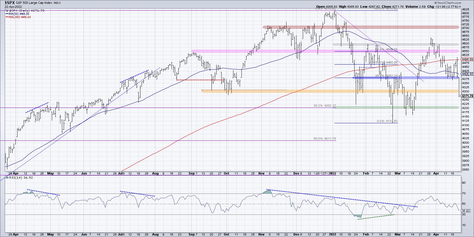
The S&P retested the January low in February and March but didn't really get much below that level. On the upside, the index shot up to 4600, but numerous attempts to push higher quickly fizzled out. Now we are left with the reality that, with all the noise and all the volatility, the S&P 500 is right about the same level that it was in late January!
So what's next? I posted a new video this week with four new scenarios for the S&P 500 in the coming months, ranging from a very bullish scenario to a very bearish scenario. Here's a quick breakdown of each of these potential outcomes.
1. The Very Bullish Scenario
In this first scenario, the S&P 500 would retest all-time highs around 4800. For that to happen, we would need to see some improvement during earnings season. Now I don't mean that companies will have to report better numbers (although that would certainly help), but rather that stocks would have to do better when the company does well.
Look at the chart of TSLA, NUE and others and you'll see what I mean. Decent quarter, strong gap higher the next morning, but, by the end of the day, the price is right back where it started the day before.
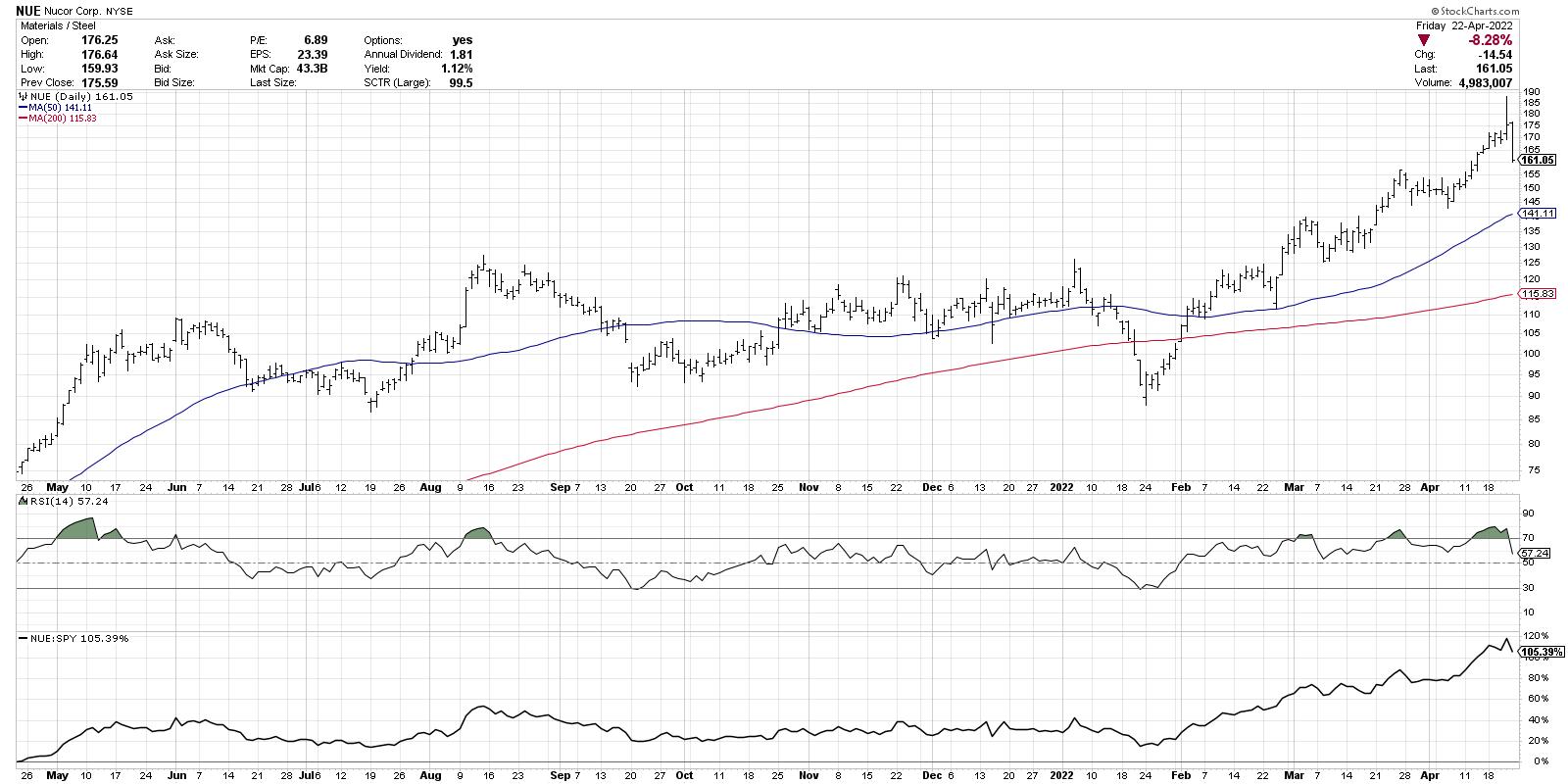
The very bullish scenario would have to involve stocks performing better on earnings wins, and the market would need to shrug off any further developments on the geopolitical front, as well as the prospect of further Fed rate hikes.
2. The Mildly Bullish Scenario
The second option would essentially be a repeat of the first quarter of 2022. We spent the last 12 weeks essentially rangebound between 4300 on the lower end and 4600 on the upper end. The mildly bullish scenario would assume more of the same.
Now it's worth noting that, while the major averages have been choppy and volatile, there are plenty of individual names and industry groups which have been in strong uptrends. There have also been stocks that have been struggling as they pound out new 52-week lows.
So this second scenario could mean even more differentiation between what's working and what's not on a single stock basis. But overall, the indexes don't make any major headway to the upside or the downside.
3. The Mildly Bearish Scenario
Now we get to some of the more painful potential outcomes over the next quarter. The third choice would include a failure to eclipse the February and March highs (we've already seen a meaningful pullback from the 200-day moving average to end this week!) and the February and March lows would certainly be in play.
The bearish scenarios both involve a new low (if not multiple new lows) for 2022, with 4000 being a reasonable downside target based on a 50% retracement of September 2020 to January 2022.
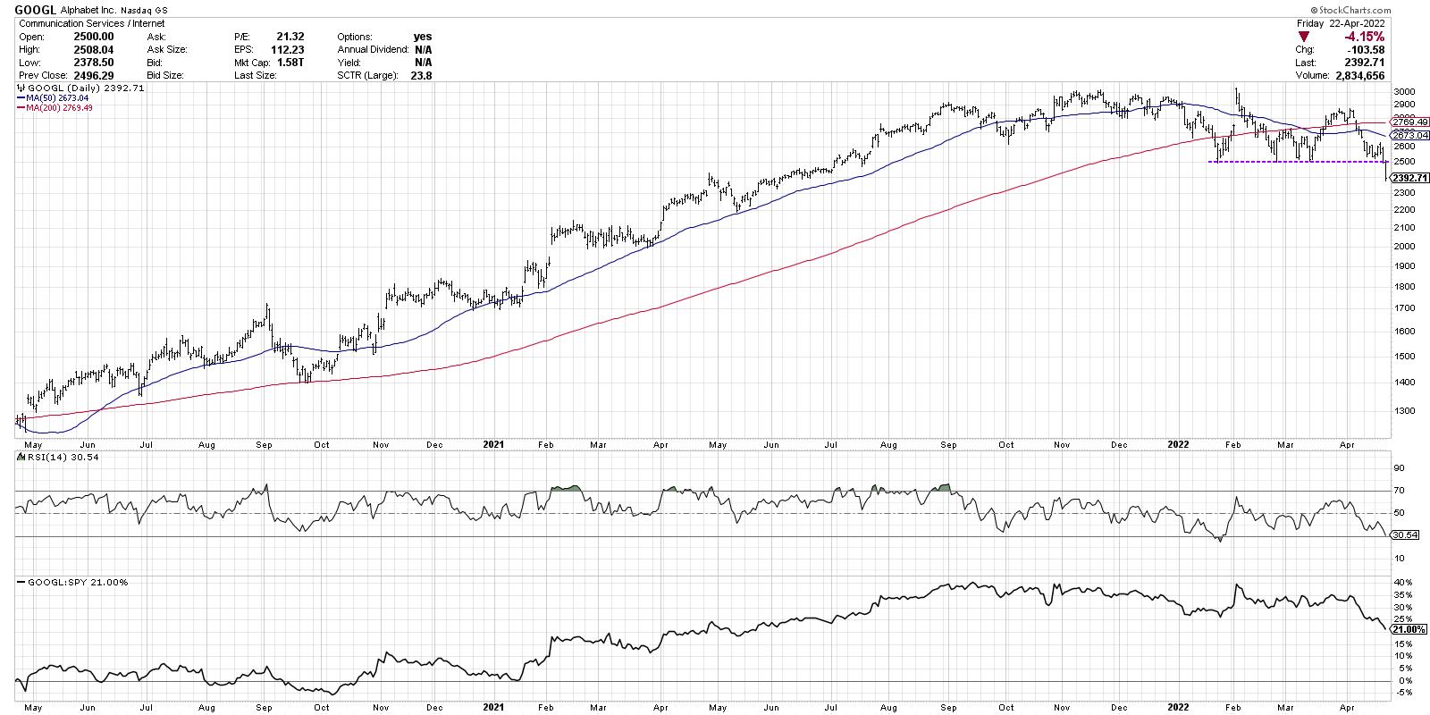
In this scenario, the prospect of higher interest rates, continued inflationary pressures, and potential escalation in Ukraine could help to fuel further downside for stocks as investors go full risk-off. Also, growth stocks like NFLX, GOOGL and others would continue to break through key support levels as investors realize the floor for stocks is further down.
4. The Very Bearish Scenario
Now we get to the most negative outcome of all, the very bearish scenario. In this case, all of the catalysts mentioned in the mildly bearish scenario play out, but the market reaction is much more severe. As investors move to full risk-off mode, the S&P 500 blows right through the 4200 level as well as 4000. 3800 becomes the new support as we look to long-term Fibonacci retracements to identify potential downside targets.
You may find that one of these four scenarios seems like the most likely, and perhaps one of them seems absolutely impossible. The reality is that all four of them are very much a possibility as investors try to make sense of the many competing macro and micro narratives.
Why is this exercise so important? Because novice investors (and even some experienced ones!) tend to think of the market in terms of certainties. "This particular outcome will play out, and here's why." The problem with that sort of thinking is you immediately start to tune out any alternative scenarios, because you are now committed to your particular point of view!
Mindful investors think in terms of probabilities instead of certainties. Think about how your portfolio would perform for each of these potential outcomes. What stocks/groups/themes would most likely work? What technical indicators could help you confirm that a particular scenario is indeed playing out? Think through the probabilities now, and don't be surprised later!
Want to digest this article in video format? Head over to my YouTube channel!
RR#6,
Dave
P.S. Ready to upgrade your investment process? Check out my YouTube channel!
David Keller, CMT
Chief Market Strategist
StockCharts.com
Disclaimer: This blog is for educational purposes only and should not be construed as financial advice. The ideas and strategies should never be used without first assessing your own personal and financial situation, or without consulting a financial professional.
The author does not have a position in mentioned securities at the time of publication. Any opinions expressed herein are solely those of the author, and do not in any way represent the views or opinions of any other person or entity.
|
| READ ONLINE → |
|
|
|
| ChartWatchers |
| Death Cross for Technology Sector |
| by Carl Swenlin, Erin Swenlin |
The following is an excerpt from this week's subscriber-only DecisionPoint ALERT Weekly Wrap.
Today, the Technology Sector (XLK) 50-day EMA crossed down through the 200-day EMA, effecting what is widely (and dramatically) known as a Death Cross. In our vernacular, we call it a LT Trend Model SELL Signal. In any language, it is bad news for this sector that has led the secular bull market. Unfortunately, there doesn't seem to be any strength that can pull this sector out of its nose-dive.
The RSI is negative and falling. The PMO is in negative territory and accelerating lower on a prior crossover SELL signal. Stochastics have turned down in negative territory as well.
Participation is anemic. The Silver Cross Index (SCI), which tells us how many stocks have a 20-day EMA greater than the 50-day EMA (they hold a "Silver Cross"), is only 31% and getting worse. The SCI has even turned down below its signal line. The Golden Cross Index (GCI) is showing only 1/3rd of the sector having a 50-day EMA above the 200-day EMA (on "Golden Cross" BUY signals). The GCI is also continuing to fall.
%Stocks > 20-day EMA is less than 3%! It gets a bit better as we look at %Stocks > 50-day EMA, but that is only at 12%. It's a little better from there, with 21% having price above the 200-day EMA. The problem is the SCI and GCI will likely continue lower, given short-term weakness is increasing.
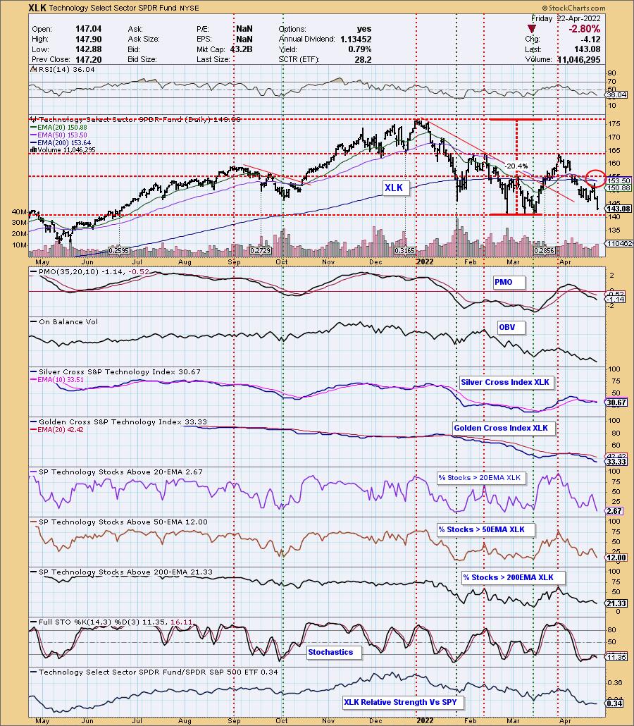
Conclusion: We have the low readings on the SCI and GCI. We have continued deterioration of %Stocks above their 20-day EMAs, which are less than %Stocks above their 50-day EMAs, which are themselves less than %Stocks above their 200-day EMAs. With all that in mind, the picture isn't likely to improve; it's just getting worse. We want to see %Stocks indicators moving higher to lower in each timeframe, NOT lower to higher. That implies serious weakness. This is a leadership sector, which tells us the market will continue to be led downward until we start to see improvement in Technology stocks.
Good Luck & Good Trading!
Carl & Erin Swenlin


Click here to register in advance for the recurring free DecisionPoint Trading Room! Recordings are available!
Technical Analysis is a windsock, not a crystal ball. --Carl Swenlin
(c) Copyright 2022 DecisionPoint.com
Helpful DecisionPoint Links:
DecisionPoint Alert Chart List
DecisionPoint Golden Cross/Silver Cross Index Chart List
DecisionPoint Sector Chart List
DecisionPoint Chart Gallery
Trend Models
Price Momentum Oscillator (PMO)
On Balance Volume
Swenlin Trading Oscillators (STO-B and STO-V)
ITBM and ITVM
SCTR Ranking
Bear Market Rules
DecisionPoint is not a registered investment advisor. Investment and trading decisions are solely your responsibility. DecisionPoint newsletters, blogs or website materials should NOT be interpreted as a recommendation or solicitation to buy or sell any security or to take any specific action.
|
| READ ONLINE → |
|
|
|
|
|
| ChartWatchers |
| How to Ride Out the Bear Market |
| by David Keller, Julius de Kempenaer |
How can we ride out this bear market? Before we can answer that question, we first have to define what qualifies as a bear market. Very often, a decline of 20% or more from the most recent high is used as a yardstick to define a bear market. That seems to be a pretty arbitrary number to most technical analysts.
In technical analysis, trends are defined as a sequence of highs and lows that move in the same direction. In other words, an uptrend is defined as a series of higher highs and higher lows, while a downtrend is the opposite, a series of lower highs and lower lows. Looking at the monthly chart of the S&P 500, neither of these two qualifications is met at the moment.
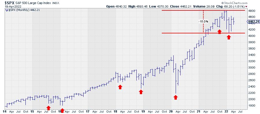
The decline from the last peak to the most recent low is just shy of 15%. Looking at the locations of the most recent highs and lows, we also have to conclude that the criteria for a bear market have not (yet) been met.
The low of February this year is clearly lower than the low that was set in October last year. But a lower high has not been put in place yet. Does this mean the market is still in an uptrend? No!! The sequence of higher highs and higher lows was breached when the market dropped below the October low. Therefore, technically speaking, there is no primary trend in the market (S&P 500 index) at the moment.
Going back to the start of the rally back in 2009, this has happened a few times in the past, first in the second half of 2015 and again in the period 2018-2020. The former can be labelled as a very short bear market because a lower high was also formed in that period. But that situation resolved itself very rapidly when the market moved to new highs again. The 2018-2020 situation was more difficult, as these two years were characterized by a few very large swings up and down, making it hard to get a clear trend. That ended when the market moved to new highs in the second half of 2020, starting a new series of higher highs and higher lows.
Where are we now?
Focusing on the most recent up-leg in the secular bull market that started back in 2009, we have to conclude that the rhythm of higher highs and higher lows has been violated, but a downtrend has not been established yet; at least, not in the longer-term monthly timeframe.
The best qualification for this moment is a sideways market.
Non-trending markets are notoriously hard to analyze, as they can resolve either way. A sideways period or consolidation can turn out to be a major peak, after which a prolonged period of declining prices will follow. Or it can be "just" a pause within the existing uptrend, which will resume once the market has absorbed all the selling pressure without sinking any further.
Right now, the S&P 500 is trading in the middle of the range between its most recent high (4820) and low (4115). A rise above 4820 (at the monthly close) will not immediately re-ignite the uptrend, as it will only mean that a higher high is in the making but a higher low has not been put into place. A drop below 4115 (monthly close), on the other hand, will confirm that a downtrend is in play.
Technical analysis is, most of the time, not predictive but merely trend-following. So we'll have to wait and see which situation comes first and adjust any views based on that.
Can we make an educated guess? Yes, at least we like to think so. You may have heard the term sector rotation before. In markets, this refers to specific sectors getting in or out of favour based on the economic cycle. At StockCharts.com, we use Relative Rotation Graphs® to visualize this phenomenon.
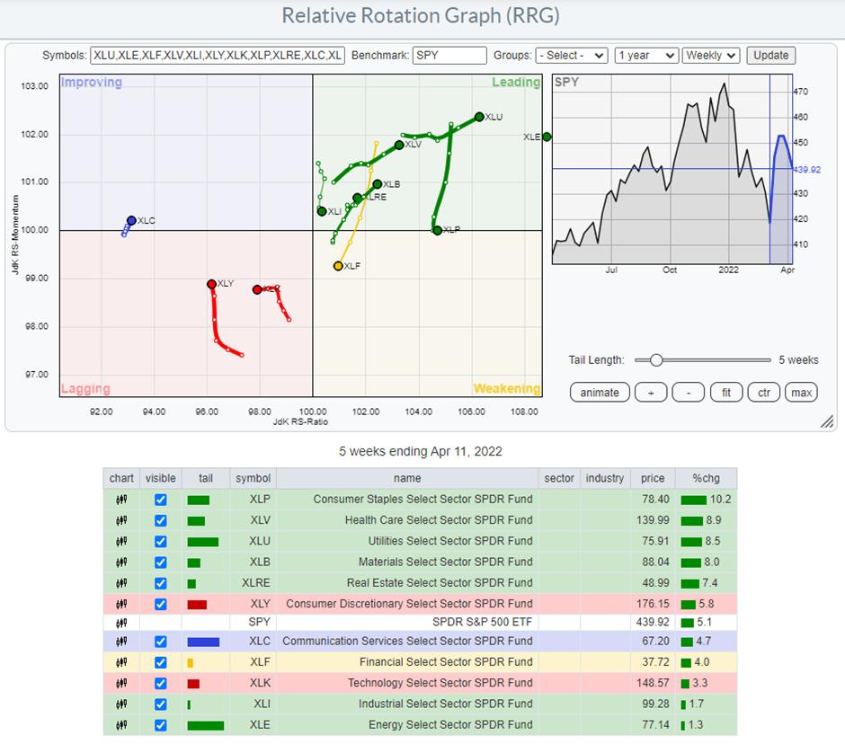
Such an RRG shows the relative positions and movement of all sectors inside the S&P 500 relative to the index (centre of the chart). On the horizontal JdK RS-Ratio axis, we measure relative strength, while on the vertical JdK RS-Momentum axis, we measure relative momentum. The combination of these two shows us the relative movements of all sectors against the S&P 500 index and against each other, giving us a high level overview of all sectors in one graph. "The BIG picture in ONE picture."
On the chart above*, you can see that two important sectors in the S&P -- Consumer Discretionary (12.5%) and Information Technology (27%) -- are inside the lagging quadrant, which means that they are in a period of underperformance vs. the S&P 500. These sectors are also often referred to as cyclical or offensive, which means that they usually do well when the market in general is moving higher.
*The chart is zoomed in to better show the rotations of the sectors other than Energy (XLE). The XLE tail is so far inside the leading quadrant that displaying it at the right scale will compress all other sectors, making them harder to see.
On the opposite side, inside the leading quadrant, we find sectors which are often labelled as defensive. These are sectors like Utilities, Health Care and Consumer Staples, which are usually doing well when the market is under pressure. Be careful, as this does not mean that they will go up in absolute price terms. It can also mean that they go down less than the S&P and, thus, do better on a relative basis.
The combination of the violation of the uptrend in the S&P chart and the current leading role of the defensive sectors suggests that the (stock) market should be approached with caution at the moment and that we are in a more risk-off environment.
This article was originally published on the NASDAQ website on 14 April 2022.
David Keller, CMT
Chief Market Strategist
StockCharts.com
|
| READ ONLINE → |
|
|
|
| The Traders Journal |
| Portfolio Profits Grow From Your Investment Garden: Here's How to Plant, Water And Weed It |
| by Gatis Roze |
 FACT: If investors make money, they remain engaged in the stock market with all its splendor and immense potential. If they lose money, they usually lose interest and move on. Over the past two decades, my role as I've embraced it has been to help you maximize those positive probabilities that make you money. FACT: If investors make money, they remain engaged in the stock market with all its splendor and immense potential. If they lose money, they usually lose interest and move on. Over the past two decades, my role as I've embraced it has been to help you maximize those positive probabilities that make you money.
If you are willing to get engaged, I will provide you with an entire smorgasbord of probability enhancers. Let's call them Level I enhancers. These are the 10 essential foundations of your investing which Grayson and I wrote about in much detail in our book, Tensile Trading.
For those of you not familiar with our methodology, these are the 10 essential stages:
- Stage 1: Money Management
- Stage 2: The Business of Investing
- Stage 3: The Investor Self
- Stage 4: Market Analysis
- Stage 5: Routines
- Stage 6: Stalking Your Investments
- Stage 7: Buying
- Stage 8: Monitoring
- Stage 9: Selling
- Stage 10: Revisit, Retrieve, Refine
Every season in sports, you hear the same refrain. Pick your favorite league and you will hear it said that teams need to get back to the basics. The basics and the foundations are always what's important. So too with investing, The 10 foundations of investing must be revisited on a regular basis before one can move on the Level II. This blog is mostly about what I'm labelling Level II enhancers.
Your investment profits are based on probabilities. There's no such thing as a 100% certainty trade that will generate a profit. But I can confirm from experience that by piling on a number of the key probability enhancers and by consistently investing with the winds of probability at your back, profits will magically appear in your account.
These Level II Enhancers are what we detail in Stage 4 (Market Analysis) of our book and in Stage 5 (Routines).
At this juncture, I'd like to step back a bit and share with you the two objectives in my writing the Traders Journal blog for over 11 years. My first goal is to "inform" you. As an educator (and full-time investor), I'm trying to acquaint you with the most useful investment tools and to appraise you of what is required to become a consistently successful and profitable investor. My second objective is to " motivate" you. If I don't excite you to take action or to inspire you with a spark of self-reflection that says "yeah, I want to do better," then my blogs will be little more than bubble gum for the mind.
So in an attempt to light that spark, I'd like to ask you to focus on your diligence here. Diligence is an attribute that all successful investors possess. There's no such thing as having too much diligence when it comes to investing. Diligence is what facilitates you working constantly towards perfecting your charts, indicators, ChartLists and routines. Diligence is what drives you to sort through the mountains and valleys of investing information. Embrace this reality: profits are the personification of diligence.
Now back to Level II. It's all about organizing your analysis, charting the most appropriate indicators, devising the most relevant routines and timeframes to fit your personal investment style. Level II is all about the most correct daily, weekly and monthly routines that capture the majority of these probabilities.
In the StockCharts.com universe, all this is synonymous with your individual collection of ChartLists. Think of it as your garden from which you grow profits. So....it's Springtime. There's much to do to promote new growth and fresh beginnings. It's a great time and an appropriate season to revisit your own garden indoors or out. In the investment arena, the metaphor is your personal assortment of ChartLists. This is indeed your financial garden from whence springs your portfolio's profits.
Your garden of ChartLists will only bloom profits if you judiciously fertilize it, water it and weed it. Fertilizing it requires that you populate your chartlist with the most appropriate tickers and indicators. Watering it requires that your routines (daily, weekly and monthly) are the best and most time efficient as possible. Weeding it requires that you jettison non-profitable indicators, charts and routines. The wrong ones will cost you precious time and cherished profits.
In closing, I submit to you that Grayson and I — hand-in-hand with thousands of users in our Stock Market Mastery ChartPack community — have been doing precisely this for over a decade. The result is one heck of a healthy garden, and you are always welcome to visit and harvest what you deem most appropriate. Warren Buffett once said, "There seems to be some perverse human characteristic that likes to make easy things difficult." The complete antithesis of his quote is the Stock Market Mastery ChartPack. It simplifies and routinizes the complexity of the stock market, thereby boiling it down to the essentials. With eye-opening transparency, the ChartPack garden will expose you to the most high-leveraged, most appropriate indexes, tickers, charts, indicators and routines for your consideration.
Unlike life and your average job, investing requires that you maintain the same personality with the same tools and the same routines every single day or week. Unapologetically, the reality is that your ChartLists and your routines are what will determine your success as an investor. The world is yours. GO FOR IT!
P.S. The latest ChartPack update reflects equities added and dropped from ALL key indexes. For example, with the S&P 500, Ceridian, Brown & Brown, and Match Group were added, while Perrigo Company, NOV, Inc. and Union Group were dropped. Index inclusion matters a lot! Just since being added to the S&P 500, Brown & Brown has risen 30% from $56 to $74.
Trade well; trade with discipline!
Gatis Roze, MBA, CMT
StockMarketMastery.com
|
| READ ONLINE → |
|
|
|
| ChartWatchers |
| This Household Name Just Had a Bullish Gap Up in a Difficult Market |
| by Mary Ellen McGonagle |
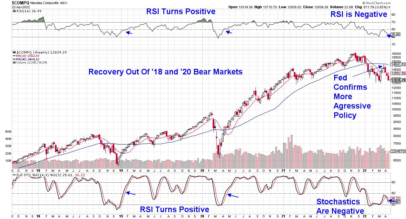
The Nasdaq has re-entered a bear market after last week's drop put this index 20.4% below its November high in price. At this time, the index is 2.6% above its next area of downside support, which is its February lows.
Below is a weekly chart of the Nasdaq, where I highlight the characteristics present just as this index turned bullish after its last two bear markets. I will continue to screen for these criteria and alert subscribers to my MEM Edge Report, just as they were alerted when the markets turned positive in 2019 and 2020.
WEEKLY CHART OF NASDAQ COMPOSITE

Until then, investors should focus on cultivating a watchlist, as moves out of a bear market can be quite powerful. For your watchlist, you'll want to focus on stocks that are exhibiting relative outperformance. In addition, you'll want the stock to be in a non-defensive area of the market, such as Staples or Utilities.
These are just two items to focus on when screening for stocks that lead a new bull market; there are also other characteristics that I'll review below.
The current selloff in the markets has been sparked by fears of aggressive action from the Federal Reserve, as they try to tame high inflation that's currently running at a 40-year high. This inflation is expected to last at least through the year-end, as the recent war in Russia has put further pressure on gasoline and food prices.
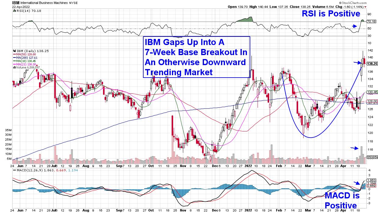
Earlier this year, I was asked to join other stock market experts and submit my top stock idea for this year. While the markets were in a much better position at that time, I'm sharing my response below, as it's on my watchlist, and I still believe this stock will head higher once downward pressure on the markets subsides. It's a stock that can outperform during periods of high inflation as, historically, companies that increase their dividends the most considerably have gone on to outperform the broader markets.
The company is IBM (IBM), which was my top pick. They offer a generous 4.7% yield, as well as awesome growth prospects. IBM reported their first quarter results last week, with earnings and revenue coming in ahead of estimates.
DAILY CHART OF INTERNATIONAL BUSINESS MACHINES (IBM)

The growth came on the heels of the company's pivot to a focus on the cloud and artificial intelligence, which is paying off. Investors responded by pushing IBM 9% higher for the week during a very difficult period for the broader markets.
The stock has additional characteristics that will make it an ideal candidate once the markets turn positive. In particular, there's the fact that it's trading at 17 times its past 4 quarters of earnings, which is well below the average of all stocks in the S&P 500. Lower multiple stocks fare well during periods of elevated inflation.
As the markets progress, my screening process for new leadership names for my watchlist may shift, as the economic backdrop evolves and different factors take on more importance. At the base of my screening, however, is a need for relative outperformance during the bear phase, coupled with strong growth prospects for the company. This combing for leadership names was how I was able to capture 12 of the top 14 performers emerging from the 2020 bear market, with half of the names going on to post triple-digit returns for subscribers to my MEM Edge Report.
If you'd like to be alerted to any shifts in market sentiment and which stocks are best positioned to benefit, try my twice weekly MEM Edge Report for 4 weeks for a nominal fee. Currently, there are pockets of strength that remain in place despite last week's selloff and you'll want to be aware of those as well. Use the link above to have access to insights that will guide you during these treacherous times for investors.
Next week, I'll be starting my 8-week mentorship, which will include eight 2-hour weekly classes followed by a 2 hour live trading session later in each week. The mentorship is designed to teach you how to outperform the markets during any period. There are a number of additional bonus offerings with this mentorship and you can read all about it here. Hurry and register, though, as there are only a few spots left!
On this week's episode of StockCharts TV's The MEM Edge, I review what triggered last week's sharp selloff and what to be on the lookout for going forward. I also identify pockets of strength, as well as ETFs to hedge against the current market.
Warmly,
Mary Ellen McGonagle MEM Investment Research
|
| READ ONLINE → |
|
|
|
| Martin Pring's Market Roundup |
| Does Recent Stock Market Action Indicate a Recession? |
| by Martin Pring |
I've been reading and hearing a lot about an impending recession, which reminds me of the saying that, when everyone thinks alike, everyone is usually wrong. That's not to say everyone is expecting a recession, but we may have reached a point where there is sufficient concern to suggest that a mild one may already be factored into prices.
Also, several observers have suggested that a recession is likely in the "next two years." I certainly do not rule out such a possibility, since that would imply a contraction 4-years from the 2020 recessionary experience, which is not inconsistent with historical precedent over the last 150-years.
Long-Term Momentum Suggests an Extended Correction or Bear Market is Likely
That said, the market typically looks ahead and peaks 6-to-9-months ahead of recessions. Consequently, if we assume that a contraction does lie 2 years down the road, then there could well be another year or more of bullish stock market action before the post-2020 bull move is over. We tend to think of the market either going up or down for an extended period. Quite often, though, its trajectory takes the form of a 1-to-2-year trading range. Think 2011-12 or 2015-16, for instance.
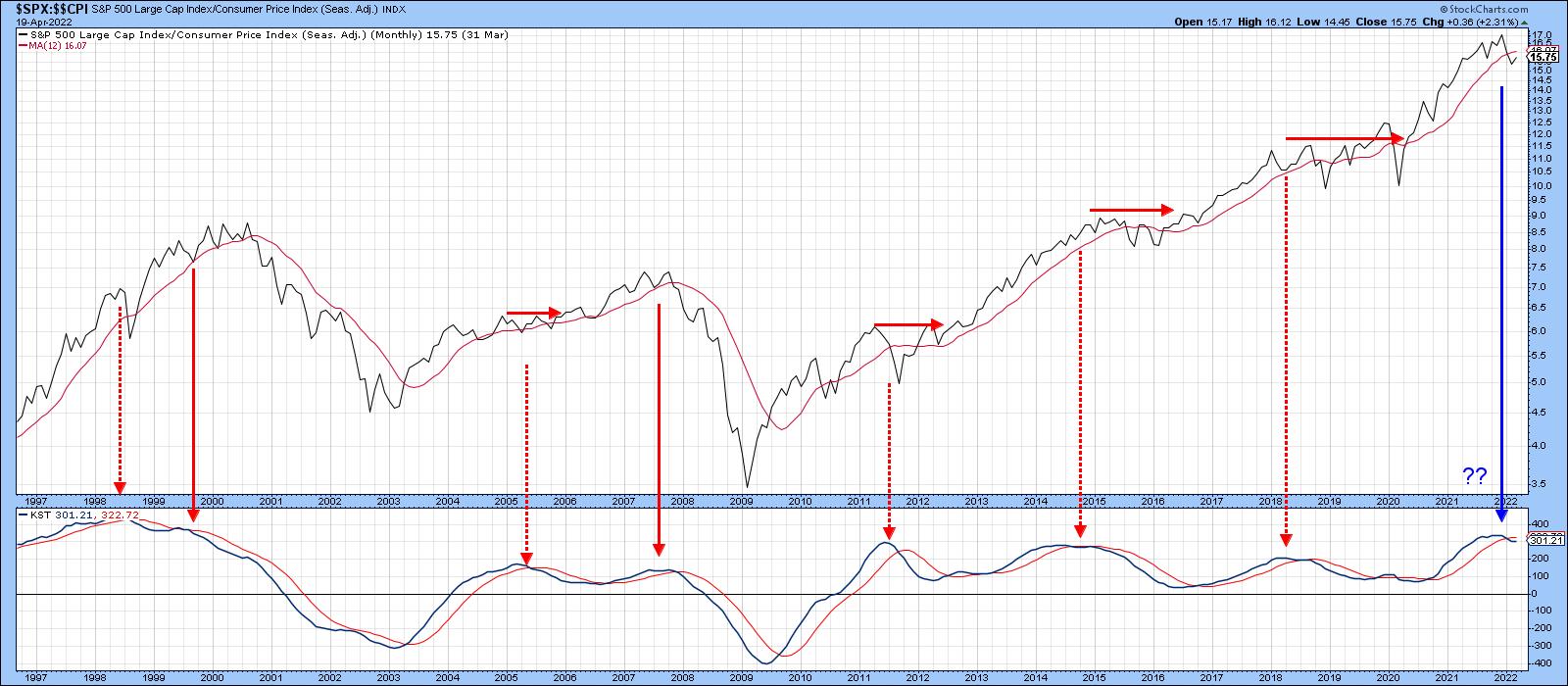
The arrows in Chart 1 approximate the long-term KST peaks for the inflation adjusted S&P Composite. History shows that such action is typically followed by a bear market. However, the chart shows that trading ranges have been more the norm since the late 1990s because economic recoveries were more extended during that period. The solid arrows identify the two bears, in 2000-2002 and 2007-2009, while the dashed ones reflect trading ranges, which were characterized by economic growth slowdowns. The 2022 arrow is in blue because it is unknown whether forthcoming action will turn out to be a full-blown bear or a trading range.
 Chart 1 Chart 1
Credit Spreads Argue Against a Bear Market
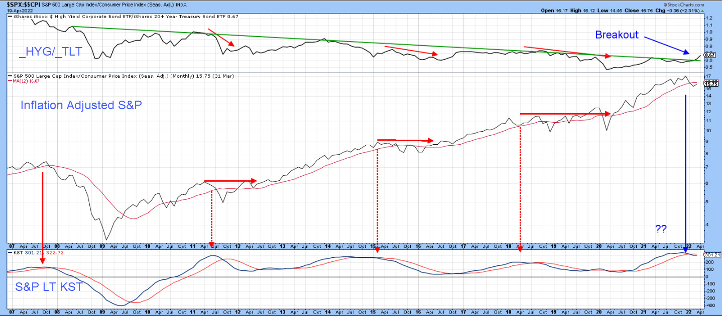
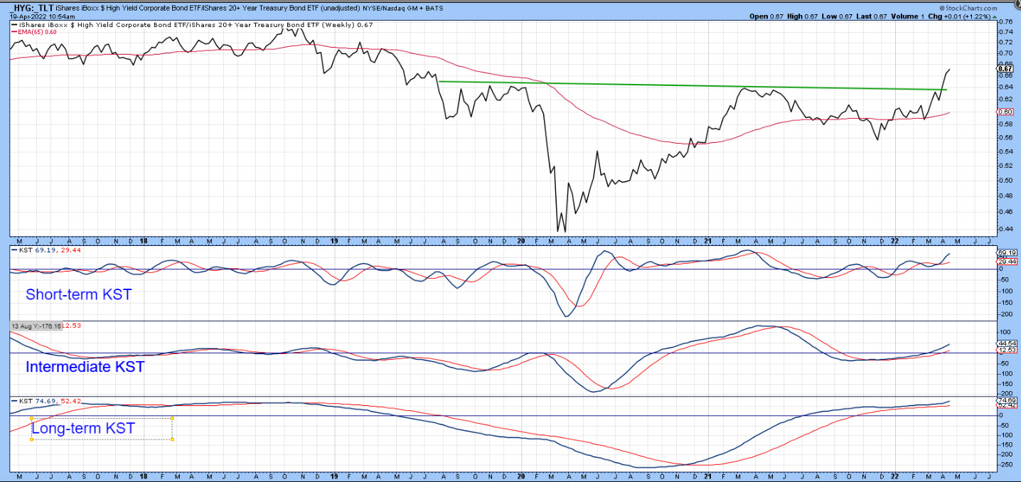
Forthcoming economic slowdowns or actual contractions often show up in the form of deteriorating credit spreads, where risky high-yield junk bonds are compared to higher-quality, lower-yielding treasuries. One way of accomplishing this is to compare the iBoxx High Yield Corporate Bond to the iShares 20-year+ Treasury ETF (_HYG/_TLT). A rising ratio indicates superior performance by the higher-yielding corporate bonds and reflects growing confidence, because investors are optimistic about the economy. A declining relationship, on the other hand, tells us that bond investors are more concerned about the possibility of defaults due to weak economic conditions, so they pressure the HYG. Think of it as a kind of canary in a financial coal mine.
 Chart 2 Chart 2
Chart 2 replicates the first chart, but narrows in on a more recent activity since 2007, since the HYG has been listed for as many years. Note that every time the KST for the inflation-adjusted S&P has peaked, the ratio has also fallen, thereby reflecting some concern about the economy. The latest KST sell signal has been accompanied by strength in the ratio, not weakness. Indeed, it has succeeded in breaking above its secular down trendline. It's possible the break will prove to be false, but, with the evidence as currently presented, it looks like a valid break.
Chart 3, featuring just the ratio, supports that idea, as all three KSTs are in a rising mode. The short-term series may be a little overextended and, therefore, suggestive of a near-term pull-back. However, its re-accelerating long-term counterpart argues for further ultimate gains. For those might be looking for a repeat of the 2007-2009 experience, it's as well to note that current price action from this relationship is exactly the opposite to that which preceded the financial crisis.
 Chart 3 Chart 3
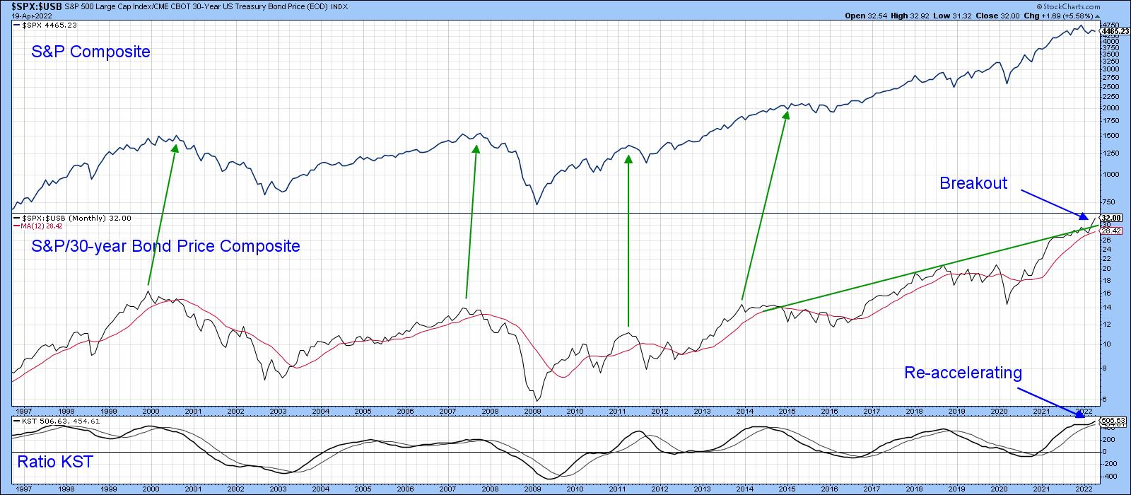
If Rising Rates are a Problem, Why are Stocks Outperforming Bonds?
When interest rates rise, investors inevitably run for the exits. That's because they fear those rising rates will feed back to economic weakness. While this is eventually true, the initial phase of rising rates is caused by a growing economy, when improving profits outweigh rising interest rates. However, the arrows in Chart 4 show that stocks, in their own right, do not usually peak until after they have begun to underperform bonds. Currently, there is no indication of that happening, as the ratio has just cleared a resistance trendline. Moreover, its long-term KST has started to re-accelerate. Both factors suggest there is more to come on the upside, both for the ratio and the S&P Composite.
 Chart 4 Chart 4
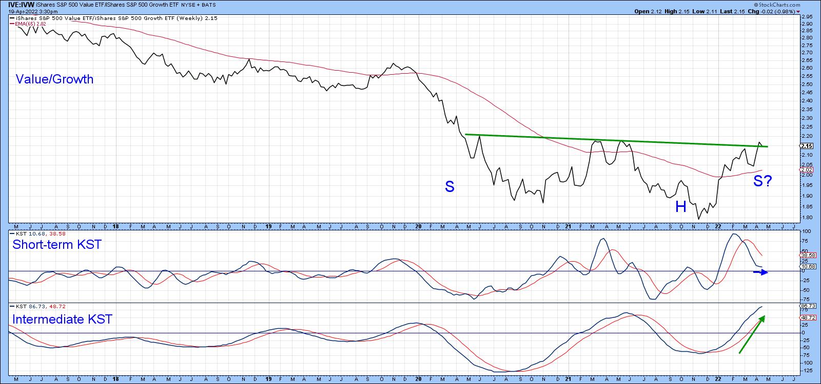
Voting for Value over Growth?
Whatever direction stocks in general may decide to take, it looks as though a major internal shift may be taking place. In this, I am referring to the ratio between the S&P Value to the S&P Growth ETFs. In that respect, Chart 5, tells us that this relationship has reached a critical chart point. The short-term KST is in a corrective mode, so a breakout could be delayed. That said, this indicator has begun to flatten and, with help from the intermediate KST, could mount a credible rally right away.
 Chart 5 Chart 5
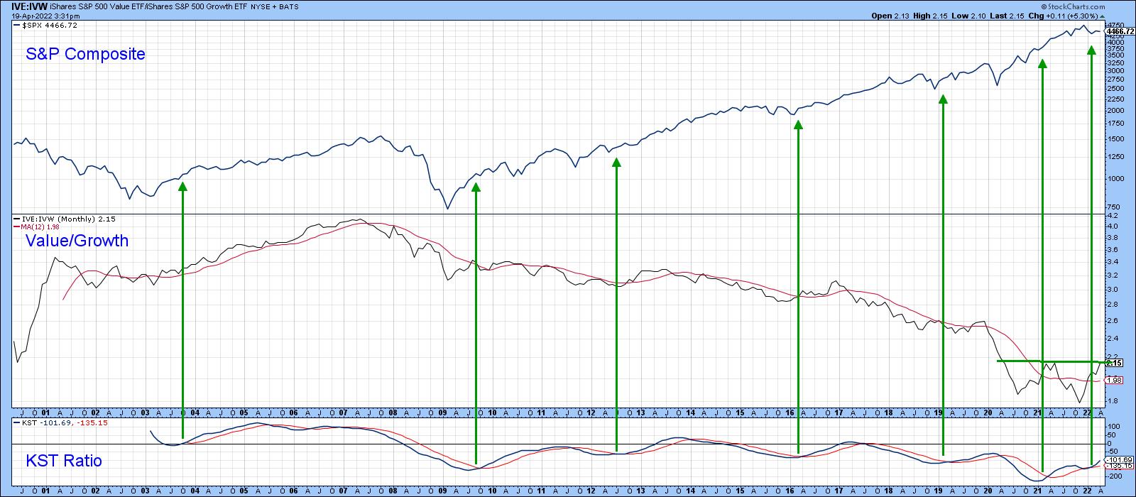
Even more encouraging for value investors is the fact that the long-term KST for the ratio in Chart 6 has begun to re-accelerate on the upside. The green arrows tell us that previous KST upside reversals have consistently been followed by a small rally in the ratio, but an even bigger one for the S&P itself.
 Chart 6 Chart 6
Conclusion
The long-term KST for the inflation adjusted S&P Composite has gone bearish. Historically, this kind of action has been followed by a bear market or an internally corrective trading range. Price action for several intermarket relationships suggest that the latter alternative, embracing a one-year-plus trading range as the more likely of the two.
Good luck and good charting,
Martin J. Pring
The views expressed in this article are those of the author and do not necessarily reflect the position or opinion of Pring Turner Capital Group of Walnut Creek or its affiliates.
|
| READ ONLINE → |
|
|
|
| The Canadian Technician |
| Commodities Start to Exit |
| by Greg Schnell |
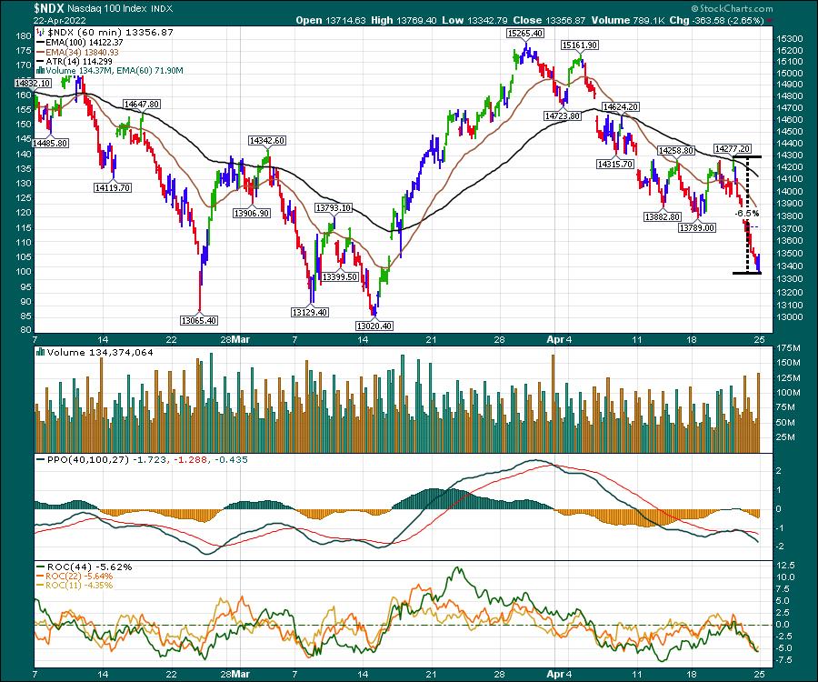
It's a twisting market, but, typically, the bears don't leave any berries untouched. Within two trading days, the Nasdaq has dropped 6.5%. By any measure, that is a fast move down in an index of some of the largest companies in the world. It's been a grind lower for three weeks since the late March top.

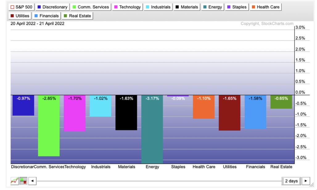
However, all the sectors were down over the last two days. Energy was clearly the worst, but the Materials sector also took a drubbing. Communication Services has really been hit hard with the drop in FB and NFLX.

While we continue in this bear market mode, there are very few places to hide. Even hiding in Staples, Healthcare, Utilities or Real Estate was hard. Staples held up okay, but that was still only the best of a bad experience.
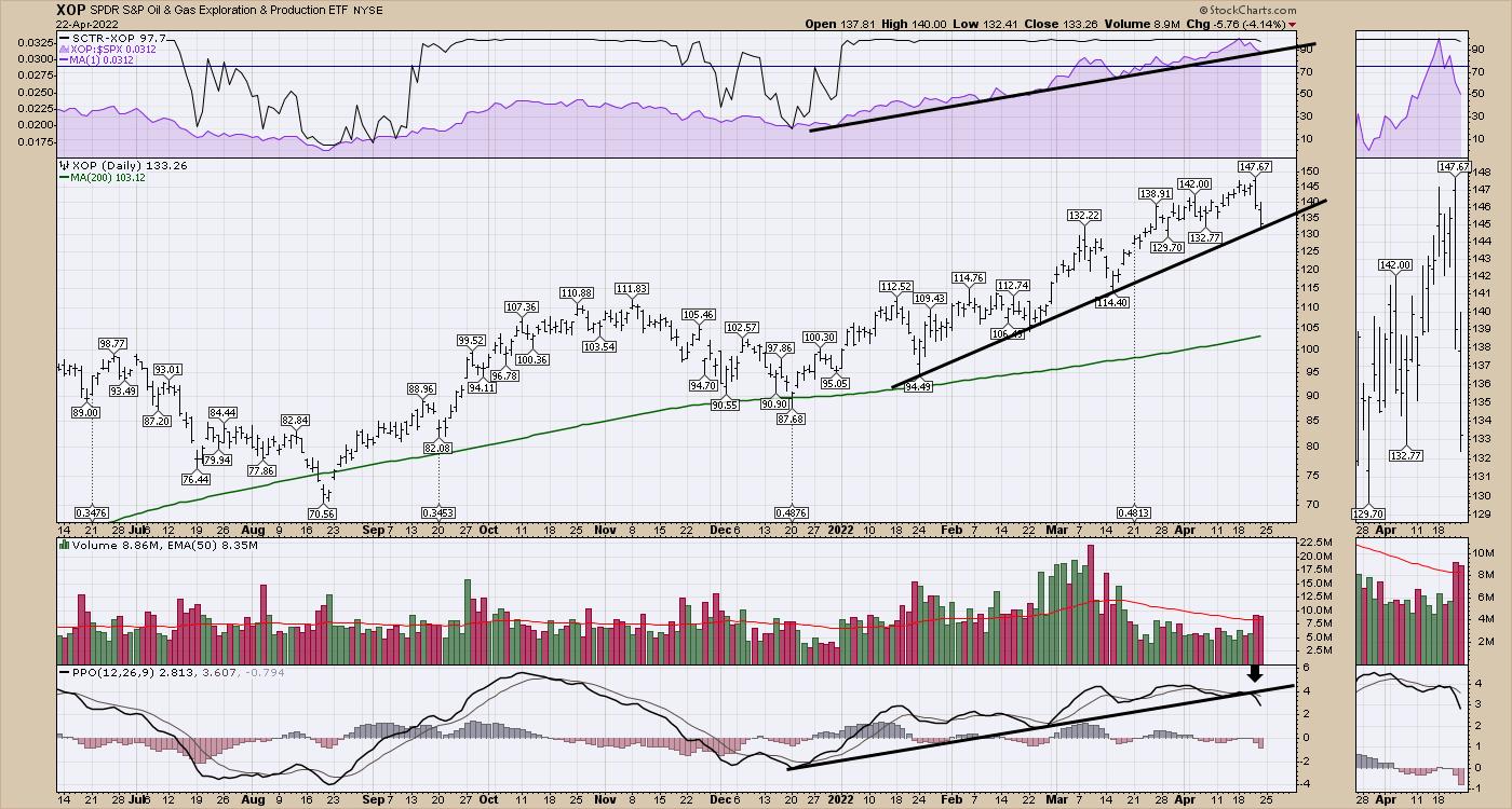
I do want to point out that the XOP went on a sell signal for me this week, and it is a cautious environment here. If the high price of commodities slows down the economy, it will eventually slow down commodities as well.

Without reviewing them all, commodities could be subject to a quick move down with all the weakness elsewhere.
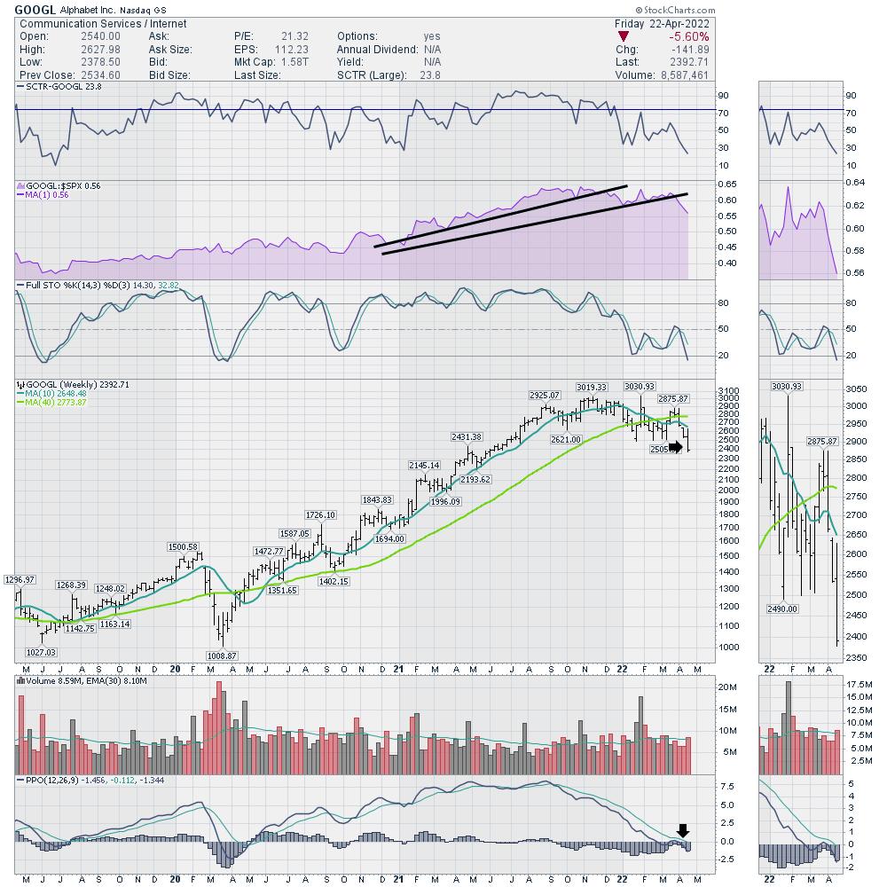
I do want to highlight the mood change on GOOGL as it is joining the Meta party and NFLX. Alphabet is starting to underperform the $SPX, as shown in purple, as it makes new 52-week lows. The PPO is accelerating lower after wobbling just below zero. This is a very weak chart setup. Use caution.

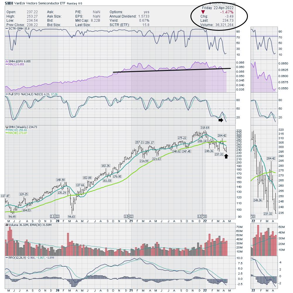
One chart that held up better than my expectations this week was the SMH ETF. There is still not a lot to cheer about, as it made a negative outside bar and closed on the lows. However, on the week, it was only down 1.47% compared to the extreme moves in the indexes. It's still negative and the PPO is a terrible position, but the fact that it didn't drop 5% this week is potentially a sign that the selling is done in the industry group. That's a long shot, but one worth watching for the week ahead.

I remember Tesla reported blowout earnings to start Thursday, but the stock still finished negative on the week. It's hard to pick winners when even the big obvious companies can't hold their gains. I plan to stay cautious here.
|
| READ ONLINE → |
|
|
|
| Top Advisors Corner |
| Edson Gould's Daily Point Index |
| by Tom McClellan |

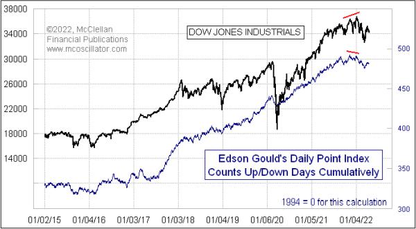
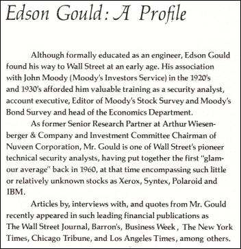
I have spent the past week going through old records, books and other materials with my father Sherman McClellan, and we came across some promotional materials from the late Edson Gould's Findings & Forecasts newsletter service. It included descriptions of some of the indicators that Gould used, including ones that he created himself. And that is where this week's chart comes in.
Gould's Daily Point Index was a rather simple indicator in construction. It looked at whether the DJIA was up or down each day, irrespective of how much it changed, and tallied that on a cumulative basis. In that sense, it is like an A-D Line for all the stocks on the exchange, but only using the end-of-day index value. I have done similar evaluations of the number of up closes over some lookback period like 20 trading days, but I have never looked at the data before in this particular way.
Gould also separately ran an Hourly Point Index, looking at whether the DJIA moved up or down in each hour of the trading day. I have not yet done the work to code that for study.
What I see in the chart above is that this Daily Point Index has pretty much done what prices have done, which is not what you want an indicator like this for. You want an indicator that is going to give you a different answer from what prices are saying, and to do so only at the times when such an answer will matter. It did show a nice bearish divergence in December 2021, foretelling the troubles that the stock market has gone through during early 2022.
But I have to concede that, after going through several years of seeing an indicator not give us any signals (during what was admittedly a Fed-stimulated market period), I might have given up looking at this indicator had I been following it, and thus probably would have missed knowing about that December 2021 signal.

Gould is perhaps best known these days for coming up with his "Three-Step-And-Stumble Rule". It came from another era, when the Federal Reserve effected monetary policy using somewhat different tools than the current Fed uses these days. That rule states: "Whenever any one of the three rates set by the monetary authorities -- the rediscount rate, the rate for bank reserve requirements, and the margin requirements on stocks -- increases three times in succession, the investor should beware, because invariably, when this has occurred, the stock market has subsequently, usually with some delay, suffered a sizable and sometimes severe setback."
Yes, kids, the Fed really did used to tighten or loosen conditions by changing how much you could leverage your money and invest on margin with your broker. They have not changed that initial margin rate from 50% since 1973, although some brokerage firms do set more stringent requirements for their customers. It has gotten up as high as 90% back in the late 1950s, meaning you could only borrow 10%. And they set it at 100% in 1946, meaning no borrowing to trade on margin at all.
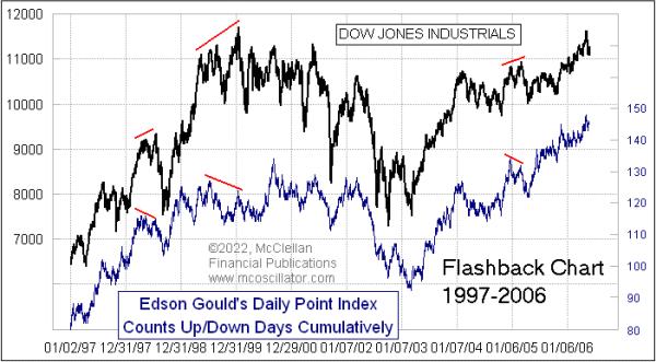
Turning back to the Daily Point Index, it has shown some interesting indications in earlier years. Here is a look at 1997-2006, just for example.

During this period, we did see a few more interesting divergences. It did not show us a divergence at every point when we might have wanted to see one, but these ones it did show were indeed good-looking ones. If you looked closely at its movements versus those of the DJIA, you might be able to find a few more such divergences. This indicator does not seem to be much good at showing us bottoming conditions for prices.
Our predecessors decades ago had to do their analysis without the ease of computing power that we now enjoy, and that perhaps explains their preference for indicators that were easy to compute. The Daily Point Index is indeed very easy to compute, but would still need to have been kept by hand on a ledger, and plotted by hand to chart it back in Gould's days. I would not want to go back to those days, except for a nostalgic look like this one.
|
| READ ONLINE → |
|
|
|
| MORE ARTICLES → |
|
 Chart 1
 Chart 2
 Chart 3


 FACT: If investors make money, they remain engaged in the stock market with all its splendor and immense potential. If they lose money, they usually lose interest and move on. Over the past two decades, my role as I've embraced it has been to help you maximize those positive probabilities that make you money.