How can we ride out this bear market? Before we can answer that question, we first have to define what qualifies as a bear market. Very often, a decline of 20% or more from the most recent high is used as a yardstick to define a bear market. That seems to be a pretty arbitrary number to most technical analysts.
In technical analysis, trends are defined as a sequence of highs and lows that move in the same direction. In other words, an uptrend is defined as a series of higher highs and higher lows, while a downtrend is the opposite, a series of lower highs and lower lows. Looking at the monthly chart of the S&P 500, neither of these two qualifications is met at the moment.
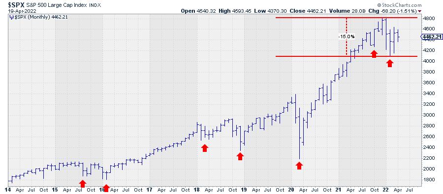
The decline from the last peak to the most recent low is just shy of 15%. Looking at the locations of the most recent highs and lows, we also have to conclude that the criteria for a bear market have not (yet) been met.
The low of February this year is clearly lower than the low that was set in October last year. But a lower high has not been put in place yet. Does this mean the market is still in an uptrend? No!! The sequence of higher highs and higher lows was breached when the market dropped below the October low. Therefore, technically speaking, there is no primary trend in the market (S&P 500 index) at the moment.
Going back to the start of the rally back in 2009, this has happened a few times in the past, first in the second half of 2015 and again in the period 2018-2020. The former can be labelled as a very short bear market because a lower high was also formed in that period. But that situation resolved itself very rapidly when the market moved to new highs again. The 2018-2020 situation was more difficult, as these two years were characterized by a few very large swings up and down, making it hard to get a clear trend. That ended when the market moved to new highs in the second half of 2020, starting a new series of higher highs and higher lows.
Where are we now?
Focusing on the most recent up-leg in the secular bull market that started back in 2009, we have to conclude that the rhythm of higher highs and higher lows has been violated, but a downtrend has not been established yet; at least, not in the longer-term monthly timeframe.
The best qualification for this moment is a sideways market.
Non-trending markets are notoriously hard to analyze, as they can resolve either way. A sideways period or consolidation can turn out to be a major peak, after which a prolonged period of declining prices will follow. Or it can be "just" a pause within the existing uptrend, which will resume once the market has absorbed all the selling pressure without sinking any further.
Right now, the S&P 500 is trading in the middle of the range between its most recent high (4820) and low (4115). A rise above 4820 (at the monthly close) will not immediately re-ignite the uptrend, as it will only mean that a higher high is in the making but a higher low has not been put into place. A drop below 4115 (monthly close), on the other hand, will confirm that a downtrend is in play.
Technical analysis is, most of the time, not predictive but merely trend-following. So we'll have to wait and see which situation comes first and adjust any views based on that.
Can we make an educated guess? Yes, at least we like to think so. You may have heard the term sector rotation before. In markets, this refers to specific sectors getting in or out of favour based on the economic cycle. At StockCharts.com, we use Relative Rotation Graphs® to visualize this phenomenon.
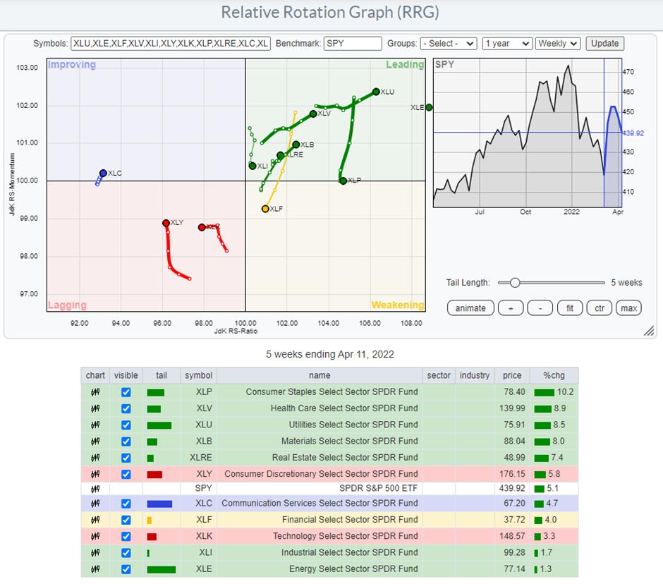
Such an RRG shows the relative positions and movement of all sectors inside the S&P 500 relative to the index (centre of the chart). On the horizontal JdK RS-Ratio axis, we measure relative strength, while on the vertical JdK RS-Momentum axis, we measure relative momentum. The combination of these two shows us the relative movements of all sectors against the S&P 500 index and against each other, giving us a high level overview of all sectors in one graph. "The BIG picture in ONE picture."
On the chart above*, you can see that two important sectors in the S&P -- Consumer Discretionary (12.5%) and Information Technology (27%) -- are inside the lagging quadrant, which means that they are in a period of underperformance vs. the S&P 500. These sectors are also often referred to as cyclical or offensive, which means that they usually do well when the market in general is moving higher.
*The chart is zoomed in to better show the rotations of the sectors other than Energy (XLE). The XLE tail is so far inside the leading quadrant that displaying it at the right scale will compress all other sectors, making them harder to see.
On the opposite side, inside the leading quadrant, we find sectors which are often labelled as defensive. These are sectors like Utilities, Health Care and Consumer Staples, which are usually doing well when the market is under pressure. Be careful, as this does not mean that they will go up in absolute price terms. It can also mean that they go down less than the S&P and, thus, do better on a relative basis.
The combination of the violation of the uptrend in the S&P chart and the current leading role of the defensive sectors suggests that the (stock) market should be approached with caution at the moment and that we are in a more risk-off environment.
This article was originally published on the NASDAQ website on 14 April 2022.
David Keller, CMT
Chief Market Strategist
StockCharts.com
Julius de Kempenaer
Senior Technical Analyst, StockCharts.com
Creator, Relative Rotation Graphs
Founder, RRG Research
Host of: Sector Spotlight
Please find my handles for social media channels under the Bio below.
Feedback, comments or questions are welcome at Juliusdk@stockcharts.com. I cannot promise to respond to each and every message, but I will certainly read them and, where reasonably possible, use the feedback and comments or answer questions.
To discuss RRG with me on S.C.A.N., tag me using the handle Julius_RRG.
RRG, Relative Rotation Graphs, JdK RS-Ratio, and JdK RS-Momentum are registered trademarks of RRG Research.


