| THIS WEEK'S ARTICLES |
| John Murphy's Market Message |
| STOCKS SELL OFF ON HAWKISH FED |
| by John Murphy |
STOCKS SELL OFF FOLLOWING POWELL SPEECH... A modest rally attempt was turned back pretty decisively today following a speech by Jay Powell that sounded more hawkish than the market was expecting. Friday's heavy selling also reinforced the view expressed last Friday that the summer rally in stocks had ended. The daily bars in Chart 1 show the S&P 500 turning back last week from major resistance at its 200-day moving average (red line) and a major down trendline drawn over its 2022 peaks (blue line). That was exactly where the summer rally should have peaked in order to maintain the market's major downtrend. Which it appears to have done.
NASDAQ LEADS MARKET LOWER... Chart 2 shows the Dow Industrials in a similar negative trend. It's also worth noting that its 14-day RSI line in the upper box has fallen below 50 from overbought territory, while daily MACD lines (lower box) have turned negative. That's true of all three charts. That combination is consistent with a market that has turned lower. Chart 3 shows the Nasdaq Composite Index turning lower as well. That index failed to reach its 200-day average and has led the selling this week. That's due primarily to the fact that technology was the market's weakest sector on Friday and for the entire week. Technology stocks are especially vulnerable to the recent upturn in bond yields and the prospect of higher rates ahead. The next technical test should occur at 50-day moving averages. The fact that the market's 50-day averages remain well below its 200-day averages which is also consistent with an ongoing bear market.
 Chart 1 Chart 1
 Chart 2 Chart 2
 Chart 3ANOTHER MOVING AVERAGE TREND REMAINS BEARISH... Another way to measure the strength or weakness of the stock market is to plot the percent of S&P 500 stocks above their 200-day moving averages. Chart 4 shows that percentage line falling below its 50% level to the lowest level in two years before rebounding over the summer. The summer bounce, however, reached the 50% level before turning down again over the last two weeks (red arrow). One sign of a bear market is having more than half of its stocks trading below their 200-day moving averages. The red line has been in that bearish position for most of the year. Its recent failure to clear its 50% line keeps the summer rally within the context of an ongoing bear market. Friday's selling pushed that percentage level back down to 35% which means that two-thirds of S&P 500 stocks are still in major downtrends. The blue down trendline also shows that a major downtrend in the percentage line starting in 2021 is still intact. Chart 3ANOTHER MOVING AVERAGE TREND REMAINS BEARISH... Another way to measure the strength or weakness of the stock market is to plot the percent of S&P 500 stocks above their 200-day moving averages. Chart 4 shows that percentage line falling below its 50% level to the lowest level in two years before rebounding over the summer. The summer bounce, however, reached the 50% level before turning down again over the last two weeks (red arrow). One sign of a bear market is having more than half of its stocks trading below their 200-day moving averages. The red line has been in that bearish position for most of the year. Its recent failure to clear its 50% line keeps the summer rally within the context of an ongoing bear market. Friday's selling pushed that percentage level back down to 35% which means that two-thirds of S&P 500 stocks are still in major downtrends. The blue down trendline also shows that a major downtrend in the percentage line starting in 2021 is still intact.
 Chart 5 Chart 5
|
| READ ONLINE → |
|
|
|
| The Mindful Investor |
| Making Sense of Mass Hysteria |
| by David Keller |
Friday's sudden 3-4% drop felt like a wake-up call of sorts. At least it did for me, as I remained bearish through much of the recent rally phase. How could the market rally given all the macro headwinds -- inflationary pressures, higher interest rates, a hawkish Fed?
Tony Dwyer explained it well on my show The Final Bar this week, talking about the opposing forces described by two popular market maxims: "Don't Fight the Fed" and "Don't Fight the Tape".
The Fed governors, as summarized on Friday with Powell's Jackson Hole press conference, have made it clear that Quantitative Tightening is designed to have a very real impact on inflation. And if it impacts inflation, it will certainly impact risk assets. On the other hand, the market has just been rallying, led by growth stocks. I've noted how the rotation from severe bearish conditions to severely bullish conditions in a short time frame tells me to expect further downside, even I was surprised by the severity of the drawdown to end this volatile week.
So either a) bulls are hysterically avoiding clear macro headwinds to the bullish thesis for stocks, b) bears are hysterically ignoring the very clear signals that demand is outweighing supply for stocks, or c) the markets will rotate between two extremes to cause us all to feel a little hysterical.
I would probably vote c), and here's why.
I have spoken to many knowledgeable and experienced technical analysts and strategists in recent weeks, some of whom are fully convinced of the bullish thesis and others who are equally as sure that the downtrend is just beginning. I choose to focus on the evidence, and here are three charts I'm watching to help me minimize the hysteria and focus on price.
First, we have the daily S&P 500 chart with a focus on Fibonacci relationships.
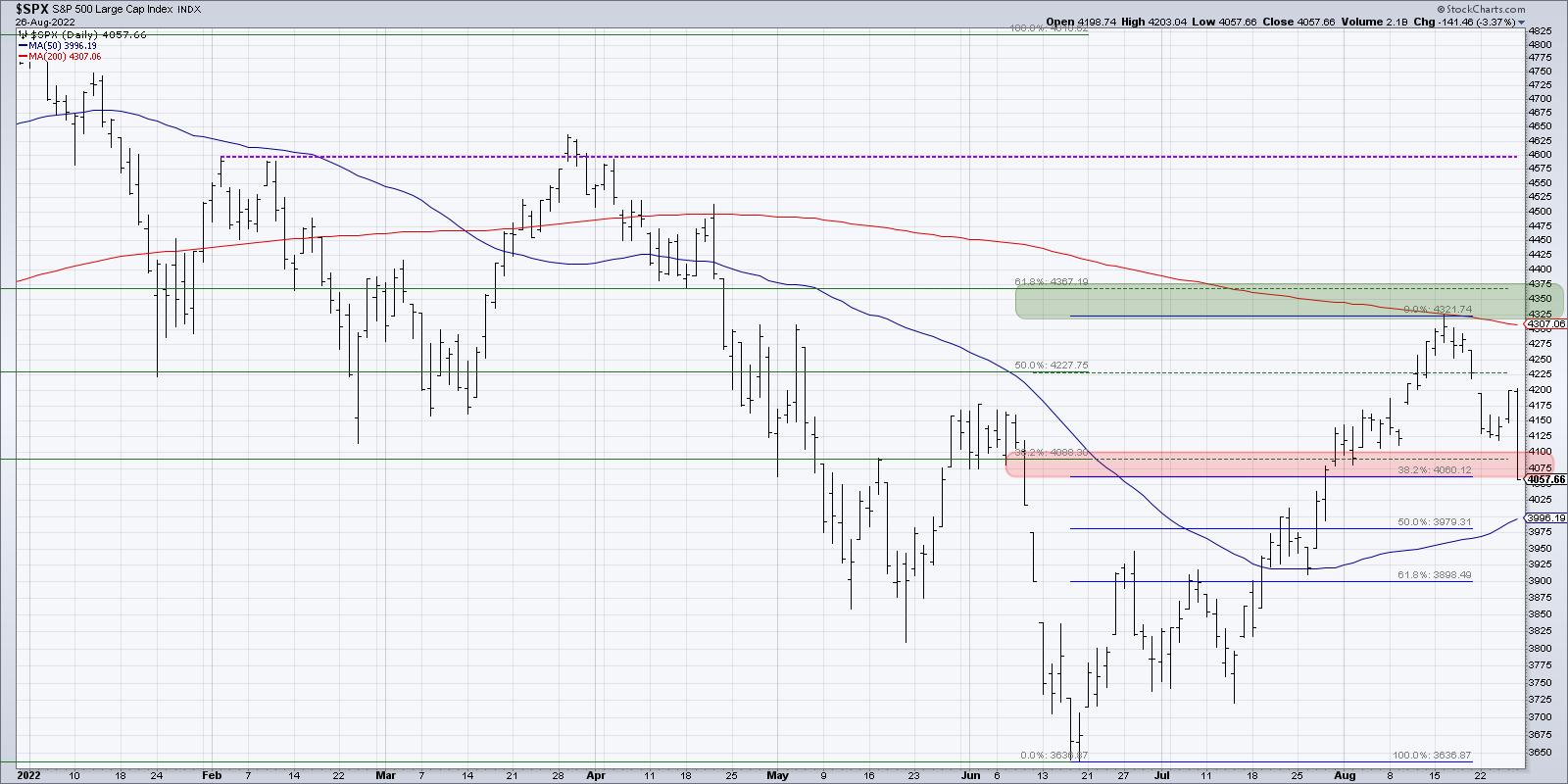
When the markets get crazier, my charts tend to get noisier, with lots of trendlines and annotations to capture my thinking as the price progresses forward. I cleaned up my SPX chart this week to focus on some key Fibonacci retracement levels.
If we start with the 2022 price range, from the January high to the June low, we end up with a 38.2% level around 4090 and a 61.8% level around 4370. The green-shaded area on the chart is from that 61.8% retracement level to the August high around 4320. If we use the June low and the August high as the framework, we get to a 38.2% retracement level around 4060, which is the bottom of the red-shaded area on our chart. The top of that red-shaded area is from the 38.2% level described above, around 4090.
You'll note that with today's selloff, the S&P 500 closed just below the bottom of the red-shaded area. That means next Monday and Tuesday could be key to determining whether we get a downside follow-through with lower prices (indicating a high probability of a retest of the 2022 lows) or a bounce back to the upside (in which case, this red/green framework remains super relevant!).
If we do follow-through to the downside, which I believe we will, then the next downside objective could be the 61.8% level around 3900.
My second chart is the VIX.
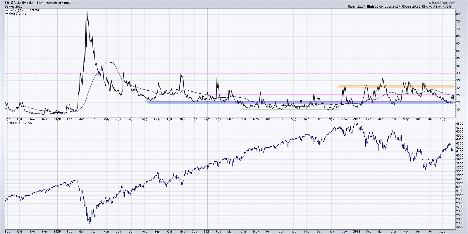
I've shared why the VIX is such an important measure of market sentiment, and this month we've seen the indicator again prove to be a vital indicator of price extremes.
For most of 2022, the VIX has ranged between 20 on the lower end and 30-35 on the upper end. The most recent stock rally pushed the VIX back down to its lowest levels for the year. As expected, volatility has now risen once again, as prices pulled back from key resistance levels. The bull case for stocks would involve the VIX most likely getting below 20 and staying there. At this point, that is not what we're seeing.
Finally, we can use Bullish Percent Indexes to measure market breadth.
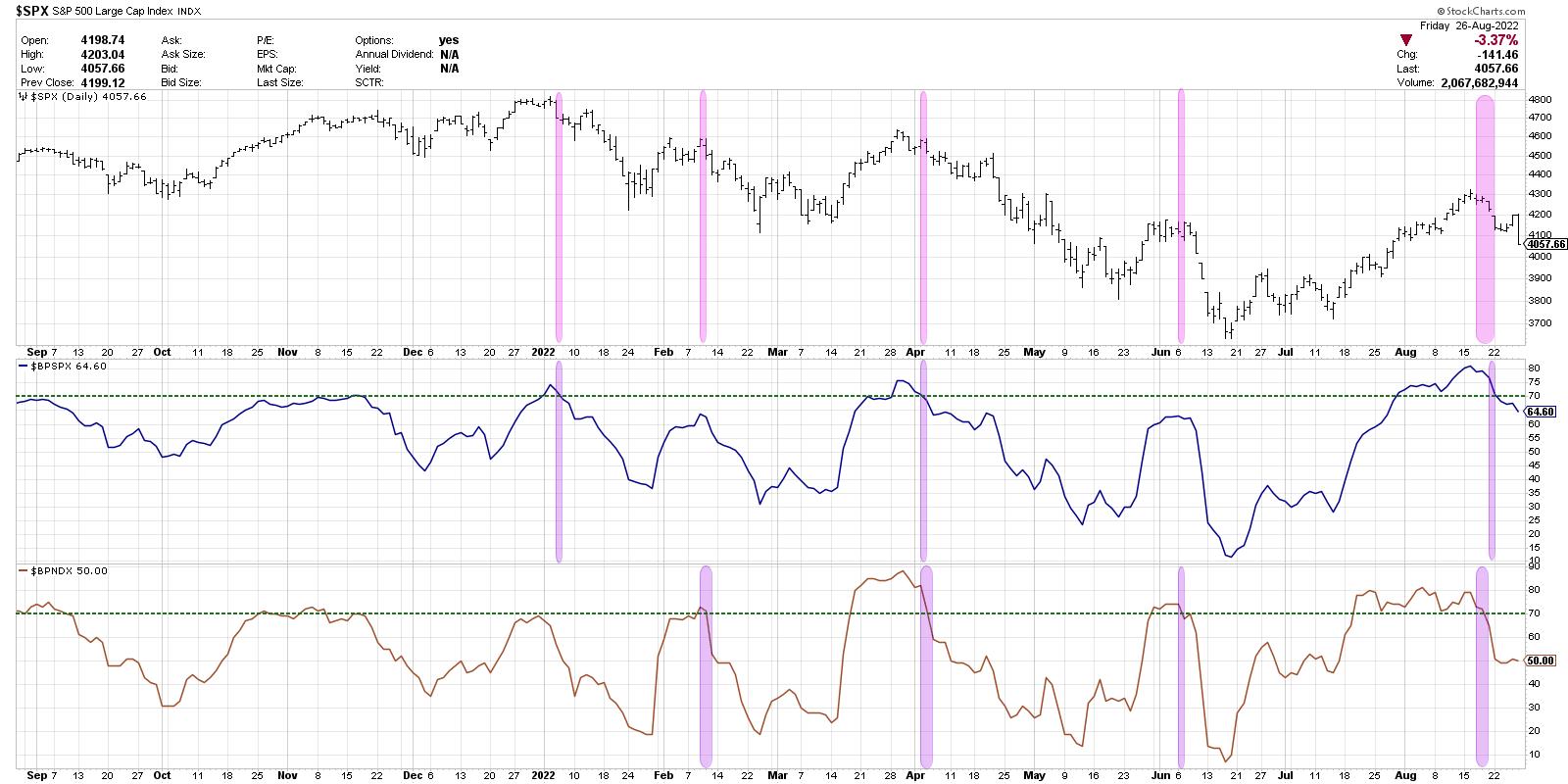
Here, we are illustrating the S&P 500 daily chart along with the Bullish Percent Index for the S&P 500 and the Nasdaq 100 indexes. I've indicated with purple bars any time either indicator has gone from above 70 to back below. On the SPX price bars, I'm highlighting any time either of the BPI charts have dipped back below 70. Basically, you can see that every major top so far in 2022 has been marked by one or both of these breadth indicators turning from confirmed bullish (over 70) to back below that key threshold.
This final chart tells me to expect further downside, because if we would rally next week, then that would be the first time in 2022 for such a pattern to have emerged.
In my webcast earlier this week, we discussed how the seasonal trends in September are not ideal for technology stocks. Given the way the week ended with a whimper, we may be seeing just the beginning of that seasonal weakness playing out in 2022.
RR#6,
Dave
P.S. Ready to upgrade your investment process? Check out my YouTube channel!
David Keller, CMT
Chief Market Strategist
StockCharts.com
Disclaimer: This blog is for educational purposes only and should not be construed as financial advice. The ideas and strategies should never be used without first assessing your own personal and financial situation, or without consulting a financial professional.
The author does not have a position in mentioned securities at the time of publication. Any opinions expressed herein are solely those of the author, and do not in any way represent the views or opinions of any other person or entity.
|
| READ ONLINE → |
|
|
|
| Wyckoff Power Charting |
| Stocks at a Crossroad |
| by Bruce Fraser |
 Determining the stride of an uptrend or downtrend is an essential Wyckoff technique. The stride of a trend is often set early in that trend and then prices can adhere to that pace of advance or decline for the majority of the bull or bear run. Trend determination techniques have been covered often in this blog and you are encouraged to review these materials and case studies. Below is an interpretation of the downtrend in force in 2022. Determining the stride of an uptrend or downtrend is an essential Wyckoff technique. The stride of a trend is often set early in that trend and then prices can adhere to that pace of advance or decline for the majority of the bull or bear run. Trend determination techniques have been covered often in this blog and you are encouraged to review these materials and case studies. Below is an interpretation of the downtrend in force in 2022.
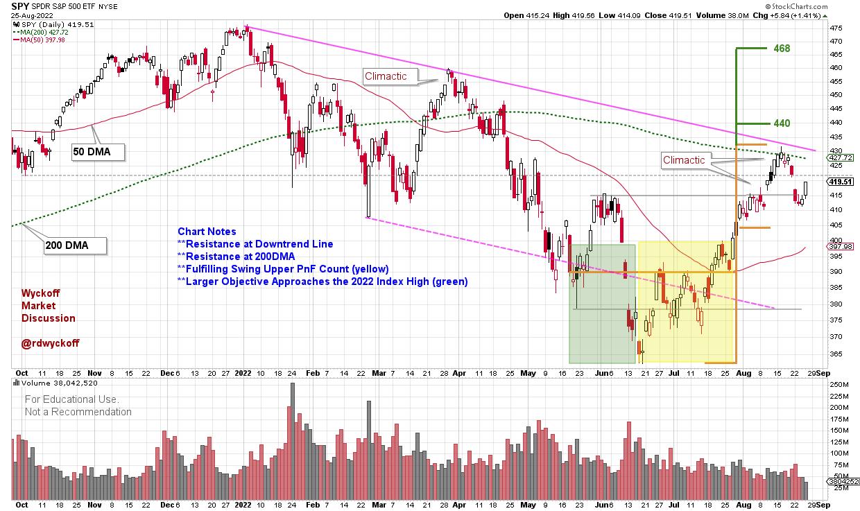
S&P 500 SPDR ETF (SPY)
Chart Notes:

Two Bullish and One Bearish Scenario:
Backup to the Edge of the Creek (BUEC). First decline from a climactic surge will typically be sharp and swift. If this is a BUEC the SPY should stabilize in the area of local support (where it is now). A small range-bound sideways structure would follow. Volume would dry up, and daily price spreads would diminish.
Last Point of Support (LPS). The sharp and sudden decline that has begun will continue into the middle of the range-bound structure forming since May of this year. A return to the area of the lower channel trendline is very possible. Typically, the shallower the reaction the more bullish for the uptrend.
Downtrend resumes. The April decline showed persistent selling with wide daily price spreads and increasing volume. Note the volatile break in early June. The SPY is very close to entering that price zone now. There was very little to nonexistent price support in the price zone from 410 to 365. A return into that price zone could recreate a similar volatility profile during a price decline.
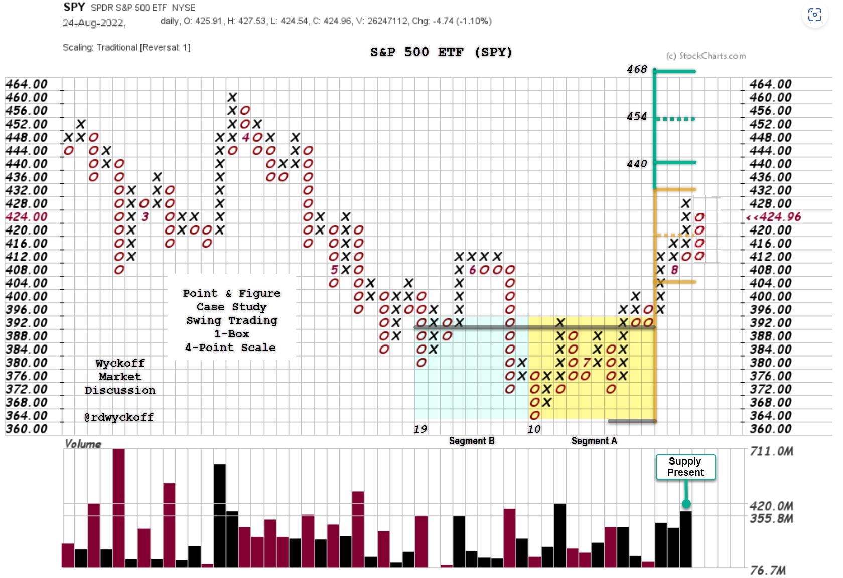 S&P 500 SPDR ETF (SPY) Point & Figure Case Study S&P 500 SPDR ETF (SPY) Point & Figure Case Study
Chart Notes:
- Segment A (yellow shading): Fulfilled during the rally to resistance. The current reaction has taken back the climactic rally run. The start point of a climactic rally is often the support point when a subsequent pullback occurs (SPY 410-412 in this case).
- Segment B (green shading): Reaches to the resistance of the January price high. The ability to consolidate here and resume the uptrend would put these higher price objectives into play.
The recent rally has been the best of the year for the stock indexes and many stocks. The rally peak is reminiscent of the March advance, only stronger. The indexes are on the cusp here. Wyckoffians have scenarios mapped out and tactics established. The market risk profile is heightened from the June and July levels when many stocks were preparing for swing trading advances. For those trading this market risk exposure needs to be reassessed and tightened.
All the Best,
Bruce
@rdwyckoff
Disclaimer: This blog is for educational purposes only and should not be construed as financial advice. The ideas and strategies should never be used without first assessing your own personal and financial situation, or without consulting a financial professional.
Announcements:
Technical Securities Analysts Association Fall Conference. September 17, 2022
Hybrid Conference Format. In-person AND virtual!
The 2022 Conference will include a great lineup of technical analysis and trading experts as guest speakers. This year, TSAA-SF is hosting a hybrid event, in-person at GGU and online via Zoom. In-person attendees will have access to exclusive pre-event coffee chats, lunch and a post event happy hour!
Virtual Attendance is Included with Your TSAA-SF Membership. To Learn More and Sign-up (click here)
To View the Speaker Bios (click here)
Wyckoff Analytics Fall Course Announcement.
Wyckoff Trading Course, Part 1. Analysis (first session is free)
Wyckoff Trading Course, Part 2. Execution (first session is free)
To Learn More and Sign-up for the Free Sessions (click here)
|
| READ ONLINE → |
|
|
|
|
|
| RRG Charts |
| Don't Even Think About Buying... (This Sector) |
| by Julius de Kempenaer |
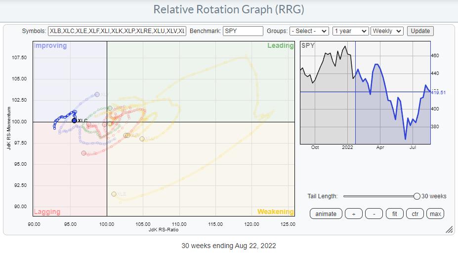
Staying out of a sector can be as important as being in the right sector. This is particularly true for the Communication Services Sector, and has been for a long time already.
The Relative Rotation Graph above shows the rotation over the last 30 weeks, starting the week of 1/24. Prior to this period, XLC had already traveled deep into the lagging quadrant, underperforming the S&P 500 by a mile. The start of the tail picks up the rotation when the sector had started to pick up some relative momentum, crossing over into the improving quadrant.
As we can see in the chart above, this rotation was short-lived, and the tail has started to roll over back down again and is now on the verge of crossing back into the lagging quadrant.
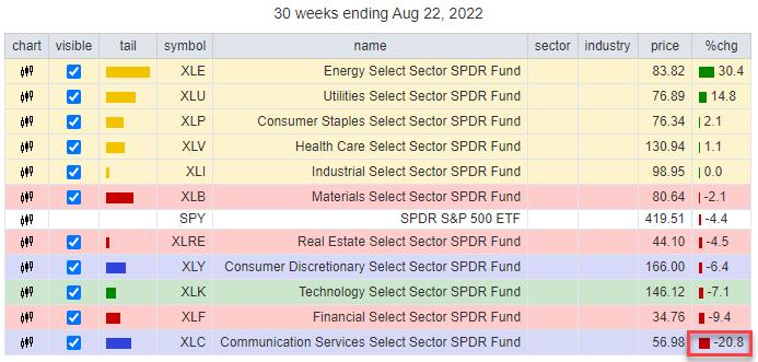
The table above shows the performance of the sectors over this 30-week period. XLC is at the bottom of the list with a loss of 20.8% over the last 30 weeks. Compare that with the 30.4% gain for the energy sector at the top of the list. That's a difference in the performance of more than 50%.
Does that mean you could have gained 50% over that period? If you had a "God" strategy (one that picks exactly the right sector at the right time) that shorted XLC and went Long XLE in equal amounts, then Yes. But that would have been a very aggressive trade. Let's get a bit more realistic here.
Suppose you are running a portfolio of ETFs and you want to outperform the S&P 500. How much would you have gained by staying out of XLC over that period? Not 20.8% The weight of the Communication Services sector in the S&P 500 is 8.4%, so that -20.8% loss only hurt the S&P 500 by 8.4%. If your portfolio would have positions in all sectors at the correct weights, you would move exactly in line with SPY. If you then would have sold XLC in the week of 1/24 and kept the 8.4% in cash, you would have outperformed SPY by 20.8% * 8.04% = 1.74%.
Plenty of professional PMs would sign immediately for such a result in 6 months' time!!
Weekly and Daily Rotations Aligning
Let's dive a bit deeper into the Communication Services sector and see if we can get an outlook for the coming weeks.
The rotation on the weekly RRG is very clearly turning back to the lagging quadrant, which suggests that we are about to enter a new leg down in an already existing relative downtrend.
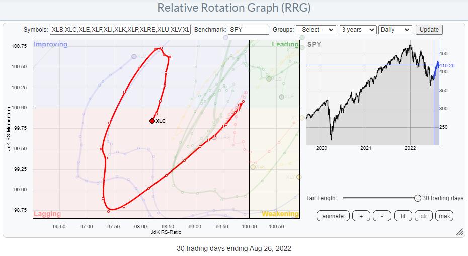
In the daily RRG above, I have highlighted the tail for XLC and, as you can see, it has also turned back down while inside the improving quadrant and has now already hit lagging, leading the way for the weekly tail to follow. This daily rotation is sending the same message as its weekly counterpart. We are embarking on a new leg down within an already falling relative trend.
When both the weekly and the daily RRG are rotating in sync, that usually sends a strong message.
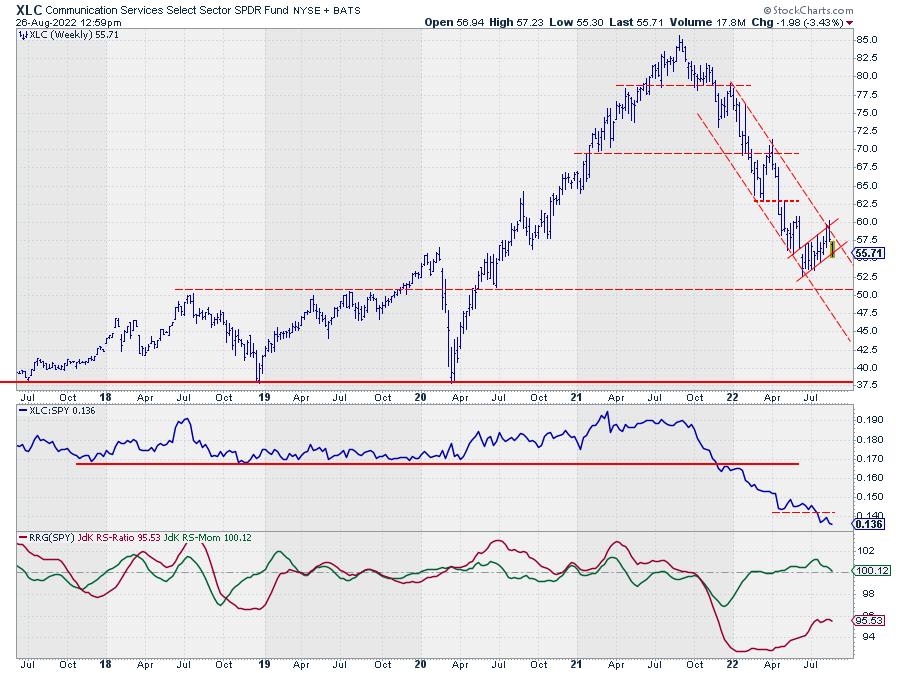
The price chart for XLC confirms that message. The downtrend that started in the middle of last year is still fully intact, showing a very regular series of lower highs and lower lows. The recent improvement ran into resistance at the level of the falling resistance line and is now close to breaking down from that consolidation. Such a move will also help the RS-line to move lower and continue its downtrend by completing a rotation completely on the left-hand side of the RRG for both the weekly and the daily time frames.
XLC - Groups
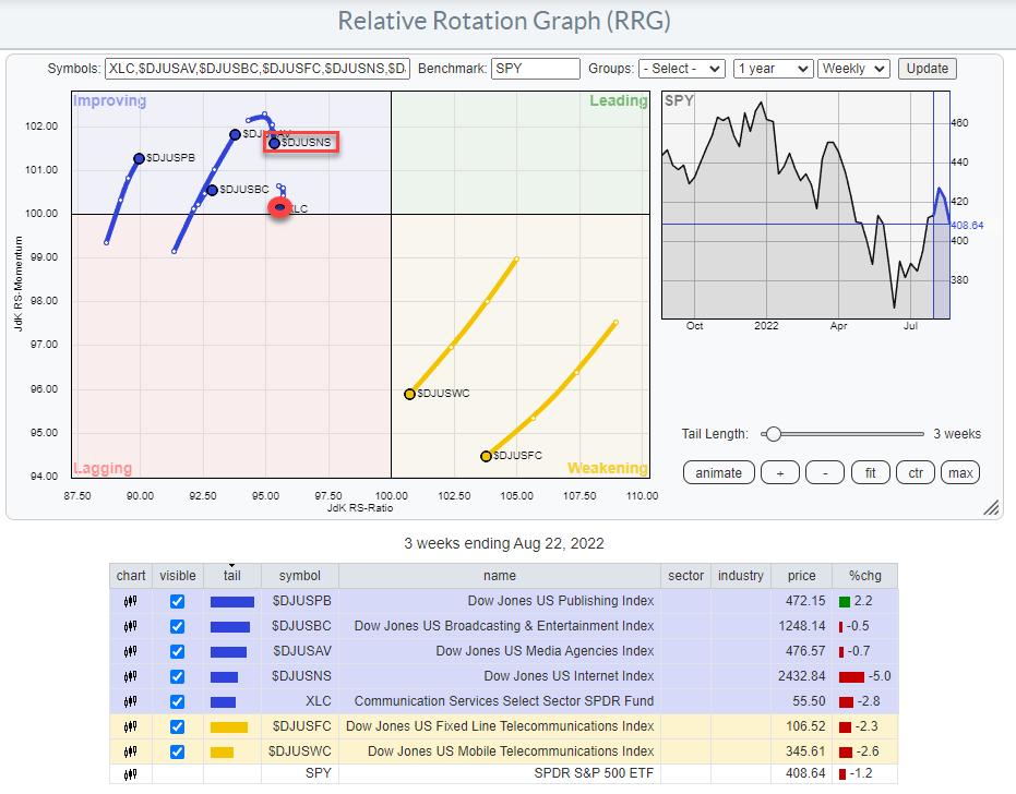
This RRG shows the rotation for the groups inside the Communication Services sector. This is a so called "double benchmark" chart. The center of the chart is $SPX, but you will also find XLC on the chart. This allows you to see the rotation of the groups against the S&P 500, but also against their sector index (XLC) at the same time.
The most important group in this universe is $DJUSNS, the Dow Jones US Internet index.
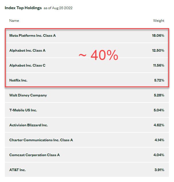
In the composition of the Communication and Services Index, the first four symbols are all in the DJ US Internet Index and they make up almost 40% of the market capitalization of the entire sector. No wonder, as that is an important group which will drive the performance of the entire sector.
When you closely look at the position of $DJUSNS against XLC in the RRG above, you will notice that its tail is inside the improving quadrant (vs. XLC as well) and rotating back down without crossing over the (imaginary) vertical axis that represents the 100-level on the RS-Ratio scale against XLC.
It is pretty clear that, when META and GOOGL break lower, the decline in XLC will start to accelerate again.
META
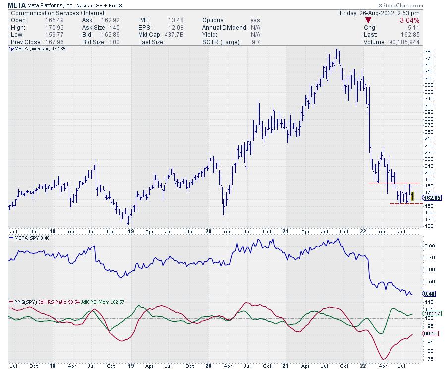
For META, the important support level to watch is around 153-154. When that breaks and META leaves the small consolidation, an acceleration lower may be expected.
GOOGL
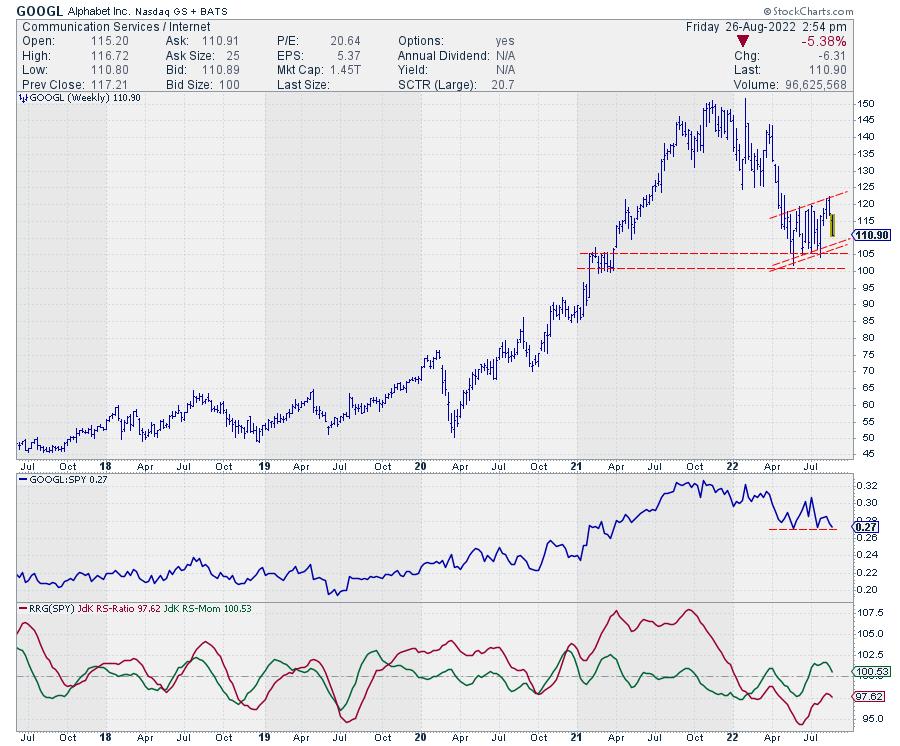
GOOGL is in a slightly rising consolidation, but is having difficulty pushing higher. There is plenty of support on the downside between 100-107.5, but ,when that area of support gives way, it will open up serious downside potential.
All in all, the outlook for this sector remains very weak, and more relative weakness seems to be underway.
#StaySafe, Have a great weekend, --Julius
|
| READ ONLINE → |
|
|
|
| Martin Pring's Market Roundup |
| Energy Gets a New Lease on Life |
| by Martin Pring |
Back in June, I wrote an article entitled Are Commodities Losing their Mojo? It drew attention to the fact that some long-term indicators were pointing to at least a temporary pull-back in prices. That process is already underway, but the article also pointed out that energy usually lags other industrial commodity prices at market peaks. We can see that from Chart 1, which compares the long-term smoothed momentum (KST) of the CRB Spot Raw Industrials to that for crude oil.
The solid arrows demonstrate that oil usually lags the Index. The dashed one indicates the sole exception. The KST for the CRB peaked a few months ago and the Index dropped below its 12-month MA. These are two indicators amongst many that tell us that commodity prices in general are in a primary bear market. That said, it is evident the KST for the oil price, based on July data, has started to tick over, but not sufficiently to conclude beyond a reasonable doubt that the game is over.
 Chart 1 Chart 1
In that respect, Chart 2, which shows preliminary August data (remember, it's not month-end yet), reveals that the KST has up-ticked slightly, with the price itself is right at its 12-month MA. A real test of the bull market is likely to take place soon. That's because the price recently experienced a whipsaw move above that green resistance trendline at around $105. False breakouts are often followed by above-average moves in the opposite direction to the breakout. Consequently, it's usually a good idea to see that they are confirmed by other trend-reversing technical evidence. In this case, a negative 12-month MA crossover would do the trick, and that seems unlikely at the moment.
 Chart 2 Chart 2
Chart 3 shows that the United States Oil Fund (USO) has broken above its June/August down trendline, having successfully tested its 200-day MA no less than four times in the last 6 weeks. Note also that the RS line, comparing its performance to the S&P Composite in the third window, has also experienced an upside breakout. Both daily KSTs are in a rising trend, which adds a further positive underpinning. Let's not forget the extreme positioning of the long-term KST for the oil price in the previous chart. That tells us this week's breakout is a high-risk one and we should be prepared in case it turns out to be false. The signal, in this case, would be a drop below the 200-day MA at $70. The MA is also in the area of the 2022 red support line. If oil has joined commodities CRB Spot Raw Industrials in a bear market, a false upside breakout would be a perfectly normal phenomenon.
 Chart 3 Chart 3
I like to see commodity price moves supported by the shares that deal in that commodity. Chart 4 certainly supports this week's upside break. It features the SPDR Energy ETF (XLE), and ot paints a similar picture to that of the USO, in that both the absolute and relative prices have broken above resistance trendlines. In this case, though, the break is stronger because the breakout trendlines represent the top of a small 2-month base. Also, the XLE is trading above its 50-day MA, whereas the USO is right at its average.
Even so, as with the USO, we have to be mindful of the possibility of a false breakout, by making sure that the XLE remains above its 50-day MA and the red up trendline at around $74.
 Chart 4 Chart 4
Further support for the oil breakout comes from Chart 5, which shows that commodities in general are also experiencing an upside breakout. We have to be a bit careful on this one, since the DBC Commodity ETF has a substantial weighting in energy; that means there is a bit of double counting going on. The lower panel of the chart features a ratio between the Goldman Sachs Natural Resource and the SPDR Consumer Staples ETFs IGE/XLP). A rising relationship tells us that investors prefer commodity-driven equities over defensive stocks, represented by the slow moving consumer staples. The two series often move in tandem, thereby offering a check on each other. Occasionally, it is possible to construct trendlines for both series, which, when violated, result in a trend change for the DBC. Tuesday saw the fourth joint upside break since late 2020.
 Chart 5 Chart 5
Chart 6 rounds out our analysis by featuring the continuous natural gas contract, the price of which has recently reached a new high. Late last year, it broke out from a 20-year base, offering a minimum ultimate upside objective of $12.50. It certainly supports the recent positive action by the oil price and oil share areas, but we should also bear in mind that this is an unusually volatile commodity and, therefore, easily prone to a false sense of strength or weakness.
 Chart 6 Chart 6
Conclusion
Commodities as an asset class are in a primary bear market. However, the oil price traditionally lags, and a short-term buy signal has been triggered for both the commodity and shares. Since those signals are coming at a time when long-term momentum is overextended, we should be particularly aware of the higher-than-normal possibility of a false breakout.
Good luck and good charting,
Martin J. Pring
The views expressed in this article are those of the author and do not necessarily reflect the position or opinion of Pring Turner Capital Group of Walnut Creek or its affiliates.
|
| READ ONLINE → |
|
|
|
| Trading Places with Tom Bowley |
| Here are the Two Industry Groups We Need to Watch Closely |
| by Tom Bowley |
It's no secret that I've turned very bullish. I stuck my neck out and made my bullish call on June 16th -- right at the bottom. I've seen absolutely nothing to change my mind since that bottom. The biggest question to me is whether we pause and consolidate over the next few weeks or if the stellar 2-month rally continues. I'd bet on the latter, given the history of cyclical bear market bottoms. I'm seeing more and more technicians say that they believe the bottom is in now and will buy pullbacks. Well, here's the pullback.
The next phase of this bull market could be every bit as explosive as what we've just witnessed. I'm still waiting for further participation from a couple key technology industry groups; they've moved higher off the bottom, but they haven't been leading on a relative basis.
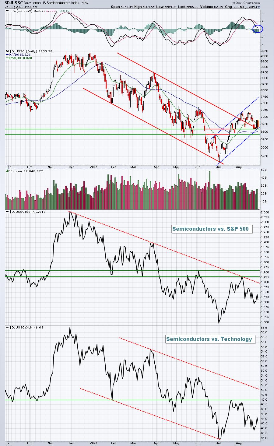
The two groups are semiconductors ($DJUSSC) and software ($DJUSSW). Here's what I'm seeing on the two charts:
$DJUSSC:
$DJUSSW:
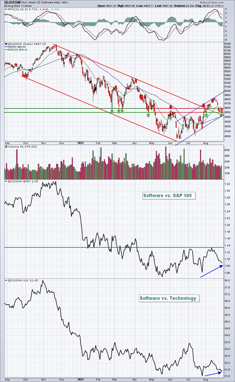
Software is showing more signs of strength than semiconductors, but both have improved off the June bottom -- certainly on an absolute basis. On a relative basis, I've drawn a few overhead resistance lines based on relative price and channel action. If those levels are cleared, I'll be looking for explosive moves from these two industries. When that happens, it'll be CHECKMATE for the bears. For those in the bearish camp, a breakdown on the absolute charts below channel and price support would be an indication of further weakness ahead.
Listen, I hear all the talk and rhetoric about higher inflation and a hawkish Fed. Blah, blah, blah. I'm telling you -- follow the money instead. Are you in the camp that believes inflation is a BIG problem? Then take one look at these two charts and explain them please:
$GOLD:$SPX:
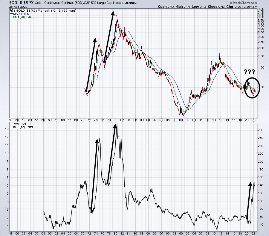
It's widely known that gold is a great hedge against inflation. It's crystal clear that Wall Street POURED its resources into gold in the 1970s. Investors did much, much better investing in gold than in the S&P 500. That ratio SOARING isn't talk, it's MONEY. Now look at the last two years. We're seeing a very similar trajectory in inflation. But where's the money going? Into gold? Ummm, I don't think so. Wall Street has many BRILLIANT minds. They're much smarter than I am. I'm never going to be as smart as many of them. But I can follow a chart. I can see where the money is going. AND IT AIN'T GOLD.
$USD:
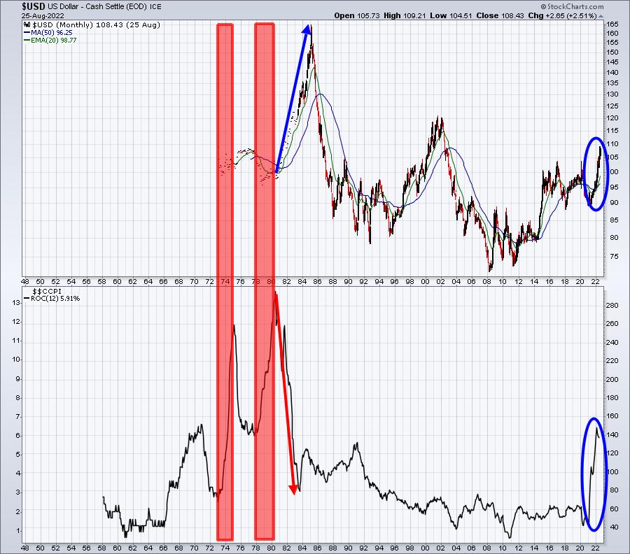
If there's one thing that will destroy a currency, it's inflation. While it's difficult to see the 1970s action in the $USD as inflation was soaring, it's quite clear what happened to the dollar when inflation was reined in. The dollar surged. As inflation has spiked the most in 40 years over the past 12-18 months, I have to ask myself why the dollar has moved to a 20-year high.
I know what the talking heads are saying "How can you avoid it?" It's everywhere with social media. You honestly can't escape it. What I'm asking everyone to do is to follow the charts and be willing to question what we're being told day in and day out. If inflation is a long-term issue, why isn't money rotating more towards gold? And why is the dollar rising? This makes ZERO sense based on what I've been taught over the years.
Could we be getting played by Wall Street? I'm asking for a friend.
Finally, I see the market taking a beating this morning based on Fed Chief Powell's remarks in Jackson Hole, giving back all of the gains from the past few days -- and then some. The Fed continues to talk tough regarding interest rate hikes. But I've been writing and posting videos about how opening gaps and market action during "amateur hour" (first 60-90 minutes) have meant little and how the true accumulation has been taking place in the afternoon. It'll be interesting to see if today's "morning distribution" is followed up with more selling in the afternoon. I'm guessing that it won't, but if it does, it certainly can change the market landscape -- at least in the near-term.
If nothing else, today's action will make our HUGE event tomorrow morning even bigger! I'll be hosting our "Where Does The Market Go From Here?" live virtual event on Saturday, August 27th at 10am ET. I'll discuss many of the manipulative actions I've seen in 2022 thus far and where I believe U.S. equities are heading for the balance of 2022 and into 2023. Thousands have registered already and you'll need to save your seat in order to attend. For more information and to register, CLICK HERE.
I hope to see you tomorrow morning!
Happy trading!
Tom
|
| READ ONLINE → |
|
|
|
| The MEM Edge |
| S&P 500 Has Broken Below Key Level - Here's What to Watch For Going Forward |
| by Mary Ellen McGonagle |
Talk about being a party pooper. Fed Chair Powell's comments today that bringing down prices "is likely to require a sustained period of below-trend growth and an increase in unemployment" brought the markets to its knees. The remarks increased fears of a prolonged rate-hike cycle which, in turn, pushed stocks sharply lower.
Hardest hit were Technology stocks, which fell 4.3% today, a loss that underscored the inability of this sector to break back above resistance at its 200-day moving average last week.
DAILY CHART OF TECHNOLOGY SECTOR:
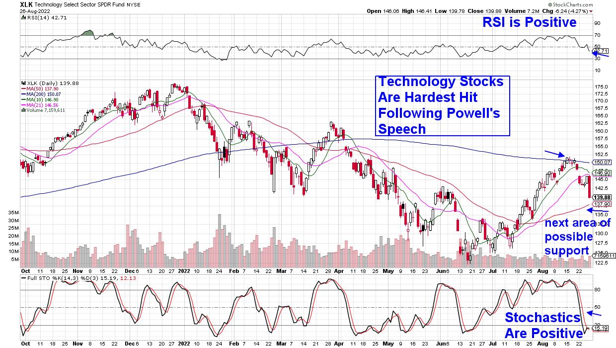
In a rising-rate environment, Growth stocks such as Technology, as well as Consumer Discretionary (to name just two areas), stand to lose the most, as higher rates reduce the value of future earnings. The chart below shows the Tech-heavy Nasdaq's performance as interest rates ebb and flow and quite clearly, higher yields are a negative.
DAILY CHART OF NASDAQ WITH YIELD OF 10-YEAR TREASURY OVERLAY
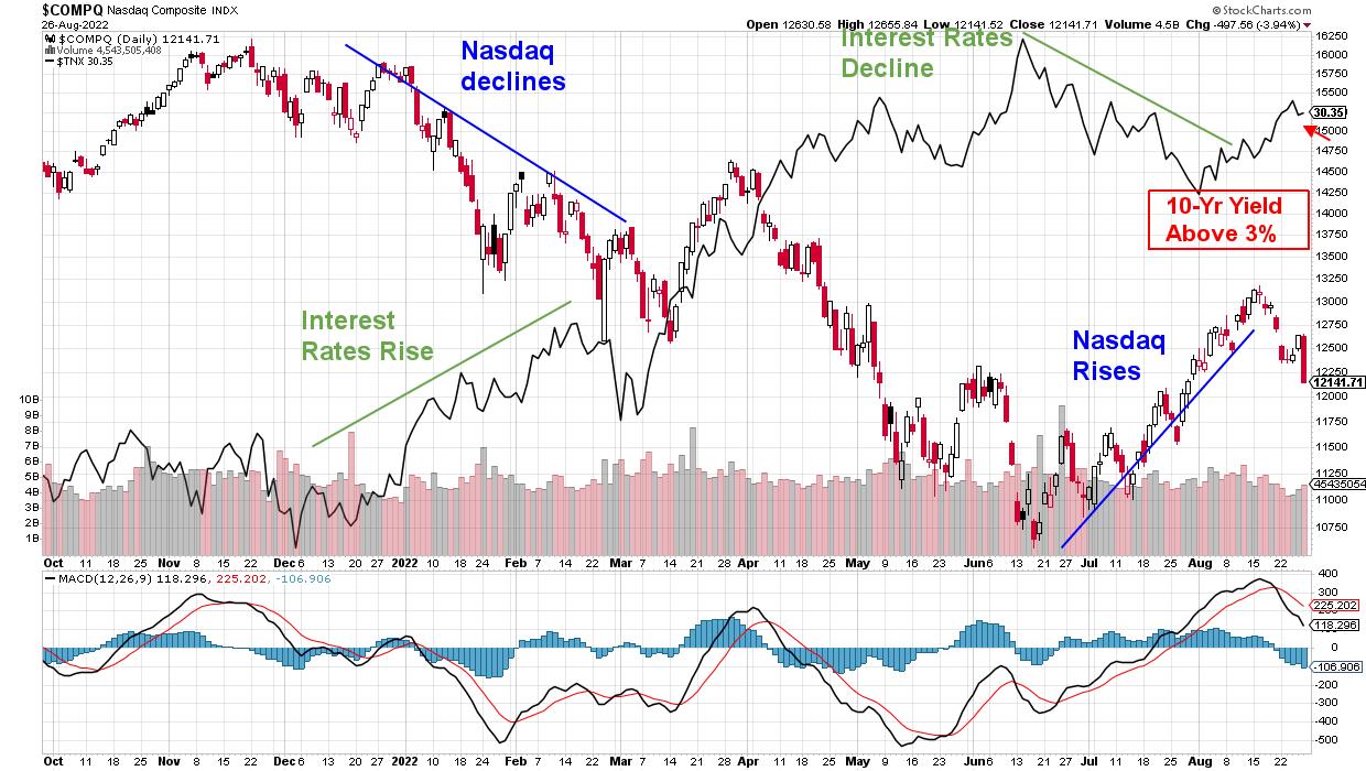
This week's pullback has pushed the S&P 500 below a key level and, with its momentum indicators in negative territory on the daily chart, the near-term outlook for the markets does not look good. Subscribers to my MEM Edge Report were alerted to this possibility in recent reports, as we trimmed stocks from our buy list and highlighted industry group charts that were weakening.
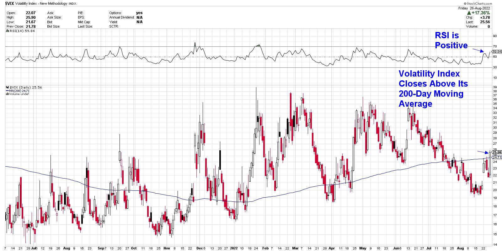
Powell's clear message today that businesses and households may feel some pain in the coming months was quite different from his normally more balanced remarks. The tone increased anxiety among investors and caused a sharp uptick in the volatility index ($VIX) -- also known as the "fear index." This is another negative for the markets.
DAILY CHART OF VOLATILITY INDEX (VIX)
As for the prospects for the markets going forward, you can access my Monday Alert Report from this week, where I share key areas of resistance, as well as price action that would put the broader markets back into an uptrend. Also included are marked-up charts of both the Semiconductor and Software groups, with detailed insights into those areas. My Alert Reports are not as detailed as my weekly MEM Edge Reports, so be sure and take a 4-week trial at a nominal fee so you can avoid losses and preserve capital amid a weakened market backdrop.
On this week's edition of The MEM Edge, now available to watch on demand at StockChartsTV.com and the StockCharts YouTube channel, I share a key level that was broken in the S&P 500 as well as what to be on the lookout for going forward. I also review stocks that are bucking the downtrend and what is driving them higher.
Warmly,
Mary Ellen McGonagle, MEM Investment Research
|
| READ ONLINE → |
|
|
|
| Mish's Market Minute |
| Powell: Inflation is Public Enemy #1 to the Stock Market |
| by Mish Schneider |
The Economic Modern Family tells us the macro story, and the charts are warning us. The indices and sectors closed the week lower and very stressed out.
The speech by Fed Chair Powell on Friday clarified what some did not want to believe, while others knew and were prepared for: inflation is still very much alive and a problem in our economy. The most interesting part of today's conference was when Chairman Powell addressed inflation directly. He said it's enemy number one, but also stressed they want to control inflation through raising rates as the data dictates.
The data at this point has the economy in a technical recession, while food and energy prices keep the economy in inflation. Inflation and recession=stagflation.
Those who know our work know we have used this word for months now. Stagflation, as we can see from Powell's data-driven desire to control higher prices, is a quagmire for monetary policy to fix. The Economic Modern Family saw this move on Friday coming, and the Dow sold off 1000 points on Friday.
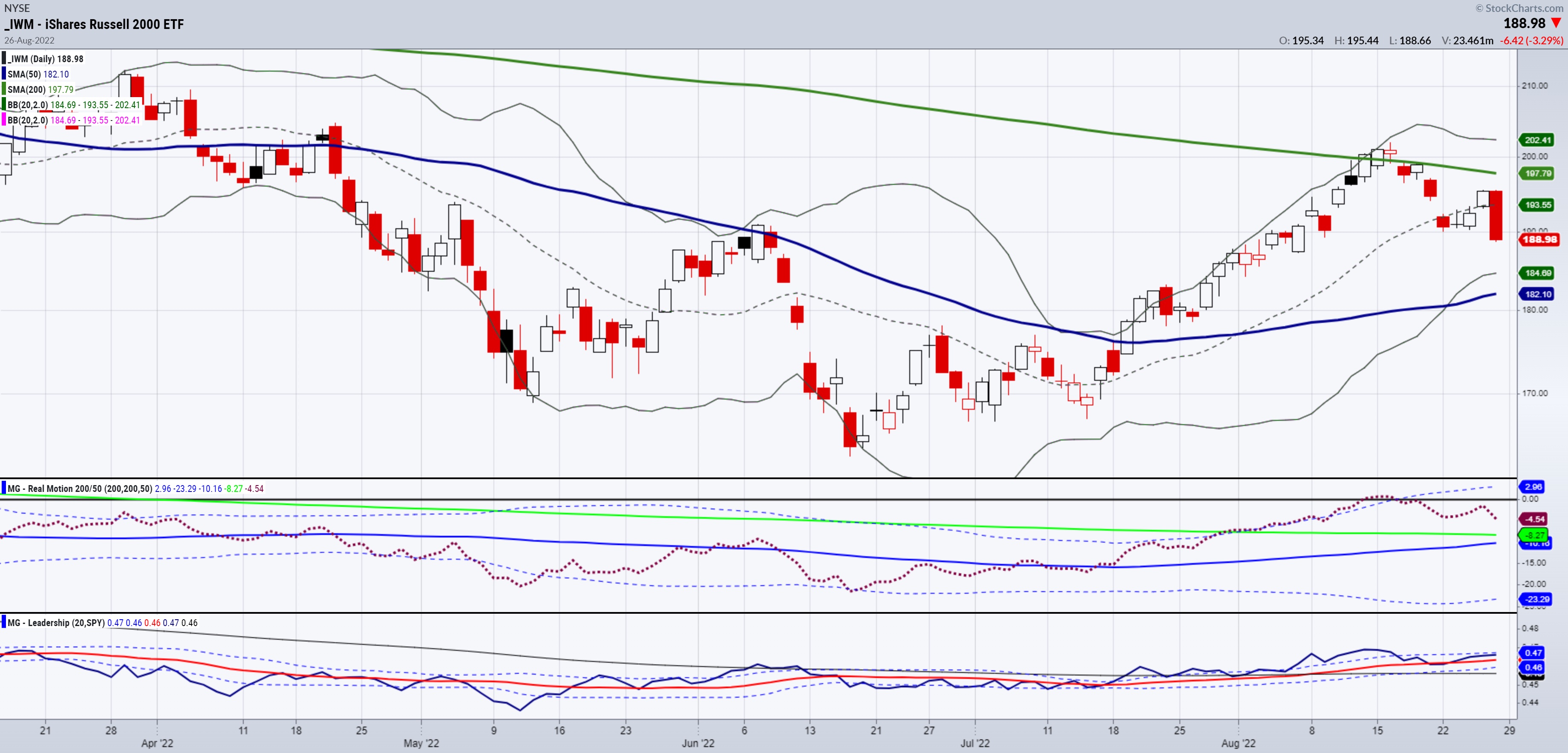
If you recall, last week, we featured the Retail sector along with the small caps index. Both have been technically perfect.
What is next from here?
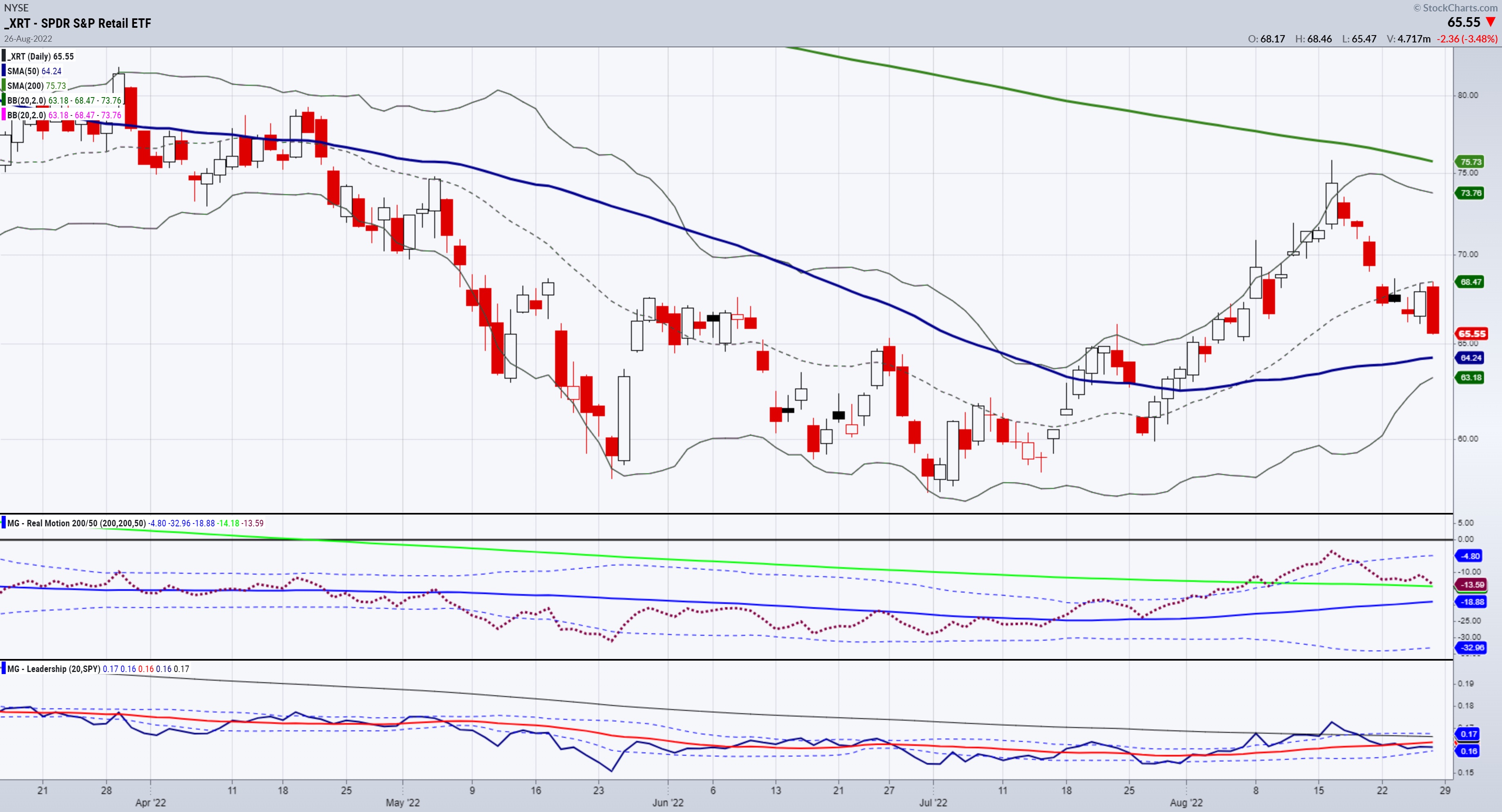
To refresh your memory, the Russells are our Granddad of the Economic Modern Family, while the Retail sector is our Grandma. We also noted pivotal areas for both sectors to close above to keep the bear market rally intact. Yes, this was a bear market rally from the July lows to the mid-August highs. Anyway, after the mid-August highs failed at the 200-DMA, the market stalled at about 50% from the lows to the highs (July-August). That is why we wrote and stated on media that 190 was the key level in IWM and 67.00 was the key level in XRT. Both closed lower, giving up 3.5-4% on Friday.
Now, the 50-DMA becomes the next focus. In XRT, it's at the 64.00 area (64.00-64.25). In IWM, it's at the 182.00 area.
Based on closing levels, Granny is much closer and deserves the rightful attention. If the consumer gives up shopping because of the higher rates, nagging and consistent inflation, that will clearly prove a quagmire for the Fed.
Another interesting development on Friday was the long bonds. Yields fell a bit as a flight to safety, so another big clue is how TLTs (20+ year long bonds) do compared to the SPY. In other words, if the market continues the carnage, bonds could move up, while SPY will move down -- something we have not really seen much in 2022. Yields move down too much, and guess what? More inflation.
Keep your eyes on Gramps too. And while you're at it, the rest of the Family. Transportation, Regional Banks, Semiconductors, Biotechnology and Bitcoin are all players and have their own story to tell.
Please make sure to watch my recent media clips, where I go into a lot more detail on investing opportunities and the macro.
Please let us know if you're not a member and would like to learn more about investing into real assets. Reach out via chat, phone, email, or book a call with our Chief Strategy Consultant, Rob Quinn by clicking here.
 Get your copy of Plant Your Money Tree: A Guide to Growing Your Wealth and a special bonus here. Get your copy of Plant Your Money Tree: A Guide to Growing Your Wealth and a special bonus here.
Follow Mish on Twitter @marketminute for stock picks and more. Follow Mish on Instagram (mishschneider) for daily morning videos. To see updated media clips, click here.
Mish in the Media
Mish presents picks to focus on in this appearance on Making Money with Charles Payne.
Mish hosted the August 26 edition of StockCharts TV's Your Daily Five, where she goes through the key macro factors of both the stock market and inflation indicators to help you plan your next moves.
Check out Mish's latest article for CMC Markets, titled "Droughts Take Toll, But Trading Opportunities Haven't Dried Up."
See Mish's appearances on Business First AM!
Mish takes you through the current drought and how it could be a long cold winter on Bloomberg's Before the Bell.
Inflation has ebbed but not disappeared, so why should the Fed's new policy? See Mish consider this question on Coast to Coast with Neil Cavuto.
Drought and more inflation is in store, with good technical levels in many raw materials holding. Mish talks commodities in this discussion with Nicole Petallides of TD Ameritrade.
ETF Summary
- S&P 500 (SPY): 399 major support, 410 pivotal, 417 resistance.
- Russell 2000 (IWM): 190 pivotal, 182 major support, 195 resistance.
- Dow (DIA): 320 major support.
- Nasdaq (QQQ): 312.50 pivotal, 303 major support and 319 resistance.
- KRE (Regional Banks): 64.00 pivotal.
- SMH (Semiconductors): Pierced the 50-DMA support, making 222 pivotal.
- IYT (Transportation): If 234 holds, that could be reason to think retest of 243.
- IBB (Biotechnology): Broke the 50 DMA 124; needs to clear again or see 118-120.
- XRT (Retail): 64.25 area the major 50-DMA support and 67 resistance.
Mish Schneider
MarketGauge.com
Director of Trading Research and Education
|
| READ ONLINE → |
|
|
|
| Top Advisors Corner |
| A Signal Called Fishhook in Gold |
| by Tom McClellan |

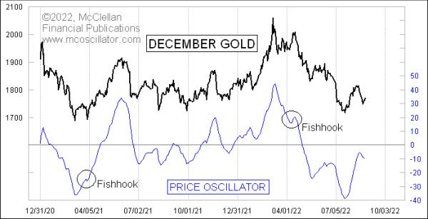
Gold prices bottomed on July 15, 2022, and moved up nicely to a top on August 12. That up move in prices was accompanied by an up move in the McClellan Price Oscillator, which is the difference between a 10% Trend and 5% Trend (19- and 39-EMA) of closing prices. It is a cousin of the McClellan A-D Oscillator, which is based on the daily difference between Advances and Declines.
The Price Oscillator has a fun trick it shows us every so often, where it creates what we call a "fishhook" structure. We are seeing one at the moment in the chart of gold's Price Oscillator. A fishhook occurs when there is a temporary reversal in the direction of the Price Oscillator's travel, and that reversal itself gets reversed. It signifies that the forces of reversal have failed, and that opens up the door to the prior trend to reassert itself with renewed vigor.
A fishhook will ideally occur with the Price Oscillator about halfway back to the zero line (or Summation Index neutral level) from an extended reading, but they can also occur at other places and scenarios on the chart. The key is a temporary reversal that gets aborted. And it is important that we see the Price Oscillator reversal get aborted. If it does not reverse again, and just continues in the new direction, then it is not a fishhook.
Not all fishhooks lead to big powerful moves, but the potential is there, which is why they get my attention when I see one.
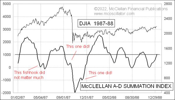
Perhaps the biggest and most dramatic example of a fishhook was the one that occurred just before the 1987 crash. This next chart shows the fishhook that appeared in the chart of the NYSE's McClellan A-D Summation Index, which is effectively a Price Oscillator for the cumulative daily A-D Line.

The Summation Index started falling from right after the August 1987 price top and, on the way downward, it turned up for 6 days as stock prices made a failing attempt to reverse and go higher. That Summation Index upturn peaked on Oct. 5, 1987 and, two weeks later, we saw the big ugly crash. Then after the Oct. 26, 1987 retest bottom, there was a failing rally attempt that turned down into the Dec. 4, 1987 retest bottom, and that latter one saw a fishhook develop as the Summation Index was headed back toward the +1000 neutral level.
When that December 1987 fishhook turned back up again, it unleashed a more powerful up move. That is the potential which a fishhook structure conveys. Prices do not always deliver on that potential, but the possibility is there.
As of Aug. 25, 2022, the Price Oscillator for gold prices has turned up again, making for a fishhook structure in gold's Price Oscillator, which conveys the message that there is the potential now for a more powerful up move in gold prices.
|
| READ ONLINE → |
|
|
|
| MORE ARTICLES → |
|
 Chart 1
 Chart 2
 Chart 3ANOTHER MOVING AVERAGE TREND REMAINS BEARISH... Another way to measure the strength or weakness of the stock market is to plot the percent of S&P 500 stocks above their 200-day moving averages. Chart 4 shows that percentage line falling below its 50% level to the lowest level in two years before rebounding over the summer. The summer bounce, however, reached the 50% level before turning down again over the last two weeks (red arrow). One sign of a bear market is having more than half of its stocks trading below their 200-day moving averages. The red line has been in that bearish position for most of the year. Its recent failure to clear its 50% line keeps the summer rally within the context of an ongoing bear market. Friday's selling pushed that percentage level back down to 35% which means that two-thirds of S&P 500 stocks are still in major downtrends. The blue down trendline also shows that a major downtrend in the percentage line starting in 2021 is still intact.
 Chart 5


 Determining the stride of an uptrend or downtrend is an essential Wyckoff technique. The stride of a trend is often set early in that trend and then prices can adhere to that pace of advance or decline for the majority of the bull or bear run. Trend determination techniques have been covered often in this blog and you are encouraged to review these materials and case studies. Below is an interpretation of the downtrend in force in 2022.


 Get your copy of Plant Your Money Tree: A Guide to Growing Your Wealth and a special bonus here