| THIS WEEK'S ARTICLES |
| John Murphy's Market Message |
| STOCKS ENDING WEEK ON THE DOWNSIDE |
| by John Murphy |
NO UPSIDE FOLLOW-THROUGH...Stocks are being sold again on Friday following Thursday's impressive upside reversal. The daily bars in Chart 1 show the S&P 500 reversing upward on Thursday after falling to another bear market low. And it did so on heavy volume. The fact that the upside reversal took place after a hotter than expected inflation report was also surprising. Core inflation excluding food and energy rose 6.6% in September which was the biggest increase in forty years. That should keep the Fed on its aggressive path to higher interest rates. While a case can be made that stocks are somewhat oversold, rising interest rates should limit any short-term bounces. Chart 1 also shows the SPX still trading below its early October peak at 3806 and its 20-day moving average (green line). Both resistance points would have to be exceeded to signal a short-term bottom. Rising bond yields are weighing heavily on stock prices.
 Chart 1 Chart 1
10-YEAR TREASURY YIELD TESTS 4.00%... The daily bars in Chart 2 show the 10-Year Treasury yield trying to close above 4.00% for the first time in more than a decade. The monthly bars in Chart 3 give a longer-term perspective and show the TNX nearing the highest level since 2008. That's not good for bonds or stocks. The rise in bond yields has also pushed mortgage rates to the highest level in two decades. That's hurting the housing market and homebuilding stocks which have been one the weakest performers this past week and for the entire year.
 Chart 2 Chart 2
 Chart 3 Chart 3
HOMEBUILDERS HURT BY RISING MORTGAGE RATES...Homebuilding stocks fell -5.8% this week making them one of the weakest parts of the market. They've also lost -36% for the year. That underperformance is due mainly to rising mortgage rates which are closely tied to the upward trend in bond yields. The weekly bars in Chart 4 show the U.S. Home Construction iShares (ITB) peaking at the end of last year just as the 10-Year Treasury yield (green bars) started rising sharply (see circles). And they've been trending in opposite directions since then. That's bad news for the housing industry and another sign of weakening in the U.S. economy. None of which is good for stocks in general.
 Chart 4 Chart 4
|
| READ ONLINE → |
|
|
|
| The Mindful Investor |
| What a Difference a Day Makes |
| by David Keller |
On Thursday, the S&P 500 index opened around 3500, which is a fairly significant level. That price point represents a 50% retracement of the 2020-2022 bull market phase.
Was I surprised to see a bounce off the 50% retracement level? Absolutely not. As Katie Stockton shared on The Final Bar this week, it would actually be surprising if the major averages had not bounced higher off this level.
After gapping lower at Thursday's open, we saw a quick acceleration to the upside. Thursday's rally pushed the S&P 500 right back above 3600, causing many investors to announce their renewed optimism in a broad market recovery.
But what a difference a day makes...
Super excited to announce our upcoming FREE webcast from Market Misbehavior called The Market Bottom Checklist Revisited, coming up on Tuesday, October 18th at 1pm ET.
Back in June, we revealed our Market Bottom Checklist including ten key items to track as the markets move lower. This time, we'll revisit those ten guideposts, reflect on the current market conditions and relate it all to the seasonal strength likely to occur in November and December.
Sign up HERE and don't miss our latest free webcast!
Friday began with a gap higher and the S&P 500 briefly teasing the 3700 level. But, through the course of the day, stocks were moving steadily lower. Many charts had rotated from a bullish candle pattern to a bearish candle pattern.
Here's the QQQ after Thursday's session:
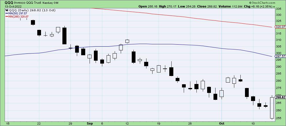
Note how the most recent candle's body "engulfs" the open-close range of the first candle? There's the bullish engulfing pattern, which indicates a strong likelihood of further upside.
But after Friday's selloff, the charts looked like this:
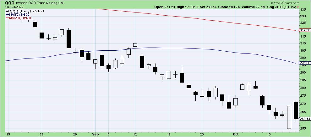
Now we have the dreaded "dark cloud cover" pattern, where we have a big up day followed by a big down day. Day two does not go below the first day's open, but it does reach at least 50% of the way down the real body of day one.
Note to candle purists: Is this pattern really more important when it happens in an uptrend? Absolutely. But for me, Friday's candle shows a severe lack of follow-through from Thursday's rally, and that's what's most important here.
So instead of the markets finishing this week with a bullish exclamation point, a strong up day announcing to investors, "Yes! We are now in a bullish phase!!", we instead have the major averages whimpering into the weekend in a position of weakness.
And this happened all over the place with individual equities. Here's the chart of TSLA.
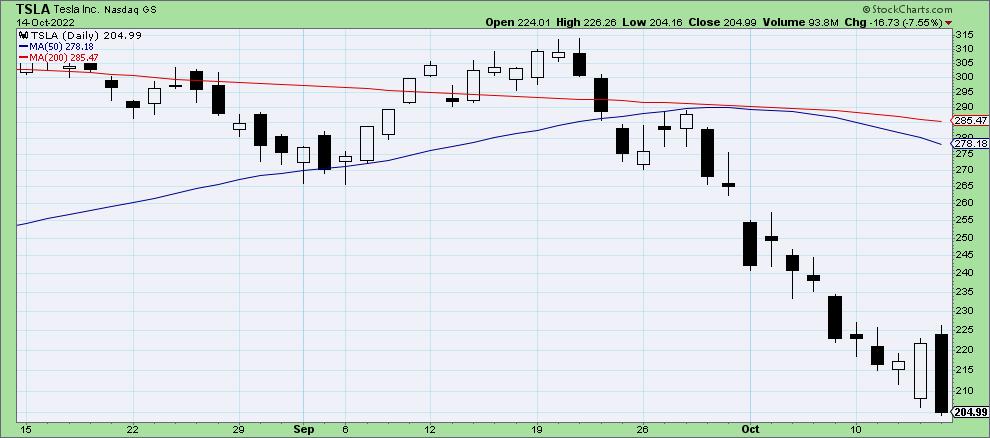
In this case, we have a bearish engulfing pattern, where the second day's candle completely engulfs the real body of the first day's candle. So all the optimism shown for TSLA on Thursday was unwound -- and then some. And if you think the action of mega cap stocks don't have an incredibly large impact on our major benchmarks, think again!
Another note to candle purists: Would this be a more ideal candle pattern if it happened during a raging uptrend? Of course. But as we mentioned above, the key here is the lack of follow-through after Thursday's rally.
So where does Friday's session leave the stock market as we prepare for next week?
My "Wrap the Week" chart (which I feature every Friday on The Final Bar) shows a familiar pattern, with the US Dollar finishing the week in the positive while literally all the other major asset classes are in the negative. That's right, the Dollar has once again earned its moniker as "the wrecking ball for risk assets".
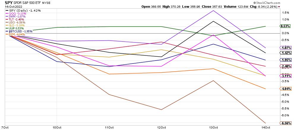
Can the market rally next week? Absolutely. Anything is possible. But given Thursday's inflation numbers and Friday's selloff, I would tend to follow the guidance of my Market Trend Model, which tells me to focus more on capital preservation over capital growth. Now is the time to remain vigilant, to focus on risk management, and to keep a wary eye open for telltale signs of a market bottom!
RR#6,
Dave
P.S. Ready to upgrade your investment process? Check out my YouTube channel!
David Keller, CMT
Chief Market Strategist
StockCharts.com
Disclaimer: This blog is for educational purposes only and should not be construed as financial advice. The ideas and strategies should never be used without first assessing your own personal and financial situation, or without consulting a financial professional.
The author does not have a position in mentioned securities at the time of publication. Any opinions expressed herein are solely those of the author, and do not in any way represent the views or opinions of any other person or entity.
|
| READ ONLINE → |
|
|
|
| Martin Pring's Market Roundup |
| Giant Outside Days Spook the Bears |
| by Martin Pring |
Thursday's price action began bearishly with the probing of recent bear market lows. By the end of the session, the DJIA, along with several other markets, totally encompassed Tuesday's trading range and then some, in a one-day pattern known as an "outside day". To be sure, one day does not make a trend, but a valid outside day or bar is expected to have an influence from between 5-10 sessions. That's usually enough time to enable a nice reversal in some of the short-term indicators. In that respect, outside bars act as a kind of reverse domino.
I classify such patterns based on several principles, as outside bars are not created equal. First, they must have something to reverse, and we certainly have that in spades. Second, they should be wide, indicating a formidable battle between buyers and sellers. Thursday's action was extremely impressive in that regard. Third, the bar should end near its high, as that indicates the dominance of buyers at the closing bell. Check for that one as well. Fourth, it's nice when the bar totally encompasses the trading range of the previous session. However, that becomes an even stronger signal when it encompasses several sessions in one go, which was the case with Thursday's action.
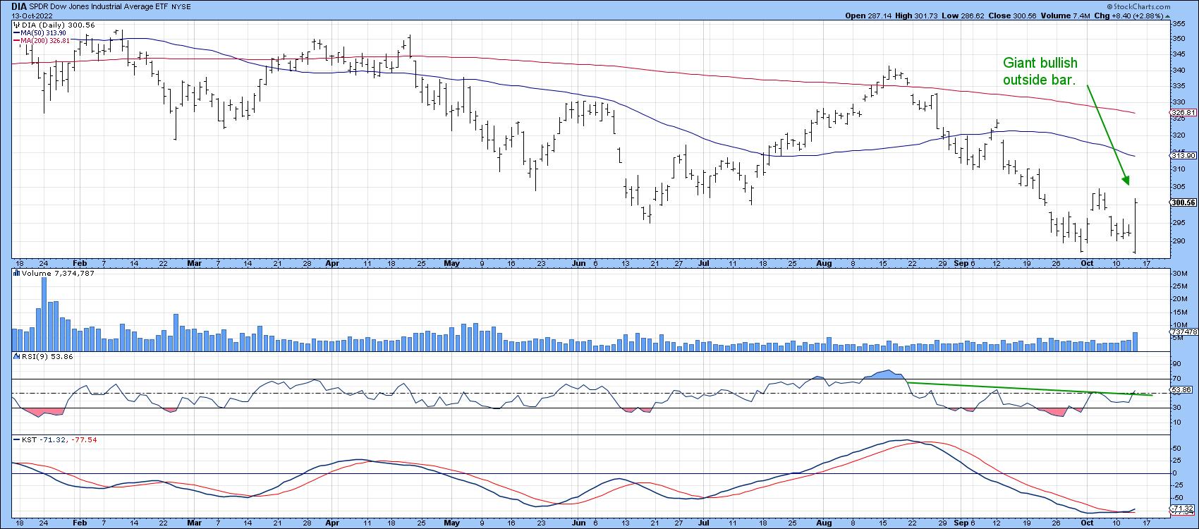 Chart 1 Chart 1
Finally, if it is to represent a true victory for buyers over sellers, it's nice for volume to pick up on the day. Once again, Thursday's action is positive for the Dow, but not exceptional. None of these favorable characteristics guarantee a rally, but certainly increase the odds of one. So too does the tentative completion of a small RSI base and KST buy signal. That may not happen right away, as wide bars are often followed by a couple of quiet sessions, when market participants pause for breath. Also, it's important to note that the outside bar is certainly not a sign that the bear market is over. We need to see the longer-term indicators reverse for that. Nevertheless, the market is about to enter one of the most positive seasonal periods of the year, so it's likely that the year-end could bring some financial Christmas cheer. Let's hope so!
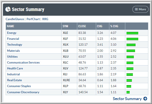 Figure 1 Figure 1
One characteristic that bothers me from a long-term perspective, should it continue, is the fact that upside leadership, which often changes when the primary trend reverses, has not done so. The attached table shows that the former leader, energy, continues to power ahead, while consumer discretionary, one of the superior performers on the downside, was up the least.
More Outside Bars
Chart 2 shows that Bitcoin also produced an outside bear. That suggests a bear market rally in the event that it can re-cross its 50-day MA and April/October down trend line.
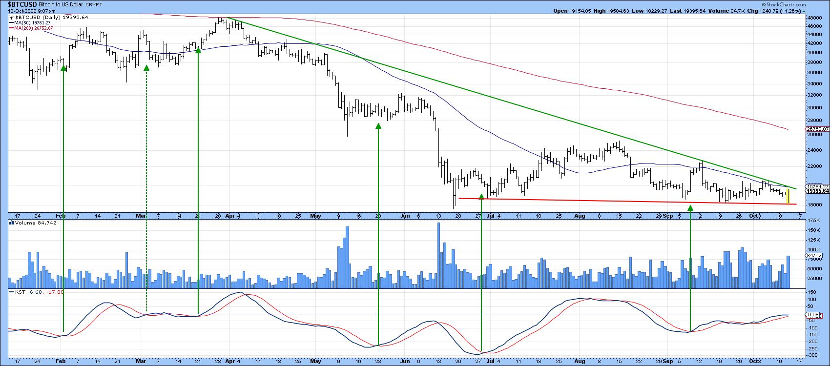 Chart 2 Chart 2
Finally, we see a similar setup for the euro being supported by a KST buy signal. You can't see the 50-day MA because it is below the down trendline. The two reinforce each other as a resistance zone, so that level around par is an extremely important one.
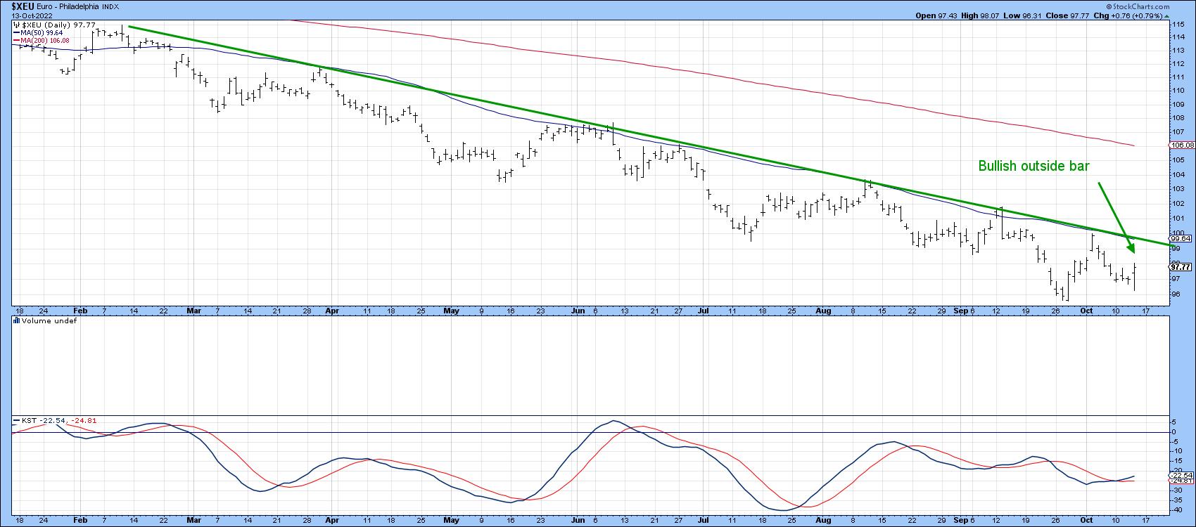 Chart 3 Chart 3
The Canadian dollar has been suffering recently but has managed to trace out and outside bar which is also a hammer candlestick. Once again we see the KST being nicely poised to trigger some kind of rally.
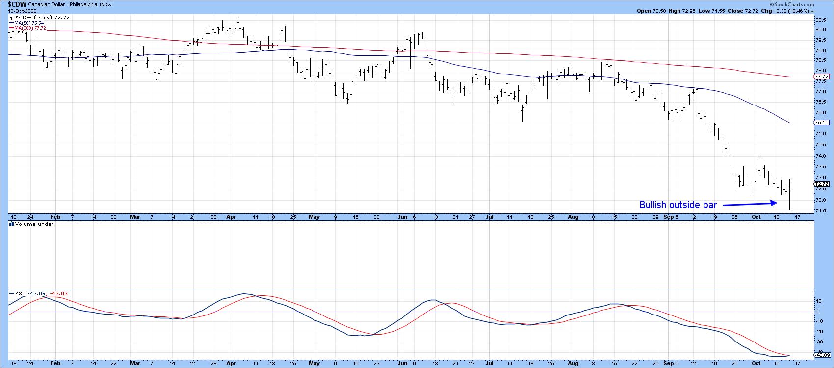 Chart 4 Chart 4
Good luck and good charting,
Martin J. Pring
The views expressed in this article are those of the author and do not necessarily reflect the position or opinion of Pring Turner Capital Group of Walnut Creek or its affiliates.
|
| READ ONLINE → |
|
|
|
| RRG Charts |
| Strong Sector Rotation To Financials, But Will It Be Enough to Turn the Market Back Up? |
| by Julius de Kempenaer |
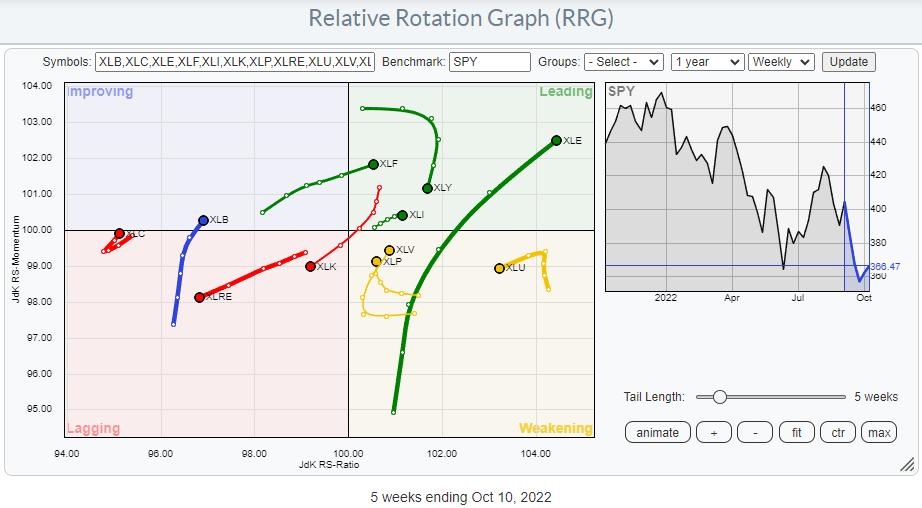
On the weekly Relative Rotation Graph, the tail for XLF has just crossed over into the leading quadrant while keeping up its rising relative momentum. This makes the financials sector one of the leading sectors in the market at the moment.
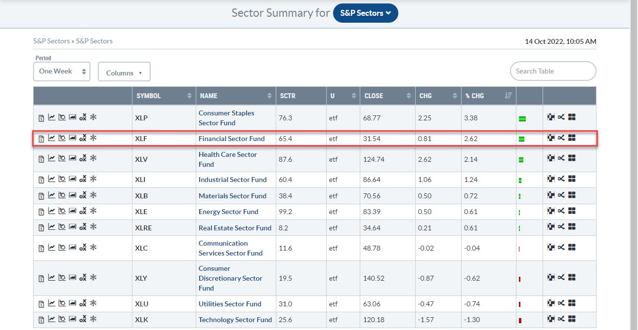
In the past week, XLF picked up 2.62%, making it the second-strongest sector in the S&P 500, which picked up "only" 0.92%. The strongest sector was Consumer Staples, and Health Care came in at no 3. This is interesting as Financials is considered an offensive sector while Staples and Health Care are hard-core defensive sectors.
The RRG below highlights all sectors traveling at a positive RRG-Heading (between 0-90 degrees or North East). The green ovals at the end indicate offensive sectors, which are expected to lead in a strong market ($SPX). Orange are sensitive sectors, while the red ovals are on the defensive sectors that usually lead during weak ($SPX) markets.
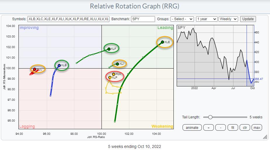
It's interesting to see how mixed that group is. Starting from the right, XLE is the strongest sector, followed by XLI. Both are sensitive sectors. The big difference is the length of the trail on both. Energy obviously has a lot of power behind the move, as it shows the longest tail in the plot. XLI is the opposite, with the shortest tail and a lot less relative momentum.
Health Care and Consumer Staples's tails are curling back towards the leading quadrant while traveling through weakening. Having these sectors still in relative uptrends and showing up at the top of the weekly performance table signals that there is still buying going on in defense. The third defensive sector is missing here, as it is not at a positive RRG-Heading, but, as you can see in the first RRG, XLU is at a high RS-Ratio reading and inside the weakening quadrant, with a good possibility of curling back up before hitting the lagging quadrant.
The only two offensive sectors on this plot are XLF and XLB. XLF obviously strong, but XLB is still at a low RS-Ratio reading while crossing into the improving quadrant. The sensitive Communication Services sector is showing a very similar rotation. XLC and XLB are too low on the RS-Ratio scale to be considered 'leading' in relative trend.
As a result, XLF is the odd one out. And, maybe more importantly, the two heavy-weight sectors, Technology and Consumer Discretionary are not participating.
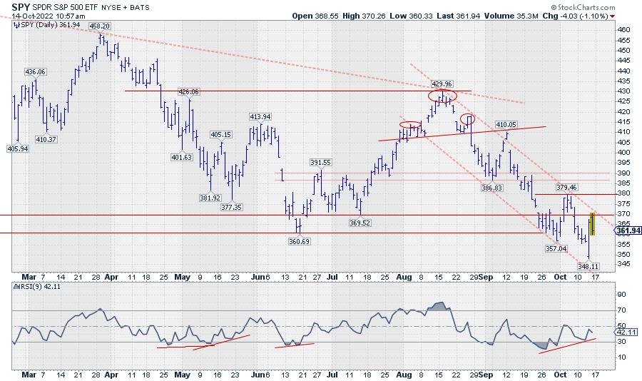
When I look at the chart of the S&P 500 with the above observations in mind, I need to conclude that the downtrend on both the daily and the weekly charts is still intact. The slingshot reversal on Thursday was indeed a nice move but, so far, not really more than that. As I am writing this on Friday morning, SPY touched the upper boundary of the falling channel, then started to retreat again.
Yes, I recognize the strength of the reversal in the form of a bullish engulfing candle and the positive divergence that has built up between the RSI and price. However, both need a trigger to confirm that something underlying has really changed.
I am closely watching two levels that need to get broken, IMHO, for such a confirmation. First is the falling resistance line, which is now coinciding with the horizontal 370-level at the upper boundary of the support zone in which we currently are. Second, and more important, is the last peak at 380. When that can be taken out, we have a completed double bottom after breaking a falling channel supported by positive divergence.
As long as that is not happening, we are still in a downtrend, with the ease of movement to the downside.
#StaySafe and have a great weekend. --Julius
|
| READ ONLINE → |
|
|
|
| The Canadian Technician |
| Nice Clues Arrived On Thursday |
| by Greg Schnell |
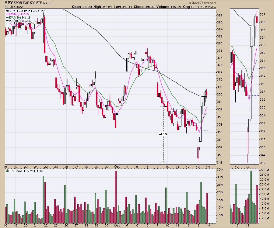
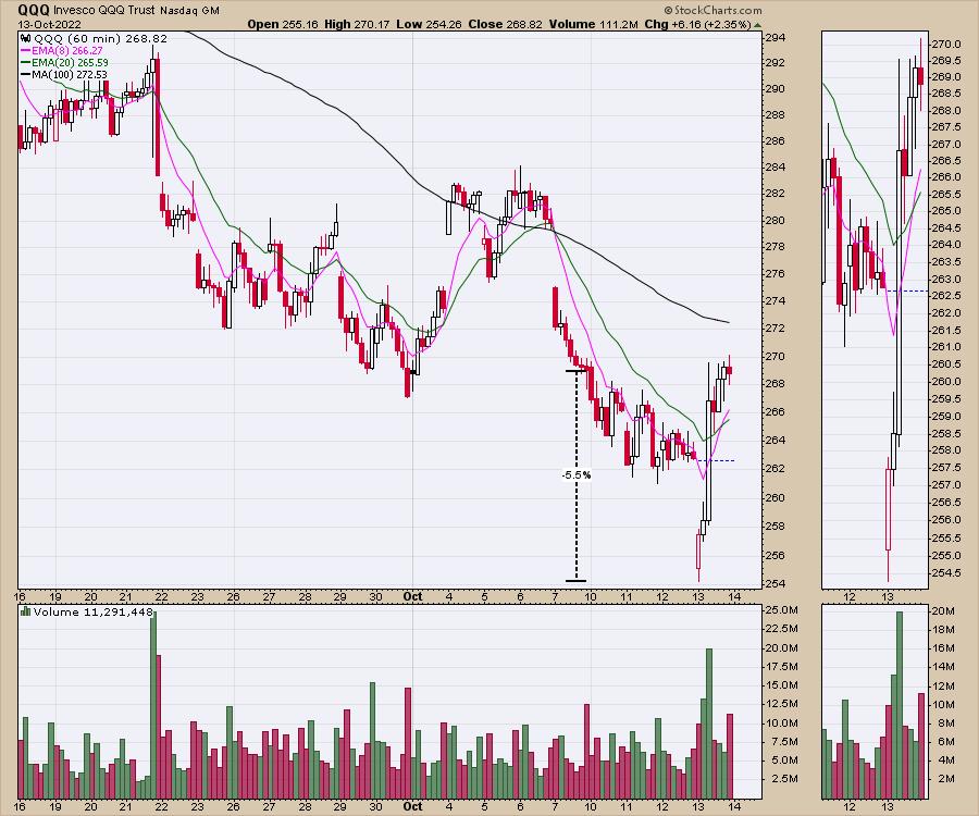
The market pushed down to new lows on Thursday, making a new market low for 2022. Frankly I though the previous lows were low enough, but hey, somebody wanted to buy at lower prices. After my article last week, the market dropped another 4% for the SPY and 5.5% for the QQQ.
The SPY 60-minute chart shows a huge reversal off the lows today.
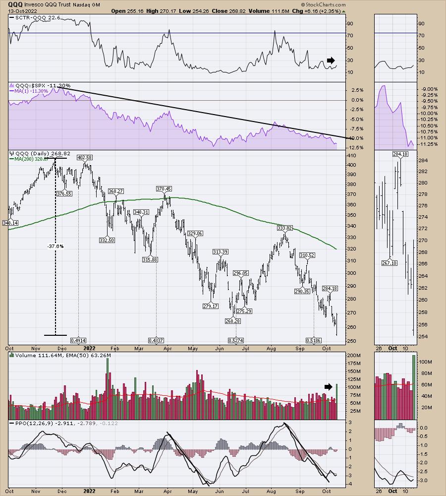
Here is the QQQ. Down another 5.5% from last Friday to start the day, only to race to the upside and retrace the entire loss for the week. Whew, that was volatile!
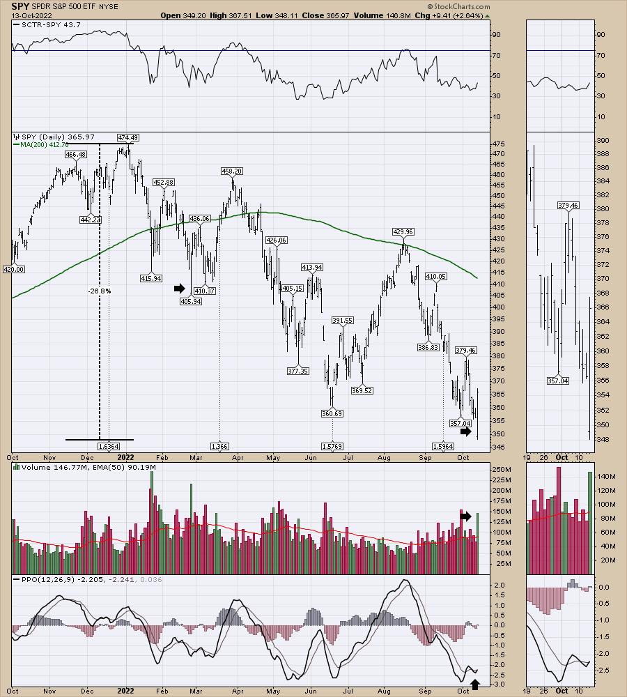
As the market topped to start 2022, the total move down for the SPY was 26% at the lows on Thursday. This was a very wide ranging daily candle, but we did see a candle like this in late February. It was the low candle until late April but the buyers on that February candle were tested a week or two later as the market retested the lows. Buying the low in the market is hard work, but at least your stop can be relatively tight.
Looking at the total drop for the QQQ from the highs of November 2021 to October of this year, it's been a trip. The technology heavy index was down a full 10% more than the SPY at the lows on Thursday, totalling a drop near 38%.
While the volume on the SPY above was significant, the volume on the QQQ was huge. Thursday marked the highest volume day in 5 months. It was also a double in volume from the prior day, so someone hit the buy button.
On TV today, a guest ranted about if you miss the top 20 biggest days in history you miss most of the upside. I'm paraphrasing but it was something like "See why you can't sit out of the market? "
Well, Thursday's massive move from down 3% to up 3% would qualify as one of those days. Where did we get back to? Friday's close.🙄 Conversely, if you felt your portfolio plummet 5.5% since Friday, what feels better sitting aside and waiting for entry? Watching a rally that posted a massive amount of buyers showing up for work, perhaps signalling a low or watching 5% of your portfolio drift away in just a few days?
At Osprey Strategic, we focus on trying to find timely entries. In the client newsletter two weeks ago, I mentioned I was getting more bullish but not buying yet. Last weekend I mentioned I was very bullish but waiting for a confirmation signal. Big bear markets are notorious for trying to suck us back in, only to roll back over. We've had some of those this year, but we have also had big wins.
You can find out more at OspreyStrategic.org and see the signals that we use to help us get into and out of the market. If you can avoid most of the downside and participate in the vast majority of the upside, it's a lot easier to grow your account.
|
| READ ONLINE → |
|
|
|
| DecisionPoint |
| 2022 Q2 Final: Earnings Have Peaked |
| by Carl Swenlin |
The following chart shows us the normal value range of the S&P 500 Index, indicating where the S&P 500 would have to be in order to have an overvalued P/E of 20 (red line), a fairly valued P/E of 15 (blue line), or an undervalued P/E of 10 (green line). Annotations on the right side of the chart show where the range is projected to be based upon earnings estimates for the next four quarters, through 2023 Q2. Note that actual earnings peaked in Q2, and earnings projections are flattening.
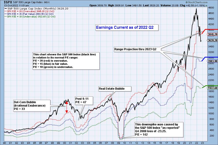

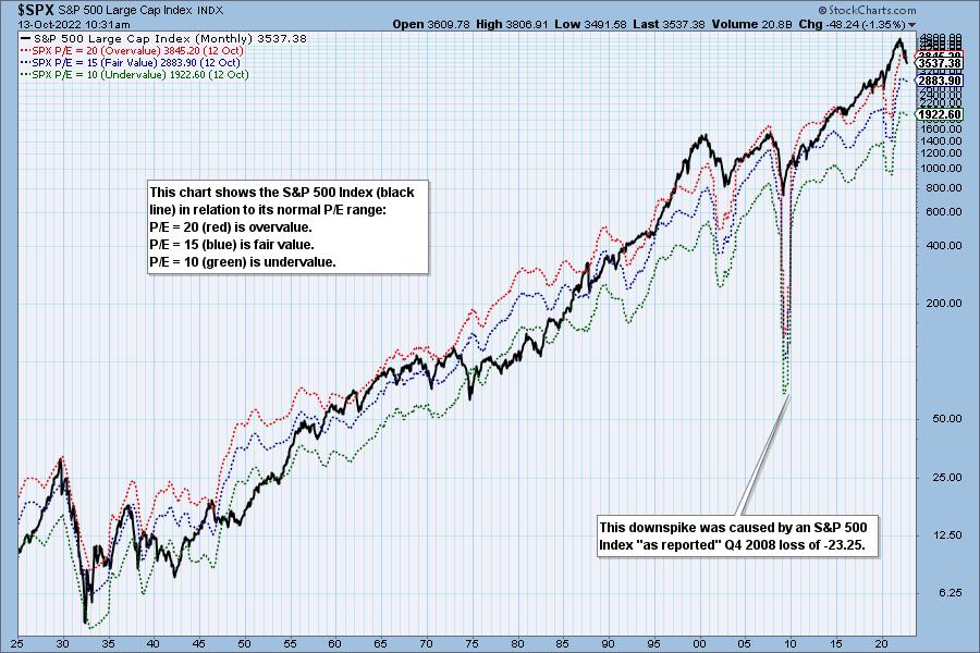
Historically, price has usually remained below the top of the normal value range (red line); however, since about 1998, it has not been uncommon for price to exceed normal overvalue levels, sometimes by a lot. The market has been mostly overvalued since 1992, and it has not been undervalued since 1984. We could say that this is the "new normal," except that it isn't normal by GAAP (Generally Accepted Accounting Principles) standards.
We use GAAP earnings as the basis for our analysis. The table below shows earnings projections through June 2023. Keep in mind that the P/E estimates are calculated based upon the S&P 500 close as of September 30, 2022. They will change daily depending on where the market goes from here. It is notable that the P/E is finally within the normal range, albeit still in the overvalued side of the range.
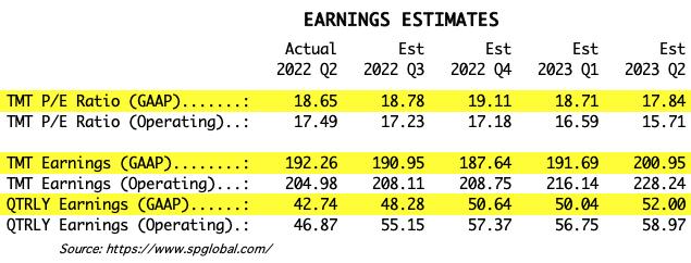
The following table shows where the bands are projected be, based upon earnings estimates through 2023 Q1.

This DecisionPoint chart keeps track of S&P 500 fundamentals, P/E and yield, and it is updated daily -- not that you need to watch it that closely, but it is up-to-date when you need it.
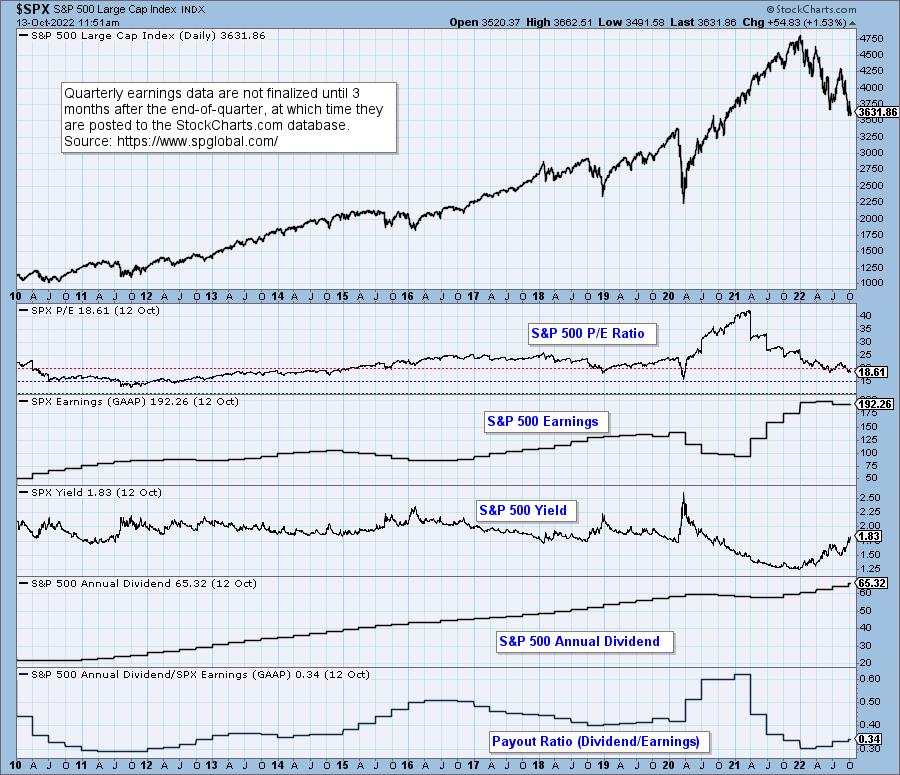
CONCLUSION: With a P/E of 18.6, earnings are within the normal range, but the market is still overvalued; however, earnings have begun to fall causing the normal range to fall as well. Perhaps the bright side of the bear market is that falling prices will keep valuations within the normal range.
Technical Analysis is a windsock, not a crystal ball. --Carl Swenlin
(c) Copyright 2022 DecisionPoint.com
Helpful DecisionPoint Links:
DecisionPoint Alert Chart List
DecisionPoint Golden Cross/Silver Cross Index Chart List
DecisionPoint Sector Chart List
DecisionPoint Chart Gallery
Trend Models
Price Momentum Oscillator (PMO)
On Balance Volume
Swenlin Trading Oscillators (STO-B and STO-V)
ITBM and ITVM
SCTR Ranking
Bear Market Rules Earnings
|
| READ ONLINE → |
|
|
|
| Don't Ignore This Chart! |
| Pepsico Inc. (PEP) Starts Earnings Season With a Bang |
| by Mary Ellen McGonagle |
Earnings season for the 3rd quarter has begun, with PepsiCo (PEP) reporting earnings and sales results today that were above estimates, despite recognizing a $1.4B charge related to its withdrawal from Russian markets.
Even more important for investors is the fact that management raised their guidance for organic revenue for the full fiscal year. The beat and guidance higher by PEP pushed the stock higher by 4% on heavy volume. In the chart below, I highlight the current position of PepsiCo and what to be on the lookout for going forward.
DAILY CHART OF PEPSICO INC. (PEP)
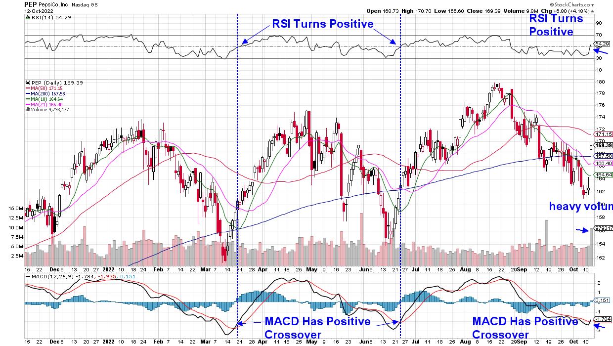
Today's gap up in price pushed PEP above near-term moving averages on heavy volume, which historically can lead to further gains. In addition, the momentum indicators -- RSI above price chart and MACD below -- turned positive following today's rally. I've highlighted the last 2 times that PEP's RSI and MACD turned positive this year and how, both times, the stock experienced a 17% move higher.
While this is great news for the current prospects for PepsiCo, there's one important additional factor to keep in mind. Both the March and July rallies that took place earlier this year occurred when the broader markets were also in rally mode. Below is a comparative chart of the S&P 500 relative to PepsiCo and, while PEP's rallies were lengthier and produced a higher return than SPX, they were in tandem with an uptrend in the broader markets.
DAILY CHART OF PEPSICO (PEP) VS S&P 500 INDEX
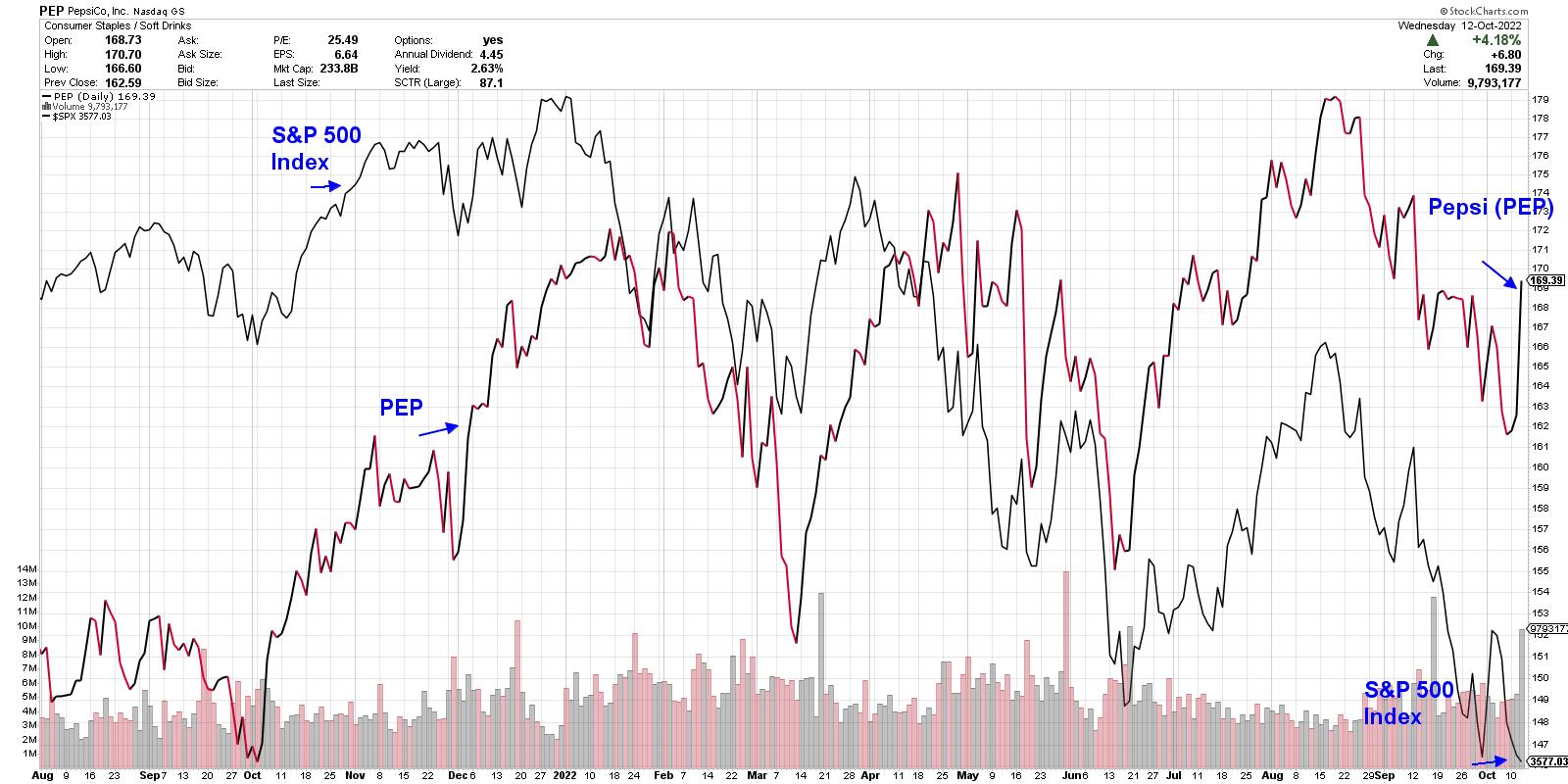
In order to prove that "this time is different," I'll need to see PEP break back above its 50-day moving average, which is a key area of possible upside resistance. In addition, the Industry Group that it's a part of will need to turn positive as well, with a break back above its 50-day moving average.
I'm considering the possibility of PEP withstanding broader market pressures that brought on a pullback in the past, simply because there are periods in a bear market when defensive stocks will rally. PEP almost doubled during the first 2 years of the 2000-2002 bear market.
DAILY CHART OF PACKAGED FOOD GROUP (from MarketSmith)
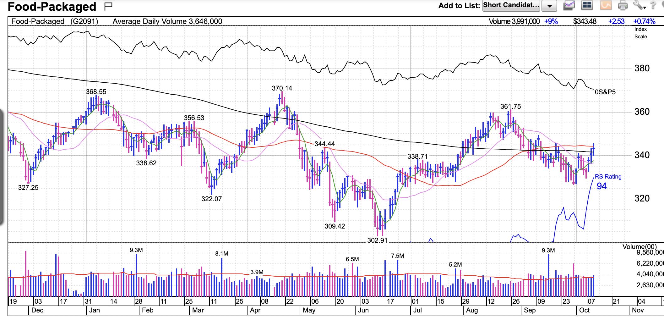
Each bear market brings its own dynamics, however, and until we see further evidence that PEP, as well as other Consumer Staples stocks, are withstanding downward pressure seen elsewhere in the markets, I'd tread lightly into any new position in the stock.
For those who'd like to take advantage of a special offer for my twice-weekly MEM Edge Report, use this link here. An annual subscription will provide you access to a live trading session on November 1st, which will give you a front row seat to earnings season. In addition, you'll receive my 30-minute course on how to use moving averages to pinpoint entry and exit points, as well as uptrends in areas of the market. (All subscriptions are prorated and can be cancelled at any time.)
I hope you'll join the hundreds of other subscribers who are regularly receiving an updated market outlook as well as inverse ETF suggestions in this bear market period.
Warmly,
Mary Ellen McGonagle, MEM Investment Research
|
| READ ONLINE → |
|
|
|
| Dancing with the Trend |
| Past Performance is no Guarantee of Future Results |
| by Grant Morris, Greg Morris |
 There is no doubt that investors are attracted by positive performance. Unfortunately, most investors stop there and never accomplish the due diligence to confirm that the returns are meaningful. In most cases they usually place entirely too much emphasis on performance without putting it into the context of the market or the ever-important philosophy behind the strategy. There is no doubt that investors are attracted by positive performance. Unfortunately, most investors stop there and never accomplish the due diligence to confirm that the returns are meaningful. In most cases they usually place entirely too much emphasis on performance without putting it into the context of the market or the ever-important philosophy behind the strategy.
Here's a fact: All performance measures are trailing performance. Why do you suppose the NASD and SEC demand that disclaimers, stating that "Past Performance is no Guarantee of Future Results," appear on all official documents and advertising? Because they know that an advisor's or fund manager's performance is only a measure of how they did in the past, nothing more. Not surprisingly, the past can be significantly affected by many events totally out of the control of the advisor or money manager.
It is not abnormal for investors to chase performance because we humans have a tendency to extrapolate the recent past into the future. Our minds cannot handle large numbers well (see article "A Different Perspective on Standard Deviation") and when confronted with difficult things we want to understand we tend to simplify it by only looking at things that are in recent memory. Trust me; this is not abnormal behavior, just a deficiency in our human makeup and a behavior that is not healthy for your investments. This is why investors are usually bullish at market tops and bearish at market bottoms. This is also why the financial media continues to invite analysts who so often are wrong in their past appearances, but keep getting invited back because they sound so convincing. Of course investors love to hear them as they tend to push all the right buttons that make them believe the analyst can predict the future. I'm sure their frequent appearances have nothing to do with any advertising dollars spent at the network. Tongue firmly in cheek.
Reading financial publications that list the recent performance of mutual funds is a primary contributor to the illusion of what will be the next "hot" performer. The reasons most funds are in the "top performer" list is because of financial events and long-term economic or market cycles that are totally out of the fund manager's hands. These events usually have an effect on asset classes which in turn have an effect on the funds' performance. A fund that is heavily loaded into a particular asset class will generally perform like that asset class. Often you will see the mutual funds ranked by using stars, with the more stars meaning it has outperformed its peers. Some studies have shown that this can also work well as a contrary opinion marker. I have looked at it in detail and while the contrary part eventually works out, the time involved is usually much longer than most investors will tolerate.
The years 1998 and 1999 are a good example of investors chasing performance – many dumped their money into technology issues (dot.com) without regard to anything other than its recent performance. Those who study market internals and risk were generally in defensive positions much of those years. Their performance suffered; however, payback time was just around the corner. The excesses of the late nineties all began to pay their tuition in early 2000. Those analysts and advisors, who were defensive early, were the top performers during the big bear market that ensued. Did they know the market was going to plummet? No, they just knew the risk of being invested was too high and acted accordingly. A similar thing happened in 2006-07, and guess what: it will happen again.
Another mistake that is common with investors is that they fail to consider their own performance, whether it is in their retirement plan, their individual brokerage account, or wherever. They focus on chasing the hot issues and totally ignore whether it is actually working or not. Most would find that chasing performance has hurt them considerably over the years. A company called Dalbar does an annual study on mutual fund investors' performance compared to a large array of asset classes. It always shows that the individuals, usually caused by frequent asset shifting, have performed poorly relative to the asset classes.
So what should one do? Assess your needs over a long term horizon. If you are amassing assets for retirement you cannot take undue risks, either by chasing performance or being highly speculative. You must adapt to a belief that it is the performance over the long term that you need in order to reach your goals. This is a lot easier to say than it is to do. The really lucky folks are the ones that find a good advisor; one they are comfortable with, one that has a good steady long-term record of not taking big risks while still getting satisfactory returns, one that takes defensive positions in bad markets. Those investors enjoy a good night's sleep. And it is not about outperforming your friends and neighbors. Your satisfactory performance is personal – period.
Trade by knowing the past but not expecting it to continue ad infinitum,
Greg Morris
|
| READ ONLINE → |
|
|
|
| MORE ARTICLES → |
|
 Chart 1
 Chart 2
 Chart 3
 Chart 4


 There is no doubt that investors are attracted by positive performance. Unfortunately, most investors stop there and never accomplish the due diligence to confirm that the returns are meaningful. In most cases they usually place entirely too much emphasis on performance without putting it into the context of the market or the ever-important philosophy behind the strategy.


