| THIS WEEK'S ARTICLES |
| John Murphy's Market Message |
| DOW TESTS 200-DAY LINE TO LEAD MARKET HIGHER |
| by John Murphy |
DOW TESTS 200-DAY LINE... October has turned to be a strong month for the market, and industrials in particular. Chart 1 shows the Dow Industrials reaching a two month high and trying to close above its 200-day moving average. The Dow has gained more than 5% for the week and 14% for the month. That's the Dow's biggest monthly gain in years. Industrials were also the week's strongest sector. Chart 2 shows the Industrial Sector SPDR (XLI) also testing its 200-day average. Its relative strength line in the upper box has also hit a new high for the year. Chart 3 shows Caterpillar gaining 14% for the week and reaching the highest level in five months. Ten market sectors gained on the week with strong gains in consumer staples and financials. Communication Services were the only losers.
 Chart 1 Chart 1
 Chart 2 Chart 2
 Chart 3 Chart 3
S&P 500 CLEARS 50-DAY LINE... The rest of the market also gained but by a smaller amount. Chart 4 shows the S&P 500 trading above its 50-day line which suggests that higher prices are probably in store. The S&P was held back by the tech and communication sectors. So was the Nasdaq. Chart 5 shows the Invesco QQQ Trust in a potential bottoming formation. It needs a close above its October high and its 50 day average to turn its short-term trend higher. Part of the recent sector performance appears to be a rotation out of big tech growth stocks into more value oriented sectors of the market. That may explain why the three biggest sector gainers during October have been energy, industrials, and financials while technology has lagged behind. Healthcare has been a standout performer.
 Chart 4 Chart 4
 Chart 5 Chart 5
HEALTHCARE SPDR MAY BE NEARING UPSIDE BREAKOUT... Investors looking for a defensive sector with promising upside potential might want to take a closer look at healthcare. Chart 6 shows the Health Care Sector SPDR (XLV) trading above its red 200-day moving average and in a potential bottoming formation. The XLV appears headed toward a test of its August high. Its relative strength ratio in the upper box is also hitting new highs. Its biggest monthly gainers have come from healthcare providers and pharmaceuticals. Biotechs also look promising. Chart 7 shows the Nasdaq Biotechnology iShares (IBB) clearing its moving average lines.
 Chart 6 Chart 6
 Chart 7 Chart 7
|
| READ ONLINE → |
|
|
|
| The Mindful Investor |
| The Perfect Chart for Navigating 2022 |
| by David Keller |
Bruce Fraser joined me on The Final Bar this week and shared a thought-provoking point & figure chart of the S&P 500 index. With the recent upswing, you can use a horizontal count to identify potential upside targets for the bear market rally. (Yes, I am still labeling this a bear market rally. I'd encourage you to do the same!) But instead of running a point & figure chart for the S&P 500 index, we can also run point & figure charts for the entire 500 members of the index using our Bullish Percent Indexes.
Now it's always easy to declare the perfect chart once you've seen its results during the course of a year. But, in this case, it's a chart that's part of our Mindful Investor Live ChartList for good reason!
As of Friday's close, 66% of the S&P 500 stocks have a buy signal on their point & figure charts. That's up from around 10% in late September.
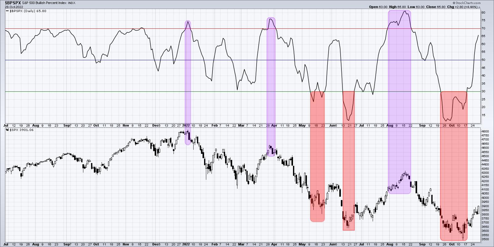
Notice the red-shaded areas on the chart, which indicate when the indicator has dipped below the 30% threshold. This happened in May (with a brief break back above 30% before the final breakout), in late June and in mid-October. These "buy" signals occurred just before fairly strong rallies into the June (about 7% from the May low) and August (a 17% rally) peaks.
Now note the purple-shaded areas, which indicate when we saw over 70% bullish readings. These regions coincide with the market peaks in January, March and August. As we pointed out to our Market Misbehavior premium members, the break above the 30% level last week indicated a high probability for a continued rise off the October low for the S&P 500.
So what's next?
I'm looking for a break above the 70% level as this bear market rally continues. This strength in the Bullish Percent Index is similar to improving breadth conditions we've noticed across the board. At some point, however, we'll most likely see this indicator rotate back below the 70% level. And if this truly is a bear market rally, then that signal could indicate an exhaustion of buyers and a likely retest of market lows!
RR#6,
Dave
P.S. Ready to upgrade your investment process? Check out my YouTube channel!
David Keller, CMT
Chief Market Strategist
StockCharts.com
Disclaimer: This blog is for educational purposes only and should not be construed as financial advice. The ideas and strategies should never be used without first assessing your own personal and financial situation, or without consulting a financial professional.
The author does not have a position in mentioned securities at the time of publication. Any opinions expressed herein are solely those of the author, and do not in any way represent the views or opinions of any other person or entity.
|
| READ ONLINE → |
|
|
|
| Dancing with the Trend |
| Junk Science; Junk Analysis! |
| by Greg Morris |
 I don't think I have offended anyone in quite a while and feel I'm not doing my job if I don't try to periodically; so here goes! I don't think I have offended anyone in quite a while and feel I'm not doing my job if I don't try to periodically; so here goes!
Often a simple mathematical series of numbers can sometimes get misinterpreted (promoted) to be something magical. My personal favorite sequence is 6, 28, 496, 2520, 8128, and 24601. I'll explain them at the end of this article. Personally, I see no value in the actual numbers that make up the Fibonacci series; a series developed by an Italian mathematician (Fibonacci) in the thirteenth century to help understand the propagation of rabbits. First, I must say that I do value the ratio of the numbers that are expanded in a Fibonacci-like series (0, 1, 1, 2, 3, 5, 8, 13, 21, 34, 55, 89, ...). That ratio is 0.618 (and its reciprocal is 1.618), often called the golden ratio because of its wide occurrence in nature; almost always with a jaundiced eye. Here is a fact: the actual numbers in the
Fibonacci series have little to do with the ratio. Any two numbers expanded in the same manner will produce the same ‘golden' ratio. Here is a test: Try it with 2 and 19. Add them together, and then add the total to the previous number just like in the Fibonacci series (2+19=21, 19+21=40, 21+40=61, etc.). Expand this until you get to four-digit numbers so that the accuracy will be acceptable (2, 19, 21, 40, 61, 101, 162, 263, 425, 688, 1113, 1801, 2914, 4716, ...). The last two numbers in this sequence are the two numbers that I will use for this example: 2914 and 4716. Now divide the first number by the second number and you will get 0.618. This is exactly the same as with the value obtained using the Fibonacci series of numbers. So why did I pick 2 and 19 for this example? Hint: the second letter in the alphabet is B. What is the nineteenth letter? S. BS! And that is what numerology is all about. Table A shows the sequence using various starting numbers including my special selection of 2 and 19. The last column begins with a negative number.
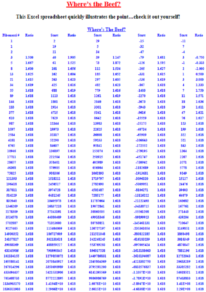 Table A Table A
I can find no source that explains why the series of Fibonacci numbers begins at zero. If I were tasked with mathematically identifying the propagation of rabbits, I think I would at least have to begin the series at 2. The fact of the matter is that the series can begin anywhere, even negative numbers, as long as the expansion follows the correct formula. It is the ratio that is important, not the actual numbers in the series. So, when you hear someone say they are going to use a 34-day moving average because 34 is a Fibonacci number, you can immediately begin to doubt the rest of their analysis. Just so you know; the Fibonacci expansion of one plus the square root of five divided by 2 will work with any two numbers, even negative numbers. Sorry, no magic here, just numerology. As far as Elliott Wave theory goes, there are often so many complications and conditions introduced into using this type of analysis, that it is incapable of being proved wrong. Sometimes I think it gets adjusted more often than earnings estimates. However, it is always convincing to align the workings of the market with what appears to be pure mathematics. In the series of numbers introduced at the beginning of this section, 6, 28, 496, and 8128, are known as perfect numbers; this means the sum of their divisors (other than the number itself) is also equal to the number. For example: 6 = 1 + 2 + 3, and 28 = 1 + 2 + 4 + 7 + 14. I like 2520 because it is the smallest integer than is divisible by all integers from 1 to 10 inclusive. Finally, I like 24601 as it is the prisoner number of Jean Valjean from Victor Hugo's Les Miserables. Incidentally, 24601 has prime factors of 73 and 337. I like these numbers solely for their mathematical uniqueness; and like many number sequences, they have no use in technical market analysis. Possibly Keno! So why are people drawn to it so much? Probably because of its false potential for predicting the future and its cottage industry of numerology advocates.
I have known many successful traders and investors over the years. I do not know anyone who trades with real money that uses junk science like Fibonacci numbers. I put out articles like this because I see so many technical analysts that do not understand the tools they use; they accept them on face value. Hopefully, you can now see the problems with doing it that way. So, were you offended by or appreciative of this article?
Dance with the Trend,
Greg Morris
|
| READ ONLINE → |
|
|
|
| The Canadian Technician |
| Smooth-Running Engine or Friction Ahead? |
| by Greg Schnell |
It has been a wonderful rally off the lows. In under two weeks, the commentary has gone from extremely bearish to the best month in 40 years. That is a wonderful change in commentary. If you weren't ready for this rally, you might be interested in this video I recorded earlier this week, Osprey Strategic October Review.
I will say its been a choppy period depending on what you bought. Tech names are thrashing about, with the mega caps having massive swings on earnings. Who would have picked the markets to be having a strong month with the mega-caps imploding? I definitely did not expect the results from those names to be so negative.
Oil names have been doing great. I am a little concerned that the oil names might top here as the weekly PPO for crude oil is right near zero.
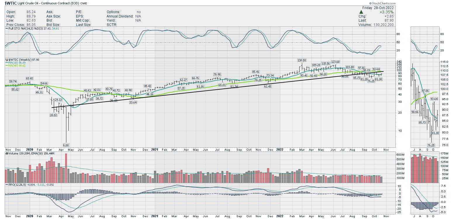
I need it to turn up soon to keep a bullish thesis.
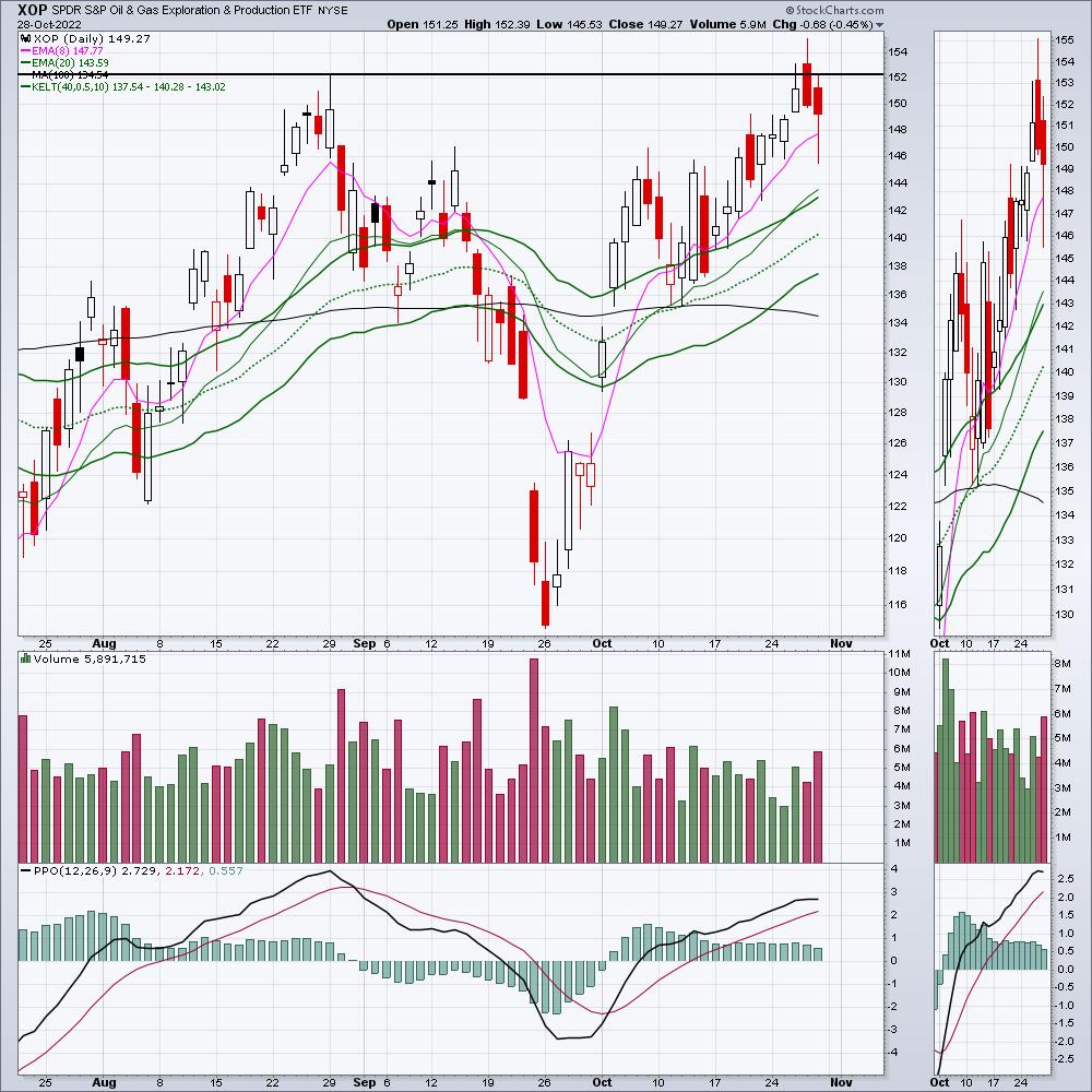
This chart of XOP -- the oil production ETF -- reversed on Thursday after taking out the prior highs. I love the inventory backdrop for oil, but it has to be mapped against the potential for a recession. I am reminded of 2008 and always wary, as I live in a city with commodities as a strong indicator of the local economy.
Let me talk about the potential for a recession and examine if that is well in the rearview mirror already. Is it priced into the equity markets and we just go higher from here?
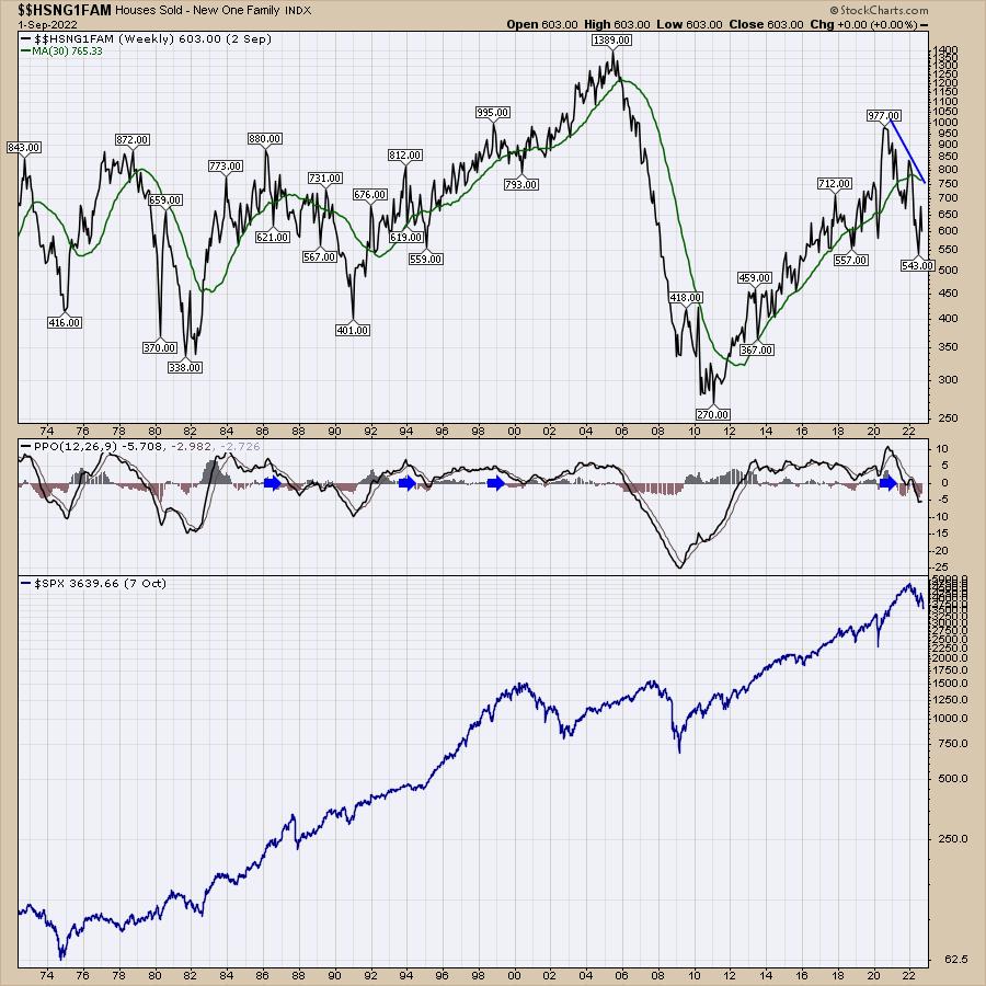
Home Sales
When I look at the home sales, this has the look of 2006-2010, but it also happened during other recessions. It dropped for the 1980-1982 recession and the 1990 recession. It did not drop in 2000-2002 (missed that cycle) but had a drop of doom in 2006-2010. This chart should update soon with another big drop. Look at the PPO indicator in the middle when it drops below zero. Those negative periods on housing sales were also broad economic recessions. It suggests being careful.
The Fed Funds Rate chart
The top panel is the fed funds rate and it is widely accepted it will be going up 0.75% on November 3rd, and potentially another 0.5% on December 15th as we come to the end of October. In the next 7 weeks, we'll see a move of 1.25%, which is an additional 500% move from where we started the year (0.25%). Let's just think about this for a minute.
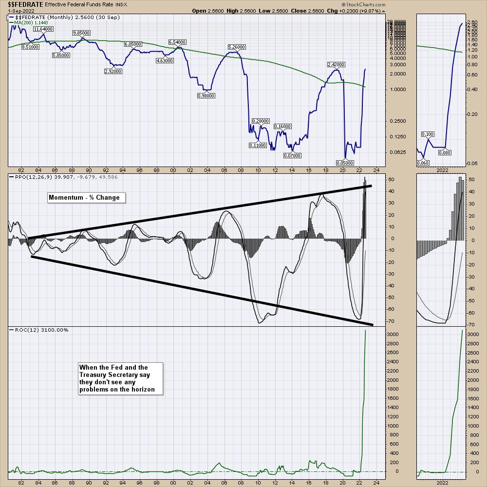
In the middle panel is the PPO momentum indicator. Notice how the swings are bigger on the right than on the left.
I am reminded of my trip to the Oakville research centre in Oakville, Ontario, Canada in 1988, where we tested new motor oil additives for unique things like low temperature startup, holding dirt and metal filings in the oil to take it to the filter, breaking up water molecules that bonded together to stop rust, detergents to clean the engine, and long-run continuous operation tests with no shutdown. Some of the additives created in these labs became commercial products. They were good, and a number of engines ran a million miles with regular oil changes and maintenance of the bearings. Those were the success stories.
But there were other additives that didn't work. The motors are running on stands in concrete rooms. A few walls had big holes in them. Why would that be?
If the additive had problems, wear would start to build heat. Heat in the bearings would create more wear, creating more friction, and eventually the crankshaft got out of balance with uneven friction. It would overheat and eventually something would fail. The parts could fall into the engine pan and destroy everything else while it continued to try and spin, or it could send the piston flying through the block and it would hit the wall with huge force. Call it a failed test.
It would overheat and eventually something would fail.
When I look at the PPO in the middle, I can't help but notice how the momentum swings in the interest rate cycle are bigger, with more force both ways (positive and negative). As the Fed tests additives to the economic engine, it is creating bigger swings in either direction using modern economic theory models. Some were tested in other countries before they used them on the US economy. Some were created and thrown in to see if they would work in real time.
When I look at the rate of change indicator on the lower panel, it is going to surge another 500% above where it already is, and it usually takes about a year for fed policy to filter into the economy. This is a moonshot by any description that started 10 months ago.
That is going to translate to an even more massive surge on the PPO in the middle. Let me get mathematical for two sentences. The PPO settings are 12 months and 26 months (the signal line is the 9 month number). So the first number is still accelerating, as we are 10 months in with further increases in the next two months and the second number is about 35% (10 months) through the 26-month setting. All that to say, this is a moonshot into space for the momentum of changing interest rates.
Day after day we hear of senior people leading the financial industry -- one would be Jamie Dimon -- warning that a "very, very serious" mix of headwinds is likely to tip both the U.S. and global economy into recession by the middle of next year. The stock has ripped higher by 25% since he said it! That makes investing very, very, hard!
"very, very serious" mix of headwinds
Staying on the chart above, when I look at the rate of change on the lower panel in Fed funds between 2014 and 2018, the move in 2016 was well above -- about 50% more -- than the 2005 high. Now it looks like it was a ripple on a coffee cup, but, at the time, it was huge. During that period, the PPO moved all the way to the top side of the range over 4 years. We don't know the effects of this current test using this new one-year-rate-of-change-additive, but we are forcing through a massive rate of change in one year. Looking at the 40-year expanding wobble on the PPO momentum indicator and the 'we won't have another economic event in my lifetime' rate of change indicator, it's hard to imagine this doesn't heat up the bearings or worse, throw a piston through the block of the economy, slamming it to a halt. This interview today from the Treasury Secretary -- I don't see a recession on the horizon.
I don't have any way of knowing what the future will bring, but it is fair to say it has the potential to unleash something we haven't seen in a 1/2 century. I don't know if economic cycle models will work. I don't know if commodity cycles can override the effects of these monetary cycles. I only know what I can see today and compare that to history.
My macro work is very effective for finding entries and exits for the stock market. Is it perfect? No. But it won't miss big changes for more than a week or two. Being blindsided by big moves down is way more dangerous than the gains on the way up. The market can always climb a wall of fear, but for me it is important to protect my capital religiously so that, when the bottom does come, we can make some real gains.
We are up a heady 14% on the Dow 30 in 2 weeks and I have enjoyed the ride. The $INDU chart is back at the 40-week moving average (WMA). The Nasdaq 100 chart has lots of room to run to get to the 40-WMA. How high will it go?
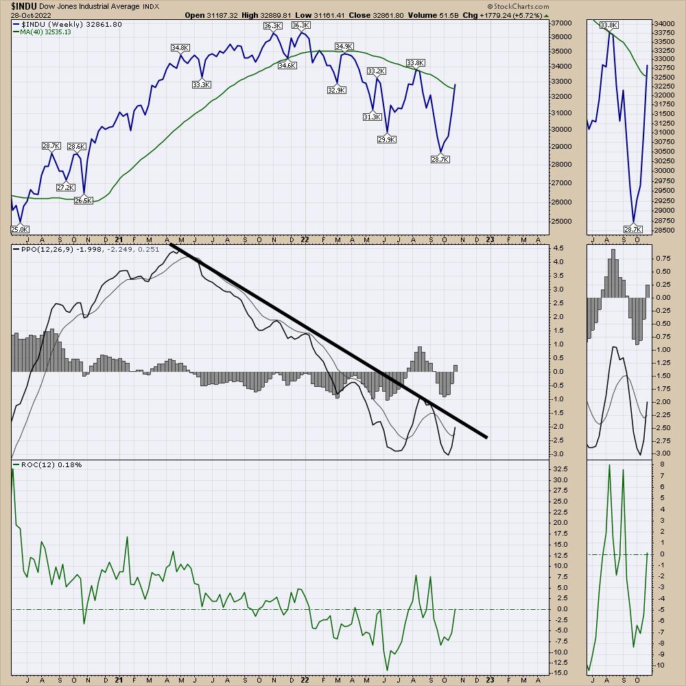
Each stock market wave in a bear market gets bigger both ways. As we roll through the 4th quarter with another massive Fed Funds rate increase designed to slow the economy, I want to be very aware of the changing tide of investors. I plan on making money for the rides up, and sitting aside for the ride down. Again, I'd encourage you to watch the video, as it discusses the October low and investing around it.
October - Osprey Strategic Market Approach
Clues from the commodity charts are hanging on the edge. A presentation I did in Calgary on October 15th carried a theme about driving along the cliff, hoping we don't have a James Dean moment. In the meantime, I am invested.
I reviewed the oil chart on today's Your Daily Five video, along with some other critical charts right now.
Your Daily Five
To summarize, the rallies in bear markets are there to get us all bulled up. I want to participate in those. Then comes a rug pull that wipes out our capital. Right now, we know there is friction ahead. We just don't know ahead of time when the market will stop rallying into it or if it will stop rallying. Investing is hard work, and investing with a smooth running engine is preferable. We don't have that right now, but we can still make money if we stay focused on price action. I am happy to have made some gains to wrap up the month and I'll be equally happy to protect the portfolio should the time come.
Stay cautious!
|
| READ ONLINE → |
|
|
|
| Martin Pring's Market Roundup |
| Which Country ETFs Can Lead Us Out of the Bear Market and Which Ones Could Drag Us Deeper In? |
| by Martin Pring |
When I am looking at a downtrend of a specific market that has been in existence for a while, I often ask myself which components might be on the verge of an upside breakout and could therefore lead it higher. Conversely, I have to ask if there are any downside breakouts taking place which could lead it lower.
The "market," in this case, is global equities, as represented in Chart 1 by the Dow Jones World Index ($DJW). As you can see, it recently bounced off its secular bull market trendline, thereby offering the possibility of a bear market low. That idea would obtain more credibility if it can rally back above the secondary dashed trendline. You could argue the case that this is a more significant line. While it may be slightly shorter, it has, nevertheless, been responsible for turning back five rallies. This compares to the solid one, which has only turned back the 2020 decline. I calculate the extended dashed line to currently be at around 456.
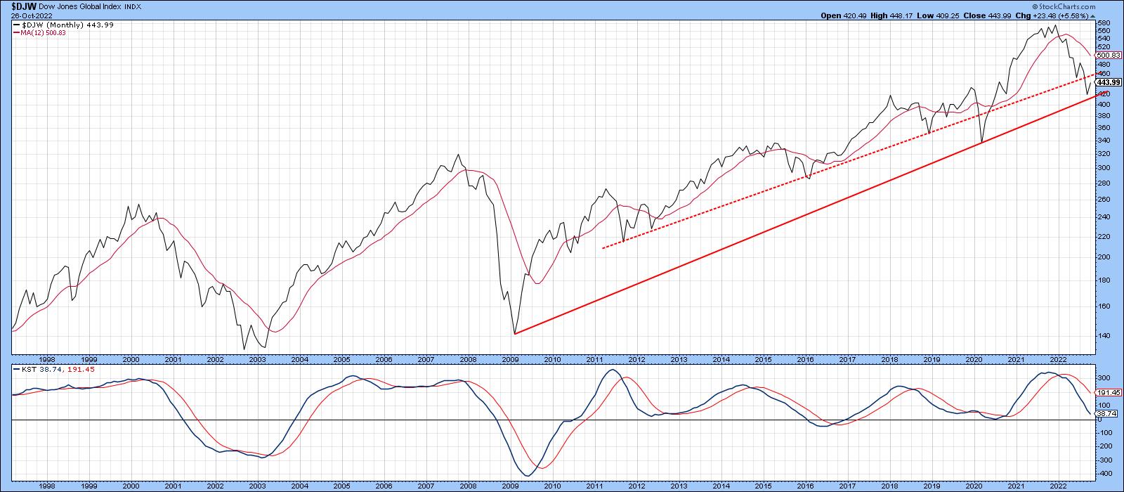 Chart 1: The Dow Jones World Index ($DJW) bounced off its secular bull market trendline. The chart is worth watching to see if $DJW follows through to its secondary trendline. Chart 1: The Dow Jones World Index ($DJW) bounced off its secular bull market trendline. The chart is worth watching to see if $DJW follows through to its secondary trendline.
The question naturally arises as to what countries, if any, are in a position to lead the index higher. Conversely, if the bear market is to extend, which ones might drag it down to new lows? Let's consider both types of candidates in turn, limiting our analysis to ETFs to avoid currency and inflationary distortions to which local indexes are subject.
Constructive Looking Country ETFs
Charts 2 and 3 feature two European-oriented ETFs, Greece and Turkey. Both appear to be forming bases. The Global X MSCI Greece ETF (GREK) is still bearishly below its 12-month MA and is sporting a negative long-term KST. Nevertheless, at $24, it is certainly within striking distance of an upside breakout at $28.
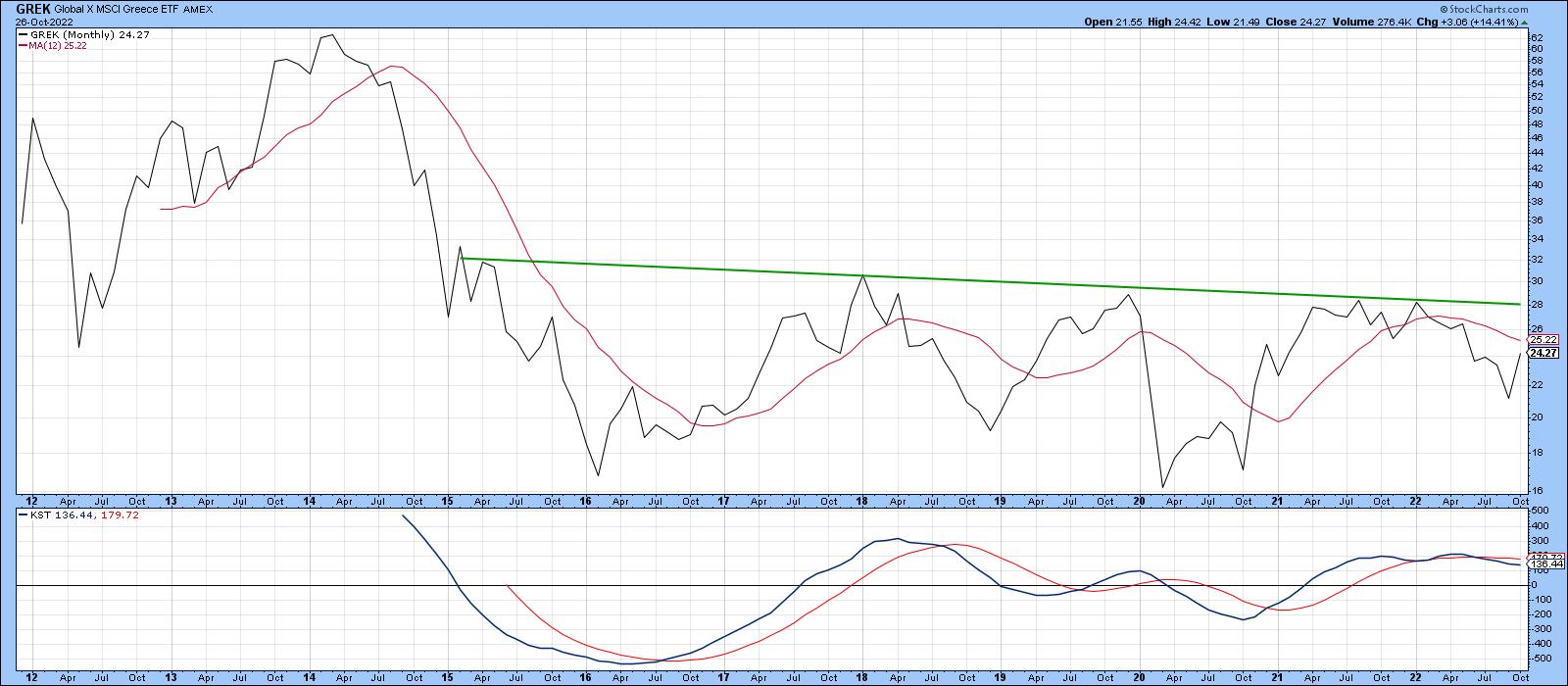 Chart 2: Global X MSCI Greece ETF (GREK) could see an upside breakout above $20. This is one to add to your ChartLists. Chart 2: Global X MSCI Greece ETF (GREK) could see an upside breakout above $20. This is one to add to your ChartLists.
Turkey is currently experiencing massive inflation, which the government is fighting with lower interest rates. Yes, lower interest rates, that's not a misprint. On the face value, the country looks to be a basket case. But the chart begs to differ. Regardless of the policy, the iShares MSCI Turkey ETF (TUR), a dollar-denominated ETF, has broken out from a five-year base, an event that is accompanied by a positive long-term KST. It's currently facing a test of the 2013-2022 down trendline, but looks to be in better long-term technical shape than most other country ETFs.
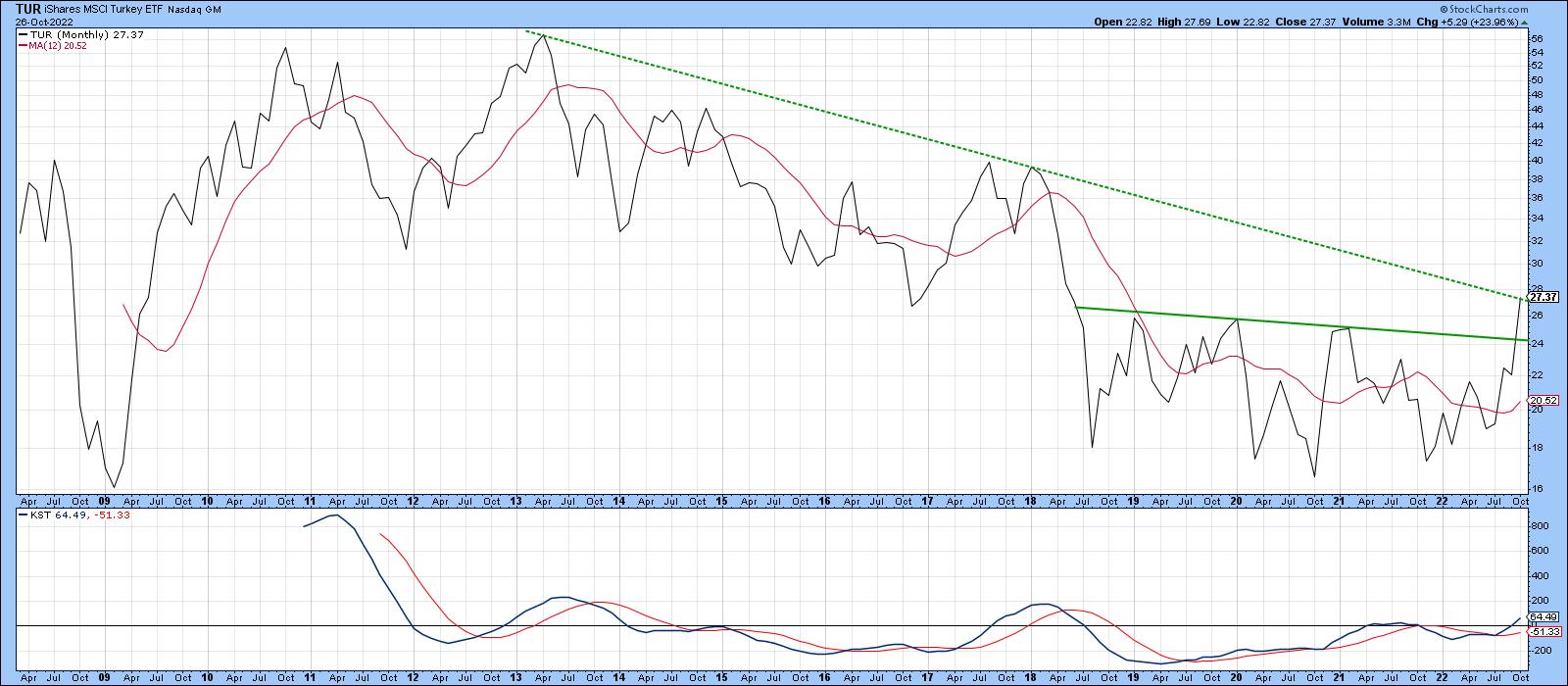
Chart 3: iShares MSCI Turkey ETF (TUR) looks to be testing its downward sloping trendline. Will it break out above it? Latin America, in the form of the iShares MSCI Mexico ETF (EWW) and the iShares MSCI Brazil ETF (EWZ), is featured in Charts 4 and 5. The EWW has yet to break above its 2012-2022 resistance trendline, but, at a current $49, does not have to rally much to surpass it. The principal problem for the EWW is that its KST is overbought and declining.
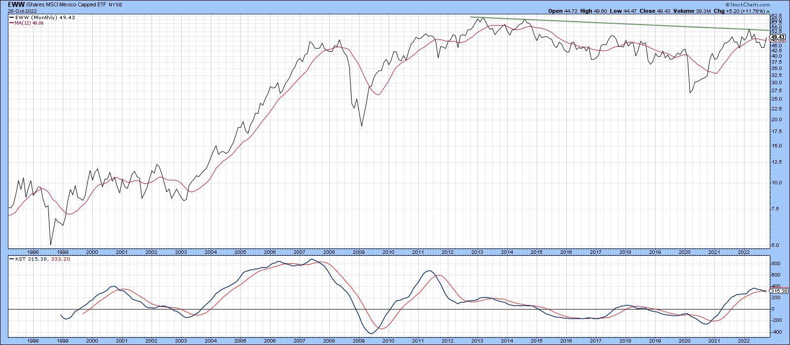 Chart 4: iShares MSCI Mexico ETF (EWW) is close to a resistance level but it also appears overbought. Chart 4: iShares MSCI Mexico ETF (EWW) is close to a resistance level but it also appears overbought.
That's not the case for its southern neighbor, Brazil. That's because its long-term momentum is in a relatively early phase of a primary uptrend. The challenge here, lies at the 2007-2022 down trendline at $37.50. A move above that point would take the price well above its 12-month MA and allow it to clear the extended red up trendline.
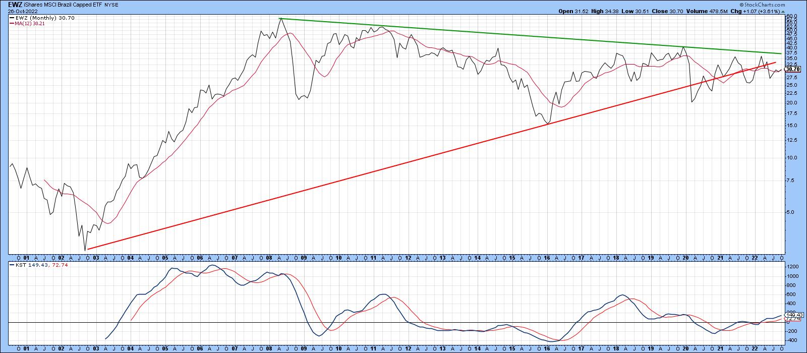 Chart 5: iShares MSCI Brazil ETF (EWZ) might be in an early stage of its primary uptrend. It's currently hovering around its 12-month moving average. Chart 5: iShares MSCI Brazil ETF (EWZ) might be in an early stage of its primary uptrend. It's currently hovering around its 12-month moving average.
Finally, the iShares India 50 ETF (INDY) is technically in a bear market, since price and KST are below their respective MAs. However, my analysis is concerned with ETFs that are within striking distance of a new high in the event that global equities have begun a new bull market. In that respect, INDY is close to 10% of that goal.
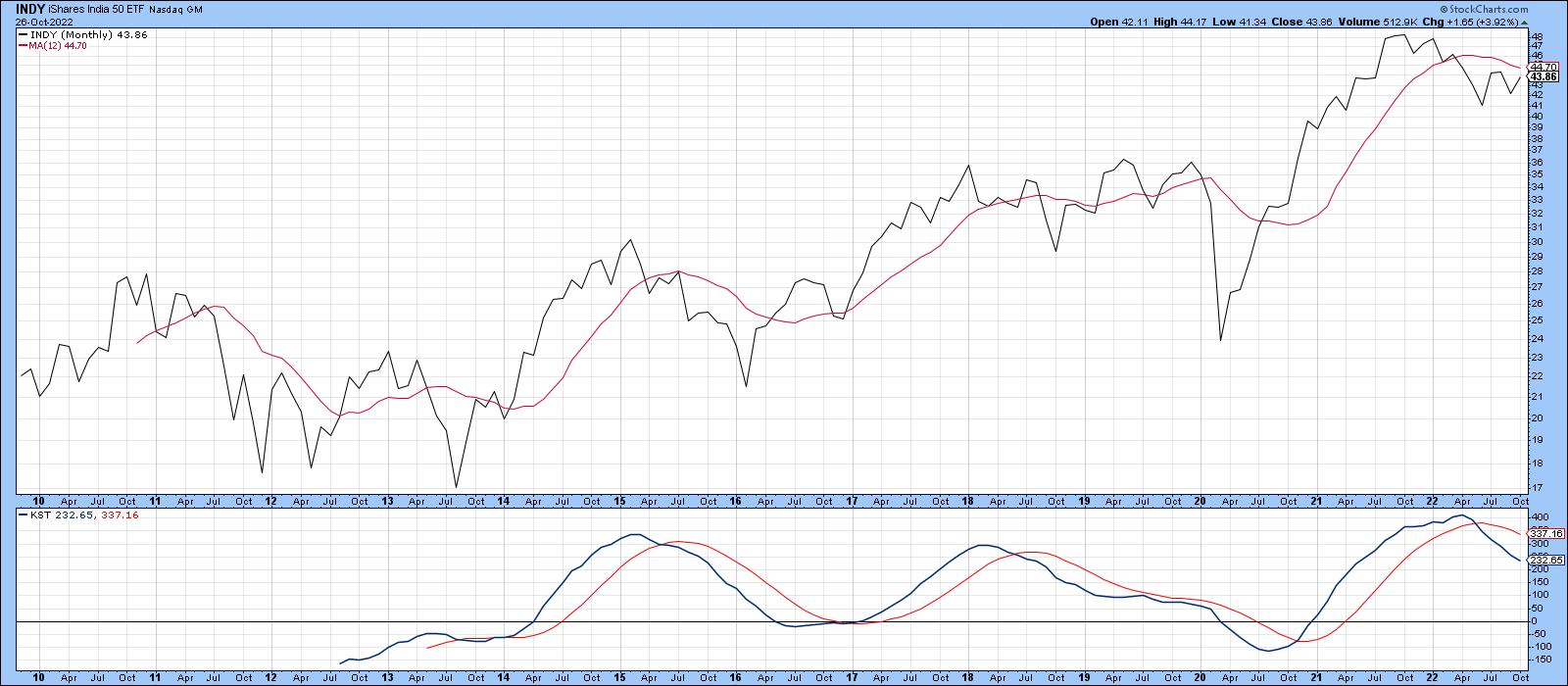 Chart 6: Although the iShares India 50 ETF (INDY) is technically in a bear market, it's pretty close to a new high. It's worth keeping an eye on and adding to your ChartLists. Chart 6: Although the iShares India 50 ETF (INDY) is technically in a bear market, it's pretty close to a new high. It's worth keeping an eye on and adding to your ChartLists.
Country ETFs Breaking Long-term Support
On the other side of the ledger are a number of country ETFs that have recently violated long-term trendlines. Take Switzerland, for example. The iShares MSCI Switzerland ETF (EWL) has dropped below its secular up trendline that dates back to 2010. A declining KST is consistent with such action.
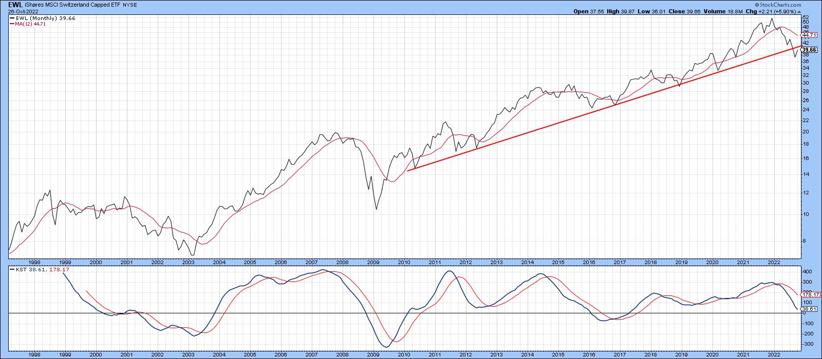 Chart 7: The iShares MSCI Switzerland ETF (EWL) is trading below its secular uptrend. Will EWL drop further? Chart 7: The iShares MSCI Switzerland ETF (EWL) is trading below its secular uptrend. Will EWL drop further?
The iShares MSCI Emerging Markets ETF (EEM), in Chart 8, has just violated its 2009-2022 up trendline. This event followed a false upside breakout in late 2020 . It represents a classic example of how whipsaws are followed by an above-average move in the opposite direction to the break.
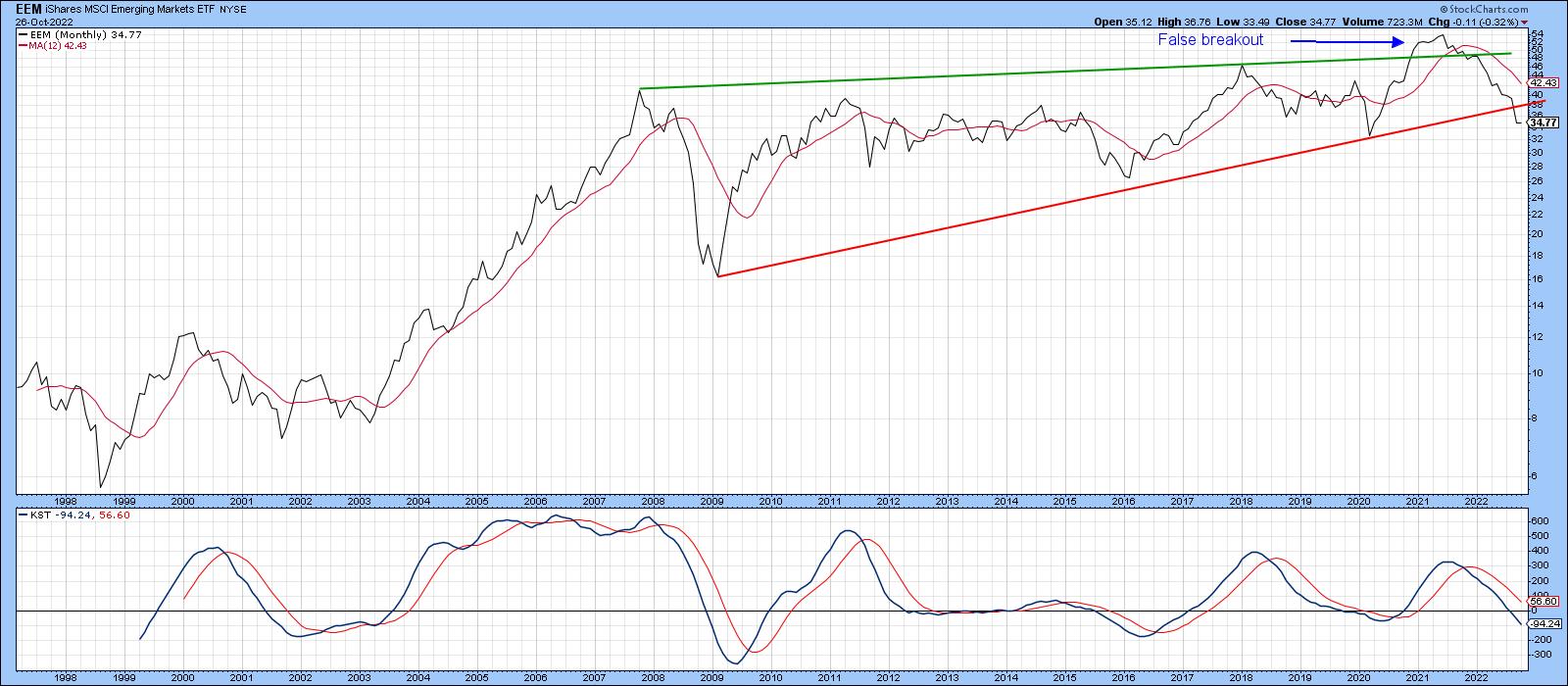 Chart 8: A false breakout in the EEM could mean further weakness in emerging markets. Chart 8: A false breakout in the EEM could mean further weakness in emerging markets.
Chart 9 sports a nice up trendline for iShares MSCI Taiwan ETF (EWT), which turned back numerous declines prior to its September violation. It's obviously oversold on a short-term basis and likely to experience some digestion of recent losses. However, as long as it remains below the extended secular bear trendline, caution is appropriate.
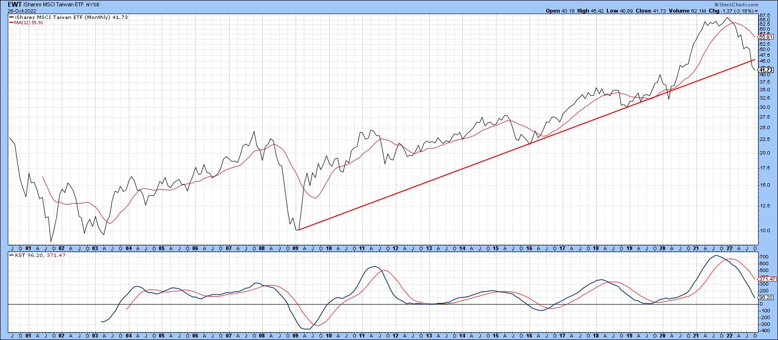 Chart 9: iShares MSCI Taiwan ETF (EWT) is trading below its trendline (red line) and could move lower. Chart 9: iShares MSCI Taiwan ETF (EWT) is trading below its trendline (red line) and could move lower.
Chart 10 shows the iShares MSCI Hong Kong ETF (EWH), which has violated a 23-year up trendline and completed a five-year broadening formation. Since the KST is not yet oversold, that break is likely to be valid.
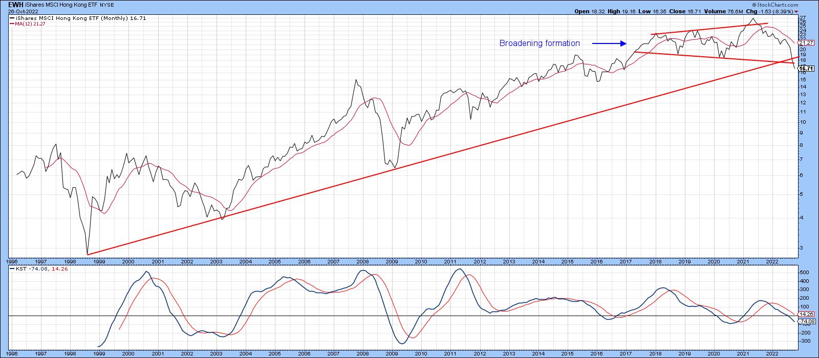 Chart 10: iShares MSCI Hong Kong ETF (EWH) has completed a five-year broadening formation chart pattern and has broken below its long-term trendline. We could see further downside in this ETF. Chart 10: iShares MSCI Hong Kong ETF (EWH) has completed a five-year broadening formation chart pattern and has broken below its long-term trendline. We could see further downside in this ETF.
Global Conditions Look Oversold
Several countries are not that far from an upside breakout should the primary trend revert to a bull. On the other hand, several country ETFs have already broken down in a major way. If the current global oversold conditions can generate a rally, many of these downside penetrations would turn out to be false, which itself would likely be followed by an above-average move on the upside. In the meantime, it's probably wiser to take a cautious stance, since the primary trend evidence is still negative and the downside breaks remain in force.
Good luck and good charting,
Martin J. Pring
The views expressed in this article are those of the author and do not necessarily reflect the position or opinion of Pring Turner Capital Group of Walnut Creek or its affiliates.
|
| READ ONLINE → |
|
|
|
| Top Advisors Corner |
| The VIX Shows There's More Room to the Upside |
| by John Hopkins |
Friday was a very telling day. Four major tech stocks -- AMZN, GOOGL, META and MSFT-- got whacked after reporting earnings during the week, which would lead you to think the NASDAQ would get crushed. Instead, what could have been a disastrous week for the bulls ended up on a very positive note. And, as you can see in the chart below, on Friday, the Volatility Index (VIX) moved back below its 200-day moving average as traders breathed a sigh of relief.
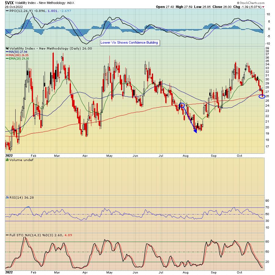
As you can see in the chart above, the last time the VIX moved below its 200-day with conviction was late July. And as visible in the chart below, the S&P made a move higher at the same time, rising 10% in just a few weeks. And you can also see a bullish close above the 50-day moving average on Friday, as well as some key levels of resistance should the market continue moving higher.
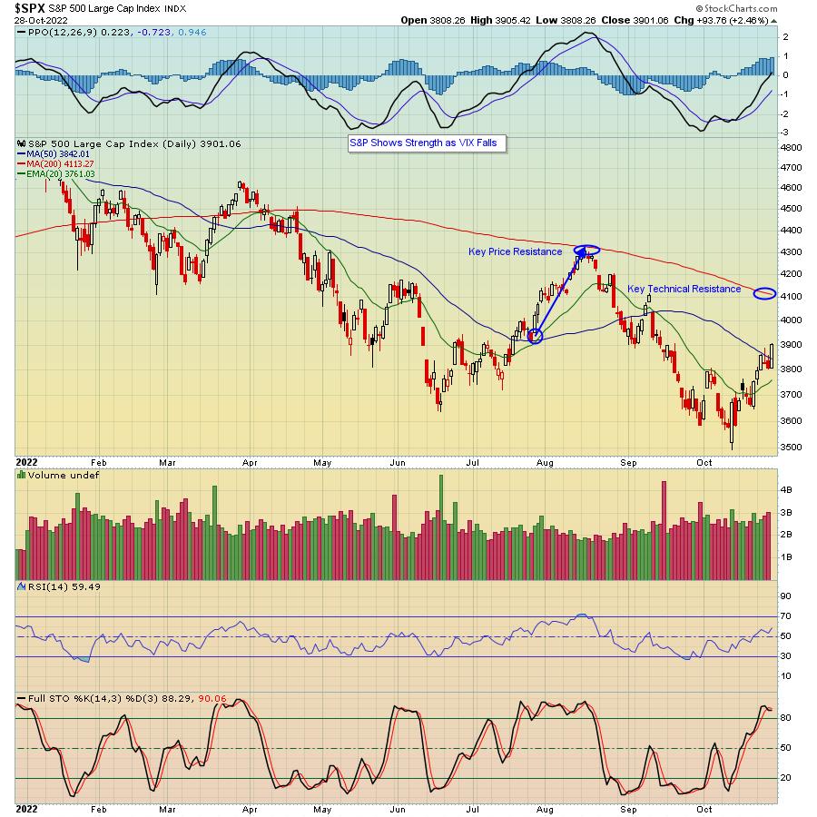
Of course, during the current Bear Market, we've seen a number of rallies fizzle out, just when it looked like the coast might be clear. So there's no guarantee that the market will continue moving higher. But, as our Chief Market Strategist Tom Bowley pointed out to our members in a Special Market Update last Thursday, we have begun the MOST BULLISH period of the year, which runs through January 18. Couple that with the very positive action on Friday in SPITE of the disappointing earnings of those highly visible tech giants, as well as a more positive VIX, and one could argue that we've seen the worst of the selling for the year.
The next key event will be the Federal Reserve Interest Rate announcement scheduled for next Wednesday. November 2. Everyone is expecting an increase of 75 basis points, with another .75 in the following meeting. The market reaction to the Fed announcement might give us some clues as to where the market is headed in the near term. My bet is that once the announcement is out of the way, the market will be free to move higher into year-end. In the meantime, you are invited to join Tom Bowley, who will be conducting a FREE webinar next Saturday, November 5 that will focus on "Market Manipulation". You will be amazed at what goes on behind the scenes that puts retail traders at a distinct disadvantage. We're going to have a full house so if you want to learn more and save a seat, just click here.
At your service,
John Hopkins
EarningsBeats.com
|
| READ ONLINE → |
|
|
|
| RRG Charts |
| SPY Rally While Technology and Discretionary Remain On Negative RRG-Heading |
| by Julius de Kempenaer |
I don't like it when parts of a puzzle don't match. You just don't get a clear picture.
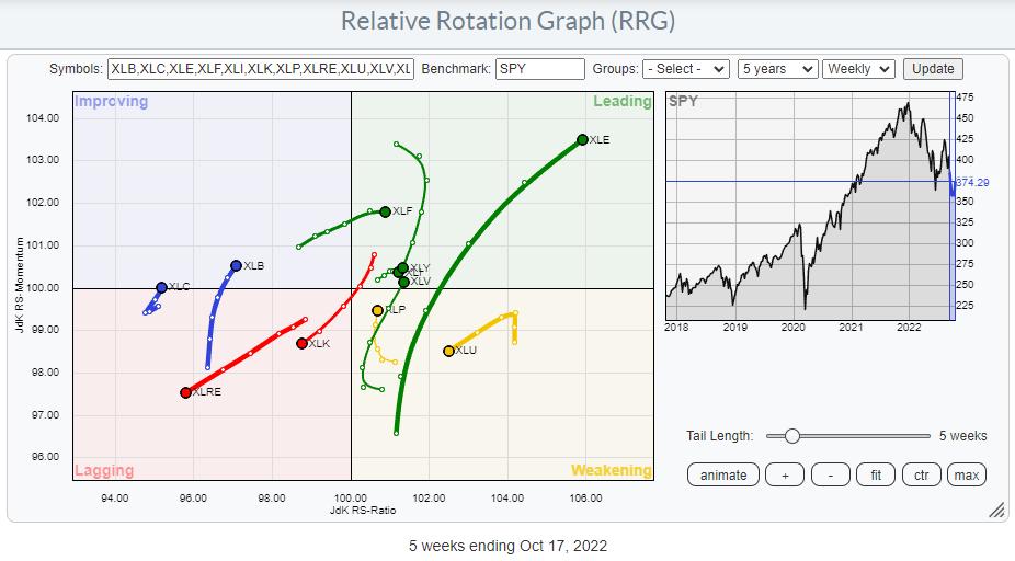
As participants in the markets, we are trying to solve the puzzle of the markets every day/week/month, and at the start of every new period, someone tosses all the pieces around, and you have to start all over again. Looking at the current sector rotation on a Relative Rotation Graph and the price chart of SPY side by side, we see a confusing picture at the moment. As if someone has just messed up all the pieces again. There is no coherent image.
SPY Weekly
Let's start with the chart of SPY on a weekly basis.
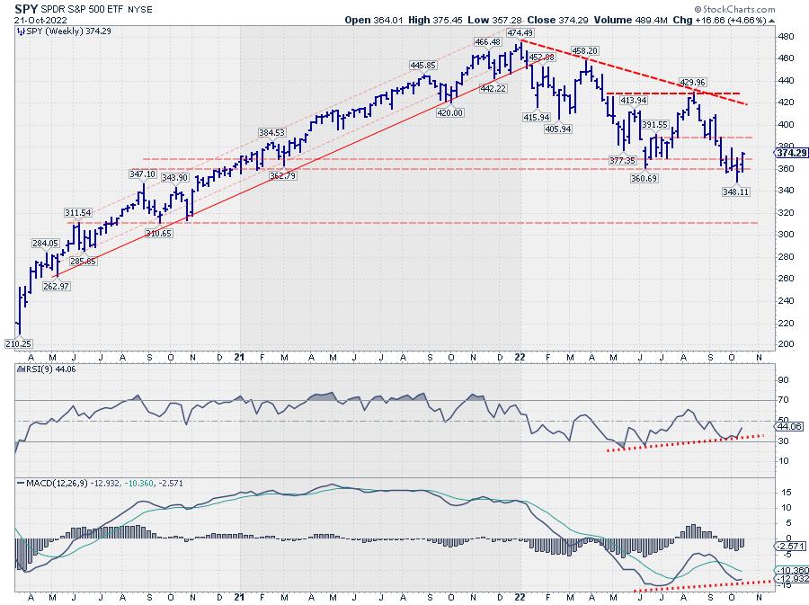
Over the last four weeks, SPY has been testing support in the 360 area. Two weeks ago, SPY dipped to a low of 348 during the week, but managed to close back up towards the 360 area, followed by a further rally last week, bringing the index back to a close at 374.
The rhythm of lower highs and lower lows is still present on this weekly chart, but, given the steep dip and the distance from the upper boundary of this falling trend, there is quite some room for the market to rise without violating this downtrend.
We can find some support for a rally from the positive divergences between price and RSI and MACD. I am not the biggest fan of a divergence in the RSI, where the indicator reached levels above 50 again between the two connected lows, but it's there.
In the MACD, a divergence seems to be setting up. It still needs a bit of work, but the early signs are there, and here the peak in between the two (possible) lows has not pushed back above 100, which makes it a valid divergence (at least in my mind).
SPY Daily
We can see more detail when we zoom in on to the daily chart.
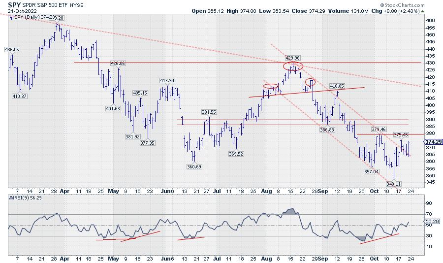
The falling trendline currently running around 415 is the same line that connects the last three major peaks on the weekly chart. The struggle around the 360 support level over the last weeks can be seen in more detail on this chart and could eventually become a double bottom. The trigger to complete this formation would be a break of 380.
The positive divergence between the price and the RSI is a bit more pronounced on this daily chart. In last week's episode of Sector Spotlight, I spoke about the need for a trigger to "activate" this divergence. That trigger came last week when the price managed to break the falling trendline. This move, at least, signaled that the imminent danger of a rapid breakdown had faded for the time being.
For the near-term, signs are pointing to the upside for SPY. Breaking 380 will be the confirmation for a further move higher. Although there is still quite some resistance on the way up, SPY could reach the falling resistance line that currently comes in around 415.
This rally could tell us a lot more about the current state of the market. When SPY can reach that overhead resistance area near 415 relatively easily, it tells us there is some serious underlying buying power. In the case that the 415 area cannot be reached, and a new lower low (weekly chart) is being put into place, it tells us that sellers are coming back early. The level of a new lower high will tell us how aggressive sellers are.
That's All Nice, BUT...
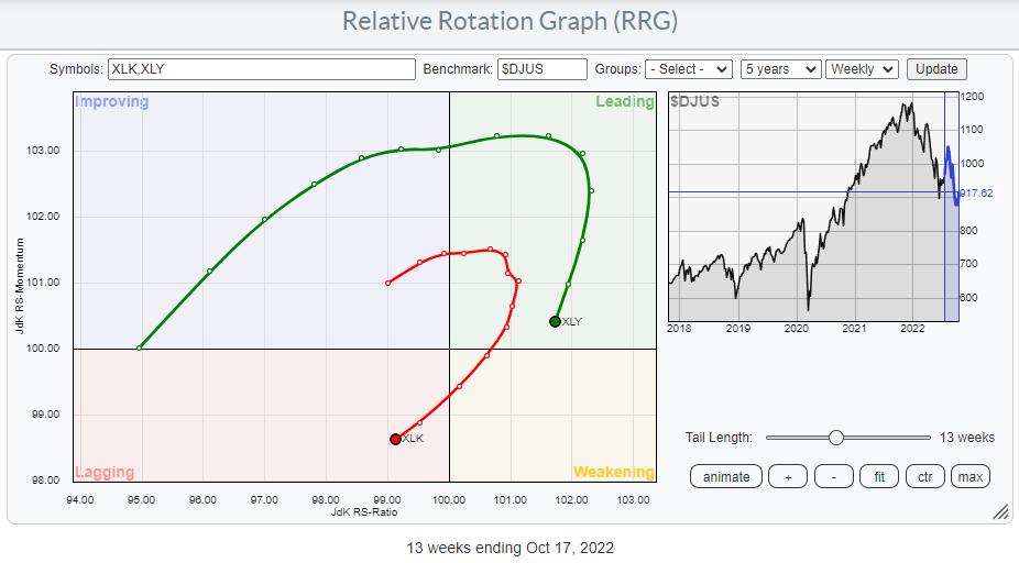
When I look at the current sector rotation, and more specifically, the rotations for Consumer Discretionary and Technology, things are not looking too good.
Both trails are clearly at a negative RRG-heading. Technology has already reached the lagging quadrant, pushing further into negative territory. Discretionary is still inside the leading quadrant, but rapidly heading toward weakening. At the minimum, we can conclude that these sectors are not likely to contribute to SPY's performance in a positive way in the near term.
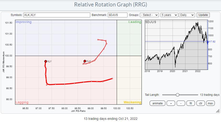
Even if we zoom in on the daily tails, things are not improving. Both sectors are in the lagging quadrant and, despite the small increase in relative momentum, we cannot say these are strong tails that will help the market to push higher at the moment.
Adding It All UP
So when we add up all the pieces of evidence, we have to conclude that things are not aligning. At least this should make you keep an open mind to the possibility that the decline is not over yet. Is it a tradable move to the upside? It depends on your investment horizon, as always. For shorter-term traders and swing traders with solid money management in place, some good trading opportunities can be found. Are you on a longer time frame? I would still be very cautious until sector rotation comes back in line with the main trend in SPY.
--Julius
|
| READ ONLINE → |
|
|
|
| The MEM Edge |
| Breadth in the Markets Is Expanding: Can the Markets Withstand the Drop In Big Tech Names? |
| by Mary Ellen McGonagle |
Today, we saw a large decline in mega-cap names Microsoft (MSFT) and Alphabet (GOOGL) after both companies reported earnings and sales that were well below estimates. Citing a strong dollar and high inflation, among other factors, both companies warned of slower growth going forward amid a tough environment.
Adding to the woes among Large Cap tech, Meta Platforms (META) came in with earnings and sales below estimates after the market's close today, and the stock is getting clobbered after hours. Large-cap Technology stocks have led the last several bull market cycles, and a loss of this leadership may be difficult to overcome.
That said, there are bright spots emerging within the markets this week. I use a service that breaks the market down into 197 Industry Groups and, of those, 85% outperformed the markets today. Among the outperformers were Energy, Healthcare and select areas of Retail, to name a few, and the gains were driven by earnings that were above estimates. In addition, Real Estate and Utility stocks are coming back to life as well, with gains that are setting them up to reverse their downtrends.
DAILY CHART OF HEALTHCARE SECTOR (XLV)
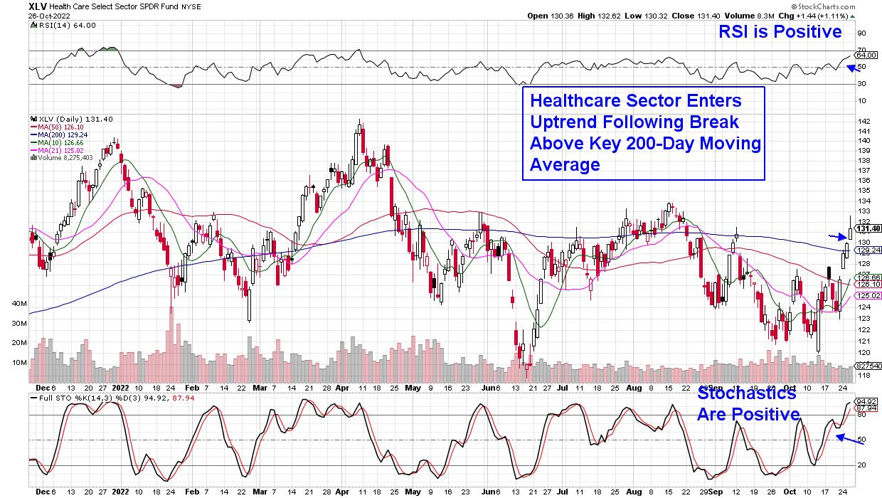
The gains in these non-Tech areas are helping to strengthen breadth in the markets, with the percent of stocks above their 50-day moving averages steadily rising. While this is good news, it's important to note that the rally stage that began in the markets last Friday is part of a bear market. In other words, we have not seen the characteristics necessary to call a market bottom.
I outline these needed characteristics regularly in my twice-weekly MEM Edge Report, and a slowdown of inflation is among them. With that, while I'm participating in this rally with select Energy and Retail stocks that are outperforming however, it's with caution. If you'd like access to this select List of buy ideas, use the link below. You'll also be alerted to new names as they're added as well as being provided with exit strategies.
I have actively advised professional money managers through several bear markets and, with the current tricky period, I hope you'll take advantage of my special trial offer.
Warmly,
Mary Ellen McGonagle, MEM Investment Research
|
| READ ONLINE → |
|
|
|
| Trading Places with Tom Bowley |
| Today Marks The Beginning Of An Overwhelmingly Bullish Period |
| by Tom Bowley |
While current technical conditions are "iffy" at best, I want to point out that we have just entered THE most bullish historical period of the year. The S&P 500 and NASDAQ can be broken down into 3 lengthy historical periods, in my view - the good, the not-so-bad, and the UGLY. Here is a breakdown on historical performance on the S&P 500 since 1950 (annualized returns shown):
- The Good (October 27th close through January 18th close): +21.22%
- The Not-So-Bad (January 18th close through July 17th close): +8.99%
- The UGLY (July 17th close through October 27th close): -1.29%
That "Good" period has also ended higher than it began in 62 of the 71 years since 1950. Has it gone up every year? Ummm, no. 9 years since 1950, it's moved lower. But clearly the odds favor the bulls. For those in the "secular" bear market camp that believe prices are going to continue to spiral lower, you'll be happy to hear that the cyclical bear market of 2018 AND the financial-crisis-related secular bear market of 2008 were both years that did not follow the bullish historical pattern. So, by no means is this a slam dunk. I'm simply pointing out historical fact and bullish odds.
Technically, we do have a positive divergence on the weekly S&P 500 chart, so that would be one technical argument for higher prices a head on the S&P 500. Here's that weekly chart:
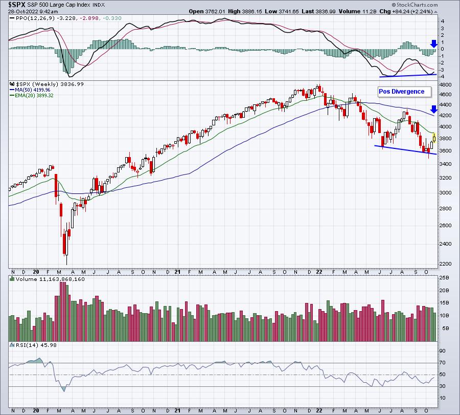
When I see positive divergences form, I immediately consider the higher probability of a 50-period SMA test and/or a PPO centerline test (blue arrows). That's worth watching throughout Q4.
Now onto the NASDAQ.
Again, let's break down those 3 historical periods, but this time since 1971:
- The Good (October 27th close through January 18th close): +23.53%
- The Not-So-Bad (January 18th close through July 17th close): +12.25%
- The UGLY (July 17th close through October 27th close): -5.58%
That's a HUGE disparity in performance and this is a trend that spans more than 50 years! (More than 70 years on the S&P 500) We need to understand that all days are NOT created equal in the stock market.
This is just one of MANY historical tendencies that you need to be aware of. Throw in the daily manipulation in the stock market throughout 2022 to favor those big Wall Street firms and it's a jungle for us retail traders. And no one cares about your money like you do. You MUST think objectively when making decisions about your trades and investments.
That's the reason we're having a SPECIAL virtual event next Saturday, November 5th on Market Manipulation. It is totally FREE (no credit card required), but you do need to register. Space is limited so SIGN UP NOW! For more information and to register, CLICK HERE.
Happy trading!
Tom
|
| READ ONLINE → |
|
|
|
| Mish's Market Minute |
| Weekend Daily: Can Investors Trust This Rally? |
| by Mish Schneider |
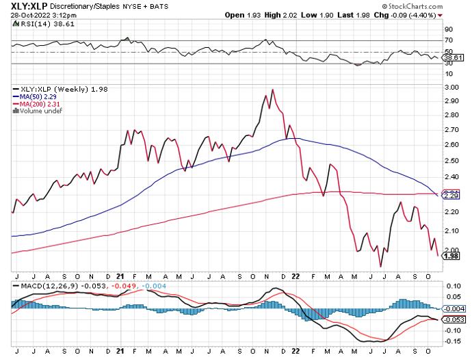 Consumer Discretionary is defined by the Consumer Discretionary Select Sector SPDR ETF (XLY) and Consumer Staples is defined by the Consumer Staples Select Sector SPDR ETF (XLP). The chart displays the price ratio, or the price spread, of consumer discretionary over consumer staples since 2020. Consumer Discretionary is defined by the Consumer Discretionary Select Sector SPDR ETF (XLY) and Consumer Staples is defined by the Consumer Staples Select Sector SPDR ETF (XLP). The chart displays the price ratio, or the price spread, of consumer discretionary over consumer staples since 2020.
GDP data painted a somewhat roseate picture for the US economy this week. Yet inflation is still rising.
The PCE price index climbed by 0.3% in a month and was up 6.2% from the prior year. Still very far from the Fed's 2% inflation target. Consumer spending has moderately increased, while sentiment rose more than expected.
GDP numbers, including consumption, only tell part of the story. Consumer discretionary can be contrasted with consumer staples, a classification for companies that produce daily necessities. As represented by XLY, consumer discretionary was up over the last five days by 2.0%, and consumer staples, defined by XLP, was more than double that - 4.5% over the week. The chart above shows that consumer staples has been the clear winner since December 2021.
Is it too early to declare that the US economy has turned a corner?
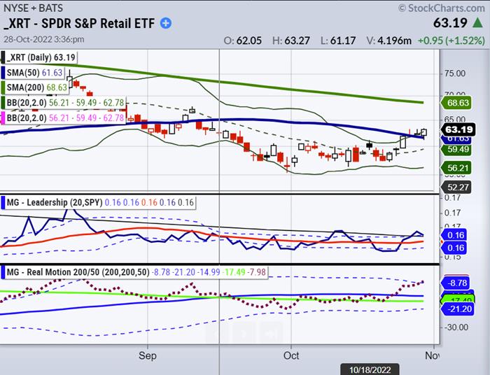
Like CPI out earlier this month, the latest PCE figures released on Friday underscore inflation's entrenched nature and provide more data that the US economy is still facing some headwinds.
Granny Retail (XRT) is the backbone of our economy, and if consumers can't afford to live comfortably and continue to spend, it will spell trouble. Families are cutting back on discretionary purchases. Plus, folks are doubtful the Fed has its back to curtail inflation. Americans are using credit cards to finance major purchases. US credit-card debt is back to pandemic levels, as seen below.
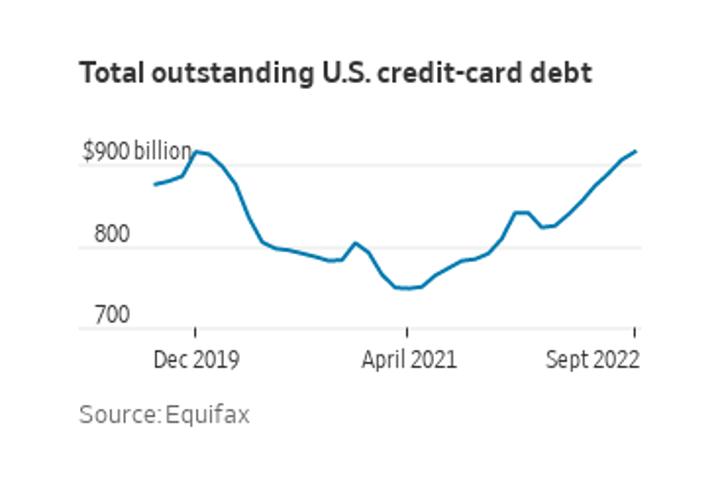 A recent Census Bureau survey found that 4 in 10 households said it had been somewhat challenging to cover usual household expenses. Consumer Staples are generally less impacted by inflation than discretionary products, so a shift in consumer spending could mean trouble for companies that produce luxurious goods and services. Nonetheless, Granny Retail (XRT), a basket of consumer discretionary and staples, is holding up for now. However, with wages rising and the Fed continuing its tightening campaign, it remains to be seen just how long this can last. A recent Census Bureau survey found that 4 in 10 households said it had been somewhat challenging to cover usual household expenses. Consumer Staples are generally less impacted by inflation than discretionary products, so a shift in consumer spending could mean trouble for companies that produce luxurious goods and services. Nonetheless, Granny Retail (XRT), a basket of consumer discretionary and staples, is holding up for now. However, with wages rising and the Fed continuing its tightening campaign, it remains to be seen just how long this can last.
It's important to remember that while markets may appear strong in the short term, they can quickly turn – so investors should exercise caution and practice sound risk management. If you're looking to stay ahead of the curve, it's crucial to monitor consumer behavior. With MarketGauge's trading platform and Mish's premium service, you'll get alerts on today's fast-moving stocks to beat the market.
You can sign up for a free consultation with Rob Quinn, our Chief Strategy Consultant, by clicking here to learn more about Mish's top-rated risk management trading service.
Mish's Upcoming Seminars -- Last Chance to Sign Up!
The Money Show: October 30 – November 1
Our members get 20% off the registration price!
Join me and many wonderful speakers at the Money Show in Orlando, beginning October 30th and running through November 1st; spend Halloween with us!

"I grew my money tree and so can you!" - Mish Schneider
Get your copy of Plant Your Money Tree: A Guide to Growing Your Wealth and a special bonus here.
Follow Mish on Twitter @marketminute for stock picks and more. Follow Mish on Instagram (mishschneider) for daily morning videos. To see updated media clips, click here.
Mish in the Media
Mish goes over Meta and Palantir and discusses how trends are switching on BNN Bloomberg.
Two US Stocks may have bottomed out on CMC Markets. 10/26/2022
Mish is patiently watching Macro Trends unfold on Ameritrade. 10/26/2022
How to Trade Post-Earnings on Business First AM. 10/25/2022
Small caps start the party and rally to resistance on Bloomberg TV. 10/25/2022
Will earnings surpise to the upside? See Mish chat on Real Vision Daily Briefing with Maggie Lake 10/24/2022.
ETF Summary
- S&P 500 (SPY): 386 support with 394 resistance level to watch.
- Russell 2000 (IWM): 181 support, 186 resistance.
- Dow (DIA): 326 support, 333 resistance.
- Nasdaq (QQQ): 277 now support, 284 resistance.
- KRE (Regional Banks): 62 support, 65 resistance level.
- SMH (Semiconductors): 188 support, 195 resistance.
- IYT (Transportation): 208 support, 214 resistance.
- IBB (Biotechnology): 127 support, 132 first resistance.
- XRT (Retail): 61 support, 65 resistance.
Mish Schneider
MarketGauge.com
Director of Trading Research and Education
Wade Dawson
MarketGauge.com
Portfolio Manager
|
| READ ONLINE → |
|
|
|
| MORE ARTICLES → |
|
 Chart 1
 Chart 2
 Chart 3
 Chart 4
 Chart 5
 Chart 6
 Chart 7


 I don't think I have offended anyone in quite a while and feel I'm not doing my job if I don't try to periodically; so here goes!
 Table A


 A recent Census Bureau survey found that 4 in 10 households said it had been somewhat challenging to cover usual household expenses. Consumer Staples are generally less impacted by inflation than discretionary products, so a shift in consumer spending could mean trouble for companies that produce luxurious goods and services. Nonetheless, Granny Retail (XRT), a basket of consumer discretionary and staples, is holding up for now. However, with wages rising and the Fed continuing its tightening campaign, it remains to be seen just how long this can last.


