| THIS WEEK'S ARTICLES |
| John Murphy's Market Message |
| STOCKS SURGE ON LOWER CPI FOR OCTOBER |
| by John Murphy |
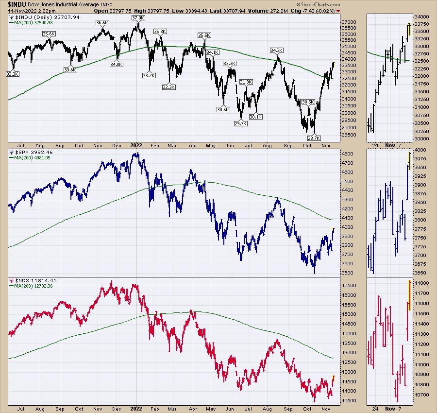
DOW LEADS STOCKS HIGHER... Annual inflation for October was a lower than expected reading of 7.7% which was the lowest since January. That softer reading raised hopes that inflation might be peaking and pushed stock and bond prices sharply higher. A big drop in bond yields and the dollar also helped. While the major trend for stocks remains down, today's strong price gains together with a more favorable seasonal pattern may be the start of a yearend rally. Historically, stocks also do well after midterm elections which may also be helping to fuel today's gains.
Chart 1 shows the Dow Jones Industrial Average ($INDU) rising to the highest level in three months after clearing its 200-day simple moving average (SMA). The Dow may be heading for a test of its August high.
Chart 2 which gives a more realistic picture of the overall market shows the S&P 500 Index ($SPX) rising to a two-month high. The SPX may be heading toward a test of its red 200-day SMA line.
Chart 3 shows the Invesco QQQ Trust (QQQ) gaining 6% today. Despite today's strong percentage gain, it's been the weakest part of the market owing to weak technology stocks which are benefitting from today's big drop in bond yields. The QQQ needs a close above its October high to turn its short- to intermediate-term trend higher. Technology stocks are the day's strongest sector. While all 11 stock sectors are gaining ground, a few market groups are having an unusually strong chart day. They include Homebuilders, Materials, and Financials.
 Chart 1 Chart 1
 Chart 2 Chart 2
 Chart 3 Chart 3
HOMEBUILDERS CLEAR 200-DAY SMA LINE. Today's big drop in bond yields is giving a boost to homebuilding stocks. Chart 4 shows the iShares U.S. Home Construction ETF (ITB) clearing its 200-day SMA and rising to the highest level since August. Homebuilders are extremely sensitive to the direction of bond yields and mortgage rates.
SO DO MATERIALS. Chart 5 shows the Materials Select Sector SPDR Fund (XLB) also trading above its 200-day SMA. The XLB may now test its August high. It's being driven higher by stocks tied to aluminum, copper, and gold. Those commodity markets are benefiting from today's sharp drop in the U.S. dollar. Gold is also benefiting from the sharp drop in bond yields. Financials are also having an unusually strong day.
 Chart 4 Chart 4
 Chart 5 Chart 5
ASSET MANAGERS LEAD FINANCIALS HIGHER. Chart 6 shows the Financial Select Sector SPDR Fund (XLF) nearing a test of its August high after clearing its 200-day SMA. It's being led higher today by asset managers.
Chart 7 shows the Dow Jones U.S. Asset Managers Index ($DJUSAG) surging above its 200-day SMA and testing its August high.
Chart 8 shows Blackrock, Inc. (BLK) testing its August high as well.
 Chart 6 Chart 6
 Chart 7 Chart 7
 Chart 8 Chart 8
|
| READ ONLINE → |
|
|
|
| The Mindful Investor |
| The Bullish Case for Gold |
| by David Keller |
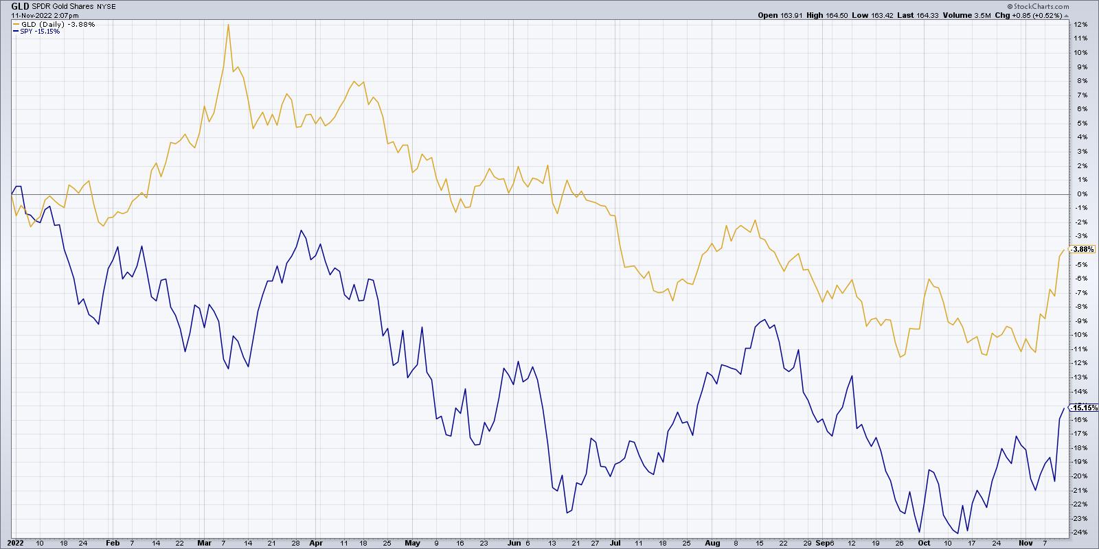
While gold has not done much in 2022 in terms of absolute returns, the GLD has indeed outperformed the SPY by about 11% year-to-date. Why has gold not done better as a safe haven? It's all about the US Dollar.
First, let's review gold's role as a "safe haven" during bear market phases.

While gold has struggled in absolute terms, it has handily outperformed the S&P 500 index year-to-date. The GLD is down about 4% in 2022, while the SPY is down 15% over the same time period.
If you had informed me at the end of 2021 that 2022 was going to be a raging bear market for stocks due to concerns about inflation, I would have told you that one of surest bets would be gold. Gold is often considered one of the best inflation hedges around! So why has gold not been a better safe haven while equities have been in a consistent bear market phase in 2022? Quite simply, the strength in the US Dollar has prevented gold from fulfilling this traditional role.

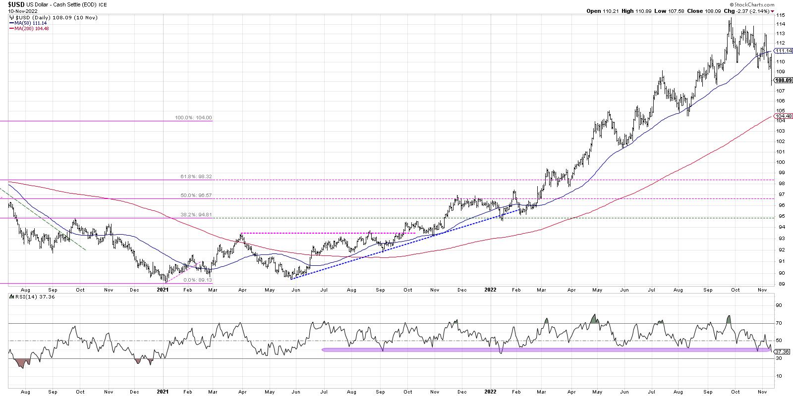
Every month in 2022, the US Dollar has made a new high for the year... until October. The $USD has now made a pattern of lower highs and lower lows over the last six to eight weeks, indicating a potential change in trend. The RSI for the US Dollar has now dipped below the 40 level for one the second time in 2022. This move below RSI 40 may indicate a "change of character" from a bullish primary trend to a bearish primary trend. This short-term weakness in the US Dollar has provided space for risk assets like equities and commodities to reverse their recent downtrends and push to the upside. Further weakness in $USD would allow risk assets including commodities to push higher.
For now, I'm watching the 105 level for the US Dollar. That represents a 38.2% retracement of the May 2021-September 2022 uptrend and would be a reasonable downside objective given the recent weakness.
So what's next for gold?

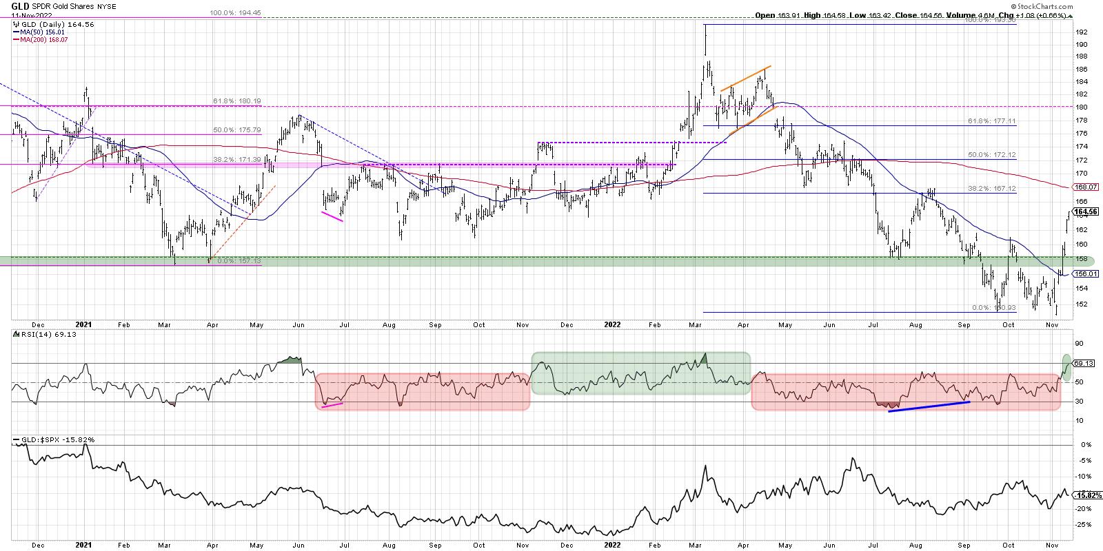
As the RSI for the US Dollar has dipped below 40, indicating a new bearish phase is likely, the RSI for gold has pushed above the 60 level after spending most of 2022 below this level. That suggests a bullish primary trend as upside momentum has expanded.
The next upside target for GLD, using Fibonacci retracements, would be around $167, which is just 1.5% above Friday's close. The 200-day moving average lies just above that level as well. If those resistance levels are violated, we could see further upside to the 61.8% retracement level around $177.

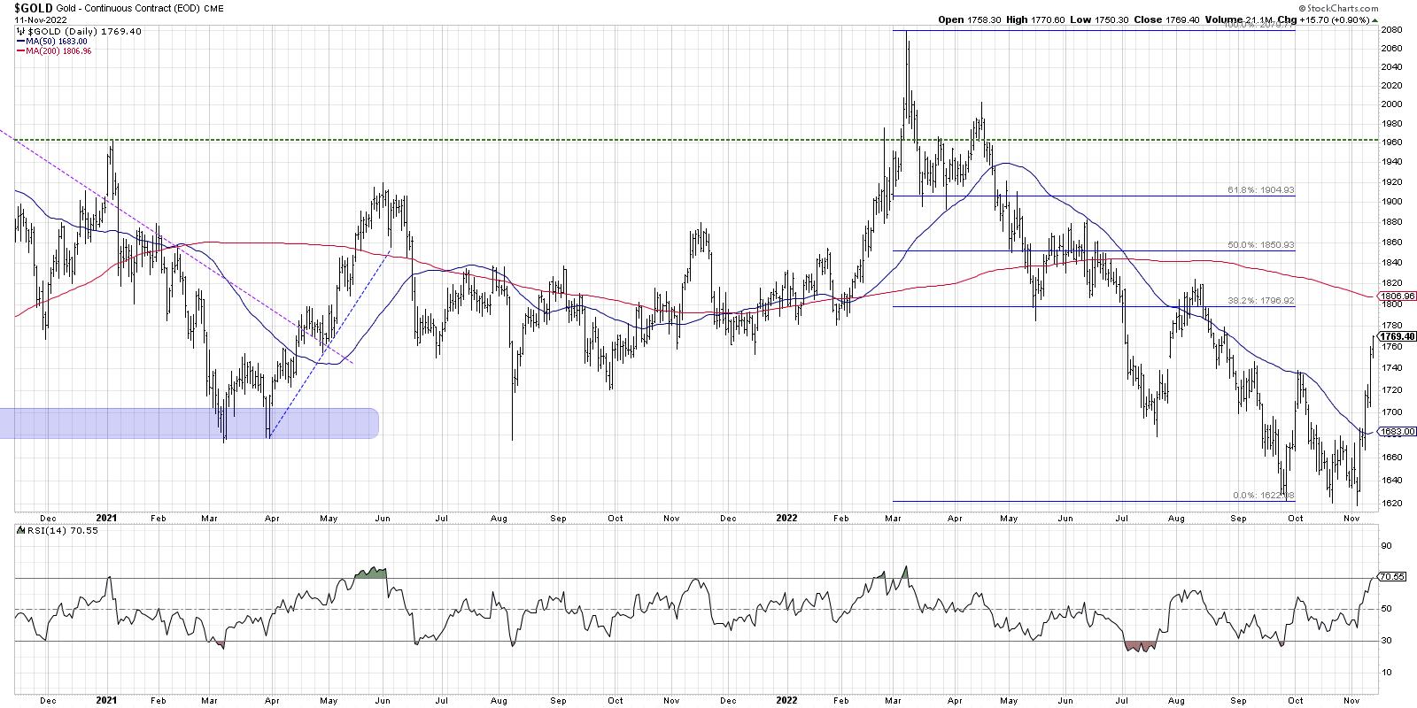
In terms of spot gold, that would suggest resistance in the $1800 range, with the next upside target around $1900/oz.
2022 through October has been all about rising interest rates, a stronger dollar, and falling risk assets. If the seasonal tendencies hold up going into year end, we may be facing a bullish run with gold in the driver's seat!
Want to digest this article in video format? Head over to my YouTube channel.
RR#6,
Dave
P.S. Ready to upgrade your investment process? Check out my YouTube channel!
David Keller, CMT
Chief Market Strategist
StockCharts.com
Disclaimer: This blog is for educational purposes only and should not be construed as financial advice. The ideas and strategies should never be used without first assessing your own personal and financial situation, or without consulting a financial professional.
The author does not have a position in mentioned securities at the time of publication. Any opinions expressed herein are solely those of the author, and do not in any way represent the views or opinions of any other person or entity.
|
| READ ONLINE → |
|
|
|
| MARK YOUR CALENDARS... |
 |
|
| Martin Pring's Market Roundup |
| Dollar and Commodities Poised at Possible Inflection Points |
| by Martin Pring |
The Dollar Index has had a good run to the upside, but is starting to show some possible signs of fatigue. That potential weakness could take the form of an actual reversal in its primary uptrend, or an intermediate counter-correction. At the same time, commodities, which often (but certainly not always) move in the opposite direction to the dollar, appear to be in the process of retracing some lost ground. Let's consider both markets in turn.
Dollar Index is Overstretched
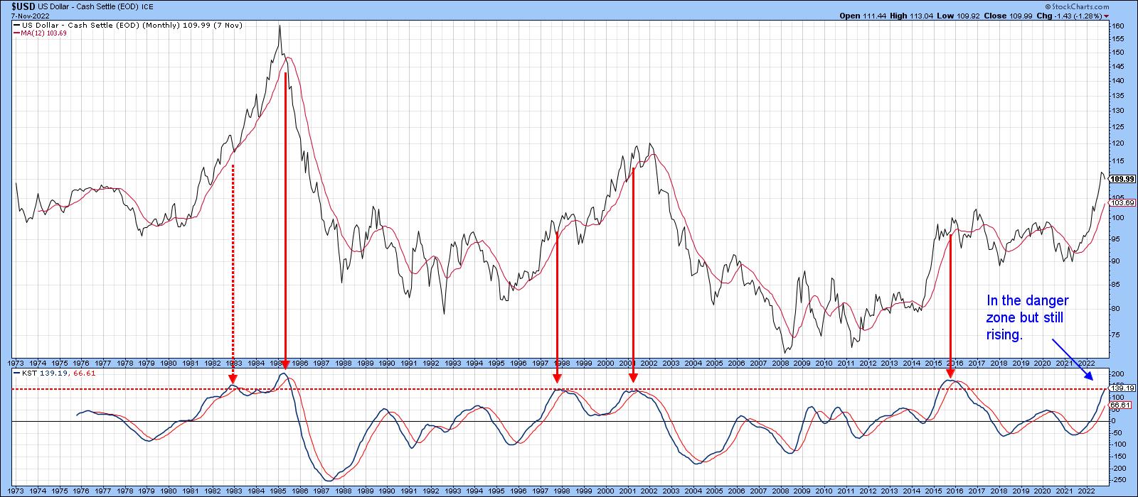
Chart 1 compares the Dollar Index to its long-term KST. Note that this momentum indicator has reached the overstretched red horizontal line. It has achieved that feat five times since 1976; each was followed by a primary trend reversal or a multi-month trading range, aside from one exception that developed during the very powerful 1980-1985 run up. The game is not yet over, as the KST is still climbing. However, there can be no disputing that the level of risk for the bulls is elevated.
 Chart 1 Chart 1
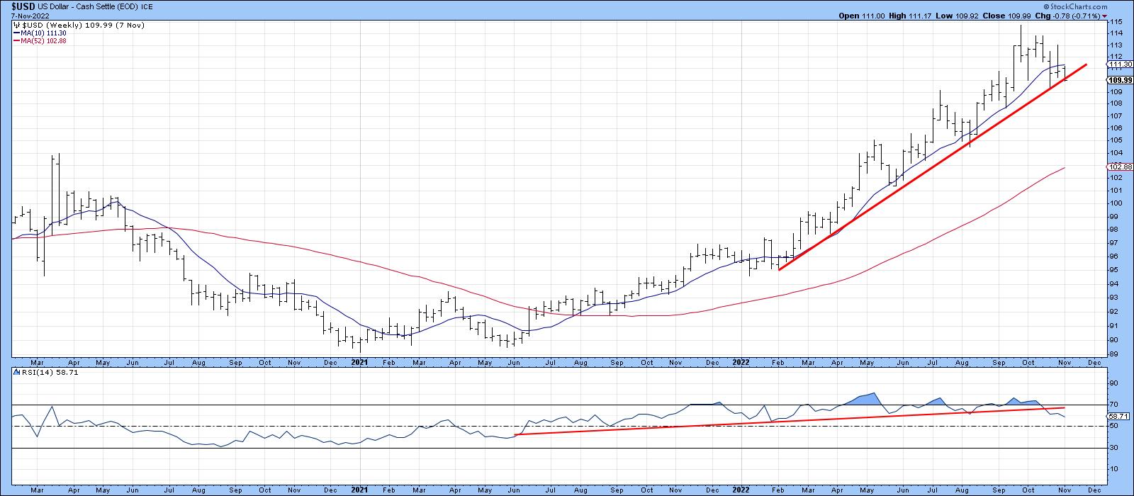
Chart 2 tells us that the Index has reached a crucial support level in the form of its 2022 up trendline. Also, the 14-week RSI has recently penetrated its 2021-2022 up trendline, indicating a loss of upside momentum. Momentum reversals should, of course, be confirmed by some kind of trend break. In this instance, that would occur with a violation of the up trendline at around the 109 area.
 Chart 2 Chart 2
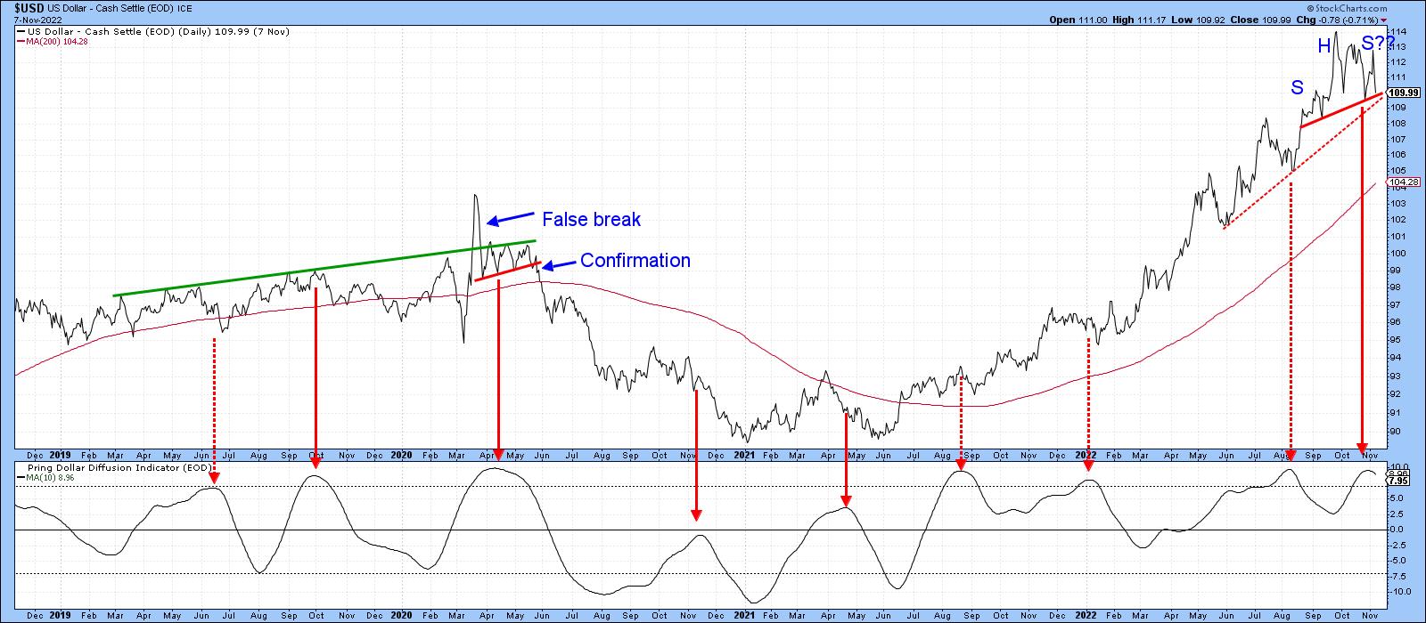
Chart 3, featuring daily data, offers another benchmark. This time, it's the neckline of a small potential head-and-shoulders top in the vicinity of 109.50 and a 5-month support trendline at approximately in the same area. Note also that the Dollar Diffusion Indicator has just begun to reverse to the downside. Recent sell signals such as this have not been very effective, since they were triggered against the backdrop of a strong rally. The same may also be true for the latest signal. However, if that 109-109.5 area is violated, the odds of a valid diffusion sell signal being effective will increase substantially.
 Chart 3 Chart 3
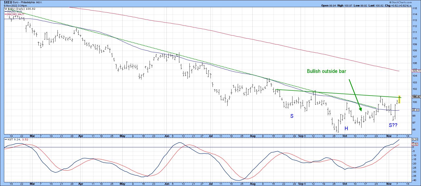
Finally, Chart 4 checks the euro's progress. Here, we see a mirror image of the Dollar Index. That's not surprising since the euro has a 57% weighting. In this instance, the currency has already violated its 2022 down trendline and 10-week MA, both of which proved to be overwhelming resistance on the way down. It is now in the process of testing the neckline of a potential inverse head-and-shoulders pattern and is being supported by a rising short-term KST.
 Chart 4 Chart 4
CRB Composite Attempting a Retracement Rally
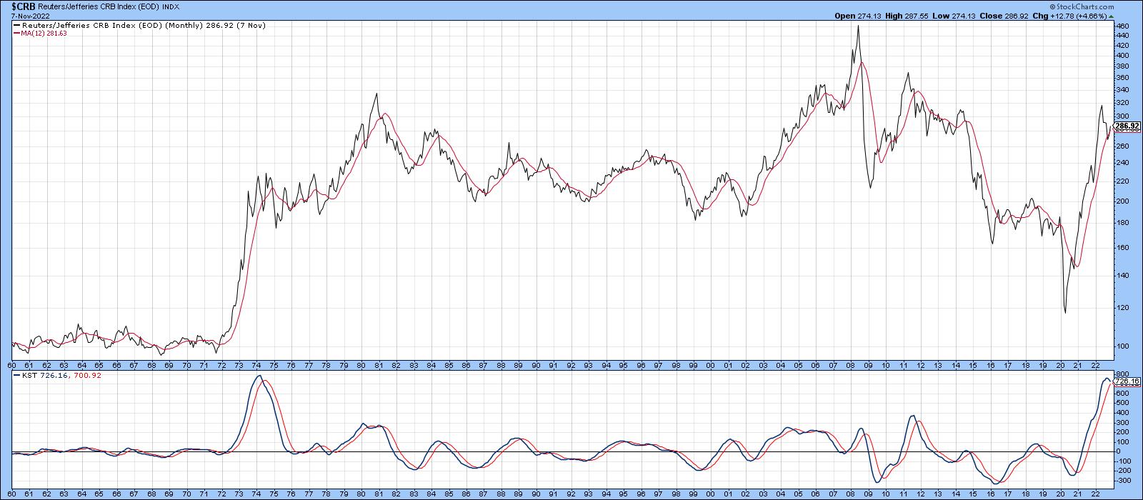
I am using the word "retracement" rally because the CRB Composite, like most other commodity indexes, is very overstretched on the upside. Indeed, the long-term KST has only reached its current level once before, in 1974. That does not preclude a new high, but make it that much more problematic. The 1974 experience, for example, was followed by a multi-year trading range.
 Chart 5 Chart 5
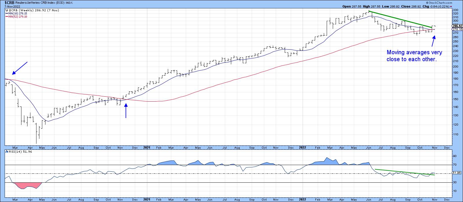
That said, Chart 6 tells us that the intermediate picture is far more balanced, as evidenced by the fact that the 10- and 52-week MAs are literally overlaying themselves. The two blue arrows in 2020 show that, when these averages came close to each other, a subsequent widening of the gap between them was followed by a significant price move. In the current situation, it seems as though the price wants to break above its 2022 down trendline, though the break is not yet decisive. The RSI is already hinting at a similar outcome, as this oscillator has tentatively broken out from a reverse head-and-shoulders of its own.
 Chart 6 Chart 6
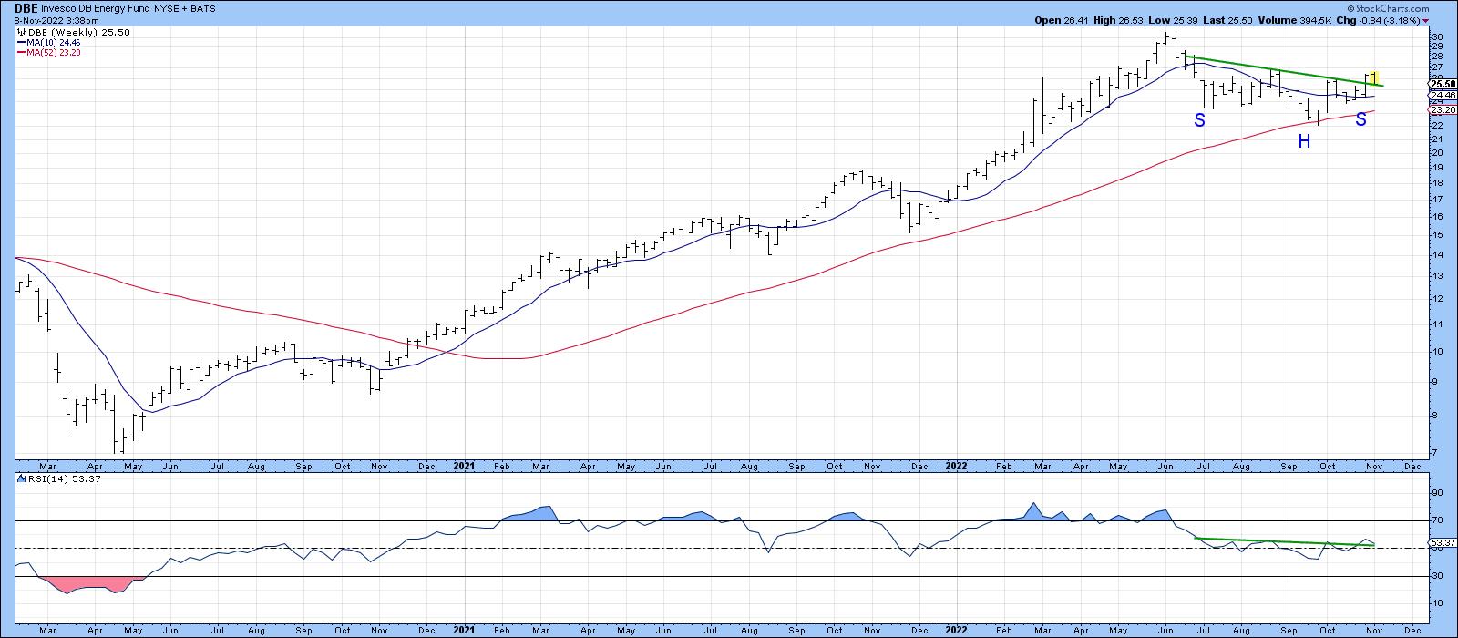
Energy is the largest component of the Index. It is represented in Chart 7 by the DB Energy Fund (DBE). In this instance, both moving averages are in a rising trend, and the price has started to move above the neckline of a reverse head-and-shoulders formation. The RSI has completed a similar pattern, all of which suggests a test of the June highs is likely.
 Chart 7 Chart 7
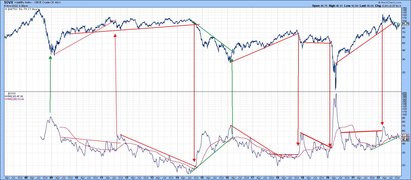
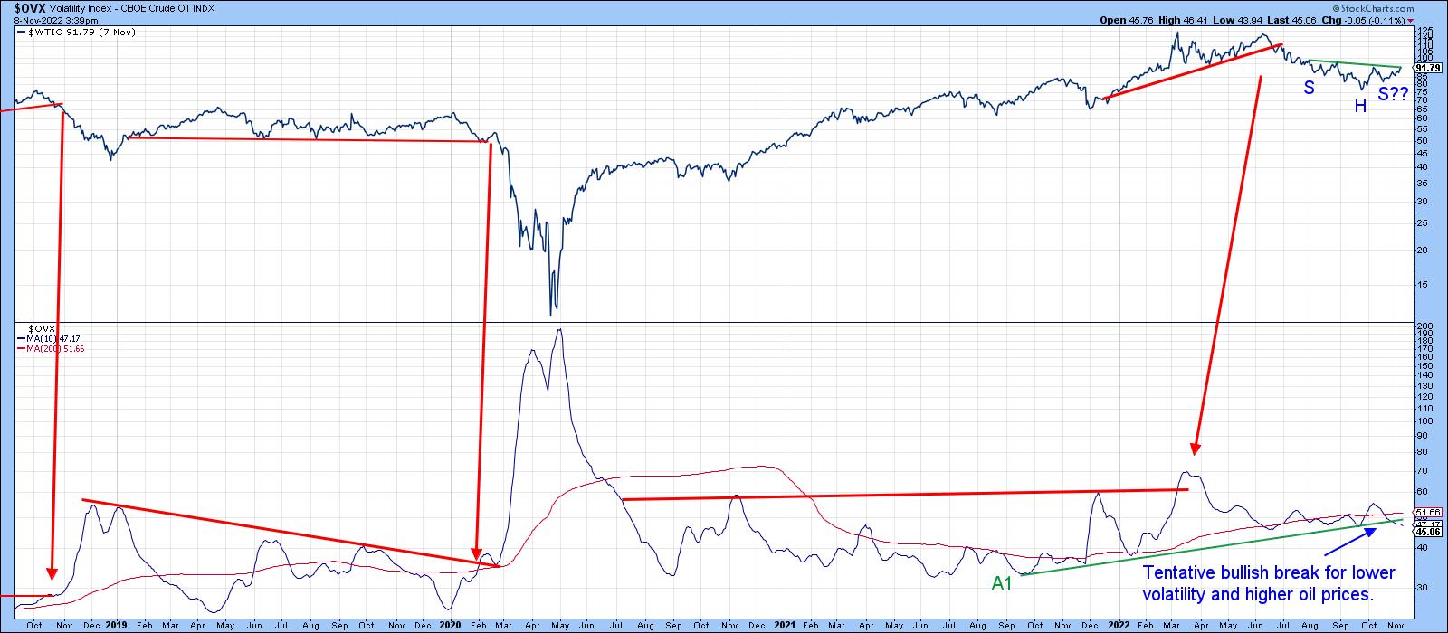
One thing to watch in this regard is the Oil Volatility Index ($OVX), shown in Chart 8 along with West Texas Intermediate. The various trendlines and arrows demonstrate that, when confirmed with a trendline break, rising volatility is usually negative for the price and vice versa. It doesn't always work out, though, as we can see from the spurious sell signal in 2011.
 Chart 8 Chart 8
Chart 9 focuses on a more recent rendition of the same arrangement. Here, we see the price poised to complete a 5-month inverse head-and-shoulders and the $OVX edging below its 2021-22 up trendline (A1). It's not yet triggered a buy signal, but is certainly worth monitoring in the period directly ahead in case one does develop.
 Chart 9 Chart 9
Good luck and good charting,
Martin J. Pring
The views expressed in this article are those of the author and do not necessarily reflect the position or opinion of Pring Turner Capital Group of Walnut Creek or its affiliates.
|
| READ ONLINE → |
|
|
|
| Don't Ignore This Chart! |
| Shopify Stock Is Getting Some Love |
| by Jayanthi Gopalakrishnan |
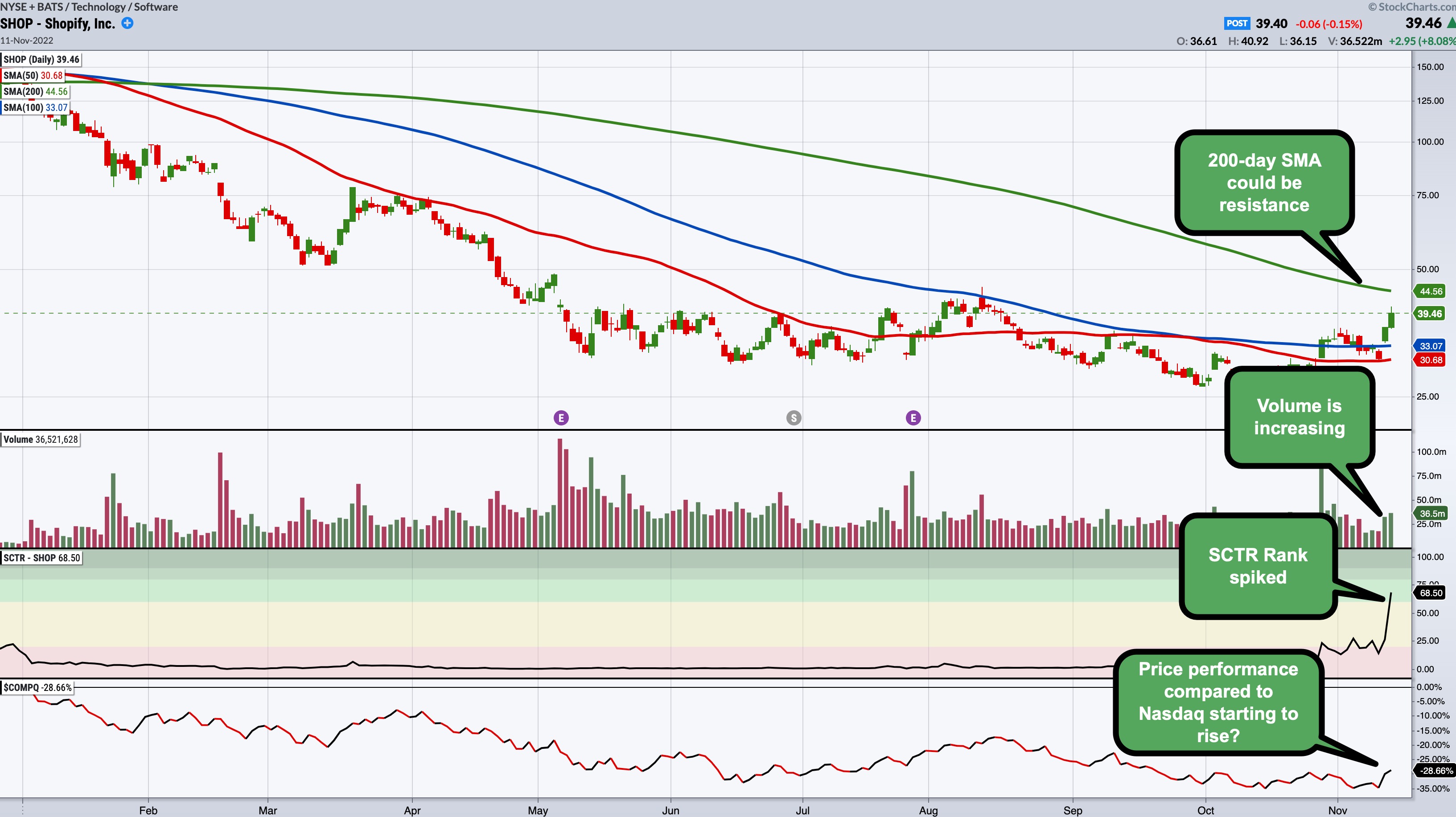
After hitting a high of around $176 in November 2021, the e-commerce platform Shopify, Inc. (SHOP) saw its stock price fall to a low of $23.63 within the span of a year. During the COVID-19 pandemic, SHOP attracted a lot of sellers, since many transitioned to offering their goods and services online. But after the economy started to reopen and people started shopping IRL again, SHOP saw a slowdown in its growth.
So, it was nice to see the stock get attention. SHOP showed up on the top of the StockCharts SCTR Reports in the Top Up, Large Cap category.

Chart source: SharpChartsACP from StockCharts.com. For illustrative purposes only.
The company reported better-than-expected Q3 earnings, which may have helped the stock price gain some momentum. But, in addition to the earnings, the chart of SHOP has a few things going for it:
- The stock is trading above its 50- and 100-day simple moving average (SMA) on rising volume. It could face resistance at the 200-day SMA, which would be a level to watch.
- The SCTR Rank (the SCTR Line is an indicator available on StockChartsACP) spiked from around 13 to just below 70.
- SHOP's price performance compared to the Nasdaq Composite ($COMPQ) is starting to show signs of increasing, although it should still be a little higher than it is now. Then again, technology stocks have taken a beating of late and are now looking like they are gaining favor.
The Takeaway
It's worth adding SHOP to your ChartList, but the price action needs to follow through a bit more than where it is. It may be riding up with the Technology sector, which may be gaining some ground, especially after Thursday's CPI number. Any evidence the company is riding on its own strength, either technically or fundamentally, would make it even more lovable.
Jayanthi Gopalakrishnan
Director, Site Content
StockCharts.com
|
| READ ONLINE → |
|
|
|
| The Canadian Technician |
| Markets Continue Bullish Ascent |
| by Greg Schnell |
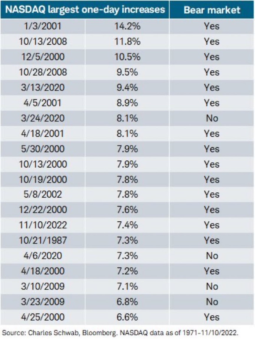
With Thursday's breakout, many charts around the world broke out. If it is a bear market rally, it's a very convincing one. I saw a nice list from Charles Schwab that shows how many of these super surge days there have been and if they were in a bull or bear market.
From Charles Schwab:

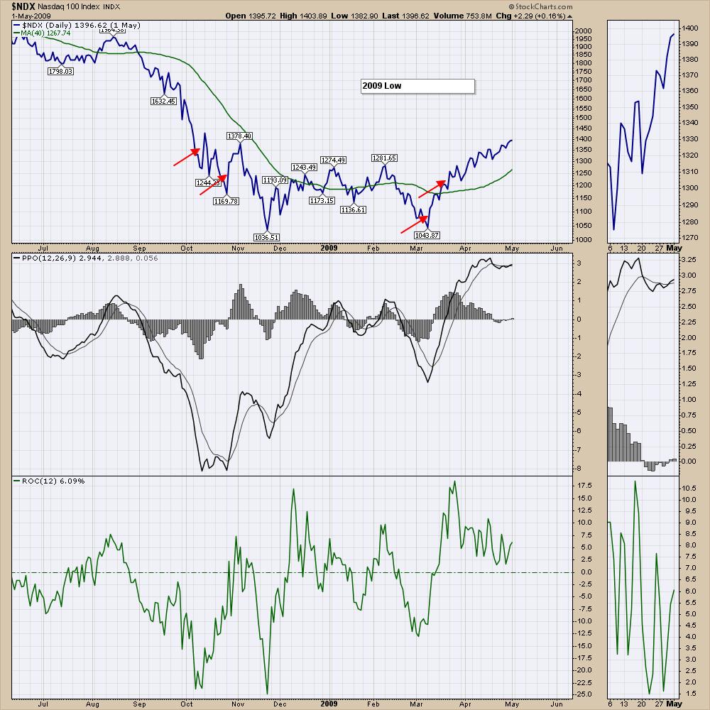
I went back to look at the chart for the ones that occurred in 2008 and 2009. Interestingly, there were some rallies that looked way bigger than March 9 or March 23, like the November low. I find it interesting that the March 2009 rallies were not in a bear market? Maybe with hindsight, you can say that was the start of the bull market? Some questions to the data, but they do give us some dates for comparison.

The move this week was dramatic, squeezing short sellers in a big way which is also why the thrust up was extraordinary. For me, it was a great rally as we change from bear to bull. The Dow was already above the 200 DMA, but the Nasdaq was not. My bias for now is bullish.

I got whipsawed as I started to see gains evaporating into Wednesday and sold my portfolio as the market struggled. Missed a nice upside day, but there is always another train at the station. I guess that is the price of playing defence in a bear market.
I like the price action I'm seeing here and I'll have a complete review for members on the weekend. If you are interested in why this week marked a major change for me in the markets, you can try a $7 subscription for a month and see if the PLUMB system works for you. Choose the $7 option on this page for more information. There is also a nice video about how we approach the market on this page. Osprey Strategic Approach.
|
| READ ONLINE → |
|
|
|
|
|
| Mish's Market Minute |
| All Indices Improved Their Market Phases This Week |
| by Mish Schneider |
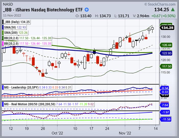
 Big Bro Biotech (IBB) is the most highly speculated and volatile sector of Mish's Modern Family. IBB is breaking out to new highs displaying Leadership. Big Bro Biotech (IBB) is the most highly speculated and volatile sector of Mish's Modern Family. IBB is breaking out to new highs displaying Leadership.
The mid-terms are now somewhat behind us, and this week we saw the FTX crypto exchange file Chapter 11. Some investors worry that there might be more domino effects in the institutional crypto space. It is worth keeping an eye on.
Concerning the market, the mild CPI inflation numbers caused a rally to erupt. Yields plummeted, the dollar softened, precious metals exploded higher, and investors had an economic reason to support a Fed pivot. All indices improved their market phases this week, with Grandpa IWM and DIA closing above their 200-day moving averages; SPY & IWM are back above their 50-day moving averages. However, the SPY, IWM, and QQQs are all overbought on price and momentum, according to MarketGauge's Real Motion Indicator, and may ultimately be subject to mean reversion.
With high inflation and global central banks tightening, where do the indices go from here?
Looking at past seasonality patterns, the fourth quarter has strong mid-term election past bullish seasonal trends.
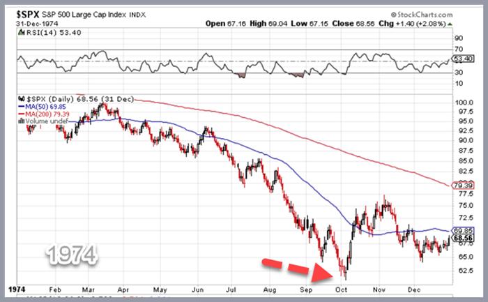
 The 1973–1974 stock market crash was one of the worst downturns. It was compounded by the outbreak of the 1973 oil crisis, high unemployment, inflation, and the dollar's collapse The 1973–1974 stock market crash was one of the worst downturns. It was compounded by the outbreak of the 1973 oil crisis, high unemployment, inflation, and the dollar's collapse
The bear market between January 1973 and December 1974 was one of the worst. In 1974, the S&P 500 increased by 20% in October and November before reversing most of the gains in December. Looking at prior bear market patterns and all three indices helps provide perspective on the overall market's direction.
SPY still has work to do before breaking out of its current trading pattern. The DIA and IWM have the most potential for growth in the short term. It's fundamental to understand where each index is trading relative to one another. The next several weeks should reveal which way these indexes are trending and whether they are trending in the same direction.
The perception of lower inflation also spurred the gold market to new highs and improved its market phase. Gold closed over its 200-day moving average and transitioned from bearish to an accumulation phase -- which has paid off handsomely for subscribers.
The sector leading the market up is Biotech (Sister Semiconductor), which is breaking out of a massive head-and-shoulders pattern on the daily chart, which we covered in live training yesterday. We also suggest paying attention to the indices' November 3 lows and any measured moves into resistance, such as critical levels like 420 in the SPY.
Risk management (Mish's specialty) is especially key in these volatile markets, and if you are not yet a subscriber to Mish's Market Minute Advantage service, now's the time!
Rob Quinn, our Chief Strategy Consultant, can provide pricing and trading software compatibility for our trading indicators and can offer a complimentary one-one-one trading consult. Click to learn more about Mish's Premium trading service.

"I grew my money tree and so can you!" - Mish Schneider
Get your copy of Plant Your Money Tree: A Guide to Growing Your Wealth and a special bonus here.
Follow Mish on Twitter @marketminute for stock picks and more. Follow Mish on Instagram (mishschneider) for daily morning videos. To see updated media clips, click here.
Mish in the Media
Read Mish's latest article for CMC Markets, titled "What's Next For Key Sectors After the Midterms".
Mish explains why MarketGauge loves metals and is still patiently loading up equities on Business First AM.
Mish talks metals, rates, dollar, and which sector to buy/avoid in this appearance on UBS Trending.
See Mish talk with Charles Payne on Making Money about the Oil markets testing the limits of Fed policy, China, and what to buy in the metals.
Mish joins Cheddar to talk about some of the fallout from the most recent Fed Meeting.
See Mish join Neil Cavuto and Eddie Ghabour on Cavuto Coast to Coast to talk about the Fed's recent rate hike decision.
Click here to see Mish and Helene Meisler's panel at the Trader's Summit event!
Mish discusses Meta and Palantir and how trends are switching in this appearance on BNN Bloomberg.
ETF Summary
- S&P 500 (SPY): 394 support, 402 resistance.
- Russell 2000 (IWM): 183 support, 190 resistance.
- Dow (DIA): 333 support, 341 resistance.
- Nasdaq (QQQ): 283 support, 291 resistance.
- KRE (Regional Banks): 63 support, 68 resistance.
- SMH (Semiconductors): 215 support, 224 resistance.
- IYT (Transportation): 225 support, 233 resistance.
- IBB (Biotechnology): 132 support, 136 resistance.
- XRT (Retail): 63 support, 67 resistance.
Keith Schneider
MarketGauge.com
Chief Executive Officer
Wade Dawson
MarketGauge.com
Portfolio Manager
|
| READ ONLINE → |
|
|
|
| Top Advisors Corner |
| Understanding Correlation Coefficients |
| by Tom McClellan |

A lot of market analysts like to use Pearson's Correlation Coefficient, because it is included in their software and it is pretty simple. You can use it quite easily in any spreadsheet program. But just because a tool is accessible and intuitive to use does not mean that it is the right tool, or even a useful tool. By failing to understand how a correlation coefficient calculation works, an analyst can reach some bad conclusions. What follows is a brief course on what correlation coefficients do and how we can be fooled by them.
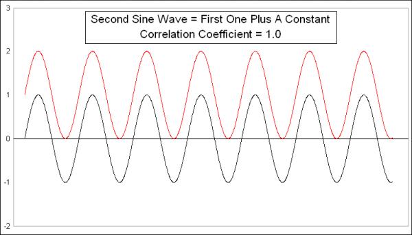
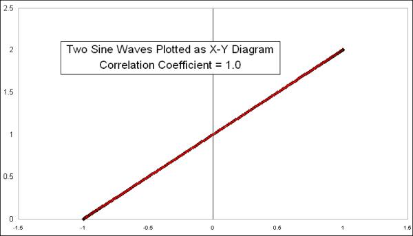
This week's first chart presents a very simple comparison. I created a simple sine wave pattern, then copied it to create another sine wave, which equals the first one plus a constant. The two sine waves are identical, and, not surprisingly, the Pearson's Correlation Coefficient is +1.0, even though they are at different numerical values. If we plotted every pair of data points on an X-Y chart, it would look like this:

What a Pearson's Correlation Coefficient is designed to measure is how much each pair of dots varies from a linear regression line drawn through the data. Since all of these data points are on the linear regression line, this comparison gets a perfect score of +1.0.
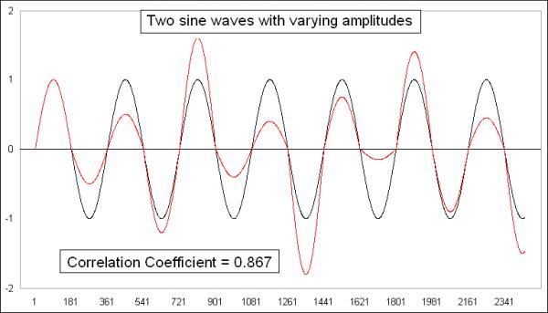
To make things a little bit more interesting, here are another two identical sine waves, but I modified one of them to change the amplitude of each half-cycle.

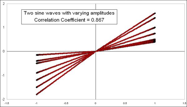
Not surprisingly, the correlation coefficient is still strongly positive, which should be the case since these sine waves are actually showing the same data, just tweaked a little bit. Plotting it on an X-Y chart shows a bit more of the differences:

Because of the way I varied the amplitudes uniformly for each half-cycle, the result is straight lines for each half-cycle, but an overall spread for the "population" of values, meaning a lot more spread of some of the data points away from the ideal (but undrawn) linear regression line.
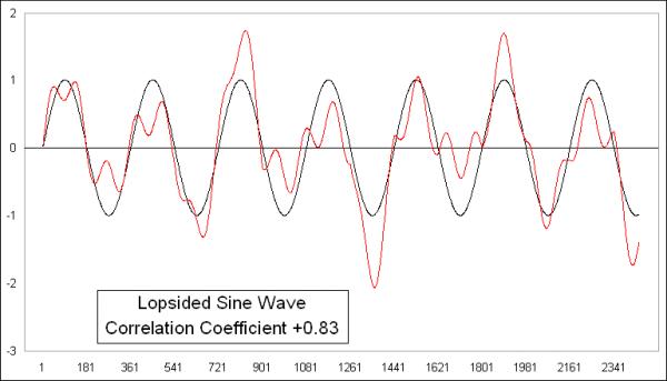
To make things a little bit more interesting, I took these last sine waves, one normal and one lopsided, and made one a little bit more lopsided by adding another sine wave to it with a different period.

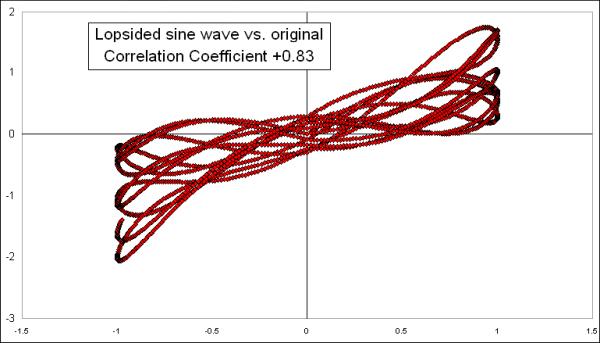
It should not be surprising that the Pearson's Correlation Coefficient is still showing a strongly positive reading, because these two waves are still the same data; I just tweaked one of them a little bit. Here is their X-Y diagram:

The overall pattern still shows us an arrangement of data points that is approximately linear, which explains the high number, and going from lower left to upper right, which explains the positive reading for the correlation coefficient.
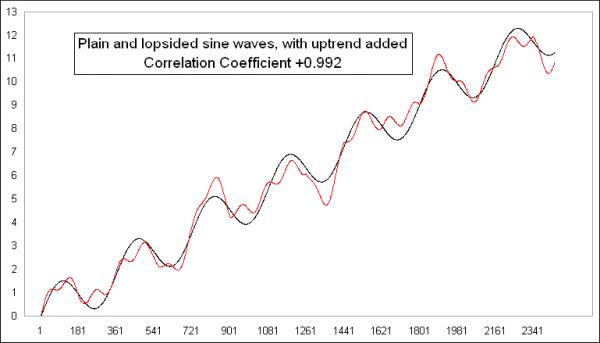
One reason that all of these comparisons are still showing high correlations despite monkeying with the data is that I left the sine waves in a sideways configuration. If I add an uptrend or a downtrend, that changes the calculations a lot. Here are those last two plots with the same exact uptrend added to each of them:

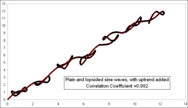
Adding the uptrend to both data sets takes the correlation coefficient up from +0.83 to an even higher +0.992. This is because the uptrend makes all the dots arrange themselves on the X-Y diagram in a much tighter-looking straight line:

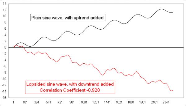
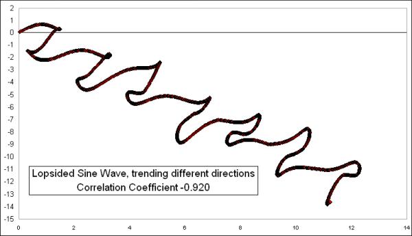
Now, it gets even more interesting if we make one of them trend downward. Here are the same two lines from the last comparison, except that I made the lopsided one trend downward while the conventional sine wave trends upward:

This flips the formerly strongly positive correlation coefficient to a strongly negative one. And that is in spite of the fact that the underlying sine waves are still in the data, and still dancing together. But having them dance together while trending apart changes the arrangement on the X-Y diagram to one that travels in a different direction:

Having the X-Y plot move from upper left to lower right is what demonstrates that it is a negative correlation. So the number would say that they are in an inverse correlation.
Remember that these are the same two original sine waves which were once perfectly (positively) correlated, and which still move together in the short run, but adding a trend to the data dramatically affects the outcome of the calculation of the correlation coefficients. This is the key lesson for everyone to take from this, which is that the correlation coefficient gets changed dramatically by the trends in the data, and thus it is nearly always the wrong tool to use for time series data, because time series data show trending behavior. It can fool you into thinking that a correlation exists when it does not, or vice versa.
What the Pearson's Correlation Coefficient statistical technique was originally intended for is to compare attributes among a sample population. If you were to measure 100 grown men, you would find that their height and their weight are positively correlated, though certainly not perfectly correlated. Another example is that the average temperature of a location is well correlated with its latitude, i.e. how far from the equator.
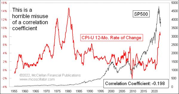
You could get some garbage results, though, if you were to try to calculate the correlation coefficient over the last 100 years between the CPI inflation rate and the DJIA. Inflation rates chop sideways, while the DJIA has trended upward (in the long run).

This would be an example of statistical malpractice, and would be a ridiculous exercise. But it can still be useful for making the point that, while anyone can calculate a correlation coefficient on any two data series, that does not mean it will give you results you can do something with.
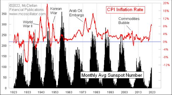
I recently shared on Twitter a chart comparing inflation numbers to sunspot counts. And while that might seem like a ridiculous pairing of data sets to compare, it actually shows a pretty obvious correlation:

They go up and down together, although the amplitudes of the two data series do not always match up. Still, their joint cyclicality is pretty obvious. So are they "correlated"? Of course they are. But the pundits nevertheless responded by asking me for a correlation coefficient (which is +0.268, since I knew you were going to ask) because they cannot believe their own eyes without a number to make them feel better. And the points in history where the correlation was broken can be pretty easily explained, i.e. WWII, the Korean War, and the Arab Oil Embargo.
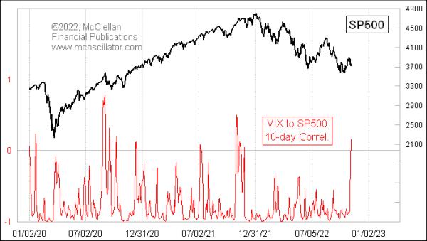
While a trend in a data set can interfere with calculations of correlation coefficients, under the right conditions that flaw can be turned into a useful feature. One good example of this was introduced to me several years ago by Jesse Felder, of www.thefelderreport.com. This next chart compares the SP500 to the VIX Index, and with just a 10-day lookback period.

Most of the time, stock prices and the VIX move in opposition, and so this indicator will show a deeply negative reading, as it should. A falling stock market tends to bring a rising VIX, and vice versa. That is the normal condition.
But very infrequently, this 10-day correlation coefficient reading will jump up into positive territory, which is a statement that things are not operating in the normal way. A positive reading means that the two are trending together in the short term, instead of inversely. Having the VIX fall while prices are falling, or rise while prices are rising, is not normal, and it is a sign of a weird market. This sign most often appears at price tops, as divergences are forming and momentum is being lost, although there are exceptions.
The stock market in October 2022 attempted another rebound effort, and that price rebound was accompanied by a falling VIX, which is the normal condition. But now the VIX is correlating slightly positively with stocks, which says that the rebound effort is wobbling, and will likely fail.
Bottom Line: Just because your software gives you a cool statistical tool to use does not mean that it is necessarily "useful". But tuning the correlation coefficient to a useful lookback period can sometimes produce useful insights.
|
| READ ONLINE → |
|
|
|
| MORE ARTICLES → |
|
 Chart 1
 Chart 2
 Chart 3
 Chart 4
 Chart 5
 Chart 6
 Chart 7
 Chart 8

