| THIS WEEK'S ARTICLES |
| Martin Pring's Market Roundup |
| Santa Comes Up Empty-Handed |
| by Martin Pring |

Statistically speaking, the last half of December is the best seasonal period of the year, part of which serves as what is popularly known as the Santa Claus rally. The first half of the month also has a slight edge to the upside, though that has not worked out so well this year, as the S&P 500 Index ($SPX) has slipped from 4080 on November 30 to 3852 on December 16. That's a loss of around 5.5%. This could set the scene for a robust second half of the month, but, unfortunately, it's not what my interpretation of the technical position is saying.
A Bearish Outside Bar
Chart 1, for instance, shows that last week's action represented a bearish "outside" bar. Notice that I put the quotes around the word outside. That's because it is not a perfect rendition of a true outside bar. To do that, the bar should totally encompass the trading range of its predecessor and then some. While last week's bar takes out the low of the previous one, the high just reaches the previous bar's high. I believe that technical interpretations should follow common sense, which means that it is occasionally appropriate to slightly bend the rules. After all, we are trying to understand the underlying psychology of what is going on and whether things may have changed.
In this example, we see the price open up for the week and quickly rally to the previous week's high. It also touched considerable resistance at the 52-week moving average (MA). By the end of the week, though, sellers had pushed the price below the previous bar's low giving them a decisive victory. Outside bars usually have an effect of between 5–10 bars, which, in this case, would take us through that bullish year-end period. Also supporting a possible negative scenario is that similar "outside" bars can be observed for most of the sectors.
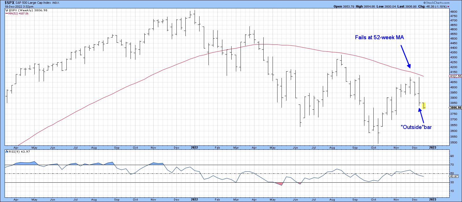 CHART 1: OUTSIDE BAR ON THE S&P 500 INDEX. On this weekly chart of $SPX, you see that the index is trading below its 52-week moving average, there's an outside bar pattern, and the 9-day relative strength index (RSI) is declining. All three point to a potentially negative scenario. Chart source: StockCharts.com. For illustrative purposes only. CHART 1: OUTSIDE BAR ON THE S&P 500 INDEX. On this weekly chart of $SPX, you see that the index is trading below its 52-week moving average, there's an outside bar pattern, and the 9-day relative strength index (RSI) is declining. All three point to a potentially negative scenario. Chart source: StockCharts.com. For illustrative purposes only.
Chart 2 also indicates a high probability that the October lows are about to be probed. First, $SPX has violated its post-October up trendline. Second, price action since mid-November has turned out to be a small head-and-shoulders top; however, the head and right shoulder whipsawed above the 200-day MA. Sometimes, invalid moves such as this are followed by a re-grouping and subsequent push to new highs; that's why it's a good idea to make sure that false upside breaks are confirmed with additional negative evidence. In this case, confirmation has taken the form of two decisive trendline violations and a negative crossover of the 200-day MA.
Finally, we can see that the 9-day relative strength index (RSI) barely moved above its equilibrium point (50), as $SPX was challenging its recovery high, and that the short-term KST, in the lower window, remains in a negative mode.
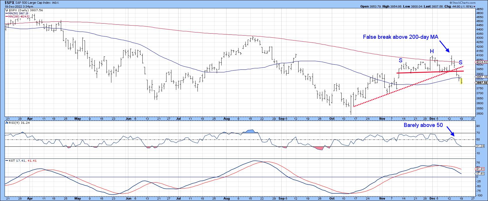 CHART 2: IS $SPX HEADED TOWARD ITS OCTOBER LOW? A break below the October rally uptrend, a negative crossover of the 200-day MA, and RSI's lack of breaking above the 50 level point to a potential decline in $SPX. Chart source: StockCharts.com. For illustrative purposes only. CHART 2: IS $SPX HEADED TOWARD ITS OCTOBER LOW? A break below the October rally uptrend, a negative crossover of the 200-day MA, and RSI's lack of breaking above the 50 level point to a potential decline in $SPX. Chart source: StockCharts.com. For illustrative purposes only.
Chart 3 compares $SPX to the NYSE common stock and regular A/D lines. Both have violated small up trendlines, but notably found resistance at their respective 200-day MAs, thereby confirming that the long-term trend remains a negative one.
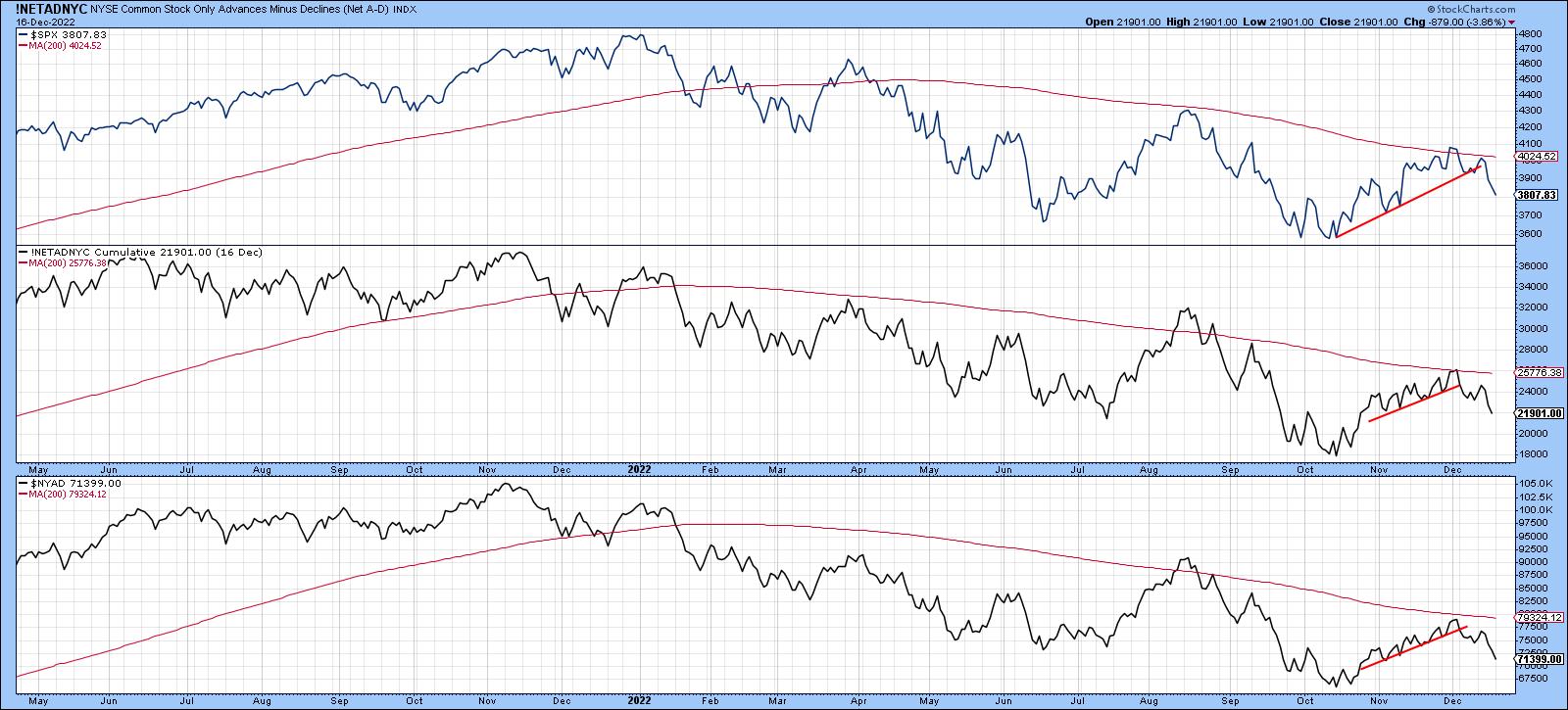 CHART 3: WHAT ARE MARKET BREADTH INDICATORS SUGGESTING? The advances vs. declines indicators have broken below their upward-sloping trendlines and found resistance at their 200-day moving averages. Chart source: StockCharts.com. For illustrative purposes only. CHART 3: WHAT ARE MARKET BREADTH INDICATORS SUGGESTING? The advances vs. declines indicators have broken below their upward-sloping trendlines and found resistance at their 200-day moving averages. Chart source: StockCharts.com. For illustrative purposes only.
Chart 4 displays my Dow Diffusion indicator, an oscillator that monitors the number of Dow 30 components in a positive trend, applied to the SPDR Dow Jones Industrial Average ETF (DIA). The Dow outperformed $SPX during the post-October rally, as the Dow, unlike the $SPX, was able to surpass its August high. Unfortunately, this breakout turned out to be false, as the Dow completed and broke down from a small top. To make matters worse, that reversal-type activity has triggered a sell signal from an overextended oscillator. The arrows show that not all such signals have been followed by a decline. Generally speaking, though, it's usually not a great time to be adding to positions, especially following the false upside break.
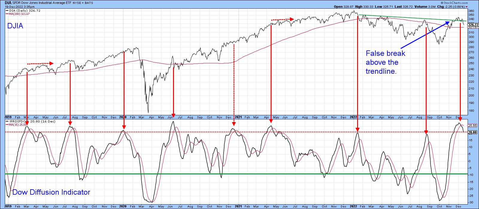 CHART 4: DOW DIFFUSION INDICATOR TRIGGERED A SELL SIGNAL. A false breakout above a downward sloping trendline along with a sell signal from the Dow Diffusion indicator suggest the Dow also is in a downward trend. Chart source: StockCharts.com. For illustrative purposes only. CHART 4: DOW DIFFUSION INDICATOR TRIGGERED A SELL SIGNAL. A false breakout above a downward sloping trendline along with a sell signal from the Dow Diffusion indicator suggest the Dow also is in a downward trend. Chart source: StockCharts.com. For illustrative purposes only.
It's also worth noting that things are not looking so well from a global short-term perspective either. The iShares MSCI World ETF (ACWI) continues to extend the series of declining peaks and troughs that began in January. The price has also experienced a false breakout above its bear market trendline and 200-day MA. This has now been confirmed by the completion of a small head-and-shoulders top. The Pring Global A/D Line was never strong enough to challenge the 200-day MA and has now violated its post-October up trendline. Looks like Santa is not going international either!
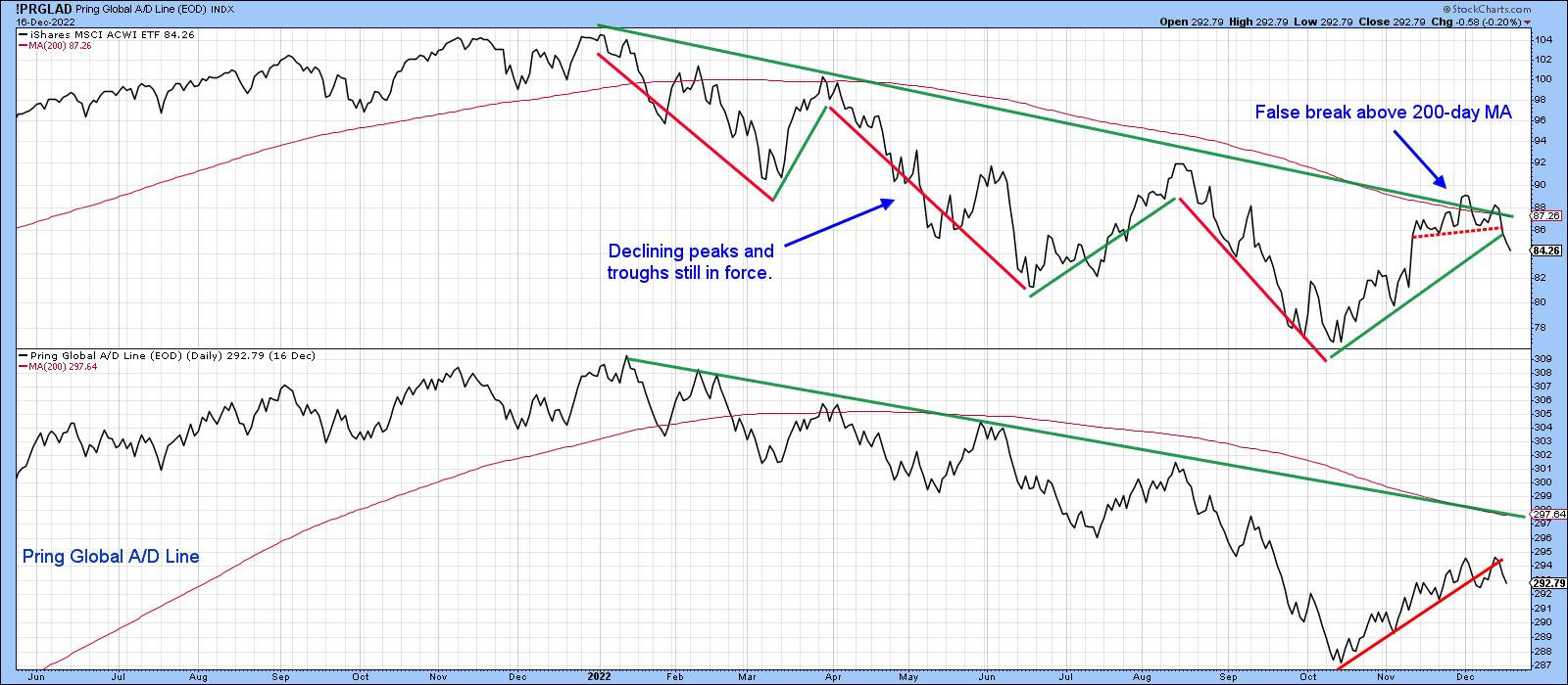 CHART 5: GLOBALLY, IT'S PRETTY MUCH THE SAME STORY. Declining peaks and troughs, a false breakout, and the Pring Global A/D line all suggest that international markets are likely to see a downtrend as well. Chart source: StockCharts.com. For illustrative purposes only. CHART 5: GLOBALLY, IT'S PRETTY MUCH THE SAME STORY. Declining peaks and troughs, a false breakout, and the Pring Global A/D line all suggest that international markets are likely to see a downtrend as well. Chart source: StockCharts.com. For illustrative purposes only.
Good luck and good charting,
Martin J. Pring
The views expressed in this article are those of the author and do not necessarily reflect the position or opinion of Pring Turner Capital Group of Walnut Creek or its affiliates.
|
| READ ONLINE → |
|
|
|
|
|
| The Mindful Investor |
| My Worst Call of the Year |
| by David Keller |
When I worked on the institutional buyside, we had the opportunity to hear from lots of brokers, strategists, and analysts in the industry. And I was thrilled to have some of the top technical analysts around coming through to talk charts with us. One of my favorite questions to ask was, "What was your worst call in the last six months, and what did you learn from it?"
For a professional strategist, dwelling on bad calls is certainly not how you want to spend your time. You'd much rather talk up your exceptionally prescient calls that everyone should hear about! But if you want to become a better investor, you need to spend less time celebrating your wins and more time dissecting your losses. And if you want to become a more successful investor, these are the kinds of questions you should be asking after a big miss:
- What evidence did you miss that would have pointed you to a more ideal conclusion?
- What tools could you add to your toolkit to better manage this sort of environment the next time it comes around?
- How could you better spend your time during the day/week to make sure you're better equipped to understand what's happening around you?
- What could you do to improve your money management processes to more effectively manage risk when you are wrong?
These are the questions that are really only answered if you approach year-end as a time to reflect constructively on your experiences as an investor.
That brings me to the ten questions that I ask myself every year, with the goals of improving my investment performance, reviewing missed opportunities, and upgrading my routines. I'm happy to share with you now my answer to probably the most painful question of the ten: "What was your worst trade, and what did you learn from it?"
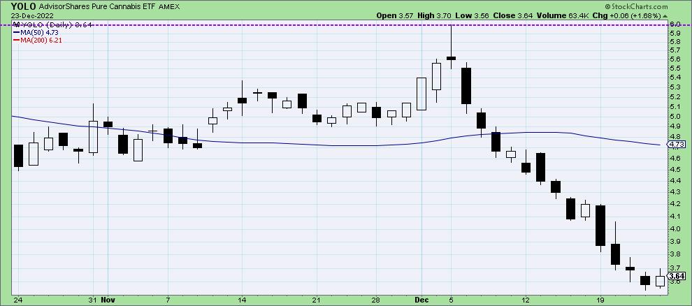
While, overall, I feel pretty good about remaining bearish through most of 2022, I had a couple big misses. And that brings us to the chart of YOLO, one of the US-listed cannabis ETFs.
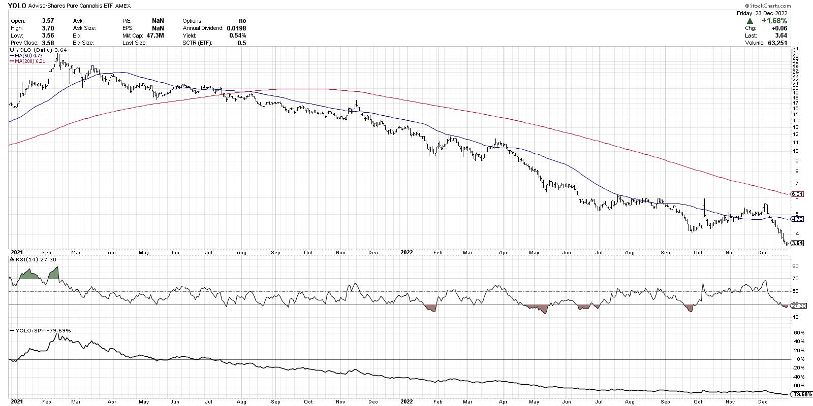
Now to be clear, I very much consider myself a trend-follower. My goal is not to buy the bottom, pretty much ever. Rather, I'd like to wait until there are some "signs of accumulation" in the form of price improvement and bullish momentum characteristics.
Knowing this fact, you may reasonably ask yourself why I thought YOLO was a good buy at $6.
The non-technical reason is that I believe in the long-term potential for the cannabis industry, similar to how I feel about the long-term potential of blockchain technology. I see the signs now that tell me there is tons of upside for these emerging themes. But, as Jon Markman so aptly described in his book Fast Forward Investing, even if you know that a certain theme is going to work over the long-term, there is no guarantee as to which products, companies, and trading vehicles will benefit the most as these themes become more developed over time.
That brings me to the clear technical evidence against buying YOLO at $6, which I clearly ignored at the time. Here's my chart, but with some additional annotations to help illustrate what I could only describe as confirmation bias run amok.
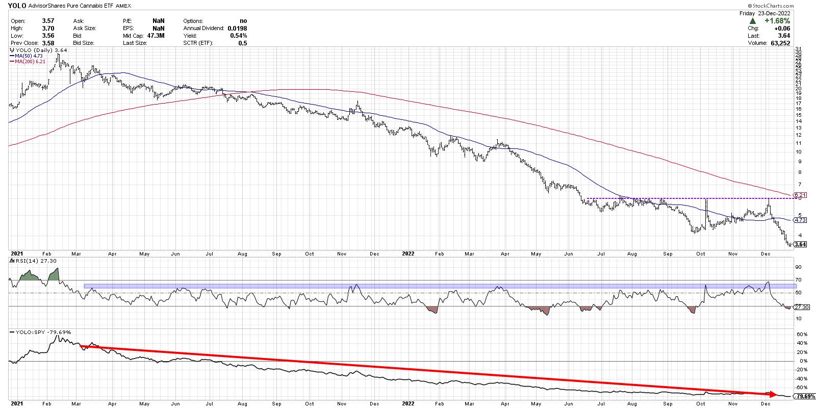
First off, the chart started making lower highs and lower lows in early 2021, after the excitement from the 2020 election cycle had all worn off. Cannabis stocks had experienced a big upswing in the fourth quarter of 2020, but, by spring 2021, a downtrend was clearly in place.
I remember exactly what caught my eye in July and August of this year. Quite simply, I noticed that YOLO wasn't going any lower. The lower lows (which had been a signature move on this chart for about 16 months) had dissipated, and the chart appeared to have stopped its endless decline.
Now did the price actually break above resistance? No. And that's where I missed one of the basic tenets of the Dave Keller investment process--to wait for confirmation of any change.
I've spoken and written about follow-through days, or the two-day rule, or whatever you want to call the idea that you need confirmation of a breakout before declaring the breakout. I did not have the patience to wait for a break above $6. So, instead of waiting for a breakout, I placed the order around $6. And I'm still waiting for that upside follow-through, with YOLO having broken below $4 this week.
Next, I ignored the momentum characteristics, which were clearly still negative. Note how many times the RSI bumped up to around the 60 level on short-term rallies, only to see the price revert lower soon after. In early December, the RSI briefly broke above 60, but, as this was happening, the price was forming a shooting star candle with an intraday high right at the well-established resistance level of $6.
Finally, and perhaps most embarrassingly, we have the long-term chronic underperformance, as illustrated by the relative strength ratio in the bottom panel.
So, in this case, I ignored something I tell our viewers at least 12 times a week: focus on charts with improving relative strength.
Full disclosure: I still own the position in YOLO. It's in a retirement account and I'm happy betting on long-term upside for this industry group. But, in my excitement at seeing a stalled downtrend in a group of which I'm fundamentally bullish, I managed to ignore what now appear to be clear signs that the chart was still bearish.
Why am I taking the time to relive this colossal miss at year-end 2022? Because I want to become a better investor, every single year. And the only way I'm really going to do so is by owning up to mistakes, reflecting on my decision-making process, and making changes to minimize the chances of having a similar mishap in 2023.
Your turn. What was your worst trade in 2022, and what did you learn from it?
By the way, want to see the other nine questions I ask myself at year-end? Just head on over to my YouTube channel.
RR#6,
Dave
P.S. Ready to upgrade your investment process? Check out my YouTube channel!
David Keller, CMT
Chief Market Strategist
StockCharts.com
Disclaimer: This blog is for educational purposes only and should not be construed as financial advice. The ideas and strategies should never be used without first assessing your own personal and financial situation, or without consulting a financial professional.
The author does not have a position in mentioned securities at the time of publication. Any opinions expressed herein are solely those of the author, and do not in any way represent the views or opinions of any other person or entity.
|
| READ ONLINE → |
|
|
|
| LIMITED TIME ONLY! |
 |
|
| The Traders Journal |
| Investor Lessons from the World Cup in Qatar |
| by Gatis Roze |
 Excellence that we investors can learn from and utilize in our trades is all around us. I encourage you to harness that energy. Here's how to use it to motivate yourself to become better as a trader and investor. Excellence that we investors can learn from and utilize in our trades is all around us. I encourage you to harness that energy. Here's how to use it to motivate yourself to become better as a trader and investor.
As I watched the World Cup Soccer matches in Qatar, two essential ingredients regularly percolated to the surface. The announcers constantly point these out. The top soccer stars — no matter their teams — combine two essential attributes. The excellence of their soccer skills is an obvious prerequisite, but that alone is not enough. The top stars who are the "go-to" players for coaches have an emotional stability that lesser players lack.
A case in point was the Brazilian national team's Coach Tite who said in the shoot-out with Croatia that he was saving his best player Neymar da Silva Santos to take the 5th and final penalty shot because "Neymar is the player with the most quality and mental preparedness to take such a high pressure shot."
As investors, I'm certain that we've all experienced situations when the markets shuffle our emotional deck pretty good — a situation that requires stability, not panic. Top sports stars and top traders excel far beyond average at being more resilient in stressful situations. They've been there before, and they know how to cope and adapt to the moment. They have an unwavering confidence and belief in their skills, their consistency and their ability to remain calm and composed. Their positive attitude often becomes a self-fulfilling prophecy. Or, as they say in soccer, they produce that "magic moment."
Contrast that to some of the lesser players who are hot-tempered personalities, easily provoked and too often disheartened by setbacks. My experience is that impulsive anger and frustration will beat you down and lead to inferior results — whether on the soccer field or in your trading room.
With respect to the soccer stars, I've been struck by the dichotomies between their passionate all consuming on-field personalities versus their everyday real-life personalities. It's as if they have developed a powerful personal avatar who takes the field with both the skills and emotional characteristics necessary to play at the highest levels. When they exit the stadium, a transformation happens. This separation of personalities — being on the street versus on the pitch — is often misunderstood by those witnessing these differences. Some stars are labeled aloof or haughty, or they're accused of embracing the dark side.
The Wall Street Journal (12/13/2022) accused Argentina's Lionel Messi of changing from a quiet genius to a snarling avenger embracing that dark side. Not every soccer star's spicy sauce is like Messi, but the transformations apply to the majority of stars.
I've written a number of blogs over the years about my "trading vest." It essentially empowers me with the investment personality I need when I'm in the stock market arena. Not unlike "the game face' put on by most professional athletes. The bottom line is that with our private life, we can fly by the seat of our pants and get by okay. But this is the antithesis of our investing life.
Your personal life may be an ensemble comedy, but when you put on your trading vest, you best engage and completely embrace your personal investing avatar.
Trade well; trade with discipline!
Gatis Roze, MBA, CMT
StockMarketMastery.com
|
| READ ONLINE → |
|
|
|
| ChartWatchers |
| Top 5 Charts Every Trader Needs to Watch in 2023 |
| by Jayanthi Gopalakrishnan |

What will the stock market look like in 2023? It's hard to tell, but these five charts could elevate your market awareness by a few notches.
Forecasting stock price movement is never easy, not even for the most experienced stock investor. As an investor or trader, the closest you can come is to keep an eye on a handful of charts that help give a big-picture view of the stock markets and to be aware of market internals. But which charts should you be watching?
David Keller, CMT, our chief market strategist, discussed his top 5 charts for 2022 in his StockCharts TV show The Final Bar. And the charts he used could be on your top 5 list going into 2023. Which charts make it to Keller's top 5 list? Let's find out.
The TL;DR
- S&P 500 Index with Fibonacci retracement levels
- 10-Year U.S. Treasury Yield Index
- U.S. Dollar Index vs. gold and crude oil
- A mega-cap stock
- The Chart, which is a combination of a broader index and sentiment indicators to help identify potential turning points in the stock market.
A Deep Dive Into the Top Charts
One of the challenges in keeping an eye on the stock markets is that there are many moving parts. These five charts make you aware of what's going on in the most important areas of the financial markets and alert you to when investor sentiment may be changing.
Bonus Gift: Access the top 5 charts here. Save them to your ChartLists and follow along.
#1: S&P 500 Index With Fibonacci Retracement Levels
It goes without saying that one of the most talked-about charts when it comes to the stock market is the S&P 500 Index ($SPX). Money managers use it as a benchmark, but, besides that, it's a good one to get an overarching view of the market. And when you add Fibonacci retracement levels (Fib levels) to the $SPX chart, you can identify areas of support and resistance levels and areas where investor behavior is changing.
Pull up the chart from the link above and, starting from the March 2020 low, see how $SPX reacted to the different Fib levels. You may notice that there's a second set of Fib retracement levels from the September 2020 low to the January 2021 high. Both sets help to identify potential turning points in $SPX.
How To Add Fibonacci Retracement Levels
- Bring up a chart of any stock, index, or exchange-traded fund (ETF).
- Select Annotate.
- Select Fibonacci arcs icon > Fibonacci Retracement
- Select a high or low point, hold down your cursor, and drag to the low or high point to the right of your original point.
- Once you're satisfied with your high and low point, release cursor, select the X on top right of chart, and save the chart.
In 2023, the 3800 level will be a key level to watch. If $SPX goes lower, the next level would be 3500 and, below that, 3200. "The bottom isn't necessarily in for the current market cycle," Dave noted. "January is typically the weakest month of the year, and Q1 and Q2 earnings may impact the overall markets. So, perhaps the 3200 level in $SPX is possible."
#2: 10-Year U.S. Treasury Yield Index
Inflation is front and center in every investor's mind, and more interest rate hikes are likely in 2023. Interest rate decisions impact the equity markets, especially when it comes to growth and value stocks. "When interest rates go higher, value stocks tend to do better and, when interest rates go lower, growth stocks tend to do better," added Keller. For this reason, it makes sense to compare the 10-Year U.S. Treasury Yield Index ($TNX) to the performance of value to growth stocks and to look at the overall shape of the yield curve.
How to Access the Dynamic Yield Curve
- From Your Dashboard, scroll down to Charting Tools in Member Tools.
- Select Dynamic Yield Curve.
- View a snapshot or animate the chart to see the changes in the yield curve.
The Dynamic Yield Curve helps to see if the curve is steep, flat, or inverted.
Interest rates are likely to go higher in 2023, which means bond and equity prices are likely to come down. But it's possible that other themes could play out similar to what we saw in 2022—when $SPX was trending lower, the Energy sector did well in the early part of the year, and Industrials and Materials did well later in the year.
This second chart can help you see if value stocks are outperforming growth stocks. So, depending on the leadership theme, you could invest accordingly.
#3: U.S. Dollar Index vs. Gold, Crude Oil
Intermarket analysis shows how different assets—stocks, bonds, commodities, and currencies—are related. Understanding these relationships can provide additional market insight. For example, when stocks are trending lower, investors are likely to invest in risk-off assets such as gold.

The price of crude oil can impact consumer behavior—higher oil prices could reduce driving and travel, which in turn can impact airline industry performance. A stronger dollar could benefit U.S. stocks, but may have a negative impact on the earnings of companies with global operations. Understanding relationships between the different assets can help you recognize when a change is taking place.
Looking at the third chart, you may want to keep an eye on the following:
- Will the U.S. dollar revert back to its mean or continue moving higher?
- Will gold sustain its upward move or reverse?
- Will crude oil continue in its downward channel?
"Intermarket relationships help you analyze trends, determine probabilities, and position yourself for what you think is the optimal scenario," Dave added. "More importantly, investors should plan for risk, since all large losses begin as small losses."
#4: A Mega Cap Stock
It's always a good idea to follow one of the mega-cap growth stocks. For 2022, Keller chose to analyze the stock of Alphabet (GOOG), for the following reasons:
- During the post-COVID upward phase, the FAANG stocks were dominant during the upward phase. If you pull up any of those charts, you'll see they have a similar movement.
- In the GOOG chart, you can clearly see the rotation from upside leadership to falling leadership.
- You can recognize three of the most important investing traits—identifying trends, following trends, and anticipating when trends are exhausted.
Adding price performance against SPDR S&P 500 ETF (SPY) helps to see how GOOG is performing with respect to the benchmark. On the chart, you can see various technical scenarios play out.
- The 50-day moving average (MA) crossing below the 200-day MA.
- A divergence between the relative strength index (RSI) and price from September to December 2021.
- A break below the early 2022 support level.
- A lower RSI range during the bearish phase.
"This chart helps to see how the investment picture changed, how the signals rotated, and what levels were established or broken," Dave noted. "It helps you understand how to apply risk management so you're better prepared for the next boom and bust cycle."
The mega-cap stock you choose for 2023 may be a different one, depending on what sector does well and which stock leads in that specific sector. There are different ways to determine the broad participation of sectors, which is why the next chart is important.
#5: The Chart
The fifth chart is a series of different charts that looks at market internals. The chart at the top can vary depending on prevailing market conditions. For 2022, $SPX made it to the top of the podium. Below the line chart of $SPX is the NYSE common stock advance/decline line, percent of stocks above their 50-day MA, S&P 500 bullish percent index, and the ratio of Consumer Discretionary to Consumer Staples. Scroll below the charts to see how to recreate this setup.
A couple of things to keep an eye on:
- The clear downtrend line in $SPX.
- From December to January 2021, $SPX was making higher highs while the NYSE Common Stock A-D line made a lower high. This was an early indication that the uptrend may be exhausted.
- Look to see if the percent of stocks above their 50-day MA is above or below the 50% level. When $SPX is making higher highs but this indicator is below the 50% level, it should be a red flag.
- For the bullish percent index, look for extreme levels in market breadth—above 70 or below 30.
- The ratio of Consumer Discretionary to Consumer Staples is a measure of the overall stability of the market. It gives you an idea of whether investors are gravitating towards offensive or defensive strategies. You'll see on the chart that this indicator didn't provide a confirming signal during the January 2022 high in $SPX.
"This chart looks at three important points—price, breadth, and leadership—which help to measure risk-on vs. risk-off mentality. When all these indicators are in agreement, it's an indication that change is afoot," Dave concluded.
Looking to 2023
Now that you've got the top 5 charts, going into 2023, what should you be looking for? Here are a few pointers:
- Watch the 3500 and 3200 Fib levels in $SPX. There could be buying opportunities at these levels.
- Will $TNX move lower towards its 200-day MA?
- Will gold continue moving higher?
- Keep an eye out for any rotation in large-cap stocks.
- Watch for a break in the downward trendline in $SPX and see if it's confirmed by the A-D line, percent of stocks above their 50-day MA, and the bullish percent index. This will help determine if investors are moving towards risk-on investment strategies.
The bottom line: There's no Holy Grail when it comes to forecasting stock price movements, but these five charts will help you stay alert to potential changes in the market. While some themes such as higher interest rates are likely to continue in 2023, the market is known for its ability to throw surprises. Be prepared to be unprepared.
Happy holidays from the StockCharts team.

Jayanthi Gopalakrishnan
Director, Site Content
StockCharts.com
Disclaimer: This blog is for educational purposes only and should not be construed as financial advice. The ideas and strategies should never be used without first assessing your own personal and financial situation, or without consulting a financial professional.
|
| READ ONLINE → |
|
|
|
| DecisionPoint |
| Crude Oil (USO) Garners PMO BUY Signal - 20+ Bonds (TLT) Triggers PMO SELL Signal |
| by Erin Swenlin |
Reminder: Prices go up for new DecisionPoint.com subscriptions in January. Details are below the article.
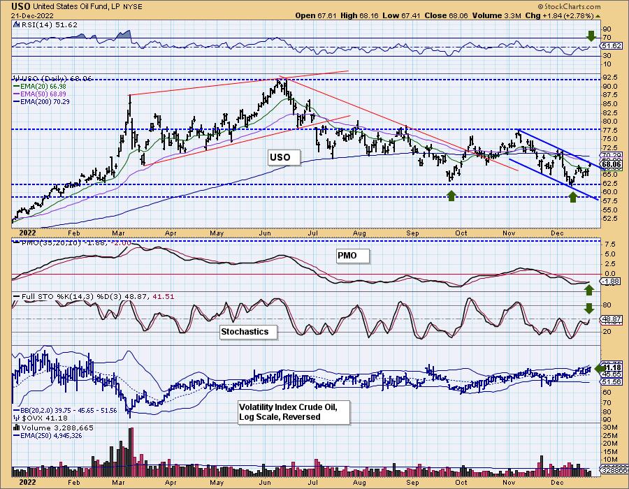
Crude Oil has been in a short-term declining trend since the beginning of November. Big picture, it is in a large trading range. After spending so much time being beat down, crude is finally making the turn. This looks more promising than the last rally, as the PMO didn't confirm it.
Price hasn't managed to pull out of its declining trend channel, but today's big gap up move does suggest it will. The indicators also favor a breakout. The RSI just moved into positive territory, and the PMO triggered a crossover BUY signal today. Stochastics are also confirming as they rise again toward positive territory above net neutral (50).
We also follow the volatility index for Crude Oil ($OVX). As with the VIX on its inverted scale, we look where it is in relation to its moving average to determine internal strength and weakness. Currently, it is oscillating above its moving average, which implies internal strength. We also would like to point out that we could be looking at an intermediate-term double-bottom forming.

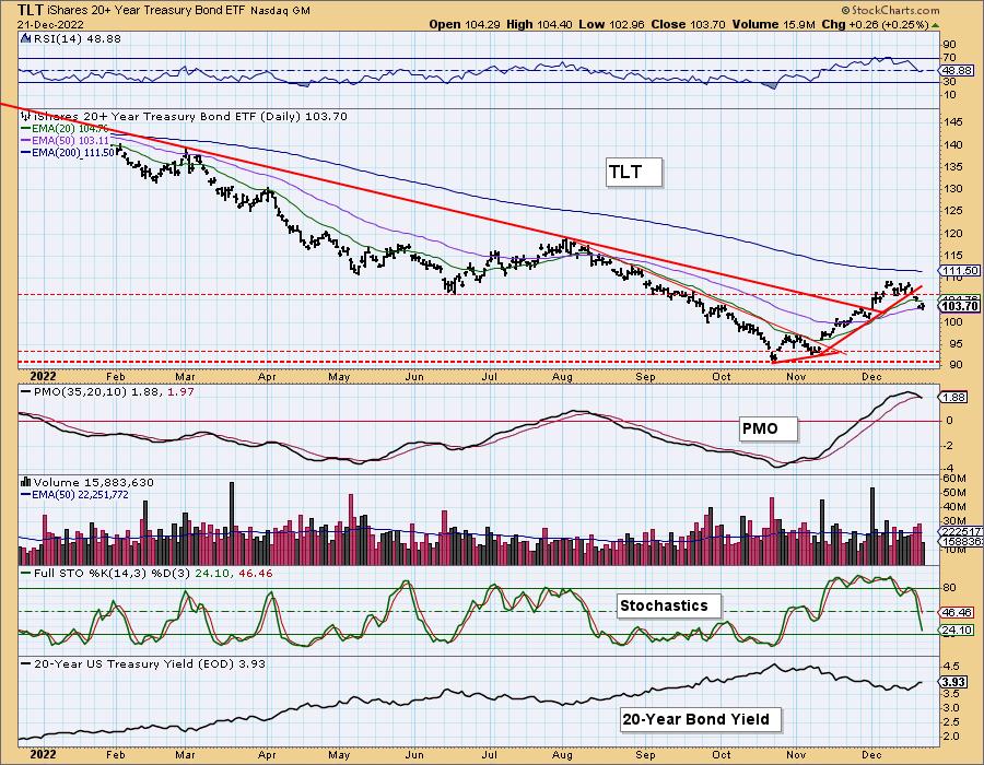
TLT also saw a new PMO crossover, but to the downside. This PMO SELL signal looks very dangerous, as it is coming in very overbought territory. The correction in interest rates is over in our opinion, so we expect TLT to return to the strong support zone at the November lows. Price managed to close above the 50-day EMA, but it is barely hanging on. The RSI moved into negative territory and Stochastics are dropping vertically. This appears to be the end of the rally in TLT as the 20-year yield recovers.

Watch the latest episode of DecisionPoint on StockCharts TV's YouTube channel here!

Our prices are going up in January!
If you've thought about getting a DecisionPoint subscription, now is the time to subscribe! Our prices will be going up! Our Bundle currently is $68/month, but, in January, it goes up to $119/month. The DP Alert will go from $35/mo to $50/month. DecisionPoint Diamonds will go from $40/month to $80/month. So don't delay! Once you subscribe, you get to keep your low rate even when we raise prices! **
** In order to keep your low rate, your subscription must continue running and remain in good standing.
Technical Analysis is a windsock, not a crystal ball. -- Carl Swenlin
(c) Copyright 2022 DecisionPoint.com
Helpful DecisionPoint Links:
DecisionPoint Alert Chart List
DecisionPoint Golden Cross/Silver Cross Index Chart List
DecisionPoint Sector Chart List
DecisionPoint Chart Gallery
Trend Models
Price Momentum Oscillator (PMO)
On Balance Volume
Swenlin Trading Oscillators (STO-B and STO-V)
ITBM and ITVM
SCTR Ranking
Bear Market Rules
DecisionPoint is not a registered investment advisor. Investment and trading decisions are solely your responsibility. DecisionPoint newsletters, blogs or website materials should NOT be interpreted as a recommendation or solicitation to buy or sell any security or to take any specific action.
|
| READ ONLINE → |
|
|
|
| The Canadian Technician |
| A Chilly Ending |
| by Greg Schnell |
The stock market has always come up with ways for challenging investors. What seems to be so obvious rarely works out, and what seems to be irrelevant surprises you months later with a chart from the bottom left to the top right.
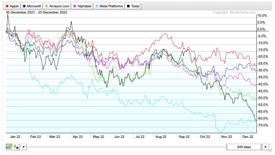
The Nasdaq is now the qadsaN index, as it spent the year going backward. All the mega cap names were sold off.
The electric bears have been taking a swipe at the electric car business for a while, but they picked up speed, swiping 68% off Tesla. They have taken a lot more percentage from other EV names, but Tesla was by far the largest market cap value change. A year ago, we couldn't get Tesla bulls off the podium. Meta and Alphabet got shellacked, along with the rest of the communications business. Amazon dropped 50% after maintaining a big price/earnings ratio for years. Microsoft and Apple also dropped meaningfully. I am not sure anyone expected the extent of the selling in the special six.

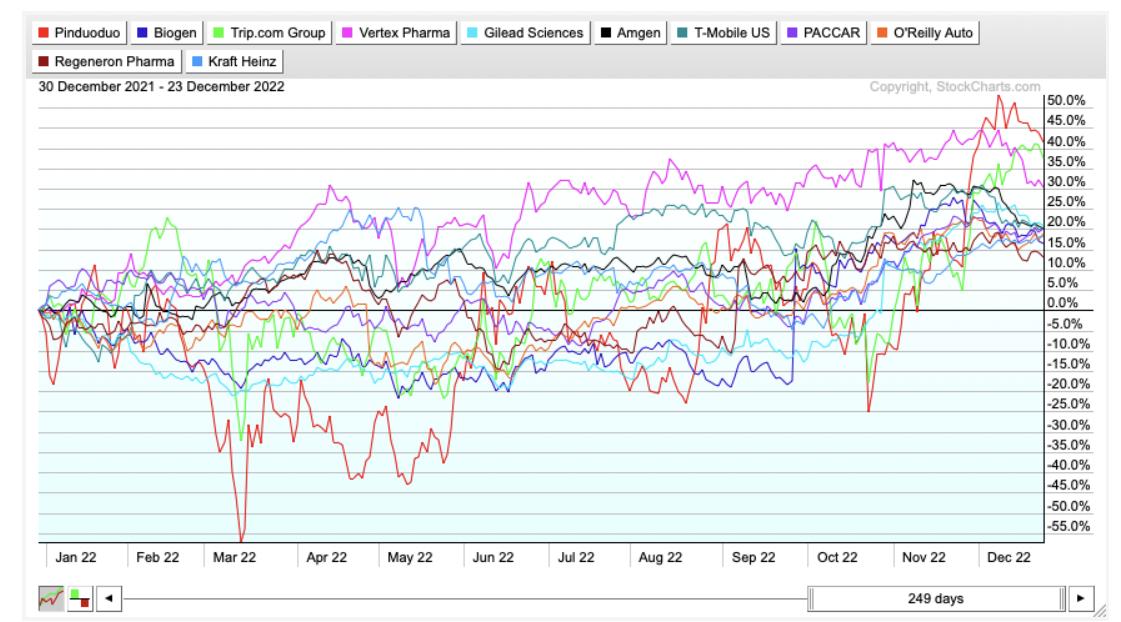
One of the things I am surprised about is how the Nasdaq is only down 30%, despite the juggernauts being down so much. There are actually a full 25 Nasdaq 100 stocks positive on the year! I know, that surprised me too.

Professional Management
So the rotation under the surface has been massive. All those long term portfolio strategies would be interesting to review. Were they able to adjust for the selling in the large caps, or too stubborn to change? This is a year where technical analysis should perform better than the fundamental analysis. Everybody's boat rises in a bull market.
ARKK
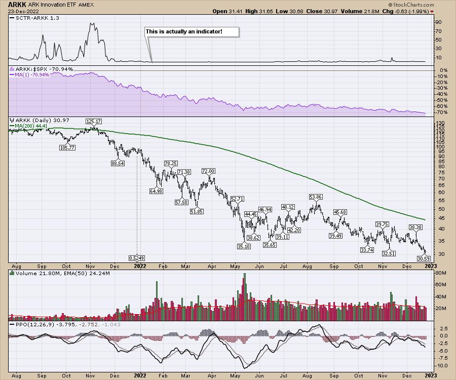
I think the ARKK chart set a record for an ETF this year, and had a SCTR ranking below 10% for the whole year. Most of the year, it was the worst 1%. Yet it still attracted capital inflows. That is remarkable story-telling. Yes, I never want to short innovation, but it should be priced right before I invest in it.

For me, just a few weeks ago, I published an article about the oil stocks breaking down. There is a reason we look at the charts every week. When things change, we need to change as well. I will be discussing that area of the market in my weekend newsletter, and you can see everything we do at Osprey Strategic for just $7 for the first month.
Have a wonderful holiday season and let's hit it hard in 2023!
|
| READ ONLINE → |
|
|
|
| StockCharts In Focus |
| Change Is Good: What's Shaking at StockCharts? |
| by StockCharts Staff |
As a development-driven company, StockCharts is always looking for ways to improve its user experience.
We needed a way for users to easily access and view the changes to our site, so, earlier this year, we switched to a release model format. If you haven't visited StockCharts recently, here's what you might have missed:
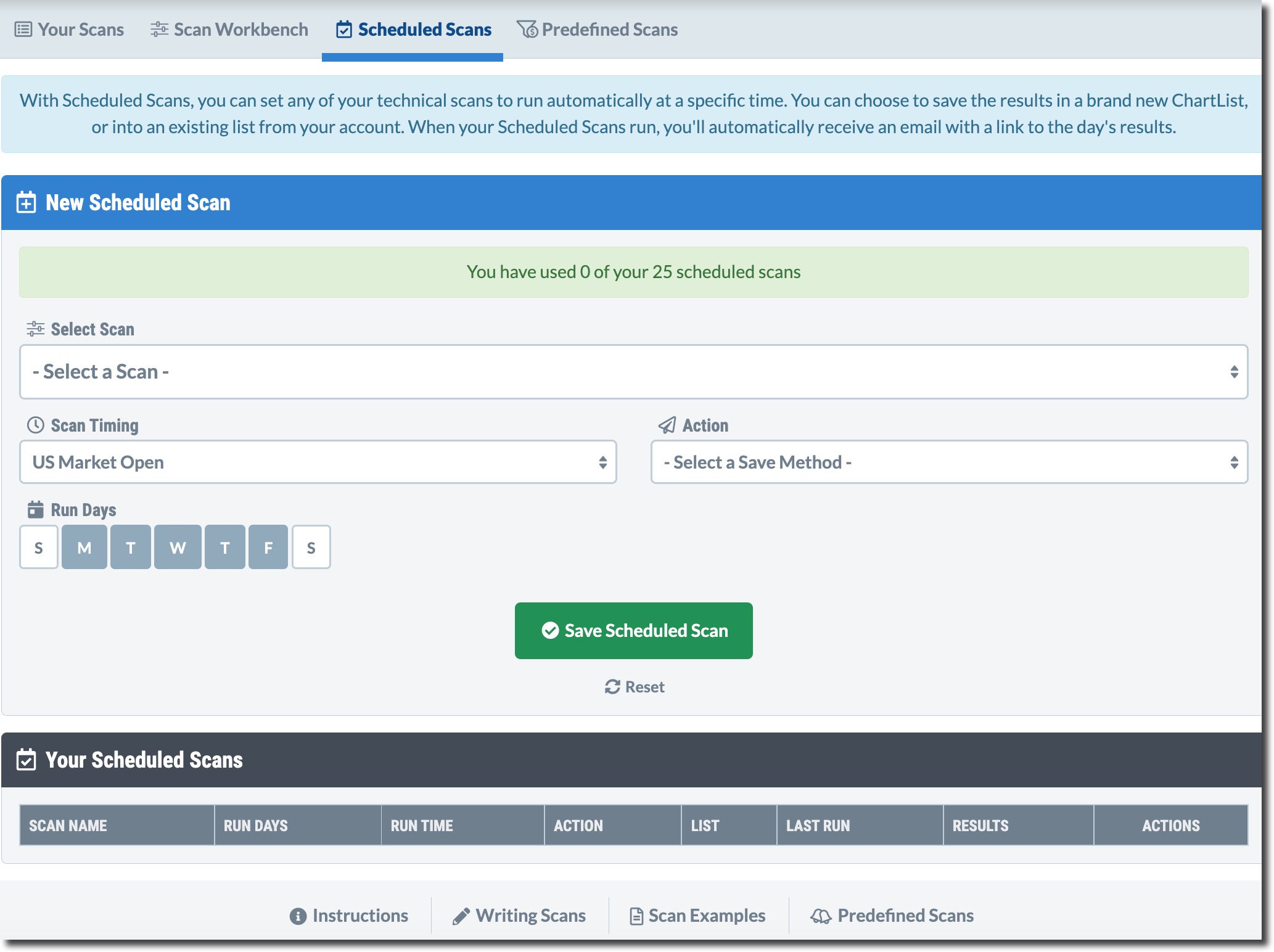
Starting with "Alki," fondly named after a neighborhood in Washington State where our headquarters is also located, we rolled out scheduled scans, additional ChartLists, and the means to add earnings dates directly to your charts so you never miss a report!

SCHEDULED SCANS. Set your scans to run on specific days of the week and/or times.
Up next was "Bainbridge."
This was where we first introduced "Chart Panels", which gave you the ability to pin three of your most important charts directly to your dashboard.

CHART PANELS. You can pin up to three of your charts directly to your dashboard.
Also notable was the addition of intraday chart periods, which divide each standard trading day into equal time blocks.
Now, we are up to our most recent release, "Camano," which debuted on December 19. Perhaps our most exciting release yet, this one is chock-full of firsts!
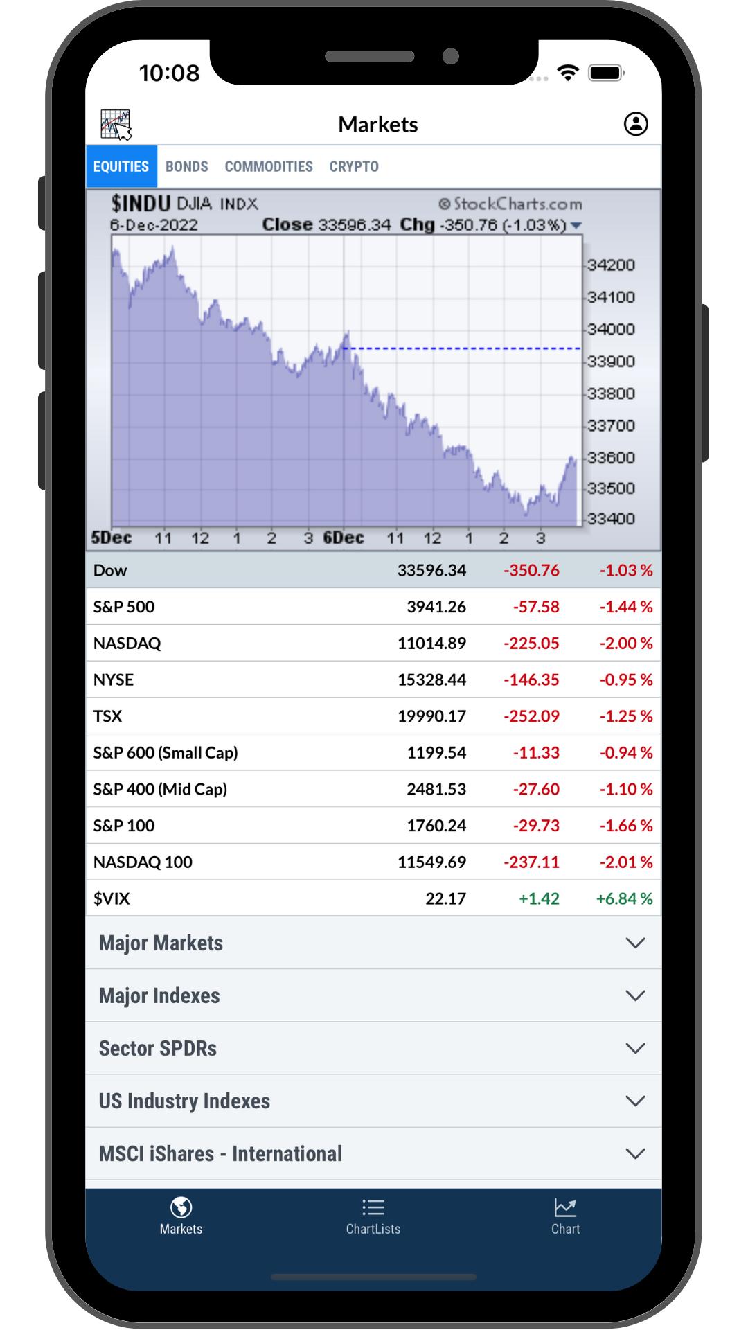
Starting out with our biggest announcement... StockCharts officially has a mobile app! Now existing members can carry StockCharts in their pockets and be fed real-time data on the go.

MOBILE APP. StockCharts has a mobile app for iOS and iPads.
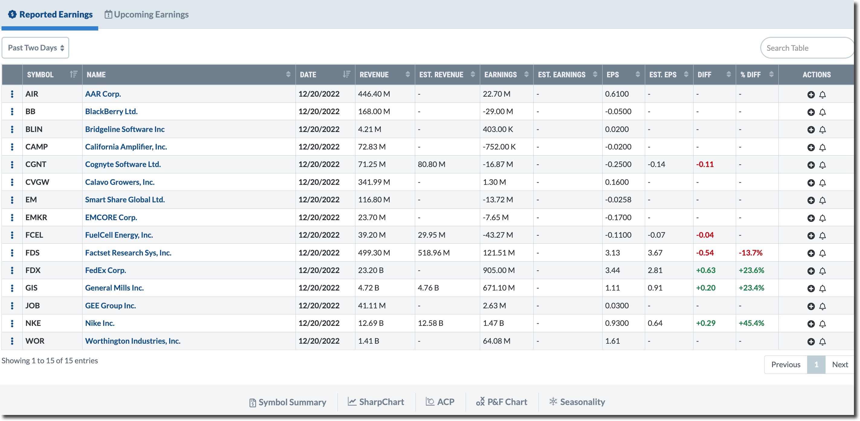
We've also built an earnings calendar, which includes reported results and upcoming earnings announcements!

EARNINGS CALENDAR. View reported and upcoming quarterly earnings releases.
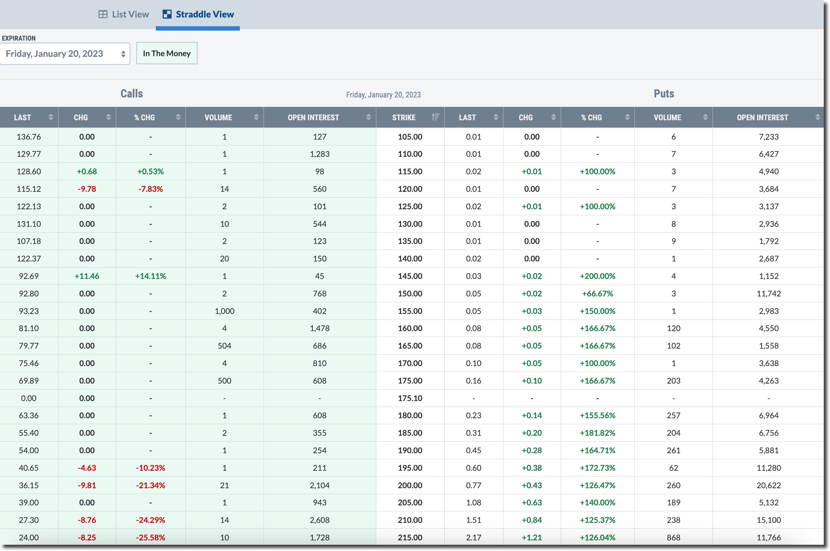
Additionally, we took the leap into the world of options, bringing you data that includes calls, puts, volume, and open interest for the complete options chain of an underlying stock.

OPTIONS VIEW. View call, put, open interest, and volume data for underlying stocks, exchange-traded funds, and indexes.
Other features in Camano include the ability to set specific days/times for scheduled scans, a curated collection of a sample chart gallery, a sample scan library, and much more!
Learn more about our exciting Camano release here!
If these features sound like something you'd like to try, we highly encourage you to do so sooner rather than later, because, right now, you can earn up to 3 months FREE during our Holiday Special!
If you are a returning member, no problem! We make coming back easy. All member charts, preferences, and data are kept for one year, so you can pick up exactly where you left off!
As you can see, a lot has changed this year and we will continue to bring you new and improved features. While these features and updates are here to stay, our Holiday Special won't last. Don't delay. Take advantage of all these features and more at this deeply discounted rate! We are confident you'll love it.
Talk Soon,
StockCharts
For a full rundown of all our releases, click here or visit www.stockcharts.com/new to learn more!

|
| READ ONLINE → |
|
|
|
| MORE ARTICLES → |
|

 CHART 1: OUTSIDE BAR ON THE S&P 500 INDEX. On this weekly chart of $SPX, you see that the index is trading below its 52-week moving average, there's an outside bar pattern, and the 9-day relative strength index (RSI) is declining. All three point to a potentially negative scenario. Chart source: StockCharts.com. For illustrative purposes only.
 CHART 2: IS $SPX HEADED TOWARD ITS OCTOBER LOW? A break below the October rally uptrend, a negative crossover of the 200-day MA, and RSI's lack of breaking above the 50 level point to a potential decline in $SPX. Chart source: StockCharts.com. For illustrative purposes only.
 CHART 3: WHAT ARE MARKET BREADTH INDICATORS SUGGESTING? The advances vs. declines indicators have broken below their upward-sloping trendlines and found resistance at their 200-day moving averages. Chart source: StockCharts.com. For illustrative purposes only.
 CHART 4: DOW DIFFUSION INDICATOR TRIGGERED A SELL SIGNAL. A false breakout above a downward sloping trendline along with a sell signal from the Dow Diffusion indicator suggest the Dow also is in a downward trend. Chart source: StockCharts.com. For illustrative purposes only.
 CHART 5: GLOBALLY, IT'S PRETTY MUCH THE SAME STORY. Declining peaks and troughs, a false breakout, and the Pring Global A/D line all suggest that international markets are likely to see a downtrend as well. Chart source: StockCharts.com. For illustrative purposes only.



 Excellence that we investors can learn from and utilize in our trades is all around us. I encourage you to harness that energy. Here's how to use it to motivate yourself to become better as a trader and investor.


