| THIS WEEK'S ARTICLES |
| John Murphy's Market Message |
| FALLING DOLLAR BOOSTS GOLD AND ITS MINERS |
| by John Murphy |
BOND YIELDS AND THE DOLLAR WEAKEN... The direction of interest rates plays a big role in determining the direction of the dollar. Rising U.S. rates during 2022 helped push the dollar to the highest level in twenty years. Chart 1, however, shows the 10-Year Treasury yield peaking during October and entering the new year on a weak note. Bond yields are down again today. That decline is also helping pull the dollar lower. Chart 2 shows the Invesco U.S. Dollar Index also losing ground during the fourth quarter and the first week of the new year. The UUP is testing previous support formed during August and has fallen below its 200-day moving average. One of the main side-effects of the falling dollar is a rally in the price of gold and gold miners which are showing new signs of technical strength.
 Chart 1 Chart 1
 Chart 2 Chart 2
FALLING DOLLAR BOOSTS GOLD... Chart 3 highlights the inverse relationship that normally exists between the dollar and gold. The green line in the upper box shows the Dollar Index peaking during the fourth quarter of last year and falling to the lowest level since August. Notice that the uptrend in the price of gold has matched the decline in the dollar very closely. Gold bottomed between September and November as the dollar was peaking and has continued to rally since then while the dollar dropped. The chart also shows the Gold Shares SPDR (GLD) rising today to the highest level in more than six m0nths. The GLD has also exceeded its August high and its 200-day moving average. Gold miners are rallying along with the metal. Chart 4 shows the VanEck Vectors Gold Miners ETF (GDX) reaching the highest level since June after clearing its 200-day moving average. The weaker dollar may also be boosting material stocks which are today's strongest stock sector. Copper and steel stocks are also rallying along with gold miners.
 Chart 3 Chart 3
 Chart 4 Chart 4
STOCKS END WEEK ON A STRONG NOTE...A sharp drop in interest rates on Friday has helped push stocks higher for the week. The daily bars in Chart 5 show the S&P 500 ending the week on a strong note. That, however, hasn't changed the market's overall chart pattern which shows the SPX locked in a trading range between its August high and October low. The SPX also remains below its 50- and 200-day moving averages which remain in bearish alignment. The direction of interest rates remains a major force in stock market direction. Today's big drop in rates accounts for most of today's stock gains. Fed policy, however, still favors higher rates which should keep stocks on the defensive.
 Chart 5 Chart 5
|
| READ ONLINE → |
|
|
|
| The Mindful Investor |
| Respecting the Rangebound S&P 500 |
| by David Keller |
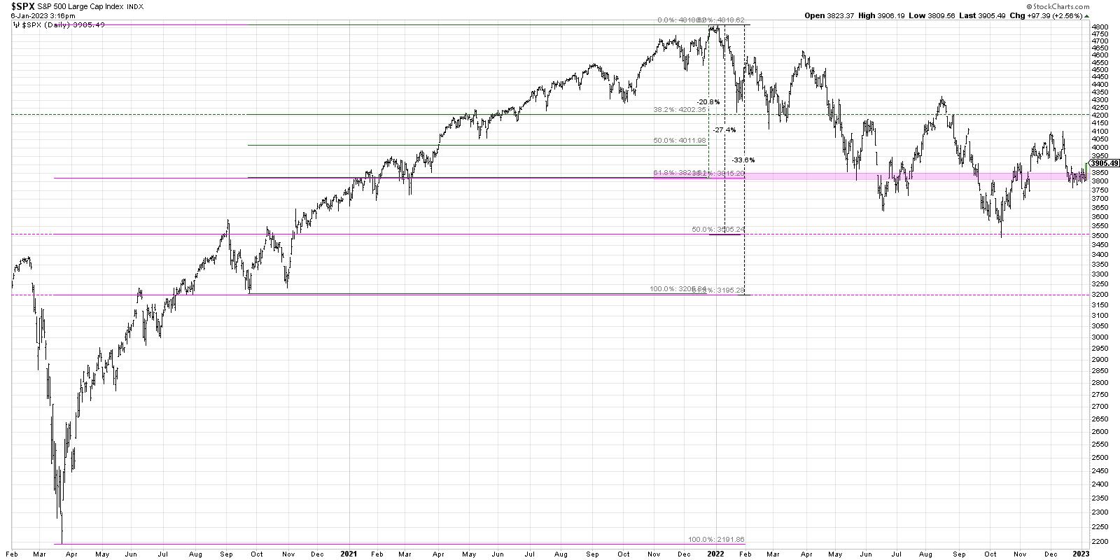
As the great bear market of 2022 was really hitting its stride, the 3800 level came into view as a likely support level for stocks. We keyed in on that level based on Fibonacci Retracements using the March 2020 low and the January 2022 high. At the time, that seemed like an aggressive downside target, and we instead focused on shorter-term objectives using the September 2020 low (not as significant as the March 2020 low, to be sure, but still an important consolidation point during the 2020-2022 uptrend).
So now, in January 2023, we are once again testing the 3800 level. Friday's price action seems to put an exclamation point on the importance of this support level. How bearish can the markets be if we remain above SPX 3800?
I would argue that, while the major trend is still down, we are now in a consolidation phase. Here's why.
Setting the Stage with Fibonacci
Reviewing the long-term chart of the S&P 500 index, you can see the larger Fibonacci framework using the March 2020 low (pink lines) as well as the secondary framework using the September 2020 low (green lines).

3800 represents about a 21% drop in absolute terms from the all-time high in January 2022. The pink-shaded area indicates the alignment of the two Fibonacci frameworks, and shows why 3800 is indeed an important level to watch.
Quick question: what return would it take to get from 3800 back up to 4800 and recover that 21% loss? Answer: 27%!
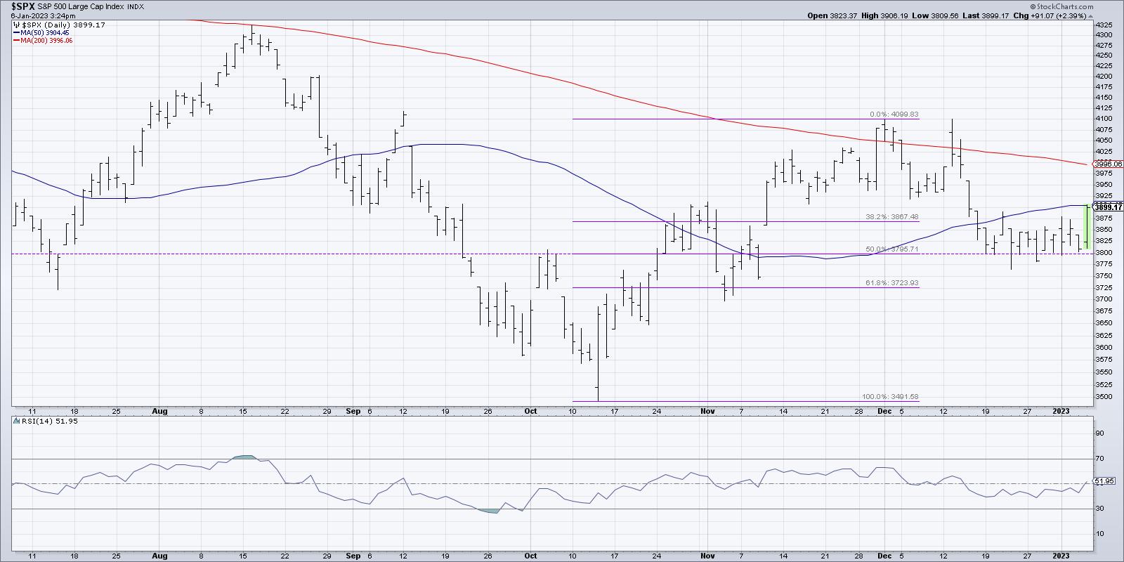
If we take an even shorter-term framework, using the October 2022 low and December high, you'll note that 3800 is about a 50% retracement of that recent upswing.

So, based on a number of different time frames, we are seeing clear evidence that 3800 appears to be a pivot point for the S&P 500.
Further Evidence Using Price and Momentum
Now, while Fibonacci Retracements certainly have some value on their own, any potential support or resistance level is further validated when the price action demonstrates the importance of the level. To put another way, the more times you test a particular level, the more significant it becomes. So the fact that the market has basically sat on this 3800 level since mid-December is arguably the most important argument that this level is valid.
Now, let's review the momentum characteristics using RSI.

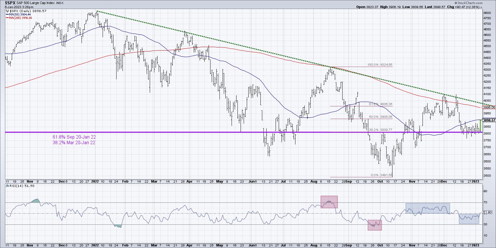
When the S&P rose to its August peak, the RSI became overbought (above 70). On the subsequent move to new lows, the RSI dropped below the oversold threshold (below 30).
I'm super excited to be a part of Market Vision 2023 hosted by Tom Bowley, founder of EarningsBeats and a long-time StockCharts contributor! I'll be sharing my "one chart" to use for 2023, and will also join Grayson Roze and Julius de Kempenaer in providing our S&P 500 projections for the year along with key sectors to watch. Sign up HERE for this free event, airing Saturday 1/7/22!
Now look at the early December peak. See how the RSI failed to break above the 60 level? On the mid-December pullback to 3800, note how the RSI failed to break below 40. We are now experiencing a consolidation phase, as the range narrows, the volatility remains muted (the $VIX remains near 20 and has not risen as the market pulled back), and the RSI is reaching less extreme levels.
All of this combines to tell the story of a market trapped in a range between 4100 on the upper end and 3800 as support.
What's Next for the S&P 500?
When the market settles into a consolidation phase, I find it's best to identify some "lines in the sand" -- levels above which or below which you decide to take action. Until then, we are in wait-and-see mode.
I could envision the S&P pushing back above 4100, especially if we continue to see lukewarm economic data encouraging investors that the Fed may begin to wrap up this tightening cycle sooner rather than later. That said, given the headwinds that exist for growth stocks in a rising rate environment, I just don't see our growth-oriented benchmarks recovering much further than that (yet!).
I very much see a break below 3800 as a likely outcome here, with a break to new lows likely if that occurs. My downside target for the S&P 500 remains 3200, and all we need is some strong economic data and/or hawkish tones from Fed governors to make that a reality.
In either scenario, we would first need to break above 4100 or below 3800. And I would propose that, whichever way breaks first, that will indicate the likely direction of the market in the coming weeks and months.
Want to digest this article in video format, just head over to my YouTube channel:
RR#6,
Dave
P.S. Ready to upgrade your investment process? Check out my YouTube channel!
David Keller, CMT
Chief Market Strategist
StockCharts.com
Disclaimer: This blog is for educational purposes only and should not be construed as financial advice. The ideas and strategies should never be used without first assessing your own personal and financial situation, or without consulting a financial professional.
The author does not have a position in mentioned securities at the time of publication. Any opinions expressed herein are solely those of the author, and do not in any way represent the views or opinions of any other person or entity.
|
| READ ONLINE → |
|
|
|
| Don't Ignore This Chart! |
| Gold Stocks are Starting To Shine: Keep an Eye on Them |
| by Jayanthi Gopalakrishnan |

After a pretty dismal stock performance in 2022, investors are looking forward to some signs of optimism in the first trading week of the new year. Alas, the first two days didn't bring much hope. Fed minutes indicate that inflation is still high, and that means more interest rate hikes in 2023. The ISM data shows that manufacturing is contracting. Big-name stocks such as Tesla (TSLA) and Apple (AAPL) saw significant price declines.
So, where's the silver, er gold, lining? Well, it may just be in gold stocks. When equities aren't looking that great, investors are inclined to invest in risk-off assets such as gold. So, even if you just invest in stocks, it's a good idea to keep an eye on other asset classes as well.
A good starting point on the StockCharts platform is Your Dashboard. Using the Market Overview panel, you can quickly skim equities, bonds, commodities, and cryptocurrencies. If you see that gold is performing well, you can either select Gold (GLD) or pull up a chart of gold futures ($GOLD).

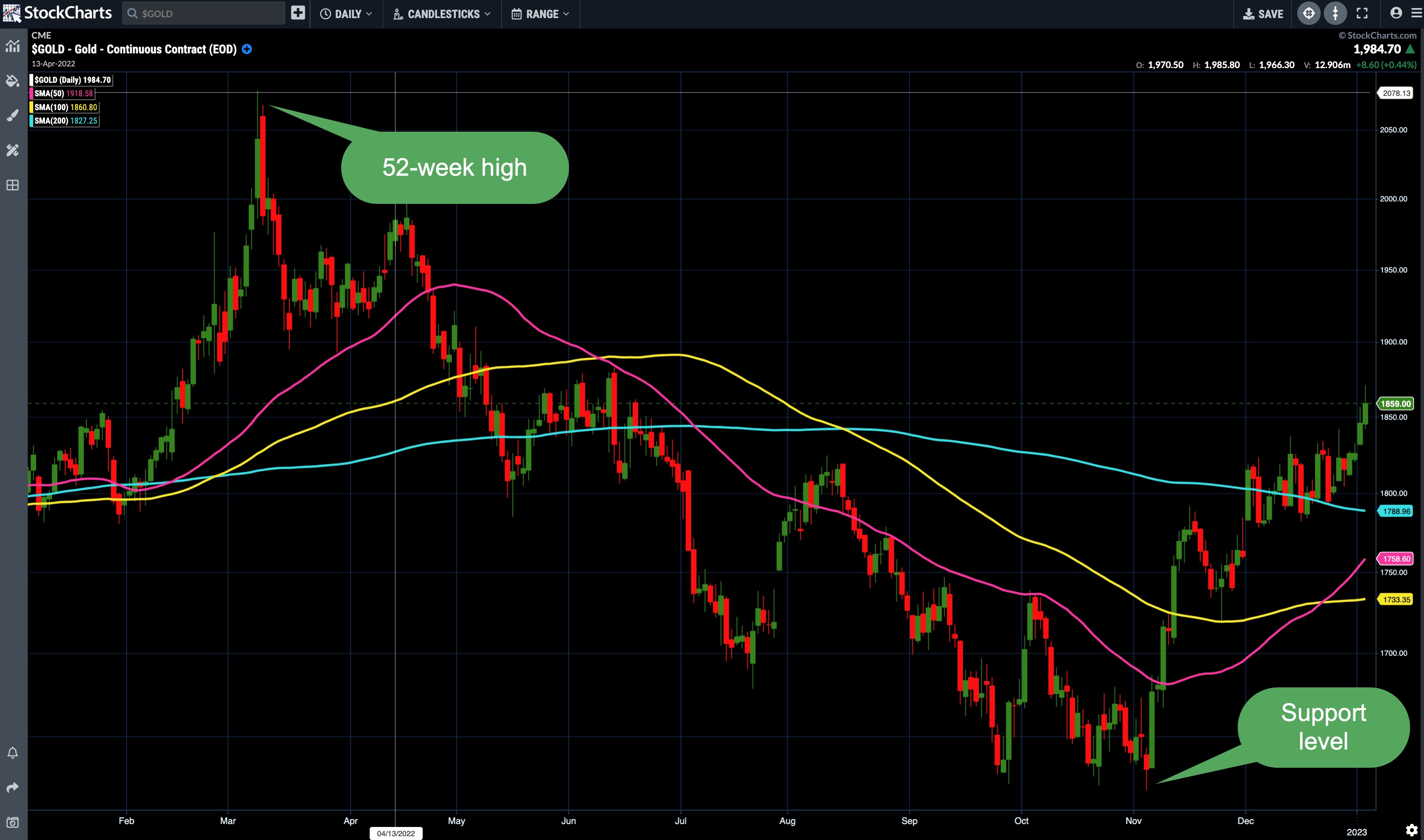
From a technical perspective, gold futures are looking ripe for a rally.
- Since bouncing off its 1618 support level, gold has moved higher, with higher highs and higher lows.
- Gold is trading above its 50-, 100-, and 200-day moving averages.
- Gold reached a 52-week high of 2078.80 per ounce. That means there's potential for further upside movement.
Trading gold futures may not be your thing, but you can take advantage of the price movement of gold futures by investing in gold-related exchange-traded funds (ETFs) or stocks. The SPDR Gold Shares ETF (GLD) is a great proxy for following gold price movement. You may also want to analyze other gold stocks, such as Newmont Corp (NEM), Rio Tinto PLC (RIO), and Southern Copper Corp. (SCCO).
In the Member Tools section of Your Dashboard, scroll down to Summary Pages and select Symbol Summary. Enter the symbol of the stock or ETF you're considering. This is your gateway to all kinds of analytic tools. You can view charts, analyze technical indicators or company fundamentals, and identify the SCTR rank, among other things.
The markets are always changing, and if one asset class isn't working for you there are other opportunities. The best way to be informed is to always have a big picture view of the market.
|
| READ ONLINE → |
|
|
|
|
|
| Martin Pring's Market Roundup |
| Tesla's Bear Market Low: Are We There Yet? |
| by Martin Pring |

I don't usually get into individual stocks, but, back in August, I found Tesla's price action to be quite interesting. That's because I felt the stock, along with its fearless leader Elon Musk, were important icons of the 2020–2022 phase of the post-financial crisis secular bull market. As such, Tesla (TSLA) had the bell-weather potential to help us determine whether a new primary uptrend had begun in the early summer of 2022 or if the bear was in hibernation. By re-grouping and rallying, it would be signaling a positive resolution. However, by breaking down, it was more likely to provide a bearish lead role.
TSLA, Technically Speaking
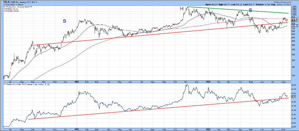
Chart 1, reproduced from the article, shows the price had traced out a large head-and-shoulders top between late 2020 and 2022. Instead of selling off sharply, it subsequently experienced a trading range and broke back above the extended neckline. The right-hand part of the chart shows the price turning back from its 200-day moving average (MA) and, once again, challenging the breakout point. again. The relative strength (RS) line replicated this action.
 CHART 1: A LARGE HEAD-AND-SHOULDERS CHART PATTERN IN TSLA. Chart source: StockCharts. For illustrative purposes only. CHART 1: A LARGE HEAD-AND-SHOULDERS CHART PATTERN IN TSLA. Chart source: StockCharts. For illustrative purposes only.
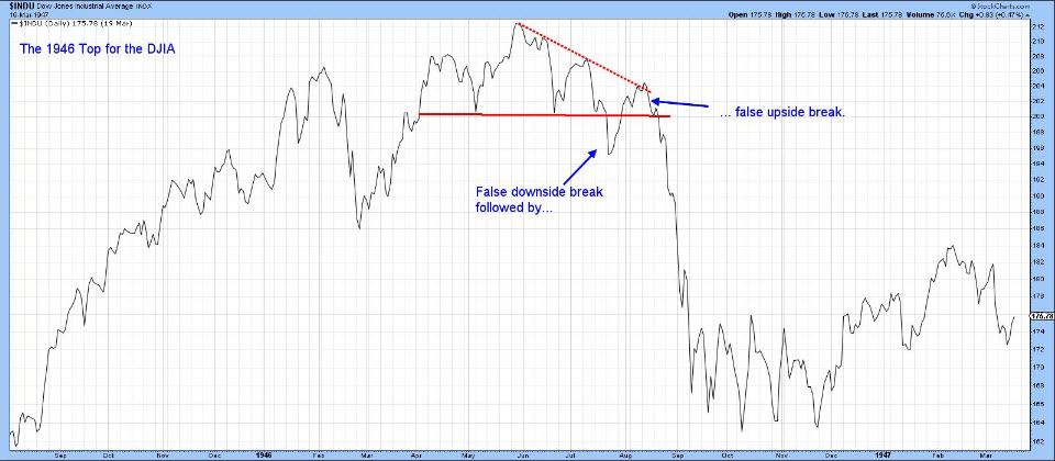
At the time, it was vitally important for the price to hold above the extended neckline, in order to avoid a double false breakout similar to the price action shown in Chart 2 for the 1946 top in the Dow Jones Industrial Average ($INDU). Remember, false breakouts, when confirmed, are usually followed by an above-average move in the opposite direction to the breakout. Double false breakouts up the ante a step further.
 CHART 2: FALSE BREAKOUT. Here you see a false upside breakout followed by an above-average move in the direction opposite to the breakout. Chart source: StockCharts. For illustrative purposes only. CHART 2: FALSE BREAKOUT. Here you see a false upside breakout followed by an above-average move in the direction opposite to the breakout. Chart source: StockCharts. For illustrative purposes only.
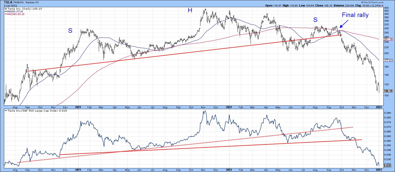
Chart 3 updates Chart 1 to 2023, where you can see that TSLA had one more small rally left, prior to a violation of its extended neckline and a subsequent waterfall decline. The stock is definitely in a bear market, but whether it will fulfill my theory that a TSLA collapse to new lows would drag the whole market with it is still open to question. It's true that the stock dropped to a post-June low in October, but that was a marginal sell-off, not one commensurate with the collapse of an icon, which is what has happened to TSLA in the intervening months. At that marginal new market low in October, signs of real capitulation were missing, some of which were discussed in this article.
 CHART 3: ONE FINAL RALLY FOR TSLA. After the small final rally, TSLA stock broke below its extended neckline and declined rapidly, and looks like it may have more downside left. Chart source: StockCharts. For illustrative purposes only. CHART 3: ONE FINAL RALLY FOR TSLA. After the small final rally, TSLA stock broke below its extended neckline and declined rapidly, and looks like it may have more downside left. Chart source: StockCharts. For illustrative purposes only.
Where Does Tesla Go From Here?
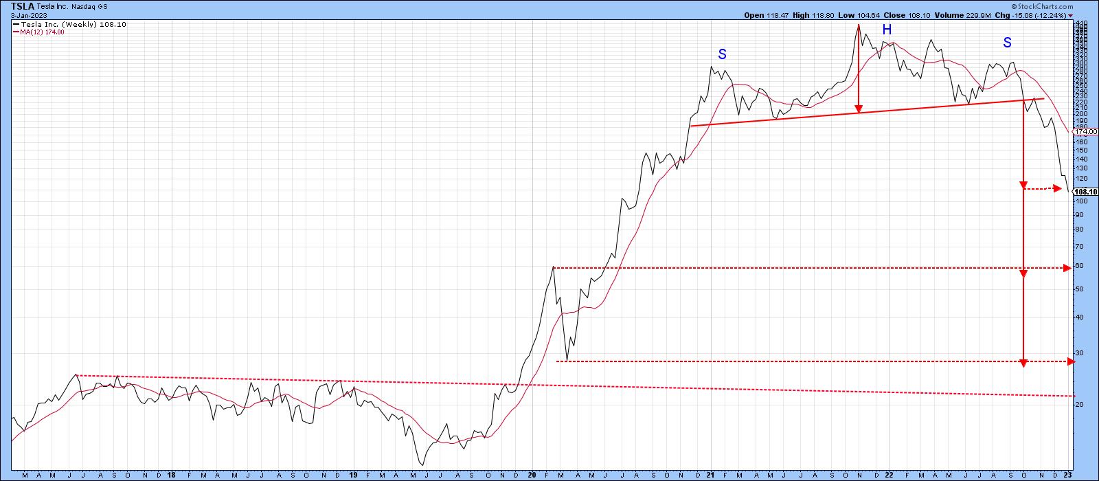
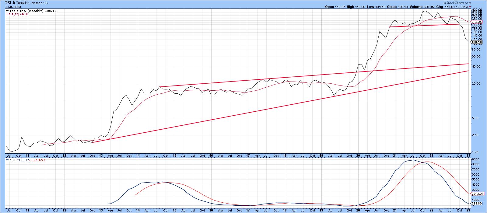
The answer to that question is unknowable. However, it is possible to look at some downside projections based on the depth of the 2202–2022 top featured in Chart 4. The first thing to note is that price has already achieved its minimum ultimate downside objective at a recent $107. Given the widespread coverage of the recent sharp sell-off, it could be argued from a contrarian aspect that the downside projection has already been met and that TSLA is currently experiencing "the" low. I can't argue with that, except to say that the longer-term indicators remain bearish. Consequently, all we can realistically do at this point is call for a relief rally and see how things pan out. After all, the long-term KST in Chart 5 has barely dropped below its equilibrium point and is nowhere near an oversold reading from which you could reasonably expect a buy signal to be generated.
 CHART 4: HOW LOW CAN TSLA GO? Looking at this chart, TSLA's stock price has reached its minimum ultimate downside objective. There's a chance of a potential relief rally but if long-term indicators continue to be bearish, trade with caution. Chart source: StockCharts. For illustrative purposes only. CHART 4: HOW LOW CAN TSLA GO? Looking at this chart, TSLA's stock price has reached its minimum ultimate downside objective. There's a chance of a potential relief rally but if long-term indicators continue to be bearish, trade with caution. Chart source: StockCharts. For illustrative purposes only.
That said, it's evident the bull market, apart from the sharp 2020 decline, was a straight-line-up affair, generating little in the way of support. Bearing in mind that previous highs and lows represent potential future support levels, the next two multiples of projected downside action approximate the early 2020 high and low at around $60 and $30 respectively. That doesn't necessarily mean either will be achieved, but they would be intelligent places to expect a reversal in the event price moves lower. Regarding the question of whether TSLA will be a reliable leading indicator for the bear market itself, I think we are likely to find out relatively early in the first quarter.
 CHART 5: LONG-TERM KST INDICATOR IS NOWHERE NEAR OVERSOLD. There may be more downside in TSLA's stock price. Chart source: StockCharts. For illustrative purposes only. CHART 5: LONG-TERM KST INDICATOR IS NOWHERE NEAR OVERSOLD. There may be more downside in TSLA's stock price. Chart source: StockCharts. For illustrative purposes only.
Good luck and good charting,
Martin J. Pring
The views expressed in this article are those of the author and do not necessarily reflect the position or opinion of Pring Turner Capital Group of Walnut Creek or its affiliates.
|
| READ ONLINE → |
|
|
|
| Top Advisors Corner |
| Bulls Hold the Line - What Comes Next? |
| by John Hopkins |
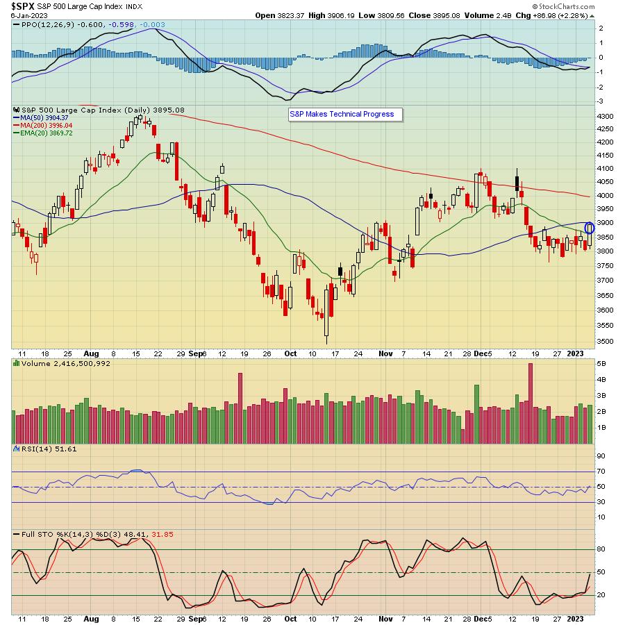
We're through the first week of January and, even though the bulls don't have that much to brag about yet, they did manage to hold the line, with the market staging a nice rally into Friday's close. In fact, as you can see below, the S&P closed back above its 20 day moving average for the first time since mid December, even challenging its 50-day before settling down in between.

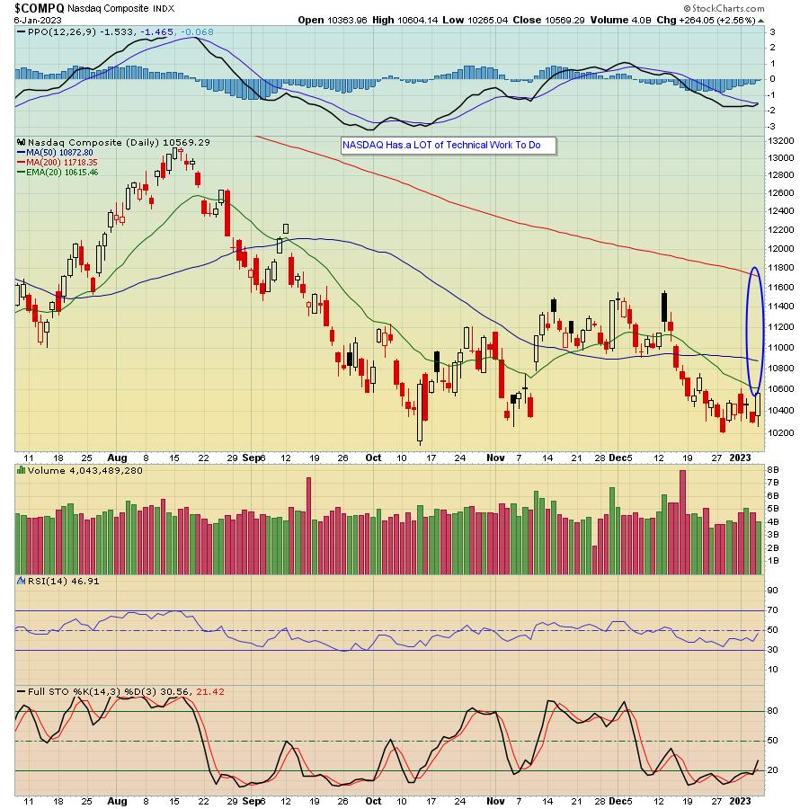
Friday's solid rally came on the heels of the jobs report showing wages have slowed, giving the bulls hope that the Fed will be less aggressive when it next announces a rate increase. But while the Dow finished the week above all of its key moving averages, and the S&P made some progress, the tech-heavy NASDAQ continues to lag, which is going to make it tough for the overall market to hold its gains unless it joins the party.

All leading to the question...what comes next? And it's a great question to ask! Plus, the timing couldn't be better, as we will be conducting a FREE, highly educational webinar, "Market Vision 2023", this Saturday, January 7 starting at 9am Eastern Time. This webinar will feature our Chief Market Strategist Tom Bowley, who will be joined by StockCharts.com's Julius de Kempenaer, Grayson Roze, and David Keller. Quite the all-star lineup! To learn more about Saturday's event and to save a seat, just click here.
2022 was a year a lot of traders would just as soon forget. But, as usual, there is nothing we can do about the past. However, we can always learn from the past as we get ready to navigate another year. Hope you can join us Saturday!
At your service,
John Hopkins
EarningsBeats.com
|
| READ ONLINE → |
|
|
|
| RRG Charts |
| Useful (Multi)Utilities |
| by Julius de Kempenaer |
From the Sector Level

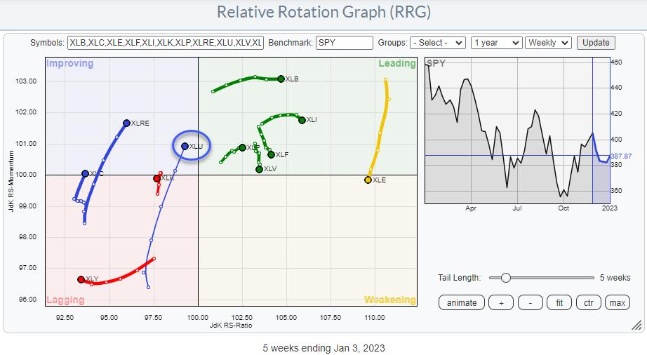
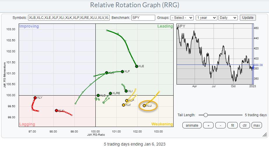
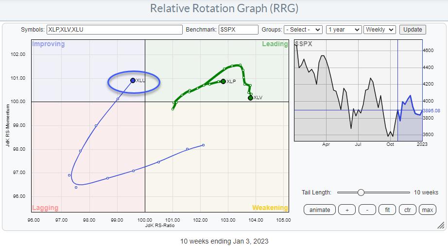
On the Relative Rotation Graph for US sectors, the tail for the Utilities sector stands out. It is relatively long compared to the other tails on the graph, which indicates that there is quite a bit of power behind the move. With the tail moving from lagging into improving and heading toward the leading quadrant, this sector deserves some attention.

On the daily RRG, XLU has moved from leading into weakening. However, the sector is still at the highest RS-Ratio reading on the daily time frame. With the tail being medium-length, there is plenty of room to curl back up before hitting the lagging quadrant.
Working from a scenario of strength with the weekly tail being the most important driver, I am watching for the daily tail to start curling back up and getting back in sync with the positive rotation, as seen on the weekly RRG.

Utilities and Consumer Staples and Healthcare are generally seen as the defensive sectors in the stock market.
The RRG above carves out these three defensive sectors against the S&P 500 index. The overall strength of this segment is well visible.
Healthcare has led the way over the past weeks and is now taking a break with a rotation lower, but is still at the highest RS-Ratio reading. Consumer Staples continue to head deeper into the leading quadrant, while Utilities are shaping up for a renewed rotation into the leading quadrant. When XLU crosses over, we, once again, have all three defensive sectors inside the leading quadrant, or at least on the right-hand (positive) side of the Relative Rotation Graph.

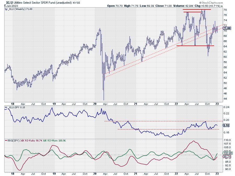
On the price chart, XLU has rallied back to the old support line, or the support zone between two rising support lines, which is now running into resistance. Old support becomes resistance. In particular, when XLU can get back above that zone and back into the old rising channel, a lot more strength is expected, i.e. move above 72 with confirmation when the sector returns above 74.
Down To Groups
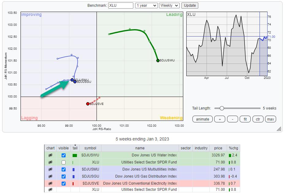
From the Sector Summary page, we can grab the RRG that shows the rotation for the various groups inside the Utilities sector.

We can see more detail when looking at the rotations for these groups against XLU as the benchmark. The first observation is that $DJUSWU (Water Index) has been leading the charge over the last months, but this group has now started to lose relative momentum while still being on the highest RS-Ratio reading. As it is currently going through a setback, the upside potential is limited here, while there is some clear near-term downside risk.
Conventional Electricity is the weakest group in this sector and should therefore better be avoided. The same goes for Gas distribution, whose tail just rolled over inside the improving quadrant and is now on its way to lagging again.
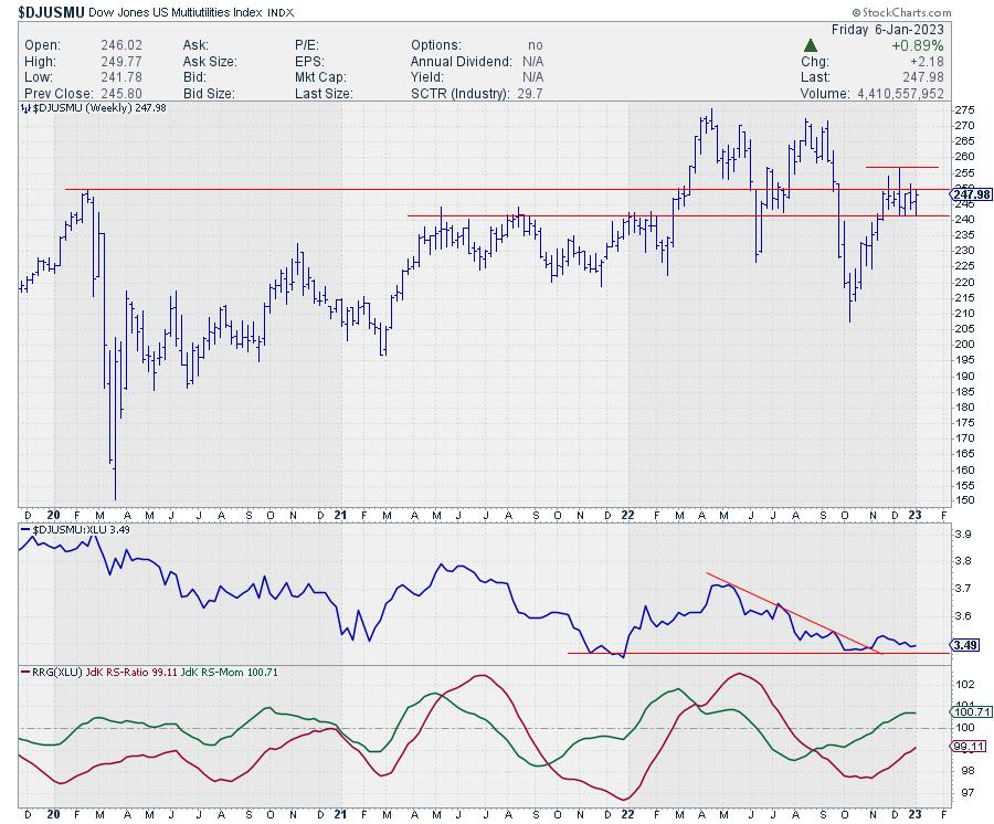
The only group currently picking up relative strength is Multiutilities ($DJUSMU), inside the improving quadrant and heading toward leading.

The RRG-Lines are picking up, with RS-Momentum already above 100, albeit flattening. The RS-Ratio is improving and heading towards that 100-level.
On the price chart, $DJUSMU is consolidating after a rally out of the October low. Moving out of that small range to the upside, i.e., above 250, will open up the way for a higher move, with some intermediate resistance expected around 257, the level of the most recent peak. A strong confirmation of the build-up in relative strength will be triggered when the raw RS-line breaks above its most recent high.
All in all, the sector continues to pick up relative strength. Multiutilities seems to be the next group set to lead the sector, while water remains strong, but seems to be going through a setback, and conventional Electricity is a drag.
Enjoy your weekend and #StaySafe, --Julius
|
| READ ONLINE → |
|
|
|
| The Canadian Technician |
| Is This the Look For 2023? |
| by Greg Schnell |
I continue to look for signs this market wants to go higher, but it refuses to show me some resilience.
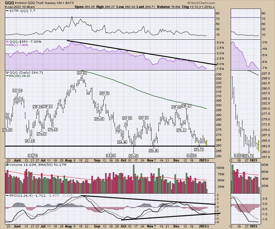
In what can only be described as a barbell strategy, on one end, we have the safety of Utilities and Consumer Staples, which may not make a lot of money, but isn't leaking it either. In the middle, we have the Nasdaq names, which continue to ooze lower. On the other end is the industrials, and commodities, which are trying to get going here, but haven't had an easy time either.
The QQQ chart just keeps drifting. This is the third test of this level. Can we hold?

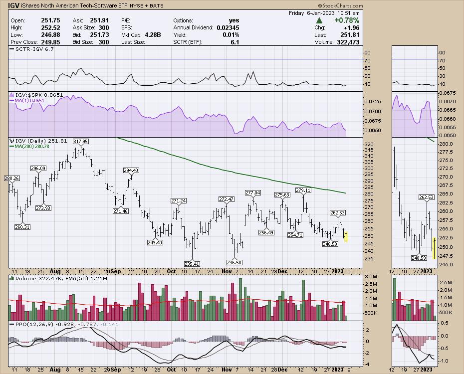
Software is down hard this week. It opened Friday morning down 6% from Monday's high.

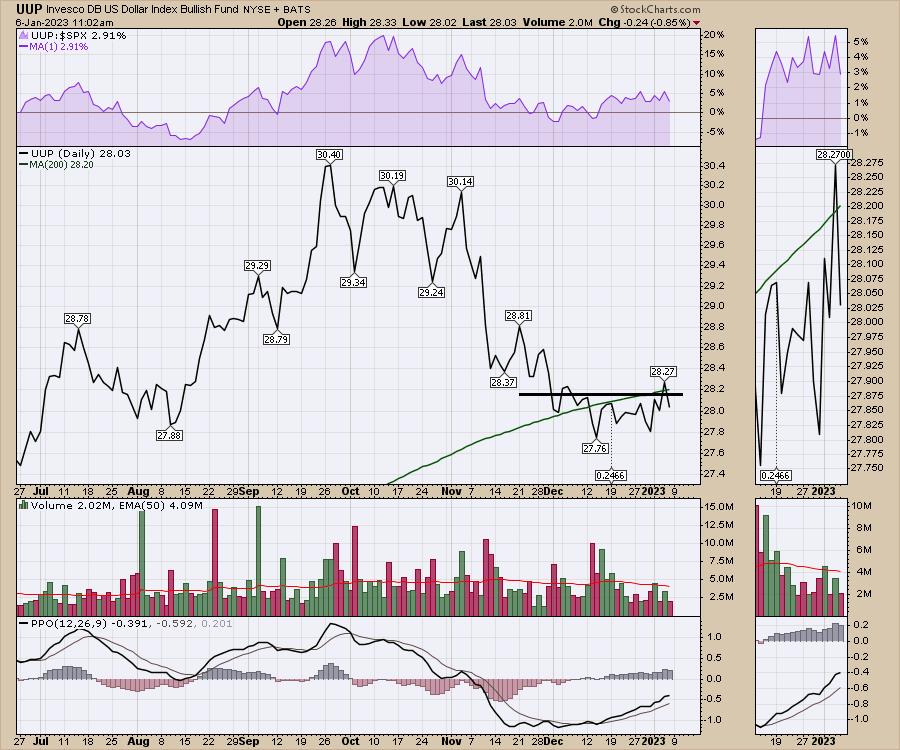
The US Dollar tried to reverse and go higher this week. It made new one month highs after consolidating through December. Friday reversed that breakout as the market surged higher.

After wage pressures pulled back in the jobs report, we have seen a 1% surge higher. It still might be a case of staying where the puck is in this market, and not hoping for some of the tech sector to start working.
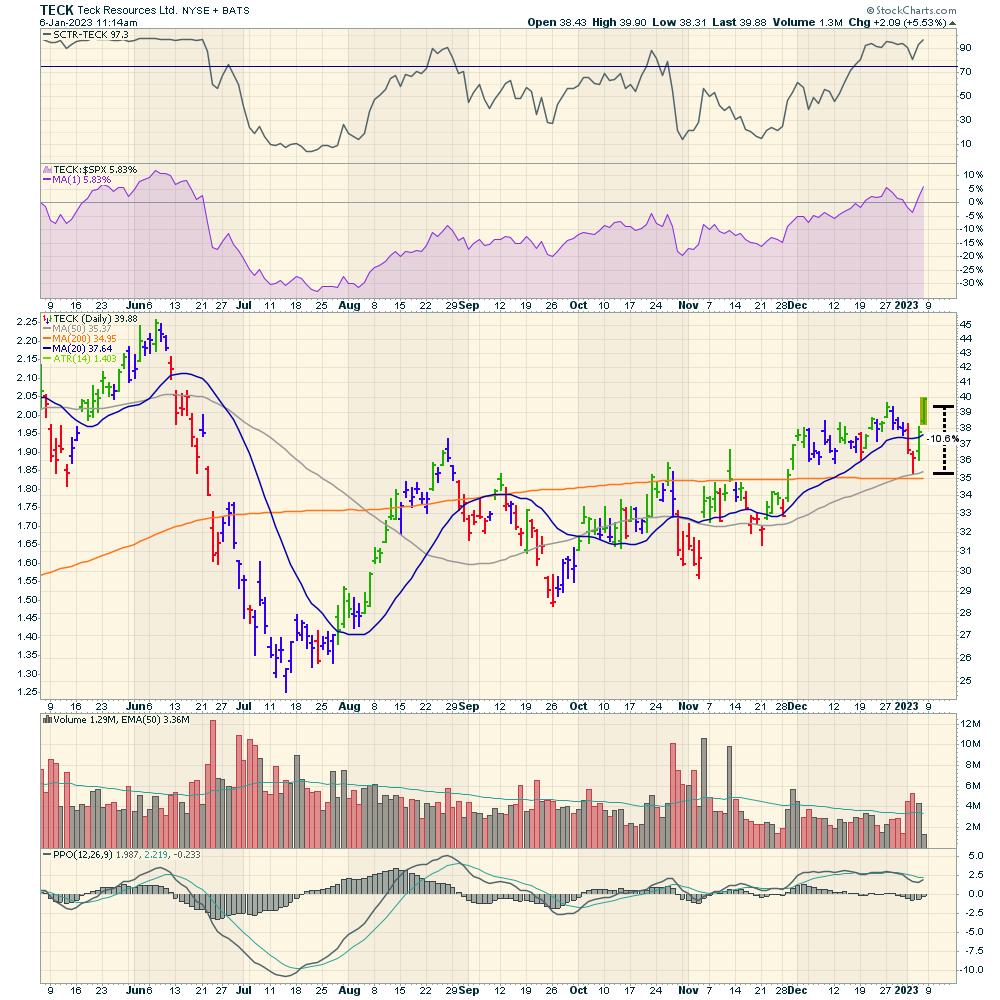
Copper names have started to move, and I'll have more information in the client newsletter, but the ride is wild. In five days, TECK lost 10%, made new one-month lows, then bounced off the 50- and 200-DMAs for a rally to new highs in 2 days. That's just one example.

For a big warm welcome to the trading landscape of 2023, I will be giving a presentation about how we plan to approach the turbulent trading market of 2023 on Tuesday, January 10 at 1 PM ET! You can register for the free event at this link. We have two primary goals: Protect capital, ride uptrends. If you struggled in 2022 or would like some other ideas, Osprey Strategic is a very affordable service.

With that, let's kick off 2023 with a bang!
|
| READ ONLINE → |
|
|
|
| DecisionPoint |
| 2022 Q3 Earnings: Market Still Overvalued |
| by Carl Swenlin |
Preliminary earnings numbers are in for 2022 Q3. To clarify, earnings results are collected for the three months after the end of the quarter. Meanwhile, "earnings season," the collection period for 2022 Q4, has just begun.
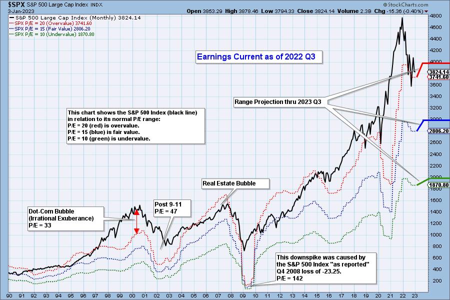
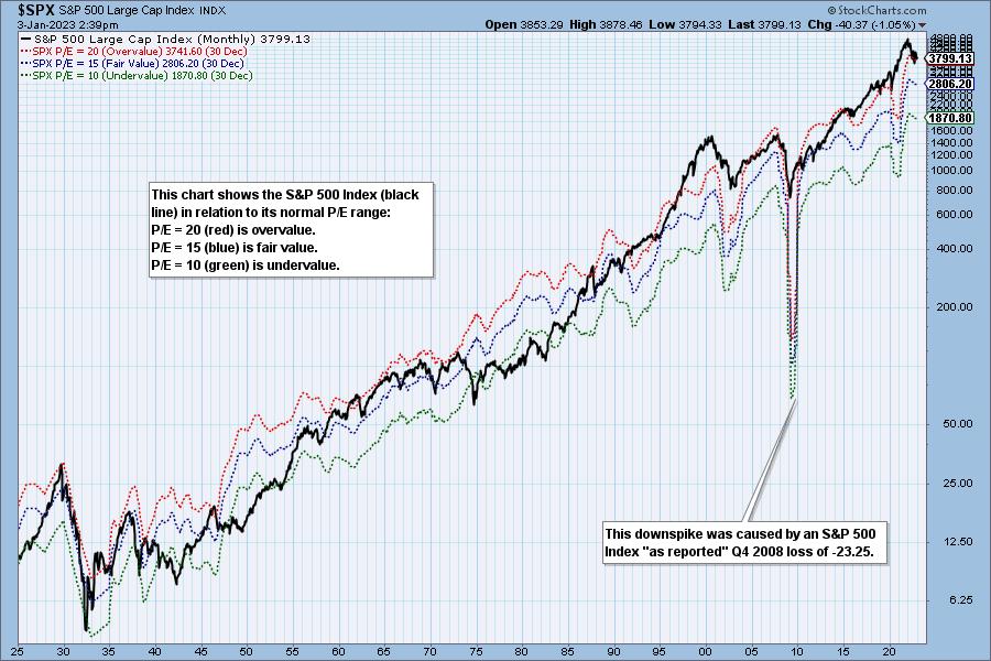
The chart below shows the normal value range of the S&P 500 index ($SPX), indicating where $SPX would have to be to have an overvalued price/earnings (P/E) of 20 (red line), a fairly valued P/E of 15 (blue line), or an undervalued P/E of 10 (green line). Annotations on the right side of the chart show where the range is projected to be based on earnings estimates through 2023 Q3.


Historically, price has usually remained below the top of the normal value range (red line). However, since about 1998, it has not been uncommon for price to exceed normal overvalued levels, sometimes by a lot. The market has been mostly overvalued since 1992, and it hasn't been undervalued since 1984. You could say that this is the "new normal," except that it isn't normal by Generally Accepted Accounting Principles (GAAP) standards.

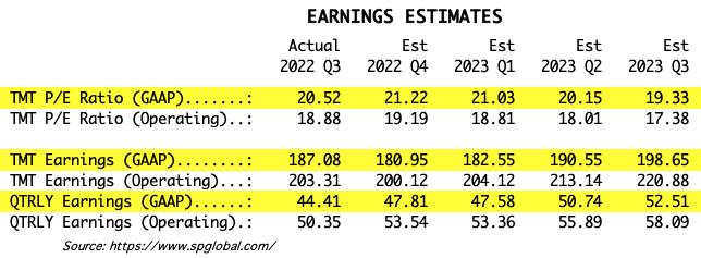
The table below shows earnings projections through September 2023, using GAAP earnings as the basis for the analysis. Keep in mind that the P/E estimates are calculated based on the $SPX close as of December 30, 2022. Keep in mind, the numbers will change daily depending on where the market goes from here. It is notable that the P/E is again outside the normal range.

The following table shows where the bands are projected to be based on earnings estimates through 2023 Q3.

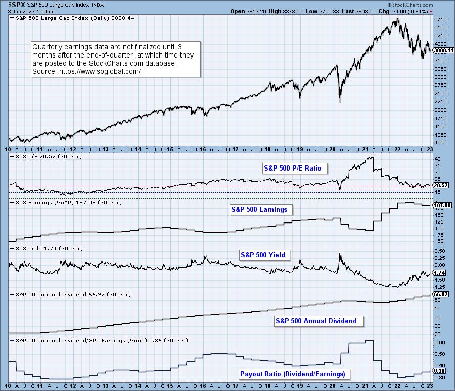
This DecisionPoint chart keeps track of S&P 500 fundamentals, P/E, and yield. It's updated daily—not that you need to watch it that closely, but it is up-to-date when you need it.

The Takeaway
The market is still overvalued and slightly above the normal range. As the bear market progresses, I expect actual earnings will fall short of estimates, and that prices will continue to fall. I would like to see the S&P 500 get back to the undervalued level, which I'm sure will happen when pigs fly. Falling prices will help that happen, but falling earnings will cause the value range to move lower, making it harder to reach undervalued levels.
Watch the latest episode of DecisionPoint on StockCharts TV's YouTube channel here!
(c) Copyright 2023 DecisionPoint.com
Technical Analysis is a windsock, not a crystal ball.
Helpful DecisionPoint Links:
DecisionPoint Alert Chart List
DecisionPoint Golden Cross/Silver Cross Index Chart List
DecisionPoint Sector Chart List
DecisionPoint Chart Gallery
Trend Models
Price Momentum Oscillator (PMO)
On Balance Volume
Swenlin Trading Oscillators (STO-B and STO-V)
ITBM and ITVM
SCTR Ranking
Bear Market Rules
|
| READ ONLINE → |
|
|
|
| MORE ARTICLES → |
|
 Chart 1
 Chart 2
 Chart 3
 Chart 4
 Chart 5

