| THIS WEEK'S ARTICLES |
| John Murphy's Market Message |
| S&P 500 BACKS OFF FROM MOVING AVERAGE AND TRENDLINE RESISTANCE |
| by John Murphy |
S&P 500 REMAINS IN MAJOR DOWNTREND...Although stocks have experienced a counter-trend rally over the last three months, their major trend is still down. One way to measure that is by looking at where moving averages and trendlines are located. Chart 1 show the S&P 500 meeting resistance near its 200-day moving average (red line) as stocks suffered their first weekly loss in the new year. The chart also shows the SPX trying to regain its 50-day average (blue line) at week's end. One notable fact is that the 50-day line is drawing closer to the 200-day line. The blue line fell below the red line nearly a year ago which is one definition of a major downtrend. A few things need to happen to improve the long term trend for the SPX. One is a decisive close above its 200-day line and its December high. Another is the blue 50-day line crossing above the red 200-day line. A third is a move above the falling purple line.
TRENDLINE RESISTANCE...The purple line also shows the SPX also backing off from a major downtrend line extending back to the start of last year. That longer-term trendline can be seen more clearly in Chart 2. The SPX would need to clear that major resistance line in decisive fashion to signal an important trend change to the upside. At the moment, however, the market's major downtrend is still in effect. There are other ways to study moving average lines.
 Chart 1 Chart 1
 Chart 2 Chart 2
S&P PERCENT OF STOCKS ABOVE MOVING AVERAGES... Chart 3 shows the percent of SPX stocks trading above their 200-day lines in an uptrend but backing off sharply this week from its late November peak. Its current reading shows 60% of its stocks in moving average uptrends which is somewhat encouraging. That red line is worth watching because a drop below its December low near 47% would signal a rally failure.
SPX % STOCKS ABOVE 50-DAY LINES...Chart 4 shows the percent of SPX stocks above their 50-day moving average lines. The blue line has backed off from resistance at its August and November peaks but remains in an uptrend. Readings above 90% usually signal an overbought market. The blue line would need to fall below its December low at 44% to signal a likely market downturn. It would then have to fall below 20% to signal an oversold market.
 Chart 3 Chart 3
 Chart 4 Chart 4
TEN YEAR TREASURY YIELD TESTS 200-DAY AVERAGE... Bond yields have been dropping over the last three months while stock prices have rallied. That makes sense considering that the direction of interest rates has an impact on stock direction. Chart 5, however, shows the 10-Year Treasury yield dropping to a four-month low but nearing its 200-day moving average. It remains to be seen if that red line provides some support to bond yields. If it does, and bond yields stabilize or move higher, that could put downside pressure on stock prices. Just as falling yields may have contributed to the three-month stock rally, any upturn in yields could have the opposite effect.
 Chart 5 Chart 5
|
| READ ONLINE → |
|
|
|
| Martin Pring's Market Roundup |
| Selecting Sectors Using the Nirvana ChartStyle |
| by Martin Pring |
In the last couple of weeks, I've had a couple of conversations with clients asking how I go about selecting promising sectors, even when not much excites me at the moment.
To start with, I'm a believer in the principle that the character of short-term moves—which I classify as moves lasting between three to six weeks on average—is determined by the direction of the primary trend (nine months to two years). Those short-term moves, taking place in the same direction as the primary trend, possess greater magnitude and tend to last longer than counter-trend movements. If you're going to get a whipsaw or other deceptive event, it's more than likely to develop during short-term trends that develop contrary to the direction of the main trend.
The bottom line is that it really helps to have the primary trend on your side, whether you're a short-term trader or an investor. There's no perfect way to identify the direction of the main trend, but a good first step is to use monthly data to calculate a long-term Know Sure Thing (KST) indicator or the moving average convergence/divergence (MACD) oscillator.
Step One: Plotting the Sectors
Figure 1, which is reproduced from my Intermarket Review, plots the approximate point on the long-term KST bell curve where each sector and industry group labeled in the diagram resided at the end of December. For the sake of convenience, I split the cycle into four parts: winter, spring, summer, and fall. A late winter/spring or even early summer position represents a great time for acquisition. Not guaranteed of course, but certainly offers better odds of success than at the beginning of the fall quadrant.
Right now, most sectors and industry groups featured in the diagram are in the corrective fall position. It is also evident that quite a few are close to joining the six groups already resting in the winter phase. It's when the number of sectors in winter peaks that a bull market generally gets underway. If the current rally extends, it will likely push a lot of groups directly into summer via the transition point (as labeled in the figure). If not, more sectors can be expected to drop into winter.
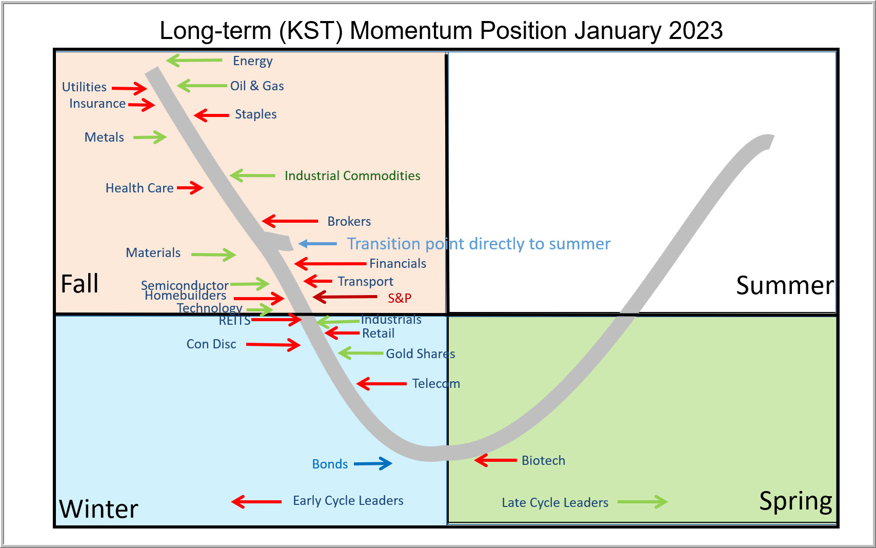 FIGURE 1. LONG-TERM KST BELL CURVE. Here you see where the different sectors and industry groups resided on the bell curve at the end of December 2022. FIGURE 1. LONG-TERM KST BELL CURVE. Here you see where the different sectors and industry groups resided on the bell curve at the end of December 2022.
Step Two: Identify Low-Risk Prospects
Step two is to take a closer look at some of these low-risk prospects currently positioned in the winter or spring quadrants from a relative strength aspect. For this, I use what I call my "Nirvana" template or ChartStyle. It is so named because it offers a substantial amount of information on the long-term technical position of a specific sector in one simple arrangement. Chart 1 for instance, shows the nirvana ChartStyle for the iShares Nasdaq Biotech ETF (IBB). This template features the price, together with its 65-week exponential moving average (EMA) in the top window. The long-term KST, constructed from weekly data and its 26-week EMA is featured in the second window.
The two lower clips feature the same EMAs and momentum. This time, however, you're looking at relative action against the S&P Composite. In doing so, you see a complete long-term picture of the absolute and relative action. In an ideal situation, you want to see both KSTs reversing to the upside from below zero at a time when the two price series are above their 65-week EMA. Alternatively, they could be breaking above a down trendline or completing a price pattern.
Incidentally, if this approach appeals to you. just click on the chart and save it as a ChartStyle for yourself.
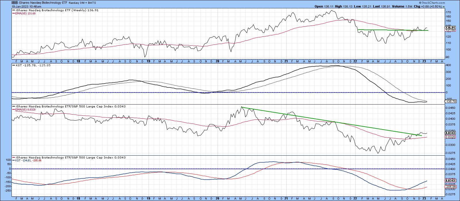 CHART 1. LONG-TERM PICTURE OF ABSOLUTE AND RELATIVE ACTION. Both KSTs should reverse and move to the upside when the two price series are above their 65-week EMA. Chart source: StockCharts.com. For illustrative purposes only. CHART 1. LONG-TERM PICTURE OF ABSOLUTE AND RELATIVE ACTION. Both KSTs should reverse and move to the upside when the two price series are above their 65-week EMA. Chart source: StockCharts.com. For illustrative purposes only.
In the case of the IBB, the absolute KST is below zero but rising gently. That puts it in the spring quadrant. The price itself is above its 65-week EMA and has completed its 2020 base, which is another positive. Relative momentum, in the bottom window, is even more firmly placed in the spring quadrant than its absolute counterpart. It's also worth noting that the RS line is above its EMA and the 2020–2022 down trendline.
The Industrial Select Sector SPDR Fund (XLI) is close to winter and its RS line has already broken out from a large base (see chart 2). This move is also being supported by a rising and firmly bullish KST. The price itself is above its EMA but needs to break more decisively above its 2021–22 resistance trendline. One problem is a declining absolute KST from an above-zero position. That could easily move from its current fall position into summer in the event that the XLI breaks decisively above its recent trading range. However, similar action that developed in 2020 shows that an immediate transition from fall to summer doesn't come without risk. One saving grace is that during this previous period, the RS line was deteriorating. Currently, it's improving, so an absolute price breakout, should it materialize, is more likely to be valid.
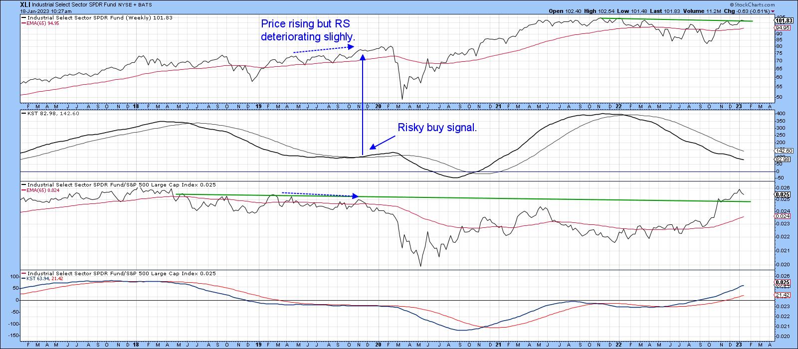 CHART 2. INDUSTRIAL SECTOR IS LIKELY TO BREAKOUT. The RS line has broken out from a base, the KST is bullish, and price is above its EMA. Chart source: StockCharts.com. For illustrative purposes only. CHART 2. INDUSTRIAL SECTOR IS LIKELY TO BREAKOUT. The RS line has broken out from a base, the KST is bullish, and price is above its EMA. Chart source: StockCharts.com. For illustrative purposes only.
Possible Bull Market?
During the bull market between late 2020 and early 2022, most sectors and groups were in a summer (markup) phase, as shown in Figure 2.
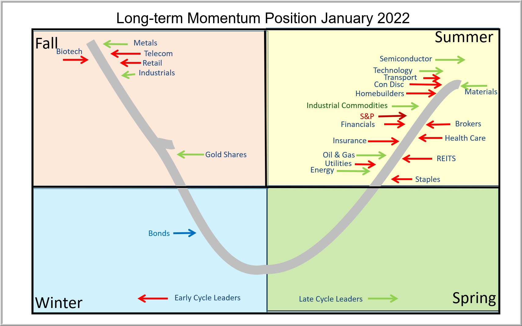 FIGURE 2: SUMMER MARKUP PHASE. If markets rally, there's a chance that most sectors will transition from fall to summer. That means a potential bull market is on the horizon although there's a chance that the groups could slip into winter. FIGURE 2: SUMMER MARKUP PHASE. If markets rally, there's a chance that most sectors will transition from fall to summer. That means a potential bull market is on the horizon although there's a chance that the groups could slip into winter.
If the current rally extends, there's a good possibility that many of them will transition directly from fall to summer, thereby indicating a bull market. However, the danger of those same groups slipping into winter cannot be discounted, so a generally cautious stance seems more appropriate until more sectors can move into a bullish position.
Good luck and good charting,
Martin J. Pring
The views expressed in this article are those of the author and do not necessarily reflect the position or opinion of Pring Turner Capital Group of Walnut Creek or its affiliates.
|
| READ ONLINE → |
|
|
|
| The Mindful Investor |
| The Most Important Breadth Indicator to Follow |
| by David Keller |
I like to keep my process simple. That means I define the market trend using a simple combination of exponential moving averages. That also means that my charts are relatively straightforward, avoiding too many indicators and sticking to what I consider simple measures of trend and momentum.
So when I think about market breadth, I (not surprisingly) prefer to keep things simple. Are over half of the S&P 500 stocks above their 200-day moving average? Then conditions are pretty good. What if less than 50% of the benchmark names are above their 200-day moving average? Then the picture is probably much less rosy.
We'll come to the most important breadth indicator in a minute, but first let's acknowledge the value of simple comparisons of price and moving average.
It All Starts With the 200-Day
One of my early mentors used to say, "Nothing good happens below the 200-day moving average." While there are indeed some positive things that could happen below the 200-day (bullish divergences come to mind), he was indeed correct that, until the price breaks above this long-term barometer, the conditions are, more likely, less than ideal.
The chart of GOOG over the last two years is a brilliant example of this approach in all its glory.
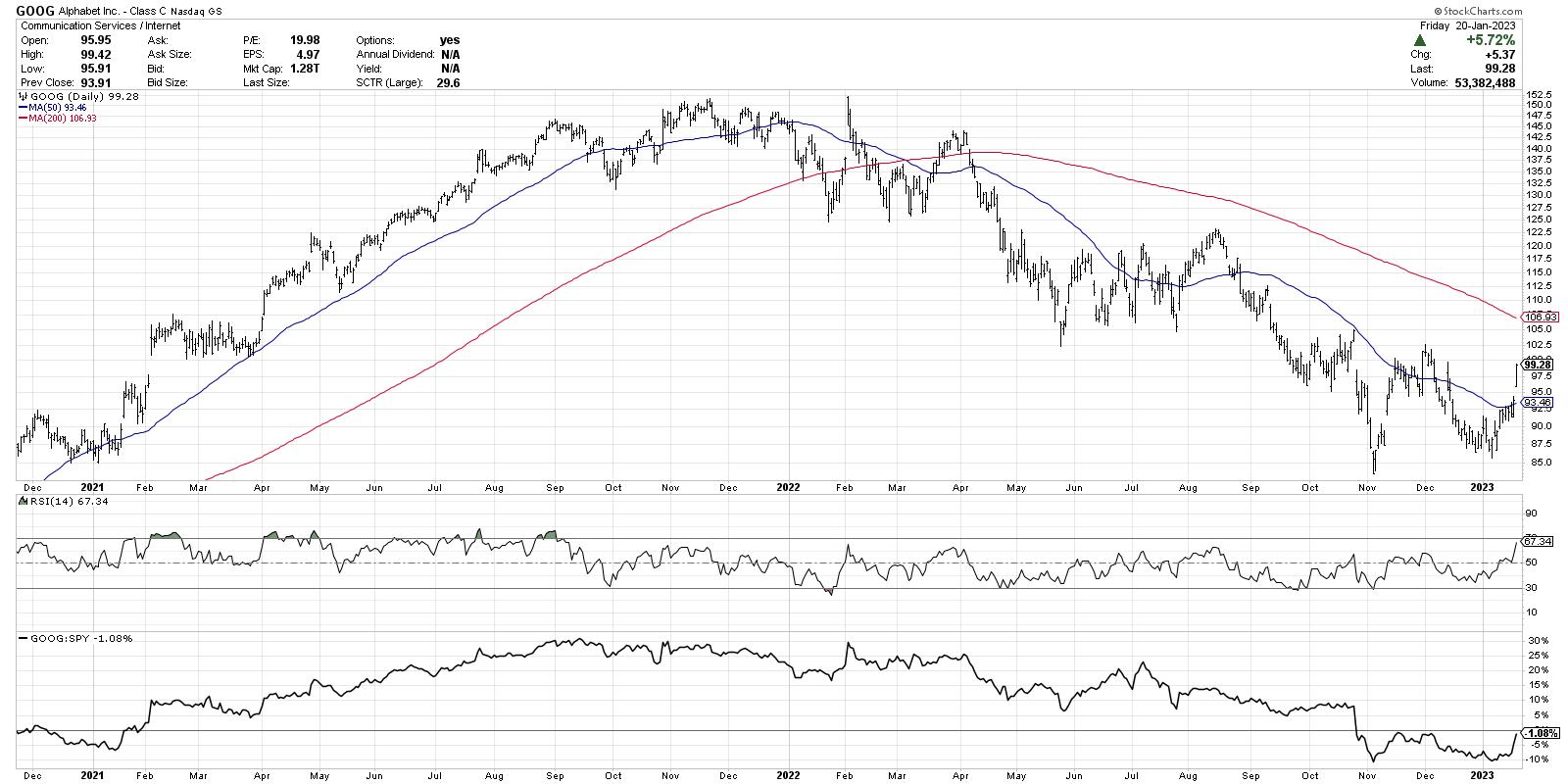
On the left half of the chart, you'll notice the price is making higher highs and higher lows. The price is above the 50-day moving average, which is in turn above the 200-day moving average. This chart is "long and strong", flowing up and to the right.
"A consistent, imperfect routine is way better than an inconsistent, perfect routine."
What sets successful investors apart from others? A commitment to a consistent set of routines. What is the first chart you look at every day? What do you watch, read, and listen to every day? How would you describe your daily and weekly routines?
In our latest free webinar, I'll walk through my own Morning Coffee Routine from start to finish. You'll see what I use to maintain a high situational awareness for the markets, and identify some ways to upgrade your own routines! Sign up HERE for this free event on Tuesday 1/24!
Look how much things evolved on the right half of the chart. The price is now making lower lows and lower highs. The price is below two downward-sloping moving averages. Conditions are clearly bearish.
Now let's take this analytical approach and expand it into a breadth indicator to tell us more about broad market participation.
The Most Important Breadth Indicator Ever
OK, I'm getting a little aggressive with the superlatives, but this chart has certainly provided some excellent perspective on the last 12 months for stocks. We're now basically checking 500 charts to see whether the price is above or below the 200-day and 50-day moving averages.
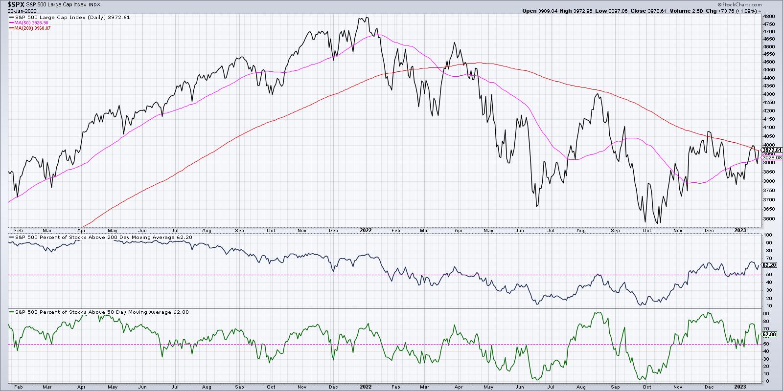
You can see on the first panel below the price that, as of Friday's close, 62% of the S&P 500 members are above their 200-day moving average. Look at how the indicator was above the pink 50% line for all of 2021, then dipped below the crucial 50% level in the first quarter of 2022. Notice how the indicator moved up to the 50%, but did not get above it, when the S&P 500 tested its own 200-day moving average in August 2022. You can also see how the indicator did finally break above the 50% level in November, as the market moved higher on a broad advance off the October lows.
Then in December, when the S&P 500 pulled back to 3800, this indicator notably remained above the 50% threshold. This was a key bullish tell when I was considering the likelihood of a retest of the October lows. As long as this indicator remains above 50%, then conditions are still fairly constructive for stocks.
Now let's review the bottom panel, which shows the percent of stocks above the 50-day moving average. On Thursday of this week, the indicator dropped to just below 50%, which is why we highlighted it as a potential breakdown on Thursday's episode of The Final Bar.
But Friday's rally on options expiration day pushed this breadth indicator back up to 63%, meaning that most stocks ended the week back above their 50-day moving averages. Investors often use the 50-day moving average as a good pullback indicator, and the fact that stocks are holding the 50-day is a pretty bullish sign going into the weekend.
What Does a Bull Market Recovery Look Like?
I think the chart of Netflix (NFLX) is a good illustration of a rotation from a distribution phase (often described as having more sellers than buyers) to an accumulation phase (buyers outnumber sellers).
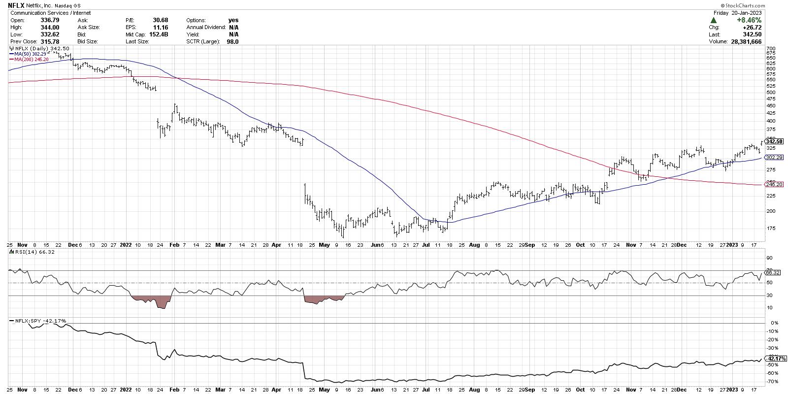
See how the price is now above both moving averages, the RSI has remained in the bullish range (above 40), and the relative strength has been trending steadily higher? The more stocks that have this sort of chart, the more likely that our benchmarks are in an uptrend phase.
Friday's trading session was driven higher by the FAANG stocks and similar names in Technology and Communication Services. If we see more of that sort of behavior going into February, then we may see the sort of bullish environment suggested by the four-year Presidential cycle. For now, I'm focused on this chart of market breadth indicators to see if they remain above the crucial 50% level. As long as that is true, then the bullish recovery phase appears to be intact.
Want to digest this article in video format? Just head over to my YouTube channel.
RR#6,
Dave
P.S. Ready to upgrade your investment process? Check out my YouTube channel!
David Keller, CMT
Chief Market Strategist
StockCharts.com
Disclaimer: This blog is for educational purposes only and should not be construed as financial advice. The ideas and strategies should never be used without first assessing your own personal and financial situation, or without consulting a financial professional.
The author does not have a position in mentioned securities at the time of publication. Any opinions expressed herein are solely those of the author and do not in any way represent the views or opinions of any other person or entity.
|
| READ ONLINE → |
|
|
|
|
|
| ChartWatchers |
| 2023 Stock Market Forecast: Where's the Strength? |
| by Jayanthi Gopalakrishnan |

Uncertain about where the stock market's headed? You should be, after a tumultuous 2022. Read on to hear what three experts think the 2023 investment landscape will look like. More importantly, get ready to take advantage of new trading and investing opportunities.
Forecasting the stock market is like predicting the weather. You never know what's going to happen from one moment to the next. The stock market can be a tricky beast, but 2023 could be a big year for investors. Whether you're a short-term trader or long-term investor, insights from three technical analysts—Mish Schneider, Tom Bowley, and Greg Schnell, CMT—are sure to help you focus on specific areas and get a better idea of what trends to watch out for.
In a recent StockCharts TV special, "Charting Forward: Q1 Market Outlook," our chief market strategist and host of The Final Bar, David Keller, CMT, picked the brains of the three panelists in a round table discussion to get their thoughts on the market, which areas are likely to outperform, and which areas are likely to underperform. Here's a glimpse at the different points of view.
CHARTWATCHERS KEY POINTS
- Commodities could shine in 2023, especially precious metals
- Energy stocks are forming a base and oil prices could see a bullish rally
- Equities are looking bullish and the biggest challenge in 2023 will be growth vs. value stocks
The Commodity Cycle
Mish Schneider, director of trading education at MarketGauge.com, is bullish on commodities. Here's her outlook.
If you look back to the late 1970s, after a recessionary period, there was a bear market. The stock market then hit a trading range. During this time, commodities started to shine. A similar scenario is likely to play out in 2023.
The S&P 500 index ($SPX) has been between 3200 and 4200 and we're close to testing the upper region of the range. Given that inflation is a global phenomenon, equities could remain stagnant for a while, which is why commodities are likely to be bullish in 2023. It wouldn't be surprising to see the U.S. dollar fall further and equities continue to remain flat, with some periods of excitement. But if you want to catch the big trends, don't lose track of energy, food, and metals.
The 80-month moving average (MA) represents a breakdown of the business cycle, and a lot of growth stocks have broken below their 80-month MA. But if you pull up a chart of commodity exchange-traded funds (ETFs) such as Invesco DB Commodity Index Tracking Fund (DBC), you'll see the opposite taking place (see chart 1). These ETFs are trading above their 80-month MA.
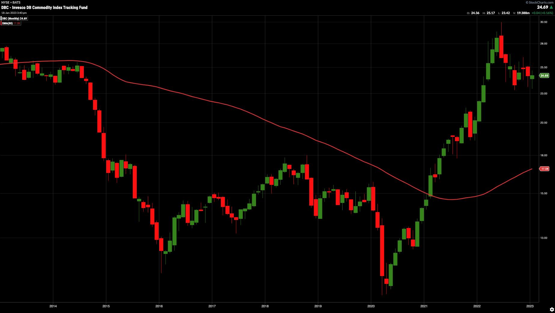
CHART 1: A POTENTIAL COMMODITY CYCLE COULD BE IN THE WORKS. The Invesco DB Commodity Index fund (DBC) is trading well above its 80-month moving average.Chart source: StockChartsACP. For Illustrative purposes only.One important point about commodities: When they're beaten down, it could mean buying opportunities. When they look great, you may want to sell them. Commodities have been trading sideways for years. 2023 may be their year.
If gold futures hold $1,900 per ounce, there's no reason the shiny metal can't go as high as $3,000 to $3,500 an ounce. Commodities are emotional, countries need them, and so do governments. Now that demand for commodities is growing, it's possible that oil could lead the charge, and may be the key to ignition. ~Mish Schneider
Bullish on Energy
Greg Schnell, CMT, MFTA, chief technical analyst at Osprey Strategic, is stoked about energy. Here's why.
With the U.S. dollar breaking down, it could benefit other asset classes. The $SPX is likely to break to the upside, reaching the 4,500 level. And expect copper to be the theme going forward, especially with wind and solar technologies. Note that Copper is considered an economic bellwether and is seeing some upside potential.
When the demand for energy increases, there's a chance that energy stocks will pop. Pull up a chart of the Energy Select Sector SPDR ETF (XLE) and you'll see that it could be indicating the start of the next bull leg. If that were to play out, energy won't get left behind.
A lower U.S. dollar bodes well for a rise in commodities. If you look at a 30-year monthly chart of the CRB index ($CRB) with the percentage price oscillator (PPO), such as in chart 2, you'll see that the PPO is the highest it's been. So keep an eye on this indicator and, if PPO turns up and moves higher in the next low, you may want to add commodities-related stocks or ETFs to your portfolio.
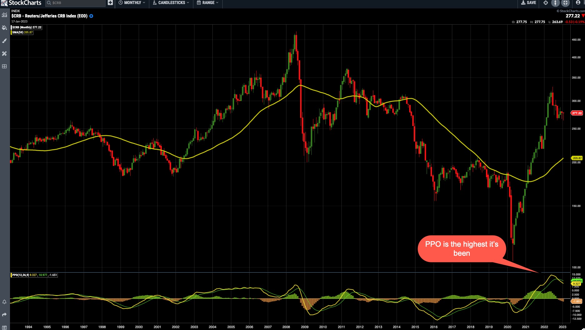
CHART 2: COMMODITIES LOOKING STRONG. Look for the PPO to go closer to zero and then turn higher. That could be an indication to invest in commodity stocks or ETFs.Chart source: StockChartsACP. For illustrative purposes only.
We've seen energy stock prices go up, but crude oil prices have been at a base of around $75 per barrel, which could be the floor. If you wanted to invest in oil, you'd want to buy it at a low, and there's a chance crude oil prices could rise from the $75 level. Going back to the 40-period MA, it looks like crude oil prices are pretty close to hitting that MA.
We're going on a run for the roses here. When crude oil crosses the center line (40-period MA) on the ice rink, oil will go deep into the zone. ~Greg Schnell
Value vs. Growth Stocks
Tom Bowley, chief market strategist of EarningsBeats.com, is pretty bullish going into 2023. Here's why he thinks $SPX has hit a bottom.
The stock market had gone up so much in 2020 and 2021 that a reversion to the mean was due, which happened in 2022. There's a lot of accumulation going on, and the biggest challenge in 2023 will be deciding between growth and value stocks. A lot will depend on what the Fed does and where interest rates go from here, but it's likely $SPX will move higher, maybe to 4,700 or even an all-time high later in the year.

In 2022 there was a shift in the markets in Q4. The Dow Jones Industrial Average ($INDU) was up 17%, while the Invesco QQQ Trust (QQQ) was relatively flat. Large $SPX market cap-weighted stocks struggled, yet the index gained in Q4. This supports the idea that money is rotating into the markets, as well as the possibility of a bull market in equities.
Value stocks are probably going to outperform growth stocks in 2023, although at some point growth stocks will come back. Pull up a chart of IWF:IWD and you'll see a reversion to the mean (see chart 3). In a low-interest rate environment, growth stocks tend to perform better. You don't want to be overweight in growth stocks until interest rates start coming down. That's when investing in S&P 500 companies will make more sense.
Using my fundamental background, if rates start to come down, growth stocks will benefit. Then, from a technical perspective, I wait to see a turn in the charts. Most bull markets will lift all boats. ~Tom Bowley
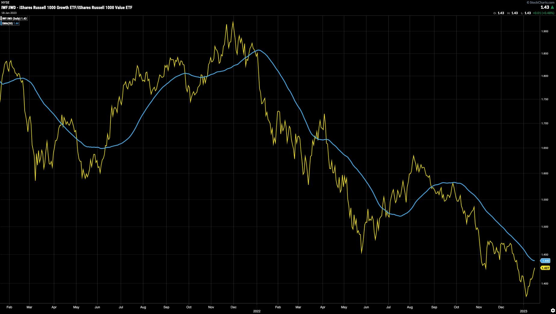
CHART 3: GROWTH VS. VALUE. Here you see the ratio of growth stocks to value stocks. Growth stocks have been underperforming value stocks in Q4 2022. Will the trend continue into 2023? It could, at least in the early part of 2023. It would also be interesting to see the reaction at the 50-day moving average (blue line).Chart source: StockChartsACP. For illustrative purposes only.
Long-Term Trends and Sentiment Shifts
It goes without saying that analyzing prevailing and long-term trends is the key to getting an idea of what the stock market might look like in the future. But, like the weather, nothing is certain in the markets. So be prepared to consider investing in markets that may not have been on your radar in the past. Keep a close eye on shifting investor sentiment; it can go a long way in determining which assets should be in your portfolio and which ones should leave. Stay tuned for next quarter's market outlook.
Want to hear more from the three talented technical analysts? Check out the entire conversation in the video below.
Jayanthi Gopalakrishnan
Director, Site Content
StockCharts.com
Disclaimer: This blog is for educational purposes only and should not be construed as financial advice. The ideas and strategies should never be used without first assessing your own personal and financial situation, or without consulting a financial professional.
|
| READ ONLINE → |
|
|
|
| Art's Charts |
| Trade Like Trevor |
| by Arthur Hill |
 Trevor Lawrence put in a performance for the ages in the AFC Wild Card game on Saturday. Chapeaux! Lawrence started the game with four interceptions in the first half but kept on throwing and brought his team back for a big win. There are some lessons here that we can apply to trading, which can also be a mental gain. Trevor Lawrence put in a performance for the ages in the AFC Wild Card game on Saturday. Chapeaux! Lawrence started the game with four interceptions in the first half but kept on throwing and brought his team back for a big win. There are some lessons here that we can apply to trading, which can also be a mental gain.
First and foremost, the Jags and Lawrence had a game plan. The interceptions were a setback, but the Jags did not change their game plan. They persevered and eventually put themselves into positive for the win.
How to up Your Trading Game Plan
Traders also need a strategy and cannot let a few losses derail them from that strategy. I run backtests to quantify strategies and these tests always include the consecutive number of losing trades. A mean-reversion strategy, which I introduced this past week, had a maximum of nine consecutive losses over a 15-year test. As such, you can expect to have five to nine consecutive losses at any point in the future. If the number hits 10, it would be time to re-evaluate the strategy. Also, note that the maximum number of consecutive winners was 20.

Trevor Lawrence threw four interceptions in the first half and kept on throwing. Not only did he keep throwing, but he also kept playing with confidence, one play at a time. The Jags would have surely lost the game had he stopped throwing or started throwing in a tentative manner.
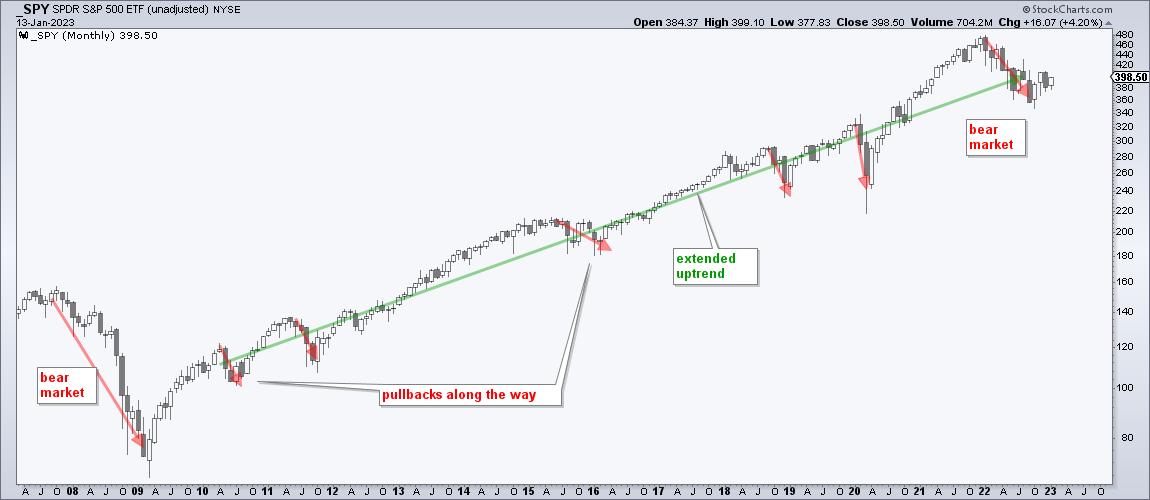
Losing trades happen and traders should continue taking signals generated by their trading strategy. Of course, the strategy should have a positive expectancy. The key is to stick with the rules and continue taking trades as they come. As with uptrends, equity curves don't go straight up. Trends (equity curves) zigzag higher with pullbacks (drawdowns) along the way. You can't capture the winning trades or hit a winning streak if you stop trading the strategy.
Losing streaks are difficult, no doubt. A trading strategy and trading process can help traders navigate rough seas and stick with the plan.
2023 marked a move towards an even more systematic approach at TrendInvestorPro as we introduced a fully quantified mean-reversion trading strategy for ETFs. We also have a trend-momentum strategy using the Trend Composite for signals. Click here for immediate access.
The Trend Composite, Momentum Composite, ATR Trailing Stop and eight other indicators are part of the TrendInvestorPro Indicator Edge Plugin for StockCharts ACP. Click here to learn more and take your analysis process to the next level.
---------------------------------------
|
| READ ONLINE → |
|
|
|
| DecisionPoint |
| Major Stock Indexes Are Faltering |
| by Carl Swenlin |
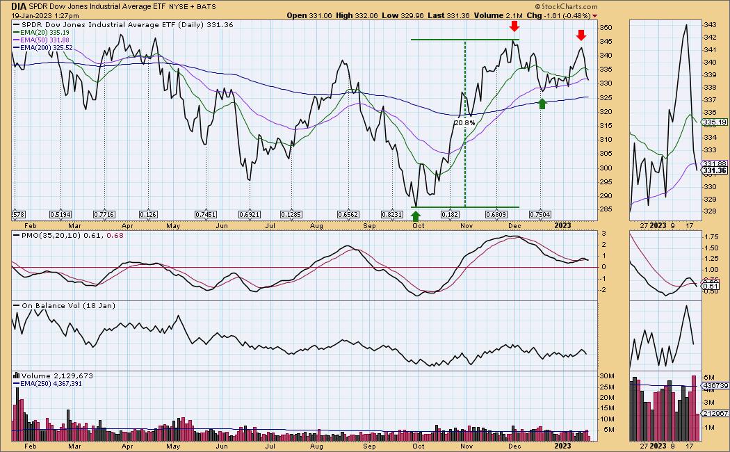
At the end of November the Dow Jones Industrial Average ETF (DIA) advanced just above +20% from its October low and officially entered a new bull market; however, technically, an intermediate-term rising trend had not been established. There is a bottom above the September bottom (green arrows), but there is not yet a top above the November top. In fact the last top is lower than the November top, and the next thing we are looking for is for price to fall below the December bottom to establish a new falling trend. The PMO (Price Momentum Oscillator) has topped and crossed down through the signal line (PMO SELL Signal).

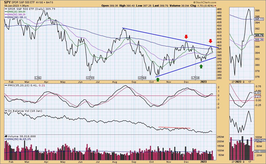
Other major indexes have also faltered. The S&P 500 (SPY) never made it to bull market territory. It also failed to establish a new rising trend, and its PMO has topped.

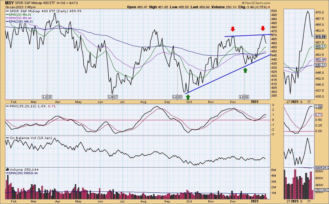
The S&P 400 Mid-Cap (MDY) actually did make a higher top, but it has turned down and formed a bearish rising wedge.

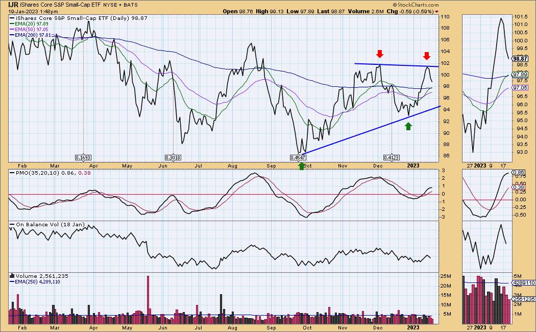
The S&P 600 Small-Cap (IJR) is similar to SPY and DIA.

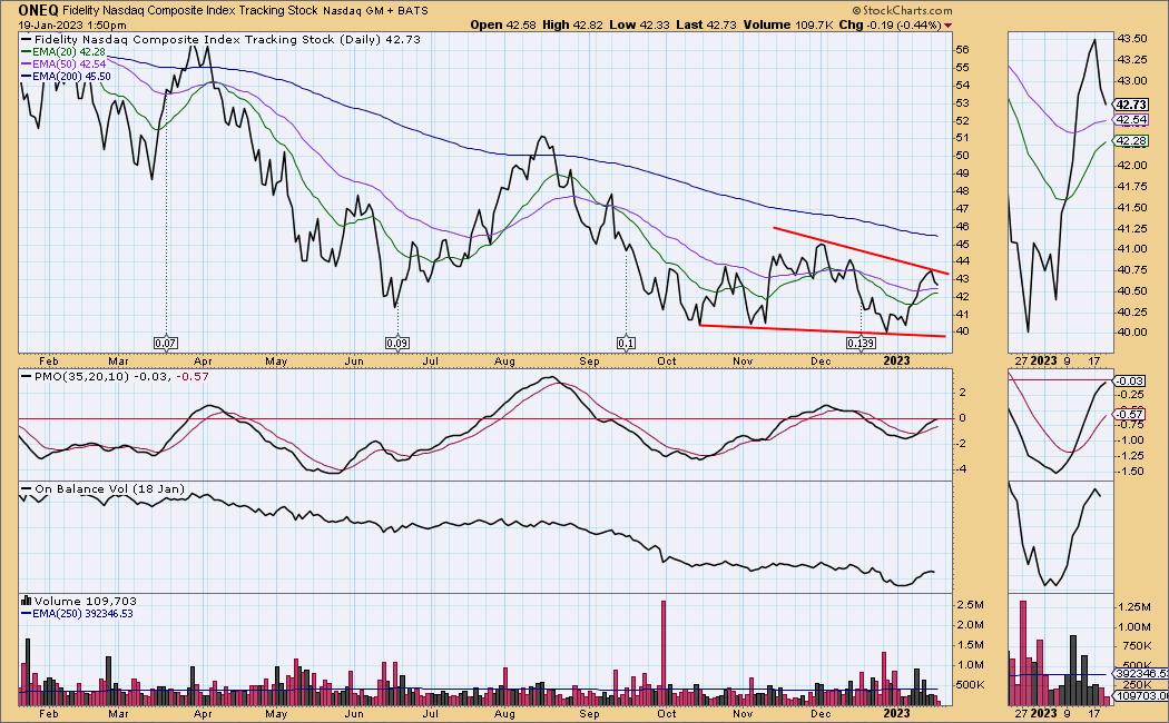
While the broad market has rallied off the October lows, the Nasdaq Composite (ONEQ) has been dead in the water, rallying only +11%. The best that can be said about at present is that it has formed a bullish falling wedge.

Conclusion: While the Dow managed to advance into bull territory, other major indexes remain in bear markets. The enthusiasm that helped the market rally out of the October lows is fading, and current signs are that the rising trend will be abandoned and a new falling trend established. It is not too late for the bull to be revived, but at this point the market appears to be turning down.
Watch the latest episode of DecisionPoint on StockCharts TV's YouTube channel here!

Technical Analysis is a windsock, not a crystal ball. --Carl Swenlin
(c) Copyright 2023 DecisionPoint.com
Helpful DecisionPoint Links:
DecisionPoint Alert Chart List
DecisionPoint Golden Cross/Silver Cross Index Chart List
DecisionPoint Sector Chart List
DecisionPoint Chart Gallery
Trend Models
Price Momentum Oscillator (PMO)
On Balance Volume
Swenlin Trading Oscillators (STO-B and STO-V)
ITBM and ITVM
SCTR Ranking
Bear Market Rules
DecisionPoint is not a registered investment advisor. Investment and trading decisions are solely your responsibility. DecisionPoint newsletters, blogs or website materials should NOT be interpreted as a recommendation or solicitation to buy or sell any security or to take any specific action.
|
| READ ONLINE → |
|
|
|
| The Canadian Technician |
| 5 Stocks to Save the Planet |
| by Greg Schnell |
At Osprey Strategic, we have been focusing on the energy crisis that has already arrived for much of the world. I'll cover off five planet-saving stocks here but we need to add some barbell context.
Saving the planet has been a theme for investing since Queen Elizabeth was dealing with smog in London back in the 1950s. As a 1000 private jet planes converged on Davos this week, they met to discuss how to force the lower class of people to behave better. From the 1950s to today, the buzz to urgently save the planet never gets old. Fossil fuel spent for politics is worthy. Home heating, cooking, agriculture, and lower class transportation; unworthy.

As North America gets drawn into the reality that cancel culture is closing existing sources of energy for the masses before the replacements are built, the energy trade looks set to resume the upward move.
Uranium, copper, crude oil, gasoline and diesel(heating oil) all had an up week, while the $SPX closed lower. It is this relative strength that we like to pay attention to, as we want to outperform the $SPX. I have specific chartlists for fossil fuels, as well as a list to trade the energy crisis outside of fossil fuels. Both had a strong week.
Renewable Energy
Elon Musk hinted at nuclear power, but until the fossils of Davos get their heads around more nuclear power, we are probably using wind, solar, and tidal. For renewable energy, we need a method to store the power and allow people to 'download' the electricity into their application.

As an example, Tesla's new semi truck needs a 1 Megawatt charge, equal to a 15 acre solar field daily. If 10 trucks use the power from a 1/4 section of land, we need some method of storing that electricity for the download the following day. Batteries are a key theme in this discussion, and lithium is a key component.
Lithium
A major component of these batteries is lithium, and Elon said "refining Lithium is a license to print money".
With that in mind, I am noticing the lithium names seem to be setting up after a multi-month correction. The cleanliness of mining lithium isn't part of this article, so don't shoot the messenger. We are here to talk stocks! Let's roll through 5 stocks to save the planet and warm the hearts of Davos.
Albemarle (ALB)
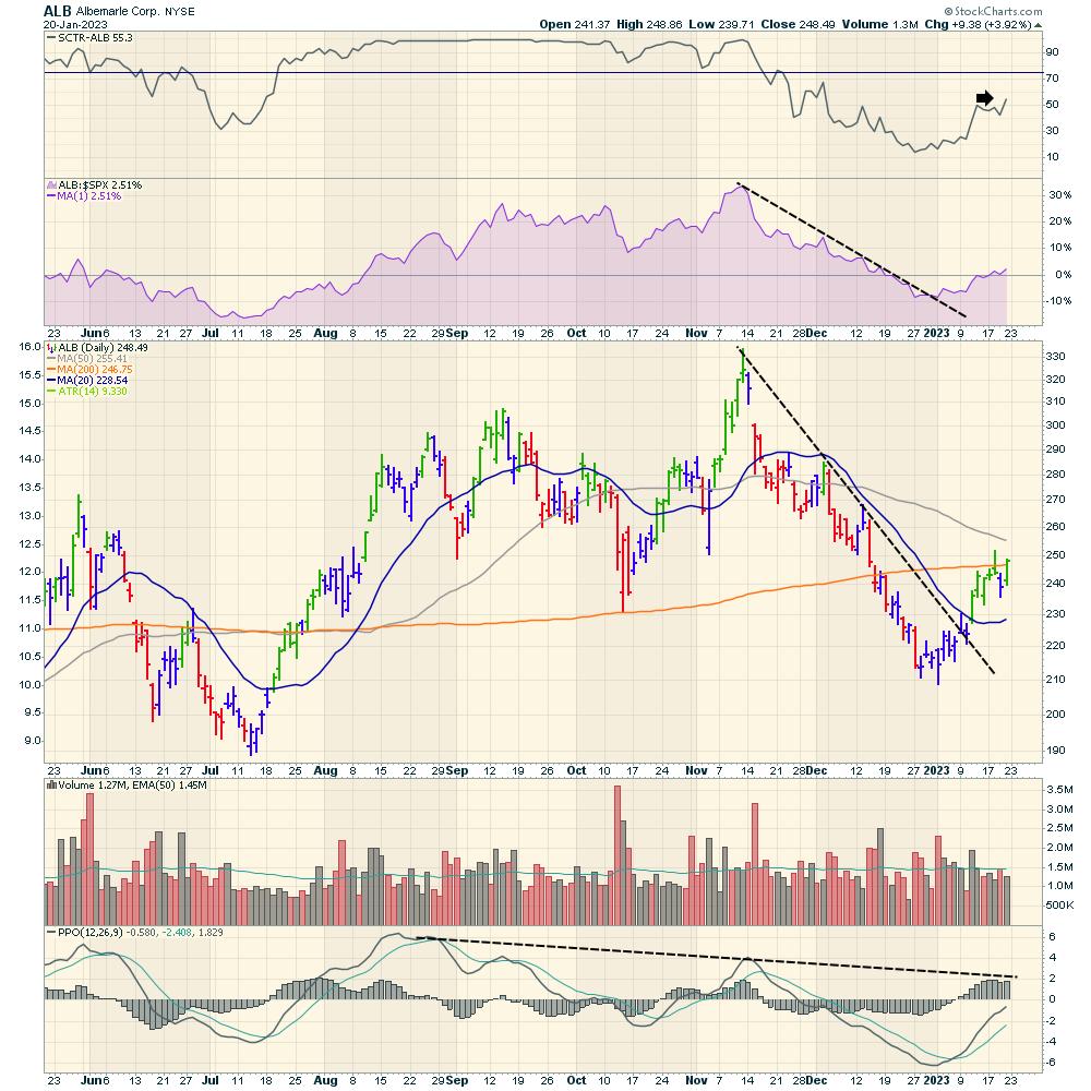
Albemarle has been a go-to name in Lithium, and the stock is starting to turn up from the recent downtrend. The SCTR is moving back above 50. Relative strength (in purple) has started to improve since 2023 began, and the stock closed back above the 200-DMA again. The PPO is still in a weak place, but it is improving.

Sociedad Quimica Y Minera (SQM)
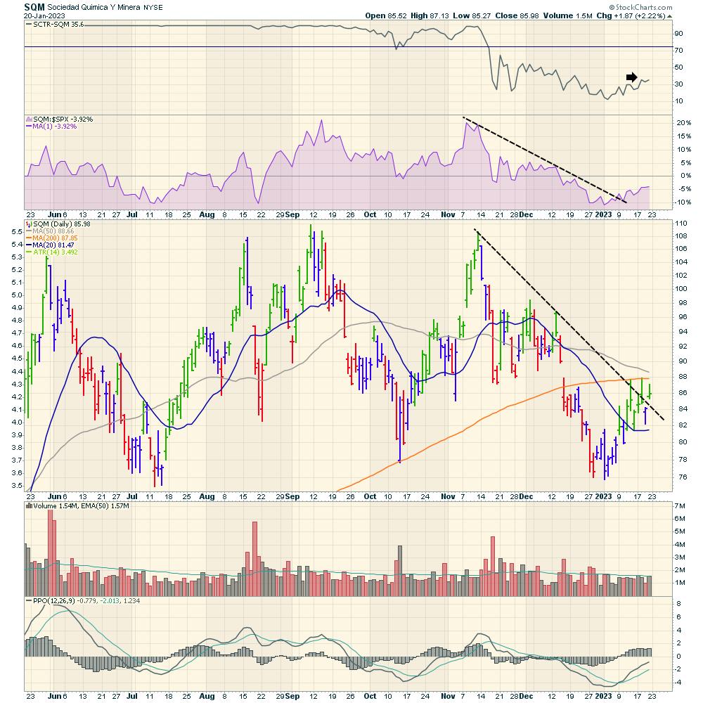
SQM has oscillated back and forth for the last 6 months, frustrating the buy-and-hold crowd. The difference this time is that the overall market is trying to thrust higher, and this can support these energy-related growth stocks. The stock broke the downtrend, and looks set to start moving higher. A continued move higher here would be at least a trade to get back to the top of the range, if not further.

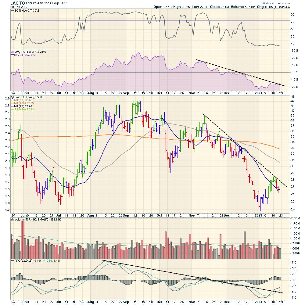
Lithium Americas (LAC.TO)
For Lithium Americas, it looks like the base is in, and perhaps it can break out above the down-sloping trend line. This is a dual listing in Canada and the USA, and here we're looking at the Canadian version of the listing (LAC in both countries). I do like that the PPO trend is breaking, as well as the relative strength trend in purple.

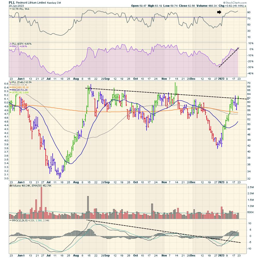
Piedmont Lithium
Piedmont already has an SCTR pushing above 75, making it more interesting. I like trading commodity-related trades near the lows as they break out, but this one also looks nice, setting up to break out to new highs. The PPO downtrend is broken. I placed the trend line on price at the highest closes on the chart along that trend line. Friday gives a glimpse of the stock breaking out.

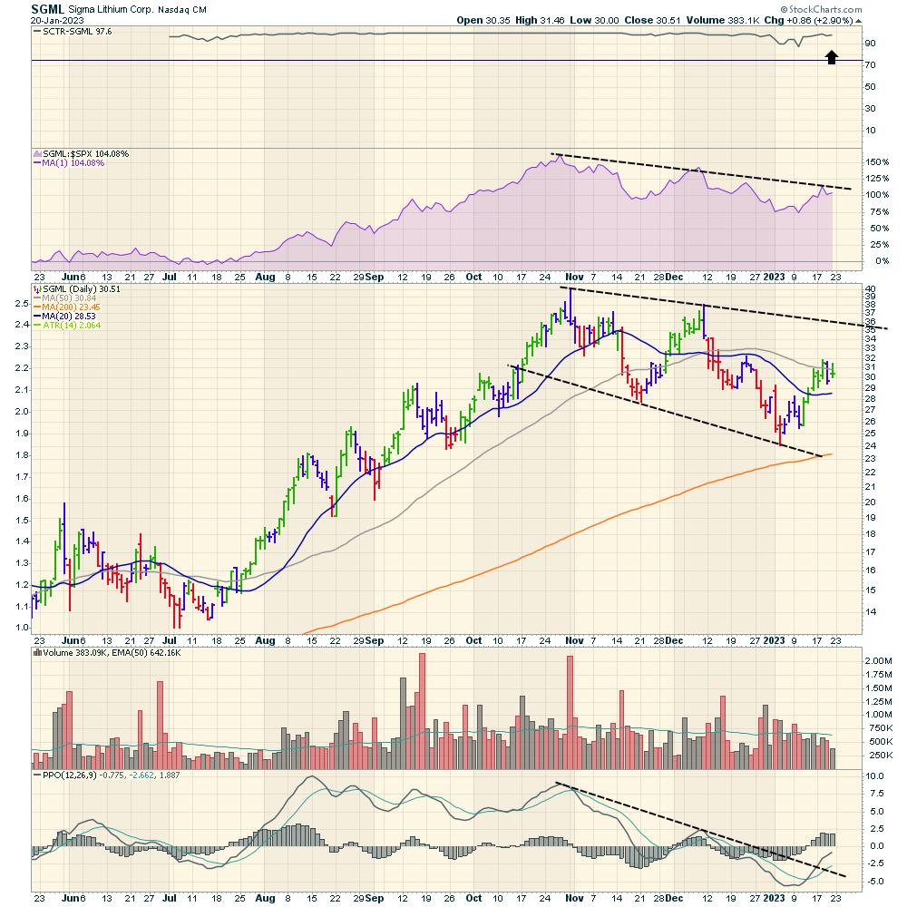
Sigma Lithium (SGML)
Sigma has an SCTR ranking pinned to the top after the huge thrust on the left side of the chart. With a wide-ranging consolidation over the last three months, the stock is trying to break out from the consolidation range. It would not take much to break the relative strength downtrend. Volume has been trending lower for the last few weeks, so that is curious.

There we have it. Five stocks to save the planet and play the renewable energy trade while all those jets from Davos get home safely! Pardon my Canadian sarcasm!
If you would like more information on what we do at Osprey Strategic, this link provides an overview of how we review the market. Check to see if it is a fit to help you keep more profits in 2023! We have plans starting from $7 for the first month, and those are available on OspreyStrategic.org.
Best wishes for a profitable 2023!
|
| READ ONLINE → |
|
|
|
| MORE ARTICLES → |
|
 Chart 1
 Chart 2
 Chart 3
 Chart 4
 Chart 5


 Trevor Lawrence put in a performance for the ages in the AFC Wild Card game on Saturday. Chapeaux! Lawrence started the game with four interceptions in the first half but kept on throwing and brought his team back for a big win. There are some lessons here that we can apply to trading, which can also be a mental gain.