| THIS WEEK'S ARTICLES |
| John Murphy's Market Message |
| S&P 500 TESTING AUGUST HIGH |
| by John Murphy |
S&P 500 TESTS AUGUST HIGH...Chart 1 shows the S&P 500 Index in the process of testing important overhead resistance at its August high (flat line). A close above that barrier would be a positive sign. The SPX has now gained 20% from its October low. Narrow market breadth had been casting doubt on the strength of the overall market. Last week's message, however, pointed out the the market rally was showing signs of broadening out. That improvement was demonstrated by new signs of leadership in more economically-sensitive cyclical stocks like consumer discretionary stocks (more on that shortly) and smaller stocks. That positive trend in those two groups continued this past week.
 Chart 1 Chart 1
SMALL CAPS TURN UP... The divergence between weaker smaller stocks and the S&P 500 Large Cap Index throughout the spring was one of the areas of concern. But that situation has improved over the past week. Chart 2 shows the Russell 2000 iShares (IWM) rising this week to the highest level in three months. In addition, the IWM is back above its major moving average lines which puts it back in sync with larger stocks. That can be seen more clearly in Chart 3.
 Chart 2 Chart 2
SMALL STOCKS BACK IN SYNC WITH SPX...Two of the lines in Chart 3 compare the Russell 2000 iShares of smaller stocks (black line) to the S&P 500 large cap stocks (green line) over the last year. The chart shows the generally positive correlation between the two lines. In other words, they generally move in the same direction. Between March and May, however, the S&P 500 rallied while small caps stayed flat. That divergence between the two was unusual. Part of the reason for small cap weakness was a plunge in banking shares which are heavily weighted in the IWM (red line). Bank shares bottomed in early May which gave a boost to smaller stocks and both have rallied together since then. The past week's upside breakout in the Russell 2000 has put it and the SPX back in sync on the upside.
 Chart 3 Chart 3
XLY BREAKOUT LEAD BY TESLA AND FORD...Previous messages have highlighted consumer discretionary stocks as one of the market's strongest sectors outside of technology and communication services. In fact, they've been the market's strongest sector for the second week in row, and have achieved an impressive bullish breakout. Chart 4 shows the XLY climbing above its February peak to reach the highest level since last September. And as has been the case over the last two weeks, auto stocks have led it higher. The May 26 message showed Tesla and Ford nearing potential upside breakouts. Charts 5 and 6 show both auto leaders achieving impressive upside breakouts since then. Tesla, however, is now in deeply overbought territory. The flip side of consumer discretionary leadership is the fact that defensive consumer staples were the week's weakest sector. That's normally a good sign that investors are turning more optimistic.
 Chart 4 Chart 4
 Chart 5 Chart 5
 Chart 6 Chart 6
|
| READ ONLINE → |
|
|
|
|
|
| The Mindful Investor |
| The Super Bullish to the Super Bearish |
| by David Keller |
One of my favorite parts of hosting a show on StockCharts TV is being able to interview analysts, traders, and money managers with all sorts of different backgrounds.
Recently, I was asked in our mailbag segment about why and how my guests can have very different takes on the markets at any given moment. The reality is that even though we all use a similar toolkit, our backgrounds and life experiences and professional trajectories are all embedded somewhere in our analysis. Whether we like it or not, who we've been up until now most likely affects how you're analyzing the charts.
And sometimes the evidence is just, well, cloudy. Much like the weather in Redmond, Washington, volatility and uncertainty are just part of the picture. I feel I've gained so much over my career by actively engaging those with a different perspective, as it's forced me out of my own narrative and allowed me to consider other points of view. So when I see the S&P 500 index bumping against the "ultimate resistance level" around 4300-4325, I can't help but consider some different potential future paths.
So what may come next for the S&P 500?
First, let's set the stage.

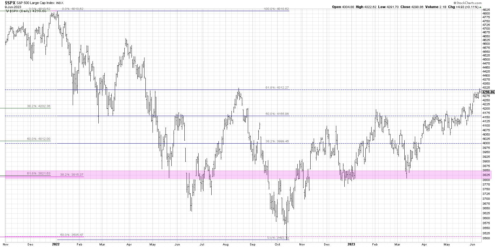
If we consider the 2022 bear market phase as the framework for a Fibonacci analysis, we come up with three important levels to watch. First, the 38.2% retracement level hits right around 4000, which was first reached in November and preceded the drop down to the December low around 3800. Second, the 50% level is right around 4155, which was pretty much where the February 2023 high ended up; note how many times we tested this level during the congestion phase in April and May!
That brings us to this week, where we have now tested the 61.8% level for the first time since the August 2022 high. If you were wondering why so many are focused on the 4300 level for the S&P 500, this chart should make it pretty clear!
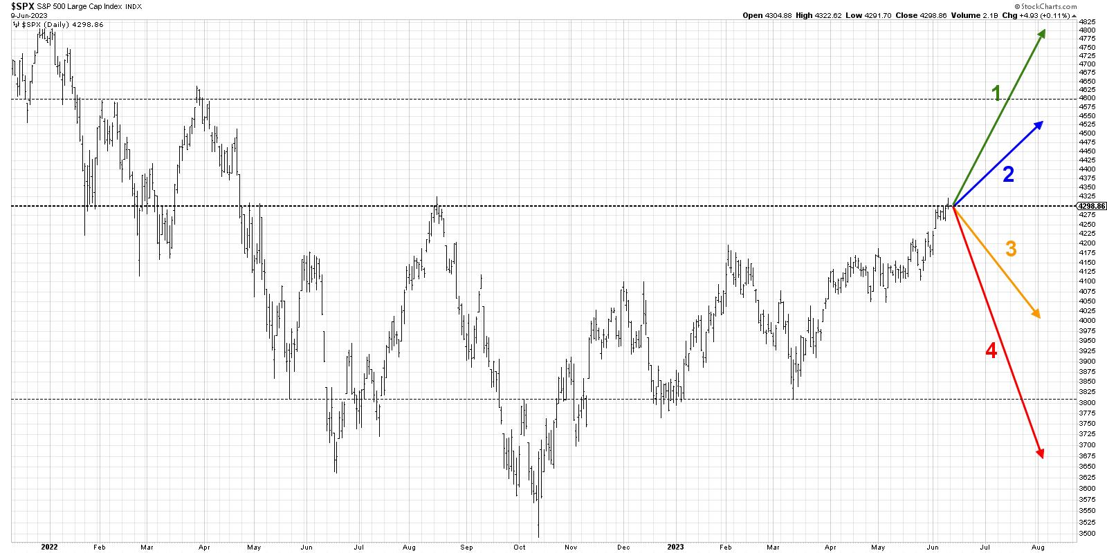
Now we'll lay out four potential scenarios for the S&P 500 over the next six to eight weeks. And remember the point of this exercise is threefold:
- Consider all four potential future paths for the index, think about what would cause each scenario to unfold in terms of the macro drivers, and review what signals/patterns/indicators would confirm the scenario.
- Decide which scenario you feel is most likely, and why you think that's the case. Don't forget to drop me a comment and let me know your vote!
- Think about each of the four scenarios would impact your current portfolio. How would you manage risk in each case? How and when would you take action to adapt to this new reality?
Let's start with the most optimistic scenario, involving a strong summer push for stocks.
Scenario #1: The Super Bullish Scenario
What if the great bull market of 2023 is just getting started? Let's say Apple doesn't stop, pushing to a new all-time high and even higher. The mega-cap growth trade which has worked for most of 2023 just keeps working.
In this scenario, 4300 recedes in the rearview mirror and pushes above 4600. We may even see new all-time highs for the S&P 500 index! Breadth conditions improve as pretty much everything is pulled along for the ride. Onward and ever upward!
Scenario #2: The Mildly Bullish Scenario
What if the mega cap growth stocks remain strong, but the pace of the uptrend slows considerably? Charts like AAPL and MSFT pull back as investors digest the gains they've enjoyed in these winning stocks in 2023. Value-oriented sectors like Energy and Financials may do well in this scenario, but, because the leadership has changed away from the growth sectors, it means limited upside for our growth-oriented benchmarks.
In this scenario, the S&P 500 does break above 4300, but does not get much further beyond that. Bulls are frustrated but still doing okay, and bears begin to really question their sanity.
Scenario #3: The Mildly Bearish Scenario
What if 4300 holds and this ends up being the top until the fall months? The mildly bearish scenario would mean that the mega growth trade chills out in a major way, and the market goes into profit-taking mode.
Perhaps we find the inflation data next week is way higher than expected, and the market gets a short-term downside shock. What's interesting here is the S&P 500 could go all the way down to around 3800, remain above the March low, and still put in a higher low. This mildly bearish scenario may just be a pullback within the context of a long-term bull phase in 2023, but the next couple months are a little rough.
Scenario #4: The Super Bearish Scenario
Here's where things get very hairy very quickly. What if there is a downside shock of sorts, causing the Fed to take drastic action that pushes risk assets lower? Investors rotate quickly to defensive positions, but this creates a feedback loop of bearishness. Fear of losing everything takes hold and investors go into a full-on fetal position.
Gold rips to the upside as "rocks over paper" becomes the trade of the year. The entire game plan for the Fed is brought into question and we're left wondering what happened to the great bull market of 2023. 3800 comes and goes and we are talking again about retesting the October 2022 lows around 3500-3600.

Okay, so have you decided which of these four potential scenarios is most likely based on your analysis? Head over to my YouTube channel and drop a comment with your vote and why you see that as the most likely outcome.
And don't forget to think through all the other scenarios as well. Only by stretching out of our comfort zones and considering other points of view are we able to better handle whatever the future may actually hold!
RR#6,
Dave
P.S. Ready to upgrade your investment process? Check out my free behavioral investing course!
David Keller, CMT
Chief Market Strategist
StockCharts.com
Disclaimer: This blog is for educational purposes only and should not be construed as financial advice. The ideas and strategies should never be used without first assessing your own personal and financial situation, or without consulting a financial professional.
The author does not have a position in mentioned securities at the time of publication. Any opinions expressed herein are solely those of the author and do not in any way represent the views or opinions of any other person or entity.
|
| READ ONLINE → |
|
|
|
| The MEM Edge |
| Down-and-Out Stocks Entering New Uptrends - These 8 Traits Will Help You Pick a Winner |
| by Mary Ellen McGonagle |
The markets are seeing a continuation of last week's broadening out into areas beyond mega-cap FAANMG names. Most of the biggest gainers have been beaten-down stocks regaining their footing amid a move back into Cyclical areas of the market. The rally in these stocks began after last Friday's May employment data showed that job openings rose higher than expected while wage gains were modest. The report helped reduce fears of a recession.
Today, I'll be sharing the key characteristics of a stock as it successfully reverses its downtrend so that you, too, can participate in the upside potential as stocks begin entering a new uptrend.
DAILY CHART OF DATADOG (DDOG)

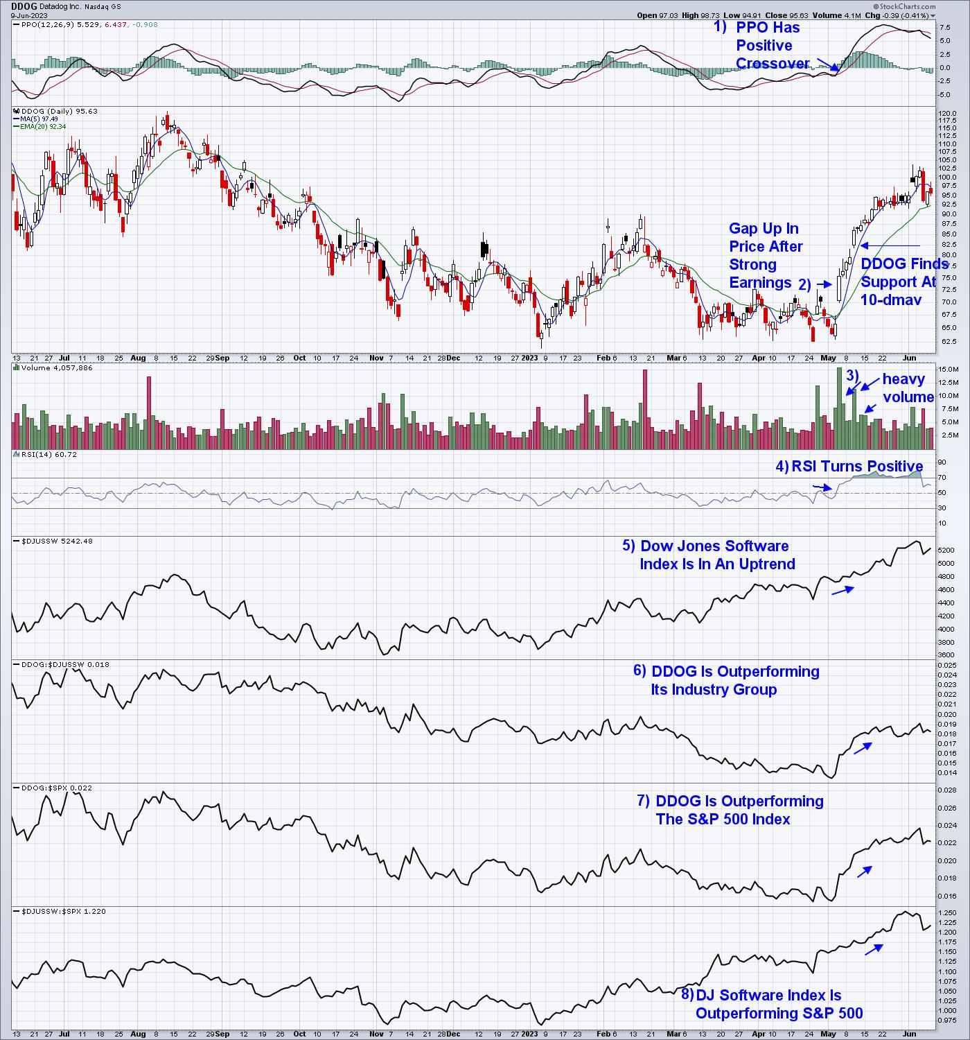
Above is a chart of Datadog (DDOG), which reversed its downtrend in early May. Subscribers to my MEM Edge Report will be familiar with this stock because that's when it was added to the Suggested Holdings List of my MEM Edge Report. Let's review some of the key traits.
First and foremost, DDOG reported strong earnings and sales, with management guiding growth estimates higher for the remainder of this year. This is a critical characteristic, as strong earnings are the primary driver of a stock that goes on to outpace the broader markets.
In response to the strong earnings, DDOG gapped up in price on heavy volume, in a move that put the stock above its key moving averages. The rally also pushed the stock's momentum indicators into positive territory, which is highlighted. You'll want to make sure that your stock is part of a strong Industry Group that's outperforming the broader markets. This is because studies show that Industry Group and Sector affiliation account for almost 50% of your stocks up or downward move.
Getting a majority of the traits highlighted above will be enough to provide conviction that further upside is ahead; however, you'll want to make sure the stock is fundamentally sound with positive momentum indicators, at the very least. Lastly, while we're currently seeing a broadening out of stocks that are advancing higher, investors will also need to be mindful of key economic data that has been known to move the markets.
Next Wednesday, the Federal Reserve will be announcing their rate hike policy, with Fed Chair Powell's press conference taking place immediately after. Most investors are looking for a pause in their rate hike campaign, so any surprise increase would not be good for the markets. In addition, core inflation data will be released on Tuesday and Wednesday, which may cause volatility depending on results.
If you'd like to be alerted to any shift in the market's current uptrend, as well as insights into the best areas to be investing, take a trial of my twice weekly report by using this link here. You'll be able to trial my MEM Edge Report at a nominal fee and gain access to prior reports as well!
Warmly,
Mary Ellen McGonagle, MEM Investment Research
|
| READ ONLINE → |
|
|
|
| Martin Pring's Market Roundup |
| Is Gold About to Explode or Crash? |
| by Martin Pring |
The price of gold was recently trading at an all-time monthly closing high. Since then, it has backed off, raising the question of whether that was "the" top or whether the subsequent short-term price decline represents a healthy digestion of previous price gains, which will serve as a launching pad for substantially higher prices?
Primary Trend Evidence
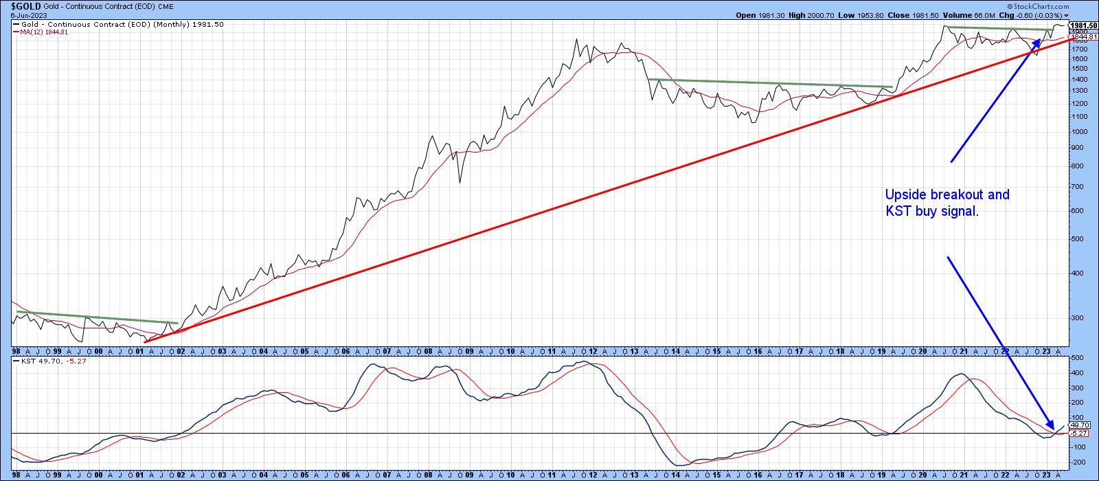
My rationale is if that was it, we should be seeing evidence of a primary trend reversal. Charts 1 and 2 suggest otherwise. Chart 1, for instance, shows that the secular uptrend that at the beginning of the century is still intact. That's because the price is trading above the red up trendline and its 12-month MA. We can see that this action is supported by a positive long-term KST. It has only recently gone positive and is by no means overextended. Equally important is the fact that the price has broken out of its 2020-23 trading range and has, so far managed to hold above the breakout point.
 Chart 1 Chart 1
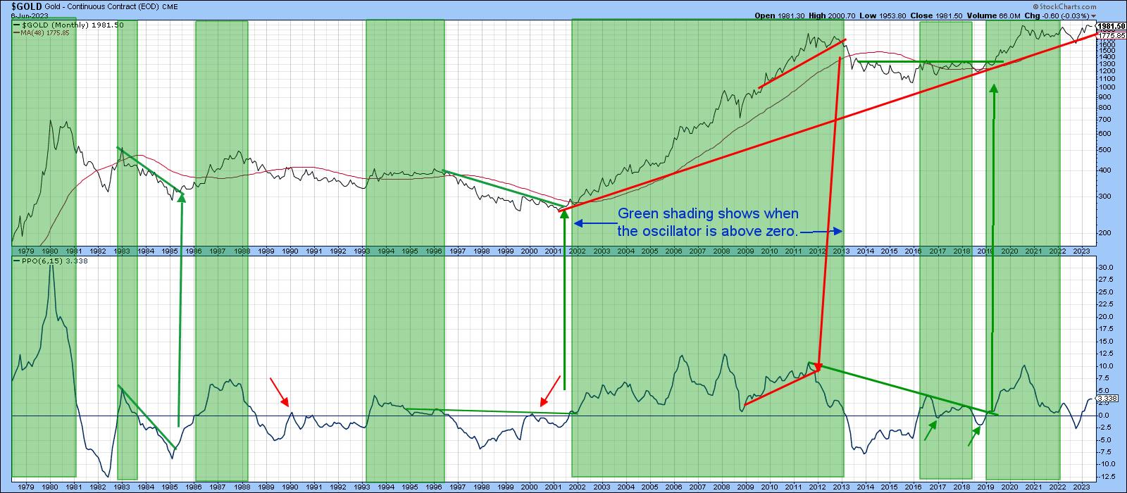
Chart 2 is also encouraging. Here, the gold price is being compared to a PPO using the 6- and 15-month parameters. Extended periods when the indicator traded above zero have been flagged with the green shadings. The four small red and green arrows tell us when whipsaw signals developed; four false signals in 40-plus years of data is not a bad performance. Currently, the PPO is rising and comfortably above its equilibrium point, so an imminent sell signal is not likely. It is also apparent that the secular up trendline is covering the 48-month MA ($1775). Support being provided by these two indicators is formidable. If violated, it would remove a strong pillar for the long-term bullish case.
 Chart 2 Chart 2
Character Matters
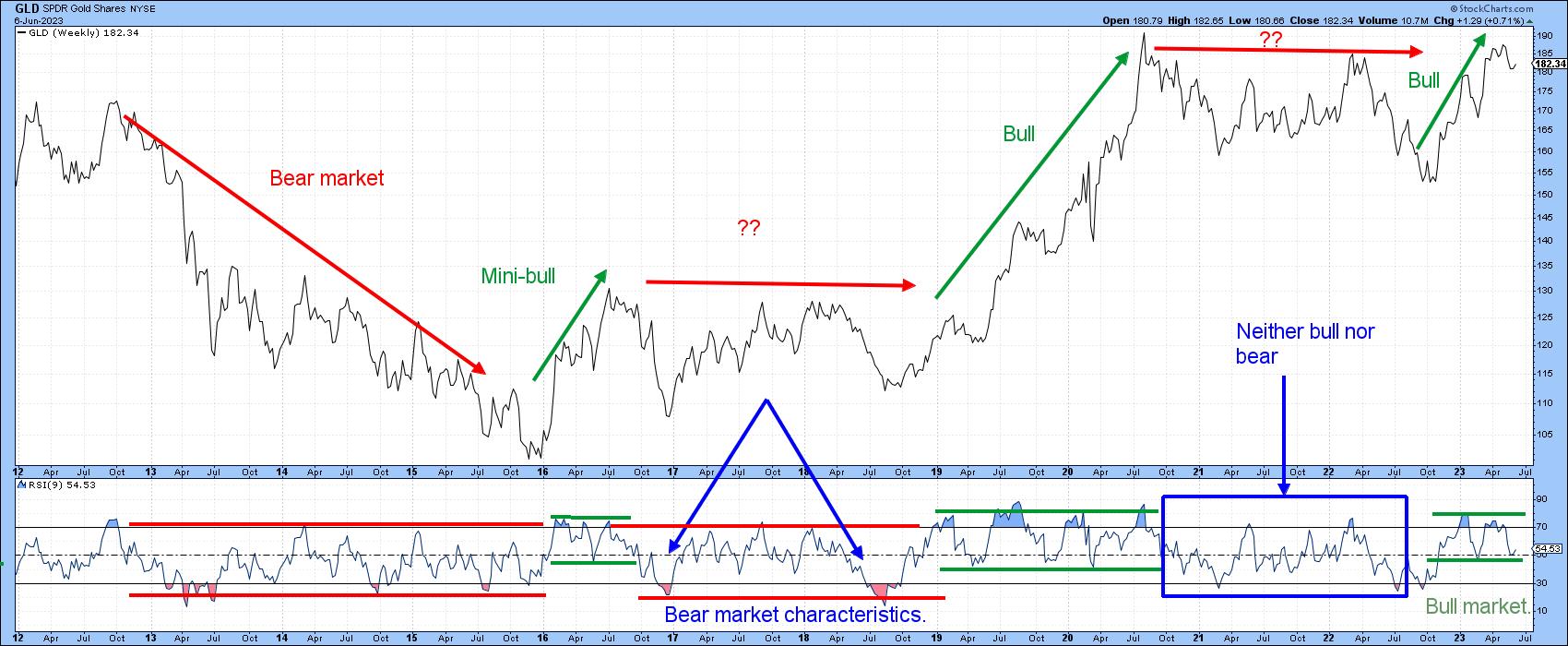
Short-term indicators behave in a different way in a bull market than a primary bear. During a bull market, oscillators tend to easily reach overbought conditions, with sell signals being ineffective as a bullish primary trend rising tide lifts all boats. Furthermore, on the rare occasion that an oscillator reaches an oversold condition, the price almost invariably snaps back. During a bear market, these characteristics operate in reverse. It follows from this differing behavior that oscillator action can be studied to see whether it is more characteristic of a primary up or downtrend.
In that respect, Chart 3 compares weekly gold to a 9-week RSI. In a clear-cut bull market like the 2019-20 advance, the railroad tracks for the RSI move distinctly to the north, followed by a corresponding switch to the south during the 2013-15 primary bear market. Since last October, there has been a definite changeover to bull market characteristics, with an instant bounce to the first and only oversold condition outside of the blue rectangle. Following that, two persistent (blue) overbought conditions developed. The subsequent corrections ended around the 50-mark, not much different from the lower tracks which earmarked the previous two bull markets.
 Chart 3 Chart 3
Short-Term Gold is Moderately Oversold
The short-term trend for gold is currently negative. That said, there are several reasons for expecting a possible reversal.
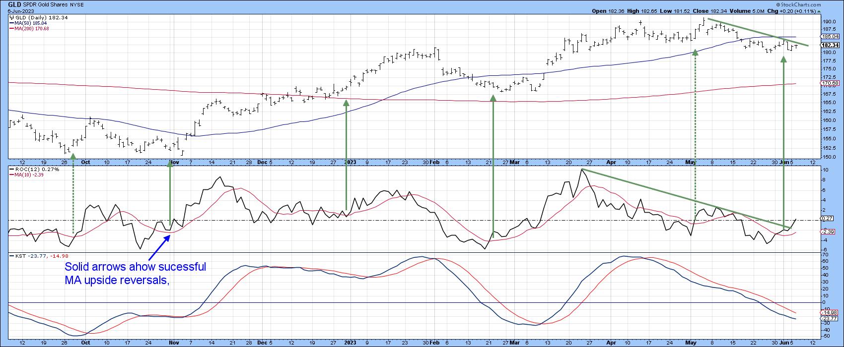
First, Chart 4 shows that the daily KST for the SPDR Gold Trust (GLD) is moderately oversold. If our bull market "rising tide lifts all boats" scenario holds out, that suggests a repeat of last November and March, when a similar KST reading was enough to act as a foundation for a rally.
Second, the 12-day ROC has violated a down trendline and has therefore reinforced the upside reversal in the 10-day MA. The all-important and highly necessary signal has not yet been triggered. That would come with a break above the May/June down trendline, with added confidence being added with a daily close north of the 50-day MA at $195.
 Chart 4 Chart 4
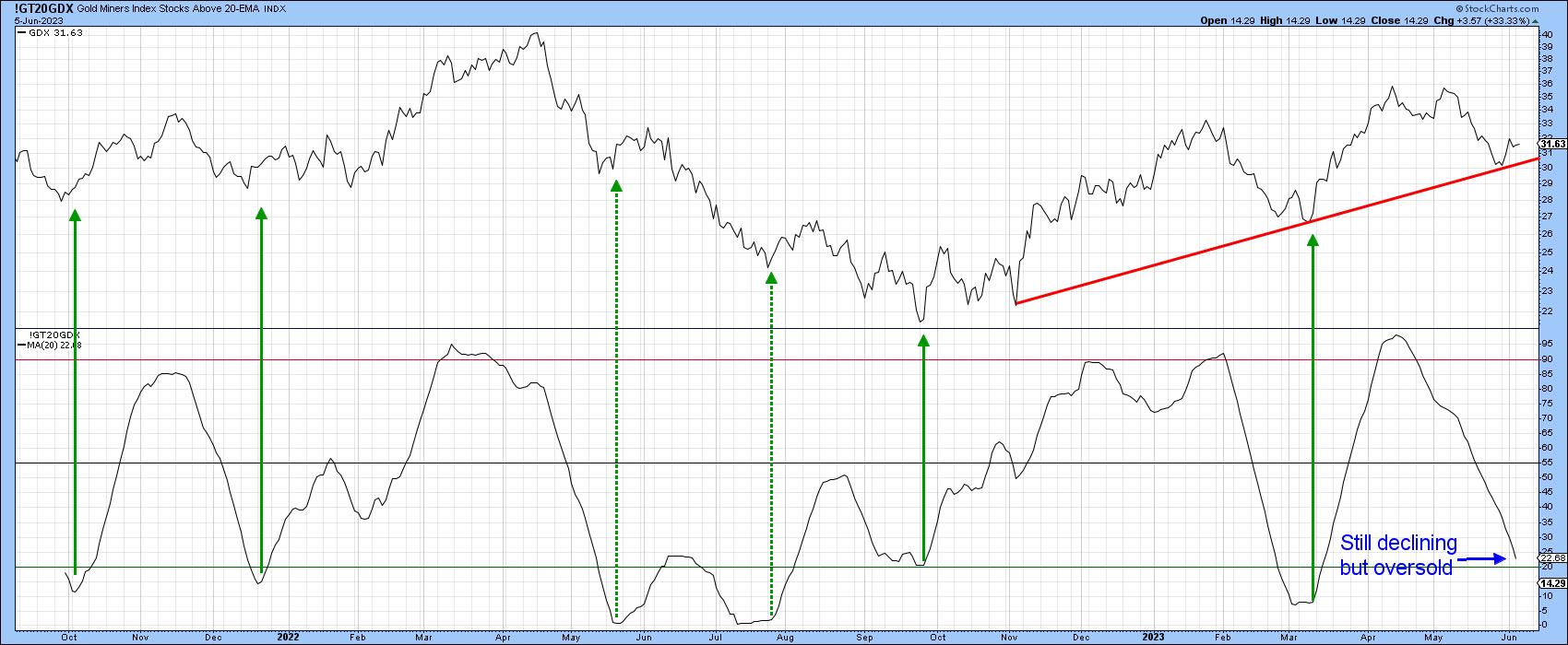
Finally, gold shares usually move in concert with the price of the yellow metal itself. In that respect, a 20-day MA of the number of gold stocks above their 20-day EMA continues to drop, so we cannot say that it is bullish. However, it is oversold. Upside reversals from similar levels have usually been followed by a nice rally, when triggered under the context of a primary up trend. Once again, I do want to stress that a buy signal has not yet been given. However, if the bull market is alive, this is as good a place as any for expecting a short-term reversal, especially as the GDX has recently found support and bounced from its bull market trendline.
 Chart 5 Chart 5
Good luck and good charting,
Martin J. Pring
The views expressed in this article are those of the author and do not necessarily reflect the position or opinion of Pring Turner Capital Group of Walnut Creek or its affiliates.
|
| READ ONLINE → |
|
|
|
| ChartWatchers |
| Is the Bull Market Back? Watch These Charts |
| by Jayanthi Gopalakrishnan |

What a week the market had!
At the start, things looked positive for the S&P 500 index ($SPX). The index finally broke above the 4200 level, the debt ceiling issue was resolved, and the probability of a Fed interest rate pause was relatively high.
But on Wednesday, things changed. Canada and Australia raised their benchmark interest rates, which may have spooked investors. Treasury yields rose, and US equities turned lower the day after the S&P 500 had closed at its 10-month high and Nasdaq Composite at its 14-month high. The probability of a Fed rate hike, according to the CME FedWatch Tool, rose from around 25% to 36%.
Investors fled to small-cap stocks. All of a sudden, the large-cap growth stocks that were in the spotlight for the last few weeks—thanks to the AI buzz, Apple's unveiling of its Vision Pro headset, a Goldilocks jobs report—were selling off.
But things were different on Thursday. The S&P was back in bull market territory, the probability of a Fed interest rate pause was above 70%, and recession worries were a distant memory. Does that mean the bear market is over? It's worth looking at the chart of the S&P 500 to get a closer look.
S&P 500 Technical Outlook
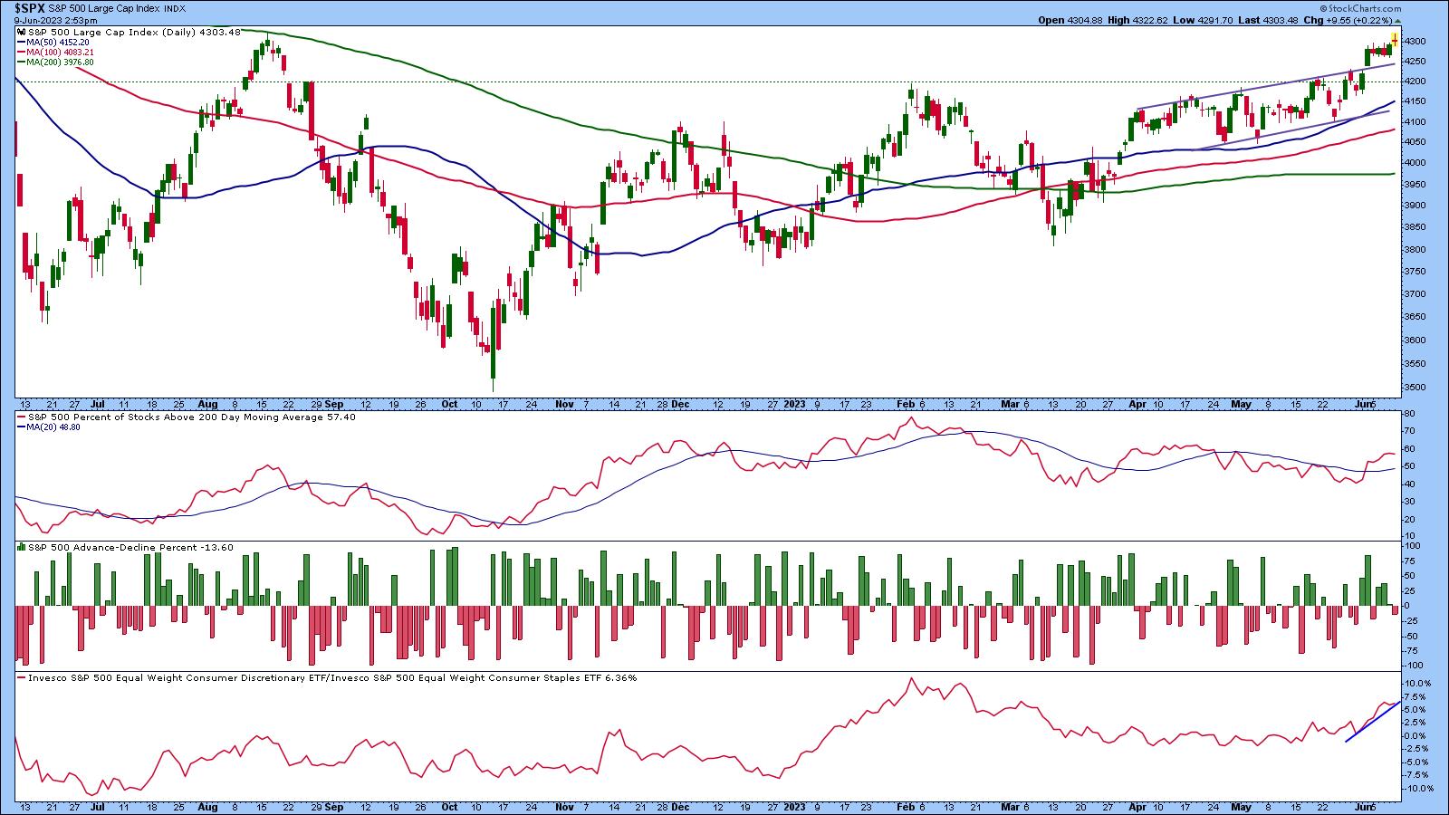
Since April, the S&P 500 index has been moving in a slightly upward channel (see daily chart below). On June 2, the index broke above the 4200 level and the top level of the upward-sloping channel.

CHART 1: S&P IN BULL MARKET TERRITORY. Will the breadth indicators support the up move?Chart source: StockCharts.com (click chart for live version). For educational purposes only.
The index is trading close to its 52-week high, above its 50-, 100-, and 200-day moving averages and market breadth shows that participation in the uptrend is moving higher.
The percent of S&P 500 stocks above their 200-day moving average (panel below price chart) is moving higher. The indicator has broken above its 20-day moving average, although it would be more confirming if the moving average trended higher.
The S&P 500 Advance-Decline Percent, which measures the percentage of net advances, is displayed in the middle panel. The indicator shows a decline in the percentage of S&P 500 stocks participating in the advance.
Switching gears to sentiment, if you look at Consumer Discretionary versus Consumer Staples, Consumer Discretionary is advancing. This suggests that consumers are gravitating towards an offensive strategy, rather than a defensive one.
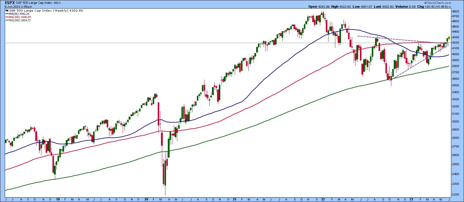
So the daily chart is giving mixed signals. To clear things up, it may help to get a longer-term perspective by turning to the weekly chart. If you bring up a five-year weekly chart of the S&P 500 index (see below), it's interesting to see how the index bounced off its 200-week moving average in October 2022 and has been in a gradual uptrend.

CHART 2: WEEKLY CHART OF S&P 500. The index has broken above a consolidation pattern, which could indicate more upside.Chart source: StockCharts.com (click chart for live version). For educational purposes only.
The index has broken above a triangle pattern and, if it continues in this direction, the S&P 500 could move toward its January 2022 high. If that's the case, the bear market may be over!
But it's unclear if we're out of the woods yet. Economic data indicates that inflation is still in play and the labor market is tight. We'll be getting more data next week ahead of the Fed meeting. If Chairman Powell suggests that past interest rate hikes have had an impact and conditions are status quo, then there's a strong chance that the market will continue higher.
Final Thoughts
One thing that's sure is investor sentiment can flip on a dime. As of now, the S&P 500 is still trending higher. But if it breaks to the downside of either the weekly chart's consolidation pattern or below the daily channel, you may want to adjust your portfolio holdings to sync with the market. Keep an eye on the Sector Summary and Market Summary pages on your StockCharts platform.
End of Week Wrap Up
Dow, S&P 500, Nasdaq up; volatility down
- Friday's close: $SPX up 0.16%% at 4298.86.xx, $INDU up 0.13% at 33,876.78; $COMPQ up 0.16% at 13259.14
- $VIX closed at 13.85
- Best performing sector for the week: Consumer Discretionary
- Worst performing sector for the week: Consumer staples
- Top 5 Large Cap SCTR stocks (Friday's close): Samsara Inc. (IOT); NVIDIA Corp. (NVDA); Palantir Technologies, Inc. (PLTR); MongoDB, Inc. (MDB); Meta Platforms, Inc. (META)
On the Radar Next Week
- May Consumer Price Index
- May Producer Price Index
- Federal Reserve Interest-rate statement and presser
- US retail sales
- Consumer sentiment

Disclaimer: This blog is for educational purposes only and should not be construed as financial advice. The ideas and strategies should never be used without first assessing your own personal and financial situation, or without consulting a financial professional.
|
| READ ONLINE → |
|
|
|
| Art's Charts |
| QQQ Breaks Away from DIA |
| by Arthur Hill |
Trend-momentum strategies that trade stock-based ETFs should require two conditions before considering a position. First, broad market conditions should be bullish. This means being long stocks in bull markets and out of stocks in bear markets. Second, the trend for the ETF should be up. Employing these basic prerequisites can improve performance. Once these two conditions are met, we can begin the ranking process to find the strongest. Let's look at examples with the Nasdaq 100 ETF (QQQ) and the Dow SPDR (DIA).
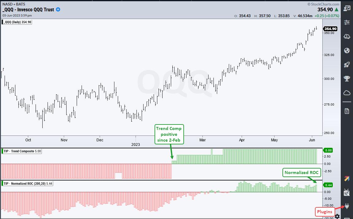
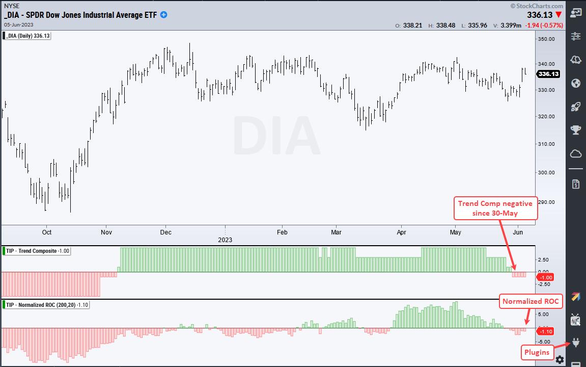
First and foremost, we must be in a bull market environment. TrendInvestorPro uses the Composite Breadth Model to determine market conditions and it has been positive since the end of March. This means the environment is favorable for stock-based ETFs. Second, the Trend Composite must be positive, which means the ETF is in an uptrend. Only ETFs in uptrends are eligible to be ranked and considered for positions in a trend-momentum portfolio. For ETFs, the rank indicator of choice is Normalized ROC. The chart below shows QQQ with a positive Trend Composite since February 2nd and Normalized ROC at 5.44.

Normalized ROC (200,20) tells us the 200-day Dollar gain or loss in ATR(20) terms. QQQ is up $26.41 the last 200 days, ATR(20) is 4.858 and Normalized ROC is 5.44 (26.41/4.858 = 5.44). In contrast to QQQ, the next chart shows DIA with a negative Normalized ROC (-1.1). Clearly, QQQ is leading and DIA is lagging. Also notice that the Trend Composite turned negative for DIA in late May. QQQ is eligible and DIA is not.

TrendInvestorPro recently introduced a strategy using Normalized ROC to trade leading ETFs. This strategy also uses the Composite Breadth Model and Trend Composite, as well as the Exponential Slope to set a momentum minimum. Subscribers get access to a seven part article detailing the strategy and showing performance metrics. Click here for immediate access.
Normalized-ROC, the Trend Composite, ATR Trailing Stop and nine other indicators are part of the TrendInvestorPro Indicator Edge Plugin for StockCharts ACP. Click here to take your analysis process to the next level.
----------------------------------------------------------
|
| READ ONLINE → |
|
|
|
| The Canadian Technician |
| Indexes Level Off |
| by Greg Schnell |
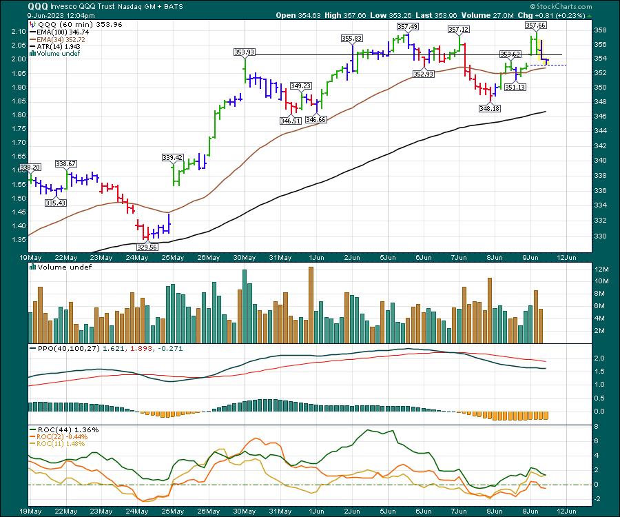
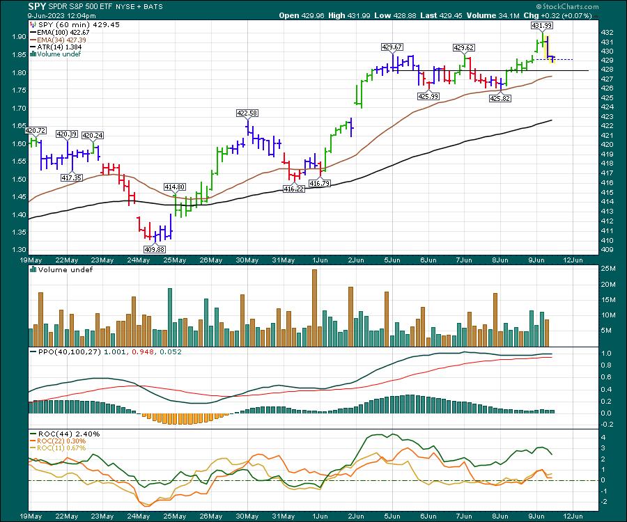
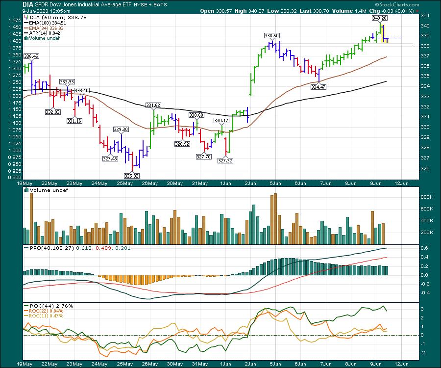
After a huge rally off the March lows, the first full week of June saw the markets move sideways, for the most part. At noon Friday, most US indexes were up marginally on the week. The charts below are all 60-minute charts.
Nasdaq 100 (QQQ)
The black line represents last Friday's close. The Nasdaq 100 had surged up to this level to start the prior week, so the advance by the top 100 is pausing at this point. Consolidation is warranted after a heady advance.

The S&P 500
The SPY is trying to point north. At noon, it was up 1-2% on the week. It is up a little more than the Nasdaq, and breadth within the 500 stocks is still positive.

Dow Jone Industrial Average
The DIA was up 0.20% on the week at noon. A steady climb from Tuesday's low helped the index get back on positive ground for the week. The chart has accelerated nicely from 2 weeks ago.

Russell 2000 (IWM)
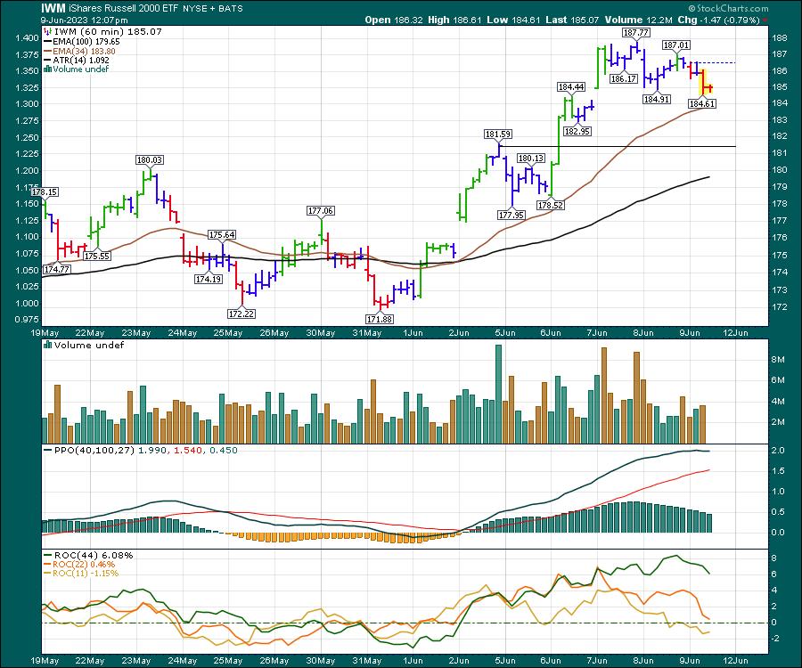
The IWM has been the story for two weeks and it definitely played catch-up. It was up 9.4% from the low two weeks ago to this weeks high and up 1.96% from last Friday's close as of noon Friday.

The $TSX (XIU.TO) (Canada)
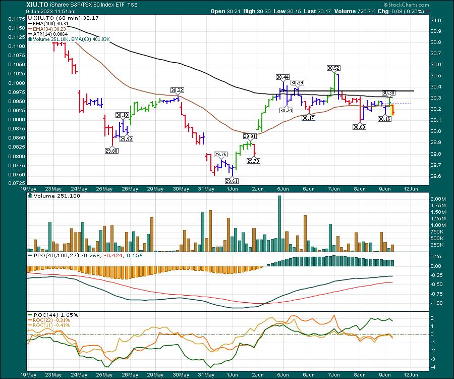
The Canadian market is down 0.67% at noon on Friday, and the chart is not enjoying the buoyancy shown in the USA. The sideways performance over the last three weeks demonstrates the difference between the markets. One significant difference for the USA is the number of technology stocks. While the Russell 2000 has lots of banks, industrials, materials and energy names that perked up this week, it seems the Canadian market missed the same thrust outside of technology on the Canadian exchange.

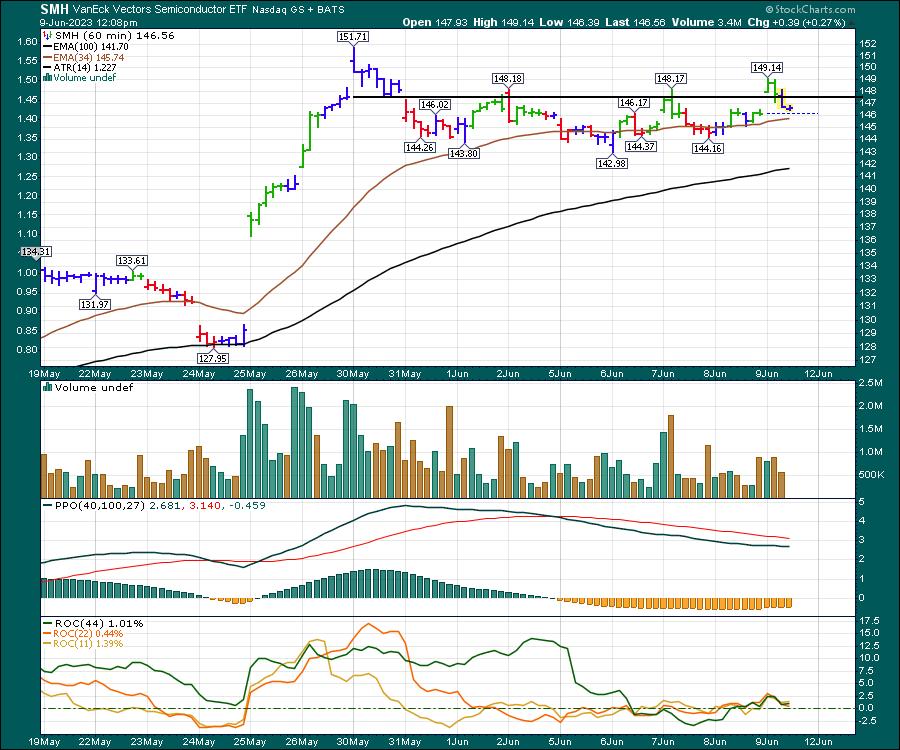
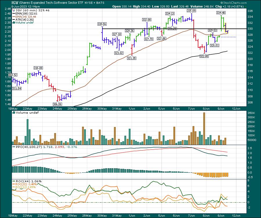
The big boosters in the USA have been semiconductors and software over the last two months.
Semiconductors
SMH is a semiconductor ETF. Flat over the last two weeks, this chart tried to break out to the upside this morning and is definitely one to watch. Many of the semiconductor names are either forming bull flags or distribution.

Software
IGV is a software ETF. There are many to choose from, but I'll use IGV. It is flat from last week and flat from the Tuesday morning surge on May 30th.

While there are still stocks going higher, it is starting to look like sideways consolidation is taking place. Watch closely to see which way this resolves.
If you would like to see more of what we do at Osprey Strategic, we offer a $7 trial for the first month, where you can look through our videos and newsletters from the past few weeks as well.
|
| READ ONLINE → |
|
|
|
| Don't Ignore This Chart! |
| Scanning for Bearish Engulfing Candlestick Patterns |
| by Karl Montevirgen |

It's tempting to think of Bearish Engulfing patterns as the negative counterpart to the Bullish Engulfing pattern because, technically, they sort of are. But the Bearish Engulfing pattern also presents a trading opportunity that's unique to the downside: Stocks tend to fall three times faster than they rise.
Why is that, exactly? Investors tend to prioritize the fear of loss over the pursuit of gains (according to trading psychology). What does that mean? For traders willing to short a stock, your chances of catching a short but significant plunge may be greater than catching a sharp upward spike.
And Bearish Engulfing patterns carry exceptionally favorable stats. But more on that soon. For now, let's go over the basic characteristics of this pattern.
What are the Characteristics of a Bearish Engulfing Pattern?
A bearish engulfing pattern is a two-candlestick pattern that signals a potential reversal from a bullish trend to a bearish trend. Here are its key characteristics:
- Existing uptrend. Before the bearish engulfing pattern occurs, there should be an existing uptrend. This pattern is a reversal pattern, so it needs an upward swing to reverse.
- First candle bullish. The first candle in the bearish engulfing pattern is bullish (white or green candle), which is part of the ongoing uptrend.
- Second candle bearish. The second candle is bearish (black or red) and "engulfs" the first candle's real body. This means the opening price of the second candle is higher than the closing price of the first candle, and the closing price of the second candle is lower than that of the first candle.
- Second candle should be much larger. The bearish (second) candle must be larger than the previous bullish (first) candle. The larger the second candle, the more significant the reversal signal is.
- High trading volume to support the reversal. A higher trading volume during the session that forms the bearish candle could indicate stronger selling pressure, enhancing the reversal signal.
According to technical analyst Thomas Bulkowski's studies, the Bearish Engulfing pattern is followed by a bearish reversal 79% of the time. Its best percentage of meeting its price target occurs during a bear market, at 76%. Overall, the Bearish Engulfing pattern presents some compelling stats, and if you want to take a deeper dive, check out Bulkowski's book Encyclopedia of Candlestick Charts.
How To Scan for Bearish Engulfing Patterns
Go to Member Tools > Scroll Advanced Scan Workbench > New
Copy and paste the following code:
[type = stock]
AND [country is US]
AND [[exchange is NYSE] OR [exchange is NASDAQ]]
AND [market cap > 100]
AND [Daily Bearish Engulfing is true]
AND [Uptrend is true]
AND [Daily SMA(20,Daily Volume) > 500000]
Once the code is entered, click Run Scan.
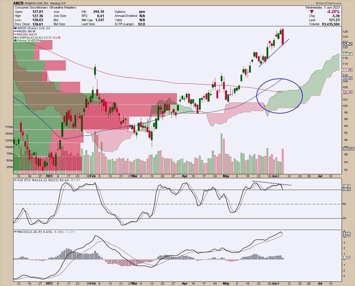
The scan yielded several results. The most well-known stock on the list is Amazon (AMZN), so let's take a look at that.
Bearish Engulfing Candlestick Signals AMZN Pullback
Take a look at the $104 to $106 price range in the chart below.

CHART 1: BEARISH ENGULFING PATTERN IN AMAZON STOCK CHART. A divergence between price highs and the stochastic oscillator indicates that AMZN may see a trend reversal. There's also a Golden Cross in the 50- and 200-day moving averages.Chart source: StockCharts.com (click on chart for live version). For educational purposes only.
Notice the Bearish Engulfing candle pattern. The divergence between the consecutive price highs and the lower highs in the overbought region of the Stochastic Oscillator is a red flag that price is likely on the verge of a reversal. The MACD hasn't confirmed this, but it tends to lag, so just keep an eye on it.
Should AMZN begin pulling back, what might it pull back to? Notice that the Golden Cross event at the end of May shows the extension of two moving averages—the 50-day SMA and 200-day SMA—that can serve as potential support levels. Underneath these averages is a thick and rising layer of Ichimoku cloud. In addition to indicating buying pressure, a bullish sign especially when thick, the green cloud also acts as potential support. Converging with this range of support (between $104 to $106) are the largest Volume by Price bars, indicating both heavy trading activity and potential support.
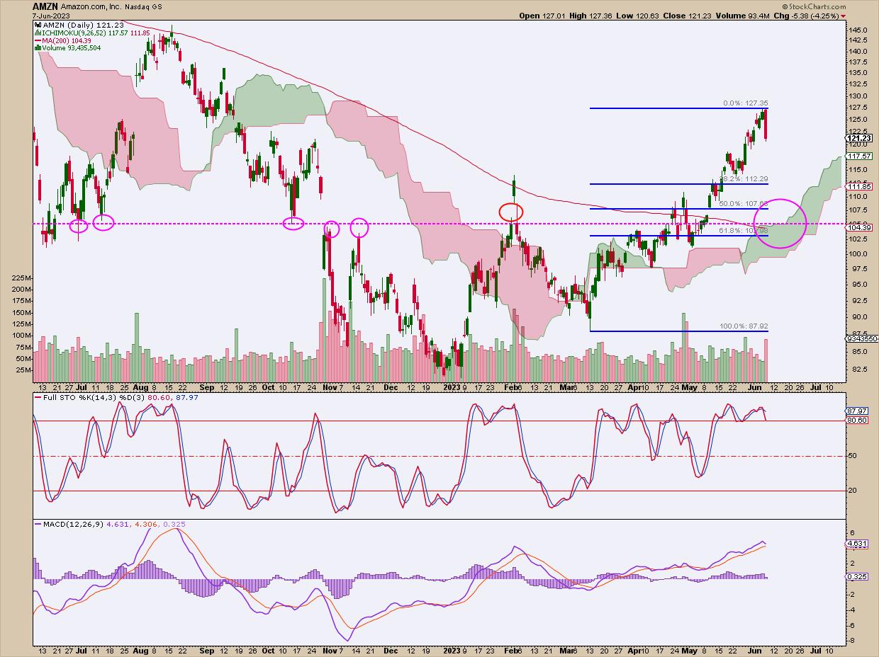
If you look at a 12-month chart (see chart below), you can see that the support range also coincides with the 50% to 61.8% Fibonacci Retracement levels starting from the second leg of AMZN's uptrend, and that $105 has a long history as both support and resistance (fuchsia circles).
The Ichimoku cloud and 200-day SMA are on the chart for reference (to compare with chart 1).

CHART 2: ONE-YEAR CHART OF AMZN. Here, you see the horizontal line that represents historical support and resistance levels. The Fibonacci retracement levels, starting at the second leg of the most recent uptrend, show that the 61.8% retracement is close to $105.Chart source: StockCharts.com (click on chart for live version). For educational purposes only.
How Do You Trade a Bearish Engulfing Candle?

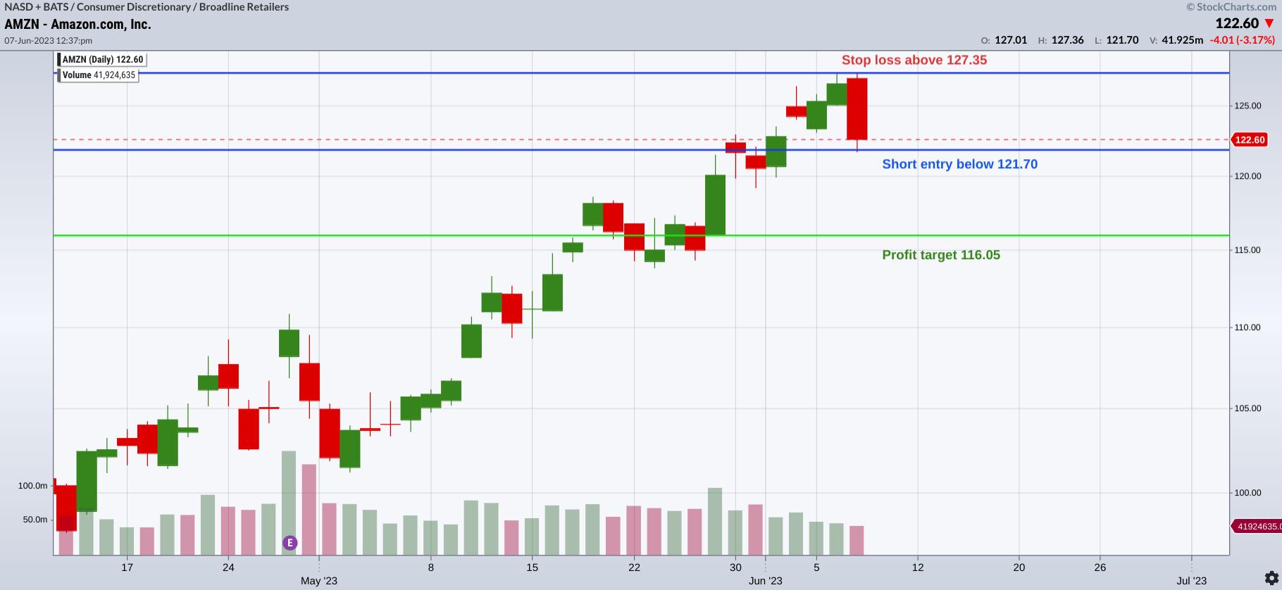
CHART 3: TRADING AMZN. Here you see the entry, profit target, and stop loss for a short position.Chart source: StockChartsACP. For educational purposes only.
- On the following trading day (assuming the engulfing pattern remains intact), you would place a short entry right below the low of the engulfing candle;
- You'd place a stop loss at the top of the formation (either the engulfing candle of the candle before it, whichever is taller);
- Your profit target would either be a 100% measure of the entire formation (a one-to-one risk/reward approach); or
- You would exit at the closest support level.
Say AMZN closed at $122.60 (see chart below). The high is $127.36 and the low is $121.70. The total risk would amount to $5.65. For the shorter-term trade, you would take the dollar-value measure of this pattern's height and subtract it from the bottom, giving a price target of $116.05 to cover your short position.
The second, further target would be the near-term support at $115 and the $104-to-$106 range, as pointed out in the charts above.
Other Stocks in the Scan
Here are some other notable stocks and exchange-traded funds (ETFs) that showed up on the scan.
ProShares UltraPro QQQ (TQQQ)
Invesco QQQ Trust (QQQ)
Adobe Systems, Inc. (ADBE)
Shopify, Inc. (SHOP)
MetaPlatforms, Inc. (META)
Looking Back at Walmart's Bullish Engulfing Pattern
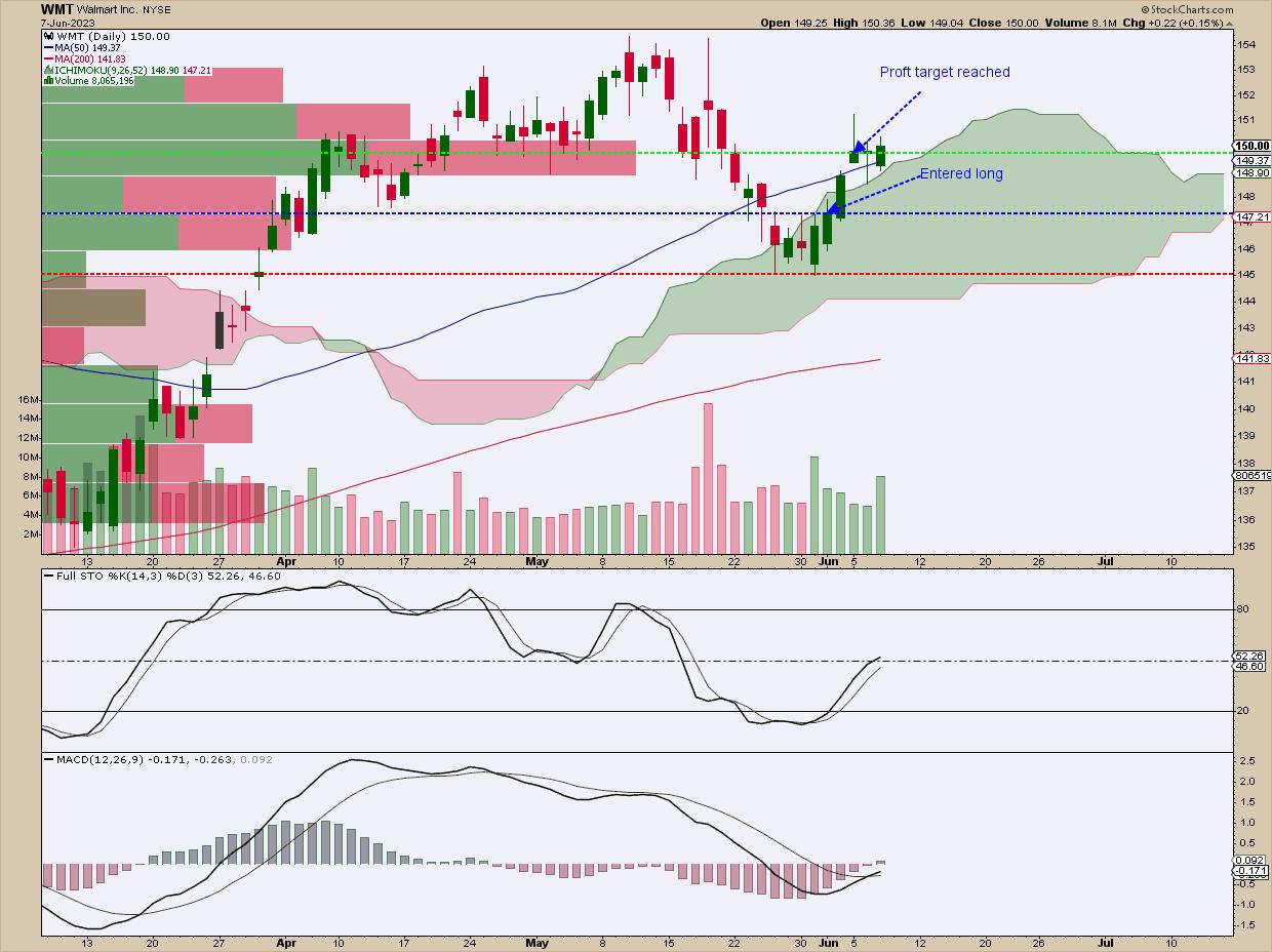
Last week's article discussed the bullish side of this same candlestick pattern. The stock in focus was Walmart (WMT). Similar to the trade setup above, the "measured" profit target had the best chance of succeeding. Let's take a look at how it did.

CHART 4: A WMT TRADE. The profit trade was reached three trading days ago.
Set a profit target based on the formation height (147.31 - 145.01 = 2.30). Add the 2.30 to the top of the formation. This gives you $149.61, which was reached three sessions later.
The Bottom Line
Because markets tend to fall faster than they rise, trading the short side of the market can sometimes present sudden and dramatic opportunities. Bearish Engulfing patterns may not be surefire signals of a decline, but they come pretty close, as their stats—a 79% bearish reversal rate—seem pretty compelling. Good luck and happy trading!

Disclaimer: This blog is for educational purposes only and should not be construed as financial advice. The ideas and strategies should never be used without first assessing your own personal and financial situation, or without consulting a financial professional.
|
| READ ONLINE → |
|
|
|
| MORE ARTICLES → |
|
 Chart 1
 Chart 2
 Chart 3
 Chart 4
 Chart 5
 Chart 6


