| THIS WEEK'S ARTICLES |
| Larry Williams Focus On Stocks |
| Focus on Stocks: August 2023 |
| by Larry Williams |
Hi Gang.
Larry Williams here. Welcome to my new stock market service called "Focus On Stocks," which I'm creating in conjunction with my friends at StockCharts.com.
As a "Focus On Stocks" subscriber, you now have access to my latest market analysis. Be sure to check out my first article below. As you can see, I'm including my short and long-term market timing thoughts as well as specific stock selections that have come across my screen. You'll be automatically notified by email whenever I post a new article.
I'll also be hosting a live monthly "Family Gathering" for subscribers, where you can join me on a Zoom webinar to talk markets, share some of the things I'm working on and answer any questions that you have. I'm really looking forward to these! (and yes, they will be recorded for later viewing)
Full Disclosure: This "Focus on Stocks" area is free to access until October 1st. We are still working on the final pricing and will let you know in the next article.
Enjoy my latest article now, and stay tuned for more later this month!
Larry
Long-Term Market Timing
The most notable event of the past few days is Morgan Stanley's "Mr. Bear" himself, Mike Wilson, tossing in the towel, saying he got it all wrong. That is a major capitulation by the bear camp. Give him credit for confessing the error of his ways; something seldom seen on Wall Street.
Of course, his capitulation was just prior to the Fed raising rates, which puts a real damper on the bull market. Life is not easy for us so-called market savants. Nonetheless, I expect the current bull market will continue trudging upwards into 2025, with the typical erratic and jerky price patterns seen in prior bull markets.
Focusing on the Intermediate-Term
Here's what I think is the most probable pattern, or road map, the Dow Jones will be etching out on our charts, highlighted here in red.
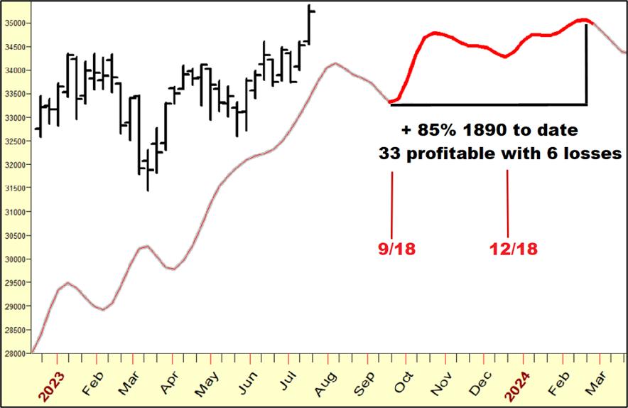 Chart 1: Long-Term Cycle Chart 1: Long-Term Cycle
This cycle study, using TimingSolution.com software, is based on a very long-term cycle wherein I have extrapolated the shorter-term elements to amplify what should be the future. Clearly, the future is never like the past. But considering this pattern has been seen 39 times since 1890 with 33 positive cycles (or 85% accuracy), it presents us with a strong bias for a rally. That, dear friends, is how I trade. I look for biases and respond accordingly.
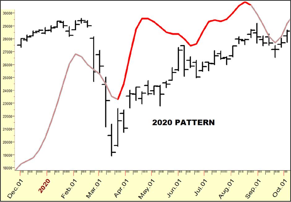 Chart 2: Long-Term Cycle Chart 2: Long-Term Cycle
Chart 2 shows the last time we saw the pattern, back in 2020. Not a perfect fit, but a very good guide to future price performance.
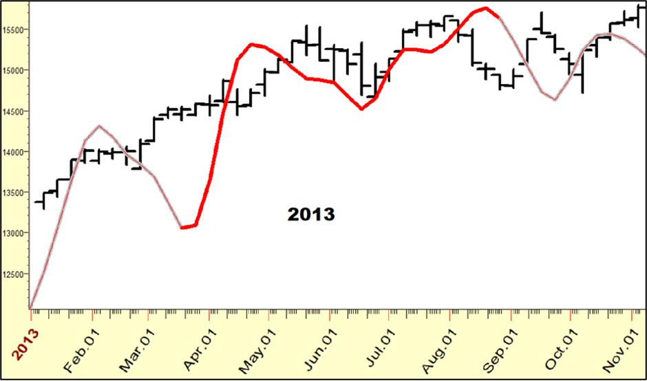 Chart 3: Long-Term Cycle Chart 3: Long-Term Cycle
The time before that was 2013, again a decent forecast of what has transpired — as was the guideline provided by this wave action in 1929.
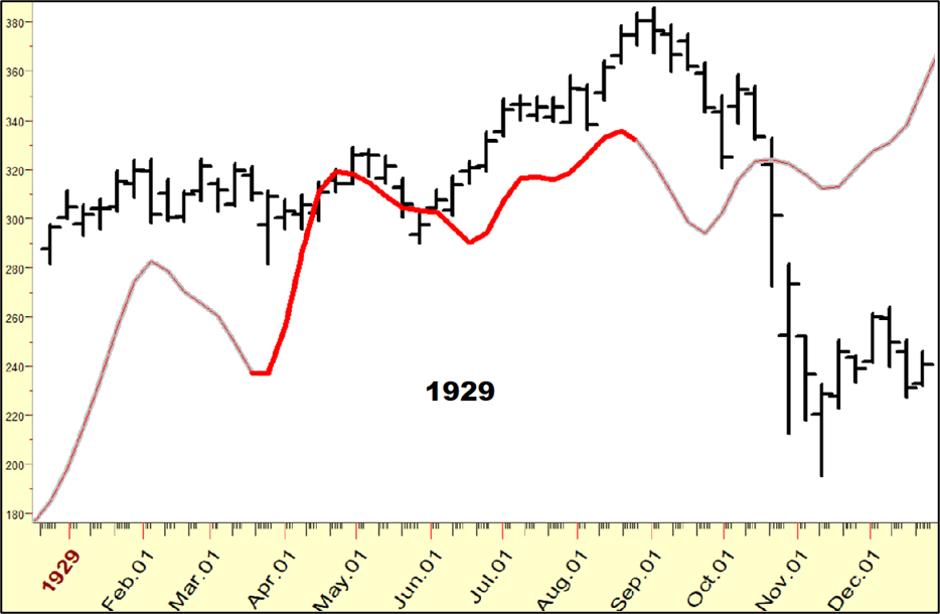 Chart 4: Long-Term Cycle Chart 4: Long-Term Cycle
What Became of the Yield Curve Bear Market/Recession?
Over a year ago, the bear camp and all the recession forecasting services clamored that the Yield Curve (the difference between 10-Year and 2-Year Bonds) had turned negative, supposedly an absolute guarantee that stocks would slide and a recession would follow.
Neither of those things took place. But why? And what can we learn here?
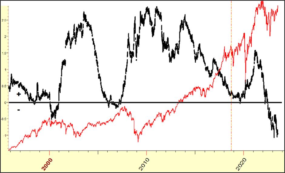 Chart 5: The Yield Curve vs. DJIA Chart 5: The Yield Curve vs. DJIA
Wall Street bears like the Curve as an indicator as much as bears here in Montana like huckleberries. At times, the Curve has foreshadowed recessions, yet that is not always the case, as I have shown on numerous StockCharts.com videos as well as in my annual reports.
In Chart 5, we can look at the last quarter-century of the Curve (in black, DJIA in red). Dipping below the black horizontal line has most often been early (by years) in calling Bear Markets. It does not appear to be a good predictor.
What Does Look Good Is...
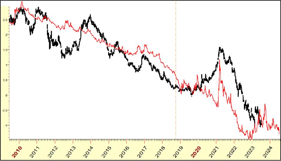 Chart 6: The Yield Curve vs. Inverted DJIA Chart 6: The Yield Curve vs. Inverted DJIA
In Chart 6, I have inverted the price scale of the DJIA. Now we see a much closer correlation of stocks to the Curve! What's more, I have pushed the DJIA price about 18 months into the future... so yes, the Dow leads the Curve!
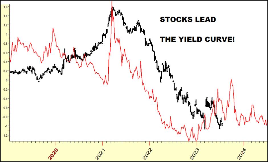 Chart 7: The Yield Curve vs. Inverted DJIA Chart 7: The Yield Curve vs. Inverted DJIA
Chart 7 is an expanded view that allows you to get a sense of what's to come for the Curve. Looks pretty choppy to me. Those who understand the Curve better than I may find this of value; the bottom line for me is that the Curve declines when stocks rally, and rallies when stocks decline.
Focus on Specific Stocks
Let's begin with IBM, the most stalwart stock on Wall Street. My wave projection tells us to expect a rally to begin — right here, right now — with a 75% history of rallying at this time. Here's how the pattern played out the last few years:
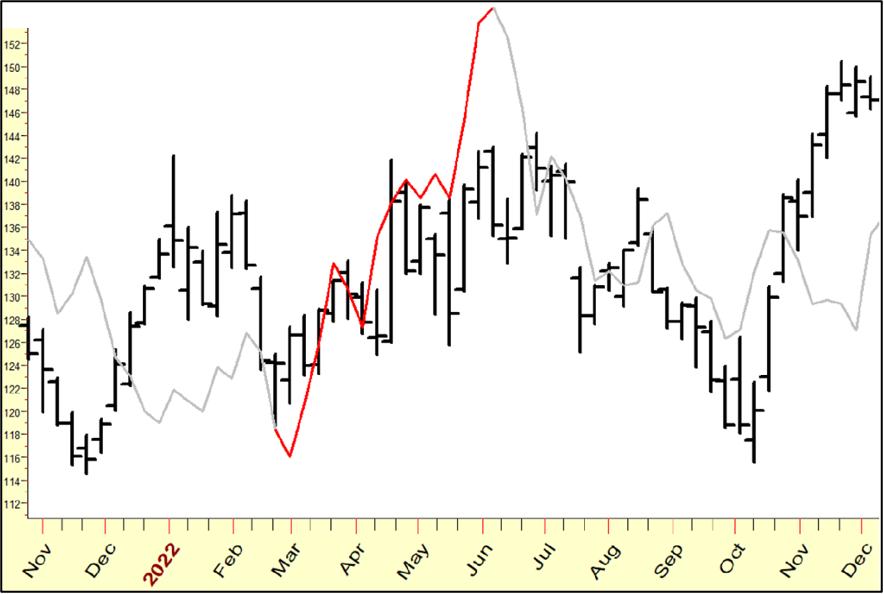 Chart 8: IBM Cycle Pattern 2022 Chart 8: IBM Cycle Pattern 2022
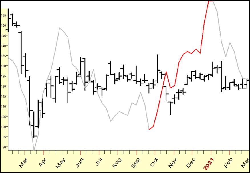 Chart 9: IBM Cycle Pattern 2021 Chart 9: IBM Cycle Pattern 2021
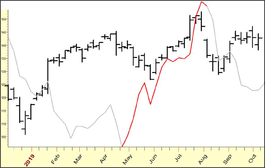 Chart 10: IBM Cycle Pattern 2019 Chart 10: IBM Cycle Pattern 2019
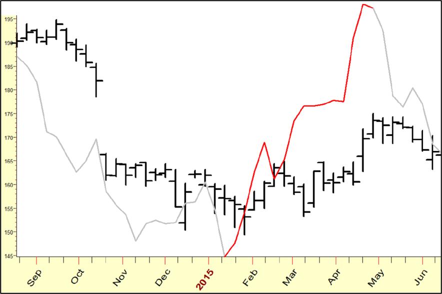 Chart 11: IBM Cycle Pattern 2015 Chart 11: IBM Cycle Pattern 2015
And here is the pattern for 2023...
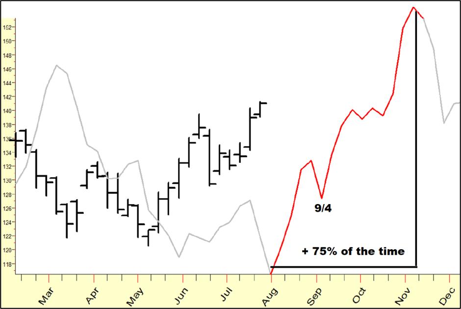 Chart 12: IBM Cycle Pattern 2023 Chart 12: IBM Cycle Pattern 2023
As you may have noted from the prior examples, the first "pullback", marked off as 9/4 in Chart 12, has also been a good time period to take long positions.
StockCharts.com users will want to pay attention to my Money Flow Index... the best times to buy, usually, are when it enters the buy zone. Here it is on a daily chart.
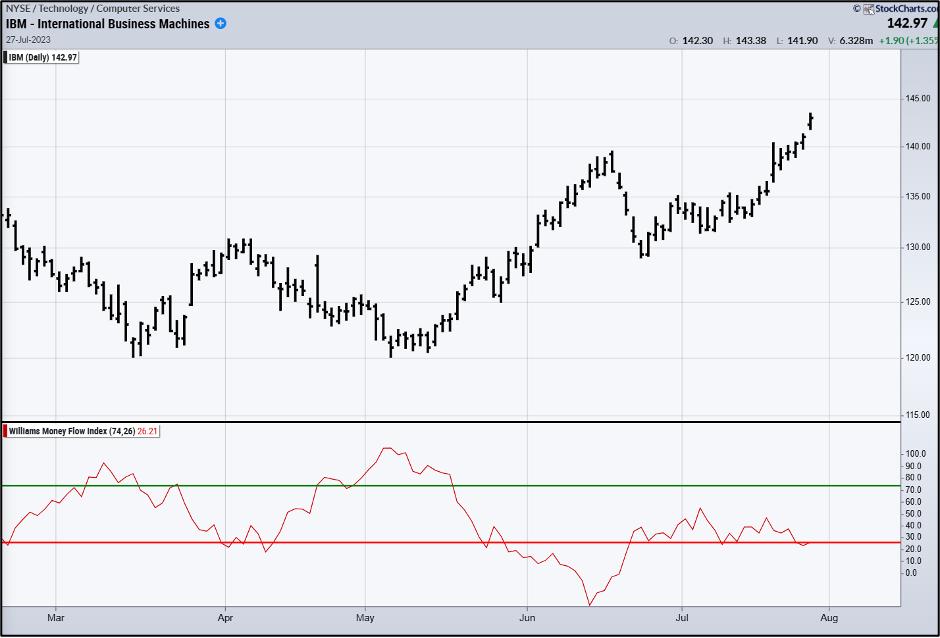 Chart 13: IBM 2023 Money Flow Index Chart 13: IBM 2023 Money Flow Index
About Time to Buy Microsoft
Cycles say Microsoft (MSFT), the "everything software" company, is getting set up for a powerhouse rally. In these charts, I have combined the short-term and long-term cycles that have been most influential in MSFT to get a sense of what is in store for this ubiquitous company.
The cycle wave tells us the stock has rallied over 90% of the time, starting around the first of September.
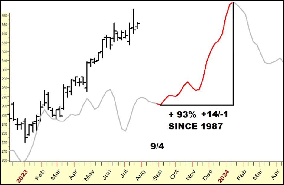 Chart 14: MSFT Wave Pattern Chart 14: MSFT Wave Pattern
Let's look at prior examples of this pattern.
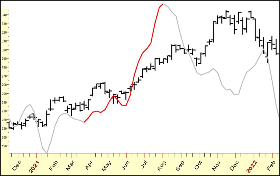 Chart 15: MSFT Wave Pattern 2021 Chart 15: MSFT Wave Pattern 2021
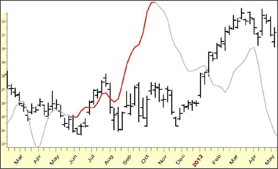 Chart 16: MSFT Wave Pattern 2011 Chart 16: MSFT Wave Pattern 2011
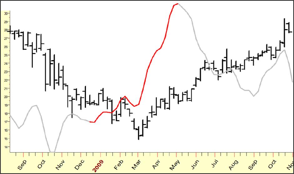 Chart 17: MSFT Wave Pattern 2009 Chart 17: MSFT Wave Pattern 2009
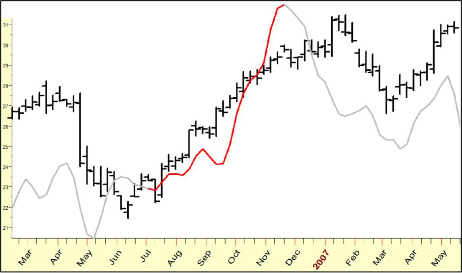 Chart 18: MSFT Wave Pattern 2006-07 Chart 18: MSFT Wave Pattern 2006-07
Next, let's examine MSFT on a weekly basis with my True Seasonal Index, which gives us another reason to expect a rally is not too far away.
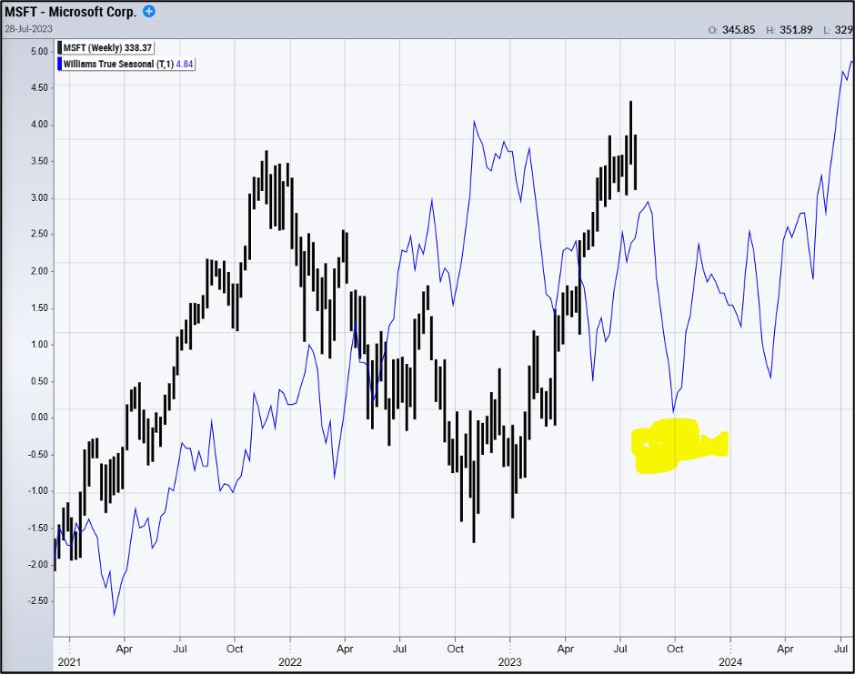 Chart 19: MSFT True Seasonal Chart 19: MSFT True Seasonal
Other Stocks
Here are stocks that should rally in phase with the mid-to-late August cycle low.
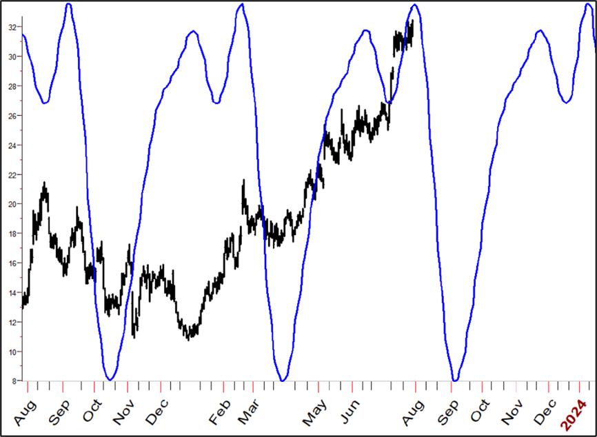 Chart 20: DraftKings (DKNG) Cycle Chart 20: DraftKings (DKNG) Cycle
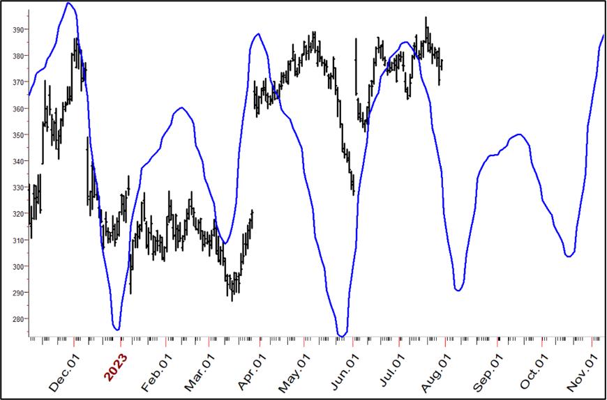 Chart 21: Lululemon (LULU) Cycle Chart 21: Lululemon (LULU) Cycle
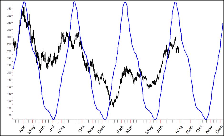 Chart 22: Tesla (TSLA) Cycle Chart 22: Tesla (TSLA) Cycle
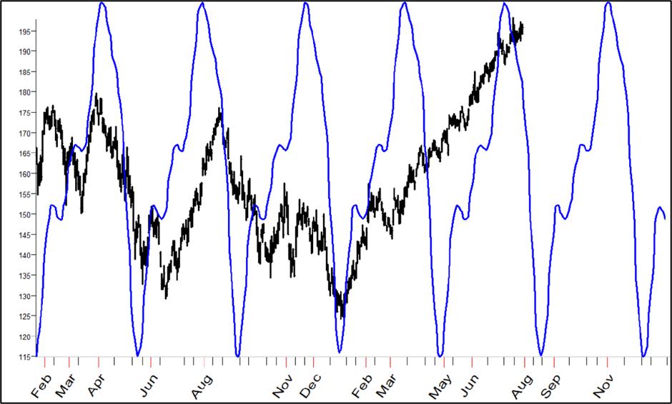 Chart 23: Apple (AAPL) Cycle Chart 23: Apple (AAPL) Cycle
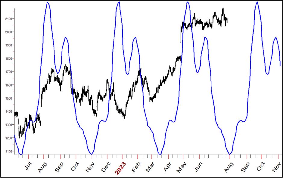 Chart 24: Chipotle (CMG) Cycle Chart 24: Chipotle (CMG) Cycle
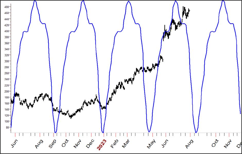 Chart 25: Nvidia (NVDA) Cycle Chart 25: Nvidia (NVDA) Cycle
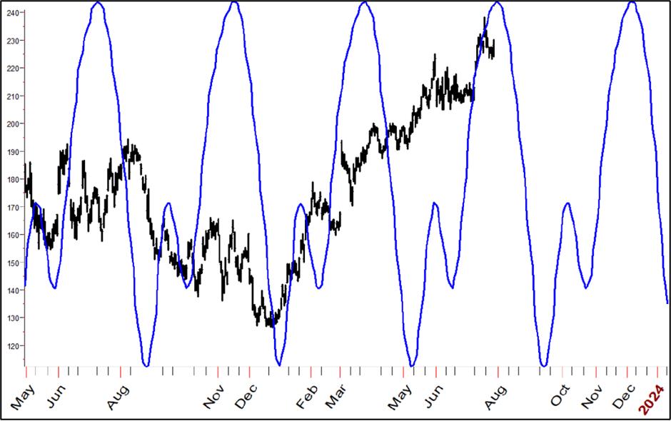 Chart 26: Salesforce (CRM) Cycle Chart 26: Salesforce (CRM) Cycle
Last Stock Chart
One last stock to take a look at is Rockwell Automation (ROK). Founded in 1903, this has been a perpetual Wall Street winner. My major cycle projection is shown in Chart 27. I have highlighted in red a wave that has seen rallies 85% of the time in the past appearances of the wave.
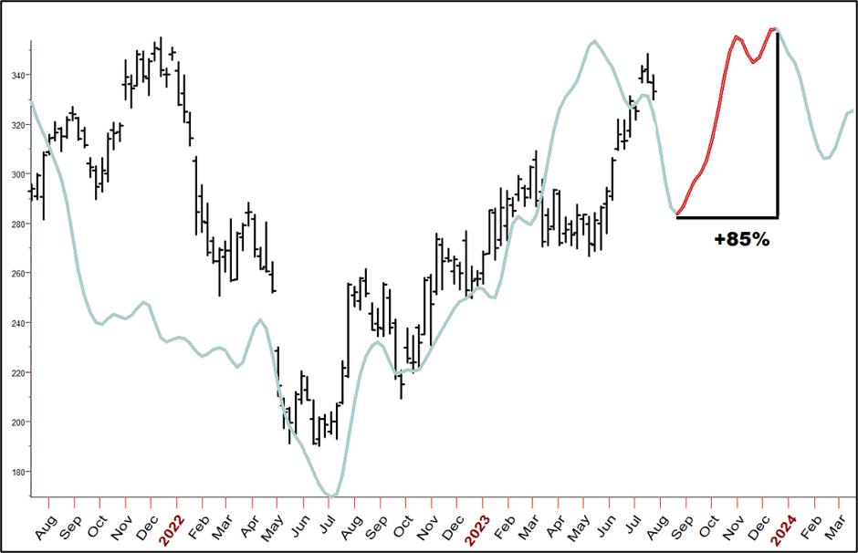 Chart 27: Rockwell Wave Pattern Chart 27: Rockwell Wave Pattern
In Chart 28, I tie together the major wave with short-term cycles to help us see when the projected-up move may begin.
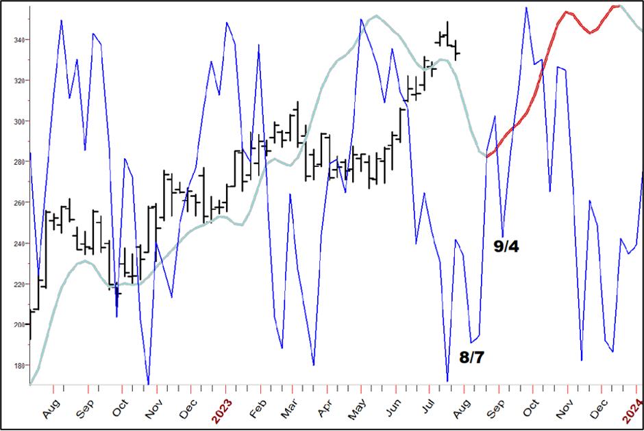 Chart 28: Rockwell Wave Pattern with Short-Term Cycle Chart 28: Rockwell Wave Pattern with Short-Term Cycle
As you can see traders will want to be looking for buy signals around the 7th of this month and the 4th of September.
For My Gold Bug Friends and Fellow Traders
Gold has shown a distinct pattern of rallying in most Augusts. Here is my True Seasonal, which, unlike all other seasonal studies, features no out-of-sample data in its forecast.
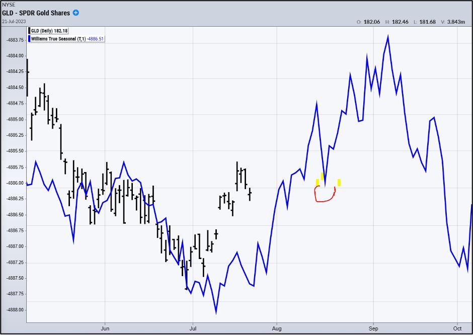 Chart 29: Gold Seasonal Pattern Chart 29: Gold Seasonal Pattern
See the little red semi-circle? That marks what's been a pretty good time for short-term traders to look for taking long positions. How good, exactly?
To answer that, let's look at my TDOM, or Trading Day of the Month concept. The idea is to find which, if any, trading — not calendar — days of the month are best for buying and selling.
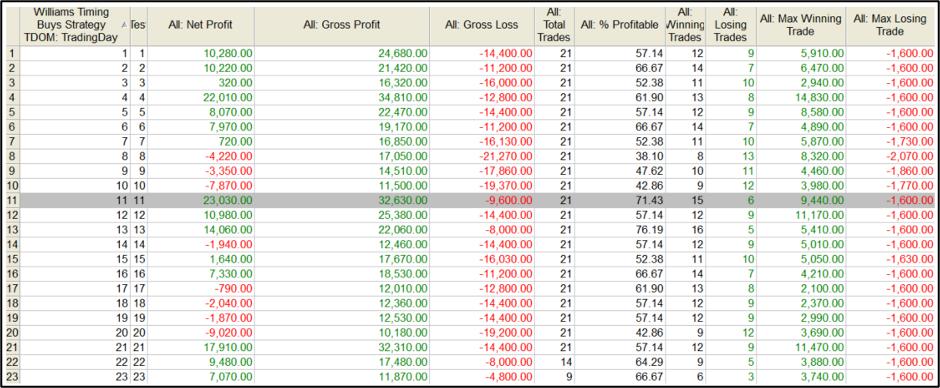 Table 1: Gold August Trading Day of The Month Table 1: Gold August Trading Day of The Month
The results show that had you bought on the opening of the 11th trading day of August, over the last 21 years, the trade was correct 71.4% of the time, taking home $23,030 in total net profits. The trade calls for buying on the night session opening, holding for three days, then exiting on the first profitable opening while employing a $1,600 stop loss.
MORE IMPORTANTLY is the fact that we see lots of green for TDOMs 1-4, 11, and at the end of the month. Traders will want to consider short-term entries at these times to have a strong bias in their favor.
Stock traders will find this same bias in the ETF for Gold, GLD.
That's it Gang!
Stay tuned though for a special online and live mid-month report, where you can give feedback and ask questions. An email will announce the time and date.
Until then ... Good Luck and Good Trading,
Larry Williams
|
| READ ONLINE → |
|
|
|
|
|
| John Murphy's Market Message |
| ENERGY SECTOR IS BREAKING OUT TO THE UPSIDE |
| by John Murphy |
UPSIDE ENERGY BREAKOUTS...Last week's message listed energy as the strongest market sector over the last week and month. That positive trend continued this past week with some upside breakouts taking place. Chart 1 shows the United States Oil Fund (USO) trading above its April high. WTIC hasn't broken out yet but is getting close. As normally happens, higher energy prices are having a positive effect on energy shares.
XLE BREAKS OUT... Last week's message also showed the Energy SPDR testing its spring high. Chart 2 shows the XLE rising above that previous peak to achieve an upside breakout as well.
 Chart 1 Chart 1

Chart 2
OIL SERVICES CONTINUES TO LEAD... The message from July 7 showed oil service stocks turning up sharply which suggested hat the entire energy sector was getting ready to rally. That group continues to lead the sector high. Chart 3 shows the VanEck Vectors Oil Services ETF (OIH) rising above its 2023 high to reach a multi-year high. A number of individual stocks in that group were also shown which have continued to rally. Exploration and Production stocks are also showing energy leadership. A couple of them are shown below.
 Chart 3 Chart 3
APACHE AND PIONEER BREAKOUTS... The next two charts show a couple of energy stocks that have helped lead the sector higher this week. Chart 4 show Pioneer Natural Resources (PXD) trading well above its April high. Chart 5 shows Apache Corporation (APA) doing the same. Both stocks are in the Exploration and Production group which has been an energy leader along with Oil Service stocks.
 Chart 4 Chart 4
 Chart 5 Chart 5
RISING OIL PRICES MAY PUSH BOND YIELDS HIGHER... The rally in energy prices may carry good and bad news. The good news is that higher prices should give a big boost to energy shares. The potentially bad news is that rising energy prices may push bond yields higher. The green bars in Chart 6 show the 10-Year Treasury bond yield climbing this week to the highest level since last November. This week's Fitch downgrade of U.S. debt probably contributed to higher yields. Rising energy prices may also be pushing yields higher. The gray area in Chart 6 shows the price of oil surging over the last month along with bond yields. Rising energy could boost inflation expectations which could push bond yields even higher.
 Chart 6 Chart 6
|
| READ ONLINE → |
|
|
|
| Martin Pring's Market Roundup |
| It's Time for These Chinese ETFs to Play Catch-Up |
| by Martin Pring |
There have recently been a lot of depressing stories concerning the state of the Chinese economy. Here are a spattering of headlines that appeared just today:
- China's Economic Recovery Weakens as Growth Concerns Linger (WSJ)
- China Manufacturing Keeps Shrinking, Weighing on Economic Recovery (Bloomberg)
- More Stimulus "Desperately Needed" as China's Economic Recovery Slows Further (CNN)
In my book, that kind of negative consensus is often the precursor of a rally. After all, markets factor in that bad news ahead of time. Consequently, when the news finally breaks, it's usually time to examine the technical picture to see if a new trend may be underway. With that in mind, I am going to start off with a quick examination of the Shanghai Composite, later following up with some Chinese ETFs traded on US exchanges.
Shanghai Composite
Chart 1 compares the Shanghai Composite to its long-term KST. The green-shaded areas tell us when the Index is above its 12-month MA and the KST is north of its 9-month MA. It's not a perfect approach, but it does avoid major declines and captures the most significant rallies.
As you can see, this technique recently went positive. The KST has not yet experienced what we might call a decisive break, so it's not unreasonable to question its validity until a little more strength could put the issue beyond a reasonable doubt.
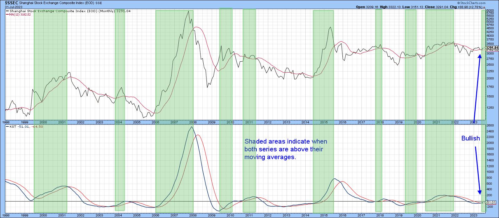 Chart 1 Chart 1
Chart 2 flags periods when the PPO using the 6- and 15-month parameters is above zero. Right now, it is literally right at that equilibrium point and poised for a signal. The small blue arrows indicate instances when the PPO has traded sideways close to zero for an extended period. A worthwhile move has usually followed. The indicator has been close to equilibrium since the beginning of the year, so, if the Index can complete the potential inverse head-and-shoulders with a month-end close above 3,350, a spirited rally would likely follow.
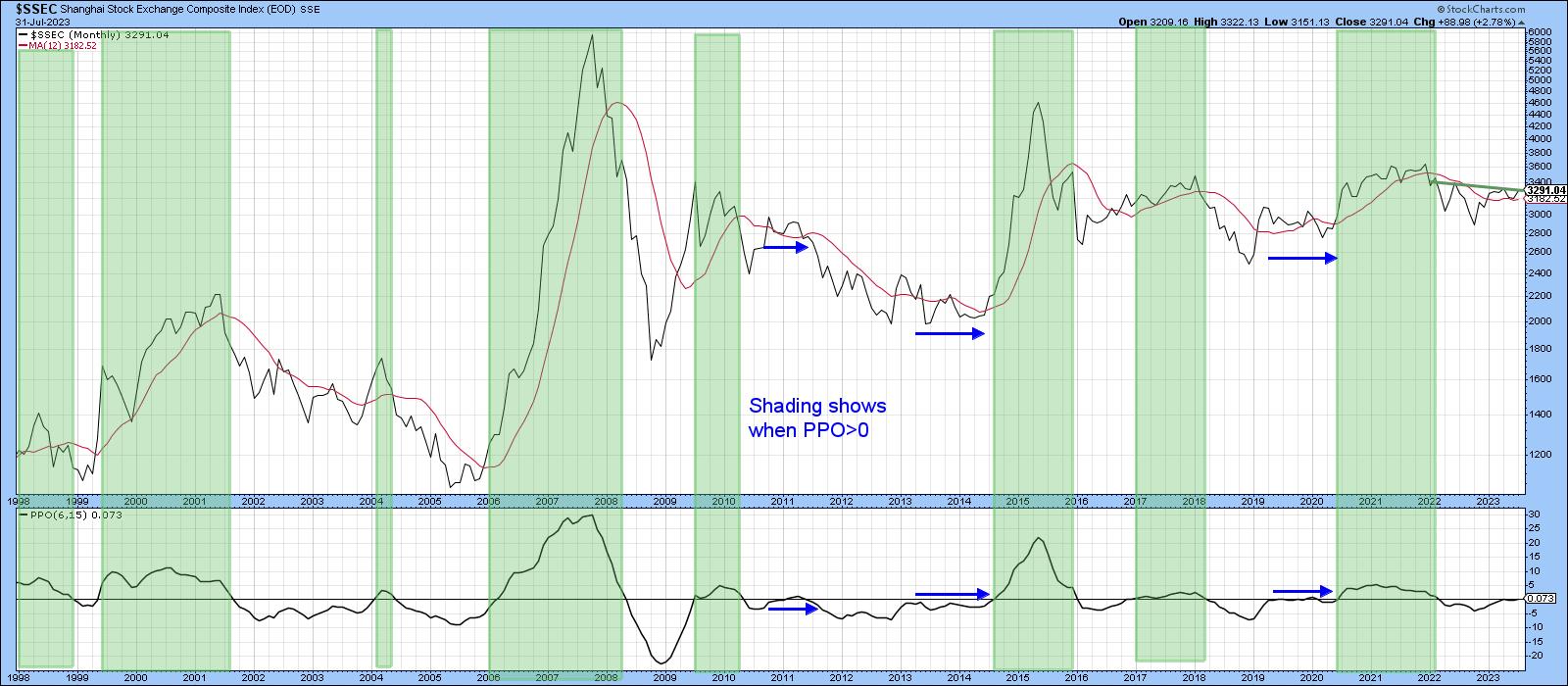 Chart 2 Chart 2
US-Listed Chinese ETFs
The iShares MSCI China ETF (MCHI) seeks to track the MSCI China Index and is one of the most liquid Chinese shares. The price is trading above its 12-month MA, and the KST is bullish as well. The MCHI also looks as if it is in the process of completing a reverse head-and-shoulders. That would happen with a month-end close north of $52.50.
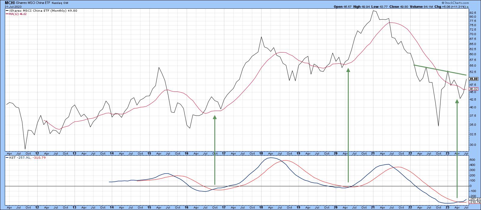 Chart 3 Chart 3
Chart 4 features weekly data together with a 13-week ROC. The thing that impresses me is the fact that the ROC was recently able to register a record reading in excess of 50%. That's either bullish or bearish, depending on your timeframe. First, it's obviously an overbought condition, where the odds favor some kind of corrective activity, so it's near-term bearish, which proved to be the case. Alternatively, from a primary trend aspect, the record reading is an extremely unusual sign that psychology has changed, so it's an early bird signal that a new bull market just began. I call these events "mega-overboughts". Once they are confirmed by a price trend reversal, they usually work. That has just happened with a violation of the 2021-23 down trendline.
There is one other observation from the chart worth noting, relating to the 40- and 65-week moving averages, which are currently converging. We can also see that the short-term time span is in the process of crossing above its longer-term counterpart. Previous examples, which have been flagged by the green arrows, were all followed by some form of a rally.
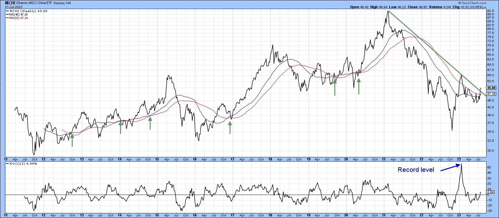 Chart 4 Chart 4
Chart 5 takes us down to the daily action and that shows the MCHI has broken out from its 2023 base, under the cover of a positive a short-term KST.
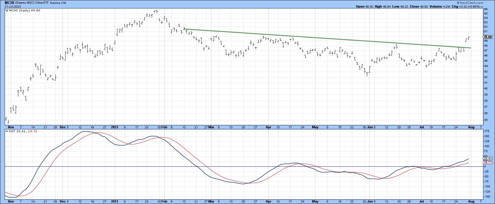 Chart 5 Chart 5
Charts 6-9 feature Chinese sector ETFs that look promising. They have either broken out in a tentative manner or require additional near-term strength to do so. Chart 5, for instance, indicates that the Global X China Financials (CHIX) are just below its 2028-23 down trendline for both the absolute and relative price. The long-term KSTs are bullish and should enable a breakout to take place.
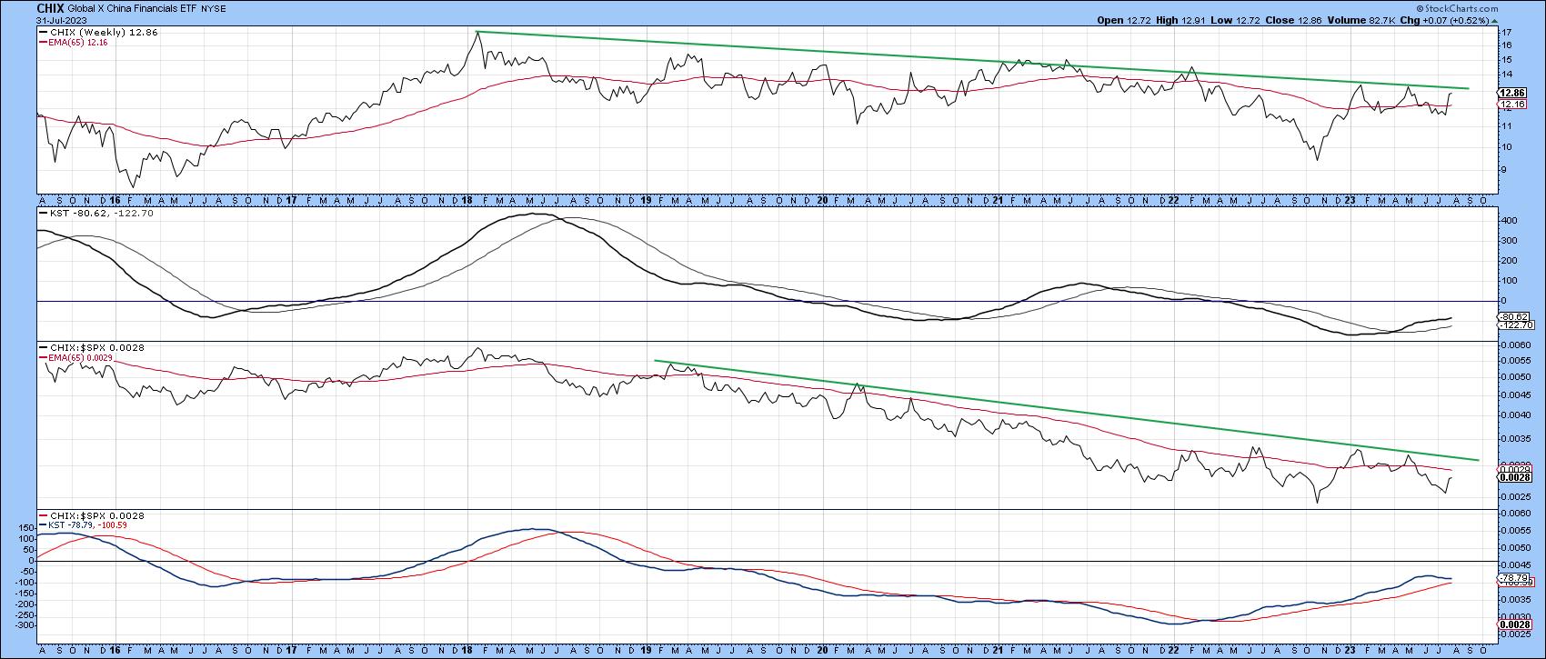 Chart 6 Chart 6
Chart 7 shows that the long-term KST for the Invesco China Technology (CQQQ) has just gone bullish. The three previous ones were followed by a nice rally. The price has already confirmed with a bear market trendline violation, and only requires a month-end close above the neckline at $47.50 to complete the bullish picture.
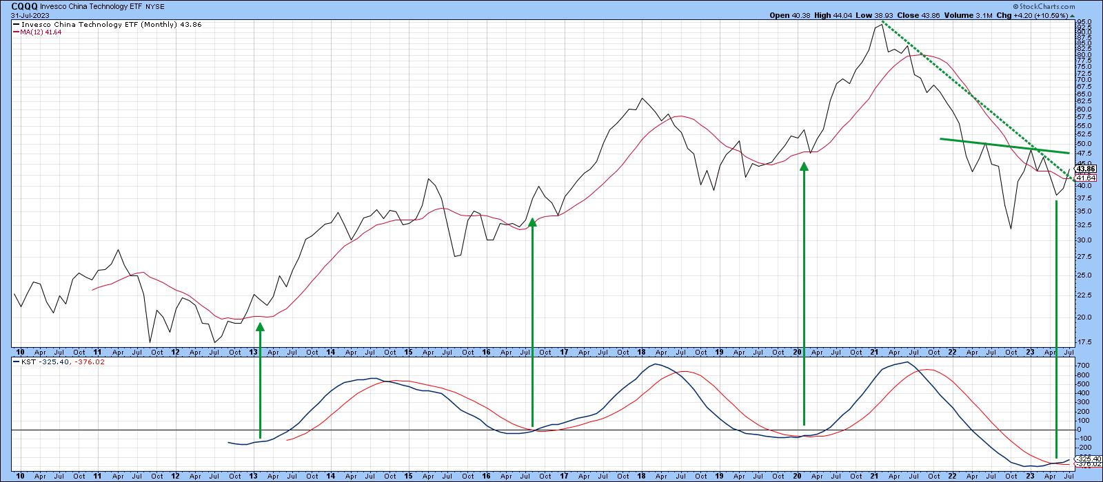 Chart 7 Chart 7
That's likely to happen because Chart 8 reveals a positive short-term KST and very recent down trendline violation.
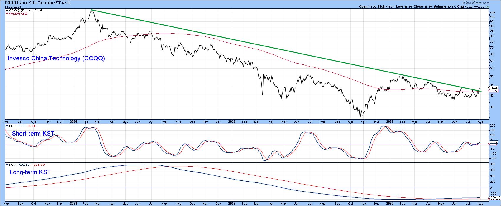 Chart 8Finally, Chart 9 tells us that both the price and RS line against the S&P for the Global X China Consumer ETF (CHIQ) have violated down trendlines. The breakout for the price is tentative at this point, but the whole setup looks encouraging. Chart 8Finally, Chart 9 tells us that both the price and RS line against the S&P for the Global X China Consumer ETF (CHIQ) have violated down trendlines. The breakout for the price is tentative at this point, but the whole setup looks encouraging.
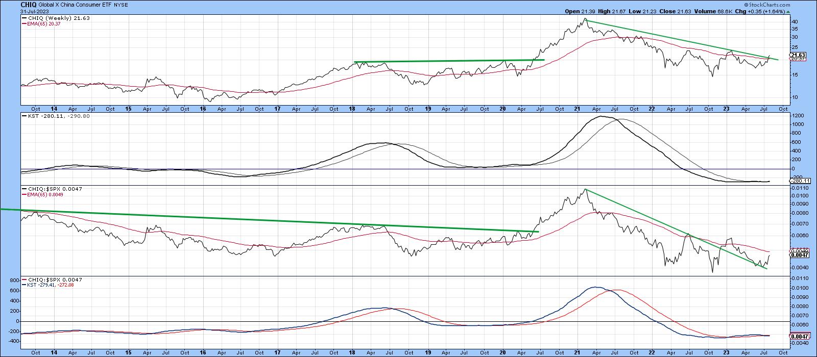 Chart 9 Chart 9
Good luck and good charting,
Martin J. Pring
The views expressed in this article are those of the author and do not necessarily reflect the position or opinion of Pring Turner Capital Group of Walnut Creek or its affiliates.
|
| READ ONLINE → |
|
|
|
| Art's Charts |
| CrowdStrike Shows Strength and Leadership with Breakout |
| by Arthur Hill |
CrowdStrike (CRWD) is separating itself from the rest of the pack with a breakout and nine month high.
The chart below shows CRWD with an uptrend working throughout 2023. The stock bottomed in January, advanced to the 140 area and hit resistance here in March-April (thick red line). The stock then broke above this resistance level in May and broken resistance turned into support (green line).
This is a classic tenet of technical analysis: broken resistance turns into the first support level after the breakout. Also notice that the Trend Composite in the lower window turned positive in mid May and is at 5. This means all five indicators in the Trend Composite are bullish. Note that this indicator and ten others are part of the TIP indicator edge plugin for StockCharts ACP.
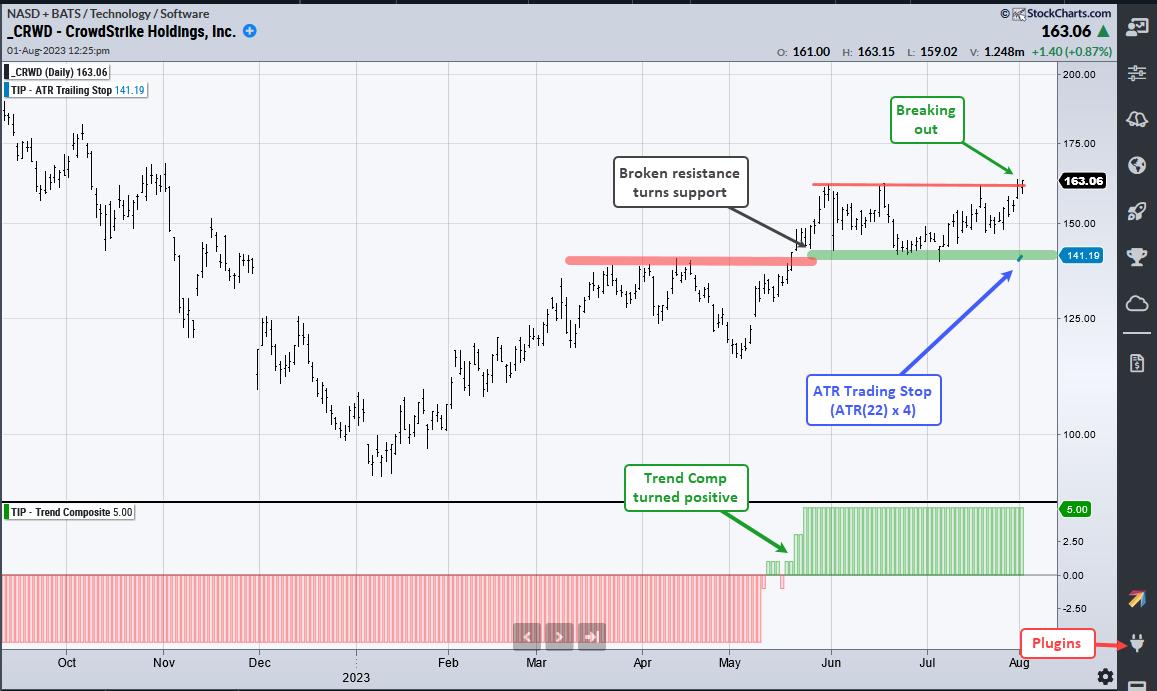
Shorter term, CrowdStrike consolidated with support in the low 140s and resistance in the low 160s the last two months. The stock is making a breakout bid here in early August and this signals a continuation of the larger uptrend. The summer lows mark key support at 140.
Chartists can also consider using the ATR Trailing Stop (short blue line). This is the highest close since the start date (31-July) less four ATR(22) values. 4 is the ATR multiplier (ATR(22) x 4). I chose this value (4) so the stop would start at the summer lows (support). This stop will rise if prices continue to rise.
TrendInvestorPro is currently running two quantified strategies. First, we have a momentum-rotation strategy trading S&P 500 and Nasdaq 100 stocks. Second, we have a short-term mean-reversion strategy trading Russell 1000 stocks. These strategies are outlined with detailed reports and performance metrics. Click here for immediate access.
The ATR Trailing Stop, Trend Composite, Momentum Composite and eight other indicators are part of the TrendInvestorPro Indicator Edge Plugin for StockCharts ACP. Click here to take your analysis process to the next level.
---------------------------------------
|
| READ ONLINE → |
|
|
|
|
|
| The Mindful Investor |
| Growth Stocks Begin Down a Slippery Slope |
| by David Keller |
As I returned from vacation last weekend and began to dig through the charts to prepare for the week, I immediately focused on Thursday with both Apple (AAPL) and Amazon (AMZN) reporting earnings. Would this provide the upside catalyst needed for the mega-cap growth stocks to find support at their 50-day moving averages?
By Friday's close, the answer appeared to be a resounding no, as a number of key market breadth indicators signaled a clear rotation from bullish phase to bearish phase. In today's article, we'll break look a little more closely at these bearish breadth indicator patterns, gauge the technical damage to stocks like AAPL after earnings, and consider some downside targets for the S&P 500.
The Market Develops Bad Breadth
As our equity benchmarks have become more top-heavy over time, given the outsized overweight of the mega-cap FAANG stocks, market breadth indicators have become much more important. Market breadth measures participation, usually using some sort of equal-weighted methodology. So while the value of the S&P 500 or Nasdaq 100 is based largely on the performance of the FAANG stocks, an equal-weighted market breadth indicator can tell you much more about the performance of all the other stocks that comprise those indices.
The McClellan Oscillator is based on daily advance-decline data for the NYSE, but smooths out the data using exponential moving averages to form an oscillator. When the indicator is above zero, conditions are bullish, and a level below zero suggests bearish conditions.
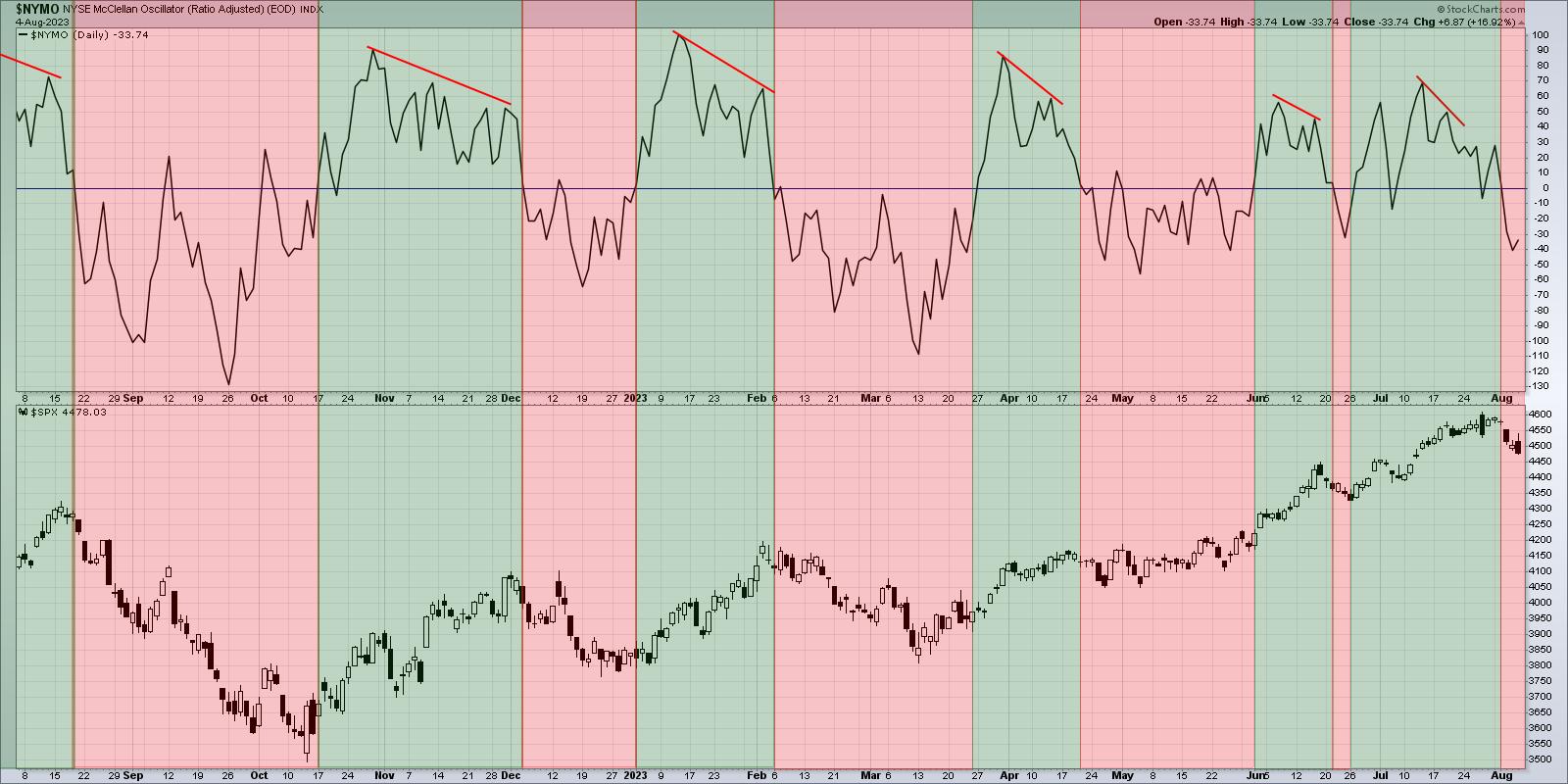
The McClellan Oscillator (top panel) just turned negative this week after being bullish through all of July. If you look back at the other red-shaded areas on the chart, you'll note that all the major pullbacks in the last 12 months have been identified with this sort of bearish rotation.
The Bullish Percent Indexes are a series of breadth indicators based on point & figure charts. Abe Cohen from ChartCraft is credited with taking the simplicity of point & figure chart and adapting the signals to create measures of market breadth.

Here, we're running a Bullish Percent Index for the Nasdaq 100 index, which means the indicator (top panel) tells you the percent of NDX names that are currently showing a bullish signal on their own point & figure chart. When the indicator breaks above 70% and then back below this extreme level, it suggests a negative rotation.
This bearish signal was triggered this week, indicating that the broad advance through July has set us up for a downside rotation into August. Note the vertical red lines which indicate previous occurrences and you'll see that the Nasdaq 100 has pulled back to some degree pretty much every time this signal has dropped.
When the market moves higher on stronger breadth, that confirms a broad and healthy advance, with many stock participating in the upside phase. When these breadth indicators turn back negative, as they have this week, it usually confirms the end of the previous bullish phase.
AAPL and AMZN Appear Similar Until They Don't
It's always newsworthy when the largest companies are reporting earnings, and this week did not disappoint, with two of the FAANG stocks announcing their latest results on Thursday. What's so interesting about this particular set of results is that the two stocks -- AAPL and AMZN -- had very similar technical setups going into their earnings report, but two very different reactions soon after.
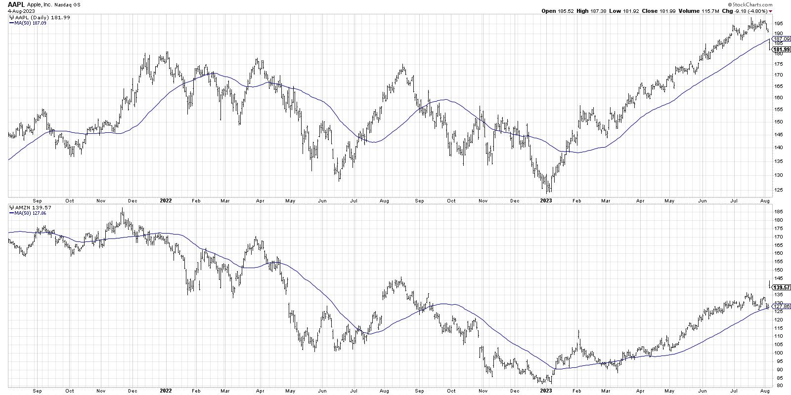
Both stocks have been above an upward-sloping 50-day moving average, confirming a consistent uptrend phase. Both names pushed to a new swing high in July, and both saw weaker price momentum going into that new high as the pace of the advance began to dissipate.
After both companies reported earnings on Thursday, Amazon gapped up by about $13, while Apple gapped down to open about $7 lower. What's very telling, however, is that both stocks finished near their low for the session.
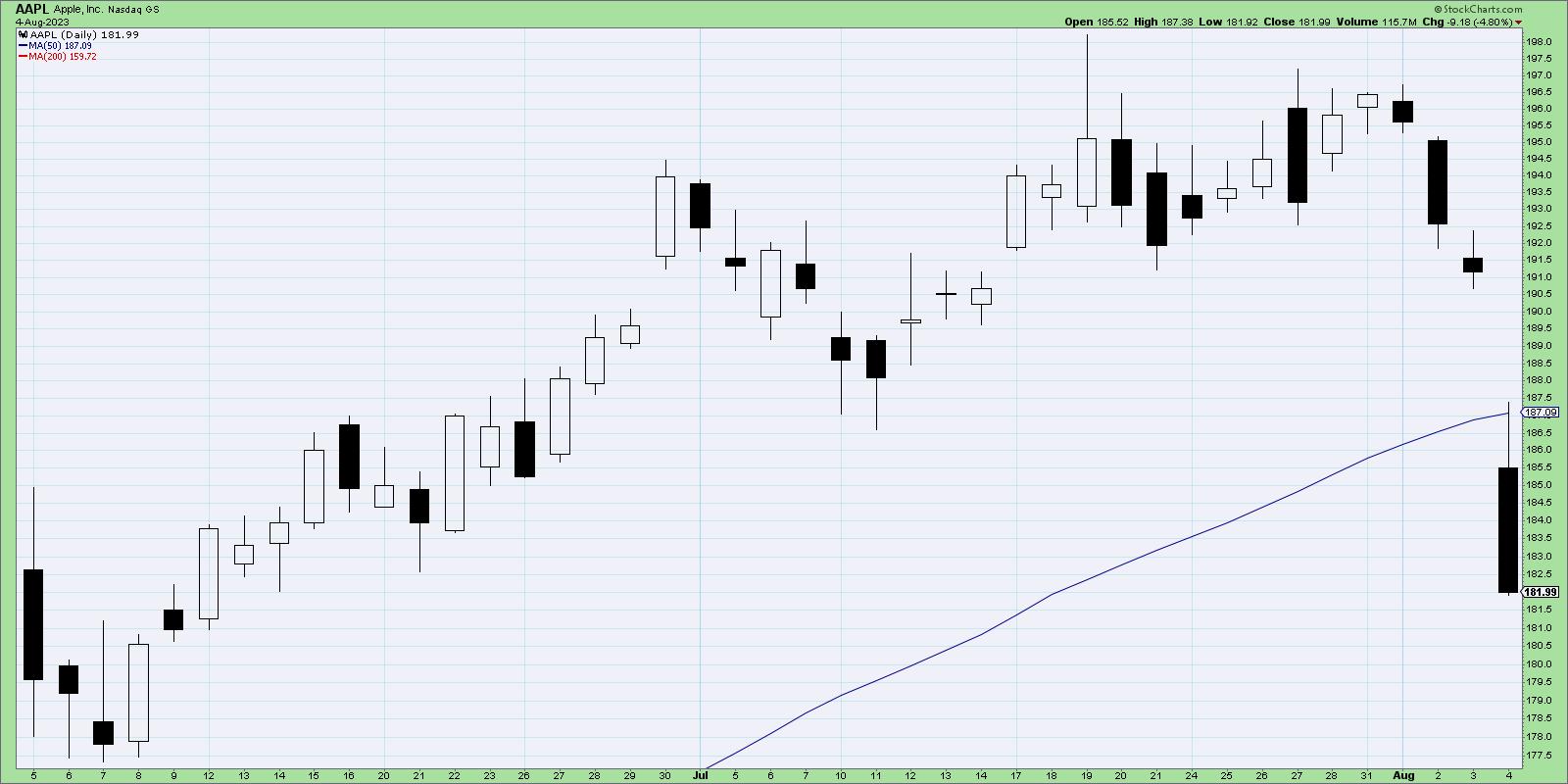
Now we're looking at a two-month daily candle chart of AAPL, which magnifies Friday's gap below the 50-day moving average. So after the gap lower at the open, the price rallied into mid-day, only to rotate lower in the afternoon to close at the low. So that means that, while some buyers jumped in and bought AAPL at a discount from Thursday's close, eventually sellers took control and pushed the price even lower.
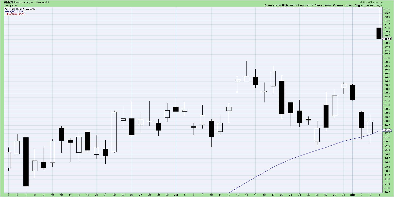
AMZN actually gapped higher on Friday, pushing the price well away from its 50-day moving average. But note Friday's candle, which is called a "shooting star" pattern. This is where the open and close are near the lows of the day, and there is a long upper shadow. This shows that, while the stock did gap higher on the earnings beat, the end of the day was marked by profit-taking as investors were willing to cash in after the bounce higher.
In both cases, the short-term reaction on Friday after earnings suggest that market participants were happy to get out of these names going into the close. This lack of buying power into next week could lead to much further downside for these and other growth stocks.
Considering Downside Targets for the S&P 500
When a chart begins to rotate from a bullish phase to a bearish phase, it's always a good idea to start thinking about downside objectives. If for no other reason, it forces you out of your predetermined narrative and encourages you to consider different probabilistic outcomes.
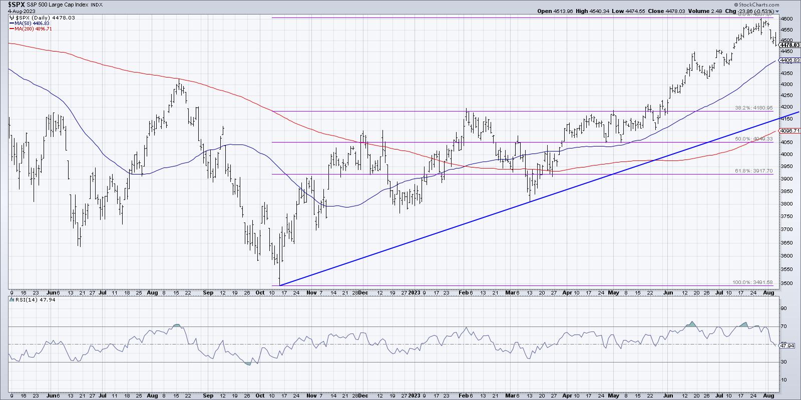
Assuming the S&P 500 has reached its peak for this part of the cycle, and is indeed heading lower in August, I'm immediately drawn to the 4200 level for two reasons. First, this would represent a 38.2% retracement of the bullish phase from October 2022 to July 2023. Second, it would bring the price down to a trendline using the October 2022 and March 2023 lows.
Depending on how long it would take to reach that price level, the 200-day moving average could end up being right around that level as well. So there we have three different technical indicators all indicating around 4200 as a reasonable downside target.
A move down to S&P 4200 would mean about a 9% pullback from the July high around 4600. If you study your market history, you'll see that even the most bullish years usually have two to three pullbacks of around 5-10% each. So this sort of further drop would not be unusual at all, but rather just the normal push and pull of the stock market cycle.
Our latest YouTube video digs into the bearish rotation in market breadth indicators, along with background on how they are derived!
RR#6,
Dave
P.S. Ready to upgrade your investment process? Check out my free behavioral investing course!
David Keller, CMT
Chief Market Strategist
StockCharts.com
Disclaimer: This blog is for educational purposes only and should not be construed as financial advice. The ideas and strategies should never be used without first assessing your own personal and financial situation, or without consulting a financial professional.
The author does not have a position in mentioned securities at the time of publication. Any opinions expressed herein are solely those of the author and do not in any way represent the views or opinions of any other person or entity.
|
| READ ONLINE → |
|
|
|
| ChartWatchers |
| Slower Job Growth, Treasury Yields, Earnings: Stock Market Looks For Support |
| by Jayanthi Gopalakrishnan |

It was quite a week in the stock market. The early part was relatively calm, but then things got a little hairy. You can thank the Fitch Ratings downgrade of US long-term debt from AAA to AA+ for the quick pivot in investor sentiment.
The reason for the downgrade: "Expected fiscal deterioration over the next three years, an erosion of governance in light of repeated debt-limit political standoffs, and a generally growing debt burden." The last time something similar to this happened was in 2011, when Standard & Poor's downgraded US credit.
When the news was released—after Tuesday's close—S&P 500 futures fell. This carried forward into the next trading day as stocks opened lower. And while equities sold off, Treasury yields and the US dollar moved higher.
A Short-Lived Hiccup?
It remains to be seen how much of an impact the Fitch downgrade had on the stock market. One thing is for sure: investors become more cautious.
Earnings. After Amazon (AMZN) reported positive earnings and upbeat guidance, the stock price rallied in after-hours trading. The company's revenues from its cloud-computing unit, AWS, helped lift other cloud stocks. Things weren't so great for Apple (AAPL). While it also beat Wall Street estimates, the slowdown in overall sales didn't help the stock much. AAPL stock price fell and is trading below its 50-day simple moving average (SMA).
July jobs report. Now that earnings season is beginning to wrap up, investors were eagerly awaiting the jobs report data. Non-farm payrolls were up 187,000, less than the 200,000 economists expected. It's also the lowest level since December 2020, which is encouraging in that job growth is slowing. But there are some sticky areas. The 3.5% unemployment rate is slightly lower than last month's, and average hourly earnings went up by 0.4%. This suggests that the labor market is still tight.
Labor participation has flatlined, which could be because a large segment of people are retiring. And the number of new participants seems to stay the same as the number leaving the workforce.
Investors may be worried the Fed isn't getting inflation down to 3%. Energy prices are going up, as are food and services prices. Despite these possible headwinds, the jobs report was considered optimistic.
Market pullback. In the daily chart of the S&P 500 index ($SPX) below, you can see that the index pulled back and has moved back below its 21-day EMA. The percentage of S&P 500 stocks above the 200-day moving average and Advance-Decline Percent also dipped during the index's pullback. All indications suggest a potential pullback, which could present buying opportunities if the stock market reverses. Keep an eye on the 50-day SMA as the next support level.
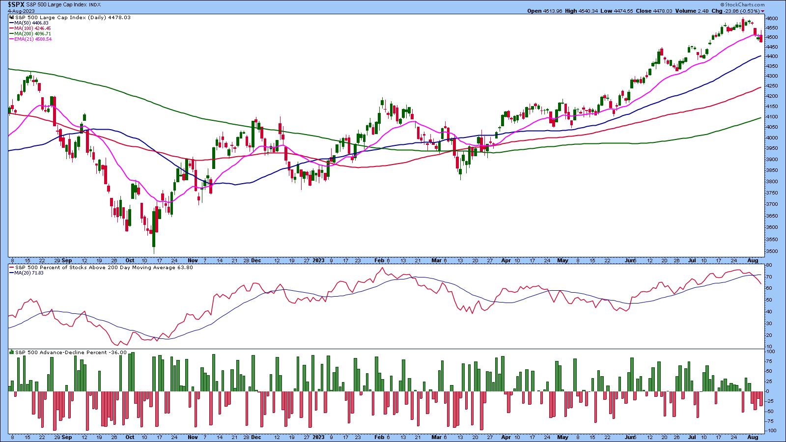
CHART 1: S&P 500 INDEX ($SPX) PULLS BACK. The index dipped below its 21-day EMA and is approaching its next support level at the 50-day SMA.Chart source: StockCharts.com (click chart for live version). For educational purposes.
After the Fitch Ratings' downgrade and the Treasury's plans to borrow $1 trillion, it's worth looking at other assets besides equities. The 10-year US Treasury Yield Index ($TNX) rose to the highest 2023 level as equities sold off. After the July jobs report, 10-year yields moved lower, but remain above 4%. This brings up the next point—mortgage rates. The 30-year fixed-rate mortgage is close to 7%, the highest rate in about two decades.
It's almost as if the forecast for how long the Fed will continue to raise interest rates keeps getting pushed out further. While some data seems to be trending in the right direction slowly, others seem to be supporting the idea that inflation is still around. If the 10-year yield hovers around 3.75%, it would be healthy for stocks, but if the 10-year yield continues to remain above 4%, stocks may sputter.
Another area to watch closely is crude oil. Price rose to the April 2023 levels, and, if price breaks above $84 a barrel, it could soar higher. If this happens, it could impact inflation, since energy is a large component of household expenses.
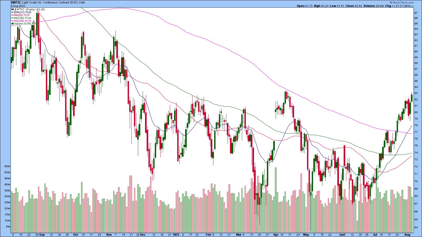 CHART 2: CRUDE OIL PRICES RISE. Crude oil futures are trading well above their 200-day SMA. The rise in oil prices may impact inflation.Chart source: StockCharts.com (click chart for live version). For educational purposes. CHART 2: CRUDE OIL PRICES RISE. Crude oil futures are trading well above their 200-day SMA. The rise in oil prices may impact inflation.Chart source: StockCharts.com (click chart for live version). For educational purposes.
End of Week Wrap Up
US equity indexes down; volatility up
- $SPX down 0.53% at 4478.03, $INDU down 0.43% at 35065.62; $COMPQ down 0.36% at 13909.24
- $VIX up 7.41% at 17.10
- Best performing sector for the week: Energy
- Worst performing sector for the week: Utilities
- Top 5 Large Cap SCTR stocks: Super Micro Computer (SMCI), Palantir Technologies (PLTR), Pohang Iron & Steel (PKX), Li Auto (LI), NVIDIA (NVDA)
On the Radar Next Week
- 30-Year Mortgage Rate
- Mortgage applications
- July CPI
- July PPI
- Michigan Consumer Sentiment
Disclaimer: This blog is for educational purposes only and should not be construed as financial advice. The ideas and strategies should never be used without first assessing your own personal and financial situation, or without consulting a financial professional.
|
| READ ONLINE → |
|
|
|
| The Canadian Technician |
| Copper Stocks Have Lots Of Volatility |
| by Greg Schnell |
Over the last few weeks, metals have been swinging wildly. I have been following Copper and Gold, and it has been a wild ride, to say the least. I'll cover off Copper and related miners today. As we wait for the world of electric cars to consume every ounce of copper, the focus for copper mining and production remains high as inventories remain low.
One of the metal mining ETFs is CPER, which trades like copper. It broke out to a higher high in mid-July, continuing a series of higher lows and highs, only to gap back down on Monday, July 17th. After a sideways week, copper surged on July 25th and tested the prior highs. In a choppy week, copper darted around but closed near the highs. On Monday, July 31, Copper surged higher with a clear break above resistance. By Wednesday, all sense of a new high was gone and copper was back below the 100-MA.
There is a trend of rising highs and rising lows. The volume has been improving, but the volume this week was well outside the June period. With the PPO rolling over onto a sell signal to end the week, it's an awfully hard trade to hold.
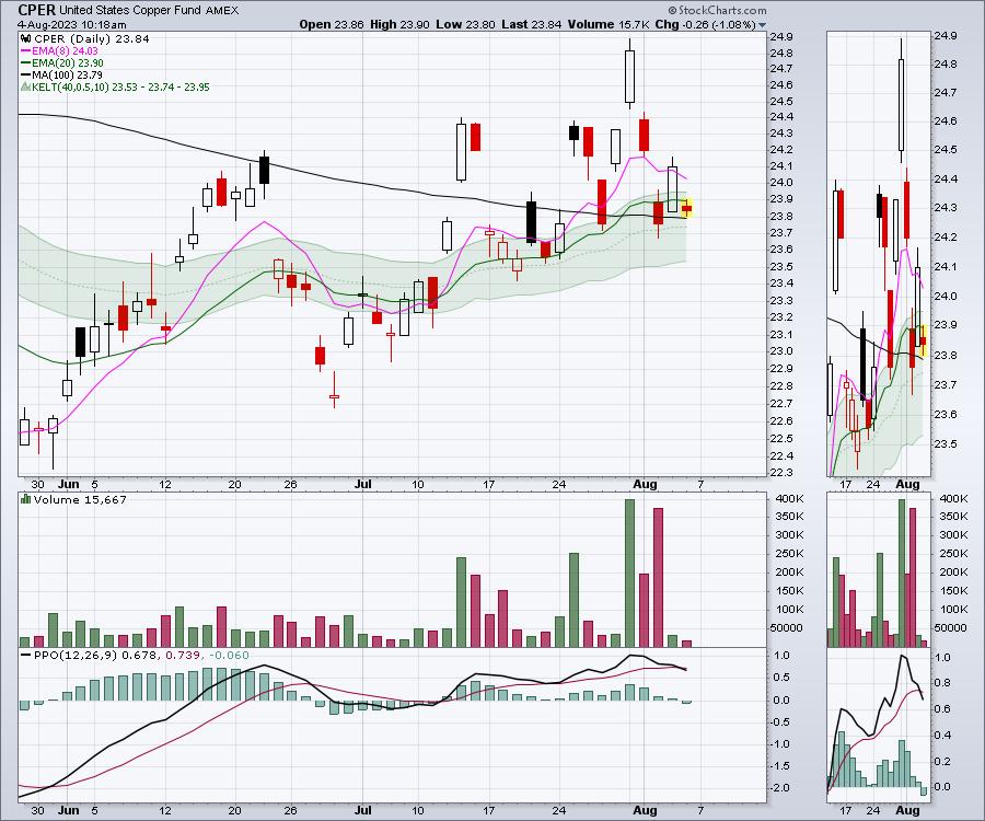
The hard part is copper is making higher highs and higher lows, but every day is a sudden move that's either supportive or damaging, making it hard to hold. While many investors might not own copper directly, some copper miners have been a robust trade, making higher highs.
The chart below is COPX, which is the copper miners ETF. Clearly, a case can be made for higher highs and higher lows. The difficult part is the opening gaps up and down every day. The high volume bars seem to be indicative of short-term tops. Now that the COPX ETF is back on a sell signal on the PPO, is it worth holding the metals throughout the third quarter?
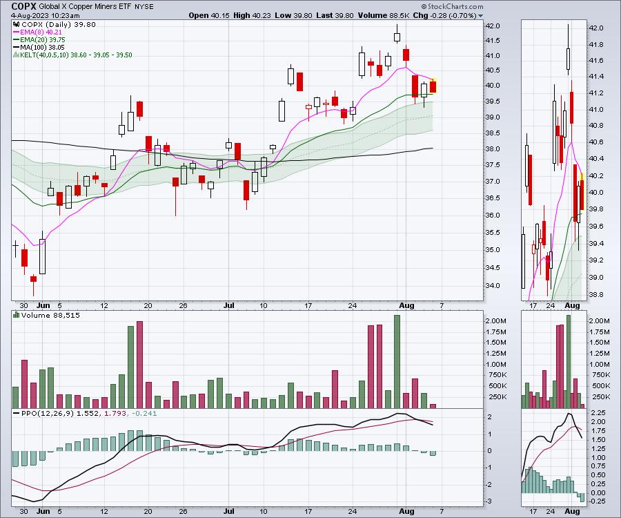
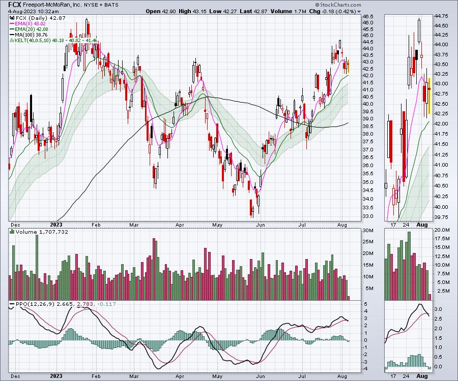
When I look at names like Freeport-McMoran (FCX) and Southern Copper (SCCO), their charts look good. The FCX chart has been pushing higher since June 1 through to July 31, but the PPO is rolling over onto a sell signal again. Which way will price go now?
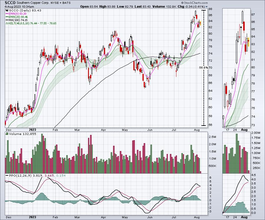
Looking at SCCO, this chart is even nicer. The stock is up 56% from late November 2022 and broke out to new 52-week highs last week! However, the PPO looks like it is ready for a sell signal.
 The bottom line is that the copper stocks have been hard to hold and, with the indexes starting to retrace, the best gains in copper names might be behind us for a few months. It is so frustrating, as the stocks are just starting to make higher highs, but then rolled over in earnest to start August. The bottom line is that the copper stocks have been hard to hold and, with the indexes starting to retrace, the best gains in copper names might be behind us for a few months. It is so frustrating, as the stocks are just starting to make higher highs, but then rolled over in earnest to start August.
|
| READ ONLINE → |
|
|
|
| The MEM Edge |
| Tech Wreck Leads Markets Into a Downtrend -- Here's Where Key Support Lies |
| by Mary Ellen McGonagle |
According to the Stock Trader's Almanac, August has been the weakest month for the Dow and the second-worst month for the S&P 500 since 1987. (September is the worst month). This seasonal weakness, coupled with over exuberance among investors, has set the markets up for at least a pause after last week's pullback puts both the S&P 500 and Nasdaq into a near term downtrend.
Among the catalysts for last week's pullback was an uptick in interest rates along with an intolerance for less than perfect earnings reports that pushed down stocks such as mega-cap Apple (AAPL), among other companies. Earnings season can be a critical period for the markets as investor sentiment is revealed based on trader's response to results. In bullish periods such as last quarter, negative news is overlooked. A case in point is Apple's rally following their May 4th release of 1st quarter results, which also showed declining overall sales.
As for rising interest rates, they're often a cause of angst for the markets - particularly for Growth stocks due to a reduced valuation of their future earnings. Since mid-May, the Growth-heavy Nasdaq has been trending higher despite a rise in yields as investors have been focused on reports of tempered inflation amid a stable economy. This is a departure from earlier periods when the Nasdaq has pulled back amid a rise in rates.
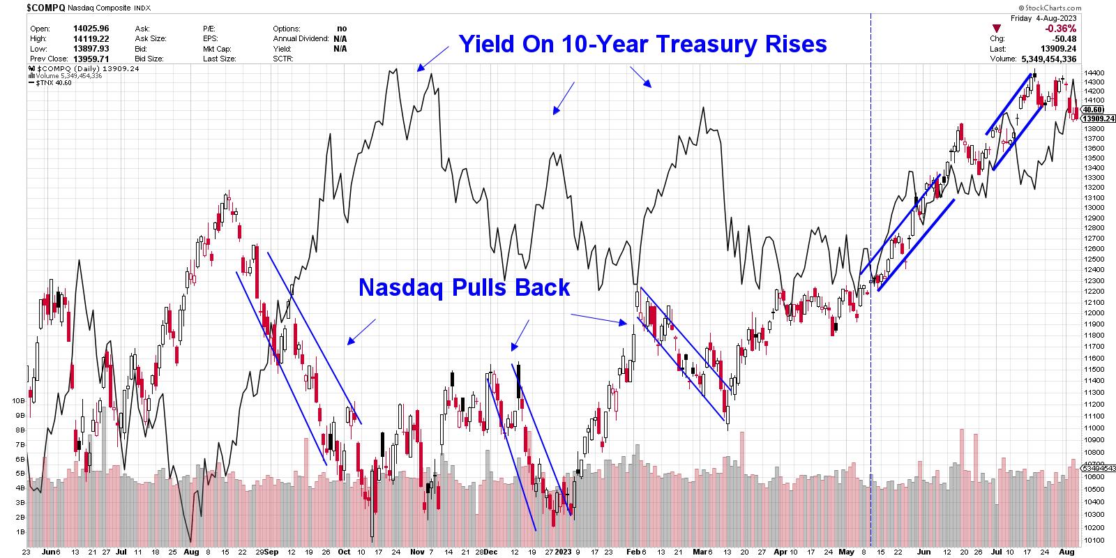 Daily Chart of Nasdaq Composite vs. 10-Year Yield Daily Chart of Nasdaq Composite vs. 10-Year Yield
Whether you take action based on last week's break in the markets will have everything to do with your investment horizon. Short-term investors will want to lock in at least partial profits and stem losses while keeping an eye on key areas of support for the broader markets. Longer-term investors can look to longer-term charts for guidance, as the monthly chart of the S&P 500 shows that the longer-term uptrend remains in place.
Below is a daily chart of the S&P 500 where I highlight the next area of possible support, which is at its 50-day moving average and is 1.6% away. Should the markets reverse trend, possible upside resistance will initially be the 10- and 21-day moving averages followed by the late July high in price at 4600. A move above this key level will set the stage for further upside.
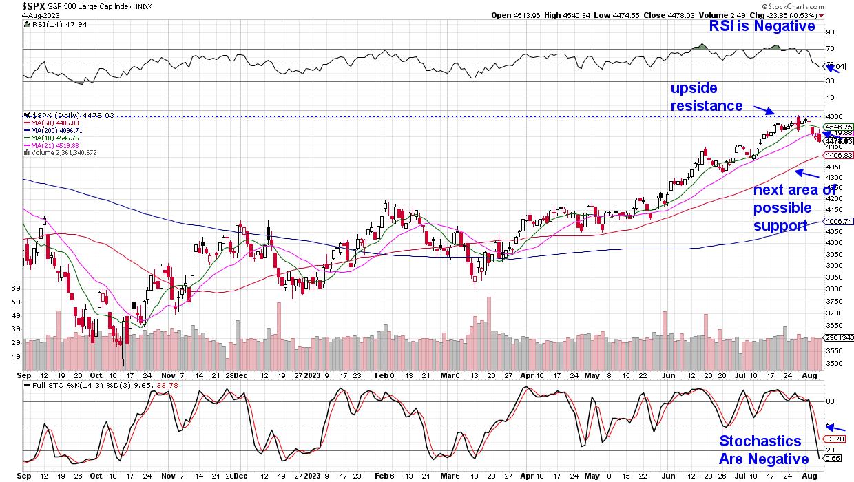 Daily Chart of S&P 500 Index Daily Chart of S&P 500 Index
If you'd like to be kept up to date on the status of the broader markets, as well as be alerted to one area that's currently withstanding the downtrend elsewhere, use this link here to trial my twice weekly MEM Edge Report. This no-obligation offer will provide you with instant access to current reports.
Warmly,
Mary Ellen McGonagle, MEM Investment Research
|
| READ ONLINE → |
|
|
|
| ChartWatchers |
| Covered Calls: Dipping Your Toes In the Options World |
| by Jayanthi Gopalakrishnan |

Have you considered renting a room in your home or joining a rideshare company to generate additional income from the assets you own? Selling covered calls on stocks or exchange-traded funds (ETFs) that you own is a similar strategy. If you have a portfolio comprising several stocks or ETFs, you can sell covered calls against those assets to generate additional income.
Looking Behind the Covered Call Curtain
A covered call is an options contract that obligates you to sell the underlying stock at a certain price by a certain date.
 You have to own 100 shares of the underlying asset. That's because one option contract equals 100 shares of stock. You have to own 100 shares of the underlying asset. That's because one option contract equals 100 shares of stock.
Say you own 100 shares of an actively traded stock like Meta Platforms (ticker symbol: META). You could sell a covered call on those 100 shares. By selling that covered call, you are obligated to sell the 100 shares of META according to the terms of the contract. Basically, you're using your 100 shares of META as collateral. In return, you receive a premium from selling the contract.
Like with anything you sell, you have to be sure the premium you receive is worth the risk of possibly unloading the 100 shares of META at a future date. With that in mind, how do you choose which option to sell?
Criteria for Selecting an Options Contract
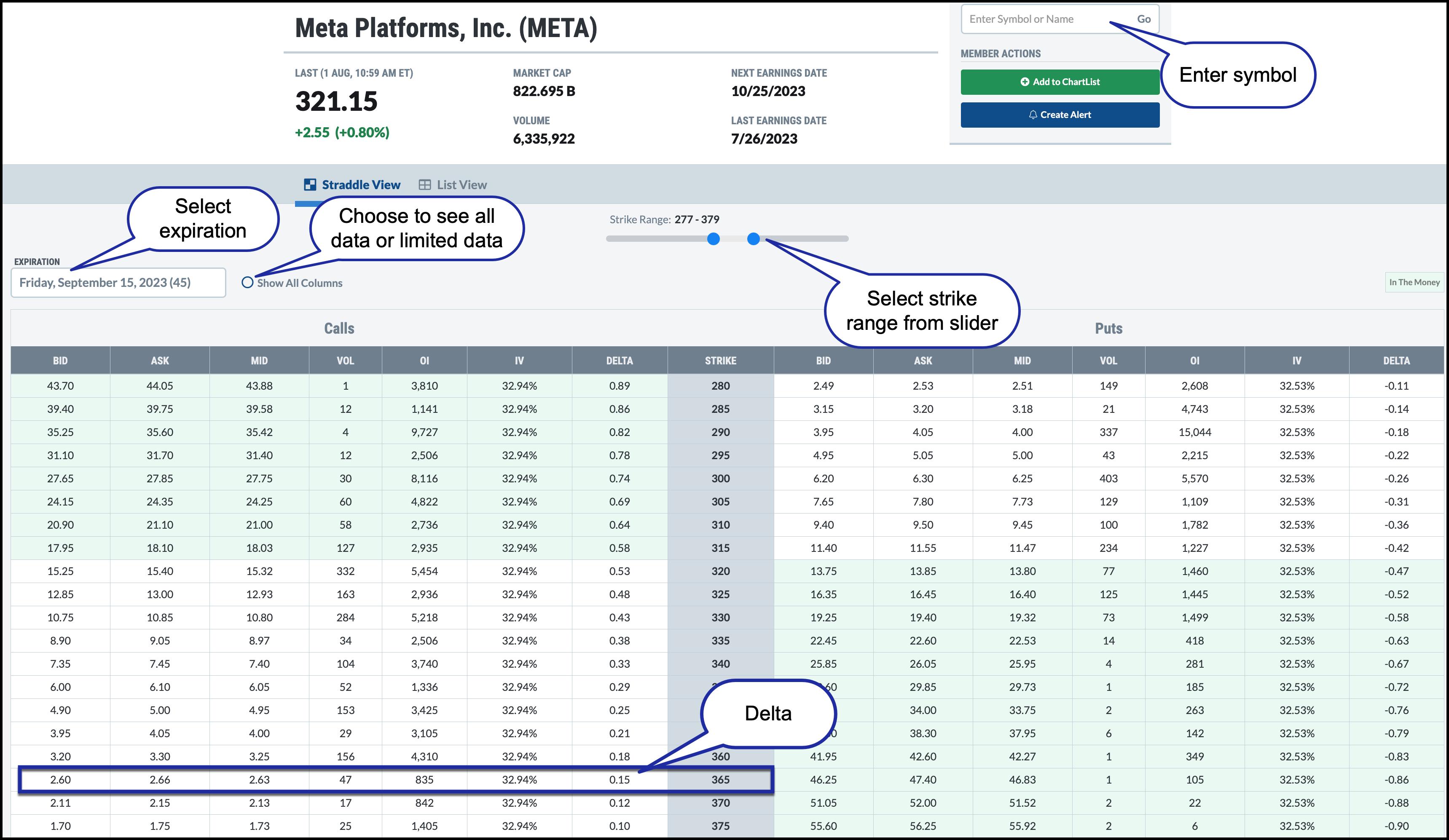
It helps to look at an option chain. You can find the options chain in the Summary Pages of the Member tools. One way to access it is as follows:
- From Your Dashboard, under Member Tools, scroll down to Summary Pages, and select Options.
- Enter the stock symbol in the symbol box at the right.
- Select the contract's expiration.

FIGURE 1: OPTIONS CHAIN FOR META PLATFORMS. Select an expiration and strike price that meets your risk/reward comfort level.Chart source: StockCharts.com. For educational purposes.
Step 1: Select the Expiration
When trading options, you have to decide which expiration to use. For a covered call, especially if you are new to trading options, it's best to start with a contract with 30 to 45 days to expiration (DTE). That's because, as options approach expiration, their time decay accelerates, so you want to trade a covered call that has enough time to avoid getting caught in the tail end of the contract's expiration. In the case of META, the September 15 contract has 45 DTE. The number within the parentheses after the contract expiration date indicates the DTE.
The complete options chain for the expiration you select will be displayed as a table. The many rows and columns may be overwhelming, but the info can be filtered. You don't need to know the data for every single strike price for the expiration you selected; it's sufficient to view the data for eight to 12 strikes above and below the stock's trading price.
See the Strike Range slider? Slide the dots at the left and right closer to the stock's current trading price and move them till you see the data for the strikes you're interested in. You could also uncheck the Show All Columns button to display fewer columns. In this case, the Show All Columns button is unchecked, so you see the relevant data necessary to place a covered call.
Step 2: Select the Strike Price
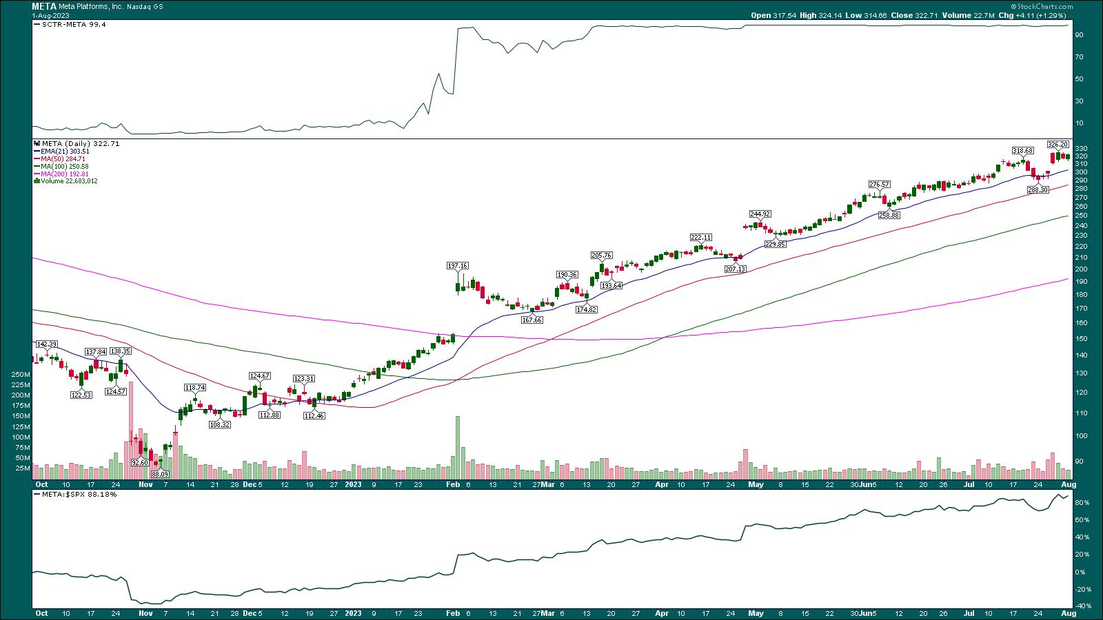
Say you bought 100 shares of META on March 14, 2023, at $190.50. The stock was trending higher; it bounced off its 21-day exponential moving average (EMA), it moved higher than a previous high, and volume was increasing. META's StockCharts Technical Rank (SCTR) was well above 90, and the stock's relative strength vs. the S&P 500 index ($SPX) was trending higher (see chart below).

FIGURE 2: META STOCK HAS BEEN IN A CONSISTENT UPTREND FROM NOVEMBER 2022. The stock looks like it has the momentum to continue higher, and if you own the stock, you could generate income through covered calls.Chart source: StockCharts.com (click chart for live version). For educational purposes.
Based on your analysis, you thought the stock had the momentum to rally higher. META is trading at around $321, so you made a good profit. You could continue holding the stock or have a mental price target of $384, close to META's all-time high. So if you slide the Strike Range slider to include the 385 strike price, you see a good range of the options data for strike prices that are out of the money, i.e., call strike prices higher than META's stock price.
You want the strike price to be below the strike price at expiration. In option speak, it means you want the option to be out of the money (OTM). But there's no way to know with certainty if the option will be OTM at expiration, but you can get an idea of the probability of the option expiring OTM. That's where delta comes in.
You want to select a strike price that has a delta between 15 and 20. So when you scroll down the delta column, you see that calls with strike prices between $355 and $365 fit the criteria. Say you pick the $365 strike price, which, out of the three, is the furthest from the stock's trading price. It has a 15 delta (delta of 0.15) which means that, all things equal, the probability of the stock reaching the strike price in 45 days is 15% or an 85% probability of expiring OTM. That's a relatively low probability.
Now look how much you'd receive in premium if you were to sell a 365 Sept 15 call. The bid price is 2.60, which means you'll receive $2.60 x 100 or $260 for selling one contract. You could also use the mid-price to determine the premium you could collect. You could also consider the 360 or 355 strike prices. Those will fetch you a higher premium, but they're also closer to the stock's price.
When Does It Make Sense to Use a Covered Call?
Your objective is to make some additional income, so you want the money you receive from selling the call to be worth the risk. Even though covered calls are a conservative strategy, there are downsides you should be aware of. More on that later.
So if META is trading at $321 and you feel confident the stock price won't rise by $44 in 45 days, you could sell the 365 calls to generate income. You purchased the stock for $190.50, so you must decide if that $2.60 in premium is worth the hassle.

If you sold the covered call, two things could happen.
- The stock could be at or above the strike price at expiration.
- The stock could be below the strike price at expiration.
If scenario 1 occurs, then you will be assigned and will have to sell your 100 shares of META at $365, the strike price of the contract. You would have profited from selling your stocks and collecting the premium. It's not the worst thing, but you no longer hold your META shares, and if the stock skyrockets after you sell it, you'd be cursing yourself. If the stock price falls after you sell your shares, you'll be a happy camper.
The sweet spot would be if the stock price moves higher but remains slightly below the strike price. You still keep your 100 shares of META, which are now trading at a higher price, and you keep the premium of the expired and worthless option. You could rinse and repeat by trading another covered call.
It would be best if you didn't forget about an options trade. While the trade is open, watch the stock price, because you need to manage your position. If the stock price is getting close to the strike price and you're getting nervous, you could buy back the short call prior to the contract's expiration. The problem is that, as the stock's price rises, the option's price also increases. So, you'll end up paying more than what you sold it for. You could also adjust your trade and roll it to a further expiration. This, of course, would incur additional transaction costs, but it could be worth the price, especially if you think the stock is going to spike higher in the near future.
What Are the Downsides of Covered Calls?
One downside of covered calls is that profits from selling a covered call are capped at the selling price of the option. Another is that, if the stock price drops significantly, the premium you received from selling the covered call may not be enough to offset the losses.
There's no free lunch. When trading options, you're basing your decisions on probabilities. And probabilities change. The 365 call might be 15 delta when you place your trade, but it can change afterward. Anything could happen between when you buy the option and the expiration date.
Start Your Options Journey
This article has scratched the surface of covered calls, but it's enough to get you started in trading options. If you'd like to explore covered calls, you can check out this video, which goes over some more of the nuts and bolts of generating income from stocks and ETFs you own. And once you've mastered covered calls, there are tons of other options strategies you could explore.
Disclaimer: This blog is for educational purposes only and should not be construed as financial advice. The ideas and strategies should never be used without first assessing your own personal and financial situation, or without consulting a financial professional.
|
| READ ONLINE → |
|
|
|
| MORE ARTICLES → |
|
 Chart 1: Long-Term Cycle
 Chart 2: Long-Term Cycle
 Chart 3: Long-Term Cycle
 Chart 4: Long-Term Cycle
 Chart 5: The Yield Curve vs. DJIA
 Chart 6: The Yield Curve vs. Inverted DJIA
 Chart 7: The Yield Curve vs. Inverted DJIA
 Chart 8: IBM Cycle Pattern 2022
 Chart 9: IBM Cycle Pattern 2021
 Chart 10: IBM Cycle Pattern 2019
 Chart 11: IBM Cycle Pattern 2015
 Chart 12: IBM Cycle Pattern 2023
 Chart 13: IBM 2023 Money Flow Index
 Chart 14: MSFT Wave Pattern
 Chart 15: MSFT Wave Pattern 2021
 Chart 16: MSFT Wave Pattern 2011
 Chart 17: MSFT Wave Pattern 2009
 Chart 18: MSFT Wave Pattern 2006-07
 Chart 19: MSFT True Seasonal
 Chart 20: DraftKings (DKNG) Cycle
 Chart 21: Lululemon (LULU) Cycle
 Chart 22: Tesla (TSLA) Cycle
 Chart 23: Apple (AAPL) Cycle
 Chart 24: Chipotle (CMG) Cycle
 Chart 25: Nvidia (NVDA) Cycle
 Chart 26: Salesforce (CRM) Cycle
 Chart 27: Rockwell Wave Pattern
 Chart 28: Rockwell Wave Pattern with Short-Term Cycle
 Chart 29: Gold Seasonal Pattern
 Table 1: Gold August Trading Day of The Month




 The bottom line is that the copper stocks have been hard to hold and, with the indexes starting to retrace, the best gains in copper names might be behind us for a few months. It is so frustrating, as the stocks are just starting to make higher highs, but then rolled over in earnest to start August.


 You have to own 100 shares of the underlying asset. That's because one option contract equals 100 shares of stock.