| THIS WEEK'S ARTICLES |
| Martin Pring's Market Roundup |
| The Dollar Index Goes to Missouri |
| by Martin Pring |
The Dollar Index has experienced a nice rally since mid-July and now reached important resistance. It's time to show us whether it can push through, thereby signaling an important extension to the recent advance. Before we examine that possibility, however, let's briefly take a step backwards by way of perspective and assess the status of the secular and primary trends.
The Secular Trend
Chart 1 plots the Index on a quarterly basis, for which there are two basic takeaways. First, the quarterly Coppock Curve remains on its 2022 very long-term buy signal. The second point is the secular trend that began in 2008 is still intact, because the Index is above its up trendline and 36-quarter MA.
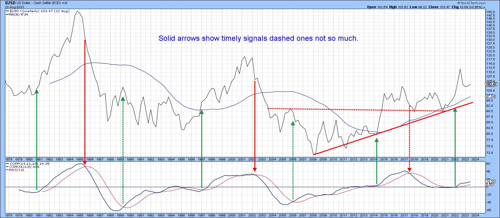 Chart 1 Chart 1
Chart 2 labels the three secular price movements that have taken place since the mid 1990s. We can see that RSI reflects the characteristics of them. For example, prolonged monthly overbought conditions are typical of a secular up trend, and long-lasting oversold readings typify the bears. By the same token, when the trend is up, prices tend to be super-sensitive to an oversold condition and, when down, to an overbought one. Those characteristics have been consistent with RSI action during the post-2008 period. Finally, the Index has managed to hold above its 24-month MA, which the small arrows show to be an important support/resistance pivot point. Not much doubt that the secular trend is up, but what of the primary one?
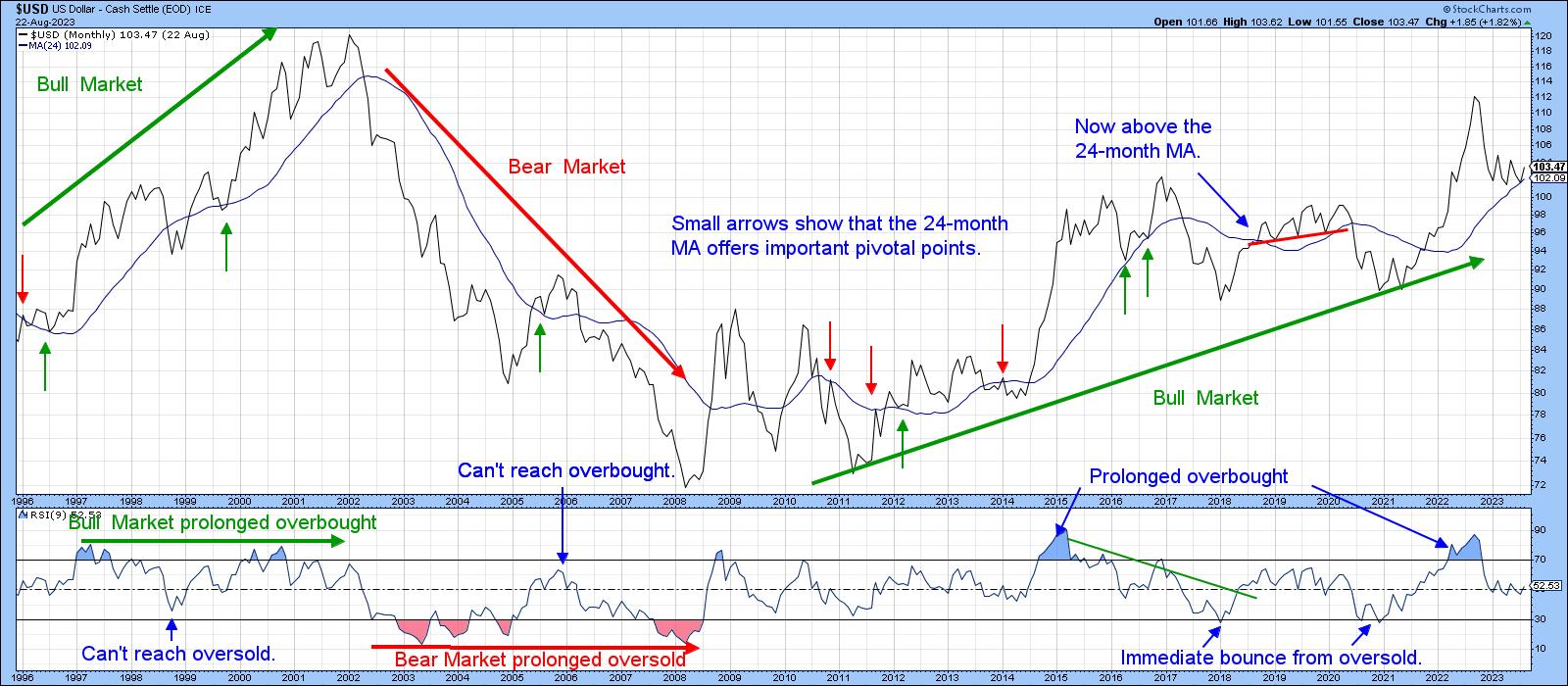 Chart 2 Chart 2
Primary Trend
Chart 3 compares the Index to its long-term KST. Red shadings appear when both series are below their moving averages. The bad news is that this model is currently bearish. The good news is that counter-secular bear markets, which is what this one is, tend to be mild in terms of both magnitude and duration. This characteristic holds out the possibility that the worst may be over. That's not to say that prices will run away on the upside, because the long-term KST still needs to work off its overbought condition. A trading range environment could well evolve first. That's an idea I first put out in an article last May.
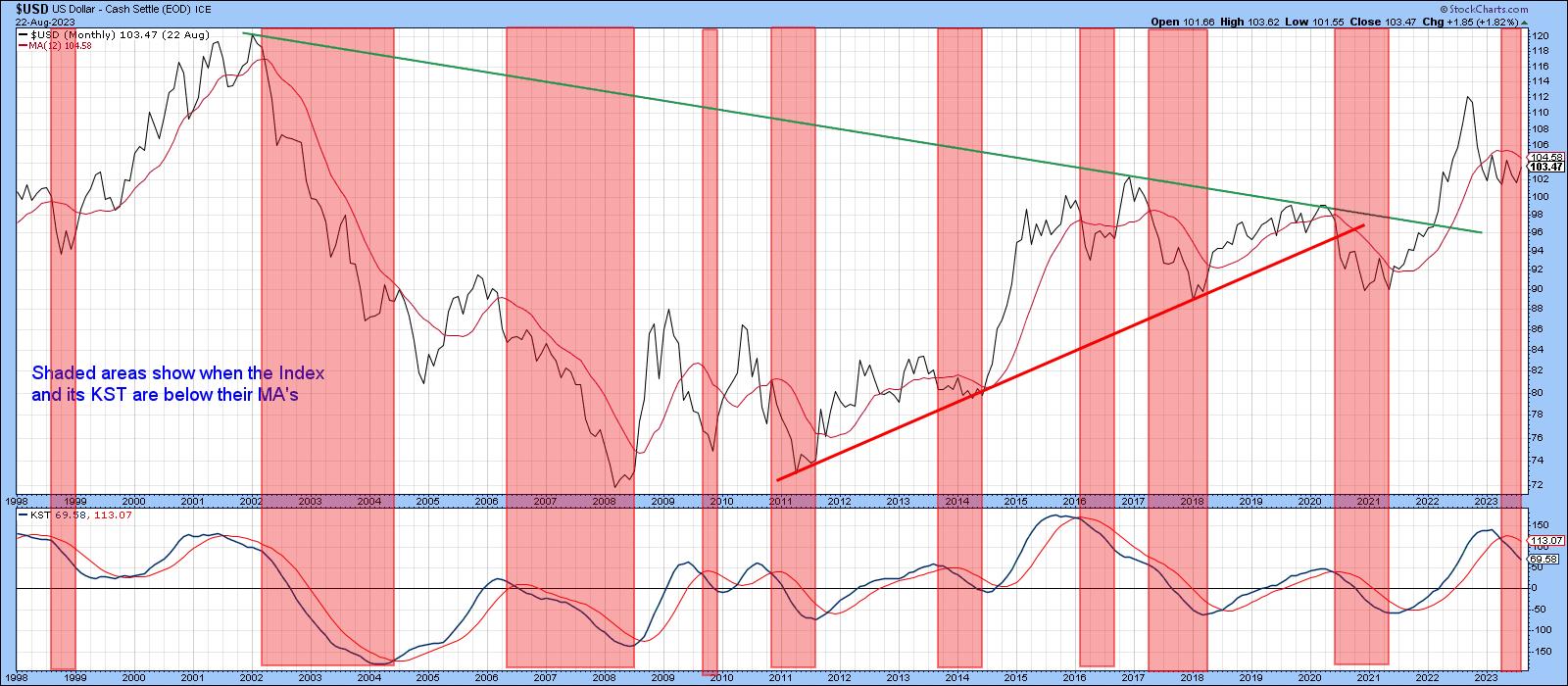 Chart 3 Chart 3
If that is going to happen, Chart 4 will need to turn more bullish. The green shadings approximate periods when the PPO is above zero, and the small blue arrows instances where the indicator reversed to the upside from a position just above zero. This approach is occasionally a bit late in triggering sell signals. However, one of its principal advantages is that it returns very few whipsaws. The preliminary August plot shows the PPO to be fractionally above zero, which makes the model bullish. However, since it could easily move in either direction, more decisive action is needed before we can say with any degree of confidence that a sell signal has been avoided.
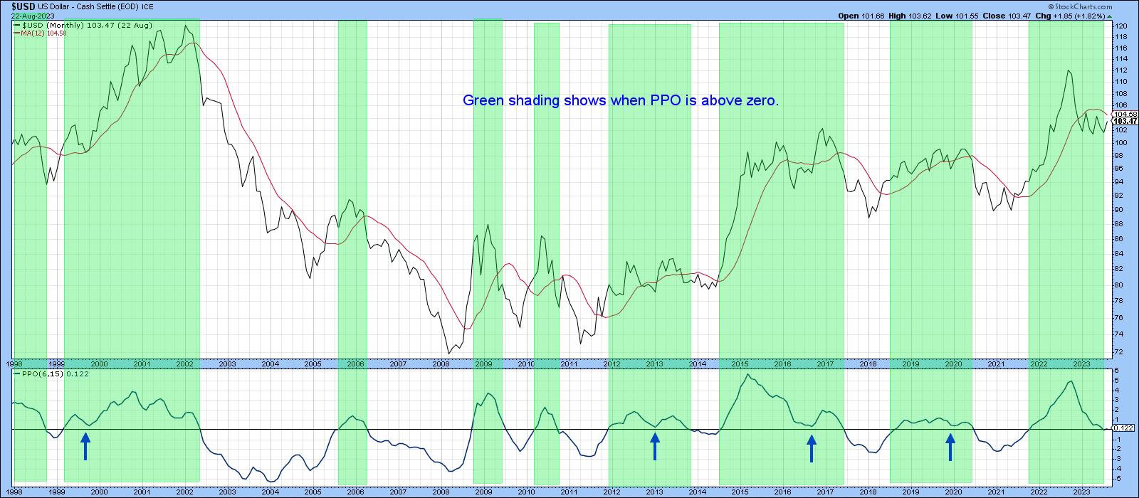 Chart 4 Chart 4
Short-Term Position
The Index is trying hard to break above the 2022-23 resistance trend line and 200-day MA. If it can, that would be an important development, because it would confirm that the July downside break was false. False breaks are often followed by above-average moves in the opposite direction, as traders scramble to get back to the right side of the market. At the moment, the tentative upside break is being supported by a bullish currency diffusion indicator and a rising KST. The red arrows show that the KST usually leads the diffusion series. Since it is still rising and the diffusion indicator is not overextended, a penetration of the line is likely. If so, the recent violation of the diffusion indicator down trendline would add to the positive evidence.
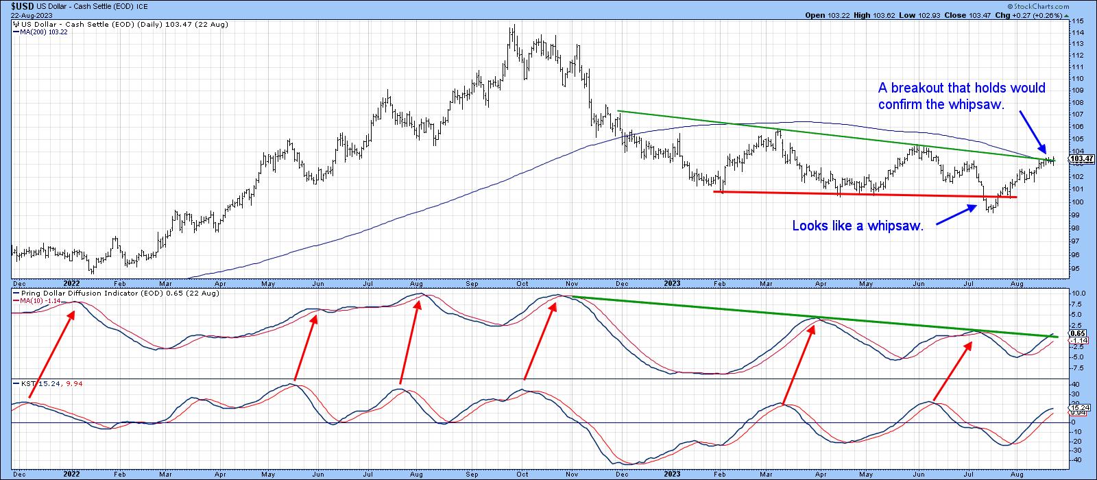 Chart 5 Chart 5
Chart 6 also offers a bullish undertow, as the stochastic indicator has once again experienced a positive divergence, its sixth one since 2008. Once the others were confirmed with a successful down trendline violation, a nice dollar rally followed.
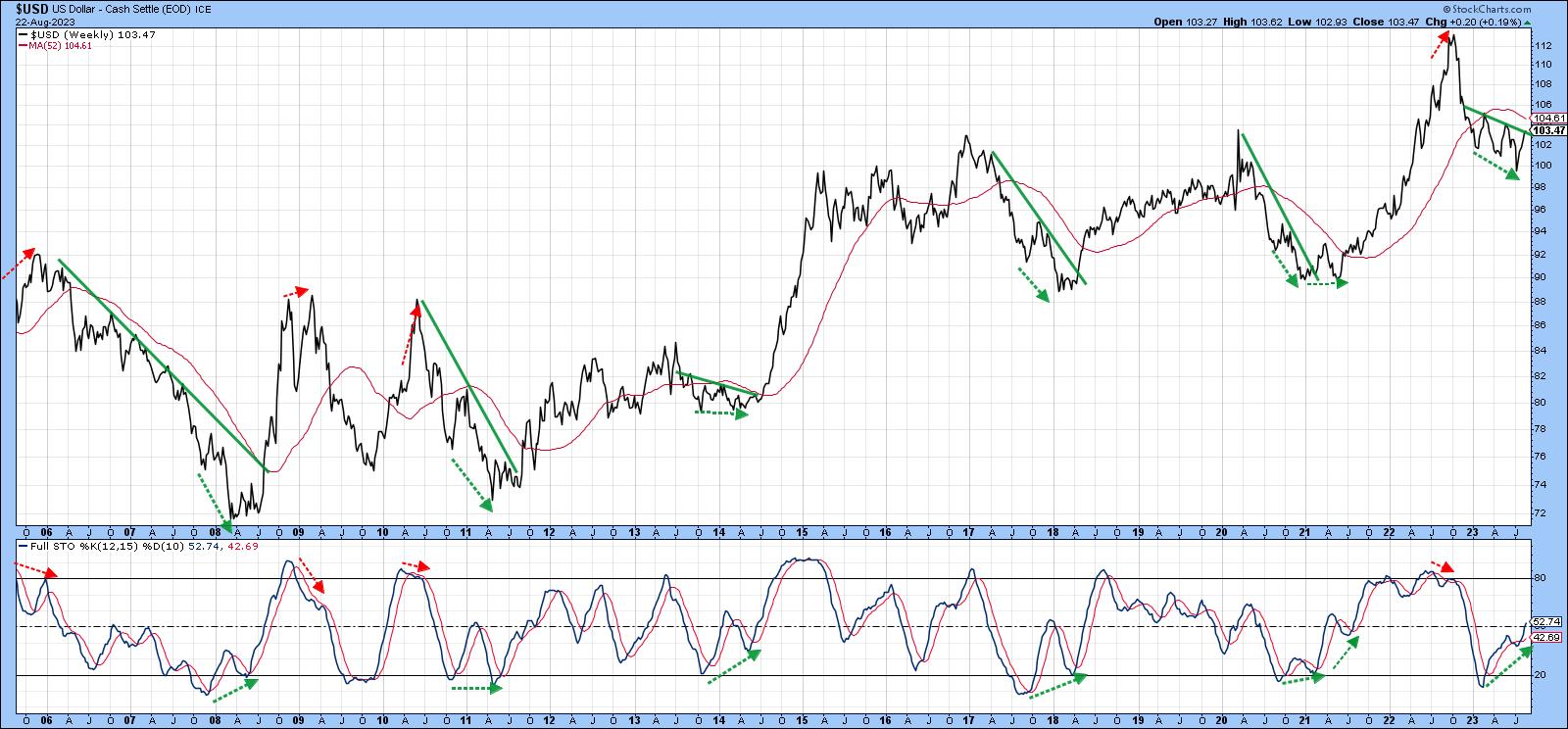 Chart 6 Chart 6
Will it happen again with the current setup? Probably so, once the Index has experienced a near-term digestion of post July gains. That seems likely, as the Invesco US Dollar Bullish Fund (UUP) experienced a short-term bearish outside bar on Wednesday. In the meantime, show me, I am from Missouri!
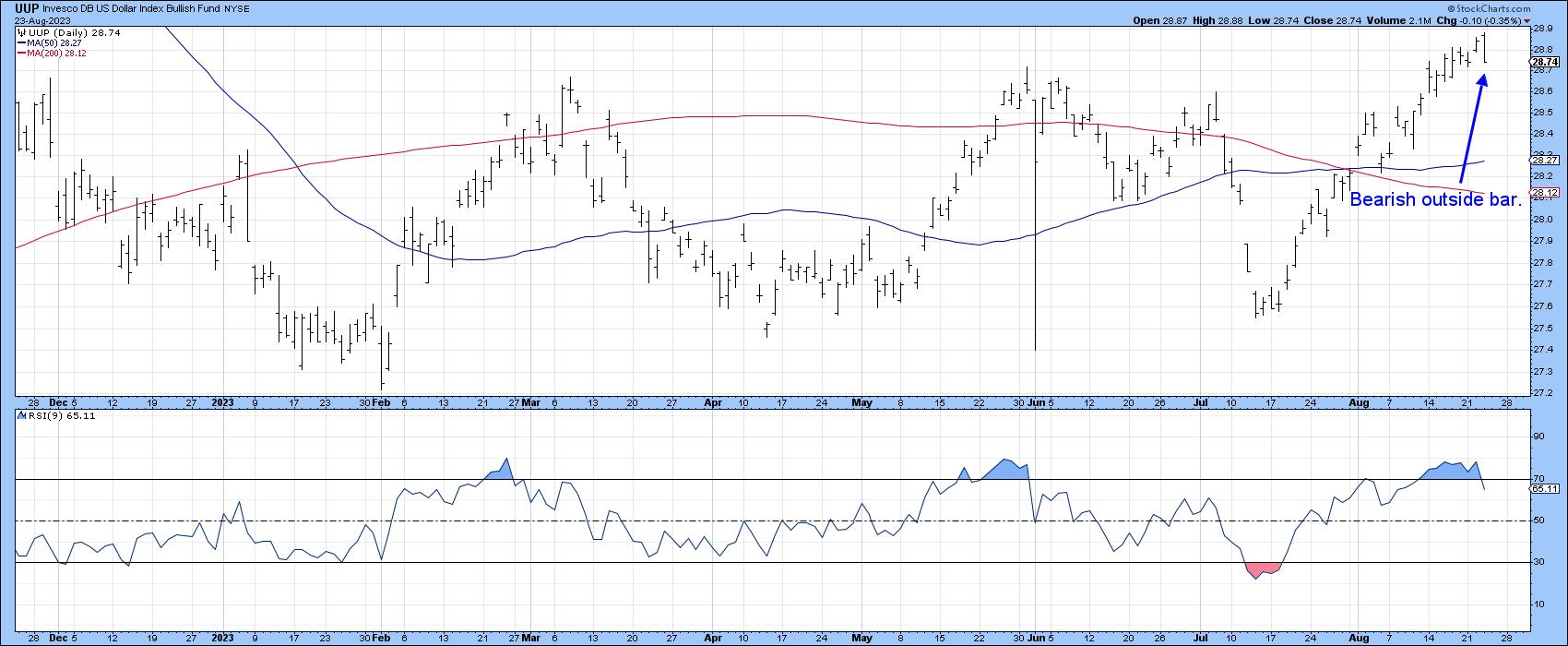 Chart 7 Chart 7
Good luck and good charting,
Martin J. Pring
The views expressed in this article are those of the author and do not necessarily reflect the position or opinion of Pring Turner Capital Group of Walnut Creek or its affiliates.
|
| READ ONLINE → |
|
|
|
|
|
| The Traders Journal |
| How William O'Neil - The Legendary Investor - Changed My Life |
| by Gatis Roze |
 I felt it only right to publicly acknowledge and thank William J. O'Neil for the lifestyle I enjoy today. He passed away in May at the age of 90, and I wanted to wait until now to explain how he changed my life. I felt it only right to publicly acknowledge and thank William J. O'Neil for the lifestyle I enjoy today. He passed away in May at the age of 90, and I wanted to wait until now to explain how he changed my life.
William O'Neil was one of my investment mentors, although I only had the special pleasure of meeting him on two occasions. The first time was in 1980 when he spent some time with myself and classmates at the Stanford Business School. It was a life passage for me. Through O'Neil's newspaper, (Investors Business Daily), his books, seminars, and various other "pixie dust free" educational tools, I, too, became a bone fide investor. He was the "knower" and I became the "spongy learner." As a knower and an investing doer, he diligently researched the history of successful equities and then made a fortune applying those insights.
Herein lies the conundrum. The overwhelming majority of bona fide market wizards are something less than 100% transparent when discussing their methods. O'Neil was the antithesis in his willingness to share why he succeeded and all the specifics. His books and seminars provided the roadmap and his newspaper was the facilitating tool. For myself personally — and I suspect the same for nearly all my readers — it is StockCharts.com in the fast-paced digital era that has now become the superior facilitating tool of choice for successful investors globally.
O'Neil struck me as a quiet man. More of a listener than a talker. Appropriately, he would often encourage investors to think of the stock market as a conversation. Let it speak to you. Be more a listener than a talker. I always remember what he said: "The stock market is human nature on parade." — words that are never better reinforced than by the ongoing recurrence of historical chart patterns. Thanks to O'Neil, I learned both to embrace technical analysis and to trust the messages my charts shared with me. These proved to be exceedingly profitable skills over the years.
Life lessons were bundled into his information-packed investment tutorials as well. He always preached positivism. He was an ardent believer in America and the long term growth of its economy and equities. For those reasons, I have always been a growth-oriented investor and have avoided short selling. Praying for a stock to go down has never been in my nature.
Early on, O'Neil made it clear to me that I needed to leave my ego outside. Personally, not easy to do. The markets will humble everyone, he said. Identifying and acknowledging your mistakes — and then making the necessary adjustments — was a prerequisite for consistent long term success as an investor. His message was clear. Operating without guardrails (i.e. not having a well-defined exit strategy) and letting your ego participate in your trades was certainly an approach doomed to produce mediocre results.
O'Neil described these elements in great length and detail. My takeaway was something I think of as the "Holy Trinity of Investing." A big part of calling this blog ‘The Traders Journal' is that he convinced me to keep an investing journal. In it, to this day I discuss my abilities to acknowledge my mistakes and cut my losses. My journals recorded my trading mistakes in great detail and my winners as well. Then too, my journals helped discipline me to recognize those mistakes real-time and to avoid repeating them. It's obvious but still profound: acknowledge your mistakes, act, learn from them, avoid them in the future. Sounds straightforward. The challenge is in the execution through all types of markets. Both he and Buffett preached the gospel of avoiding mistakes as paramount to extraordinary results.
Finally and perhaps most importantly, William O'Neil both inspired and convinced me that in order to truly excel and achieve consistent profits, one needs a detailed roadmap. One that incrementally improves your probabilities over all 10 stages of investing. Our book about "The 10 Stages Of Stock Market Mastery" resulted indirectly from O'Neil's own 7-step program for buying an equity. It's all about discipline and consistently embracing an organized methodology which enables an investor to peel back the vast layers of the market and approach it with a clear lens so one isn't impulsively tempted to buy the "bright shiny thing" in today's news.
The bottomline is that this brief blog is meant as a tribute to William O'Neil. In the near future, I plan on sharing with you 12 specific takeaways that salute the significant impact O'Neil has had on my own investing roadmap. Until then...William J. O'Neil, rest in peace.
Trade well; trade with discipline!
Gatis Roze, MBA, CMT
StockMarketMastery.com
|
| READ ONLINE → |
|
|
|
| ChartWatchers |
| Trading With the Williams Money Flow Index |
| by Karl Montevirgen |

When stocks embark on a strong and sustained uptrend or downtrend, you can attribute a large portion of that momentum to the actions of the big institutional players, or what Larry Williams calls the "informed money."
The Advantage of "Informed Money"
It's a good idea to keep an eye on what the "informed money" traders are doing, if only for two advantages they hold over the crowd: one, a sizable store of capital that's capable of moving stock prices over time, and, two, more access to information and analysis that's generally beyond the public's capacity.
Ok, I Get It. But How Can You Track Institutional Trades?
Trying to do this on your own might require more research time than you've got, especially regarding stocks. In the commodity futures market, you can at least look at the weekly Commitment of Traders (COT) report released by the Commodity Futures Trading Commission (CFTC).
The COT report is a weekly publication that shows the net positions of commercial traders, hedge funds, and retail investors in the futures markets. Larry Williams has been using this report for decades, interpreting the data and transforming it into a tradable algorithm. Fortunately, he found a correlative method to transfer this analysis into the stock market, making it useful for anyone who trades stocks rather than commodities.
Enter the Williams Money Flow Index.
What Does the Williams Money Flow Index Tell Us?
The Williams Money Flow Index visually illustrates institutional buying and selling. Williams often emphasizes that institutional players don't buy like the public. They have their reasons and methods to buy and sell. Sometimes, this can work contrary to popular thinking. And it's these periods that you'll want to pay attention to.
Take a look at the chart below.

CHART 1: THE WILLIAMS MONEY FLOW INDEX OSCILLATES WITHIN A RANGE. Generally, the indicator oscillates between zero and 100, although sometimes it can exceed the 100 level.Chart source: StockChartsACP. For educational purposes.
The Williams Money Flow Index looks like a typical oscillator ranging from 0–100 (though the index can exceed the 100 level, unlike some oscillators). There are two lines: a green line situated at 74 and a red line situated at 26.
- When the index exceeds the green line, it indicates strong institutional buying, which, in turn, hints at a potential rally. This signals a potential "buy."
- Conversely, when the index falls below the red line, it indicates strong institutional selling, suggesting a potential price dip. This signals a potential "sell."
What does this look like in action? Let's look at a weekly chart of Tesla, Inc. (TSLA) below.
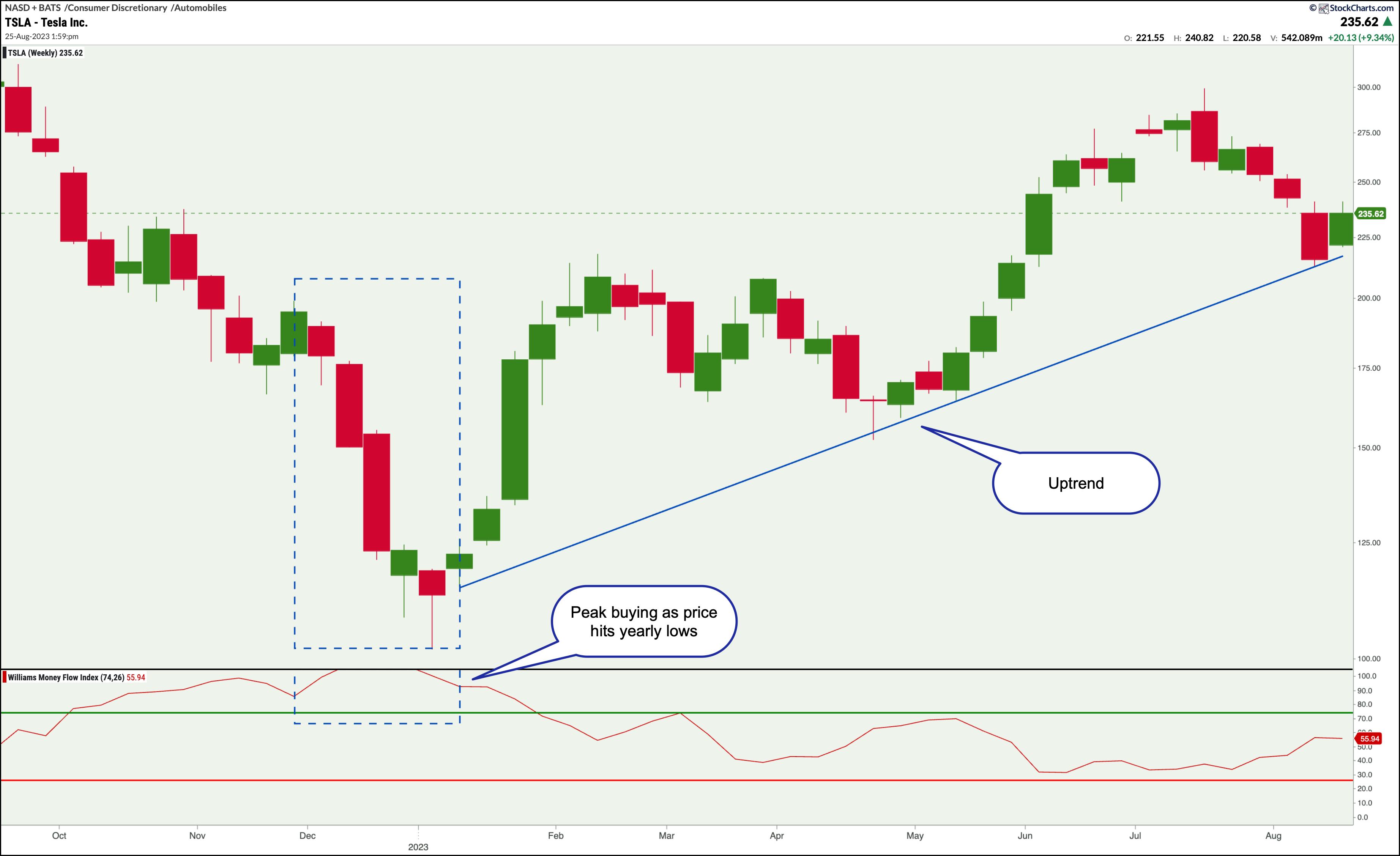
CHART 2: WILLIAMS MONEY FLOW INDEX IN ACTION. A sharp downtrend in price coincides with institutional buying. After this contrarian move, an uptrend ensued.Chart source: StockChartsACP. For educational purposes.
The chart shows a sharp downtrend coinciding with massive institutional buying, as illustrated in the LW Money Flow Index (two blue rectangles). This indicates that, while the public may have been selling TSLA stock, the "informed money" was buying it up. The outcome of this contrarian move is evident in the strong six-month uptrend that followed.
Can the LW Money Flow Index Work on Daily Charts?
If you've been following Larry Williams for some time, you know his penchant for longer timeframes. The reason is simple: the shorter the time frame, the more "market noise" (meaning insignificant fluctuations) you'll get. This is why many of his presentations feature weekly charts. He's after the "big move," which is, as you can guess, where the big profits are made.
With that said, Williams' Money Flow Index works for daily charts as well. Let's look at a daily chart for Microsoft (MSFT).
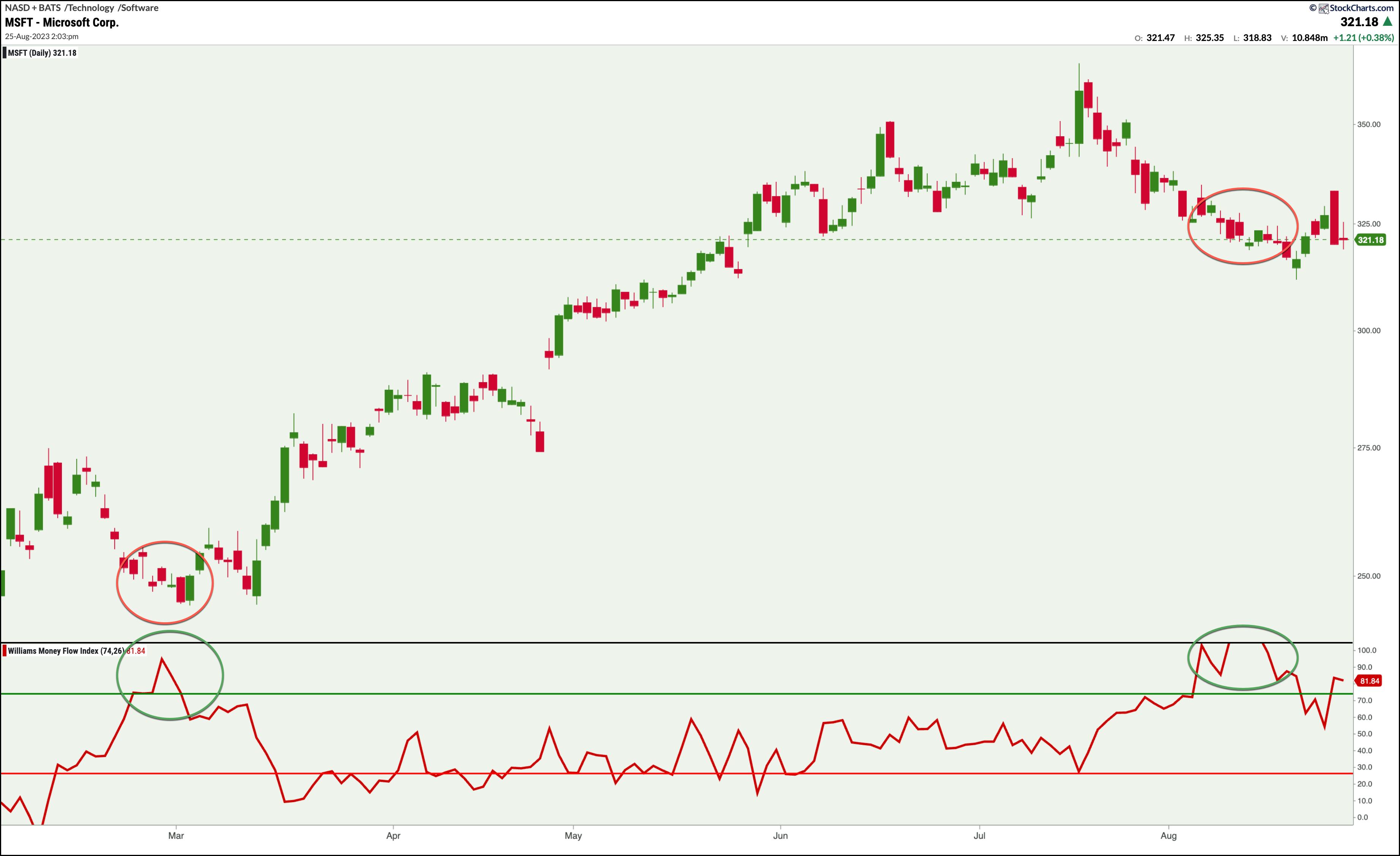
CHART 3: APPLYING THE WILLIAMS MONEY FLOW INDEX TO A DAILY CHART. A rise in the Williams Money Flow Index when price appears to be bottoming out is usually followed by an uptrend. Will this happen to MSFT?Chart source: StockChartsACP. For educational purposes.
The MSFT chart exhibits a dynamic similar to what took place in the weekly chart—a rise in the Williams Money Flow Index when price appears to be bottoming out (green and red circles illustrating the index and price action). In the MSFT example above, the institutional accumulation resulted in a four-month rally.
The second point of accumulation, toward the right of the chart, signals an even higher accumulation level as the index exceeds 100. This brings us to the present day (or the time of this writing). Will there be another multi-month rally?
A Few Caveats
So far, there's been no mention of the index line falling below the 26 level (red horizontal line), and it did a few times. If the above-mentioned scenarios are true—that the index line above 74 signals institutional accumulation and below 26 signals institutional distribution—then why didn't we address the instances wherein the line fell below 26?
Larry Williams is insistent about following the big moves, like extended price swings or longer-term trends. Big moves are where the "big money" is. You generally want to be on the right side of the market. In the MSFT example above, price was in a clear uptrend; because of this, there's no point in looking at bearish signals.
 Are there any other Larry Williams indicators you can use to enhance the Williams Money Flow Index? There are several, and you can check them out by visiting this page. Are there any other Larry Williams indicators you can use to enhance the Williams Money Flow Index? There are several, and you can check them out by visiting this page.
The Bottom Line
When it comes to catching large money moves in the market, it helps to observe what the "big players" are doing, since they play a heavy hand in moving prices. By keeping tabs on their activities, you can gain timely insights that the average trader will likely miss. The Williams Money Flow Index is one of the few tools that helps you observe what the institutional money is doing. And whether you decide to trade with or against the "informed money," you can at least see where they are, so to speak, and what they're doing. Happy trading!

Disclaimer: This blog is for educational purposes only and should not be construed as financial advice. The ideas and strategies should never be used without first assessing your own personal and financial situation, or without consulting a financial professional.
|
| READ ONLINE → |
|
|
|
| RRG Charts |
| Watch These Four Horrible Charts in the Dow Jones Industrials Index |
| by Julius de Kempenaer |

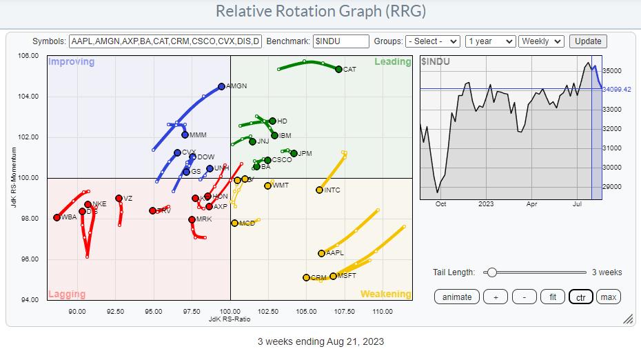
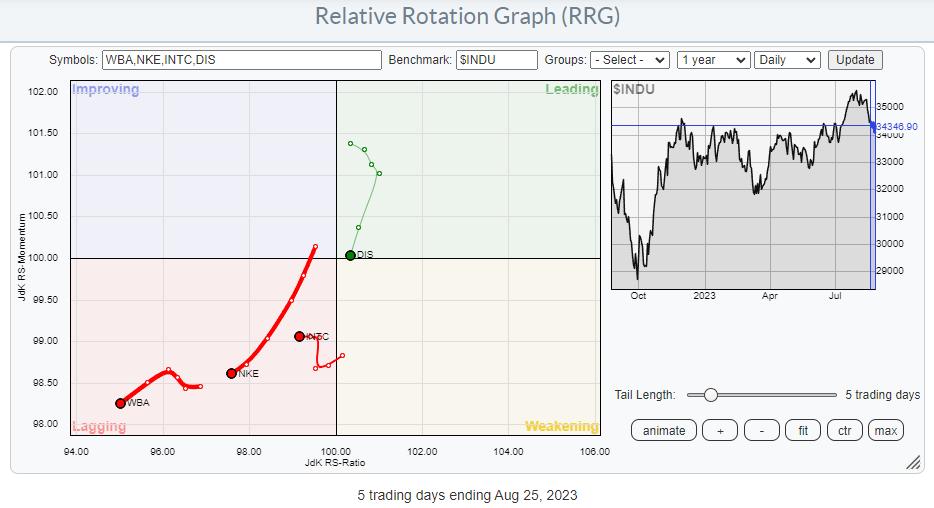
The Relative Rotation Graph above, which shows the rotations inside the DJ Industrials index, exhibits an evenly-spread-out universe of stocks. This is primarily the result of $INDU being a price-weighted index, as opposed to the S&P 500, which is cap-weighted. The difference in weight between the largest and the smallest stock in the universe is, therefore, much smaller, which makes the RRG more evenly distributed.
DJ Industrials

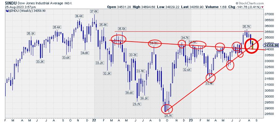
The price chart of the DJ Industrials index shows the market at a crucial level/juncture.
First, the slightly down-sloping former resistance level runs over the major highs since early 2022. That line was broken upward in June/July, and the market is testing that level as support as we speak. Secondly, the angled support line connects the lows since October 2022. That line is currently being tested for the fifth time.
The amount of touchpoints on these trend lines makes them very valid market levels to be watched, IMHO.
A quick assessment of this price chart tells me that:
- The DJ Industrials index is still in a rhythm of higher highs and higher lows, which started out of the low in March.
- The former resistance line running over the highs since March 2022 is currently being tested as support.
- The rising support line out of the October 2022 lows is currently being tested.
- As described above, both support levels are now coming together around 34k, making that area an important "double" support level/area.
All in all, this means that a new low being put into place in this area should be seen as a buying opportunity for another leg up within the existing uptrend. Especially with double support so close, these sort of setups provide good risk/reward ratios.
The first hurdle and target that comes in sight on the upside is the horizontal level at 35.5-35.7.
Back to the RRG
The RRG above can greatly help select stocks within the DJ Industrials index that are likely to help push the index higher. BUT, for this occasion, I want to look at which stocks better be avoided.
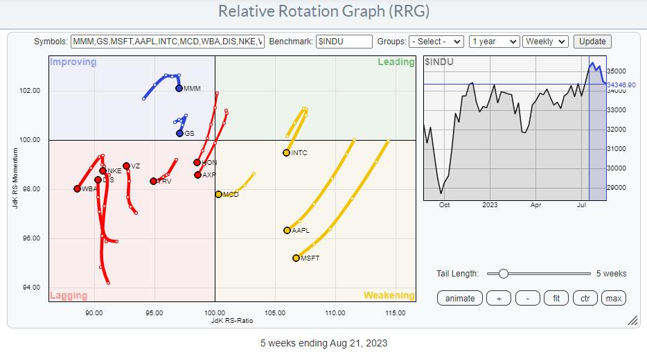
The first thing I do in a first pass is to toggle through the index members by highlighting the line in the table below the graph, either by clicking with the mouse or using the up-and-down arrow keys to browse the universe. The resulting tails are plotted on the RRG below. Remember, I am looking for stocks likely to UNDERperform the index.

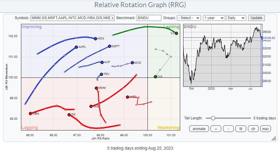
These are the weekly tails. But to really get to the point and find actionable securities (to avoid), I bring this group to a daily RRG.

On this RRG, I do another pass to find the stocks on a negative trajectory on both the weekly and the daily timeframes.
Here is the result.

As always, the proof is in the price.
DIS

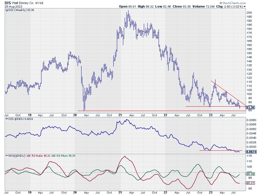
This week, DIS is sinking through important horizontal support near 85. There is one more important support level left, around 80. This was a low in March 2020 and in Feb 2016.
The break below 85 is already pretty negative, but when 80 also gives way, there will be a new scary roller coaster ride in Disneyland.
INTC

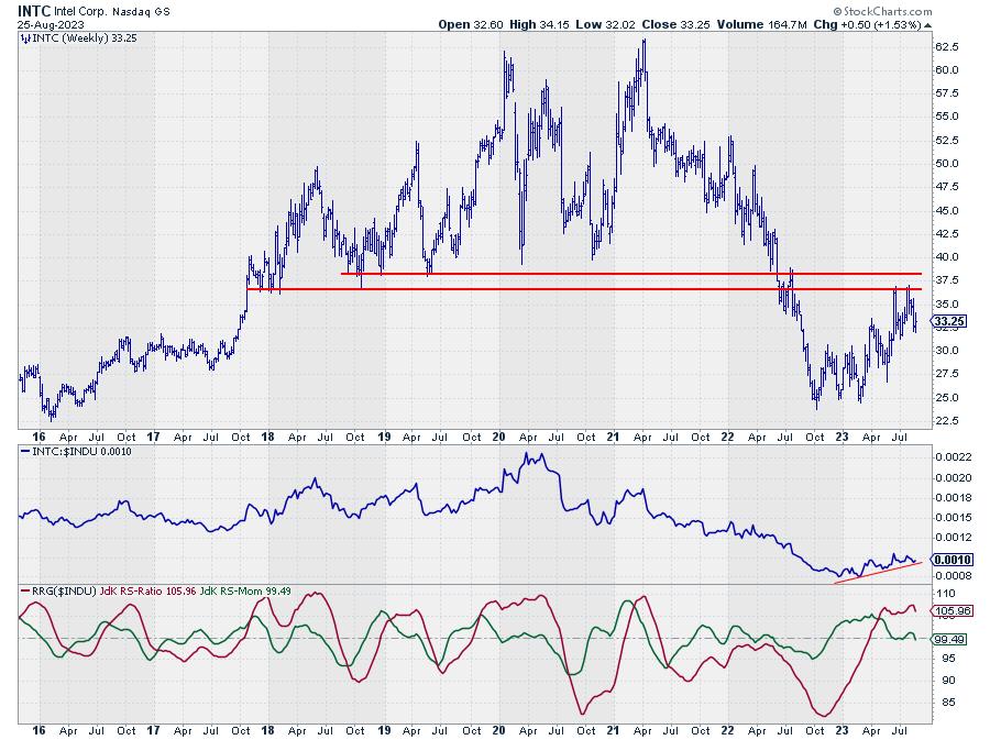
INTC rotated from leading into weakening on the weekly RRG, and the daily tail just crossed into lagging and continued to move lower on the RS-Ratio scale after a short momentum hiccup.
On the price chart, INTC recovered from its steep decline after breaking horizontal support in June. However, the rally that emerged from the October and Feb lows at 25 has tested old support near 37 as resistance twice and failed to break higher.
Breaking the most recent low near 27 will complete a double top formed against major overhead resistance, while relative strength is fading (RRG lines are rolling over). This will likely trigger more downside and a test of the area near 25 again.
NKE

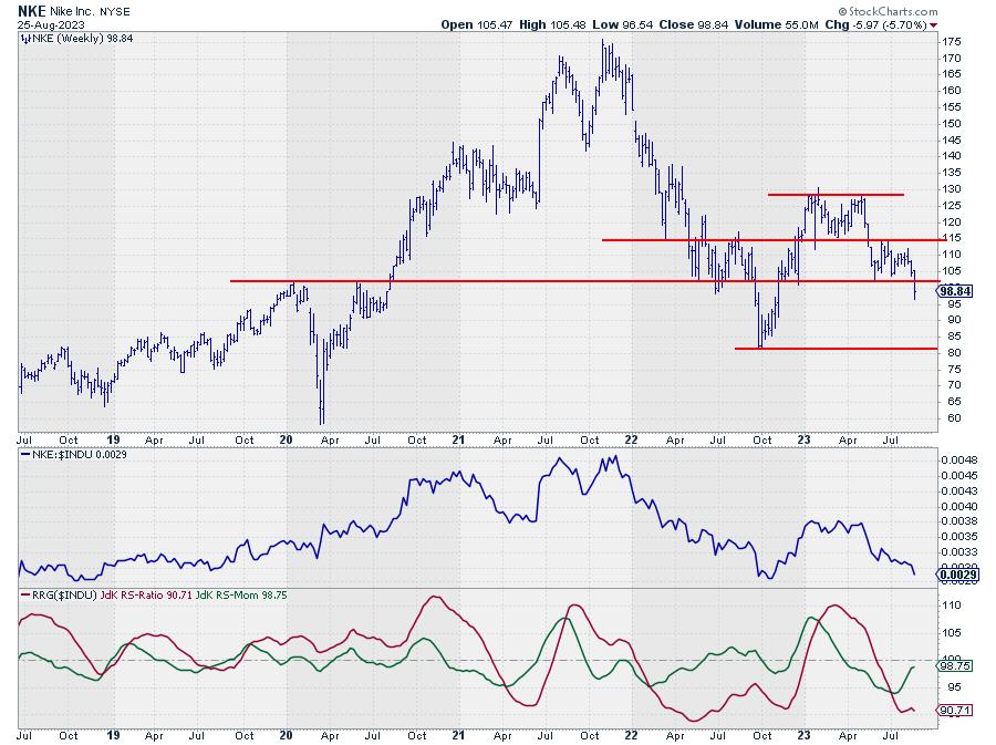
This week, NKE is breaking below another major support level near 102. This happened after NKE had already completed a double top at 129 by breaking the in-between low at 115.
This week's break lower also marks the break from a small consolidation/continuation formation, which adds to the evidence for more weakness ahead. With no intermediate support in sight, the next meaningful level, and therefore the first target for NKE, is only found at the October 2022 low, just above 80.
That means roughly 20% downside risk, with only 3% upside potential (back to the breakout level).
WBA

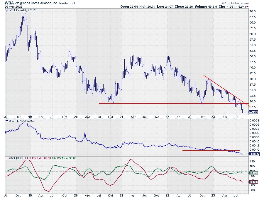
WBA is already been underperforming the DJ industrials for years. But the recent break below a major horizontal support level at 28.50 adds new fuel for the ride's lower price and relative performance. This break in price, combined with the horrible relative strength, makes WBA the worst stock inside the DJ industrials index.
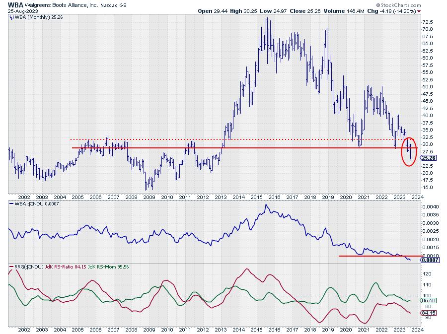
How bad the damage really is is best seen on a monthly chart.

WBA is breaking to its lowest level in a decade. I don't need a calculator to know that this is one massive underperformer compared to the S&P 500 over the same period.
Conclusion
The technical outlook for the DJ Industrials index remains strong, as long as the index manages to hold above double support near 34k on the price chart.
By underweighting or avoiding DIS, INTC, NKE, and WBA, it should be possible to outperform the index with very limited risk. A potential strategy to achieve this would be to buy Diamonds (DIA) and create downside exposure via options or straight short sales for these four stocks.
#StayAlert and have a great weekend, --Julius
|
| READ ONLINE → |
|
|
|
|
|
| DecisionPoint |
| Swenlin Trading Oscillators Trying To Turn Up |
| by Erin Swenlin |
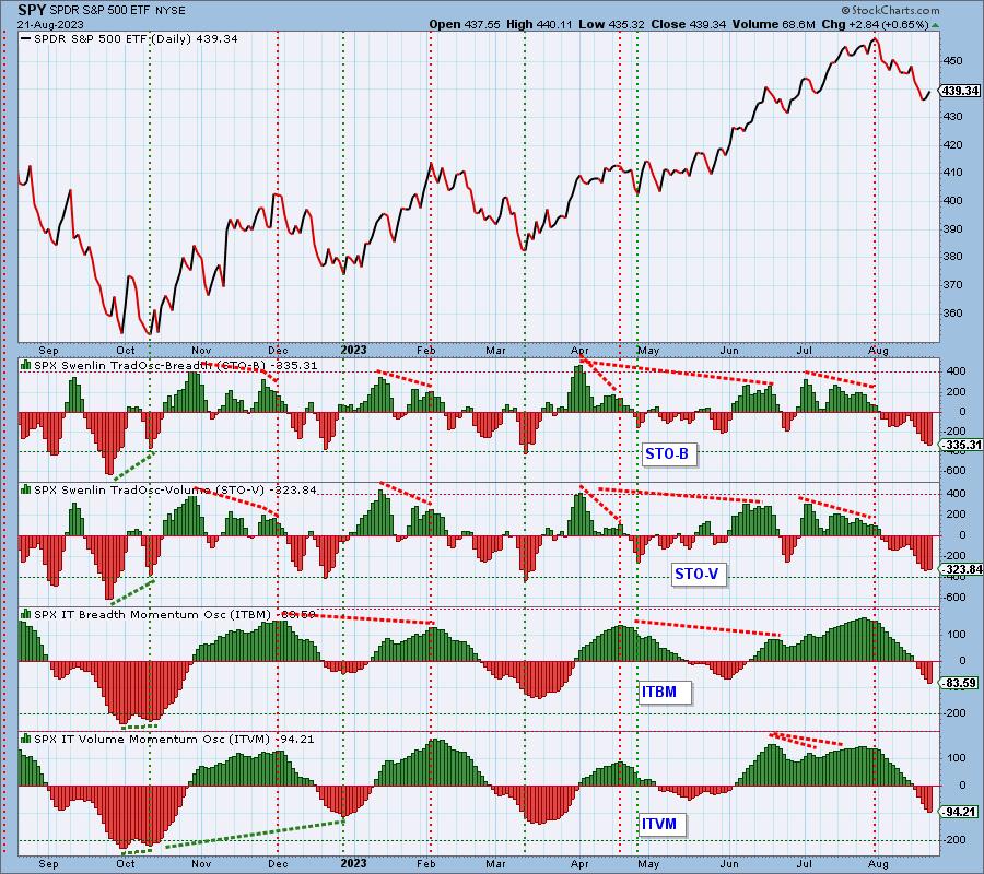
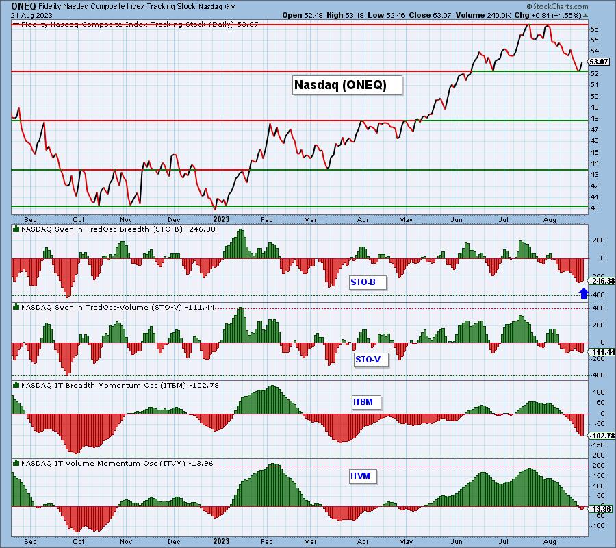
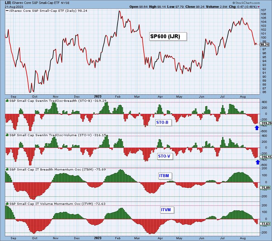
It was ultimately a decent rally today on the SP500 with help from the tech heavy Nasdaq. Swenlin Trading Oscillators (STOs) are our primary short-term indicators. They have been in decline for all of the indexes, but we noted a few trying to turn up. The SPY saw a rise in the Swenlin Trading Oscillator for volume (STO-V), but not the Swenlin Trading Oscillator for Breadth (STO-B). The Nasdaq (ONEQ) saw the opposite with the STO-B rising, but STO-V still falling. Both have turned up for the SP600 (IJR).
As noted above, only the STO-V turned up for the SPY, but another rally will likely push the STO-V up as well. The intermediate-term ITBM and ITVM are not confirming this short-term bullish condition on the STO-B.

August Summer Sale is On!
Buy One Month and Get One Month FREE!
No coupon code is required. Sale ENDS August 31st! No exceptions!
All other major indexes with the exception of the Nasdaq and SP600 continue to see lower readings. It isn't completely surprising to see the Nasdaq improving given the rally today. However, only the STO-B turned up on the Nasdaq. Notice that all the other indicators remain in decline.

We were asked today in the DecisionPoint Trading Room about STOs for the small-caps. The SP600 (IJR) actually looks healthier than both the Nasdaq and SPY given its Swenlin Trading Oscillators began turning up on Friday. We still don't have confirmation from our intermediate-term indicators, but this is a very interesting development, particularly given the lackluster performance today. Again, no confirmation by the ITBM and ITVM to be seen.

Conclusion: Our primary short-term indicators (STOs) are beginning to show a few signs of life. Seeing the broader SP600 improvement under the surface is encouraging for the rest of the market. We would caution this is early and our sense is that we are about to see a pause in the decline, particularly given the NYSE isn't showing signs of improvement.
Learn more about DecisionPoint.com:
Watch the latest episode of DecisionPoint on StockCharts TV's YouTube channel here!

Try us out for two weeks with a trial subscription!
Use coupon code: DPTRIAL2 at checkout!
Technical Analysis is a windsock, not a crystal ball. --Carl Swenlin
(c) Copyright 2023 DecisionPoint.com
Helpful DecisionPoint Links:
DecisionPoint Alert Chart List
DecisionPoint Golden Cross/Silver Cross Index Chart List
DecisionPoint Sector Chart List
DecisionPoint Chart Gallery
Trend Models
Price Momentum Oscillator (PMO)
On Balance Volume
Swenlin Trading Oscillators (STO-B and STO-V)
ITBM and ITVM
SCTR Ranking
Bear Market Rules
DecisionPoint is not a registered investment advisor. Investment and trading decisions are solely your responsibility. DecisionPoint newsletters, blogs or website materials should NOT be interpreted as a recommendation or solicitation to buy or sell any security or to take any specific action.
|
| READ ONLINE → |
|
|
|
| Mish's Market Minute |
| Can Small Caps Lead the Market Higher? A Video Analysis |
| by Mish Schneider |

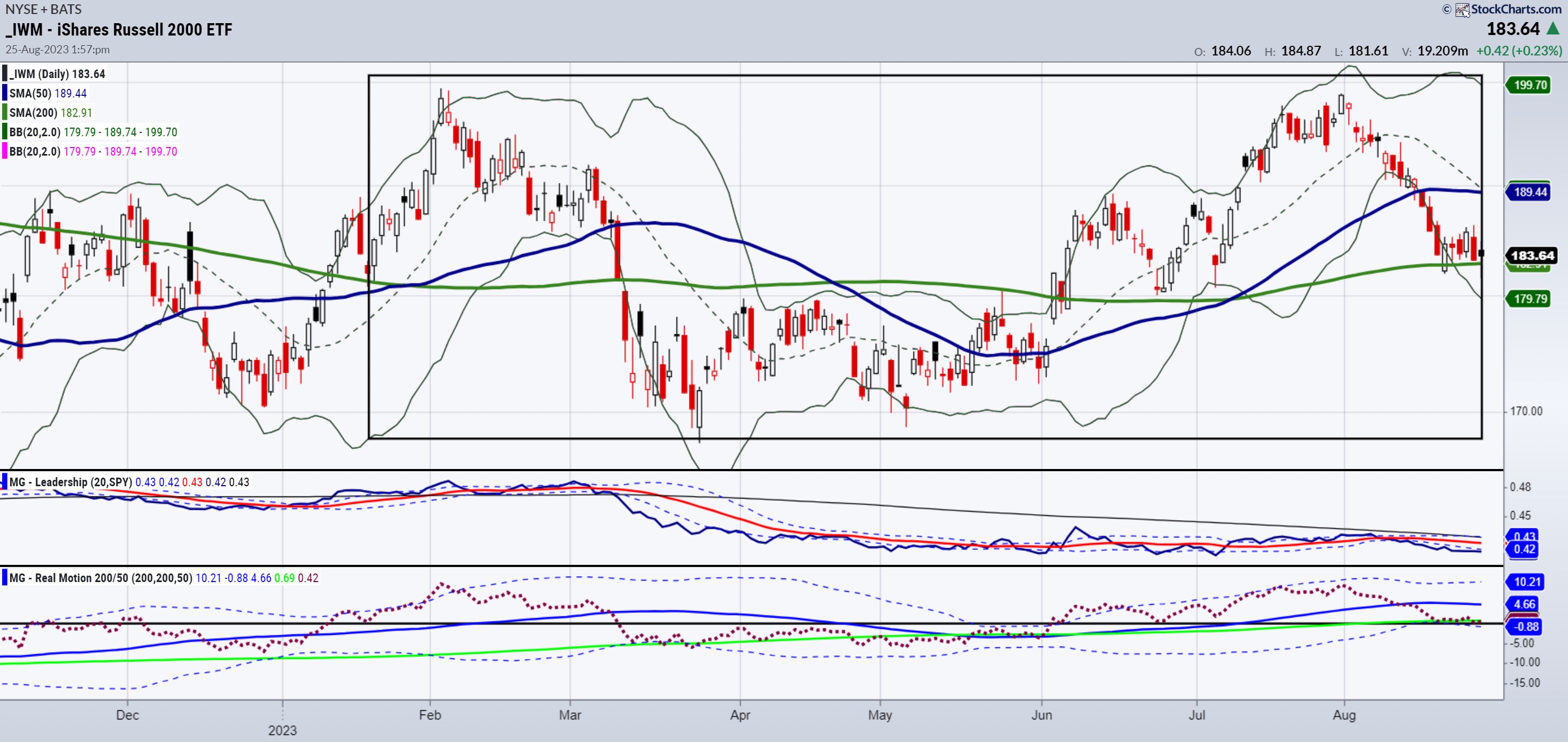
Small caps, as measured by IWM, are key for the fall and heading into 2024. You can also look at the S&P 600 (SML).
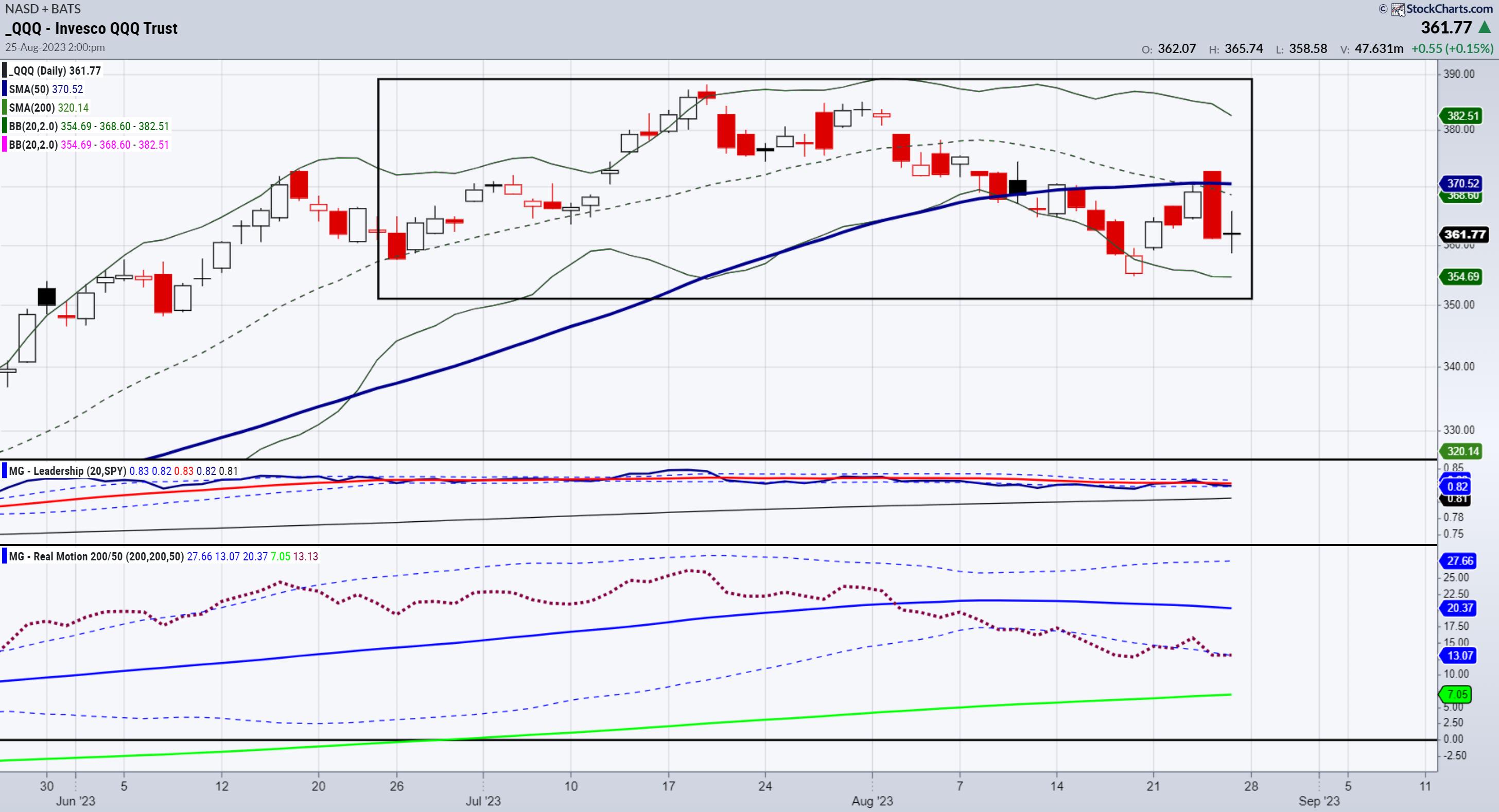
IWM could be forming an inverted head-and-shoulders bottom, going back from the start of 2023. (See the rectangle area of the IWM chart). SPY QQQs, on the other hand, could be forming a head-and-shoulders top. (See rectangle area of the QQQ chart).

That should tell you where we are at--equal potential to see IWM lead us up if clears back over 190, or a more significant down move if fails 180 under the pressure of QQQs should they fail the head-and-shoulders neckline.
Our MarketGauge quant models are aside in small cap all-stars, yet long small-cap earnings growth. This means that the strength is in the stocks that have merit based on earnings and not as correlated to the indices.
Have a listen to August 24th live coaching session where we cover the indices, economic modern family, and market outliers. (Make sure you're logged in to MarketGauge to access the link.) And stay tuned as Monday August 28th on the close of the day, as Mish will be guest hosting for David Keller on StockCharts TV's The Final Bar.
For more detailed trading information about our blended models, tools and trader education courses, contact Rob Quinn, our Chief Strategy Consultant, to learn more.
If you find it difficult to execute the MarketGauge strategies or would like to explore how we can do it for you, please email Ben Scheibe at Benny@MGAMLLC.com.

"I grew my money tree and so can you!" - Mish Schneider
Get your copy of Plant Your Money Tree: A Guide to Growing Your Wealth and a special bonus here.
Follow Mish on Twitter @marketminute for stock picks and more. Follow Mish on Instagram (mishschneider) for daily morning videos. To see updated media clips, click here.
Mish looks at a selection of popular instruments and outlines their possible direction of travel in this appearance on CMC Markets.
Mish talks NVDA and "Trading the Weather" in these two appearanceson Business First AM.
Read Mish's commentary on Gold in these two articles from Kitco.
Mish and Nicole discuss where to park your money, barring any watershed event, in this video from Schwab Network.
On the Friday, August 18 edition of StockCharts TV's Your Daily Five, Mish covers bonds, the dollar, risk-off indications and several key commodities with actionable levels to consider.
Mish joins Maggie Lake of Real Vision to discuss what rising bond yields mean for investors across the market landscape, what comes next for stocks and commodities, and why she is taking profits here in the growth and AI stocks.
Mish shows why January and now the July reset worked in this appearance on Business First AM.
Mish discusses Alibaba's stock price in this appearance on CNBC Asia.
In this guest appearance on David Keller's The Final Bar on StockCharts TV, talks higher rates and why China may deserve a second look for investors.
Mish discusses inflation, bonds, calendar ranges and places to park your money on the Benzinga Morning Prep show.
Mish covers why August is a good time for caution in this appearance on Business First AM.
Mish and Jared go over oil and what might happen with small caps and regional banks in this appearance on Yahoo! Finance.
Coming Up:
August 28: Yahoo Finance, Before the Bell & Chuck Jaffe, Money Show & Making Money with Charles Payne, Fox Business & guest host on The Final Bar, StockCharts TV
Mish will be on break starting August 30 and return Tuesday, September 5th.
September 7: Singapore Breakfast Radio, 89.3 FM
September 12: BNN Bloomberg & Charting Forward, StockCharts TV
September 13: Investing with IBD podcast
October 29-31: The Money Show
ETF Summary
- S&P 500 (SPY): 440 now back to pivotal.
- Russell 2000 (IWM): Popped off the key support. 185 pivotal.
- Dow (DIA): Will watch to see if it can get back over 347.
- Nasdaq (QQQ): 363 pivotal.
- Regional Banks (KRE): Still needs to get back over 44 to be convincing.
- Semiconductors (SMH): 150 back to pivotal.
- Transportation (IYT): 239 still support to hold, with 252 biggest overhead resistance.
- Biotechnology (IBB): Compression between 124-130.
- Retail (XRT): Has been and remains to be an underperformer and concern going forward.
Mish Schneider
MarketGauge.com
Director of Trading Research and Education
|
| READ ONLINE → |
|
|
|
| Top Advisors Corner |
| M2 Continues to Fall, Making Stocks Overvalued |
| by Tom McClellan |

The latest data just out on the monetary aggregate known as M2 showed a continued shrinkage of the money supply. M2, in nominal terms, is now down 3.7% from a year ago. But, at the same time, nominal GDP (not adjusted for inflation) for Q2 of 2023 is up 6.3% from Q2 of 2022. That means the larger size of the economy is having to get by with less money circulating around to keep everything lubricated.
Money supply is like oil in an engine. You need a certain amount to keep everything coated with oil and lubricated. It only takes a small amount of oil to keep the valves and pistons moving, but you need a specific level in the sump for the pump to pick up and circulate everywhere. When that oil level drops a little bit on the dipstick, the engine can still be okay, but if it drops too much, then components will start to fail.
If you put too much oil into an engine, you can harm the engine that way too, making it not work properly. But if you put too much money into an economy, you get some weird effects. One is inflation, the rate of which is coming down as money supply shrinks. Another effect is that stock prices tend to benefit from all of that excess money that does not have a real mission to work on, so that excess money pushes up stock prices.
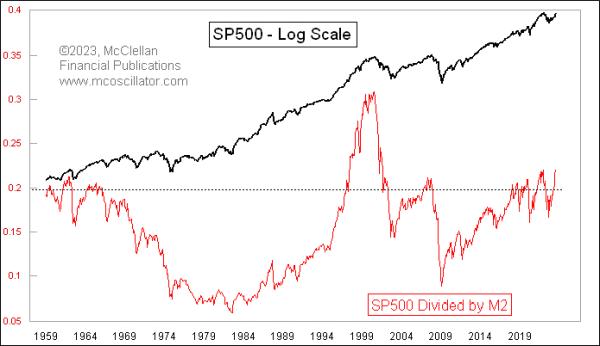
What we face now is a situation wherein money supply is shrinking, but stock prices were still rising as of July. And as we see in this week's chart, that combination has been pushing up the ratio of the S&P 500 Index level to M2. This is a very high level historically speaking. It did go higher in the late 1990s thanks to the Internet bubble, with predictably painful effects afterward. All of the other instances of this ratio being up this high have also led (eventually) to bear markets.
Shrinking the money supply is arguably a good idea if the problem that you are trying to solve is high inflation. So kudos to the Fed for making that happen. But as an individual investor, we cannot do anything about inflation, and our concern is knowing what stock prices are going to do. This M2 shrinkage is not bullish news for stock prices, although it may not have to take effect immediately. It is possible, as we saw in the late 1990s, for this ratio to continue a lot higher before it decides to matter.
|
| READ ONLINE → |
|
|
|
| MORE ARTICLES → |
|
 Chart 1
 Chart 2
 Chart 3
 Chart 4
 Chart 5
 Chart 6
 Chart 7


 I felt it only right to publicly acknowledge and thank William J. O'Neil for the lifestyle I enjoy today. He passed away in May at the age of 90, and I wanted to wait until now to explain how he changed my life.


 Are there any other Larry Williams indicators you can use to enhance the Williams Money Flow Index? There are several, and you can check them out by
