| THIS WEEK'S ARTICLES |
| The Mindful Investor |
| Lagging Indicators Confirm Bearish Phase For Growth |
| by David Keller |
I have found that novice investors think of technical analysis as fairly homogeneous. At the end of the day, technical indicators are just basically analyzing price patterns, right?
Technical analysis is actually comprised of a fairly diverse set of tools to help investors understand investor sentiment by analyzing price and volume trends. While the common thread for technical analysis is a focus on the markets themselves (through price and volume) as opposed to factors that often influence market activity (for example, fundamental or macroeconomic analysis), it turns out that there are many different ways to quantify investor sentiment through charts.
In this article, we'll talk about two main categories of technical indicators, how leading and lagging indicators represent different approaches to price analysis, and how we can apply these concepts to the current chart of Apple Inc. (AAPL).
Leading vs. Lagging Indicators
I like to classify technical indicators into general buckets: leading indicators, which are designed to anticipate a change in trend, and lagging indicators, which are more confirmational and tell you when a trend has actually reversed.
These two categories remind me of the broader labels of growth vs. value investing. Growth investors tend to buy strong companies in the hope that they will continue to grow earnings over time. Value investors, on the other hand, tend to invest in companies trading for less than what they are worth based on some valuation assessment.
There isn't necessarily a "right" or "wrong" way to invest, but there are different periods where growth or value approaches will tend to be more successful. The same can be said for the different types of technical indicators, and, for many investors, a balance of leading and lagging investors is probably the best approach.
I tend to favor lagging indicators in my own technical work, although I do employ some leading indicators as well. One indicator in particular, the Relative Strength Index (RSI), combines both leading and lagging capabilities to help define the trend and recognize trend shifts.
RSI as a Leading and Lagging Indicator
Toward the end of a bullish phase, the price will often continue higher, while a momentum indicator like RSI actually rotates lower. This indicates a lack of upside momentum and indicates that the uptrend may be nearing its end. This is where RSI can help anticipate potential turning points, as the signal occurs while the current trend is still in place.
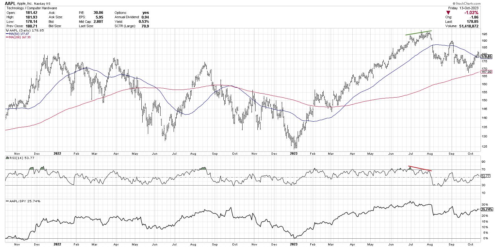
Let's review the chart of Apple going into its July high.

Note the consistent uptrend that began in January, providing a sudden reversal from a bearish Q4 2022. When AAPL made another new high in late June, the RSI spiked up to almost 80. During subsequent price highs in mid- and late-July, the RSI peaked around 70 and 65, respectively.
This "bearish momentum divergence" suggested that while the price of Apple was still going higher, the bullish momentum propelling the price action was beginning to dissipate. Sure enough, AAPL gapped down below its 50-day moving average soon after, beginning a bearish phase that may still be in place today.
RSI can also be used as a lagging or trend-following indicator, designed more to validate a potential price reversal you've already observed. Notice how, during the first half of 2023, the RSI remained in the 40 to 80 range? This range is more characteristic of a bullish trend than a bearish trend.
Now look at how the entire range of the RSI pushed lower starting in August, with the RSI now rotating between 20 and 60. This shift to a more bearish range could have helped a savvy investor rotate to more defensive positioning.
Outlook for AAPL
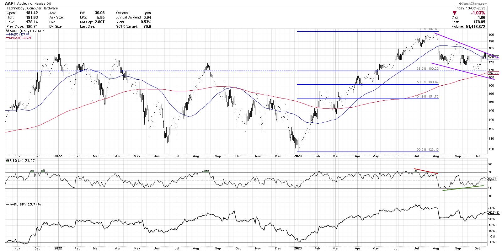
Since the July peak, Apple has now entered a downtrend comprised of lower highs and lower lows. The RSI became oversold during the August low, but was not oversold at the September low. Now we are observing a bullish momentum divergence, providing a leading indicator of a potential change in trend.

Considering the weight of the evidence, I'm seeing the price in a clearly defined downtrend channel. The low in September came at a confluence of support, just above the 200-day moving average and right around the 38.2% Fibonacci level. Now the stock is giving a second attempt at pushing above the 50-day moving average, after an unsuccessful attempt in late August.
While the RSI divergence tells me to be ready for a reversal, the clearly defined downtrend in price on weak momentum compels me to remain on the sidelines. A break below that confluence of support around $168-170 would validate the bearish thesis and suggest further downside into year-end 2023.
As a trend-follower, I have always felt that my main goals are threefold:
- Define the trend
- Follow that trend
- Anticipate when the trend is exhausted
By combining both leading and lagging technical indicators into your toolkit, you will be best prepared for changing market environments and trend reversals!
RR#6,
Dave
P.S. Ready to upgrade your investment process? Check out my free behavioral investing course!
David Keller, CMT
Chief Market Strategist
StockCharts.com
Disclaimer: This blog is for educational purposes only and should not be construed as financial advice. The ideas and strategies should never be used without first assessing your own personal and financial situation, or without consulting a financial professional.
The author does not have a position in mentioned securities at the time of publication. Any opinions expressed herein are solely those of the author and do not in any way represent the views or opinions of any other person or entity.
|
| READ ONLINE → |
|
|
|
| Martin Pring's Market Roundup |
| REITS Getting Ready to Rally, But What Happens After That? |
| by Martin Pring |
Several short-term charts suggest the SPDR Real Estate ETF (XLRE) is getting ready to rock and roll, thereby indicating an extension to this week's rebound is in the cards. It's possible that the expected rally could result in shifting some of the longer-term indicators towards a positive mode; however, that's going to be a tall order because of extensive technical damage done in the last couple of years. Let's start with the near-term picture and work our way higher.
Short-Term Picture
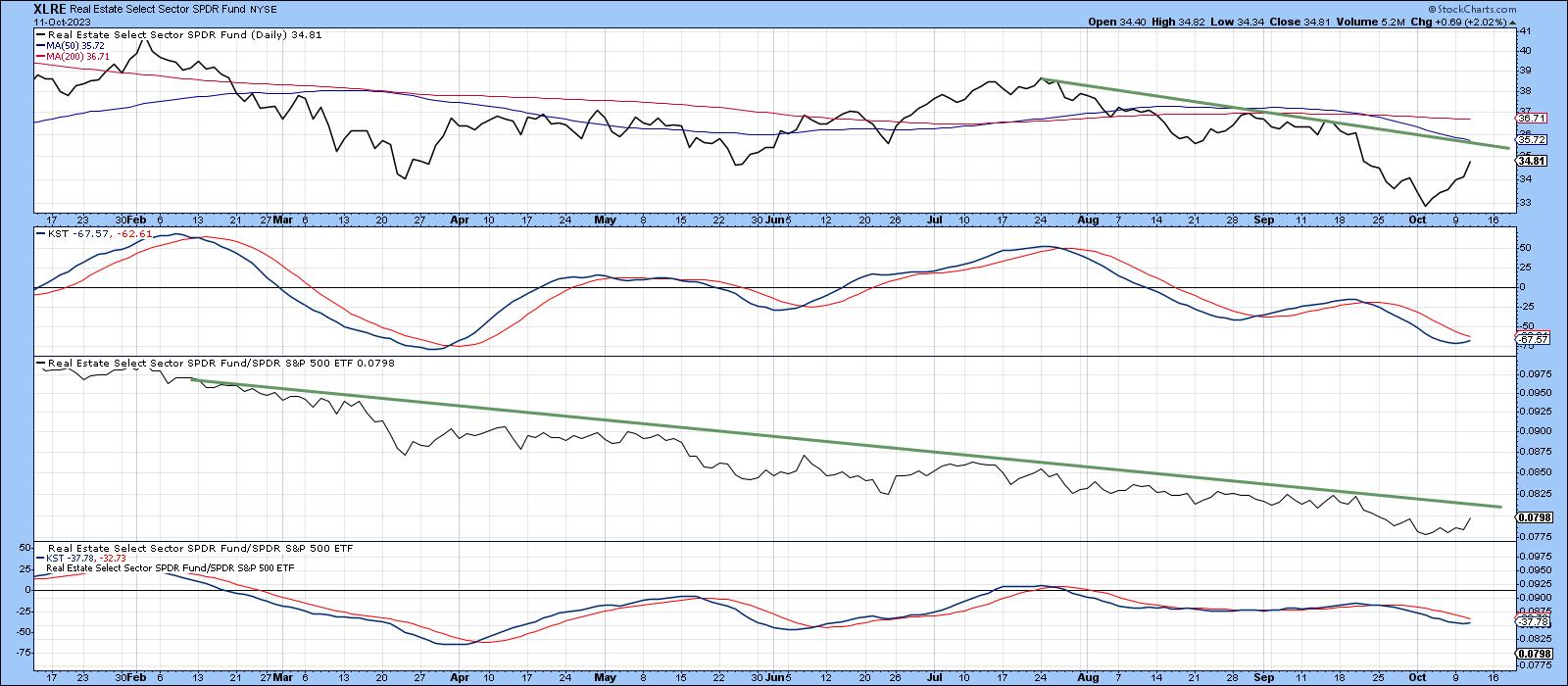
The upper window in Chart 1 shows that the XLRE is currently below its 50-day MA and the July/October down trendline. A challenge is underway, as we can see from the reversing action of the daily KST in the second window. Relative action in the third clip has been even worse, with 2023 reflecting a clear-cut downtrend. It would not take much, though, to result in a penetration of that line.
 Chart 1 Chart 1
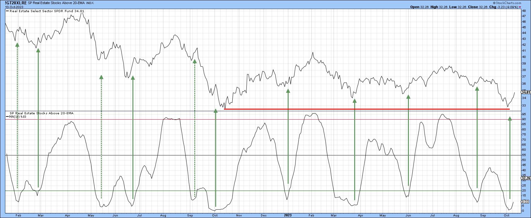
Some encouragement is being given by the percentage off REITS above their 20-day EMA, which has already begun to turn up. The solid arrows tell us that such action has usually been followed by a short-term rally of some kind. The dashed ones in Chart 2 also remind us that this is far from a perfect approach.
 Chart 2 Chart 2
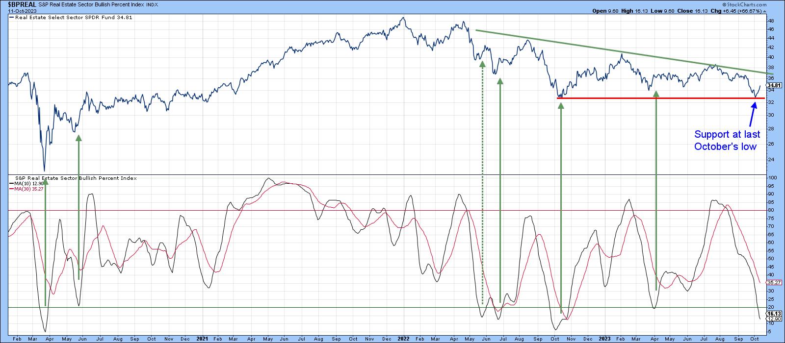
Chart 3 draws our attention to the deeply oversold condition this sector currently finds itself in, because the 10-day MA of the bullish percentage is very close to its maximum downside extreme. The arrows flag oversold upside reversals. Only the mid-May signal failed to result in a worthwhile short-term rally. It's important to note that an upside reversal has not yet been triggered, though the reversal in Chart 2 says it will likely happen soon.
 Chart 3 Chart 3
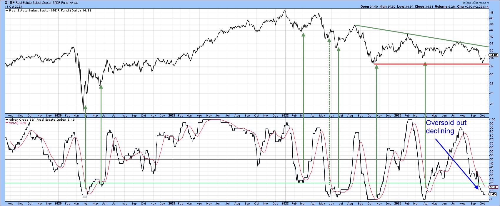
Finally, Chart 4 represents another breadth indicator, the percentage of REITS experiencing a positive silver cross. A positive silver cross takes place when the 20-day EMA of the price of one of the components crosses above its 50-day counterpart. This indicator has also reached an extreme oversold reading and is waiting for an upside reversal to earn another green arrow.
 Chart 4 Chart 4
The Longer-Term Picture and Relative Performance
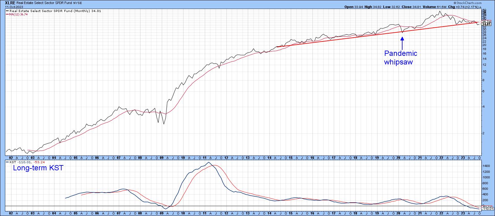
The indicators suggest the odds of a short-term rally in this beaten-down sector are good. However, I am wondering what happens after that, as REITS have been a really great performer so far this century. Chart 5 shows the XLRE rose from $1.30 in 2002 to its December 2021 monthly closing high of $48.86. The chart also shows that the price completed a massive head-and-shoulders top during the recent market correction. Both the price and its KST remain below their respective MAs.
 Chart 5 Chart 5
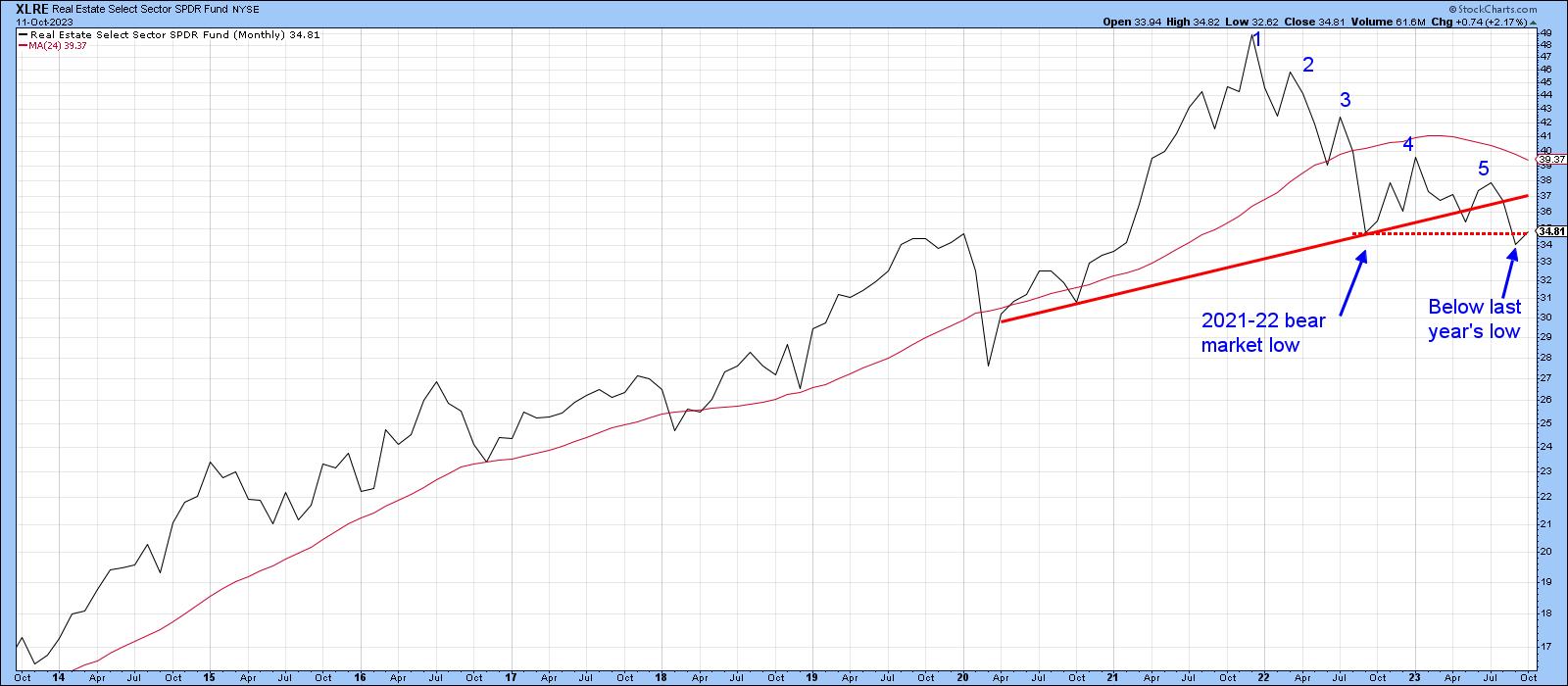
Chart 6 also reveals a series of consecutively lower highs. Arguably more important is the fact that September saw the XLRE register a post-2022 monthly closing low, thereby indicating that the 2021-present bear market is intact.
 Chart 6 Chart 6
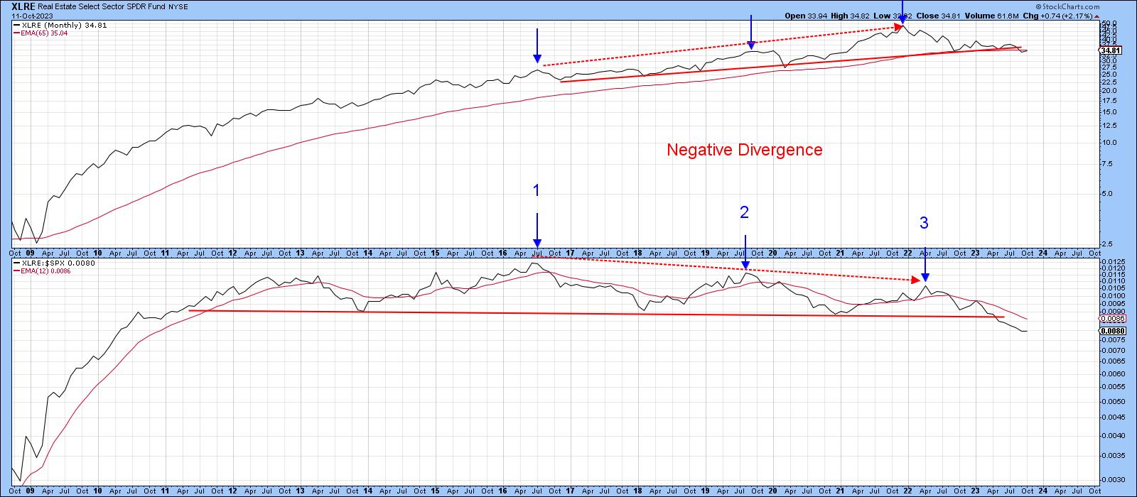
The completion of a 7-year top is no mean feat, but the technical damage already done also extends to its relative performance. For this, we turn to Chart 7, which compares the price to its relative line. The relative performance of REITS peaked in 2016, five years ahead of the absolute top. Since then, the RS line has seen two consecutive lower highs as the XLRE itself has been working its way higher. This negative divergence was confirmed at the turn of the year, when the RS line completed a 12-year top. That alone suggests this sector will be under pressure for many years to come.
 Chart 7 Chart 7
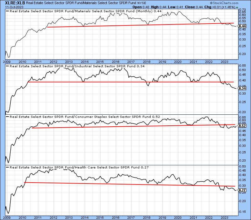
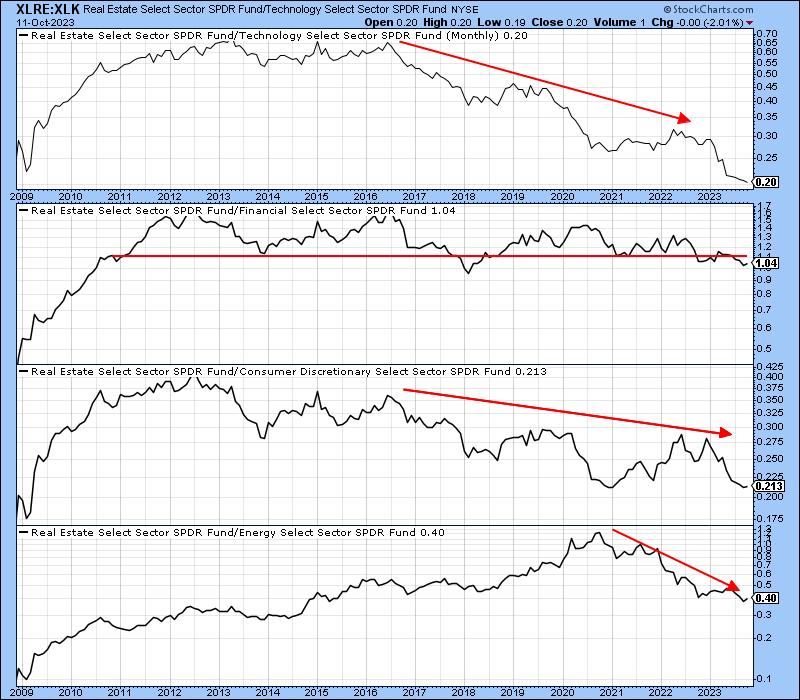
Chart 7, as well as Charts 8 and 9, round out the picture by comparing the XLRE to many other sectors, the vast majority of which are in relative bear markets.
 Chart 8 Chart 8
 Chart 9 Chart 9
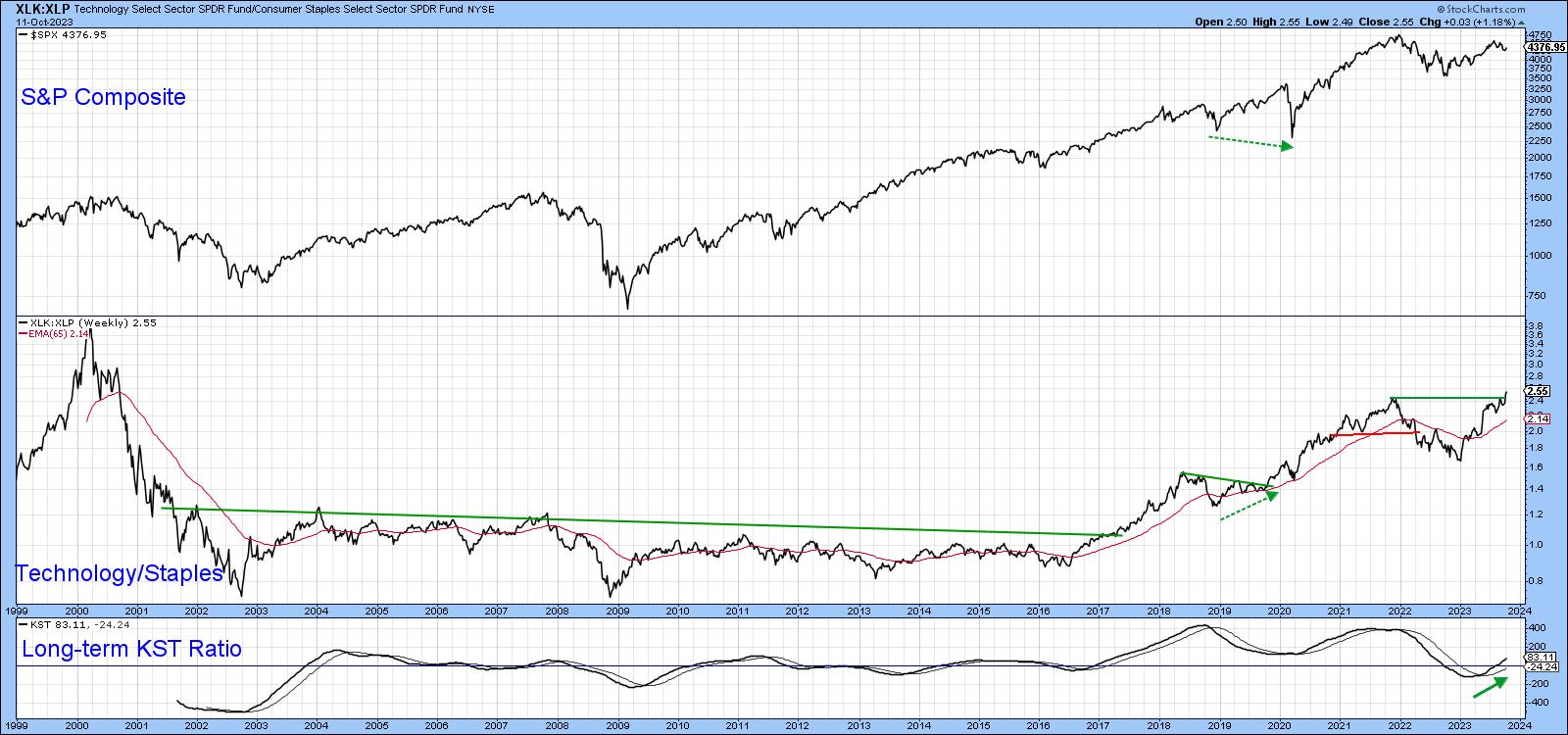
On a happier note, Chart 10 compares the XLK to the XLP. When this relationship is in a rising mode, it's usually bullish for the market. This week's break to a new high is therefore very encouraging.
 Chart 10 Chart 10
Good luck and good charting,
Martin J. Pring
The views expressed in this article are those of the author and do not necessarily reflect the position or opinion of Pring Turner Capital Group of Walnut Creek or its affiliates.
|
| READ ONLINE → |
|
|
|
| Art's Charts |
| EBAY Cannot Hold a Bid |
| by Arthur Hill |
Despite a rough ride in September, the S&P 500 is still up 14% year-to-date and the Nasdaq 100 is up a whopping 40%. The gains here, however, do not tell the entire story because many stocks are struggling in 2023. In fact, around half of the stocks in the S&P 500 are up year-to-date and half are down. EBAY is up less than 2% year-to-date and looks poised to turn negative.
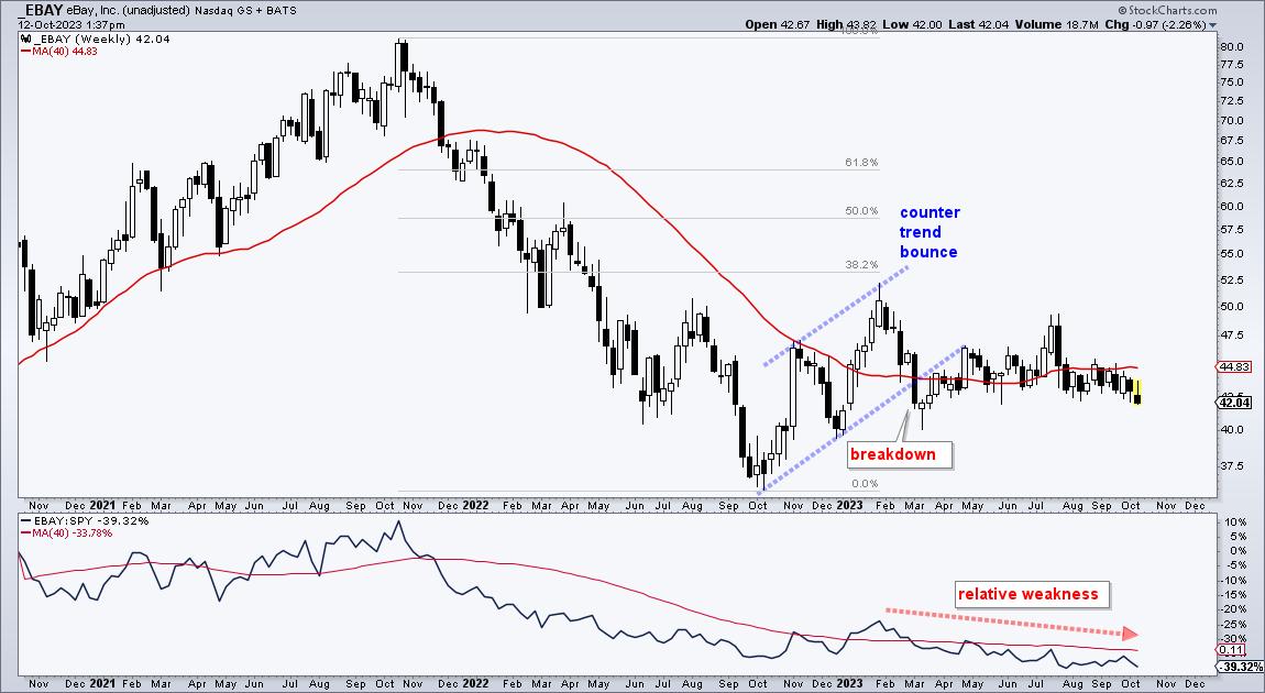
The first chart shows weekly candlesticks with the 40-week SMA and the price-relative (EBAY:SPY ratio) in the indicator window. Long-term, EBAY fell some 50% from October 2021 to October 2022 and then bounced with a rising channel. This channel retraced around 38.2% of the prior decline and EBAY broke the channel with a sharp decline in early March. Even though the stock stabilized after this "breakdown", it never escaped the gravitational pull of the 40-week SMA (red line) and underperformed the broader market.

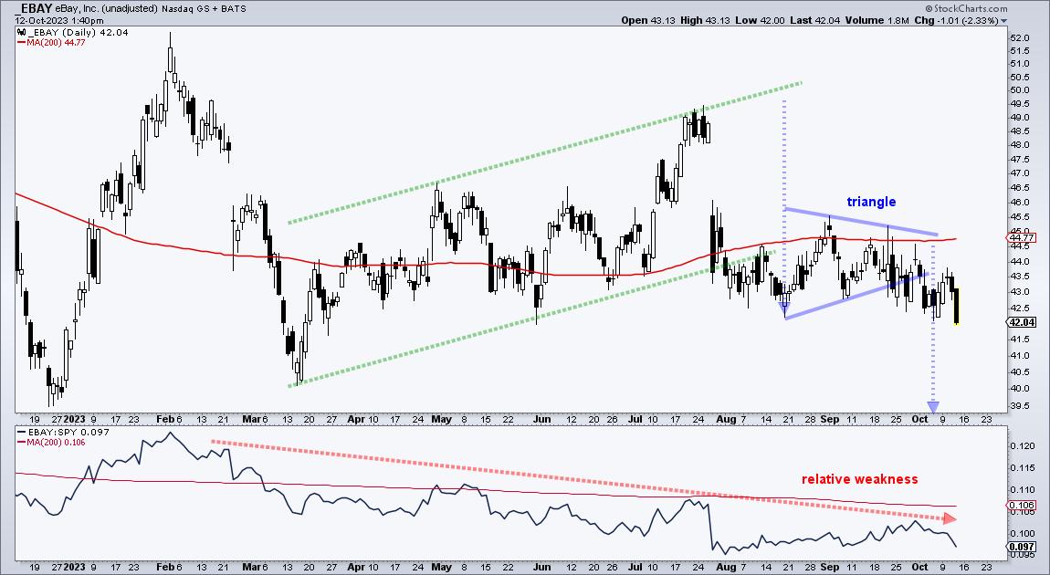
The next chart shows daily candlesticks and a breakdown in the making. The stock broke the lower trendline of a rising channel in July and then firmed with a triangle. A triangle after a sharp decline is typically a bearish continuation pattern. It represents a consolidation that alleviates oversold conditions. Stocks are up in October, but EBAY is not participating because it broke the triangle line and exceeded its August lows. This signals a continuation lower and I would expect new lows from EBAY. A close above the 200-day SMA would call for a re-evaluation.

This week on Chart Trader we weighed the long-term evidence for stocks and put forth targets for the oversold bounce in SPY and QQQ. We are still highlighting long setups and trading ideas, but these are limited to stocks in strong groups. Click here for immediate access to our reports and videos.
//////////////////////////////////////////////////
|
| READ ONLINE → |
|
|
|
| The MEM Edge |
| Stock Market Rally Fizzles – What to Do Now |
| by Mary Ellen McGonagle |
The markets started the week on a strong note with a rally, which was boosted by the release of dovish remarks from the Federal Reserve's last meeting. A stronger-than-expected CPI report sparked an increase in interest rates, however, which pushed the markets lower. The selling picked up on Friday, with the Nasdaq losing 1.2% in a move that reversed its recent uptrend.
Large-cap growth stocks were hit the hardest, while small-cap stocks also took a step back with a pullback that puts these stocks back to their lows for the year. Seasonality is expected to improve next week; however, earnings season is due to pick up as well. If last week's earnings reports among big banks are any indication, we may be in for a tough ride.
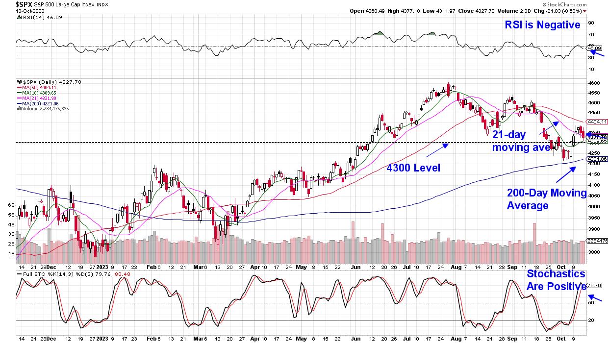
 DAILY CHART OF S&P 500 INDEX DAILY CHART OF S&P 500 INDEX
The Technology sector remains in an uptrend, however, as do most of the Magnificent Seven stocks, which led the markets higher earlier this year. At this time, the S&P 500 and Nasdaq need to regain their 50-day moving averages amid a period of improving breadth in order for investor confidence to resume. In the meantime, you'll want to put together a watchlist so that you'll be prepared for the new uptrend. Be sure and focus on stocks that are holding up well, as these relative outperformers will often go on to lead once market pressures lift.
Should we see further deterioration, you'll want to pay attention to key areas of support, such as the 4300 level on the S&P 500 chart above. A break below this level will put the 200-day moving average into focus and a close below this key moving average would be quite negative for the markets. Investors will also want to pay close attention to other metrics, such as interest rates, as well as investors response to earnings reports. Both items are highly impactful to price action in the markets.
At this time, we're in a wait-and-see period for the markets, which now have a negative bias. If you'd like to be alerted to any shifts in my market outlook, be sure and take advantage of my 4-week trial at a nominal fee. My twice-weekly MEM Edge Report has been helping investors navigate these tricky periods this year, and you'll want to make sure you're in the correct stocks once these markets turn. Be sure and use this link here!
Warmly,
Mary Ellen McGonagle
Editor, MEM Edge Report
|
| READ ONLINE → |
|
|
|
| ChartWatchers |
| Stock Market Weekly Update: 3 Valuable Points You Need To Know About the Selloff |
| by Jayanthi Gopalakrishnan |

It's been a challenging week—geopolitical worries, no Speaker in the House of Representatives, hotter-than-expected inflation data—which means the stock market will likely continue its choppy movement. Now, the focus turns to earnings, with JP Morgan Chase (JPM), Citigroup (C), and Wells Fargo (WFC) all reporting better-than-expected figures.
Earnings season could keep the stock market smooth over the next few weeks, but it may end up being more distracting than anything else. Given the larger picture of global events, it's best to tread carefully.
Broader Market Holds Support
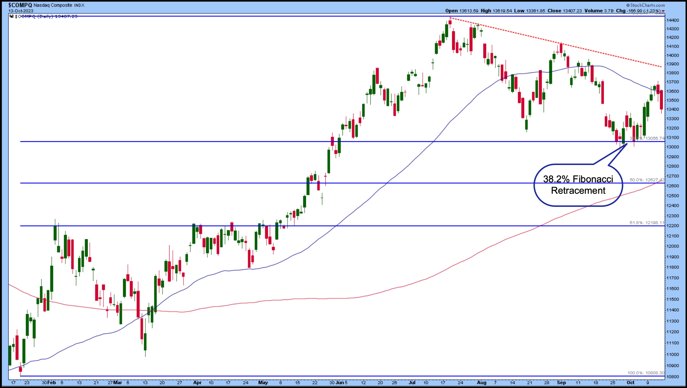
When September, a seasonally weak period, came to an end, investors felt a sense of relief, since the worst month was over. It was a dismal month, but, despite the pullback, the broader indices are showing some signs of recovery. The S&P 500 ($SPX) held its 200-day moving average (MA) support. The Dow Jones Industrial Average ($INDU) fell below its 200-day MA and is battling to break above it. The Nasdaq Composite ($COMPQ) held up well above its 200-day MA. The chart below shows how the Nasdaq Composite bounced off its 38.2% Fibonacci retracement level and is now facing resistance from its 50-day MA.

CHART 1: THE 38.2% FIBONACCI RETRACEMENT IS THE SUPPORT LEVEL TO WATCH. The overall trend is still down but if the Nasdaq Composite bounces back and breaks above the downward-sloping trendline (red dashed line), it could be positive for stocks.Chart source: StockCharts.com. For educational purposes.
The series of lower highs and lower lows is still in play, indicating that the market is in a consolidation phase. That must change to higher highs and higher lows to confirm an uptrend. And given that the mega-cap tech stocks hold the line in the Nasdaq Composite, keeping a close watch on the index for any change in investor sentiment is a good idea.
Investors Aren't Panicking Yet
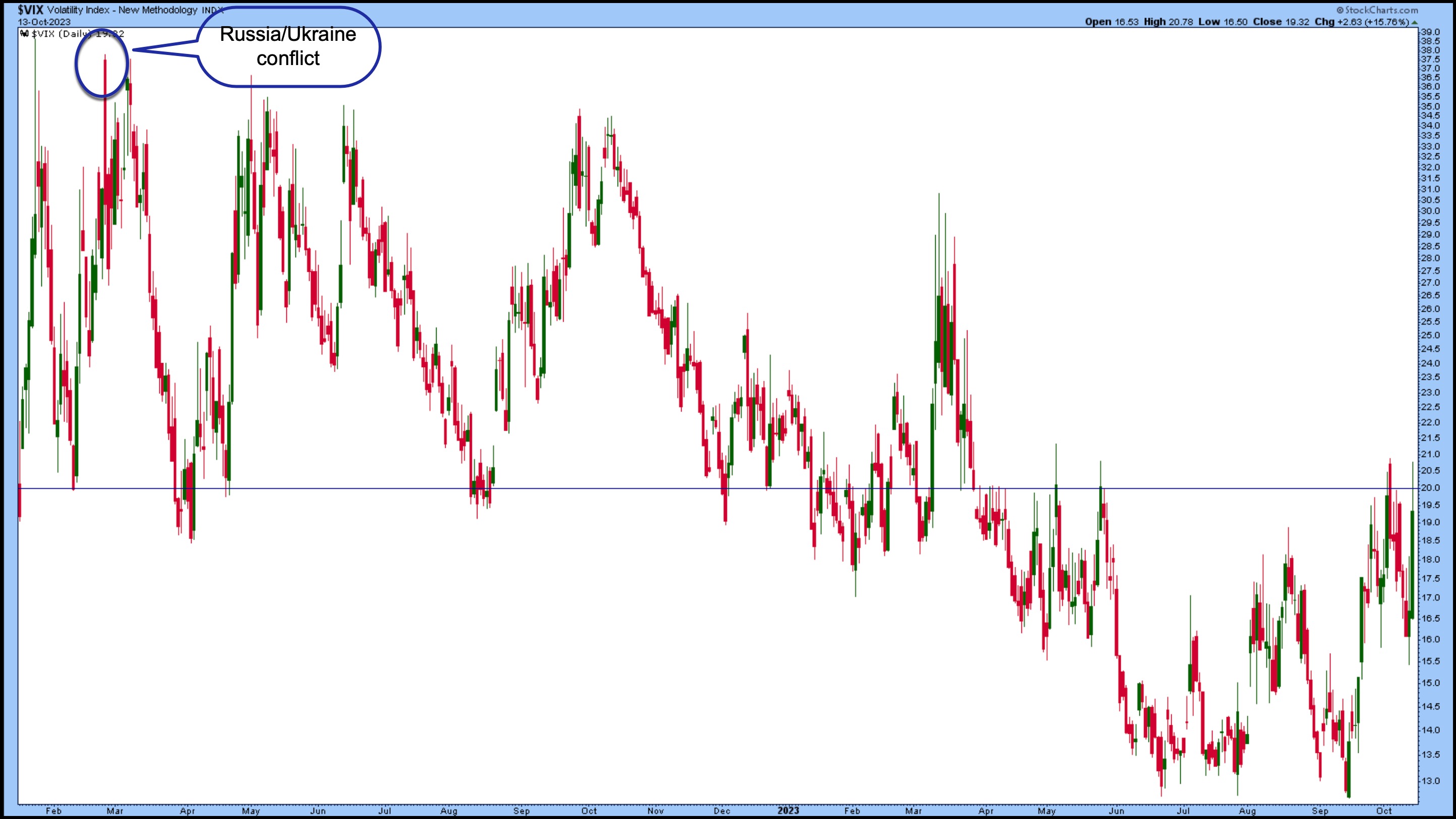
Speaking of investor sentiment, given the rise in uncertainty, it's not surprising to see the CBOE Volatility Index ($VIX) rising. The VIX, considered the market's "fear gauge," has been moving between 12 and 21 for the last few months, within a relatively normal range. Friday's high got pretty close to the high of the range, but pulled back to close at 19.32. It's nowhere close to its massive over-80 spike that occurred when the pandemic hit.

CHART 2: THE CBOE VOLATILITY INDEX ($VIX) IS STILL MEEK, RELATIVELY SPEAKING. Even though the VIX rose in today's trading, it's still not indicating panic among investors.Chart source: StockCharts.com. For educational purposes.
At the onset of the Ukraine-Russia conflict, VIX spiked to around 36, which is high, but relative to 80, it's pretty tame. But that doesn't mean all is complacent. If you see the VIX spike, it's an indication that investors are starting to panic. Have a backup plan in case the stock market goes awry.
How Should You Prepare?
If the VIX shows signs of fear, look at how the "risk-off" sectors, such as Utilities, Consumer Staples, and Real Estate, perform. The type of stocks most exposed to geopolitical winds tends to do worse when volatility ticks up. These can include Industrials, Materials, Technology, and Financials.
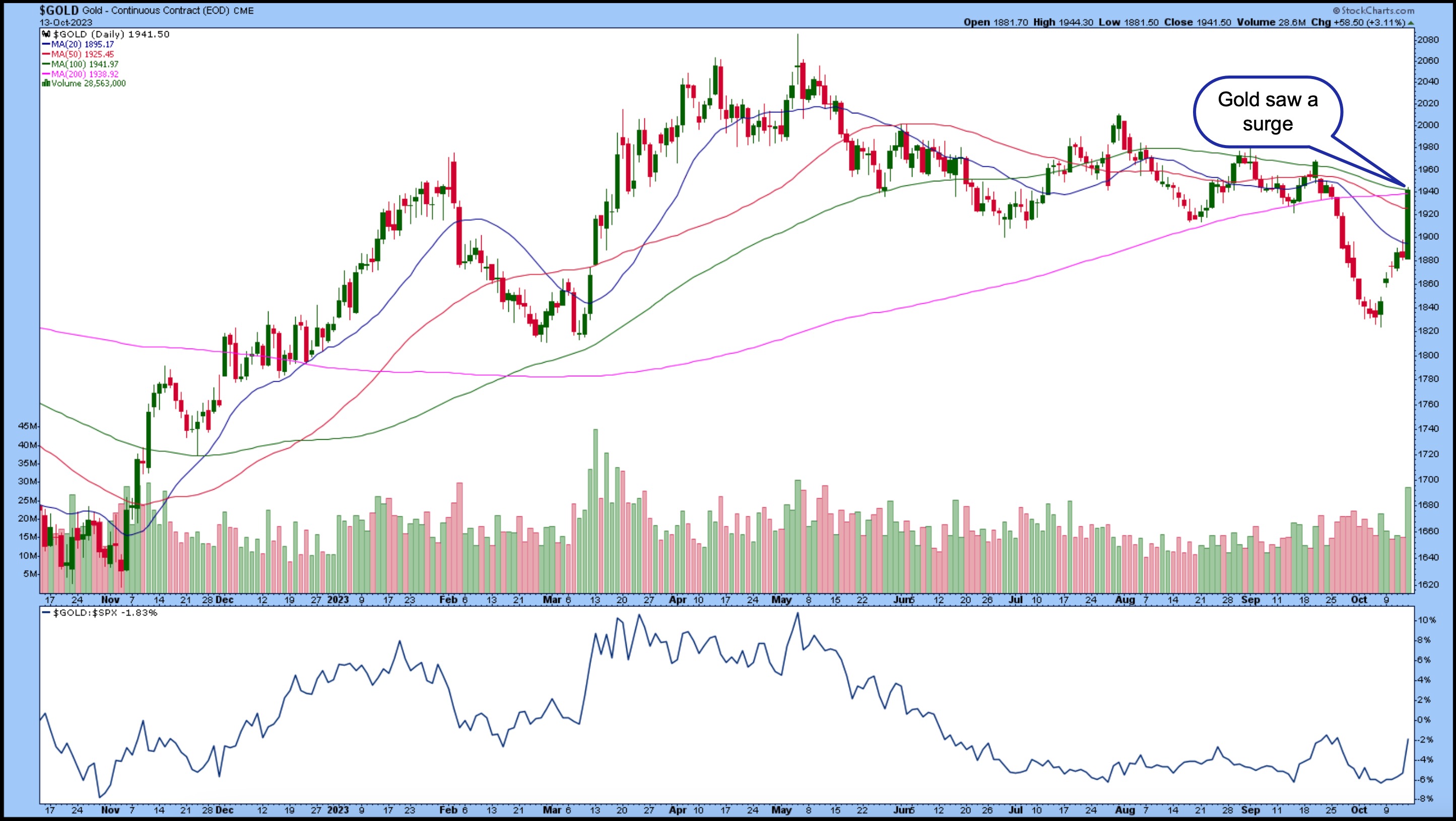
When volatility spikes, investors also flee from stocks and into fixed income, gold, the US dollar, and cash. Gold futures rose above $1,900 per ounce on Friday (see chart below), but gold is still underperforming the S&P 500. Investors may gravitate toward gold ahead of the weekend in case tensions escalate. If this were to happen, it wouldn't be surprising to see investors pile into the "risk off" areas.

CHART 3: GOLD PRICES SURGE. Investors likely fled to gold ahead of the weekend, in the event of escalation of geopolitical tensions. Chart source: StockCharts.com. For educational purposes.
That doesn't mean you should rush to the "risk-off" type of investments immediately unless you're a short-term trader who gets in and out of assets based on short-term price action. You're better off letting the dust settle and seeing where things end up. So far, despite the selloff, the broader indexes are still holding on to support levels. There's no need to panic just yet.
End-of-Week Wrap-Up
US equity indexes mixed; volatility up

- $SPX down 0.5% at 4327.78, $INDU up 0.12% at 33670.29; $COMPQ down 1.23% at 13407.23
- $VIX up 15.76% at 19.32
- Best performing sector for the week: Energy
- Worst performing sector for the week: Consumer Discretionary
- Top 5 Large Cap SCTR stocks: Vertiv Holdings, LLC (VRT); Super Micro Computer (SMCI); Applovin Corp. (APP); Plantir Technologies, Inc. (PLTR); Jabil, Inc. (JBL)
On the Radar Next Week
- Earnings from Bank of America (BAC), Goldman Sachs Group, Inc. (GS), Johnson & Johnson (JNJ), Lockheed Martin Corp. (LMT), United Airlines (UAL), Netflix, Inc. (NFLX), Tesla, Inc. (TSLA), American Airlines Group (AAL), and many more.
- September retail sales
- Fed speeches
- September housing starts
|
| READ ONLINE → |
|
|
|
|
|
| ChartWatchers |
| The Best Cybersecurity Stocks Showing Profitable Investment Opportunities |
| by Karl Montevirgen |

Cybersecurity companies occupy a unique space. It can never end or stand still. It can only escalate and transform. And given the increase in spyware attacks, the necessity for cybersecurity will increase.
So, if you're wondering whether there's "growth" in the cybersecurity industry, well, yes. Let's look at the industry using the First Trust NASDAQ Cybersecurity ETF (CIBR) as a proxy.

CHART 1: YTD COMPARISON BETWEEN CIBR ADN S&P 500 INDEX. More recently, cybersecurity stocks have outperformed the S&P 500.Chart source: StockCharts.com. For educational purposes.
Looking back year-to-date, CIBR and the S&P 500 index's performance have always intertwined. But in the last two months leading to the Q3 earnings season, cybersecurity stocks are leading the S&P 500 index ($SPX) by a much wider margin. Let's take a closer look at CIBR.
CIBR: Bullish Bounce Amid Stalling Momentum

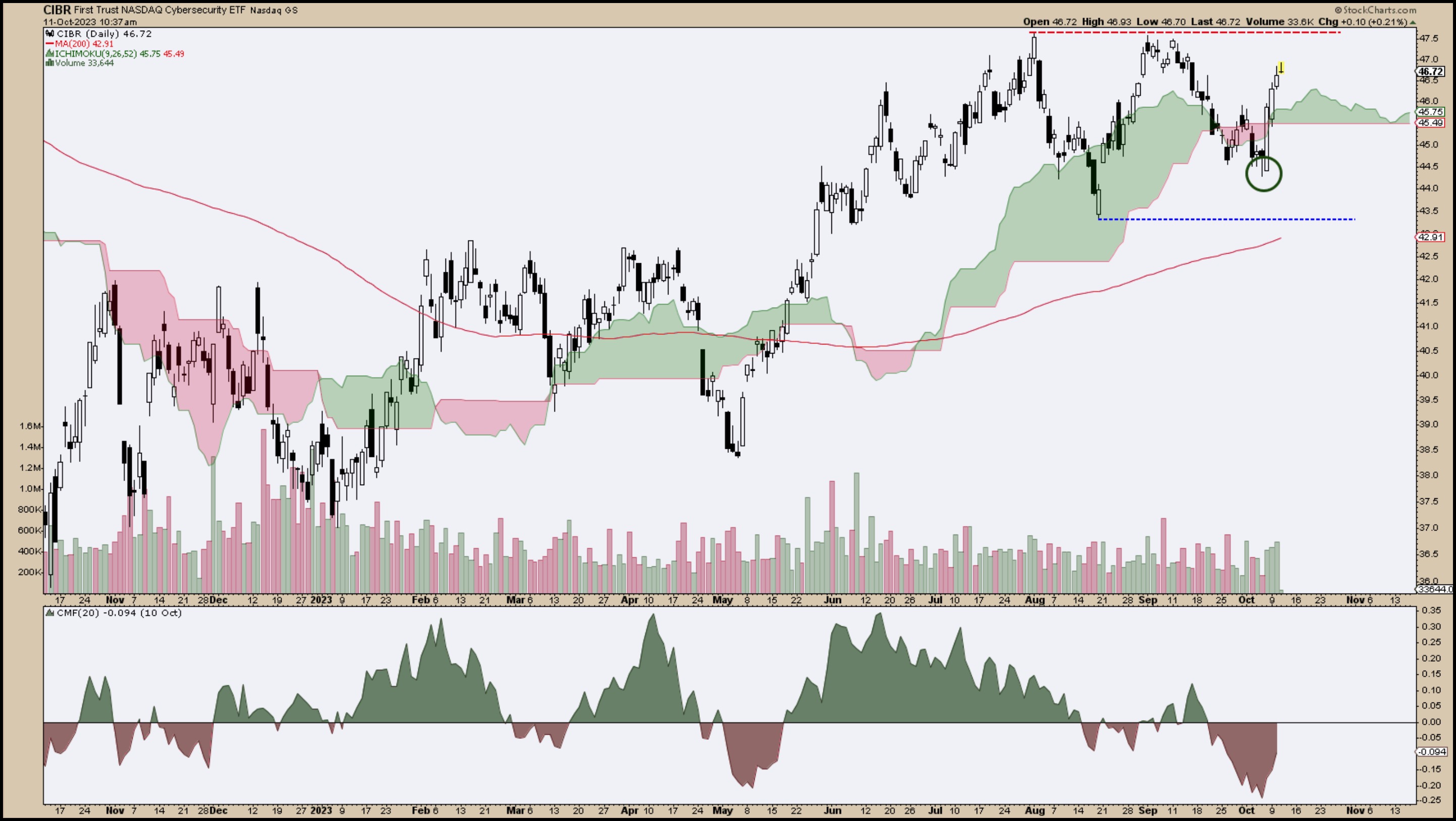
CHART 2: DAILY CHART OF CIBR ETF. Look for CIBR to break out above the $47.50 level.Chart source: StockCharts.com. For educational purposes.
As noted in the article Which Cyber Security ETF is the Strongest?, you can see the signs of strength in CIBR. The most recent swing low is above its August low and 200-day simple moving average (SMA). But there isn't much of an uptrend thesis until CIBR breaks above resistance at the two equal highs at $47.50. And if you look at price in relation to the kumo (Ichimoku cloud), it's trading right into it, signaling a period of market indecision. You can also see a significant drop in buying pressure, as shown by the Chaikin Money Flow.
So, cybersecurity stocks may have been outperforming the S&P 500 over the last few months, but their collective momentum has largely stalled. Other factors are weighing into this stall, a big one being the surge in 10-year US Treasury yields ($TNX). But we're also approaching Q3 earnings season. And for the biggest of these cybersecurity companies, it may be a make-or-break moment. Let's dive into four of the biggest cybersecurity companies (by market cap).
Palo Alto Networks (PANW): Trending but Troubled?
Palo Alto Networks is the largest cybersecurity stock by market cap (over $79 billion), yet the stock's trading volume of just under 4 million on average is far below most popularly traded stocks. You can grab this information on StockCharts' Symbol Summary, a useful tool for at-a-glance fundamentals and technicals. With a SCTR score of 94.9, it demands a look at PANW's current momentum and trajectory.

CHART 3: DAILY CHART OF PANW. Palo Alto Network's stock price is testing its highs. Will it break above this resistance level?Chart source: StockCharts.com. For educational purposes.
Like CIBR, PANW bounced well above its August lows and 200-day SMA. It found support at the kumo, which also shifted from bearish to bullish, projecting further bullish support 26 periods ahead. While PANW tests its three-month highs for the fourth time, divergence and negativity in the CMF suggest that buying pressure has dwindled, and momentum is waning. Of course, this can all change when PANW reports earnings on November 16. And it's important to note that PANW has always delivered a positive earnings surprise since 2015.
The second-largest cybersecurity stock, with even greater average trading volume, is Fortinet (FTNT). While FTNT has similarly delivered strong earnings surprises since 2016, its technical scenario differs from PANW.
Fortinet (FTNT): Legit Plunge or Guidance Fakeout?

CHART 4: DAILY CHART OF FORTINET STOCK. The stock chart of FTNT shows weakness, but this could change when the company reports earnings in November.Chart source: StockCharts.com. For educational purposes.
On August 4, FTNT had its biggest one-day drop on record, falling 26%, after issuing a negative earnings forecast. This took its prices below the 200-day SMA, and its low above $56.00 has been tested four times, proving to serve as resilient support. Still, it has yet to break above the 200-day SMA support-turned-resistance, and the bearish kumo thickens. And its SCTR score of 25 adds further gloom to the technical picture. The CMF, however, shows a higher low against FTNT's parallel lows (bullish divergence?). In short, FTNT's November 2 earnings report is critical, and if it outperforms its issued guidance, then FTNT could surge.
Crowdstrike (CRWD): A Steady Uptrend

CHART 5: DAILY CHART OF CROWDSTRIKE STOCK. The stock price is an an uptrend. Keep an eye on near-term resistance levels.Chart source: StockCharts.com. For educational purposes.
The third-largest cybersecurity stock by market cap is Crowdstrike (CRWD). In contrast to the previous two stocks, CRWD has been on a steady uptrend since the beginning of the year. Breaking above its September high, it exemplifies an "uptrend" in its most standard definition: a series of higher highs and higher lows. Its SCTR score of 97 places it well above PANW. CRWD is slated to report on November 28, and like its industry competitors, CRWD has a history of positive earnings surprises.
Last on this list is the fourth biggest cybersecurity stock by market cap: Zscaler (ZS)
ZScaler (ZS): A Highwire Outperformance?

CHART 6: DAILY CHART OF ZSCALER. The stock has broken above a broadening top formation. Does this mean the stock will pull back or continue to move higher?Chart source: StockCharts.com. For educational purposes.
ZS saw a dramatic jump on May 6 due to a Barclays analyst upgrade. From June up until a few days ago, ZS has been forming a long Broadening Top before breaking out to the upside. To splash a little sobriety on its bullish surge, broadening tops have a 67% rate of pulling back. But there's also a rising and thickening bullish kumo, which suggests a range of potential support. With a 98.4 SCTR score, ZS leads all four stocks on positive technical ranking. And like the other four stocks discussed, ZS, too, has a history of outperforming on the earnings front. The company is slated to report on December 7.
The Bottom Line
The cybersecurity world isn't just about dodging digital bullets; it's about innovation and market performance. While CIBR gives a glimpse of the industry's potential, big players like PANW, FTNT, CRWD, and ZS show an interplay of technicals and fundamentals behind the proverbial firewall of valuations. As the necessity of cybersecurity grows, so do the stocks. And if you're not watching this space, it's time you did.

Disclaimer: This blog is for educational purposes only and should not be construed as financial advice. The ideas and strategies should never be used without first assessing your own personal and financial situation, or without consulting a financial professional.
|
| READ ONLINE → |
|
|
|
| DecisionPoint |
| Nasdaq 100 (QQQ), Communication Services (XLC), and Transports (IYT) New Bullish Bias in IT |
| by Erin Swenlin |
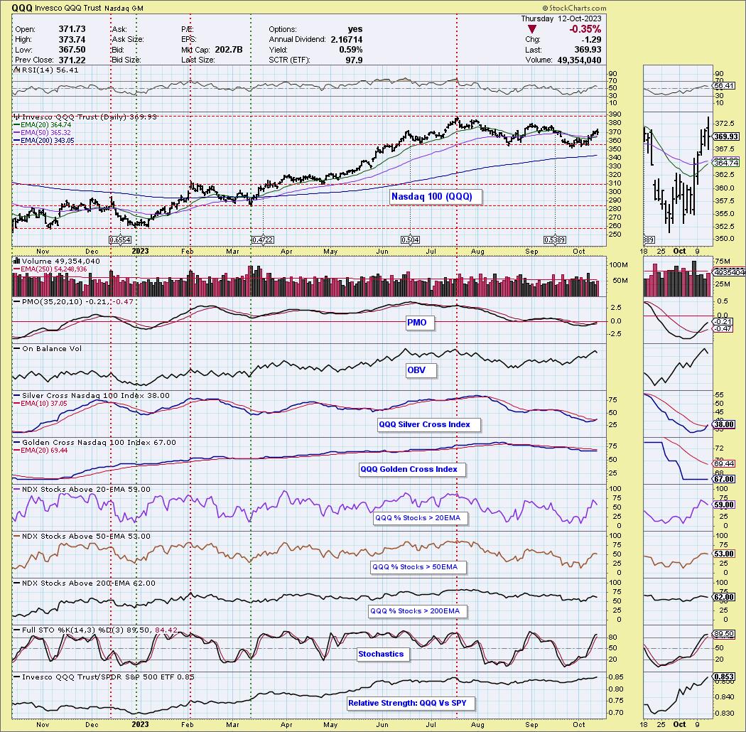
The Silver Cross Index is another way for us to measure participation within an index, sector, or industry group. It tells us how many stocks have a "Silver Cross", or a 20-day EMA above its 50-day EMA; when it moves above or below the signal line, it is a "Shift". The Golden Cross Index measures what percentage of stocks hold a 50-day EMA above the 200-day EMA. We'll concentrate on the Silver Cross Index in this article.
Today, the QQQ's Silver Cross Index had a "Bullish Shift" as it crossed above its signal line (10-EMA). We also saw Communications Services (XLC) and Transports (IYT) have the same Bullish Shift. This moves the IT Bias to "Bullish". We thought we would look at the charts to determine if these are good signals or not.
We like the QQQ's chances of moving higher, given the expansion in participation of stocks above their 20-/50-day EMAs. The long-term is a little murky given the Golden Cross Index is still in decline, and %Stocks > 200-day EMA are also in decline. The RSI is positive and the PMO is rising on an oversold Crossover BUY Signal. Stochastics are also above 80. Look for the QQQ to move higher after a short cooling-off period.

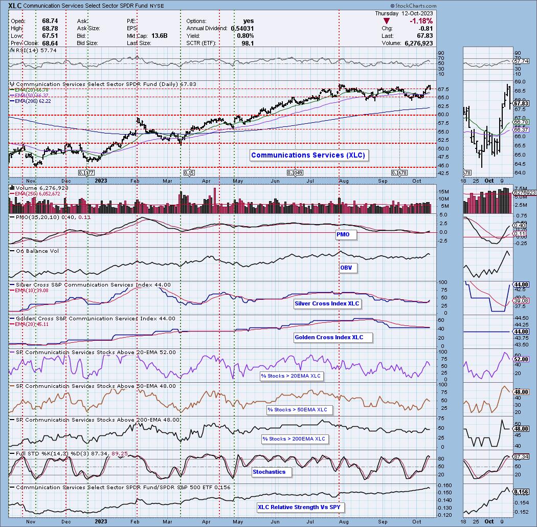
XLC had a terrible day, but we didn't see that much damage to %Stocks > 20/50/200-day EMAs. The other indicators are still healthy as well, but we aren't thrilled with the drop below the prior September high. The Silver Cross Index is oversold and rising quite strongly given today's decline. Under the hood, XLC looks like it could see an upside reversal.

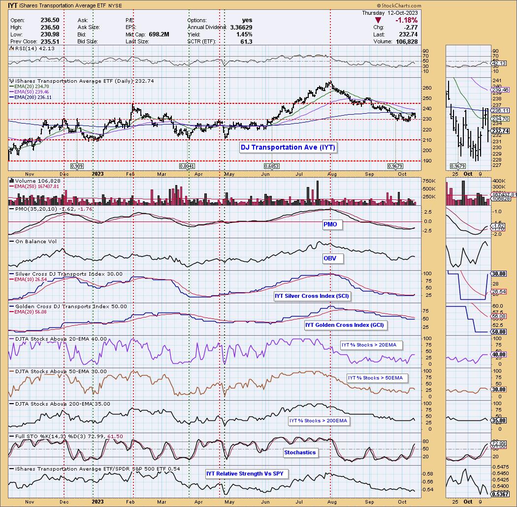
We aren't very bullish on IYT, despite today's Bullish Shift on the Silver Cross Index. %Stocks > 20-/50-/200-day EMAs are in decline and never really reached our bullish 50% threshold. Price fell at overhead resistance at the 200-day EMA almost as soon as it broke the declining trend. Relative strength is terrible, so even if we get a reversal back up, there are likely far better areas of the market to pluck.

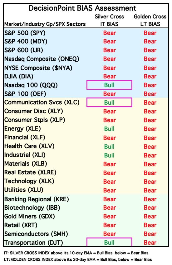
Conclusion: The Silver Cross Index and Golden Cross Index are another way to look at participation. DecisionPoint.com has the Silver Cross Index and Golden Cross Index for all major indexes, all of the sectors, and select industry groups. Below is our current bias table that we publish daily in the DecisionPoint Alert. Biases are still very bearish in the long term, but we are beginning to see some improvement on IT Biases. This suggests to us that we have likely hit a significant price bottom in the market.

Learn more about DecisionPoint.com:
Watch the latest episode of DecisionPoint on StockCharts TV's YouTube channel here!

Try us out for two weeks with a trial subscription!
Use coupon code: DPTRIAL2 at checkout!
Technical Analysis is a windsock, not a crystal ball. --Carl Swenlin
(c) Copyright 2023 DecisionPoint.com
Disclaimer: This blog is for educational purposes only and should not be construed as financial advice. The ideas and strategies should never be used without first assessing your own personal and financial situation, or without consulting a financial professional. Any opinions expressed herein are solely those of the author, and do not in any way represent the views or opinions of any other person or entity.
DecisionPoint is not a registered investment advisor. Investment and trading decisions are solely your responsibility. DecisionPoint newsletters, blogs or website materials should NOT be interpreted as a recommendation or solicitation to buy or sell any security or to take any specific action.
Helpful DecisionPoint Links:
DecisionPoint Alert Chart List
DecisionPoint Golden Cross/Silver Cross Index Chart List
DecisionPoint Sector Chart List
DecisionPoint Chart Gallery
Trend Models
Price Momentum Oscillator (PMO)
On Balance Volume
Swenlin Trading Oscillators (STO-B and STO-V)
ITBM and ITVM
SCTR Ranking
Bear Market Rules
|
| READ ONLINE → |
|
|
|
| Top Advisors Corner |
| McClellan Oscillator Leaves a Simple Structure Above Zero |
| by Tom McClellan |

As we are looking for when the normal seasonal low is going to arrive, what we want to see is either a juicy oversold condition that one can buy into or a confirmation of a new uptrend getting started. Or both. We did not get as juicy of an oversold condition as I would have liked, but the stock market started up anyway, and even took the NYSE's McClellan A-D Oscillator up above its zero neutral level.
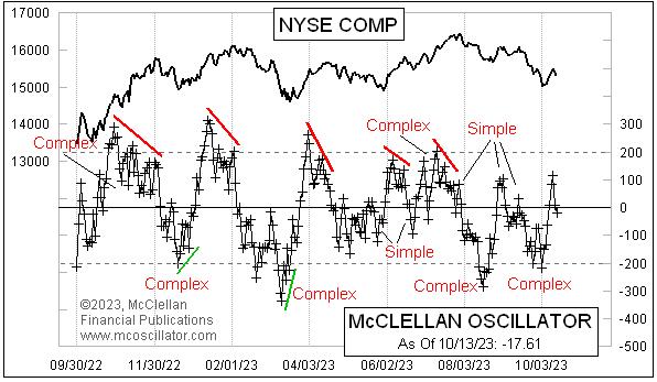
Now, however, the Oscillator has fallen back down through zero as of Friday, Oct. 13, 2023, and the manner of this brief trip above zero has additional information for us to learn from.
At an elementary level, the Oscillator is bullish when it is above zero and bearish when below zero. And it can get to overbought and oversold extremes. At the next level of learning, we find that there is additional information available from the patterns that the Oscillator forms. And the simplest of these is to evaluate whether there is a "simple" or "complex" structure.
A complex structure is one that involves chopping up and down on one side of the zero line without crossing that line. Complex structures convey a message of strength for the side of zero on which they form. This can be bullish strength if above zero, or bearish strength if below. That message of strength remains in effect until either there is a divergence relative to prices or it gets refuted by a subsequent structure.
A simple structure sees the Oscillator move across zero and then back again, without building any complexity. A simple structure says that side is weak. Sometimes you can see alternating simple structures on both sides of zero, saying that neither side is in charge.
This latest trip above zero can now be declared to be a simple structure, now that the Oscillator has dropped back below the zero line. The message is that the initial attempt to start a bullish seasonal up move was perhaps started too early, before all the troops were in formation and ready to march. Seeing the structure above zero as a simple one does not necessarily mean that the bears are in control; it just means that the bulls are not, and the bears have a chance now to try their hand.
If we see the Oscillator jump back up above zero again soon, that would mean this dip below zero is a simple one, which cancels the message of the prior complex structure below zero. And that would be a moment to say that the bulls have a chance once again to see if they can get something started.
You can see a chart of the NYSE's McClellan A-D Oscillator every day on our web site's Market Breadth Data page. And if you want to learn more about what the Oscillator's patterns can tell us, check out Sherman and Marian McClellan's original book, Patterns For Profit, available in electronic form here.
|
| READ ONLINE → |
|
|
|
| Mish's Market Minute |
| Will Bitcoin Go the Way of a Commodity or an Equity? |
| by Mish Schneider |

I went back to my Outlook 2023 written in December 2022, where I begin with:
You Can't Run with the Hare and Hunt with the Hounds.
This expression will ultimately summarize the upcoming year.
As the Year of the Tiger loses its roar, the Year of the Rabbit hops into view.
For 2023, one word and two expressions keep coming up:
Chaos,
Trying to fit a square peg into a round hole,
Looking for Inflation in All the Wrong Places
My readers know we have been buyers of dips in oil and gold. And that got us wondering about Bitcoin. In the next-to-last page of the Outlook, we call Bitcoin "The Family's Adolescent".
More:
As the one who is still trying to figure out who it wants to be in relation to the economies domestically and abroad, we love how predictable the chart looks.
A monthly breakdown under $15,950 could lead Bitcoin to lose half its value.
As December 2022 is turning into an inside month, price trading within the trading range of November, a move over $21.500, could catch many bears off guard."
Considering the outperformance versus the SPY in September, despite currently slightly underperforming, what's next for our adolescent? Here are some of the recent headlines about cryptocurrencies, specifically Bitcoin.
- Prince Filip of Serbia: Bitcoin is an "open secure protocol akin to the internet".
- Ark Invest Research forecasts $1.48 million bull case for Bitcoin
- Deadline for the SEC to hear Grayscales' appeal for a spot Bitcoin ETF
- President of Madiera welcomes Bitcoin
- Paul Tudor Jones: "Bitcoin should "probably take on a larger percentage of your portfolio".
We find the 2 most interesting headlines are that of Cathie Wood and PTJ. Both bulls, one with a great track record and one with a horrific one. So, could they both be wrong?
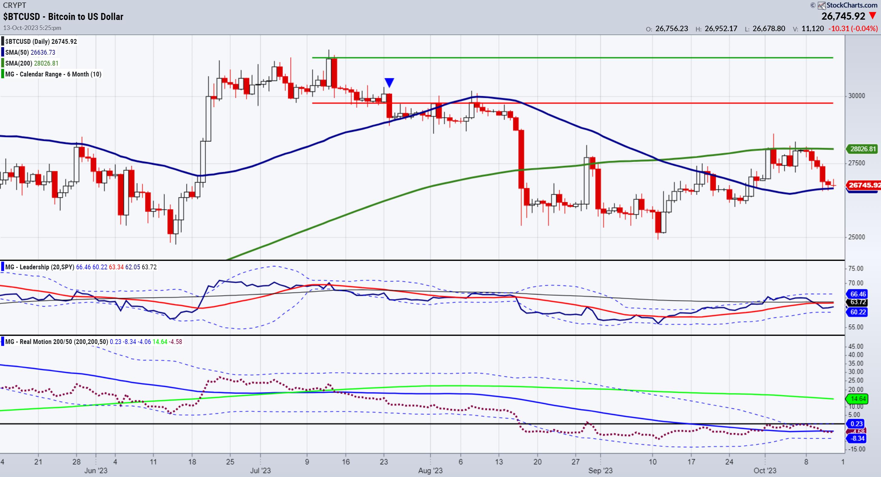
The chart of BTCUSD dissected:
- Price sits on the 50-day moving average (blue line).
- The Phase is Distribution.
- The price is well under the July 6-month calendar range low.
- In Leadership, it underperforms the SPY.
- In Momentum, it is slightly below the 50-DMA for a teeny bearish divergence to price.
$26,500 is the support to hold to see higher levels. Ideally, a close over 28,000 sets up the bulls the best. With three peak lows -- January 2023, March 2023, and September 2023 -- Bitcoin is making higher lows. However, until momentum improves and BTCUSD begins to outperform the SPY, we are more neutral than bullish or bearish.
We do like Friday the 13th's action, so do not lose track.
This is for educational purposes only. Trading comes with risk.
For more detailed trading information about our blended models, tools and trader education courses, contact Rob Quinn, our Chief Strategy Consultant, to learn more.
If you find it difficult to execute the MarketGauge strategies or would like to explore how we can do it for you, please email Ben Scheibe at Benny@MGAMLLC.com.

"I grew my money tree and so can you!" - Mish Schneider
Get your copy of Plant Your Money Tree: A Guide to Growing Your Wealth and a special bonus here.
Follow Mish on Twitter @marketminute for stock picks and more. Follow Mish on Instagram (mishschneider) for daily morning videos. To see updated media clips, click here.
Mish and Dale Pinkert discuss the disconnect between news and markets-and how to best invest right now in this video from ForexAnalytix's pre-market show.
In this video from CMC Markets, Mish shares her short-term forecast for USD/JPY and popular commodity instruments ahead of the US PPI announcement and September's Fed meeting minutes, with recent dovish comments from Fed officials suggesting a potential shift in the committee's policies.
Mish joins Business First AM to discuss the market reaction to the war in Gaza in this video.
Mish discusses what's needed for a market bottom on the Financial Sense Newshour podcast with Jim Puplava.
Mish takes over as guest host for David Keller, CMT on the Monday, October 9 edition of StockCharts TV's The Final Bar, where she shares her thoughts in the daily Market Recap during a day of uncertain news.
To quote Al Mendez, "The smartest woman in Business Analysis @marketminute [Mish] impresses Charles with her "deep dive" to interpret the present Market direction." See Mish's appearance on Fox Business' Making Money with Charles Payne here!
Mish covers bonds, small caps, transports and commodities-dues for the next moves in this video from Yahoo! Finance.
In this video from Real Vision, Mish joins Maggie Lake to share what her framework suggests about junk bonds and investment-grade bonds, what she's watching in commodity markets, and how to structure a portfolio to navigate both bull and bear markets.
Mish was interviewed by Kitco News for the article "This Could Be the Last Gasp of the Bond Market Selloff, Which Will be Bullish for Gold Prices", available to read here.
Mish presents a warning in this appearance on BNN Bloomberg's Opening Bell -- before loading up seasonality trades or growth stocks, watch the "inside" sectors of the US economy.
Watch Mish and Nicole Petallides discuss how pros and cons working in tandem, plus why commodities are still a thing, in this video from Schwab.
Coming Up:
October 19: Live coaching
October 20: StockCharts TV's Your Daily Five
October 23: BNN Bloomberg
October 27: Live in-studio with Charles Payne, Fox Business
October 29-31: The Money Show
Weekly: Business First AM, CMC Markets
ETF Summary
- S&P 500 (SPY): 435 resistance, 429 support.
- Russell 2000 (IWM): 177 resistance, 170 KEY support.
- Dow (DIA): 338 resistance, 332 support.
- Nasdaq (QQQ): 368 pivotal, 363 support.
- Regional Banks (KRE): 39.80-42.00 range.
- Semiconductors (SMH): 150 resistance, 143 support.
- Transportation (IYT): 237 resistance, 225 support.
- Biotechnology (IBB): 120-125 range.
- Retail (XRT): 57 key support; if can climb over 61, bullish.
Mish Schneider
MarketGauge.com
Director of Trading Research and Education
|
| READ ONLINE → |
|
|
|
| MORE ARTICLES → |
|
