| THIS WEEK'S ARTICLES |
| John Murphy's Market Message |
| IMPORTANT SUPPORT LEVELS ARE BEING BROKEN |
| by John Murphy |
S&P 500 BREAKS 200-DAY LINE...Last week's message showed the S&P 500 testing important support lines which included its 200-day moving average. Those support levels are being broken to the downside. The daily bars in Chart 1 show the SPX falling below its 200- day line (red arrow). In addition, it has also broken the rising support line drawn under its October/March lows (black arrow). The SPX has also fallen below the peak formed during February just below 4200 (red circle). All of which suggests that stock prices are heading lower. A lot of other support levels are being broken.
SMALL CAPS HIT NEW YEARLY LOW...Chart 2 shows the Russell 2000 iShares falling below their previous low formed during the spring and appear headed toward their low formed last October. The S&P 500 Equal Weighted Index has also fallen to the lowest level in a year. The vast majority of individual stocks are also in downtrends.
 Chart 1 Chart 1
 Chart 2 Chart 2
MOST S&P 500 STOCKS IN DOWNTRENDS... Here's another important support level being broken. Chart 3 shows the Percent of S&P 500 stocks above their 200-day averages falling to 28% which is the lowest level in year. That means that nearly three-quarters of SPX stocks are trading below their red lines. Various measures of market breadth have been sending warning signals that the vast majority of stocks haven't been keeping up with with the S&P 500. This week's selloff in previous market leaders has contributed to this week's breakdown.
 Chart 3 Chart 3
LEADERS TUMBLE... The major market averages have been held up by a handful of large stocks in the communication and technology sectors. A tumble in those former leaders has contributed to this week's selling. Charts 4 and 5 show Meta and Alphabet selling off sharply and in heavy trading. Chart 6 shows Apple falling below its 200-day average. Those are some of the stocks that had been holding the market up. Not any more.
 Chart 4 Chart 4
 Chart 5 Chart 5
 Chart 6 Chart 6
|
| READ ONLINE → |
|
|
|
| The Mindful Investor |
| My Downside Targets for the S&P 500 |
| by David Keller |
If you've been fighting the mounting bearish evidence up until this week, then perhaps the distribution we've witnessed here in late October has been enough to convince you otherwise. It was easy for some to write off the negative rotation in key leadership groups, and maybe you flat-out ignored the head-and-shoulders top on the S&P 500 chart, but at this point, the weight of the evidence appears to have rotated clearly to the bearish side.
In a bullish phase, I like to think of the market as "innocent until proven guilty". You assume that the uptrend of higher highs and higher lows will continue until some catalyst causes a change of character on the chart. In a bearish phase, stocks become "guilty until proven innocent", and investing involves less of a "do I think the market will go lower" question and more of a "what would I need to see to turn bullish" discussion.
So what's next for the S&P 500 now that we all agree that the market is guilty until proven innocent? Today, we'll identify three potential downside targets for the S&P 500 chart using price patterns, Fibonacci retracements, and traditional support and resistance levels.
What is your downside objective for the S&P 500? Watch this, and then let me know!
Downside Target #1: SPX 4050
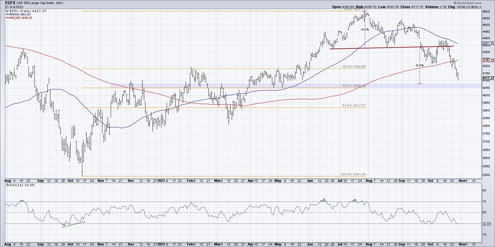
Now that the S&P 500 has broken below its 200-day moving average, what's the next most obvious area for potential support? Let's point out that when the SPX broke down through the 200-day, it also pushed below the first Fibonacci retracement level around 4180. This level represented a 38.2% drop from the July 2023 high down to the October 2022 low, and now it's firmly in the rearview mirror.
Following this Fibonacci methodology, the 50% level would be next. That suggests 4050 as a reasonable downside target, which happens to be only about 70 points below Friday's close!

Remember the head-and-shoulders top we mentioned earlier? The minimum downside objective for that classic price pattern would come in right around 4080, which means we have a "confluence of support" where multiple technical approaches all coalesce around the same level.
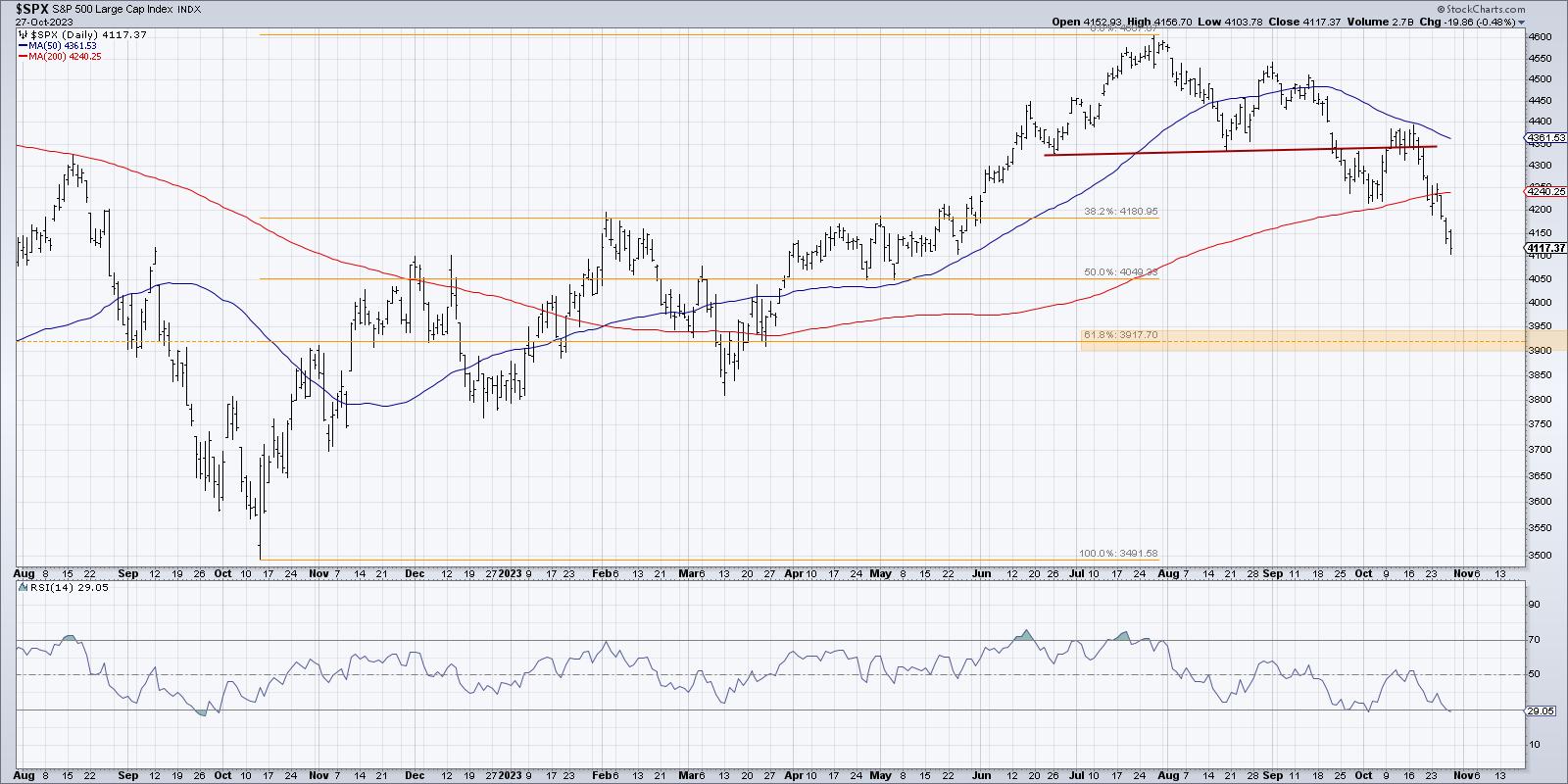
Downside Target #2: SPX 3920
What if the 4050 level doesn't hold? In that case, we can follow this same Fibonacci progression and look further down to the 61.8% retracement level. This comes just below 3920 and would represent about a 15% drop in absolute terms from the July 2023 high.

The 61.8% retracement level often represents a "point of new return" level, as a break below would suggest a full retracement of the original move. That would mean a further drop to the October 2022 low around 3500. But given the fact that there is no other real support level around 3920, I'm inclined to consider this a secondary level for now.
Downside Target #3: SPX 3800
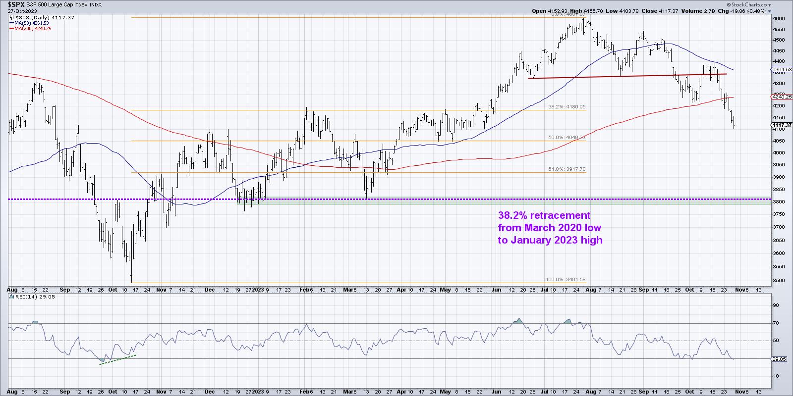
This brings up the most severe scenario, at least as severe as we're able to consider at this particular juncture. What if 4050 and 3920 come and go, and the market is still in a decline? That's when 3800 will become the new area of interest.
Given what I've seen so far from stocks, including bearish Dow Theory confirmation, breadth deterioration, and just plain old price declines, I'm fairly confident that 3800 is a reasonable downside objective. This would take us down almost 18% down from the July 2023 high, and about 21% off of all-time highs in January 2022.

You'll see how 3800 lines up pretty well with the major lows in March 2023 and December 2022, but you may also notice the purple dashed line around 3815. This line shows a 38.2% retracement from the January 2022 high back down to the COVID low in March 2020. That's why SPX 3800 has been on our radar for quite some time, and why we feel a remarkable symmetry would come to pass with an S&P 500 drop back to this same 3800 level.
Mindful investors know that improving your situational awareness involves a consistent process of analyzing both leading and lagging indicators to anticipate, identify, and confirm turning points. By focusing in on the downside targets we've discussed here, you may just find that the equity markets are starting to actually make sense here in late 2023!
RR#6,
Dave
P.S. Ready to upgrade your investment process? Check out my free behavioral investing course!
David Keller, CMT
Chief Market Strategist
StockCharts.com
Disclaimer: This blog is for educational purposes only and should not be construed as financial advice. The ideas and strategies should never be used without first assessing your own personal and financial situation, or without consulting a financial professional.
The author does not have a position in mentioned securities at the time of publication. Any opinions expressed herein are solely those of the author and do not in any way represent the views or opinions of any other person or entity.
|
| READ ONLINE → |
|
|
|
| Martin Pring's Market Roundup |
| Some Gold Indicators Approach Critical Chart Points |
| by Martin Pring |
When Anwar Sadat, President of Egypt was assassinated in 1981, gold rallied sharply over the near-term, but the advance soon petered out. The reason was that gold was in a primary bear market, so the advance merely represented a counter-cyclical move. Gold has rallied sharply since the Middle East crisis broke out, so will this advance also end in tears for the bulls?
Gold Itself is at Important Resistance
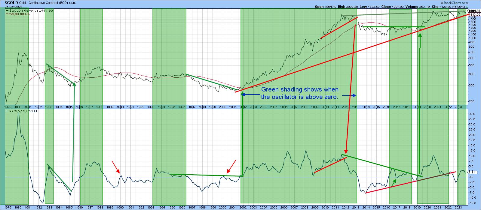
The answer is much more important now, because gold is trading slightly below some mega-resistance in the form of the 2011-2023 overhead trendline, as is shown in Chart 1. It is also just above the 2001-2023 secular bull market trendline, which means that something big could be about to happen in either direction.
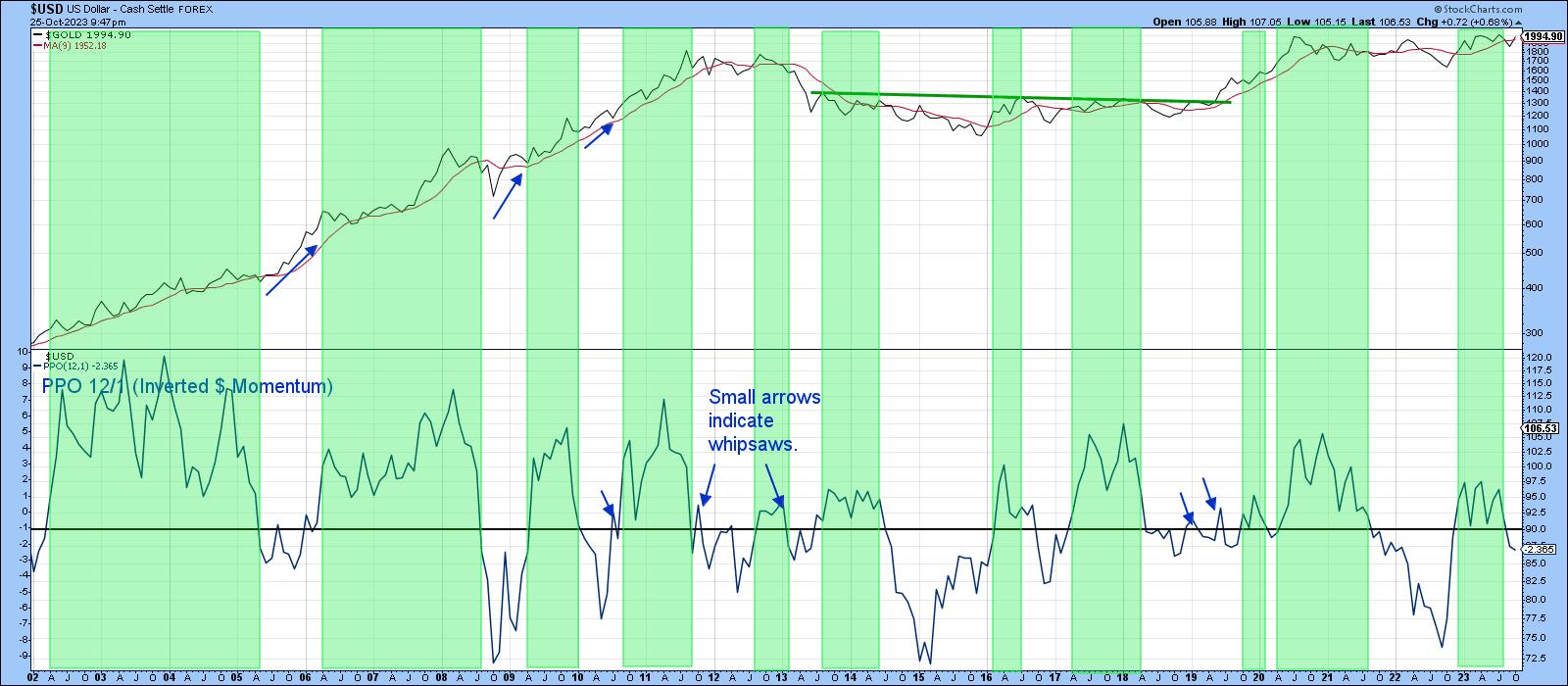
The green shadings point up periods when the PPO is above zero, thereby reflecting a bull market. Nothing is perfect, so the three small arrows flag the few whipsaws that have developed over the last 40 years or so. This PPO is currently in a positive mode, and the price itself has moved back above its 12-month MA. That does not guarantee an upside breakout, but it certainly increases the odds.
 Chart 1 Chart 1
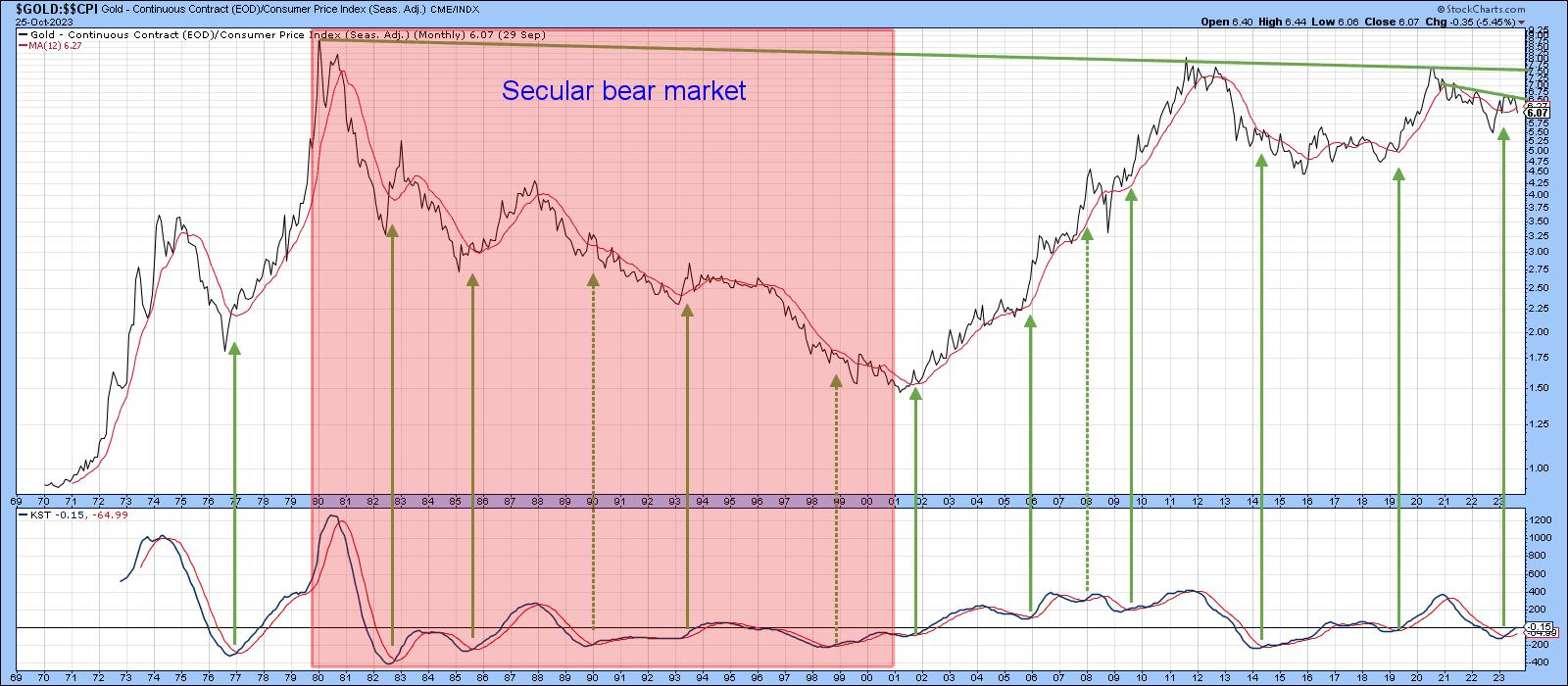
Chart 2 shows an even greater area of resistance when gold is adjusted for inflation. That resistance takes the form of a trendline joining all the peaks since 1980. Note that the chart has not been updated to reflect the recent rally.
 Chart 2 Chart 2
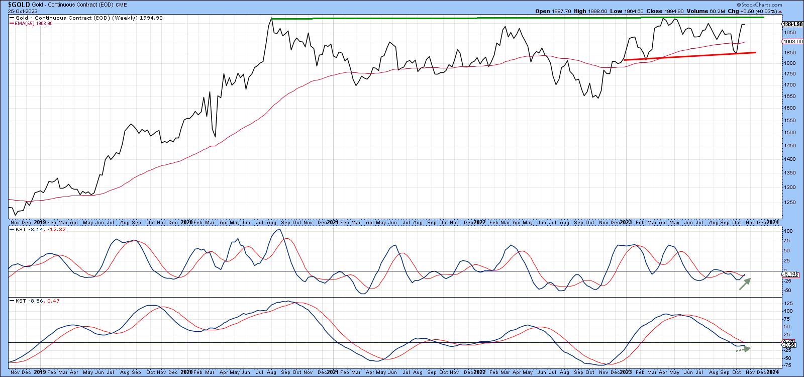
Chart 3 focuses on weekly data, where the overhead resistance in the $2,000 area is obvious. The short- and intermediate-term KSTs have started to turn, but are not what we might call decisively bullish. On the one hand, we could say they are in a subdued mode and therefore able to support a nice rally before becoming overextended. On the other, it's possible that a "Sadat" bear market scenario materializes. In that case, the tentative reversal in these indicators would be brief, as the resistance proved overwhelming, with the price subsequently sinking below the red support line.
 Chart 3 Chart 3
The Dollar Headwind
The strong US Dollar Index is supporting the case for a downside breakout. In that respect, Chart 4 compares the gold price with a PPO for the dollar. Since the two tend to move inversely, the PPO has been plotted inversely, so the two series swing in a similar direction. The blue arrows, plotted against the gold price, flag periods when it has rallied in spite of a rising dollar (declining PPO). There are not many instances, as this is the exception rather than the rule. A rising dollar would therefore act as a headwind for additional gains.
On the flip side of that are two factors. The first is that the dollar is short-term overbought and could consolidate for a while, or decline and thereby provide a window of opportunity for gold to break to the upside.
 Chart 4 Chart 4
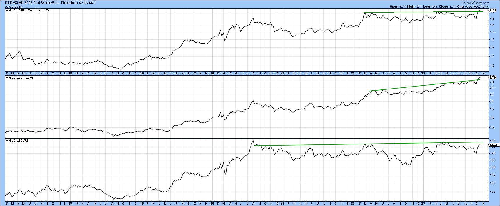
The second is that gold has broken out in both yen and euro terms and is positive in its own right. In that way, currency swings have been acting as the icing on the bullish case.
 Chart 5 Chart 5
As we can see, the dollar price of the yellow metal has reached a crucial technical juncture. That's not all, as several gold-related relationships have reached a similar technical spot.
Key Relationships Could be Close to a Breakout Point
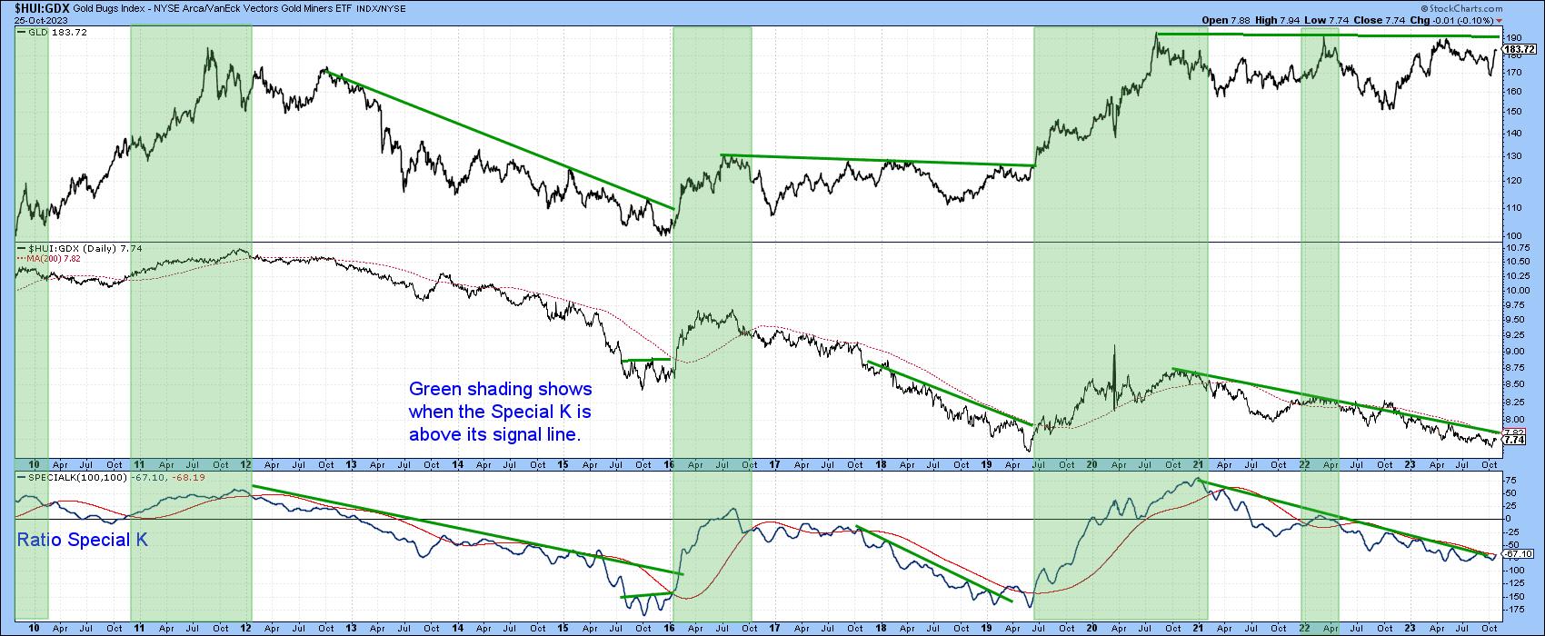
The Gold Bugs Index ($HUI) consists of companies that downplay the hedging future production. That means it is a more leveraged way of playing swings in the gold price than the VanEck Gold Miners ETF (GDX). Its relative strength against the gold price is featured in the middle window of Chart 6. The shading represents periods when the Special K of the ratio is above its red signal line. These tend to be strong periods for the GLD, which is featured in the upper window. When trendlines can be drawn for all three series and are jointly violated on the upside, a strong gold rally typically follows. The ratio is currently trading just below its 200-day MA and the Special K is right at its downtrend line and signal line. We have already discussed the fact that gold itself is just below resistance, so this combination could be very close to an upside resolution that will filter down tor the price itself.
 Chart 6 Chart 6
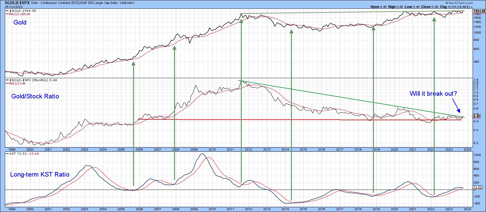
Chart 7 features the Stock/Gold ratio. This series has also been caught between two converging long-term trendlines and has started to break to the upside in favor of gold. In this respect, it is being supported by a bullish long-term KST. A breakout would be significant because a rising ratio is usually, though certainly not always, bullish for gold in its own right and bearish for stocks in theirs.
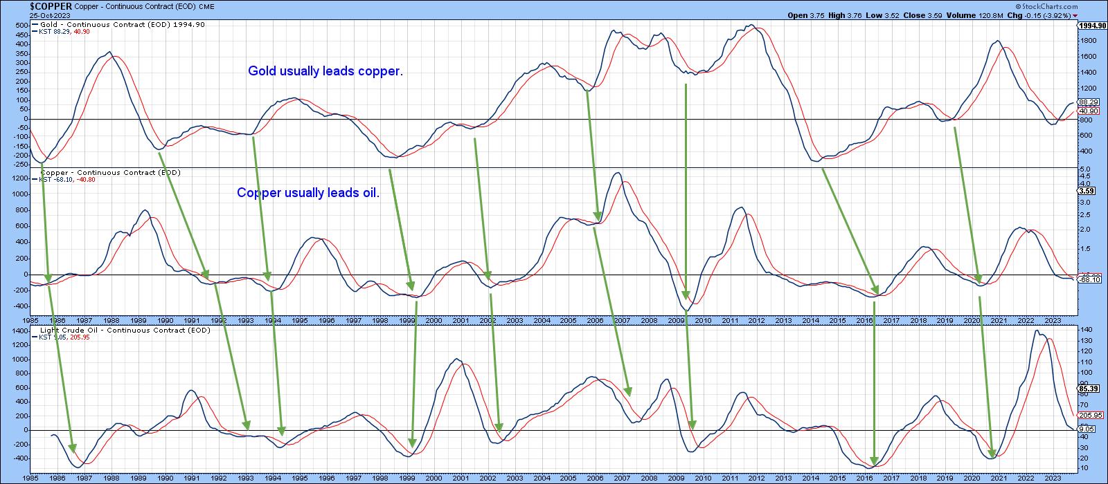
 Chart 7Finally, Chart 8 features the long-term KST for gold, copper, and oil. The arrows tell us that lows in the gold KST typically lead those for the two commodities. Unfortunately, those leads vary. However, should gold break above the resistance trendline in Chart 7, it is very likely that it will be followed by commodity inflation in the usual manner. Chart 7Finally, Chart 8 features the long-term KST for gold, copper, and oil. The arrows tell us that lows in the gold KST typically lead those for the two commodities. Unfortunately, those leads vary. However, should gold break above the resistance trendline in Chart 7, it is very likely that it will be followed by commodity inflation in the usual manner.
 Chart 8 Chart 8
Good luck and good charting,
Martin J. Pring
The views expressed in this article are those of the author and do not necessarily reflect the position or opinion of Pring Turner Capital Group of Walnut Creek or its affiliates.
|
| READ ONLINE → |
|
|
|
| The MEM Edge |
| Consumer Spending Remains Strong -- Here are 3 Stocks for Your Watch List |
| by Mary Ellen McGonagle |
The U.S. economy grew at a 4.9% annualized rate that was fueled mainly by consumer spending as Americans poured their disposable income into vacations, dining out, and online shopping. The pace of growth was the fastest since late 2021 and was made possible by slowing inflation and a strong jobs market. According to Fed data, there's been an increase in wealth since COVID, with the median net worth climbing 37% from early 2020 into the beginning of this year -- which, in turn, has fueled higher consumption levels.

Not all areas are benefiting from the increase in consumer spending, however, as many discretionary-related companies have been under selling pressure amid a slowdown in sales. This has kept the Consumer Discretionary sector in a confirmed downtrend, as only 12% of stocks are trading above their key 50-day moving average. There are bright spots, however, with select names in the Restaurant, Travel-Related, and Apparel industries in confirmed uptrends due to product demand.
While the stocks highlighted below have bullish charts amid a strong growth backdrop, we would not be a buyer given the negative price action in the broader markets. Instead, safekeep these names in your watchlist as, historically, stocks that can withstand downward pressure in the broader markets will go on to become leadership names once market pressures subside. This is especially true if the company has a positive earnings and sales growth outlook.
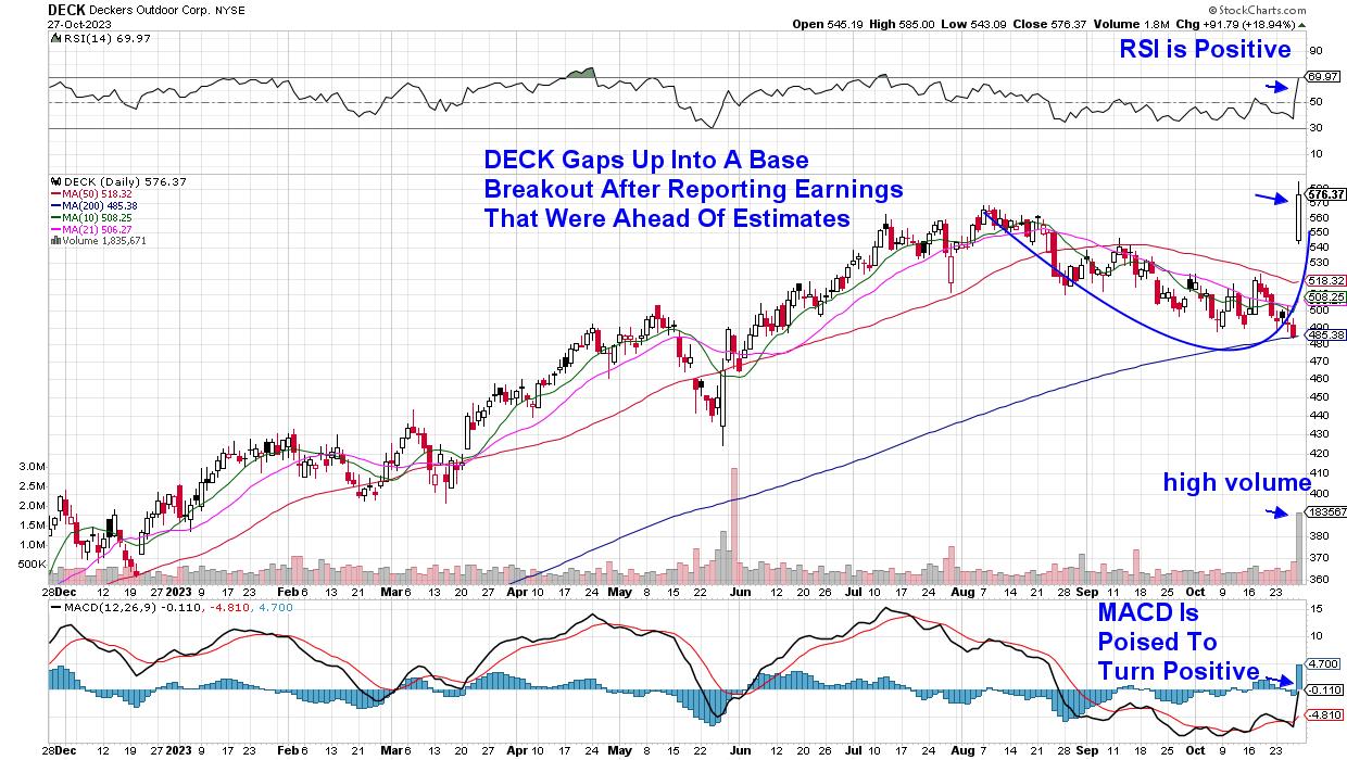
 Daily Chart of Deckers Brand (DECK) Daily Chart of Deckers Brand (DECK)
Above is Deckers Brands (DECK), maker of popular footwear products. The company just reported record earnings led by their running shoe Hoka, which saw sales grow by 27% in their most recent quarter. Revenue rose even more in their UGG boot division, which gained 28% over the same quarter last year. In addition, management guided growth prospects higher going forward.
In response, investors bid DECK up 19% in a move that pushed the stock out of a base on heavy volume. With the RSI in positive territory and the MACD poised to turn positive, this price action puts the stock on a path to trade higher -- particularly after the markets turn positive.
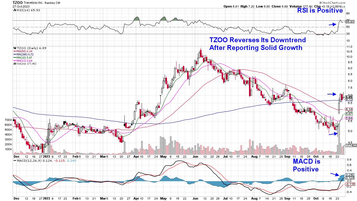
 Daily Chart of Travelzoo (TZOO) Daily Chart of Travelzoo (TZOO)
Travelzoo was another big winner this week after the company reported a 30% year-over-year increase in revenue, with most of the increase coming from their European business segment. In addition, the company saw an increase in members who are presented with travel experiences at a reduced price.
TZOO entered a new uptrend after Wednesday's continuation rally pushed the stock above its 200-day moving average on heavy volume. The RSI and MACD were pushed into positive territory as well. The stock has a history of posting significant gains after strong earnings, such as late April of this year.
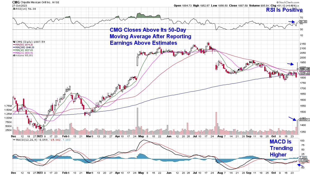
 Daily Chart of Chipotle (CMG) Daily Chart of Chipotle (CMG)
Restaurant company Chipotle (CMG) reported earnings today that were 22% higher than last year, despite raising prices amid increased costs for the company. The results came in above estimates, which pushed the stock into an uptrend after a close above its 50-day moving average. While the stock fizzled into the close due to management's conservative guidance for growth into next quarter, CMG now has a positive RSI, with the MACD trending upward. A sustained move above this key moving average would bolster the possibility of a move higher; however, we'd wait for a new uptrend in the broader markets before initiating a position.
As cited earlier, the broader markets are in a confirmed downtrend, with both the S&P 500 and Nasdaq below their key 200-day moving average following heavy volume selling, which points to distribution. The weekly charts of these Indexes are troubling as well, which I'll review in my Sunday MEM Edge Report while highlighting what needs to take place before a new uptrend can emerge. To be kept on top of the market's condition as well as be alerted to additional stocks that are watchlist worthy, use this link here to trial my twice weekly report for a nominal fee.
Warmly,
Mary Ellen McGonagle, President, MEM Investment Research
|
| READ ONLINE → |
|
|
|
| RRG Charts |
| Bonds Now Beating Stocks While NVDA Goes into Tailspin |
| by Julius de Kempenaer |

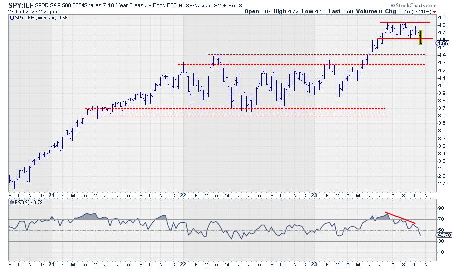
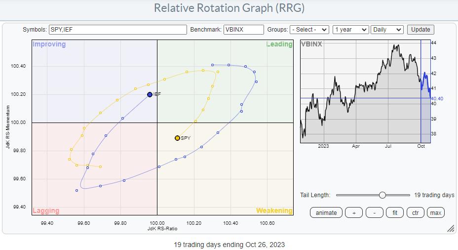
SPY:IEF completes top formation
One of the metrics I keep a close eye on is the ratio between stocks and bonds. Most of the time, I use SPY:IEF. (SPY, obviously, is the ETF that tracks the S&P 500 stock index, while IEF is the ETF that tracks the prices of US Government bonds with a maturity between 7-10 years.) In Sector Spotlight, I address that ratio on a regular basis when we talk about rotations in asset classes. When the ratio moves up, stocks are outperforming bonds, and vice versa. When the ratio moves down, bonds are outperforming stocks.
Looking at the chart above, the uptrend starting in March took the ratio from below 4 to the area between 4.8 and 4.9. This level was reached for the first time in July, after which SPY:IEF started to trade in a sideways range, between 4.85 at the top and 4.6 at the lower end.
Last week, the market took out the lower boundary of that range, completing a top formation. This means that the powers of supply and demand have now shifted in favor of Bonds. Just like the analysis of a regular price chart, we can apply essential technical analysis tools to these ratio charts.
As a first potential target, the area between 4.3 and 4.4 shows up. The level of major peaks formed in 2022. The upside is now expected to be kept at the breakout level, i.e., 4.6. So, the upside potential is now much less than the downside risk.
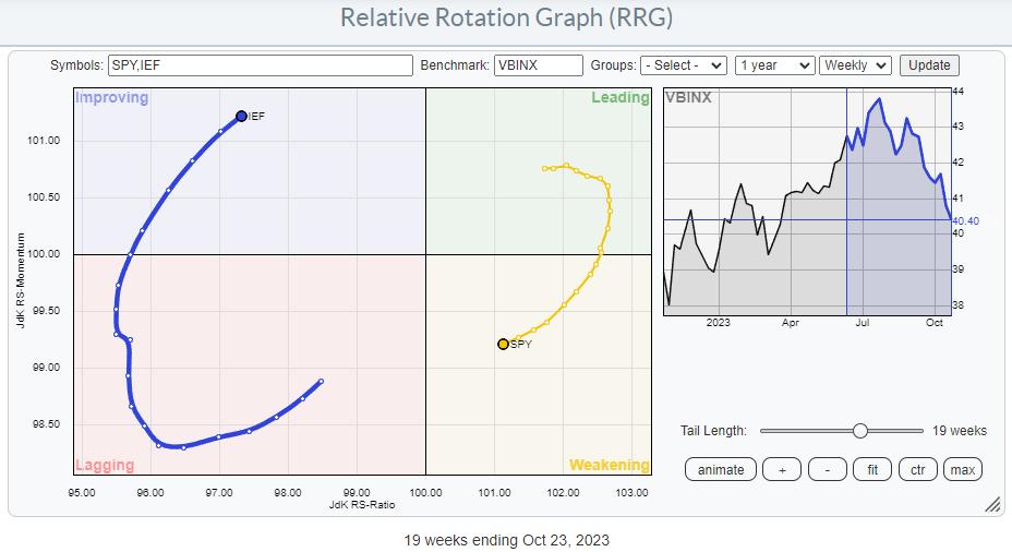
Weekly RRG

On the weekly RRG, SPY is rotating through the weakening quadrant and heading towards lagging, while IEF is inside the improving quadrant and heading towards leading.
Daily RRG

The interesting thing is that a similar rotation is showing on the daily version of the chart. This means that the family and the weekly rotations are now in sync and reinforcing each other.
As a result, the outlook for the next few weeks remains (firmly) in favor of bonds over stocks.
What's Happening in NYFANG+

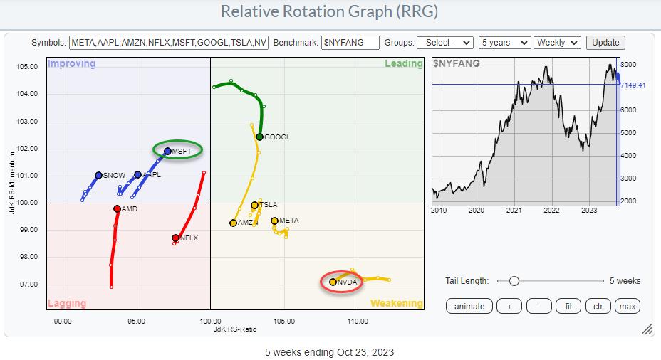
Some of the major stocks are grouped together in the NYFANG index. Plotting this group on a Relative Rotation Graph and using the $NYFANG index as the benchmark (thus making it a closed universe) shows some interesting rotations.
Just once more to make sure; this is on a relative basis, and stocks showing strong or positive rotation and are inside or heading toward the leading quadrant do not necessarily also show uptrends in price.
The two tails that have my attention on this graph are MSFT and NVDA. NVDA has rotated into weakening from a long stint through leading. At the same time, MSFT has pretty much traced out an opposite rotation. This can be seen very well on the Relative Rotation Graph, in combination with the other stocks in the universe. But the best way to see the interaction between these two stocks is in a direct confrontation.
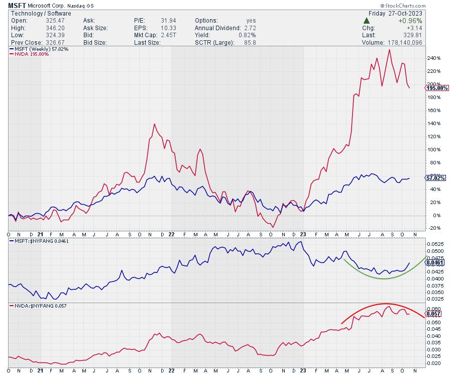
A Direct Confrontation Between MSFT and NVDA

The chart above shows the PERFORMANCE of MSFT (blue) and NVDA (red) in the main panel. The panels below are the RS lines vs. NYFANG index for both stocks.
This is an excellent example of how two stocks can go up in price but have completely different relative strength profiles. At the beginning of this year, both stocks were at similar levels. But the NVDA took off, reaching triple-digit returns, while MSFT massively lagged, reaching "only" a 60% return. This difference is translated in an RS line for NVDA, which trended higher in a very regular rhythm. And MSFT moved lower in RS terms.
These trends are now changing. On the RRG, this shows up as tails rotating in opposite directions. On the RS charts above, you can see how NVDA is rolling over while MSFT is curling back up.
This is a strong indication of a change in the relationship, this time in favor of MSFT over NVDA.
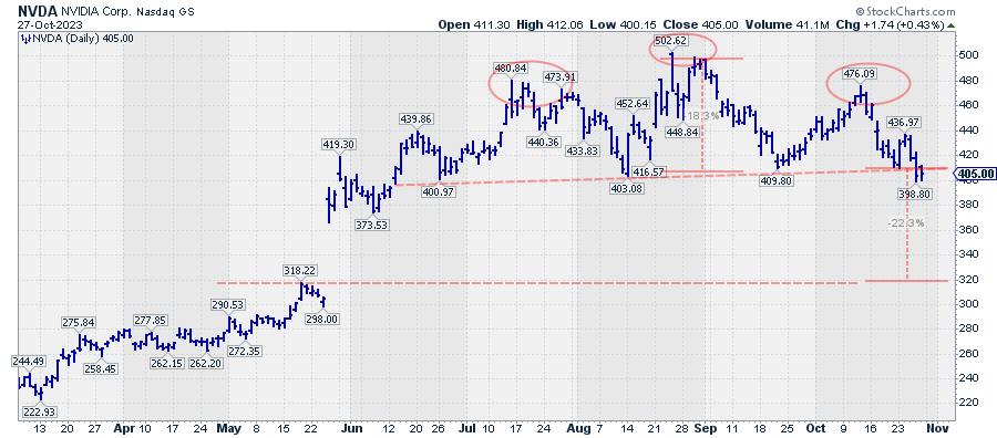
NVDA Completing H&S Top Formation

Last week, NVDA completed an H&S top formation by breaking below the neckline, which connects the three lows that define the bottom of the formation. Based on this formation, a price target for NVDA can be achieved by measuring the height of the formation from the neckline, roughly near 410, to the highest point near 500. This difference of $90 may be projected below the breakpoint near 410, resulting in a price target of around $320, which would mean NVDA closing the gap that occurred in May.
Such a move will definitely support the rotation in favor of MSFT over NVDA.
#StayAlert and have a great weekend. --Julius
|
| READ ONLINE → |
|
|
|
|
|
| ChartWatchers |
| Stock Market Indexes Shatter Critical Support Levels. Watch the March Lows. |
| by Jayanthi Gopalakrishnan |

When uncertainty prevails, investors become indecisive, which leads to erratic movements from one day to the next. This is what's happening in the market right now. One day, you think the worst is behind you; the next day, the market sings a different tune.
Q3 2023 GDP increased 4.9%, which sent equities lower. A strong labor market didn't ease investor sentiment either. But then, on Friday, the personal consumption expenditures price index (PCD) came in at 3.7%, indicating inflation slowed slightly in September. Investors were more optimistic, especially in the big tech space. Strong earnings from Amazon.com (AMZN) and Intel (INTC) helped reignite investor interest in the technology stocks for most of the trading day, but that fizzled towards the close.
Where Should Investors Turn?
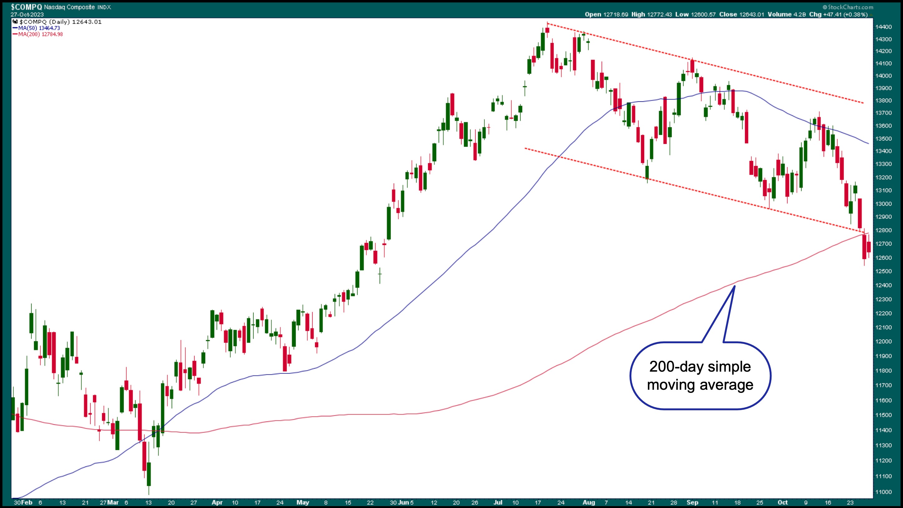
The Nasdaq Composite ($COMPQ) had a rough week, falling below its 200-day moving average. Although the Nasdaq Composite closed higher on Friday, it bounced off its 200-day SMA and closed lower (see chart below). It also broke below its downward-sloping channel (red dashed line).

CHART 1: NASDAQ COMPOSITE DAILY CHART. The Nasdaq fell below its 200-day moving average and below a downward-sloping channel. The next support level could be the March lows. Chart source: StockCharts.com. For educational purposes.When the stock market is jittery, it makes it even more difficult for individual investors and traders to make decisions. This increases the probability of making errors, which can be frustrating. So what's an investor to do? Well, it might be a good time to sit back and observe. The last thing you want to happen is to get caught up in the daily up-and-down movement. You want to see a definite trend, and right now, that trend is still pointing down.
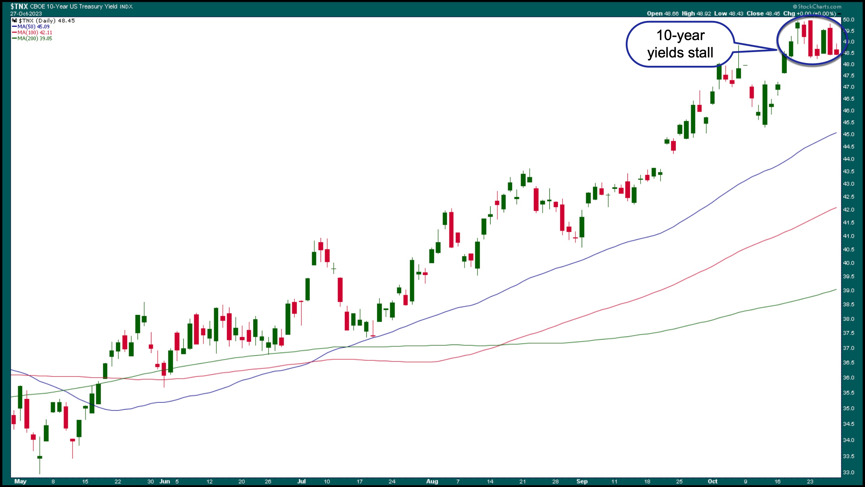
If a significant portion of your portfolio comprises tech stocks, you must monitor US Treasury yields. Rising Treasury yields weigh heavily on growth stocks. The daily chart of the 10-year US Treasury Yield Index ($TNX) below shows that yields have risen, although they're looking like they may be close to the top. If we see stability in the bond market, there's a chance of a rally in equity markets.

CHART 2: DAILY CHART OF 10-YEAR US TREASURY YIELD INDEX ($TNX). After rising to levels not seen since 2007, 10-year yields are taking a breather. Their direction rides a lot on whether the Fed is still hawkish. Chart source: StockCharts.com. For educational purposes.
Interest rate levels have influenced investor sentiment, especially regarding high-growth stocks. If rates start coming down, it'll be interesting to see how quickly the equity market will react. Remember, investors have sold off a lot of their big tech holdings. Will they jump back into them quickly when rates fall?
But what if yields remain high for longer than expected? Which investments should you be considering? This week, Bitcoin ($BTCUSD) rallied to the upside, rising to its highest level in 2023. The rally was news-driven, and Bitcoin broke from the trading range it has been in since August. But that doesn't necessarily mean Bitcoin should be considered a "safe-haven" investment. It's still a volatile instrument driven mostly by speculation.
What About Gold?
Gold is another speculative investment. Although the general thinking is that gold is a safe haven, there's no obvious correlation between equities and gold. It may be good to move to gold but don't plan to hold it for the long term.
Each day presents a different story; the best you can do is wait for things to turn with momentum. It's likely there won't be much decisive action until after the Fed's interest rate decision on Wednesday.
End-of-Week Wrap-Up

- $SPX down 0.48% at 4117.37, $INDU down 1.12% at 32417.59; $COMPQ up 0.38% at 12643.01
- $VIX up 2.85% at 21.27
- Best performing sector for the week: Utilities
- Worst performing sector for the week: Energy
- Top 5 Large Cap SCTR stocks: Vertiv Holdings, LLC (VRT); Super Micro Computer (SMCI); Applovin Corp. (APP); Splunk Inc. (SPLK); PDD Holdings Inc. (PDD)
On the Radar Next Week
- Earnings from Caterpillar, Inc. (CAT), Pfizer, Inc. (PFE), Advanced Micro Devices (AMD), Apple, Inc. (AAPL), DoorDash (DASH), Marathon Oil (MRO) and many more.
- August home prices
- October PMI
- September JOLTs Job Openings
- Fed Interest Rate Decision
- October Employment Data
Disclaimer: This blog is for educational purposes only and should not be construed as financial advice. The ideas and strategies should never be used without first assessing your own personal and financial situation, or without consulting a financial professional.
|
| READ ONLINE → |
|
|
|
| ChartWatchers |
| Many Reasons to Love and Hate AMZN Stock |
| by Karl Montevirgen |

If you're feeling a little conflicted on Amazon's (AMZN) near-term prospects and whether to take a bullish or bearish stance, it's probably because of the many reasons—technical and fundamental—to consider either perspective.
Technical Reasons to Hate AMZN Stock: The Bearish Case
Despite AMZN's strong YTD performance, the big picture shows it underperforming the S&P 500 ($SPX) by -29% and the Consumer Discretionary sector (using XLY as a proxy) by -18% (see weekly chart of AMZN below).

CHART 1: WEEKLY CHART OF AMZN. The current price action may be nothing more than a bear rally.Chart source: StockCharts.com. For educational purposes.
The upside trend break (see blue trendline) marks the stock's reversal after bottoming at the beginning of 2023. But is this a mere correction? Once the rally hit the 61.8% Fibonacci retracement level, drawn from the 2021 peak to 2023 trough, the bears were jumping (and bulls lost heart).
What fundamentals support this bearish technical outlook? There are many...
Fundamental Reasons to Hate AMZN Stock: The Bearish Case
AMZN may have a diverse startup portfolio, but startups are going extinct, at least for now. With over 543 startup shutdowns recorded this year, the drop in cloud service demand will sting.
Also, AMZN's stock price is down 25% from where it was in early January 2021. Macroeconomic challenges, such as high oil prices and interest rates, could hurt the company's performance.
Lastly, Amazon is in an antitrust battle with the FTC over price manipulation and merchant lock-in. This could hurt the company and lead investors to sell.
Technical Reasons to Love AMZN Stock: The Bullish Case

CHART 2: DAILY CHART OF AMZN. The year-to-date picture shows a different situation, with price declining into potential critical support. Plus, buying pressure, as shown by the Chaikin Money Flow (CMF), appears to reveal a sharp surge.Chart source: StockCharts.com. For educational purposes.
Here's a question: Are the bulls failing to see the big picture (long-term), or are they right in taking a more "current view of AMZN's performance?
AMZN may be declining against the S&P 500, but it's still outperforming it in the near term by 21%. As for XLY, AMZN's year-to-date outperformance is quite pronounced and rising, up 22%. AMZN's price action shows a sharp decline that began in September; however, by drawing a Fib retracement from the March bottom to the September top, representing the stock's YTD surge, we can see that the stock's price touched the 50% Fib level, which happens to coincide with the 200-day simple moving average (SMA).
Adding to the technical bull case, look at the Chaikin Money Flow (CMF) in the lowest panel. The CMF shows a sharp divergence between AMZN's decline and the rise in buying pressure, indicating that more investors are buying than selling the stock (possibly). This bullish technical perspective is not without fundamental merit either.
Fundamental Reasons to Love AMZN Stock: The Bullish Case
Amazon has a diverse portfolio of startups. AWS has supported around 250,000 startups, including 83% of the world's unicorns. Startups are slowing right now, but there's the generative AI boom, which can increase demand for AI cloud services.
AMZN stock has had a strong year-to-date performance, up 50%, with the company's revenue having grown across all of its business segments. Its diverse revenue streams also show signs of strength.
Overall, its dominance in e-commerce and cloud services, plus its strengthening digital ad revenue, all provide a strong case for its growth prospects.
Earnings Will Be a Critical Driver for AMZN's Stock Directionality
Today's earnings drop has everyone on edge. If today's numbers show a hint of weakness or Amazon's grip slipping, the bears will be ready to pounce, potentially sending the stock deeper into negative territory.
A couple of things to consider:
- Bulls might find AMZN in "buy" territory down to $110, its 61.8% Fib level. Granted, there's a reason to bet on a reversal in momentum and price (versus taking a riskier pre-emptive approach). A stop loss at around $107 would be reasonable, as it would invalidate the near-term technical bull case.
- Bears are likely in position already, with many shorting the stock since September. Hopefully, they placed a stop loss right above $135, the most recent swing high point, to prevent from getting "squeezed" just in case AMZN reveals a blockbuster beat.
The Bottom Line
The conflicting forces of boom and doom are clashing fiercely as AMZN's earnings report looms. The outcome dictates the stock's immediate trajectory—surge or plunge. With a long-term technical landscape that paints a grim picture of potential bear rallies and a 25% nosedive since January 2021, the bears seem to be standing their ground. However, the bulls have a robust case, too, with a 50% spike in YTD performance, dominance in e-commerce, and a potential AI cloud services boom. Either way, today's earnings are poised to tip the scales, a financial showdown and make-or-break moment for AMZN's near-term fate.
Stay on top of stock market action. Sign up for our free weekly ChartWatchers newsletter.
Disclaimer: This blog is for educational purposes only and should not be construed as financial advice. The ideas and strategies should never be used without first assessing your own personal and financial situation, or without consulting a financial professional.
|
| READ ONLINE → |
|
|
|
| DecisionPoint |
| Is the Bear Back? |
| by Carl Swenlin |
The S&P 500 (SPY) has fallen about 10 percent from the July top, and the last two weeks has been pretty rough, so should we be looking for the Bear to take charge again?
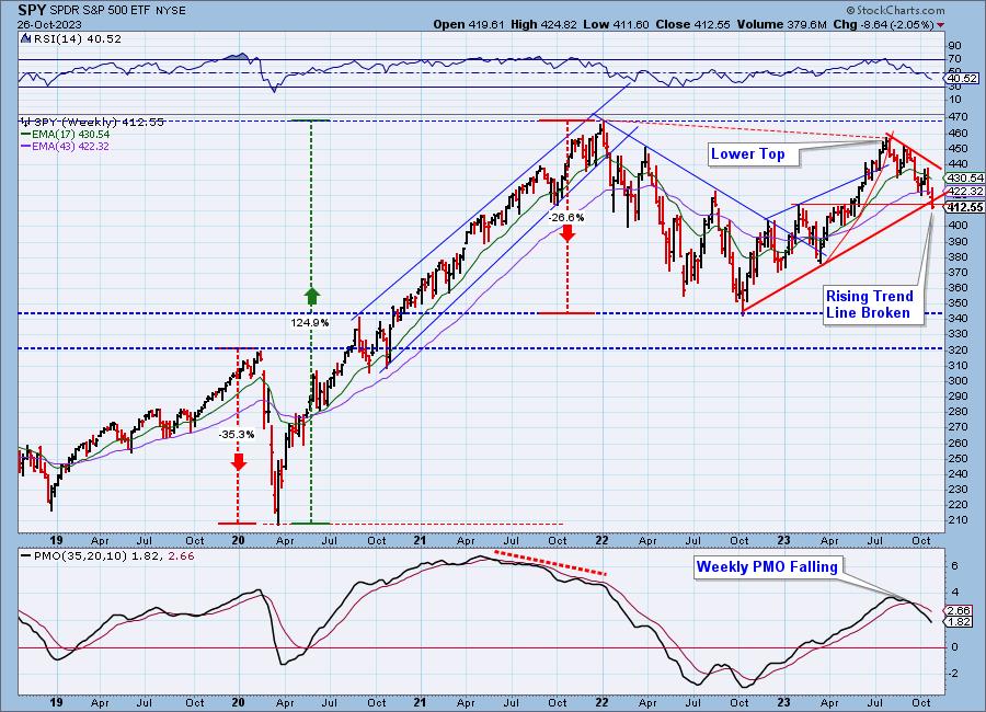
First, looking at a weekly chart, it is not clear that the Bear actually left town. In spite of a great rally off the October 2022 low, the market top in July never actually exceed the January 2022 all-time high, so the current decline could be the next down leg of an ongoing bear market.

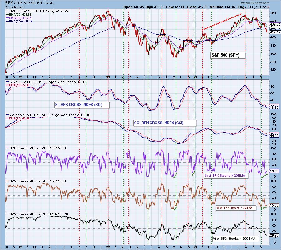
This next chart shows some of the best breadth indicators available. The Silver Cross Index (SCI) is an intermediate-term indicator that shows the percentage of stocks in the S&P 500 Index that have their 20-day EMA above their 50-day EMA. Currently, that number is only 19%, meaning that 81% are in a negative configuration. The Golden Cross Index (GCI) is a long-term indicator that shows the percentage of stocks with their 50-day EMA above their 200-day EMA (commonly called a Golden Cross). That number is 44%, which, on this indicator, signifies a bear market.

A minor, but maybe important, feature at the lower right corner of this chart may be the two rising dotted green lines drawn under the % SPX Stocks > 20EMA and % SPX Stocks > 50EMA, which represent a positive divergence against price. These may be a hint that a bounce is in the cards.
Conclusion: Is the Bear back in town? Considering the lower long-term price top, it is not clear that he actually left. Considering the fact that only 19% of S&P 500 stocks are positively configured (20-EMA above the 50-EMA) in the intermediate-term, the internals do not encourage positive thinking. The best thing we can say at this point is that the SCI is very oversold, and that offers hope of an upside reaction.
Learn more about DecisionPoint.com:
Watch the latest episode of DecisionPoint on StockCharts TV's YouTube channel here!

Try us out for two weeks with a trial subscription!
Use coupon code: DPTRIAL2 at checkout!
Technical Analysis is a windsock, not a crystal ball. --Carl Swenlin
(c) Copyright 2023 DecisionPoint.com
Disclaimer: This blog is for educational purposes only and should not be construed as financial advice. The ideas and strategies should never be used without first assessing your own personal and financial situation, or without consulting a financial professional. Any opinions expressed herein are solely those of the author, and do not in any way represent the views or opinions of any other person or entity.
DecisionPoint is not a registered investment advisor. Investment and trading decisions are solely your responsibility. DecisionPoint newsletters, blogs or website materials should NOT be interpreted as a recommendation or solicitation to buy or sell any security or to take any specific action.
Helpful DecisionPoint Links:
DecisionPoint Alert Chart List
DecisionPoint Golden Cross/Silver Cross Index Chart List
DecisionPoint Sector Chart List
DecisionPoint Chart Gallery
Trend Models
Price Momentum Oscillator (PMO)
On Balance Volume
Swenlin Trading Oscillators (STO-B and STO-V)
ITBM and ITVM
SCTR Ranking
Bear Market Rules
|
| READ ONLINE → |
|
|
|
| MORE ARTICLES → |
|
 Chart 1
 Chart 2
 Chart 3
 Chart 4
 Chart 5
 Chart 6

