TAKEAWAYS
- The Stock/Bond ratio is changing course
- SPY:IEF complets top formation
- NVDA completes large H&S formation unlocking 20% downside risk
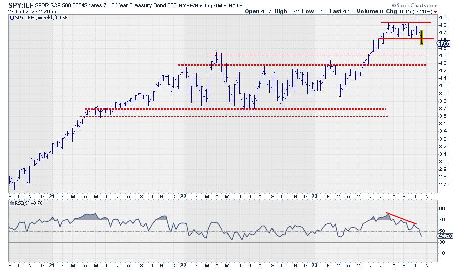
SPY:IEF completes top formation
One of the metrics I keep a close eye on is the ratio between stocks and bonds. Most of the time, I use SPY:IEF. (SPY, obviously, is the ETF that tracks the S&P 500 stock index, while IEF is the ETF that tracks the prices of US Government bonds with a maturity between 7-10 years.) In Sector Spotlight, I address that ratio on a regular basis when we talk about rotations in asset classes. When the ratio moves up, stocks are outperforming bonds, and vice versa. When the ratio moves down, bonds are outperforming stocks.
Looking at the chart above, the uptrend starting in March took the ratio from below 4 to the area between 4.8 and 4.9. This level was reached for the first time in July, after which SPY:IEF started to trade in a sideways range, between 4.85 at the top and 4.6 at the lower end.
Last week, the market took out the lower boundary of that range, completing a top formation. This means that the powers of supply and demand have now shifted in favor of Bonds. Just like the analysis of a regular price chart, we can apply essential technical analysis tools to these ratio charts.
As a first potential target, the area between 4.3 and 4.4 shows up. The level of major peaks formed in 2022. The upside is now expected to be kept at the breakout level, i.e., 4.6. So, the upside potential is now much less than the downside risk.
Weekly RRG
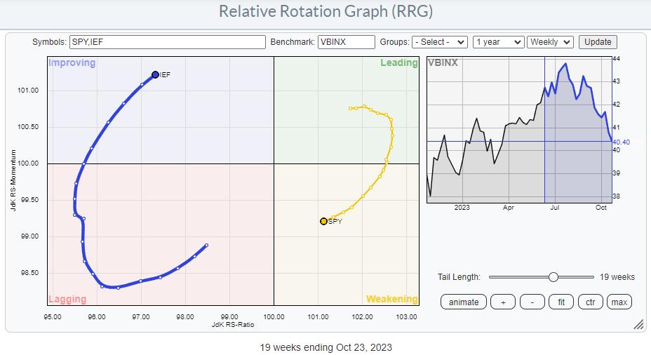
On the weekly RRG, SPY is rotating through the weakening quadrant and heading towards lagging, while IEF is inside the improving quadrant and heading towards leading.
Daily RRG
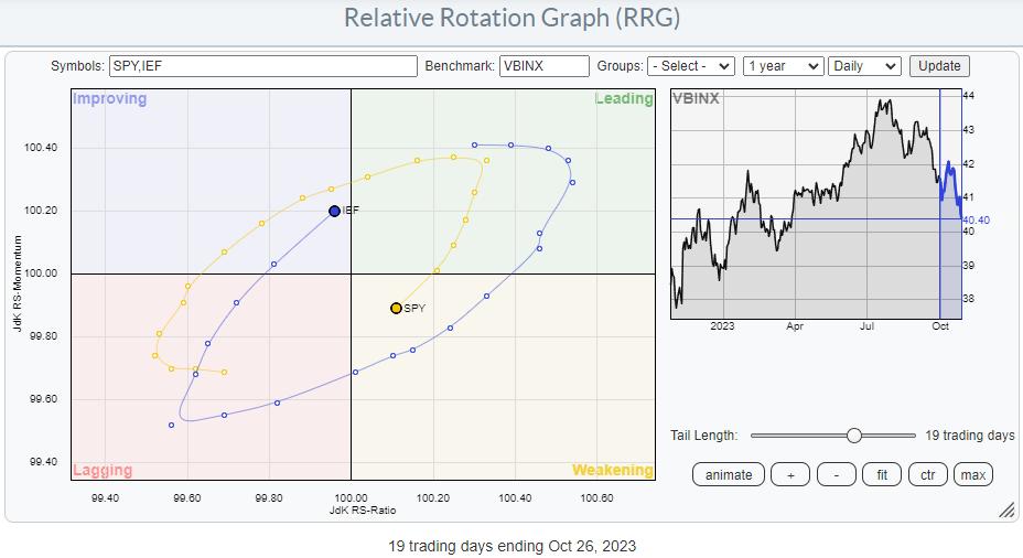
The interesting thing is that a similar rotation is showing on the daily version of the chart. This means that the family and the weekly rotations are now in sync and reinforcing each other.
As a result, the outlook for the next few weeks remains (firmly) in favor of bonds over stocks.
What's Happening in NYFANG+
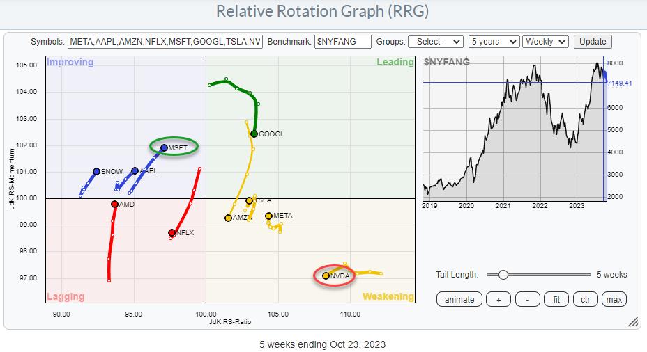
Some of the major stocks are grouped together in the NYFANG index. Plotting this group on a Relative Rotation Graph and using the $NYFANG index as the benchmark (thus making it a closed universe) shows some interesting rotations.
Just once more to make sure; this is on a relative basis, and stocks showing strong or positive rotation and are inside or heading toward the leading quadrant do not necessarily also show uptrends in price.
The two tails that have my attention on this graph are MSFT and NVDA. NVDA has rotated into weakening from a long stint through leading. At the same time, MSFT has pretty much traced out an opposite rotation. This can be seen very well on the Relative Rotation Graph, in combination with the other stocks in the universe. But the best way to see the interaction between these two stocks is in a direct confrontation.
A Direct Confrontation Between MSFT and NVDA
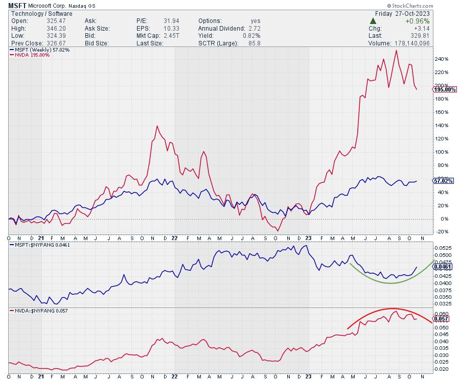
The chart above shows the PERFORMANCE of MSFT (blue) and NVDA (red) in the main panel. The panels below are the RS lines vs. NYFANG index for both stocks.
This is an excellent example of how two stocks can go up in price but have completely different relative strength profiles. At the beginning of this year, both stocks were at similar levels. But the NVDA took off, reaching triple-digit returns, while MSFT massively lagged, reaching "only" a 60% return. This difference is translated in an RS line for NVDA, which trended higher in a very regular rhythm. And MSFT moved lower in RS terms.
These trends are now changing. On the RRG, this shows up as tails rotating in opposite directions. On the RS charts above, you can see how NVDA is rolling over while MSFT is curling back up.
This is a strong indication of a change in the relationship, this time in favor of MSFT over NVDA.
NVDA Completing H&S Top Formation
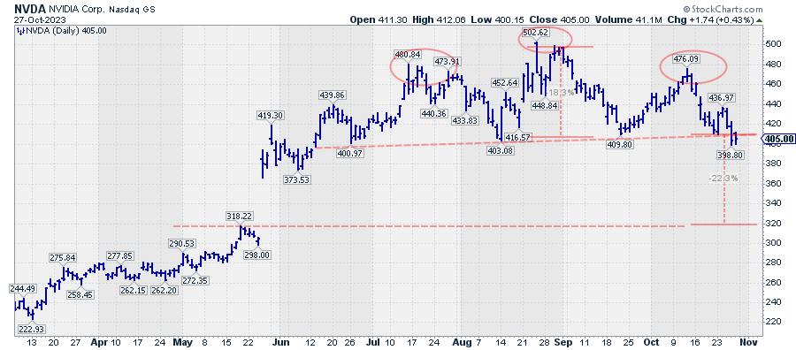
Last week, NVDA completed an H&S top formation by breaking below the neckline, which connects the three lows that define the bottom of the formation. Based on this formation, a price target for NVDA can be achieved by measuring the height of the formation from the neckline, roughly near 410, to the highest point near 500. This difference of $90 may be projected below the breakpoint near 410, resulting in a price target of around $320, which would mean NVDA closing the gap that occurred in May.
Such a move will definitely support the rotation in favor of MSFT over NVDA.
#StayAlert and have a great weekend. --Julius
Julius de Kempenaer
Senior Technical Analyst, StockCharts.com
Creator, Relative Rotation Graphs
Founder, RRG Research
Host of: Sector Spotlight
Please find my handles for social media channels under the Bio below.
Feedback, comments or questions are welcome at Juliusdk@stockcharts.com. I cannot promise to respond to each and every message, but I will certainly read them and, where reasonably possible, use the feedback and comments or answer questions.
To discuss RRG with me on S.C.A.N., tag me using the handle Julius_RRG.
RRG, Relative Rotation Graphs, JdK RS-Ratio, and JdK RS-Momentum are registered trademarks of RRG Research.


