| THIS WEEK'S ARTICLES |
| John Murphy's Market Message |
| MEMBERS ONLY |
| OVERBOUGHT SPX TESTS OLD HIGH |
| by John Murphy |
|
S&P 500 TESTS OLD HIGH... A lot of attention is being paid to the S&P 500 which is in the process of testing its record high. That can be seen in Chart 1. In addition, its 14-day RSI line is in a very overbought condition...
|
| READ ONLINE → |
|
|
|
| ChartWatchers |
| Investing in 2024: 3 Promising Opportunities To Watch |
| by Jayanthi Gopalakrishnan |

The last trading day of the year is behind us. It's time to relax, get ready to ring in the new year, reflect on stock market action, and set your investment goals for 2024.
2023 was a particularly difficult one for investors. In the early part of the year, investors feared a recession in light of high interest rates, inflation was a huge concern, and we went through a regional banking crisis. The way things were unfolding caused concern, especially with the Middle East conflict, but things changed in the last quarter, and the year ended on a positive note.
Interest Rates
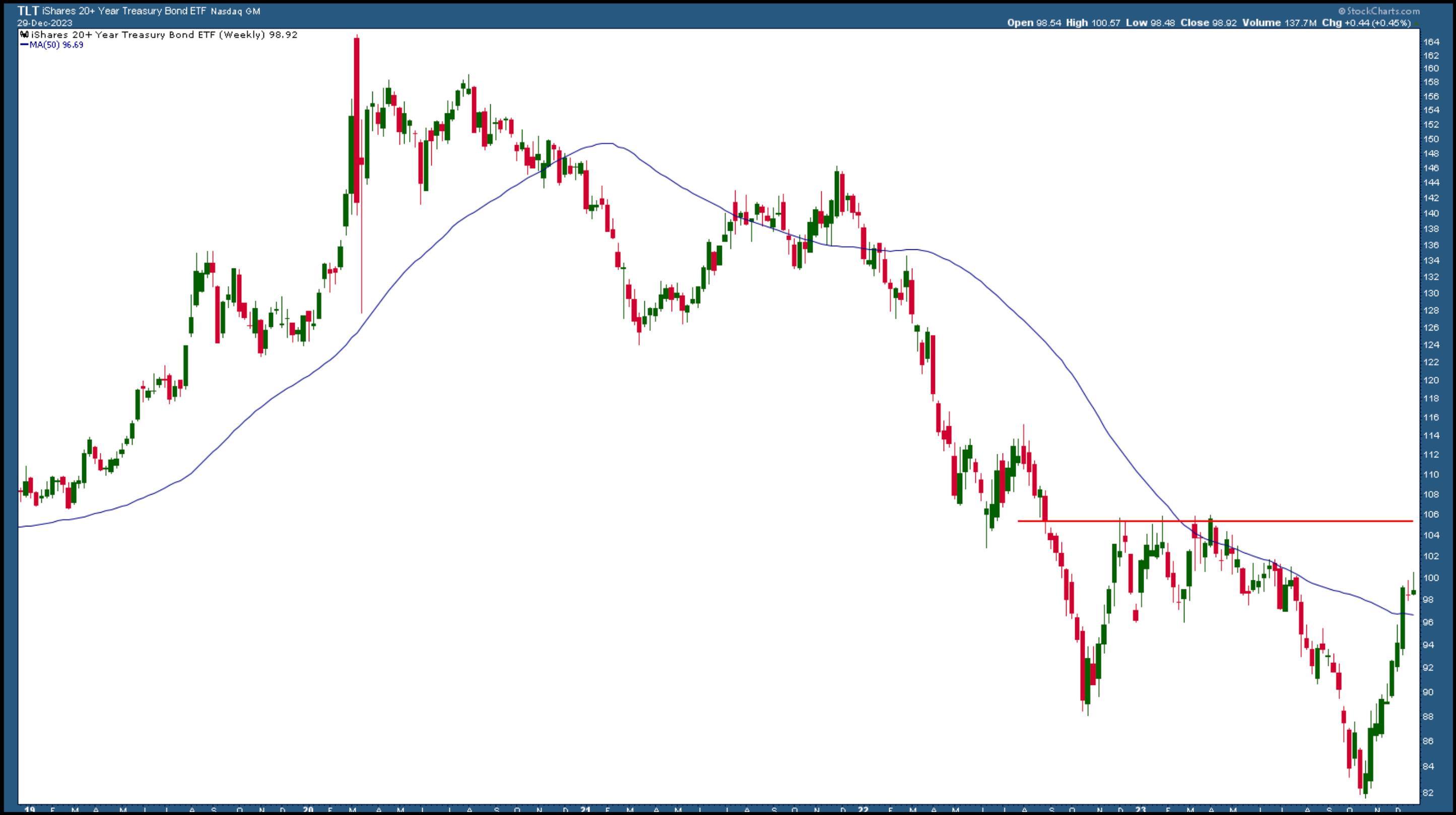
After reaching levels not seen since 2007, Treasury yields fell by around one percentage point. This helped the out-of-favor bond market, which finally showed signs of life. The weekly chart of the iShares 20+ Year Treasury Bond (TLT) below shows that bonds still have to move higher before confirming an uptrend. A break above its first resistance level at the 105.50 level, TLT's previous high, would be a more confirming signal. Yet, it's encouraging that the iShares 20+ Year Treasury Bond (TLT) is trading above its 50-week simple moving average (SMA).

CHART 1. WEEKLY CHART OF TLT. Bond prices benefited from declining Treasury yields. Even though TLT is trading above its 50-week simple moving average, a break above 105.50 would confirm an uptrend. Chart source: StockCharts.com. For educational purposes.
In the last Fed meeting, Chairman Jerome Powell indicated that rate cuts could occur before inflation hit the 2% target. That was enough to send investors flocking to equities, especially in the AI space. Investors are confident that a handful of mega-cap tech stocks would make great strides in AI technology. These stocks, known affectionately as the Magnificent Seven, were responsible for most stock market gains.
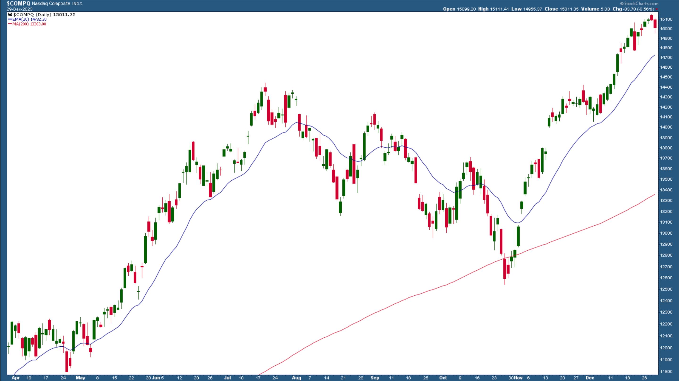
The stock market ended the year with a bang, with the Dow Jones Industrial Average ($INDU) rising 13.7% for the year, the S&P 500 ($SPX) up 24%, and the Nasdaq Composite up 43.6% (see daily chart below), the clear winner of the three broad indices.

CHART 2. DAILY CHART OF NASDAQ COMPOSITE. AI euphoria resulted in a stellar rally in the Nasdaq Composite, making it the biggest gainer of the three broad indices. Chart source: StockCharts.com. For educational purposes.
Given all the positive data, the stock market is positioned to continue moving higher in 2024. The Santa Claus Rally is on track, and which would mean a year-end boost. Earnings and revenue expectations are high, and the market has priced in interest rate cuts. Yet there are other segments of the stock market that investors may be able to gain from in 2024.
Trading the World
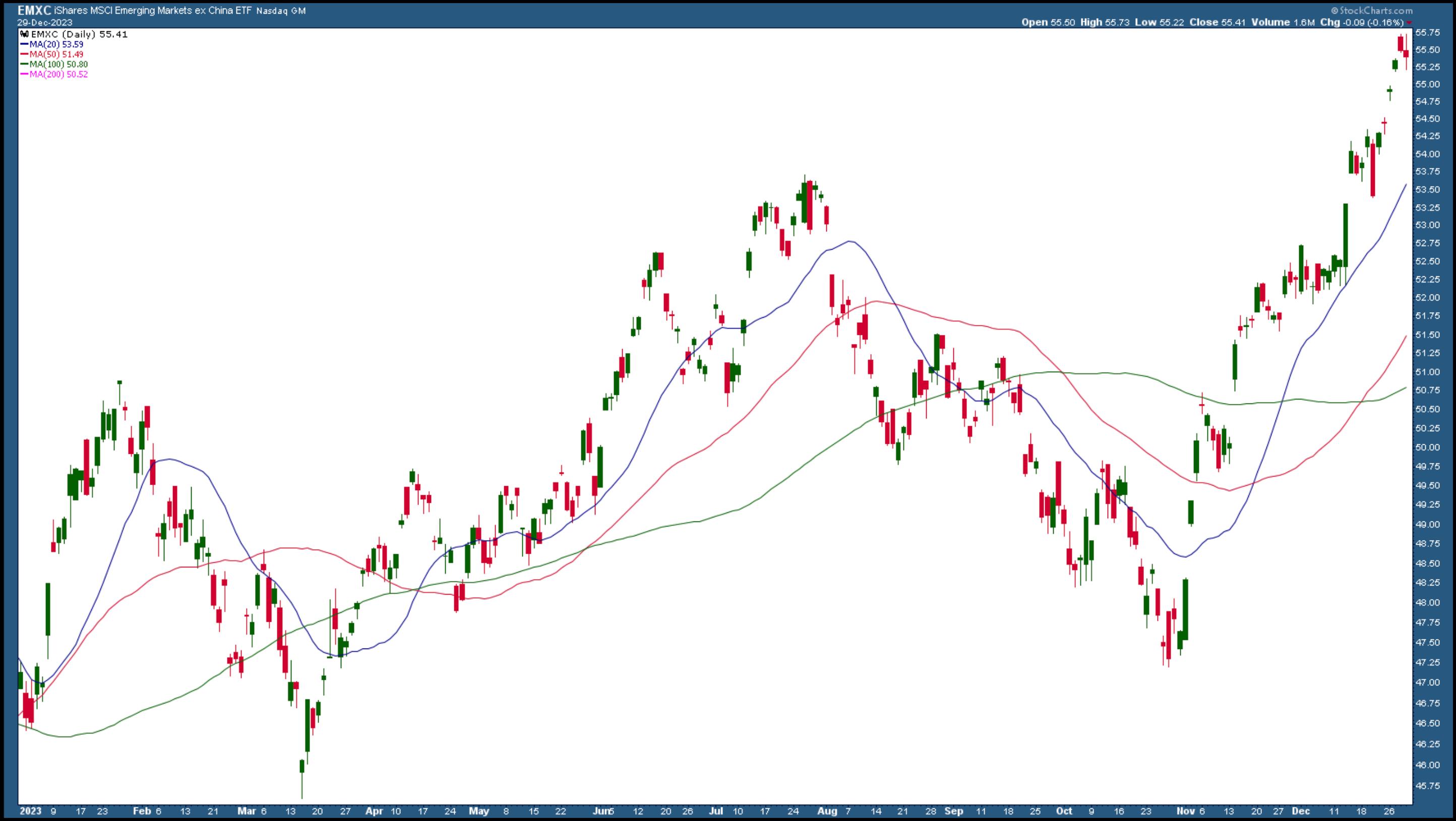
Next year is a record year of elections, and over half of the world's population will be heading to the polls. This serves as a reminder that investors could benefit from international stocks. So far, emerging markets outside of China have picked up, as seen in the chart of iShares MSCI Emerging Markets ex China ETF (EMXC) below. After trending lower for most of 2022 and then trending sideways for most of 2023, emerging markets are starting to break out of a trading range. Their price action is similar to US small-cap stocks, another area you should watch in 2024.

CHART 3. DAILY CHART OF ISHARES MSCI EMERGING MARKETS EX CHINA ETF. Emerging markets have struggled in 2023, but they are breaking out of their trading range. Chart source: StockCharts.com. For educational purposes.
Three countries that have seen a strong 2023 are India, Japan, and Mexico. These three markets could continue moving higher, but if some other emerging markets start showing signs of catching up to these three, you could find some good values here.
If you will be investing outside of the US, closely follow the US dollar. Although the US dollar has weakened, it's still relatively high. A weakening dollar is an indication of loosening financial conditions, but it also benefits developing countries. The bigger question would be if the US dollar holds on to or falls below its 200-day SMA.
Bitcoin
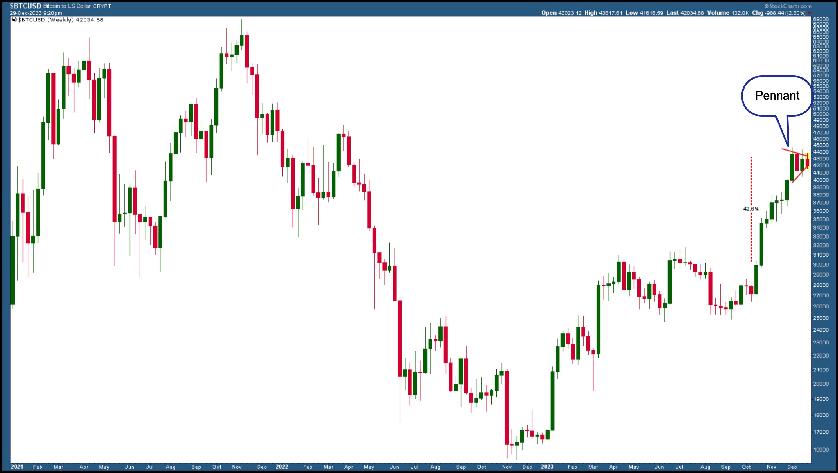
Bitcoin prices fell drastically in 2022. After reaching a high of 69,355 in October 2021, it fell to a low of 14,925 in November 2022. Higher interest rates, the Sam Bankman-Fried incident, the collapse of FTX, and regulatory crackdowns hurt the cryptocurrency's price. Since then, Bitcoin has soared, reaching a 52-week high of 45,260. Some of that move may have to do with the possible regulatory approval of spot Bitcoin ETFs, which would open the door for a larger investment pool.
Based on the weekly chart of Bitcoin to US dollar ($BTCUSD) below, the cryptocurrency can rise further. After breaking above $30,000, there was no turning back until it hit its 52-week high of $45,260. The cryptocurrency is now stalling, forming a pennant formation.

CHART 4. WEEKLY CHART OF BITCOIN TO US DOLLAR. A break above the pennant formation could take $BTCUSD to its all-time high of $69,355.
A breakout above the pennant formation could see Bitcoin move 42.6% higher, the length of the flagpole. This would mean a rise to $61,275, close to its all-time high. If it continues higher, there's a chance Bitcoin hit a new all-time high. Of course, things could go in the other direction; Bitcoin could break below its pennant formation and go down to the $30,000 level or lower.
The Bottom Line

AI growth, emerging markets, and Bitcoin are three areas to watch in 2024. As 2023 winds up and before you ring in the new year, it may be a good idea to set your investment goals for 2024. Create ChartLists of the different areas to watch, i.e., mega-cap tech, small caps, bonds, emerging markets, and Bitcoin, and be ready to sell assets that aren't performing well and add those that can sizzle your portfolio.
As small caps and emerging markets (besides China) break out of their trading range and interest rates fall, Financials and other small caps will probably do well in 2024, as will bonds and emerging markets. A lot depends on how worldwide elections play out. Geopolitical tensions could flare up, which could have an impact on supply chains and trade restrictions. This could introduce volatility in equities, which is why it's good to add an uncorrelated asset class such as Bitcoin or gold to your portfolio. It's always good to have a healthy balance of different asset groups.
If there's one word that encapsulates your investment strategy for 2024, it would be diversification. And last but not least, make it a point to go over last year's trading resolutions.
Disclaimer: This blog is for educational purposes only and should not be construed as financial advice. The ideas and strategies should never be used without first assessing your own personal and financial situation, or without consulting a financial professional.
|
| READ ONLINE → |
|
|
|
| Trading Places with Tom Bowley |
| These Stocks Are Looking Good As We Move Into 2024 |
| by Tom Bowley |
Happy New Year!
Throughout 2024, I'll be commenting on various sectors, industry groups, and individual stocks that flash breakouts and relative strength, but what about stocks that are just beginning to strengthen? There are many individual stocks that set 52-week and all-time highs as we ended 2023, but these are two that struggled in 2023 and now appear to be headed for a much stronger year:
3M Company (MMM):
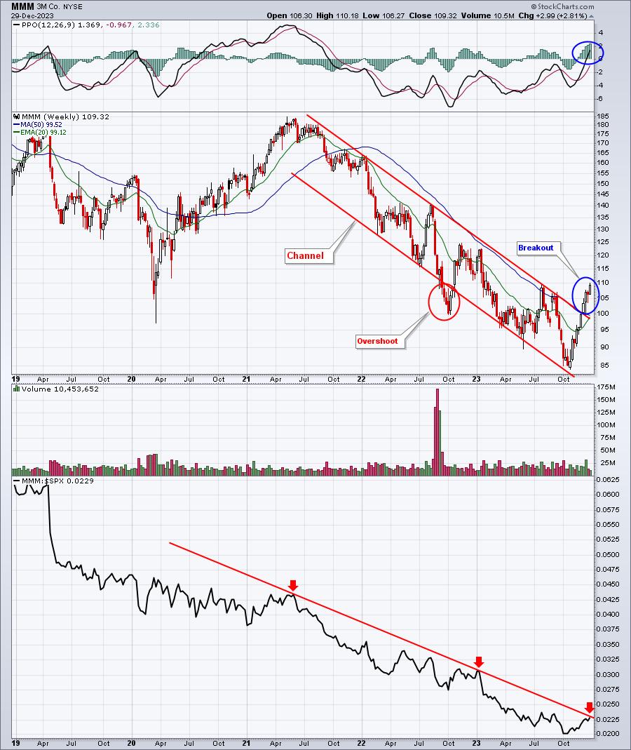
It certainly appears as though a lengthy downtrend in MMM has reversed:

Breaking the absolute price downtrend is our first clue that things could be much different in 2024 for MMM. Also, note that the weekly PPO has turned positive for the first time since Q3 2021. The next confirming signal would be a clear reversal to the upside in the relative performance of MMM vs. the benchmark S&P 500. In the bottom panel above, you can see that MMM is challenging that relative downtrend line as we open 2024.
Finally, MMM has a dividend yield of 5.47%, potentially setting up as a nice investment for those with more of an income mentality, as opposed to capital appreciation. Perhaps MMM will provide nice capital appreciation in 2024 as a kicker.
Citigroup, Inc. (C):
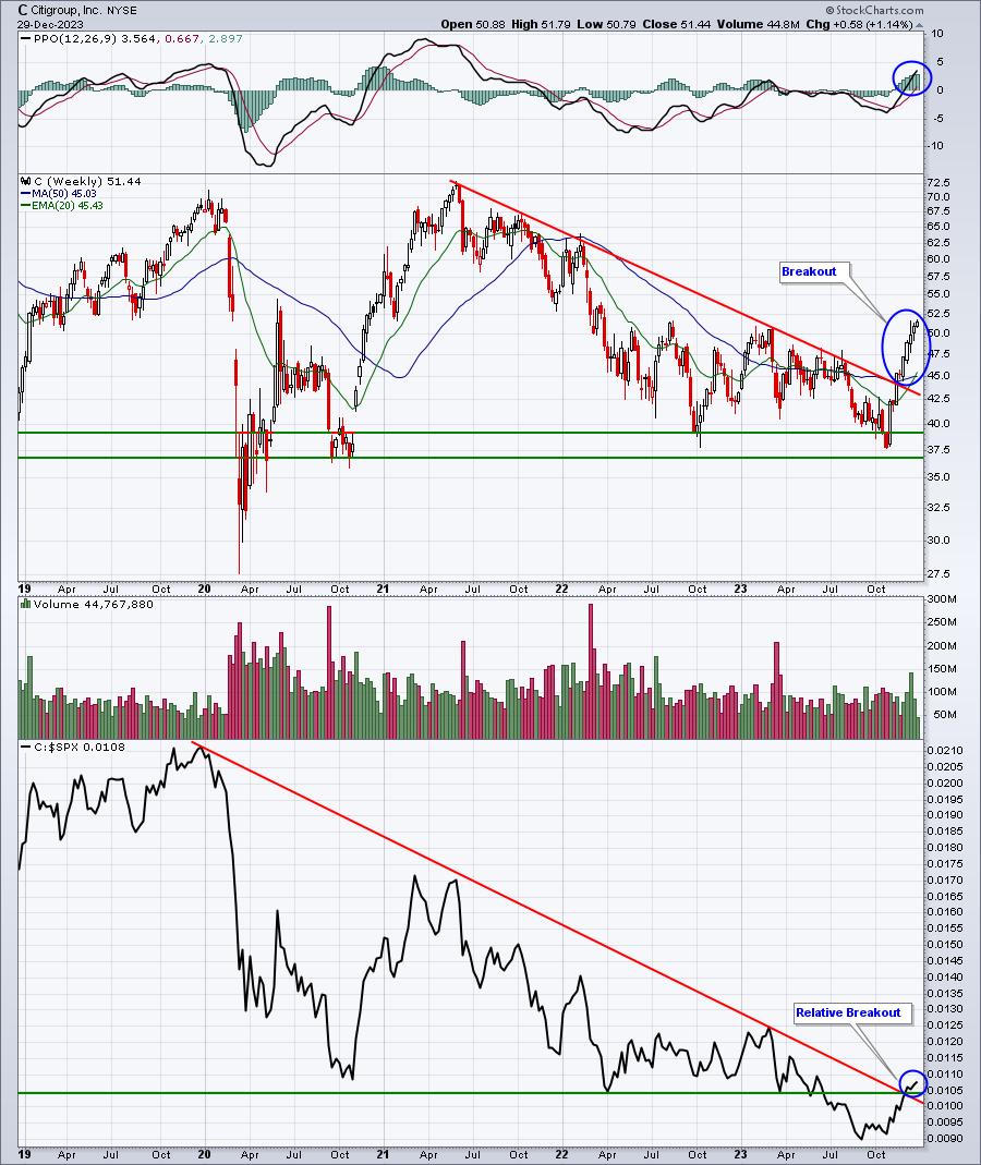
C broke a similar downtrend during Q4 2023, after trending lower with most banks. Inverted yield curves historically impact banks the strongest as they squeeze banks' net interest margins, which is a key driver in bank earnings. The stock market looks ahead, however, and I believe the expectation of multiple rate cuts in the fed funds rate is helping to drive current outperformance of banks. It's quite likely to continue in 2024. On the C chart, you can see the reversal in its downtrend rather clearly:

In addition to the more favorable price chart, C also boasts a strong 4.04% dividend yield, providing another solid income option for that style of investor. Any additional capital appreciation would be icing on the cake.
On Monday, I will provide a technology company that appears poised for a very strong 2024. There will likely be a couple triggers to watch for to confirm a strong year ahead, but the recent absolute and relative price strength, along with an excellent AD line is providing early bullish signals. If you'd like to see this chart, I'll send it to your email address Monday morning. Register HERE for our FREE EB Digest newsletter.
Also, next Saturday, January 6th is our annual MarketVision virtual conference. Grayson Roze, StockCharts.com's Director of Operations, will join me for "MarketVision 2024: Beyond The Fed", where I'll provide my 2024 stock market forecast and S&P 500 target. It was one year ago that I accurately forecast that the S&P 500 would reach 4700 by the end of 2023. There weren't many bulls to be found a year ago, but as it turned out, the bullish side was the right side as the S&P 500 gained 24% to finish the year at 4769.83. I thought we'd see roughly 23%. 1% off, not bad. For more information and to register for this year's event, CLICK HERE.
Happy New Year and happy trading!
Tom
|
| READ ONLINE → |
|
|
|
| RRG Charts |
| Which Sectors Benefit Most From the Large- to Mid- & Small-Cap Rotation? |
| by Julius de Kempenaer |

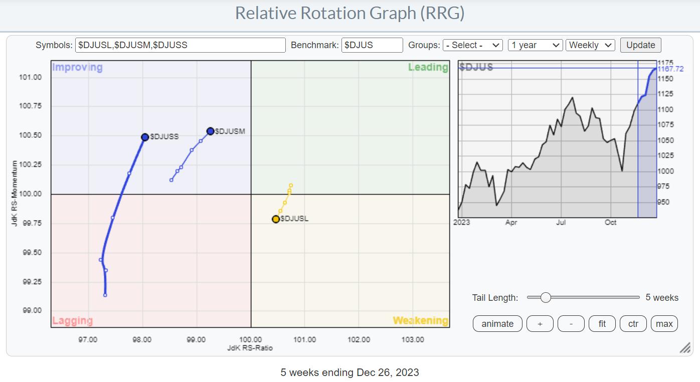
I have used this Relative Rotation Graph regularly in the past few weeks to indicate the ongoing rotation out of large-cap stocks into the mid-and small-cap segments.
This is happening while the market as a whole, in this case, the Dow Jones US index ($DJUS), continued to move higher.
What this means is that investors are pulling money out of large-cap stocks and re-distributing it to the mid- and small-cap segments. While also adding fresh money into the market (otherwise, we would not be going higher).
In this last written RRG article for this year, I'd like to review a Relative Rotation Graph that I introduced in Sector Spotlight a few weeks ago.
Sector Spotlight 11/7/23
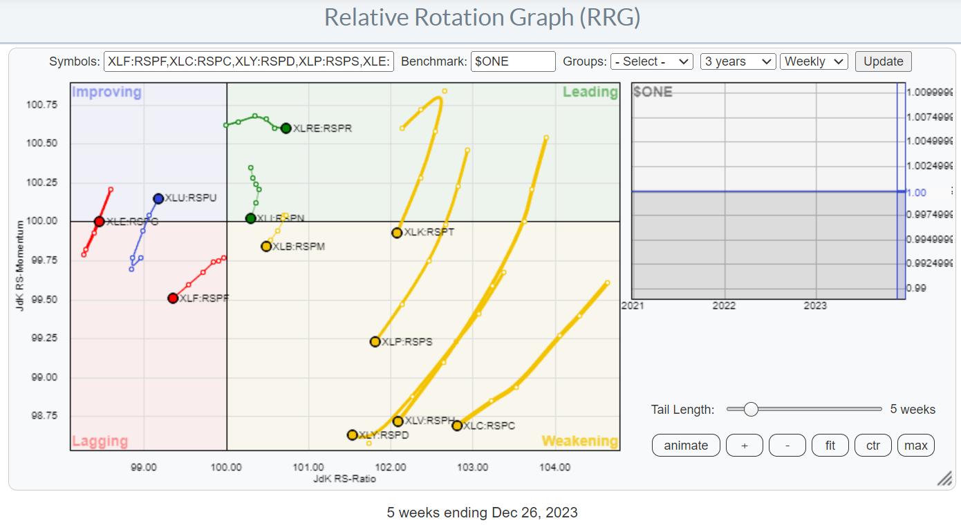
This particular RRG uses ratio symbols to visualize the difference in rotation between cap-weighted and equal-weighted sectors.

You may need a few seconds to adjust and understand what we are looking at here.
The 11 tails each represent the comparison between the cap-weighted sector divided by the equal-weight sector. So for technology, that is XLK:RSPT.
When that ratio moves higher, cw is outperforming ew and vice versa. So, we are interested in the absolute direction of that tail. Therefore, we use $ONE as the benchmark.
*When you are a StockCharts.com subscriber, clicking on the image will take you to this RRG, which you can then save as a bookmark in your browser for later retrieval
Now, look at that RRG again.
What immediately stands out, at least to me and I hope to you as well, is the large group of tails inside the weakening quadrant and heading towards lagging. We can include XLI:RSPN in that group as well, as it is close to crossing into weakening and also traveling at a negative heading. XLF:RSPF is already well inside the lagging quadrant and heading deeper into it at a negative heading.
For all these sectors :
- Financials
- Industrials
- Materials
- Technology
- Consumer Staples
- Consumer Discretionary
- Health Care
- Communication Services
the conclusion is that the equal-weight versions should be preferred over their cap-weighted counterparts.
That leaves only three sectors where the cap-weighted version has a better outlook for the coming weeks. These are
- Real-Estate inside the leading quadrant
- Utilities inside the improving quadrant
- Energy moving back from lagging to improving
It is a clear rotation away from cap-weighted, i.e., large-cap names, to the second and maybe third-tier market capitalizations at the start of the new year.
I am going to leave you to think about this observation. I wish you a very happy New Year, and I am looking forward to seeing you back in 2024 with more written RRG blog articles and Sector Spotlight videos.
Thank you for 2023, --Julius.
|
| READ ONLINE → |
|
|
|
| Don't Ignore This Chart! |
| Is FedEx's Long-Term Uptrend in Jeopardy? Here's What to Watch. |
| by Karl Montevirgen |

Santa Claus might have had a lot of presents to deliver this holiday season but whatever burst of activity happened leading up to the last few weeks, it wasn't enough to help FedEx (FDX) meet Wall Street's expectations. Suppressed demand resulting in a huge earnings miss and muted full-year sales outlook all contributed to its dramatic 12% drop last week.
Suppressed demand may have weakened FedEx's performance, but on a macroeconomic scale, it's an extremely difficult thing to try to predict. But from a technical analysis perspective, you can at least see where the inflection points might be, even if the fundamental picture remains too foggy to look ahead.

CHART 1. WEEKLY CHART OF FEDEX (FDX). Note FedEx's muted performance against the broader market and the Industrial sector. Chart source: StockCharts.com. For educational purposes.
FDX fell sharply last week, just 6% shy of its all-time high of $304.36. Having entered overbought territory last summer, the latest drop brought FedEx's relative strength index (RSI) reading down to 50. Technically, it has some upside room to run, which is somewhat promising, considering that FedEx's longer-term uptrend is still intact. It would have to close below $223.62, its October swing low, before its uptrend may be invalid.
Plus, looking at FedEx as a bellwether for global economic trade, its price action relative to the S&P 500 ($SPX) and the Industrial Sector (XLI) demonstrates muted yet recovering performance. Looking at the charts, you can see the effects of suppressed demand followed by a modest recovery.
On a more near-term scale, what does its price action indicate?

CHART 2. DAILY CHART OF FDX STOCK. There are many key levels surrounding FedEx's price action based on the stochastic oscillator and volume-by-price bars. It provides a context to anticipate the stock's longer-term trajectory. Chart source: StockCharts.com. For educational purposes.
The stock price is hovering between $250 and $255. Last week, its downward gap found support right above its 200-day SMA. The stochastic oscillator, now well below the 20 line, is deep in oversold territory.
If FedEx gathers enough strength to rally, note the blue dotted line above $260. You're not looking at the series of highs from July to September but at the blue line which, marks the higher part of the volume by price bar and sits near the middle of the price gap which, in many cases, tends to get filled. The volume by price bar shows the tremendous selling that took place at this price, making it a strong resistance area to watch.
Conversely, the same can be said of the blue bar below the price. This level coincides with the November low, the highs in March through May (resistance turned support?), and another notable volume by price level, all indicating a potential support range. If price breaks below the 200-day simple moving average (SMA), the $225 range will likely provide ample support.
The Bottom Line
We may not be able to predict how the macroeconomic winds will blow in the next quarter, at least with regard to global deliveries. But the market's early guesses can be detected and possibly anticipated by watching these key levels. In other words, keep an eye on price within this general context. One effective way would be to set price alerts at these key levels.
How To Set a Technical Price Alert

Setting a technical alert at these support and resistance levels would be helpful as you weigh your potential entry points against any market developments that may influence your decision.
To access the Technical Alert Workbench, follow these steps:
- Log in to your account.
- At the top of any page, click on "Your Dashboard".
- From Your Dashboard, click the Alerts button or the "New" button in the Your Alerts panel.
- In the Alerts workbench, choose which type of alert you want to create from the "Alert Type" buttons at the top left. To create a price alert, select "Price Alert" as the alert type.
- Add COST in the symbol box and set your price trigger.
- Choose how you wish to be notified and click the Save Alert button.
Disclaimer: This blog is for educational purposes only and should not be construed as financial advice. The ideas and strategies should never be used without first assessing your own personal and financial situation, or without consulting a financial professional.
|
| READ ONLINE → |
|
|
|
|
|
| DecisionPoint |
| Intermediate-Term Participation Levels Are Very Overbought, and They Are Weak Long-Term |
| by Carl Swenlin |
When we discuss participation, we are referring to the more specific and accurate assessment of breadth available with the Golden Cross and Silver Cross Indexes. The venerable and widely-known Golden Cross is when the 50-day moving average of a price index crosses up through the 200-day moving average, which signals a shift from long-term bearishness to long-term bullishness for the price index. (Note: We use exponential moving averages, a.k.a. EMAs.)
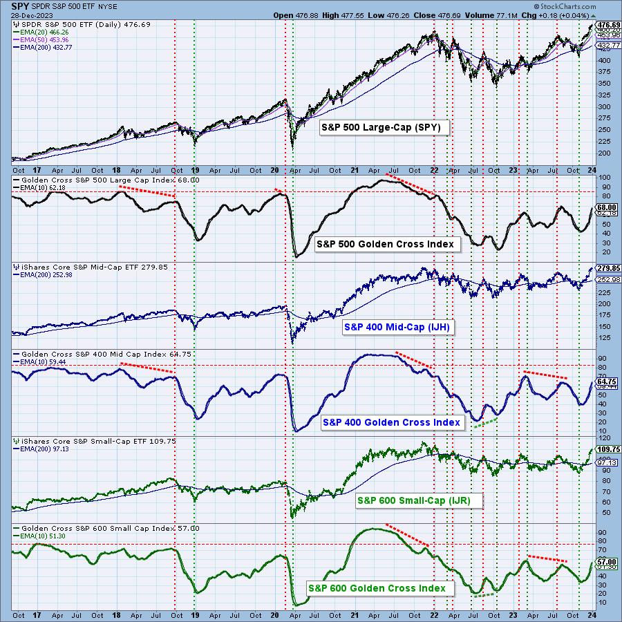
Taking this one step further, we have developed the Golden Cross Index, which is the percentage of stocks in a given index that have a Golden Cross. The chart below shows the ETFs for the S&P 500 Large-Cap, S&P 400 Mid-Cap, and S&P 600 Small-Cap Indexes with their respective Golden Cross Indexes (GCI). While the GCIs are all well above the bull market level of 50%, they are well below their bull market levels in 2021 of above 90%, even though their price indexes are at or near new all-time highs. While they could continue to improve, we must take it as a negative sign that long-term participation is so poor.

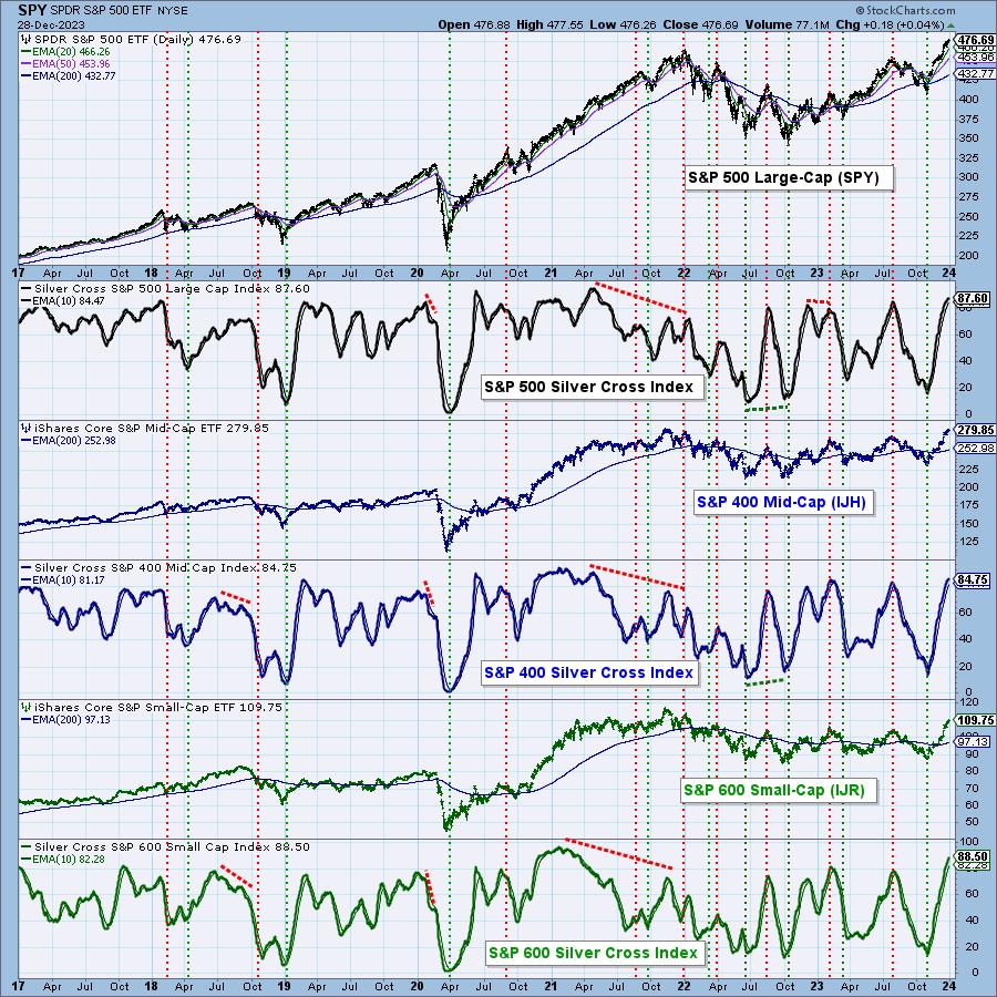
Being a long-term indicator, the slower, more deliberate pace of the GCI does not apply well to shorter time frames. To help with this, we developed the Silver Cross Index (SCI), which is the percentage of stocks in a given index whose 20-day moving average has crossed up through their 50-day moving average (which we named the Silver Cross). The SCI shows the level of participation in the intermediate-term.
Here is a chart of the three S&P Indexes with their respective SCIs. We note that all the SCIs are in the mid-to-high eighties, which is near the top of their range, and is the overbought level for the last three years. As a general rule, SCIs do not linger at these levels, and we should expect to see them turn down soon. We can observe that prices don't always follow the SCIs down, but it is risky to assume otherwise.

Conclusion: Participation in the long term is weak, and it is overbought in the intermediate term. In our opinion, the market is vulnerable to a correction.
Learn more about DecisionPoint.com:
Watch the latest episode of DecisionPoint on StockCharts TV's YouTube channel here!

Try us out for two weeks with a trial subscription!
Use coupon code: DPTRIAL2 at checkout!
Technical Analysis is a windsock, not a crystal ball. --Carl Swenlin
(c) Copyright 2023 DecisionPoint.com
Disclaimer: This blog is for educational purposes only and should not be construed as financial advice. The ideas and strategies should never be used without first assessing your own personal and financial situation, or without consulting a financial professional. Any opinions expressed herein are solely those of the author, and do not in any way represent the views or opinions of any other person or entity.
DecisionPoint is not a registered investment advisor. Investment and trading decisions are solely your responsibility. DecisionPoint newsletters, blogs or website materials should NOT be interpreted as a recommendation or solicitation to buy or sell any security or to take any specific action.
Helpful DecisionPoint Links:
DecisionPoint Alert Chart List
DecisionPoint Golden Cross/Silver Cross Index Chart List
DecisionPoint Sector Chart List
DecisionPoint Chart Gallery
Trend Models
Price Momentum Oscillator (PMO)
On Balance Volume
Swenlin Trading Oscillators (STO-B and STO-V)
ITBM and ITVM
SCTR Ranking
Bear Market Rules
|
| READ ONLINE → |
|
|
|
| Top Advisors Corner |
| IWM Shares Outstanding Rises With Small-Cap Interest |
| by Tom McClellan |

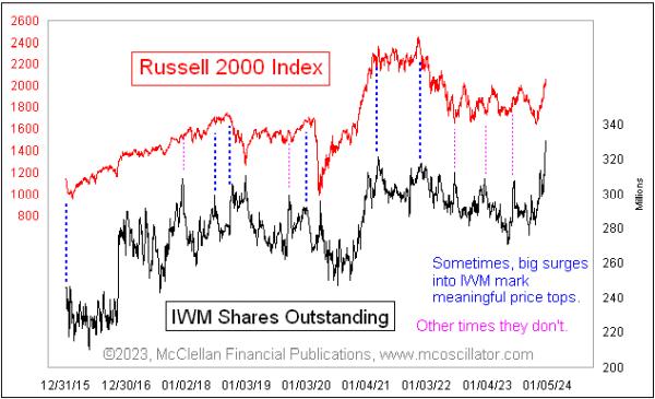
The Russell 2000 Index has been performing quite well lately, rising 26% since the Oct. 27 low. This has resulted in a lot of performance chasing, with traders piling into IWM, the iShares Russell 2000 Index ETF. Part of that performance chasing has meant a big surge in the number of shares outstanding of IWM.
An ETF is different from a closed end fund (CEF), in that an ETF can expand or contract the number of shares in existence as needed to meet demand and keep the net asset value (NAV) close to the share price. More shares outstanding means more traders want to own it.
A lot of the time, a big surge in IWM shares outstanding like this is a great marker of a price top. But there are quite a few instances when a big surge in shares outstanding occurs without a big price move to help explain it, which I have noted with the pink-dashed vertical lines. Those instances are harder to explain. There have even been spikes in shares outstanding occurring as prices fall, as with the one at the bottom of the 2020 COVID Crash.
It does appear that when a big surge in shares outstanding occurs simultaneous with a price surge, that more accurately marks a topping condition. But remember that a condition is not a signal, and there is no telling just from this observation of a spike in shares outstanding when this condition is going to decide to matter.
One question which comes up when noticing the rise in the number of IWM shares outstanding is whether this inflow into that ETF (and thus into the stocks it holds) is driving the up move in the Russell 2000 Index. But the total value of all of those shares outstanding in IWM is only about 1% of the market capitalization of all the Russell 2000 stocks, so it is not much of a factor.
Any indication of trader sentiment can offer us a useful message about sentiment swinging too far, if read correctly. In the case of IWM and its number of shares outstanding, there are traders who can be induced to buy when they see positive performance. But at some point, all who can be convinced to buy will have done so, and so there are no more marginal buyers left to fuel further gains. But how much of a move into IWM is exhaustive?
A sentiment survey such as AAII, NAAIM, or Investors Intelligence bulls vs. bears has bounded values. In other words, there can never be more than 100% bulls or 100% bears, and sentiment can only swing just so far. An indication like the number of shares outstanding in an ETF is not bounded in this way, and thus it can be difficult for us to declare when it has gone far enough to provide a compelling indication. And even if all the hot money has bought, so that there is none left, a trend can still continue until that hot money (and other money) gets a hint that the music is about to stop playing, and they start pulling money back out again.
|
| READ ONLINE → |
|
|
|
| Top Advisors Corner |
| Momentum Run Unfolds; Here's How to Prepare for When the Momentum Reverses |
| by Joe Duarte |
Editor's note: This week's issue of Joe Duarte's Smart Money Trading Strategy Weekly is being produced early due to the New Year's holiday. Happy New Year to everyone.
The stock market is in a classic momentum run where daily gains become commonplace and it feels as if the market can never fall again. This leads to rising levels of bullish sentiment and eventually leads to a correction.
I don't want to rain on anyone's parade, and would not be surprised if a strong end to the year carries well into January. But, as I look around, I see a market that needs a rest, which is why it's a good time to review how market declines develop and unfold. Suffice to say that, when the decline eventually comes, the action in the bond market will likely play an important role.
How Market Declines Unfold
The year 2023 was volatile, but ended on a high note. Unfortunately, the uncertainty surrounding global geopolitics – wars, elections, deglobalization, and population migrations – combined with over-the-top optimism, could make for a disappointing start to 2024, once the upward momentum thrust runs its course.
As I noted in my previous post, one of my favorite sentiment indicators, the CNN Greed-Fear index, recently hit a reading of of 80 (12/20/2023). Over the ensuing few days, it barely budged, moving slightly lower into the high 70s, but remaining well entrenched in the Extreme Greed side of its range. At the very least, these types of readings reflect an investor sentiment environment which will eventually limit the market's upside.
Other sentiment measures, such as the CBOE Volatility Index (VIX, see below) and the CBOE Put/Call Ratio (CPC) have kept their cool, which is why the rally has moved higher. Any type of meaningful decline will likely be preceded by a rise in these two instruments. That's because they both reflect a rise in pessimism.
Here's how it works. There is always an event, inside or outside the markets which raises investor fear. If you're looking for one in this market, think about something that leads to higher interest rates.
Fear is Central to Market Declines
When investors become fearful, they buy put options. Inside the market, this means that market makers are selling puts to put buyers. This buying and selling of puts, in turn, causes a rise in put option volume, which raises the Put/Call ratio and simultaneously causes VIX to move up.
Where it gets interesting is in the fact that market makers must hedge their put sales, which are bullish bets, albeit unintended ones on the part of the market makers. The problem for the market makers is that bullish bets when the market is turning bearish are a recipe for disaster. But because market makers, who are privy to the order flow before anyone else, know beforehand that the bullish trend is turning bearish, they can prepare.
Thus, even though they are obligated to sell the puts to the public, because they know that the order flow is no longer bullish, they hedge their required put sales to put buyers via the short sale of stock index futures. It is that stock index future short-selling by market makers that causes the market to fall when VIX and the CPC to rise.
Moreover, when stock index futures decline, because of the market makers' short sales, they trigger short sales from algo traders (CTAs, and hedge funds), especially when key support levels are breached. Combined, these mechanical moves by big money algo-guided investors result in a market decline. And the decline picks up speed when everyone else figures out what's happening and runs for the exit.
Stick With the Plan
When the impressive rise in stocks, which started in October, runs its course, it will be obvious, as the scenario I described above will unfold.
Of course, forecasting is a fool's game. And any investor who knows a few things will tell you there is no way to know what the future holds beyond an understanding of the mechanics of any market trend. Yet it's always best to be prepared, which is why these basic tenets are worth repeating:
- Stick with what's working, and if a position is holding up, keep it;
- Take profits in overextended sectors;
- Consider some short term hedges;
- Look for value in out-of-favor areas of the market that are showing signs of life; and
- Protect your gains with sell stops and keep raising them as prices of your holdings rise.
In addition, it's also helpful to remember that market declines will eventually lead to market rallies. And as I described in my latest Your Daily Five video, during a market decline, it's best to focus on value. Specifically, those areas of the market which hold up better than others.
For a detailed plan on portfolio preservation consider a FREE Trial to Joe Duarte in the Money Options.com.
Last Look at 2023 Bellwethers and What the Algos are Waiting For
With the trading year winding down, it's a good time to see how things may shape up for 2024.

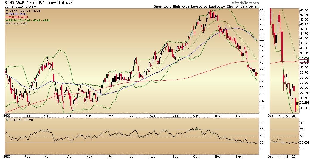
As usual, the bond market is a great analytical anchor. The U.S. Ten Year Note yield (TNX) ended 2023 below the key 4% level, which, as I've noted, is an important level. Not only is it a psychologically important yield point, it's also a place where algos are likely to set up "if this happens, do this" triggered trading programs. On the down side, the floor for TNX is 3.8%. A break above 4%, or a fall below 3.8% will likely trip mechanical trading programs, which are likely to trigger related programs in stocks.

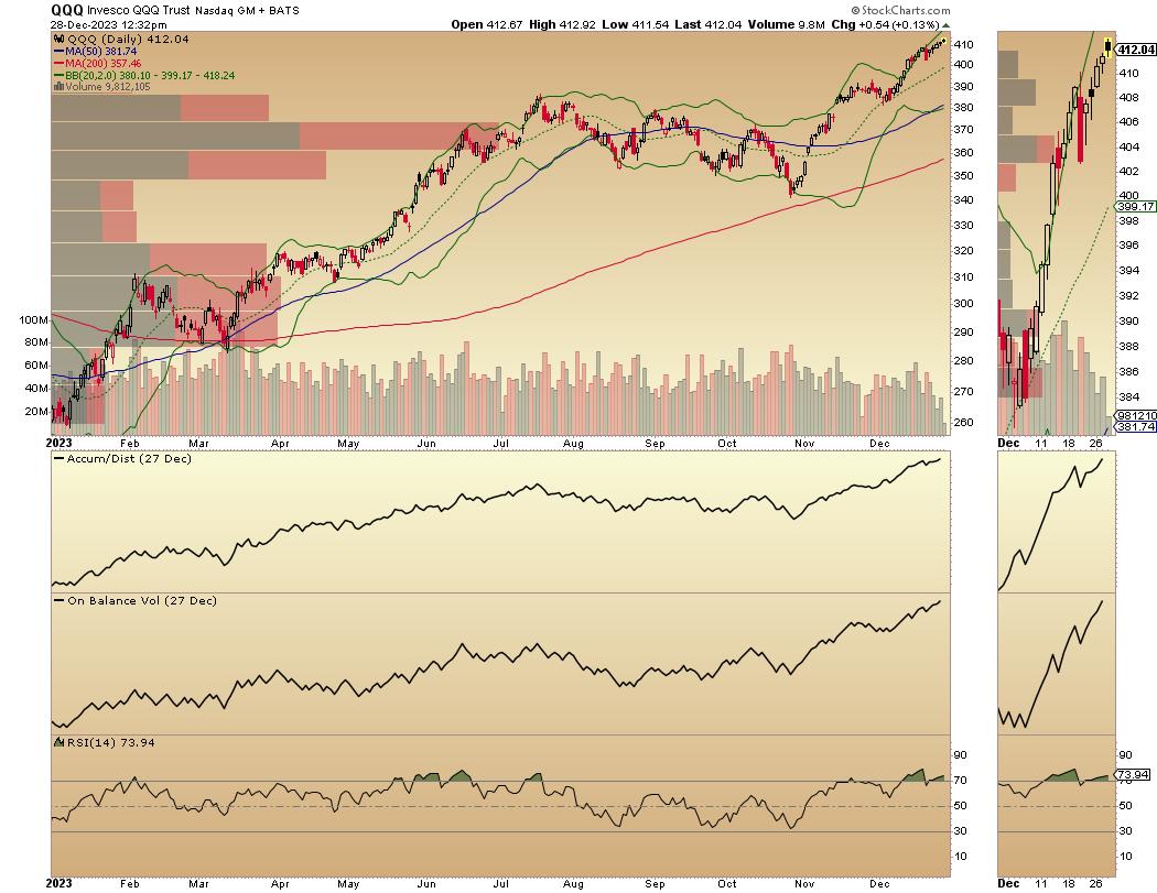
One of the algos' favorite trading vehicles is the Invesco QQQ Trust (QQQ), whose general trend is often closely tied to the action in TNX via related programs. QQQ is in a steadily rising upward momentum thrust, which looks sustainable in the short term.

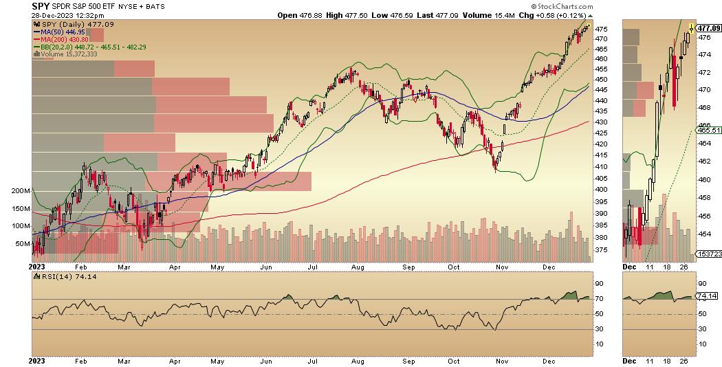
The other algo trading favorite, the SPDR S&P 500 ETF (SPY), is in a similar trading pattern. Both are very overbought, as RSI has been above 70 for several weeks. On the other hand, both ADI and OBV remain in uptrends, suggesting this trading pattern can go on for some time.

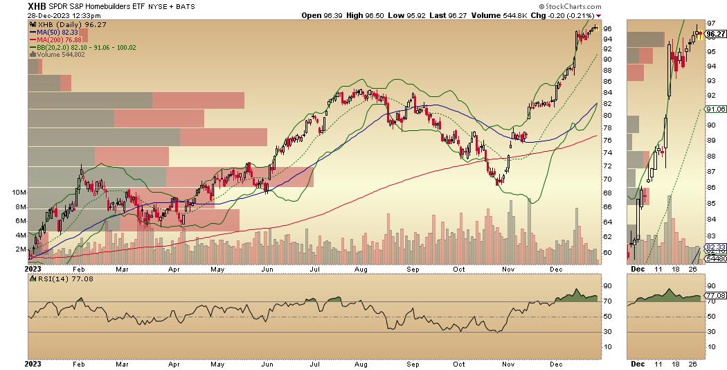
The story sector for the year, the homebuilders (as in the SPDR S&P Homebuilders ETF, XHB), is also in a positive posture, albeit in a slightly less robust posture than QQQ and SPY. As with the other two, ADI and OBV remain constructive.
For the big picture on homebuilder and real estate stocks, click here. For detailed Buy and Sell recommendations on homebuilders, click here.
Market Breadth Breaks Out
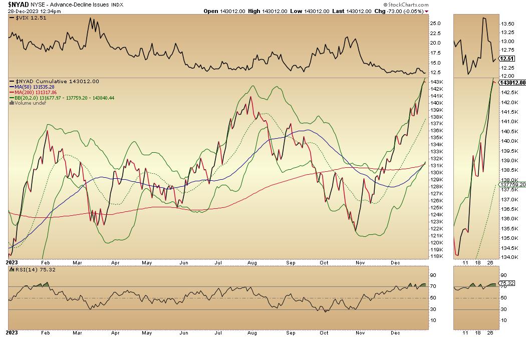
As I wrote last week, the NYSE Advance Decline line (NYAD), although overbought, was poised for a breakout, which is unfolding and could extend into January.

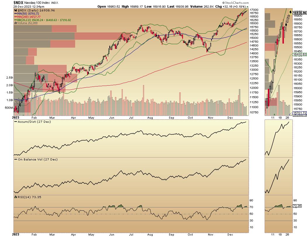
The Nasdaq 100 Index (NDX) remains in an unfettered momentum-driven uptrend, as the Fed's bullishness continues to squeeze short sellers. NDX is overbought, but ADI and OBV are rising, which means the overbought condition could increase before any consolidation.

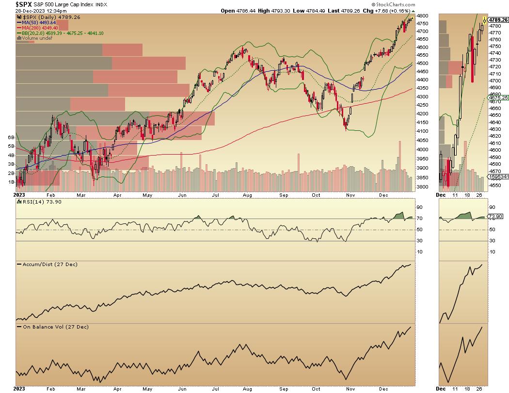
The S&P 500 (SPX) is in a similar posture, overbought but showing no signs of slowing down.

VIX Remains Below 20
The CBOE Volatility Index (VIX) remains below 20, a bullish posture for stocks. If VIX remains subdued, more upside is possible.
A rising VIX means traders are buying large volumes of put options. Rising put option volume from leads market makers to sell stock index futures, hedging their risk. A fall in VIX is bullish, as it means less put option buying, and it eventually leads to call buying. This causes market makers to hedge by buying stock index futures, raising the odds of higher stock prices.
To get the latest information on options trading, check out Options Trading for Dummies, now in its 4th Edition—Get Your Copy Now! Now also available in Audible audiobook format!
 #1 New Release on Options Trading! #1 New Release on Options Trading!
Good news! I've made my NYAD-Complexity - Chaos chart (featured on my YD5 videos) and a few other favorites public. You can find them here.
Joe Duarte
In The Money Options
Joe Duarte is a former money manager, an active trader, and a widely recognized independent stock market analyst since 1987. He is author of eight investment books, including the best-selling Trading Options for Dummies, rated a TOP Options Book for 2018 by Benzinga.com and now in its third edition, plus The Everything Investing in Your 20s and 30s Book and six other trading books.
The Everything Investing in Your 20s and 30s Book is available at Amazon and Barnes and Noble. It has also been recommended as a Washington Post Color of Money Book of the Month.
To receive Joe's exclusive stock, option and ETF recommendations, in your mailbox every week visit https://joeduarteinthemoneyoptions.com/secure/order_email.asp.
|
| READ ONLINE → |
|
|
|
| MORE ARTICLES → |
|


