| THIS WEEK'S ARTICLES |
| Larry Williams Focus On Stocks |
| MEMBERS ONLY |
| Guidelines for 2024 | Focus on Stocks: January 2024 |
| by Larry Williams |
|
Let's Get This Out of The Way Right Now For the last 18 years, I've had a love affair with my annual forecast report. Until I began writing this letter, it was the only thing I did...
|
| READ ONLINE → |
|
|
|
| The Mindful Investor |
| Three Charts to Track Impending Doom |
| by David Keller |
OK, I literally tried to think of the most bearish headline possible. To be clear, I'm actually still bullish on the long-term structure of this market. I've learned that when my Market Trend Model is bullish on the long-term and medium-term time frames, the primary trend is still positive. And that's not a judgment call; that's a fact based on the trend as defined by the weekly moving averages.
But just before the holidays, I found myself less and less able to ignore the extremely euphoric breadth readings, which tend to coincide with meaningful market tops. Not necessarily "the world is ending" type of tops, but definitely the "I probably want to wait to see how this plays out" sort of tops.
2024 has thus far started with a whimper for stocks, with growth sectors giving back some of the gains from December.

Should we be surprised by this initial downswing in the new year? And what warning signs should we be preparing for to anticipate a deeper and more sustained correction?
Seasonal Trends Suggest Weakness in Q1
The reality is that this initial weakness in January is actually quite common in an election year. Jeff Hirsch, editor of The Stock Trader's Almanac, addressed this seasonal pattern recently on my show. And the seasonal charts on StockCharts tell the same concerning story.

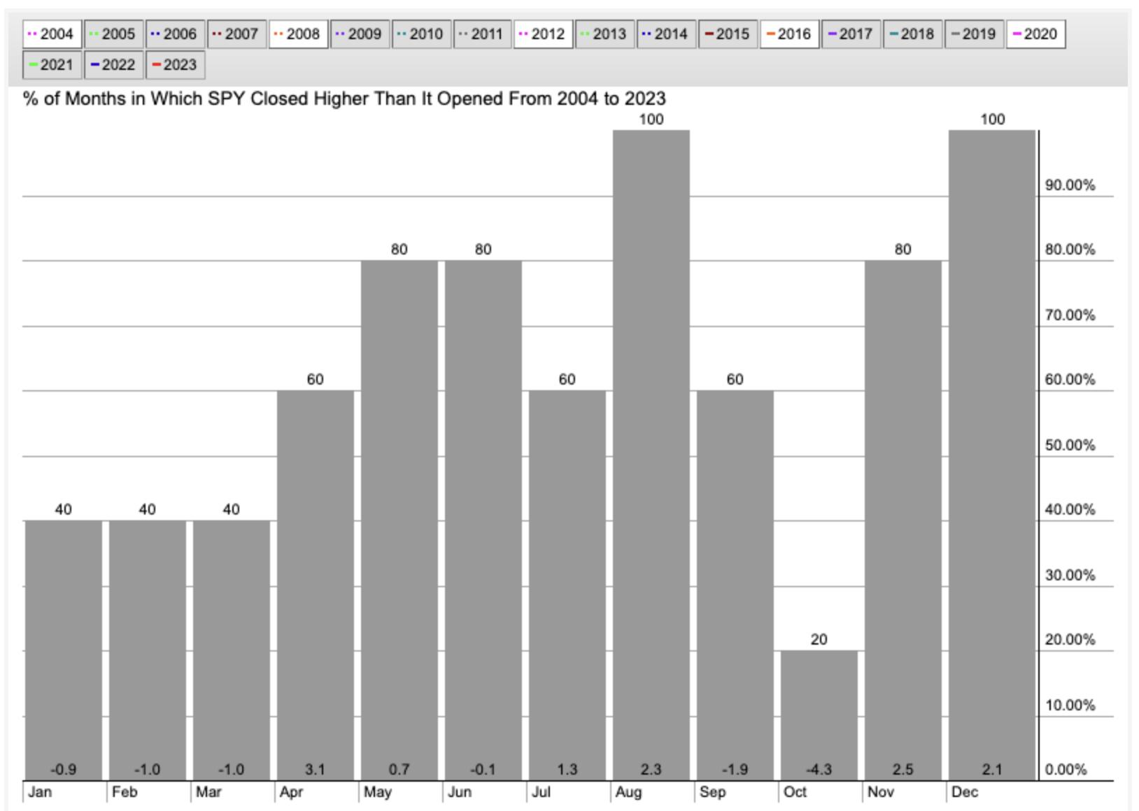
If you look at the last five election years, you'll find that the first quarter is actually the weakest three-month period. The S&P 500 is down an average of about 1% in each of the first three months of the year, and each month has finished lower in two out of the last five observations.
Your eyes may also be drawn to the month of October, is almost always a down month with an average return of -4.3%! But we'll get to that later this year. Back to the current market, and an important sell signal that was registered this week.
Key Short-Term Breadth Indicator Turned Bearish
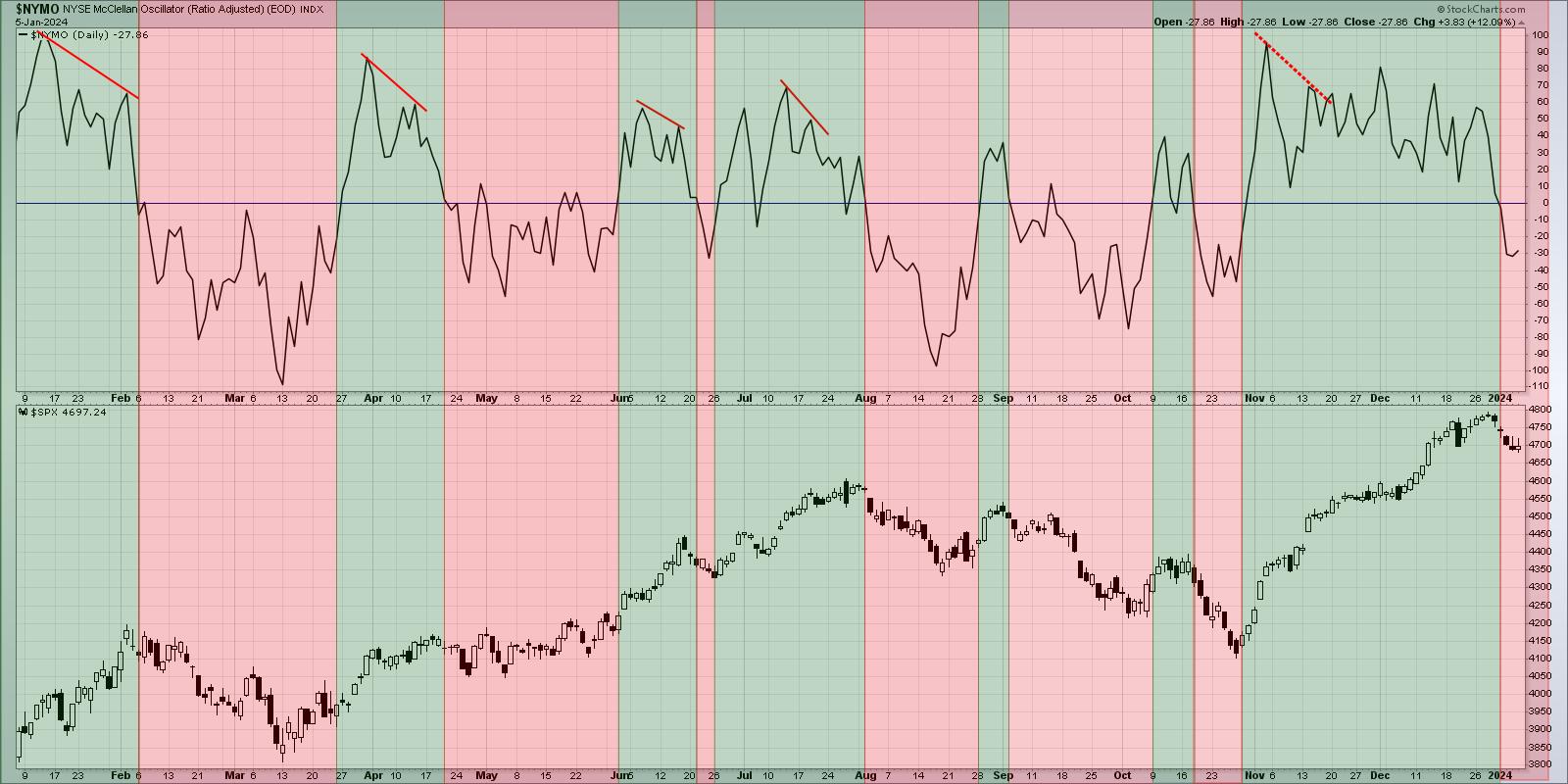
The McClellan Oscillator looks at the changes in advance-decline data to create a momentum indicator for breadth, sort of an RSI for the market breadth. And this week's price deterioration pushed this indicator below the zero level.

I've shaded the chart green when the McClellan Oscillator is above zero, and red when the indicator has moved below zero. Note the general trend in the S&P 500 index (bottom panel) during the green and red shaded areas, and you'll see why this recent sell signal leaves me thinking that further downside may be in store.
So now we have a weak seasonal pattern based on the average election year, as well as the confirmation of breadth conditions beginning to turn lower. So what chart could help us confirm that this is not just a brief one-week pullback but something more potentially sinister?
Volatility May Bring Confirmation
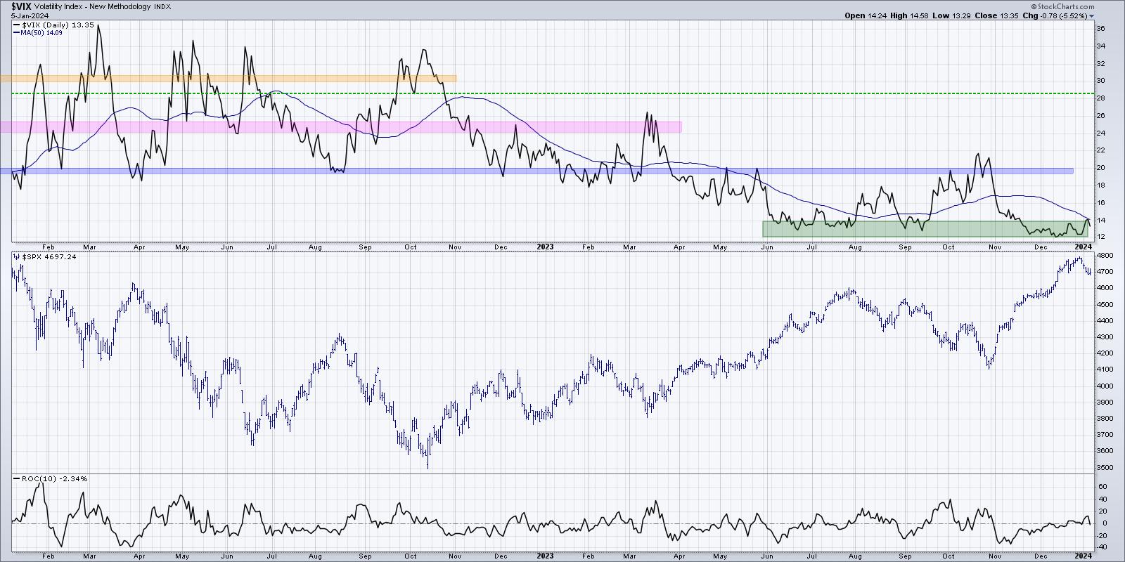
When markets move higher, you tend to see lower volatility. This is because investors usually don't completely freak out and then buy aggressively; they tend to accumulate positions over time. But when things turn lower, panic takes control and we hit the sell button aggressively to try and assuage our fears. That's why volatility spikes in a down market, and that's why the VIX may be a good chart to follow in January.

This week's selloff saw the VIX go from just above 12 to just above 14 in just five trading sessions. We're coming off the lowest levels in years, as the rally off the October low was a classic slow-and-steady, low-volatility uptrend. So if and when the VIX pushes above 14 or 15, that would most likely confirm that the seasonal tendencies for election years are playing out right before our eyes.
I love following seasonal tendencies and other cycles, as they can provide a "base case" for the markets based on what usually happens. But will 2024 follow that normal seasonal pattern? Further drops in breadth inxdicators would validate that thesis, and a spike in volatility would suggest that risk-off may be the best option for investors in Q1.
RR#6,
Dave
PS- Ready to upgrade your investment process? Check out my free behavioral investing course!
David Keller, CMT
Chief Market Strategist
StockCharts.com
Disclaimer: This blog is for educational purposes only and should not be construed as financial advice. The ideas and strategies should never be used without first assessing your own personal and financial situation, or without consulting a financial professional.
The author does not have a position in mentioned securities at the time of publication. Any opinions expressed herein are solely those of the author and do not in any way represent the views or opinions of any other person or entity.
|
| READ ONLINE → |
|
|
|
| RRG Charts |
| SPY Resting at Support, But Financials Showing Strength |
| by Julius de Kempenaer |

HAPPY NEW YEAR!!! (I guess that is still allowed on day 5...)
Let's kick off the start of the new year with a quick look at the condition of SPY before we dive into some sector rotation.
Is SPY Hitting Pause Button?
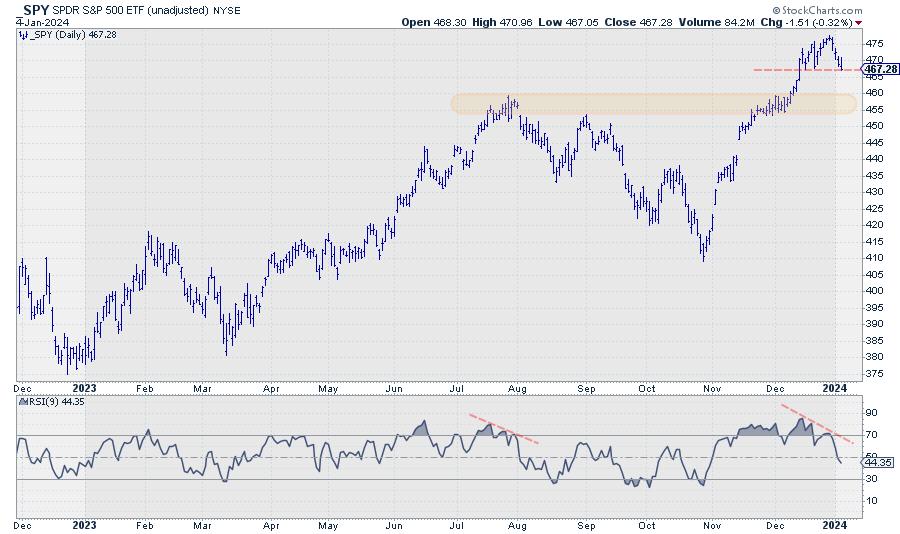
As you know, I use weekly charts most of the time, but the chart above is the daily chart of SPY, as I want to highlight the fact that the market is currently resting at (or testing, if you want) a short-term support level around 467-468.
Looking at the hourly chart, we can even argue it is breaking that support area. The final verdict will become clear at today's (Friday 5th) close. The negative divergence, penciled in on the RSI in the chart above, suggests that a pause or setback is imminent.
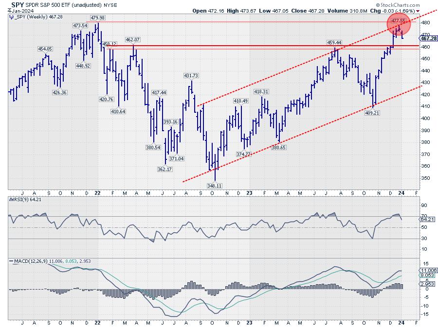
If and when this break indeed materializes, I am looking at support in the 455 area as a first possible target. Should support hold and we bounce up, we might be seeing a small H&S formation in the making. Either way, the fact that all this is happening just shy of heavy overhead resistance around 480 is causing upside potential to be limited in the near term.

This is very well visible on the weekly chart above, where horizontal resistance coming off early 2022 and the rising resistance line that marks the upper boundary of the channel are coming together, causing double resistance.
All in all, at least a small setback or pause to digest the recent rally seems imminent.
Sector Rotation

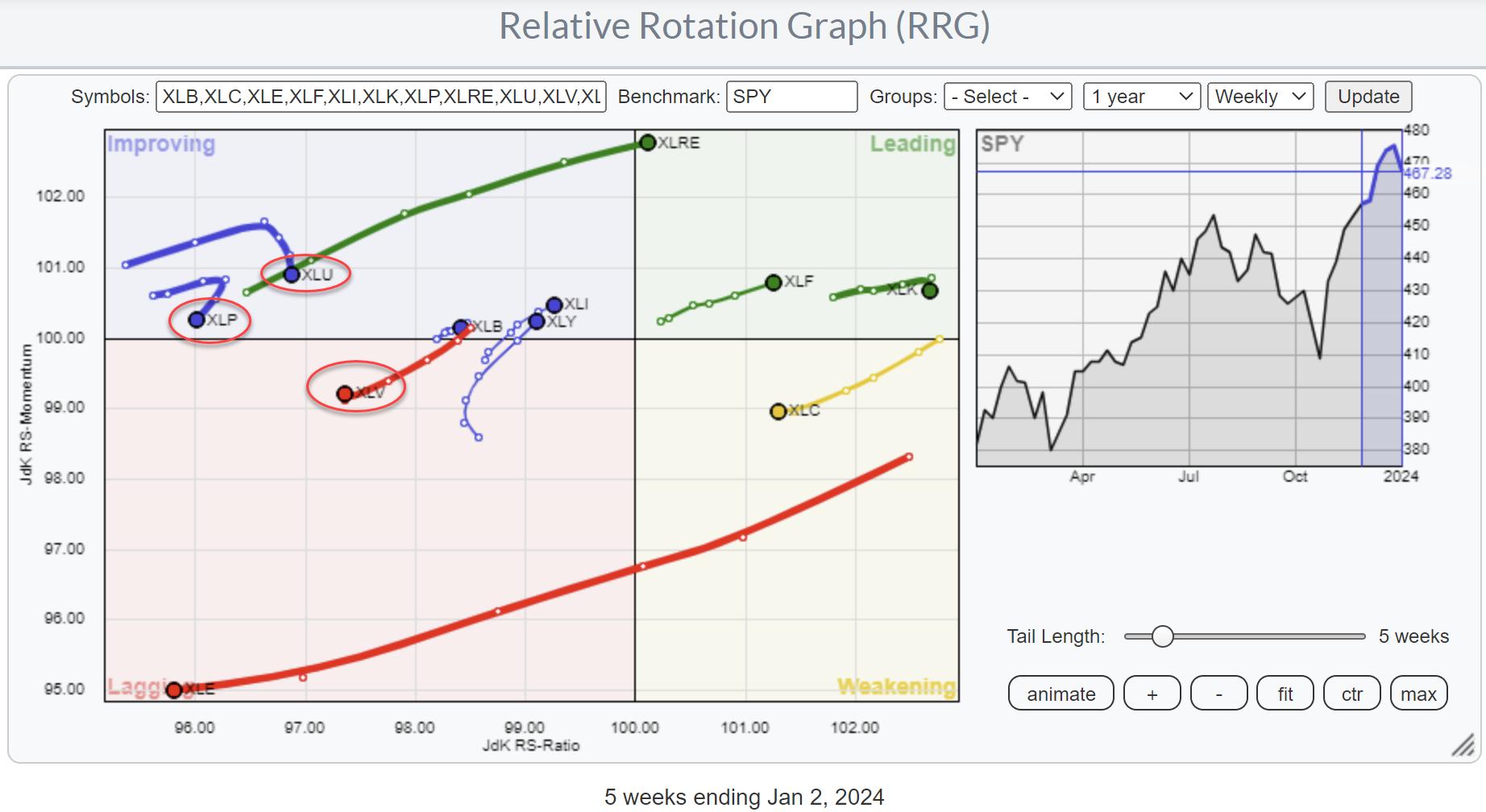
The longer-term sector rotation, as seen on the RRG above, still favors a positive outlook for SPY. The three defensive sectors -- Staples, Utilities, and Health Care -- are at the left-hand side of the graph and traveling at a negative RRG-Heading. This is a rotation that is characteristic of a strong market in general, as investors prefer more offensive sectors.
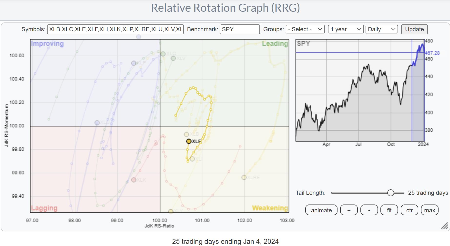
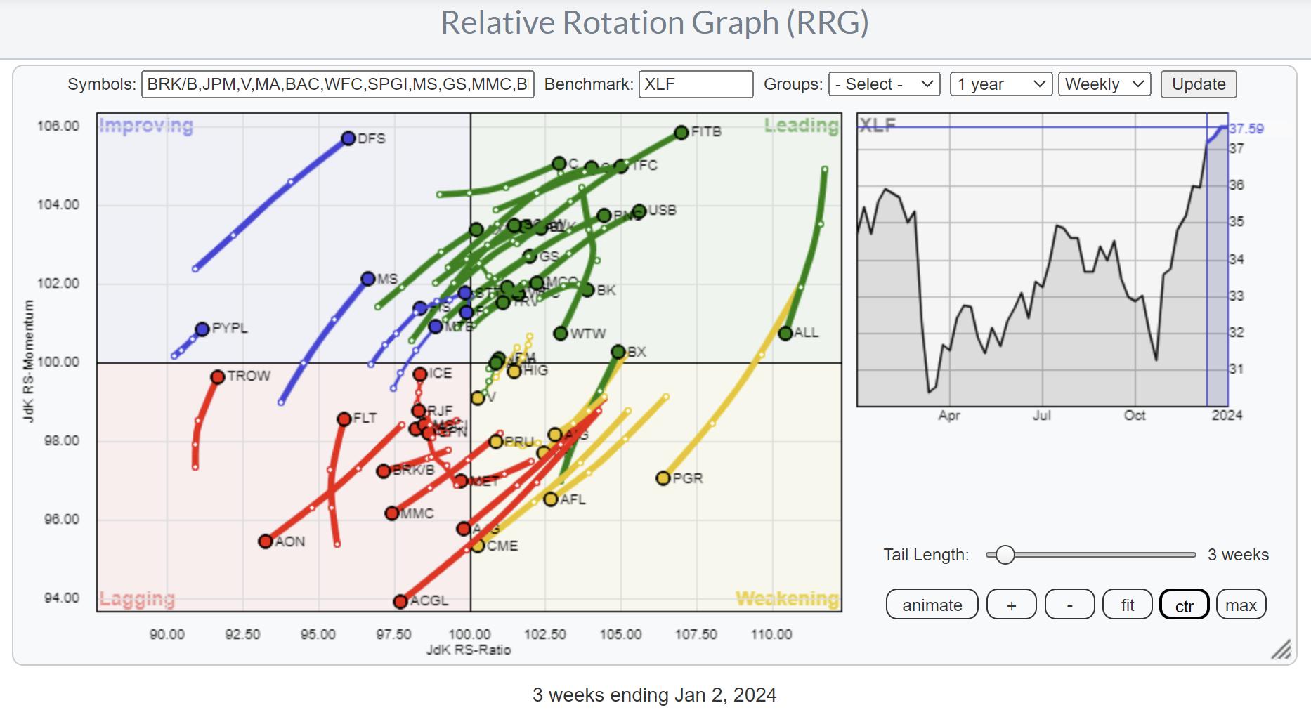
A rotation that stands out is the opposite move for Real Estate (XLRE) and Energy (XLE). But the one sector I want to highlight here is Financials (XLF). On the weekly RRG, the XLF tail is inside the leading quadrant and heading further into it at a strong RRG-Heading.

On the daily chart, the XLF tail is inside the weakening quadrant and has already curled back up; it is now heading back to the leading quadrant. This brings the daily rotation back in sync with the weekly, which usually is a strong sign for further improvement against SPY.
Financials


To find individual stocks inside the Financials sector, you can pull up the pre-defined RRG with all the members in XLF.
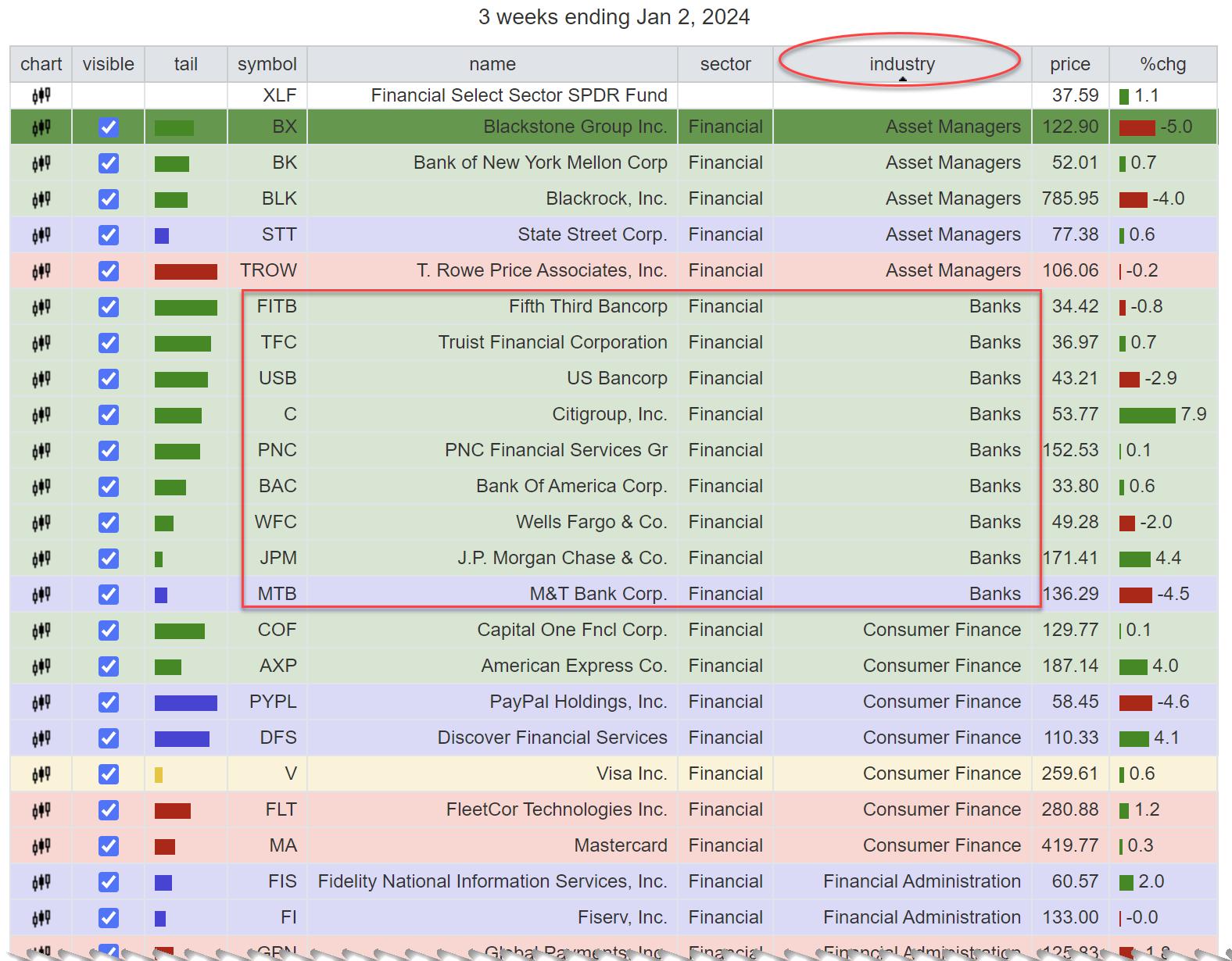
A quick way to identify an industry within the financials sector that holds potentially interesting stocks is to sort the table below the RRG on the "Industry" column (just click at the top of the column) and look at the quadrant colors. The table above shows that all banks are inside the leading quadrant. Clicking on the line of the individual stock will highlight the tail on the RRG. By using the arrow (up/dn), you can browse through the individual tails to get a better handle and find names to bring up on a price chart.
#Stay alert, --Julius
|
| READ ONLINE → |
|
|
|
| Martin Pring's Market Roundup |
| MEMBERS ONLY |
| Three Intermarket Relationships to Watch in Early 2024 |
| by Martin Pring |
|
It has been a great rally, but this week has seen the DJIA violate its post November up trendline. In addition, the 9-day RSI has retreated below its 70 overbought zone for the first time since early November, and the daily KST has triggered a sell signal...
|
| READ ONLINE → |
|
|
|
| ChartWatchers |
| Hot Jobs Data Sends Stock Market Seesawing, Ending Nine-Week Winning Streak |
| by Jayanthi Gopalakrishnan |

You can't blame the market for taking a breather after nine positive weeks.
The first trading week in January ended lower, which may have concerned investors. It's understandable how jittery investors are when you view the market's reaction to the December jobs report. The jobs data came in better than expected, which sent ripples through Wall Street. Right after the data was reported, equity futures fell, and Treasury yields ticked higher.
However, investors overcame the shock after digesting the info and looking more closely at the data. And the lower-than-expected ISM number, plus factoring in two major strikes and their impact on the jobs numbers, calmed investors for a short while. Equities turned higher, and Treasury yields dropped. The market continued to seesaw between gains and losses throughout the trading day.
Don't be surprised if the market exhibits similar behavior next week, as investors await December CPI data and the start of earnings season. This doesn't happen till the end of the week, so expect more of the same until Thursday.
According to the CME FedWatch Tool, the probability of an interest rate cut in the March Fed meeting is at 64%, lower than before today's data was released. 2024 is a 50-50 year, with elections and the Fed's interest rate. Elections are going to take place in several countries around the world. And with over half the world's population heading to the polls this year, it's bound to bring some volatility to the stock market.
From a seasonal perspective for the US market, the first quarter of an election year tends to be volatile. There's a chance that stocks could sell off ahead of the elections, but generally trend higher after the elections. And while 2023 performed as expected, seasonally, it doesn't mean you should sit back and expect your portfolio to grow at the end of the year. Keep a watch on the broader market.
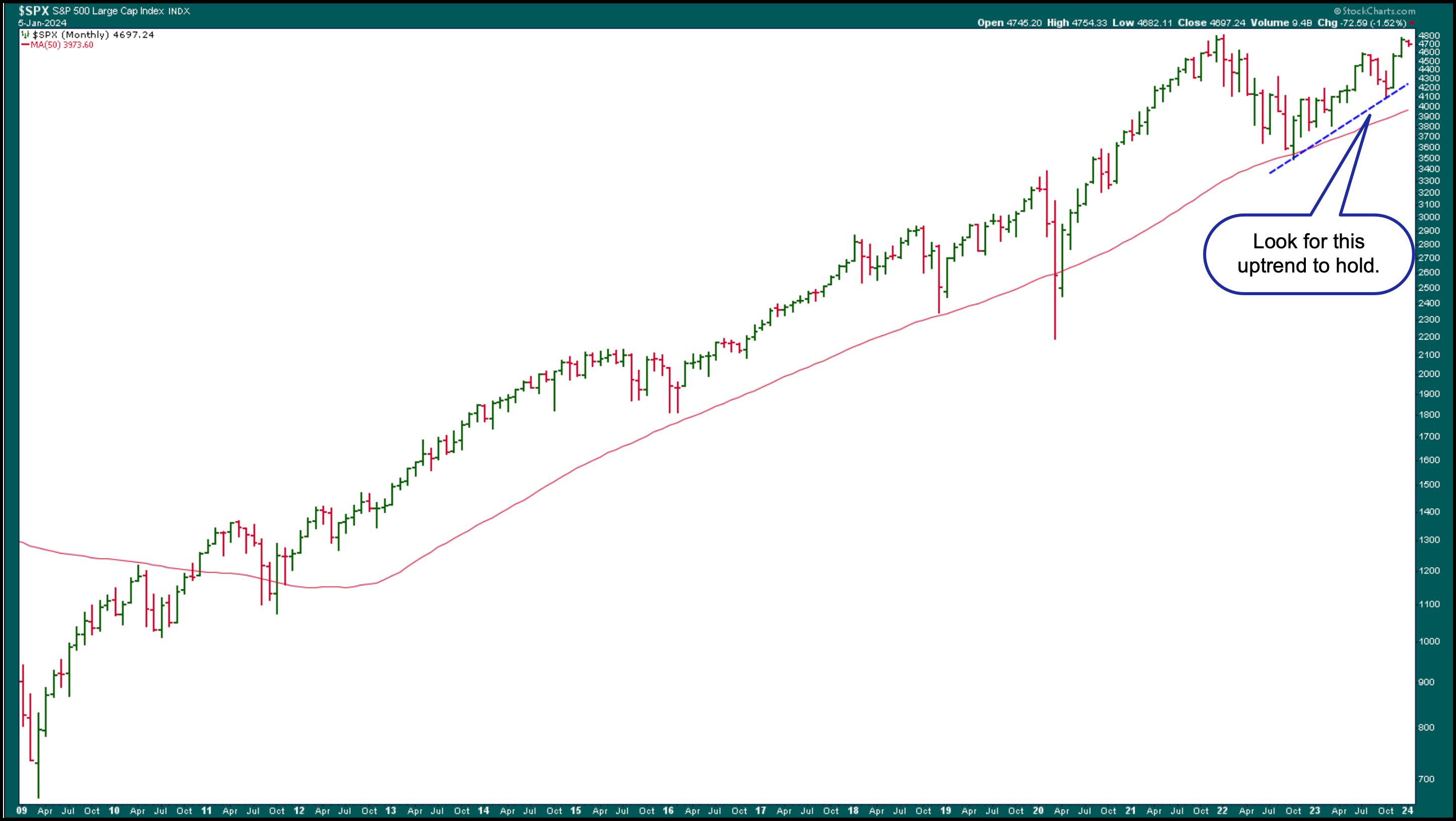
Given the S&P 500 index ($SPX) has been trending higher, trading above its 50-month simple moving average and showing a relatively steep uptrend since 2022 (see chart below), a correction shouldn't be worrisome until the index nosedives below critical support levels.

CHART 1. MONTHLY CHART OF S&P 500. The index has been trending higher since 2012 and, except for a few instances, staying above its 50-month simple moving average. A break below the blue dashed uptrend line could be the first indication of a reversal.Chart source: StockCharts.com. For educational purposes.
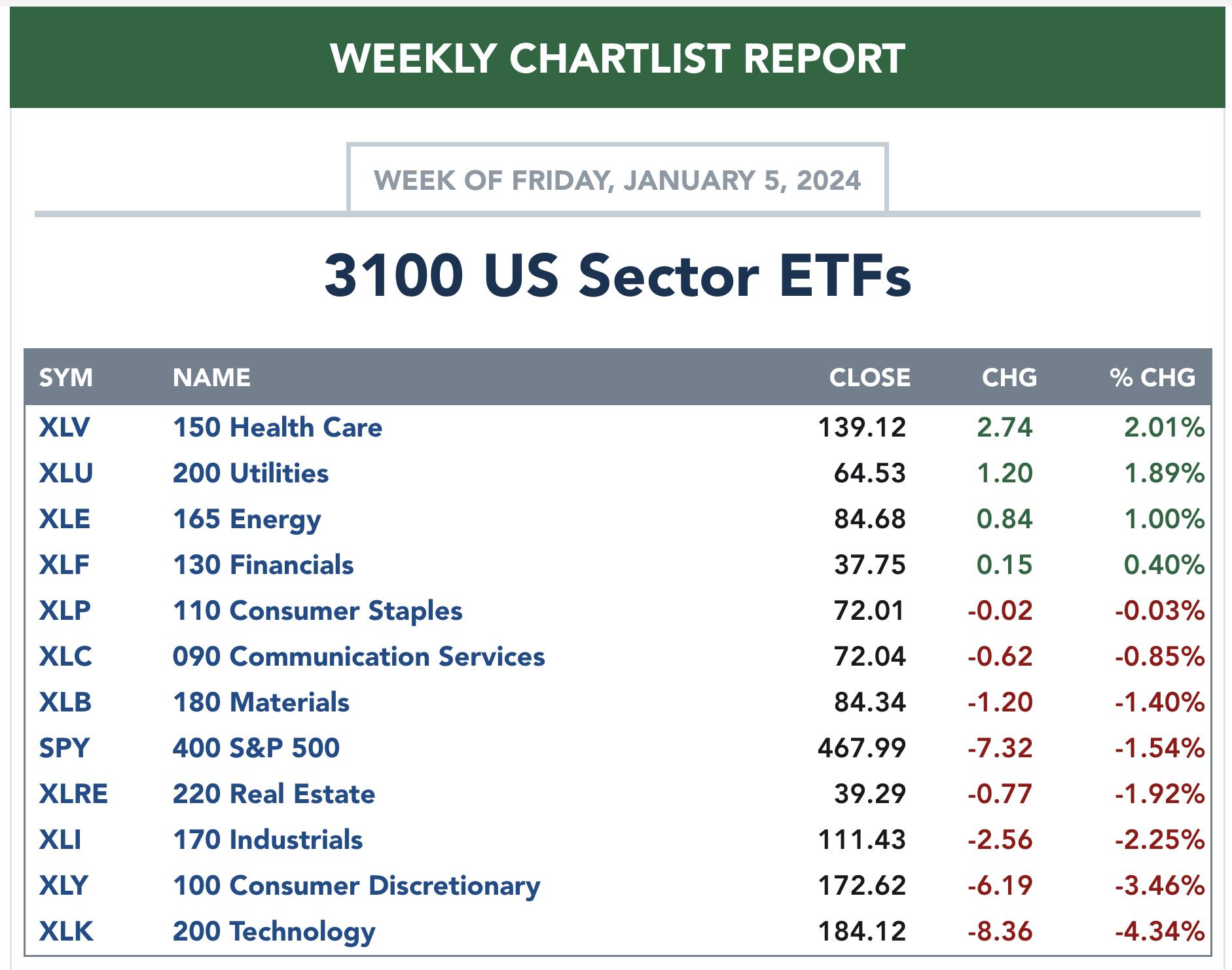
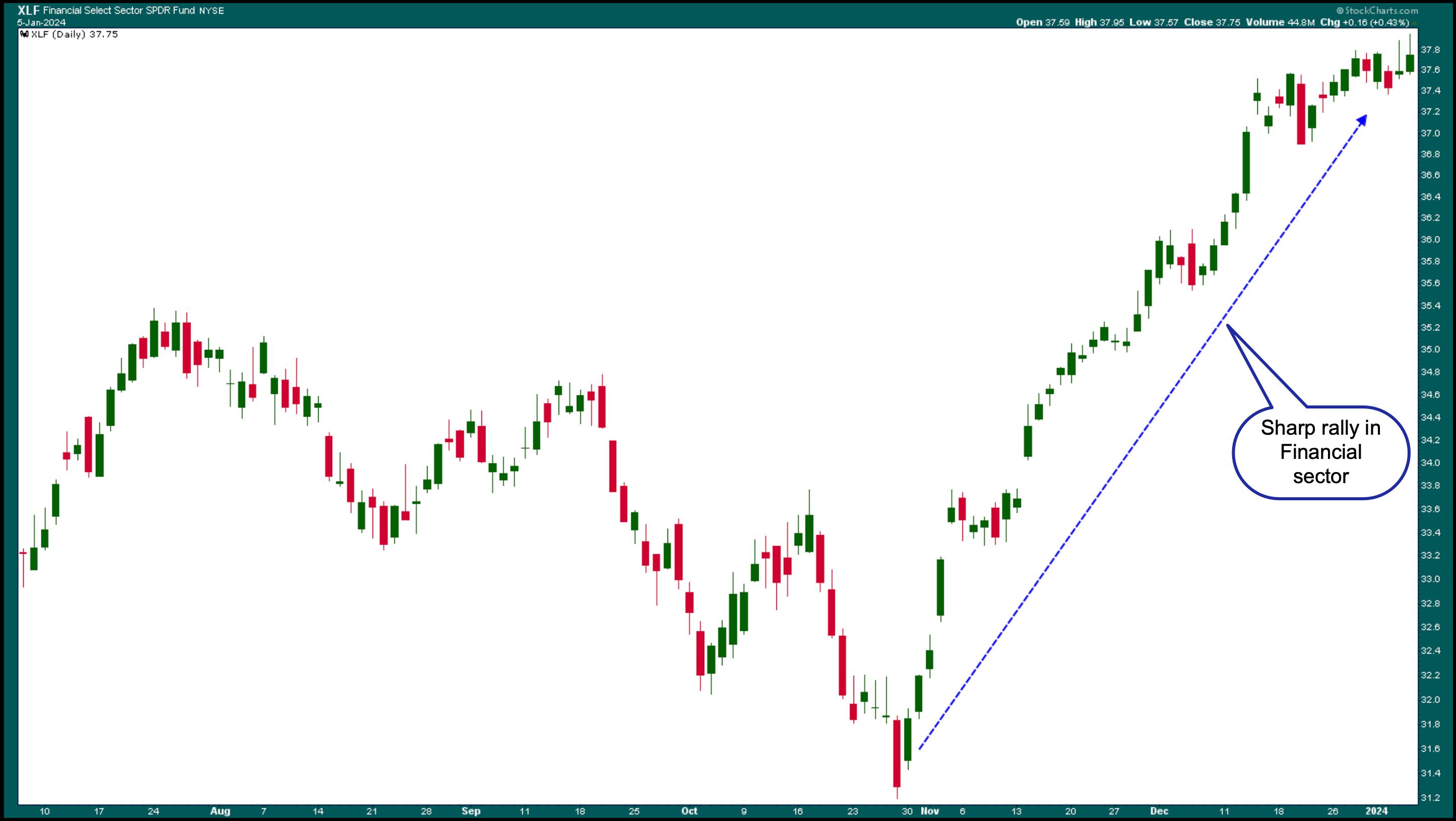
We have seen a rotation in leadership from Technology to Financials and Health Care, two sectors that struggled last year. The hope of lower interest rates likely boosted the Financials, which have seen a sharp upside rally since early November. The Health Care sector saw a similar move as Financials, though it pulled back a bit on Friday.

CHART 2. DAILY CHART OF FINANCIAL SELECT SECTOR SPDR ETF (XLF). After yields started falling, the Financials started recovering and rallied strongly.Chart source: StockCharts.com. For educational purposes.
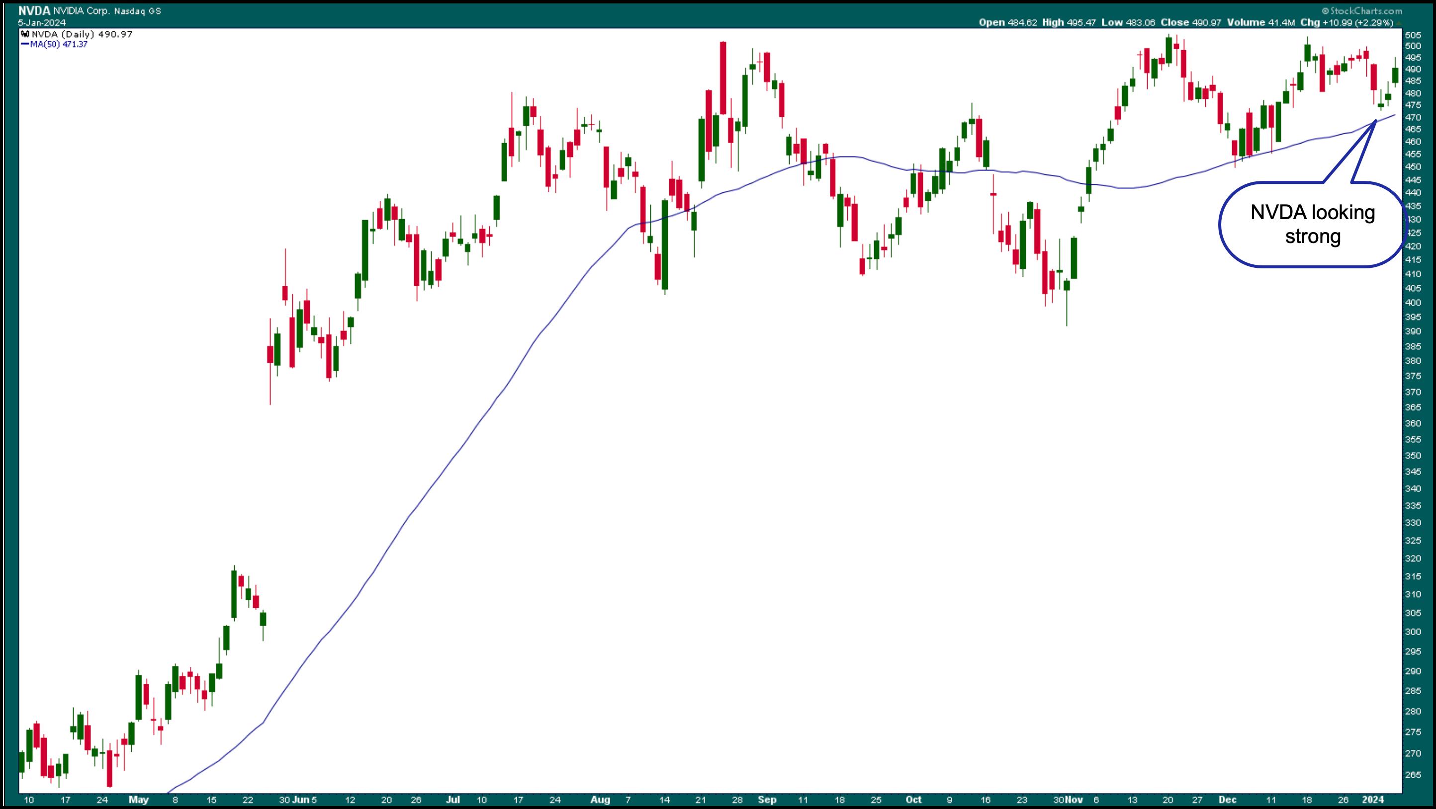
But that doesn't mean the Magnificent Seven will lose their status symbol. Although it closed off its high, Nvidia Corp. (NVDA) showed signs of recovering today. NVDA's stock still has a strong chart, maintaining support of its 50-day SMA. If the stock continues to rally in 2024, it could pull the rest of the market with it, especially the other six stocks that closely follow behind. So don't lose faith in the mega-cap tech stocks just yet.

CHART 3. NVIDIA STOCK IS STILL BULLISH. Don't give up on the Magnificent Seven stocks; they could still rally higher.Chart source: StockCharts.com. For educational purposes.
It's not out of reach for Treasury yields to fall lower, as the Fed is expected to lower rates. Lower interest rates could see growth stocks pull back, but how much lower are interest rates likely to go?
As long as the economy keeps chugging along, the expectations the market has priced in will probably hold. But that doesn't mean interest rates will fall close to zero; more likely, they will pull back, and then probably settle at around the 3% level. A lot has to do with the balance between interest rates and economic growth.
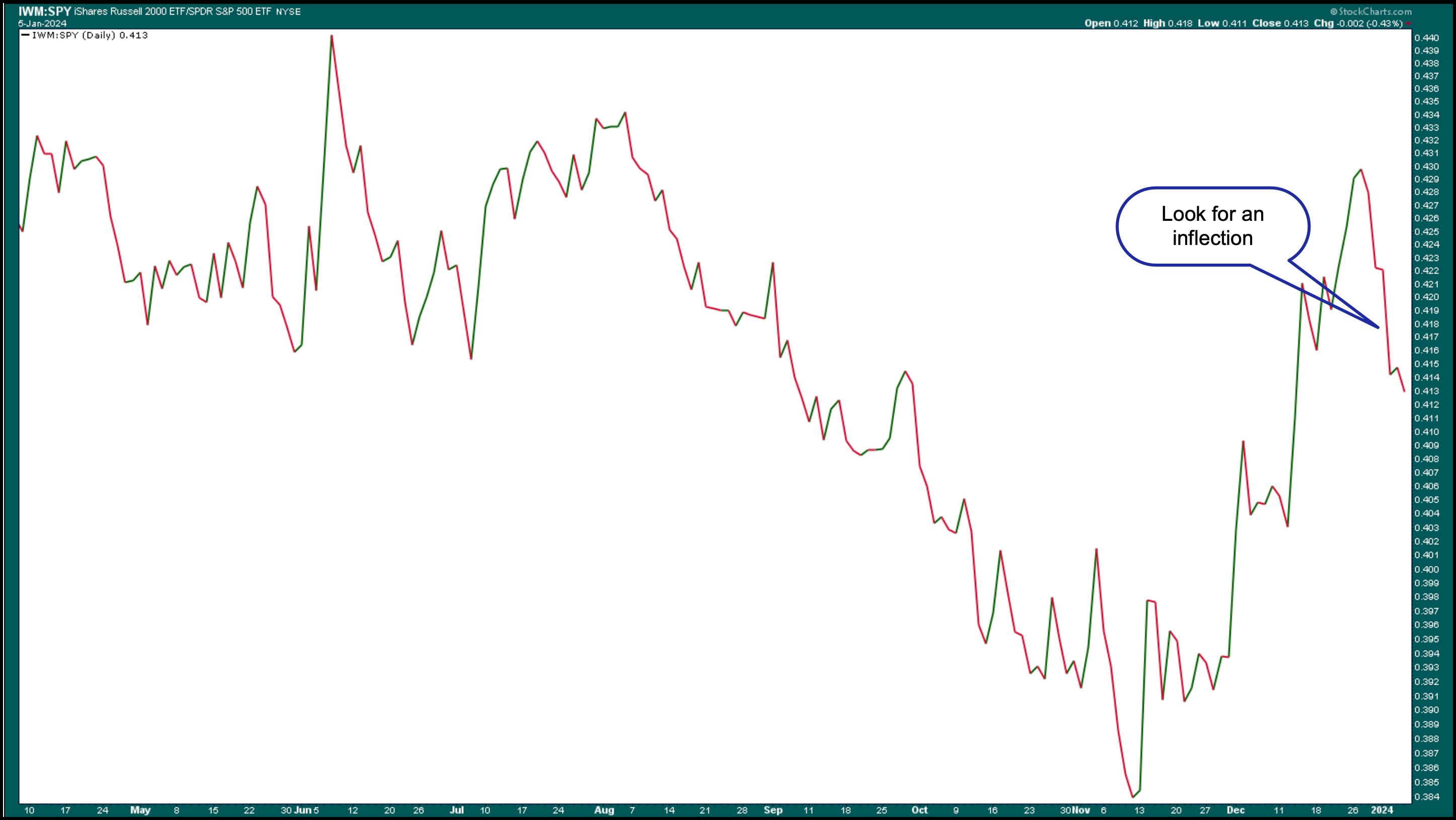
On a closing note, small-cap stocks could show strength as rates fall. Keep an eye on a chart of the small caps vs. large caps in 2024, such as the one below of iShares Russell 2000 ETF vs. the SPDR S&P 500 ETF (IWM:SPY).

CHART 4. SMALL CAPS VS. LARGE CAPS. If the small caps start outperforming the large caps and trend higher, you may want to put more weight on small-cap stocks.Chart source: StockCharts.com. For educational purposes.
If there's a clear rotation and investors gravitate toward small-cap stocks, it may be worth adding more weight to this asset class.
End-of-Week Wrap-Up
- $SPX up 0.18% at 4697.24, $INDU up 0.07% at 37,466.11; $COMPQ up 0.09% at 14524.07
- $VIX down 5.52% at 13.35
- Best performing sector for the week: Health Care
- Worst performing sector for the week: Technology
- Top 5 Large Cap SCTR stocks: Affirm Holdings (AFRM); USX-US Steel Group (X); Coinbase Global (COIN); PDD Holdings (PDD); Karuna Therapeutics (KRTX)
On the Radar Next Week
- December CPI
- December PPI
- Earnings season kicks off with Bank of America (BAC), JP Morgan Chase (JPM), Wells Fargo (WFC), Citigroup (C), Delta Airlines (DAL), and more.

Disclaimer: This blog is for educational purposes only and should not be construed as financial advice. The ideas and strategies should never be used without first assessing your own personal and financial situation, or without consulting a financial professional.
|
| READ ONLINE → |
|
|
|
|
|
| The MEM Edge |
| New Year Starts With a Bang as Leadership Areas Get Hit |
| by Mary Ellen McGonagle |
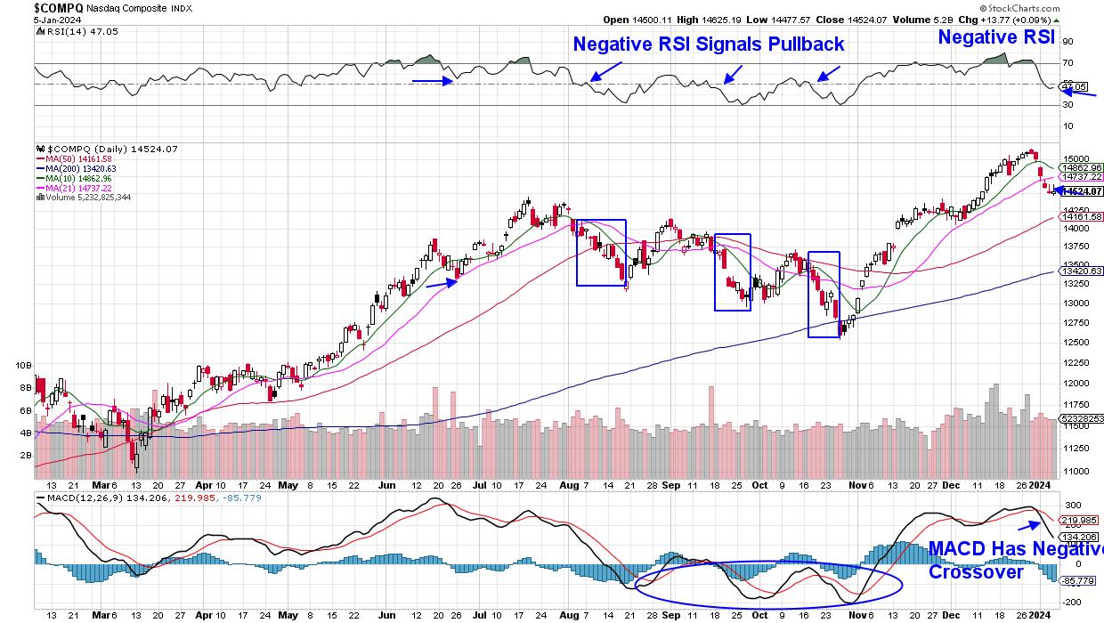
Last week, Growth stocks came under selling pressure, with the Nasdaq falling over 3% amid sharp declines in most of the Magnificent Seven names. These weren't the only 2023 darlings that pulled back, as Semiconductor and Software stocks also underperformed. In turn, the Technology sector was the worst-performing for the week, with a 4.2% drop.
As you can see in the chart below, the Nasdaq posted a negative RSI on its daily chart last week, which is an event that also occurred 3 times last year, as highlighted. When coupled with a close below its 21-day moving average as marked by the rectangular boxes, further selling took place.
 Daily Chart of Nasdaq Composite ($COMPQ) Daily Chart of Nasdaq Composite ($COMPQ)
While it's unclear how much lower the Nasdaq may go, keeping your eye on interest rates will certainly be key. Similar to those periods of weakness last year, rates are ticking higher, with the yield on the 10-year Treasury now back above 4%. Growth stocks fare poorly in a rising rate environment. You'll also want to examine the characteristics that marked the early November bottom in the Nasdaq, as this Index went on to regain its uptrend into year-end.
Also notable last week was a pronounced move into Value stocks led by Financials and Healthcare, which both outperformed. Next week, we'll see clues into the fundamental state of Financials, with notable Bank stocks such as JP Morgan (JPM), Bank of America (BAC) and Wells Fargo (WFC) due to report their 4th quarter results. Management's guidance regarding growth prospects for this year will be equally important. Each of these companies has a bullish chart heading into their results.
While pullbacks can be painful, during a bull market phase such as now, they allow strong areas of the market to set up for another leg up. Subscribers to my MEM Edge Report were advised to stay with most of the Growth stocks on the report's suggested holdings list when we issued our Midweek Report on Wednesday. My weekly report on Sunday will provide further insights into the broader markets, as well as industry groups and select stocks. You can use this link here to gain immediate access as well as a 4-week trial, all at a very nominal fee.
Happy New Year!
Mary Ellen McGonagle
|
| READ ONLINE → |
|
|
|
| Don't Ignore This Chart! |
| Sprouts Farmers Market: A Hidden Gem on the Corner of Wall and Main Street? |
| by Karl Montevirgen |

Most traders and investors are drawn to a smooth trend, that being a movement whose highs and lows are progressive, consistent, and easily traceable. The problem is when this characteristic is exhibited by a relatively unpopular stock in a sector that's not necessarily associated with growth.
Sprouts Farmers Market (SFM) isn't the sexiest stock on Wall Street. But on Main Street, in neighborhoods it serves, it's a popular hybrid grocery and specialty store that stands a few notches above your typical grocer. It's a Consumer Staples stock that (depending on the forecast source) has delivered nothing less than upside surprises each quarter since 2019.
Technically, Sprouts Farmers Market's upward trajectory has been as smooth as its (fundamental) earnings trend. The trading volume may be a bit low, but its market presence is relatively strong as a company. And it's one of a few stocks that came up on the StockCharts "All-Time High" scan.
For those looking to get some exposure to Consumer Staples in a stock exhibiting consistent growth, is Sprouts Farmers Market a good candidate for a buy, or might its record high be subject to the weight of market gravity? Let's take a look.

CHART 1. WEEKLY CHART OF SPROUTS FARMERS MARKET. Note the steady uptrend since 2020 and the shift from a wide/volatile to a narrow/steady uptrend channel.Chart source: StockCharts.com. For educational purposes.
Looking at Sprout Farmers Market's five-year performance, you can see it trending downward in 2019, culminating in the 2020 COVID Crash bottom. Interestingly, every quarter has delivered a positive earnings beat except for the reporting period in August 2019 (black arrow).
After bottoming out in 2020, you see a volatile-yet-steady uptrend, despite mostly negative readings in the Chaikin Money Flow (CMF) indicator. And once the money flow turned positive in 2022, the trend channel began to narrow (see blue channel), leading to the current month, where Sprouts Farmers Market is consolidating at its all-time high range and near the top of the trend channel.
So, what does the near-term picture look like?

CHART 2. DAILY CHART OF SPROUTS FARMERS MARKET. Note how price strongly reacts to the 50-day and 200-day SMAs.Chart source: StockCharts.com. For educational purposes.
The top panel indicates that Sprouts Farmers Market has consistently and steadily outperformed its sector, Consumer Staples (using XLP as the sector proxy).
On the price chart panel, the 50-day simple moving average (SMA) and 200-day SMA are in "full sail" with a smooth uptrend curve; more importantly, you can see how SFM's stock has been responding sensitively to both moving averages, seeing either as opportunities to buy the dip.
At the end of December into the new year, Sprouts Farmers Market's stock price consolidated in a rectangle formation. This is a continuation pattern that, according to Thomas Bulkowski's Encyclopedia of Chart Patterns, tends to break to the upside 63% of the time. However, looking at the Relative Strength Index (RSI) displayed in the panel below the chart, you see it's falling from overbought territory as SFM consolidates, hinting at a potential near-term pullback.
The Upside Scenario
With no resistance overhead (Sprouts Farmers Market is at an all-time high), the typical projection for a rectangle trade (giving a target equivalent to the pattern's height) might be too small relative to the downside risk. This is where looking at fundamentals and the larger economic picture can help gauge the likelihood of a prolonged uptrend. SFM can break toward the upside, but will it have enough momentum to keep going without taking a breather?
The Downside Scenario
A pullback seems warranted, at least sometime before Sprouts Farmers Market's next earnings reporting period in February. So you'll want to closely monitor the price action between now and February 29, SFM's next earnings reporting date.
According to Bulkowski, there's a 37% chance that price will break below the rectangle. Considering how the broader market is taking a breather after a six-week run to the upside, SFM will likely get caught in that tide. Still, even if SFM falls to the 50-day SMA, the intermediate-term uptrend would still be valid. And considering the quiet bullishness surrounding the stock (for those who know about it) and how its buyers seem to take every opportunity to jump in as prices reach the 50-day (and 200-day) SMA, it's likely to provide ample support for SFM. In other words, the 50-day SMA makes for a favorable opportunity to buy the dip.
The Bottom Line
Though not a high-profile item, Sprouts Farmers Market (SFM) has given investors consistent growth. Its trend has been upward since the 2020 downturn, with positive earnings surprises each quarter and a solid "Main Street" market presence overall. It has been outperforming its sector, indicating the potential for continued growth. But there's also a possibility of a near-term pullback, as the stock seems overbought. If you want to gain exposure to Consumer Staples, Sprouts Farmers Market is a good candidate. If it breaks to the downside, look to the moving averages as your entry point and keep an eye on its price action, leading to its next earnings date in February.

Disclaimer: This blog is for educational purposes only and should not be construed as financial advice. The ideas and strategies should never be used without first assessing your own personal and financial situation, or without consulting a financial professional.
|
| READ ONLINE → |
|
|
|
| DecisionPoint |
| Earnings for 2023 Q3 Show Market Still Overvalued |
| by Carl Swenlin |
S&P 500 earnings are in for 2023 Q3, and here is our valuation analysis.
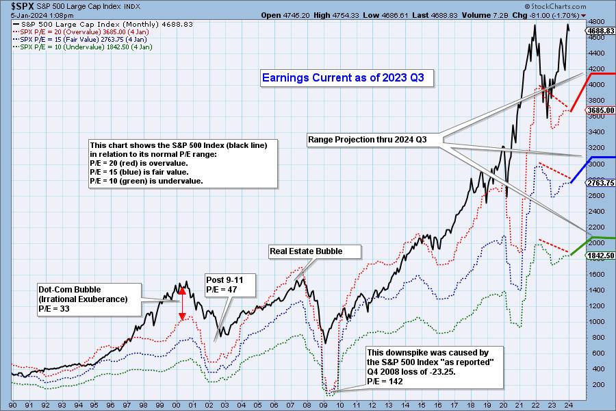
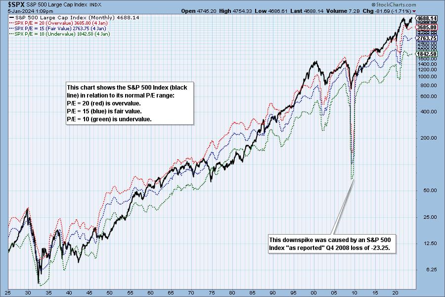
The following chart shows the normal value range of the S&P 500 Index, indicating where the S&P 500 would have to be in order to have an overvalued P/E of 20 (red line), a fairly valued P/E of 15 (blue line), or an undervalued P/E of 10 (green line). Annotations on the right side of the chart show where the range is projected to be based upon earnings estimates through 2024 Q3. Technically speaking, note that the value range has a negative divergence versus price.


Historically, price has usually remained below the top of the normal value range (red line); however, since about 1998, it has not been uncommon for price to exceed normal overvalue levels, sometimes by a lot. The market has been mostly overvalued since 1992, and it has not been undervalued since 1984. We could say that this is the "new normal," except that it isn't normal by GAAP (Generally Accepted Accounting Principles) standards.

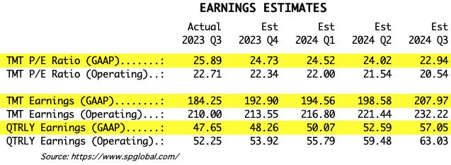
We use GAAP earnings as the basis for our analysis. The table below shows earnings projections through September 2024. Keep in mind that the P/E estimates are calculated based upon the S&P 500 close as of December 29, 2023. They will change daily depending on where the market goes from here. It is notable that the P/E is outside the normal range.

The following table shows where the bands are projected be, based upon earnings estimates through 2024 Q2.

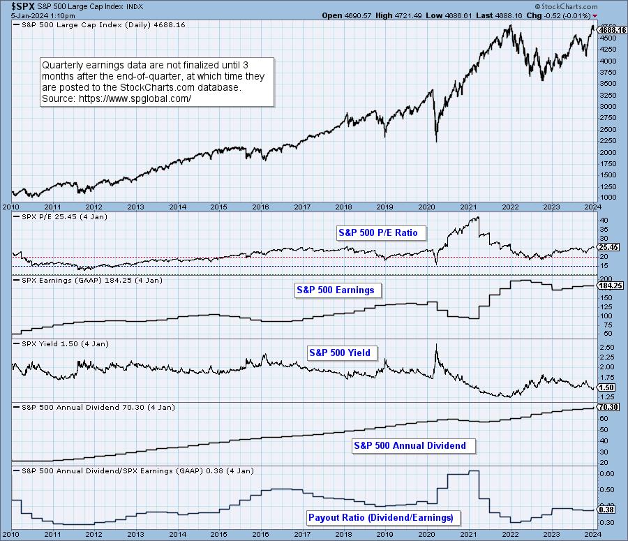
This DecisionPoint chart keeps track of S&P 500 fundamentals, P/E and yield, and it is updated daily -- not that you need to watch it that closely, but it is up-to-date when you need it.

CONCLUSION: The market is still very overvalued and the P/E is still above the normal range. Earnings have ticked up, are trending up, and are estimated to be higher for the next four quarters. Being overvalued doesn't require an immediate decline to bring valuation back within the normal range, but high valuation applies negative pressure to the market environment.
Watch the latest episode of DecisionPoint on StockCharts TV's YouTube channel here!
(c) Copyright 2024 DecisionPoint.com
Technical Analysis is a windsock, not a crystal ball.
Disclaimer: This blog is for educational purposes only and should not be construed as financial advice. The ideas and strategies should never be used without first assessing your own personal and financial situation, or without consulting a financial professional. Any opinions expressed herein are solely those of the author, and do not in any way represent the views or opinions of any other person or entity.
DecisionPoint is not a registered investment advisor. Investment and trading decisions are solely your responsibility. DecisionPoint newsletters, blogs or website materials should NOT be interpreted as a recommendation or solicitation to buy or sell any security or to take any specific action.
Helpful DecisionPoint Links:
DecisionPoint Alert Chart List
DecisionPoint Golden Cross/Silver Cross Index Chart List
DecisionPoint Sector Chart List
DecisionPoint Chart Gallery
Trend Models
Price Momentum Oscillator (PMO)
On Balance Volume
Swenlin Trading Oscillators (STO-B and STO-V)
ITBM and ITVM
SCTR Ranking
Bear Market Rules
|
| READ ONLINE → |
|
|
|
| MORE ARTICLES → |
|


