| THIS WEEK'S ARTICLES |
| The Mindful Investor |
| Beware the Hindenburg Omen! |
| by David Keller |
The S&P 500 shall heretofore be known as an index that has broken the incredible 5,000 level. That alone is a pretty amazing milestone for a benchmark that was down around 3500 just over a year ago! But another significant signal may be developing as well, that being the dreaded Hindenburg Omen.
But what is the Hindenburg Omen, and what does it actually represent?
Today, we're looking at a broad market indicator created years ago by Jim Miekka, and it essentially looks for conditions that are very common at major market tops. Does a valid signal guarantee a major market top? Of course not. But going back through market history, very few major peaks have occurred without the Hindenburg Omen dropping a bearish signal just beforehand.
You can break the Hindenburg Omen down into three components: a bullish market trend, an expansion in new highs AND new lows, and a bearish rotation in breadth. Let's review each of these components in turn.
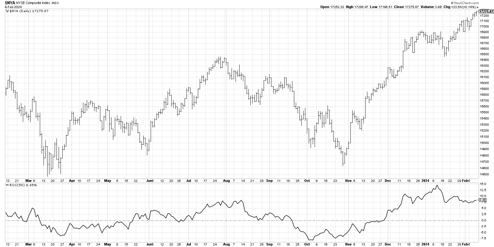
First, we need to confirm that the market is in an established uptrend, as this is an indicator designed to identify market tops. So we take a chart of the NYSE Composite index ($NYA) and look to make sure that the 50-day rate of change (ROC) is positive -- i.e., the market is higher than it was ten weeks ago. If so, then the first condition is met.
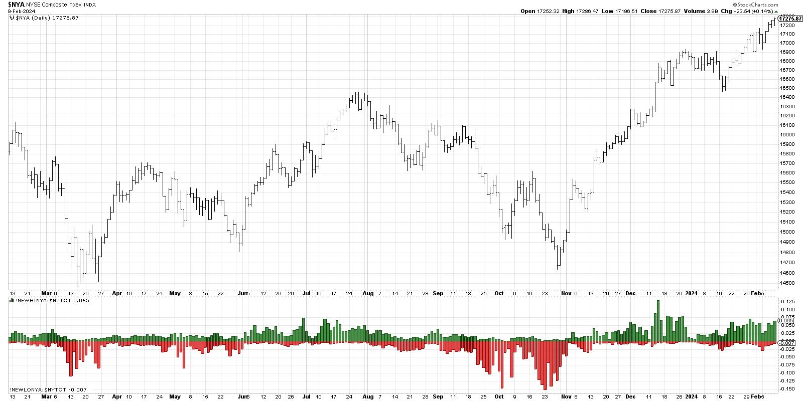
Next, Miekka noticed that, at major market tops, there were not only plenty of stocks making new 52-week highs, but also a bunch of stocks making new 52-week lows. This implied a period of indecision, as stocks were both breaking out and breaking down around the same time. Technically, we're looking for at least 2.8% of NYSE listings making a new high and 2.8% making a new low on the same day. This provides the second condition of the three.
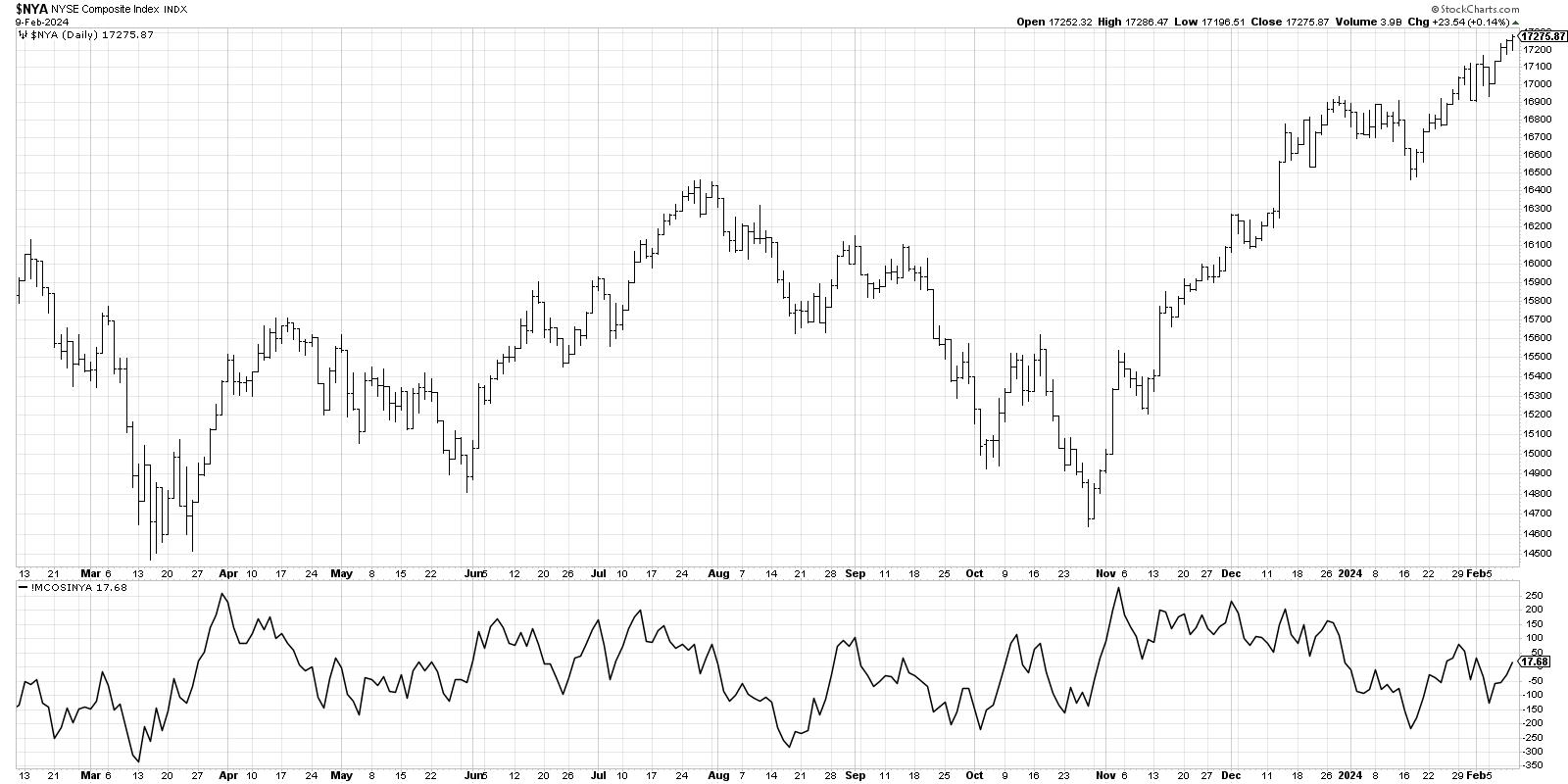
Finally, we're looking for a bearish rotation in market breadth, suggesting that the strength that pushed the benchmarks higher in the bullish phase are now starting to dissipate. Here we use the McClellan Oscillator on NYSE data, and, when the indicator breaks below the zero level, it constitutes a negative breadth reading.
When we put all three indicators together, you get a super busy chart like this!
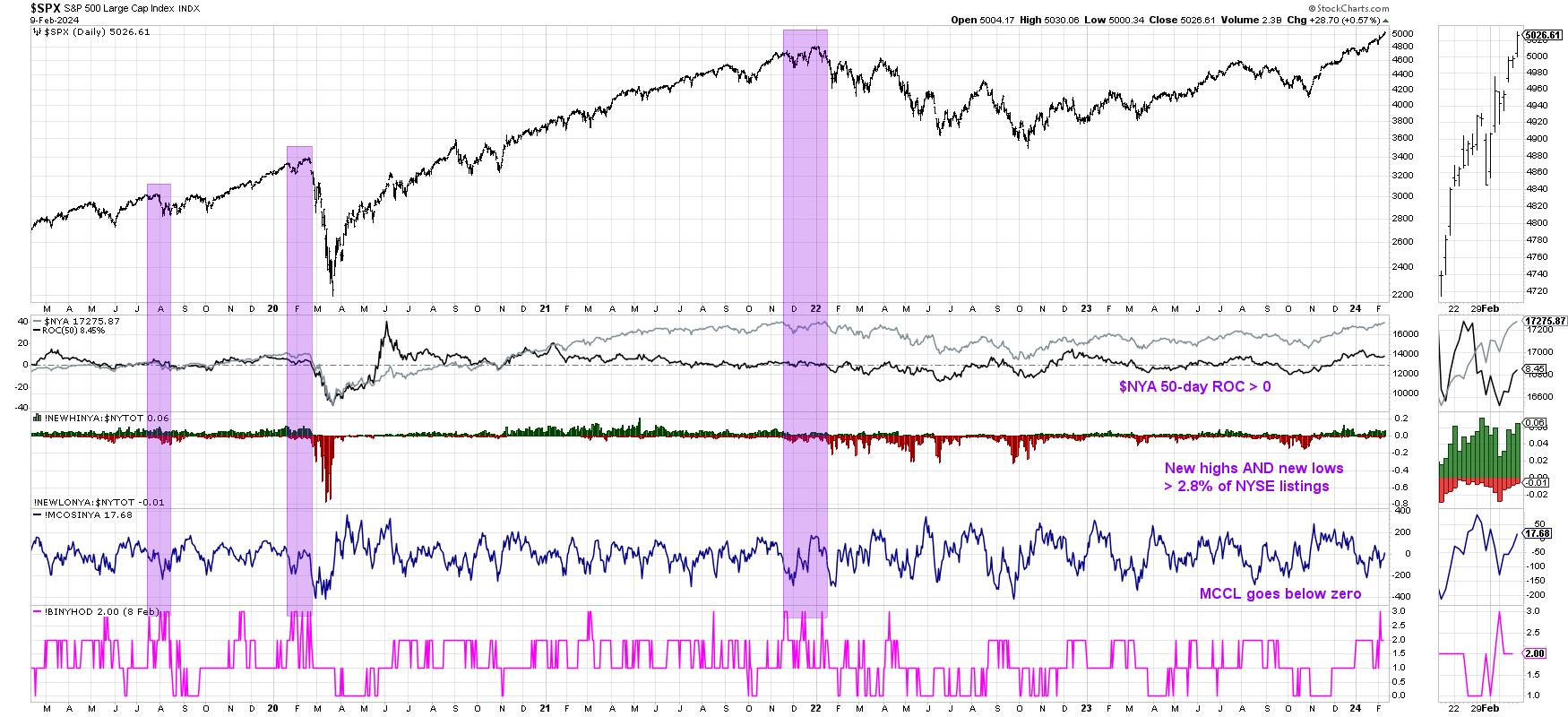
The series at the bottom is a composite indicator that checks for the three conditions above. When all three conditions have been met, the indicator shows a value of +3. It's important to note that just one signal is not enough. You need multiple triggers within a one-month period to complete a valid Hindenburg Omen signal.
In recent market history, we've seen three valid signals: August 2019, February 2020, and December 2021. Two of those signals occurred before significant drawdowns, which is why the initial signal we noted this week has us a bit skeptical of further market upside today. If we do see a confirmed Hindenburg Omen signal with another confluence of triggers over the next couple weeks, then we may be just peering over the precipice of a major market decline.
Indicators like the Hindenburg Omen don't signal often, and they are certainly not 100% accurate at calling major market tops. But mindful investors know to pay attention when conditions look similar to previous market tops. Remember, all large losses begin as small losses!
RR#6,
Dave
P.S. Ready to upgrade your investment process? Check out my free behavioral investing course!
David Keller, CMT
Chief Market Strategist
StockCharts.com
Disclaimer: This blog is for educational purposes only and should not be construed as financial advice. The ideas and strategies should never be used without first assessing your own personal and financial situation, or without consulting a financial professional.
The author does not have a position in mentioned securities at the time of publication. Any opinions expressed herein are solely those of the author and do not in any way represent the views or opinions of any other person or entity.
|
| READ ONLINE → |
|
|
|
| Martin Pring's Market Roundup |
| MEMBERS ONLY |
| Only a Fool Would Try to Call a Correction in a Bull Market, So Here Goes! |
| by Martin Pring |
|
The vast majority of the primary trend indicators are pointing to a bull market and have been doing so for the better part of a year. Chart 1, for instance, shows that NYSE Margin Debt, or rather its long-term KST, has only recently gone bullish...
|
| READ ONLINE → |
|
|
|
| RRG Charts |
| Visualizing the Market Factors Panel on RRG |
| by Julius de Kempenaer |
With the release of the new Panels feature on the StockCharts dashboard, there are a lot of ways that users of RRG charts can take advantage! Let's take a close look at one in particular.
Market Factors Panel
One of the most significant new panels available for users is the "Market Factors" panel.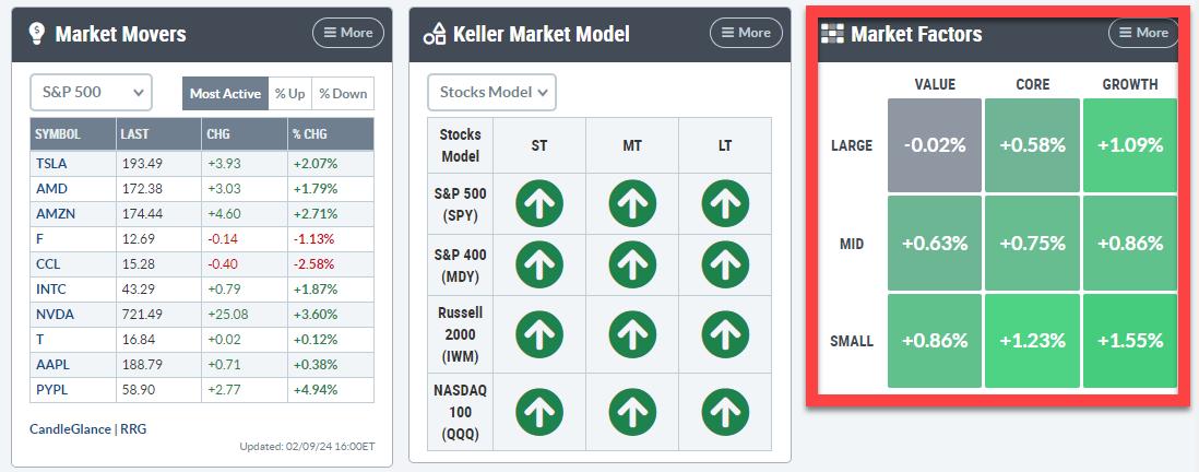
This panel slices the S&P 1500 into nine segments broken down by size-value-growth. It is very similar to the one used in the RRG dropdown.
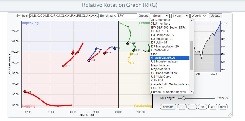
The only difference, and there is quite a distinct difference (as you will see), is that this panel uses S&P indices and only covers the S&P 1500 segments. Meaning the S&P 400, 500, and 600, along with its growth and value brothers and sisters.
Two Key RRGs
Here is the RRG from the pre-defined list.
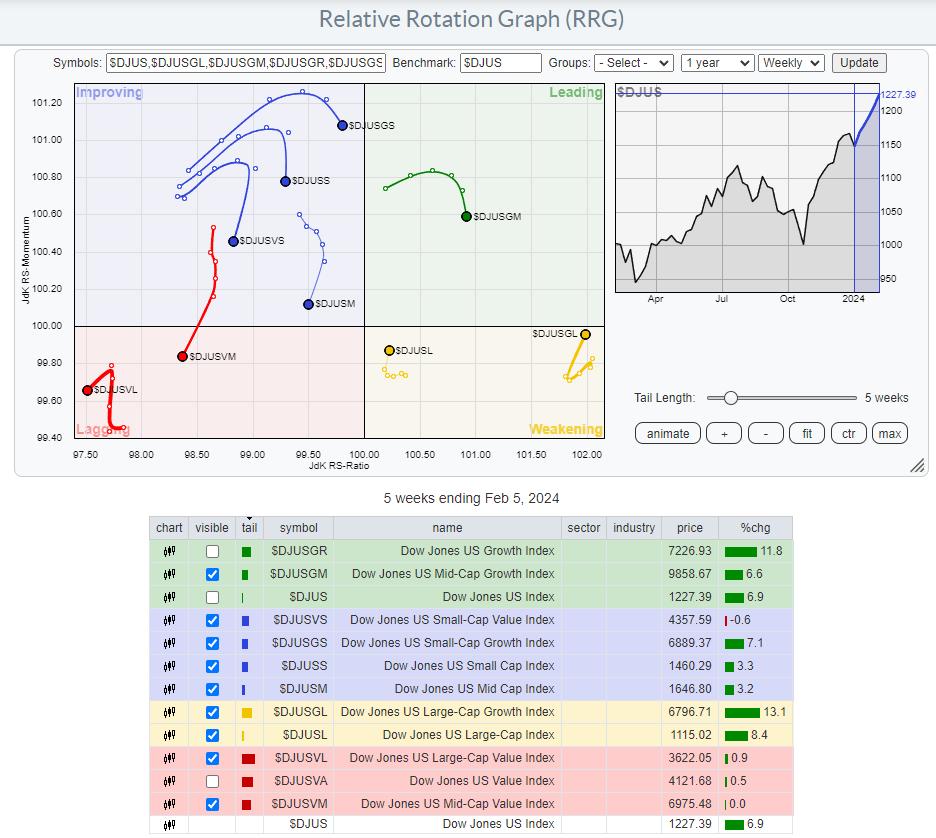
As you can see, I have ticked off the US Growth and US Value indexes, as they cover the entire market (all size segments) and the DJ US index, the benchmark on this graph.
This is the RRG for the market factors using the same underlying ETFs as the Market Factors panel.
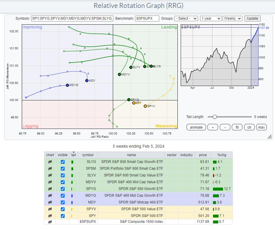
The RRG is linked (just click the image) to a live version on the site, which you can then save as a bookmark in your browser for later retrieval. I will also add this to the group of pre-defined universes.
The benchmark for this group is the S&P Composite 1500 index ($SPSUPX).
Same Approach, Different Images
Looking at these two RRGs, you can see that they are quite different from each other but, in the bigger picture, send a similar message.
The differences are primarily caused by the different universes. The DJ groups hold 153 stocks in the large-cap index, 314 in the mid-cap index, and 610 in the small-cap index. So, especially in the large- and mid-cap segments, the S&P groups are much broader, which can have significant effects on the behavior of the indexes.
I use these "Big Picture RRGs" from a very high level. This means I pay much more attention to the general rotations of the various tails vis-a-vis each other than to their exact locations on the RRG.
One observation that I found quite interesting on the Market Factors Panel RRG is the location of the cluster of SPYG, SPY, and SPYV.
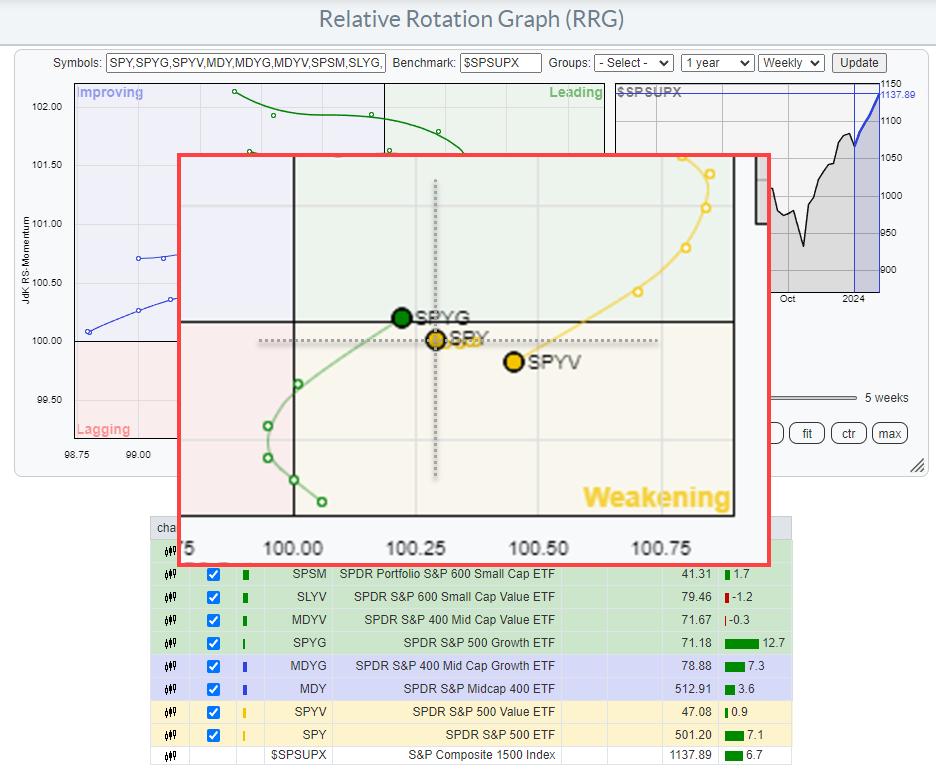
What you can learn from this cluster of tails is their positioning on the RRG and the relative positioning among the three of them.
First of all, these are all S&P 500, so large-cap indices, and they are positioned to the right of the benchmark (S&P 1500) and thus in a relative uptrend. You can also see that inside the S&P 500 segment, growth is rapidly improving against value. The preference started to turn around some 5 weeks ago, when the growth and value tails started to curl.
Much like the DJ version, albeit in a different location on the RRG, what you also see is that the mid- and small-cap groups for both the growth and value segments have started to roll over, some of them already at a negative heading. The only group still at a positive heading is large-cap Growth, and maybe mid-cap growth, though the latter is debatable as this tail is still inside the improving quadrant, but on flat momentum at the lowest RS-Ratio reading in the universe.
This is something to ponder over the weekend, as it means that, once again, the foundation of the rally is getting narrower after an attempt of the mid- and small-cap groups to start participating. This attempt seems to fail, while the market continues to climb..... a "Wall of Worry?" Only time will tell, but I believe there is reason enough to get more cautious, and risk is increasing every day.
#StayAlert and have a great weekend. --Julius
|
| READ ONLINE → |
|
|
|
| Art's Charts |
| Generals March On, but Fewer Troops are Following - Get the Essential Breadth Indicator ChartList |
| by Arthur Hill |
 Divergences reflect a disconnect between price and the indicator. A bearish divergence forms when price forges a higher high and the indicator fails to confirm this high. In the case presented below, we have the S&P 500 moving higher and fewer stocks making it back above their 50 and 20 day SMAs. Fewer stocks are participating in the advance from late December to early February. This shows weakness under the surface and this weakness could extend to the index. Divergences reflect a disconnect between price and the indicator. A bearish divergence forms when price forges a higher high and the indicator fails to confirm this high. In the case presented below, we have the S&P 500 moving higher and fewer stocks making it back above their 50 and 20 day SMAs. Fewer stocks are participating in the advance from late December to early February. This shows weakness under the surface and this weakness could extend to the index.
The chart below shows two breadth indicators based on S&P 500 stocks: the percentage of stocks above their 50 and 20 day SMAs. The S&P 500 hit another new high this week, and remains well above its 50 and 20 day SMAs. These two indicators were keeping pace in December, but stumbled over the last few weeks. Overall, sizable divergences are forming and these could foreshadow a correction or pullback in the stock market.
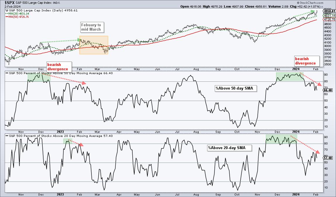
The first indicator window shows SPX %Above 50-day SMA moving above 80% on December 1st and holding above 80% until January 16th (green shading). This indicator then moved below 80% and weaken further into February. The index is at a new high and only 66.40% of its components are above their 50-day SMAs, which means 37.6% are below. Overall, the indicator is above 50%, but fewer stocks made it back above their 50-day SMAs. There is less strength within the S&P 500.
The lower window shows SPX %Above 20-day SMA getting above 80% from November 14th to January 2nd (green shading). This indicator plunged to around 30% in mid January and then rebounded to the 60% area. Again, the S&P 500 is at a new high and far fewer stocks are making it back above their 20-day SMAs.
The S&P 500 is weighted by market cap with the top ten stocks accounting for 32% of the index and the top 50 stocks accounting for 57.34%. This market-cap weighting means divergences in breadth do not always lead to weakness in the index. However, we are also entering a seasonally weak period. Notice that we saw bearish divergences from December 2022 to February 2023 and the index fell around 9% from February 2nd to March 13th, 2023 (yellow shading). Corrections are part of the process.
Interested in Breadth Analysis? StockCharts members who join Chart Trader receive the Essential Breadth Indicator ChartList. Organized in a logical top-down manner, this list has over 100 customized breadth charts covering the major indexes and sectors. There is also an accompanying report and video explaining the charts and indicators. Click here to learn more.
At TrendInvestorPro, we covered this growing divergence and showed a 30 year seasonality chart for the S&P 500 earlier this week. The combination of weak seasonal patterns and deteriorating breadth argues for a pullback. Chart Trader reports and videos are published every Tuesday and Thursday. These include broad market analysis as well as curated setups for trading ETFs and stocks. Click here to learn more.
//////////////////////////////////////////////////
|
| READ ONLINE → |
|
|
|
| Don't Ignore This Chart! |
| Decoding PLTR Stock: Why It's an Attractive Investment |
| by Jayanthi Gopalakrishnan |

If you look at a chart of PLTR stock, you can see that it has had quite a ride, from its short-lived period of glory in 2021, when the stock price rallied from $10 to $45, to a slow decline to a low of $5.84.
Since April 2023, the stock has shown signs of life, with trading volume picking up and the stock price gradually rising. The main reason for this could be its involvement in the AI space. But PLTR's stock price also hit some headwinds when analysts became concerned about the slowing in growth from US government contracts.
Impressive Earnings Send PLTR Stock Higher
Palantir's Q4 earnings report, released Monday after the close, may be the catalyst for returning the stock to its previous highs. A large percentage of Palantir's growth came from commercial deals. Alex Karp, CEO of Palantir Technologies, emphasized the extraordinary performance of commercial deals—70% year-over-year growth—during the Q4 earnings call. Guidance was also positive.
On Tuesday, the stock experienced its best one-day gain ever, and it has continued to rise from there. Palantir was filtered in the New 52-week Highs scan in StockCharts. The weekly chart of PLTR paints a good picture of the stock price since its IPO in 2022. The stock has moved beyond its November high of $21.85 and faces little resistance before its September and November 2021 highs.
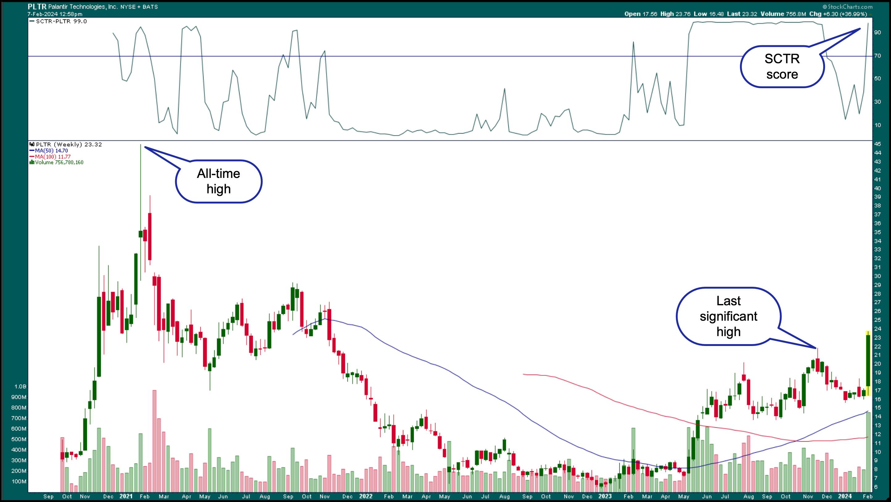
CHART 1. WEEKLY CHART OF PLTR STOCK. The stock has broken above its last significant high and has little resistance before hitting its September and November 2021 highs. The SCTR score sits at 99.Chart source: StockCharts.com. For educational purposes.
Also, note the StockCharts Technical Rank (SCTR) score of 99 (see top panel). Between May and November 2023, the SCTR score was around 99, but it dipped from there. It's now back at its highs, which makes it a stock worth following.
Analyzing PLTR, Technically
When a stock gaps up after an earnings report, how do you know if it'll continue to trend? One way to help identify a trend is to add an indicator, such as the Average Directional Index (ADX), to a chart (see top panel).
In the daily chart of PLTR stock below, the ADX is at 17.62, below the 20 threshold most analysts use. Note that Welles Wilder, the creator of the indicator, preferred to use 25 as the threshold level. Whichever level you use, once the ADX crosses above the threshold level, it indicates a trend.
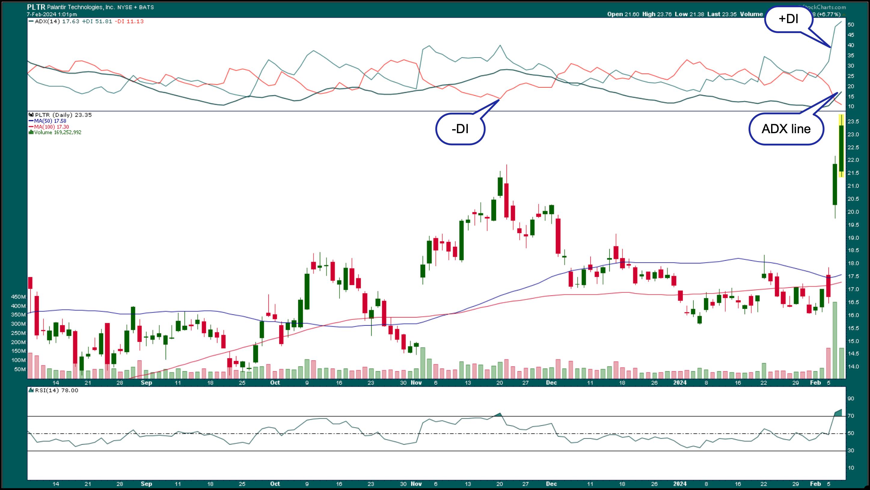
CHART 2. DAILY CHART OF PLTR STOCK. Is the gap up in the stock's price the start of a trend? Monitor the ADX and relative strength index (RSI) to see if the momentum remains strong. If it does, the stock would be a worthwhile investment.Chart source: StockCharts.com. For educational purposes.
Since the ADX is trending higher, it may not be long before it hits the 20 level, especially if PLTR's stock price keeps rising. Remember that the momentum may be strong, as earnings results are still fresh in investors' minds. It tends to wane over time.
To see other stocks filtered in the StockCharts 52-week High scan, check out the Sample Scan Library page.
In addition to the ADX line, you could add the +DI and -DI lines to the indicator (select ADX Line (w/ +DI and -DI from the indicators list in the SharpCharts workbench). In the daily chart above, the +DI (green line) crossed above the -DI, which is considered a buy signal. This occurred a couple of days before the earnings report. If the +DI remains above -DI when the ADX line crosses above 20, it would be a favorable entry condition. A sell signal would be triggered when the -DI line crosses above the +DI line. You may also want to add a trailing stop if PLTR stock moves higher.

The relative strength index (RSI) is an indicator that can help identify a stock's momentum. The RSI is in overbought territory, but that doesn't necessarily mean the stock will sell off. A stock can remain in overbought territory for an extended period. If the stock continues to trend higher and its RSI remains overbought, it indicates that the momentum is still strong and investors are still interested in buying the stock.
The Bottom Line
PLTR's investment in AI data analytics, upbeat earnings, and positive guidance make it a stock to consider adding to your portfolio. Another positive for the company is its four consecutive quarters of positive GAAP earnings. This makes PLTR eligible to be added to the S&P 500. If this happens in 2024, it could be another catalyst that pushes the stock price higher. Most importantly, the stock trades below $30, making it an affordable AI play for many investors.
Disclaimer: This blog is for educational purposes only and should not be construed as financial advice. The ideas and strategies should never be used without first assessing your own personal and financial situation, or without consulting a financial professional.
|
| READ ONLINE → |
|
|
|
| Don't Ignore This Chart! |
| The Costco Stock Surge: What You Need to Know Right Now! |
| by Karl Montevirgen |

Costco (COST) stock has soared into uncharted heights, leaving its last all-time record in the dust. With a little under a month before the company is scheduled to open its earnings book, you'd think investors are expecting something of a blowout report, judging from the price action.
Costco Outperforming the Broader Market and the Staples Sector

CHART 1. WEEKLY CHART OF COST. Note COST's strong outperformance in technical ranking and relative to a few key benchmarks.Chart source: StockCharts.com. For educational purposes.
Costco's SCTR score crept up to 91, which it hasn't seen since 2022, when it last broke record-high territory. This indicates that several technical indicators are flashing a bullish signal, supported by the "full sail" position of its 50-week and 200-week simple moving average (SMA). Strong bullish momentum? It sure appears so.
Plus, COST, on a longer-term scale, has outperformed the broader market ($SPX) and its sector, Consumer Staples, quite handsomely, clocking in a 69% and 77% gain over those respective benchmarks. As an aside, COST is among the several large cap stocks that came up on Thursday's New All-Time Highs scan, on a day when the big three indices barely budged.
But is there sufficient tailwind to maintain its skybound momentum? One way to gauge this is to add an indicator, such as the Money Flow Index (MFI).
Plotting the Money Flow Index on SharpCharts
To add the MFI:
- From Your Dashboard, click on Charts & Tools at the top left navigation bar;
- SharpCharts is the top left selection; enter your ticker symbol there;
- In the SharpCharts Workbench, select the Money Flow Index from the Indicators menu to view the indicator.

What's Happening to the Tailwinds?

CHART 2. DAILY CHART OF COST. Note that all points to continued bullishness except for the MFI, which started showing a decline in buying pressure in December.Chart source: StockCharts.com. For educational purposes.

A quick recap: The Money Flow Index (MFI) is essentially a volume-weighted Relative Strength Index (RSI). When prices go up, more money flows in (buying pressure), and when prices go down, money flows out (selling pressure). The MFI is a momentum oscillator that uses volume and price movements to spot potential turning points and extreme price levels.
You can see COST rising steadily with a slight pullback. Meanwhile, the 50-day, 100-day, and 200-day SMAs are fully extended, indicating a strong uptrend.
In contrast, however, the MFI is declining (see blue arrow) from its last "overbought" level in mid-December, as price continued to rise. This divergence indicates that prices are going up, despite buying pressure declining. In short, a pullback is due, and the most recent candle hints that the market may also be getting the message.

Still, it's too early to confirm that this is the start of a pullback. Typically, Fibonacci retracement levels would be helpful in measuring the pullback and determining a few good long entry points, but this isn't possible just yet, as the pullback hasn't been confirmed.
So instead, if you're bullish on COST, set a price alert at $675, its last swing low (see blue horizontal line). A break below this level would likely mean prices are heading further down. And from there, you'll have several potential entry points:
- A pullback confirmed would be the green light to use StockCharts' Fib retracement tool, which can be used to identify an entry point;
- Look at the 50-day or 100-day SMAs for a potential bounce (especially if any enter confluence with other market support levels); and/or
- Set your sights at $640 (see red horizontal line), the next swing low, for a potential entry.
The Bottom Line
The StockCharts' New All-Time High scan engine, coupled with the SCTR ranking, is a valuable tool for identifying strong stocks to trade. Of course, "all-time high" can often mean "too high" or overbought. Indicators like the MFI, among others, can help you understand whether there's enough momentum to support the stock's current trajectory or if it's due for a pullback. Oftentimes, stocks hitting a record high are due for a pullback, and that's where you select the technical tools to measure the pullback and identify potential entry points.
Disclaimer: This blog is for educational purposes only and should not be construed as financial advice. The ideas and strategies should never be used without first assessing your own personal and financial situation, or without consulting a financial professional.
|
| READ ONLINE → |
|
|
|
| Wyckoff Power Charting |
| Tape Reading for Distribution |
| by Bruce Fraser |
 Recent Power Charting episodes have been devoted to the classic technique of chart reading innovated by Richard D. Wyckoff. He referred to the method as ‘Tape Reading' while it is actually the technique of reading charts, bar by bar to assess the likely future direction of an index, stock, bond or futures contract. This price and volume chart reading method is as powerful and relevant as it was a century ago when Mr. Wyckoff was successfully employing it. Using the Case Study approach we utilized at Golden Gate University (GGU), the recent episodes of Power Charting have largely focused on this type of analysis. Recent Power Charting episodes have been devoted to the classic technique of chart reading innovated by Richard D. Wyckoff. He referred to the method as ‘Tape Reading' while it is actually the technique of reading charts, bar by bar to assess the likely future direction of an index, stock, bond or futures contract. This price and volume chart reading method is as powerful and relevant as it was a century ago when Mr. Wyckoff was successfully employing it. Using the Case Study approach we utilized at Golden Gate University (GGU), the recent episodes of Power Charting have largely focused on this type of analysis.
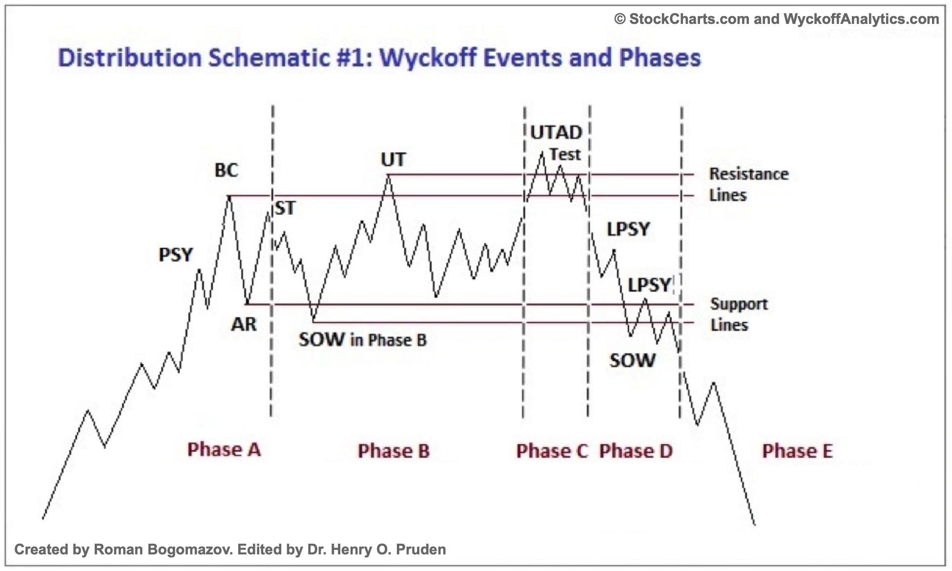
The current Power Charting (link below) has a Distribution case study of United Parcel Service (UPS). Mr. Wyckoff integrated Vertical Bar Chart analysis with Point and Figure studies therefore we do the same in this case.

The Wyckoff Community have enthusiastically embraced these studies and have asked for more of them. I am all for it. Chart reading is about the most fun a Wyckoffian can have! This bar by bar analysis of price and volume is a meticulous process that once understood can reap huge rewards. It is a mastery skill. Wyckoffians will study and markup thousands upon thousands of charts, finding their mastery path continuing to ever higher levels. My mission, in these cases, is to support you on your personal market mastery journey.
All the Best,
Bruce
@rdwyckoff
Disclaimer: This blog is for educational purposes only and should not be construed as financial advice. The ideas and strategies should never be used without first assessing your own personal and financial situation, or without consulting a financial professional.
Power Charting Video: Tape Reading for Distribution
Video Index
00:00 Intro
02:03 New StockCharts Index Members Page
10:43 Pruden Model - Distribution Definitions
11:30 Wyckoff Rules
11:43 Long Term Weekly Chart (UPS)
14:00 Point & Figure Big Picture (UPS)
15:18 Tape Reading Action (UPS)
21:54 Point & Figure (UPS)
Reference to Wyckoff Distribution definitions: CLICK HERE
|
| READ ONLINE → |
|
|
|
| DecisionPoint |
| Sentiment Lopsided - Is It a Problem? |
| by Erin Swenlin |
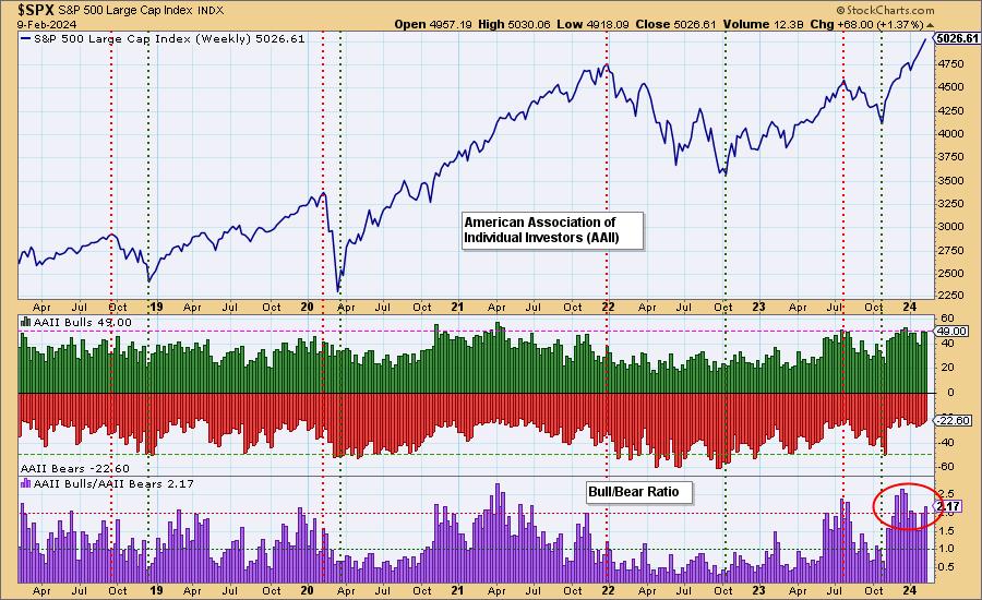
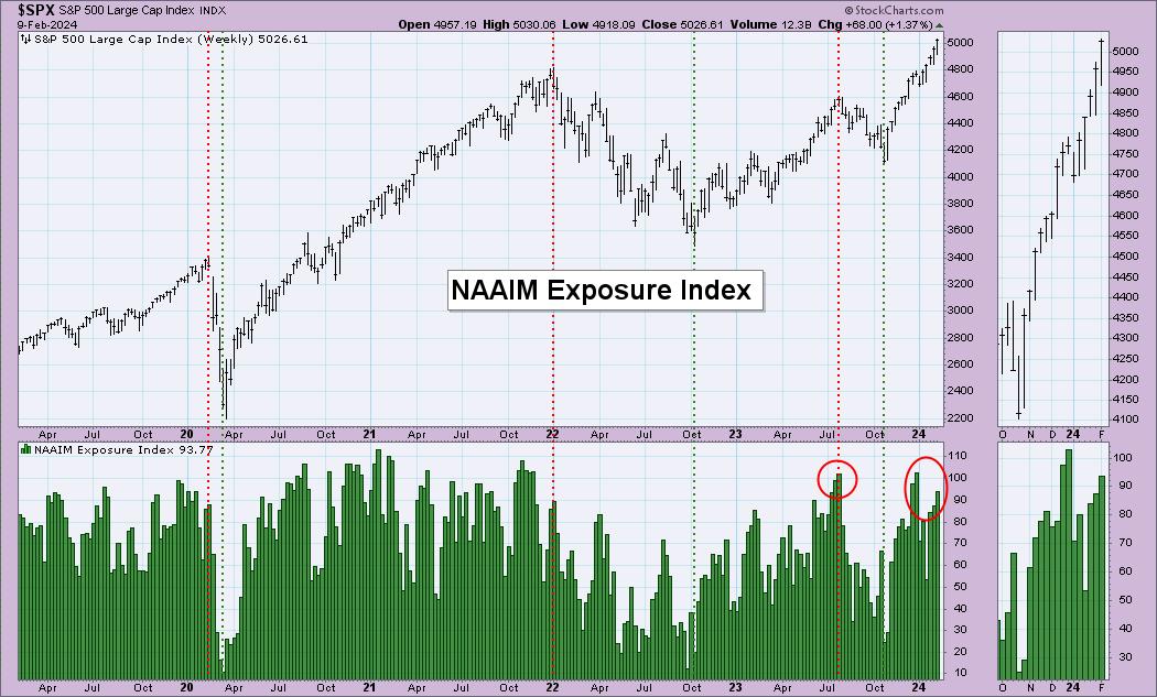
Periodically, we like to review sentiment charts, and today we have two for you. One is the poll results from the American Association of Individual Investors (AAII) and the other is the National Association of Active Investment Managers (NAAIM) Exposure level.
In both cases, we are starting to see sentiment lopsided to the bullish side. Not a surprise; given the rally out of the October lows, investors should be bullish. However, bullish sentiment becomes a problem if it hits extremes. Sentiment is contrarian. When investors get overly bullish and hop on the wagon, the wheels will eventually fall off from the weight. The reverse is also true with extreme bearish sentiment typically leading to higher prices. This is apparent when you look at key tops and bottoms in the market.
The Bull/Bear Ratio is where to focus on the AAII chart. The ratio is definitely showing strain to the upside, but it could get more overbought.

The NAAIM Exposure Index shows high readings of exposure. We would point out that during a strong bull market move, as we saw in 2020-2021, those readings can get very overbought and not lead to downside. We just note that last time readings got to this level, it was a problem.

Conclusion: Readings on sentiment indicators are lopsided to the bullish side. However, we do note that these readings can persist in a strong bull market move. That is likely the case right now, but we should be aware that current conditions are reading overbought for sentiment indicators. It will be worth watching further.
Watch the latest episode of the DecisionPointTrading Room on DP's YouTube channel here!

Try us out for two weeks with a trial subscription!
Use coupon code: DPTRIAL2 at checkout!
Technical Analysis is a windsock, not a crystal ball. --Carl Swenlin
(c) Copyright 2024 DecisionPoint.com
Disclaimer: This blog is for educational purposes only and should not be construed as financial advice. The ideas and strategies should never be used without first assessing your own personal and financial situation, or without consulting a financial professional. Any opinions expressed herein are solely those of the author, and do not in any way represent the views or opinions of any other person or entity.
DecisionPoint is not a registered investment advisor. Investment and trading decisions are solely your responsibility. DecisionPoint newsletters, blogs or website materials should NOT be interpreted as a recommendation or solicitation to buy or sell any security or to take any specific action.
Helpful DecisionPoint Links:
Trend Models
Price Momentum Oscillator (PMO)
On Balance Volume
Swenlin Trading Oscillators (STO-B and STO-V)
ITBM and ITVM
SCTR Ranking
Bear Market Rules
|
| READ ONLINE → |
|
|
|
| MORE ARTICLES → |
|


 Divergences reflect a disconnect between price and the indicator. A bearish divergence forms when price forges a higher high and the indicator fails to confirm this high. In the case presented below, we have the S&P 500 moving higher and fewer stocks making it back above their 50 and 20 day SMAs. Fewer stocks are participating in the advance from late December to early February. This shows weakness under the surface and this weakness could extend to the index.


 Recent Power Charting episodes have been devoted to the classic technique of chart reading innovated by Richard D. Wyckoff. He referred to the method as ‘Tape Reading' while it is actually the technique of reading charts, bar by bar to assess the likely future direction of an index, stock, bond or futures contract. This price and volume chart reading method is as powerful and relevant as it was a century ago when Mr. Wyckoff was successfully employing it. Using the Case Study approach we utilized at Golden Gate University (GGU), the recent episodes of Power Charting have largely focused on this type of analysis.