| THIS WEEK'S ARTICLES |
| The Mindful Investor |
| Bearish Engulfing Pattern Marks Top For NVDA? |
| by David Keller |
Large-cap growth stocks have been outperforming for quite some time, with semiconductors perhaps the most representative of the strength of that trade in recent months. In fact, the semiconductor ETF (SMH) finished the week up 29% year-to-date, far outpacing the S&P 500 and Nasdaq 100, which are both up about 7.5% in 2024.
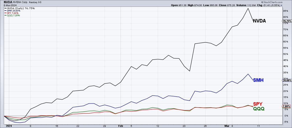
Nvidia (NVDA) has been perhaps the most overheated of the Magnificent 7 stocks, gaining over 87% in 2024 through Thursday's close. Friday, however, saw NVDA open higher and close lower, creating the dreaded bearish engulfing pattern. Does this mean the top is in for Nvidia?
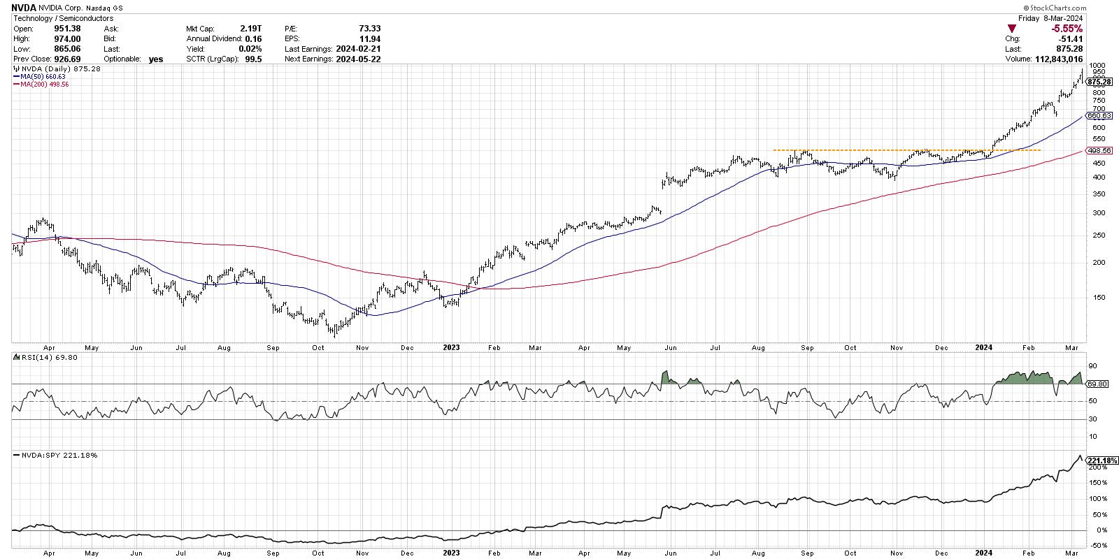
Let's start by reviewing the long-term trend going into this week, which has been nothing short of exceptional. After breaking above resistance around $500 in early January, Nvidia embarked on a consistent uptrend of higher highs and higher lows. NVDA almost doubled in value through this week, reaching an intraday high of $974 on Friday. But the lower close is what really tells the story here.
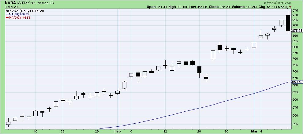
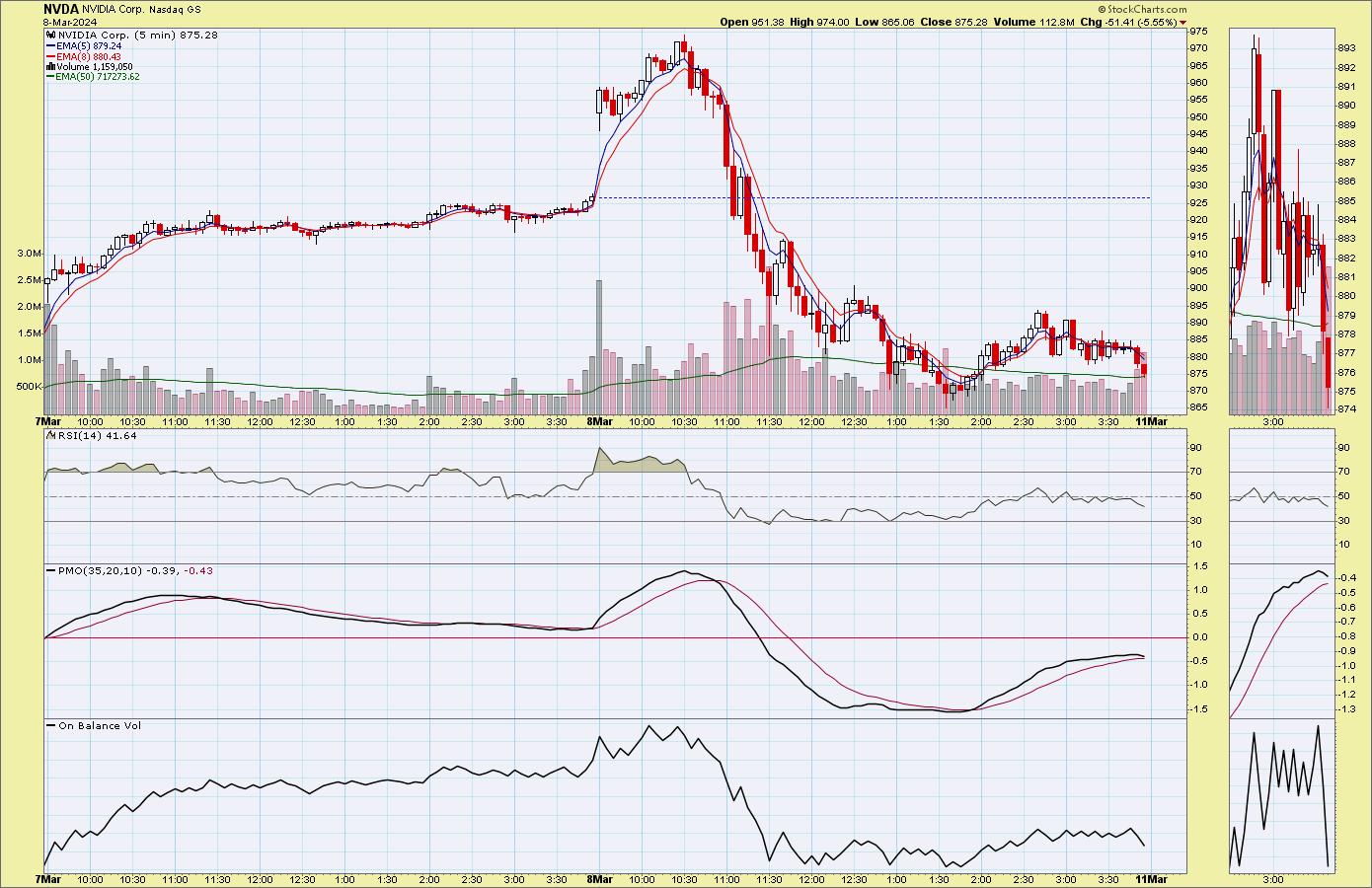
A bearish engulfing pattern is a classic two-bar reversal pattern where an up close, if followed by a down close, and day two's real body "engulfs" the range of day one's real body. The intraday chart for these two days shows how the short-term price action demonstrates a true reversal in sentiment.
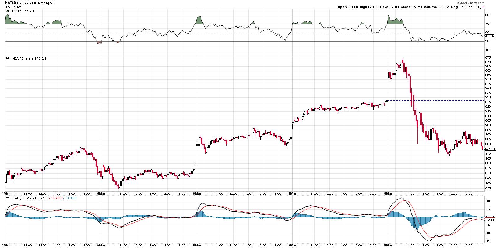
Now we're seeing this week's price action using 5-minute candles. Note how Thursday's rally continued the upward trajectory that really began on Tuesday going into the close. Friday saw a big gap higher at the open, but, after an initial rally, NVDA turned lower and continued this pullback into the afternoon. By the close, Nvidia finished well below Thursday's trading range, creating the bearish engulfing pattern.
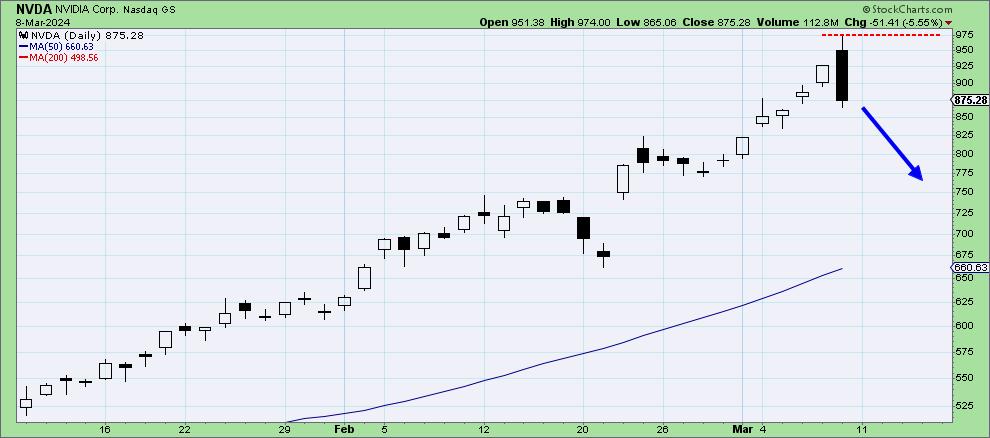
The good news is about two-bar candle patterns is that they provide a built-in risk management system! Steve Nison is generally credited with bringing candlestick charting, a traditional Japanese form of technical analysis, and promoting its merits to Western technical analysts. I spoke with Steve years ago about reversal patterns, and he noted that the high of the two-bar bearish engulfing pattern can be used as a simple stop-loss technique.
So, if NVDA would push above the $975 level next week, based on Friday's intraday high, that would negate the reversal pattern and suggest further upside potential. Otherwise, the bearish implication of this pattern remains in place, and suggests that semiconductors may be in for a pullback as we continue through the month of March.
Author's note: I've set a price alert for NVDA breaking above $975 using the Technical Alert Workbench, and I'd encourage you to do the same!
If we assume that "the top" is in, at least for now, then how can we identify some potential downside targets for Nvidia?
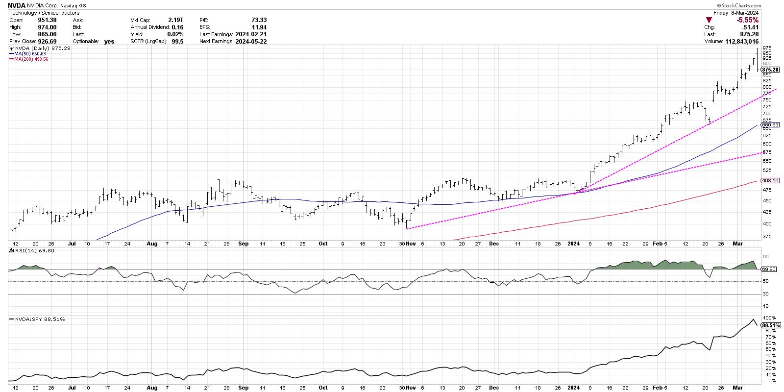
A trendline based on the major lows in 2024 yields a downside objective around $760-775, depending on how quickly a pullback would occur. This would also line up fairly well with Nvidia's most recent swing low, around $775. If this level would fail to hold, I'd key in on the 200-day moving average, which currently sits around $660.
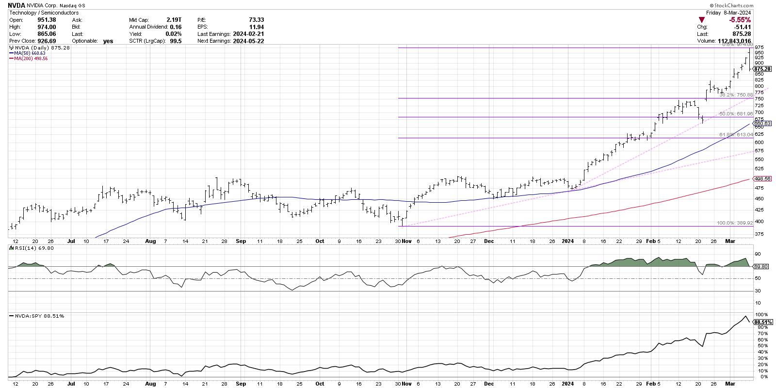
A quick Fibonacci analysis would suggest an initial downside target around $750, which would represent a 38.2% retracement of the October 2023 low to the recent high around $975. The 200-day moving average also lines up well with the 50% retracement level around $682, giving additional emphasis to this as a potential downside support level.
As I mentioned at the beginning of this article, I would consider charts like Nvidia to be innocent until proven guilty. This means an uptrend is in place as long as we continue to observe a pattern of higher highs and higher lows. But, by noticing a bearish engulfing pattern on NVDA, as well as on the S&P 500 and Nasdaq 100, we can anticipate how short-term price reversals could indeed manifest into broader declines that could catch investors by surprise!
RR#6,
Dave
P.S. Ready to upgrade your investment process? Check out my free behavioral investing course!
David Keller, CMT
Chief Market Strategist
StockCharts.com
Disclaimer: This blog is for educational purposes only and should not be construed as financial advice. The ideas and strategies should never be used without first assessing your own personal and financial situation, or without consulting a financial professional.
The author does not have a position in mentioned securities at the time of publication. Any opinions expressed herein are solely those of the author and do not in any way represent the views or opinions of any other person or entity.
|
| READ ONLINE → |
|
|
|
| Martin Pring's Market Roundup |
| MEMBERS ONLY |
| Everyone Has a Plan Until They Get Punched in the Face. Did Jerome Powell Just Get Punched in the Face? |
| by Martin Pring |
|
The title of this article may be exaggerated, but, last Friday, the probabilities for an upward reversal in the rate of inflation later this year went substantially higher...
|
| READ ONLINE → |
|
|
|
| Art's Charts |
| Using the ATR Trailing Stop to Manage the Trade and Define the Trend |
| by Arthur Hill |
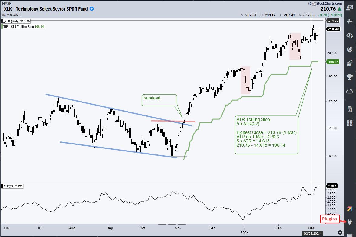
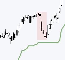 As its name suggests, the ATR Trailing Stop is normally used to trail a stop-loss for a long position. It can also be used to identify an outsized decline that could reverse an uptrend. Today's example will show how to apply the ATR Trailing Stop on a breakout and use it to define the current uptrend in the Technology SPDR (XLK). As its name suggests, the ATR Trailing Stop is normally used to trail a stop-loss for a long position. It can also be used to identify an outsized decline that could reverse an uptrend. Today's example will show how to apply the ATR Trailing Stop on a breakout and use it to define the current uptrend in the Technology SPDR (XLK).
ATR is the Average True Range, which is a volatility indicator developed by J Wells Wilder. The bottom indicator window shows ATR (22) at 3.091 for the Technology SPDR (XLK). The green line on the chart is the ATR Trailing Stop (5 x ATR(22)). 5 is the multiplier. This means it is 5 ATR(22) values below the highest close since November 6th, which is when XLK broke out. When prices rise, this stop will trail prices higher and always remain 5 ATR(22) values below the highest close of the move.

Why did I pick 5 for the multiplier? At the time of the breakout, I choose 5 as the multiplier because this value placed the initial stop just below the late October low (gray line). This is the natural level to set a stop because it represents a support level based on a reaction low. Note that this indicator is part of the TIP Indicator Edge Plugin for StockCharts ACP.
The ATR Trailing Stop can also be used to define an uptrend. There were two sharp pullbacks during the current advance. The red shadings in early January and late February mark these pullbacks. The ATR Trailing Stop held in both cases, which means the pullbacks were less that 5 ATR(22) values. A decline that breaks the ATR Trailing Stop would be greater than 5 ATR(22) values and this would be an outsized decline. Trend changes often happen with outsized moves so I will be watching the ATR Trailing Stop going forward.
Chart Trader reports and videos focus on stocks and ETFs with uptrends and tradeable patterns. Each week we cover the overall market environment and then feature highly curated trading ideas. This week we covered the Copper Miners ETF (COPX), the Metals & Mining SPDR (XME), the Bank ETF (KBWB), Moderna (MRNA), Illumina (ILMN) and more. Click here to learn more and get immediate access.
///////////////////////////////////
|
| READ ONLINE → |
|
|
|
| RRG Charts |
| Clear Split in NY FANG+ Universe Offers Pair Trading Universe |
| by Julius de Kempenaer |

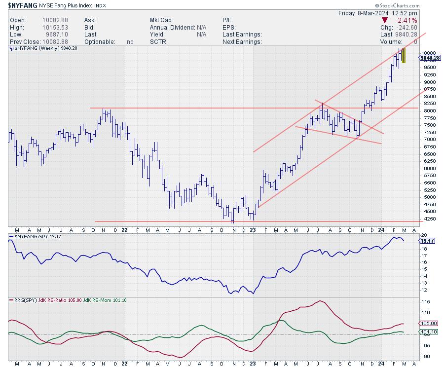
It is no secret that the NYFANG+ Index is still in in incredible up-run after bottoming out in October last year and subsequently breaking significant overhead resistance around 8.000. In the last 3-5 weeks, the index stalled just below 10.000 and moved sideways.
Split Universe
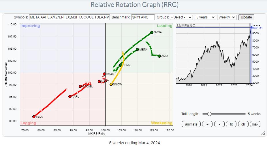
However, under the hood, some big moves are taking place. These are clearly visible on the Relative Rotation Graph.

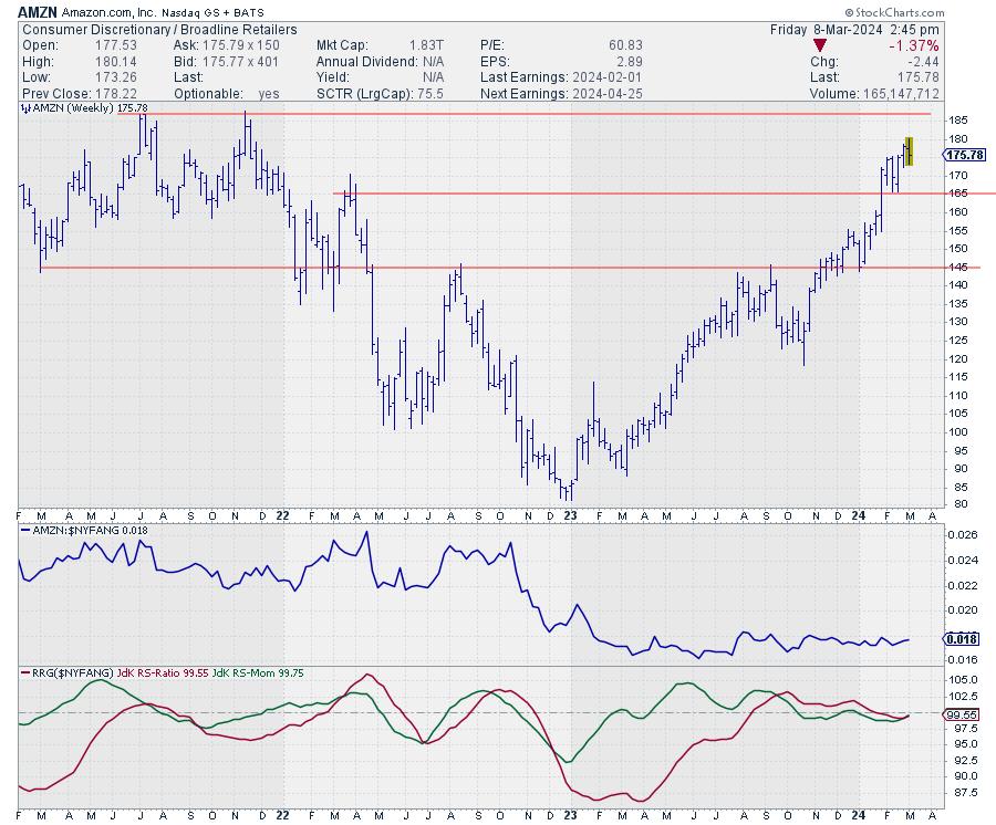
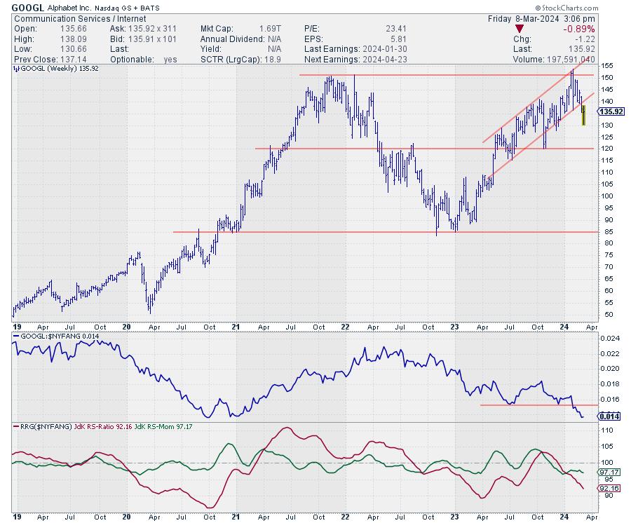
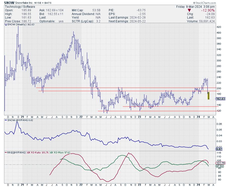
On the weekly RRG, the split between the individual stocks in this universe is clearly visible. AMD, NVDA, META, and NFLX are all inside the leading quadrant AND in a positive RRG-Heading. AMZN is inside the lagging quadrant but very close to the benchmark and on a positive RRG-Heading. TSLA, AAPL, GOOGL, and MSFT are inside lagging AND on a negative RRG-Heading. Also on a negative RRG-Heading, but inside the weakening quadrant, is SNOW. MSFT is the only stock inside lagging, not on a negative or a positive heading.
Given the incredibly steep rise of the market (NYFANG), entering new long positions at current levels means taking a lot of risk. In no way does this mean selling when you hold the index or the stronger stocks in this group. The trend is undeniably still up. But as we all know, the longer and the steeper a trend gets, the higher the risk is getting.
Still, looking for some trading action, I would prefer looking at some pair trading opportunities.
The Long Side
The candidates for the long side of a pair trade would be NVDA, META, AMD, NFLX, and AMZN.
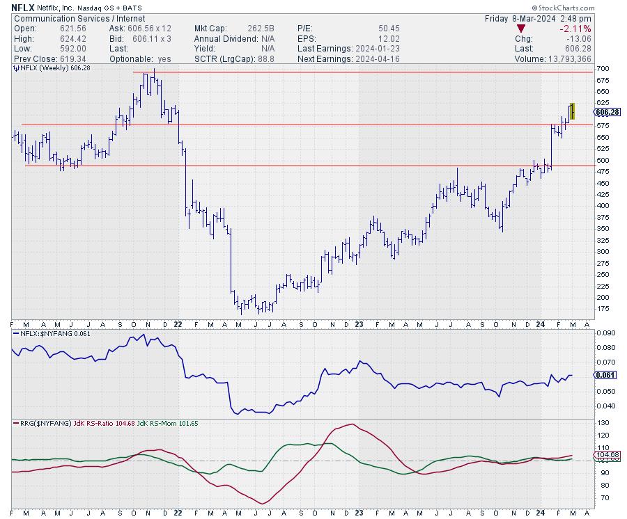
Looking at the individual charts of NVDA, META, and AMD, they are on almost vertical trajectories and very deep inside the leading quadrant. This leaves NFLX and AMZN as potential candidates, as they seem to have some upside potential left in them.
AMZN or NFLX


Looking at both charts, I see that they look very similar. Both have recently broken overhead resistance and both are underway to test their respective all-time high levels.
The upside potential, measured from current levels to ATH for NFLX, is around 14%, whereas, for AMZN, it is only 6%. Combine that with the tail for NFLX already being inside the leading quadrant and at a strong RRG-Heading while AMZN is still inside the lagging quadrant (on a positive heading), and my preference goes to NFLX. It has more price potential and has already made the turnaround from a relative downtrend to a relative uptrend.
The Short Side
The candidates for the short side of a pair trade would be coming from TSLA, AAPL, GOOGL, or SNOW. And to be honest, all four would be good candidates. However, AAPL and TSLA are relatively close to their support levels, where demand might pick up. Maybe only temporarily, but still, I have to assume that it might stall any immediate further declines.
GOOGL or SNOW
That leaves GOOGL and SNOW for further inspection.


The downside risk/potential for both, towards their next support levels, is quite similar, around 12-13%. However, the tail for GOOGL is already well inside the lagging quadrant and has just confirmed the already existing downtrend in relative strength by breaking below its previous relative low. This makes me lean a bit more toward GOOGL as the short candidate, but equally good arguments can be found for SNOW.
You could even think about a three-legged position, with NFLX on the long side and GOOGL and SNOW, each being half of the short side.
Such an approach would still get you "in the game" while being agnostic to general market direction.
#StayAlert and have a great weekend. --Julius
|
| READ ONLINE → |
|
|
|
| DecisionPoint |
| What Happened to NVIDIA (NVDA)? |
| by Erin Swenlin |
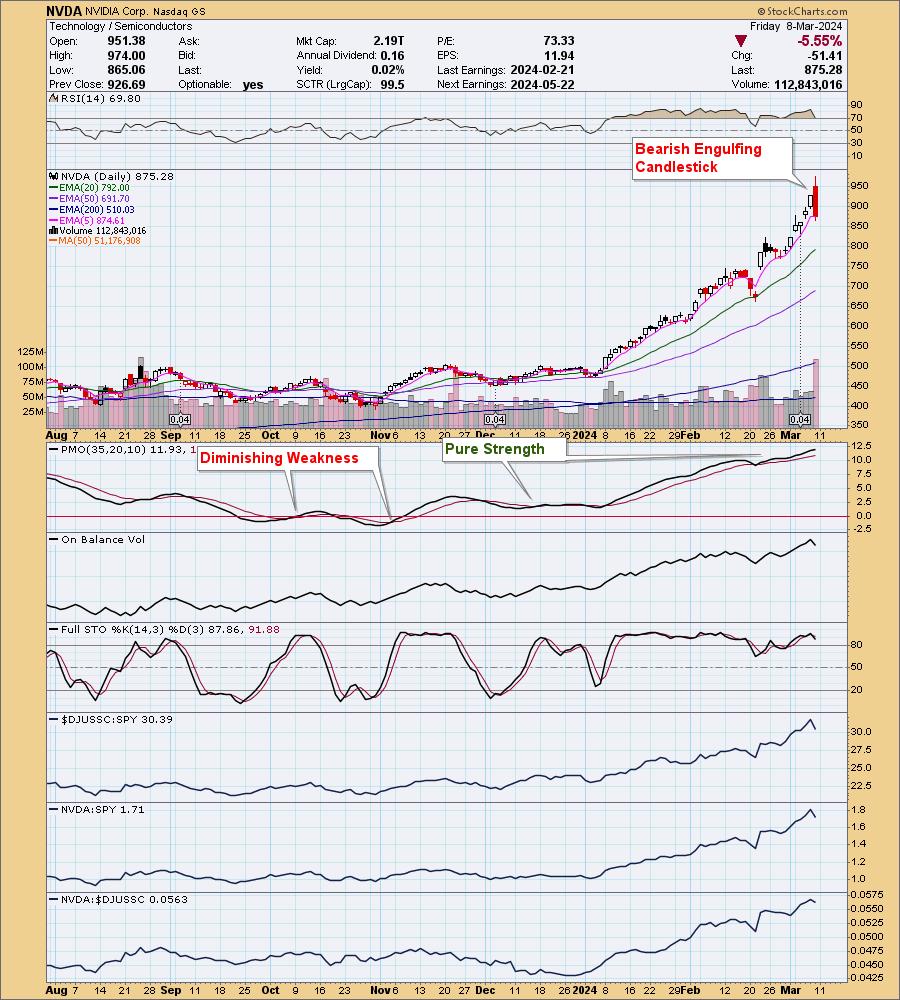
NVIDIA (NVDA) was enjoying quite a rally to start the day. All seemed right with the world. Someone recently said to me, regarding another company, that it was "a victim of its own success." This is what happened to NVDA.
It appears that the ceiling was reached for investors, who were ready to take profits and move on. Over the prior six days of trading, NVDA was up over 19%. It was time for some profit-taking.

Today's decline did set up a bearish engulfing candlestick that would imply more downside ahead on Monday. But will it really herald more selling? We saw that decline before earnings, and it didn't turn into much. It's time for a pullback, or at the very least consolidation, but we wouldn't be at all surprised if this powerhouse defies gravity further. It wouldn't be a bad idea to get a stop set here to preserve profits, just in case this does signal a more concerted decline.

Learn more about DecisionPoint.com:
Watch the latest episode of the DecisionPointTrading Room on DP's YouTube channel here!

Try us out for two weeks with a trial subscription!
Use coupon code: DPTRIAL2 at checkout!
Technical Analysis is a windsock, not a crystal ball. --Carl Swenlin
(c) Copyright 2024 DecisionPoint.com
Disclaimer: This blog is for educational purposes only and should not be construed as financial advice. The ideas and strategies should never be used without first assessing your own personal and financial situation, or without consulting a financial professional. Any opinions expressed herein are solely those of the author, and do not in any way represent the views or opinions of any other person or entity.
DecisionPoint is not a registered investment advisor. Investment and trading decisions are solely your responsibility. DecisionPoint newsletters, blogs or website materials should NOT be interpreted as a recommendation or solicitation to buy or sell any security or to take any specific action.
Helpful DecisionPoint Links:
Trend Models
Price Momentum Oscillator (PMO)
On Balance Volume
Swenlin Trading Oscillators (STO-B and STO-V)
ITBM and ITVM
SCTR Ranking
Bear Market Rules
|
| READ ONLINE → |
|
|
|
| Trading Places with Tom Bowley |
| You Need To Realize ONE Important Fact With Big Rallies Like This One |
| by Tom Bowley |
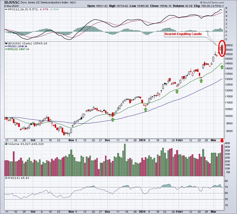
Make absolutely no mistake about it, Friday was the most bearish day of 2024. There was a bearish engulfing candle on MASSIVE volume in the semiconductors area ($DJUSSC), and this group has been BY FAR the biggest single reason why our major indices have advanced as much as they have. Check out this chart:

That's a NASTY bearish engulfing candle on the semiconductor chart. And the reversal occurred on the second largest volume of the past 6 months. I believe today's open marked a very significant top on the DJUSSC. That doesn't mean the overall market rally has ended. But I do expect to see other areas of the market lead the next advance. At a minimum, I'd expect at least short-term consolidation or selling among semiconductor stocks. That's not a bad thing, it's a necessary thing. Continuing higher in parabolic fashion would only end in a much more substantial pullback.
But huge rallies do not always end in despair. In fact, most just keep on truckin'!
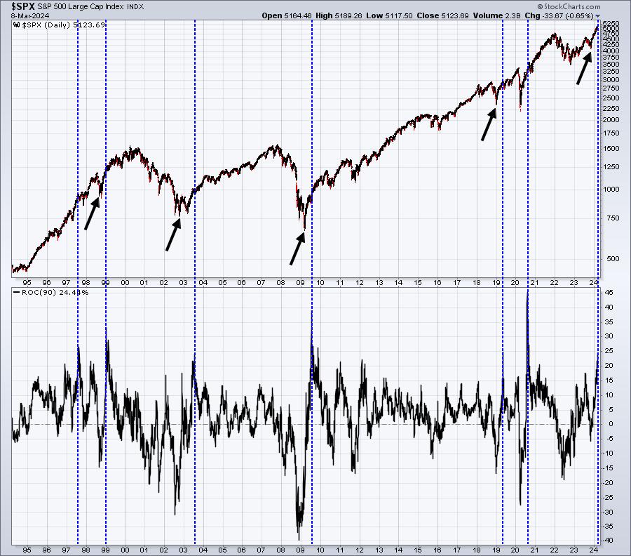
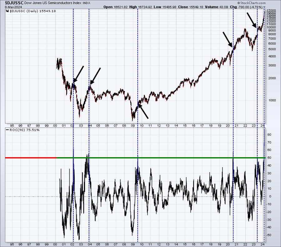
Let's check to see how the rally off the October 27th low measures up against other periods over the past few decades, first on the S&P 500 and then on the semiconductors index ($DJUSSC):
S&P 500:

The blue-dotted vertical lines coincide with every 90-day period in which the S&P 500 gains 25% or more. Prior to the current 25% gain in 90 days, you can see that it's only been achieved a handful of other times over the past 30 years. The black arrows tell you that every one of these 25% rallies occurred AFTER a significant bear market bottom or correction low. This is the importance of calling major market bottoms, because the biggest gains take place on the heels of these bottoms.
Next, check out what happens to the S&P 500 after these 25%+ gains are made. It keeps going higher! We are in a secular bull market. If you have been waiting to get into this rally, I'd consider using any short-term weakness to do so. That's my opinion, of course. I'm not a Registered Investment Advisor and, therefore, am not licensed to provide recommendations. I'm simply providing educational materials based on my research. Do with it what you will.
Semiconductors ($DJUSSC):

Here, the blue-dotted vertical lines coincide with 90-day periods where the DJUSSC gains at least 50%. Again, this has only happened a handful of times. Right now, the last 90 days has resulted in a gain in the DJUSSC of more than 75%, which eclipses any other semiconductor rally over the past 30 years. The group needs a break.
Should semiconductors stall here, I'm still very encouraged by the small cap asset class. On Monday, I'll be analyzing a tiny software company that this week broke out of a cup with handle pattern on crazy high volume. It potentially could gain 40-50% over the next few months to its pattern measurement. To check it out, you can CLICK HERE to subscribe to our FREE EB Digest newsletter with only your name and email address. I'll send you this tiny software stock on Monday morning.
Happy trading!
Tom
|
| READ ONLINE → |
|
|
|
| ChartWatchers |
| Ozempic Set the Stage, But Could Novo's Newest Drug Be the Real Moneymaker? |
| by Karl Montevirgen |
If you ran a StockCharts scan for Runaway Gaps (Runaway Gap Ups) on Thursday, you would have come across only 12 stocks. Among them, the most recognizable name was Novo Nordisk A S (NVO), the Danish pharma company best known as the developer of the popular diabetes II drug, Ozempic.
Having already gained 26% since January, NVO jumped over 9% after reporting successful early trial results for its new weight loss drug, amycretin. Trial participants who took the drug achieved an average weight loss reduction of 13.1% over a 12-week period.
Wall Street sentiment is betting on the possibility that this new drug will be just as big as, if not bigger than, Ozempic, and some investors want to get in early. It's easy to see why by simply looking at a weekly chart plotted over five years, covering the time when Ozempic became mainstreamed not only as a diabetes drug, but as a weight loss drug.
 CHART 1: WEEKLY CHART OF NOVO. Notice the significant strength and momentum of the uptrend over a five-year period. The demand for weight loss is virtually "inelastic" these days. CHART 1: WEEKLY CHART OF NOVO. Notice the significant strength and momentum of the uptrend over a five-year period. The demand for weight loss is virtually "inelastic" these days.
Looking at the 50-, 100-, and 200-week Simple Moving Averages, not only are have they been fanning-out in full sail since Ozempic ads have began penetrating the mainstream consciousness, but NVO appears to be stretching the MAs to breaking point (if you can imagine such a thing), defying gravity with only the slightest indication (yet) of a potential pullback.
The daily picture gives us a clearer picture, not only of the strength of NOV's performance, but of potential entry points should you want to go long.
 CHART 2. DAILY CHART OF NVO. Not only does this look like a microcosm of the longer-term weekly chart, it also illustrates a similar trend relative to the broader market, its sector, and industry. CHART 2. DAILY CHART OF NVO. Not only does this look like a microcosm of the longer-term weekly chart, it also illustrates a similar trend relative to the broader market, its sector, and industry.
Runaway gaps, characterized as strong bullish continuation patterns, are located in the middle of a trend. But trends can only be confirmed looking backwards; we're not there yet. So, are we looking at an exhaustion gap instead, one on the verge of a pullback?
Note the divergence between NOV's price surge and the Money Flow Index (MFI) reading. As a volume-weighted RSI of sorts and an indicator to gauge momentum and anticipate possible reversals, the divergence we're seeing hints at a potential dip in NVO's share price.
Despite this, note NVO's strong outperformance relative to the S&P 500 (+17%), its own sector via SPDR Health Care Select Sector Fund XLV (+20%), and the Dow Jones U.S. Pharmaceuticals Index or $DJUSPR (+23%).
The 50-day SMA and the Kumo segment of an Ichimoku Cloud has been plotted to show a potential landing point if a pullback were to occur. And if NVO were to pull back now, drawing a Fibonacci retracement from the October 2023 low would give us a 50% level right at $112.50, so we're looking at the range, mostly covered within the "cloud."
The Bottom Line
But here's where you really have to think for yourself. Ozempic fever drove NVO's seven-year uptrend, and arguably, it isn't over yet. The most recent surge is driven by sentiment and speculation surrounding that amycretin will bolster and continue NVO's winning streak. The $112 to $118 range may be a reasonable "technical" entry point, but with a PEG (Price to Earnings to Growth) ratio of 4.87, it's far from being undervalued.
How to Run a StockCharts Scan
Finding the right stocks and exchange-traded funds (ETFs) to trade can be tricky. But with a little work, you can create a strategy that identifies a few promising prospects.
Fortunately, it isn't too hard to learn how. Just stick to these steps:
- Select (or create) a few different scan criteria
- Be sure to run these scans regularly
- Analyze the stocks (or ETFs) that your scan has identified
- Determine your overall trading setup (including your entry and exit criteria)
The StockCharts Scan Engine is useful for narrowing down stocks and ETFs that match certain requirements. It comes with a bunch of ready-made scans that are a good starting point. As you get the hang of these scans, you can adjust them or create new ones that align with your trading goals.
For example, this article was prompted by a Runaway Gap Ups scan. As you can imagine, there are plenty more scans you can run. Try out the StockCharts Sample Scan Library (Charts & Tools > Sample Scan Library)
|
| READ ONLINE → |
|
|
|
| MORE ARTICLES → |
|


 As its name suggests, the ATR Trailing Stop is normally used to trail a stop-loss for a long position. It can also be used to identify an outsized decline that could reverse an uptrend. Today's example will show how to apply the ATR Trailing Stop on a breakout and use it to define the current uptrend in the Technology SPDR (XLK).