| THIS WEEK'S ARTICLES |
| The Mindful Investor |
| Three Breadth Indicators to Confirm a Bullish Market Trend |
| by David Keller |
There's no denying the strength the major averages have displayed off their April lows. The S&P 500 finished the week within a rounding error of the previous all-time high around 5250. What would it take for the SPX and NDX to power to new all-time highs in May?
Today, we'll break down three market breadth indicators that we are watching to confirm the likelihood of a further rise for the equity indexes. We're also watching those same three charts for warning signs of a trend exhaustion! First, let's measure how many stocks are above key moving averages.
Percent of Stocks Above the 50- and 200-Day Moving Averages
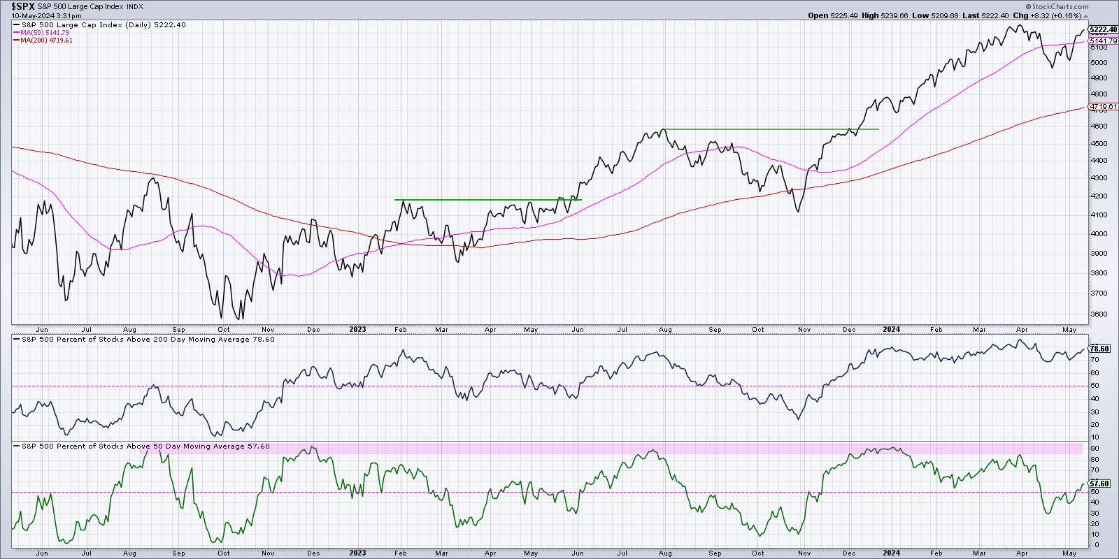
One of my favorite breadth indicators looks at how the members of a particular index are trading relative to their 50-day and 200-day moving averages. During an uptrend phase, a stock tends to be moving higher above two upward-sloping moving averages. By making this simple comparison across a large number of names, we can determine whether a market move is more of a narrow or a broad advance.

The bottom panel shows that at the end of 2023, about 90% of the S&P 500 members were trading above their 200-day moving average. By the mid-April market low, that number had gone down to around 30%. That suggests that about 60% of the S&P 500 members had broken down through their 50-day moving average in early 2024. Talk about a broad market decline!
Since the April low, this indicator has popped back over 50% to reach almost 60% this week. I've generally observed values over 50% are bullish, meaning that most SPX members are in a short-term uptrend. Thus, as long as this indicator remains above 50%, conditions are fairly constructive. In terms of danger signs on this chart, I've noticed that when the indicator gets up to around 85-90%, that's usually right around a market top. So, for now, this indicator suggests market strength.
New 52-Week Highs and Lows
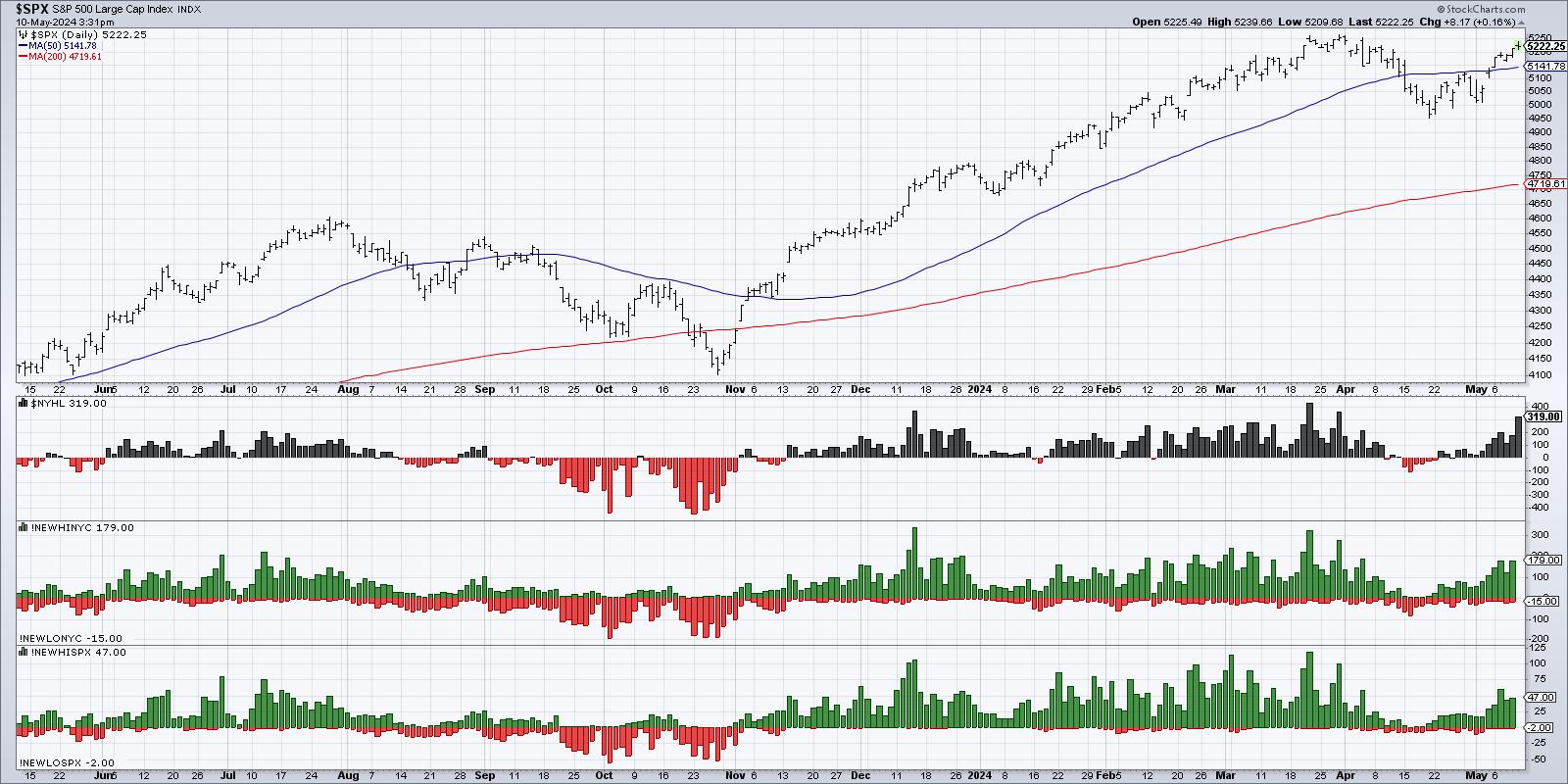
Now that we've determined a broad advance off the April lows, what about the leadership names? Are there stocks already achieving a new 52-week high?

You can see in the bottom panel that, when the S&P 500 had pulled back to around 4950 in mid-April, there were very few 52-week highs (green) or 52-week lows (red) for the S&P 500 members. Most stocks had made a new 52-week high in Q1, and most are still well above their October 2023 lows. But, in the subsequent three weeks, you can see a growing number of new 52-week highs.
So even though the S&P 500 itself has still not achieved a new 52-week high, there are some early leadership names that are already pushing to their own 52-week high. A healthy uptrend is usually marked by an expansion in new 52-week highs. Hence, the more green on this chart going forward, the better.
What would raise a red flag on this second chart? Basically, an evaporation of new 52-week highs would tell you those early leadership stocks are no longer making upward progress, and that, most likely, we are in a new pullback phase.
Nasdaq 100 Bullish Percent Index
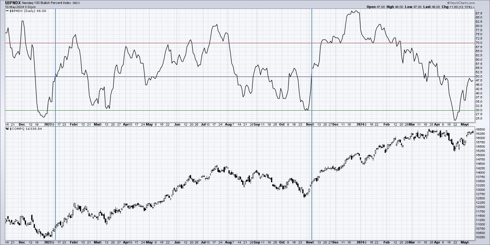
The Bullish Percent Index is a market breadth indicator constructed by analyzing point & figure charts for a particular universe -- in this case, the Nasdaq 100 members. What percent of those stocks have most recently given a buy signal on their own point & figure charts?

The top panel shows the Nasdaq 100 Bullish Percent Index, which is getting very near to the 50% level. I have found that when the indicator dips below 30%, but then pushes back above 50%, this often serves as a strong buy signal and suggests further upside. You can see the most recent signals in January 2023 and November 2023 demonstrate this phenomenon.
So if this indicator pushes above 50% in the month of May, that would suggest that the current uptrend phase may just be getting started. If the indicator fails to push above 50%, that could indicate that this group of leading growth stocks, including pretty much all of the Magnificent 7 stocks, are not showing enough upside momentum to confirm the uptrend.
Do you think the S&P 500 will achieve a new all-time high above 5250 in May 2024? Watch the video below, then drop a comment and let me know!
RR#6,
Dave
P.S. Ready to upgrade your investment process? Check out my free behavioral investing course!
David Keller, CMT
Chief Market Strategist
StockCharts.com
Disclaimer: This blog is for educational purposes only and should not be construed as financial advice. The ideas and strategies should never be used without first assessing your own personal and financial situation, or without consulting a financial professional.
The author does not have a position in mentioned securities at the time of publication. Any opinions expressed herein are solely those of the author and do not in any way represent the views or opinions of any other person or entity.
|
| READ ONLINE → |
|
|
|
| Martin Pring's Market Roundup |
| MEMBERS ONLY |
| NYSE and Global A/D Lines Trade at New All-Time Highs |
| by Martin Pring |
|
The magnitude and duration of corrections are largely determined by the direction of the prevailing primary trend. If it's bearish, they tend to be more severe and last longer...
|
| READ ONLINE → |
|
|
|
| RRG Charts |
| These Three Strong Financial Stocks Look Ready To Surge Higher |
| by Julius de Kempenaer |

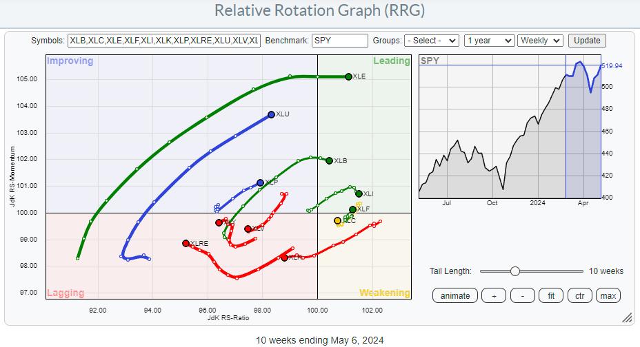
The Relative Rotation Graph for US sectors shows long tails for XLE and XLU. Both are on a strong RRG-Heading toward or into the leading quadrant. Also inside the leading quadrant are XLB and XLI, though they have rolled over and are starting to lose a bit of relative momentum.
Sectors on negative RRG-Heading and inside the lagging quadrant are XLRE, XLY, XLV, and XLK, with the S&P 500 moving higher in the last three weeks.
For this article, I want to focus on the Financials sector (XLF). The tail for XLF just completed a short rotation through the weakening quadrant and is now returning into the leading quadrant.
The Weekly Chart

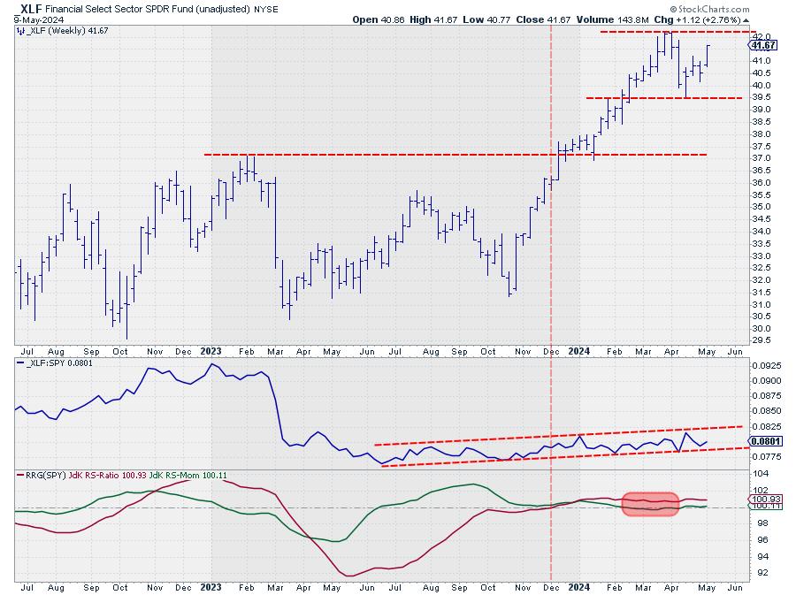
The chart above, in combination with the RS-Line and the RRG-Lines, shows what is happening presently. At the dashed vertical line, both RRG-Lines had crossed above the 100-level, pushing the XLF tail into the leading quadrant on the RRG. At the start of 2024, the green JdK RS-Momentum line started to roll over and lose some strength, causing the XLF tail to roll over while still inside the leading quadrant. At the start of the red-shaded box, the RS-Momentum line dips below 100. This has pushed the XLF tail into the weakening quadrant. Note that the red JdK RS-Ratio line remains above 100. At the end of the shaded box, the RS-Momentum line crosses back above the 100-level, which pushes the tail back into the leading quadrant.
When you study the raw RS-Line, you see that it is moving inside a narrow uptrend channel. The period covered by the shaded area reflects a flat period of relative strength inside that channel, after which the rhythm of higher highs and higher lows continues. This rotation on the RRG reflects the continuation of an existing relative uptrend, making it much less risky than the turnaround from a downtrend to an uptrend, which happened at the dashed vertical line.
The Daily Chart

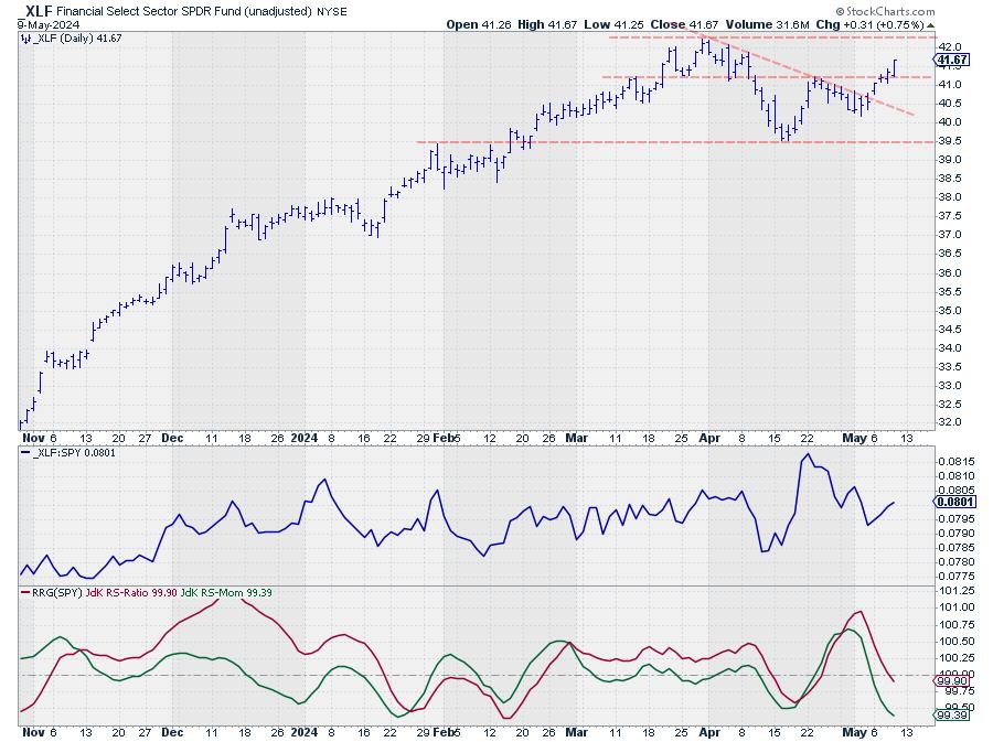
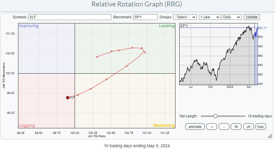
The recent dip to 39.50 and the subsequent rally show up in more detail on the daily chart. This week, XLF takes out its most recent high, starting a new series of higher highs and higher lows. The next resistance level is at the all-time high of 42.20 at the end of March. The setback off of that all-time high has caused relative strength to correct slightly, causing the (daily) RRG-Lines to dip below 100 and push the XLF tail into lagging on the daily RRG.

With the price chart already back on the way up, relative strength is expected to follow shortly. As soon as the daily tail starts to turn back into a 0-90 degree RRG-Heading, relative strength for XLF is expected to improve further, making it one of the leading sectors in the S&P 500.
Individual Stocks

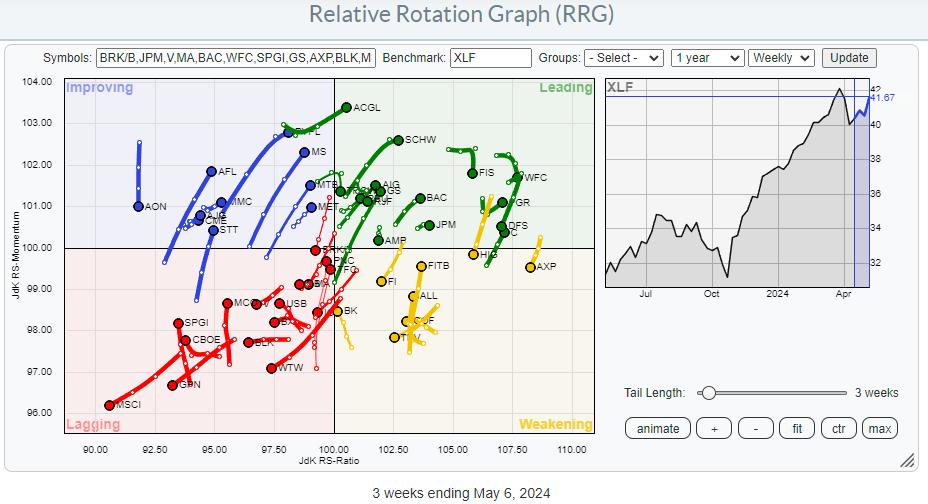
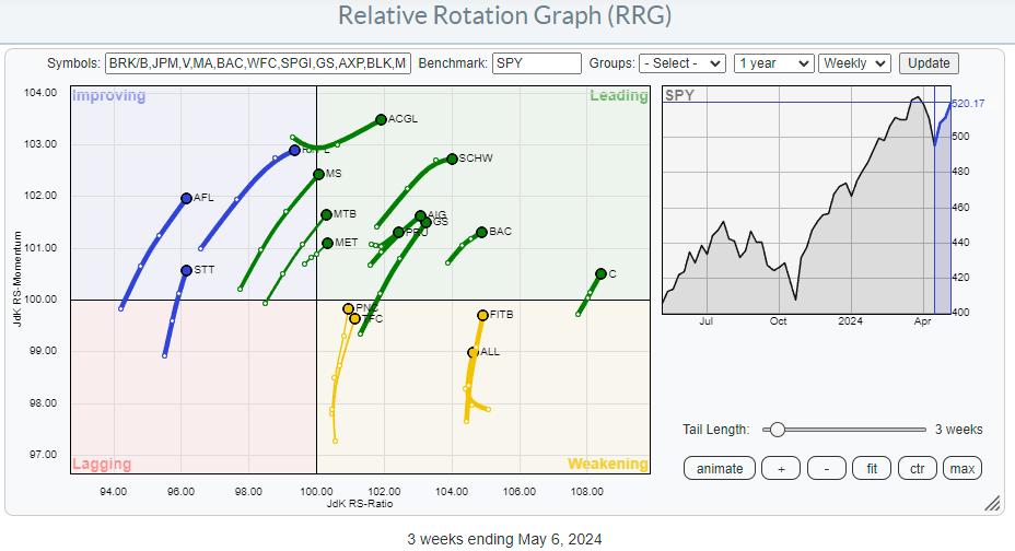
The RRG for individual stocks inside the financials sector shows an evenly-distributed universe around the (XLF) benchmark. Going over the tails for the individual stocks, I found a few names that are definitely worth a closer look.

This RRG shows the tails at a strong heading, narrowing the search for good stocks. While checking out the individual charts, I found several promising names. The three that I want to mention here are not only at strong rotational trajectories, but also (close to) breaking out, AND they are some major names in the sector.
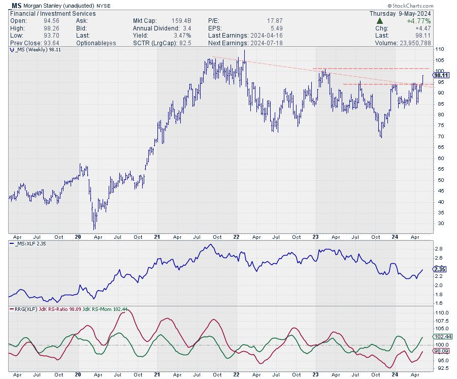
Morgan Stanley

MS is breaking a double resistance level this week, as the horizontal barrier over the most recent peaks and the falling resistance line coming off the 2021 peaks coincided. This unlocks fresh upward potential for MS, with intermediate resistance waiting around 100 before nearing the area around the all-time high at 105.
Subsequently breaking these barriers will push this stock further into the leading quadrant, making it one of the leaders in the sector.
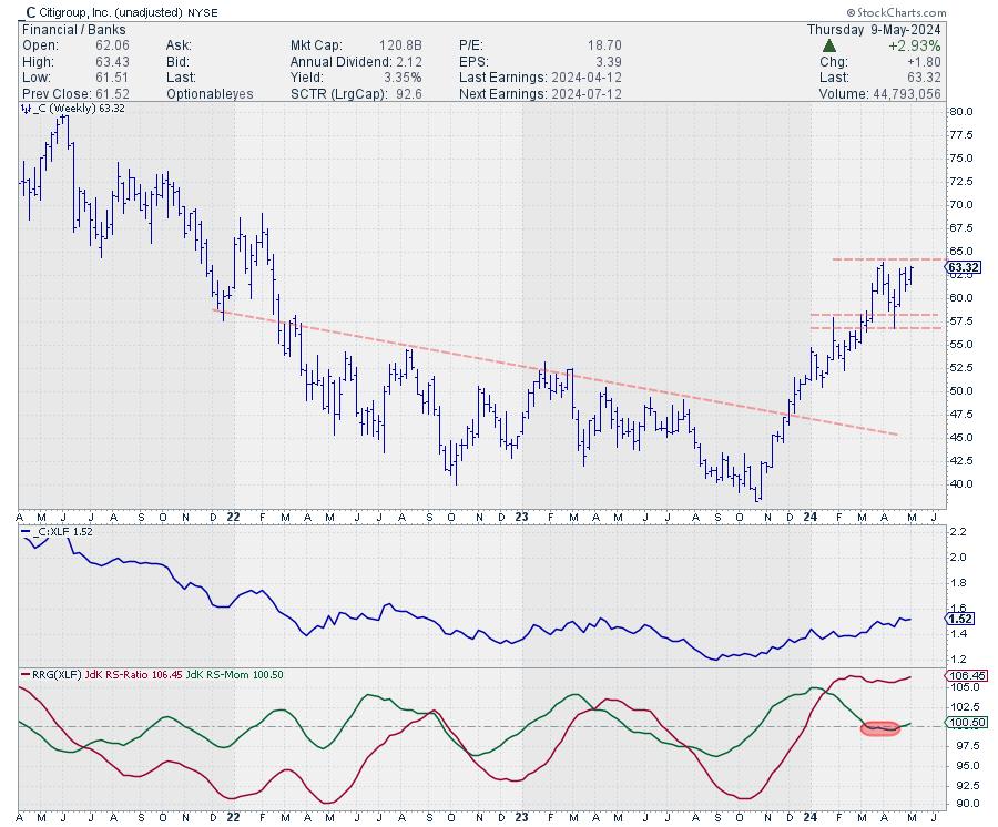
Citigroup

Citigroup is still trading below its previous high. However, given the recently-formed higher low and the strong rally out of it, an upward break is likely. Such a break is supported by the recent relative rotation back into leading from weakening.
Just like MS, C is also one of the bigger names in the financials sector. Strength in big names is usually what drives a sector up.
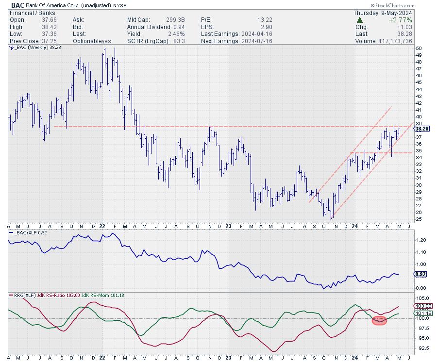
Bank of America

BAC is also close to breaking overhead resistance, after which there is plenty of upside. Relative strength is coming out of a long downtrend that started early in 2022, making this a major reversal. Taking out the barrier at 38 opens the way for a further move toward 50, which is substantial. But unlike you may think, that area is NOT the all-time high for BAC... that was set around 55 in October 2006.
Like MS and C, BAC is also one of the more important stocks in the Financials sector. Another important name in the sector is GS, which I did not include as it is already well underway after breaking higher.
When such important names in a sector are all starting to break higher, it is good news for that sector.
#StayAlert, --Julius
|
| READ ONLINE → |
|
|
|
| Don't Ignore This Chart! |
| Why Novo Nordisk's Stock Price Recovery Makes It a Promising Buy |
| by Jayanthi Gopalakrishnan |

Novo Nordisk (NVO) reported Q1 earnings on May 2. Even though it was a positive report, sales of its weight-loss drug Wegovy came in below expectations, causing the NVO stock price to fall lower.
The selloff may have been an initial and short-lived reaction, as NVO pivoted and gapped up on Monday. Maybe investors realized that the stock was a bargain, given that overall sales are strong, as are sales of Ozempic, its diabetic drug.
The stock was filtered in the StockCharts Technical Rank (SCTR) crossing scan, which looks for stocks crossing above the 76, 79, and 80 levels. The logic behind the scan is to find stocks that are beginning to gain strength and could potentially be good candidates to add to your portfolio.
Novo Nordisk's Technical Outlook
Follow the live chart.
Let's analyze the charts of Novo Nordisk stock.
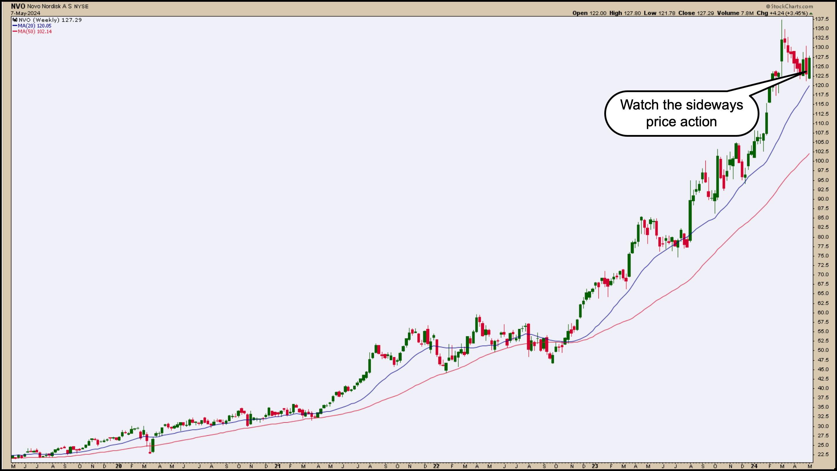
The five-year weekly chart of NVO below shows the stock is trending upward, particularly since October 2022.

CHART 1. WEEKLY CHART OF NOVO NORDISK. The stock price has been trending higher and is now pulling back. Could it break out higher and reach its all-time high?Chart source: StockCharts.com. For educational purposes.
For the most part, NVO has traded above its 20-week simple moving average (SMA). The stock pulled back while the overall market was pulling back. What's interesting in NVO's pullback is that it started looking like a flag pattern, but then moved sideways.
Follow the live chart.
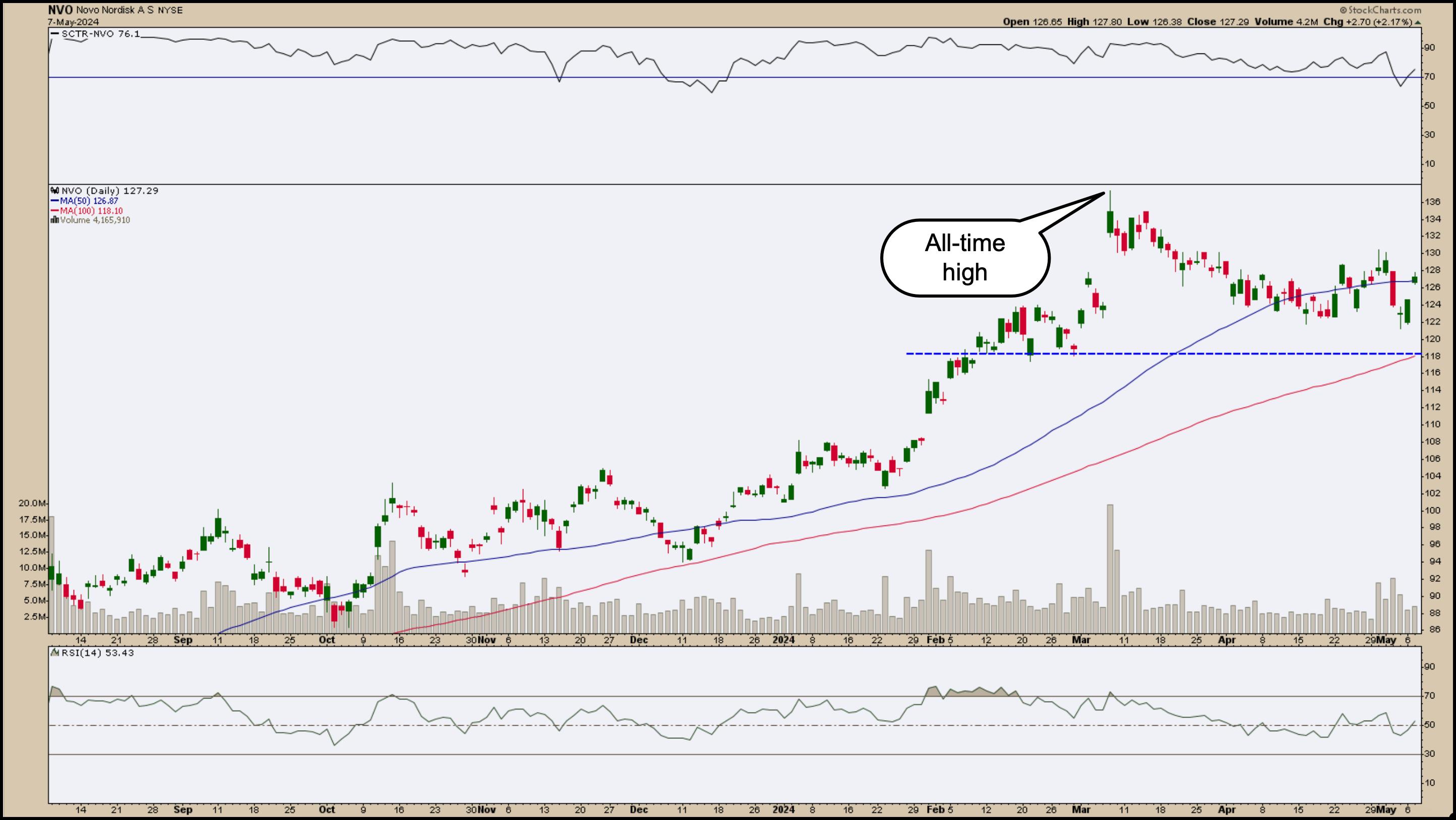
The daily chart below shows a more granular picture. The upward trend stalled, but recovered. The stock price is at its 50-day SMA with slightly higher volume.

CHART 2. DAILY CHART OF NOVO NORDISK. If the stock price moves above the 50-day moving average on strong follow-through, the price could reach and move above its all-time high.Chart source: StockCharts.com. For educational purposes.
The relative strength index (RSI) in the lower panel is slightly above 50, indicating that, if the stock moves higher, it has room to move before hitting overbought territory. The SCTR line in the top panel has crossed above the 70 line, another positive for the stock.
If NVO continues moving higher, accompanied by a rising RSI and SCTR, the odds of the stock price hitting its all-time high are good. If the upward price movement has strong follow-through, the stock could also hit new all-time highs.
With all stocks, you'll have to look at the other side of the coin. What if NVO fails to hold the support of its 50-day SMA? It could fall to its 100-day SMA, which at this point coincides with previous support levels. If the SCTR dips below 50 and RSI moves below 30, the probability of an uptrend will reduce significantly.
The Takeaway
When you see a stock you like, it's a good idea to add it to one of your ChartLists. All charts may not move in the direction you expect them to go, but the weekly and daily chart of NVO are worth watching. Novo Nordisk's stock has potential to rise further and, if it does, your portfolio could get a nice boost.
SCTR Crossing Scan
[country is US] and [sma(20,volume) > 100000] and [[SCTR.us.etf x 76] or [SCTR.large x 76] or [SCTR.us.etf x 78] or [SCTR.large x 78] or [SCTR.us.etf x 80] or [SCTR.large x 80]]
Credit goes to Greg Schnell, CMT, MFTA.
Disclaimer: This blog is for educational purposes only and should not be construed as financial advice. The ideas and strategies should never be used without first assessing your own personal and financial situation, or without consulting a financial professional.

|
| READ ONLINE → |
|
|
|
| Art's Charts |
| Six Leaders, but One Is Getting Real Frothy |
| by Arthur Hill |
After sharp declines into mid April, stocks rebounded over the last three weeks and the S&P 500 SPDR (SPY) came within 1% of its March high. This March high acts as a benchmark high that chartists can use to compare performance. Stocks and ETFs trading above their March highs are leading and showing relative strength.
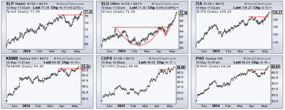
Current leaders include the Consumer Staples SPDR (XLP), Utilities SPDR (XLU), Aerospace & Defense ETF (ITA), KBW Bank ETF (KBWB), Copper Miners ETF (COPX), Infrastructure ETF (IFRA) and Water Resources ETF (PHO). The CandleGlance chart below shows all hitting new highs here in May. All six are also in clear uptrends.

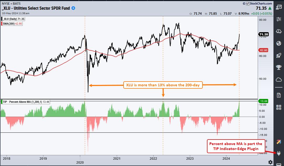
The CandleGlance chart above shows XLU with a cup-with-handle breakout at 66 in late April. This signal was featured in ChartTrader on April 30th. Despite a strong extension on this breakout, XLU is a concern because it is trading some 13% above its 200-day SMA. The next chart shows XLU with the Percent Above MA (1,200,1) indicator. XLU was more than 13% above its 200-day SMA in February 2020 and April 2022 (dashed lines). This ETF is getting frothy and ripe for a correction. This indicator is part of the TIP Indicator-Edge Plugin for StockCharts ACP.

This week at TrendInvestorPro (ChartTrader) we featured tradable patterns in Vertex Pharma (VRTX), Union Pacific (UNP), the Home Construction ETF (ITB), Lennar (LEN) and CrowdStrike (CRWD). We continue to monitor short-term breadth during this rebound and update our 14 indicator Composite Breadth Model every Tuesday. Click here to learn more.
//////////////////////////////////////////////////
|
| READ ONLINE → |
|
|
|
| Trading Places with Tom Bowley |
| This Is What I Mean By Leading Stocks In Leading Industry Groups |
| by Tom Bowley |
Sample Report
A few days ago, I provided a sample of our Weekly Market Report (WMR), which is sent to our EarningsBeats.com members on Mondays. Below is a sample of our Daily Market Report (DMR), sent out to members on Tuesdays through Thursdays. A very brief market update is sent out on Fridays.
Enjoy the report as a thank you for following me here at StockCharts.com over my 17 years of contributing articles. If you'd like to kick the tires on our EarningsBeats.com service, we have a 30-day FREE trial and there's never been a better time to join. Our Spring Special kicks off in the next week, so if you enjoy our service, you'll have an opportunity to extend your membership using our best deal of the year. CLICK HERE to get your free trial started!
Executive Market Summary
- Our major indices were lower overnight, but reversed when initial claims unexpectedly rose
- That rise in claims quickly drove the 10-year treasury yield ($TNX) lower, aiding stock futures
- Commodities are jumping today as silver ($SILVER, +2.71%) moves within 2% of its recent high close
- The dollar ($USD) reversed yesterday after moving higher in prior sessions, likely adding to the interest in commodities
- Crude oil ($WTIC, +0.23%) reversed yesterday as well; any move higher from here will meet a lot of congestion near $82 per barrel
- Today's equity strength currently is centered in real estate (XLRE, +1.81%) and utilities (XLU, +1.12%), two defensive sectors
- Technology (XLK, -0.18%) is the only sector in negative territory at this time as computer services ($DJUSDV, -3.16%) is weighing on the group
- Airbnb (ABNB, -6.62%) is one of the worst S&P 500 performers after reporting quarterly results; ABNB has broken beneath recent price support at 155 in an overall deteriorating travel & tourism group ($DJUSTT)
Market Outlook
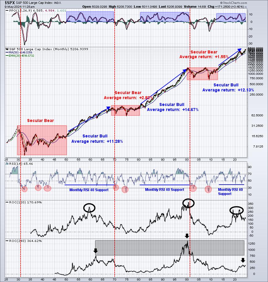
The only time during the last 12 years that I suggested it was a good time to sit it out was heading into 2022 and just before one of our worst cyclical bear markets hit. Otherwise, I've suggested that anyone investing for the long-term stay the bullish course and remain long. Of course, the ultimate decision is entirely yours. We provide our guidance based on our own independent research and signals, but it's always up to you. We can't take on your risk and we are not privy to your personal financial situation and risk tolerance. It would be foolish for us to attempt to manage anyone's money, and it would also be ill-advised since we are not Registered Investment Advisors and are not licensed to do so.
As a quick refresher, if you're natural tendency is to want to short the stock market, I'd simply put this up next to your computer screen as a reminder of what the stock market does over time. Then decide if you'd be better off with a positive mindset or negative mindset when it comes to U.S. equities:

This is why I feel it's important to ignore the news and follow the charts. There are always reasons why the stock market is about to plummet. That's one constant that never changes. To be a successful investor/trader, you need to be able to look objectively at the stock market and only hunker down when most signals line up bearishly. In my humble opinion, that's not the case right now.
Sector/Industry Focus
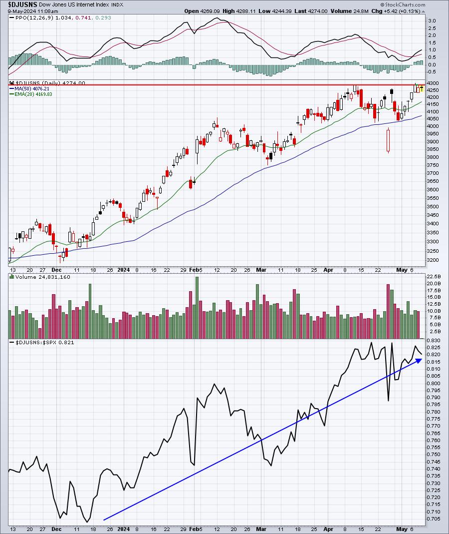
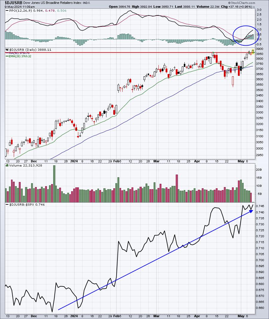
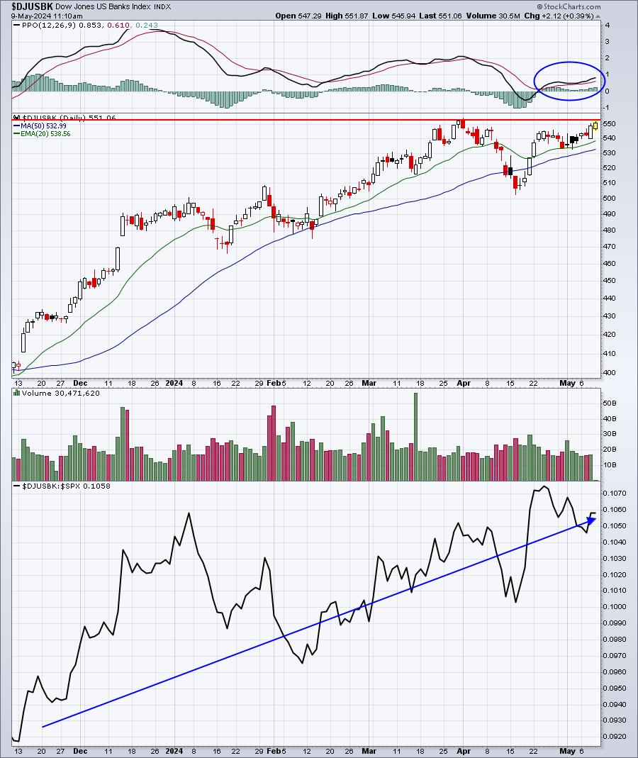
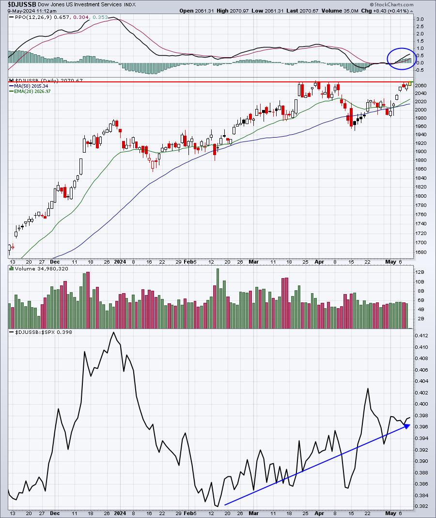
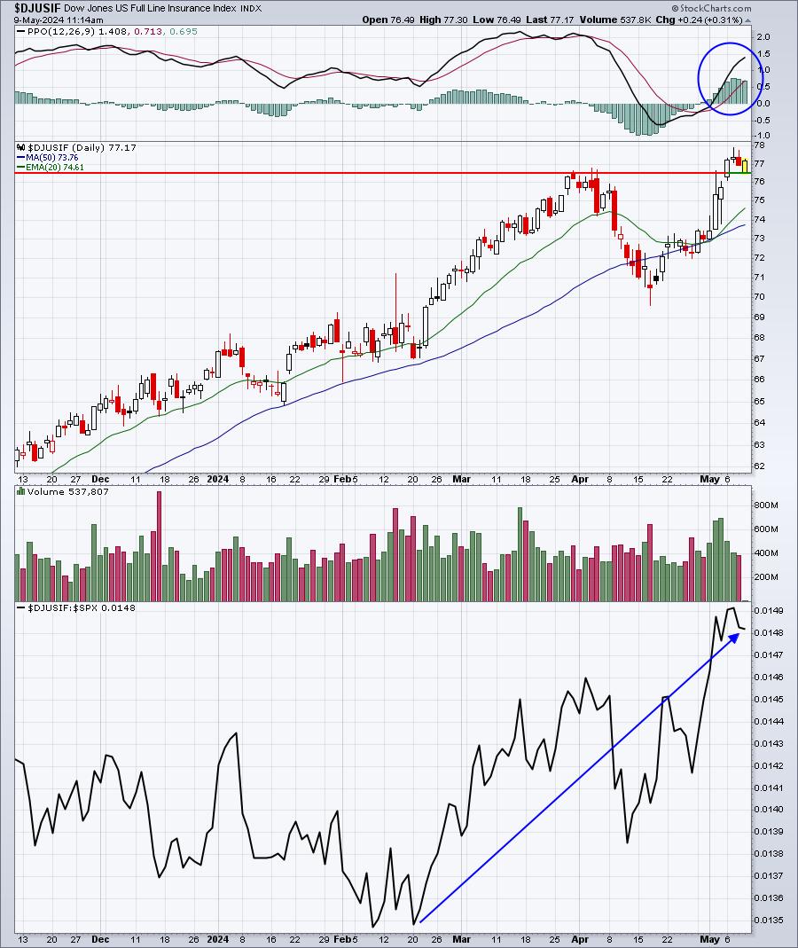
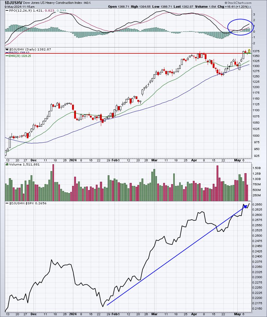
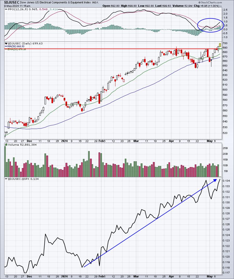
Here are several industries that are breaking out to new highs or threatening to break out - all amongst our 5 aggressive sectors - XLK, XLY, XLC, XLI, and XLF. When I talk about trading leading stocks within leading industry groups, this is how you begin the process. Find several of the best industry groups:
Internet ($DJUSNS):

Broadline Retailers ($DJUSRB):

Banks ($DJUSBK):

Investment Services ($DJUSSB):

Full Line Insurance ($DJUSIF):

Heavy Construction ($DJUSHV):

Electrical Components & Equipment ($DJUSEC):

ChartLists/Strategies
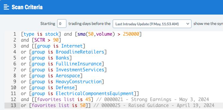
Ok, so if we truly remain in a secular bull market and the recent period of selling/consolidation is drawing to a close, how do we find individual stocks to consider for the next leg up in the stock market. Well, first we know that the above industry groups are strong right now and strengthening. Defense ($DJUSDN) and aerospace ($DJUSAS) were not shown above, but are two other industries really strong now. Second, let's run a scan of stocks with SCTRs above 90 (excellent relative strength) that reside in the above industry groups. I'll add a minimum average volume filter and run this scan against our Strong Earnings ChartList (SECL) and Raised Guidance (RGCL) - you can run this scan against the entire stock population if you'd like. But by including our SECL and RGCL, we know that these companies are strong fundamentally in addition to their technical strength:

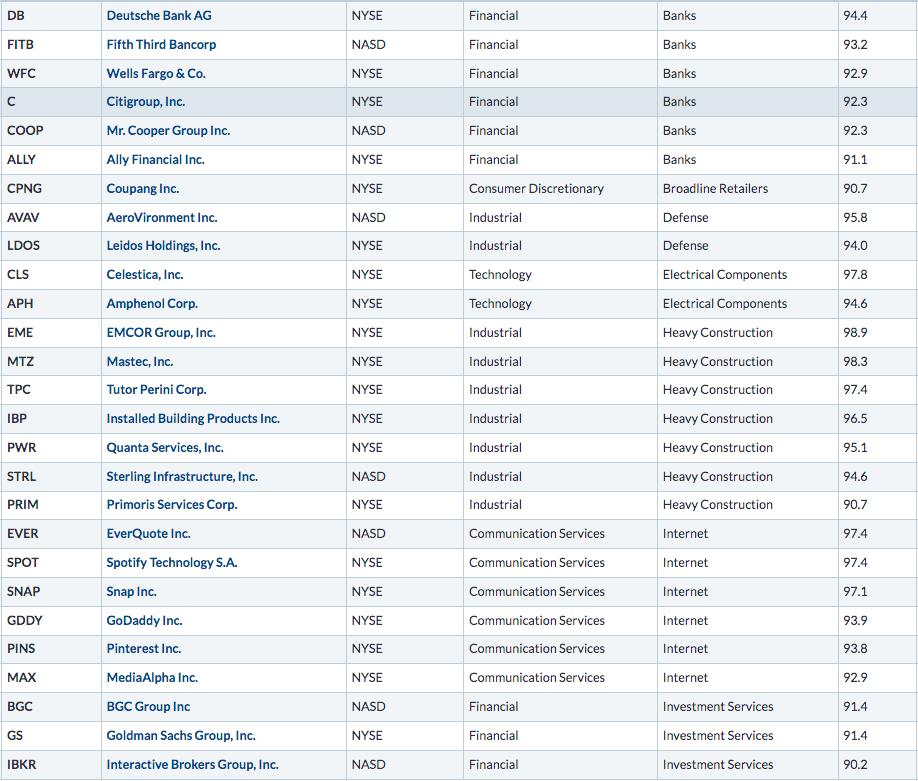
.....and the results sorted first by SCTR, then by industry group:

These are 27 companies with excellent relative strength (based on the high SCTR score) that belong to those industry groups showing excellent strength. These stocks are the collective "poster children" of "leading stocks in leading industry groups".
Earnings Reports
Here are the key earnings reports for the next two days, featuring stocks with market caps of more than $10 billion. I also include notable companies with market caps below $10 billion. Finally, any portfolio stocks that will be reporting results are highlighted in BOLD. If you decide to hold a stock into earnings, please understand the significant short-term risk that you are taking. Please be sure to check for earnings dates for any companies that you own or are considering owning.
Thursday, May 9:
BN, CEG, TAK, SLF, MTD, TEF, RBLX, WPM, TU, ARGX, PBA, WBD, EDR, WMG, RPRX, AKAM, H, EPAM, VTRS, SUZ, BAP, RBA, PODD, USFD, GEN, EVRG, CRL, NTRA, SOLV, ONTO, TREX, TPR, DBX, HRB, MARA, NXST, PLNT, FOUR, HAE, FROG, INSM, TSEM, SYNA, ALRM, VCTR, CLSK, YETI, YELP, SG, VERA, TGLS, NTLA, DNUT, PLUG, SOUN, NTCT, WRBY, VITL, CSIQ, CARS, SBH, ZIP
Friday, May 10:
ENB, CRH, DOCN, ROAD
Economic Reports
Initial jobless claims: 231,000 (actual) vs. 212,000 (estimate)
Happy trading!
Tom
|
| READ ONLINE → |
|
|
|
| DecisionPoint |
| Silver Cross BUY Signals on the Dow (DIA) and Russell 2000 (IWM) |
| by Erin Swenlin |
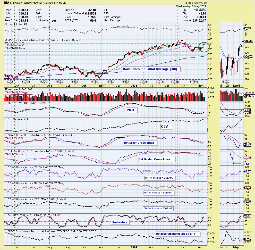
The Dow Jones Industrial Average ETF (DIA) 20-day EMA crossed up through the 50-day EMA (a Silver Cross), generating an IT Trend Model BUY Signal. The Dow saw a better rally today than the SPY, but, under the hood, it isn't quite as strong as the SPY. We do still have participation readings above our bullish 50% threshold, with the exception of the Silver Cross Index. It should be able to get above its signal line soon if participation readings hold up. Remember, the Silver Cross Index tells us how many stocks have a "Silver Cross" within the index. Those stocks have a bullish bias in the intermediate term.
(To see the "under the hood" chart of the SPY, you can become a member of DecisionPoint.com for access to it and all other major indexes, sectors and select industry groups.)

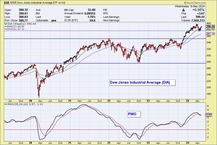
The weekly PMO is decelerating, but is still holding a Crossover SELL Signal. This looks like a good rally, but expectations should be tempered based on the weekly chart.

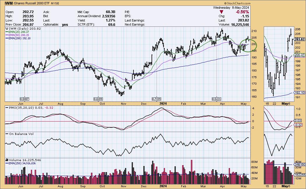
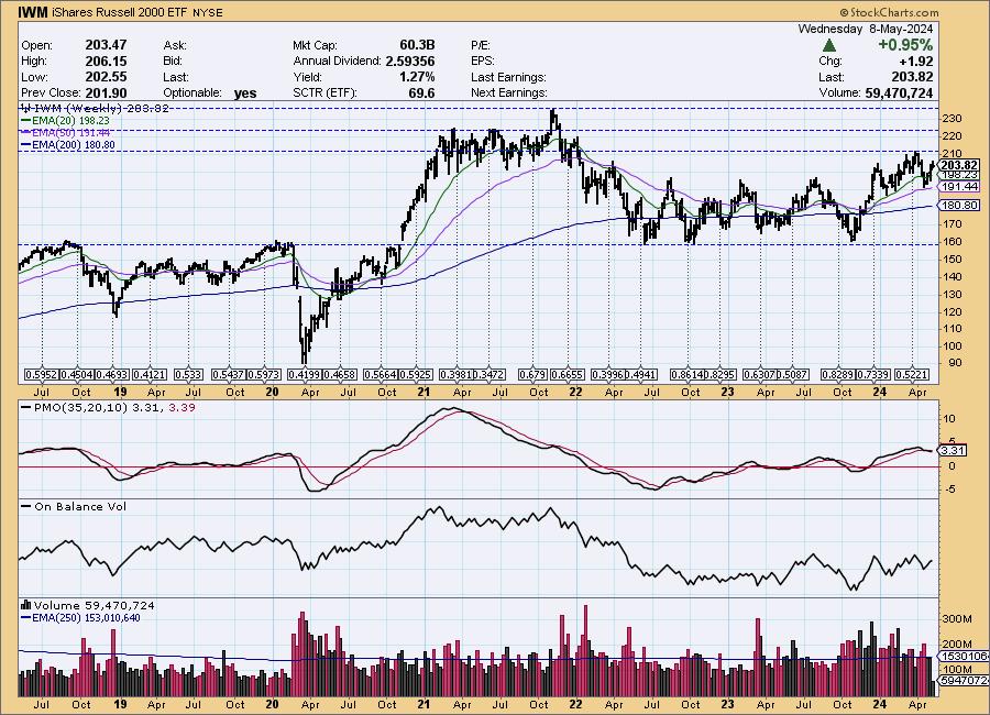
The Russell 2000 ETF (IWM) 20-day EMA crossed up through the 50-day EMA (Silver Cross), generating an IT Trend Model BUY Signal. It was not a good Wednesday for small-caps, but, given price is above the 20-/50-day EMAs, we still got the Silver Cross. The PMO has just reached above the zero line, but we don't like the weakness we are seeing already in price as it topped.

IWM has been mostly rangebound, and right now it is at the top of the range, making it vulnerable. The weekly PMO is on a relatively new Crossover SELL Signal. We would be careful with this group.

Learn more about DecisionPoint.com:
Watch the latest episode of the DecisionPointTrading Room on DP's YouTube channel here!

Try us out for two weeks with a trial subscription!
Use coupon code: DPTRIAL2 at checkout!
Technical Analysis is a windsock, not a crystal ball. -- Carl Swenlin
(c) Copyright 2024 DecisionPoint.com
Disclaimer: This blog is for educational purposes only and should not be construed as financial advice. The ideas and strategies should never be used without first assessing your own personal and financial situation, or without consulting a financial professional. Any opinions expressed herein are solely those of the author, and do not in any way represent the views or opinions of any other person or entity.
DecisionPoint is not a registered investment advisor. Investment and trading decisions are solely your responsibility. DecisionPoint newsletters, blogs or website materials should NOT be interpreted as a recommendation or solicitation to buy or sell any security or to take any specific action.
Helpful DecisionPoint Links:
Trend Models
Price Momentum Oscillator (PMO)
On Balance Volume
Swenlin Trading Oscillators (STO-B and STO-V)
ITBM and ITVM
SCTR Ranking
Bear Market Rules
|
| READ ONLINE → |
|
|
|
| MORE ARTICLES → |
|
