| THIS WEEK'S ARTICLES |
| Larry Williams Focus On Stocks |
| MEMBERS ONLY |
| June & Gloom | Larry's "Family Gathering" June 18, 2024 Recording |
| by Larry Williams |
|
June is here! Will it be bloom or gloom for the stock market? In this month's Family Gathering video, Larry examines the current averages in the market and what the advance-decline line is telling us...
|
| READ ONLINE → |
|
|
|
| Art's Charts |
| Finding Emerging Leaders within Key Groups |
| by Arthur Hill |
 The broader market is fairly mixed with one clear leader: technology. I am also seeing mixed performance within the technology sector and within specific groups. Semiconductors are strong overall, but groups like cybersecurity are more mixed. This makes it a stock pickers market. In such conditions, I am looking for individual stocks that are emerging as leaders. Today's article will focus on CyberArk Software (CYBR), which was covered this week in ChartTrader. The broader market is fairly mixed with one clear leader: technology. I am also seeing mixed performance within the technology sector and within specific groups. Semiconductors are strong overall, but groups like cybersecurity are more mixed. This makes it a stock pickers market. In such conditions, I am looking for individual stocks that are emerging as leaders. Today's article will focus on CyberArk Software (CYBR), which was covered this week in ChartTrader.
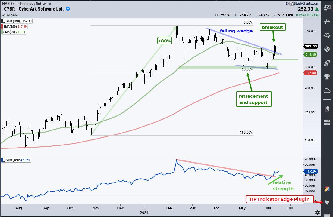
The chart below shows CYBR breaking out of a falling wedge with a strong advance over the last two weeks. It is an emerging leader because it recently broke the 50-day SMA and exceeded its mid May high (breakout). In addition, the overall pattern and retracement look like a correction within a long-term uptrend. CYBR is well above the 200-day SMA and the decline back to 225 retraced around half of the prior advance, which was a whopping 80%. Thus, we have a two steps forward and one step backward sequence for the long-term uptrend.

The indicator window shows the price-relative (CYBR/RSP ratio) turning up in June and breaking its mid May high. This means CYBR is starting to outperform the broader market again (relative strength). Thus, we have a long-term uptrend and break above the May high on the price chart. We also have a price-relative breakout to signal relative strength. This is a bullish combination. A strong breakout should hold so I would set a re-evaluation level on a close below 235 (green line).
Looking for more emerging leaders? This past week we covered two more cybersecurity stocks, a semiconductor name with a classic correction and a few healthcare stocks. ChartTrader reports and videos also cover broad market trends with a focus on SPY, QQQ and MAGS. Click here to learn more and gain immediate access.
//////////////////////////////////////////////////
|
| READ ONLINE → |
|
|
|
| ChartWatchers |
| Tech Stocks Take a Breather: Is Now the Best Time To Buy the Chip Dip? |
| by Jayanthi Gopalakrishnan |

Who would have thought a mid-week break would halt the stock market's winning streak? Maybe the hot PMI reading leaked, or traders and investors felt the stock market was getting so toppy that it was time to take some profits from the high flyers.
No Selloff Follow-Through
Thursday's selloff impacted large-cap semiconductor stocks the most. NVIDIA, Inc. (NVDA) dropped over 3% and closed the week down just over 4%. Broadcom Inc. (AVGO) has been selling off since Tuesday, ending the week lower by 4.40%.
Click here for live chart.
Thursday's selloff impacted large-cap semiconductor stocks the most. NVIDIA, Inc. (NVDA) dropped over 3% and closed the week down just over 4%. Broadcom Inc. (AVGO) has been selling off since Tuesday, ending the week lower by 4.40%.
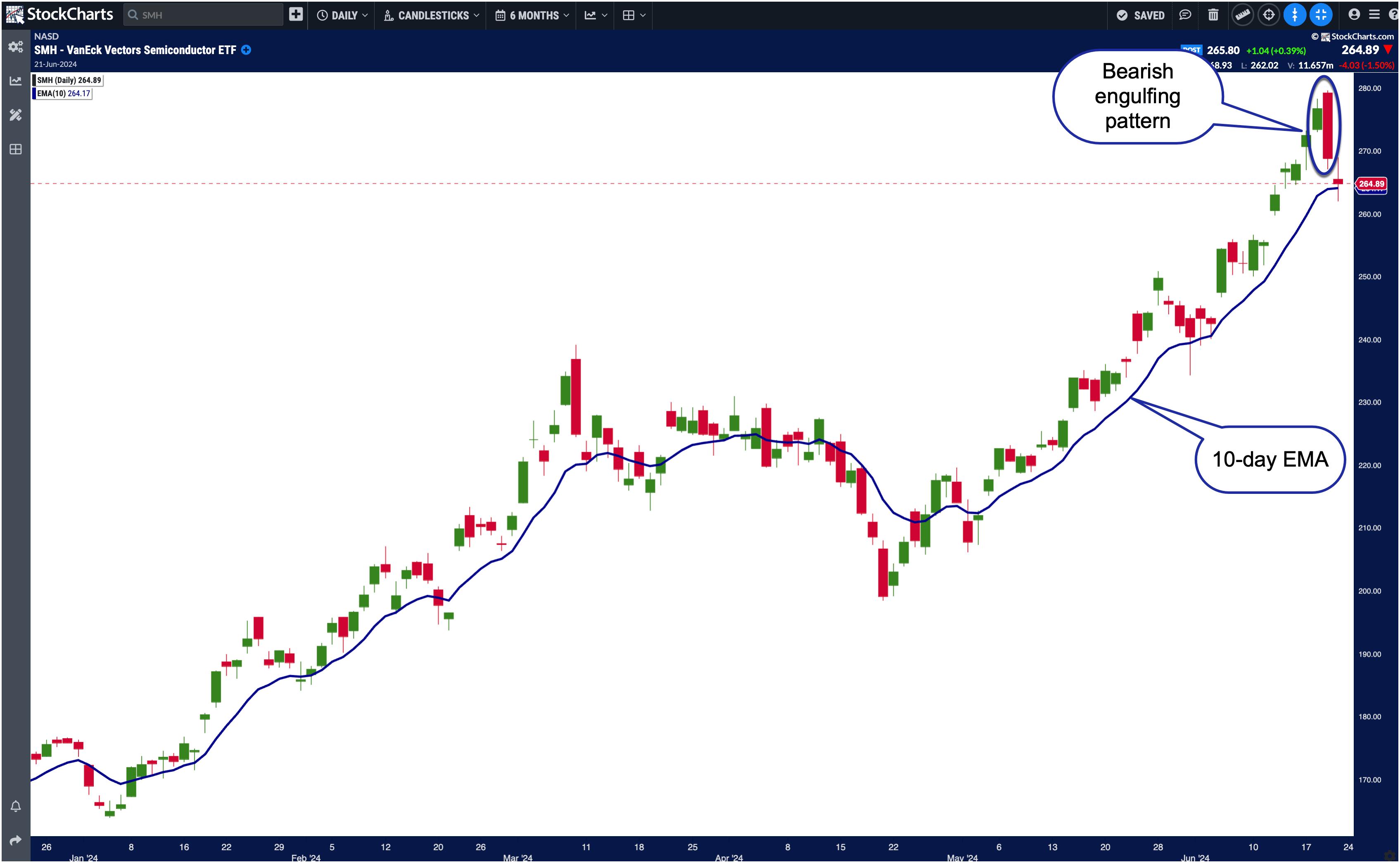
This semiconductor weakness can be seen in the VanEck Vectors Semiconductor ETF (SMH) chart below.

CHART 1. DAILY CHART OF THE VANECK SEMICONDUCTOR ETF (SMH). The bearish engulfing pattern was an indication that further selling is likely to take place, and a reversal could be on the horizon. However, SMH managed to hold on to its 10-day EMA.Chart source: StockChartsACP. For educational purposes.
SMH closed barely above its two-week exponential moving average (EMA). An important point to note is that Thursday closed with a bearish engulfing pattern. It's only natural for technical analysts to think that the selloff would continue into Friday. It did initially, but reversed, closing with a candlestick that resembled a doji. This indicates investor indecision.
Overall, Friday's price action was relatively quiet, a surprise after the previous day's selloff and for a quadruple witching day. This indicates that investors aren't rushing to sell off just yet. The stock market is still very bullish, for good reason. There have been no signs of any slowing down in economic activity.
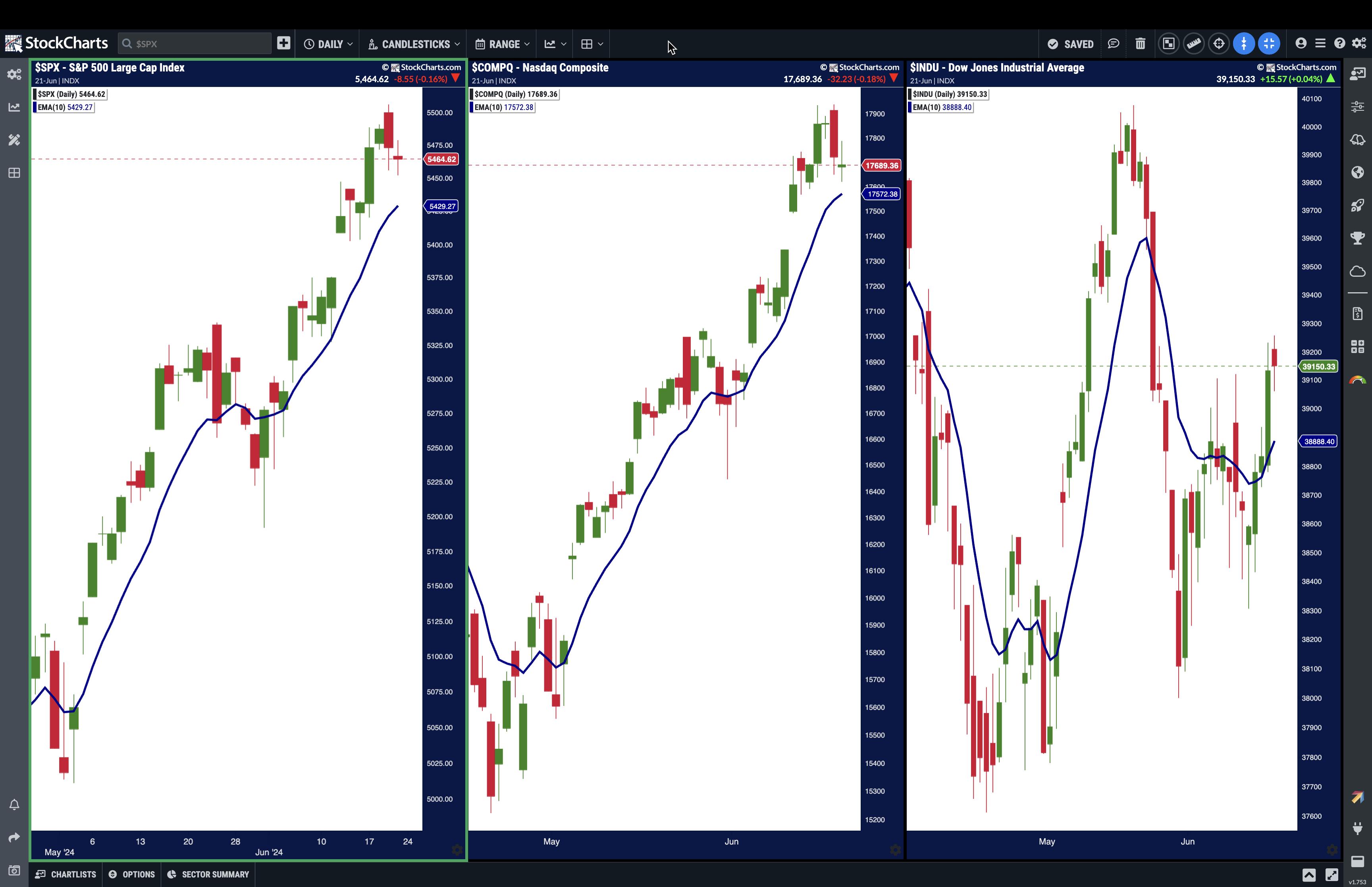
If you look at a short-term moving average, such as a two-week (10-day) EMA, it's clear that the S&P 500 has been trading above it for most of June. The Nasdaq Composite ($COMPQ) displays a similar picture.
Click here for live chart.
Overall, both indexes look like their strong uptrend is intact. The Dow Jones Industrial Average ($INDU) is the one that has struggled lately, although it closed above its 10-day EMA on Thursday and Friday.

CHART 2. DAILY CHARTS OF S&P 500, NASDAQ COMPOSITE, AND DOW JONES INDUSTRIAL AVERAGE. All three indexes have the legs to carry the bull run further.Chart source: StockChartsACP. For educational purposes.
Nothing has changed the bullish sentiment of the stock market. While semiconductor stocks sold off, stocks in other sectors did well. Healthcare stocks such as Gilead Sciences, Inc. (GILD), Sarepta Therapeutics, Inc. (SRPT), and Zealand Pharma (ZLDPF) saw strong gains.
All Quiet On the Weekly Front
There's not much economic data next week except for the PCE. The bigger attraction will probably be Micron Technology, Inc (MU) earnings. The stock had a nice run from mid-April until Thursday, when it plunged hard following its semiconductor cousins. Wall St. analysts expect $0.51 earnings per share and revenues of $6.66 billion. If MU beats estimates, it could boost tech stocks. Investors who missed out on the chip rally may have an opportunity to buy on the semiconductor dip if MU delivers. Micron announces earnings on Wednesday after the close. It's all about timing!
Bonds were relatively flat this week after last week's strong rally. Overall, the uptrend is still in play, with a series of higher highs and higher lows. It's probably not time to invest in the bond market, but it's worth watching the price action. It can often act as a leading indicator if it shows a strong move in either direction.
The bottom line: Next week, watch Micron's earnings results on Wednesday after the close and Friday's PCE number.
End-of-Week Wrap-Up

- S&P 500 closes up 0.61% for the week, at 5464.62, Dow Jones Industrial Average down 1.45% for the week at 39,150.33; Nasdaq Composite closed flat for the week; down 0.23% at 17,689.36.
- $VIX up 4.72% for the week at 13.20
- Best performing sector for the week: Consumer Discretionary
- Worst performing sector for the week: Utilities
- Top 5 Large Cap SCTR stocks: NVIDIA (NVDA); Super Micro Computer, Inc. (SMCI); MicroStrategy Inc. (MSTR); Vistra Energy (VST); Sea Ltd. (SE)
On the Radar Next Week
- April Case-Shiller Home Price
- May New Home Sales
- May Durable Goods Orders
- Q1 Final GDP Index
- May PCE Price Index
- Micron Technology earnings
Disclaimer: This blog is for educational purposes only and should not be construed as financial advice. The ideas and strategies should never be used without first assessing your own personal and financial situation, or without consulting a financial professional.
|
| READ ONLINE → |
|
|
|
| Martin Pring's Market Roundup |
| MEMBERS ONLY |
| Is the Eighteen-Month Dollar Index Trading Range About to be Resolved? |
| by Martin Pring |
|
Chart 1 shows that the Dollar Index has been in a trading range since the start of 2023. Its sheer size indicates the ultimate breakout could be followed by a sizeable move in either direction...
|
| READ ONLINE → |
|
|
|
| The MEM Edge |
| Seasonality and Positive News Pushes These Stocks into an Uptrend |
| by Mary Ellen McGonagle |
Last week, the broader market Indices hit another new high on Thursday before pulling back into Friday's close. Not all areas participated, however, as the recently explosive move into AI stocks ran into trouble later in the week. Instead, many of last week's top performers were down-and-out stocks that are now in the beginning stages of reversing their downtrends.
Just take a look at the top performers in the Dow Jones Industrial Average, which posted a 1.5% gain for the week vs a flat finish for the Nasdaq. Among the winners were Cisco (CSCO), McDonalds (MCD), and Nike (NKE) which are each trading well below prices from earlier this year. Last week, they averaged gains of 3.5%, yet they still have work to do before regaining their uptrends.
Below are two stocks that are further along in their downtrend reversals; however, one has more positive characteristics that point to further upside, while the other has more work to do. Let's review.
 Daily Chart of MasterCard (MA) Daily Chart of MasterCard (MA)
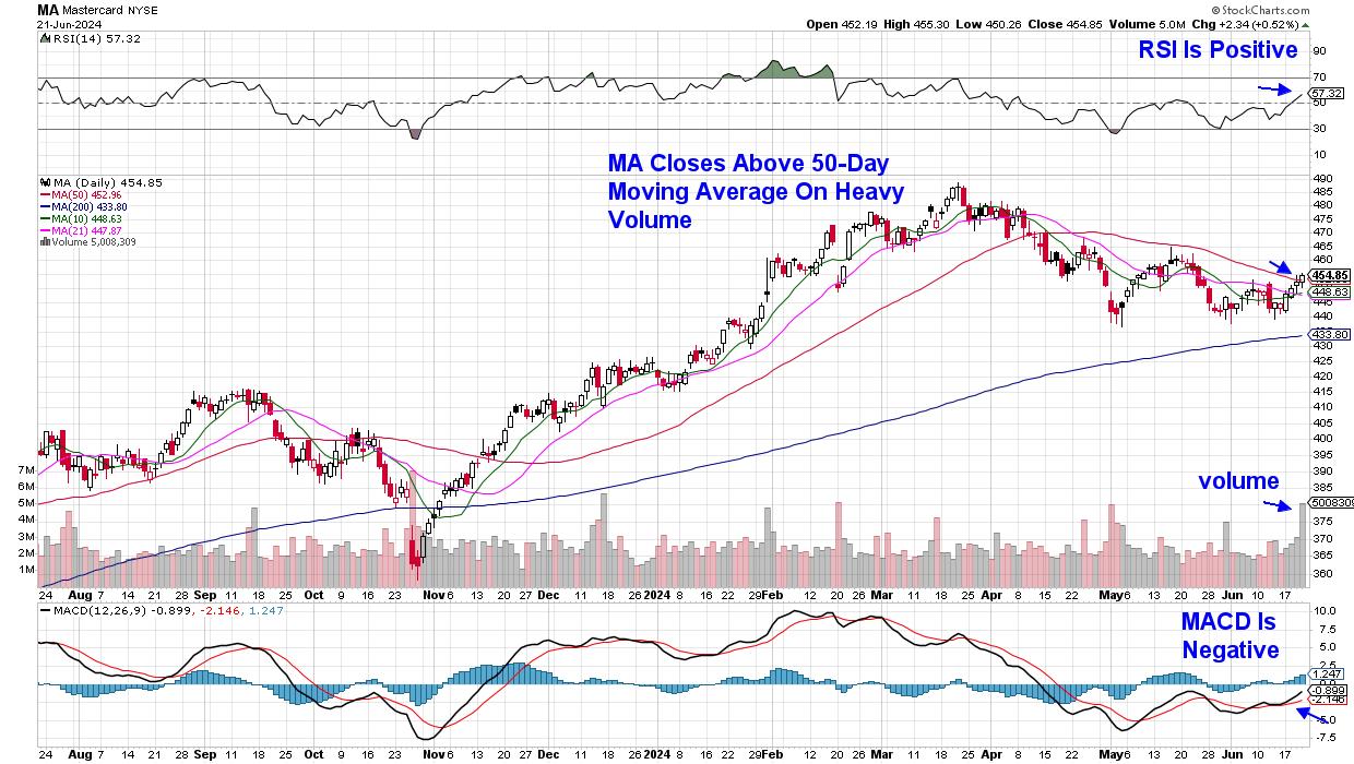
As you can see in the daily chart of MasterCard (MA) above, the stock has closed the week back above its key 50-day simple moving average. The fact that this move above resistance occurred on heavy volume is quite constructive, as it indicates possible institutional sponsorship.
Other positive factors are at play as well, such as the fact that the RSI is now in positive territory. In addition, the seasonality for Mastercard is positive, as the stock has gained in the month of July -- 1 week away -- each of the last 10 years. However, while the MACD has posted a bullish crossover, with the black line up through the red, it remains in negative territory.
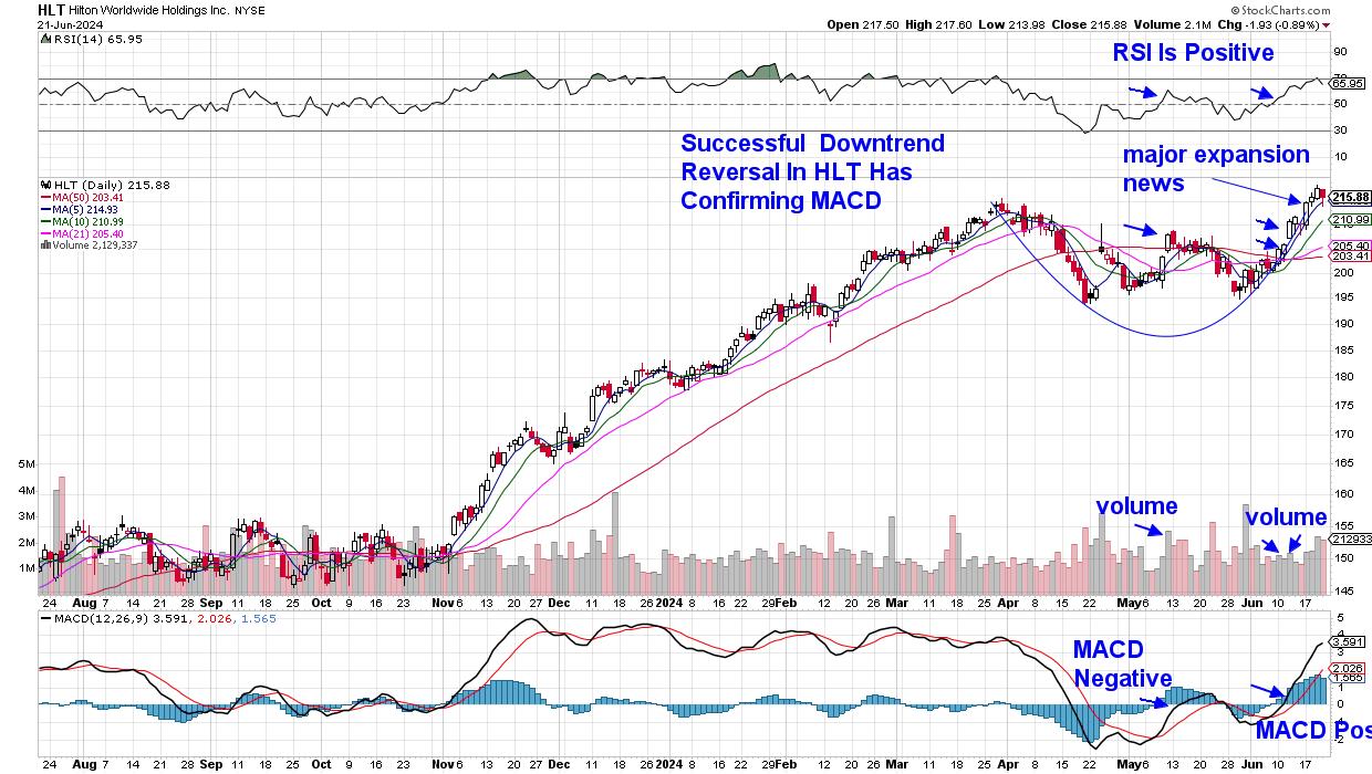
 Daily Chart of Hilton (HLT) Daily Chart of Hilton (HLT)
Hilton (HLT) is another stock that's entering a seasonally strong period. The stock began its downtrend reversal in mid-June, with the RSI turning positive as the stock closed above its 50-day moving average. In addition, the MACD turned positive at the same time, which provided further confirmation. Perhaps most important, however, is that Hilton announced an expansion plan that will double the number of their "lifestyle" hotels over the next four years.
The expected growth pushed the stock higher so that, last week, HLT entered a strong buy zone after breaking out of an 11-week base on volume. Also highlighted above is the early May downtrend reversal attempt, which was not confirmed by a positive MACD, nor was there positive news regarding growth prospects.
While much of my work involves spotting high growth stocks that are advancing toward base breakouts, downtrend reversals, such as Hilton (HLT) above, play a key part as well. Vertex (VRTX) is a prime example, as the stock was added to my Suggested Holdings List in early May as it began a new uptrend amid news of a new non-addictive pain medication.
A move above key resistance that's confirmed by a positive RSI and MACD, coupled with bullish corporate news, can yield some top performers. While Mastercard (MA) is interesting, the stock still has work to do before gaining my confidence.
If you'd like to be alerted to top stocks poised to trade higher, use this link here to trial my twice weekly MEM Edge Report. You'll also be kept on top of broader market conditions as well as sector rotation into newer areas of the market. Use the link above to see what others are raving about!
Warmly,
Mary Ellen McGonagle, MEM Investment Research
|
| READ ONLINE → |
|
|
|
| RRG Charts |
| Price Pays... But For How Long? |
| by Julius de Kempenaer |
While the S&P 500 continues to move higher, the number of stocks participating to the upside continues to decline. In other words, market breadth is deteriorating. However, it has been doing that for quite some time already, and, as we all know, we should not swim against the tide.
Nevertheless, I have become increasingly interested in the continued narrowing of market breadth over the past few weeks.
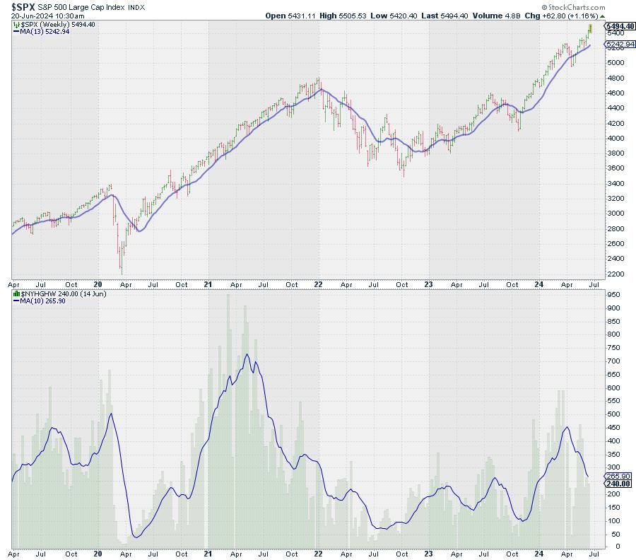
Declining New 52-week Highs
One of the first charts in my chart list is a chart of the S&P 500 with the new 52-week highs.

The decline in new 52-week highs is very visible. In and of itself, it is not a major sell signal, as this metric can decline while the market moves higher for quite some time; for example, in the second half of 2021. The peak in new 52-week highs occurred in May-June and then declined into December while the S&P powered higher.
However, what we can learn from this decline is that the base and the foundation for the rally are getting narrower. Fewer stocks are participating to the upside.
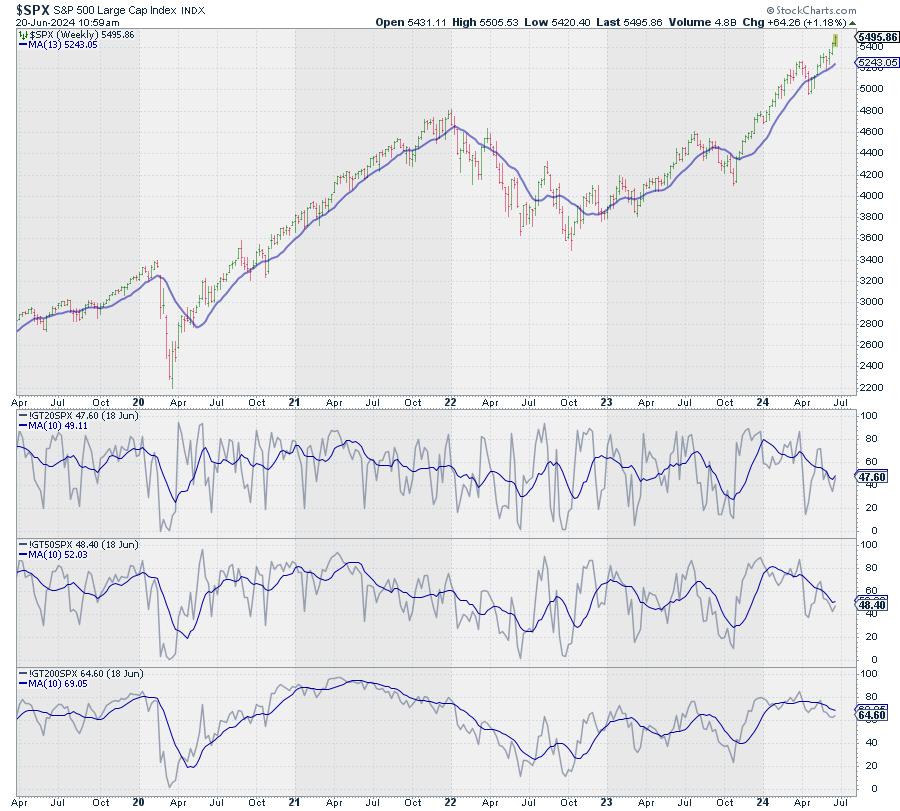
Declining % of Stocks above 200-, 50-, & 20-Day Exponential Moving Average
Other metrics to measure market breadth and participation are indicators that track the percentage of stocks above a moving average. At StockCharts.com, we track these percentages for the major indices and sectors for 20-, 50-, and 200-day exponential moving averages.

The chart above shows these metrics for the S&P 500 index. I plotted the individual indicators and then overlaid a 10-week moving average on each to gauge the trend. All three have started to come down from elevated levels and are now moving lower, while the S&P is still moving higher.
As said, this in itself is not extremely alarming, but something to be aware of. Remember, we are trying to piece together the pieces of the puzzle the market is giving us each day.
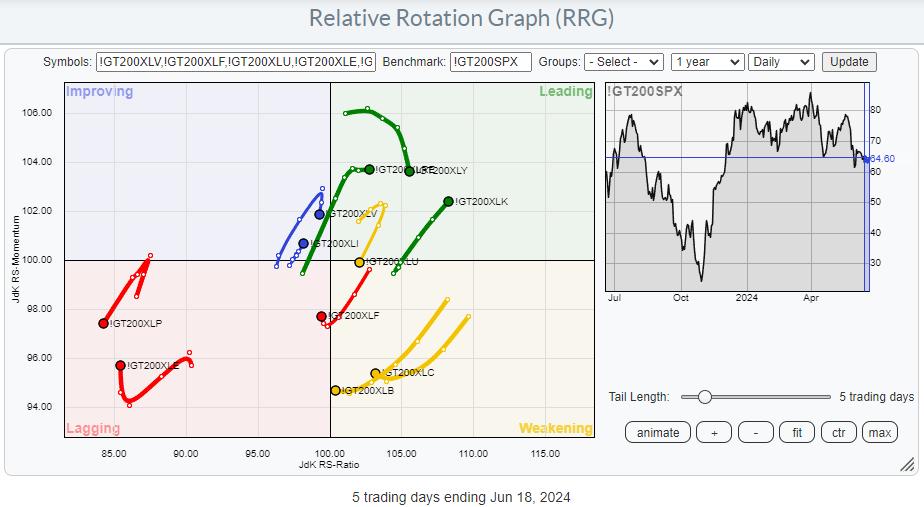
Plotting on a Relative Rotation Graph
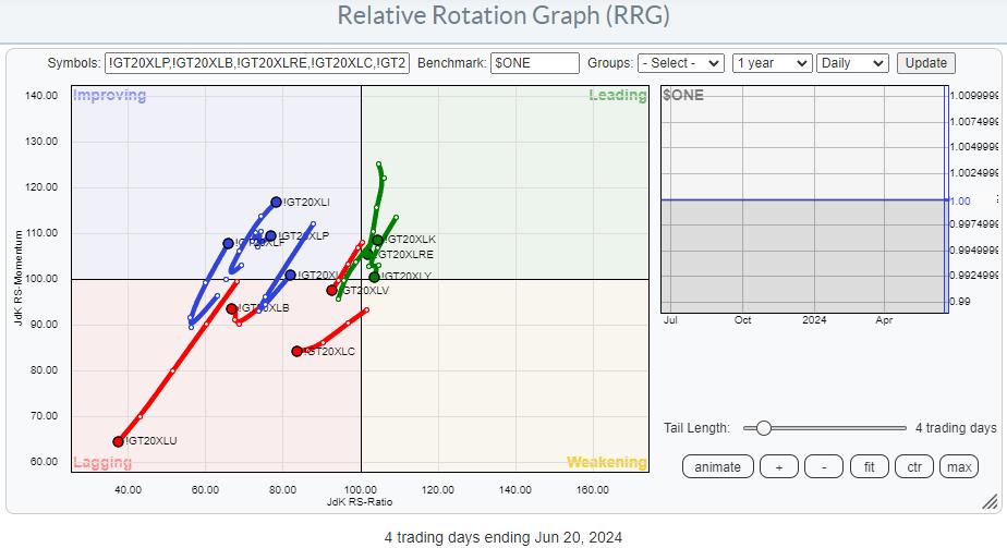
However, as we have these indicators for the individual sectors, we can also plot them on a Relative Rotation Graph.
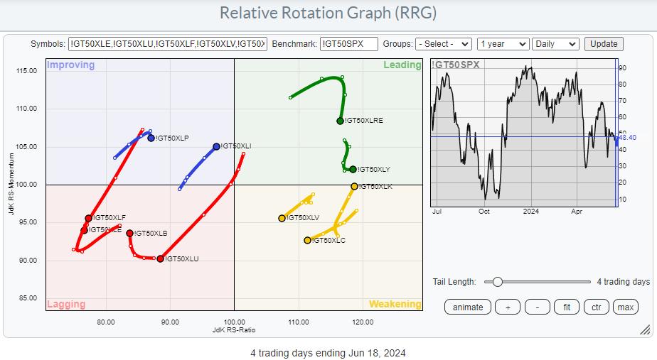
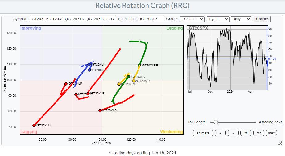
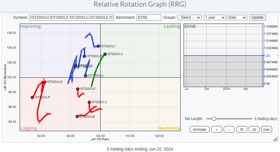
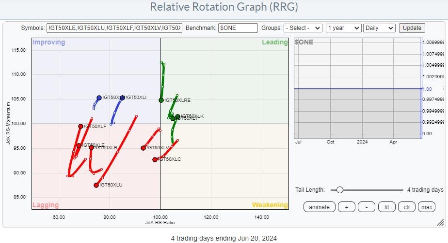
The RRGs below show the relative rotation for these indicators (200-day, 50-day, and 20-day) against the respective indicator for the S&P 500.


On the 200-day version, we find quite a few tails still on the right-hand side of the graph, but most have rolled over and/or turned to a negative RRG-Heading. Only !GT200XLK is still at a strong heading and moving further into the leading quadrant.
On the 50-day version, the tails have moved further left, indicating weakening across the board (lower RS-Ratio readings). !GT50XLK is inside, leading and moving further into it.
Finally, on the 20-day version, things are a little more pronounced, with a few tails really accelerating into the lagging quadrant. Some mild improvement is found for XLF and XLI across all three MA periods.
So, the main takeaway is that the majority of sectors are seeing their percentage of stocks above one of the moving averages declining faster than the percentage of stocks above these MAs for the S&P 500. Technology goes against this trend, and Financials and Industrials have a mildly improved reading.
Using $ONE as the Benchmark

 
Running these same universes on Relative Rotation Graphs but swapping the $SPX benchmark to $ONE gives us the absolute trends comparison for these metrics. The main observation on these RRGs is that pretty much all tails are clustered on the left-hand, negative side of the graph. This indicates that most of these indicators are trending lower.
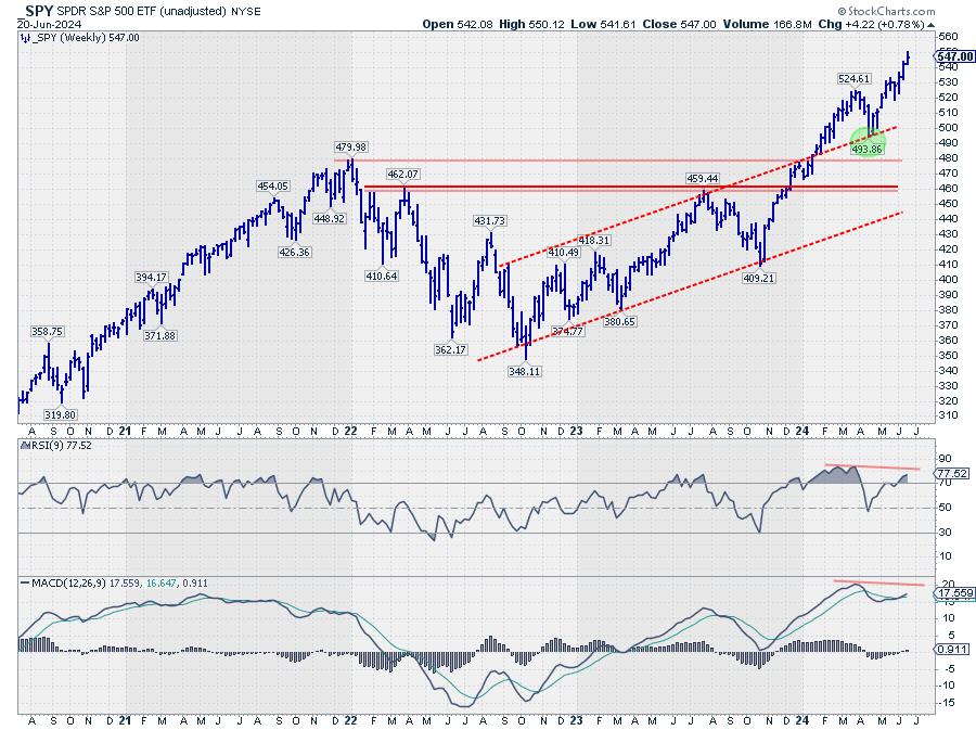
And SPY continues to move higher...

And all that while, the S&P 500 continues putting in new highs.
Looking at the S&P chart in combination with RSI and MACD, we see that RSI and MACD are still below their previous peaks, keeping the possibility of a negative divergence alive.
We all know that "price pays!!" but, in the current environment, I can't help asking myself, "But for how long?"
StayAlert, --Julius
|
| READ ONLINE → |
|
|
|
| Fill The Gap by CMT Association |
| Gold Top? Focus on These Potential Price Objectives |
| by Stewart Taylor |

In early 2024, gold reached the price objective derived from the breakout of the large triangle that had evolved beginning in early 2022. Upon reaching the area of the objective, a classic buying climax halted the trend.
The subsequent trading range has been characterized by distribution. In the event of a breakout lower, the amount of distribution (cause) derived from the Point and Figure (P&F) count suggests a downside objective of 10–12% lower is reasonable. But will it reach this price objective?
In this article, we'll make a technical assessment of the daily and weekly charts, provide evidence suggesting that the range is likely distribution (Wyckoff), and show how to assess potential price objectives using point and figure charts.
Weekly Chart of Gold

CHART 1. WEEKLY CHART OF CONTINUOUS GOLD CONTRACTS.
In November 2023, gold broke above lateral resistance developed along the $2079–$2085-per-ounce area.
- The lateral resistance and rising support generated by the trendline (A) defined a large triangle.
- In anticipation of a breakout, it seemed appropriate to determine upside price objectives.
- I prefer to use multiple techniques to generate objectives. I particularly like Fibonacci extensions and retracements, point & figure chart projections, and price channels.
- I look for confluences of multiple techniques and combine them with traditional chart support and resistance to generate objectives.
Objectives are useful in three ways:
- To ensure that reward exceeds risk to the stop by at least 3 to 1.
- To monitor for trend-ending action around those objectives.
- To adjust existing trades as those objectives are reached.
Importantly, the original breakout from the 2079–2085 triangle generated a price objective of 2540. That objective is derived thusly:
- 2079 (initial point of the triangle ) – 1618 (bottom of the pattern) = 461 points.
- 461 points added to the triangle top (2079 + 461) = 2540 objective.
I believe triangle price objectives are areas to monitor for resistance rather than discrete points.
Additional objectives can be derived using Fibonacci Objectives derived from the 1618 – 2085 – 1824 price sequence.
- 1.382% = 2461 & 1.618% = 2570.
- Soon after the breakout from the triangle, a confluence of objectives could be calculated: 2461, 2540, and 2570.
- Potential objectives can also be derived by channelizing the price behaviors.
- I prefer overbought and oversold as defined by price channels than by momentum (i.e. stochastics, RSI or MACD).
In March, the market broke out of the triangle and, over the next several weeks, marked up to 2454.
- The combination of overbought in the channels and the 1.382% Fibonacci objective (a bit short of the 1.618% objective), and in the area of the triangle objective, clearly defined an area of the chart where supply was likely to develop.
- As the price approached the objective confluence, it had already exceeded the two main channel tops at A1 (derived from trend line A) and B1 (derived from trend line B), and overbought conditions had developed in momentum measures, like RSI and stochastics.
- When I see resistance confluences of this nature, I begin to monitor for trend-ending action (for instance, a buying climax and secondary test pattern).
- Despite very bullish news and strongly bullish sentiment, a classic buying climax (BC) developed. Note the much higher than normal volume that occurred on a wide range bar that set a significant new high, but closed near the bar's low.
- Buying climaxes typically resolve into trading ranges. Trading ranges can be distribution (marking a long term top) or re-accumulation (a pause before continuing higher).
- Over the next three weeks, the market pulled back to 2285, then rallied in a secondary test (ST). The secondary test was completed by a wide price spread bar that closed near its low. This is the juncture at which I became particularly interested in the pattern of price and volume and the potential downside objectives.
- The price-volume relationships should point toward either distribution or re-accumulation.
Generally speaking, there are only two outcomes to the range: either the buying climax is short-term, and the market will move higher after a period of re-accumulation, or the buying climax will offer a significant top, leading to a significant markdown once supply is completely distributed to weak hands.
This is when I shift attention to the daily perspective chart to closely monitor price spread and volume relationships.
Daily Chart of Gold
CHART 2. DAILY CHART OF CONTINUOUS GOLD CONTRACT.
Without going into a detailed Wyckoff price/volume analysis, I will make the case that it is likely that the range is one of distribution. Note the appearance of supply (inside the oval) just before the buying climax at 2449, the lower volume and angle of attack on the rally to 2454 (secondary test), and the expansion of volume and close near the low of the price spread (last arrow). Rallies inside the range are being aggressively sold as strong hands distribute to weak hands. Additionally, much of the price action has developed below the midpoint of the range.
With the assessment of distribution, I thus need to begin planning for a bearish breakout. The first part of the plan is to arrive at some estimation of how much downside potential exists.
- One of Wyckoff's main principles is "The Law of Cause and Effect." Cause refers to the amount of accumulation or distribution that occurs inside a range. Effect is the extent of the move out of that range.
- The accumulation or distribution inside a range determines how far the breakout of the range will move. In other words, the time spent in the consolidation is related directly to the distance of the subsequent move.
- Point and figure (P&F) charts are used to determine the extent of the cause and generate initial price objectives out of the range.
Gold P&F One-point Boxes X 3 Box Reversal

CHART 3. POINT & FIGURE CHART OF GOLD CONTINUOUS CONTRACT.
Trading ranges represent areas of the chart where large numbers of shares change hands, often moving from strong hands to weak hands. This is why a consistent relationship exists between the length of a trading range and the size of the subsequent move. This is particularly true in very liquid, heavily-traded markets.
There is no end to the debate regarding which points should be used to define counts. I like to keep it simple. I look for the walls of the range, count across the two walls, and then project from the low. Others would use the smaller count derived from the two walls between the buying climax and the secondary test. After all, I mostly use the objectives to help define risk vs. reward and to help draw my attention to the chart as the area of the objectives is reached.
Assuming the current range does not extend and I am correct in my assessment of distribution, the count projects enough cause to suggest downside of 2010–2030. If the range extends, the count will lengthen, and the price objective grows greater. With this view, I should be able to fashion a trade well in excess of 3-1 (minimum) risk reward. I suspect that when a trade sets up, that risk-reward will be in excess of 10-1, as a stop versus my entry is likely to be less than 1%. If I am wrong and the range is one of re-accumulation, the same method can be applied to a breakout higher.
Please note that this is not a trading recommendation. Entry will be determined by price action and trade implementation techniques that I hope to present in future pieces.
Shared content and posted charts are intended to be used for informational and educational purposes only. The CMT Association does not offer, and this information shall not be understood or construed as, financial advice or investment recommendations. The information provided is not a substitute for advice from an investment professional. The CMT Association does not accept liability for any financial loss or damage our audience may incur.
|
| READ ONLINE → |
|
|
|
| Don't Ignore This Chart! |
| Gilead's Game-Changer: What You Need to Know About the Stock |
| by Karl Montevirgen |

Gilead Sciences' (GILD) new HIV prevention shot, lenacapavir, hit it out of the park in a late-stage trial, showing 100% effectiveness. 2,000 women participated in the trial, and none of them contracted HIV, signaling a potential game-changer for HIV prevention. All Gilead has to do now is to replicate the results once more before seeking FDA approval.
If Gilead is successful, lenacapavir could be available by late 2025.
How Did the Market React?
Shares of GILD jumped 7%, bucking a deep six-month downtrend. Looking at StockCharts' Symbol Summary, GILD also popped up on several positive scans (see the image of the StockCharts' Predefined Scans below).

Gilead looks promising, but it's still a waiting game. Will Gilead replicate its results? It's possible, but nobody knows until it happens. Will the FDA give lenacapavir the green light? Again, nothing's guaranteed.
But does the investment's potential upside significantly dwarf the downside (as long as you mitigate your risk and manage your position size)? It's highly likely. Gilead is on the verge of something huge. Many traders and investors won't wait for FDA approval to jump on what might be the next big breakthrough in HIV prevention.
If you feel this opportunity is too compelling to ignore, here's what you must watch.
The Macro Picture
First, it's important to remember that biotech companies like GILD are often on the cutting edge of medical science, making them highly speculative investments. To appreciate how fickle and risky their stocks can be, take a look at the two boxes in GILD's weekly chart below.

CHART 1. WEEKLY CHART OF GILEAD SCIENCES (GILD). The rapid surge in October 2022 was due to the FDA approval of two of GILD's products. The steep fall in GILD's stock price in 2024 was due to setbacks in the late-stage trial of a cancer treatment drug.Chart source: StockCharts.com. For educational purposes.
The surge within the blue box was driven by two of GILD's key (FDA-approved) products—Biktarvy (a daily HIV treatment drug) and Trodelvy (a cancer treatment drug)—both of which saw substantial sales increases. Note how its SCTR score jumped above the 90 line. Within any SCTR universe, the top 10% of performers typically rank within a range of 90 to 100. The bottom 10% rank between 0 to 10, highlighting weakness in performance levels. That's what happened next to GILD's trend.
You can see this in the red box. At the start of 2024, Gilead's shares fell due to setbacks in their late-stage trial of Trodelvy, which failed to show that it can improve patients' overall survival rates when compared to other existing treatments. As you can see, the SCTR score was close to zero. And even after Thursday's 7% surge, the SCTR, though improving, is still incredibly low at 30.
If GILD is poised to become the "next big thing," does the 30 score indicate a bottom-floor opportunity to jump in?
Here Are the Levels to Watch
Take a look at the daily chart of GILD below.

CHART 2. DAILY CHART OF GILEAD SCIENCES. From strong downtrend to a surprise upside reversal. Is it time to buy?Chart source: StockCharts.com. For educational purposes.
A few points to note about the daily chart are as follows:
- GILD exploded above its 50-day simple moving average (SMA) on high momentum. Before this, the 50-day SMA has acted somewhat as a dynamic resistance level since the beginning of the year.
- The Chaikin Money Flow (CMF) confirms the shift in buyer sentiment; it's above the zero line, indicating a rapid shift from selling to buying pressure.
If you're looking to enter a position in GILD early on, be aware of the potential support levels below $68 and $66 should prices pull back (there's no indication that it will at the moment). The first resistance level GILD needs to surpass is above $70. This level was tested several times last year and served as an important support level this year until it was finally broken in April.

The next important level of resistance sits right below $75. Not only does this mark March's swing high point, but the concentration of volume surrounding this congestion range (see the Volume-By-Price indicator) warns that it might prove a significant zone of contention between the bulls and bears. If price clears that level, and if GILD's trial results continue to look promising, then the path toward (and beyond) $79 might be smoother sailing (to which you can expect some resistance and profit-taking).
The Takeaway
Gilead Sciences (GILD) is making headlines with its new HIV prevention shot, lenacapavir, showing 100% effectiveness in a major trial. If it can replicate its results, the medication has a clear shot at FDA review. If that goes well, the medication can hit the market as early as 2025. GILD has been trending downward for most of the year, with its SCTR score rising from below 10 to a weak 30. If the upcoming trials succeed, lenacapavir could revolutionize HIV prevention and offer significant returns. However, if it fails, tracking the stock's performance will be straightforward. In short, this could be a chance to get in early on a potential game-changer.
Disclaimer: This blog is for educational purposes only and should not be construed as financial advice. The ideas and strategies should never be used without first assessing your own personal and financial situation, or without consulting a financial professional.
|
| READ ONLINE → |
|
|
|
| DecisionPoint |
| Deja Dot.com Disaster? |
| by Carl Swenlin |
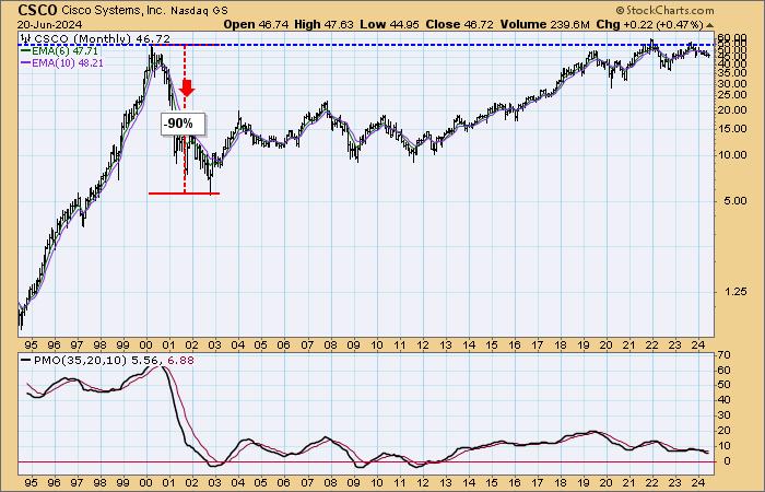
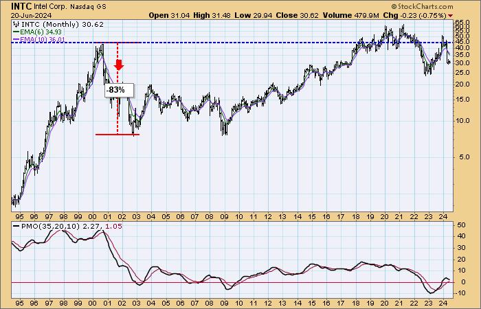
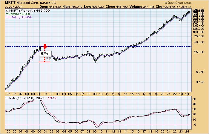
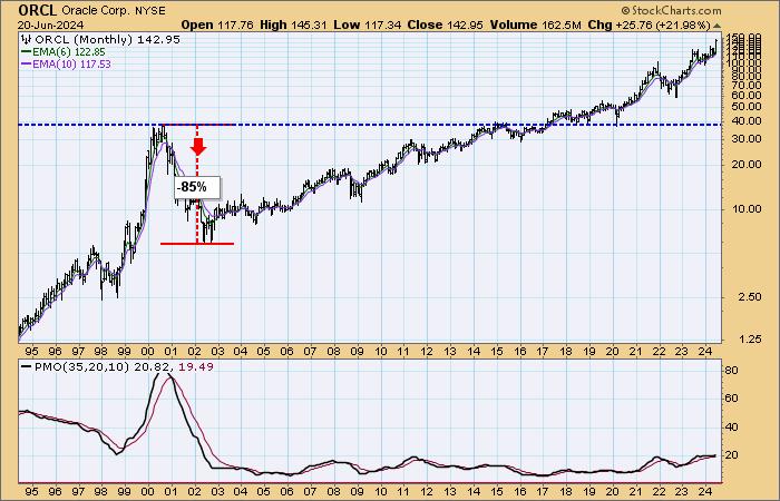
Today on Fox Business' Varney & Company, David Bahnsen (The Bahnsen Group) was asked if the current market reminded him of the Dot.com Bubble. He said it did, but not the part about all those worthless dot.com companies that went bust. Big companies like Cisco, Microsoft, and Intel also had parabolic up moves, and then they had parabolic breakdowns from which it took years to recover.
In the dot.com bubble, there was a belief that companies with a pile of web pages were going to make a pile of money. Currently, there is a frenzy that is derived from unrealistic expectations regarding AI. Yes, AI will be successful, but the specifics have yet to be seen, and there is a hint of Tulip Mania in the air.
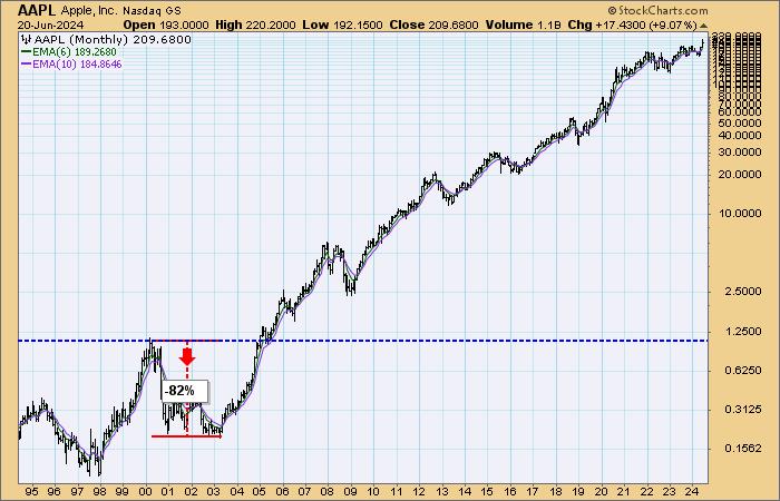
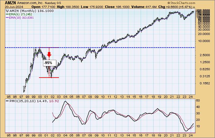
We don't know how it will eventually play out, but there will eventually be a bear market, and we will see those so-called "bullet proof" stocks get shot full of holes. To demonstrate what can happen, lets look at what happened to the stocks of some solid companies during the Dot.com bust. Just to be clear, I lived through those days, and I can say that today has a very similar look and feel. Yes, 9/11 contributed to the decline, but most of the damage had been done before then.
In 2000, pre-iPhone Apple was not the company it is today, but it was a solid company. It then lost -82%, taking five years before returning to its 2000 high.

Amazon was still a book store. It fell -95% and took 10 years to recover.

Cisco was one of the biggies in 2000, and it fell -90% and took 22 years to recover.

Intel was another favorite back in the day. It fell -83% and took 18 years to recover.

If any of these stocks was bulletproof, it was Microsoft. It fell a meager -67% and took 15 years to recover.

Finally, Oracle fell -85% and took 14 years to recover.

CONCLUSION: We do not know how or when the inevitable "adjustment" will materialize, but we think it is bound to happen, because it always, always, always does. We do not mean to imply that there will be losses similar to 2000-2002. But there is the history. Will we learn from it?
Learn more about DecisionPoint.com:
Watch the latest episode of the DecisionPointTrading Room on DP's YouTube channel here!

Try us out for two weeks with a trial subscription!
Use coupon code: DPTRIAL2 at checkout!
Technical Analysis is a windsock, not a crystal ball. --Carl Swenlin
(c) Copyright 2024 DecisionPoint.com
Disclaimer: This blog is for educational purposes only and should not be construed as financial advice. The ideas and strategies should never be used without first assessing your own personal and financial situation, or without consulting a financial professional. Any opinions expressed herein are solely those of the author, and do not in any way represent the views or opinions of any other person or entity.
DecisionPoint is not a registered investment advisor. Investment and trading decisions are solely your responsibility. DecisionPoint newsletters, blogs or website materials should NOT be interpreted as a recommendation or solicitation to buy or sell any security or to take any specific action.
Helpful DecisionPoint Links:
Trend Models
Price Momentum Oscillator (PMO)
On Balance Volume
Swenlin Trading Oscillators (STO-B and STO-V)
ITBM and ITVM
SCTR Ranking
Bear Market Rules
|
| READ ONLINE → |
|
|
|
| MORE ARTICLES → |
|


 The broader market is fairly mixed with one clear leader: technology. I am also seeing mixed performance within the technology sector and within specific groups. Semiconductors are strong overall, but groups like cybersecurity are more mixed. This makes it a stock pickers market. In such conditions, I am looking for individual stocks that are emerging as leaders. Today's article will focus on CyberArk Software (CYBR), which was