TAKEAWAYS
- The number of new 52-week highs is declining
- The percentages of stocks trading above 200-,50-, and 20-day Exp Moving Averages are declining
- Despiote narrowing breadth, the S&P continues higher
While the S&P 500 continues to move higher, the number of stocks participating to the upside continues to decline. In other words, market breadth is deteriorating. However, it has been doing that for quite some time already, and, as we all know, we should not swim against the tide.
Nevertheless, I have become increasingly interested in the continued narrowing of market breadth over the past few weeks.
Declining New 52-week Highs
One of the first charts in my chart list is a chart of the S&P 500 with the new 52-week highs.
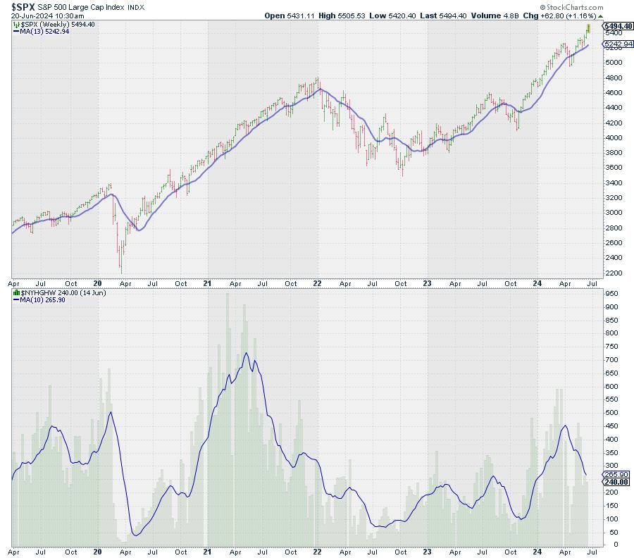
The decline in new 52-week highs is very visible. In and of itself, it is not a major sell signal, as this metric can decline while the market moves higher for quite some time; for example, in the second half of 2021. The peak in new 52-week highs occurred in May-June and then declined into December while the S&P powered higher.
However, what we can learn from this decline is that the base and the foundation for the rally are getting narrower. Fewer stocks are participating to the upside.
Declining % of Stocks above 200-, 50-, & 20-Day Exponential Moving Average
Other metrics to measure market breadth and participation are indicators that track the percentage of stocks above a moving average. At StockCharts.com, we track these percentages for the major indices and sectors for 20-, 50-, and 200-day exponential moving averages.
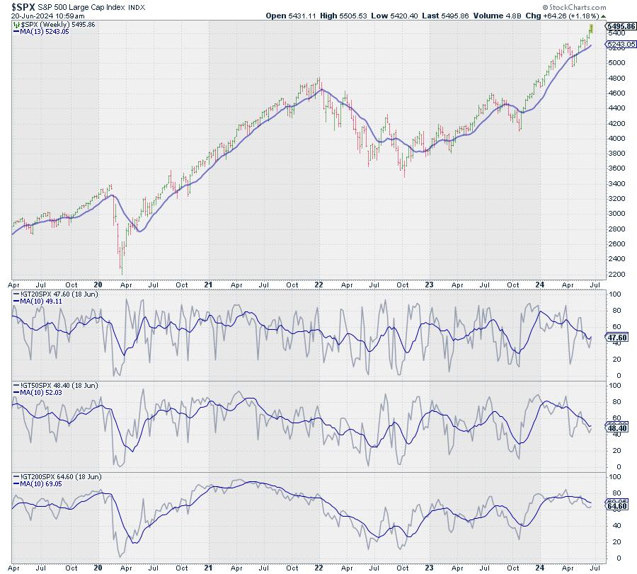
The chart above shows these metrics for the S&P 500 index. I plotted the individual indicators and then overlaid a 10-week moving average on each to gauge the trend. All three have started to come down from elevated levels and are now moving lower, while the S&P is still moving higher.
As said, this in itself is not extremely alarming, but something to be aware of. Remember, we are trying to piece together the pieces of the puzzle the market is giving us each day.
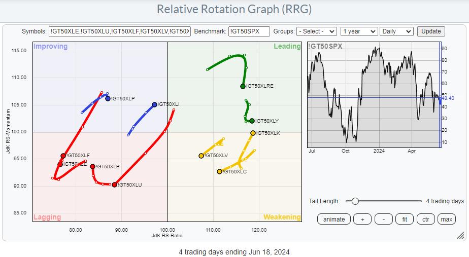
Plotting on a Relative Rotation Graph
However, as we have these indicators for the individual sectors, we can also plot them on a Relative Rotation Graph.
The RRGs below show the relative rotation for these indicators (200-day, 50-day, and 20-day) against the respective indicator for the S&P 500.
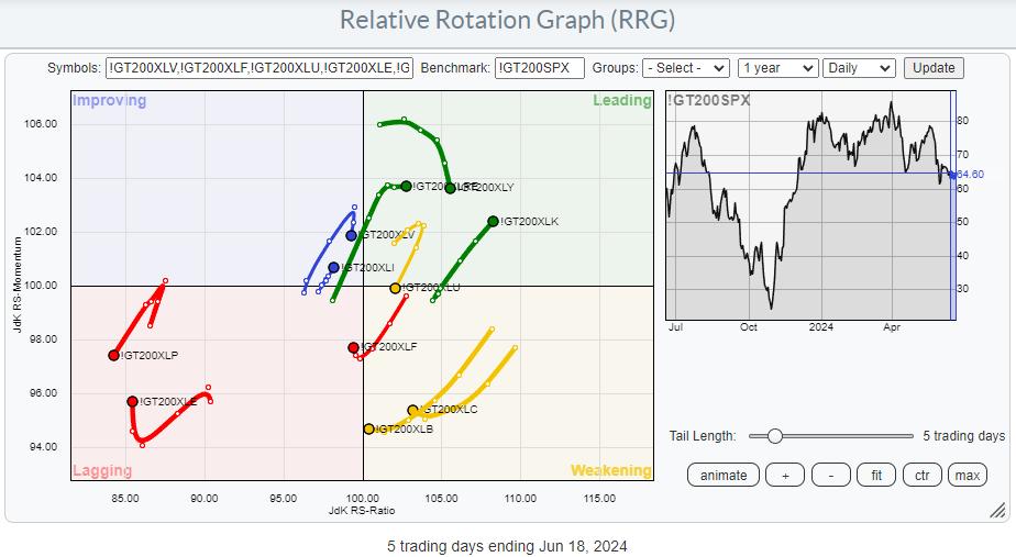
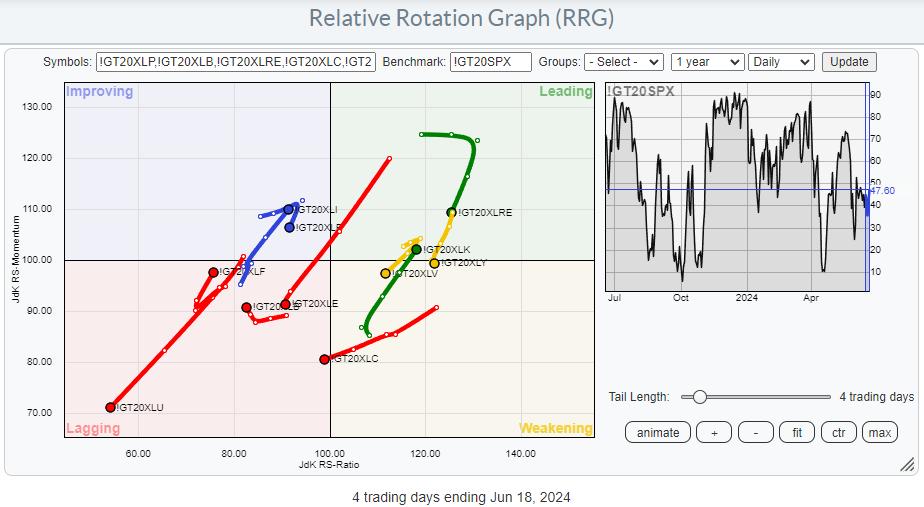
On the 200-day version, we find quite a few tails still on the right-hand side of the graph, but most have rolled over and/or turned to a negative RRG-Heading. Only !GT200XLK is still at a strong heading and moving further into the leading quadrant.
On the 50-day version, the tails have moved further left, indicating weakening across the board (lower RS-Ratio readings). !GT50XLK is inside, leading and moving further into it.
Finally, on the 20-day version, things are a little more pronounced, with a few tails really accelerating into the lagging quadrant. Some mild improvement is found for XLF and XLI across all three MA periods.
So, the main takeaway is that the majority of sectors are seeing their percentage of stocks above one of the moving averages declining faster than the percentage of stocks above these MAs for the S&P 500. Technology goes against this trend, and Financials and Industrials have a mildly improved reading.
Using $ONE as the Benchmark
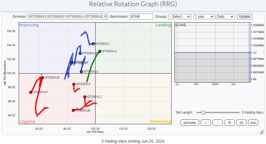
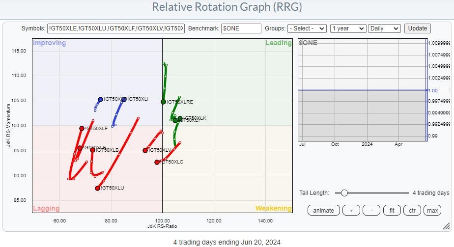
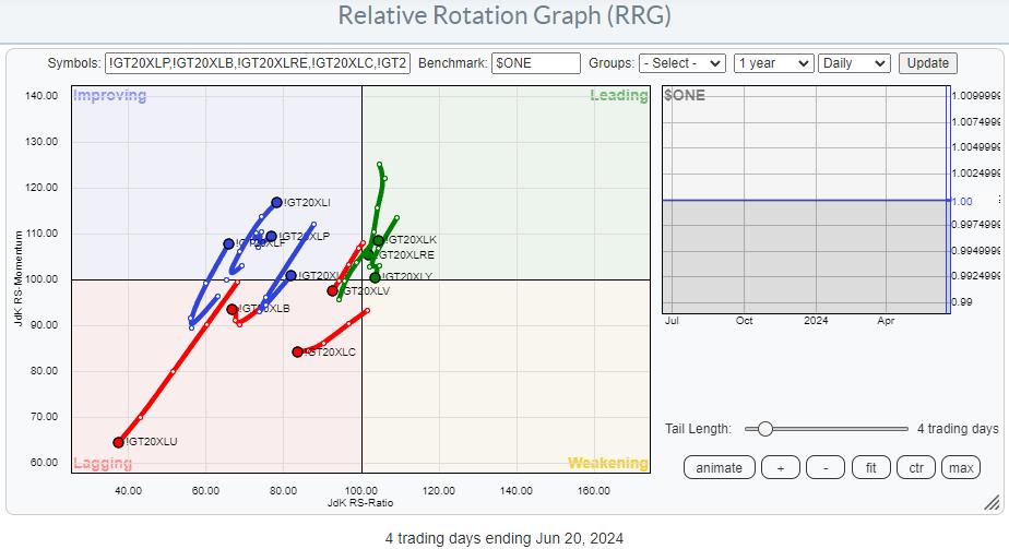
Running these same universes on Relative Rotation Graphs but swapping the $SPX benchmark to $ONE gives us the absolute trends comparison for these metrics. The main observation on these RRGs is that pretty much all tails are clustered on the left-hand, negative side of the graph. This indicates that most of these indicators are trending lower.
And SPY continues to move higher...
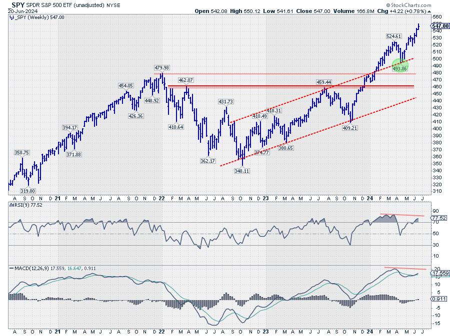
And all that while, the S&P 500 continues putting in new highs.
Looking at the S&P chart in combination with RSI and MACD, we see that RSI and MACD are still below their previous peaks, keeping the possibility of a negative divergence alive.
We all know that "price pays!!" but, in the current environment, I can't help asking myself, "But for how long?"
StayAlert, --Julius
Julius de Kempenaer
Senior Technical Analyst, StockCharts.com
Creator, Relative Rotation Graphs
Founder, RRG Research
Host of: Sector Spotlight
Please find my handles for social media channels under the Bio below.
Feedback, comments or questions are welcome at Juliusdk@stockcharts.com. I cannot promise to respond to each and every message, but I will certainly read them and, where reasonably possible, use the feedback and comments or answer questions.
To discuss RRG with me on S.C.A.N., tag me using the handle Julius_RRG.
RRG, Relative Rotation Graphs, JdK RS-Ratio, and JdK RS-Momentum are registered trademarks of RRG Research.


