| THIS WEEK'S ARTICLES |
| Larry Williams Focus On Stocks |
| MEMBERS ONLY |
| Bonds To Get Beat Up? | Focus on Stocks: August 2024 |
| by Larry Williams |
|
It looks to me like it's time for the bond market to take a breather, if not have a pullback from now into late October. We can sum it up with the cycle projections from Chart 1. I have highlighted, in red, the down leg of the 450-day cycle...
|
| READ ONLINE → |
|
|
|
| Art's Charts |
| This Breadth Indicator Points to More Downside and a Potential Opportunity |
| by Arthur Hill |
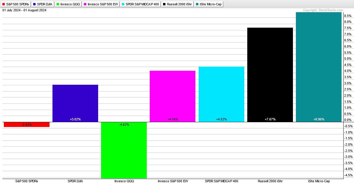
The broad market and the group are big drivers for stock performance. Recently, the Nasdaq 100 ETF (QQQ) led the market lower with sizable declines over the last five weeks. Weakness in QQQ weighed on tech stocks and tech-related industry groups, such as semis, software, and cybersecurity. The PerfChart below shows QQQ down 4.62% since July 1st, SPY down a fraction, and the Russell 2000 ETF (IWM) up 7.67%.

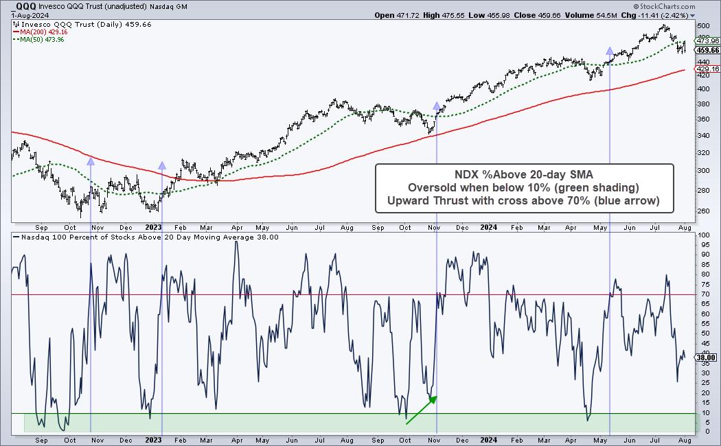
QQQ is in the midst of a pullback within a long-term uptrend. Chartists looking for opportunities in tech stocks and tech-related groups should wait for an oversold condition in the Nasdaq 100, which we are doing at TrendInvestorPro. We can identify oversold conditions using price oscillators and breadth indicators. I prefer breadth indicators because they aggregate performance for the average stock within the index.
The chart below shows QQQ with the Nasdaq 100 %Above 50-day SMA indicator in the lower window. First and foremost, QQQ hit a new high in July and remains well above the rising 200-day SMA. Thus, the long-term trend is up. This means the current pullback is a correction within this bigger uptrend.

NDX %Above 20-day SMA is a breadth oscillator that becomes oversold with a move below 10% (green shading). This means more than 90% of Nasdaq 100 stocks are below their 20-day SMAs. This is an oversold extreme that can pave the way for a bounce or breakout. It is important to wait for some sort of upside catalyst because stocks can become oversold and remain oversold. The blue arrow-lines show when this indicator surges above 70% (after becoming oversold). This shows a big increase in upside participation and acts as a bullish signal.
NDX %Above 20-day SMA has yet to become oversold and this means the correction in QQQ and tech stocks could continue. We are monitoring Nasdaq 100 breadth using an indicator that aggregates signals in seven short-term breadth indicators. The last oversold reading was in mid April and it has yet to become oversold. Click here to learn more.
//////////////////////////////////////////////////
|
| READ ONLINE → |
|
|
|
| RRG Charts |
| It's Been a Long Time Mr Bear, Where Have You Been? |
| by Julius de Kempenaer |

And then ..... all of a sudden..... things are heating up. Lots of (downside) market action in the past week.
Let's see what sector rotation and RRGs can tell us.
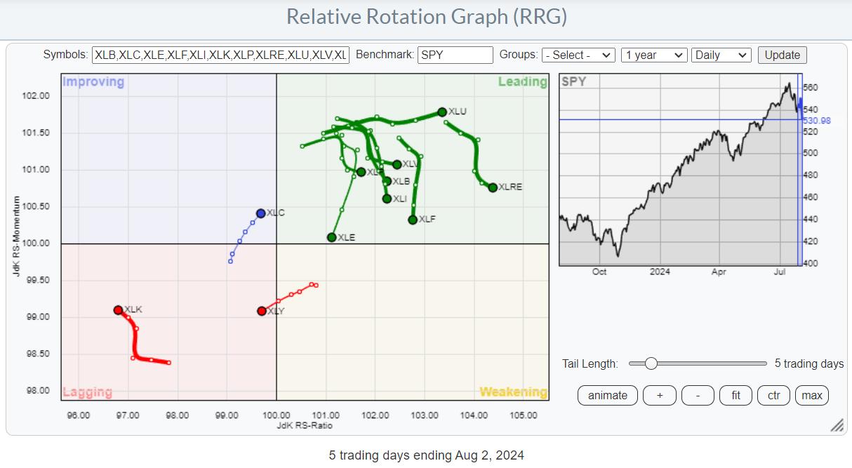
The RRG at the top is a daily RRG, as recent price action has significantly impacted near-term rotations.
The main takeaway is the concentrated risk-off rotation, with Technology and Consumer Discretionary rotating into the lagging quadrant. To offset the nose-dives in these two sectors, many others came floating to the surface on a relative basis.
Utes Lead, Tech Lags

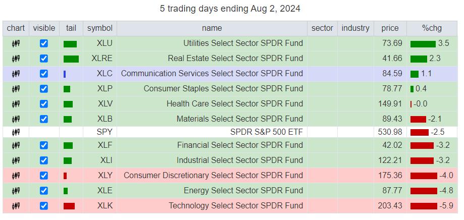
Looking at the price performance over the last five days (snapshot Friday, 8/2, 1:30 pm ET), we see the defensive sectors rising to the top of the table, while the more offensive sectors are found at the bottom. Investors are flocking to the safe havens of Utilities, Consumer Staples, and Healthcare. The odd ones are Real Estate and Communication services (META is certainly helping here).
The real damage for the cap-weighted S&P 500 comes from Consumer Discretionary and Technology.
Equal Weight Sectors Paint a More Realistic Picture

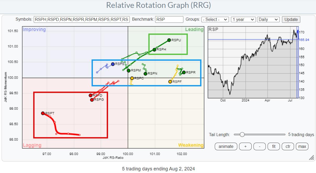
The RRG showing the equivalent equal-weight sectors paints a pretty clear picture. Three sectors are shooting deeper into the lagging quadrant: Consumer Discretionary, Energy, and Technology. Utilities and Healthcare are making the opposite move into leading. The remaining sectors are mixed around the 100 level on the JdK RS-Momentum scale.
This paints a more realistic picture at the sector level, which is less impacted by mega-cap stocks, but it confirms the rotation we also see in the cap-weighted sectors. RISK OFF.
Is the BIG ROTATION Over?

For a few weeks, it was all about the "BIG ROTATION," the move from large caps into small caps.
I discussed this two weeks ago in this video for StockChartsTV and asked whether that market segment would be big and strong enough to prevent the S&P 500 from falling.
At that time, the rotation was clearly visible, and SPY was holding up above support near 550, so there was no massive "outflow" of money from the S&P 500.
When the market moves lower, by definition, money is flowing out of it. When the market moves higher, new money is put into stocks. When (sector) rotation takes place while the market remains stable, the money is moved around between sectors.
At first, investors pulled their money from mega-cap and large-cap stocks and moved it to other sectors and segments (small caps). But now, money is actually leaving the market.
Interestingly, more money leaving the market seems to come from the small-cap segment.
Large and Small Both Go Down, but At a Different Pace
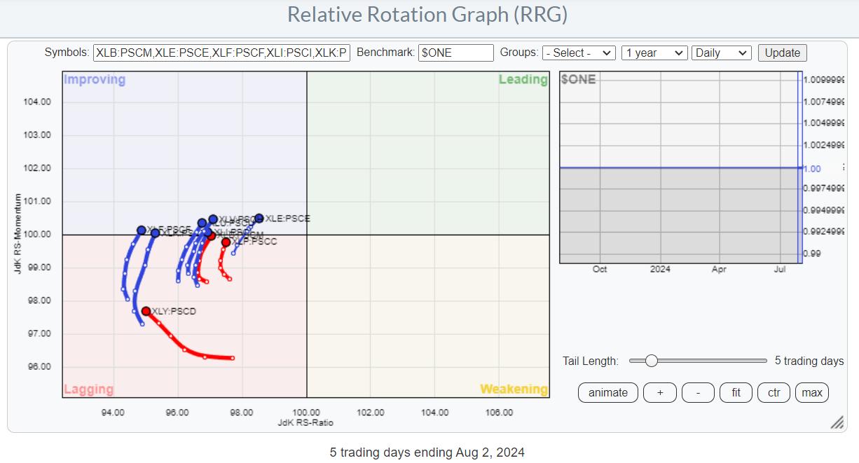
The RRG shows the ratios between cap-weighted large-cap sectors and cap-weighted small-cap sectors. It uses $ONE as the benchmark to visualize the movement between large- and small-cap sectors.
All tails are on the left-hand side of the graph, indicating that these ratios are in downtrends, meaning large caps are underperforming small caps. But the improvement over the last five days is rapidly becoming visible. All these tails are curling back up, indicating that the downtrends (meaning a preference for small caps over large caps) are starting to level off and improving.

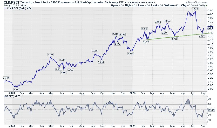
The chart above shows this ratio for XLK:PSCT in combination with an RSI(9). The sharp move lower from the 4.979 peak has come to rest near the developing support line around the levels of the previous lows while the RSI is executing a positive divergence.
Pretty much all of these ratios are showing similar charts.
Hence, on a relative basis, large-cap stocks seem to be making a comeback, but only because they are dropping less fast than the small-caps.

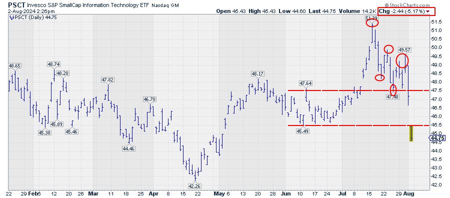
In reality, small-cap technology stocks are dropping like a stone.

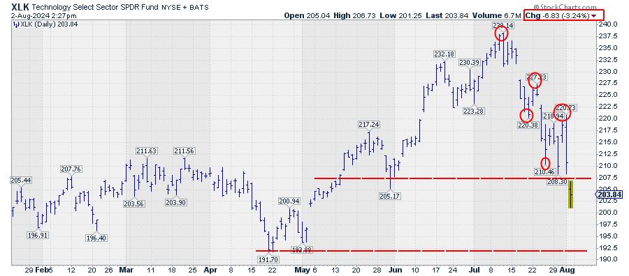
And so are large-cap technology stocks, only a little less.
When you are a long-only investor with a capital preservation benchmark, don't be fooled by RRG tails that are turning upward or rotating into the leading quadrant.
Where it all comes together.

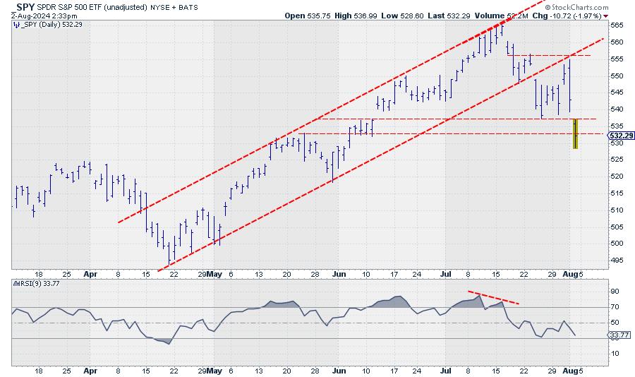
This chart was snapped Friday, 8/2, at 2:30 p.m. ET. The bounce from wherever it will come is very likely to give us more clues about the near future. I would not be surprised to see some "Wham Bam, Thank You, Ma'am" short covering, taking the market a little up from its lows.
What happens from there will be our guide going into next week.
The area between 533 and 537.50 will likely start to serve as overhead resistance, while the way down is now open to the 517.50-520 area.
#StayAlert and have a great weekend. --Julius
|
| READ ONLINE → |
|
|
|
| Martin Pring's Market Roundup |
| MEMBERS ONLY |
| Is the Bond Market About To Make a Big Move? |
| by Martin Pring |
|
The bond market experienced a secular bear between 1981 and the spring of 2020. Chart 1 offers three reasons why it has since reversed and given way to a secular uptrend or possibly multi-year trading range...
|
| READ ONLINE → |
|
|
|
| ChartWatchers |
| Recession Fears Top of Mind As Tech Stocks Selloff |
| by Jayanthi Gopalakrishnan |

The dog days of summer are here. And the stock market gives us a brutal reminder of this.
The first trading day of August began on a very pessimistic note. Thursday's weak manufacturing data spooked the stock market. All broad stock market indexes, including the S&P 600 Small-Cap Index ($SML) and the S&P 400 Mid-Cap Index ($MID), fell sharply after the Purchasing Managers' Index (PMI) from the Institute of Supply Management (ISM) came in at 46.8 (below 50 indicates contraction).
Friday was even worse after the July jobs report data was well below expectations. The broader indexes continued their slide with the charts of the broader equity indexes ending the week with technical breakdowns. But in the recent past, hasn't the stock market rejoiced when a softer jobs number was released?
It's Different This Time
Thursday's quick shift from green to red shows how this market can shift on a dime. On Wednesday, investors were optimistic about a rate cut in September after hearing Fed Chairman Powell's comments after the FOMC meeting. Maybe those comments were fresh in everyone's minds because the following day, investor sentiment shifted drastically.
After the PMI data came out, concern grew that perhaps the Fed's decision to leave interest rates unchanged in the July meeting may not have been a smart decision. A September rate cut may be too late.
Friday's weaker-than-expected employment report didn't help. It magnified the fear and accelerated the selloff in equities. If you dig deeper into the report, it's enough to create some fear. If the labor force participation rate is rising, as is evident in the July NFP, but there aren't enough jobs to hire the additional job seekers, unemployment will rise.
The fear has now shifted from a soft landing to a possible recession. That the Fed hasn't cut interest rates yet is maybe enough reason for investors to wrap up for the rest of the summer months and reset in September.
Two bad reports like the ones we just got tend to set off red flags. Stocks got slammed across the board—large caps, mid-caps, small caps, tech stocks, and industrials—all underwent significant drops. Another shift can be seen in the CME FedWatch Tool. Since the July NFP report, there's a 73.5% chance of a 50 basis-points rate cut in September.
Sentiment Shift
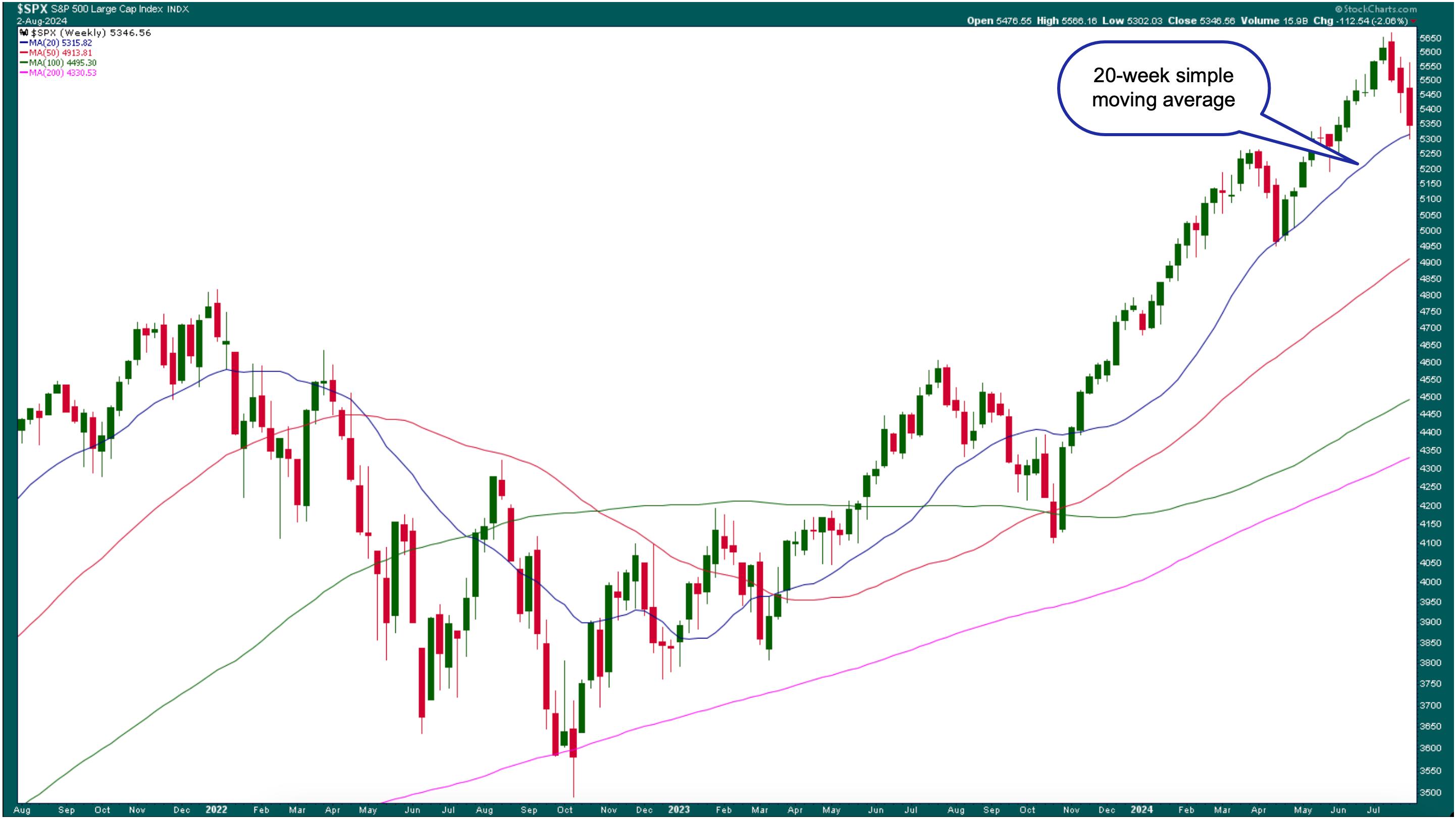
So, how bad was the technical damage? The weekly chart of the S&P 500 ($SPX) shows it tested its 20-week simple moving average (SMA) support and closed slightly above it. So, from a longer-term perspective, the damage isn't as deteriorating as your portfolio or daily chart may suggest.

CHART 1. WEEKLY CHART OF S&P 500 INDEX. The index tested its 20-week moving average. Will it hold? That's something to watch next week. Chart source: StockCharts.com. For educational purposes.
The daily chart tells another story. If there were one word to describe the action in the daily chart below, it would be "wipeout." Well, maybe it's not that bad.

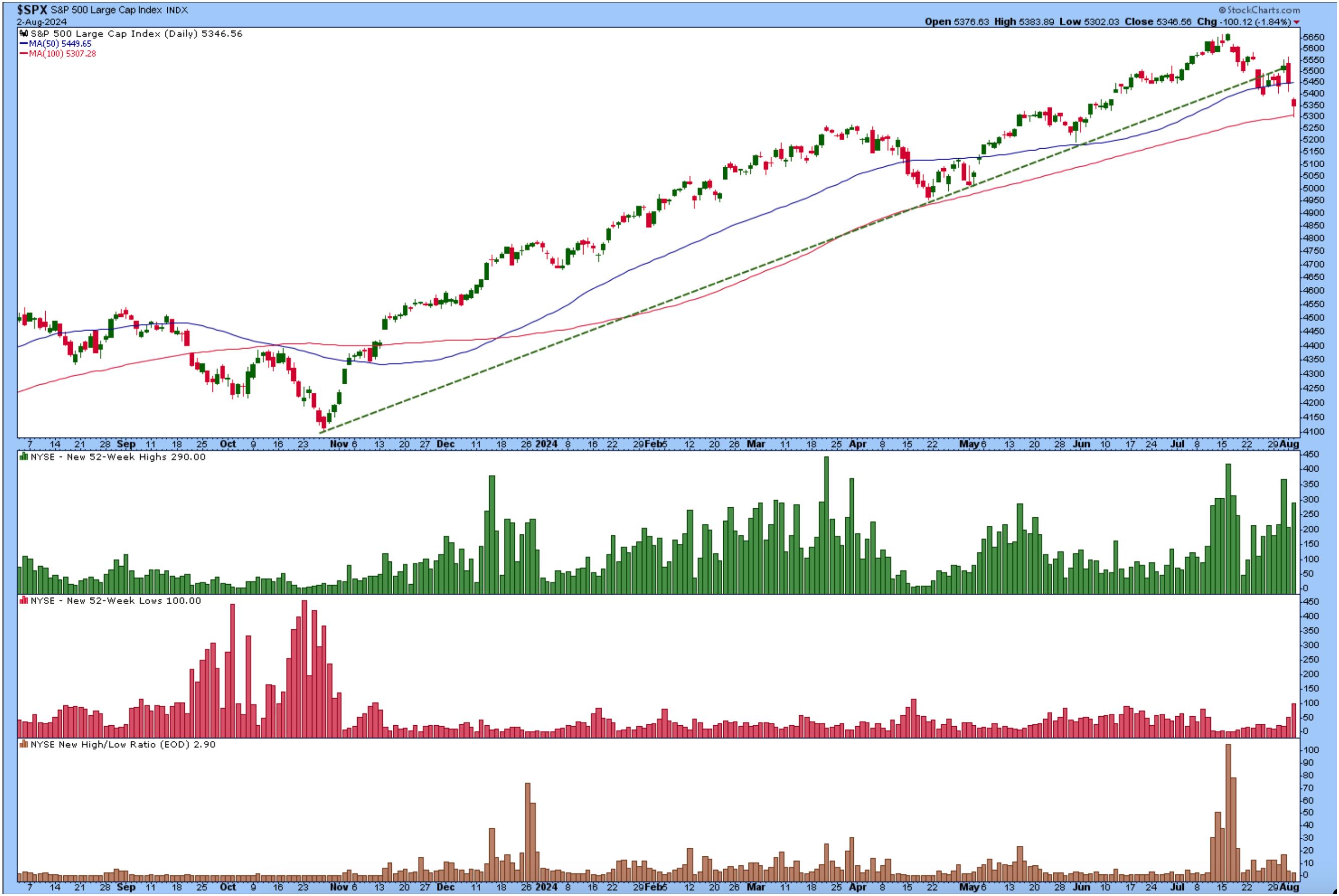
CHART 2. DAILY CHART OF THE S&P 500 INDEX. The index has broken below the trendline from the October lows but is now at its 100-day simple moving average support. Chart source: StockCharts.com. For educational purposes.
The S&P 500 has broken below its upward trendline from the October lows and is now testing its 100-day SMA support. The market breadth indicators in the lower panels aren't showing too much weakening, but it's something to watch for.
If the S&P 500 continues its downward move into next week, it could challenge the April lows before returning to firm ground. That would be about a 13% decline in value, which could be a healthy correction. That can be painful to deal with in an overextended market.
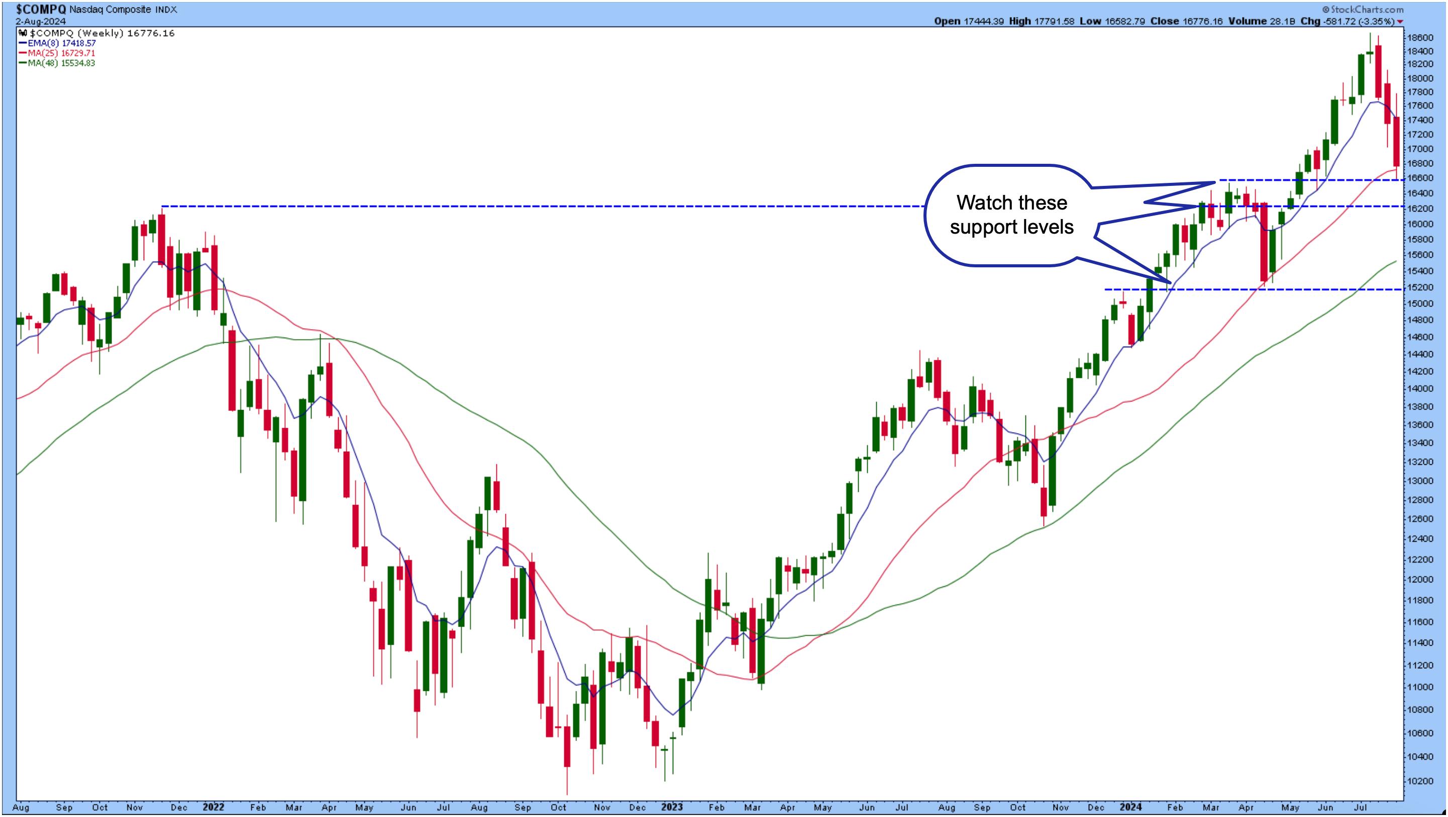
The Nasdaq Composite ($COMPQ) was hit even harder than the S&P 500. In the Nasdaq's weekly chart, you can see the index is at the support of its 25-week SMA and also hit the support of its March 18 high.

CHART 3. WEEKLY CHART OF NASDAQ COMPOSITE. Keep an eye on some key support levels. Chart source: StockCharts.com. For educational purposes.
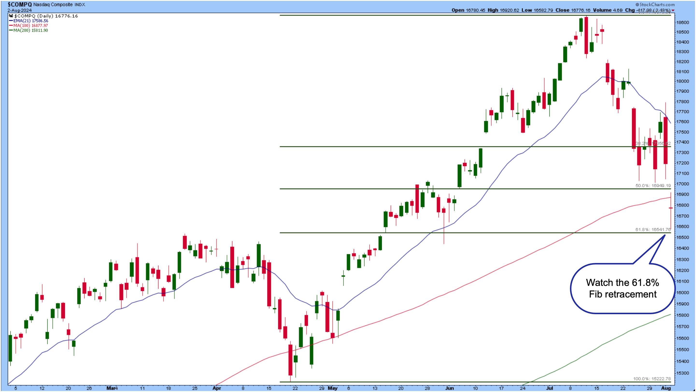
The daily chart below suggests that the index is likely to reach its April lows—almost a 20% move from the high. If tech company earnings follow the trend of either weak guidance or lower-than-expected earnings reports, the Nasdaq could take a deeper dive.

CHART 4. NASDAQ COMPOSITE ALMOST AT A 61.8% FIBONACCI RETRACEMENT. The tech selloff could continue, so keep an eye on the next support levels. Chart source: StockCharts.com. For educational purposes.
Bonds Step Up
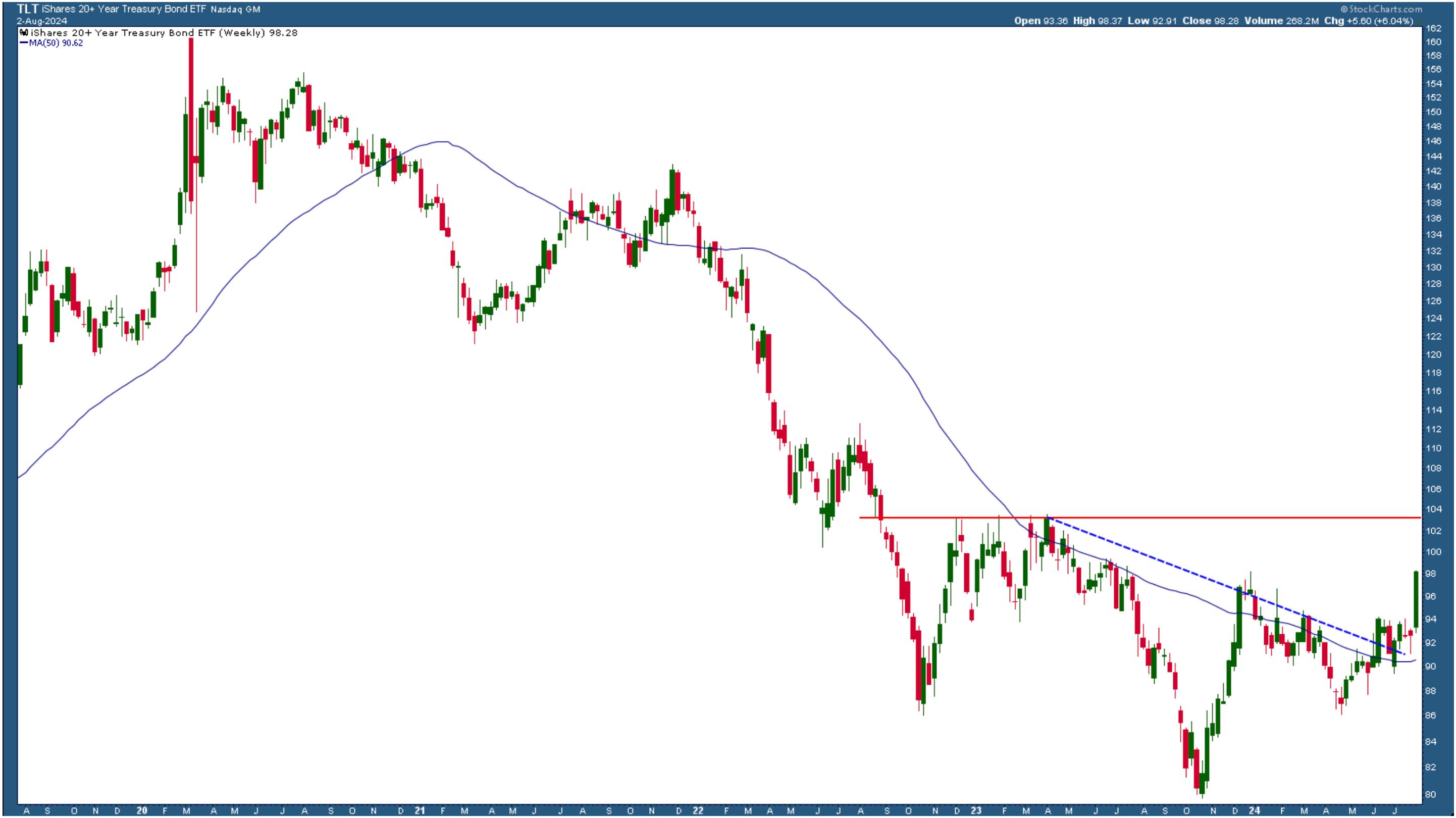
If investors are pulling money out of stocks, where is the money going? Could it be bonds? Maybe. Bonds were one of the bright spots on Thursday. The weekly chart of the iShares 20+ Year Treasury Bond ETF (TLT) below shows that bonds broke out on strong momentum on Friday. If you're sitting on some cash, it may be time to allocate a portion of your portfolio to bonds.

CHART 5. WEEKLY CHART OF TLT. Bond prices have broken out to the upside. This could be the time to pay attention to bonds. Chart source: StockCharts.com. For educational purposes.
As the stock market indexes dropped, the Cboe Volatility Index ($VIX) spiked. On Friday, the VIX almost hit 30 but closed below the high. Talk about a panic rise!
Closing Position
Overall, August started badly. This is a difficult market for long-term investors. Should you wait it out or sell your long equity positions and park some of your cash in bonds? It's best not to focus on all the noise and stop worrying about the day-to-day moves. But you should still monitor important support and resistance levels.
Another point to remember is that we're amid a seasonally weak period, which tends to be more pronounced during an election year. Let's hope we'll get out of this in September without too much damage and perhaps a 50 basis point rate cut.
End-of-Week Wrap-Up

- S&P 500 closed down 2.06% for the week, at 5346.56, Dow Jones Industrial Average up 2.10% for the week at 39,737.26; Nasdaq Composite closed down 3.35% for the week at 16776.16
- $VIX up 42.71% for the week closing at 23.39
- Best performing sector for the week: Utilities
- Worst performing sector for the week: Technology
- Top 5 Large Cap SCTR stocks: Carvana Co. (CVNA); Insmed Inc. (INSM); MicroStrategy, Inc. (MSTR); Alnylam Pharmaceuticals, Inc. (ALNY); Ryan Specialty Group Holdings, Inc. (RYAN).
On the Radar Next Week
- July ISM Services PMI
- August 30-Year Mortgage Rates
- June Consumer Credit Change
- July Manufacturing PMI
- Fed speeches from Daly and Barkin
- Earnings from Lucid Group (LCID), Caterpillar Inc. (CAT), Gilead Sciences (GILD), Robinhood Markets, Inc. (HOOD), Palantir Technologies, Inc. (PLTR), and many more.
Disclaimer: This blog is for educational purposes only and should not be construed as financial advice. The ideas and strategies should never be used without first assessing your own personal and financial situation, or without consulting a financial professional.
|
| READ ONLINE → |
|
|
|
| Trading Places with Tom Bowley |
| Unbelievable! The Fed Creating Its Own Nightmare And We're The Puppets |
| by Tom Bowley |
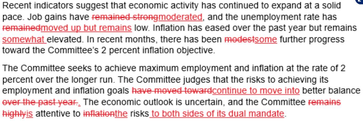
This Fed has got to go. It's time. You've overstayed your welcome, Fed Chief Powell. I literally was just shaking my head after reading the changes to the Fed's policy statement. The changes were in the first two paragraphs, so let me jump right in and show you what changed in the wording and, essentially, what the Fed acknowledged:

Wording in red with a line through it was wording from the prior policy statement that was not in the current policy statement. Wording in red and underlined is new wording in the current policy statement. I think the most important change is the last line in the second paragraph. At the prior meeting, the statement said the FOMC "remains highly attentive to inflation risks". That clearly showed that the Fed was much more concerned about inflation than the economy. The economy wasn't even mentioned. But the latest statement now reads that the FOMC "is attentive to risks to both sides of its dual mandate." The dual mandate, of course, is to maximize employment (economy) and stabilize prices (inflation). So the Fed is now acknowledging that the economy is weakening, which is EXACTLY what I've been saying for the past several weeks. We dedicated an event last Saturday to this exact topic to warn our members of the deteriorating economy and what that could mean for the S&P 500.
It's not pretty.
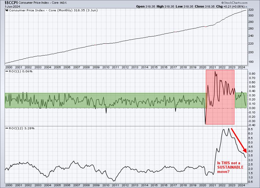
In order to avoid recession, the Fed needs to act and cut rates. But no, no, no, not this Fed. They're still looking for a "sustainable" path to its 2% target on inflation, as if this chart doesn't CLEARLY show a sustainable path:

I've been in the camp of a soft landing. Now I've decided I don't like camping. I also don't like this Fed, if you couldn't tell. Not only did the Fed leave rates unchanged and fail to give us all a sense of security that rates will drop in September, but it was a UNANIMOUS decision. They're all going along for this ride with the Fed Chief of Sustainability Powell.
Powell is in the business of creating pain for investors globally. His infamous speech from the stage in Jackson Hole in 2022 completely derailed a massive 700 point-rally in the S&P 500 over the prior 9-10 weeks. This isn't new.
Do you know how many trillions and trillions of dollars trade every day in the U.S. bond and stock markets? There are BRILLIANT economists in the world's largest financial firms and all of this money has been SCREAMING at the Fed to cut rates. But they have their own agenda and are the LEAST transparent Fed that I've ever seen. Would you like to see some immediate fallout from the Fed paying ZERO attention to the stock and bond markets?
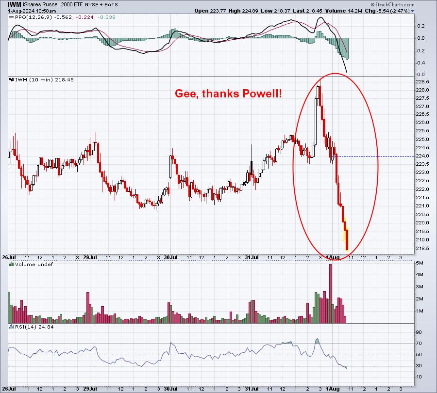
How about this 5-day chart on the IWM (small cap Russell 2000 ETF):

Wednesday 3pm: The moment that Wall Street realized that all its hopes and dreams of a rate cut were crushed and that our economy is as good as gone. Soft landing? Very, very doubtful. The good news is that Christmas specials should be great this year as companies try to get rid themselves of massive inventories.
Listen, it's not too late to get the recording from last week's "Why The S&P 500 May Tumble". It may turn out to be the most important video you watch this year. A FREE 30-day trial membership will do the trick. I laid out the path for the S&P 500 and key growth areas. The only thing I'd change, 5 days later, is the title. A more appropriate title would be "Why The S&P 500 Will Tumble".
Also, I just recorded a YouTube video last night, "Fed Makes Wrong Move AGAIN!". Be sure to "Like" the video and "Subscribe" to our YouTube Channel. I appreciate your support!
Sleep well Powell.
Happy trading!
Tom
|
| READ ONLINE → |
|
|
|
| Don't Ignore This Chart! |
| Small Caps Poised to Soar: Is Now the Time To Buy IWM? |
| by Karl Montevirgen |

In July alone, the iShares Russell 2000 ETF jumped upwards of 12%, outpacing the S&P 500, before retracing half that distance. Historically, the Russell (in general) hasn't done as well as other major indexes, mainly because it doesn't have the same exposure to fast-growing tech companies. However, that lack of exposure is driving its surge, as investors may be rotating out of tech and into small caps.
What this might indicate: The small cap surge signals a shift in market sentiment, with investors eyeing opportunities beyond the tech sector.
The Macro View
Let's take a look at the chart below: iShares Russell 2000 ETF (IWM).

CHART 1. WEEKLY CHART OF IWM. The Russell 2000 proxy is recovering from a decline and a lengthy trading range.
IWM was in a bear market from the end of 2021 to the middle of 2022 (see blue dotted line), losing 31% of its value from its all-time high of $235.46. It then got caught in a broad trading range (see green rectangle), finally breaking out at the beginning of 2024.
Despite its impressive rise, IWM must break past $235.46 and keep climbing to confirm a new small-cap bull market.
So, are we at the start of a new bull market for small caps?
If so, IWM is only 8% away from that mark.
But ... Why IWM, and Why Now?
The Russell 2000 is more balanced and diversified than the S&P 500. Its largest stock holding makes up only 1.7% of the index (meaning less concentration risk). Also, IWM trades at a P/E of 16.9, which is cheaper than the S&P's 24.3 ratio.
Why now? Falling interest rates typically create a favorable economic environment for small caps. Overall, small-cap stocks tend to shine in periods of economic recovery and when interest rates are favorable.
Depending on your perspective on the economy over the last few years, there are either potential rate cuts on the horizon or both an awful economy and potential rate cuts soon.
Key Levels to Watch
Thursday was a particularly bad day on Wall Street, with the Dow plunging 700 points, the S&P 500 down 1.9%, and the Nasdaq and Russell, losing over 3%.
Following the broader market, you can see the IWM tumble in the chart below.

CHART 2. DAILY CHART OF IWM. Wow, look at that tumble.
If IWM is to challenge its all-time high of $235.46 and proclaim a new bull market, it doesn't look like it has enough momentum to do so, as the Chaikin Money Flow (CMF) shows ... well ... no convincing money flow either from the bull or bear side.
The StockChartsTechnicalRank (SCTR) score looks promising, jumping above 90 again (indicating several technical indicators are bullish across multiple timeframes). However, with the broader market being bearish on this day, IWM is feeling the pressure.

The key level to keep an eye on is around $205. High volume concentration (look at the Volume-by-Price indicator) coincides with the projected Kumo support level and the 38.2% Fibonacci retracement level, making it a strong range of interest and potential buying. And if IWM falls below this level, you have down to $187.50—where the 61.8% Fib retracement and the January lowest swing low of the year happen to meet—to find favorable buying opportunities. Keep an eye on momentum; the more bullish, the more favorable.
Closing Bell
Small caps look to be making a comeback. IWM needs to break $235.46 to confirm a new bull market, and it's just 8% away. Investors may be rotating out of tech stocks and into small caps, drawn by lower P/E ratios and other diversification benefits. If you want to get in on the action, keep an eye on key levels around $205 and $197.50 for buying opportunities. Market sentiment may shift big time as the likelihood of rate cuts looks more promising.
Disclaimer: This blog is for educational purposes only and should not be construed as financial advice. The ideas and strategies should never be used without first assessing your own personal and financial situation, or without consulting a financial professional.
|
| READ ONLINE → |
|
|
|
| MORE ARTICLES → |
|


