TAKEAWAYS
- Some real damage for the markets
- Equal weight sector rotation paints a more realistic picture
- The BIG ROTATION into small caps has come to a halt
And then ..... all of a sudden..... things are heating up. Lots of (downside) market action in the past week.
Let's see what sector rotation and RRGs can tell us.
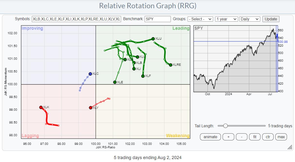
The RRG at the top is a daily RRG, as recent price action has significantly impacted near-term rotations.
The main takeaway is the concentrated risk-off rotation, with Technology and Consumer Discretionary rotating into the lagging quadrant. To offset the nose-dives in these two sectors, many others came floating to the surface on a relative basis.
Utes Lead, Tech Lags
Looking at the price performance over the last five days (snapshot Friday, 8/2, 1:30 pm ET), we see the defensive sectors rising to the top of the table, while the more offensive sectors are found at the bottom. Investors are flocking to the safe havens of Utilities, Consumer Staples, and Healthcare. The odd ones are Real Estate and Communication services (META is certainly helping here).
The real damage for the cap-weighted S&P 500 comes from Consumer Discretionary and Technology.
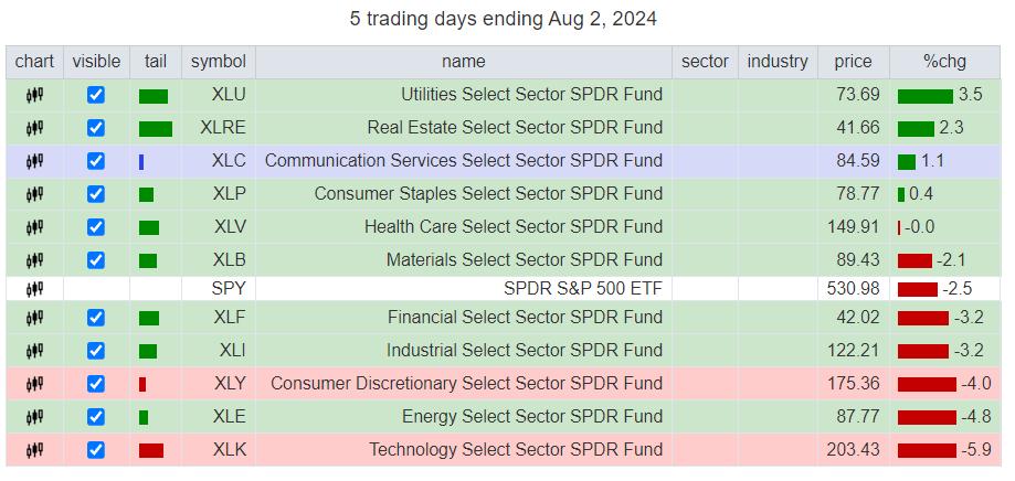
Equal Weight Sectors Paint a More Realistic Picture
The RRG showing the equivalent equal-weight sectors paints a pretty clear picture. Three sectors are shooting deeper into the lagging quadrant: Consumer Discretionary, Energy, and Technology. Utilities and Healthcare are making the opposite move into leading. The remaining sectors are mixed around the 100 level on the JdK RS-Momentum scale.
This paints a more realistic picture at the sector level, which is less impacted by mega-cap stocks, but it confirms the rotation we also see in the cap-weighted sectors. RISK OFF.
Is the BIG ROTATION Over?
For a few weeks, it was all about the "BIG ROTATION," the move from large caps into small caps.
I discussed this two weeks ago in this video for StockChartsTV and asked whether that market segment would be big and strong enough to prevent the S&P 500 from falling.
At that time, the rotation was clearly visible, and SPY was holding up above support near 550, so there was no massive "outflow" of money from the S&P 500.
When the market moves lower, by definition, money is flowing out of it. When the market moves higher, new money is put into stocks. When (sector) rotation takes place while the market remains stable, the money is moved around between sectors.
At first, investors pulled their money from mega-cap and large-cap stocks and moved it to other sectors and segments (small caps). But now, money is actually leaving the market.
Interestingly, more money leaving the market seems to come from the small-cap segment.
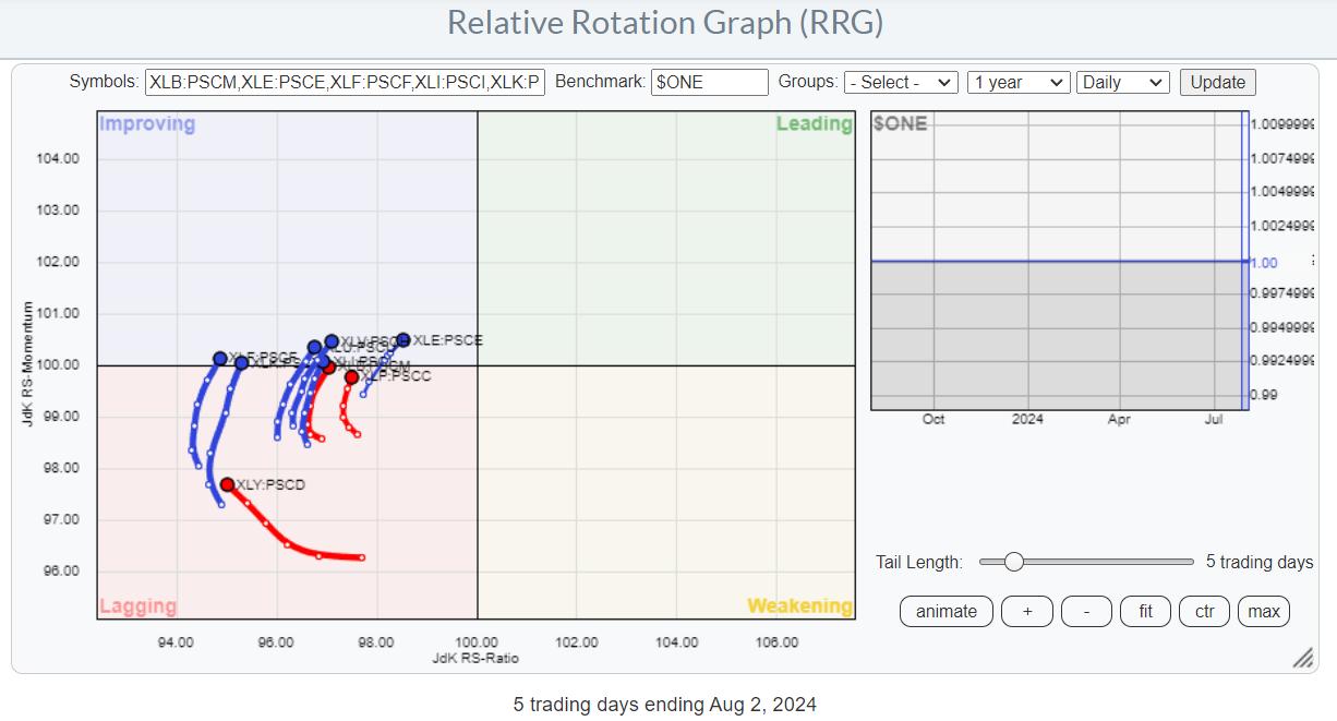
Large and Small Both Go Down, but At a Different Pace
The RRG shows the ratios between cap-weighted large-cap sectors and cap-weighted small-cap sectors. It uses $ONE as the benchmark to visualize the movement between large- and small-cap sectors.
All tails are on the left-hand side of the graph, indicating that these ratios are in downtrends, meaning large caps are underperforming small caps. But the improvement over the last five days is rapidly becoming visible. All these tails are curling back up, indicating that the downtrends (meaning a preference for small caps over large caps) are starting to level off and improving.
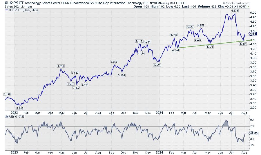
The chart above shows this ratio for XLK:PSCT in combination with an RSI(9). The sharp move lower from the 4.979 peak has come to rest near the developing support line around the levels of the previous lows while the RSI is executing a positive divergence.
Pretty much all of these ratios are showing similar charts.
Hence, on a relative basis, large-cap stocks seem to be making a comeback, but only because they are dropping less fast than the small-caps.
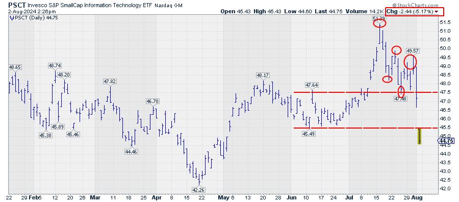
In reality, small-cap technology stocks are dropping like a stone.
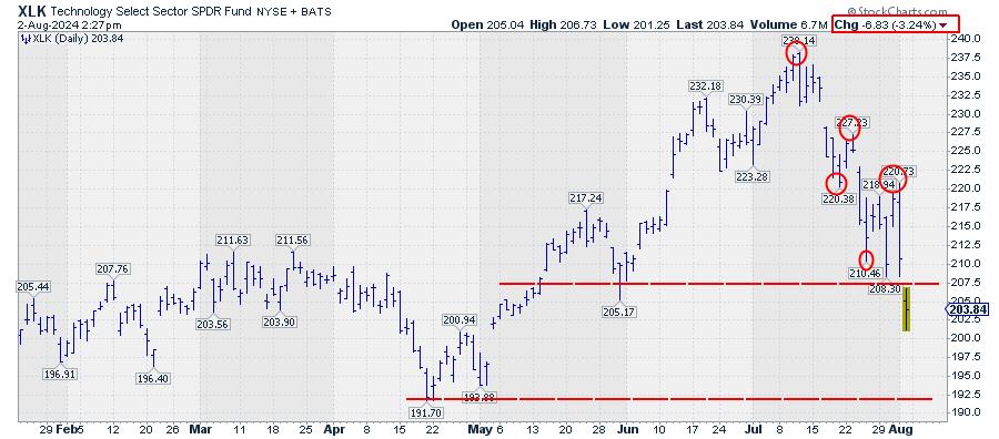
And so are large-cap technology stocks, only a little less.
When you are a long-only investor with a capital preservation benchmark, don't be fooled by RRG tails that are turning upward or rotating into the leading quadrant.
Where it all comes together.
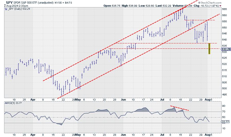
This chart was snapped Friday, 8/2, at 2:30 p.m. ET. The bounce from wherever it will come is very likely to give us more clues about the near future. I would not be surprised to see some "Wham Bam, Thank You, Ma'am" short covering, taking the market a little up from its lows.
What happens from there will be our guide going into next week.
The area between 533 and 537.50 will likely start to serve as overhead resistance, while the way down is now open to the 517.50-520 area.
#StayAlert and have a great weekend. --Julius
Julius de Kempenaer
Senior Technical Analyst, StockCharts.com
Creator, Relative Rotation Graphs
Founder, RRG Research
Host of: Sector Spotlight
Please find my handles for social media channels under the Bio below.
Feedback, comments or questions are welcome at Juliusdk@stockcharts.com. I cannot promise to respond to each and every message, but I will certainly read them and, where reasonably possible, use the feedback and comments or answer questions.
To discuss RRG with me on S.C.A.N., tag me using the handle Julius_RRG.
RRG, Relative Rotation Graphs, JdK RS-Ratio, and JdK RS-Momentum are registered trademarks of RRG Research.


