| THIS WEEK'S ARTICLES |
| Martin Pring's Market Roundup |
| MEMBERS ONLY |
| Four Intermarket Confidence Relationships that Aren't Confident |
| by Martin Pring |
|
Most of the primary trend indicators I follow are in a bullish mode and show few signs of flagging. That said, some intermarket relationships, which help to indicate whether the environment is risk-off or risk-on, have started to move in a risk-off direction...
|
| READ ONLINE → |
|
|
|
| Larry Williams Focus On Stocks |
| MEMBERS ONLY |
| Larry's LIVE "Family Gathering" Webinar Airs NEXT WEEK - Thursday, September 19 at 2 PM EDT! |
| by StockCharts Team |
|
Larry is going LIVE! Don't miss the upcoming "Family Gathering" webinar with Larry Williams, airing live through Zoom on Thursday, September 19 at 2:00pm Eastern Daylight Time...
|
| READ ONLINE → |
|
|
|
| The Mindful Investor w/ David Keller, CMT |
| Here's My Most-Likely Scenario for QQQ |
| by David Keller |
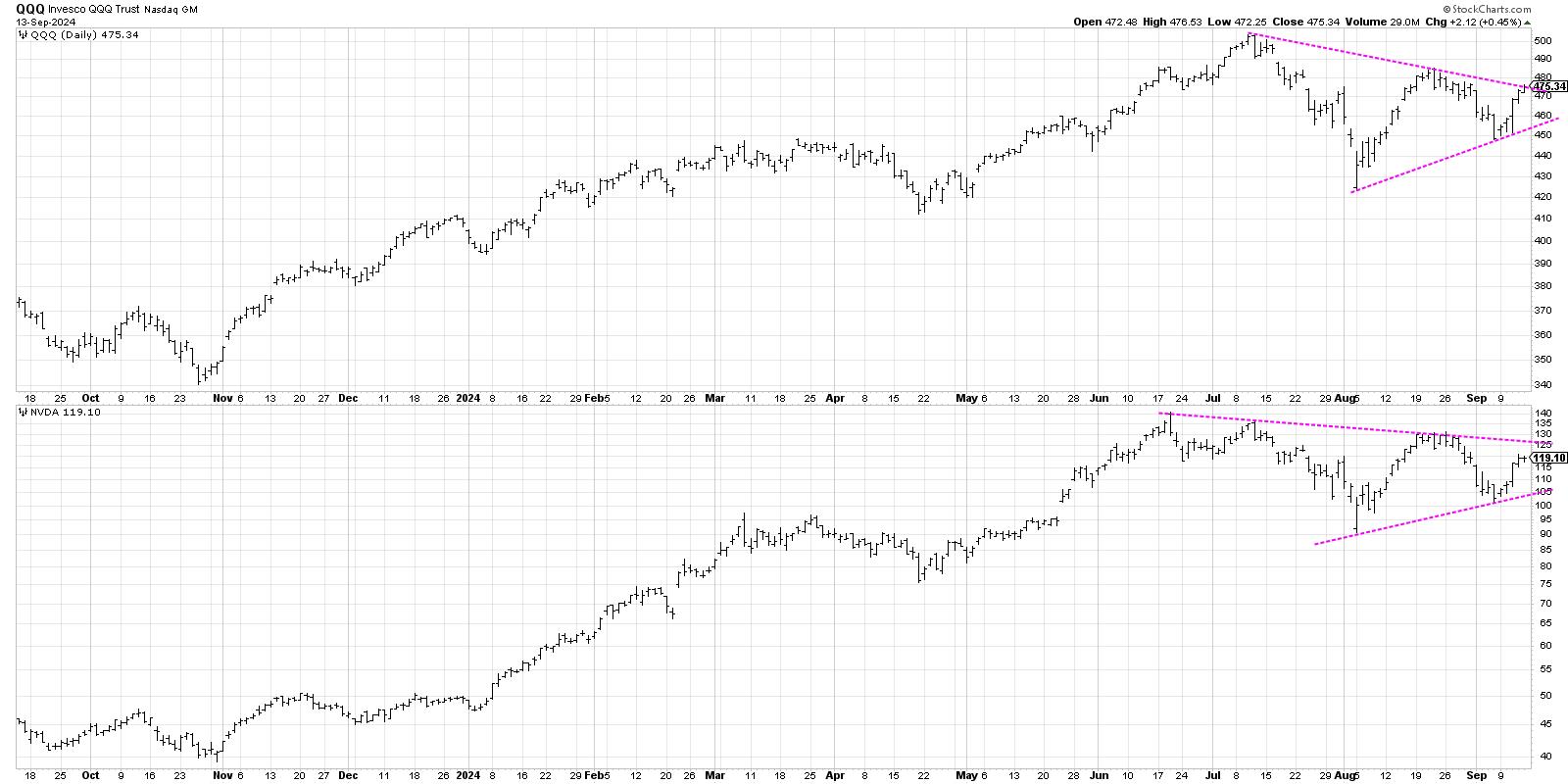
While the S&P 500 finished the week once again testing new all-time highs around 5650, the Nasdaq 100 remains rangebound in a symmetrical triangle or "coil" pattern. While this pattern does not necessarily suggest a potential next move for the QQQ, it did lead me to think about four different scenarios that could play out over the next six to eight weeks.
The chart of the QQQ looks a lot like the chart of Nvidia (NVDA), with a clear consolidation pattern of lower highs and higher lows. Other leading growth names like Meta Platforms (META) have failed to signal an upside breakout to give an "all clear" signal for the bulls. And defensive sectors continue to thrive, even though the S&P 500 finished in the green every day this week.
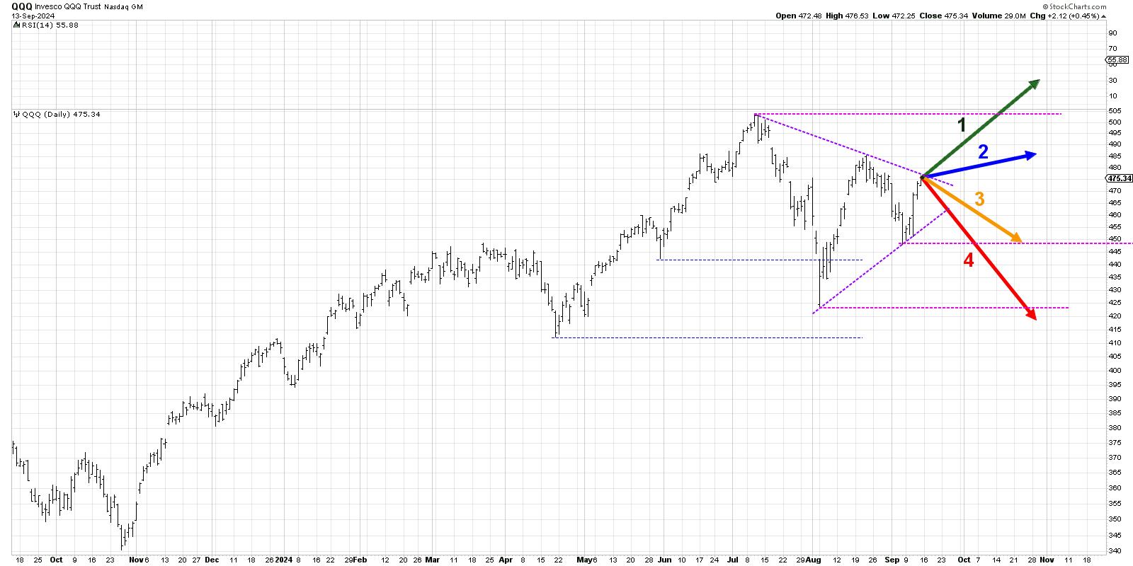
Today, we'll lay out four potential outcomes for the Nasdaq 100. As I share each of these four future paths, I'll describe the market conditions that would likely be involved, and I'll also share my estimated probability for each scenario.
By the way, we conducted a similar exercise for the Nasdaq 100 back in June, and you won't believe which scenario actually played out!
And remember, the point of this exercise is threefold:
- Consider all four potential future paths for the index, think about what would cause each scenario to unfold in terms of the macro drivers, and review what signals/patterns/indicators would confirm the scenario.
- Decide which scenario you feel is most likely, and why you think that's the case. Don't forget to drop me a comment on my channels and let me know your vote!
- Think about how each of the four scenarios would impact your current portfolio. How would you manage risk in each case? How and when would you take action to adapt to this new reality?
Let's start with the most optimistic scenario, with the QQQ achieving a new all-time high over the next six to eight weeks.
Option 1: The Very Bullish Scenario
What if NVDA breaks out to the upside, META finally pops above $550, and the rest of the Magnificent 7 stocks go right back to a leadership role? That would certainly drive the Nasdaq and the S&P 500 to their own new highs in the next month or so. If Powell's press conference next week renews investor optimism and the market prices in a perfect soft landing for the economy, we could perhaps see this play out.
Dave's Vote: 10%
Option 2: The Mildly Bullish Scenario
If the Mag7 names continue to struggle and fail to breakout, but other sectors like financials and industrials surge higher, we could get a more mildly bullish rally here. That would mean the QQQ remains below its 2024 high, but stockpickers rejoice as plenty of opportunities appear outside of the growth sectors.
Dave's vote: 30%
Option 3: The Mildly Bearish Scenario
What if the Fed meeting does not go as well next week, and investors start thinking recession again? Defensive sectors have certainly been showing strength in recent months, and it feels like it would not take much to reverse the signs of optimism I've observed over the last week. Bonds outperform stocks as investors get defensive, and suddenly we're all hoping for an October rally to overcome the bearish sentiment.
Dave's vote: 45%
Option 4: The Super Bearish Scenario
You always need a doomsday scenario, and this last option would involve a big time "risk off" move for stocks. Growth stocks rotate lower, and risk-off plays like gold shine brightest as the QQQ retests the August low around $425. Perhaps Powell fails to boost investors' confidence and the "goldilocks scenario" for the economy seems like a distant memory.
Dave's vote: 15%
What probabilities would you assign to each of these four scenarios? Check out the video below, and then drop a comment with which scenario you select and why!
RR#6,
Dave
P.S. Ready to upgrade your investment process? Check out my free behavioral investing course!
David Keller, CMT
Chief Market Strategist
StockCharts.com
Disclaimer: This blog is for educational purposes only and should not be construed as financial advice. The ideas and strategies should never be used without first assessing your own personal and financial situation, or without consulting a financial professional.
The author does not have a position in mentioned securities at the time of publication. Any opinions expressed herein are solely those of the author and do not in any way represent the views or opinions of any other person or entity.
|
| READ ONLINE → |
|
|
|
| ChartWatchers |
| A Half Point Fed Rate Cut? The Stock Market Thinks So |
| by Jayanthi Gopalakrishnan |

This week's stock market action may have caught many investors by surprise. After last week's massive selloff, this week's turnaround reignited investor enthusiasm in equities. Large-cap growth stocks were the leading asset class in the early part of the trading week, and, by Friday, the clear leaders were the mid- and large-cap stocks.
This week's Consumer Price Index (CPI) and Producer Price Index (PPI) showed that inflation has cooled, which means the Fed will probably cut interest rates. More optimistic is the thinking that there may be more than the 25 basis points (bps) we were expecting last week.
Broader Market Index Price Action
The Dow Jones Industrial Average ($INDU), S&P 500 ($SPX), and Nasdaq Composite ($COMPQ) closed higher for the week. The S&P 500 and the Dow are trading close to their August highs, but the Nasdaq has some catching up to do. In Nasdaq's defense, it was the hardest hit among the three.
The Nasdaq's daily chart gives a clearer picture of where the index stands now, technically speaking, battling against resistance from the downtrend line. A break above this line would mean the bulls are still in the lead, but a break above the August high would indicate bulls are charging to the finish line.
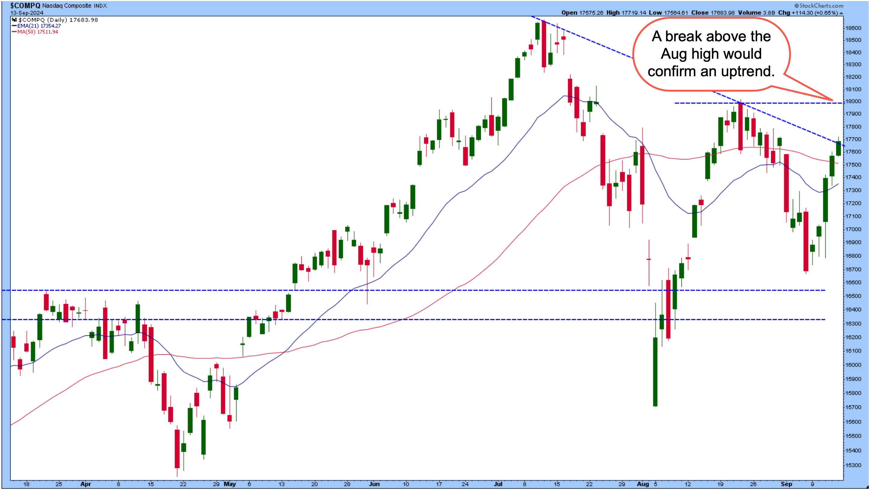
FIGURE 1. WILL THE NASDAQ COMPOSITE BREAK THROUGH ITS DOWNTREND? A break above the downtrend would be bullish for the tech-heavy index, but a more confirming move would be a break above its August high.Chart source: StockCharts.com. For educational purposes.
If you participated in the "dip buying" this week, the resistance of the downward trendline is one to watch carefully. And if you missed buying on the September dip, a break above the trendline should be an early signal to prepare to add positions, but waiting for the index to break above its August high would be wiser.
There are a couple of factors to keep in mind. One is that it's still September, a seasonally weak month for stocks. The second is there's an FOMC meeting next week. Investors expect an interest rate cut to be announced, but how much will the Fed cut rates? The odds of a 50 basis point cut have risen since last week; as of this writing, according to the CME FedWatch Tool, the probability of a 25 bps cut is 51%. The probability of a 50 bps is 49%. These percentages drastically differ from last week's odds, when the odds for a 25 bps rate cut were above 70%.
The stock market is acting like it expects a 50 bps cut. If the Fed cuts 25 bps, though, the market could be disappointed, so tread carefully. A lot is riding on the Fed's decision on Wednesday.
Small Cap Revival
The S&P Small Cap Index ($SML) started gaining traction this week, surging on Friday. Looking at the ratio chart of the iShares Russell 2000 ETF (IWM) and SPDR S&P 500 ETF (SPY), we can see small-cap stocks are beginning to gain strength, but still have some work to do before outpacing the bigger stocks.
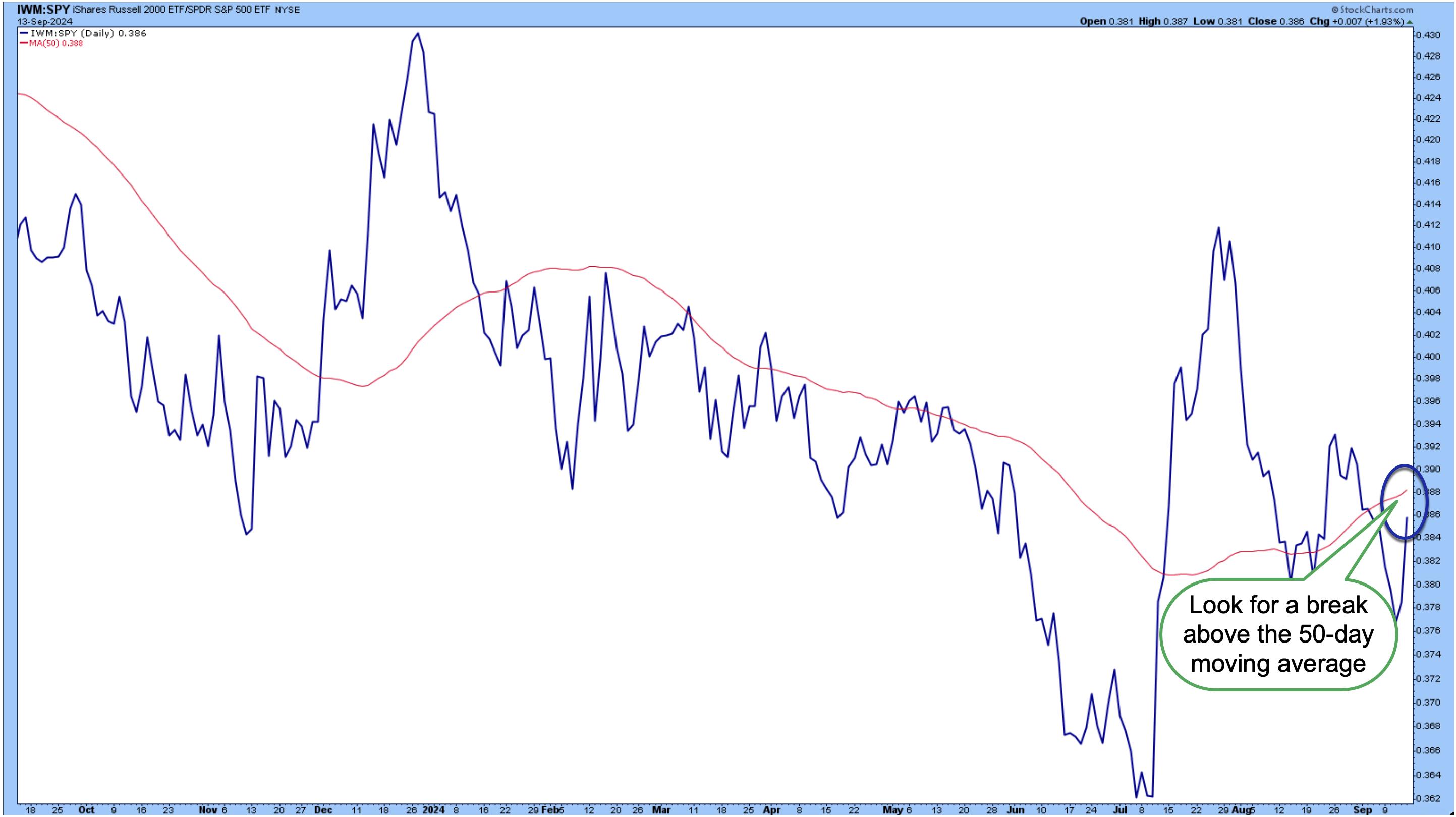
FIGURE 2. SMALL CAPS VS. LARGE CAP STOCKS. Small caps surged this week, but they still have more to go before catching up with their bigger cousins.Chart source: StockCharts.com. For educational purposes.
Small caps surged in July when inflation fears were in the rear-view mirror, but fell after concerns of a recession surfaced. Now that interest rate cuts are on the table, small-cap stocks may see more upside. A break above the upward-sloping 50-day simple moving average (SMA) could give IWM a further boost.
What's Happening With Precious Metals?
Gold prices hit an all-time high on Friday, riding on interest rate cut expectations. The daily chart of the SPDR Gold Shares (GLD) below shows price breaking above a consolidation area, gapping up, and hitting an all-time high.
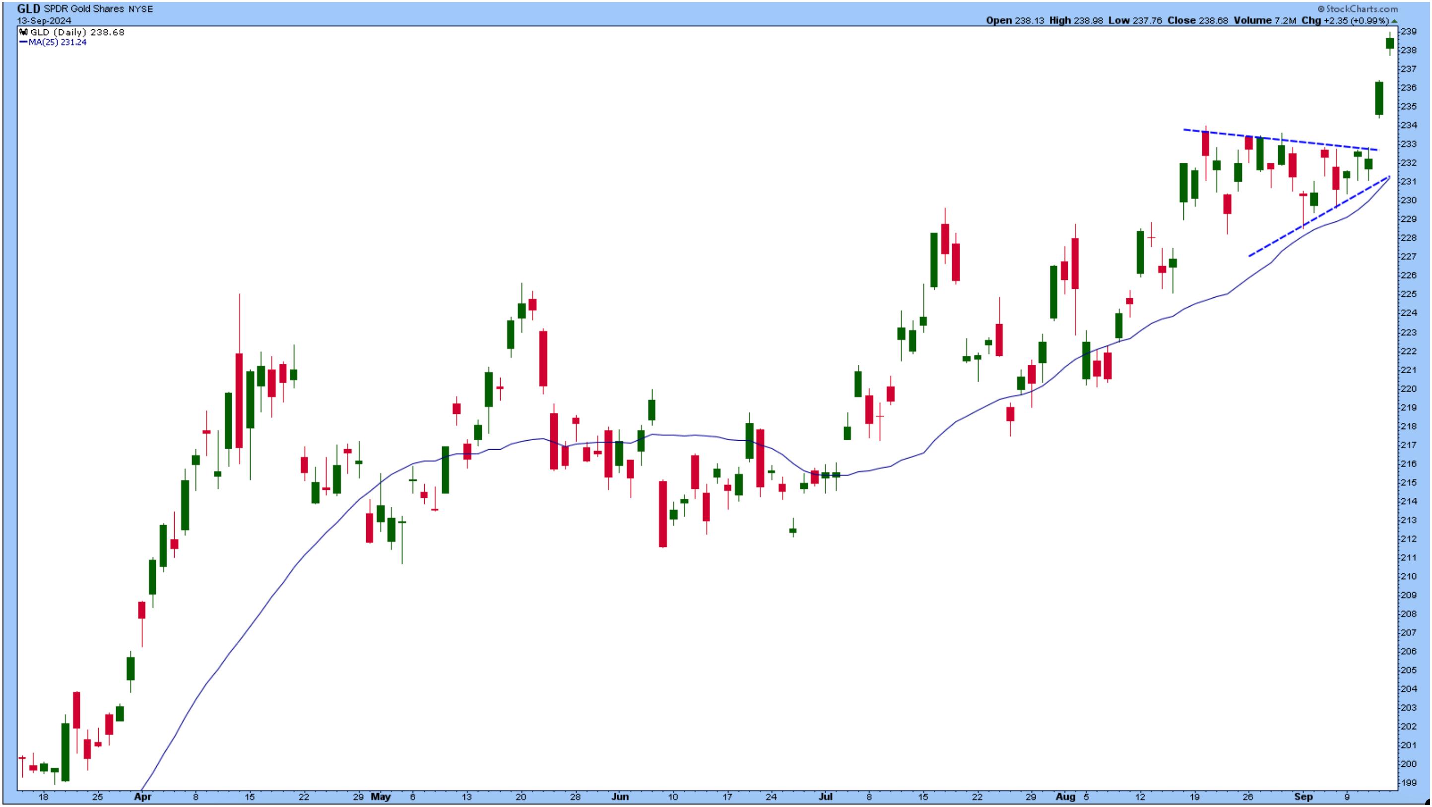
FIGURE 3. GOLD PRICES HIT AN ALL-TIME HIGH. After breaking out of a consolidation pattern, gold prices gapped up and surged.Chart source: StockCharts.com. For educational purposes. Why the rise in gold in tandem with a rise in equities? Investors want to hedge their positions in case the Fed makes a surprise move.
Silver prices also moved higher, as seen in the chart of the iShares Silver Trust ETF (SLV). A break above the downward-sloping trendline and Friday's large gap up are positive for silver traders. If silver prices continue to rise, the series of lower highs could be behind the white metal—for a while, anyway.
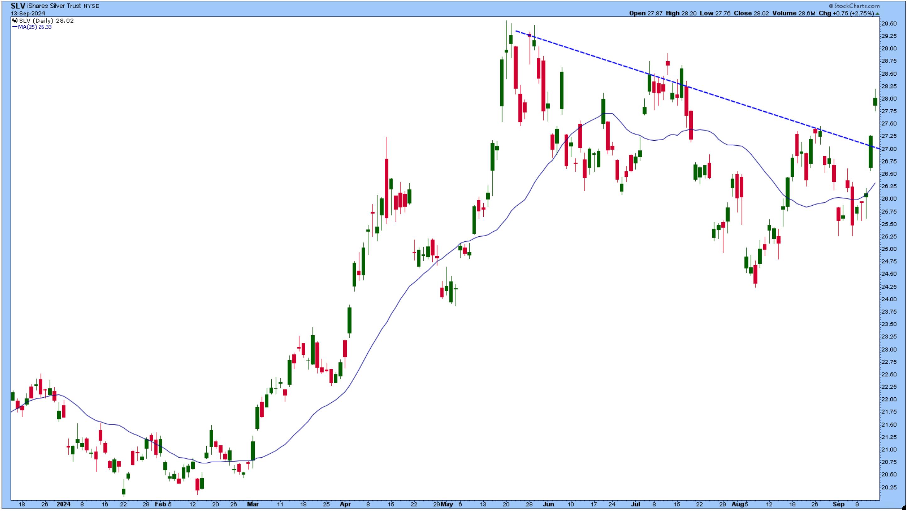
FIGURE 4. SILVER SURGES. SLV breaks above its downward-sloping trendline. Whether this upward move will continue rests on how much the Fed cuts rates in next week's FOMC meeting.Chart source: StockCharts.com. For educational purposes.
The only known market-moving event next week is—you guessed it—the FOMC meeting. Expectations of a 50 bps cut are rising. How much will the Fed cut? We'll know soon.
End-of-Week Wrap-Up
- S&P 500 closed up 4.02% for the week, at 5626.02, Dow Jones Industrial Average up 2.60% for the week at 41,393.78; Nasdaq Composite closed up 5.95% for the week at 17683.98
- $VIX down 26.01% for the week, closing at 15.56
- Best performing sector for the week: Technology
- Worst performing sector for the week: Energy
- Top 5 Large Cap SCTR stocks: Insmed Inc. (INSM); FTAI Aviation Ltd. (FTAI); Applovin Corp (APP); Cava Group (CAVA); SharkNinja, Inc. (SN)
On the Radar Next Week
- August Retail Sales
- August Housing Starts
- Fed Interest Rate Decision
- FOMC Economic Projections
- August Existing Home Sales
Disclaimer: This blog is for educational purposes only and should not be construed as financial advice. The ideas and strategies should never be used without first assessing your own personal and financial situation, or without consulting a financial professional.
|
| READ ONLINE → |
|
|
|
| RRG Charts |
| A Déjà Vu in The Consumer Staples Sector Sends a Strong Warning Signal |
| by Julius de Kempenaer |
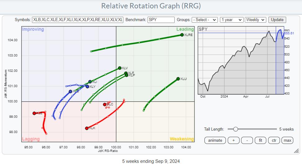
Tech Rallies, But Remains Inside the Lagging Quadrant
A quick look at the Relative Rotation Graph for US sectors reveals that the Technology sector is still the main driving force for the market. Technology now makes up more than 30% of the market capitalization of the S&P 500, so it significantly influences the price (movement) of the S&P 500 index.
On this weekly RRG above, the XLK tail can be seen heading further into the lagging quadrant, together with XLC and XLE.
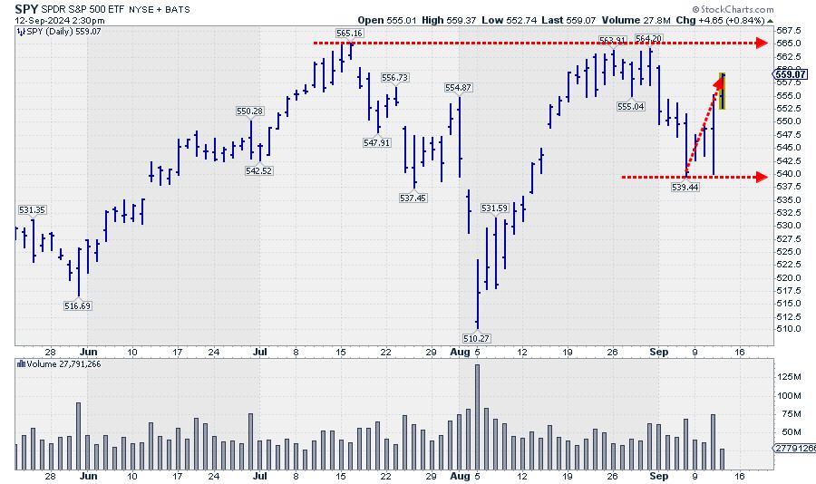
After dipping to the 540 area at the end of last week, the market has recovered some of that ground so far this week. This move has now established the area around 540 as support, while overhead resistance still remains intact around 565. A break of either level will very likely ignite an acceleration in the direction of the break.
On the weekly RRG, this move has had no material impact so far.
The Daily RRG Shows Some Improvement
Only when zooming in on the daily Relative Rotation Graph can we see this week's improvement.
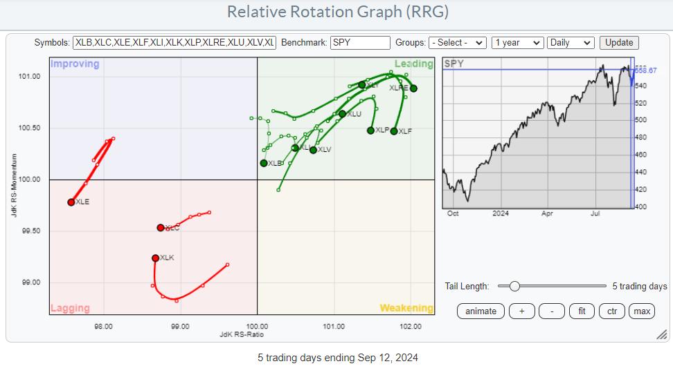
What is interesting to see on this daily RRG is that the same three sectors that are inside the lagging quadrant on the weekly RRG are also inside the lagging quadrant on this daily RRG. XLC and XLE clearly confirm their relative downtrends by rotating at a negative RRG-Heading.
The uptick in tech stocks so far this week has caused an improvement in relative momentum, but not (yet) in relative strength.
But It's Based On a Narrow Foundation
Zooming in on the technology sector members and using the table below to examine their performance over the last five trading days, we find the RRG provides some insight into where this jump in performance is coming from.
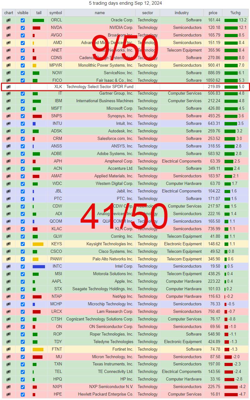
With XLK up 5% so far this week, only 9 out of the 50 stocks in this group outperform SPY. The other 41 are below XLK. With NVDA being one of the top-ranking stocks, this group is already pulling performance up by its market capitalization, especially because MSFT, the other big name inside XLK, is only 0.5% below XLK.
Therefore, the foundation of this tech rally so far is very narrow. Again.
Based on these observations, I will judge the current tech rally as a recovery within an established relative downtrend.
Defensives Pushing Into Leading RRG Quadrant
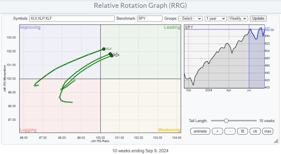
On the opposite side of the spectrum, three sectors seem very well positioned for further outperformance. XLV (Health Care), XLF (Financials), and XLP (Consumer Staples) have all just entered the leading quadrant, which means a turnover from a relative downtrend into a relative uptrend against SPY. All three are rotating at a positive RRG-Heading, and all three are showing an increasing RRG-Velocity.
Looking at their individual charts combined with relative strength and their RRG-Lines, one sector stands out with a setup we have seen before.
Consumer Staples
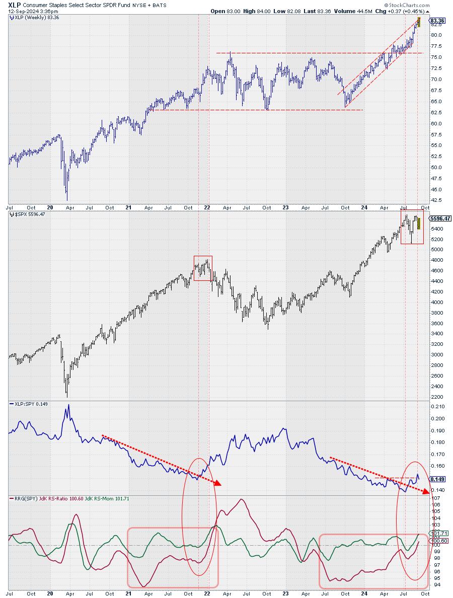
At the end of 2021, the consumer staples sector ended a prolonged period of underperformance (20 months), marked by the first vertical dashed line in November 2021, when the RS-Line broke above a falling resistance line. By then, the JdK RS-Momentum line had already crossed above the 100 level, pushing the XLP tail into the improving quadrant.
A few weeks later, the JdK RS-Ratio line also crossed above 100, and the tail moved into leading. Shortly after that move, the market started to drop, and XLP started to serve its role as a defensive sector, outperforming SPY for more than a year while the market (SPY) dropped 20%.
Fast Forward to the Present
The RS-line of XLP has broken above its falling resistance after a downtrend that started at the end of 2022, so almost two years ago -- 21 months, to be exact. RS-Momentum rose above 100 a few weeks after that event, and this week, RS-Ratio also crossed above 100, pushing the XLP tail into the leading quadrant.
The price moves on the SPY chart are almost identical on both occasions. There is a peak when the RS line crosses upward, and a second peak shortly after the RS-ratio line crosses above 100.
Given the defensive nature of the Staples sector and the analogy that seems to be playing out at the moment, I am keeping my cautious/careful approach to the markets.
RISK > POTENTIAL REWARD
#StayAlert, --Julius
|
| READ ONLINE → |
|
|
|
|
|
| Trading Places with Tom Bowley |
| September: Exit Light, Enter Night |
| by Tom Bowley |
Much like the southeastern portion of the U.S. frets over the potential of devastating hurricanes, stock traders and investors brace for their own financial hurricane this time of year. Last week, we saw the NASDAQ 100 ($NDX) tumble, dropping nearly 6% during a holiday-shortened trading week. This isn't unusual. The NDX has lost ground during September in 9 of the past 12 years: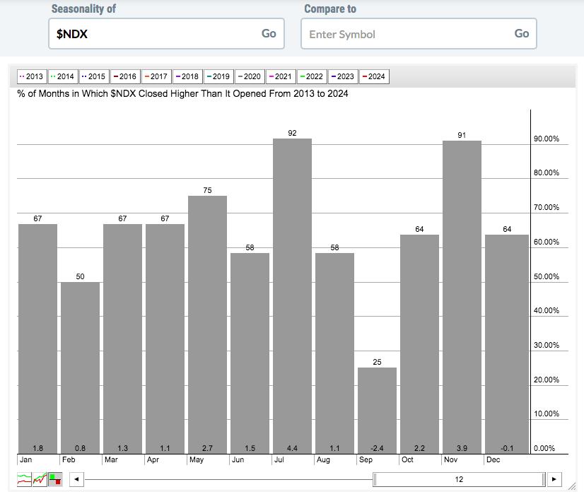
Look at those average monthly returns for each calendar month over the past 12 years - since the secular bull market began in 2013. 9 of the 12 calendar months average double digits gains, with July (+4.4%), November (+3.9%), and May (+2.7%) topping the list. December (-0.1%) is the only other month showing a negative average return, though it's essentially breakeven. That leaves September, which has averaged moving lower by 2.4% over the past 12 years, as the worst performer among all calendar months.
As August ends, it reminds me of Metallica's hit, "Enter Sandman". Remember the line, "exit light, enter night"? August is the light (at least on a relative basis) and September is the night. As soon as the calendar flipped, sellers appeared and were ready to rumble. Thus far, the bulls haven't put up much of a fight.
There is a silver lining, however. We just need to escape September first. Here's a seasonality chart of the S&P 500:
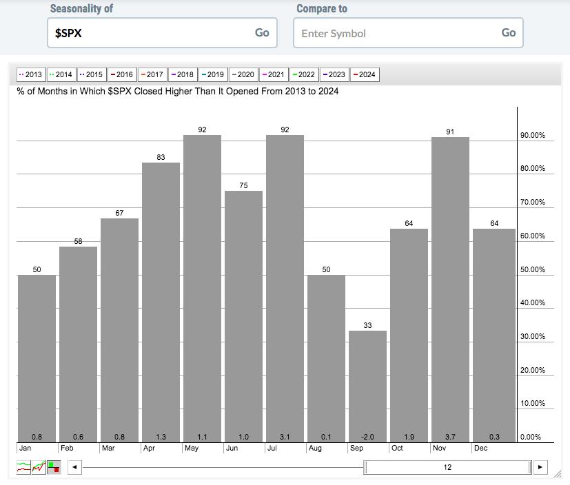
This covers the past 12 years, or the entirety of the current secular bull market, which, in my opinion, began the day that the S&P 500 cleared its 2000 and 2007 tops. That was on April 10, 2013 and the S&P 500 never looked back. Study those average monthly returns. You can clearly see a significant drop off in August and especially September, right? Then, like a water faucet being turned from cold to hot, the market heats up big time in Q4. By simply adding the monthly returns in each calendar quarter, you can see the following historical performance of the S&P 500 by calendar quarter:
- Q1 (January, February, March): +2.2%
- Q2 (April, May, June): +3.4%
- Q3 (July, August, September): +1.2%
- Q4 (October, November, December): +5.9%
Does this guarantee us excellent market returns in Q4 2024? Of course not. But it is ONE bullish historical signal that you should be aware of, especially if we begin to see bottoming signs form technically. The absolute BEST period of the year to be invested in the S&P 500 from a long perspective is from the October 27th close through the following January 18th close. The S&P 500 has ended that period higher that it began in each of the last 7 years and in 14 of the last 15 years. And if we stretch it further, that upcoming period has risen 38 of the last 41 years. It's not a slam dunk, but the odds of the period ending higher sure do favor the bulls by a WIDE margin.
Let me add to this bullish history with one more fact. Since 1982, this October 27th close to January 18th close has seen the S&P 500 climb more than 10% 8 times, more than 9% 12 times, and more than 8% 16 times! Yet we've only seen 3 declines over that same period. The % lost in those 3 years are 8.98% (2016), 13.68% (2008), and 2.29% (2001). I'll take my bullish chances when the September/October low forms.
I talked about potential levels on the S&P 500 when it finally reaches bottom over the next handful of weeks. My weekly market recap video for the week ended September 6th, "Where Is The Likely S&P 500 Bottom?", is ready for your viewing pleasure. Please "Like" the video and "Subscribe" to our channel, if you haven't already. Feel free to leave me a comment with your thoughts on the S&P 500 as well.
Also, on Monday, I'll be breaking down a chart that looks like it is heading lower in a big, big way in our FREE EB Digest newsletter. If you'd like to see the article and you're not already a free subscriber, CLICK HERE to register. There is no credit card required and you may unsubscribe at any time.
Happy trading!
Tom
|
| READ ONLINE → |
|
|
|
| Don't Ignore This Chart! |
| The SCTR Report: Insmed's Stock Hangs in the Balance—Here's What You Need to Know |
| by Karl Montevirgen |
Numerous companies are making strides within their respective sectors, but, unless you follow the sector closely, you might not be aware of them. That's what makes StockCharts Technical Rank (SCTR) reports so helpful.
If you've checked your SCTR reports regularly, you might have noticed Insmed (INSM) appear at or near the top over the last three months.

FIGURE 1. DAILY SCTR REPORTS SHOW INSM IN THE OF THE TOP-UP, LARGE-CAP STOCKS.Image source: StockCharts.com. For educational purposes.
Insmed (INSM) is a biotech company that has had a near-perfect SCTR score of 99.9 since the end of May.
A SCTR (pronounced scooter) score above 90 is exceedingly bullish, as it signals technical strength across multiple technical indicators and timeframes. Sustaining a score well above 90 for months tells you that something tremendous is happening with the company and its stock.
But if you don't follow biotech, you're probably wondering, "What is Insmed? Why haven't I heard of it? Why is it soaring now? Where was it before it showed up on the SCTR report's top spot?"
In a Nutshell, Here's What's Driving INSM
Insmed's stock is popping thanks to positive results from a late-stage study of its antibiotic drug Arikayce, developed for treating a rare, severe lung infection. The study's success boosts hopes for broader FDA approval, driving INSM's sharp breakaway gap to all-time highs.
Before this, however, what did INSM's performance look like?
Three-Year Lookback at INSM's Performance

FIGURE 2. WEEKLY CHART OF INSM. The recent tests catapulted INSM to all-time highs.Chart source: StockCharts.com. For educational purposes.
Take note of the following points:
- The breakaway gap (see orange short-term downsloping trend line) from $22 to $49.53 marked a 125% spike.
- While INSM's SCTR score has exceeded the 90 line four times in the last three years (see green circles), notice how it barely outperformed, and largely underperformed, its broader industry, represented by the Dow Jones U.S. Biotechnology Index ($DJUSBT).
- The latest break above the 90 line looks flat-out bullish (see green rectangle), aligning with a 171% outperformance of its industry.
Does this make INSM a strong candidate for a long position? To explore that further, let's shift to a daily chart.
Should You Go Long INSM?

FIGURE 3. DAILY CHART OF INSM. Note the declining momentum and topping formation.Chart source: StockCharts.com. For educational purposes.
Here are the main things to keep an eye on:
- INSM looks to be forming a double top; still, market sentiment reacting to INSM's latest testing news and developments moving forth may defy (bearish) technical indications.
- The Chaikin Money Flow (CMF) shows that buying pressure is fading, matching up with the Relative Strength Index's (RSI's) bearish divergence signal from overbought levels.
- Despite looking toppy, for INSM's near-term uptrend to continue, you'd want to see it break above resistance at its all-time level of $80.53 while remaining above its most recent swing low at the $70 range.
- If it falls below the $70 range, the next lines of support can be at the previous swing lows of $67.20 and $61.50.
Warning: A deeper correction may indicate that something is off between the technical reading and the market's reaction to the company's news or product development.
If INSM falls below $61.50, the long-term uptrend could still hold despite invalidating the short-term trend. Be extra careful, though! INSM might slide to $45–$52, hitting key Fibonacci retracement levels, but a dip that low could mean something big has changed with INSM's product development, and the price action may be reflecting the market's response to these (bearish) developments.
Closing Bell
StockCharts' SCTR Reports spotlight hidden stock opportunities that might not have crossed your radar. Insmed is a great example. It's been riding high on positive testing news, but its technicals are flashing warning signs. If you want to follow INSM's price action, add it to one of your StockCharts ChartLists. If not, be sure to use SCTR daily to find other (potentially hidden) opportunities for your next trade.
Disclaimer: This blog is for educational purposes only and should not be construed as financial advice. The ideas and strategies should never be used without first assessing your own personal and financial situation, or without consulting a financial professional.
|
| READ ONLINE → |
|
|
|
| Art's Charts |
| Market Timing for a Rules-Based Strategy |
| by Arthur Hill |
 Any strategy that trades stocks needs some sort of market timing mechanism to identify bull and bear markets. Typically, stock strategies are fully invested during bull markets because risk is acceptable. Strategies move to cash during bear markets because risk is above average. Preserving capital during bear markets is important to long-term outperformance (see SystemTrader). Any strategy that trades stocks needs some sort of market timing mechanism to identify bull and bear markets. Typically, stock strategies are fully invested during bull markets because risk is acceptable. Strategies move to cash during bear markets because risk is above average. Preserving capital during bear markets is important to long-term outperformance (see SystemTrader).
Here is a simple idea for a market timing mechanism. First, use the S&P 500 SPDR (SPY) to represent the US stock market. SPY is based on the S&P 500, which is the most widely used benchmark for US stocks. Second, apply a long-term trend indicator for broad market timing. The chart below shows SPY with the Trend Composite. This indicator aggregates signals in five trend-following indicators. It is currently at +5 and still signaling a long-term uptrend (bull market). Note that this indicator is part of the TIP Indicator Edge Plugin for StockCharts ACP.

The chart above starts in 2022. Notice that the Trend Composite was mostly negative (bearish) in 2022. Strategies trading stocks would have been mostly in cash during this bear market and this would have preserved capital. The Trend Composite turned positive in February 2023 and has been mostly positive the last 19 months. It spent three weeks in negative territory from late October to mid November 2023 (whipsaw). Strategies trading stocks would have been mostly long during this period and participated in the bull run.
Strategies should have well-defined rules governing decisions. Stocks moved sharply lower last week, but the Trend Composite has yet to turn negative and signal a bear market. Similarly, the Composite Breadth Model, which times the market for our Dual Momentum Rotation Strategies, has yet to turn bearish. Thus, our strategies remain invested in stocks showing strong upside momentum. They will move to cash when a bear signal triggers. Click here to learn more.
//////////////////////////////////////////////////
|
| READ ONLINE → |
|
|
|
| MORE ARTICLES → |
|


 Any strategy that trades stocks needs some sort of market timing mechanism to identify bull and bear markets. Typically, stock strategies are fully invested during bull markets because risk is acceptable. Strategies move to cash during bear markets because risk is above average. Preserving capital during bear markets is important to


