| THIS WEEK'S ARTICLES |
| Martin Pring's Market Roundup |
| MEMBERS ONLY |
| The Dollar Index is Down, But Is It Out? |
| by Martin Pring |
|
The Dollar Index has been selling off sharply in the last few weeks and has now reached critical support in the form of the lower part of its recent trading range. The big question is whether it will break below the range or extend it in any way...
|
| READ ONLINE → |
|
|
|
| The Mindful Investor w/ David Keller, CMT |
| Top Ten Charts to Watch for October 2024 |
| by David Keller |
As we near the end of what has been a fairly solid Q3 for the equity markets, we are left with the eternal question for investors: "What's next?"
We now have the Fed's first rate cut in the rearview mirror, with multiple rate cuts expected into early 2025. We also have a highly contested election season, a rapidly escalating situation in the Middle East, and earnings season, which is only a couple weeks away.
The beauty of technical analysis is that price action should compensate for investor expectations for all of the above. If investors are excited, nervous, euphoric, despondent, or anywhere in between, the interplay between buyers and sellers can tell us a great deal about investor sentiment. With that in mind, here are some of the individual stock charts I'll be watching as we transition into the fourth quarter.
Comcast Corp. (CMCSA)
As I reviewed hundreds of charts to eventually settle in on just ten to review, I was struck by the fact that five out of the ten are in the same sector: Communication Services. From Magnificent 7 names to old telecoms, there are plenty of improving charts in this sector.
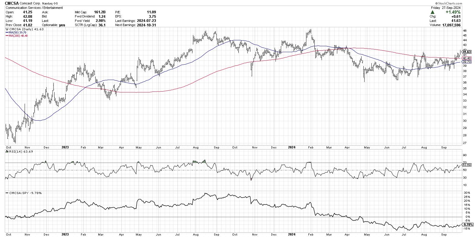
While many stocks could be considered overextended after this week, Comcast is definitely not one of the them. This chart features a classic rotation from a distribution phase (lower highs and lower lows) through a consolidation phase (even highs and lows) and into a new accumulation phase (higher highs and higher lows).

This week, CMCSA finally pushed back above its 200-day moving average, as well as the previous peak from mid-July. If this stock can follow through above the $42 level, we could easily see a retest of the January 2024 peak around $46 and beyond.
Meta Platforms, Inc. (META)
One of the key questions for October is whether the market will remain strong despite the normal seasonal weakness around this time of year. META may be the best chart to watch to determine whether our benchmarks will remain in a bullish phase.
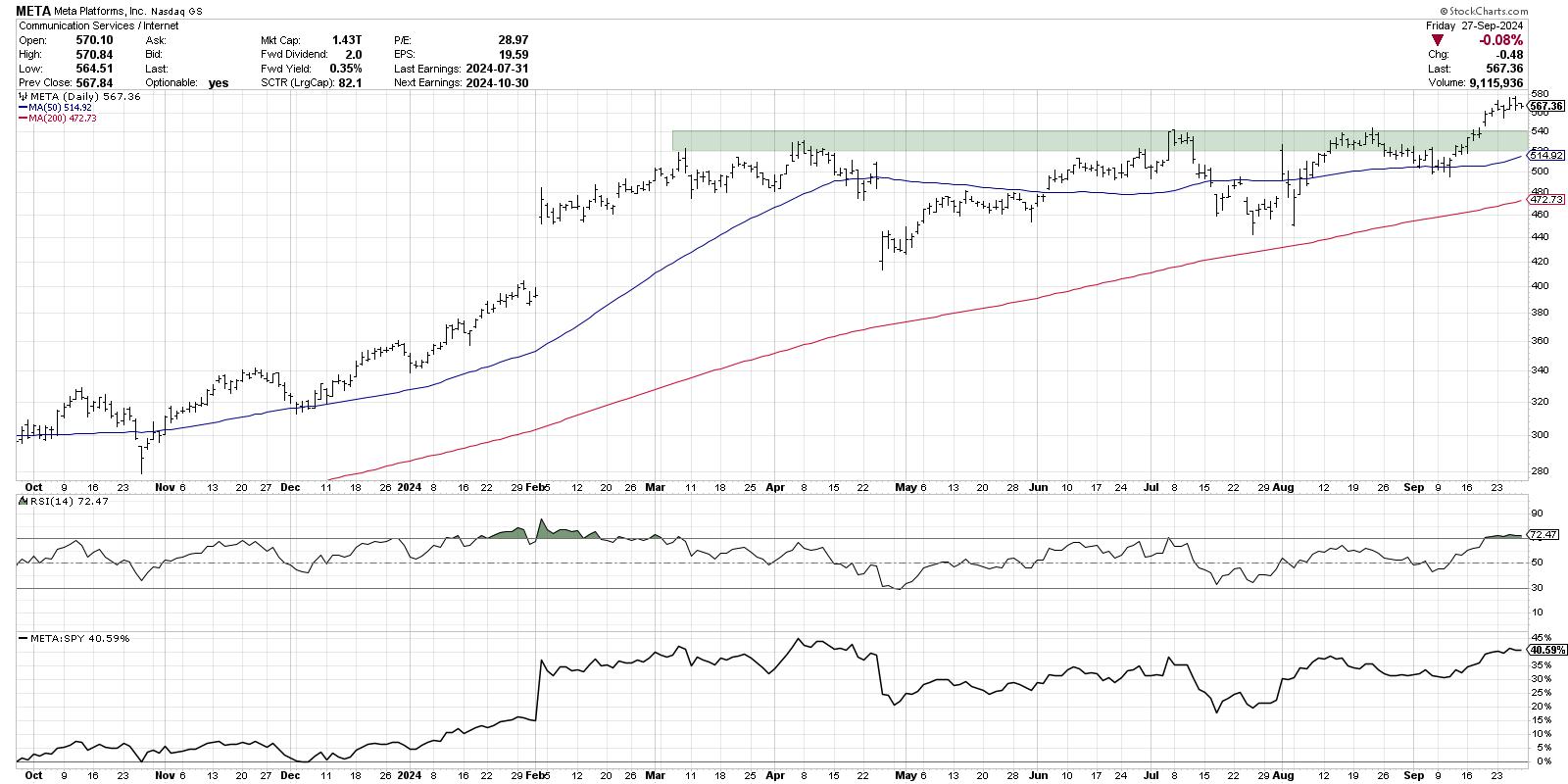
Meta has tested resistance in the $520 to $540 range since first arriving at these levels in March, and, a couple weeks ago, that level was finally eclipsed. Any time a stock breaks above a well-established resistance level, I want to see it hold that breakout point on any subsequent pullbacks.
META ended the week in an overbought condition, with the RSI remaining above 70. This often suggests a pullback is imminent, particularly when the RSI dips back below this overbought level. Will Meta Platforms hold $520 as well as the 50-day moving average on a pullback? If so, then this bull market could see unusual strength in arguably the weakest of the 12 months from a seasonal perspective.
VFCorp (VFC)
Next is VFCorp, my first selection outside of the Communication Services sector. This producer of apparel and footwear brands, including Timberland and The North Face, has entered a new uptrend phase off a major low back in March.
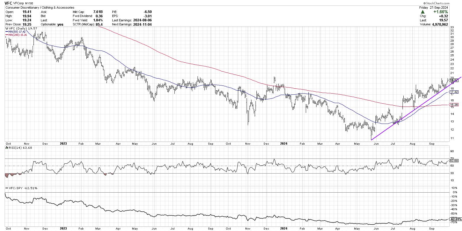
While VFC has already gained about 80% off the March low, the bullish phase appears very much still in place here. We can see a consistent pattern of higher highs and higher lows, and the price is now trending higher above two upward-sloping moving averages. The RSI indicator tells us the momentum is strong but not excessive. I tend to think of charts like this as "innocent until proven guilty," and, as a trend-follower, that means I follow the trend until the chart tells me to do otherwise!
Looking for the other seven charts to watch? Check out the full video on my YouTube channel!
RR#6,
Dave
P.S. Ready to upgrade your investment process? Check out my free behavioral investing course!
David Keller, CMT
President and Chief Strategist
Sierra Alpha Research LLC
Disclaimer: This blog is for educational purposes only and should not be construed as financial advice. The ideas and strategies should never be used without first assessing your own personal and financial situation, or without consulting a financial professional.
The author does not have a position in mentioned securities at the time of publication. Any opinions expressed herein are solely those of the author and do not in any way represent the views or opinions of any other person or entity.
|
| READ ONLINE → |
|
|
|
| ChartWatchers |
| Stock Market Regains Bullish Edge: Can Geopolitical Tensions Change Its Direction? |
| by Jayanthi Gopalakrishnan |
 There's one trading day left for the month of September. Unless something drastic happens over the weekend, the stock market looks like it has bucked the September seasonality pattern of being the worst trading month for equities. That's not to say seasonality doesn't work; in the early part of the month, after all, there was a dramatic pullback. But the stock market has recovered and is now moving higher. There's one trading day left for the month of September. Unless something drastic happens over the weekend, the stock market looks like it has bucked the September seasonality pattern of being the worst trading month for equities. That's not to say seasonality doesn't work; in the early part of the month, after all, there was a dramatic pullback. But the stock market has recovered and is now moving higher.
A handful of data this week stoked the stock market. The US economy continues to grow, the labor market appears to be moving toward a better supply/demand balance, the Federal Reserve made its first interest rate cut, and inflation is cooling. But the biggest news was the China stimulus decision. That was a surprise and sent Chinese stocks and ETFs soaring.
The August personal consumption expenditures (PCE) indicated that inflation is coming down and getting closer to the Fed's 2.0% target. This isn't a surprise, but it helped keep the optimistic sentiment going, at least into the first half of Friday's trading.
The Dow Jones Industrial Average ($INDU) hit a record high, sold off in afternoon trading, and eked out a record close. The S&P 500 ($SPX) and Nasdaq Composite ($COMPQ) also sold off on Friday, closing in the red. Despite the selloff, the overall trend in equities is still very bullish.
An Analysis of the Broader Stock Market Indexes
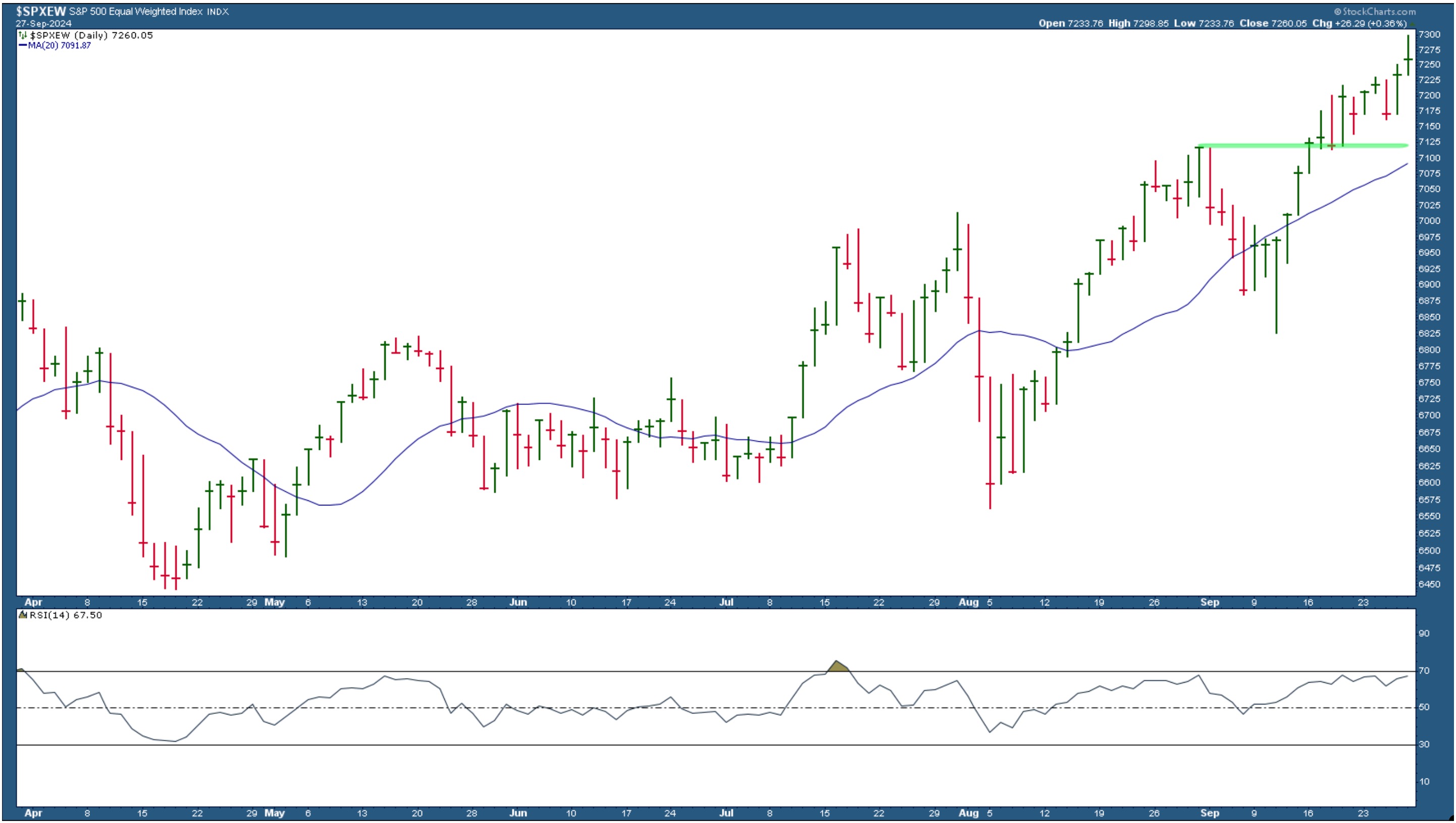
Although the S&P 500 closed lower on Friday, the S&P 500 Equal Weighted Index ($SPEW) closed slightly higher (see chart below).

CHART 1. S&P 500 EQUAL-WEIGHTED INDEX.
$SPXEW is trading well above its 20-day simple moving average. Its relative strength index (RSI) is just below 70, which means it has a lot of upside room.
This could mean that investors are shifting away from large-cap tech stocks and into other areas. The rise in the Dow Jones Average this week indicates that perhaps investors are rotating into Industrials and Materials. Small and mid-cap stocks also closed higher on Friday.
China-related stocks continued their bullish move on Friday. The iShares China Large Cap ETF (FXI) is getting pretty close to a resistance level. If it breaks above it on strong momentum, it would be worth allocating a portion of your portfolio to the ETF.
Then, There Are Bonds
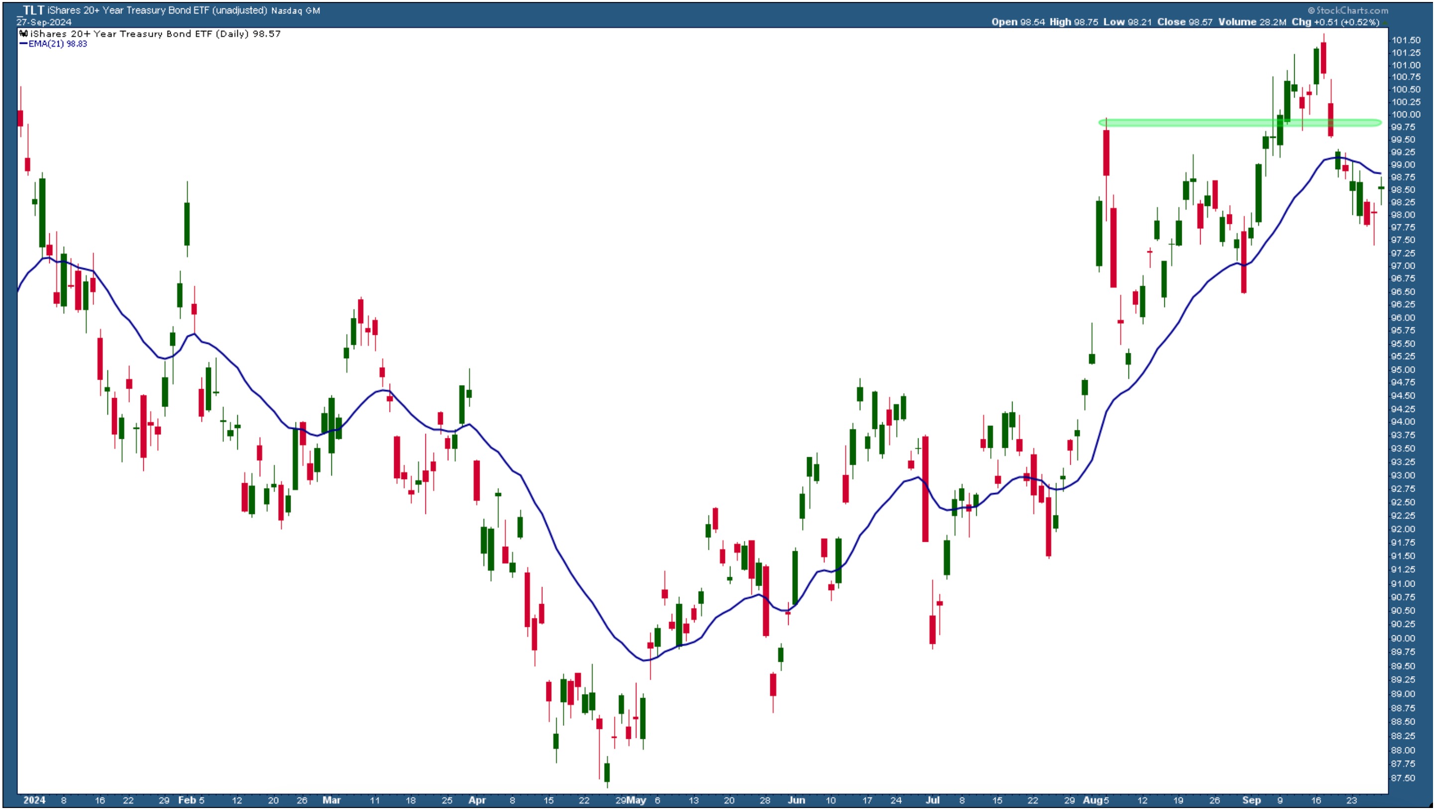
After the Fed cut interest rates, US Treasury yields rose and bond prices pulled back. The August high in the chart of the iShares 20+ Year Treasury Bond ETF (TLT) is one to watch. If TLT breaks above this level (green horizontal area), bond prices could rise.

CHART 2. DAILY CHART OF TLT.
On Friday, TLT reversed after Thursday's doji candle. However, Friday's candle was also a doji, which failed to break above its 21-day exponential moving average. One day's action doesn't make a trend, but, in light of future interest rate cuts, there may soon be a buying opportunity in TLT. If you are already in bonds, like I am, then you could add to your positions after a breakout. This is one chart I'll be looking at.
Of course, this could change if next week's data doesn't support an upward move in bond prices. Next week, there will be a lot of employment data and several speeches from Fed officials, including Chairman Jerome Powell.
The jobs data will show whether the labor market is tightening or loosening and could steer investor expectations about further interest rate cuts by the Fed. According to the CME FedWatch tool, the probability the Fed will cut rates by another 50 basis points is 54.8%. If the labor data supports a 50 bps cut, that probability could rise higher.
Metals Keep On Shining
The price of gold pulled back on Friday after a series of "all-time high" closes. Central banks continue to purchase gold and add it to their global reserves. Gold and silver prices have rallied this year, and interest rate cuts by the Fed, plus China's recent stimulus measures, keep sending prices higher. Copper is another commodity that has benefited from China's stimulus news.
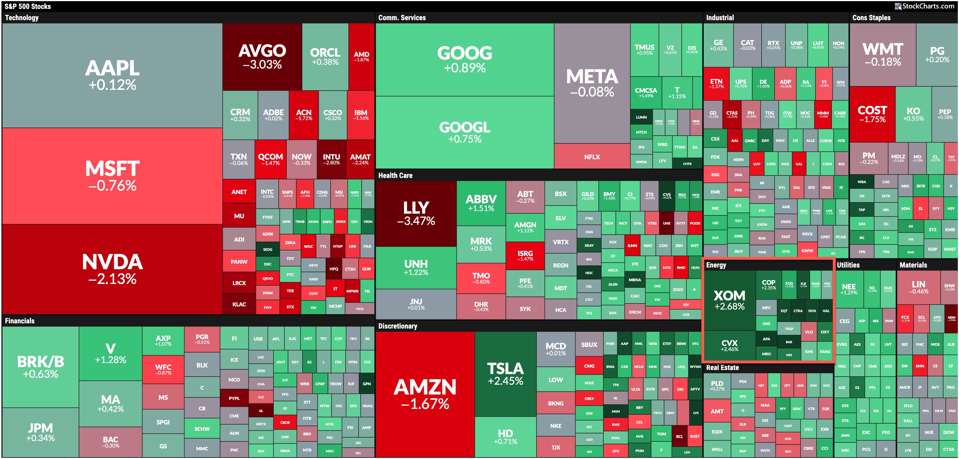
One commodity that wasn't rallying like the metals was crude oil. Oil prices saw massive declines this week but turned around on Friday afternoon. Geopolitical tensions that surfaced may have been the reason for the price turnaround. The Energy sector, which has been the laggard of late, was the top-performing S&P sector on Friday (see Friday's MarketCarpet). It occupies very little real estate on the MarketCarpet, but it's the greenest of the sectors.

FRIDAY'S S&P SECTOR PERFORMANCE.
While most of this week's news was positive, we ended on a slightly uncertain note—the surfacing of geopolitical tensions in the Middle East. The CBOE Volatility Index ($VIX) inched up slightly. China's stock exchanges will be closed most of next week in honor of China National Day, so there may be sideways movement in Chinese-related stocks and ETFs. There's still plenty of US data to focus on, so keep an eye and ear tuned to the market. More importantly, keep an eye on the rotation. The StockCharts MarketCarpets are a great starting point.
End-of-Week Wrap-Up
- S&P 500 closed up 0.62% for the week, at 5738.17, Dow Jones Industrial Average up 0.59% for the week at 42,313; Nasdaq Composite closed up 0.95% for the week at 18,119.59
- $VIX up 4.48% for the week, closing at 16.87
- Best performing sector for the week: Materials
- Worst performing sector for the week: Health Care
- Top 5 Large Cap SCTR stocks: Insmed Inc. (INSM); Applovin Corp (APP); Carvana (CVNA); Vistra Energy Corp. (VST); XPeng, Inc. (XPEV)
On the Radar Next Week
- Fed Chair Powell speech; speeches from Bowman, Bostic, Cook, and other Fed officials
- August JOLTS Job Openings
- ADP Employment Report
- Weekly Jobless Claims
- September ISM Manufacturing PMI
- September ISM Services PMI
- September Non-Farm Payrolls
- Nike (NKE) Earnings
Disclaimer: This blog is for educational purposes only and should not be construed as financial advice. The ideas and strategies should never be used without first assessing your own personal and financial situation, or without consulting a financial professional.
|
| READ ONLINE → |
|
|
|
| Trading Places with Tom Bowley |
| Could U.S. Stocks Crash In October? |
| by Tom Bowley |
That's a great question right now as many folks still remain quite nervous. The Volatility Index ($VIX), for example, gained more than 10% today, despite a minimal decline in the S&P 500. It's a signal that the stock market likely won't handle bad news very well. Next week, we have the September nonfarm payrolls. And earnings season is set to kick off in just a couple weeks, when the banks begin reporting. Could we see an earnings warning or layoffs from a big name or two? We don't know, but if we do see bad news, it's quite possible we see another leg lower in October.
But could it crash?
Well, first we'd have to define "crash." Over the past 74 years, the S&P 500 has seen a drop of 9% or more in a calendar month just 17 times. That's 1 monthly drop of 9% or more every 4 years or so. If you're looking for the start of a 20% to 30% drop, or even more, I'd say the chance of that is extremely slim, probably negligible.
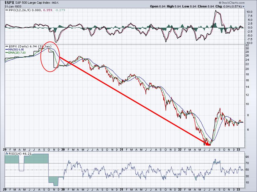
Let's take a look at the 2 worst October declines in U.S. history. First, there was October 1929 - The Great Depression:

October 1929 began the largest decline in U.S. stock market history. The decline didn't find a bottom until nearly 90% of the stock market's value was lost.
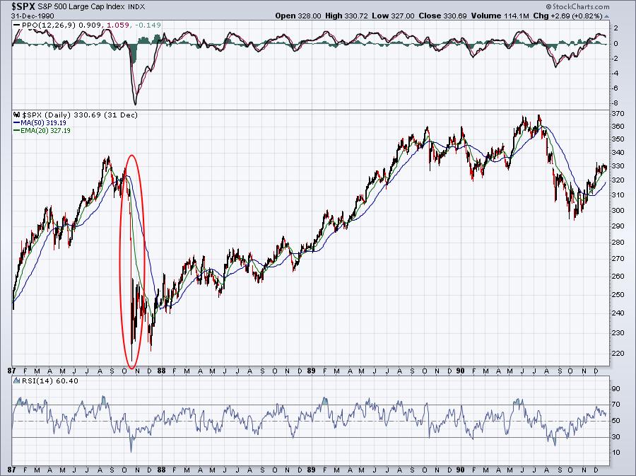
The other October decline that gives the month its bad name was October 1987 crash. Remember Black Monday? If you weren't investing back then, this is what the chart looked like:

The 1987 "crash" happened over the course of a few weeks, not a few years like in 1929. There have been other rough Octobers, but they simply haven't been as catastrophic as the 1929 and 1987 versions. In fact, earlier I mentioned that we've seen calendar month declines of 9% or more 17 different times since 1950. October has played a role in many of these. Furthermore, there have been 14 bear market declines (losses of 20% or greater from all-time highs) since 1950 and October has played a very interesting role in those too.
So what might we expect in October 2024?
If you're interested in stock market history, then EarningsBeats.com is the right place to get your information. It's interesting that the "Go Away" month (May, according to the Wall Street "experts") has never had one of those 9% or more calendar month losses. May also has never started a bear market, yet the bottom of one was found in May. You can't trust the historical information that you get from the media, but I can promise you that the information that we provide at EarningsBeats.com is 100% factual and ZERO percent false or misleading. As a practicing CPA for two decades, I can analyze and report data.
Tomorrow morning, on Saturday, September 28th at 10:00am ET, I'll be hosting a FREE event, "History of Market Bottoms." I want all of you to understand history the way we do at EarningsBeats.com. This event does require registration. To get more information and to save your seat, REGISTER NOW! If you're reading this article and it's beyond Saturday 10:00am ET, no worries. Anyone who registers (even late) will receive a recording of the event. Finally, we've developed an ebook, "74 Years of Market Bottoms", that will be sent to you immediately upon registration, so don't delay!
I'll see you Saturday morning!
Tom
|
| READ ONLINE → |
|
|
|
| RRG Charts |
| Opportunities in Industrials and Materials |
| by Julius de Kempenaer |

Despite a backdrop of conflicting market signals, there are still sectors within the S&P 500 that are showing promising movements and potential opportunities for investors. Today, I'd like to highlight two sectors in the S&P 500 that are worth a closer look: Industrials and Materials.
The Market's Mixed Signals
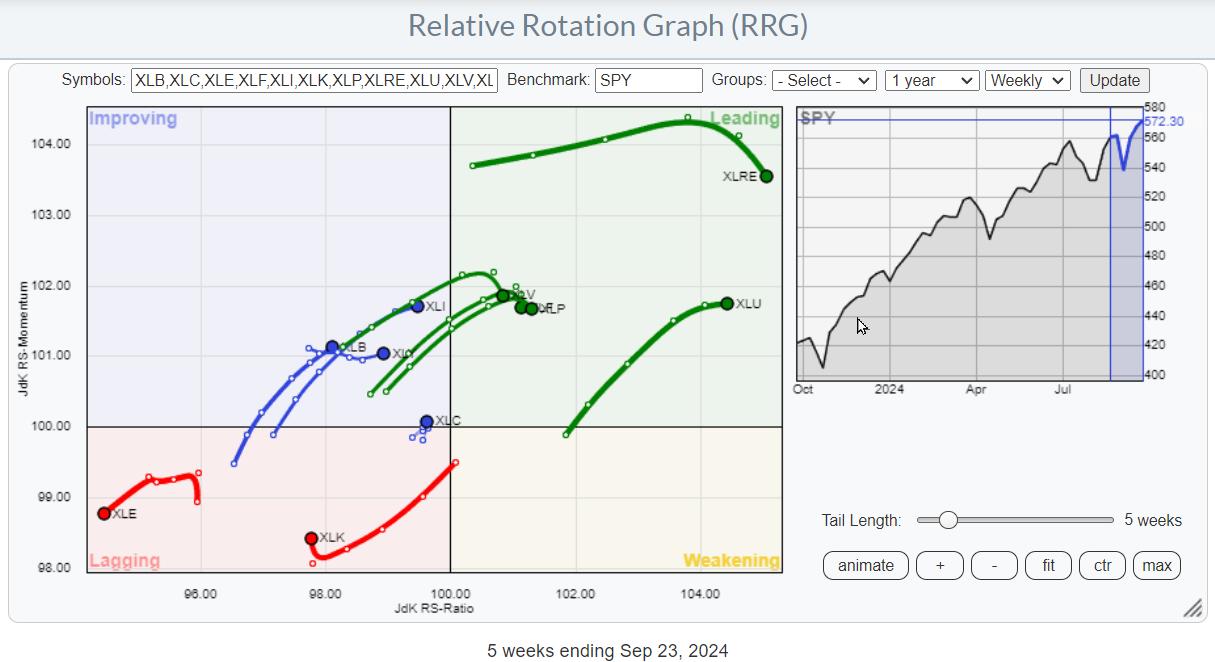
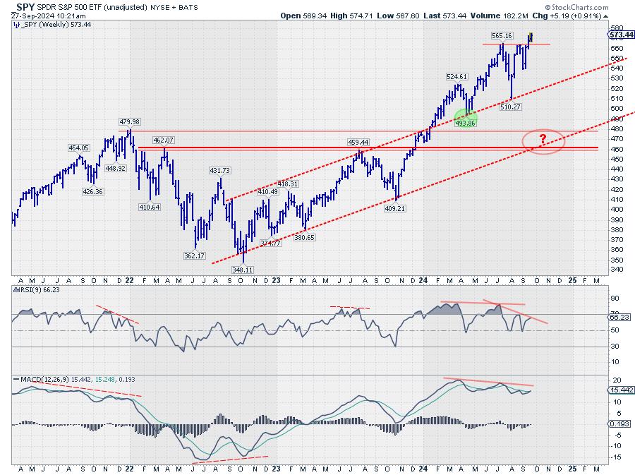
The S&P 500 has recently broken above its resistance, a move that has been met with some skepticism due to the negative divergence observed between the RSI (Relative Strength Index) and price, as well as the MACD (Moving Average Convergence Divergence) and price. Additionally, sector rotation, as indicated by the RRGs (Relative Rotation Graphs), suggests a defensive posture still prevalent in the market.

This creates a somewhat confusing landscape for investors (well, at least it does for me), with these conflicting signals flying around. However, that doesn't mean that there are no opportunities to be found.
Spotlight on Industrials and Materials

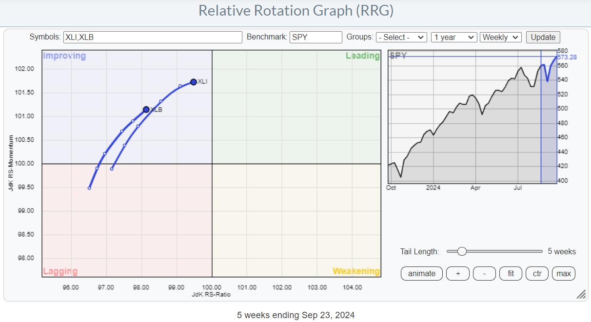
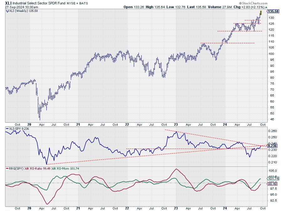
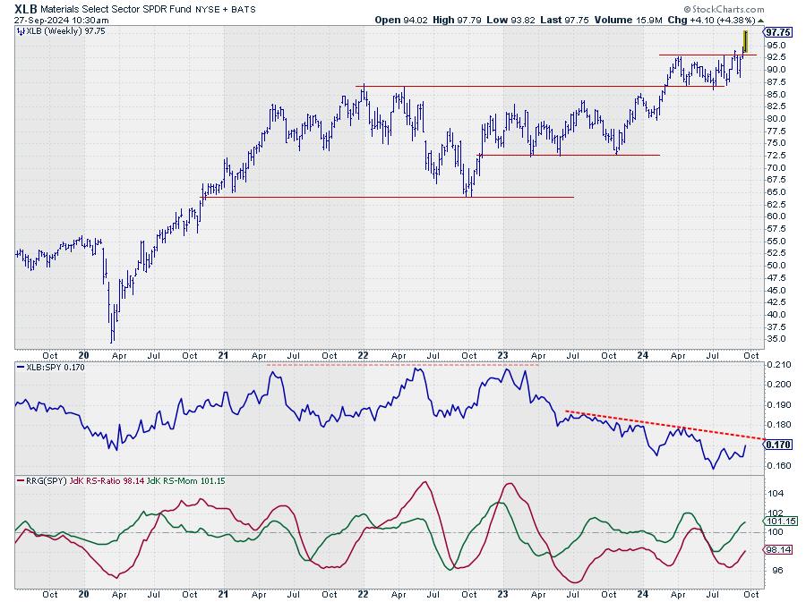
When we focus on the Relative Rotation Graph for US sectors, two stand out: Industrials (XLI) and Materials (XLB). Both sectors are currently positioned in the improving quadrant and are rotating towards the leading quadrant with a strong RRG heading. This means that they are gaining on both axes.
Industrials Sector (XLI)

Looking at the price chart for the industrial sector, we can see that XLI broke to new highs a few weeks ago, well before the S&P 500 did. However, the raw RS (relative strength) line is still in a downtrend, with major highs being lower. We're approaching a crucial resistance in the RS line, and for the sector to continue its improvement, it needs to break above this falling resistance.
In the coming weeks, it will be more important to monitor the move in relative strength for the industrial sector rather than the price itself. The price is performing well, but a breakthrough in relative strength is needed to push the sector further into the leading quadrant.
Materials Sector (XLB)

The Materials sector has a similar setup to Industrials. The price has also broken to new highs, albeit slightly later. The relative strength series of lower highs and lower lows is still in place, but the RRG lines are both moving higher, pushing the tail further into the improving quadrant toward leading.
Both Industrials and Materials sectors are showing signs that they are worth a closer look for investors seeking to trade individual stocks rather than the market as a whole.
Identifying Strong Performers in Industrials

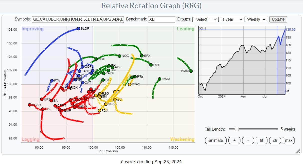
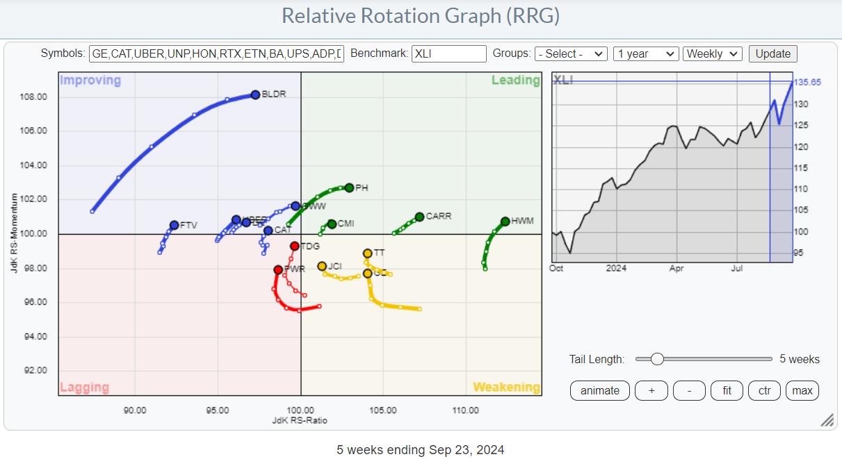
To find individual stocks within the industrials sector, we need to bring up the RRG that shows its members. The routine is to look over the individual tails and find those with a strong RRG heading, particularly those that are rotating from leading into weakening and then turning back up towards leading.

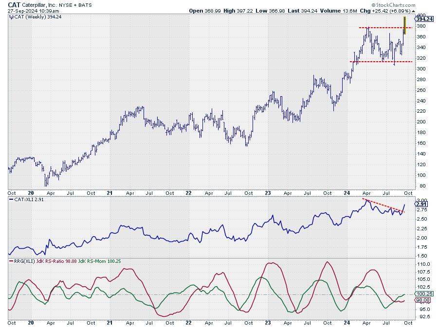
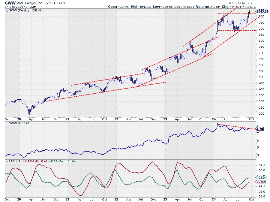
Highlighted Stocks: Caterpillar (CAT) and W.W. Grainger (GWW)

Caterpillar (CAT) is positioned in the improving quadrant, having just crossed over from lagging. The price chart shows Caterpillar breaking to new all-time highs after a corrective move, which is causing the relative strength to jump and push the RRG lines higher.
This combination of improving relative strength and an upward break in price is a strong indicator.

W.W. Grainger (GWW) is in a similar situation, with the price chart showing a break to new highs and the relative strength line having less of a decline. The RRG lines are indicating a new relative uptrend for GWW against XLI.
Since the sector itself is already in a relative uptrend or starting to move into one versus the S&P 500, stocks like GWW and Caterpillar are strong stocks in a strong sector.
Exploring the Material Sector's Potential

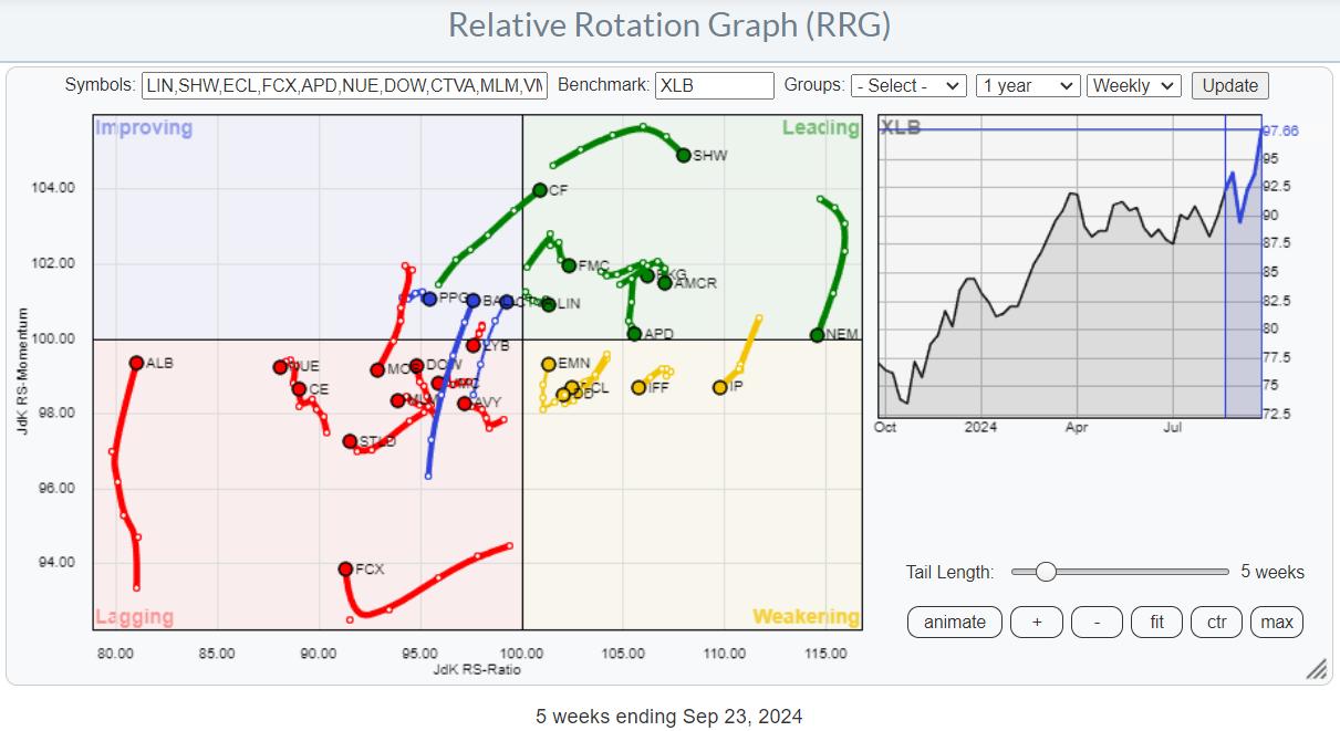
Using a similar approach for the material sector, we'll look at the RRG showing the rotations for the individual members and focus on the tails with a strong RRG heading.

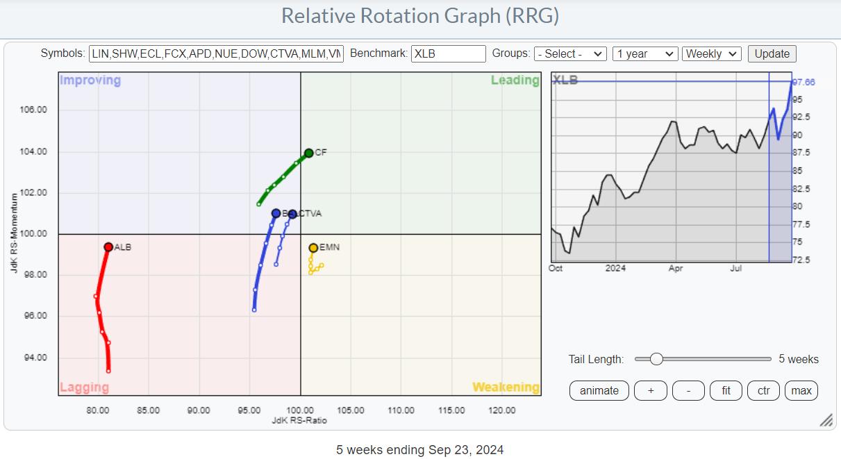
Highlighted Stocks: CF Industries (CF) and Eastman Chemical Company (EMN)

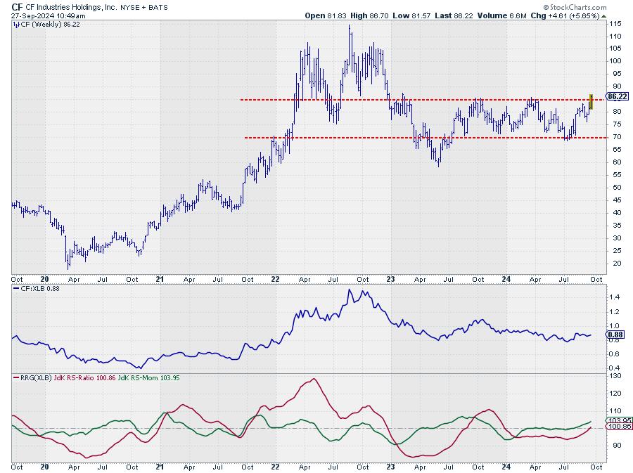
CF Industries (CF) is approaching heavy overhead resistance and needs to break above $86. The relative strength line is improving, and the RRG lines are pushing the tail of CF into the leading quadrant. This could be a very good addition to any portfolio, especially if CF breaks and holds above the $86 resistance.

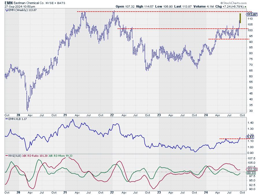
Eastman Chemical Company (EMN) has already broken out of a consolidation period and is moving towards all-time high levels. The raw RS line has broken its previous peak, starting a series of higher highs and higher lows. The RS ratio line is above 100, indicating that EMN is starting a new relative uptrend, which is usually a good sign.
Conclusion
Despite the conflicting signals in the market, there are still pockets of strength to be found. The industrial and material sectors are two such areas that offer interesting opportunities for investors. By focusing on individual stocks within these sectors, particularly those with strong RRG headings, we can find potentially strong performers that may outperform both their sector and the broader S&P 500 index.
#StayAlert and have a great weekend. --Julius
|
| READ ONLINE → |
|
|
|
| |
| DecisionPoint |
| This Week's "Sector to Watch" and "Industry Group to Watch" |
| by Erin Swenlin |
On Friday mornings in our DP Diamonds subscriber-only trading room, the DecisionPoint Diamond Mine, I like to look for a "Sector to Watch" and an "Industry Group to Watch" within. These are for your watchlist and not necessarily ready for immediate investment. In the case of this week's Sector and Industry Group to Watch, we will need to take our cue from Monday's trading to know if this area of the market will thrive.
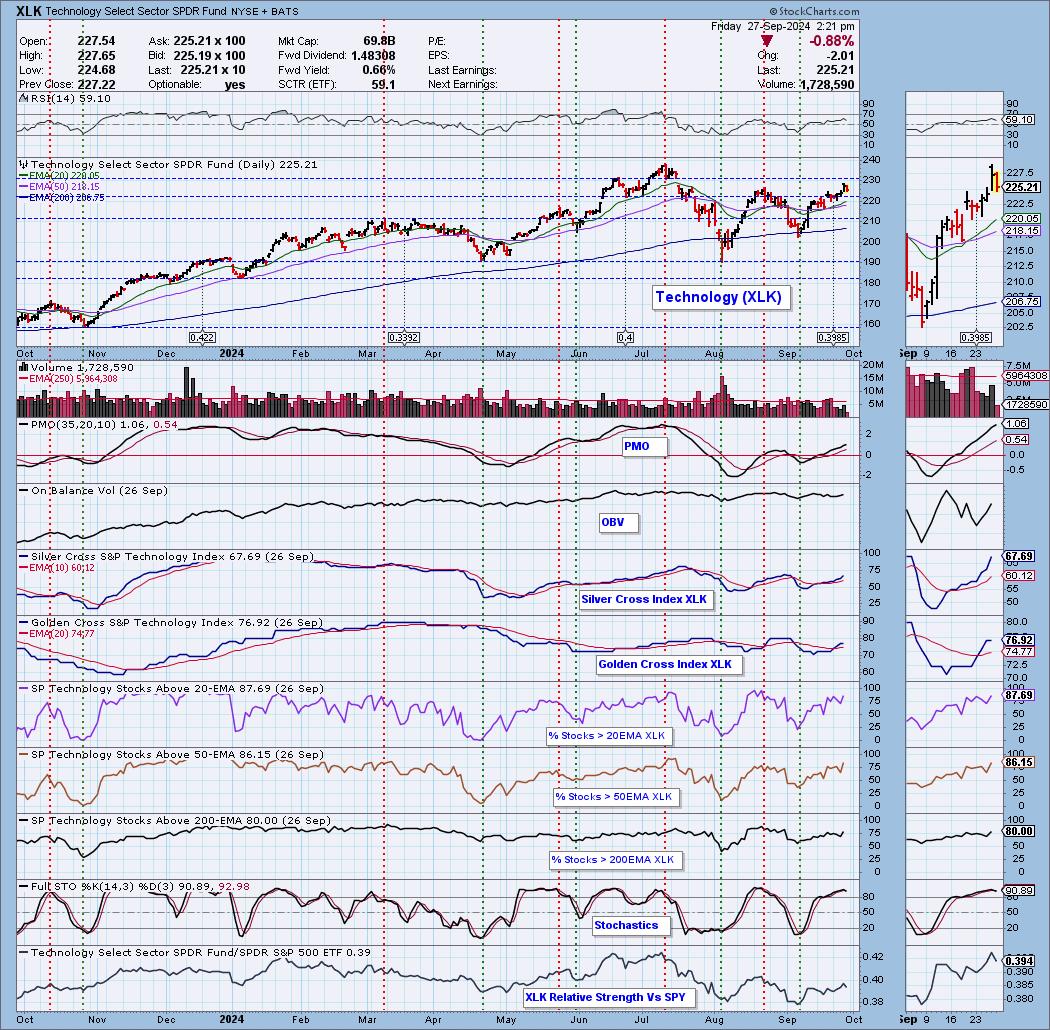
I picked Technology as the Sector to Watch. I could've easily picked Materials, Communication Services, Consumer Discretionary and Utilities, all of which are sailing higher. The big problem with those sectors is that the RSI is overbought on all of them, so price is overbought. Technology, on the other hand, has rising momentum and an RSI that is not overbought.
Let's look "under the hood" at Technology. (FYI - We have under the hood charts for all of the sectors, indexes and select industry groups on our website available to subscribers of any of our subscriptions on the website). Technology is overcoming the previous top from August. As noted above, the RSI is not overbought and the PMO is rising above the zero line. I particularly liked the acceleration on the Silver Cross Index, which tells us how many stocks have a 20-day EMA above the 50-day EMA. Participation of stocks above key moving averages is very healthy reading in the 80th percentile. Stochastics did top, but are firmly above 80, suggesting internal strength. We can also see outperformance against the SPY. All of this adds up to a likely advance higher.

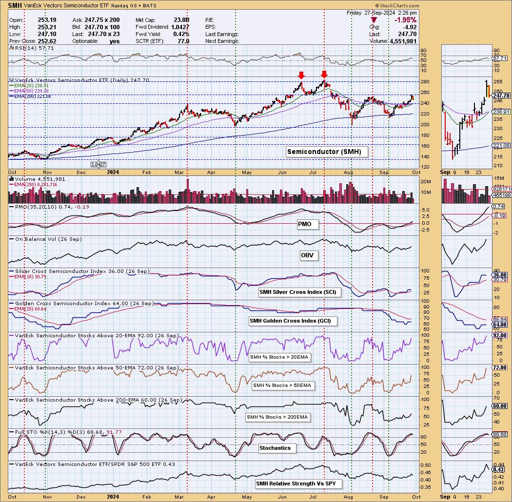
The Industry Group to Watch is Semiconductors (SMH). We happen to have an under the hood chart for this group, so we'll review it. Price has reached overhead resistance and, as of this writing, it is pulling back. However, the internals look very strong. The RSI is not overbought and the PMO is rising above the zero line, indicating new strength. The Silver Cross Index is above its signal line and is reading above our bullish 50% threshold. Participation is strong and, in the case of %Stocks > 50/200EMAs, there is room for improvement before getting too overbought. Stochastics have topped but, as with Technology, they are comfortably above 80, indicating internal strength.

Conclusion: Next week, we should put Technology and Semiconductors on our radar. They may not be ready for primetime right away, so we do need to watch what the market does on Monday. If it decides to decline, this area of the market will likely be hit. If it decides to inch higher, these will be the areas to pay attention to.
Introducing the New Scan Alert System!
Delivered to your email box at the end of the market day. You'll get the results of our proprietary scans that Erin uses to pick her "Diamonds in the Rough" for the DecisionPoint Diamonds Report. Get all of the results and see which ones you like best! Only $29/month! Or, use our free trial to try it out for two weeks using coupon code: DPTRIAL2. Click HERE to subscribe NOW!
Learn more about DecisionPoint.com:
Watch the latest episode of the DecisionPointTrading Room on DP's YouTube channel here!

Try us out for two weeks with a trial subscription!
Use coupon code: DPTRIAL2 Subscribe HERE!
Technical Analysis is a windsock, not a crystal ball. --Carl Swenlin
(c) Copyright 2024 DecisionPoint.com
Disclaimer: This blog is for educational purposes only and should not be construed as financial advice. The ideas and strategies should never be used without first assessing your own personal and financial situation, or without consulting a financial professional. Any opinions expressed herein are solely those of the author, and do not in any way represent the views or opinions of any other person or entity.
DecisionPoint is not a registered investment advisor. Investment and trading decisions are solely your responsibility. DecisionPoint newsletters, blogs or website materials should NOT be interpreted as a recommendation or solicitation to buy or sell any security or to take any specific action.
Helpful DecisionPoint Links:
Trend Models
Price Momentum Oscillator (PMO)
On Balance Volume
Swenlin Trading Oscillators (STO-B and STO-V)
ITBM and ITVM
SCTR Ranking
Bear Market Rules
|
| READ ONLINE → |
|
|
|
| Don't Ignore This Chart! |
| Unlocking GDX's Short-Term Potential: How to Nail the Measured Move Strategy |
| by Karl Montevirgen |

A few weeks back, two gold mining ETFs made it to the top 10 of the StockCharts Technical Rank (SCTR) Report, and they're still holding strong. Given the low trading volume in these ETFs, a more tradable alternative is the VanEck Vectors Gold Miners ETF (GDX), which still has a high SCTR (pronounced "scooter") score. As of this writing, it's at 98.
Looking back, how did GDX perform? It helps to revisit the article, which laid out the conditions and criteria for the uptrend—namely, key levels of support and resistance, price points which would determine either a trend continuation or reversal, and the seasonality context which can inform the more fundamental (and geopolitical) forces affecting the gold trade.
Referring to the original chart while tracking the events in the days after the article dropped, here's what happened.

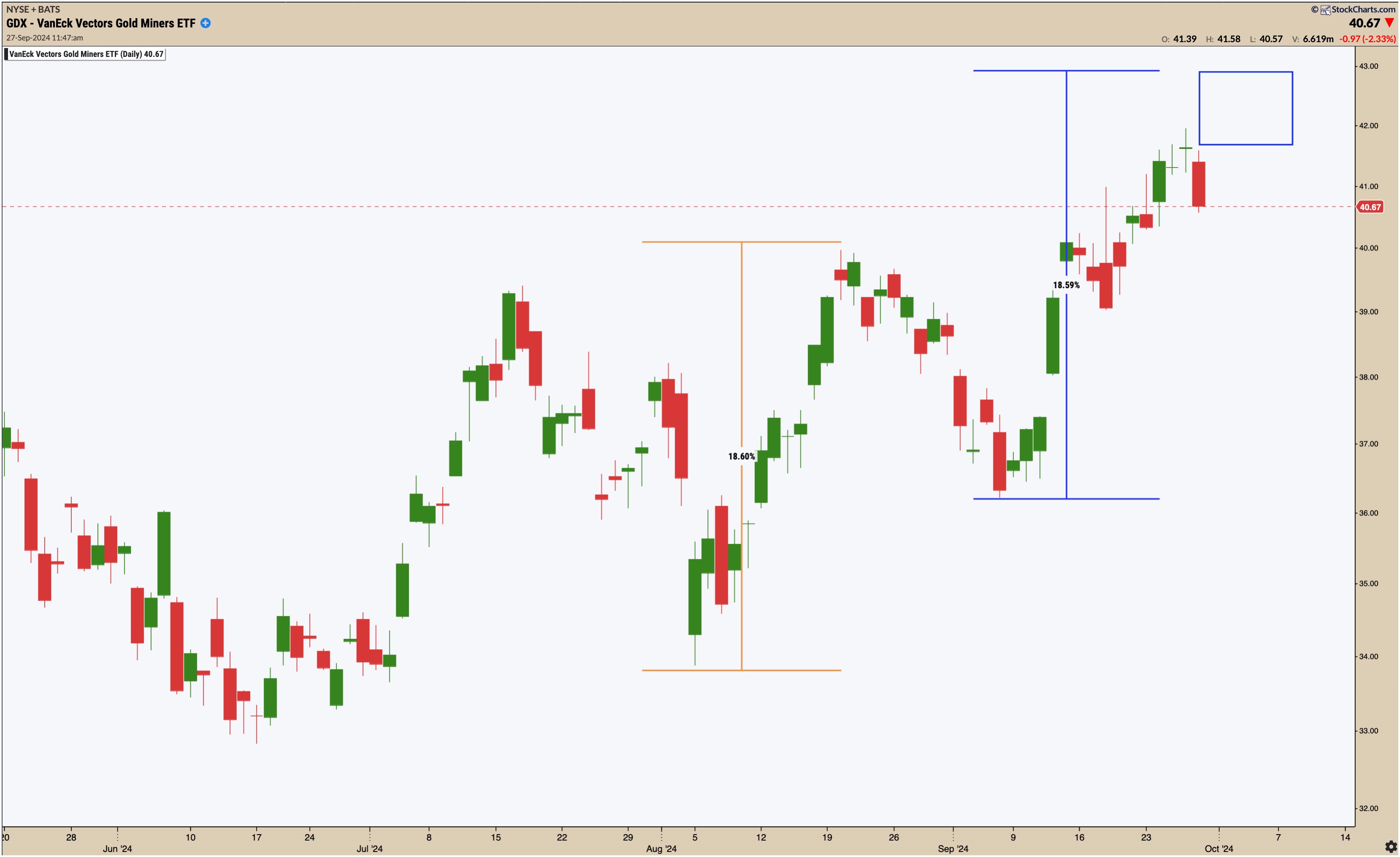
CHART 1. DAILY CHART OF GDX. Everything to the right of the blue vertical line shows what occurred after the article dropped.Chart source: StockCharts.com. For educational purposes.
As anticipated, GDX bounced at the Ichimoku Cloud line and broke above the swing point at $40 (see the ZigZag line) while remaining well below the then-previous swing low. It demonstrated the classic uptrend principle of higher highs and lower lows.
Meanwhile, buying pressure started to drop, based on the Chaikin Money Flow (CMF) readings, indicating weakness in momentum and a potential pullback.
A Short-Term Trade Within a Longer-Term Investment
Nobody knows how gold or gold miners will fare in the coming months. Analyst predictions are all over the map—and given the economic, political, and global context, it's really no surprise.
However, you can prepare for multiple scenarios. One approach traders use is to capitalize on short-term trading opportunities as they arise, taking profits along the way.
With that in mind, the August low-to-high rally and September pullback presented an ideal opportunity to trade a "measured move."
What is a Measured Move?
Simply put, a measured move is a three-part trading pattern comprised of the following:
- An initial move in one direction (like a rally)
- A pullback
- A continuation in the original direction that mirrors the height of the first move
The goal is to forecast the height of the final move based on the initial move. Whether the outcome of a measured move trade works in your favor or not, it provides you with a clear target and two clear exits in the form of a stop loss and profit target.
Take a look at GDX's daily chart below.

CHART 2. DAILY CHART OF GDX. You can use the percent change tool to measure and then project a given price move.Chart source: StockChartsACP. For educational purposes.
GDX's price move from its August 5 low to its August 20 high was approximately 18.60%. I used the Percent Change tool (available in the Annotation tool in SharpCharts and StockChartsACP) to measure this change (orange percent change measurement).
According to the "measured move" principle, the next leg up starting from the bounce on September 6 would be roughly equal to this first move. So, the second percent change ruler starts at the low of September 6 and extends its height to approximate the first measurement (blue percent change measurement).
The above chart shows that the price is about 90% of the way through the measured move. The blue rectangle on the chart shows the remaining space needed to complete the full 100% move.
How to Trade GDX
The September 6 low was a good "long" entry point for holding GDX long-term. But if you wanted to play it safe, given the longer-term uncertainty in the market, you could have used the "measured move" principles to pull off a short-term trade. Another option would be to lighten your position by unloading a portion of it by setting a profit target using the measured move principles.
Closing Bell
Short-term trading is a distinct approach that not all traders will adopt. But it also presents opportunities to take profits along the way as you chase longer-term profit goals. There are multiple swing trading setups you can use to pursue a trade within a (longer-term) trade, and using measured move principles—for trend continuation and various other patterns—is one clear way to approach such a pursuit. The GDX scenario above illustrates a clear way in which you could have used this strategy.
Disclaimer: This blog is for educational purposes only and should not be construed as financial advice. The ideas and strategies should never be used without first assessing your own personal and financial situation, or without consulting a financial professional.
|
| READ ONLINE → |
|
|
|
| MORE ARTICLES → |
|


 There's one trading day left for the month of September. Unless something drastic happens over the weekend, the stock market looks like it has bucked the September seasonality pattern of being the worst trading month for equities. That's not to say seasonality doesn't work; in the early part of the month, after all, there was a dramatic pullback. But the stock market has recovered and is now moving higher.