| THIS WEEK'S ARTICLES |
| Larry Williams Focus On Stocks |
| MEMBERS ONLY |
| Is This Still a Bull Market? | Larry's "Family Gathering" October 18, 2024 Recording |
| by Larry Williams |
|
Are we still in a bull market? That's a key question Larry considers in his final "Family Gathering" video, examining all the information available and what kind of conclusions about the state of the market we can draw from it...
|
| READ ONLINE → |
|
|
|
| Martin Pring's Market Roundup |
| MEMBERS ONLY |
| The Next Big Move in Yields May Be Different Than You Think |
| by Martin Pring |
|
Below, Chart 1 shows a weekly plot for the 30-year yield, where we can see a perfectly formed top whose completion was followed by a negative 65-week EMA crossover. At the time of the breakdown, there were few grounds for suspecting a false break...
|
| READ ONLINE → |
|
|
|
| The Mindful Investor |
| Does the MACD Histogram Hold the Secret to Anticipating Trend Changes? |
| by David Keller |
The Moving Average Convergence/Divergence (MACD) indicator, created by technical analyst Gerald Appel, is a technical indicator designed to confirm once a trend change has occurred. Based on exponential moving averages, it is not built to anticipate a price reversal, but rather to identify that one has already occurred.
The lesser known MACD histogram can actually provide a powerful leading indicator as to when a turning point could be just around the corner. Today we'll use the weekly chart of IBM to show how by combining these two techniques, we can anticipate potential reversals and then confirm when and how the trend has shifted.
Using the MACD or PPO Indicator to Define the Trend
To start this discussion, let's be clear on why we're using the PPO indicator instead of MACD on our example charts. The MACD indicator is based on the price difference between two exponential moving averages, while the PPO indicator is based on the percent difference between those two averages.
For a short-term time frame, the indicators are almost identical and either one can be used for effective signals. For long-term time frames, however, using percentage terms instead of price terms allows for a more consistent comparison especially if the stock or ETF has experienced big price swings.
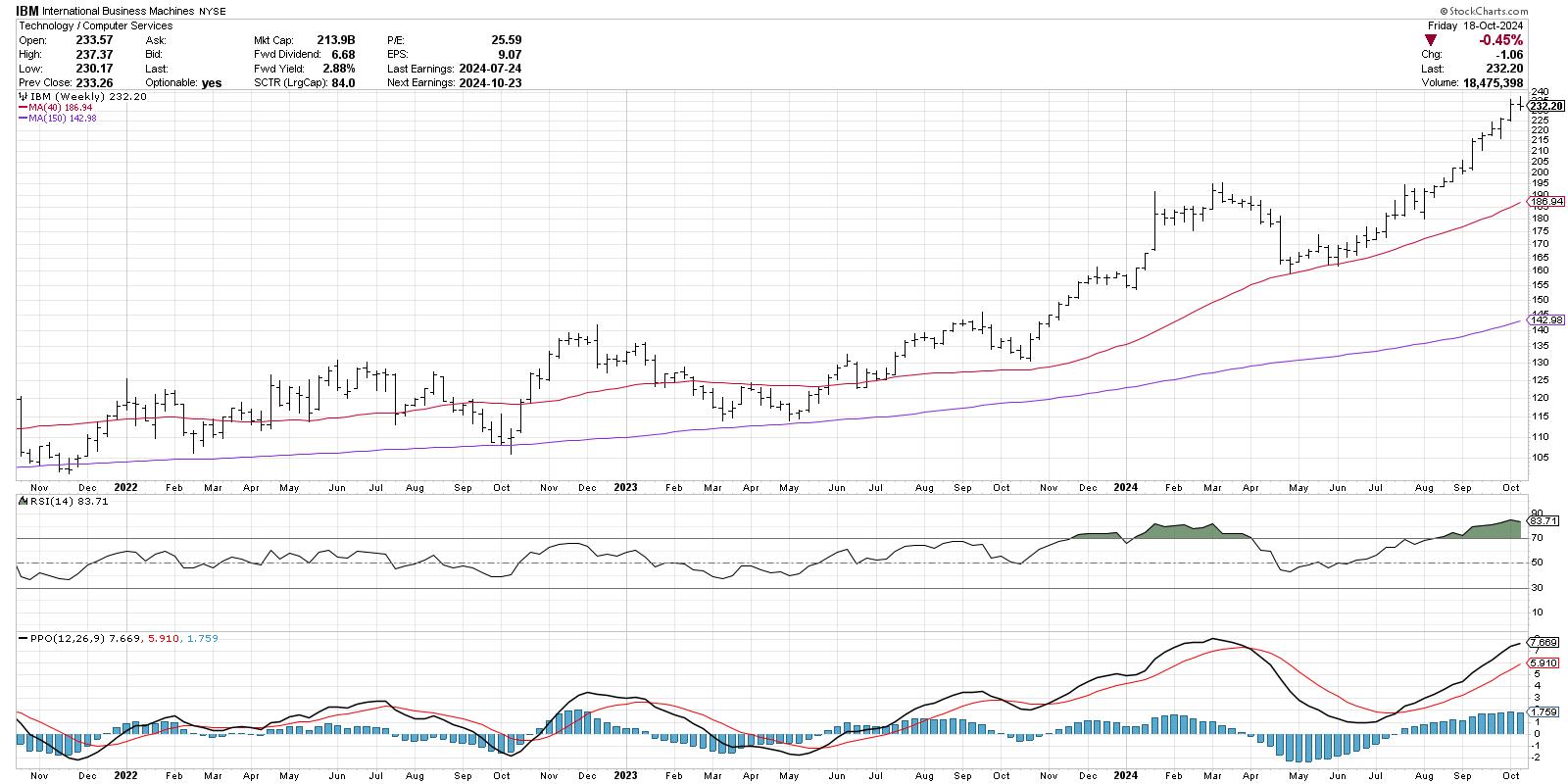
On the weekly chart of International Business Machines (IBM), the PPO indicator (bottom panel) starts with the PPO line, which represents the difference between the 12 and 26-week exponential moving averages. Then we have the red signal line, which is simply a 9-bar moving average of the PPO line.
Note the sell signal in late March 2024, when the PPO line crossed down through the red signal line. Conversely, the buy signal in mid-July is based on the PPO line crossing back up through the red signal line. At the present time, the PPO indicator suggests the uptrend is alive and well, with the PPO line sloping higher above the red signal line.
Adding the Histogram Helps to Anticipate the Signals
See how the sell signal in March came after the peak had occurred, and the price was already in a new downtrend? Also, notice how the buy signal in July appeared well after the actual price low in April?
This is actually by design, as the PPO indicator is considered a lagging indicator. It's not designed to tell you a reversal may be coming soon, but rather that a reversal recently happened and is now being confirmed. But what if we want to anticipate those reversals before they occur?
The PPO histogram, shown behind the PPO indicator in blue, represents the difference between the PPO line and the signal line. Go back to that March peak, and you may notice that the histogram had started to slope downward starting in February. Then in May, right as the price was finding a new swing low, the histogram started to slope back upwards.
So to summarize the components, the histogram reversals raise the "red flag" that a potential price reversal is coming, and then the actual PPO crossover confirms that the trend reversal has actually occurred. Now we can use the PPO indicator as both a leading and a lagging indicator!
Using the Histogram With Other Indicators
Fast forward to October 2024, and you'll see that this week the PPO histogram moved slightly lower. This could represent the early warning of an impending top for IBM. In this situation, I like to go to a lower time frame, in this case the daily chart, and use trend-following techniques to confirm a breakdown on the shorter time frame. While the weekly may still be my main indication, a sell signal could come earlier on the daily chart and help me to take action before the pain gets too unbearable!
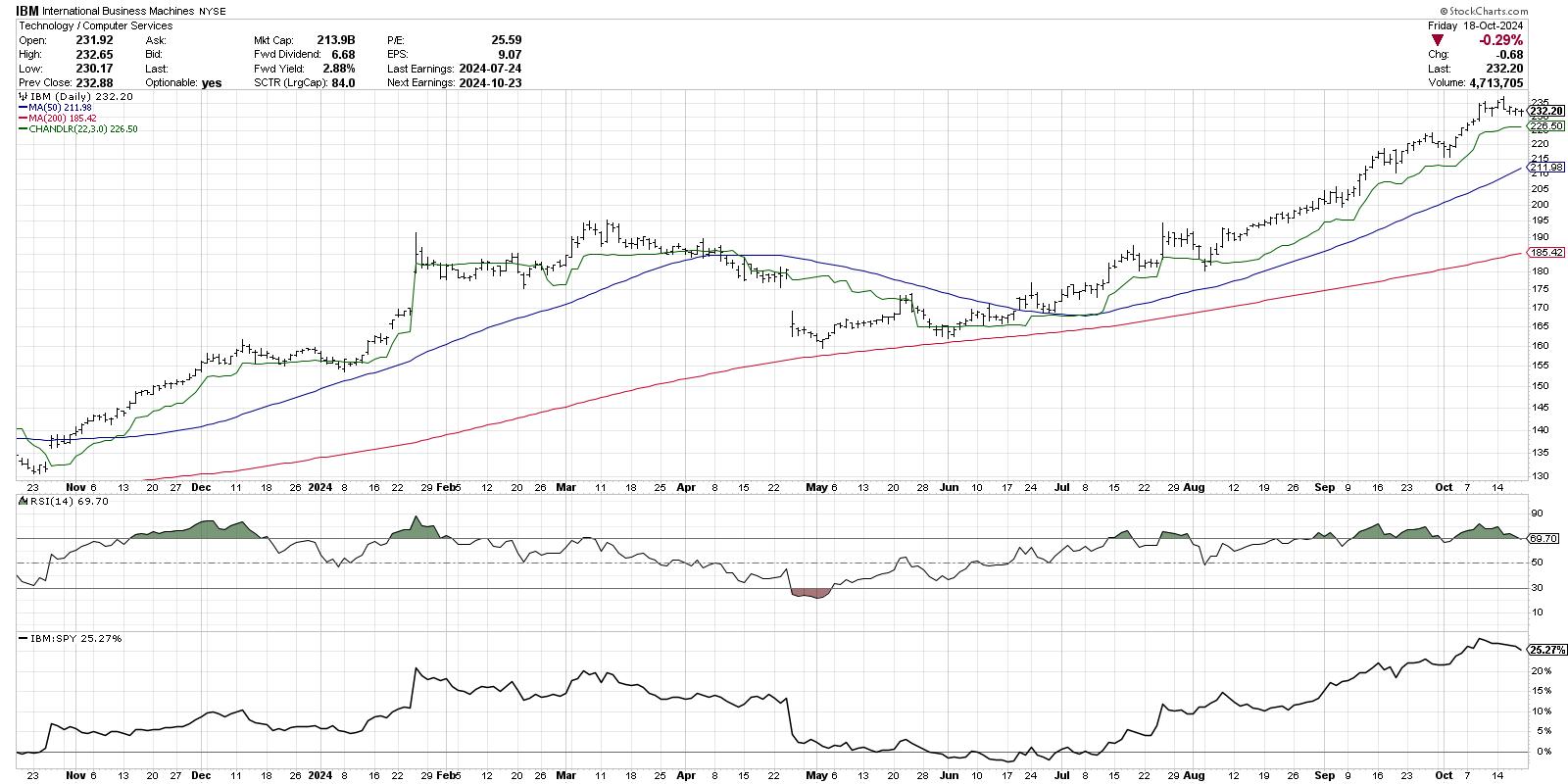
Here I'm showing the Chandelier Exit system, which is a trailing stop indicator based on Average True Range (ATR). As long as IBM remains above the Chandelier Exit, the uptrend is most likely still alive and well on the daily chart. A breakdown of this trailing stop could help me confirm the bearish divergence we've noted on the weekly PPO chart.
The technical analysis toolkit consists mainly of leading indicators and lagging indicators. While I primarily use lagging indicators to follow the trends and confirm trend reversals, I have also found leading indicators such as the PPO histogram to be a vital part of managing risk and identifying opportunities for my portfolio.
RR#6,
Dave
PS- Ready to upgrade your investment process? Check out my free behavioral investing course!
David Keller, CMT
President and Chief Strategist
Sierra Alpha Research LLC
Disclaimer: This blog is for educational purposes only and should not be construed as financial advice. The ideas and strategies should never be used without first assessing your own personal and financial situation, or without consulting a financial professional.
The author does not have a position in mentioned securities at the time of publication. Any opinions expressed herein are solely those of the author and do not in any way represent the views or opinions of any other person or entity.
|
| READ ONLINE → |
|
|
|
| OptionsPlay |
| Disney Stock Options Strategy: A Detailed Guide to Boost Your Earnings |
| by Tony Zhang |
 Walt Disney Co. (DIS) has struggled as a business over the past few years and isn't on many investors' radars these days. However, Disney seems to have turned a corner last quarter and is positioned for a resurgence in its core theme parks and streaming businesses. Walt Disney Co. (DIS) has struggled as a business over the past few years and isn't on many investors' radars these days. However, Disney seems to have turned a corner last quarter and is positioned for a resurgence in its core theme parks and streaming businesses.
With consumer spending in the travel sector remaining robust, demand for Disney's theme parks is increasing. Additionally, Disney+ is on track to become profitable by Q4, and the inclusion of ESPN could further enhance Disney's edge in the streaming space. These factors provide upside potential for Disney's stock price, particularly as the company recovers from recent challenges and realigns its strategic focus.
Disney's stock price has recently broken above its trading range, pulled back, and bounced off its $92 support level (see chart below). This suggests there is momentum to target $102 to the upside and $113 as an extended target to the upside.
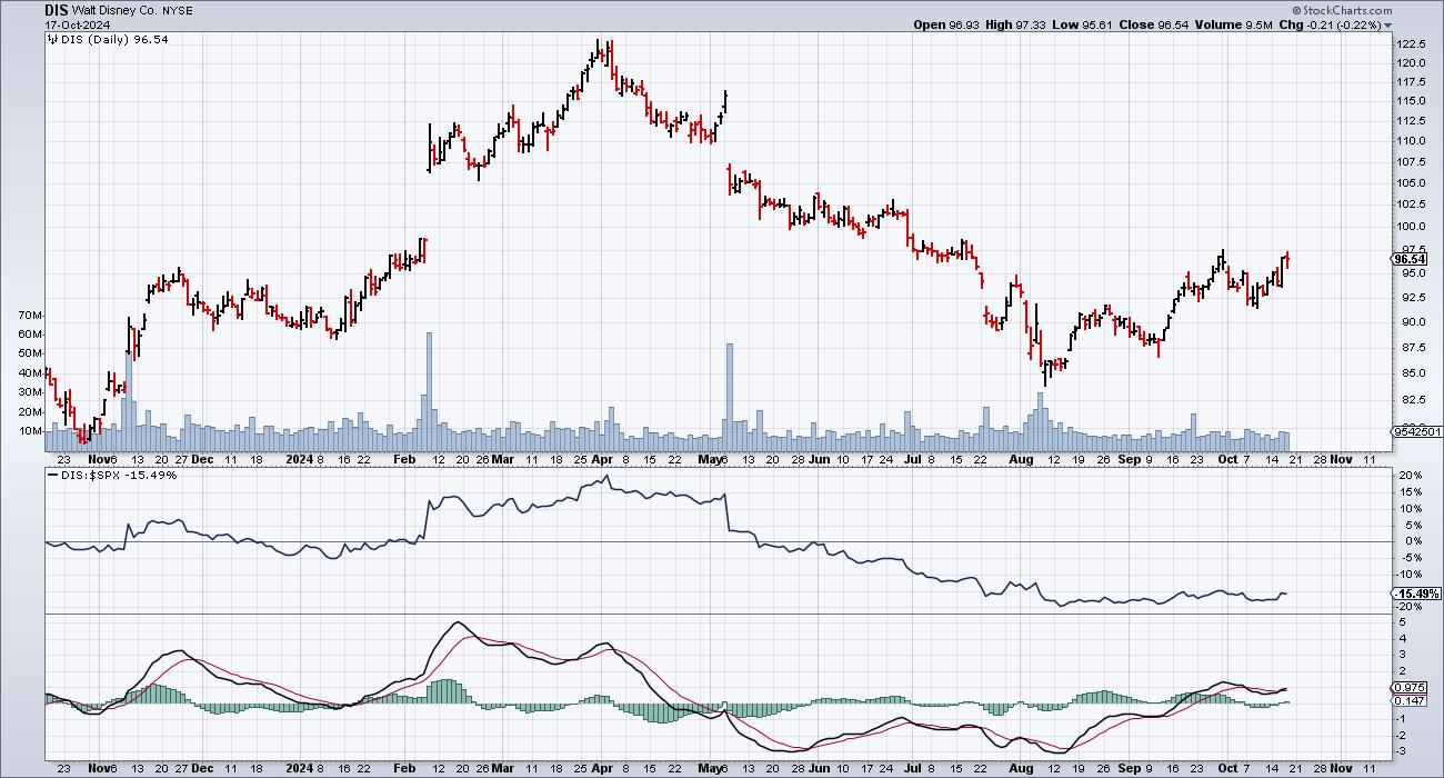
FIGURE 1. DISNEY'S STOCK PRICE HAS THE POTENTIAL TO MOVE HIGHER. An improving relative performance and moving average convergence/divergence support a potential higher price move in Disney.Chart source: StockCharts.com. For educational purpose.
With the relative performance of DIS to the S&P 500 ($SPX) improving and the moving average convergence/divergence (MACD) showing signs of strengthening, this confirms the upside potential as DIS potentially breaks out above its $97.50 resistance.
Disney stock appears modestly undervalued, trading at 18x forward earnings, slightly below the industry average. Its expected earnings per share (EPS) growth of 14.5% aligns with the industry average, while its revenue growth forecast of 4% aligns with its peers. However, Disney's net margins of 5% surpass the industry average of 3%, indicating a stronger outlook on profitability, especially with anticipated improvements from its streaming business and sustained demand in its theme parks.
Options on DIS are expensive, with the IV rank at 67%. So, to capitalize on a potential major breakout for DIS, I suggest buying a December $95/$110 call vertical for $5.09 debit.
A call vertical involves buying a call option and selling another with a higher strike price. The two options have the same expiration date.
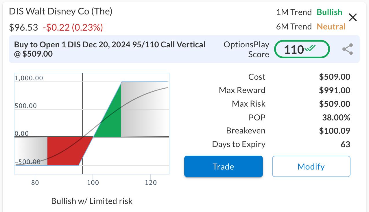
FIGURE 2. CALL VERTICAL ANALYSIS. Here, you see the cost of the trade, the risk curve, and the risk/reward tradeoff of the call vertical for DIS. Image source: OptionsPlay.
This structure allows an offset for the relatively expensive Dec $95 call options and reduces the overall risk by selling the $110 calls. This structure entails:
- Buying the Dec 20 $95 Call @ $6.25
- Selling the Dec 20 $110 Call @ $1.16
This call vertical spread allows for a maximum reward of $991 per contract if DIS is above $110 at expiration, with a maximum risk of $509 if DIS is below $95 at expiration.
|
| READ ONLINE → |
|
|
|
| ChartWatchers |
| A Strong Week: Stocks, Gold, and Crypto's Robust Performance |
| by Jayanthi Gopalakrishnan |
 Despite a light economic data week, the stock market continued its rally, with the S&P 500 ($SPX) and the Dow Jones Industrial Average ($INDU) closing at record highs. How many times have we heard that? This is the sixth positive week for the three indexes. Despite a light economic data week, the stock market continued its rally, with the S&P 500 ($SPX) and the Dow Jones Industrial Average ($INDU) closing at record highs. How many times have we heard that? This is the sixth positive week for the three indexes.
Strong earnings from big banks, Taiwan Semiconductor Mfg. (TSM), United Airlines Holdings (UAL), and Netflix, Inc. (NFLX) injected optimistic energy into the stock market.
Tech Stocks Hold Steady
The tech-heavy Nasdaq Composite ($COMPQ) may not have hit all-time highs, but its daily chart is worth a closer look. An ascending triangle formation has reached its apex, indicating indecision among investors. The breadth indicators in the lower panels below the price chart echo this indecision.
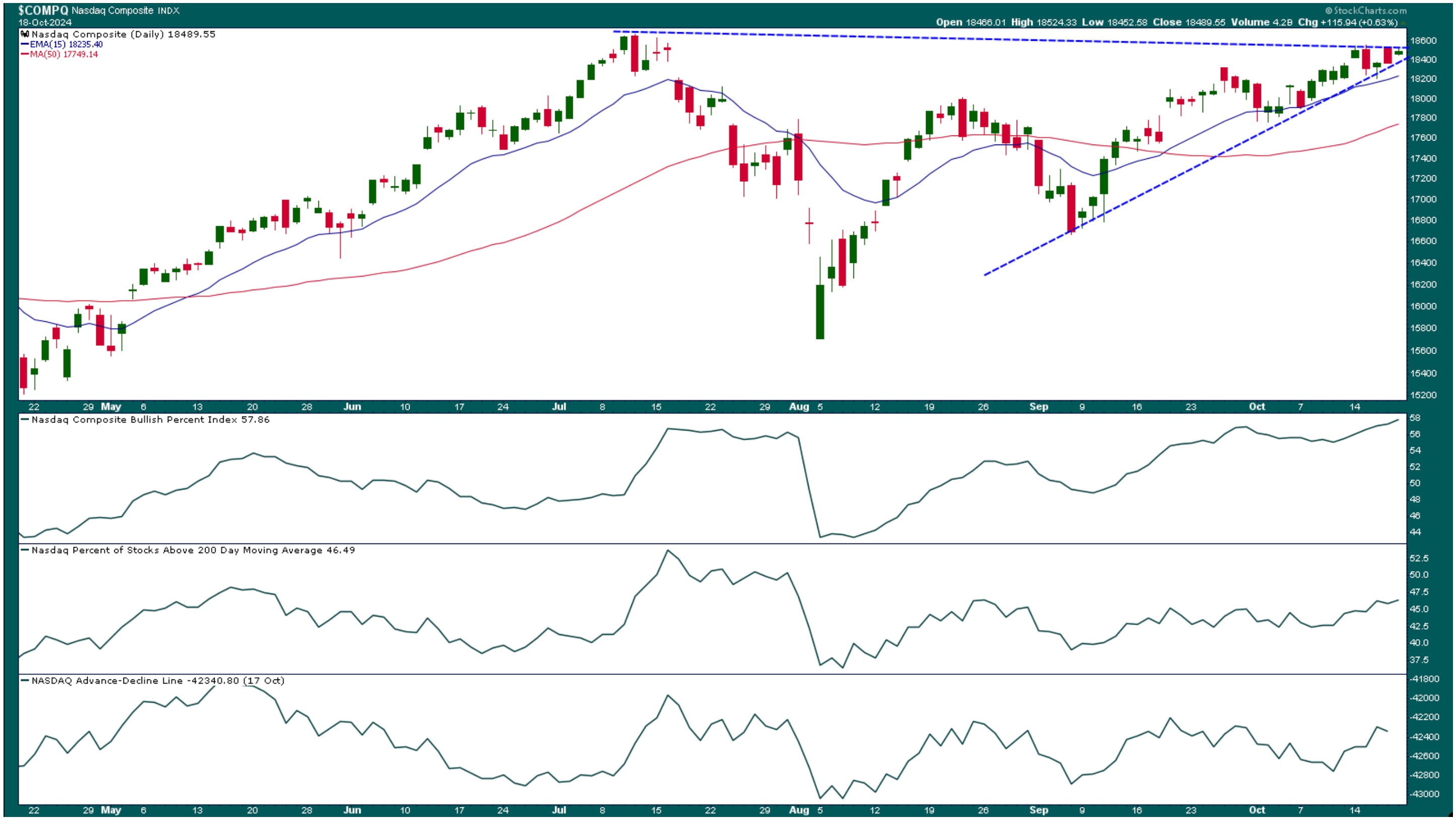
CHART 1. NASDAQ COMPOSITE CONVERGING AT TRIANGLE APEX. The Nasdaq Composite seems to be at a point of indecision. This could continue until Tech stocks report quarterly earnings. Chart source: StockCharts.com. For educational purposes.
The Nasdaq Bullish Percent Index (BPI) is trending higher but is registering at 57.76, which is slightly bullish. The percentage of Nasdaq stocks trading above their 200-day moving average is also lukewarm, and the Nasdaq advance-decline line isn't showing strong bullish participation.
Investors are probably waiting for Tech earnings. Until then, the index will probably stay put unless some unknown market-moving event occurs before then. The indecision in Tech stocks isn't stopping investors from shifting to other areas of the market.
Mid-Caps Might Flatten
The S&P 400 Mid Cap Index ($MID) broke out of its trading range in September and has been trading above it since then. The index hit an all-time high this week, but has started to show signs of flattening (see last two bars in chart below).
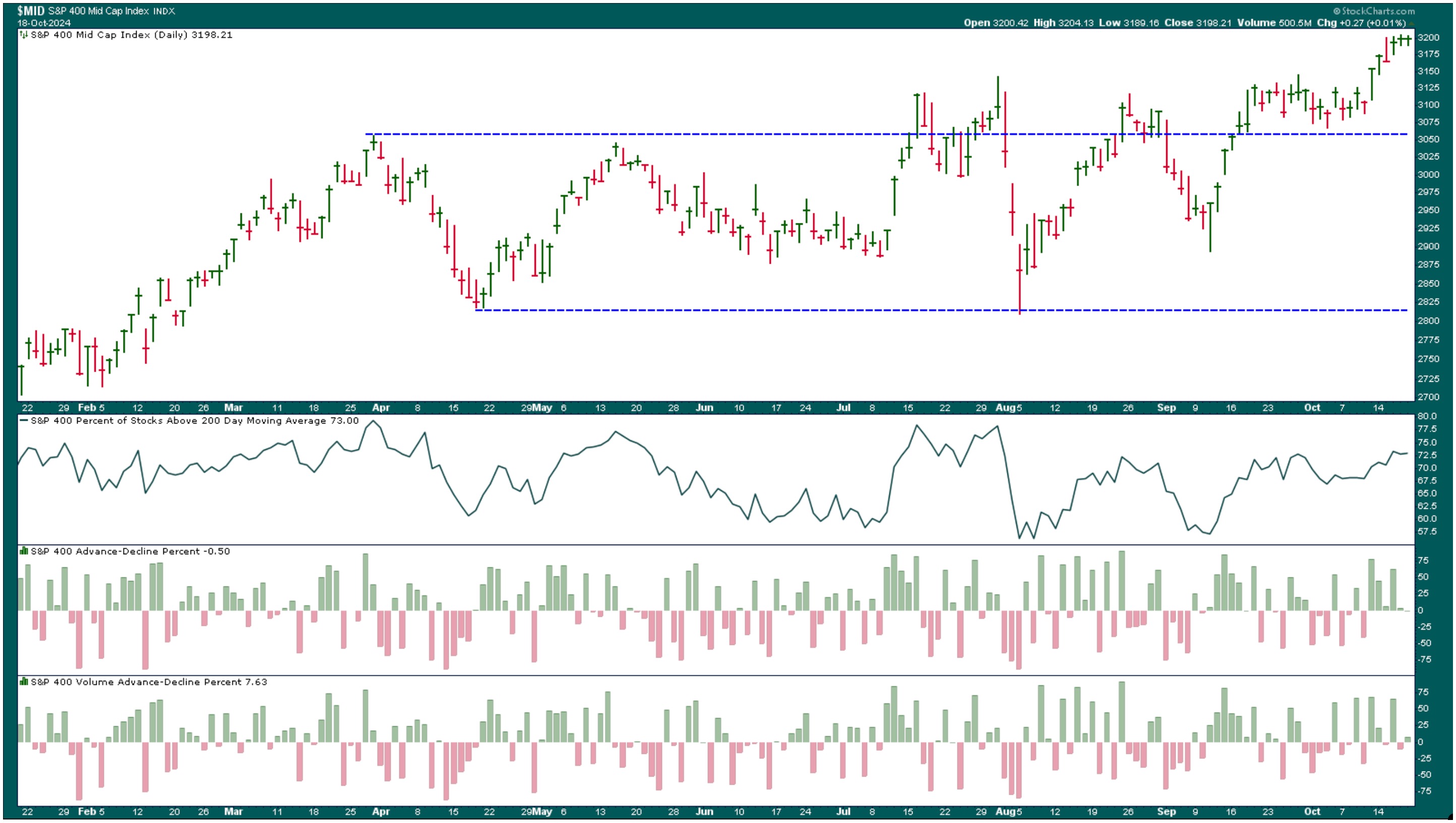
CHART 2. MID-CAP STOCKS BREAK OUT OF RANGE. After hitting an all-time high, the S&P 400 Mid-Cap Index is stalling.Chart source: StockCharts.com. For educational purposes.
The percentage of $MID stocks above their 200-day moving average is 73, which is pretty healthy. The advances still need higher volume to push the index higher. Until that happens, the mid-cap asset class may stall.
Bitcoin Breaks Out, Gold Glitters
Bitcoin has also shown its might this week. The weekly chart shows Bitcoin breaking out of a flag pattern (see below).
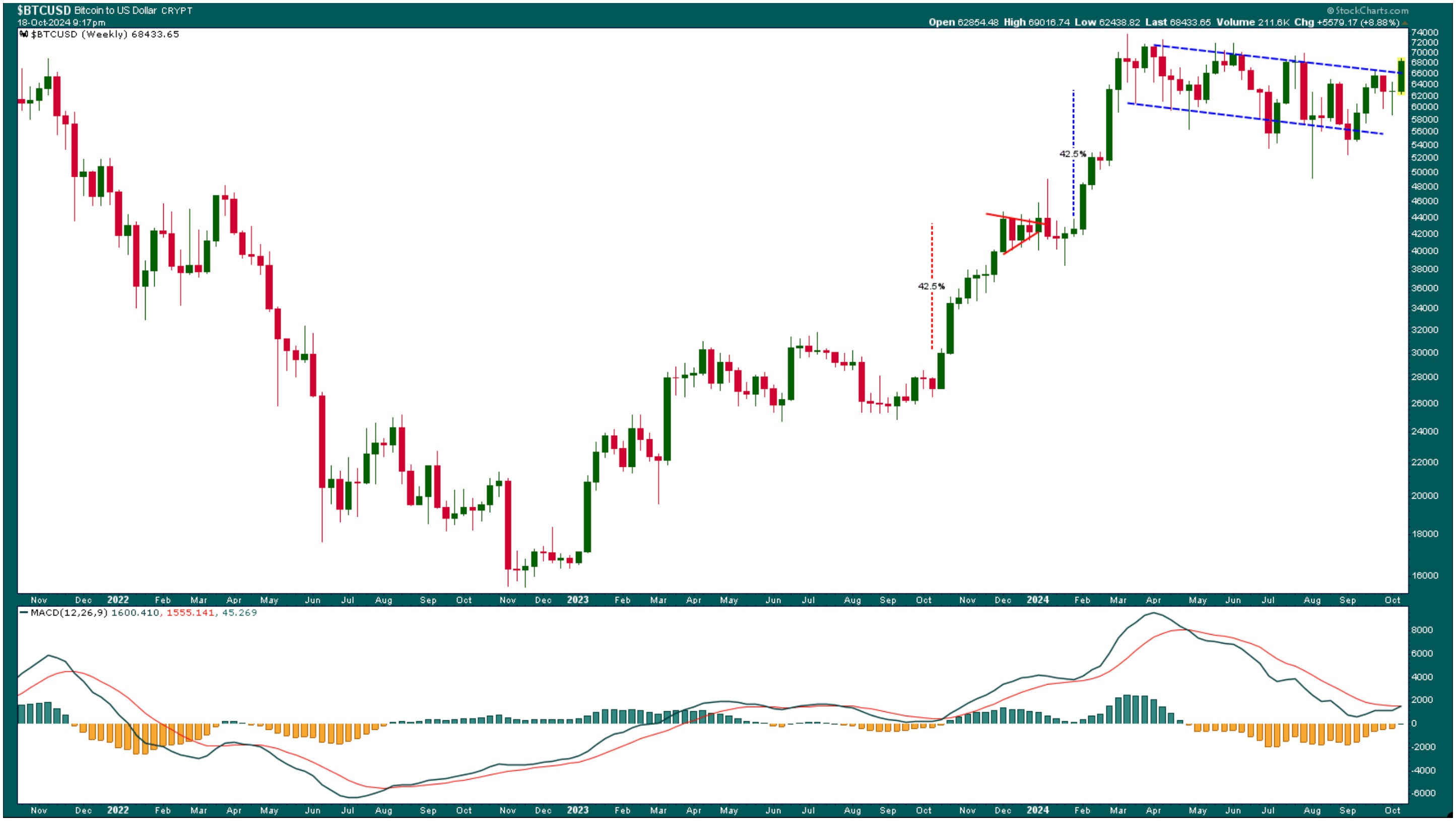
CHART 3. BITCOIN BREAKS OUT OF A CONSOLIDATION PATTERN. A breakout plus a possible MACD crossover could send Bitcoin prices higher. Note that the crossover is close to the zero line, an encouraging sign. Chart source: StockCharts.com. For educational purposes.
After hitting the measured move targets following the previous consolidation, $BTCUSD has been in an extended consolidation pattern and has finally broken out. A bullish crossover in the moving average convergence/divergence (MACD) could occur. The crossover is close to the zero line, a criterion I look for. Look at what happened to the price of Bitcoin the last time a crossover took place at the zero line! Bitcoin could move higher by about 42.5%.
Speaking of all-time highs, gold prices are on fire. The SPDR Gold Shares ETF (GLD) has been in an uptrend since early March, and central bank interest rate cuts have propelled gold prices higher (see chart below).
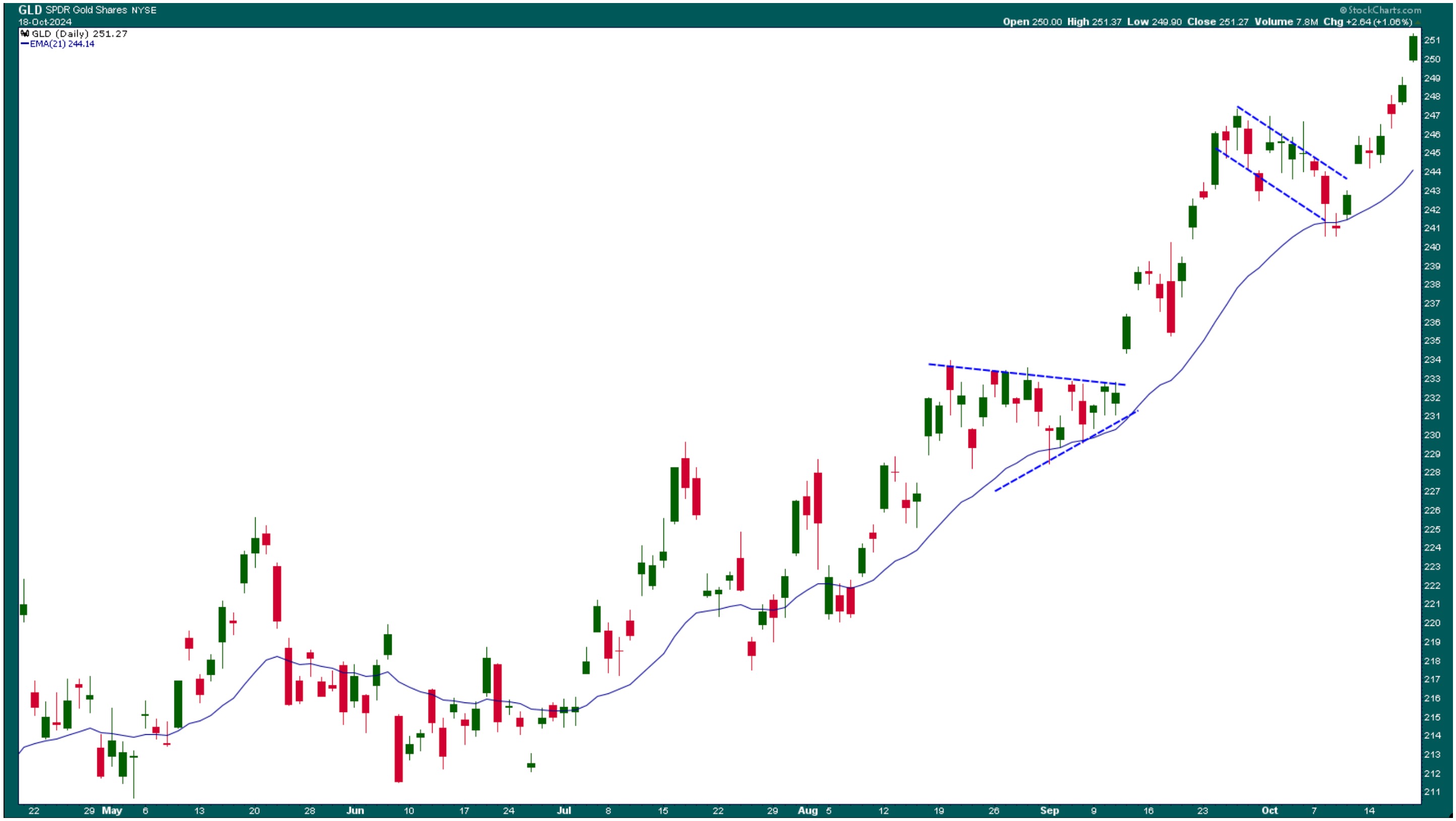
CHART 4. GOLD PRICES ON A TEAR THIS YEAR. GLD has been following a typical uptrend, going through consolidations, breaking out of them, and continuing its ride higher. Chart source: StockCharts.com. For educational purposes.
GLD could potentially rise above $250, but it's difficult to set an entry point unless there's a pullback. If you are considering going long now, apply stringent stop losses.
The Atlanta Fed GDPNow is estimating a 3.4% growth in Q3 2024. This has led investors to think the Fed will not cut interest rates in its November meeting. However, the CME FedWatch Tool shows a 92.9% probability of a 25 basis point cut. So, if there's a rate cut in November, GLD could rise higher. This can change though, considering we're less than three weeks away from the meeting, which happens to be right after the U.S. presidential election.
Looking Forward
Next week is thin on economic data, but earnings season continues. It's not a strong week for Tech earnings, so the Nasdaq could continue its indecisive price action. As for the rest of the market, there could be more of the same. As always, anything could happen over the weekend that could send things awry.
End-of-Week Wrap-Up
- S&P 500 closed up 0.85% for the week, at 5864.67, Dow Jones Industrial Average up 0.96% for the week at 43,275.91; Nasdaq Composite closed up 0.80% for the week at 18,489.55
- $VIX down 11.88% for the week, closing at 18.03
- Best performing sector for the week: Utilities
- Worst performing sector for the week: Energy
- Top 5 Large Cap SCTR stocks: Insmed Inc. (INSM); Carvana (CVNA); Ubiquiti, Inc. (UI); Applovin Corp (APP); Cava Group, Inc. (CAVA)
On the Radar Next Week
- Fed speeches
- September Existing Home Sales
- September New Home Sales
- Earnings from Tesla (TSLA), General Motors (GM), Verizon Communications (VZ), Coca Cola (KO), among others

Disclaimer: This blog is for educational purposes only and should not be construed as financial advice. The ideas and strategies should never be used without first assessing your own personal and financial situation, or without consulting a financial professional.
|
| READ ONLINE → |
|
|
|
| Don't Ignore This Chart! |
| Dell's Bullish Climb: Should You Get In Now? |
| by Karl Montevirgen |
 When the market is rallying in full swing, it can sometimes be difficult to select which stocks, among the hundreds, might present the best case to buy. For spotting the strongest stocks on a technical basis, the StockCharts Technical Rank (SCTR) can be an essential tool. When the market is rallying in full swing, it can sometimes be difficult to select which stocks, among the hundreds, might present the best case to buy. For spotting the strongest stocks on a technical basis, the StockCharts Technical Rank (SCTR) can be an essential tool.
There are many ways to use the SCTR Report. One would be to pull the top-performing stocks. Another strategy is to view the Top Up tab in the SCTR Reports panel on Your Dashboard to find the stocks with the biggest SCTR moves.
Dell Technologies (DELL) may not be leading the top 10 pack, but it's beating hundreds of stocks that happen to be rallying as of this writing. Note: this can change during the trading day.

FIGURE 1. SCTR TOP UP REPORT. Despite DELL occupying 7th place at the moment of writing, it's still among the top stocks gaining more technical strength in the US stock market.Image source: StockCharts.com. For educational purposes.
Dell Stock's Price Action
Dell's upward run is a continuation of the bullish reversal that started in August, as you can see in this weekly chart.

FIGURE 2. WEEKLY CHART OF DELL. Besides the dip in August, DELL's uptrend, however volatile, remains unbroken.Chart source: StockCharts.com. For educational purposes.
Dell's stock price uptrend remains intact despite the volatility and dip from February through August. The stock bounced back at the 61.8% Fibonacci retracement line, which, for many investors, served as a favorably low entry point.
Note the SCTR line above the chart. You should keep an eye on a crossover above the 70 line, which marks a bullish threshold for me (more on this later).
What Conditions Might Trigger a Buy?
Let's switch to a daily chart.

FIGURE 3. DAILY CHART OF DELL STOCK. Watch those swing points for potential entry points.
The following are important points to note on the chart:
- The swing points illustrate an almost textbook uptrend (blue trendline) of higher highs (HH) and higher lows (HL).
- The green arrows mark areas of support. If an uptrend consists of consecutive HHs and HLs, then support, and potential stop loss levels, would be right below each swing low.
- The horizontal dotted blue lines mark potential resistance levels (and, for swing traders, multiple opportunities to close out with a profit). Dell's stock price is currently breaking above the first resistance level marked on the chart.
The Chaikin Money Flow (CMF) below the chart is above the zero line (magenta rectangle), meaning buying pressure is a dominant factor in DELL's momentum. You would want it to remain there if you were to go long.
So, when might you consider going long?
- If you're not already in the position, look at the SCTR line above the chart. Wait for the SCTR line to break above 70—that's your first signal.
- Ensure its CMF reading remains strong and does not show signs of weakening.
- If DELL breaks the HH>HL pattern, then the short-term uptrend is in question and may trigger a stop loss below the swing point you've chosen as an ideal exit (where you place your stop loss will vary according to your risk tolerance).
How To Set a SCTR Alert
On Your Dashboard, click the Charts & Tools dropdown menu.
- Select Advanced Alerts.
- From Alert Components, select symbol from the TICKER PROPERTIES dropdown menu.
- Select SCTR in the PRICE, VOLUME, & SCTRS dropdown menu.
The screenshot below displays the alert.

Save your alert and choose how you you'd like to be notified.
To learn more about setting alerts, visit the Technical Alert Workbench support page.
At the Close
When picking stocks in a rally, tools like the SCTR report make life easier. Dell (DELL) might not be sitting at the top spot right now, but it's climbing fast, showing some serious technical strength. Keep an eye on that SCTR line—once it crosses 70, paired with a strong CMF reading, it could be your signal to go long. Set a SCTR alert on your dashboard to catch this market opportunity.

Disclaimer: This blog is for educational purposes only and should not be construed as financial advice. The ideas and strategies should never be used without first assessing your own personal and financial situation or without consulting a financial professional.
|
| READ ONLINE → |
|
|
|
| RRG Charts |
| Using RRG To Find Best Three Stocks inside the DJ Industrials Index |
| by Julius de Kempenaer |
In this week's RRG video, I shared my concerns about the current market conditions. The sector rotation model and current sector rotation, as we see it on the Relative Rotation Graph for US sectors, are sending us conflicting signals. This combination continues to make me cautious about fully buying into the rally with new positions.
Being fully-invested is too risky at the moment (for me).
My current approach is that the risk of being fully invested in the market right now, or even buying into it, is too high for my comfort. Instead, I suggest we focus on identifying individual stocks or industries that present profit opportunities for long positions.
Dow Jones Industrials: Finding the Right Stocks

I haven't blogged about individual stocks for a while, especially not about the members of the Dow Jones Industrials. Thus, I thought it would be beneficial to examine the constituents of the Dow Jones Industrials Index to find suitable candidates for long positions.
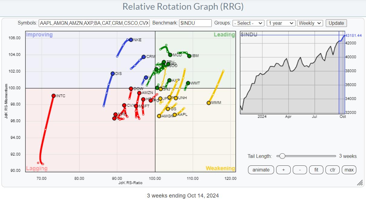
Outliers on the RRG
When you look at the RRG holding the Dow Jones Industrial Stocks, two real outliers catch the eye. The first is Intel (INTC), which is in the lagging quadrant and experiencing a significant hiccup in relative momentum. The second outlier is 3M (MMM), located in the weakening quadrant and rapidly losing relative momentum. If removed from the equation, these two stocks allow us to see a more balanced distribution of stocks across the various quadrants.

Positive RRG Headings
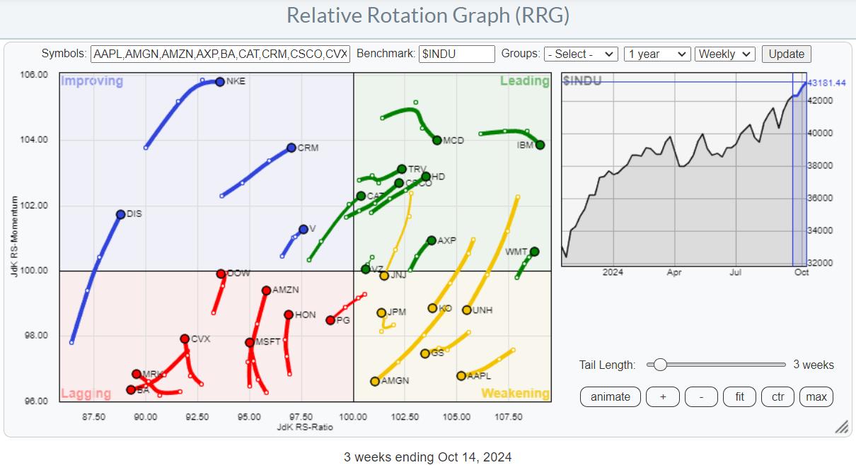
My next step is to toggle over all the individual stocks and highlight those with a positive RRG heading between 0 and 90 degrees. This indicates that a stock is gaining relative strength against the Dow Jones Industrials and is supported by positive momentum.

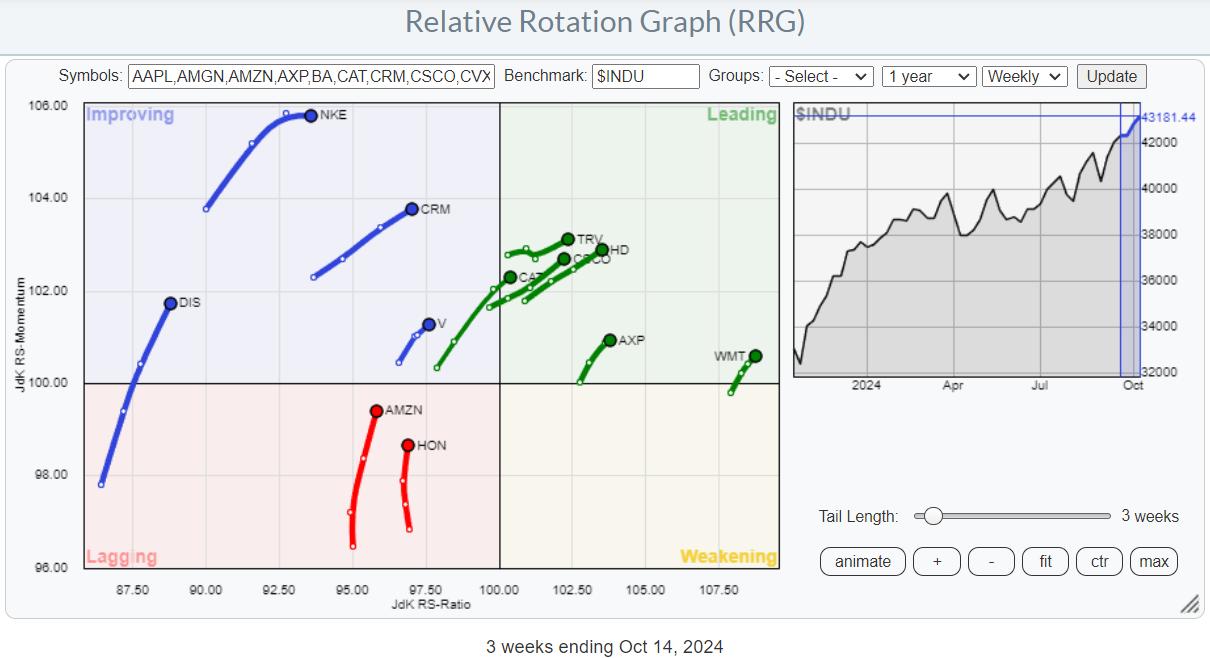
With this filter, we see two stocks in the lagging quadrant on a positive heading: Amazon and Honeywell. Four stocks are inside the improving quadrant, and they seem to be continuing their improvement: DIS, NKE, CRM, and V.
Concentrating on the Leading Quadrant
The leading quadrant has a higher concentration of stocks on a positive heading, and that's where I want to focus our attention. After reviewing the individual charts of these stocks, I've identified a few worth a closer look and might be considered for adding to a portfolio.
The Strong Performers: TRV, WMT, and AXP
Travelers (TRV), Walmart (WMT), and American Express (AXP) are showing very strong charts in terms of price and relative strength. However, they've had such a long run that I wouldn't recommend chasing them higher. The same goes for American Express (AXP). If you already hold these stocks, they are a great "hold," but I wouldn't initiate new positions.
The Top Three Picks
Now, let's talk about the three stocks that stand out as potential additions to our portfolio.
Caterpillar (CAT)

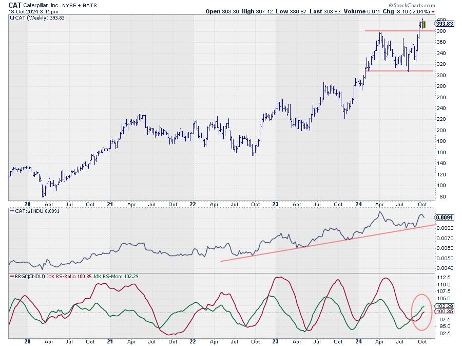
Caterpillar's price has just broken above the previous high at $380 and is consolidating. As long as it stays above $380, it has a good chance of continuing its uptrend. The RRG lines have turned up and are both above 100, indicating a positive RRG heading.
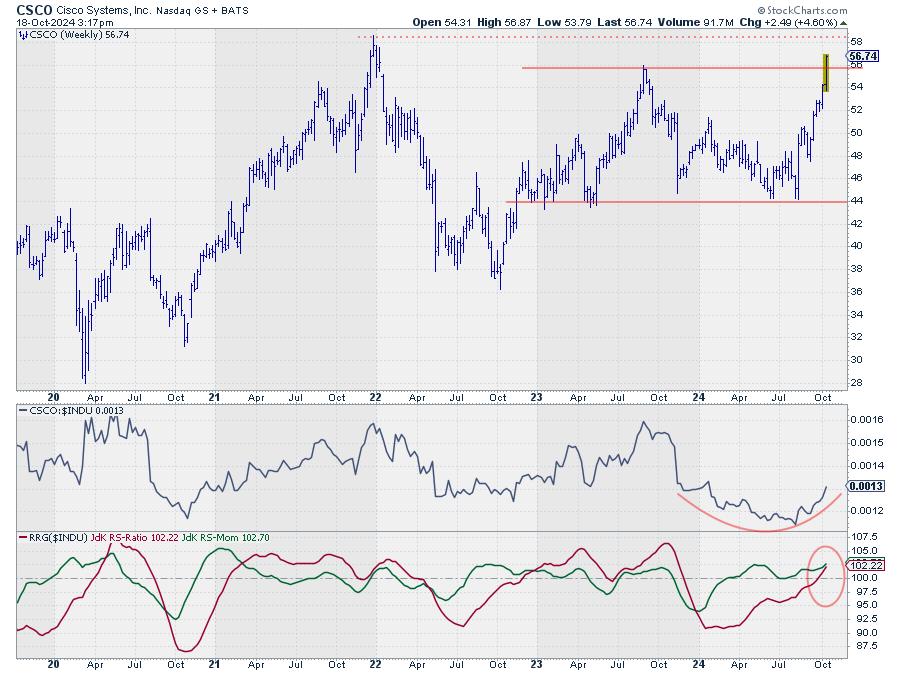
Cisco (CSCO)

Cisco bottomed out around $44 and has climbed to its previous high of around $56. It's now breaking above that resistance, which is a positive sign.
The next target is the late December 2021 peak, just below $60. The relative strength is picking up again, confirmed by both RRG lines pushing above the 100 level. Once that barrier is taken out, a lot of upside potential for CSCO will be unlocked.
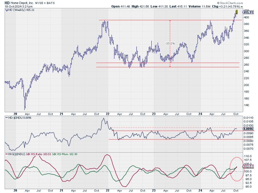
Home Depot (HD)

Home Depot has broken above resistance around $390, formed by two peaks in late 2021 and March 2024. The stock confirms a new uptrend with the RRG lines pushing above 100. We could see significant upside potential when the raw RS line surpasses its previous high from March 2024.
By measuring the height of the range from $260 to $390, we can project a rough price target of $520 for Home Depot to be reached within the next two years, as long as the support around $390 holds.
Remember, it's not about chasing the market; it's about making informed decisions based on solid analysis.
#StayAlert and have a great weekend, --Julius
|
| READ ONLINE → |
|
|
|
| DecisionPoint |
| Signal Scoreboard As Good As It Gets |
| by Carl Swenlin |
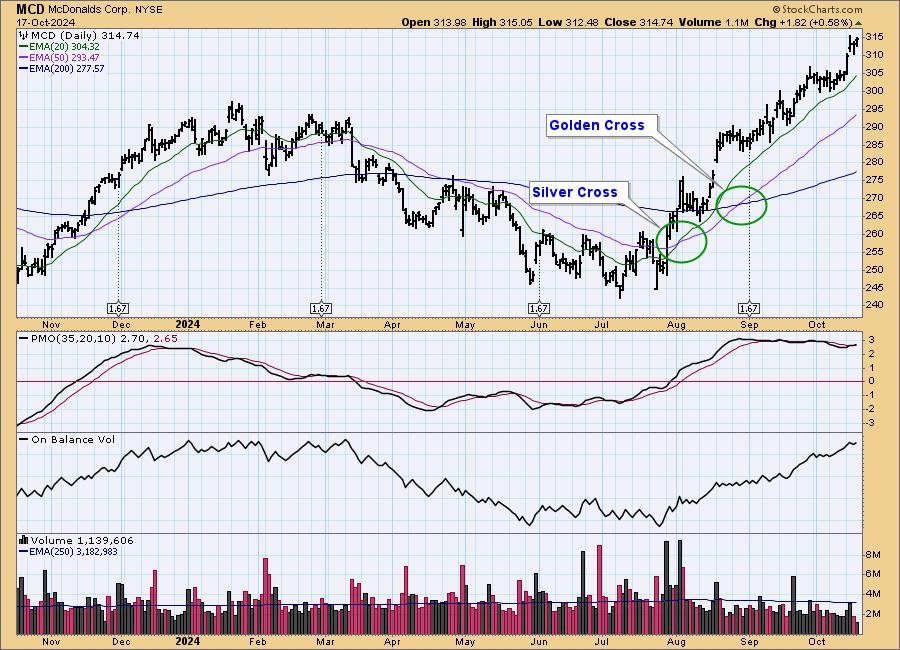
At DecisionPoint, we track intermediate-term and long-term BUY/SELL signals on twenty-six market, sector, and industry group indexes. The long-term BUY signals are based upon the famous Golden Cross, which is when the 50-day moving average crosses up through the 200-day moving average. (We use exponential moving averages -- EMAs.) Intermediate-term BUY signals are based upon the 20-day moving average crossing up through the 50-day moving average, which we call a Silver Cross. On the McDonalds (MCD) chart below, you can see examples of each.
A caveat that comes with the signals is that they are information flags, not action commands. A new signal tells us to look at the chart and decide if any action is appropriate. In the case of these two crossovers, they were healthy-looking signals, with price showing clear changes of direction within each timeframe.

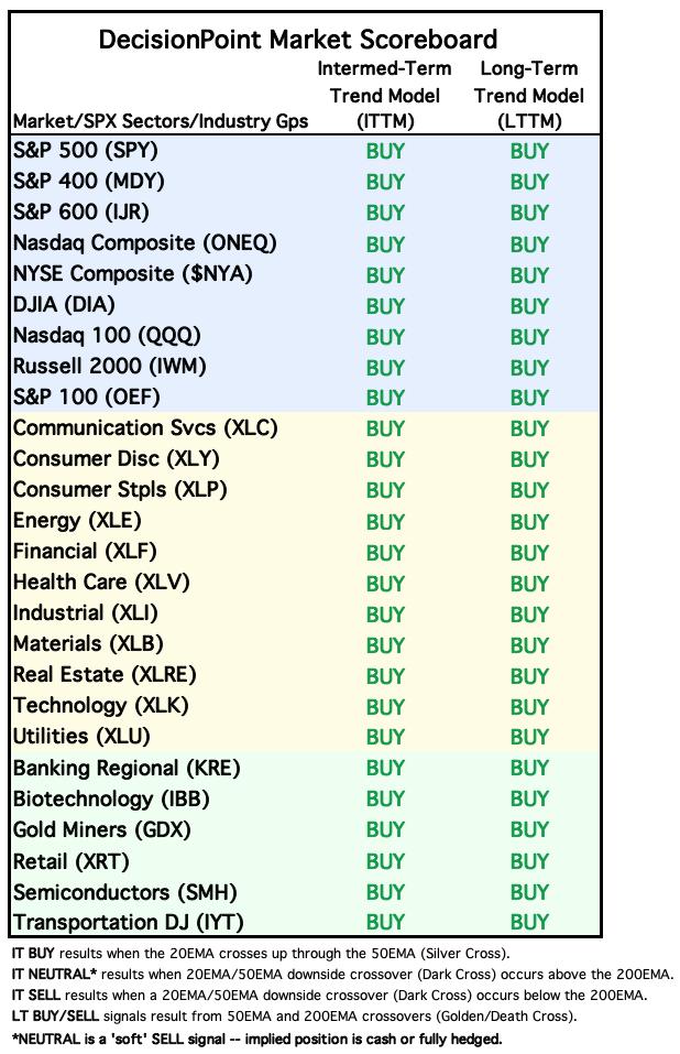
Next we have the DecisionPoint Market Scoreboard, which we publish daily in the DecisionPoint ALERT. It is current as of the close on October 17, 2024, and it is as good as it can get. This is good news and bad news. The good news is that the stock market is looking very healthy in terms of raw price action. The bad news is that the signal status is as good as it gets, and the pendulum will be swinging the other way, probably sooner than later.

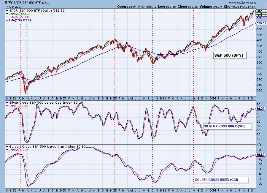
Along with the signal tracking, we have created the Silver Cross Index (SCI) and Golden Cross Index (GCI) for each of the market/sector indexes above. The Silver Cross Index shows the percentage of index components that are on a Silver Cross BUY signal. The Golden Cross Index shows the percentage of index components that are on a Golden Cross BUY signal.
The chart below is for the S&P 500 Index. Note that both the GCI and SCI show 80 percent of S&P 500 component stocks are on BUY Signals in both time frames. This is not as strong as in 2021, but it is very solid and partially backs up what we see on the DecisionPoint Market Scoreboard.

Conclusion: We check these charts every day, and are always aware of developing weakness and potential for signals to change. In the last few weeks, I found the picture to be unusually stable, and currently with no immediately impending signal changes. This, of course, could change in a heartbeat, but, for the moment, calm prevails. As I said, when things are as good as they can get, we should be alert for conditions to start deteriorating, but so far, so good.
Introducing the new Scan Alert System!
Delivered to your email box at the end of the market day. You'll get the results of our proprietary scans that Erin uses to pick her "Diamonds in the Rough" for the DecisionPoint Diamonds Report. Get all of the results and see which ones you like best! Only $29/month! You can also use our free trial to try it out for two weeks using coupon code: DPTRIAL2. Click HERE to subscribe NOW!
Learn more about DecisionPoint.com:
Watch the latest episode of the DecisionPointTrading Room on DP's YouTube channel here!

Try us out for two weeks with a trial subscription!
Use coupon code: DPTRIAL2 Subscribe HERE!
Technical Analysis is a windsock, not a crystal ball. --Carl Swenlin
(c) Copyright 2024 DecisionPoint.com
Disclaimer: This blog is for educational purposes only and should not be construed as financial advice. The ideas and strategies should never be used without first assessing your own personal and financial situation, or without consulting a financial professional. Any opinions expressed herein are solely those of the author, and do not in any way represent the views or opinions of any other person or entity.
DecisionPoint is not a registered investment advisor. Investment and trading decisions are solely your responsibility. DecisionPoint newsletters, blogs or website materials should NOT be interpreted as a recommendation or solicitation to buy or sell any security or to take any specific action.
Helpful DecisionPoint Links:
Trend Models
Price Momentum Oscillator (PMO)
On Balance Volume
Swenlin Trading Oscillators (STO-B and STO-V)
ITBM and ITVM
SCTR Ranking
Bear Market Rules
|
| READ ONLINE → |
|
|
|
| MORE ARTICLES → |
|


 Walt Disney Co. (DIS) has struggled as a business over the past few years and isn't on many investors' radars these days. However, Disney seems to have turned a corner last quarter and is positioned for a resurgence in its core theme parks and streaming businesses.

 Despite a light economic data week, the stock market continued its rally, with the S&P 500 ($SPX) and the Dow Jones Industrial Average ($INDU) closing at record highs. How many times have we heard that? This is the sixth positive week for the three indexes.


 When the market is rallying in full swing, it can sometimes be difficult to select which stocks, among the hundreds, might present the best case to buy. For spotting the strongest stocks on a technical basis, the


