TAKEAWAYS
- The MACD and PPO indicators are trend-following devices designed to confirm a trend reversal has occurred.
- The histogram shows when the MACD indicator is showing signs of a potential reversal, providing more of a leading indicator.
- Investors can use other indicators, such as the Chandelier Exit system, on shorter time frames to help confirm the signals on the weekly chart.
The Moving Average Convergence/Divergence (MACD) indicator, created by technical analyst Gerald Appel, is a technical indicator designed to confirm once a trend change has occurred. Based on exponential moving averages, it is not built to anticipate a price reversal, but rather to identify that one has already occurred.
The lesser-known MACD histogram can actually provide a powerful leading indicator as to when a turning point could be just around the corner. Today, we'll use the weekly chart of IBM to show how, by combining these two techniques, we can anticipate potential reversals and then confirm when and how the trend has shifted.
Using the MACD or PPO Indicator to Define the Trend
To start this discussion, let's be clear on why we're using the PPO indicator instead of MACD on our example charts. The MACD indicator is based on the price difference between two exponential moving averages, while the PPO indicator is based on the percent difference between those two averages.
For a short-term time frame, the indicators are almost identical and either one can be used for effective signals. For long-term time frames, however, using percentage terms instead of price terms allows for a more consistent comparison, especially if the stock or ETF has experienced big price swings.
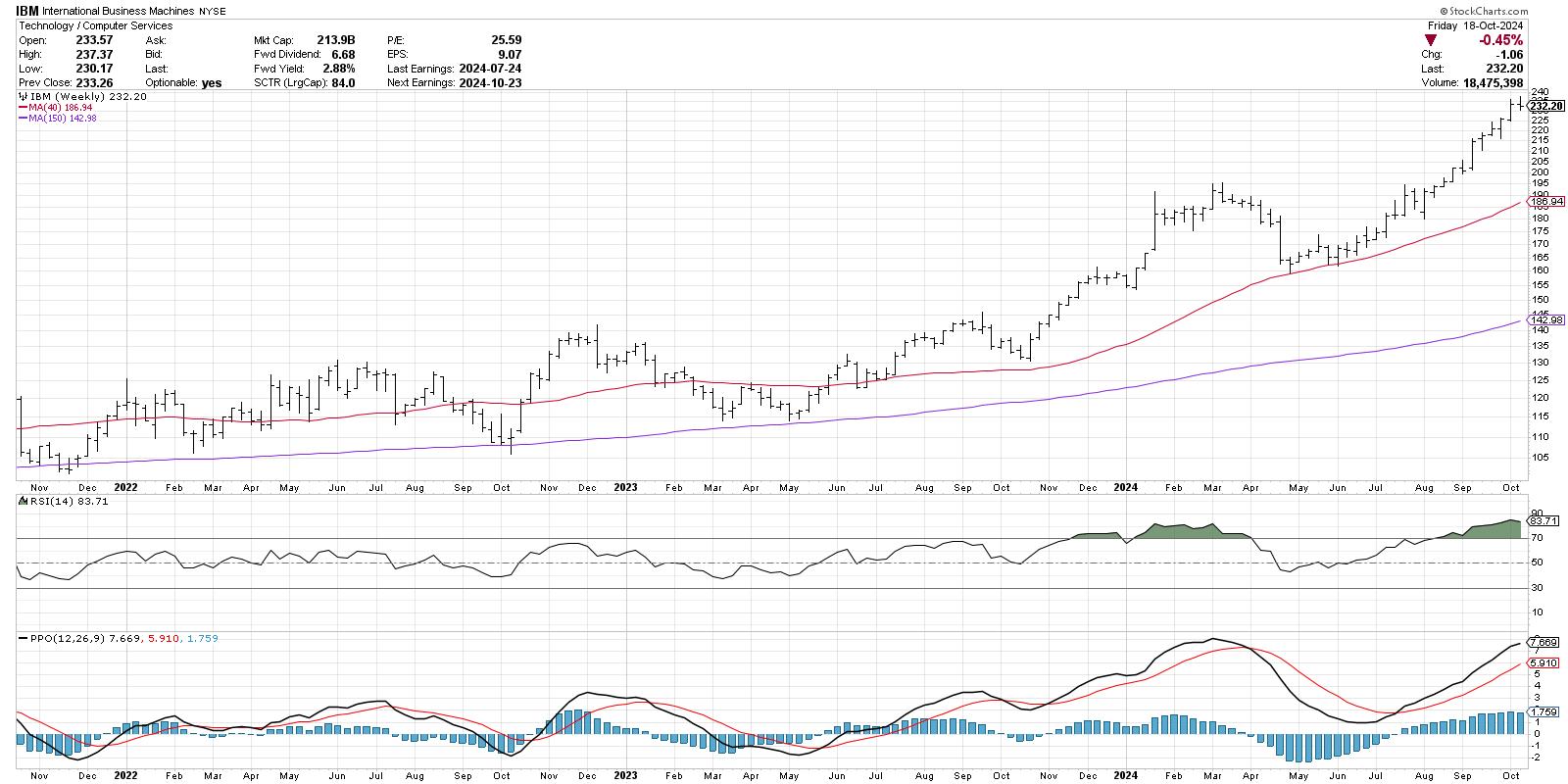
On the weekly chart of International Business Machines (IBM), the PPO indicator (bottom panel) starts with the PPO line, which represents the difference between the 12- and 26-week exponential moving averages. Then we have the red signal line, which is simply a 9-bar moving average of the PPO line.
Note the sell signal in late March 2024, when the PPO line crossed down through the red signal line. Conversely, the buy signal in mid-July is based on the PPO line crossing back up through the red signal line. At the present time, the PPO indicator suggests the uptrend is alive and well, with the PPO line sloping higher above the red signal line.
Adding the Histogram Helps to Anticipate the Signals
See how the sell signal in March came after the peak had occurred, and the price was already in a new downtrend?Also, notice how the buy signal in July appeared well after the actual price low in April?
This is actually by design, as the PPO indicator is considered a lagging indicator. It's not designed to tell you a reversal may be coming soon, but rather that a reversal recently happened and is now being confirmed. But what if we want to anticipate those reversals before they occur?
The PPO histogram, shown behind the PPO indicator in blue, represents the difference between the PPO line and the signal line. Go back to that March peak, and you may notice that the histogram had started to slope downward starting in February. Then, in May, right as the price was finding a new swing low, the histogram started to slope back upwards.
So, to summarize the components, the histogram reversals raise the "red flag" that a potential price reversal is coming, and then the actual PPO crossover confirms that the trend reversal has actually occurred. Now we can use the PPO indicator as both a leading and a lagging indicator!
Using the Histogram With Other Indicators
Fast forward to October 2024, and you'll see that this week the PPO histogram moved slightly lower. This could represent the early warning of an impending top for IBM. For this situation, I like to go to a lower time frame, in this case the daily chart, and use trend-following techniques to confirm a breakdown on the shorter time frame. While the weekly may still be my main indication, a sell signal could come earlier on the daily chart and help me to take action before the pain gets too unbearable!
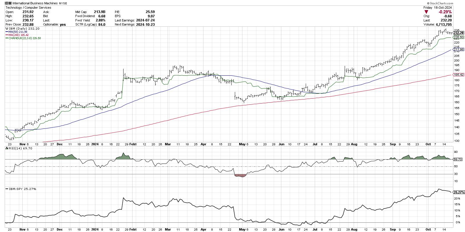
Here I'm showing the Chandelier Exit system, which is a trailing stop indicator based on Average True Range (ATR). As long as IBM remains above the Chandelier Exit, the uptrend is most likely still alive and well on the daily chart. A breakdown of this trailing stop could help me confirm the bearish divergence we've noted on the weekly PPO chart.
The technical analysis toolkit consists mainly of leading indicators and lagging indicators. While I primarily use lagging indicators to follow the trends and confirm trend reversals, I have also found leading indicators such as the PPO histogram to be a vital part of managing risk and identifying opportunities for my portfolio.
RR#6,
Dave
P.S. Ready to upgrade your investment process? Check out my free behavioral investing course!
David Keller, CMT
President and Chief Strategist
Sierra Alpha Research LLC
Disclaimer: This blog is for educational purposes only and should not be construed as financial advice. The ideas and strategies should never be used without first assessing your own personal and financial situation, or without consulting a financial professional.
The author does not have a position in mentioned securities at the time of publication. Any opinions expressed herein are solely those of the author and do not in any way represent the views or opinions of any other person or entity.