| THIS WEEK'S ARTICLES |
| Martin Pring's Market Roundup |
| MEMBERS ONLY |
| Several Intermarket Relationships Precariously Positioned for Stocks |
| by Martin Pring |
|
Chart 1 compares the S&P Composite with the NYSE A/D Line and its Common Stock counterpart. These, of course, are not intermarket relationships, but the chart does show that some near-term weakness would violate their bull market trendlines...
|
| READ ONLINE → |
|
|
|
| OptionsPlay |
| Pumping the Brakes on Ferrari (RACE) |
| by Tony Zhang |
Despite its position as a luxury automaker synonymous with prestige and performance, Ferrari N.V. (RACE) may be showing signs of a near-term downturn. Recent price action, coupled with stretched valuations and slowing shipment trends, suggests that RACE may face potential downside.
By incorporating both technical and fundamental analysis, we can see a compelling risk/reward setup for a bearish trade. The best part? This opportunity was identified automatically by the OptionsPlay Strategy Center within StockCharts.com, showcasing how you can effortlessly discover trades like this on your own.
Technical Analysis
From a technical perspective, the chart reveals a concerning pattern:
- Broken Support: After breaking below $460 support in early November, RACE has rallied back to retest this level as resistance, providing a favorable risk/reward for bearish exposure.
- Underperformance: Its underperformance relative to the S&P 500 with negative momentum further reinforces the case for downside toward the $400 support level.
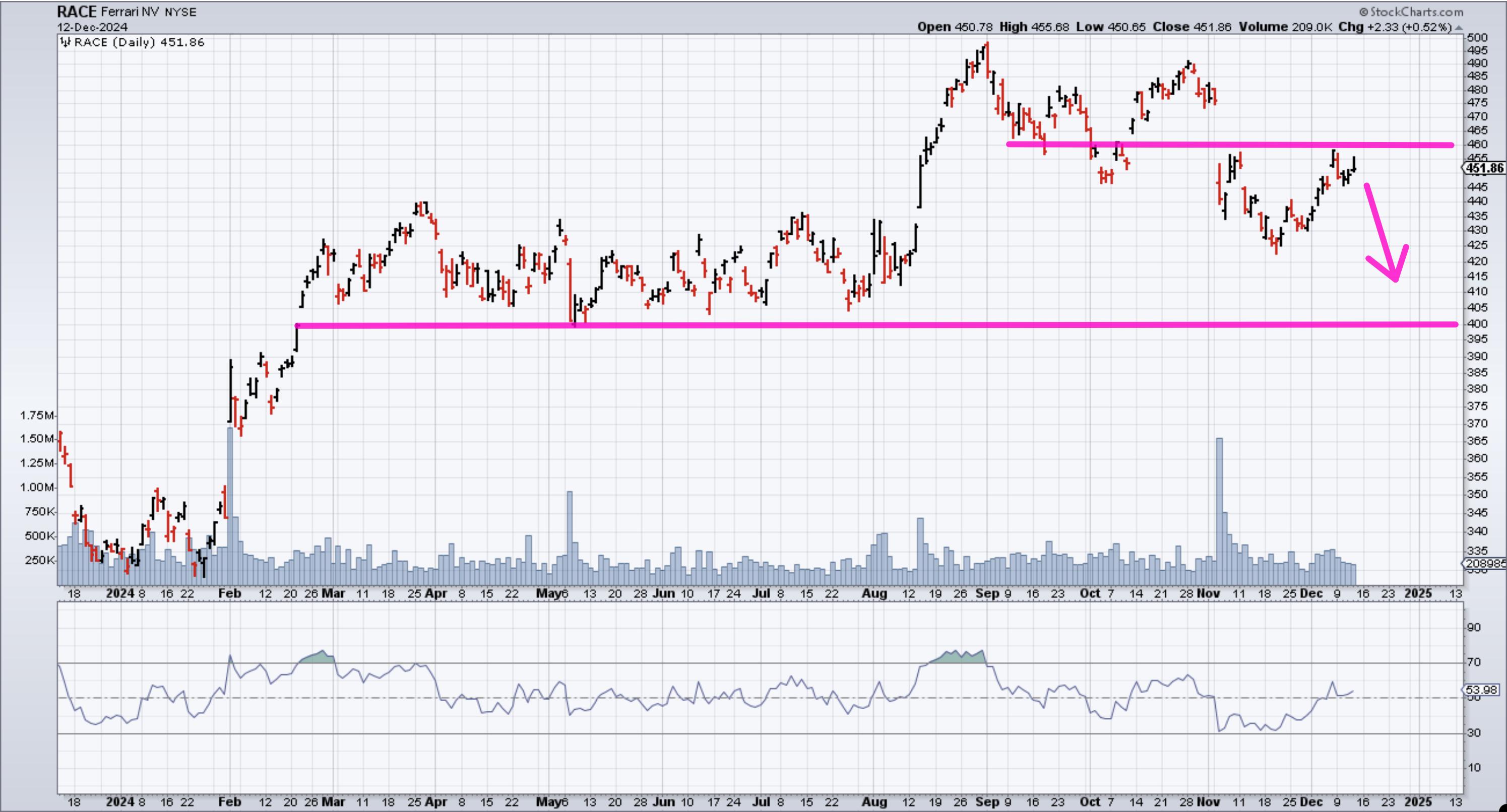 FIGURE 1. DAILY CHART OF FERRARI NV. The stock has broken support and is underperforming relative to the S&P 500. Chart source: StockCharts.com. For educational purposes. FIGURE 1. DAILY CHART OF FERRARI NV. The stock has broken support and is underperforming relative to the S&P 500. Chart source: StockCharts.com. For educational purposes.
Fundamental Analysis
RACE's valuation appears lofty, given its modest growth profile:
- High Valuation, Moderate Growth: Trading at 47x forward earnings, RACE commands a substantial 490% premium to the industry. Yet expected revenue growth of only 9% and EPS growth of 12% offer limited justification for such a rich multiple.
- Margins and Premium Pricing: To its credit, Ferrari boasts a best-in-class net margin of 22%; however, even premium margins fall short of supporting the current multiple without correspondingly robust growth.
Recent quarterly results highlight the concerning picture. Although Q3 2024 saw net revenues increase by 6.5, shipments declined by 76 units year-over-year, with notable weaknesses in key regions like China, Hong Kong, and Taiwan. Rising SG&A expenses—driven by digital initiatives and brand investments—also weigh on near-term profitability. While Ferrari's emphasis on hybrids and personalization points toward innovation and resilience, the current fundamentals do not convincingly justify its elevated valuation.
Options Strategy
Given the bearish timing and valuation concerns, a put vertical spread offers a defined-risk way to position for potential downside. The OptionsPlay Strategy Center suggests buying the February $460/$410 Put Vertical at a $18.30 debit:
- Buy: February $460 Put @ $24.30
- Sell: February $410 Put @ $6.00
- Net Debit: $18.30 per share or $1,830 total per contract
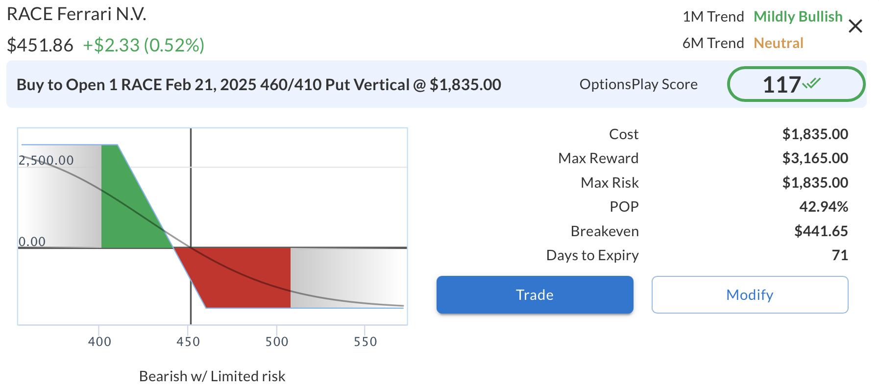 FIGURE 2. BUYING A PUT VERTICAL SPREAD IN FERRARI NV. Here you see the strategy details of buying a Feb. 21, 2025 $460/$410 put vertical.Image source: OptionsPlay Strategy Center in StockCharts.com. For educational purposes. FIGURE 2. BUYING A PUT VERTICAL SPREAD IN FERRARI NV. Here you see the strategy details of buying a Feb. 21, 2025 $460/$410 put vertical.Image source: OptionsPlay Strategy Center in StockCharts.com. For educational purposes.
This strategy:
- Maximum Potential Risk: $1,830
- Maximum Potential Reward: $3,165
- Breakeven Point: $441.65
- Probability of Profit: ~43%
If RACE remains under pressure and trades below $441.65 by February 21, 2025, this strategy stands to benefit, offering an attractive risk-to-reward profile for bearish traders.
Unlock Real-Time Trade Ideas with OptionsPlay Strategy Center
This bearish opportunity on RACE emerged within seconds, courtesy of the OptionsPlay Strategy Center on StockCharts.com. By employing its Bearish Trend Following scan, the platform identified RACE as a candidate, then structured an optimal options trade to match the bearish thesis—no lengthy research required.
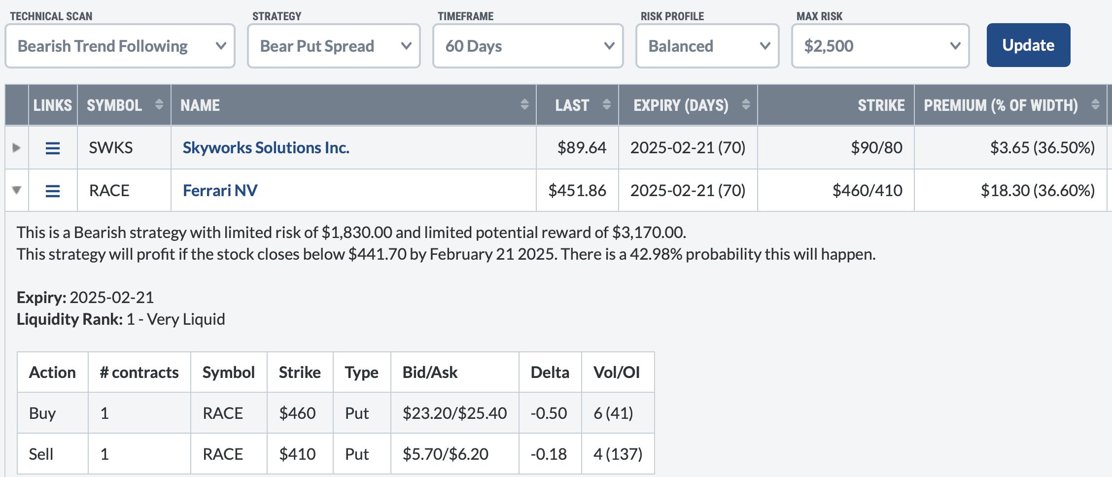 FIGURE 3. FERRARI NV WAS A CANDIDATE UNDER THE BEARISH TREND FOLLOWING SCAN. FIGURE 3. FERRARI NV WAS A CANDIDATE UNDER THE BEARISH TREND FOLLOWING SCAN.
Image source: OptionsPlay Strategy Center in StockCharts.com.
By subscribing to the OptionsPlay Strategy Center, you can:
- Effortlessly Discover Trading Opportunities: Market scans highlight potential trades in real-time, tailored to your market outlook.
- Receive Optimal Trade Structures: Access pre-calculated options strategies that align with your view, risk tolerance, and profit targets.
- Save Time and Enhance Efficiency: Eliminate hours of research—find the best options trades within seconds, every day.
Don't let valuable trading opportunities slip away. Subscribe to the OptionsPlay Strategy Center today and empower your trading journey with the tools and insights you need to stay ahead of the market.
|
| READ ONLINE → |
|
|
|
| Don't Ignore This Chart! |
| Why Cisco's Stock Reversal Could Be a Game-Changer |
| by Jayanthi Gopalakrishnan |
 Stocks can move fast, like the speed of an arrow flying through the air. And if you don't monitor your charts, you can easily miss a trading opportunity. Stocks can move fast, like the speed of an arrow flying through the air. And if you don't monitor your charts, you can easily miss a trading opportunity.
Last week, I wrote about CSCO stock, one of the stocks filtered in my StockCharts Technical Rank (SCTR) scan. At the time, I was waiting for CSCO's stock price to pull back to its 21-day exponential moving average (EMA). Well, it happened a lot quicker than I anticipated.
It's good that I go through all my ChartLists every trading day. The pullback also coincided with the upward-sloping trendline. It was accompanied by declining relative performance against the Nasdaq Composite ($COMPQ) and a decline in the value of the full stochastic oscillator.
Is this a classic buy-the-dip moment? To answer the question, let's look at the daily chart of CSCO.

FIGURE 1. DAILY CHART OF CSCO STOCK. The uptrend is still in play, making the pullback to the 21-day EMA an attractive entry point.Chart source: StockCharts.com. For educational purposes.
The uptrend broke slightly to the downside, but the support from the 21-day EMA was strong. Thursday's price action indicated a reversal is possible.
The stochastic oscillator is approaching the 50 level and is starting to turn higher. The last two times CSCO's stock price pulled back to the 21-day EMA, the oscillator turned up at around the 50 level. I'll be watching to see if a similar scenario unfolds this time.
CSCO's price action looks attractive. I'm ready to open a long trade in CSCO when the %K line crosses over the %D in the stochastic oscillator. CSCO's stock price hit an all-time high in early December, so a pullback is a prime time to open a long position if all your criteria are met.
The Game Plan
Cisco Systems may not be a direct AI play, but it is a networking company, and the stock could benefit from tech companies' increased AI spending. So it's not too far-fetched to anticipate CSCO's stock price to ride along with the AI wave.
Thursday's price action does not yet confirm a bullish upswing, but I'll watch this chart closely. It's an opportunity I don't want to miss.
Even if it looks like a near-perfect setup to buy on the dip, there's still a chance the trade could go against me. If I enter a position at around $59 and the trade goes south, the 50-day SMA would be my maximum stop loss.

Disclaimer: This blog is for educational purposes only and should not be construed as financial advice. The ideas and strategies should never be used without first assessing your own personal and financial situation, or without consulting a financial professional.
|
| READ ONLINE → |
|
|
|
| ChartWatchers |
| How to Spot Low-Volatility Stocks That are Ready to Explode |
| by Karl Montevirgen |
 As the year winds down, investors are beginning to position their portfolios for the New Year. I'm considering it, and perhaps you are too. As the year winds down, investors are beginning to position their portfolios for the New Year. I'm considering it, and perhaps you are too.
Next year, in addition to the seasonal rotations among sectors, we have a plot twist: a new administration in D.C. likely to bring disruptive policy changes affecting the market.
The Financials sector is expected to perform well under the new administration. If that's the case, it's worth taking a closer look at this sector and identify which stocks to watch for potential buy opportunities. If you're already considering financial stocks and looking to fine-tune an entry before year-end, then consider those that have pulled back or are trading in a tight, low-volatility consolidation range—prime candidates for a potential bounce.
How can you spot these opportunities? One way is to use MarketCarpets' Bollinger Band Width setting.
On Monday, I used this tool with the Latest Value setting, which provides a score between 0 to 100. The closer to zero, the narrower the BandWidth. The narrower the BandWidth, the greater the likelihood of spotting a "squeeze" leading to a significant price move or a breakout.

FIGURE 1. MARKETCARPETS BOLLINGER BAND WIDTH SET TO LATEST VALUE. It won't be surprising if most of the big stocks on the list with the lowest value exhibit similar patterns.Image source: StockCharts.com. For educational purposes.
If you look at the table on the right, you'll see that the three biggest stocks with the lowest chart values are Visa (V), Mastercard (MA), and Berkshire Hathaway B shares (BRK/B). If you were to continue scrolling, the three big banks with the narrowest Bollinger Bandwidths are Bank of America (BAC), Morgan Stanley (MS), Goldman Sachs (GS), and JP Morgan Chase (JPM). For many investors, some of these shares are quite expensive. So, let's consider that and focus on the stocks that are more relatively affordable to most readers: BAC, MS, and JPM.
Before diving into these stocks, let's examine the sector's breadth using a daily chart of the S&P FInancial Bullish Percent Index ($BPFINA). We'll also compare the relative performance of the Invesco KBW Bank ETF (KBWB) as a proxy for the large U.S. banking industry against the Financial Select Sector SPDR (XLF), which represents the broader financials sector.
Sector Breadth and Relative Performance of Banks vs. Sector
The $BPFINA shows the percentage of stocks signaling Point & Figure "buy" signals. Right now, 91% of S&P financial stocks are flashing buy signals (see below).

FIGURE 1. FINANCIAL SECTOR BULLISH PERCENT INDEX. The Financial sector is bullish but potentially overbought.Chart source: StockCharts.com. For educational purposes.
While a BPI figure above 50% is bullish, above 70% signals that the sector is potentially overbought. On an industry level, the banking industry is outperforming broader financials by 11% and rising.
Bank of America
Let's get to the stocks, starting with a daily chart of BAC.

FIGURE 2. DAILY CHART OF BANK OF AMERICA. Is the stock poised for a big move up or down?Chart source: StockCharts.com. For educational purposes.
There's a lot here, so I'll bullet the key points:
- BAC's technical strength, as measured by the StockChartsTechnical Rank (SCTR) is slightly declining, but at a level just below 70, it signals only slight weakness.
- The Bollinger BandWidth has decreased significantly, and BAC's price is above the lower band. This doesn't signify a squeeze as much as a low volatility pullback. But what are the chances that BAC is likely to decline further?
- On a relative performance scale, BAC is slightly underperforming its industry, down barely 2%.
- In terms of momentum, there's a divergence between indicators: On Balance Volume (OBV) suggests high buying pressure, possibly driven by retail investors, while Chaikin Money Flow (CMF) indicates strong selling pressure, likely reflecting institutional activity.
BAC is one of the largest US banks, so I'd add it to my ChartList as a possible prospect for a longer-term investment. However, given the mixed technical signals, I consider this a wait-and-see moment, observing how price reacts at current levels and whether the OBV and CMF can align if BAC continues its move to the upside.
How does BAC compare with Morgan Stanley?
Morgan Stanley
Let's take a look at a daily chart.

FIGURE 3. DAILY CHART OF MS. The stock's performance, as measured by SCTR, is performing slightly better than BAC.Chart source: StockCharts.com. For educational purposes.
- MS's SCTR score, at 83, is stronger than BAC's and close to the 90 level, which might be considered exceedingly bullish.
- As its Bollinger BandWidth narrows, the stock has also fallen below support, coming out of a rounding top, and looking to fill the wide gap made at the beginning of November.
- MS is slightly outperforming its industry peers by slightly over 3%, better than BAC's relative performance.
- Selling pressure, however, is strong, and the OBV and CMF appear to align.
This appears to be a classic pullback scenario. I would add this to my ChartList, as MS is one of the biggest players in the industry, but I'd wait for a bounce and monitor a bullish reversal in both the OBV and CMF before considering a long position.
JP Morgan Chase
Finally, let's look at the last big bank on my list: JP Morgan Chase. Below is a daily chart.

FIGURE 4. DAILY CHART OF JPM. The divergence in the OBV and CMF is something to watch carefully.Chart source: StockCharts.com. For educational purposes.
- JPM's SCTR score of 76 is declining, yet still relatively bullish.
- Its Bollinger BandWidth indication is similar to the two we just viewed. In JPM's case, traders seem hesitant to commit to any direction as price settles right below the middle band. It's as if they're waiting for some indication to trigger movement in one direction or another.
- Regarding relative performance, JPM is barely outperforming its industry peers, by a little over 1%.
- Similar to the BAC example, there appears to be a potential, yet prominent divergence between retail buying and institutional selling, as the OBV has been climbing while the CMF has been steadily declining.
JPM is sitting in a near-term holding pattern. It's going to break eventually. But for now, the market appears unable to commit to a given direction, and the mixed momentum signals seem to support this view. It's best to monitor this on my ChartList and wait for stronger bullish signals and a definitive reversal to the upside before jumping in. In short, patience.
At the Close
Planning the coming year, I focused on a given sector (Financials) and used MarketCarpets' Bollinger BandWidth setting to identify stocks with tight, low-volatility setups that might signal a breakout opportunity. This led me to BAC, MS, and JPM. While these stocks remain on my ChartList as longer-term prospects, I'm opting for a wait-and-see approach. Fine-tuning an entry is important. And while there are many ways you can do this, I just showed you one approach that might just come in handy given the right circumstances.

Disclaimer: This blog is for educational purposes only and should not be construed as financial advice. The ideas and strategies should never be used without first assessing your own personal and financial situation, or without consulting a financial professional.
|
| READ ONLINE → |
|
|
|
| The Mindful Investor |
| Will the QQQ Sell Off in January? Here's How It Could Happen |
| by David Keller |
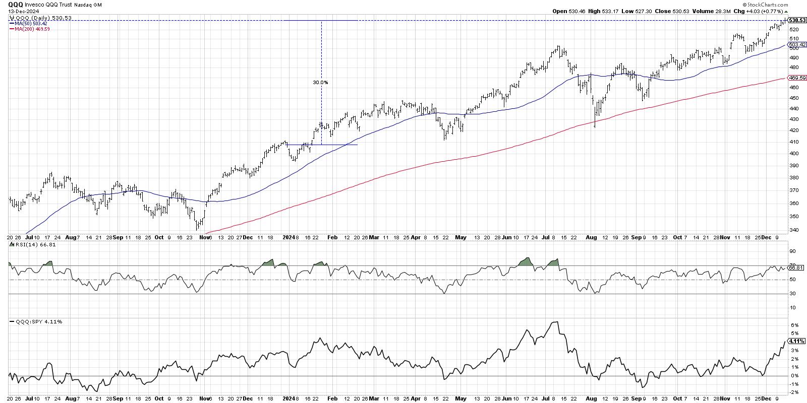
In recent interviews for my Market Misbehavior podcast, I've asked technical analysts including Frank Cappelleri, TG Watkins, and Tom Bowley what they see happening as we wrap a very successful 2024. With the Nasdaq 100 logging about a 30% gain for 2024, it's hard to imagine that incredible bullish continuing into 2025. But it is definitely possible!

Q4 has seen the return of the dominance of the Magnificent 7 stocks, with charts like META breaking to new all-time highs. Despite weaker market breadth conditions all around, indexes like the Nasdaq 100 have remained quite strong, driven by the strength in mega-cap growth.
While Q4 of an election year tends to be quite strong, once investors are able to gain at least some clarity of what to expect in terms of policy changes in the years to come, Q1 of a post-election year tends to have mixed results! So today, we'll lay out four potential outcomes for the Nasdaq 100, and as I share each of these four future paths, I'll describe the market conditions that would likely be involved, as well as my estimated probability for each scenario.
By the way, we conducted a similar exercise for the Nasdaq 100 back in September, and you won't believe which scenario actually played out!
And remember, the point of this exercise is threefold:
- Consider all four potential future paths for the index, think about what would cause each scenario to unfold in terms of the macro drivers, and review what signals/patterns/indicators would confirm the scenario.
- Decide which scenario you feel is most likely, and why you think that's the case. Don't forget to drop me a comment and let me know your vote!
- Think about how each of the four scenarios would impact your current portfolio. How would you manage risk in each case? How and when would you take action to adapt to this new reality?
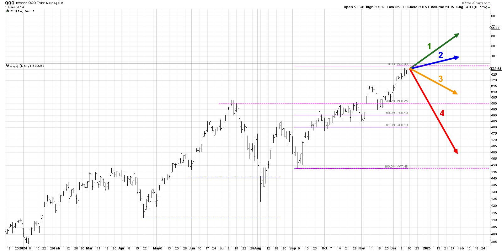
Let's start with the most optimistic scenario, with the QQQ achieving a new all-time high over the next six to eight weeks.
Option 1: The Very Bullish Scenario
For the most bullish scenario, I basically assumed that the uptrend we've observed since September continues at a very similar pace. That would mean the QQQ could reach up to around $560 or so by the end of January. For that to happen, we'd need charts like NVDA to resume their uptrends, charts like META to hold their recent breakout levels, and all the other sectors to resume a more bullish configuration!
Dave's Vote: 10%
Option 2: The Mildly Bullish Scenario
What if the Magnificent 7 names slow down a bit, and even though other sectors like financials and industrials begin to outperform, it's just not enough to push the benchmarks much higher? Scenario 2 would mean a slower pace to the recent advance, but the bullish phase would still keep the QQQ this week's close around $530. Perhaps the Fed meeting next week suggests a more measured pace to rate cuts in early 2025, and investors grow a bit more skeptical that this market euphoria will continue.
Dave's vote: 20%
Option 3: The Mildly Bearish Scenario
The bearish scenarios basically assume that this week's high is about it, and that even though we may drift a bit higher into year end, January 2025 looks a lot like January 2022. The mildly bearish Scenario means we pull back a bit, but not enough to push the Nasdaq 100 below "big round number" support at $500.
There are a number of ways this could play out, but perhaps the first run of economic data in January, combined with a disappointing beginning to earnings season, makes us all realize that the euphoria of 2024 is now in the rearview mirror!
Dave's vote: 60%
Option 4: The Super Bearish Scenario
You always need a super bearish scenario, if only to remember that it's always a possibility regardless of whatever's happened in recent months! Scenario 4 would mean about a 15% decline in January, which would actually be a fairly reasonable corrective move based on market history.
If economic data shows that inflation is not remaining in the 2-3% range, or if earnings season is punctuated by a series of high profile misses, or if the Magnificent 7 all begin breaking down, this super bearish scenario could become a reality in short order.
Dave's vote: 10%

What probabilities would you assign to each of these four scenarios? Check out the video below, and then drop a comment with which scenario you select and why!
RR#6,
Dave
P.S. Ready to upgrade your investment process? Check out my free behavioral investing course!
David Keller, CMT
President and Chief Strategist
Sierra Alpha Research LLC
Disclaimer: This blog is for educational purposes only and should not be construed as financial advice. The ideas and strategies should never be used without first assessing your own personal and financial situation, or without consulting a financial professional.
The author does not have a position in mentioned securities at the time of publication. Any opinions expressed herein are solely those of the author and do not in any way represent the views or opinions of any other person or entity.
|
| READ ONLINE → |
|
|
|
|
|
| Art's Charts |
| Fintech Leadership Provides Good Hunting Ground for Bullish Setups |
| by Arthur Hill |
Chartists looking for stock setups can start with strong industry groups. The Fintech (FINX) is in a strong uptrend and leading, but looking extended short-term. While there is no setup currently, we can learn from past setups and apply these lessons to stocks within the group.
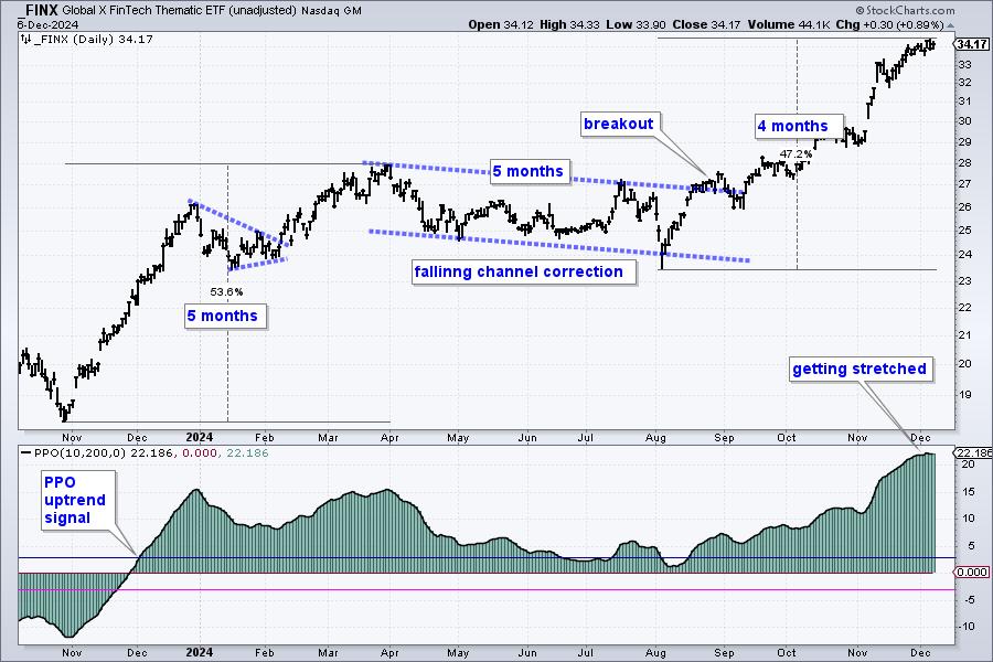
FINX is both strong and extended. The chart shows FINX advancing 53.6% from November to March. It then moved into a long corrective period as the falling channel formed over the next five months. This correction ended with a breakout in late August and the ETF recorded its first new high in mid September. FINX extended further and led the market over the last four months.

Even though FINX shows no signs of weakness on the price chart, it is becoming quite extended because the 10-day EMA is over 20% above the 200-day EMA. The bottom window shows this difference using the PPO(10,200,0). I use this mostly as trend indicator. It turns bullish with a move above +3% and bearish with a move below -3%. These signal buffers reduce whipsaws and catch big trends.
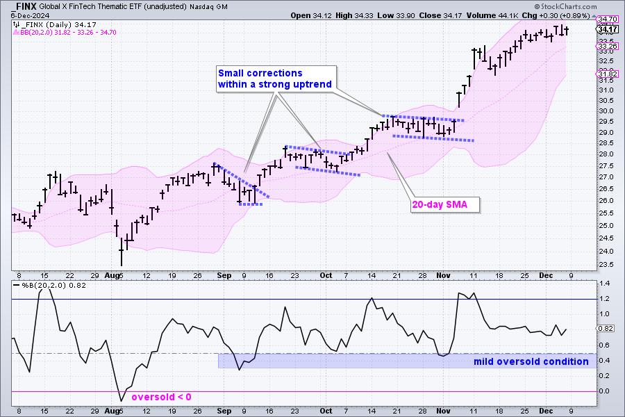
With FINX looking extended, it is time to exercise some patience and wait for the next opportunity. The blue dashed lines show short-term bullish continuation patterns within the strong uptrend. These represent tradable pullbacks. We can use these examples as a guide in the future, and also look for tradable pullbacks individual fintech stocks.

The indicator window shows %B, which quantifies the relationship between the close and the 20-day SMA. The pullbacks were quite mild as %B dipped below .50 just twice. This means the close was below the 20-day SMA, which is the middle line on the Bollinger Bands. A decline to the 20-day SMA signals a pullback within the uptrend and this is an opportunity, not a threat.
Extended or not, FINX is still a leader and still in a strong uptrend. This means fintech stocks provide a good hunting ground for bullish setups. Pullbacks and oversold conditions provide opportunities. This report continues at TrendInvestorPro where I feature a fintech stock with one such setup. Click here to see the full report and learn more. This week we featured tradable setups in over a dozen ETFs and stocks.
//////////////////////////////////////////////
|
| READ ONLINE → |
|
|
|
| Trading Places with Tom Bowley |
| Identifying GREAT Trades and Looking Ahead to 2025 Using RRG Charts |
| by Tom Bowley |
There are a number of ways that you can find great trading opportunities. One way is to simply follow a chart on a WatchList and wait for certain indicators to reach "buy" points. For instance, an uptrending stock many times will find support as its 20-day EMA is tested or when its RSI approaches 40 during pullbacks. For this article, however, I want to show you an interesting way to use RRG charts to accomplish the same thing, only RRG charts might be better for traders who visualize movements better when comparing relative moves.
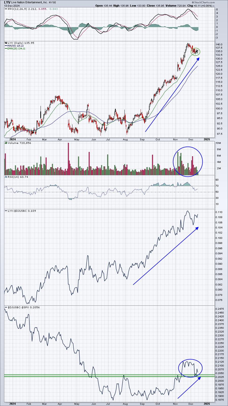
Live Nation (LYV) is in the communication services (XLC) sector and from early-August through late-November, it was in a stealth uptrend outpacing nearly all stocks on a relative basis as it gained over 60% in that 3 1/2 month span. I like to see 20-day EMA tests and this one is quite clear:

There's a lot to like here as LYV's industry group - broadcasting & entertainment ($DJUSBC) - is now showing much better relative strength to the S&P 500. In other words, money is rotating INTO the entertainment area and, as an industry group leader, LYV is reaping the rewards. The early-December selloff has taken LYV out of overbought territory on its RSI and allowed it to test its rising 20-day EMA, setting up for a bounce.
If I use the weekly and daily RRG charts and dissect the component stocks within the communication services sector, here's what I find:
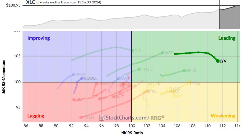
Weekly RRG - XLC

I've highlighted LYV as it's the furthest XLC component stock to the right and in the leading quadrant, showing both strong bullish momentum and excellent relative strength. That tells us that we have a stock worth watching for possible trade setups during periods of short-term selling. For that short-term selling and how it looks on a daily RRG, let's drill down to that time frame and check it out.
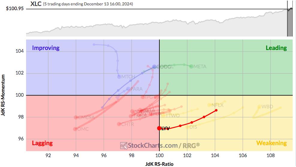
Daily RRG - XLC

Once again, I've highlighted LYV so that you can visualize its movement from an RRG perspective. From experience, many leading stocks will have short-term pullbacks where they move all the way through the Weakening quadrant, only to turn higher and head back towards the Leading quadrant. LYV's sharp chart would show this as a rally back to test the recent price high. If and when that occurs, we'll see LYV's daily RRG chart turn back towards the Leading quadrant. But my point here isn't whether LYV moves higher again for us to make money. Instead, I'm simply pointing out how healthy stocks will look on their weekly and daily RRGs. The weekly chart will highlight a stock's powerful recent move higher and the daily chart will help us to identify those bullish stocks, and possible entry points, that are experiencing short-term weakness.
As a swing trader, this is EXACTLY what we want to look for.
Huge RRG Event
Saturday morning at 10:00am ET, Julius de Kempenaer, Sr. Technical Analyst here at StockCharts.com and the founder and creator of RRG charts, will join me for a FREE (no credit card required) EarningsBeats.com event, "Key Rotation Into 2025", where we'll use RRG charts to show everyone the critical rotation that's taking place now that will likely help shape the direction of our major indices during the balance of 2024 and throughout 2025. For more information and to register for the event, CLICK HERE.
If you cannot make the event live, those registering will receive a copy of the recording of the event that you can check out at your earliest convenience. So please register NOW and save your seat!
Happy trading!
Tom
|
| READ ONLINE → |
|
|
|
| DecisionPoint |
| Bearish Formation Threatens Gold's Advance |
| by Carl Swenlin |
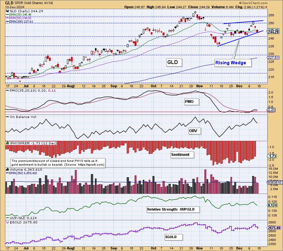
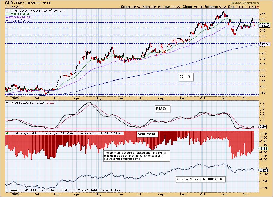
After the November pullback, GLD began to rally again. This week, on Wednesday, price exceeded the nearest November top, which made official the new rising trend from the November low. Brief celebration ends the following day as GLD tops, setting the top boundary for a bearish rising wedge formation. Rising wedges are bearish because they normally resolve downward.

GLD has rallied +40% since the February low, so it is entitled to take a break.

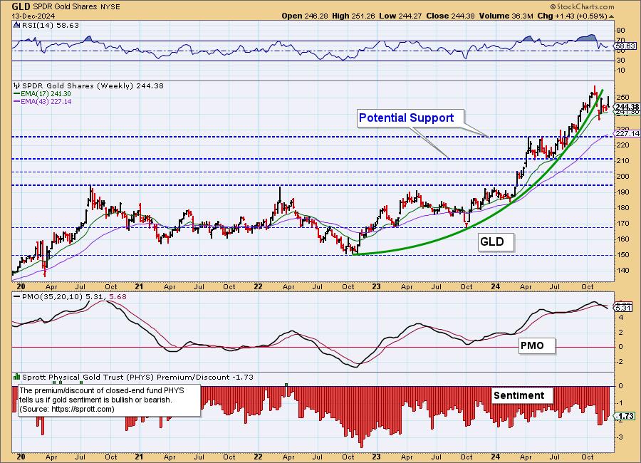
The weekly chart shows the root of the problem, which is the parabolic advance (+71%) from the 2022 low. Parabolic advances beg for correction, which can sometimes be severe. In the case of GLD, we do not expect more than a sideways digestion process to dampen the angle of ascent.

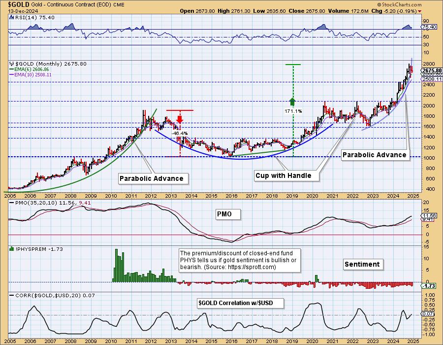
The monthly chart emphasizes the steepness of the advance to all-time highs, and the need for some digestion or correction. Should gold pull back, two support levels are apparent: 2450 and 2085. We think the second level is unlikely because sentiment is still too bearish.

Conclusion: Gold has had a very profitable rally since the 2022 low, and it would be beneficial for it to take a break with either a pullback or consolidation. It appears that that process has begun.
Introducing the new Scan Alert System!
Delivered to your email box at the end of the market day. You'll get the results of our proprietary scans that Erin uses to pick her "Diamonds in the Rough" for the DecisionPoint Diamonds Report. Get all of the results and see which ones you like best! Only $29/month! Or, use our free trial to try it out for two weeks using coupon code: DPTRIAL2. Click HERE to subscribe NOW!
Learn more about DecisionPoint.com:
Watch the latest episode of the DecisionPointTrading Room on DP's YouTube channel here!

Try us out for two weeks with a trial subscription!
Use coupon code: DPTRIAL2 Subscribe HERE!
Technical Analysis is a windsock, not a crystal ball. -- Carl Swenlin
(c) Copyright 2024 DecisionPoint.com
Disclaimer: This blog is for educational purposes only and should not be construed as financial advice. The ideas and strategies should never be used without first assessing your own personal and financial situation, or without consulting a financial professional. Any opinions expressed herein are solely those of the author, and do not in any way represent the views or opinions of any other person or entity.
DecisionPoint is not a registered investment advisor. Investment and trading decisions are solely your responsibility. DecisionPoint newsletters, blogs or website materials should NOT be interpreted as a recommendation or solicitation to buy or sell any security or to take any specific action.
Helpful DecisionPoint Links:
Trend Models
Price Momentum Oscillator (PMO)
On Balance Volume
Swenlin Trading Oscillators (STO-B and STO-V)
ITBM and ITVM
SCTR Ranking
Bear Market Rules
|
| READ ONLINE → |
|
|
|
| MORE ARTICLES → |
|


 Stocks can move fast, like the speed of an arrow flying through the air. And if you don't monitor your charts, you can easily miss a trading opportunity.

 As the year winds down, investors are beginning to position their portfolios for the New Year. I'm considering it, and perhaps you are too.


