| THIS WEEK'S ARTICLES |
| The Mindful Investor |
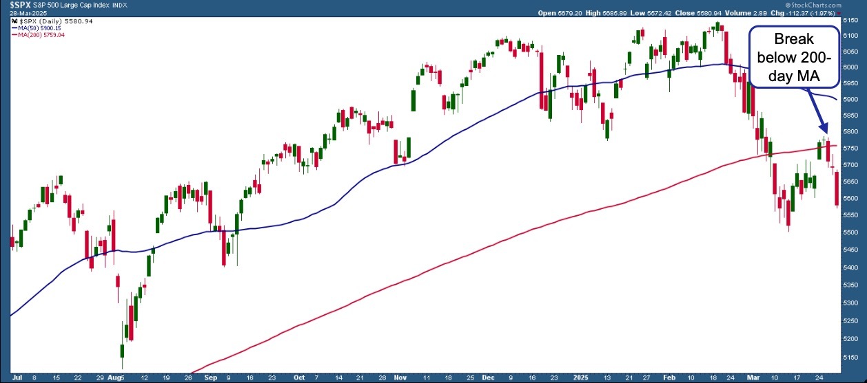
| Bear Flag Alert - Downside S&P 500 Target Update |
| by David Keller |
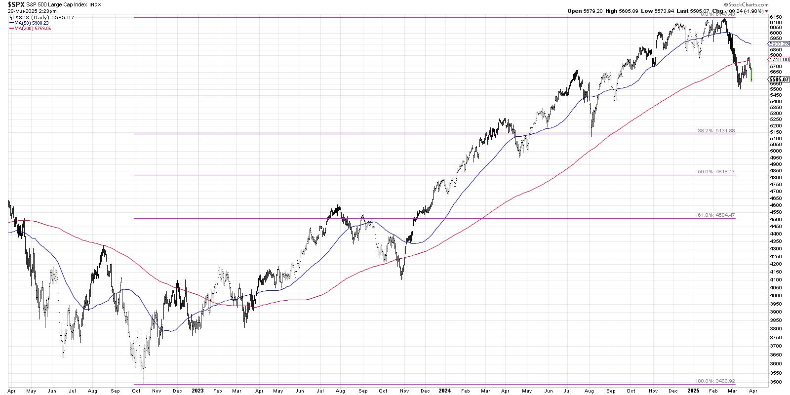
Friday's overheated inflation data appears to have initiated a new downward leg for the major equity averages. This could mean a confirmed bear flag pattern for the S&P 500, and potentially much further lows before this corrective period is complete.
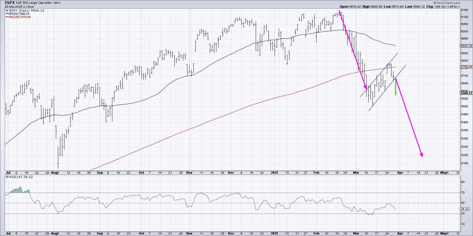
A bear flag occurs during a downtrend phase, where price begins a brief countertrend rally of higher highs and higher lows. This short-term uptrend swing formed by parallel trendlines represents a brief pause within the longer downtrend structure. If and when the price breaks below the lower trendline, that confirms the bear flag pattern and suggests a continuation of the bear phase.
A bear flag often occurs around the midpoint of the downtrend, which is why we can use the trend leading into the pattern as a way of projecting a minimum downside objective. Based on the daily S&P 500 chart, and assuming a confirmed bear flag pattern this week, that would suggest a downside objective around 5200.
How else can we corroborate this indicator that implies a 16% drop from the February all-time high? The good news is that patterns like this don't happen in a vacuum, so let's review how this analysis relates to other areas of the technical toolkit.
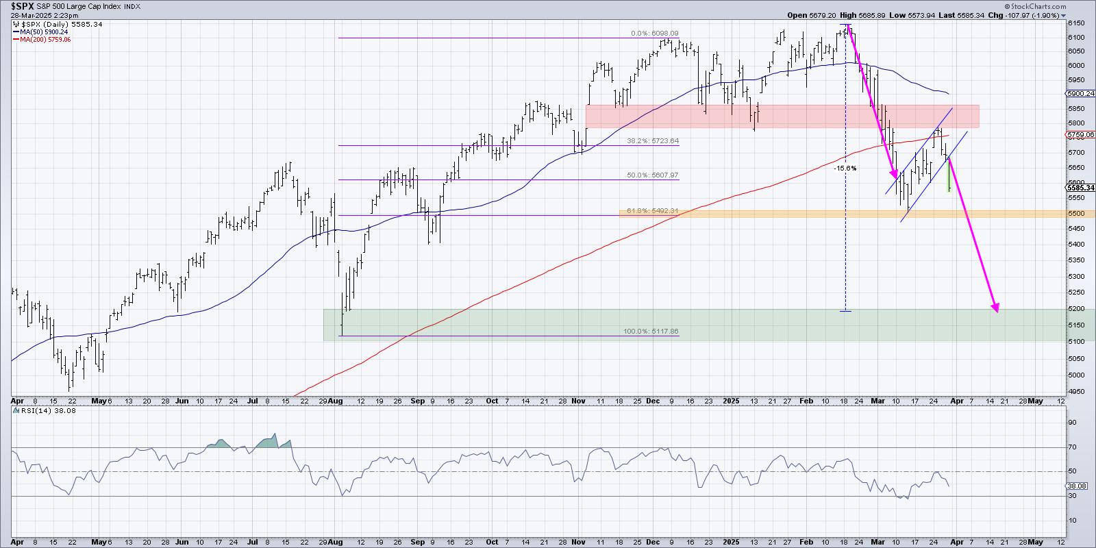
Here, we can see that the swing low from earlier in March lined up almost perfectly with a 61.8% retracement of the August 2024 to December 2024 bull phase. The subsequent bounce earlier this month drove the S&P 500 up to test its 200-day moving average from below, a level which coincided with the price gap formed around election day in November.
I always think of charts in terms of key price levels, what I call "lines in the sand," so I can set alerts and focus on taking action only when the chart confirms a new trend. In this case, the 5500 level seems to be the most important price point to monitor, as a violation of that support level would mean a breakdown through Fibonacci support as well as the March swing low.
Assuming a break below 5500, the S&P 500 would then have a clear path to a new downside objective in the 5100-5200 range. The 5200 target is derived from the bear flag pattern described today, while the 5100 level is based on a longer-term Fibonacci structure using the October 2022 low.
It's worth noting that none of these targets are absolute guarantees! Only by analyzing trend, breadth, and momentum readings along the way down can we validate the likelihood of further deterioration. I sign off every episode of my daily market recap show with the tagline, "It's always a good time to own good charts." Based on this week's bear flag pattern, the S&P 500 just isn't a good chart.
One more thing... We interviewed options expert Jay Soloff last week on the Market Misbehavior podcast in what ended up being a masterclass on the VIX. If you've ever wondered what the VIX represents and how investors can use it to assess market conditions, you should make the time to listen in!
RR#6,
Dave
P.S. Ready to upgrade your investment process? Check out my free behavioral investing course!
David Keller, CMT
President and Chief Strategist
Sierra Alpha Research LLC
Disclaimer: This blog is for educational purposes only and should not be construed as financial advice. The ideas and strategies should never be used without first assessing your own personal and financial situation, or without consulting a financial professional.
The author does not have a position in mentioned securities at the time of publication. Any opinions expressed herein are solely those of the author and do not in any way represent the views or opinions of any other person or entity.
|
| READ ONLINE → |
|
|
|
| Martin Pring's Market Roundup |
| MEMBERS ONLY |
| Is It Time to Buy Tesla? |
| by Martin Pring |
|
Recently, there have been horror stories about individual Tesla owners being harassed and dealers being vandalized, all because people have decided they don't like Elon Musk or his recent DOGE actions...
|
| READ ONLINE → |
|
|
|
| Art's Charts |
| Performance Profile Paints Different Pictures for Commodity and Equity ETFs |
| by Arthur Hill |
The performance profile for 2025 says a lot about the state of the market. Commodity-related ETFs are leading, non-cyclical equity ETFs are holding up the best and cyclical names are performing the worst. Clearly, this is not a positive picture for the stock market. This report will show how to interpret the performance profile and separate the leaders from the laggards using a ChartList.
The following images come from the summary view of the TrendInvestorPro core ETF ChartList, which has 72 ETFs covering equities, commodities, bonds and crypto. The period setting is year-to-date (YTD) with the first example sorted by the year-to-date percentage change (% CHG) to see the leaders at the top. I added the SMA(200) column to see how far above/below each ETF is from its 200-day SMA. There are three performance takeaways.
First takeaway: commodity ETFs are leading. The image below shows the 10 ETFs with the highest year-to-date gains. Nine of the top ten are commodity-related ETFs. We are seeing strength in precious metals (gold, silver), industrial metals (copper, copper miners) and integrated energy (XLE). Broady speaking, this tells us that commodities are preferred over stocks.
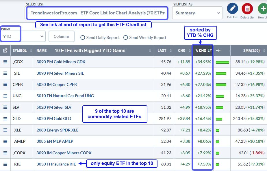
TrendInvestorPro covered the leading equity and commodity ETFs in our reports/videos this week. We saw breakouts in Aerospace-Defense and continued leadership in Insurance. Gold has blue skies as it trades near all-time highs, while Copper is looking dicey as it goes parabolic. Click here to take a trial and get immediate access.
Second takeaway: Equity ETFs from non-cyclical groups show relative strength. These include Aerospace-Defense (ITA), Insurance (KIE), Healthcare (XLV), Telecom (IYZ) and MLPs (AMLP). Non-cyclical groups are more insulated from economic fluctuations and often hold up better during periods of economic uncertainty.
Third takeaway: Equity ETFs from cyclical groups show the most pronounced downtrends. The example below is sorted by percent above 200-day SMA. The furthest below their 200-day SMAs are at the top and showing the most pronounced downtrends. Here we see ETFs related to Housing (ITB, XHB), Retail (XRT) and Semiconductors (SMH, SOXX). This is not the performance profile of a bull market.
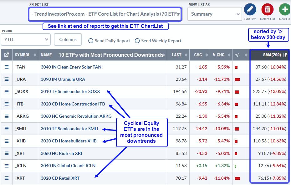
Need an organized and focused ETF ChartList that covers all bases? Our Core ETF ChartList has 72 names organized in a logical top-down manner. It includes 59 equity ETFs, 4 Treasury bond ETFs, 7 commodity ETFs and 2 crypto ETFs. Sign up for a trial at TrendInvestorPro and I will share this ChartList.
/////////////////////////////////////////////
|
| READ ONLINE → |
|
|
|
| ChartWatchers |
| Unveiling Market Trends: What's Triggering a Midweek Bearish Shift? |
| by Jayanthi Gopalakrishnan |

Wednesday's stock market price action revealed a caution sign, and with it, any hope that rose from Monday's price action just got buried. The Tech sector sold off, with the Nasdaq Composite ($COMPQ) falling over 2%.
The chart of $COMPQ indicated hesitation. Of the three broader indexes, it was the one that didn't cross above its 200-day simple moving average (SMA), and its breadth wasn't showing signs of expanding. The Dow Jones Industrial Average ($INDU) still holds on to its position above its 200-day SMA and 21-day EMA.
The S&P 500 is a concerning chart. The index crossed above its 200-day SMA on Monday; then, on Tuesday, there was a doji candlestick indicating indecision among investors. Then comes Wednesday, and we see a wide-range down day that closed well below the midpoint of Monday's trading range. This satisfied the conditions for an evening doji star, which is a bearish reversal pattern. In addition, the index wasn't able to close above its January low. This doesn't leave a warm, fuzzy feeling.
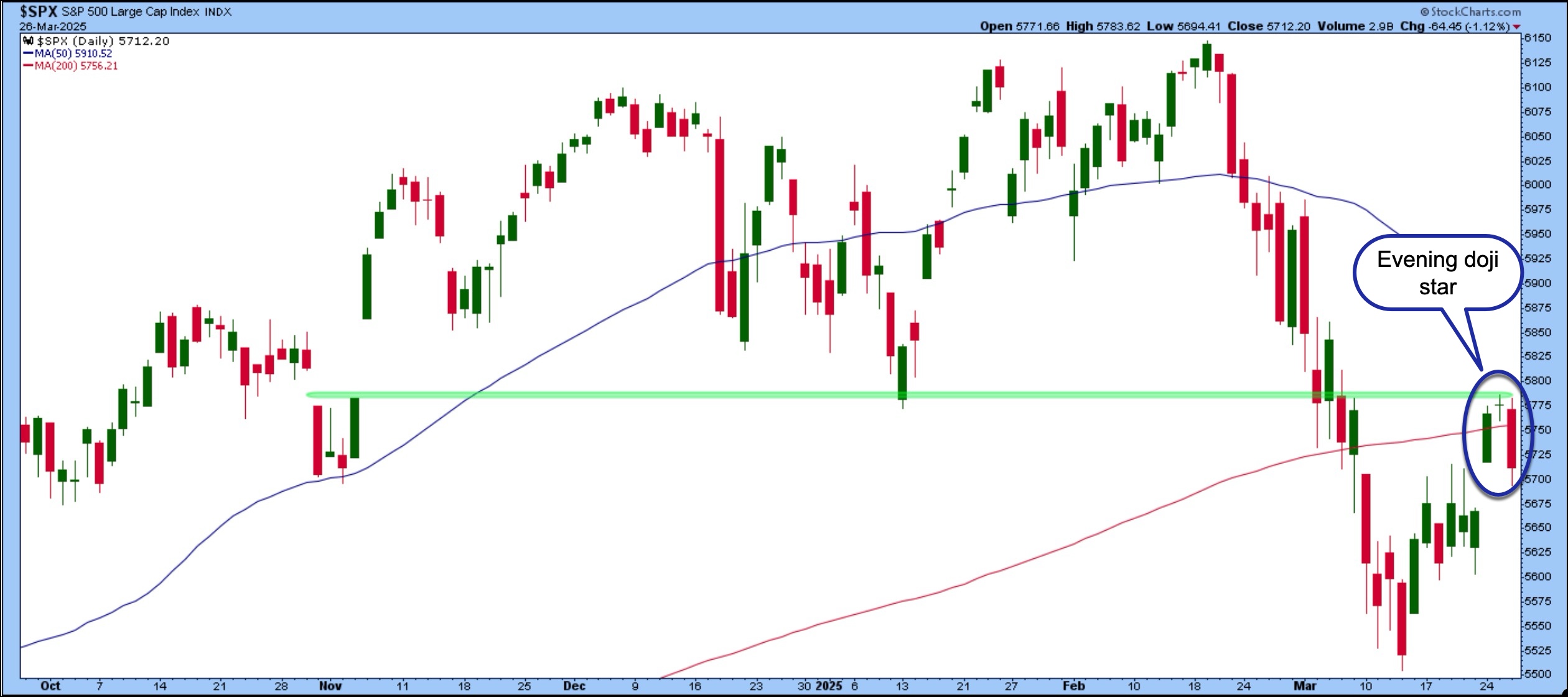
FIGURE 1. BEARISH REVERSAL IN THE S&P 500 DAILY CHART? The evening doji star is an indication of a bearish reversal. Will this hold or will the pattern fail? It's something to watch for as tariff concerns remain front and center. Chart source: StockCharts.com. For educational purposes.
Consumer Discretionary Sells Off
The back and forth with tariffs was the main cause of Wednesday's selloff. The news of President Trump prepping to sign an auto tariff statement after the market closes elevated investor uncertainty. The automobile industry was the worst performer in the Consumer Discretionary sector (see MarketCarpet below).

FIGURE 2. CONSUMER DISCRETIONARY SECTOR'S MARKETCARPET. The automobile industry was the worst hit in this sector. After the tariff announcement on Wednesday, the sector could see further selling. Image source: StockCharts.com. For educational purposes.
Tesla, Inc. (TSLA), the largest weighted stock in the Automobile sub-industry, fell 5.58%. There were many other auto manufacturers such as Toyota Motor (TM), Ferrari (RACE), General Motors (GM), and Honda Motor Co. (HMC), who experienced a similar fate.
Mr. Market didn't know the tariff details before the close, so the selloff was in anticipation of 25% tariffs being implemented. At around 5:30 pm EDT, President Trump announced the implementation of 25% tariffs on autos manufactured outside of the U.S. Shares of Ford Motor Co. (F), General Motors (GM), and Stellantis (STLA) were trading lower after Wednesday's close. Don't be surprised if Thursday is a volatile trading day.
Semis Tumble
Things weren't so rosy in AI land, either. Microsoft, Inc. (MSFT) scaled back on its data center buildouts, which didn't help tech stocks. The Technology sector was the worst-performing S&P sector on Wednesday.
The Technology sector MarketCarpet below gives a good picture of the magnitude of the selloff. Semiconductors were the worst hit, with NVIDIA Corp. (NVDA), Broadcom, Inc. (AVGO), and Taiwan Semiconductor Mfg. (TSM) seeing significant declines.

FIGURE 3. TECHNOLOGY SECTOR MARKETCARPET. The Technology sector was the hardest hit on Wednesday. As you can see, it was a sea of red with the large-cap weighted stocks seeing significant selloffs. Chart source: StockCharts.com. For educational purposes.
What a difference a day makes. The Cboe Volatility Index ($VIX) is inching higher after its slide since March 11. It's back above 18 indicating that fear is back on the table.
Fasten Your Seatbelts
The rest of this week could be volatile. Keep your eyes on the macro picture. Treasury yields held on, but could rise further on Wednesday. As a result, the U.S. dollar could strengthen against the Japanese yen. If inflation expectations and concerns about economic growth rise, precious metals could shine.

Disclaimer: This blog is for educational purposes only and should not be construed as financial advice. The ideas and strategies should never be used without first assessing your own personal and financial situation, or without consulting a financial professional.
|
| READ ONLINE → |
|
|
|
| DecisionPoint |
| Silver Cross Index Tops Beneath Signal Line on SPY |
| by Erin Swenlin |
One of the indicators that Carl Swenlin developed is the Silver Cross Index. It is one of the best participation indicators out there! Here's how it works:
We consider a positive 20/50-day EMA crossover a "Silver Cross". If a stock has a Silver Cross it has a bullish bias. The opposite of a Silver Cross is a Dark Cross. Stocks with a Dark Cross have a bearish bias.
The Silver Cross Index measures the percentage of stocks holding Silver Crosses. The current percentage on the Silver Cross Index is just 37% so this tells us that 63% have bearish biases. This condition suggests to us that the market has more downside to absorb.
The Silver Cross Index was nearing a Bullish Shift across its signal line, but instead has topped. It is likely to continue declining given less stocks are above their 20/50-day EMAs versus the Silver Cross Index percentage.
Participation measured by the percent of stocks above their key moving averages are all below our bullish 50% threshold. Stochastics have topped and the PMO topped Friday. The short-term rising trend has been broken. This looks like a textbook reverse flag formation that was confirmed with Friday's decline. The minimum downside target of the pattern would put price near 480. This sure has the earmarks of a failed bear market rally.
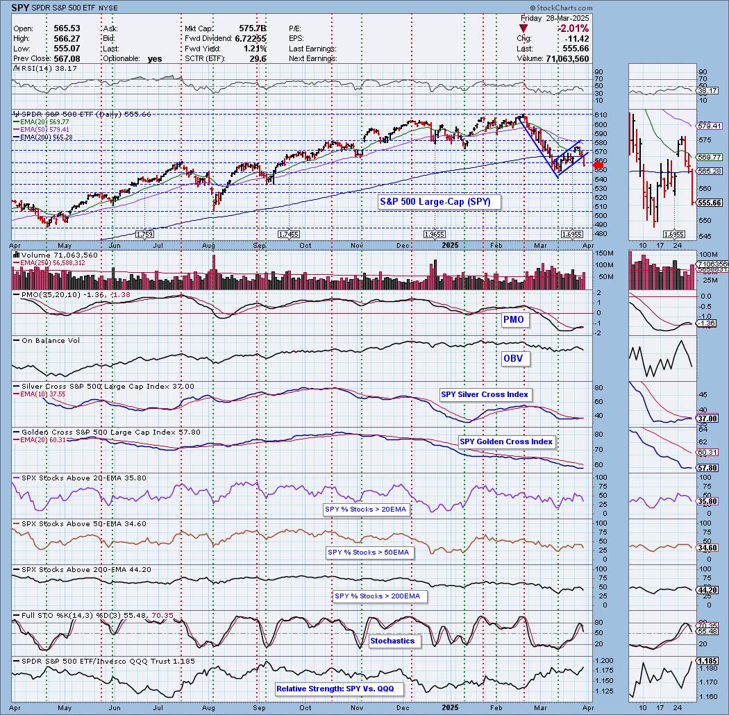
Conclusion: The Silver Cross Index is at a very low 37% and has now topped beneath its signal line. Participation, as measured by the %Stocks > 20/50EMAs, is mediocre at best and reading below the Silver Cross Index. This looks like the end of a bear market rally based on the bear flag that was confirmed on Friday.
(Note: This chart is from our "Under the Hood" ChartList on DecisionPoint.com. We have these charts with the Silver Cross Index for all the major indexes, sectors and select industry groups. All subscriptions include access to these charts!)
The DP Alert: Your First Stop to a Great Trade!
Before you trade any stock or ETF, you need to know the trend and condition of the market. The DP Alert gives you all you need to know with an executive summary of the market's current trend and condition. It not only covers the market! We look at Bitcoin, Yields, Bonds, Gold, the Dollar, Gold Miners and Crude Oil! Only $50/month! Or, use our free trial to try it out for two weeks using coupon code: DPTRIAL2. Click HERE to subscribe NOW!
Learn more about DecisionPoint.com:
Watch the latest episode of the DecisionPointTrading Room on DP's YouTube channel here!

Try us out for two weeks with a trial subscription!
Use coupon code: DPTRIAL2 Subscribe HERE!
Technical Analysis is a windsock, not a crystal ball. --Carl Swenlin
(c) Copyright 2025 DecisionPoint.com
Disclaimer: This blog is for educational purposes only and should not be construed as financial advice. The ideas and strategies should never be used without first assessing your own personal and financial situation, or without consulting a financial professional. Any opinions expressed herein are solely those of the author, and do not in any way represent the views or opinions of any other person or entity.
DecisionPoint is not a registered investment advisor. Investment and trading decisions are solely your responsibility. DecisionPoint newsletters, blogs or website materials should NOT be interpreted as a recommendation or solicitation to buy or sell any security or to take any specific action.
Helpful DecisionPoint Links:
Trend Models
Price Momentum Oscillator (PMO)
On Balance Volume
Swenlin Trading Oscillators (STO-B and STO-V)
ITBM and ITVM
SCTR Ranking
Bear Market Rules
|
| READ ONLINE → |
|
|
|
|
|
| ChartWatchers |
| This Precious Metal is On the Verge of a Massive Breakout. Here's How to Catch It! |
| by Karl Montevirgen |
 Gold at $3,100 and silver at $50? That might've sounded wild a year or two ago, but it's now the upper trajectory some analysts are eyeing. With consumer confidence cratering to a 12-year low, inflation expectations rising, and central banks hoarding bullion like it's the latest fashion, gold is holding firm above $3,000 per ounce and silver is knocking on $34. Gold at $3,100 and silver at $50? That might've sounded wild a year or two ago, but it's now the upper trajectory some analysts are eyeing. With consumer confidence cratering to a 12-year low, inflation expectations rising, and central banks hoarding bullion like it's the latest fashion, gold is holding firm above $3,000 per ounce and silver is knocking on $34.
There's another thing to consider: the gold-to-silver ratio is still high, reaching 91:1 on Monday and 89.7 on Tuesday, hinting that silver may be massively undervalued. If the ratio snaps back to historical norms, silver could explode past $40, even $50, while gold edges toward $3,100 or higher.

FIGURE 1. CHART OF GOLD/SILVER RATIO. The historical average is at 65:1, well below the data on the chart. Any level above 87 signals a potential buying opportunity.
Note how the price of silver, namely its rallies highlighted in the shaded area below the chart, is responding to the ratio. I'm going to cover this in more detail below, as the ratio serves not only as guidance but also as an important component for an entry setup.
So, if analysts are targeting $3,100, where is gold now, and what setup might it present? Take a look at a daily chart.

FIGURE 2. DAILY CHART OF GOLD. Gold is pulling back, an ideal setup for those who are bullish on the yellow metal.
Gold has pulled back from its all-time high of $3,056, coinciding with an overbought reading in the Relative Strength Index (RSI). The Quadrant Lines give you a wide range of support levels for entry.
- The second quadrant, containing the previous swing high at $2,960, may see some bulls jumping in.
- Below that, the third and fourth quadrants coincide with the two previous swing lows near $2,890 and $2,840.
Staying within and bouncing from these quadrants could signal continued strength in the current swing. Below that level would indicate the end of the current uptrend, and whether the price reverses or falls into a range, you will likely find plenty of support at the two areas highlighted in magenta.
Next, take a look at a daily chart of silver.

FIGURE 3. DAILY CHART OF SILVER. According to the gold/silver ratio, silver may be poised for another leg up.
Take a look at the green circles highlighting where the gold/silver ratio exceeded 89. These are relatively high levels, considering that the average ratio reading is between 65 to 75 depending on the historical average you're measuring. As soon as the ratio falls below that level, silver tends to rally. You see this twice in January, plus once in February and March; now that the ratio has risen above this level once again, will silver rally in response? That's the big question, and one you should keep focused on.
The $40–$50 target range that many analysts are eyeing is still a distance away. The RSI, holding above the 50 line, suggests there's room for more upside before hitting overbought territory.
If you're bullish on silver, hoping for it to reach the projected levels above $40 and toward $50, here's what you should focus on:
- Silver would need to break above resistance levels at $34.25, the most recent swing high, and $34.75, which would see the grey metal enter its 12-year high territory, paving the way to $40 and above.
- If silver pulls back, it should stay above (ideally) $32.75 and $31.75.
- A close below $31.75, even if it finds support at the next swing low at $30.75, would signal weakness and likely invalidate the current uptrend.
What does this mean for investors using ETFs like SLV and GLD?
As a stock investor, you're likely not seeking exposure to precious metals in the futures or spot market. The most commonly traded metals-backed options are the following ETFs:
- SPDR Gold Shares (GLD), which you could learn more about in the StockCharts' Symbol Summary; and
- iShares Silver Trust (SLV), whose info is also available in the Symbol Summary.
The prices will differ as ETFs are structured differently. With that said, what do these price moves mean for the ETFs?
- If gold climbs to $3,100 an ounce, GLD—designed to track 1/10th of an ounce—could be trading in the $310 to $330 range.
- If silver makes a run at $50, SLV could surge right alongside it, potentially hitting $50 per share.
If you're looking to ride the metals rally without holding physical bullion, these ETFs offer a direct and highly liquid way to gain exposure. And if silver's historical catch-up to gold kicks in, SLV could potentially deliver the bigger upside.
At the Close
Gold and silver are both showing signs of strength, backed by macroeconomic pressure, historical ratios (at least for silver), and the overall technical context. Silver could be setting up for a catch-up move that might outperform gold in percentage terms. So, stay nimble, watch your levels, and remember that when silver moves, it often moves fast.

Disclaimer: This blog is for educational purposes only and should not be construed as financial advice. The ideas and strategies should never be used without first assessing your own personal and financial situation, or without consulting a financial professional.
|
| READ ONLINE → |
|
|
|
| RRG Charts |
| The Best Five Sectors, #12 |
| by Julius de Kempenaer |
Energy Jumps to #2
A big move for the energy sector last week as XLE jumped to the #2 position in the ranking, coming from #6 the week before. This move came at the cost of the Consumer Staples sector which was pushed out of the top-5 and is now on #7.
Because of the jump of Energy, the Financials sector was pushed down to #3. Healthcare and Utilities remain in the top-5 but have switched positions.
The New Sector Lineup
- (1) Communication Services - (XLC)
- (6) Energy - (XLE)*
- (2) Financials - (XLF)*
- (5) Utilities - (XLU)*
- (4) Healthcare - (XLV)*
- (7) Industrials - (XLI)*
- (3) Consumer Staples - (XLP)*
- (8) Real-Estate - (XLRE)
- (9) Consumer Discretionary - (XLY)
- (10) Materials - (XLB)
- (11) Technology - (XLK)
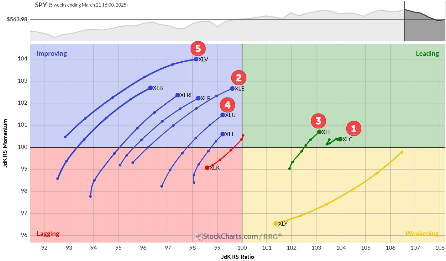
Weekly RRG: XLF and XLC remain strong
On the weekly Relative Rotation Graph, Communication Services and Financials remain strong inside the leading quadrant. From the big cluster of tails inside the improving quadrant, XLE has jumped to the front of the queue (almost) while XLU and XLV continue to pick up nicely.
The long tail on XLY at a negative RRG-Heading rapidly continues to push the sector to the lagging quadrant. The Negative RRG-Heading on XLK keeps the sector at the bottom of the list.
Daily RRG: Modest Pickup of Relative Momentum for XLK and XLY
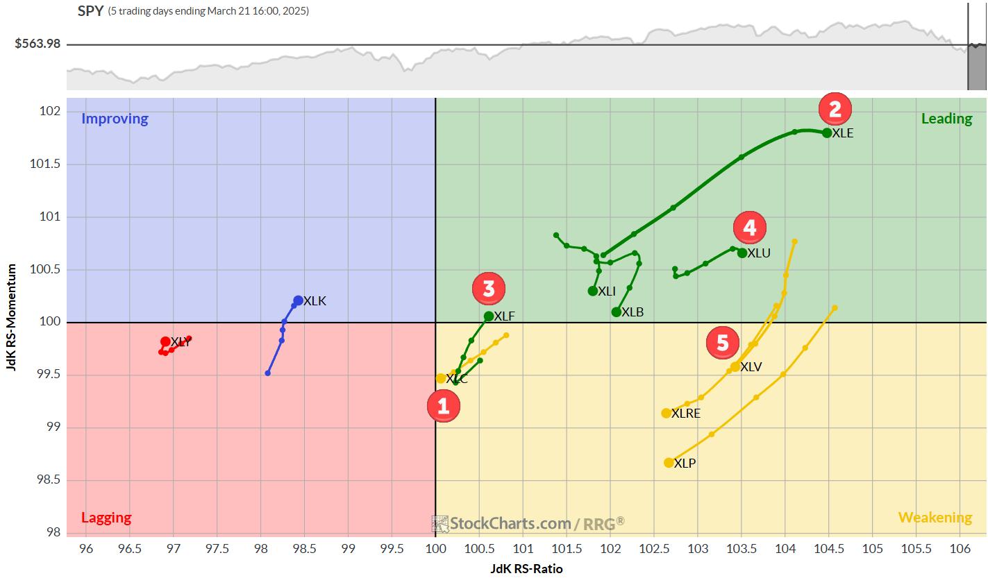
On the daily RRG:
- XLE jumps to the highest RS-Ratio reading while maintaining the highest RS-Momentum.
- Utilities stall inside the lagging quadrant
- XLV rotates into weakening but remains at an elevated RS-Ratio reading
- XLF rotates back into the leading quadrant, signaling the start of a new leg in the already established relative uptrend.
Communication Services
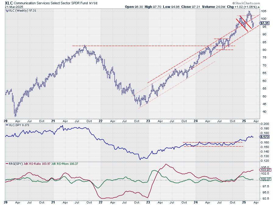
XLC held above the rising support line and closed towards the high of the week, suggesting that a new higher low is now getting into place.
Relative Strength continues to be strong, and RS-Momentum bottoms against 100-level.
Energy
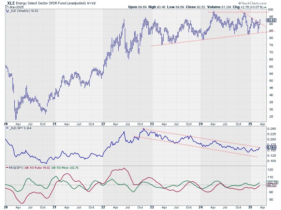
The Energy sector rapidly improved, jumping from position #6 to #2 in one week. On the price chart, XLE is breaking its falling resistance, which opens the way for a further rally to the horizontal barrier near 98.
The raw RS-line is close to leaving its two-year-old falling channel, which would signal a significant shift in sentiment and a turnaround into a relative uptrend.
Financials
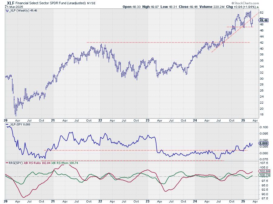
XLF remains a strong sector in position #3, with relative strength continuing to rise.
Last week's rally on the price chart brought the price back to the old rising support line, which is now expected to start acting as resistance. The former support from the low near 5o is also expected to start acting as resistance.
This means that the upside potential in terms of price seems limited for now, but RS is still going strong.
Utilities
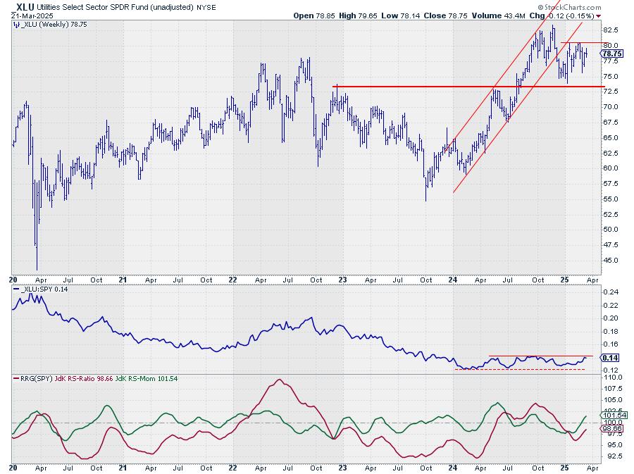
Relative strength for Utilities continues to creep higher, enough to keep the sector inside the top 5.
Both price and RS remain within the boundaries of their trading ranges.
Healthcare
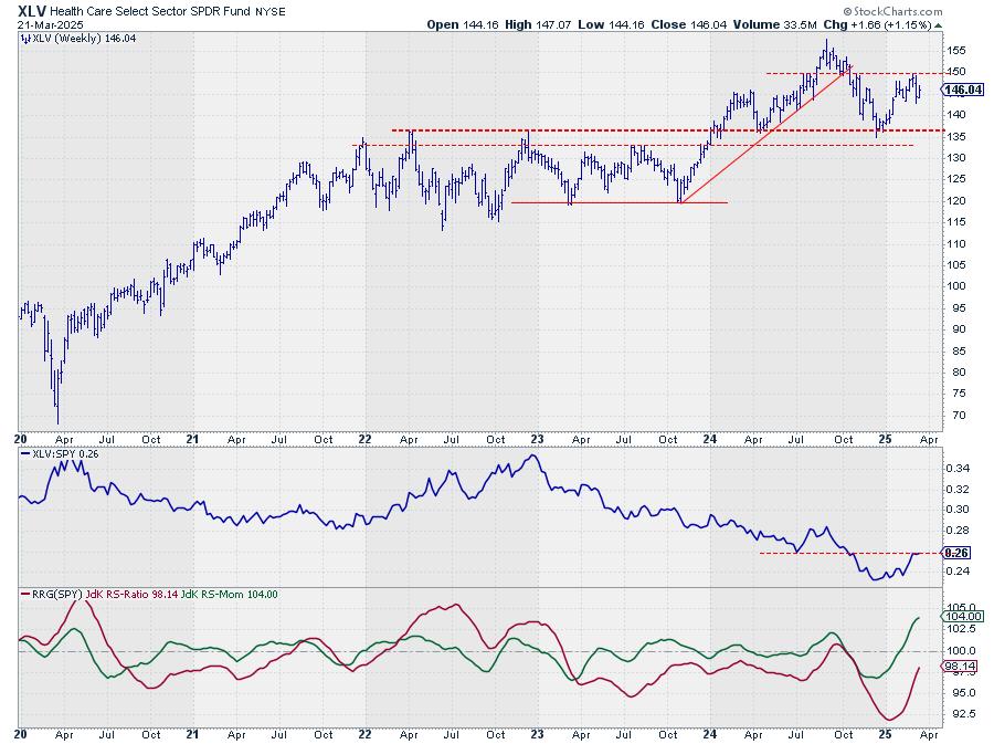
RS for the Healthcare sector stalled at the level of the previous low. The RS-Ratio and RS-Momentum combinations on the daily and weekly Relative Rotation Graphs remain strong enough to keep the sector in the top 5.
Portfolio Performance Update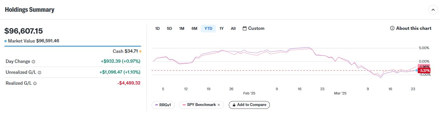
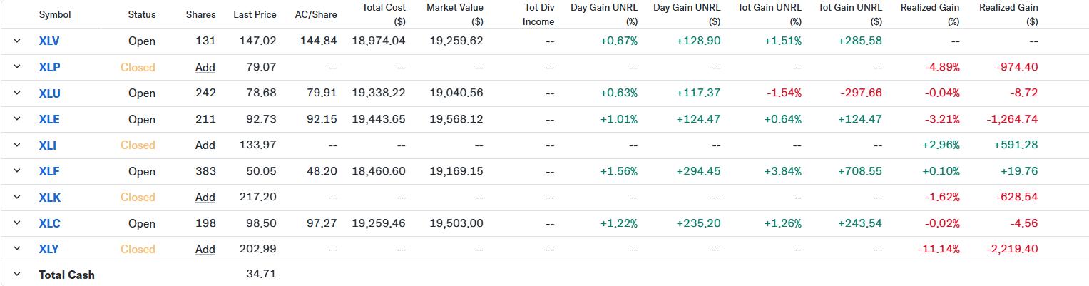
In the portfolio, the position in Consumer Staples (XLP) was closed against the opening price of Monday morning (3/24). At the same time, a new position was opened in Energy (XLE) against the opening price.
The rally in Consumer Discretionary and Technology at the end of last week has put a small dent in the performance,e and RRGv1 is now 1.4% behind SPY since the start of the year.
#StayAlert, -Julius
|
| READ ONLINE → |
|
|
|
| MORE ARTICLES → |
|